#i say sketch but this is the first time i did like. proper lineart for something
Explore tagged Tumblr posts
Text

fun little oc sketchy stuff :]
#ikachap#my art#for fun stuff#oc stuff#tw gore#tw blood#may have missed halloween but its never too late to draw zombie stuff#sketchy stuff#i say sketch but this is the first time i did like. proper lineart for something#honestly pretty jazzed with the results! killed my wrist though#monster oc
59 notes
·
View notes
Text

a vil piece i drew for a twst art nouveau open collab on twitter :] thank you to @/snailwonderzz for hosting it!!
rambling & thoughts abt this piece below the cut because i put a lot of thought into it
tbh my thoughts on this piece are properly expired because i did this MONTHS ago and its. its not as fresh as it used to be but here we go

so i made this thing ^ for twitter because obviously i cant ramble there but the whole gist of it is there from the beta designs and everything, but something i didn't include in the picture above is my struggle with deciding what color the dress should be because i don't make thumbnails/colored sketch before like getting into lineart and coloring


okay pic above is the options i had for deciding the color (ended up doing the one on the second pic, second from the left) it's a bit fun to revisit because this pic took 11 hours or so ibispaint says okay wait time to properly get rambling
i. unexpectedly put a lot of effort and thought behind this piece considering that its probably my first ever proper serious twst artwork...??? and its an open collab too so you cant not expect me to tryhard a little www but anyway. i do wish i could have done more but im impatient and i want to get this finished asap with how busy i already was with other stuff so as a result i didnt put much though in the backgrounds and just balled it but yknow what. its okay i like the end result, its nice to see and im glad to see that people like it too!! about the beta designs; im genuinely a big fan of like some of them but i knew it was going to be a pretty detailed (and draining) piece so i decided for something simple :] i did regret not putting any accessories in vil's hair though :( it completely slipped my mind until i was like .... halfway? through shading ANYWAY. i think that should be all? idk my thoughts are no longer fresh anyway so i dont have much to say now compared to back then but if you read this thank u . i put a lot of love and effort in what i do and i hope it shows through my art. hopefully i can draw more twst soon !!
#twst fanart#twisted wonderland#twst#artwork#vil schoenheit#twst vil#disney twst#disney twisted wonderland#twisted wonderland fanart
97 notes
·
View notes
Text
It's that time again, time for "I spam multiple polls on you and then run off to do errands". Yay~
So. Summoner OCs. As you know, we're nearly done wrapping up all of the six in sprite form at least, with the only odd one out currently being Eclair (and his alt as Magni) before they've all collectively graduated to 'actually has an up-to-date visual on them for once' status.
The original plan after this was to then go and make ref sheets based on the visuals given by the sprites.
But then the art meme invasion happened, and now I'm stumped. So, that brings me to this latest bout of questionaires with the gist being: "Shit. What now?"
So first question (this'll be rapid-fire-repeated for the sake of slotting the polls in proper, sorry in advance, I hate it too): What should I prioritize first? It's for-sure related to the summoners at least (other OCs exists, but they're still baking in the oven at the moment, give them a bit more time), but the question comes in what's next and what now for them.
Of the possible choices, we have:
A) Ref sheets (like initially planned).
Pros:
Tries to document as much as possible of certain details to the summoners from multiple angles.
Has a more finalized and uniform documentation and idea on things from drawn details to color palettes and such.
Get a more closer-up view of what the FEH sprites originally conveyed, including details simplified, too tiny to see in detail, or straight up skipped due to either the angle or the simplification of the sprites.
Cons:
It's a LOT of details to unpack. Including certain alt details, including details that might not fit in a single sheet, and so on. It's a pretty big project that'll take a bit of time per summoner I feel.
In terms of immediate reference, you now already have the FEH sprites to have a more immediate general idea of what each summoner looks like in their 'default' state, so this is a more detailed walk-back of much of what you already know by now.
Worth noting:
That's not to say I also might not have other drawings on the side that escape containment (especially if I get stumped on specific parts and try to visualize it mid-work, like what happened with Magni-Eclair), but for the most part, there'll be quite the ref sheet flood.
I'm also torn likewise on whether to do the ref sheet with minimal (thin) lineart (neater than sketch but around the same idea) or to go all-in on the usual stronger lineart (mostly out of concerns whether or not it conveys properly or the line thickness might get mistaken as overdetails).
B) This big-ass compilation of OC meme prompts hmrg brought to my attention (thanks~)
Pros:
Conveys a lot of prompt ideas and alts that I've been sitting on that a quick cautionary glance at the prompts hit the nail on the head of giving it a good platform to bring certain prompts up.
Silly times for silly moments in a lot of these. It's a lighthearted break from being either informative or dark-heavy-handed lately. (Well, some of them anyways...), and since a lot of these memes are based around capturing moments or pointed context, less word vomit this time.
They're fairly small, straightforward, and isolated, compared to a lot of these being bigger or fuller spreads (especially the ref sheets).
Cons:
Certain prompts might be about things I already just did and reiterating what you already know very recently even. Not all of them, but some of them (ex: the sudden spike of attention to Ephrel/Spectailis and again likewise with Eclair/Magni).
Derails reference based prompts and collections compared to a lot of these. This gives visuals to key moments of their lore, but is a lot less referential compared to the other two options here.
Many, MANY parts to the meme as a whole, so Summoner OC tag is gonna have quite A Time...
Worth noting:
I'm also torn on whether or not to do this sketch style (again, quicker, but somewhat messier), proper art style (fully rendered) or the aforementioned compromise (lineart, flatter colors, simpler shades) so that's a whole other discussion about how to approach it too.
I'm also going to properly break this down into individual parts, rather than dump the entire compilation on everyone's heads, and more than likely, it'll rotate across the six summoners, rather than be uniformly on one each.
C) This other big-ass meme quite a bit of you had been chipping away at for a good while before that I've been watching other people work on for a time (Henlo buds, nice to see your summoner alts 💖)
Pros:
Much more detailed and pointed look at the summoners and their specific alts (compared to the haphazardness of the other two, especially the other OC prompt meme) and even pokes at a lot of the rarer alts the other two options might gloss over.
Lore for alts not necessarily plot-centric compared to the others which tend to focus on alts or the moments that inspired them. It gives a chance to see or hear about seldom-seen or seldom-discussed alts.
Cons:
Basically the same as the second option where they'll be broken up into a LOT of parts, a lot of tag spam, and a lot of word vomit to go with. Not to mention it might single out a summoner, rather than rotate among them, so you're gonna be especially spammed multiple times over by one summoner in particular out of the rest.
There's also a lot of lore attached to the fleshed out alts too... which people might be a lot less patient of the essay floods to go with. hrm...
Worth noting:
I'm also only going to focus on one summoner at a time, which leaves it up in the air of which summoner even goes through these gauntlet of alts in the first place.
Whether or not the five who DIDN'T get picked right away also go through it is up in the air, but in the hypothetical scenario all six of them got a go on Summoner Alt's Wild Ride, that means you take all the concerns of this and multiply it by six.
-
Which brings us to the second half of this questionaire: What's a good bare minimum here?
As you saw recently, I tried to experiment around with a good grasp on what is the bare minimum to aim for before something's presentable enough to share. The last two things that flew by were sketches I felt were my new bare minimum (cleaned up sketchy lines with enough cleaning to fix details, overlap, or early-sketch jank to convey the main idea, but no attention otherwise to being neat and tidy, adding weight like cleaned up lineart, and either no color and shading or doing it more sloppy style in the future).
In the past, my previous bare-minimum used to be to at least get them to lineart level, give or take a much more emphasis on color-flats or much simpler cel-shade if even that. The former was way quicker and I had an easier time getting more art out (especially "give general ideas of what I'm trying to convey" pieces rather than fully-realized pieces) while the latter is tidier and at least more presentable, short of going all-in from start to finish with rendering and the whole nine yards.
There WILL be a return to art-that's-fully-realized, but how do you guys feel so far about the sketchy-lines (quicker but little to no line-weight and less stress on tidiness) versus the inked-lines (as close to final lineart as possible with lines, but takes a bit longer)? A good comparison of what I mean is compare for instance the last bit I did with Magni-Eclair versus pretty much all of Sharena Week.
-
So for poll 1 or 2...
4 notes
·
View notes
Note
5, 11, 16, and 19 please.
(Link to ask)
Absolutely!
5. Anything you haven’t drawn yet but want to?
I've got so many ideas of stuff I want to draw, but just never get the time to do. The most recent fanfic comic I did was one of them until recently! But I guess a few would be some scenes from Assassins! that I haven't gotten around to illustrating, some more character study sheets, as well as an entire long running comic I plan to create once Cigarettes and Assassins! are both complete! Just to name a few...
In terms of like... concepts or physical things and ideas I have wanted to draw but haven't, I don't really have any qualms. I'm pretty good at just doing whatever I feel like in that regard lol.
11. Favorite comment you���ve ever recieved on your work?
I don't receive many comments on my stuff, which is unfortunate but not something I can really change. The one that has stuck out to me the most, however was one that I received on One Mistake when I was still in the middle of finishing it.
It was a bit of an indepth criticism of a certain character dynamic I had made the focal point of that part of the story, and a critique on how I had handled the 'making up' portion of the relationship.
While criticism may not be the first thing most people think of in terms of 'favorite comments' I cherish it for the sole reason that it was the first time anyone had given me an analytical response to something I had meant to be taken with that analytical context. It was the reply I was hoping people would give to the part of a story I had put a lot of time, effort and continuity into. Plus, the ideas being presented were things I had already been toiling over in my rewrite of One Mistake to begin with, so that was also pretty cool to feel like I was sharing a mindset with someone absorbing my creation.
I also just now realized this was meant for art stuff and not fanfic lol. Same applies to artwork I guess, still don't get many comments so none in particular really stand out.
16. What’s the most daunting part of your process? Ex, planning, sketching, lineart, rendering etc
hmmm.... that is a thought provoker for sure. I don't really have one part of the artmaking process I favor over the others, since it is all just kind of a process for me. Ever since I started this cool thing of turning my sketches into my lineart via the airbrush tool in Paint Tool Sai, I haven't really had any problems!
I'd say the most daunting process is just getting started. Putting pen to paper and just doing sometimes seems impossible. But if I just force myself to sit down and start, it usually turns out ok.
19. Favourite character(s) to draw?
You'd expect me to say Kiyotaka. Which is half true, mainly because I've drawn him so much and he has been the catalyst to change my art style entirely. But believe it or not, I used to never draw people, like at all. I was a furry artist in the lamest sense of the word, since most of my OC's at the time were animals in some capacity. So I really should give it to Taka for pushing me out of my comfort zone and forcing me to take the daunting journey of learning over two years how to draw people good.
The characters that are my real true favorites to draw are my OC's of course. James, Goose and The Oposstag to be specific!

They're my babies, my darlings, my easiest things to draw. James specifically, used to be my go-to if I was ever in a slump and needed to draw something easy and simple. Bones and furry creatures have always been my specialty when it came to art, (If you've seen any of my animal-ish drawings you could see the difference in quality compared to drawing people) It just always has come easier to me than drawing people, but as an artist, I need to push myself out of my comfort zone to improve, and I'd say I've done a pretty good job improving!
Thank you so much for the ask, I hope I answered it all in good proper english and good proper wordage :)))
-Goose
0 notes
Note
Just wanted to day that I really love your work!!! And Aldo was wondering if you'd be able to talk through the process of how you make your comics? You get them done so quick!! And their always so good from backgrounds to expression their amazing!!! Loving your aftermath comic BTW, I look for it constantly even tho I know you post mostly on Tuesday lolol.
Also- Ace solidarity unite!!! ✌️
Hey there! It is possible that you have me confused with @happyfoxx-art who is the one who does the Aftermath comic, so maybe she can say a thing or two about her comic process.
The comics I'm more known for are "The Brains and The Brawn", "Puppet on a String", and "Mikey Bakes a Cake."
In case you are asking about me specifically, I'll talk about my comic process. I usually start with lots of brainstorming in the form of daydreaming and occasionally scribbling out ideas. I often switch between creating a script and sketching out rough scenes depending on how visual the moment is. If there's more dialogue or I want to note down the events panel-by-panel, I'll script more, if the scene is more action-y and I have a specific idea for the layout that I want to visualize, I'll sketch it. I already talked about how I figure out posing in my sketchwork on a previous ask.
Often I create the scenes out of order and write/draw whichever comes to mind first. For example, these are an assortment of drawings I did on my first concept sketch page for "The Brains and The Brawn".
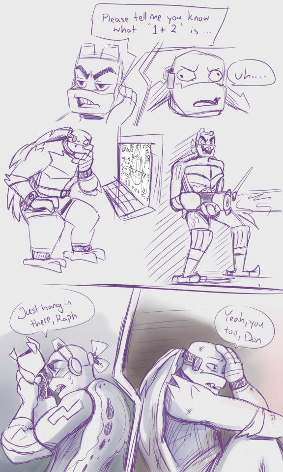
These are from pages 3, 4, 8, and 10, and while they have nothing to do with each other, they represented the main ideas I had for the comic overall.
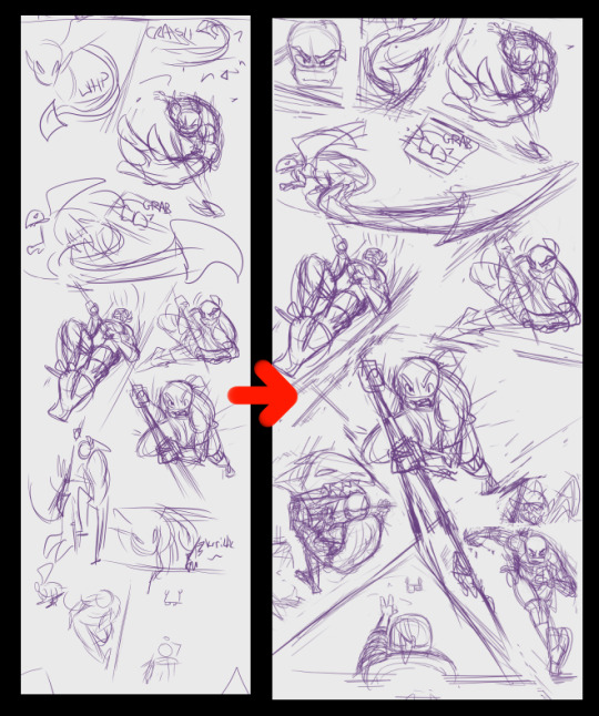
After that I'll essentially finalize my written script to make sure everything flows well story-wise, and then go about adding or subtracting panels to lay them out in a proper page-like format. It's kind of like slotting puzzle pieces together to see what fits. This is how I get more dynamic action paneling in my comics. Below you can see some of my more disjointed initial sketches (left) become a bit more finalized (right):
From there I block in all the panels with lines, then trace over the sketches with lineart, and fill in the lines with color. Those stages involve a little less thinking on my part, since a lot of it is just filling in what I already have planned out.
I would personally like to get a bit better with color since I tend to color-pick from other source material a lot. I'm hoping in my next comic project to get a bit more trippy and abstract with the coloring. I make sure to keep each color on a separate layer, and group the layers by character to keep things organized. I usually fully color a character at a time.
After that, I add in lights, shadows, and any special effects. I think the shading and lighting is where it really comes together because it adds a nice sense of depth to everything.
Eye shines are very important to me.
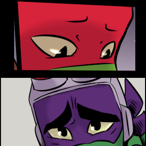
I do dialogue and sound effects last. Yes, there is a basic dialogue I put in the script, but honestly, I struggle most with dialogue (I am shocked folks think that the lines are so in-character), so I put the most time and effort into finalizing that. I will make sure to keep space for where the dialogue bubble should go, but it's often filled with placeholder dialogue until I finalize it on the last step.

I'm aware that this is rather rare for comic artists - often the dialogue comes/is blocked in first for most from what I hear, But for me, the final drawing helps me figure out the right mood/tone for the dialogue in the end anyway. That's just what works for me.
Anyway, that's at least how my comic process goes. Thanks so much for asking! And if you were looking for @happyfoxx-art, then maybe she'll add onto this post. I, for one, would be interested in her process as well :3
(also, heck yeah! Ace solidarity baby!!! [shakes your hand])
111 notes
·
View notes
Text
Artist’s Spotlight - Steorie
Drum roll, please!! It is my great pleasure to introduce as our first artist interviewed in this new series, the one, the only, Steph aka @steorie! Do you want to know more about one of the most prolific artists in the fandom, the one behind several fandom-famous fanart (including our lovely icon)? Then wait no more! Enjoy her interview (and go follow her, in the odd chance you don’t already).
S: Ok, uhm, where to start? 😆 I’m a tattoo artist from Germany and try everything to get my studio going right now. Other than that I’m either reading or drawing in my free time. I’m boring like that.
GT: How did you become a tattoo artist?
S: Oh my, I kinda stumbled into this. I was very unhappy with my job back at the time and a friend of mine (who is heavily tattooed) said that if I can draw I could tattoo it too. (which isn’t all that easy in the end 😅) But yea, I went and started an apprenticeship in a studio for a few months, then quit my job and started working as a tattoo artist full time. And I’ve been doing that for a good 3 1/2 years now.
GT: Has it paid off?
S: Oh most definitely. One of the best decisions I’ve ever made. :)
GT: I gather you've always been artistic. Did you take any art classes or just practiced by yourself?
S: I never went to an art school. I just have always been drawing since I can remember. :) I love watching livestreams of other ppl drawing/creating things, though. I learnt a lot that way.
GT: Do you remember when you started doing fanart? Or at least doing it consciously?
S: Hmm, I think proper fanart that wasn’t some horrible doodles where no one could see what it was supposed to be, might be fanart for sailor moon and dragon ball. 😌 Think I was around 11/12? But I’m not really sure though. 😅
GT: Hahaha I'm sure your doodles were still great. But omg, two of my favorite animes! Who are your favourite characters on them?
S: Usagi and Rei. <3 their friendship was everything to me. I also love Vegeta! I have a soft spot for mean looking ppl with a big heart. ❤️
GT: Love Rei! I'm an Aries like her, so I had something to relate to her. And I love love love Vegeta, though my favorite is Trunks. But Vegebul remains one of my favorite ships.
Do you remember your first ships ever on any show?
S: Vegeta and Bulma are one of my all time fav OTPs. Also Seiya and Usagi are I think, my first ever ship, back when I didn’t even know what shipping was. 😆
GT: Nice to know we have two OTPs in common! What are some of your other ships? Do you still make fanart for them as well?
S: I dont have a lot of shows that im invested in THAT much that i have the urge to draw fanart for it. But im still madly in love with Agron and Nasir from the Starz Show Spartacus. (Everyone needs to watch this tbh!)
Another one of my first otps in a show are Michael and Maria from the original Roswell Show back in the 2000. They had the best chemistry too. :)
GT: How would you describe your fanart style?
S: Uh…oh my, let me think. 😆🤔I’m a big ol romantic deep down in my heart. lol I guess that shows in my style? Also I love bright colors. I want people to start smiling when they see my art. 🙈❤️
GT: I would say the colors definitely are your most easily recognizable attribute!
Walk us through your process, please.
S: I have to admit that I never do any sketches tbh. I just start directly with the lineart once I got inspired with an idea and go for it. I mostly do digital art. I work on an iPad Pro and use the procreate app. I have a lot of back and forth going on when I start to color. I use lots of different layers and settings and fool around with the colors and filters until I like what I see. Oh my gosh, I’m so bad at explaining. In the end I just BS my way through art and hope for the best.
GT: And what does inspire you? Where do you get your idea from?
S: I mostly get inspired by the show itself. But there are so many mindblowing fanfictions out there as well that constantly give me ideas. Also music and the lyrics of songs I love. :)
GT: How often do you start a new piece? And, on average, how long does it take you to complete it?
S: I usually don’t work on more than one piece at a time. I need to focus on one and don’t want to work on anything else before I finish the current drawing. I usually need a week, maybe two? Depends on how detailed the drawing is going to be, if I’m going to color it, if I will add a background and so on. :) My submission for the Gallavich zine (which you guys will hopefully hold in your hands soonish!) took me about 28 hours for example.
GT: Wow! That's dedication! And it shows.
Do you take prompts? What about commissions?
S: I don’t have enough time for requests. :( but I do take commissions from time to time if I can manage it next to my main job. :)
GT: What are some of your own favorite Gallavich fanarts?
S: Definitely the one you are using as an icon right now. And maybe one I did back in 2014 when I first started watching the show. It’s of them from season one, sharing a smoke in their winter coats. :)
GT: They're both great! And once more, thank you for letting me use your art as an icon.
What are some of the other people in the fandom you admire?
Anyone goes, not only here either, and not just artists.
S: You are very welcome. :))
Oh, there are so many talented people out who make the fandom such a special place. Let me think for a second.
Art wise I’m in love with Lulu‘s (@luluxa) painting. The way she colors her pieces is absolute art goals. So very impressive. Also she adds so many details and makes it such an experience to look at her art. Phenomenal!c❤️ I also adore Mitchell’s (@psychicskulldamage) art! His chibi comics are sooooo freaking adorable and funny! The style is also so unique and it brings me so much joy whenever he shares something new. ☺️💓
Another huge inspiration and talent I admire is Gray (@gallavichy). Her stories just go straight to my heart and I have taken a lot of inspiration for drawings from her stories. The emotions she inflicted in me with her writing is unbelievable.
There are so many more ppl who needs to be mentioned but these three immediately come to mind. :)
GT: When did you first start watching Shameless?
S: I started back in 2014, when season 4 aired.
GT: And what attracted you to Ian and Mickey's relationship?
S: Well, first of all, the chemistry between Noel and Cam is just sooo good and they are both so amazing together. It’s so much fun to see them together on screen. I fell in love with Ian and Mickey’s teasing, bickering and how they fought so hard at such a young age to be together, in whatever way they could be at certain times. The connection they shared, even if they were apart and couldn’t be with each other, it was always obvious to them that they were each other’s person though. And that fascinated me and I was in deep. :’)
GT: Did you join the fandom right away? How was the fandom back then different from now?
S: Omg it’s been so long. 😂 I was still very much into Spartacus at the time and only sloooooowly stepped into shameless. But the fandom was immediately so very welcoming and supportive, I was in deep quickly. lol I would say the fandom hasn’t changed much? At least from what I experienced. Still lots of amazing art, stories, discussions and memes going around, next to ppl fighting tooth and nail about certain topics. 😅 We are a lot of very passionate people, so it never gets boring. 😆❤️
GT: Truly.
You mentioned the fandom being welcoming and supportive. Have the comments on your art always been positive?
S: Surprisingly, yes! The art I made during s4-5 for shameless is still my most popular shameless related stuff, if we take a look at the notes at least. It really blew my mind.
GT: Let's go back to Shameless. What's your favorite season of the show?
S: I would have to say season 4. It was just phenomenal. From the acting, to the story telling, to the whole mood of the season. I was just so invested in everyone's storyline. Frank and his failing liver, Fiona in jail and how she endangered Liam, Debs slowly becoming a young woman, SHEILA, even Sammi was fun to watch and her storyline with Frank really got to me, how she showered him and was there to bring his drinking buddies from the alibi to Sheila’s house when he was too weak to make it there on his own. Of course I don’t have to mention how brilliant yet gut wrenching Ian and Mickey’s journey throughout the season was. Just chefs kiss on all fronts.
GT: I just love Sheila.
Do you have a favorite episode and/or scene?
S: I mean my fav episode has to be 10.12. :)
GT: I think we all collectively died when we watched that!
What did you think of the ending?
S: Tbh, yes. As far as it concerns only Mickey and Ian. (I didn’t like all the endless open endings for everyone else though) Their future looks so bright right now. I couldn’t ask for more. I’m sure they will have a good, sweet life together. <3
GT: Do you have any headcanons for their future?
S: I’m sure, they will expand their business as they mentioned in 11.10. Hire some guys, buy more cars and so on. I could imagine them each doing something different later on though and only function as the bosses of the transport business. I hope Ian can work in the EMT, nurse field again somehow? And as for Mickey, I could see him do more with his passion for art. Maybe he will work as a tattoo artist himself one day. 😆❤️
GT: I agree, I'd also love for Ian to go back to being an EMT, he was actually good at it. And hell yes to tattoo artist Mickey!
S: Other than that I think they will eventually move back to the South Side again, maybe buy a house? And I hope they are gonna travel together once their probation is over. See the world and everything it has to offer. :’) Maybe visit Mandy, wherever she is and then Fiona in Florida.
GT: I so wish they'd at least mentioned Mandy again!
If you could go back and change one thing in canon, what would it be?
S: I think I wouldn’t change anything? Well, obviously I wish I could undo any harm ever done to them, but that’s not how it works. Yea, I think I wouldn’t change a thing storytelling wise. I would have wanted to see them on THE date. No matter which season but it would have been some nice fanservice if they had shown them at sizzlers or something else on a date. ☺️
Okay wait.
Ian sleeping with that woman in season 7. Cause I think he was always sure about his sexuality and it was kind of unnecessary? (You could maybe link it back to his bipolar and him being kinda already a bit unbalanced after the fight with Caleb and maybe his meds didn’t work properly anymore, but even then I’m not that sure he would have done it?)
GT: What's the most challenging thing about creating fanart about them?
S: It’s the coloring for me. I can do lineart for hours and hours but once it’s time for color I’m like …lmao
GT: And what's the most fun part?
S: Oh definitely the hair.❤ I loooooove drawing hair. And Ian's and Mickey's are kinda unique, which makes it even more fun. ��
GT: What are your favorite themes of tropes to draw?
S: Uh, I don’t have any? 😳
GT: Hahah, that's ok. Great, actually. But are there any themes or tropes you won't do?
S: Uh, I dunno…do you have examples of what kind of tropes are out there?😅
GT: Well, for instance, I know you didn't use to make smut art until very recently. What made you decide to go for it? (not that we're complaining)
S: Ah, i get it now. Well, I’m still very picky about nsfw stuff. I usually prefer to leave some things to the imagination, you know. But i kinda got bored a bit, drawing always the same kinda stuff and you can learn so much about anatomy if you draw ppl being intimate with each other! 😆 So yea,i learnt once again to never say never.
GT: Hahah
About about future works. Do you have any WIPs or ideas for future art?
S: I have a few things I wanna draw (but so little time.) I also work on a fun commission right now. If ppl are interested in WIPS or something like that, I sometimes post WIP stuff on my twitter. :)
GT: Nice to know!
Same as here right, @steorie?
S: Yes. :)
GT: Speaking of, I meant to ask you, why steorie? Is it a combination of your name and something else?
S: Haha yes, actually. 😅 it’s so lame. I always made a typo when writing my name on the keyboard when I was younger and Steph most often became Steo. The rie got added cause I liked the sound of it. 😂😂😂
GT: Well, it's definitely unique!
That's about it, love! Thank you so much for being the first in this series!
Leave a message to your numerous fans.
(I'm not joking btw)
S: Thank u so very much for reaching out and having this fun chat with me. :)
Just thanks to everyone for the constant support over the years. I read each and every tag and comment you guys leave on my stuff! Thank you, thank you! ♡
78 notes
·
View notes
Note
I admire your art reeeeally much! Can you make a video how you draw this? I really want to know the way you start to draw and how you do the thingy with the colours ans stuff!
Thank you dir posting your arts!! :> <3
HI!!!! thank you so much for ur interest!!!! i won’t make a video but i can show u some screenshots of my wips and explain my process ^__^ sorry this took so long to answer but anyways here we go!!!!! this is all over the place im so sorry- i draw differently every time and i don’t really follow a direct process so HI
this isn’t really meant to be a tutorial by any means but rather just me rambling and documenting the different stages of my drawings. the main thing is to just have fun with it!!
in case you don’t know, i draw on procreate! i use nikko rull as my main brush to block down colours, and since i draw using my finger i basically use this as a substitute for nicer shapes since i lack any kind of pressure sensitivity. i use the drawing brush eaglehawk to do all of my lines- although depending on what im drawing and what stage im at in the drawing i’ll sometimes switch to other brushes for a softer/harder look. mainly though, i’ll use eagle hawk when im doing sketches n stuff or if i want certain shapes or details. my main blending brush is spectra! i used to use salamanca to blend but that’s kinda fallen out of use for me. but if i need more textures i’ll switch it up (for example, with the kaiba drawing i did, i blended with spectra first and then softened with the standard soft airbrush tool) below is an image i posted on my story like a year or so ago about how i create that “painted” look in some of my drawings. Note: i don’t really use any opacity layers anymore except for finishing touches- i just blot colours down from the wheel
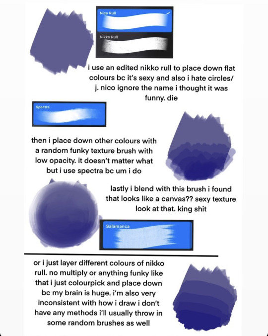
so! let’s talk about how i actually draw my pieces. when i’m not like. just doing some quick and fun sketches i always start off using the nikko rull brush to blob down some colours in the shapes that i want on the canvas. my process is essentially to blob and then refine ^__^ i’ll be going over my portrait type pieces bc the way i do backgrounds or sketches is waaay different and both change a lot

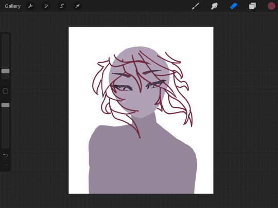
i always start off with a general circle for the head- and i draw the body in a slightly different shade for visibility. this is honestly the easiest way for me to visualize drawings bc i am very close to having aphantasia so it’s extremely hard for me to imagine things in my head and they appear more like shapes and gestures to me ^__^

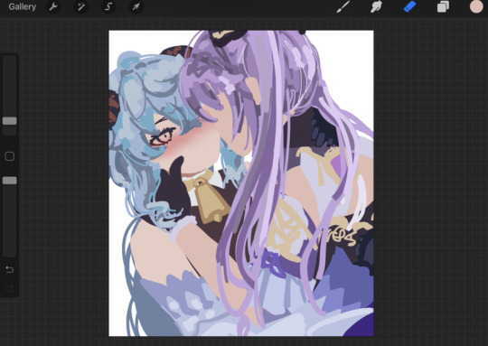
i don’t really do any sketches or like preparation beforehand like im not joking when i say i just draw and that’s as far as my planning goes. i never do proper lineart ever all of my lines are the sketches that i drew from a blank canvas. anyways in these two images u can see how the drawing starts to take form on top of the bases i already drew. i pick individual colours from the colour wheel and layer them (full opacity) over top of each other to create form. i would explain how i pick colours for my drawings but honest to god that would need it’s own separate post and most of it is just instinct. but anyways you can see in the judai drawing i kinda combined both my sketch style and painted style- like i said i don’t follow any proper way to draw

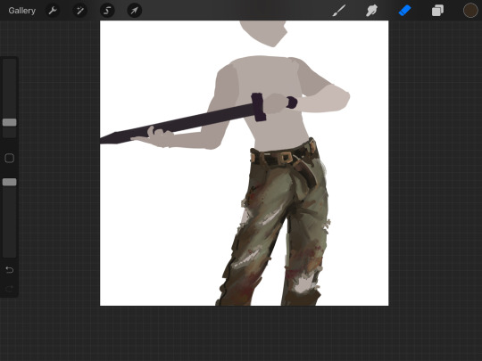
i next start to refine and blend the colours that i blocked down- adding more as needed (like if i feel a colour is getting too swallowed or i need lighting in an area, etc) i’ll sometimes do this all at once or in sections like u see in the image on the right

LASTLY IS JUST. exporting the canvas and importing it back in to draw overtop of everything on one single layer, i’ll add any effects here or adjust the colours as i see fit idk. or, in the case of that judai drawing on the right, i’ll darken things to make them more visible than the original i drew. i’m not joking when i say i draw like a painter and i didn’t even know that’s how painters draw until recently but it’s all about blobbing and then refining/blending
anyways. i can certainly say this wasn’t helpful in any way at all but i at least hope it was interesting to read ^__^ thank you again for the ask!!
49 notes
·
View notes
Text
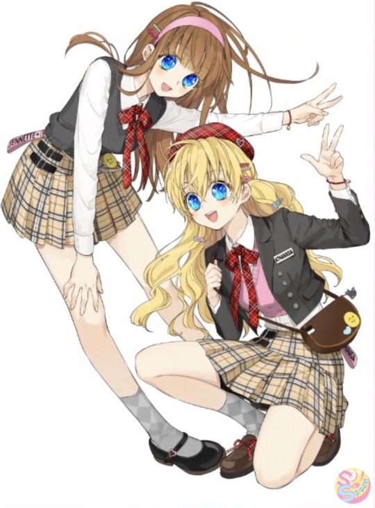
Haha I translated this video
(For a better understanding, please watch this one first!)
-> Back then, I was in a situation where I had to urgently create special content for Volume 5, but since I was also working on the updates, I didn't have time to think about a concept, so I realised I had never drawn something like this.
(A behind the scenes I couldn’t mention last time)
-> The concept and color scheme are decided.
Trying to change the color around and changing the shape of the outfits to find something that feels nicer.
-> Since it’s a set of pictures, I must compare them so they don’t feel to different to the other.
-> Trying to match the proportions of the two characters.
Since I started directly from the sketch, Ijekiel is hurting a lot in the back haha
-> At first, I was drawing a sporty concept, but in response to the opinion of the editorial department, I decided to change it to a k-idol outfit, with school uniforms vibes.
-> After all, it was a randomly drawn picture, so now I have to modify the proportions of the human body... TT
-> Now I have to draw Jennette’s face properly.
-> I wonder if it’ll be a pretty pattern...
Now I’m trying to customise it to get the feeling I want.
-> The battle with the pattern continues...
The change of the pattern must reflect according to the movement of the fabric.
-> I thought it would be nice if the boys' clothes have detailed logos , so I'm testing and putting various logos.
-> I had no proper text that came to mind, so most of it are the characters’ names or information Ha ha ha
-> I didn’t think through it properly at the beginning, so I kept crying and thinking that it would be so much easier if I had the kids’ birthday dates... so I remembered
-> There were meant readers who were also curious. Since there was no birthday in the original work, I was thinking that I could make them up...
-> I wanted to make the birthdays at this point, so I asked the editorial department if it would be okay to make birth dates for them, and they said okay so I'm going to make a birthday for them sooner or later!
-> Athy would be in early summer or July, which is articulated with a vaguely emerging image, Claude was born in February, Jennette in early fall... Around September? Lucas, on December 25. Ijekiel on spring... I think he was born in March. Only Lucas has a set date... I think. *feeling omnipotent*
-> Anastasius feels like a raw mid-winter in January. I think October is good for the uncle White. I think Felix was born in midsummer/July. Lily's name is Lily (lillies bloom in summer) so it would be good in August.
-> The color scheme and details came out roughly.
I started doing the lineart.
-> I feel like I’m unconsciously doing the wrinkles of their shirts bigger.
-> I’m using different props.
I continue doing the lineart.
-> Also squeezing in logos or text. [‘Warning’ on Lucas’ shoe] Dangerous man Lucas...!
-> Since it is a bonus that comes with Volume 5, I will also put information about Volume 5.
(She wrote “volume 5” on the boys’ clothes)
-> Ijekiel looks a little sporty, so I was worried, but I think the active feeling looks fine, so I keep going as it is.
-> Since the wrong placement was the problem from the start, Ijekiel is going to suffer until the end...
-> I was asked to draw him behind Lucas, so even if he’s a bit hidden, he has to stand out well on himself.
-> But Ijekiel keeps avoiding with Lucas and it’s getting annoying to draw
-> It’s difficult...
Can’t you two get closer to each other?
-> I feel like I’m adding too many layers... But it looks nice and cool. I'm drawing them to look relaxed.
-> The boys’ lineart is over to some extent, so we start with the girls’ lineart.
-> When I keep drawing for the webtoon and then switch to draw illustrations, the feeling is very different and I get lost every time.
How do I do it...?
-> However, I can’t run past the deadline, so I have to work even if I want to sleep.
-> It feels like I’m broadcasting live.
I must prepare my mind and organize my materials nicely. Ugh! It could be nice if I could draw very carefully... but I always say ‘but first I have to do...’
-> Sometimes I feel like I have to search through my whole body for the skills to do something and have to scrape all down to the bottom to find it... It feels like a constant fight.
-> I rarely draws girls’ legs because in the WMMAP world, women are wearing long dresses.
So it's fun to draw a short skirt and legs after a long time.
-> Jennette is friendly with Athy, so their pose wasn't hard to find at all.
I drew it straight out easily.
-> After all, drawing legs is interesting~
-> the girls' line art is also finished, and then the coloring begins.
-> (this is a wordplay on Hangul so I had to translate it somehow) IJKLALPHS is now Ijekiel Alpheus haha
I’ll stop now because I don’t have much to use...
-> Still, thanks to the formative features of Hangeul, wouldn't it look geometrically cool to foreign fans?
-> Trying to find a nice variation by trying out different types of letters...
-> Even I gave up on IJKLALPHS haha
-> After roughly finishing the coloring, I hurry up with Athy’s color scheme, gogo!
-> The pattern in put in the sketch was filled properly.
-> I’m always attentive to do the patterns and wrinkles around the sewing lines nicely.
-> This process seems boring and not more rewarding than I originally thought when I was doing it... But the pattern is perfect! It really stands out when you first see it.
It’s like doing house chores...
-> If you know how to do it well, it’s okay, but if you don't, it's annoying..
So, pattern twisting should be done with the feeling of laying the foundation.
-> Now it’s time to pour the colors following the areas.
-> I am working on the details a little more. When you pour the colors, it is easier to see the details compared to when you only did the line art.
-> After this, I start coloring more in detail.
-> Now I won’t touch anything but little more details and the shape. In fact, I’ll keep doing it until the end.
-> I am modifying the smileys one by one to suit each character. After fixing it all, I was proud. It's cute.. haha
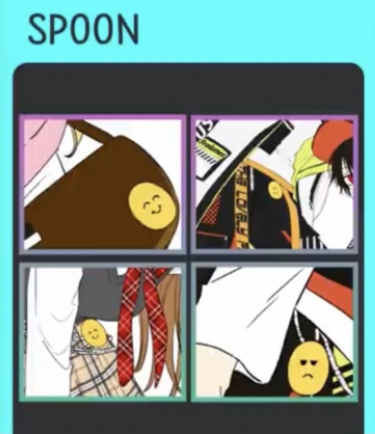
-> I’ll proceed to continue coloring.
-> This drawing is very a hip fashion themed, and there a lot of black, so I paint the skin with a lower saturation than usual.
-> Lucas’ colouring is not complete, but at this point, I’ll also proceed to colour Ijekiel.
I alternately paint the one and then the other to see the balance between the two.
-> Then, the coloring of the boys is not over yet, but I start coloring the girls too in order to balance them.
-> [the balance the colors of the boys and the girls], I select the boys’ main colors with a pipette and use them [to paint the girls].
-> Even if the balance is correct, the girls seem to have been paint much brightly, so I increased the temperature of their skin color.
-> In order to equally increase the nice complementing of the characters, I continuously compare and correct it.
-> At this stage, we pass the image to the editorial department and wait for feedback to see if there are any corrections that need to be done.
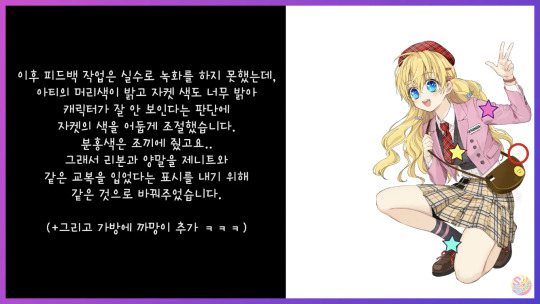
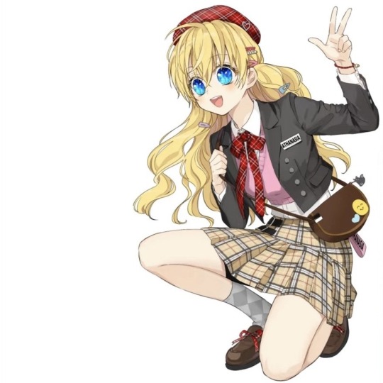
Afterwards, I was unable to record the rest by mistake, but I adjusted the color of the jacket to a dark color because Athy’s hair color is bright and the jacket color was too bright to see the character. So the vest became pink... So I changed the ribbon and socks to the same ones as Jennette to show that they are wearing the same uniform.
(+ And added blackie to her back hahaha)

#spoon’s youtube channel#who made me a princess#wmmap#sbap#sbapod#suddenly became a princess one day#i suddenly became a princess
71 notes
·
View notes
Photo
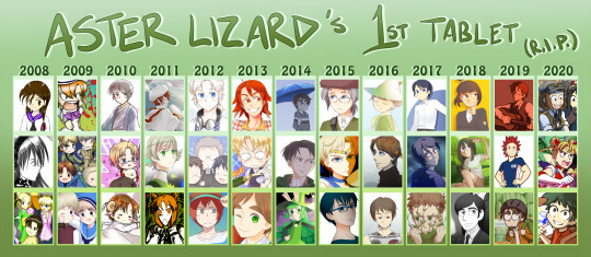
As a memorial for my first tablet, which died this year, I put together pieces from each year that I had it (it lasted for almost 12 years!) Also I’m curious to see how my art evolved over the years, and this was a good excuse.
Analysis of each year under the cut:
2008: -Got my first tablet in September (the top pic was my very first attempt with it aaa) -Was into fanimations and creating fanart of peoples' OCs, and Japanese stuff in general -Made several attempts at original stories, but they barely lasted after creating the characters --However, I did have two stories that I made fair progress on: one of my group of friends at the time, and a horror story with disabled protagonists
2009: -I was very into horror tropes at this time, so it was difficult to find early stuff that didn't have blood on it :'D -HETALIA -My art themes immediately moved into Cuteness Territory, which I've pretty much stuck with to now -Also pretty much adopted Himaruya's art style almost overnight -The prototype characters of Kaleidoscope Children began here, though I didn't start making proper art of them until next year
2010: -So much Hetalia and chibi content (I should put a cuteness warning next time) -Played around with different art techniques -Discovered SAI -Finally completed a group picture (with 50+ characters!), which is a big accomplishment considering how easily I get bored/burnt out --This was probably the first pic I did that got fairly popular
2011: -Moved over from Photoshop to SAI as my primary art program (PS was only used for extra effects) -Finally drew fanart that wasn't Hetalia, haha -My first commission -Out of my old artwork, this year was perhaps my favourite; there are a lot of works I'm still really pleased with
2012: -Half of my art this year was digital paint, and the other half was 'attempted digital watercolour', which I never really mastered... -First attempt applying for an art job (I didn't get it, but in retrospect I'm glad I didn't, I wasn't ready yet :'D ) -Joined an art contest (and only one) on deviantart
2013: -The number of original pics outnumbered fanart (especially Hetalia, I probably drew it once a year for the next few years) -In previous years I made a couple of attempts at a simplified/more cartoony art style, but didn't really settle on something until this year, though I still primarily stuck to my more anime-influenced style -Used the Fringe tool for shading for a few years
2014: -Too busy with school, probably only made like 5 proper pics this entire year -For the next few years, I drew eyes where the lineart has no gaps between the eyelids (so more Western-ish) -Started experimenting with darker shading -First attempt at detailed food
2015: -Also not very productive -Got a food art commission
2016: -Still not very productive -First 500+ note popular pic -Stopped adding highlights to hair
2017: -Started reviving KalChi and gave them new profile pics -Wasn't super proud of my art style at this point (particularly how I drew eyes)
2018: -BNHA -Finally I had a series to obsess over again and draw lots of fanart for again! -For some reason, something clicked toward the end of the year, and I started to really like drawing??? (not that I had low self-esteem about my art, but most of what I drew didn't feel grand or special or super memorable) -New tricks: Multiply for the lineart layer, also finally drawing a decent BG instead of mostly blank/basic BGs
2019: -New lineart technique, which for lack of a better term I call the 'traditional/marble-chiseling technique', which makes me feel like less of a perfectionist due to the rougher lineart 👍 (i.e.: the rough sketch becomes the final lineart, I don't make a separate layer for the final lineart anymore) -Drew eyes differently (lineart gaps again and smaller irises) inspired by BNHA's art style -Getting back into making comics frequently again -Also more proper BGs! -Perhaps the highest enjoyment I've had yet
2020: -Zines! -The most detail I've done yet -Tablet dies in the middle of my 3rd zine work in mid-late summer (R.I.P.), while I finished it with my backup tablet --This became my first 1000+ note popular pic!
2 notes
·
View notes
Text
Yuumi’s art process (with pics!)
This is how I go about doing the art palettes, and generally how I do art (specially on lose, not so long pieces such as these). I’ll breakdown the process under the cut so I don’t spam people’s timelines (´・ω・`)
I was going to put these final advises at the very end but someone else might make use of these instead of going through the whole thing so here:
Important things to keep in mind in case you’re learning and actually think I’m worth being listened:
References are GOOD. No one is perfect and no one knows how to draw stuff from their memory so go google weird things, Google-sensei won’t judge. Hopefully. (else set your navigation on private).
Brushes and whatnot don’t make the artist, but it sure as hell help you feel like you’re doing what you like or not. I can’t stress enough how many times I’ve just not finished works because my brushes felt “off”.
Posemaniacs is very good for both anatomy and speed practise (I’m aware I’m really fast compared to my fellow artist friends but by no means it’s a standard, I just got used to work fast uwu)
Be careful with your wrist!!! use your whole arm when drawing!! and also T a k e · b r e a k s.
Art block is a bitch and strikes anyone. I’m usually artblocked but if you find something you’re passionate about go draw that, whatever it is. (I hadn’t consistently drawn in p much 5 years after college and thanks to MLB season 3 here I am LOL)
And now for the actual breakdown:

Step 1: Sketch
My first step is the sketch, which some of you might think “but it’s SO CLEAN!!”, yes, sometimes I leave my sketches as lines and polish them a bit. Anyways, these is what my sketch looks like and next an important thing:
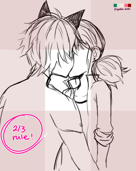
...which is the 2/3 rule! Photoshop blabbery ahead, tl:dr how i made the grid
I’ve been doing this small trick by filling a layer of any color, lowering the opacity to 50% and transforming it to 33,33% it’s height duplicate and place on each side of the canvas and then merge, and then another layer doing the same but doing 33,33% width instead of height. Then I merge both layers, set the opacity to 30% and the result is that perfect 2/3 rule.
If you don’t really know what the rule is, I kindly suggest this instead of my explanation bc words are not my forte.
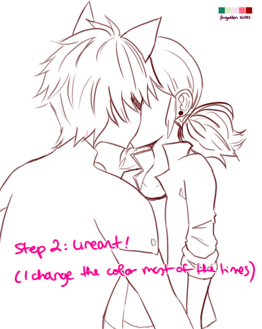
Step 2: Lineart!
Nothing to say here other than cleaning the lines from earlier with a different (or the same in this case) brush as the sketch one. Opacity varies from day to day.
I have several styles of lineart and they all come with the mood I feel on that day, so don’t be afraid of experimenting and finding what you like most! I personally like thin lines a lot but also thick lines too! i’m constantly looking for the perfect line™ and to give an idea this is what my brushes look like:
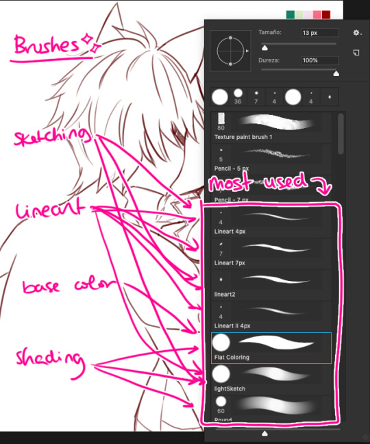
in summary, practise with as many tools you can find around and see which ones you like most uwu

Step 3: Base Color
This is probably the part where I give up the most bc it boooooores me LOL. I try to spend as little time as possible in order to overcome this step. These are usually colors I use in 99% of my pics, since... idk years. If you look in my old arts in twitter you’ll see them haha.
Something important I’d like to mention here is ✨LAYERS✨:
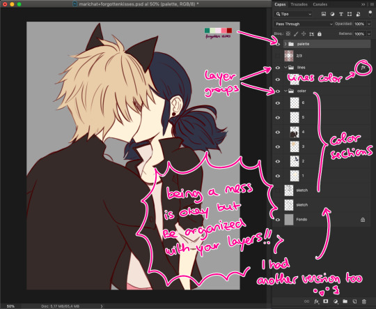
This is how my layers look like in the base color part. I tend to do 1 for skin color, 2 for hair / eyes, 3+ for clothes and stuff. I tend to separate them in colors so they don’t merge! I go with numbers because... I think it’s faster to type and I’ve been using this way of naming for years so it works for me, what matters is that you group your layers and keep them organized uwu (specially if someone else has to look at your psd files >>)

Step 4: Shading!
Normally, I shade every single layer with a proper shade but on the case of the palette challenge I’m doing just the skin because I want to stress the light mood. Liiiike if I want to go with a softer light I’d use lighter shades or a stronger light = stronger shades. To pick colors, I usually go with that brown from Chat Noir and Marinette’s jacket as my universal black (I don’t like working with black, I’m weird), and most of the colors I just eye pick from the Color Picker on Photoshop. In the right you can see my swatches:
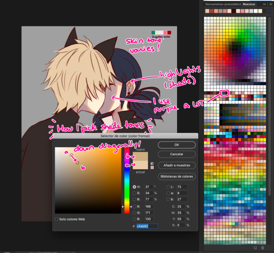
To choose the shade tone (in this example we’ll use Chat Noir’s hair), I picked a Yellow -Adrien’s hair is specially hard to color ugh- And then with that same tone I’d choose its shade going diagonally looking for a darker tone. This way you can find interesting colors! On this pic I did that for Adrien’s hair and... the rest I did the following:

I did my lazy shading™ : which consists in a layer set to Multiply with 50% opacity (this varies depending on the light, again), and I shade everything with the same tone (my to go is purple, but sometimes I use other colors too). This gives a sense of uniformity and the resulting shades are way nicer in my opinion.

Step 5: But Yuumi... where are the palettes???
I take that people straight handpick the palettes and use them to shade all the way and I respect them for that. I instead decided to do whatever floats my boat so I color regularly but add the palettes over the whole thing to change the overall mood and colors of the illustration. I randomly use the Gradient Tool and use the palettes’ colors around and then set that layer to Screen, Multiply, Focal Light, Overlay... etc etc, whatever I feel like doing in that moment, and so the magic happens! :’D
I don’t usually do this on my works but this is a new way to experiment for me and I’m having fun with it!
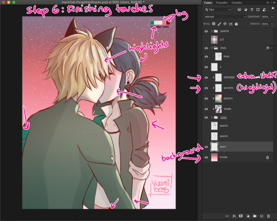
Step 6: Finishing Touches
Here is where I use the palettes the most, adding random highlights in whatever way I feel like. Yep, I pretty much Ladybug my whole coloring process: Wing it and go with the flow™. I’m still learning about lighting and whatnots but I really don’t care at this point LOL
To which you’ll say: But Yuumi?? In art school they told me that---
To which I say: shhhhhhhhhhhhh assigntments are over for me. go watch some Bob Ross (I am serious). Do whatever you feel like. Be happy. No one is going to judge you, and if they wanna judge they better be paying for your work first. so. whatever you do: BE HAPPY. or don’t do it. unless it’s a school assignment, in that case go do it or i’ll kick your ass.
✦ Finishing Notes ✦
So yea, that’s my art process in how I’ve been doing these Miraculous Color Palettes and generally how I go about my illustrations most of the time. For more complex illustrations, I need to remember how I did those (oops). And actually, do them. These illustrations usually take up 2 or 3 hours to make, on other pieces i’ve been working on them for up to 8 hours, it really varies from piece to piece, but I hope this was helpful!
Please let me know if you have any questions, commenting in this very post will help me -and others?- keep track of things and learn together! My asks are also open and I’ll reply as fast as I can uwu (my requests are still waiting there, don’t worry).
aaaaand that’s all, folks. Stay Peachy!
54 notes
·
View notes
Note
hiiii! i just wanna say, i adore your art. second, im teaching myself to draw and while i can draw simple basics (mouths and sometimes eyes if im lucky), im still a beginner. ive watched many art videos and im still a bit confused on wtf im doing. so i just came here to ask if you had any words of wisdom for beginners? could be anything from what tablets to buy to simple mistakes to avoid. ive read some of the other posts here and have found it all extremely helpful so far! Thx for all you do!!
Hey there! Thank you so much!
I would put a read more but tumblr is broken. I’m trying to cover a lot of varied thoughts in little points, so if there’s anything you would like me to elaborate on or otherwise have questions on, feel free to shoot me an ask or dm me!
General
I think the biggest thing to remember is not to compare yourself extensively to others. A little bit of comparison is healthy... But too much will destroy your confidence, motivation, and take the fun out of art. Particularly if you are comparing yourself to someone older than you (life experience and coordination come into play here) or that has been drawing much longer (practice).
Additionally... If you’re not having fun (and you’re not getting paid to do it), don’t force yourself. If you find yourself being frustrated or bored with art, don’t force yourself to do it. That’s how you burn out and get art block! This applies to parts of a peice, too! If you don’t feel like drawing a face or a hand today? don’t force yourself to finish it. Come back to it later when you aren’t as frustrated or are getting better results. Even if its a week or a month from now. Honestly, at any given time I have probably ten headless bodies in my drafts. That’s okay! I just come back to them when I’m ready to do the face. And don’t be afraid to abandon something if it doesn’t feel right!
Something that also doesn’t get said enough.... take care of your body! I never knew when I started art, but artists are supposed to do warmup sketches and stretches and muscle exercises! I didn’t do any of this, and i went through a period of a few months where I was drawing for 5ish hours every single day. I developed carpal tunnel from it! So remember to take care of yourself. Take breaks, stretch, remember to eat.
Practice
Practice!!!! Even if its just for fifteen minutes every day. Or twice a week. But if art is something you really want to get good at, you have to put in the time and effort!! You can’t expect to draw an hour per month and be on the same level as someone who draws an hour a day!
I know I say this a lot but I think the biggest thing is just reference! If you don’t know what something looks like, look at a picture of it when you draw it! To go hand in hand with that, though, don’t just copy what you see! Learn from it and apply it! So take, for example, a shoe! pay attention to the way the heel is shaped, the location of the eyelets for the laces... how large the toe is, how steep the top! While you’re at it, look at other styles of shoes as well, and compare them! See what makes it look like a boot versus a trainer! And then the next time you draw it, hopefully you’ll remember all the things you learned the first time around!
I do lots of studies that serve no purpose other than to teach me things! I use referencing/studies to learn about color theory, shapes, and anatomy in a real environment. For example, hands or fabric folds! Oftentimes I’ll do them timed (20 or 45 minutes) so that I don’t fixate on perfecting things, just on the process itself and what I can learn from it. This also helps with getting better acclimated to your software and more coordinated with what you’re doing. Repetitive learning, like with playing sports.
I’ve realized a lot of people don’t quite understand what a study is? Basically you just look at a photo and try to replicate it so that you can learn about lighting or color theory or textures or anatomy or whatnot. So here’s an example of a timed study.
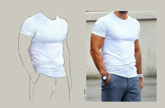
Additionally, don’t avoid!! We, as humans, have a tendency to avoid things that make us uncomfortable or are difficult. But it will make you a better artist in then end. When I first started, I absolutely hated doing fabric. I felt like I wasn’t good at it. So instead of avoiding drawing clothing, I sat down and did studies and sketches of different kinds of fabric. By the end of this learning period, I became comfortable with it and grew to enjoy it. These days, I adore sketching clothes, and it’s why my pants and shirts and things tend to be detailed instead of stylized in line art. If you don’t like drawing hands because you feel like you aren’t good at it? Sit down, look at a bunch of pictures of different hands, and practice it. By the end, you’ll be more comfortable, you’ll have learned something. Even if you feel like the drawings you ended up with aren’t good, you’ll still have learned, and that’s what matters!
Style
I worked on basics before I tried to develop a style. I made sure to start with a very realistic method at first, so that I could be sure I understood how fabric folds, anatomy, and realistic expressions worked before I tried to stylize them. I think in the long run this approach really paid off for me. It also allowed me to be conscientious of what elements I was absorbing into my artwork. I hear from so many artists that they started drawing when they were younger and into anime or cartoons or things like that, and tried to emulate it. Because those styles became so ingrained into their artistic skillset, it becomes near impossible to iron out those influences and get rid of them later. So starting with realism is a way to ingrain proper anatomy and other good practice into your artwork.
One way to develop style is to take a look at the artwork of someone you admire, and try to list out the things you like form their style - perhaps the thickness of their lines, or the way they do eyes. Do this with several artists, take all those little details you like and try them out! See if you enjoy using them in your own drawing process! Think of it like a grab bag or a pick-n-mix, sprinkling in the elements you like here and there to create something new and your own - not just copying another artists style word for word.
Don’t worry too much about it though; don’t allow yourself to become anxious or fixated on “achieving a style”. Its a natural ever evolving process that comes with time and practice. I know a lot of people get hung up on style, but just take it one day at a time!
Also try to keep in mind what style you’re going for as you begin drawing. And I don’t mean that like sailor moon vs. ghibli. I mean that as in, is this piece going to be a painting, a lineart, a lined painting, cell shading...? It will help you in the longrun if you narrow down the broad kind of style you use, and refine from there.
Workflow
My workflow for paintings is very different from my workflow for lineart and cell shading. A full tutorial on how I do paintings can be found here! A process video for how I cell shade can be found here!
Everyone is going to have a different method that works for them! You just have to experiment and find out how you like to draw! For me, personally, I use color blocking for painting (see the tutorial above) and a spine method for lineart. How the spine method works is that I will draw lines that represent the legs, arms, back, etc. so that I can determine the placement, length, and composition. From there, I’ll add a dark outline that actually shows the shapes of the body. Then, I’ll use thinner lines to add details. This is the method I’ve found that works for me. Another commonly used method that I’m sure you’ve seen is representing body parts with cylinders and cubes. There are lots of good tutorials out there on breaking down bodies into shapes like this!
Something that I do is if I’m not quite happy with a part of a drawing, I don’t just erase it. I duplicate the layer so that I always have the original copy, and then I make changes from there. Sometimes I can end up with five or six different versions of the same arm or face that i’ve made minor changes to. And then I compare and pick the one I like best, or condense all the parts I like from each version to make a “best” version.
Tools
Currently I use Procreate and the standard Ipad with Apple Pencil. Prior to March I was using a Wacom Bamboo Touch and Photoshop Elements 2008. I find its harder for me to do full paintings in procreate, but its made my life a million times easier for lineart and cell shading. The pen pressure is phenomenal, and I also adore that its wireless / active screen instead of plug in like the wacom. The programme itself is intuitive and easy to get the hang of; it simply lacks a lot of the neat tricks that photoshop has, like rendering (lens flares, for example), gradients, and gradient maps. Try testing out different trials of programmes... firealpaca, photoshop, autodesk, whatever it may be! What works for me may not work for you!
287 notes
·
View notes
Text
Sans Tutorial?
Last year someone sent an ask for a tutorial about how I draw Sans, but I have been pretty busy and not gotten around to making it! I don’t know how helpful this will be, because it turns out my technique is basically:
1. draw a circle
2. draw the rest of the skeleton
But anyway, I’ll post the steps for this picture here :3
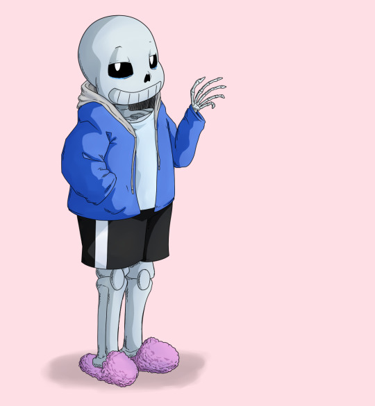
I have picked up some good tips from tutorials but I don’t use them very much because some are too basic, some are too advanced, some are written too proscriptively, and usually the example art looks way better than what I’m doing if I follow along. So my tips may be a mix of too-obvious and not-adequately-explained, but perhaps a few beginner or intermediate level artists will find something useful here :3 I will assume you know what layers are and have software that can do layers. I use Paint Tool SAI, which is pretty affordable, and there are other programs that are free.
First I draw a circle where I want the skull to be. I don’t necessarily stick with this circle as I continue sketching. And one of the advantages of drawing digitally is that I can move parts around if it’s not working. If I’m planning out a complex picture, Sans will be a circle with two more circles for eyes and a vague cylinder/blob as a body, at first.
Then sketch in more detail. Fingers are important, and I often have to go back and refine the sketch of the hands in the middle of doing the lineart.
There are many different and valid styles for drawing Sans. I always draw his eyes as this sort of arch-like shape, like a half circle that’s stretched out vertically. Even if they’re half-lidded, I start with the whole eye shape (and if they’re half closed they tend to end up pretty rectangular).
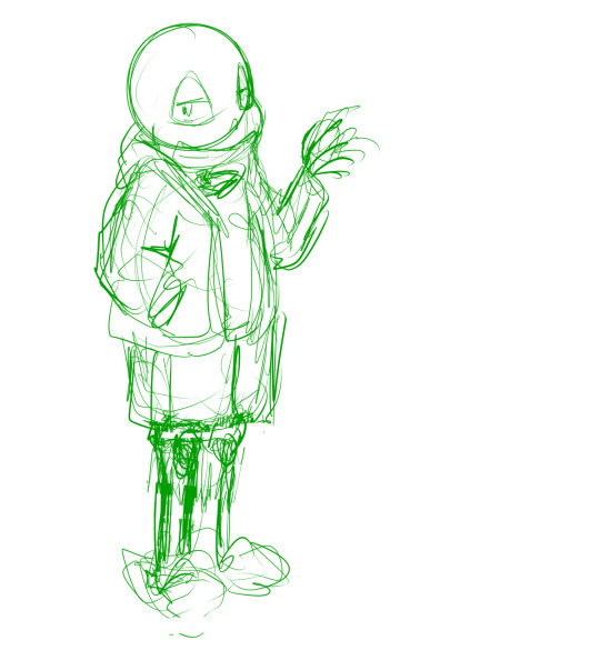
In this picture, I made his legs too short, then too long, and you can see some artifacts of how they got moved around and adjusted. (I pretty much never draw him just standing there in full-body, I guess owo) It’s much easier to adjust things in a sketch than after it’s been lined, so take your time. If I wasn’t feeling confident, or if I wanted to make the linework easier, or if I wanted someone to approve the picture before I did lines, I would do another, more-refined sketch on top of this one. But I’ve been drawing a lot of Sanses over the past few years so I didn’t :3 I do have a brush for sketches that is not totally opaque.
(Beginner tip: If you’re using a serious art program, you can reduce the opacity of the sketch layer and draw the next sketch in a new layer on top. This is how you’ll do the linework too. I also put Sans’s legs on a separate layer when I was adjusting them in this pic. This is also a good time to adjust the framing of the picture; I usually drew it too small and off-center. This pic is a bit off-center because I thought I might add text on the right side about the steps. But then I didn’t.)
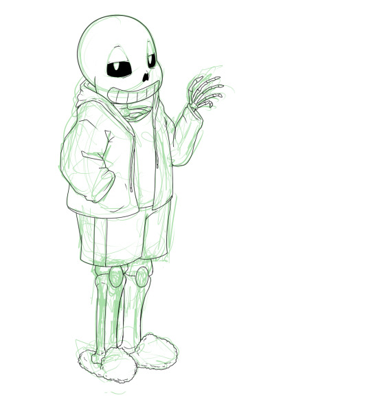
Next is lines. In Paint Tool SAI, I can have multiple layers in a folder and select the whole folder as “selection source” (so I can fill in the colors later). This makes it easy to use a Lineart layer for the smooth curve of Sans’s skull, and a regular Raster layer for the rest of the lines. Of course, make sure the line width is similar. (Being able to choose a selection source other than “current layer” or “whole image” is one of the advantages of SAI in my experience.)
I used thin lines here. I don’t always, but sometimes I try to use thin lines and add plenty of detail and I’m pretty pleased with it. (Often if I want to save some energy I use thicker, rough-textured lines, so that you won’t be able to tell so much where I got the curve of the skull wrong and then adjusted it.) When I first started drawing Sans, I gave him too many teeth. Then I overcompensated and gave him too few teeth. Now I’ve settled on about this many teeth. I like to draw bony, skeletal hands. For any bones, Google image search is your friend. You don’t need to know the proper name of the bone; just search for the body area + bones. I usually draw the nose hole a bit more simplified. I don’t always bother with the drawstring. Sometimes I give him a turtleneck sweater so I don’t have to draw a glimpse of collarbone, ribs, spine inside his shirt. Idk why his tibiae are so thick today owo

Flat colors and cel shading. I like to put a bright color that contrasts with the colors I’m using in the background, so I can easily see corners that got missed by the fill tool. Usually, I do multiple layers of the base colors, so that I won’t have to worry about the edges when shading. (All the color layers are collected in a folder. Not the bg though; if it’s complex it will have its own folder.) Here, I used a shading layer for each base color layer (the shading layer is a clipping layer, so the shade color won’t be visible unless it’s overlapping its correct base color). I don’t like to be organized and label my layers, so I do the shading right after the base color, while I still remember what layer it’s on :3 You can also do the flat colors on one layer (or just in one folder) and then put a multiply or shading layer as a clipping layer over that for the shading (many fewer layers to deal with but you must pay more attention to the staying inside the lines). Aside from the sketches, I still haven’t used any brush other than the default pen. You can of course use more layers and more colors for fancier cel shading. I have used a few extra darker shades on Sans’s neck.

More shading. I usually choose between cel-shading and more shading, but I tried adding a little bit more here since it’s a tutorial. It doesn’t make a huge difference though; if I hadn’t done cel-shading, I would have made the blendy shading stand out more. You can do each color individually (here’s a tutorial about that), but you can also make a clipping layer over all the colors (flat colors on one layer or all the color layers in a folder) and make it a multiply or shade layer, and shading for all the colors there. I like to fill in this shading layer with white so it blends more between the light and dark. This is also a great technique for adding shading to something that has a pattern on its surface (e.g. you can add fur texture to your rainbow cat without painting the texture in every color of the rainbow). This is where I use brushes I adapted myself or stole from other artists :3 and another place where SAI has an advantage because it’s specifically designed to be good at painting. I lightened the background and added a little shadow (blurred with the watercolor brush).

Extra cross-hatchy lines. When I do thin lines, I like to add these lines as a little extra shading/detail. I usually do them before color, and on a separate layer so I can keep them out of the “selection source” when filling in flat colors. This time I did them at the end. They add a little texture to everything and I think they work well on the hand bones.
22 notes
·
View notes
Note
2, 5, 6, 10, 15, 16, 18, 21, 24
2. How long have you been drawing?
as long as I could hold a crayon (recently found a few illustrated stories from ages 4-5) but considering almost ever kid drew on whatever surface they could find I’ll say I started to be passionate about drawing since I was 7.
5. What’s your favorite thing to draw?
I think other than people I really like drawing cats, they have a nice flowy shape and big round eyes so cute and fun to draw. Also, if I take the time to use a proper reference roses are nice to draw. Otherwise my sketchbook implies I like drawing cute objects with faces. Usually food…
Specifically on people mmmm I can’t decide between eyes and mouths. Such expressive but simple parts of the body. ok I have to say, hair is sometimes hard uNLESS it’s big and fluffy I LOVE ME SOME BIG HAIR. Which is why I love drawing hair now, I cheat and add just a liiittle extra fluff to a character’s hair.
….this is me avoiding the obvious answer : Chat Noir, which interestingly enough wraps all of the above into one big-eyed, floofy, rose-offering, food-loving, kitty…. im a disaster
6. What’s your least favorite thing to draw?
lately, the outline of the head. ANy head. I sWEar the face looks fine but one side of the jaw is lopsided, or the cheak is a different shape on the other side. HATE. Surpisingly I don’t even hate drawing hands that much anymore. HEADS.
10. Are you confident about your art?
You know what, I think I’m getting there :)
not like the level where I can whip out an ink freehand live in front of someone who requested something buT SOMEDAY
15. How long does an average piece take you to complete?
I think with the new style I’ve been using, 35-40 minutes for something fully colored if the character is drawn past the waist? Otherwise I’ve been getting some successful 5-10 minute doodles in - which is HUGE for my perfectionist ass - so I’m happy about that.
16. Do you draw more today than you did in the past
Definitely more today. I mean, you could argue i doodled on homework and all that jazz, but completed digital art posted every day would have past me quaking
18. What are you currently trying to improve on?
Speed, lineart, symmetry
21. Do you like to challenge yourself?
Yeah! Have to improve somehow. Wanna take a crazy perspective? Go for it no matter how long it takes! Wanna color with brighter colors? Not backing away easy. Draw with lineart first and no sketch? Hell yEAH lets see what’ll happen!
24. Do you feel jealous when you see other people’s art, or inspired? (Be honest!)
Not really, sometimes when people say how long something took I get discouraged because I think I’m not fast enough for a consistent audience/fanbase. But It just makes me want to try harder. I don’t like saying I’ll never get there, that’s old me. That bitch is dead
Send me a number
3 notes
·
View notes
Text
Weekly Update Feb 10, 2023
Struggling a bit but did some stuff this week still. Main issue was getting my computer fixed, which I was able to do. In the meanwhile I did some sketches on paper, as well as a few after I got my computer fixed.
I made progress on the test animations for the eventual TRG animated, although I have not thrown together any promotional drawings for colosseum yet. More importantly, I have found issues in a number of pieces with the rigs that will need to be replaced. Tim needs one new arm, and Emile needs all of his arms replaced. I hope to fix these tomorrow, although schoolwork will take priority. These should be faster fixes than the legs, although again, Emile will likely need added joint pieces in each of his shoulders. He is the oldest rig and thus the most scuffed.
Animation itself is running smoothly when I have time to work on it. The new tweening method is working wonders, and the old method remains for instances where it doesn’t work, like when adobe decides to break someone’s arm randomly. This saves steps and allows more minimal movements to be much easier, which should make everything smoother and more natural looking. The fan animations are meant to be practices to ease me into animating for eventual original animation, so I am willing to put in more effort than is necessary if it means building skill. Progress on the final test is locked behind making Emile’s new arms, but I’d say is one third done (in terms of frame number, a little more than that). Buying myself time for deciding a proper clip, which has not been set in stone, although I have enough to work with should I finish faster than expected.
The Nintendo direct was this week, and it showed four niche mystery detective-type games: Ghost Trick, DecaPolice, Professor Layton, and Rain Code. I hope they are all reasonably priced, since I’m not so hot on cash right now (surgery is expensive). I do hope they can also help with inspiration stuff, drawing the DecaPolice protagonist has already helped with drawing different face shapes than I’m used to with my style. Expect more of him.
As for OC related projects, not much to share this week. Outline progress was unfortunately minimal, though structural progress on the secondary story is progressing, although my intent was to make more progress towards the primary. Hopefully work on this can be done in my photography class, as the professor has kindly asked me to not animate during lecture (because she doesn’t like the clicking of my mouse, a fair reason).
Inktober 52 was almost missed entirely this week. Next week will likely be the same, due to the homework pileup, though Tomorrow and Sunday buy me time to get caught back up.
The only real OC related thing I did that mattered this week was the lineart test. Any time I’m self conscious about my art I try something new to improve, to which the test greatly helped me get the hang of where to and where not to use sketchy lines. I hope to incorporate this in the test animation as well, though that will be a finishing touch, and the proper movement and expressions should be focused on first. People do seem to still be enjoying my style, despite it being different from most others I see. Nice comments do a lot for my confidence, so I hope to make more content that warrants them.
Spring break is coming up, but also looking to be busy with doctor visits and meetings to arrange living arrangements (both looking to be effectively resolved, I’m not in any danger for a while). I should still have plenty of time to work, but until then, progress on everything will be sluggish, and which project I work on will depend on my mood. Next week I fill try to focus on fixing everyone’s arms, chipping away at the test animation, outline work, art style tests (including fanart probably), and hopefully a TRG Colosseum promotional drawing or a few.
0 notes
Text
Aki’s Commissions- OPEN

You know, it’s been forever since I’ve ever brought up the fact I do commissions? And that they’re open? And have been open since I first wanted to do them, but have never had the offer taken up? (I also added my Ko-Fi on my page, too. Apparently, I never did that here.)
So here’s a reminder that I do commissions~ Read all about what I can make for you under the cut!!
.: Art :. Sketches [ Example (BLOOD WARNING) ] Pencil [ Example ] Lineart [ Example ] Colored [ Digital/Traditional ] { Traditional || Digital } -Bust -To Waist -Full Body Icon [ Example ] Character Design [ Example 1/Traditional || Example 2/Digital (NSFW warning!! Kinda? Nothing too graphic, really) ] Music Comics [ Example ] Animation [via Flipnote Studio] { Example } -Simple -Complex .: Stories :. One-Shots Chapters Scripts Character Bios .: Will Do… :. -Writing~NSFW (both smut and gore, though I am unsure how good my violence writing is) -Couples/Pairings [ OC/OC, Canon/Canon, OC/Canon, Self Insert/Canon, etc. ] -Animals/Furries -Robots (Art-Selective; Writing-OK!) -Selective kinks (Art-Depends; Writing-Probably, please ask me via message first) -Writing~Reader Insert -Art-Bases (I can create bases for you; I won’t use em, though!) .: Won’t Do… :. -Art~NSFW (actually this is more of an ASK ME kinda thing; I might, I might not) -Incest -Triggering topics in general (by that, most awful things like rape) -Art~Drawing complex robotics -In general, just ask about what I will and won’t do
.: Prices :. Now prices all depend on what you’re requesting of me and what it involves. At the moment, art costs more than writing, for example; so that commission of your character with their significant other will cost you more as a drawing than if I had written a story about them. This is mainly because on a good day, writing for me is a lot easier than drawing, since I can focus on writing more without tiring, as on the other side… It goes on and on, so it’s easy for my attention to scatter. A full, traditional art piece will most likely go from $20-25, with sketches being $10, pencils being about $15, and lineart settling at a price most likely around $17. Though again, this depends on the commission placed. A pencil drawing of Wheatley from Portal 2 isn’t going to be the same price as say, a Zora from Ocarina of Time, also done by pencil. Animations also work on this basis, though with the added element of how complex or simple you want it to be. Simple is limited movement; hair in the wind, blinking and smiling, blink-and-blush, etc. Complex delves into wider movement, like a turn of the head to the viewer to make a facial expression, smiling and waving, drawing a sword, etc. Anything that draws out body movement will probably be considered complex. Since this will be done on Flipnote Studio and not an animation program, coloring is unlikely, but open to request. However, I will hold my right to notch up the price for a request for proper, digital coloring and not the FS color palette. (Mainly because the latter is a lot easier to use than the former.) There’s also now an option I recently added called "Music Comics". Depending on tune and break, they’re usually about 70+ pages, but… You know, that varies. Seeing as these projects will take awhile and shift in price with the complexity of your character… I might shoot these up to at least $35 ~ $45+ at a base price. It’s going to vary a lot depending on page numbers, if you want animation parts done (only parts, it’s a “comic” for a reason!), complexity of the character(s), how many characters, and way of coloring. (These will be made on Flipnote Studio, most likely, so price is lower if you use FS coloring or slightly higher if you want me to use Photoshop colors.) Character design will likely stay in the $20-25 range, as they will have full body shots and colors to go with them, which can be edited slightly by the owner, of course. These also can apply to customs! I will gladly make you an OC- fandom related or not- as long as you specify you want this and a custom character! Outline as many or as little details as you want and I'll get right on it!! Digital art is also an option, as I own a tablet now! However, my personal laptop is down, so while I can still complete these commissions, they will take longer than others, due to not having use of my personal laptop. The prices will probably stay in the $15-20 range as well, as I feel I am not up to standard with my art in that area as of right now. Icons are about $5 at the least! Might alter a bit depending on complexity. – Story writing! As with the above, prices vary on subject matter and length.
One-shots will likely be placed at $10-15 at most, seeing as how it’s a straight plow-through to an end goal.
Chapters will hover at $10-15, though may jump depending on what you need me to write and for how many chapters.
Scripts (often for voice acting) may drop to $5 or even hop up to $15, again, depending on length and details needed.
Character sheets would go up to the $10-20 mark, as it raises the question of what character, for what, and if any templates I already use would suffice. Like the reference sheets for art, they are welcome to slight alterations by their owners if my choices don’t suit the character they envisioned. (Just don’t go nuts on me, here.)
–
Also… I do voice commissions! If you ever need me to voice something, I am up for just about anything! Check this tag on my Tumblr for the voices I have done in the past or this list of voices I can do for easier browsing. Voices vary depending on request, with the most basic sitting at $5-10. I can’t image that they’d get any higher than $15, but… I am also open to being hired, as well! Just ask about that, my Ghosties~!
–
On a final note, I am also open for being hired for writing solely. If you feel my writing is good enough for a story you envision, but have trouble expressing? I’d love to write it for you! Need a BETA reader for a chapter coming out? I’d love to read it over! I’m also open to helping with plot details from books to gaming and, on the latter note, am also open to writing things as a script for games as well.
(What separates this from commissions is commissions being a one or two-shot thing; I do the work you ask of me, done! Being hired by you is me sticking with you on a project until it’s hit completion and we all go out for a celebratory drink…whatever you fancy, LOL.)
–
On the last note I shall give you all before you can either stop reading and run away (or maybe actually stay and commission; that’d be rad as heck), a format kind of like the one I’m about to lay down when asking for commissions from me would be awesome! It saves me from questioning everything and dragging out the order longer than it should be.
What you want (art/story), with what/from what (your OCs/a fandom/a canon), with details of commission, followed by specifics, reference, and then a send off. Feel free to add more/less, depending on the commission you’re asking of me. Alter to suit your needs!
EXAMPLE
“Hey, Aki! I wanted to commission you for a drawing of my proxy OC! I wanted it to be a bust drawing in digital, with color and transparent background. Nothing special, but maybe have them give an intimidating look would be nice? You can find her reference here! [LINK] Please message me back with a price when you can, thank you!”
#self ship#self insert#self insert community#self ship community#Commissions#Aki's Open Commissions#I have nothing else to do aside from finish my own art so#yeah!!!!!
32 notes
·
View notes
Text
art critique?
i might be a bit overexcited because it has been a long time since i’ve seen an active art/writing review account so a fair warning that i’m going to ramble a lot. i hope it’s okay that i’m going to submit 3 pieces for now - though it might be two if you don’t critique animation - and that i might submit an oc review in the future. i’ll also be giving links because i’m sort of afraid that the images won’t load (except for the animation).
(Mod Jibs will be reviewing in brackets)
(Thank you for the submission and unfortunately, I don’t have a lot of experience with animation so I can’t give you an in depth critique on it, just a glancing once over. When the girl is saying no, the mouth doesn’t make the right shape so it ends up looking more like a haa sound. the mouth should be more round.)
[i] the first one is an animation that was recently done. i think this is the second one i did this year after i had to reset my phone and lose most of my previous animations so i’m a bit rusty. i’d like to know if the lip movement was done right but any other advice to improve future animation is welcome!! (link: https://www.instagram.com/p/Bil93I_nLy1/?taken-by=papparafin)
[ii] this one is a sort of warm up for a new app i was using to draw with some of my ocs. kind of experimented with the shading and i’d like to know which character had the best shading within the four. i know that you can’t really judge a character design by headshots but what do you think of their color palettes? and a bit of context: Yana is a Pokemon OC, Tomoko is a Kagerou Project OC, Holly is a Harry Potter OC, and Lethia is an original OC (though the setting of her story is an Umineko-inspired 20th century witch/afterlife setting) (link: https://www.instagram.com/p/BiCE1p1Fx6c/?taken-by=papparafin)

(So I want to say, thank you for including links, that was a very smart move of you. On to the headshot. I have a couple issues with the saturation in tomoko and some of the colour choices with Lethia. There’s also some anatomy issues on the hands that need to be addressed as well. I’ll start with the anatomy and end on the colour theory.)

(Here I did quick sketches of the headshot you gave with fixes. The first anatomy issue I spotted was the lack of fingers on Yana. With how the hands are positioned you wound see a lot more of the pinky and other fingers then showed. So a quick finger add was taken. Next Yana is looking up, so i adjusted the nose, pulling a line to illustrate the bridge and fixed the mouth. The middle of the mouth sits directly under the nose and the corners line up with the iris’ of the eye. how you had the mouth before made it look like Yana was talking out of their cheek. I put an indent in the mouth because the character is not front facing and that changes the shape of it. Out of personal preference, I made Yana’s hair a brighter orange just because it really brought out the blue, but the colours you have now are fine but this is just a small tweak that you can choose to ignore.)
(Holly’s face was lopsided in shape causing your eyes to be different widths from the nose and the corners to be different heights.The hand had the same issues as Yana’s so just study hands, I know they’re hard. The hair also didn’t have proper physics. Curls are heavy and having curly hair myself I have never had it from the middle have two different flips in it where it left the hair line visible. It’s one and then the weight of the hair drags it down the shape of the face. The colours were fine on Holly, If a little dull. To fix that I’d just pick a darker shade for the hair and you’d be fine.)
(Tomoko anatomy wise was the best but her face had similar issues to Holly’s just make sure your eyes are aligned. The colours around the mouth were super muddy so you lost completely that she was sticking out her tongue, just keep that in mind. Your clothing folds were off as well. When arms are lifted the material tends to bunch up and fold rather than round out as you had drawn. The sleeves would keep their pointy shape and the rest of the sleeve would bunch up around the shoulder. Tomoko’s palette was all in the same value range. it was all very desaturated muddy colours. The skin I kept the same but it came out lighter just because of my drawing program but I darkened the hair and blazer, only leaving the original colour as highlights. You can see that those simple value changes really added depth to your design.)
(Lilith was interesting. I noticed that she was once again looking up and her pupils weren’t looking the same way so I fixed that. Her eyes were also two different sizes and one was higher than the other once again. But what the big thing with Lilith was is the colour palette. There was not enough contrast between the hair and the shirt. So quick fix once again, made the hair a dark shade of green so it fit with her theme and made the yellow more pure yellow and stopped it from leaning towards the green’s making it look more golden which I think is what you were going for.)
[iii] this fanart is also digital art but i lined this on paper (and lined the green blood with glitter pen which was a huge mistake) and then continued working on it on the same app as the previous art. i want to know what can be improved lineart-wise and how to make the pose less “floaty” because i understand that my anatomy still needs a lot of practice. actually, if you have any methods/techniques about learning anatomy that’d be great!! (i’m still going to look around your ref tags but most advices don’t work for me most of the time) (link: https://www.instagram.com/p/BiYj3ytnYmw/?taken-by=papparafin)

thank you for taking time to look over these and please tell me if there’s anything that i can do to improve my art!!
(The pose in this will never not be floaty unfortunately simply because people don’t stand like this. If you changed the angle so it looked like he was laying down and then added a drop shadow, that would fix your problem. The green for the blood looks a lot like snot and the teal as a background colour doesn’t really work. I did a few fixes that I will go over.)

(Now I understand wanting to keep certain things certain colours but if the background is a darker shade, it really makes the character pop. It also doesn’t hurt the eyes as much as that bright teal. The feet were severely off to the point where they looked broken and more like hooves then actual people feet. Feet are probably the easiest thing to draw in my book. it’s two triangles tied to together. I would recommend you study hands and feet along with faces. your anatomy for the body’s fall squarely in cartoon territory so your legs and arms lack definition. If you eventually wanted to stray away from the cartoon style, I would also practice drawing arm and leg muscles.
So In conclusion, face, hands and feet should be the three top for anatomy and you need to look more at colour theory and how that relates to a characters palette as well. Good start and I’d love to see more from you.
-Mod Jibs)
2 notes
·
View notes