#i noticed similarity in the composition of these shots!
Explore tagged Tumblr posts
Text


Sephiroth and Genesis — Fallen Angels
#i noticed similarity in the composition of these shots!#i am suffering from wishful thinking but i felt as if it was deliberate#Genesis was redeemed in this scene under the stars 👀#sephiroth#genesis rhapsodos#crisis core#ever crisis#the first soldier#ffvii#final fantasy 7#ff7
379 notes
·
View notes
Text
Gonna take a moment to talk about one of the things I have noticed artist sometimes do not take into consideration when doing illustrations.
Values.
Because it is something I too had issues with at first but I am slowly getting better at and I feel like sharing this knowledge with you all.
Let’s take this WIP I am currently working on. This is the very first sketch, is messy, is nowhere the final product, but it is the final composition of the piece so I started thinking about the colors.

Very basic idea, Green/Red opposite colors on the color wheel make a very visually appealing color palette, and yet it doesn’t look right to me.
So I screen shot it, and edited it to mono colors, aka black and white, since it allows you to see values easily. FYI Value is nothing more than how light or dark a color appears.
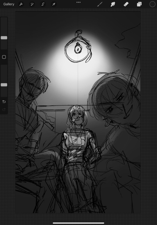
And I can immediately see the issue. Tim and Bernard are in the foreground, yet their values are too similar to the background, so they get lost. And even tho Darla is the main focal point of the piece, I do not want Tim and Bern to just be lost, how do we fix it? Simple, we can either darken them or the background to ensure the difference between both is obvious.
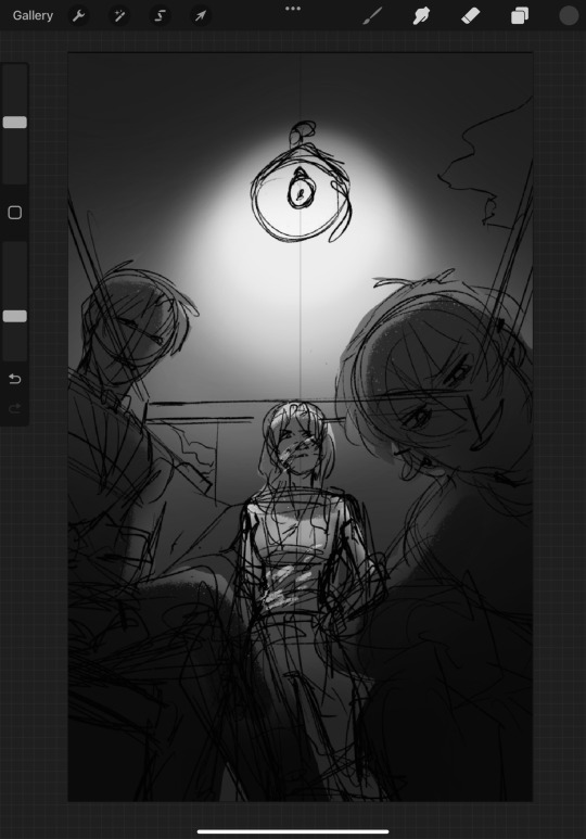
So in this next pass I have darken them considerably, and it does looks better, but we can push it a bit further to ensure nothing get lost anywhere.
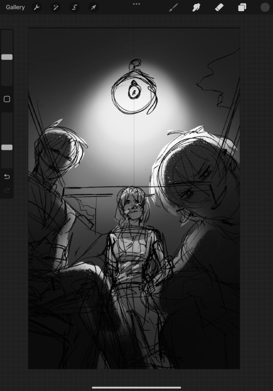
Ah rim light, my favorite tool to ensure something pops against the background. Now this? This looks great. Darla is still the center, being the lighter part of the composition, but Tim and Bernard are still visible and do not get lost in the background. Your eyes will first fall on Darla and then move into the other part of the illust, as I want it to do.
If we compare it side to side you can see how with just a few changes it looks way better, and it takes just a few minutes and some screen shots for you to achieve better values for your pieces.


This was a very short art advice from me to you, I am in no way a professional artist but hey any help is good right? 🫡
#art advice#kind of???#idk I just see this issue a lot with artist#and I feel is something so simple we just need to be reminded about it once in a while#gotham trio mob au
280 notes
·
View notes
Text

Ultratober art challenge- favorite song! (2 weeks late oops)
drawing this was such a journey so I have some progress shots and notes below
This was inspired by an Ultrakill themed October art event I saw on twitter. The first prompt was "favorite song", so I had to choose between Duel and Castle Vein. I ended up going with Duel because I already had an idea for a drawing of V1 and V2.

I wanted the drawing to look similar to the album covers for the game soundtrack, so I went with the solid red and black style (yellow just to highlight where the wings would go on the sketch).
I assumed this would just be a short project, since there were only two colors and no background... I was wrong.

I got a bit overzealous and really wanted to put as much detail onto V1 and V2 as possible, to make up for the lack of background. After spending over an hour detailing V1, I realized not only did I still have to add the wings, I had to do it all over again on V2.

The wings were kind of a nightmare. I had trouble figuring out both the correct perspective and angles, but also positioning them so they didn't cover up any important parts of their bodies. If you notice that the base of V2's wings look different from V1's, It's because I still hadn't figured out how to draw them properly at that point (and I was too lazy to go back and fix it later).
I'm happy with the end result though. I considered adding some motion blur, but I felt like it didn't really improve the composition in any way so I left it out.
Thanks for reading :)
#my art#art#ultrakill#v1 ultrakill#v2 ultrakill#ultratober#ultrakill fanart#expect more ultrakill stuff in the future i fell in love with this game#can tag as ship. i guess#tw eyestrain
96 notes
·
View notes
Note
Please, talk about the Gom Jobbar scene
Oh hell yes.
So this is one of those posts that really should be a short video essay of me talking over the scene but instead it is gonna be a loooooong wall of text and screenshots. Maybe it will assume its final form some day if I'm ever in possession of the free time and patience to make video essays. I also highly recommend watching Denis Villeneuve's own breakdown of this scene from 2021. I'll try not to duplicate things said there.
We have to start with the setup, which begins with this scene:


We see Jessica on her knees, in the rain, waiting for an arriving ship. These are the first shots in the movie where we see Jessica when no one else is watching her, and this woman who stood calm and composed before representatives of the Emperor of the Known Universe is terrified. Which creates an immediate sense of dread over whoever is coming in that ship.

Whomst in the fuck now?
We also get this shot where we're alone with Jessica. It's a little hard to see in a still frame but there's a moment where she, like, steels herself before she wakes Paul up.

Holy fuck tho, I just noticed the similarities between this shot and the one of the Bene Gesserit arriving, with the almost monochromatic color palette and the shafts of white light.
Once Paul wakes up we shift to his POV. He immediately knows something is off ("What's wrong?" is the first thing he says) but gets no information about what's happening.

Then we get this short scene, where Paul is told he is going to meet the Reverend Mother and but not much else about what's going on. The whole "She wants to know about your dreams." "How does she know about my dreams?" [no answer from Jessica] exchange, I think, implies that she knows because Jessica told her about Paul's dreams, which is this little tiny betrayal of confidence that gives Paul the first inclination that his mother may not be someone he can fully trust in this situation. Which is exactly what Dr. Yueh warns him about immediately after.
We also get two new languages used in this scene. Dr. Yueh speaks to Paul in Mandarin, which he understands and presumably Jessica does not. This gives us a piece of information about Paul's curiosity toward other cultures and his facility with languages. And Jessica uses the Atreides battle sign, which Paul also understands. Outside the library, Jessica pauses to give Paul one more silent warning, although she still hasn't told him what's about to happen.
This is just the setup. So before we've even entered the room, we've created this sense of unsettled foreboding dread (the Denis Signature Vibe) without a clear understanding of why things are happening--which is exactly how Paul feels.
I should also add that in the book, this scene takes place during the day, with the Reverend Mother sitting in front of a window. Shifting it to the middle of the night not only makes it way creepier but also tells us that (1) the Reverend Mother is the kind of person who can command Jessica's attention at any time of day or night and (2) this is all somewhat illicit and possibly is happening without Leto's knowledge.

Whomst in the fuuuuuuck?
We get this sort of weird POV shot of Paul crossing the room when it's not actually happening:

which I think is supposed to suggest some subtler form of control than the Voice, which Paul resists.
Before they've even properly entered the room, Mohiam manages to insult both Paul's parents ("defiance in the eyes, like his father" and dismissing Jessica with a curt "leave us"). And the first thing Paul says is to defend his mother's place in the social hierarchy ("You dismiss my mother in her own house?") with all the haughtiness you would expect.
The power dynamic gets rapidly clarified.

Momentary aside to say that I love the composition of this shot. Neither of them are quite on the third--they're just a bit too close to each other to make the shot look balanced. But neither of them are in center frame either--the box is in the center. They're not exactly aligned to the light gray columns between the bookshelves behind them, either, and the bookshelves are just slightly asymmetrical. It all makes things feel just a little claustrophobic and unsettling. Denis Villeneuve frequently uses this technique of creating unbalanced shots and intentionally leaving too much space in awkward parts of the frame to create a sense of unease.
Paul isn't kneeling in the book either--he's standing beside the chair in a setup that I don't think would actually work given the heights of the actors here, or would look awkward as hell. So they've solved a practical blocking problem and done some storytelling with it as well.
This is where we get our first look at the Voice at full power, and it's one of only two scenes where we get some subjective POV of what it feels like to be Voice-controlled (the other one being Feyd-Rautha and Lady Margot's interaction which deserves its own post). I really like that they didn't go for Voice Slow (zombie shuffling across the room) because Voice Fast is much more disturbing. The subjective experience of it seems closest to like, blacking out and waking up in a place or doing a thing and not knowing how you got there. The camera effect is just a really fast dolly and a slick edit, but Timothée really sells it with his split-second moment of confusion and shock before he realizes what happened and gets angry about it.

So now we're here, with the poison needle and the pain box.
"No need to call the guards. Your mother stands behind that door. No one would get past her."

This is a slick fucking piece of editing. Because just as Paul is learning that his mother has not only trapped him in this situation but is ensuring it continues uninterrupted, we cut to Jessica for the first time since she left the room and we see how absolutely terrified she is.
Also from this point, the sound in the film starts crossing the barrier of the door--we hear some of the dialogue between Paul and Mohiam when we're on shots of Jessica, and when the pain sound effect starts up, we hear it continuously on both sides of the door. So even though Jessica is not literally experiencing the pain, it feels like she is vicariously.
It would be really easy to tip the balance of sympathy in this scene one way or the other--toward Paul who's realizing his mother has handed him over to a painful and potentially lethal test, or toward Jessica who is listening to her child scream in pain and not only cannot stop it but is tasked with making sure it continues. But Denis Villeneuve is an absolute master at controlling and directing your POV in a way that allows you to feel sympathy for multiple characters at once and engage with complicated, contradictory emotional landscapes, and this is a little demonstration of what he's going to do on a much larger scale later in the story.
Timothée's pain acting...is excellent, that's all I'll say about that. Love that he's allowed to get all gross and drippy with it.
Now we get to the litany against fear.

Jessica starts it specifically in response to hearing Paul scream on the other side of the door. So, practically, she is using it to control her own fear. But the way the scene is intercut, it plays as if she is almost coaching or guiding Paul into controlling his own reactions. With every line that she says, we cut back to Paul as he is starting to master the situation.
"I must not fear." Paul is not in control here and seems about at his physical limit for keeping his hand in the box.

"Fear is the mind-killer." This is the one where it really seems like he could be reciting the same litany in his head or under his breath.

"Fear is the little death that brings obliteration." We don't really see Paul's face in the accompanying shot, but the pain sound effect really goes into overdrive, like she is pushing him harder.
"I will face my fear and I will permit it to pass over me and through me." Seems like Paul is getting to some kind of Zen place or whatever where he can withstand the pain.

This is when the first flash of vision pops up and the balance of power starts to shift in Paul's favor. We realize it at the same time both he and the Reverend Mother do.

Then we have this great moment where he looks up at her and we don't quite know what is happening but somehow Paul has started to win this interaction. And we go through a whole Face Journey with him that's intercut increasingly rapidly with Jessica's lines, flashes of the visions, and Mohiam's reaction as she starts to realize she's lost control of the situation.

"And when it has gone past--"

"I will turn the inner eye to see its path--"

"--and where the fear has gone, there will be nothing--"

"Only I will remain."

This part is great because like...nothing is happening. He just looks up at her. But we know that whatever battle is going on between them, Paul is winning now.
(Side note: this is a duel, right? This is his first of three duels, and like the duel with Feyd, he wins it on his knees.)
Then as soon as she says, "Enough," the facade cracks again a little.

And then he does the thing!! That is one of my favorite Paul physicalities!! Where he tilts his chin up so he can look down his nose at someone. Which is particularly audacious when you're on your knees.

It looks arrogant but there's also something a bit...childish? about it. It's something that he does specifically when he feels he does not have control of the situation and he's trying to regain it. He does it to the Emperor at the end of Part Two.
Anyway I LOVE the whole section of intercutting between Jessica and Paul because like. They are physically separated by a door but emotionally they feel connected. She put him in this situation, but then it's almost like she is reminding him that she also gave him the training to survive it. Which like, isn't that a microcosm of their whole fucked-up relationship?
"...You inherit too much power."
"What, because I'm a duke's son?"
"Because you are Jessica's son. You have more than one birthright, boy."
Almost all the dialogue from this scene is taken word for word from the book (although sometimes condensed). This is one of the few lines that got changed. In the book, Jessica is the one who reminds Paul that he is a duke's son--not her son. In general the movie dialogue is more faithful to what's in the book than you might expect. But every once in a while there is a line that feels like it's talking back to the original text like this.
There's another little emotional reversal right at the end of the scene, when Jessica comes in and her face just floods with relief at realizing Paul is still alive. But meanwhile you can see that Paul is really processing how betrayed by her he feels.

And then, after all that, they do talk about his dreams.
Denis has said in interviews that this was one of the very first scenes they filmed. Which is. Insane to me. This is an iconic scene from the book that every fan will come to with expectations and it's a really hard acting job! For everyone involved but especially for Timothée, because so much of the scene turns on him having an intense reaction to something that's not real and generally just...doing stuff with his face, and hoping that the sound design and the score and some scenes that haven't been shot yet will sell what's going on. Usually you would want to work up to an intense emotional scene like this, give the cast and crew a little time to get comfortable with each other. Nope! Anyway Denis has also said that he knew after this scene that he had cast correctly and yeah. I would say so.
#asks answered#dune#dune 2021#paul atreides#lady jessica#denis villeneuve#timothée chalamet#scene breakdown#thank you for prompting me to take so many screenshots of timmy's pain faces that was fun
103 notes
·
View notes
Text
Hey am I the only one who thought the story of the couple living in the manor may have been a retelling of or metaphor for how Kinger and Queenie were separated?
TADC episode 3 spoilers + theory below the cut!
To recap the story of the couple in the manor:
Martha and Baron Theodore Mildenhall lived together in Mildenhall manor. Theodore had been hunting as a hobby for as long as he could remember. at some point Theodore becomes aware of the presence of a creature near his manor that is neither man or animal.
Believing it to be dangerous to him and his wife, he attempts to hunt and kill the creature, plagued by a feeling of dread the entire time.
Over time, his hunt for the creature turns into an obsession, and he spends years trying to catch it. He at some point learns that this creature is an angel of God, but this doesn't stop his pursuit.

When he eventually does catch it, he decapitates it, but the body goes missing during the minute he isn't looking at it. He knows it's still alive somewhere. He knows it will be back to claim its head.
He mounts the head on his wall as a trophy, but he doesn't celebrate. He becomes anxious and paranoid, constantly on edge for when the body will return.
One day, this paranoia leads him to mistake his own wife for the creature, and he shoots her, leaving himself as the only living thing he has left to protect.
He hides in his cellar with a shotgun and two rounds. There he stays, keeping watch for the creature's inevitable return. He dies alone there, his soul dragged down to hell for the crime of harming one of God's angels.
TL;DR: Theodore and Martha Mildenhall live together in this manor. Theodore hunts as a hobby. This hobby turns into an obsession when he tries to kill a monster to protect his wife. He finds out the monster is an angel of God. He doesn't care. The angel's body lives and escapes when he does eventually catch it. He becomes paranoid the body will come back for its head and mistakes his wife for the angel's body, killing her. He dies alone in his cellar and goes to hell because he harmed an angel.
I believe the angel is meant to represent Queenie, and that Theodore and his story represent Kinger and how he accidentally caused Queenie to abstract.
Hear me out:
The eyes on the head of the angel are misaligned in the exact same way Queenie's are,


and when Kinger first sees the head, he stares at it for a long time before saying "You know, I'm starting to think..." before cutting himself off. He may have been about to acknowledge the similarity between it and Queenie. His eyes tremble noticeably during the moment after he says this.


He never elaborates on this statement for the rest of the episode.
Kinger appears to see Queenie inside the mouth of the angel while it's chasing him and Pomni. I say this since it's out of character and unlikely that he'd call anyone else "beautiful" and "honey" in the same sentence.


The composition and numerous eyes within the mouth also mirror a scene later in the episode depicting him and Queenie after she abstracted.


Also, his eyes tremble in this scene in the same way as when he was looking at the angel's head for the first time.
Kinger doesn't find out what he believes to be a monster is an angel of God until after he's shot it.
This could be a parallel to how Theodore didn't realize what he believed to be the angel's body was his wife Martha until after he'd shot and killed her.
Both people took the shot in the effort to protect someone they cared about, but both times it only made things worse for both parties.
Based on Kaufmo's abstraction and the way people respond to stress in real life, it's likely that Queenie was isolated from Kinger to some degree before she abstracted.
Kinger says he doesn't remember the events that lead up to him and Queenie in his pillow fort together.
Something may have come between her and Kinger that caused Queenie's relationship with him to weaken, which made her spend less time around him and other people as a result. It's possible that Kinger accidentally said or did something that sent her over the edge and caused her to abstract.
In conclusion, Kinger may have caused his wife to abstract and Caine used this fact with a modified version of the events leading to it in his horror tragedy adventure because he's an AI and isn't capable of coming up with completely original stories or art, just like generative AI in real life.
#tadc#tadc spoilers#tadc theory#the amazing digital circus#tadc kinger#tadc queenie#tadc angel#tadc episode 3#tadc ep 3#tadc ep 3 spoilers#the mystery of mildenhall manor#tadc caine#fan theory#decapitation#gun violence#body horror#horror#blood#scopophobia#eye contact#memory loss#abstraction#religious imagery#biblically accurate angel#death#tadc 3 spoilers
47 notes
·
View notes
Text
So @doyou000me sent me an ask about the film making of Love for Love's Sake (which I have learned is based on a novel and now I'm very interested in reading it lol) so having watched the currently available episodes the big thing I noticed was the shows use of Aspect Ratio.
"In simple terms, the aspect ratio of a movie is how wide the frame of the movie is versus how tall it is, usually expressed as a ratio. For example, most TVs and computer monitors are 1.77:1 (more often expressed on consumer packaging as 16:9), which means the screen itself is 1.77 times as wide as it is tall. The higher the first number in this ratio is, the wider the screen will be." (source)
I know, nerd math.
Basically you know those black bars you sometimes see on the top and bottom of the screen when watching a film or tv show? That's a director filming in a specific aspect ratio:
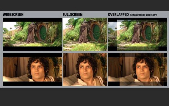
(source)
Film makers use aspect ratios in a ton of ways, there's a lot of examples out there from Hateful Eight (Quentin Tarantino), and Dark Knight (Christopher Nolan) where the former used aspect ratio to invoke the film making style of old westerns, while Nolan used a taller aspect ratio for fight/action scenes to give the scene more physical impact.
A recent example that I've seen that I think applies really well to Love for Love's Sake is Marry My Husband:

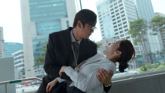
See how the first scene has black bars above and below? The director is using a different aspect ratio than in the second shot (these are both taken from ep01). What does this signify in the story?
Flashbacks. Flashbacks in Marry My Husband are always filmed in a different aspect ratio than scenes in the "present" storyline of the show. Perfect Marriage Revenge also uses aspect ratios this way.
Love for Love's Sake does something similar but instead of flashbacks it uses aspect ratio to denote between "worlds".
The game world is filmed in a longer aspect ratio than the "real" world which is filed in a different ratio (not a standard full screen but it does have a taller ratio than the game world):

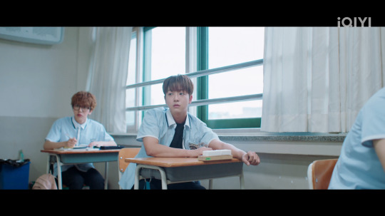
This, so far, has been consistent in the four episodes that are out. We have another return to the "real" world in I believe ep03 and we see this same aspect ratio dynamic.
Another thing I noticed is the "real" world's color saturation is much higher and warmer than the "game" world, but it's also (ironically) much more enclosed - this could honestly be a story choice or a budget issue - and boxed in. Something I don't see discussed a lot in terms of cinematography in BL is the use of Lines and Shapes in film and how they add to the composition of a shot.
I really like this video on the subject though it focuses mostly on animation it's still relevant:
youtube
Now if you look at the "real" world scene in Love for Love's Sake we see that the protagonist, before we even know who he is, or anything about him, is in a highly saturated room, warmly lit, but also boxed in:
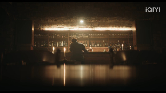
The warmer saturation denotes a sense of intimacy, which makes sense in a bar setting, but the boxed in frame around him gives us a sense of tightness, tension even, maybe a sense that he feels trapped. We later learn through dialogue he's unhappy with his life and unhappy with the way the novel story he read has played out.
Then, when the scene transitions into the "game" world, the protagonist is in a different aspect ratio, the color grading is now more desaturated and has a higher blue hue to it, the character is also in an open space and filmed front forward facing instead of from behind:
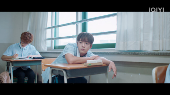
This all works well because the audience knows, even before the character does, they are in another "world" and its very different from their own. It creates to specific aesthetics which help set the worlds apart from one another.
For more on color theory, this is one of my favorite videos on the topic which has more to do with like, hue and saturation rather than "the blue curtains mean xyz" which is a singular and narrative heavy way to focus on color theory instead of how color adds to the tone, emotion, and world building of a piece of media.
youtube
I think the first episode of Love for Love's Sake is the best filmed of the episodes so far, the budget starts to chip away in other episodes but I do want to give them their roses b/c they do work within their budget well. There's a lot of interesting visuals used especially with the game pop ups that I really like, and some nice camera work. The editing is a bit weak at times but there's been some good choices too.
I also really liked the scene with Yeo Woon running and how his feet lit up and how that aligned with his affection points going up. The editing for that was well done.
So yeah, those are my film making thoughts on the show for now lol
Check out other posts in the series:
Film Making? In My BL? - The Sign ep01 Edition | Aspect Ratio in Love for Love's Sake | Cinematography in My BL - Our Skyy2 vs kinnporsche, 2gether vs semantic error, 1000 Stars vs The Sign | How The Sign Uses CGI
[like these posts? drop me a couple pennies on ko-fi]
#love for love's sake#kbl#chaos pikachu speaks#spot my kofi some coins if y'all like these posts lmao#also love for loves sake is cute as hell I'm into it#its a bit slow but last episode picked up and it's very charming#chaos pikachu metas#also if you wanna have a fun time watch any video on transformers the last knight and learn how to NOT use aspect ratios lmao#god that was such a frustrating thing to witness#Youtube#pikachu's bl film series
70 notes
·
View notes
Text
Btw this is what I mean when I say if you only watch anime, if you just wait for anime adaptations instead of giving Manga a chance, if you see Manga as just the beta version of something that would be better animated, you're absolutely missing out on some of the best art this planet has to offer.
(This post turned long as all hell so examples under the cut)

vs

(Yashahime)
The limitations of black and white make for some absolutely incredible artistic choices. Despite the lack of colour, the dramatised use of light and shadow is much more pronounced.
The colour versions are beautiful in their own way, but there's just something about black and white that evokes drama that a full colour piece of the same scene often takes for granted.
There is also a lot more care put into detail in individual panels, because you can stop to examine them. In an anime, details (like the legs on this centipede for instance) are often forsaken, understandably, because of time constraint. You're not going to over-detail something you only see for a few frames.
I'm going to use FMA as an example because people love to argue about which anime is better and my answer, for fifteen years, has been: The Manga.


Both scenes gorgeous, but in the manga version the artistic choice to make his eyes the brightest part of the page, even to the point of not shading his irises, draws the viewer's attention to Edwards eyes and his intense emotion, whereas the anime version kind of draws your eye to his hand and the motion of pointing. As yellow is the first colour the human eye tends to notice, I think the fact he's rendered in colour also serves to distract the eye from the most important part -- the determination and emotions in Ed's eye.
Same manga, different scene:

In the manga, a huge part of Lust's character design, and many of the sins in turn, is that they are an inky black blot on the page. They stand out as the darkest part of any given panel they're in. As such, I think their design when rendered in full colour feels markedly less inhuman when next to the rest of the cast.
In the anime, you get the Lust vs Roy scene as below. Good posing and composition, and by all means a great scene overall. This is two people in an arena who have just duked it out, and the dust is clearing:
The manga version looks like this:

There is no obligation to render a background and the scene is all the more intense for it: All it comes down to is these two characters, and the moment that one of them is about to die. The entire universe, for this panel, it just Lust and Roy. She emerges from the smoke like a tumour, like a parasite reaching for a host. She is not simply standing in front of him, she is emerging from obscurity, her strike sudden but his resolve unwavering. You can see from the way the smoke lingers around him that Roy stood stock still, as the smoke on her side whorls with the ferocity of her movement. He waited for her to pounce, knowing he'd kill her now or die trying. Even the sound effect is used as part of the visual experience.
Another FMA example:
This is a beautiful scene where Edward's arm is the focus, showing the way it, and the regret and heartache and loneliness and guilt that it represents, overshadow his life and his actions. Very nice, I like the way it's the shiniest part of the shot, if not necessarily the coldest.

But here's a very similar scene in the manga:

(All Fullmetal Alchemist and its adaptations)
I think again that the lack of obligation to render a background when it would not enhance the scene does so much heavy lifting here. The way his shirt is completely dark and the background is completely bright means that the grey that is Ed slices through the panel. You don't see his eyes, much like the anime example, but the way he's half in shadow and the way he stands in the void makes him feel so, so much more lonely here.
(I'm certain there's a more equivalent moment in the FMA manga but I couldn't find it for a whim post so here we are)

(Kagurabachi)
This one doesn't have an anime yet but the way this artist renders shadow dripping from a blade to form an inky black goldfish makes it difficult to imagine how you could render this in anime format and maintain the same feeling, or even improve on it. The lack of background makes the contrast bold, but anime often can't really leave the background perfectly black without making the scene confused.
Anyway this isn't to say anime can't look fucking awesome because it very often does. But if you're not reading the manga, well, you don't HAVE to. But you're missing out majorly and I'm sick of it being treated as this preliminary, inferior art form that needs a studio to pick it up and "improve" it to make it worthwhile.
19 notes
·
View notes
Text
now that i have recovered from the emotional shock of seeing *that* akutagawa scene from chapter 88 animated in HD 4K (i thought i’d have another week to emotionally prepare myself LMAO), i just wanna be a little bit of a nerd and say that i really liked the cinematography/composition this episode.
in particular, i really enjoyed the anime’s decision to draw visual parallels between this fight and previous fights (in particular, the fight against francis, which is important because it is the first time they worked together).
after all, this fight is the culmination of everything they’ve done together. from the combining of their abilities, coming to an understanding with each other, realising the potential of beast-beneath the moonlight-rashoumon… bringing back similar shots that were used in previous fights is SUPER effective at highlighting the parallels and how far they’ve come, in my humble opinion.
here are a few things i noticed:
- first of all, both of them activating their abilities one after another is an explicit nod to S2’s fight;


- the confrontation/conversation in the hallway from S2 (to an extent! they’re on the same sides, which caught my eye);

- akutagawa blowing up the engine room on the ship, and kyouka doing the same during the first fight between him and atsushi (S1);

- and a similar angle being used for black tiger claws / koukko zessou as a nod to the fight in the S3 finale.
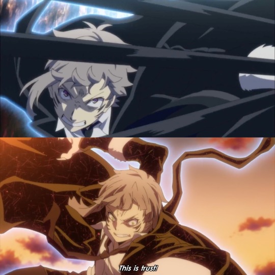
the parallels — though maybe less explicit, *are* still there in the manga? like, the entire “structure” of the fight so to speak is very similar to the francis fight in S2 — akutagawa finding atsushi, taking place on a(n air)ship, breaking away from the fight to strategise before confronting the final boss (then, francis, and now, fukuchi) is undeniably a nod to that fight? i love that this is given its due in the anime as well.
another thing about the cinematography this episode i loved was them using the clock as being the indicator of fukuchi’s fuckass space-time sword doing its thing. that was a really nice touch, in my opinion; the cuts in between were jarring and disorienting and really helped put us into sskk’s shoes.
and as for the background design alongside the clock itself — there were a couple of things about them i enjoyed:
- the number of floors / levels of the ship in the back (5, as a nod to the five ways an angel decays, the DOA)
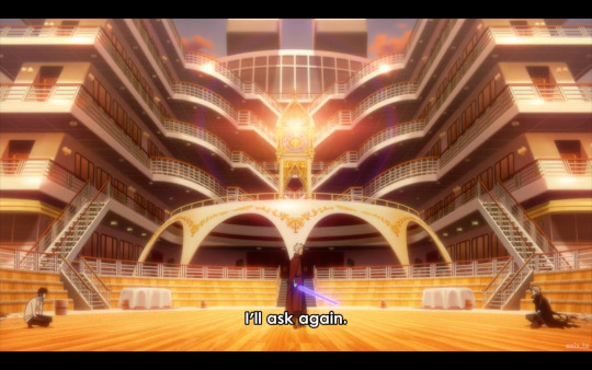
- the blue of the clock is meant to be reminiscent of fukuchi’s sword, i’d argue, with the way both of them pops out of the sunset/orangey-red lighting
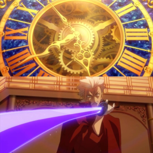
- the clock’s design being super ornate and gold plated reminds me a *bit* of a tabernacle (where they keep unused eucharist in a church) — and thus brings up connotations of sacrifice. that white bridge-thing beneath the clock as well reminds me a lot of an altar, too (see the image above the last to see what exactly i’m referring to, because image limit)
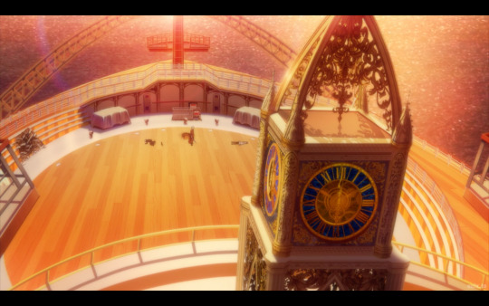
okay, yeah, that one might be a bit of a stretch, sure. but its placement as being above them, combined with the two tables/boxes to the left and right of the ship’s bow (which looks very much like a cross, btw) gives it a distinctly religious, altar-kinda feel, i’d argue. and crosses have been used in S4 as symbolism as well!
(tbh, there could even be a bit more imagery i’m missing, because — the angels of the DOA refers specifically to the buddhist conception of an angel. i’m not too familiar with buddhist imagery, but i thought that this was worth pointing out regardless!)
the last thing i want to say is that the red and blue symbolism went CRAZY this episode. i don’t have much else to say because it was super obvious — they even reused the same “black tiger claws” shot from S3, after all — but i do wanna point out that the symbolism even went into the carpets. the fucking carpets.
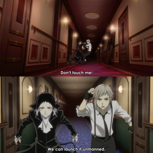
like, the shift: it’s red when akutagawa’s leading the conversation but changes to blue after atsushi’s suggesting of the submersible as a strategy? i mean, i don’t know if this (or anything i’ve said, to be fair) was intentional or not, but it’s a cool detail anyway!
personally, i enjoyed this episode, the action was great, and all of this too was a really neat addition as well! and now… uh. we wait for the chaos to get worse i suppose !? (laughs nervously)
#while i haven’t been enjoying S5 as much as i did S4 i think they still did pretty good w this episode#there was a lot i really enjoyed about this episode!!#studio bones will always deliver on the action. we can count on that bit at least LMAO#next week though…. it’s shin soukokover#bsd#jem rambles#bsd s5#bungo stray dogs#bsd spoilers#atsushi#akutagawa#shin soukoku#bsd atsushi#bsd akutagawa#bsd sskk#sskk#i do mourn the loss of some of the nuance of their characters but. they did say at the panel the anime focuses more on action sooo 🥴#you win some you lose some i guess#only reason i was able to make this post btw is because ive watched bsd so many times to the point shit’s literally engraved into my brain#it’s bad for me NDLDGAJ#bsd analysis#bsd anime analysis#bungo stray dogs season 5#bsd season 5
120 notes
·
View notes
Text
Trigun Manga Reaction
Now reading Volume 1 Chapters 7!


Oh. Nice foreshortening!
Have I mentioned before that the art in the manga is amazing? I mean not only is it pretty but the techniques and the visual storytelling!

This manga really spoils me rotten with beautiful double spreads.
Was Trigun a weekly manga or a monthly comic in the 90's? Like, how is this level of quality maintained every chapter?!

This sweet apologetic smile. Baby Girl Vash. SOMEONE PLEASE PROTECT HIM!!!

I love this part because of how the "tech" looks. Maybe I'm just high on nostalgia but if you ask me, the best and most creative visual takes of futuristic technology are from the 90's. OK... 70s to 80's too. BUT 90'S ARE THE BEST!

LMAO! I remember this! Vash loves teasing his enemies with cheeky notes, doesn't he?

Dime novels??? Penny dreadfuls?? Gasp! HARLEQUINS?!!
DOES THE SETTING OF TRIGUN HAVE AN EQUIVALENT OF HARLEQUINS?! IF SO, I'D BE SO HAPPY BECAUSE I HAVE THIS HC ABOUT WOLFWOOD'S FASHION CHOICE BEING CONNECTED TO THOSE RAUNCHY CHEAP ROMANCE NOVELS!!!

Also, another amazing nightmare face! But then...

WHIPLASH! Vash adding levity by hyping himself up. Tho more likely, he is telling the truth. Not that anyone would really believe it with the facade he puts up.

Oh, wait. I only notice this just now. The Vash's glove design in the manga is what was used in in Tristamp. Only three fingers are covered. In '98, it was all of his fingers are concealed by the glove.

AH! I REMEMBER THIS! ESPECIALLY HOW IT ENDS! I'm laughing already. Kaite... is not the best navigator.

Ah Classic Vash. Deflect. Deflect. Deflect.

Oh... This scene. It's kinda scary how catching Vash off guard is deadly for his attacker. Really highlights how much he has to control all himself all the time. Killing is too easy for him with his abilities. So, he has to exercise strict disciple and caution for the sake of others all the time.

This is also sad. A kid telling off an adult for not wanting to kill. It really hammers down how awful their world is - that killing is the norm and logical thing to do. Avoiding violence and killing is seen as stupidity.

This page makes my heart hurt for so many reasons. Vash is suffering physical pain from being shot. However, I think what is more devastating is his ideals being questioned and insulted by a child - someone who should be innocent from the concept of taking lives.
Vash was hurt by what Kaite said. But, I think he also understands why he did it too. It was out of both worry and the unfortunate circumstance of their violent word. Hence, his intense glare at the top of the page then softening into a sheepish look at the bottom.

Oh wow. Another beautiful art and amazing composition and...
Rem just has strong presence in the manga, doesn't she? It's something that was in Tristamp but kind of lessened in '98.

Oh... I wish this had not been cut out from '98. I don't think this can be rehashed in Tristamp, can't it? Damn... it deserves to be animated.

Kudos for '98 in doing a great job animating this page.

Boo for not doing justice for this page, '98! WHAT THE HELL?! Why was Rem not featured a lot in '98?! At least, Tristamp made up for it... BUT I LIKE REM'S LONG HAIR DESIGN BETTER!


HAHAHAHAHA!

AH.... Ah? AHHHH?!
Fuck! I forgot. This was not supposed to be funny?! Why did I remember this scene is funny?!
Also:
@poofyphluff

I read about the filler thing. Didn't expect it to be that much. And yeah, I'm really admiring Nightow's skills with scaling in his art. It really enhances his visual story telling.
@revenantghost

It is slowly dawning on me the differences between '98 and the manga PLUS the similarities between Tristamp and manga.
I guess my memory is not as accurate as I believe. I thought the OOC-ness from '98 is not that much yet. I thought Vash being a horndoggy perv is just a Badlands thing. It's really nice that it is nowhere here in the manga tho and Tristamp.
It begs the question tho, why make Vash like that in '98?
Oh. So Wolfwood's situation and I guess the '98 ending is similar to what happened with the first Fullmetal Alchemist anime? The studio was forced to do an AOE.
Thanks for sharing your thoughts! Feel better soon.
#trigunbookclub#trimax journey#i think my memory is a bit unreliable regarding '98#hmmm maybe i should re-watch while reading the manga#for comparison's sake#however i'm mad!!! we were deprived of so much early rem scenes!#why??!!!
13 notes
·
View notes
Text
G Witch Onscreen Text: Episode 6
GRAAAHH!! This is part SEVEN in my attempt to transcribe and discuss all the onscreen text in G Witch!! Because I CAN!!! GRAHH!! We're on episode 6, halfway through season 1!! Grah Graaaahh!!!
Click here to go back to Episode FIVE!! Grahhh!!!
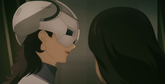
Let us begin.
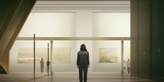
Not text, but during Bel and Prospera's initial confrontation, the building they're in has art pieces on display. Maybe it's some kind of museum?
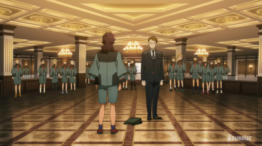
Not text again, but we don't get very many looks into the common areas of the 3 branches, so here's Jeturk House's. It's really flashy and gold, huh? It also matches the aesthetic of Vim's office.
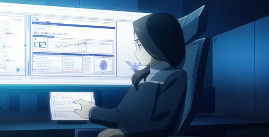
During the scene with Bel and El4n, Bel consults the data on this monitor when she tells him that he'll be fine piloting the Pharact for the duel against Suletta. We get a couple of shots of this monitor, so I'll do my best to glean what information I can from it.

On the left side of the monitor is a mockup of the Pharact. TEXT: (Top Left) REGISTERED NAME: PHARACT MS: FP/A-77 PMET CODE: P017-0046
(Bottom Left) MANUFACTURER: PEIL TECHNOLOGIES STATUS: IN TEST OPERATION
We see the Pharact's Permet Code here, that being PO17-0046. The 'P' probably stands for 'Peil.' Also, have you noticed the the MS IDs for all of Peil's mobile suits have a '/' in them? The 3 branches all have their own unique naming conventions when it comes to their MS codes. It's obvious, sure, but it's something you might not have noticed unless you were looking at it.
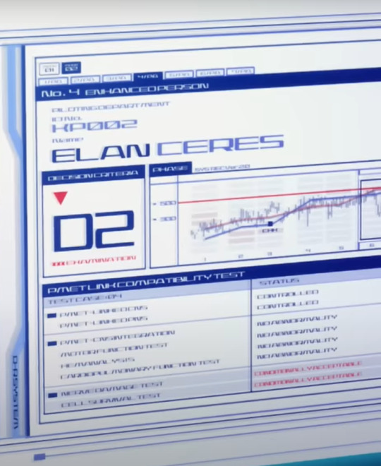
This info here, on the right side of the monitor, is much more interesting. TEXT (Header) No. 4 ENHANCED PERSON >PILOTING DEPARTMENT >ID. NO: KP002 NAME: ELAN CERES
This screen is how we learn that El4n is indeed the 4th Enhanced Person in the show proper.

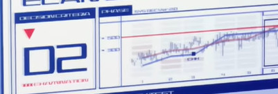
Underneath the header is this info box and a graph. The box on the left says DECISION CRITERIA D2 ***EXAMINATION
What this box means is mostly speculation on my part, but I believe this is a grading system that evaluates the remaining health/usefulness of an enhanced person. There's a red arrow pointing down, implying that this grade, D2, is worse than the grade from the previous evaluation.
The graph to its right is a bit harder to analyze.
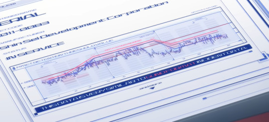
It's exceedingly similar to the graph shown during the Shin Sei Inquiry by Shaddiq, that measured Aerial's Permet Influx, but they probably aren't measuring the same thing.

I think it's probably closer to the little bit of this graph we see in the prologue, that I speculated was a measurement of a pilot's exposure to a data storm.
The graph has no title, it only says PHASE on the header, followed by Sys REC Ver. 2.0, which means this data was either recorded from the Pharact of El4n's body. The highlighted point is labelled CHH.
My BEST guess is it's measuring the amount of Permet radiation his body is suffering from.
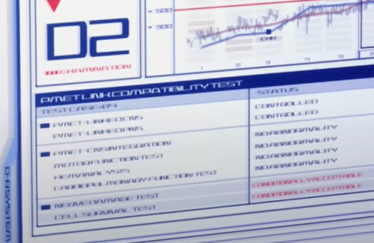
Underneath the graph is this subfield TEXT (top to bottom.) PMET LINK COMPATIBILITY TEST TEST CASE: 04 | STATUS PMET LINKED CNS | CONTROLLED PMET LINKED PNS | CONTROLLED PMET-CNS INTEGRATION | NO ABNORMALITY MOTOR FUNCTION TEST | NO ABNORMALITY HEMANALYSIS | NO ABNORMALITY CARDIOPULMONARY FUNCTION TEST | NO ABNORMALITY NERVE DAMAGE TEST | CONDITIONALLY ACCEPTABLE CELL SURVIVAL TEST | CONDITIONALLY ACCEPTABLE
This is an evaluation of El4n's body, and from this we get a really good look into the true danger of piloting a Gundam.
To start, CNS stands for Central Nervous System, and PNS stands for Peripheral Nervous System. The first box is analyzing the status of the artificial nervous system implanted into El4n's body.
PMET-CNS INTEGRATION can thus be assumed to be analyzing its integration with the rest of El4n's body. MOTOR FUNCTION TEST is self evident, an analysis of El4n's motor skills. HEMANALYSIS is an analysis on the chemical composition of one's blood. CARDIOPULMONARY FUNCTION TEST is a test evaluating the strength and health of your heart and lungs.
NERVE DAMAGE TEST and CELL SURVIVAL TEST are self evident, but what's most important about them is that, unlike the rest of his results, they're labeled CONDITIONALLY ACCEPTABLE. If he hadn't been disposed of by Peil, we can see that this is probably what would have killed him. A combination of Cellular Necrosis and Nerve Damage.
We can glean from this chart that over exposure to Permet primarily affects the Nervous, Cardiovascular, and Pulmonary systems, as well as cause cellular necrosis.

Finally, though we unfortunately never get a closer look at it than this, there's this final box here, labeled EEG[???], and contains what i think is a CT scan of El4n's brain.
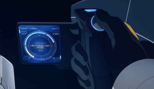
TEXT: PROPULSION CONTROL SYSTEM HIGH MANEUVER MODE
When Suletta is piloting the Aerial to test out the thrusters, we can see the system and mode being tested.

When talking to Miorine and Nika in their shuttle, we can see SS/O.M is added to the com screen on Suletta's phone. Not sure what it means !
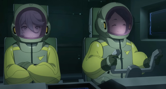
Not text but I love Mio's face here after she finishes giving Suletta the pep talk, but before she responds to Nika. She's like, hm! Helping Suletta felt really good. I hope this doesn't awaken anything in me.
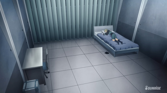
El4n doesn't have anything in his room whatsoever.
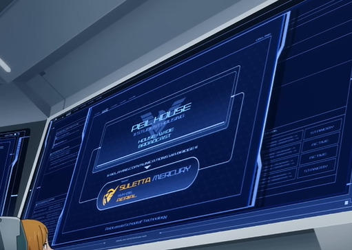
When Suletta asks to talk to El4n, they can't get a hold of him directly, so they just do a HOUSE WIDE BROADCAST instead.
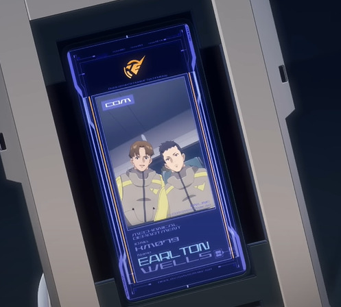
TEXT: MECHANICAL DEPARTMENT ID No: KM079 NAME: EARLTON WELLS.
Not important, but one of the two students Suletta speaks to is named Earlton Wells.
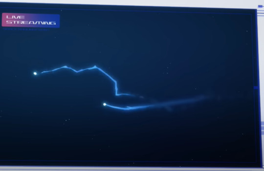
During the duel, Bell can tell that El4n isn't doing well because his flight path is jagged, he can't fly straight anymore.
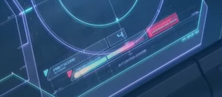
We can't read this error message, but we can read PMET SCORE 4, so its most likely an error related to that.
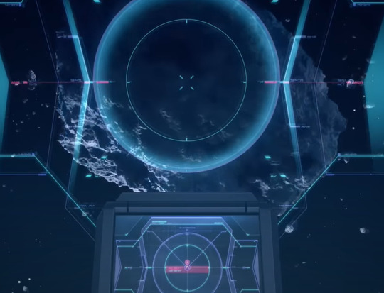
We can see the alert message on El4n's screen when he's about to run into the meteor. It just says ALERT.
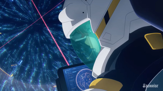
When Suletta is trapped and Aerial increases its Permet Score, we can see little whispy things on the main monitor. Oooohhh..pretty...
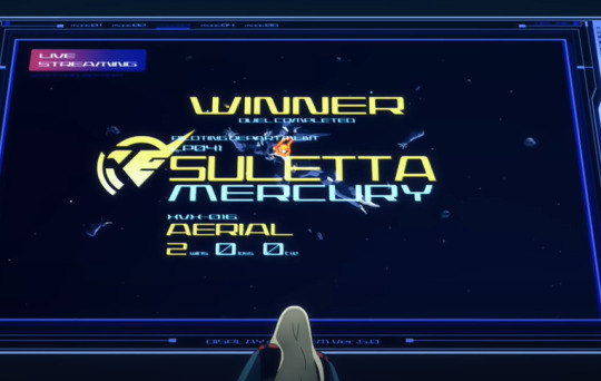
So, bit of a mixup here, before, when Suletta defeated Guel in the rematch, it said she had 2 wins, which made it seem like her previous win had been reinstated. That wasn't true! It was just a mistake, because when she defeats El4n here, she still only has 2 wins. Can't win em all !
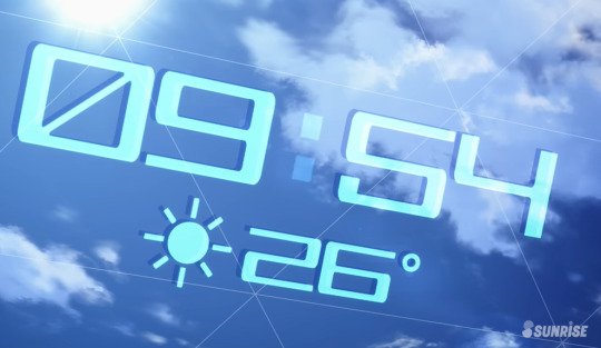
Here, we can see that time and temperature in Asticassia's simulated environment. It says 26 degrees and is sunny, which means that Asticassia uses Celsius and not Farenheit.
When Bel begs the Peil Witches to reconsider, if you look at the monitor, you can see Elan hanging up in front of the laser. They're watching him die here, and Bel saw it too.
AND THATS IT!!! HUAAAAHHH!!! THANK YOU FOR READING! I NEED TO GO! YOUR FINAL GIFT:

You ever notice how since the beginning the Enhanced Persons were alluded to be like Eri because only 4 and 5 were ever able to see and hear her when they're overloaded with Permet?
Click here to go to Episode 7!
Click here to go to the Masterpost!
41 notes
·
View notes
Text
Some observations about the gay Kazui theory
A lot of people have been discussing this and it’s super interesting so I wanted to share some stuff I noticed too! Posting this before cat since it’s possible this theory will get either debunked or confirmed by then.
Lyrics from Cat
First, let’s talk about the preview of cat from the 2nd trial song previews. One thing I personally dislike from the staff’s English translation is this part:
“Devotion-love, lame, cheating”
While the first two tl choices are good imo, the third part could have been chosen better. The reason for this being, while it’s not a wrong tl per say, 化かす (bakasu) means “to confuse”, “to delude” according to my dictionary. There’s also the expression 狐と狸の化かし合い (kitsune to tanuki no bakashiai), which refers to two people outfoxing each other.
While I get this might be for localization purposes, I feel like the word “cheating” has connotations in English that are way too different from the original in this case. What I’m trying to say is that we should probably wait for the mv itself to draw our conclusions regarding this (though it’s also possible this really is just about cheating).
These lines caught my attention too, but for another reason:
“Love + Fate = Crap”
“Disgusting playing-house + Disguise + Fake”
While at first glance, these lyrics make it look like Kazui might be a cheater (and not shy about it), I feel like this could be a case of Kazui lashing out after he spent so much time in a relationship with a woman when he’s not attracted to them in the first place. It’s possible Kazui actually saw his wife in a best friend kind of way, and that they only got married because of their families’ and society’s pressure, compulsory heterosexuality, you know. There Are a lot of suspicious things about Kazui that he needs to explain, but maybe cheating isn’t actually one of them. We’ll see, though.
Next, let’s discuss some things from the half mv.
How Shidou and Kazui respectively visualize their partner
This next section will reference Triage, where we have a look at Shidou’s family for the first time. As a quick note, there has been some debate over the woman in the mv potentially being Shidou's sister or other family relative but I personally believe she's his lover because of this part:
Shidou (we recognize him as he has the same outfit as in the rest of the mv) has his arm around her waist so I assumed they’re romantically involved because of it.
But how does this all connect to Kazui? You guessed it, the way Shidou and Kazui visualize their partner in their respective mvs vastly differs. Let’s have a look.

Shidou’s visual representation of his lover.

And here’s Kazui’s.
Notice anything? In my opinion, these choices were very deliberate. As various people in the fandom have pointed out, characters in mil mvs who have faces are very important to whichever story is being told (Rei in Muu’s mvs, Shidou’s lover mentioned earlier etc). So it can make one wonder, why does Kazui’s wife, who he obviously cares deeply for, not have a detailed face when we see her?
To continue this particular point, I want you to look at these consecutive shots from half:


It’s unclear who the blonde woman on the top is, she could be someone Kazui met at the bar, or a coworker etc. It’s not really important who she is for our theory, what’s to note is that these two shots come one after the other, and that the composition in both is extremely similar. My interpretation for this is that, between a woman who is in the grand scheme of things a stranger to him, and the woman he married, Kazui makes almost no difference in the way he visualizes them (as in facial detail). Because ultimately, if he’s gay, no matter how hard he tries, no matter the woman, he won’t be able to love them romantically. This could be what the staff was going for here.
The green apple and the pixelated person

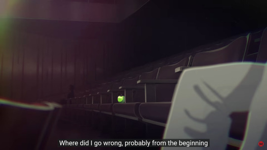
There’s a cool detail about the two shots above. To start off, the first one’s composition is a little curious. It follows the rule of 1/3; 2/3 with Kazui in the third third of the screen, but the remaining part of the image feels strangely empty, save for the green light at the top.
It could represent Kazui’s solitude in the theater, but a few scenes later we get the second shot, where we see the green apple on one of the seats.
A fun fact is that, if you count the seats between Kazui and the apple, you notice that 4 seats on Kazui’s right seats the apple… Which corresponds to the second leftmost seat in the first screenshot. The apple was with him the whole time, and the green light stands right in the middle of the two. Hmm. But what does this mean? Honestly I’m not sure. If anything it means the apple is so important to Kazui it was given this special place.
But then there’s also the pixelated person in the back of the second screenshot. Who are they? They’re probably very important to the story, especially when the apple stands right between them and Kazui.
Since the mystery person isn’t in the first shot where we’re introduced to Kazui, it could mean that whoever they are/represent, Kazui would rather not acknowledge them. At least not until he has to.
Look at the lyrics that play when this scene is on screen.
“Where did I go wrong, probably from the beginning”
And then, during the same sentence, we get this Kazui who looks like he just had a revelation.
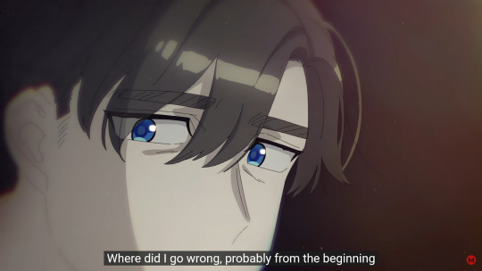
This sentence probably refers to the fact Kazui’s relationship with his wife was bound to fail, because of his sexual orientation. And the mystery person might be a representation of men in general, who Kazui could be attracted to.
The chair and what it could represent
At certain parts during half, it seems as if Kazui is talking to this chair. Some examples:

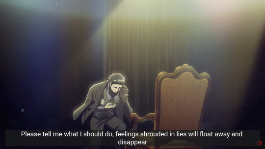
It should be noted that both times Kazui does this, the lyrics he sings are the same. This part in particular caught my eye:
“Please tell me what I should do”
Who exactly is Kazui talking to here? He could simply be thinking of his wife here, but since there’s so much emphasis on the chair, I thought they could be symbolic for an entity or a group of people Kazui knows. I have two guesses: it might represent either his family, or maybe society in general.
I don’t think it’s the former because Kazui seems at odds with them and possibly got disowned, so I feel like he wouldn’t value their opinion too much. As for the second option, it could be Kazui asking us what he should have done/ how he should have handled the situation (with him being gay and unable to love his wife romantically, but not wanting to hurt her feelings). It’s hard to know because we don’t have a lot of context for this part so it could be anything really.
Some parts of the lyrics that could specifically refer to homosexuality
These don’t really fit in any of the other points I talked about but if we look at them in the context of this theory they can be pretty telling:
“So many things I wish I hadn’t known, I’m just a coward”
“What I gave up a long time ago, why is it questioning me now?”
“So many things I should have known, I’m just a coward”
Kazui’s possible coming out to his wife
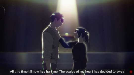
In my opinion, this part could be the aftermath of Kazui coming out to his wife. Let me explain. Here we have the apple (temptation/the forbidden fruit = the idea of homosexuality here?) in the background, so that’s one thing. Add to that the lyrics playing:
“All this time till now has hurt me, The scales of my heart have decided to sway”
This line could refer to the moment Kazui felt like he had to be honest with his wife, because as much as he loved her, pretending to basically be someone he wasn’t was hurting him. Hence “the scales of his heart swaying”. This scene then led to Hinako jumping from the balcony at some point, but at the moment we don’t know the details.
Hope you enjoyed!
#milgram#milgram theory#kazui mukuhara#I swear I have mil theories that don't involve gay ponders#even if the next one is about Muu lol
67 notes
·
View notes
Note
I have a similar-ish art style to you in the sense that a lot of my art just by the way I stylize certain features makes my it look creepy. This is a huge problem for me because I do genuinely love drawing cute stuff but I can’t because of my art style. I don’t want to completely change my art style because one that would take forever but two drawing things that are scary and creepy help me cope with my agoraphobia and paranoia. I know this is more of a do you have advice than a proper question but what would you suggest I do?
(side note: I ADORE YOUR ART!!!! I especially love your Sayaka work as a massive pmmm fangirl)
Hello, firstly, thank you for taking your time out to write out a long ask. (/ _ ; ) <- Grateful. I’m not a reliable person to ask things about in terms of art given I’m not a professional or good at it, but as usual I will try my best to answer your question here.
I suppose there is a perspective that what constitutes as “cute” differs from everyone, and often I’ve noticed that things that are cute can also be creepy simultaneously depending on context, not just by changing styles alone. Kyubey is an example of this, if you must. It has all the markers of “cute animal design” - round eyes, large bushy tail, cat-like ears, and in the show it behaves like a cat hopping around and perched on the shoulders of the magical girls. Yet it’s not restricted to the interpretation that it’s just cute, since later on there are different things which make it creepy. The context of what the alien creature represents, for one, or the way shots of it are accompanied by a gloomy, industrial background which contrast its bright, supposedly cheerful colour scheme, or how there’s nothing humanly sentimental in it whenever it focuses on Kyubey’s eyes. These transitional details are what balances something that can be deemed both creepy and cute, although not everyone might share this perception.
You don’t have to change your art style, just the way you want to stylise cuteness in your own way. This could mean cutting down “realistic” details for the subject but still keeping the way the background is coloured or textured, for one. Cute things can be achieved also by being simplified. I think Kyubey would look terrifying and not cute at all had they went with a realistic cat design and not an “anime” styled one. One reference I often think about is the way Gekidan Inu Curry captures the dichotomy of Sayaka.
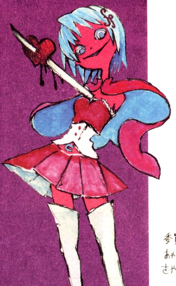
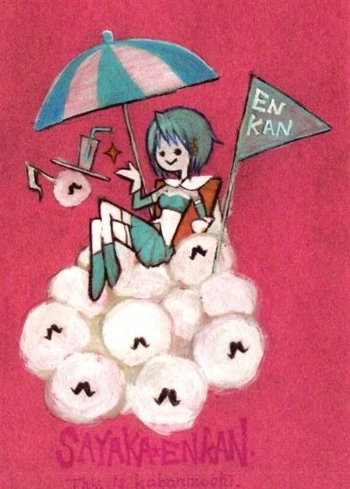
In this example, the highlight is the “size” or composition of the subject. Sayaka on the left is closer to the audience, so we can see her details clearly (how tall she is, how her eyes look, the shadows coloured over her heart). It makes her seem menacing because she’s so close and doing strange things. Yet it has a retain “moe” charm to it because the way it’s coloured and being sketched that it seems…cute. In its own way. Sayaka on the right is sitting further away and enjoying a drink atop a mountain of fluffy Anthony balls. It’s worth noting as well how her eyes in the second picture are more simplified, being drawn on as dots, but the style does not outright lose its creepiness [the weird, dated shading on the umbrella, her hair being textured darker, the background being a fuzzy red].
What you could do is try thinking about how something that is cute would look like in your style. If that makes sense. It is a sort of attitude that affects the approach of your art. Thus it’s strongly encouraged to experiment with what you can draw in your current art style instead of needing to change it. If a rabbit is cute, can you find a way to make it look cute in your style? What is the core appeal of the thing you like? What elements are making current results unsatisfactory by your standards? What do you have to adjust? — Those are questions you’ll venture the answer yourself, and the more you draw, the more your style changes on its own, organically, so don’t worry about it. You may not be able to draw cute things today or tomorrow, and you will likely struggle to get the process of it, but eventually you’ll certainly be able to draw the diverse things you really enjoy without having to sacrifice the personal components of your art’s identity and what it ultimately means to you. With all that said, I’m not sure how realistically useful my suggestion or advice will be, but I will nevertheless be supportive of your endeavours. Good luck!
And thank you! I love drawing Sayaka, so I’m happy people like seeing her just as much. ٩(๑❛ᴗ❛๑)۶!
#ASKS 💌#Walter white voice: this guys has no idea what he’s doing#I don’t remember anything I say ever so I apologise in advance for any contradicting statements
12 notes
·
View notes
Text
Ok Doctor Who ramble time after watching the two newest episodes which for reference I did still love and enjoy overall Also spoilers for parts of the episodes
Lets go, ok so I think the one thing i've been finding odd is the reuse of older quotes and shot compositions from older Russel T Davies episodes. Like in this one Ruby talks about how the world didn't end in 1963 which is worded almost exactly to what Martha says in The Shakespears code ('...am I missing something here? The world didn’t end in 1599. It just didn’t. Look at me, I’m living proof.') And the scene in Space Babies in which they stand infront of the large window feels eerily similar in shot composition and location to one of the first shots in Rose's second episode The End of the World, which also has the same scene of having her phone boosted and calling her mum.
Just things I've noticed that are either meant to be intentional call backs or just lazy reusing things that worked last time.
Also smaller gripe as The Beatles are one of my hyper fixation I am still so disappointment how little they are in the episode :( I don't think Ringo even gets a line in and George is just as easily dismissed, both writing some pretty good songs for the band (George writing the one song most people know of the group 'Here comes the sun') also John didn't wear those glasses at the time, like he was deeply insecure about needing glasses which could have also been a thing in the episode if they wanted to use the beatles in the story. It could be an endearing moment of showing their weakness and being able to start to bond to be friends to team up against the monster. They way they should have actually advertised the episode is 'The beatles appear twice and just exist I guess' Maybe the dance number at the end could have worked if the song was like tied to the musicians rather then repeating there's a twist at the end cause it would be cooler if it was a more hidden phrase. THEY COULD HAVE DONE THE SONG TWIST AND SHOUT MY GOD I JUST REALISED- THAT COULD GET ACROSS WHAT THEY WANTED THE SAME WAY AND FEEL MORE SUBTLE CAUSE ITS A SONG THAT ALREADY EXISTS AND JUSTIFIES ITSELF CAUSE THE BEATLES ARE THERE.) Ok i gotta stop typing now.
My apologies for length, doctor who and the beatles are both hyper fixations for me if it wasnt obvious already.
#doctor who#new who#the doctor#dr who#dr who spoilers#dr who ramble#the beatles#doctor who spoilers#the devils chord#space babies#nuwho#cd tism time lol#mod cd
6 notes
·
View notes
Text
I finished watching The Cleveland Show last Friday, been wanting to write a review of some sort about it but couldn't really find the words to do so yet.
It's an interesting spin-off, I remembered when it first started airing in the Netherlands around 2010-ish that I was intrigued by the idea of a "black" Family Guy spin-off, not yet realising that Cleveland was being voiced by a white guy at the time until shortly afterwards. I did remember the characters from the show, the slightly uncanny character designs compared to Family Guy, and of course Cleveland's rap! I used to keep an mp4 of that rap on my MDA Vario IV Windows Mobile PDA, playing that on the Windows Media Player app as I fantasized about becoming a musician as I was listening to very niche music from chiptune to underground rap music I came across on YouTube that mostly sounded catchy as my English listening skills weren't up to scratch yet.
I vaguely remembered episodes where the stories just felt "off"
But enough rambling, let's get to the actual review:
(Beware of spoilers)
The first episode was MUCH funnier than I remembered, I was prepared for the absolute worst and poorly aged jokes for a 15 year old show but I honestly thought it was hilarious! The meta joke of the "black show written by white people" sets an interesting tone for what I think the idea of The Cleveland Show was. I genuinely enjoyed the first season of The Cleveland Show, the cutaway gags were neat too, although one might notice that there's just a different vibe in the air, I still struggle to put it into words in a way that makes sense, but the animation style feels different from Family Guy and American Dad. I should mention that beyond looking up the writers, I have not yet looked into the team behind The Cleveland Show (or any of Seth's shows for that matter), so it wouldn't surprise if different animators worked on this.
I've mentioned this before, but The Cleveland Show's animation style resembles that of a Playstation 2 game. It might be the fast-paced "stop and go" animation where characters quickly move from pose A to B when talking ans background characters sometimes being so static that they keep staring at a subject that has since disappeared. There are so many scenes where you could add a loading screen behind and it would feel natural lol I'm on the spectrum btw
Season two was also pretty funny and enjoyable! I do start to notice that the whole "black comedy" part of the show starts to disappear, but the stories surrounding Cleveland's family still make sense to me and show interesting characters dynamics and growth.
Season three is where the show started to lose me a little. Even though this show has little to none necessary need for canon events and continuity just like Family Guy and American Dad, the stories just did not make sense to me strangely enough. What might have been a contributing factor for me is the character designs on The Cleveland Show being far more detailed than any character I've seen in Family Guy and American Dad, most camera compositions being in medium-medium close added to those details as it felt more like a "single camera sitcom" compared to those total shot multi camera sitcoms.
I feel like I was "hate watching" season four to some extent. But the episodes just did not feel interesting to watch. A large majority of season three and four felt like "filler episodes" if that make sense. Not literally but there's that feeling you experience when watching those episodes that feels similar to watching a filler episode of any show with a more canon storyline.
I can see why the show got cancelled because you could feel the decline, I do wonder what a "finale" would've looked like. In any scenario, the family would probably return to Quahog either way but it would be nice to give the characters some closure.
Here's a list of other thoughts as the formatting of this pose is already messy enough:
Love the guest stars brought on this show, Ye's character Kenny West still gotta be my favourite character. Ye's voice acting sounds a bit monotonous as of he's either reading the script out loud or having a difficult time saying his lines with the time codes. I'd kinda love for his character to make a return to Family Guy or American Dad.
Gus is another character I love and HOLY MOLY you're telling me that David Lynch voiced Gus?! That discovery made me love Gus' character even more!
The hurricane episode missed the mark for me! The family trying to navigate around Junior being an atheist has such potential to make for a powerful storyline, but sadly misses the mark so much! The family does not find common ground with Junior and then completely ruins it when Cleveland sneezes and Junior says "god bless you!"
Choni's introduction to the show feels so unfortunate. They painted her so cocky and it made it difficult for me to sympathize with her during her first episode. it's sad because her character in general is pretty lovely.
Cleveland Junior being a spy who got rid of the original Junior is so funny to me and I choose to believe that this is (still) canon in Family Guy
I disliked the international episode with a passion, but the German segment parodied a certain "Persona 2 character" that acquainted me about info surrounding the writers that suddenly made me aware why so many characters were... like the writers (Forgive me for the vague wording for I'm not informed enough but have zero issues with these characters, it was just a bit notable, especially as they kinda took the place of what I feel like initially was supposed to be black characters)
I watched multiple reviews about the show on YouTube to see if they experienced similar things I did and could put them into words, I agree with how all of them point out the bond in Cleveland's family and how everyone learns to get along, make mistakes, and learn/grow from them!
Like most other fans, I wish that Family Guy involved Cleveland's family more often! Seeing Rallo and Roberta just standing in the background despite probably being the strongest two characters back in The Cleveland Show is such a shame to seeing them reduced to a "Boondocks ripoff" punchline.
Donna's ex husband getting together with her mom makes me realize that Donna is now technically canonically also the older sister of Roberta and Rallo.
That's pretty much all, might add more thoughts later.
#Late Night Thoughts#The Cleveland Show#review#thought piece#Family Guy#American Dad#Seth MacFarlane
2 notes
·
View notes
Text
ok so anyway double first impressions and observations!! idk if ill be repeating any points other people have already brought up since im typing this without having looked through the milgram tag. and this probably won't be all that organized despite my attempt of neatening it up but ah well. i tried grouping my observations by point at least, but they're not in an order that follows the sequence of the mv.
also id like to preface this that firstly a) i don't have any personal experience with DID whether it be in myself or with people i know so please be patient with me if i say something wrong and b) for now please assume im going with the 2koto theory? not because i dont believe in the trikoto theory but because i haven't really dug that deep into it and so id be bad at spotting evidence of it myself
also im mostly going off of what i see visually in the mv since i haven't gotten to analyzing the lyrics yet
for now im referring to host mikoto and alter mikoto as bokuto and orekoto respectively.
the rest of the post under the cut!!
1. magazine/print(?) texture
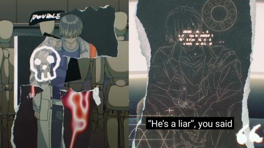
the first thing i took note of was the magazine/print(?)(there's definitely a better term for this because just saying 'paper' doesn't fit. someone please help) texture that shows up when the mv kind of fragments. there's a lot of text that shows up like printed letters on a newspaper/print(?) that floats around.
how i find this interesting is actually in contra:st to the magazine texture on cat and the magazine/scrapbook format of this is how to be in love with you:

whereas kazui and mahiru center more on the clean perfect 'advertising' feel of magazines, mikoto's texturing in double feels more like the kind of crinkled old magazines you rip and mess up for collages in primary school.
it's kind of interesting, actually: with kazui and mahiru, it's their portrayals of the idealized romanticized forms of love and romance they're being sold. so with mikoto, is it the shreds of the idealized 9-5 grind he's been sold? since it seems to be implied in double and also one of the shots in undercover that mikoto is pushing himself too far for the sake of his work, and it's well known that the work grind in japan is crushingly brutal and overtime is not only expected but actively encouraged (i may be reaching with this one though? i dunno man).
2. the eye imagery
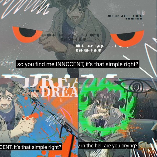
the next thing i noticed was that double has a lot of eye imagery. it's really interesting because it's like it's carrying over the feeling of surveillance from MeMe by replacing the camera povs that feel like spying on mikoto with more straightforward eyes on him.
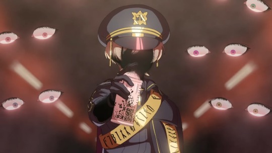
what else is interesting to me though is the way the eyes watching mikoto in double contrast with the eyes watching fuuta in backdraft. as far as i can tell mikoto and fuuta are the only ones in milgram with eye imagery? but there's a difference in that while fuuta's eyes are disturbing partly because of the fact that they're semirealistic, mikoto's in contrast are a lot more abstracted in comparison. i wonder what exactly the eyes in double are supposed ro represent, since fuuta's are meant to represent judgement. given the stylistic differences between them im really curious as to what the similarities and differences would be between how they both view being watched? i can't come up with anything concrete at the moment though.
3. across the train carriage
i think throughout double there's a kind of shot composition/framing that shows up a few times, and it's that orekoto and bokuto seem to be across the train carriage from each other.
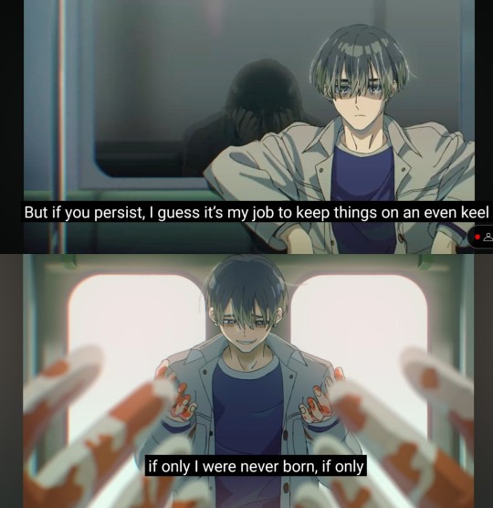
in the first image, it looks like bokuto is being reflected in the window behind orekoto, meaning he'd have to be sitting across from him in the train carriage. in the second, an identical pair of hands are overlapping orekoto's image, and since i doubt there'd be a mirror cutting right through the middle of the carriage in front of the doors, it'd have to mean that they're mirroring each other's actions from across the train carriage.

(you'll have to forgive me for it being in still images, i wish i could get it in motion but i am. not a gif maker. it's at roughly 2:16 though for anyone who needs it)
it also shows up in this scene which i like a lot!!! where the camera starts from a mikoto leaning haggardly against the train door looking at something behind the camera, who im assuming to be bokuto, before it pans up towards the ceiling and down again to the mikoto holding onto the bloody bat, who im assuming to be orekoto.
the Across the Train Carriage framing is really really really cool in and of itself and i love it!! but that panning shot has me rolling it's so good and i love it so much. the way it pans back down to orekoto so he's upside down makes it so disorienting and difficult to process especially with the scribbly effects over it. this could be reflective of how bokuto feels about this whole thing himself, but i donthave much of an analysis for this point, i just wanted to point it out because i think the directing of it is really really really damn cool
4. phone call home
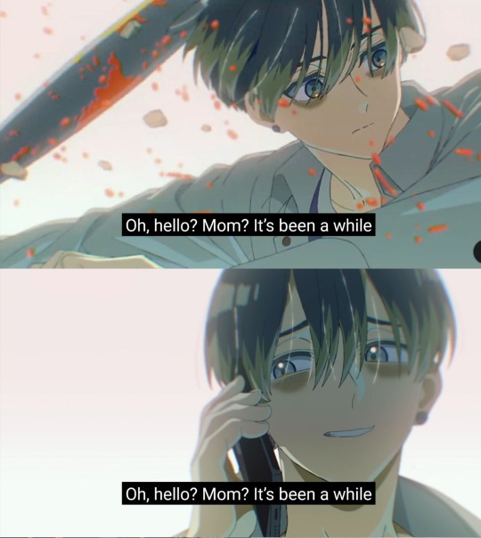
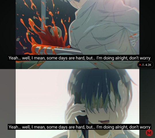
yea i don't have an analysis for this part either, i also just find this sequence of events really really cool. just—the calmness of the phone call over the flashes of orekoto violently 'taking care of' the things troubling them!!!! it's the juxtaposition of the mikoto who calmly tells his mom that everything is alright and he's fine vs the mikoto that takes care of things for him that allows that kind of calmness to exist in the first place. it tickles my brain
although there is the thing of: if people are right that the mv visually distinguishes between bokuto and orekoto through the presence of eyebags, it is a little odd that the mikoto on the phone also has eyebags, implying that the him on the phone is also not bokuto. and i don't know what that's supposed to signify, but it's a little interesting to think about.
5. glitching Next Station screens
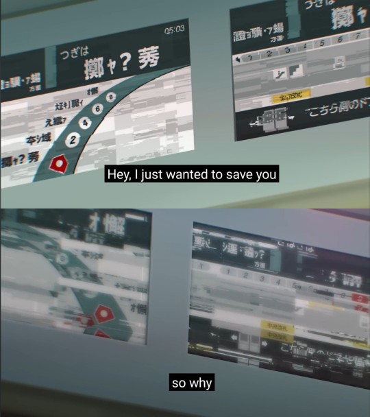
it's interesting to note that as the mv progresses the screens that show the train route and what the next station is get glitchier and glitchier. do any of the train station names correspond with actual train stations on the japanese train system? do they mean something else? im really curious, but my japanese isn't great and consists of only the 2 duolingo units i did like years ago, so could anyone please give me a hand with translating or point me to someone who has already translated it?
the constant appearances of trains in both MeMe and double is really interesting to me and i wonder what exactly it could be representing or what the significance of it is, especially since mikoto apparently bikes to work and doesn't commute on public transport
anyways, that's about it for all the things i took note of upon watching double the first two times, and i haven't done any especially deep analysis or anything. i haven't touched on all the mannequins either, mostly because im not reslly sure what they're supposed to represent and so don't really have much to say about them.
also hanae natsuki delivers a banger vocal performance once again!! ive never heard him miss in any of the roles ive seen him in, but he once again knocks it out of the park with mikoto. i haven't listened to mikoto's t2 voice drama neoplasma yet, but im sure hanae natsuki did amazing work on that once again, so im really excited to give it a listen!!
as for now though, i think ill have to look at everyone else's analyses of double to understand mikoto better, since even though i love him as a character and i like doing analysis im not as great at theorizing
#uhhhh first of all if the photos are kind of badly edited that's because im doing the best i can with the collage function in my phone's#gallery app;;;; so sorry about that#also if this is super messy and kind of hard to follow im also sorry about that!! i didn't really know how to organize the jumble of#thoughts about double so i ended up deciding rhat grouping them by point would be best#milgram#mikoto kayano#oh yea also sorry that allllll of my screenshots have rhe lyric captions still in them even though i focused on the visuals#i was taking the screenshots as i watched and was too lazy to go back and retake all of them hsbdbsbfjsd
15 notes
·
View notes
Note
Ayo has NASA ever shown any pics of Mars moons in it's sky? I NEED TO KNOW
a couple asks ago i showed an example of this. here’s a few more:

annular solar eclipse/transit of Phobos across the Sun from Curiosity.
transit of Deimos across the Sun from Curiosity.
Occultation of Deimos by Phobos as seen by Curiosity.
The telephoto cameras used for navigation on Mars are also capable of being used as weak telescopes. (I do not know how they safely get photos of the Sun, though. Even at Mars distance that would still fry the sensors--so i assume they must have put a solar filter on the instrument specifically for this use case.)
While looking for images I came across this really cool one from Spirit:

The bright moon-like glow is Phobos. The dimmer dot is Deimos. Towards the bottom of the image is the Hyades cluster, and the bright star Aldeberan. In the lower left is the Pleiades cluster. This is an approximately naked eye-like view (well, maybe 2x or 3x magnification), except that with the naked eye Phobos would not look overexposed.This is really striking to me because this actually feels like a view of the night sky on Earth, yet with alien moons. Really cool.
Here’s a labelled, overexposed version:

I don’t think there’s been any color pictures of this done because Mars rovers are not astronomical observatories and because there’s not much color detail actually visible in the moons. And I assume aside from the solar eclipse pictures these images were all taken at night, with pitch-black skies and nearly black horizons.
This evening or afternoon image depicting Phobos as seen by Curiosity is a composite image--Phobos is probably much brighter here than it would really look during the day on Mars.
Deimos is visible in this poorly white-balanced shot of Mars from Perseverence. The sky is green here but Mars’ sky is really more of a yellow or brown color.

Here is almost the reverse--seen from an orbiting satellite, here is Phobos against the limb (edge of the visible disk; horizon) of Mars. I believe terrain looks weirdly flattened and a little distorted here due to lensing from Mars’ atmosphere--you can see how the effect gets worse closer to the limb. A similar effect, but more significant, can happen when looking at the limb of the Earth from space. Space probes use multiple color filters to take color photos, but when it comes to fast moving targets it’s not possible to switch colors in time, which is why this image is in grayscale. Notice also how dark Phobos is--it’s almost black. It only appears bright against the even blacker space. This is also true of the Moon, incidentally, but the effect is even more pronounced with Phobos.
9 notes
·
View notes