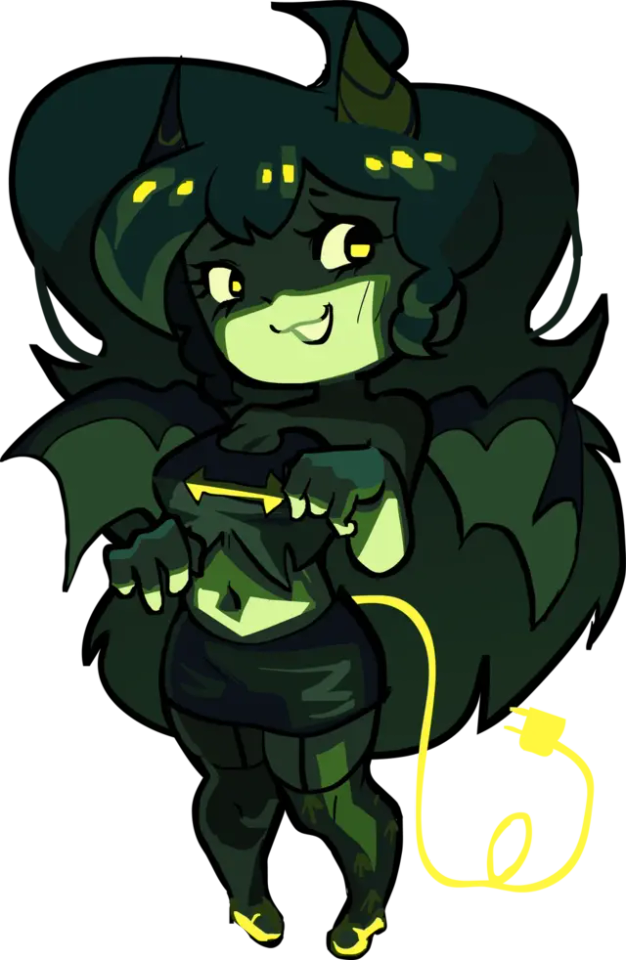
#i liked it black and white compared to my recolor
Explore tagged Tumblr posts
Visit Tumblr Blog
Explore Tumblr blogs with no restrictions, modern design and the best experience.
Last Seen Tumblr Blogs


Fun Fact
Tumblr was acquired by Yahoo for $1.1B in 2013.
Photo
cr: @kithtaehyung
#myg#min yoongi#yoongi#yoongi gif#suga#suga gif#bts suga#userbangtan#bangtanarmynet#armysource#networkbangtan#btsgif#btsedit#gif#agust d#agust d tour#d day#d day tour#ryen supporting the yoongi stans with all the juicy videos <3#i liked it black and white compared to my recolor#looks better on mobile than desktop
497 notes
·
View notes
Text
tips for 4t3 converters/CAS clothing creators
3 main things:
non-recolorable presets
DDS. settings
Adult to Teen conversions
disclaimer: i'm not a CC expert, but these are things i've noticed and learned these last couple months converting cc. special thanks to thornowl and the other converters in the TS3 Creators Cave discord.
Non-recolorable presets:
we obviously know that ts4 lacks a CASt tool, so ts4 creators rely on recolors. In my conversions, I do include a couple of the item's recolors. these usually are patterns that CASt does not have.
one thing I've noticed more and more converters doing is putting such item recolors in the 'Overlay' tab in TSRW.
let me show you what that looks like for a non-recolorable preset:
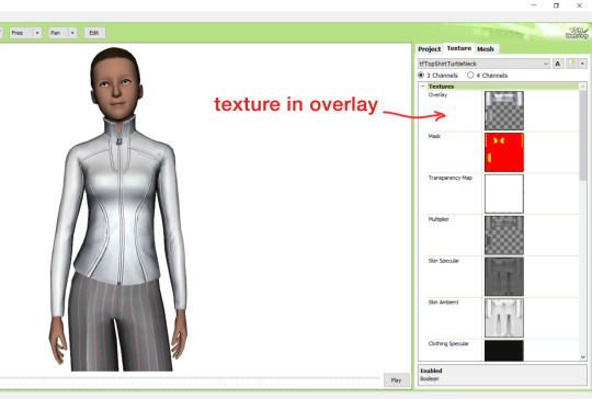
it looks over-saturated, and almost crunchy. but there's another place you can import the recolor into: stencils.
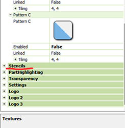
stencils will be found at the bottom, under patterns. hit the plus sign next to stencils to open it.
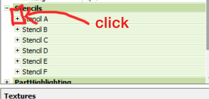
opening it will show you this:
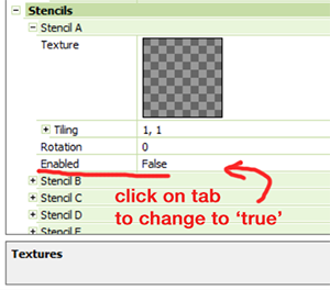
by default, it will be enabled as false. import your recolor into the texture tab as you would do for any other texture tab. make sure you tick the 'false' to 'true.' stencils override overlays, so if you want to use an overlay, enable stencils back to 'false.'
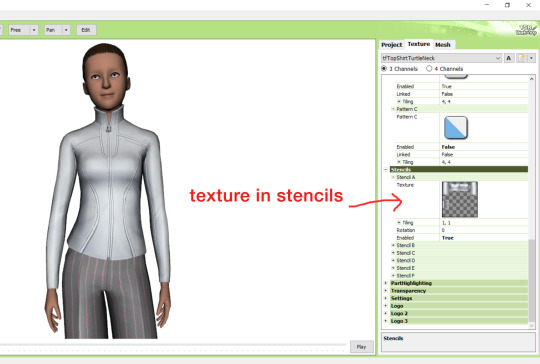
here's what the recolor imported into stencils looks like:
here's the two side by side:
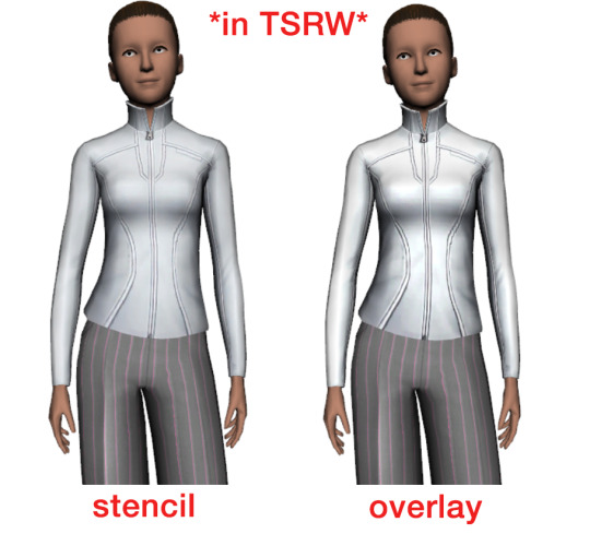
see how different they are? let's see how they are in game:
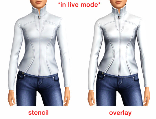
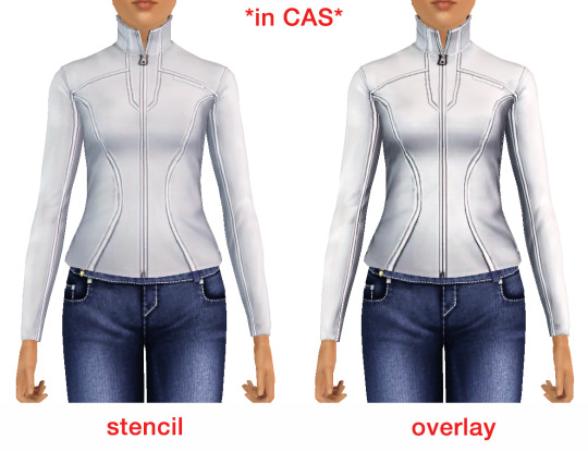
click on the pictures to really see the difference in quality. since TS3 uses DDS. format, it compresses the texture, which results in the crunchy texture. importing the recolor into the overlay tab makes the DDS. compression more noticeable. it ultimately is up to you and whichever one you prefer, but do keep it in mind.
the overlay tab is good for small details that you want to maintain on all recolorable presets, like zippers, buttons, tags, etc. just look at EA clothes for reference, especially their shoes and male clothes.
another thing you can see from the images are the bumps on the mesh. doing normal maps can help you keep those same details on the recolorable presets without importing the recolors.
-----------------
DDS. settings:
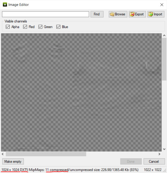
something I also see and used to do myself is bloat package files with large file sizes, specifically normal and specular maps, as well as masks. the Sims 3 Tutorial Hub provides a link to plain maps, but the file sizes are unnecessarily big.
let's look at some of EA's maps in TSRW:
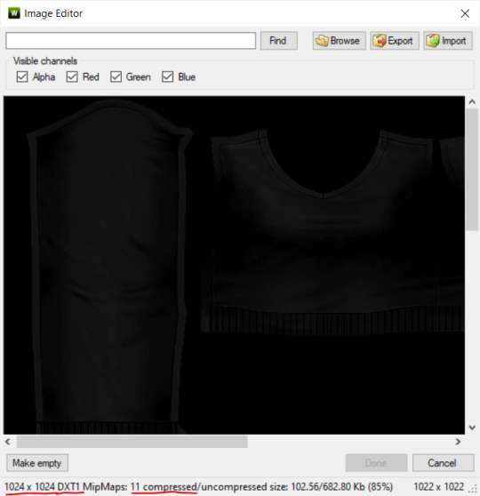
here's the specular from one of the basegame sweaters. notice the image size, DXT format, and compression size.
a lot of converters don't want the shine on regular clothes, so we use a plain, black specular map. but ask yourself, why do you need a 1024 x 1024 purely black specular map with no details?
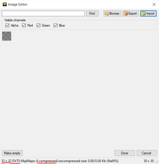
let's try sizing it down:
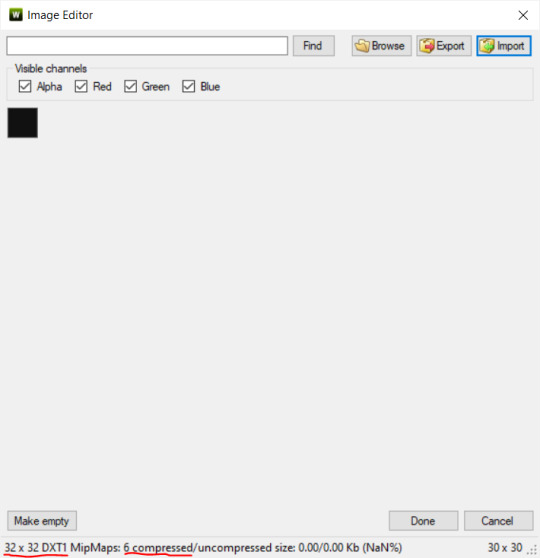
notice the difference between the image and compression size. instead of bloating the package file, we can keep it down by using a 32x32 plain black specular map instead, since there aren't details we want from the specular map.
same goes for normal maps:
and masks (meant for 1 channel only):
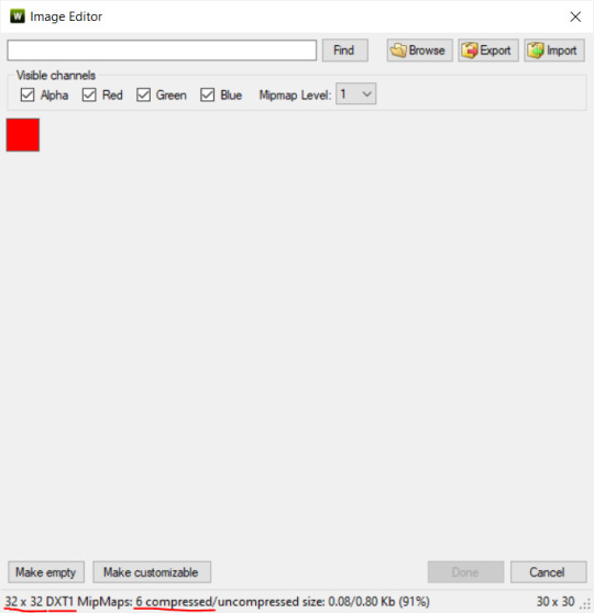
now, notice how I underlined the info about DXT MipMaps. see how the normal map has a different number there compared to the specular map and mask.
the reason these textures use different DXT is because of the colors and alpha channel.
here's how my DDS. settings appear when saving:
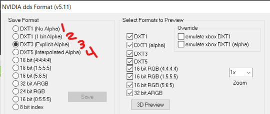
DXT1 (no alpha): this keeps only the 3 color channels and has the strongest compression. it results in half the file size as DXT3/5. 3 channel masks should be saved with this, as they don't need an alpha channel.
DXT1 (1 bit alpha): this includes an alpha, but only black or white. it also results in half the file size as DXT3/5.
DXT3: this one is rarely used for TS3 textures. it really is only used for overlays. it compresses the same as DXT5, but may not be the best for images with smooth-blended alpha regions (Neely).
DXT5: multipliers and normal (bump) maps should only EVER be saved with this. it's best for colors but has a larger file size. this is why it's important to reduce the multiplier and normal map image size, especially if you don't make a normal map.
if you DO decide to do a specular and normal map, they should be regular image size, 1024x1024, and saved in the right format.
here is more information on which textures should use which compression.
-----------------
Adult to Teen Conversions:
the default for converters is obviously AF and AM. a lot of people want the items for teens too. I've seen several converters just enable it in TSRW:
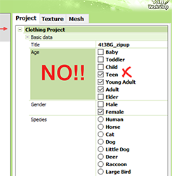
please don't do this. it's honestly the lazy route. you can hardly ever get away this, specifically because of the body differences between adult and teen.
some major issues with this include gaps, seams, and unnatural body characteristics:
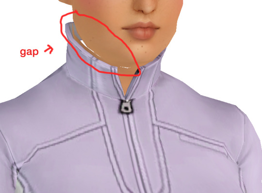
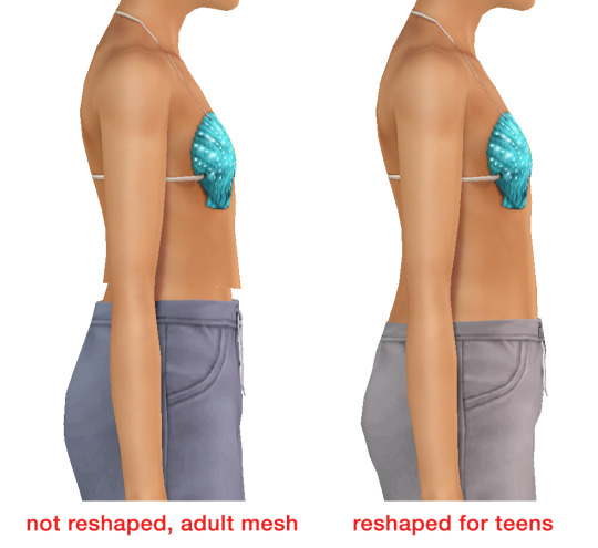
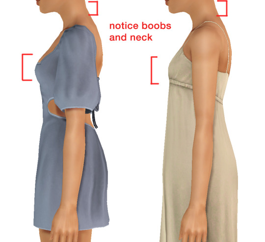
so please, either skip the teen mesh entirely or spend the time reshaping the mesh. @/sweetdevil-sims has a great tutorial on converting meshes from AF to TF here. the inevitable seams on TF meshes are also now fixed, thanks to @/thornowl with their new version of mesh toolkit.
@pis3update
---------------
here are reduced file sizes and corrected settings of the plain mask, specular, and normal:
download
Sources:
Neely, G. ‘Buckaroo’. Working with DDS/DXT Files. Available at: https://www.buckarooshangar.com/flightgear/tut_dds.html (Accessed: 28 May 2024).
181 notes
·
View notes
Note
which character had the best development?
This certainly is an interesting question.
After all, not all character development is good development. Some can turn characters for the worse, spiraling deeper into the dark side, and yet it is still considered as development. Sometimes, it's a mix of both bc it isn't always black and white. So if you think I would be choosing a protagonist, that's where you're wrong.
Surprisingly, there are a lot of good candidates who had well-executed development, some more subtler than others. But, in my personal opinion, 3 may have the best character development. I do understand how this may be a basic answer but it's true.
I've been watching this show over the years and I seen how much 3 has grown as a character and much like others have, his actions stemmed from loneliness. Take the YT arc for example: as much as he wanted to take over 4's channel, it really wasn't what he wanted. He wanted to be loved, to be remembered for his achievements. He then had the choice to redeem himself, which eventually we see more of his vulnerable side and insecurities. Becoming more and more part of the Crew. While he wouldn't admit it outright to others, he truly cares about his friends and have done a few sacrifices for them.
Now ofc, with the story alone, 3 and Puzzles would've been tied with the best development. But I think what gave the bonus point to 3 was his character model. From the start, being a Mario recolor, 3 was obsessed with 4 and wanted to be just like him. But over time, his redesigns have grown further and further from being 4's look-alike to be his own individual character. Transitioning from blue to purple, to having a beard. But it isn't a complete transformation as 3 still has insecurities, being compared to 4 and his success. His model changes alongside his development (a visual change) and that's absolutely brilliant.
thanks for the ask!
#smg4#smg4 smg3#ink answers#it truly was a close call between 3 and Puzzles#and now i lowkey would like a subtle redesign for Puzzles to show her current development
20 notes
·
View notes
Text
I never posted my Engage design headcanons in one proper comprehensive place, have I?
All the dragons have pointy ears. I'm sorry but that's a requirement for dragons. I'm ok with them being only a little pointy and still resembling humans more, but come on. Regular ears on dragons just feels wrong.
Way too many for Alear.
Present Alear's male design has his hair and eye colors swapped. Only a matter of personal preference, really.
May actually be the case in canon, but Past Alear's hair and eyes are a darker tone of red compared to how they are in the present. You know, just to further visually show how dead inside they are.
Inversely, Xeno Alear's hair and eyes are a lighter shade of blue compared to Present and Emblem Alear's. Lumera's hair color, more precisely.
As a Corrupted Alear's red hair and eyes start glowing. The more Emblems they reawaken the more they start looking like Corrupted Morion from the strain, complete with face cracks and blank red eye by the end of it.
Both of Emblem Alear's eyes become red when Engaging. Their partner gains blue eyes instead. (Unrelated but I like calling the form someone gets when engaging with Alear their Eternal form)
Alear done but the Veyle section is almost as long!
take that fucking collar and ankle chains off of her I swear to god
Xeno Veyle has short hair, wears a hood similar to Eveyle except its design is meant to not stand out instead of looking, well, evil. Also while Main Veyle prefers her tome, she favors her dagger. All of this based on my view of her as a stern, aloof leader who's trying her best to help while remaining undercover from the like, two lines we get about her.
Fell Princess Veyle (as in, postgame Veyle but before she becomes the Fell Queen) has an outfit a bit more practical to move around (since she's mainly spending her time in Gradlon and that place is hell to navigate) and also starts incorporating a bit of black into her outfit.
Oh boy. Fell Queen Veyle. For starters she obviously looks more regal and refined (also she's an adult by this point), her new dress has black as its primary color while still being welcoming and she obviously wears a different crown compared to Eveyle. Speaking of her,after accepting her as part of herself and merging with her in an hypothetical final Engage DLC I'll hopefully talk about in a future post, one of her eyes becomes red as proof of it. The opposite of Alear's red eye, in fact.
Four Winds
Let's not kid ourselves, their designs are recolors at most because IS didn't want to make new assets for them. So!
Zelestia's battle outfit is much more clothed, warm and comfy because you CANNOT convince me she would wear the same skimpy clothing as Zephia.
Similar case with Gregory. Either a similarly cozy outfit or something to make him not stand out. Heck, maybe even some armor. Either way, no way that man goes in a fight with his chest almost bare.
Madeline's armor is way more practical, with no ribbons in sight and probably taking some cues from Mauvier's outfit. Let's be honest, she probably outgrew ribbons years ago.
Conflicted on whether or not Nel should have gotten partially white hair. On one hand it would make sense given that's what happened to Alear, but at the same time her design is already peak and I finding myself liking her regular hair way more, so...
#fire emblem#fire emblem engage#fe17#fe17 spoilers#alear#veyle#zelestia#gregory#madeline#nel#my headcanons
23 notes
·
View notes
Text
FNF CONNECTED UNIVERSE LINE UP Part 2: The Girlfriends
Yippee, new line up. Didn't have as much trouble on this one either.
Idk how much yapping I'll be doing, since I don't really know how much I have to talk about.
But still
Close ups and yapping under the cut
Alternate Universe Girlfriends
So just like with the Boyfriends, all these Girlfriends are technically all the same person, just from different universes. So I tried some elements of their designs consistent between them all, which stem from my base game Girlfriend design.
Unlike BF, there's a good bit more to talk about with GF since I draw her pretty different compared to her in-game design. The main thing is her more apparent demonic traits, like her horns, tail, and purple splotches. The explanation for this, in universe, is that she doesn't have the full power to cloak herself yet. See, her and her family are "music demons", which gain their power by leeching from music, usually a particular genre. GF hasn't really decided what genre to leech from yet, so she isn't as powerful as she could be. She also has a coat cuz uhhh. Silly. Things like her demonic traits and her coat (Or something of similar shape like a feather boa) would be the things to connect all the AU GFs.
Moving on, we have Herself, who I was looking forward to drawing the moment I started this line up cuz I had just. Such a clear vision of her in my head. Although it was a struggle to put that vision on paper.
It's hard to put the exact vision into words, but it's like having her form become less defined as it goes downwards, until it's just the wispy silhouette of her hair. There's a certain balance you have to strike with the wispy nature of her form and the trademark Girlfriend hair shapes, and that's what ended up being the biggest struggle. Once I figured that out though, it was pretty simple. Shapes were the most important thing since her coloring is pretty monochromatic. Not counting the black, this design only utilizes two different colors, both being shades of red. Her design includes a feather boa instead of a jacket, mainly cuz I completely forgot about that rule when I got to her and the boa was a lot easier to add than a jacket. It also makes an interesting shape I think.
Next is Funkadelix, and she really wasn't too hard. The main thing was giving her traits from my main GF design, which wasn't hard at all. For her horns I referenced her Halloween attire. Her tail too, sorta, but I mainly just referenced the thinness of it.
There isn't all too much to say about MDM. There wasn't a lot to change or add. Main addition was the boa, which was admittedly kinda fun to draw in my style for that AU.
Now onto Mix. If you saw my post yesterday about the doodle/sketch pile for this line up, you might've seen a design concept I did for Mommy Mearest, and that was literally just for Mix's design. Except it was virtually pointless cuz I didn't really include any aspects of my MMM into my Mix design. It's fine though, I think she turned out fine. Might take another pass at her in the future when I ACTUALLY have my MMM design figured out.
Lastly for this section, HD. I actually had quite a bit of fun drawing her. Don't really got much to say about her though. I'm pretty sure she was the first AU GF I gave a boa, so she's the one that started that. It was originally going to be all white, but my good good friend @minxtheeenby suggested it fading into black, and I really like how it turned out.
"Side" GFs
So first is Belladonn (B-Side). I know I wanted her to appear more sophisticated. That's just always how I imagined her, even back well the mod was still a simple recolor remix mod. There's also something so fun about classy characters that are also dangerous. We need more regal women that carry around bats full of nails. I had a lot of trouble nailing (pun not intended) her hair. The main thing that sets it apart from the traditional GF cut is her side bang (idk hair terms, I think that's what it is), but besides that, not much else. So I had to mess with it a bunch to get something I liked.
Amelia's (D-Side) design was pretty straight forward. The main thing was just adding a few more details to spice it up a bit. Which just happened to be buttons on her jacket and lil heart patterns on her knees. I also wanted her to be short. Cuz idk, she gives short vibes. A lil idea for her that isn't showcased here is that I imagine her pigtail buns actually turn into her horns when she is in her demon form. (Bad doodle, but just to show the concept:)

Lizzy (G-Side) was kinda fun to come up with ideas for. Most of her design is taken from the fake teasers for the mod, cuz silly. But because her mom is some sort of light spirit.. thing, I wanted to mix that in somehow too. So that's where the white highlights on her horns, hair, and tail come from, but that's not all it added.
She also has pretty funky eyes, that are somewhat inspired by Shara Ishvalda's eyes
Also, in that doodle, I imagine all of her hair is floating, I just. Didn't feel like drawing her pigtails cuz I mainly wanted to highlight the eye thing.
The New Yorkers
With Shaya, I mainly added a bit of stuff to her outfit, since the original is too simple with my design style. I basically just added a bat wing shape motif to her design. Cuz. Cuz vampire. This is also present in her ear shape cuz I didn't want them to JUST be pointed, cuz I wanted her to stand out a bit more from the demon girls. So different ear shape.
I don't really know how much Azalea (Neo) changed. I know I changed her hair a bit (to further differentiate her from GF) and I altered her top a bit but I THINK that's it. I did change her and her family's lore a bit though. Cuz I made them robots. THATS RIGHT, THIS IS WHO I WAS TALKING ABOUT WHEN I WAS TALKING ABOUT MAKING ONE OF THE GIRLFRIENDS A ROBOT. Azalea's pretty android-esc, but I imagine her parents are just full on robots. I can't wait to design them. But yeah, I imagine Azalea is much more human looking because she just wants to be part of human society and her parents love her so they got her the more human looking body so she could live out her dream. We love supportive parents *explosion emoji* *explosion emoji* *explosion emoji*
Not much to say about Grace. I just gave her a bit of melanin cuz apparently she's mixed. That's all I really changed tho.
I don't think I changed Judith MUCH. Her face is a bit more. Wolf-like? Idk. I also TOTALLY didn't reference Clawdeen Wolf's hair when designing her. Totally not.
Vikki (Minus) is grouped with the New Yorkers cuz. There's only one of her. Unlike the Minus BFs. I just made her a lil more goth, since people literally call her "Goth GF". Also made her hair a bit more blocky. cuz. cuz the minus symbol. Shape *sparkle emoji*
Who the Fuck Knows (Miscellaneous)
So starting with Cherry (Swappin'), in this AU she's actually GF's younger sister. She also already has a music genre to leech from (rap), so she's better at concealing herself. Not much else to say, I did not change her design much.
Nothing much to say about Barbara either, I barely changed her.
Now Astra (Starcatcher) was fun. While I was initially sketching her, I realized that both her alien species and the Alien Hominids have the same style of classic antennae. So I decided "Huh, what if their species are related." So I did that. Not much else to touch on besides that.
Tootsie belongs to @minxtheeenby and is part of their Sunday Night Snackin' AU. I drew her with her wings and tail out, which aren't usually out, but uh. Silly.
Belletrix didn't really change as much as I was expecting her too. The main thing was just. Making her an imp that could exist in the Hellaverse. Which was pretty easy. And then I just made shit up when it came to her outfit cuz it was kinda hard what was going on with that in the first place.
Next is Gabriella, YIPPEE. So she's the GF from Plants vs. Rappers. Vastly different appearance wise though, cuz, yknow. Can't have her look too similar to GF. And just like I did with Dennis, I decided to base her on another zombie from Neon Mixtape Tour: The Glitter Zombie
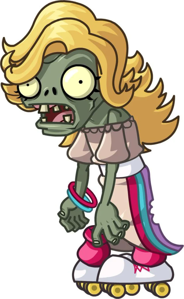
Idk, I thought it'd be cutie patootie. And it was. I really like how she turned out. I got lazy when it came to her flag, I did not feel like drawing that shit.
Last but not least is Ashley, the GF from my own AU. Which does not have a name. Idk, it's mainly just an excuse for me to draw anthro Monster Hunter monsters. But yeah, she's an intersex Leostra (Gender neutral term for the Teostra/Lunastra species that @sleepymushrxxm came up with) and I love her.
That's all I got. Gonna hopefully start working on the Pico's here soon.
#ashedwings post#ashedwings art#fnf#friday night funkin#friday night funkin’#wingz!ng au#fnf mod#ashedwings design#fnf mods#gf fnf#fnf gf#girlfriend friday night funkin#fnf girlfriend#fnf au#long post#ashedwings ramble
96 notes
·
View notes
Text
The Real and Artificial light
Weak-ass not-essay about relationships in Dual Destinies
CW: dual destinies spoilers (as always)
So hear me out. Color pallettes and meaning.
Both Fulbright and Athena can represent the sun/light as the opposition to the Blackquill's darkness.
Ever on and on. I continue circling with nothing but my hate in a carousel of agony.
Fulbright is literally a white man jumpscare. His outfit is white. With the only exceptions of his shirt and a tie. I mean, it's still just a recolor of Damon Gant suit, but let's ignore that for a minute. He has a "bright" in his last name. He's emotional, loud, sparkling idiot. His costume is perfect as a total opposite of Simon's black.
Athena's suit is brightly yellow. Most of her designs includes moon as a main theme: bunny headphones and bunny purse when she was a child, and moon earring now. But she can be compared to the sun. She's also loud, active and publicly emotional. Yellow color is not opposite to black. Well, as much as white and black. But it's higly different in brightness/saturation scale.
Both Athena and Fulbright acting like they want to help Simon.
Fulbright with his reformation plan. Self reflective essays and electrocution included.

And it's obviously extremely stupid and fake pretentious bullshit because it's higly implied that Bobby knows the date of execution. He's playing the role of the good guy, but not being a good guy.
Never gonna give you up, never gonna let you down. Oops, I lied.
Athena, on the other hand. Turned her life around, Phoenix Wright style, to get him out from prison.

She can't force him to do anything. So she is working from the point of compassion. Trying to understand why he lying about being a murderer.
And it's a big difference tonally. Pushing from outside VS waiting for a person to open to you.
Fascinating.
Anyway, Aura choose the third path. PUSHING EVERYONE ELSE. ROBOT UPRISING.
#ace attorney#ace attorney spoilers#simon blackquill#athena cykes#bobby fulbright#most of this post is my incomprehemsible blabbering#but you see my vision right#this guy is fake#a total fraud#and it is something that he always was
34 notes
·
View notes
Text
TIPS on drawing BIPOC ocs!
Soooo I recently did a collab with another webcomic creator, if you have seem my last post you know what one : ))
as soon as I saw the wonderful artwork I received I noticed something that felt off to me, it's lin's skintone.
This is my Oc Lin Peckett (main character of my comic I Love you Lin peckett)

I never specified her ethnicity (which is my fault on my part) I thought people might know by her looks that she's a POC. specifically she is black/Mexican mixed (I believe blaxican is the term used sometimes)
here are some examples of people I based her off of aesthetically
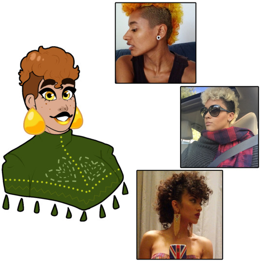
they are all people of color, share similar skin tone and hair as her. these images are good inspiration to use!
these women in these pictures are all women who are black/Mexican
I used the eye dropper tool to pick 3 different shades of color for comparison, notice how multiple shades are similar to her skintone
lin has tan skin thats more on the lighter side, sometimes her skin tone changed depending on the lighting but her main color is tan. she has lots of warmer tones compared to cooler tones, so keep it more on the yellow side than red/pink compared to other skintones. you can see a difference between the top and middle one than to the bottom one.
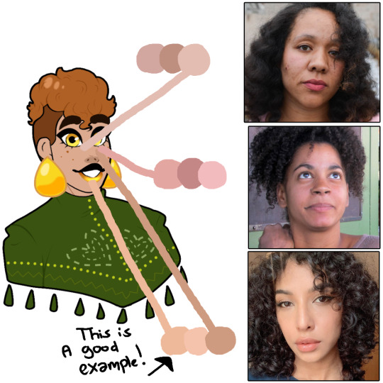
here are some white women to compare lin's skintone to
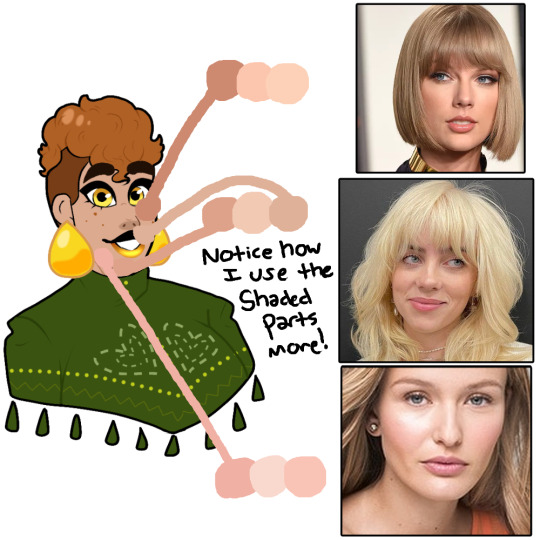
notice how some are similar to her skin, you might think ok so she's white NOPE, look a second time and notice how the color that matched best with her are the parts of these women's faces that are shaded or shadowed. using these women are not good references and if you notice most of them have more pinker tones, lin has warm toned skin.
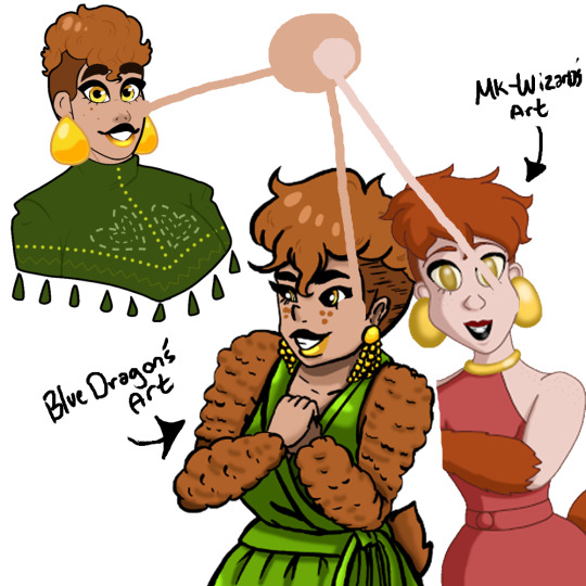
heres two pieces of artwork I received recently of my oc lin, (both by wonderfully talented creators I'm grateful to get art from) but notice how bluedragon's artwork is the same as lin's. that's because she used an art programs best friend
the eye dropper tool!
this thingy?
it's literally in every single art program ever created, yes even mspaint
use it if you're not sure what skintone to use on a character!
but back to that drawing, you can see a big difference between the two pieces the one on the left by bluedragon is accurate. and the one on the right is by mk-wizard which has lin is very light skin. which is just not correct lol

so let's use are little friend again (the eye dropper tool) to recolor lin with the skintone used in mk-wizard's artwork. as you can tell it's a BIG difference! lin would be a unseasoned piece of chicken if I colored her like this lol (get it …chicken.. HA)
so my final notes to this long post is, please study the character you are drawing a bit more, ask questions. I know this artist isn't whitewashing lin purposely it's an honest mistake that could be anything from different computer monitors showing up different tones? or them being inexperienced drawing POC? which you have all the time in the world to keep studying while drawing! it's okay to make mistakes and learn from them : )))
also this isn't a "callout post" or anything negative towards the artist, this is simply some advice not just for them but for every artist.
I hope this helped in any way possible? and if I missed anything or made any mistakes pls educate me more on drawing BIPOC! I love to hear advice <3 anyways have a good day and drink some water bye~

#i love you lin peckett#iloveyoulinpeckett#webcomic#web comic#lin peckett#oc#indie comic#art advice#drawing bipoc#drawing tips#art tips#art help#art tutorial
79 notes
·
View notes
Note
Not completely sure how to word this and sorry about it being so long, but do you think a good way of making it make sense that Billy & Tommy are not white but were born to and raised in white families with no concerns about adoption or affairs or anything that both of their families assumed that what’d happened was something like what’d happened with Liam in Shameless US? If you’ve never watched that show, basically Liam was born to Frank and Monica, two white parents, while looking fully black and being played by a fully black actor, and basically they explained how this was possible in-universe by saying that Frank had one black grandfather, and somehow because of that, Liam turned out to look fully black, so basically my idea is that Billy’s & Tommy’s parents each had like one Desi or Romani close ancestor, and they just assumed that they turned out to be brown because of them.
I want to clear up a couple things here-- first of all, Romani people are not desi. The diaspora originated in what is now India and Pakistan, but we are not interchangeable with modern-day Indian or Pakistani natives. Second, that Shameless storyline is weird as hell to me, on several levels, and I would advise you to never compare it to real-- or fictional, for that matter-- mixed-race people or families. I come from a mixed background, and I will admit, genetics are crazy, and you'd be surprised the way features can skip a generation. But casually and retroactively making an entire family of white characters, played by white actors, part Black for laughs is not what I'd call authentic representation.
I actually answered a very similar question a while back, and you can read that here. I recognize that acknowledging Billy and Tommy's heritage and/or depicting them as people of color creates a weird discrepancy, and there's no perfect solution to that. I think if Wanda had been drawn or more commonly recognized as a woman of color back when Young Avengers was written, we probably wouldn't have this problem-- most writers, I hope, would not choose to magically turn characters of color, even babies, into white people.
I do actually think that giving the Kaplan and Shepherd families mixed Romani and Jewish heritage is the easiest solution, but not if you're going to frame it the way Shameless did. I also think it's actually important that Billy and Tommy were not fully aware of this heritage growing up, or that they each arrive at different parts of their identities differently, because that is a real experience within diaspora. Having that experience represented within this family adds to the diversity of the story.
As far as character design goes-- if you assume that their parents are white-presenting, it might be more realistic for the twins to be somewhat lighter or more ambiguous in appearance than Wanda, just to diminish the obvious questions. But these are also magical cartoon characters, and Wanda's canon design is not that dark in the first place. It should be pretty easy to suspend disbelief, especially when we don't see the Kaplans more than once a decade. I've been using edits and recolors to make my point about representation for years, but at the end of the day, I think the look is a lot less important than understanding Roma identity and the historical context these characters exist in.
Additionally, I think that Billy and Tommy's unique situation makes the most sense if you view it as a metaphor for transracial adoption. It doesn't answer the practical questions about their birth or looks, but it is a real experience that maps very closely onto these characters and their identities. For Romani people, in particular, this is a very sensitive part of our history that ties into where the Maximoffs come from and what they've been through. Exploring that experience, even through allegory, adds a lot of depth to the representation these characters provide.
9 notes
·
View notes
Text

Just finished drawing my ref for my newest discovered kintype!! I wasnt sure if I was fully white or if I had black marks but when I recolored the pupils from black to the red that fully albino rabbits have something clicked and made my brain go YES thats me and that only happens in fully white rabbits lol so I am glad that saved me the trouble of drawing a bunch of black marks and comparing it haha.
This isn't a fursona version of my kintype, my kintype is actually a furry bunny like this! I think I might also have a normal rabbit form as the same bun, which is interesting since I am not sure how that would work in a spiritual kintype sort of way, like was I a shapeshifter? A lot of fursonas do have the furry form and the normal animal form which is interesting that my kintype would work that way as well. I am really curious about like, what that means spiritually or psychologically?
As I was making this post I was comparing different lop ears to talk about which ones seemed most likely but comparing them side by side and reading more about them as I made this made me realize I am definitely an American fuzzy lop, their faces are better (as in closer to mine) than a holland lop and they grow wool like an angora which I related to but felt angora wool was too long, and american fuzzy lops grow it shorter. Aaah so happy to find it! I cant find a red eyed white image of them but I would be shocked if they didnt exist.
9 notes
·
View notes
Note
hi, your overlay tutorial is sooooo beautiful! I wonder if you could make tutorial for overlaying image and gif as seen in this Natasha edit /post/693119366952288256/pscentral-event-06-favorite it's sooo beautiful!
Hi there! I just want to make sure you know that I am not the same creator of that gifset, but I can definitely explain how this person made that gifset.
This is the Natasha gifset, as you can see it’s gorgeous.
Before I begin I want to start by saying it’s totally fine to take inspiration from other gifs, to see something that someone has done and replicate it in your own way. With giffing, at the end of the day, we’re all using the same source material, the same amount of scenes and minutes of screen time to create something so there are going to be similarities in gifs across the same fandom. However, it is never okay to steal someone’s gifs and repost them as your own, nor is it okay to directly and blatantly copy someone’s gifset frame for frame to post even if you make the gifs yourself. Copying to learn a technique is fine so long as that gifset stays in your drafts or stays in your groupchat.
It is always a good idea to give credit where credit is due when giffing, in that if you use a text post/tweet/a specific set of graphics or theme, to credit the person you got the idea from by linking back to where you got it.
I’m assuming you’re asking specifically about the third gif. The process is going to be similar to the one I detailed here, however the gif on the left has either a grayscale or black and white filter on it, or you can even open a Hue/Sat layer and take out as much saturation as you want. It all depends on the look you’re going for!
The gif on the right has cyan added to it, whether they did that with a brush or layers idk and I’m not going to try to recreate it exactly, so if you want to know for sure I recommend asking them. But I can show you a similar process with Photopea, which is what I’m assuming you’re wanting (although to be completely honest I primarily use Photoshop now😂😭)/
Lately in my own gifs I’ve been doing blend types other than Lighten (like Screen for example), and this kind of looks like that but I could be wrong! Again, it all just depends on what kind of look you want, the vibe or aesthetic you’re going for.
The tutorial I make for you will use Lucas from Stranger Things S4 because that is the only live action on my hard drive at the moment😂😭 I mainly gif anime now (anime sideblog: @icythot-bakubitch) and I could absolutely do a tutorial with it but it won’t come out the same as what you’re wanting to see.
This tutorial is made on the basis that you already know 1) how to make a gif 2) how to make overlays and 3) have a good sense of familiarity with photopea/photoshop.
If you don’t have those things, you’re welcome to look at my other tutorials:
Make A Gif | Anti-White Washing (BBC Merlin) (OFMD) | Overlays
Please remember that this gif is made with Photopea and not Photoshop, so there is going to be a deficit in quality compared to the set you’ve shown me. Your quality will come out much better if you’re able to use Photoshop.
Basically all I really did was add a Black and White layer to the bottom gif, making adjustments to keep as much quality as possible and adjusting the brightness to my taste. The original gif is already pretty dark, I probably should have picked something else but for a tutorial I’m not that pressed.
On the top gif, I used Selective Color and Hue/Sat to change the cyan of his background to purple.
Using a soft round brush I cleaned up their faces and got rid of any parts of the background that I felt was too distracting.
Attached below is a side by side of the original and recolor respectively, and then a screenshot of my layers.


Again, this is my way of doing things. It’s going to look different from someone else’s. Focus on finding a style that you like and that works for you. Just because a style of giffing is popular or something a lot of people are doing doesn’t mean that you have to do that.
I’m sure there are better or more efficient ways of doing things as well! And there isn’t one set way of doing things, this is not a be all end all of doing overlays or giffing.
If you have questions regarding the Natasha set more specifically, I highly recommend asking the creator personally. All I’m doing is explaining the recoloring process when it comes to overlay gifs as it applies to Photopea.
#stranger things#tutorial#photoshop tutorial#photopea#gif tutorial#lucas sinclair#liongifs#my tutorials#asks#anonymous
20 notes
·
View notes
Text
Goncharov: The Red Edit predates Schindler's List by 5 years and I'm tired of the claims that it's a derivative piece of stunt editing. The exclusive use of red explores Color Theory, and, if I may be so bold, Color Perception. By which I mean not only the emotions and esoteric concepts ascribed to colors, but also the myths,l egends, stories, and sayings that inform those emotions and concepts.
The Red Edit renders the world of Goncharov in black and white, linking it even closer to noir films of the early 20th century, with red being recolored where it was present before, with two notable exceptions.
This, to me, highlights the commonalities between the two sides, as the Italian and Russian flags both feature prominently. The viciously brutal and cathartically gory action scenes, (Often mistaken for a Hammer Horror pastiche, but is more likely a response to and exaggeration of the gore present in Twitch of the Death Nerve (1971)) take on a different, more melancholy tone, specifically when compared and contrasted to Katya's pining and romantic scenes.
So before we can discuss the ways in which the actions scenes are reframed, we must discuss the first notable exception to the use of red in the film. Katya's pining and romantic scenes are tinted rose-pink, a clear play on the phrase rose-colored glasses. They are not uniformly pink, merely the red that Gancharov or Andrey are wearing is instead pink, including the blood on their clothes when they first fight over her and Goncharov leaves Andrey for dead with a bullet in his chest.
(Sidebar, totally lost it the first time I saw this and Andrey came back, the explanation of his heart being on the right side of his chest, and the confessional scene with the priest where he admits Goncharov stole his heart anyways, *chef's kiss*)
Goncharov actually introduces pink to the film first, the blood of his enemies as he storms through the Russian safehouse for Katya is initially confusing, as we've seen blood as red previously in the film, but is contextualized by Katya's use of pink to mean that Goncharov loves something about this violence.
Through out both Goncharov and Katya's development, the pink darkens to red as they grow and shed their naivete and selfishness, coming to empathize with their enemies.
Lastly, the use of the color red is altered in one other specific context, and is often mistaken as homophobic. When Andrey and Goncharov finally kiss, the strand of saliva that lingers between their lips on the close up is red. While the creator (a gay Korean-Italian man whose gows by the name Amedeo Amadeus) has stated in interviews that it was meant to symbolize the Red String of Fate and the concept of Jung, not blood.
Given that the scene is, in it's original context, explicitly homosexual; deliberately shown and framed to not be an attempt a CPR, it is unrealistically tender, and passionate but not fetishistic, it's somewhat suprising that anyone would mistake this as a censorship edit.
However, the creator stated that this was actually meant to symbolize the acceptance of a marriage proposal, which was his interpretation of Goncharov's last line, spoken to Andrey but unheard by the audience.
Before I can recommend the Red Edit, however, I must recommend those at risk for seizures instead watch the Re:Red Edit, as the original Red Edit my cause episodes bc of the way it was made.
When Goncharov released in 1973, it was in color, and the Red Edit achieved its black and white capture by handcranking a film camera aimed at a theater screen displaying the color movie. despite the creator's best efforts, there is an unavoidable flickering at times, as the hand crank desyncs from the projection.
In conclusion, no matter how you watch it, the Red Edit is astonishing peice of critique, a display of technical skill, and an artwork in it's own right that deserves better than to be derided as a derivative of 'that one Schindler's List scene'.
5 notes
·
View notes
Note
Do you agree with the complaints about Thunder's shape and coloration? I don't necessarily see a problem with either, but a lot of people complain about him being bulbous, some even saying that about the chest area, and I get why people think he should be more white than black, but consider the fact that the black coloration might be a dominant trait. After all, Light Furies are a subspecies.
Kinda yes and no. I don't like Thunder model. simple. I think he's more shaped like RR than night fury, hard to explain in word but like he is taller/higher build compare to NF low built, his legth is shorter, each section of his body is more seperate than the flowly blend together that NF and LF shape feel. He is less steamline. I feel like the contribution to this is also because his default stand is quite different from NF stand. It's uptight. If comparing the model seems unfair then comparing the toy might give the better idea? When he flies he also have his neck held up instead of forming a steamline shape. Might be a weird inaccurate comparison but I feel like his model is like if you put the shape together where as NF are like start from the same shape being carved into that form, does that make sense?


(Though, Thunder has moments of hunching down to make the body more steamline like NF and honestly he looks a lot better when he does that. It's few and far inbetween though)
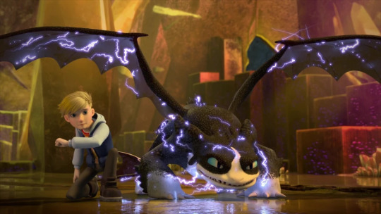
All this which I did speculated that it's due to stylize difference at first as I have pointed out that his 2d rendition is more shaped like NF but then more dragons that has the same style and design as the first series and movies come up and now I'm not so sure anymore
That being said. I don't actively hating it either, seeing him in motion and three season in and he's not as bad or the worst thing in the world as people made it out to be. He still feel like a fury and it's not like Toothless from the series didn't suffer every disease too. (compare to the movie at least) I dislike series toothless as much.

Going back to the topic of shape, and the "no" part of my answer. I don't have problem with Thunder's sharper shapes (wing tip, tail, or even the shorter wingspan). I feel like that's a deliberate design decision. Instead of making a recolored night light as the main character, they make a specific shape and body for him that play well with what they're going for him. It's like what they do with LF too, make a specific shape for her. Thunder is given a sharper NF shape that invoke the feel of thunder and I respect that. I like that they do that for him(and I still hold on to him being skrill relative) and although I hate the snout I think that part is deliberate as well.
weird chest? yeah I noticed but it didn't bother me much. As for color. Eh I heard that even the original three night light color isn't scientifically accurate either so I've never care about applying that logic, you know. Dreamwork isn't make him black with the intention that he's the product of incest. The Night lights in the third movie enable them the possibility of black and white NF and they just go with it without thinking too much about scientific. Same with how Nightlight being a hybrids enable them to create more hybrids despite the dragons not looking compatible. the door of possiblity simply just open and they took it and run with it.
TLDR; Don't like the model but don't have problem with the overall design. If he's in other medium that's not that 3d model, like maybe I draw him while keeping all the design, then he's alright to me.
#long post#httyd ask#thunder#the nine realms#httyd#how to train your dragon#night fury#httyd nine realms#httyd the nine realms#dragons the nine realms#dragons: the nine realms
11 notes
·
View notes
Note
-shyly raises hand on anon cause were not mutuals- plz? I love rambling about fnaf theories and being rambled to about fnaf theories
AW i got you anon <3 lemme copy & paste from the convo i had with my friend!
"i'll just start from the beginning
shadow bonnie first shows up in fnaf 2 and is basically this void - like, completely black except for these white pupils - version of toy bonnie. that part doesn't really play into my theory, the important part is that he is bunny/bonnie-shaped
THEN there is also shadow freddy - shadow freddy shows up as a literal recolor of golden freddy, sitting in the same position as him, just a lil more...purple, you could say. he shows up in the office every so often as an easter egg (as does shadow bonnie). they dont ever really hurt you, theyre just there
SO. my theory basically hinges on their roles in fnaf 3
in fnaf 3, shadow freddy reappears in the sense that he lures the animatronics to the safe room (the same place where william afton killed the children) and he dismantles them to get rid of the evidence
AND shadow bonnie reappears in one of the minigames where you free the children's spirits
so in essence, shadow bonnie is "good" and makes an effort to help the kids, but shadow freddy is depicted as "bad," luring the kids - via the animatronics - to their dooms
and :))) in the books, right ? guess which suit william afton used to lure the kids. because...it wasn't spring bonnie. it was fredbear
so. spring bonnie is the suit william died in, right? and fredbear is the one that he killed the kids in-
so my theory is essentially -
william's spirit got fractured when he "died." like, the fragments of himself that possessed each suit split off and formed their own identities, essentially, and i'll go into this in a second
shadow freddy represents the more violent, evil of himself - the one who is only ever shown, yknow, killing the fucking animatronics in the same way that he killed the kids.
whereas shadow bonnie might represent an aspect of himself that is more remorseful - maybe some part of him, way deep down, actually did care. and that's why the only shadowy bunny character - the only match to shadow freddy - is shown caring about the kids, trying to save them. maybe it's an act of atonement, yknow??
as for why it takes on toy bonnie's form in the second game, i think it's because this part of william is more unstable (probably because it got shoved deep down for so long and it doesnt really have much of an identity as a result??? idk if that makes sense but yknow. its just like "im a bonnie i guess ill just cling to that")
and thats also why its minigame might be so glitched, even compared to the others. like.....shadow bonnie is all over the damn place, and his form is constantly unstable. so like??"
#long post /#{ SHOUTOUT TO ATLAENTIAN FOR TELLIN ME HOW READMORES ON MOBILE WORK }#{ tumblr why }#🎬 || it's make believe inside your head. (headcanons.) || 🎬#🎬 || time for bear. (ooc.) || 🎬
9 notes
·
View notes
Text
This is unrelated to anything but yesterday I was walking the pups and one of the kids told me they liked my hair.
We also got a cheap flagpole that keeps falling apart and someone stuffed it in our little mailbox instead of letting it fly away.
And someone moved one of the doors we tossed by the road to be picked up because we forgot to.
Legit this is the nicest neighborhood I’ve ever lived in.
And yet I can’t help but think if I talked about this in Alabama, a lot of people would be bewildered. Cause B and I are a couple of white folks that seem to be the only white people on an all black street. Hell, baby me would’ve been confused.
But comparing that to the street I grew up on -- meth house that blew up, my mom nearly getting a CPS case on our next door neighbor (legit, she only didn’t get it because the office realized it was literally our neighbor. She joked she could’ve just walked around the fence to conduct business. Glad she didn’t get it cause dad was a violent alcoholic), the constant open and closed CPS cases on our other neighbor.
Yeah idk. There’s not much of a point except I love my neighborhood and need to recolor my hair for the boy who told me he liked it.
3 notes
·
View notes
Note
I saw your recolors and I'm a little curious about the color palette changes compared to the canon colors. Are they like AUs? or OCs?
hmm... I’m never really good at explaining this, but I’m gonna try hueheuehue
okay !! so basically I got into Evillious a few months or so before Outlaw & Lychgate, and fixated on it pretty quickly ☺️ so it wasn’t long before I created ... technically an AU??? since there was a LOT of canon info unreleased when I got into EC, I changed up a LOT about the story, so it’s my super super super modified version of canon. along with that came color palette changes; some for specific reasons, and others for less important reasons!
for example, I actually changed Irina to be a Haku instead of an Iroha, since I gave her an important connection to Clarith. that’s why she’s got white hair and red eyes! Nemesis is also a Haku ( she has long Haku hair in my canon, I just couldn’t edit it in the recolors I’ve done of her thus far ) because I have her modified as possessing Levia’s soul and Irina’s body! that’s one of the more important color changes, but there are other changes like the GUMIs having black hair that aren’t as important!
I could go on and on and ON about my modified au, since I’ve been working on it for close to 3 years now, but this is hopefully a good summary for the color changes ! ☺️ buuuut TL;DR —> the color changes are due to my Evillious AU of modified canon! ☺️💕
7 notes
·
View notes
Text
“Yeah, right. What future?” - Twisted Wonderland OC
Made with picrew
.
Jacob Orion Columbus is a side character in my fanfic, Twisted Wonderland: Our Precious Treasure. Often seen as a difficult student, he's a student from Royal Sword Academy who appears to have connections with Jonah Argentum.
.
==/Technical Information/==
Japanese: ジェーコブ・オリオン・コロンバス
Romaji: jeekobu orion koronbasu
Voiced by: ???
Debut: Chapter 57 - Beginning of the Rebellion
.
==/Biographical Information/==
Name: Jacob Orion Columbus
Nickname: Jake, Jakey
Gender: Male
Age: 16
Birthday: 1st September
Star Sign: Virgo
Height: 155 cm
Eye Color: Blue
Homeland: Radiant Haven
Family:
Agar Every (father, unknown status)
Rebekah Columbus (mother)
.
==/Professional Status/==
School: Royal Sword Academy
Dorm: Arvorking ( @animenightmarenation )
School Year: First
Class: 1-D, Student no.6
Occupation: Student
Club: Equestrian Rider
Best Subject: Zoology/Wildlife Biology
.
==/Fun Facts/==
Dominant Hand: Right
Favorite Food: Blueberry milkshake
Least Favorite Food: Peas
Dislikes: Rules, Chores, Homework, His mother worrying about him, Thinking about his future, Any mentions of his biological father and missing brother
Hobby: Animal care (mostly his dog), Going on a magical wheel ride
Talents: Mechanics, Scavenger hunts, 'Beast tamer'
.
==/Appearance/==
Jacob is a teenage boy with dark skin, blue eyes, and dark blue hair with light purple bangs and downward ahoge.
He's usually seen in his school uniform which consists of an unzipped short-sleeved white hooded jacket with gray buttons and a gray checkered pattern at the hem. Underneath, he wears a black shirt with a V-neck. He also wears dark brown cropped trousers that were hemmed with the same checkered pattern as the jacket and black high-top boots.
He doesn't really like his dorm uniform. It feels uncomfortable and just doesn't suit him. His dorm uniform consists of a dark tunic top, light green capelet, white trousers, brown belt, and red boots. He also wears a long brown scarf and reaches his nose.
.
==/Personality/==
Jacob is a quite difficult kid to approach because of his trust issue. He doesn't have friends growing up so he doesn't really know how to socialize with his peers. He's blunt and honest, sometimes doesn't even care about others' feelings. He would also hide his face every time he gets excited, like pulling his jacket close to his face.
Jacob is actually a brilliant-but-lazy type. He's able to build his own magical wheel with the scraps that he found in the nearby junkyard, but at the same time he would never do his homework, takes nap in class, and don't even bother with the exam. He's also surprisingly good with animals.
Cold on the outside, but he's crying in the inside. He's basically that one kid who has trouble showing how much it hurts him and how he regrets doing everything he had done but never really make an effort in doing it. Everyone had already seen how bad he is, so why bother change.
He's a lonely kid and questioning about his future often. He really wants to know where he belongs and what's his purpose in this world? While he loves his mother, he also realized that he only causes more troubles.
Entering RSA was a small step in transformation. Jacob becomes more open and often seen walking down the hall with someone (mostly Rielle who loves to drag him around) and starting to care about school. He's rather clingy once he had friends, always want to stay with him because he's worried he would be alone again. He won't hesitate to punch anyone who dares to hurt his friends.
.
==/History/==
Jacob was born in Radiant Haven, a small harbor town located near the Valley of Thorn. His mother works in a family inn owns by a friend of hers while he didn't really know what his father's job was. His mother was the one who mostly raised him for his father was nearly absent in his file. Little Jacob tried his best to gain his father's attention but always fail in the end. One day, his father just... left and never return. The little family never recover from that. But lucky for them, the family dinner's boss is very kind and very supportive of her. His son was also a childhood friend with Jacob, but he soon left to continue his study.
Jacob wasn't the best in coping with his father's disappearance. He refuses to remember the man who just up and left without saying goodbye. Jacob grew up becoming a troublemaker, both in school and in his everyday life despite knowing how much it hurts his mother.
When the RSA's Flying Golden Carriage arrived from him, he remembered how joyous his mother's face was, knowing that Jacob might have a chance for his future. Of course, Jacob would roll his eyes for that, but he said he might give it a try for her sake.
RSA turns out wasn't so bad. He made friends (more like some people approached him but the most notable on was Prince Rielle Triton) who are always supportive of him and make sure he doesn't get left behind. He still doesn't know what the future is holding for him, but it doesn't seem as cloudy as before...
.
==/Unique Magic/==
Portkey Gate, which allows him to teleport anywhere he had stepped his foot in. However, this only works if he knows and remembers where is he going. This is also not an offensive type of magic, so he needs other ways to attacks.
.
==/Trivia/==
Name meaning:
Jacob: "seizing by the heel", "supplanting" Orion: the constellation Orion, the most famous constellation so it's often used in navigation Columbus: 'dove' in Latin, named after Christopher Columbus
Jacob has a talent for magical wheels. He can build one on his own even upgrade it with scraps.
When he was younger, he loves to go to the local junkyard and found some potential scraps to rebuilt.
In RSA, because he mostly doesn't know where to go, he enrolls in the Helpers Course.
He's pretty athletic but doesn't really want to join the Magishift Club because there are too many works and practices.
He's really good at animals. In the Equestrian Rider Club, he's often on the horse care duty. For once, he doesn't mind.
His horse is the most untamable, but both rider and horse managed to trust each other.
He named his horse Rain because they first time bonded during a really heavy storm during his horse care duty. The poor girl was terrified of the thunder so Jacob tried his best to calm her down.
He may or may not have a crush on Rielle, but it was still vague for him.
He's the first non-NRC OC that appears in my fanfic, debuting in The Rebel of the Wilderness Arc, which also marks the first appearance of @animenightmarenation 's RSA OCs
During his first appearance, it appears that he might have a connection with Jonah, wondering why the NRC student doesn't remember him.
He and Jonah have some similarities: their Biblical name (Jacob the son of Issac and brother of Esau; Jonah the prophet who was swallowed by a big fish) and relationship in sailing (Jacob surname is from Christopher Columbus; Jonah is the 'Captain of Ramshackle Dorm').
Like other NRC-RSA students, Jacob is basically Jonah's hero counterpart, even though their personalities are the opposite of each other (also note that Jacob is more individualist compare to Jonah's collectivist).
Jacob is able to build himself a hybrid weapon between a sword and a blaster acting as his 'magical pen'. He uses his crystal on to the sword-blaster and it can shoot basic light magic attacks and form a light blue laser-like sword. This weapon can also be used as a baton or a wand to cast magic.
Back home, Jacob has a white husky dog whose name is Artoo because she liked to chew on everything when she was a pup.
.
==/Behind the Scene/==
Previously, Jacob has dark brown hair with red bangs. However, the color of his bangs is nearly similar to Jonah, so I recolor it.
He also used to have a darker color scheme with portrays his bad boy side, however, I changed that too.
He's actually a redesign version of a scrapped DCA OC named Isabella. After a few complications to fit them in the plot, Isabella was scrapped and changed into Jacob.
I often call him 'Yu-Gi-Oh boy' because of his hair (which is actually pretty tame compare to the usual Yu-Gi-Oh standard)
He was inspired by two Disney characters; in original Twisted Hero and Ezra Bridger from Star Wars Rebels
The other inspiration for this boy is actually his main twisted form. However, because he's connected to Jonah's real villain, I'm still keeping it a secret
Some of his traits come from Ezra Bridger: his blue hair and eyes, his scavenging tendencies, the traveling between places/worlds, their hybrid weapon, their beast taming talents
Originally, I want to give Jacob a telekinetic power similar to the Force, but because it seems to be too overpowered, it was scraped
Jacob weapon is basically Ezra's lightsaber-blaster weapon and combines it with Kingdom Hearts' keyblade ability to cast magic
Speaking of Kingdom Hearts, his school uniform is based on Riku's outfit in Kingdom Hearts 3 but with a different color scheme.
Hiss nickname 'Jake' can be a reference to the main character in the Disney Junior show 'Jake and the Neverland Pirate'
A sudden realization that he's nearly the same as Deuce. Both of them likes magical wheels and both troublesome boys, except Deuce stopped being a bad boy while Jacob is still trying
His birthday is the date of the premiere of Star Wars Rebels short Property of Ezra Bridger, which is also marked Ezra's first appearance in the series
#twisted wonderland#disney twisted wonderland#twst#twisted wonderland oc#twst oc#royal sword academy#jacob orion columbus (my oc)
31 notes
·
View notes