#i like how it is softer and streamlined and beautiful it was
Explore tagged Tumblr posts
Text

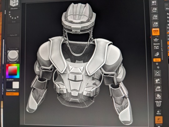
finally getting somewhere \o/
#jrnlsht#you can tell that once the proportions are right i have to quickly go back in and make the style cohesive but#the edgeflow is there#im absolutely having fun at this point lol i am not the quickest with z*modeler but its going ten / twenty times as fast as it took#to make the helmet or skates#and im looking at the helmet like oh i should have done it differently#shoutout to the people who sell old n*h*l equipment online and also thank you geno for being old enough#that his mid 2000s style of equipment is old enough to be online :P#i like how it is softer and streamlined and beautiful it was#i made my own changes obviously but im trying to keep the original basic shape#treating this like its a goddamn fashion garment lol
8 notes
·
View notes
Text
A TORN HEART STILL BLEEDS II
Chapter 2
“Another Witcher, like myself, you say?” “Aye, last saw him going to the resident Sorceress, parted ways with a Bard, too, he did.” “Thank you. Here, the Hag head. She’ll not be stealing your children now.” Kalrys bid the merchant farewell after receiving her pay, thankful to be done with the contract. The head had begun to stink and she had more important matters at hand. If Geralt was there then this was no mere coincidence, but the thought of meeting him again unsettled her. They had parted ways amicably but it had left her with more questions rather than any closure. If she remained in the city she would no doubt cross paths with him and she could then try to make sense of it all. As fate would have it, however, it wouldn’t be Geralt that Kalrys would encounter, but his fated lover instead.
The sensation could only be described as the disturbance caused when a lightning strike is about to hit; static irritates the air, making every hair stand to attention, while the undeniable feeling that something dangerous is about to happen bubbles within. Coming to a halt, Kalrys’ body stiffened at such a sudden change, warily looking around herself until she found a possible source for the dramatic and dangerous shift in atmosphere. Not far from her stood a most beautiful woman whose body was dressed in a fantastic gown of black and white. Black feathers adorned the bust and flowed upwards to form a collar around a streamlined neck, while the sleeves and hemline were dripping with black lace. A waft of lilac and gooseberries drifted before her keen senses and, for a moment, she felt weak at the knees; enraptured. This, however, did not last when striking violet eyes caught her stare, blazing like the very lightning that threatened to break. Clearly the conversation between the nobles didn’t interest her from the way she stared back at the Witcheress, unmoving and unwavering in its ferocity. A Sorceress— No, the Sorceress. Amidst her undeniably provocative scent was another, one she recognized to be Geralt’s, which matched what the merchant had told her. A fact that, when coupled with the intensity of her gaze, led Kalrys to believe there was so much more to all of this than she first realized. Fortifying herself, Kalrys decided against retreat and, instead, stood her ground, watching the raven haired beauty like a hawk. The Sorceress did the same, mirroring her rival as she went about her own business. When she went along with her envoy of nobles, Kalrys followed like a shadow — brazen and defiant — and this infuriated the Sorceress. Finally, when free of prying eyes at last as the nobles left Yennefer to her own business, it was time to put an end to this game of cat and mouse. “I assume you’re following me for a reason. Well, go on, explain yourself.” A statement, not a question, and a demand to round it off; how straightforward of her. It caused Kalrys to smirk lightly against her will. “Right to the point I see.” Kalrys replied curtly, shrugging her shoulders as she came to lean against an old cart. “I was curious about you,” she explained. There was no sense in lying, but she wasn’t about to give more than necessary to this woman. “About me? Surely you mean my connection with Geralt ,” Yennefer corrected, fixing the Witcheress with a pointed glare. Though she wasn’t about to stop there, not when faced with a rival for Geralt's affections that actually posed a real threat. “I know all about your little tryst in Valen, too,” she added spitefully, “so there’s no need to hide your intentions. Just get on with it so I can go on with my day!” This stunned the Witcheress, making her hesitate. It wasn’t everyday that she met a foe that truly intimidated her, especially one that was so forthright. “I wanted to know where he and I stand with one another, but seeing you...” Kalrys’ voice faded, the words wilting on her tongue. “Seeing me?” Yennefer pressed, raising an eyebrow. Her interest piqued by the sudden shift in the impressive woman before her, a strange elation coursing through her. Had she won without even really trying? A pity if that were true, but she’d understand if the Witcheress didn’t wish to find herself painting the alleyway with her own internal organs. “Seeing you,” Kalrys echoed, continuing, “I can see that no amount of words or action will sway him from you.” It was a bitter pill to swallow, but Kalrys knew that even with the bond they shared, she could never compete with the intricate threads of fate that bound Geralt and Yennefer together. A bitter scoff rang clear as a bell in the heavy space between them and the pregnant silence ruptured, spilling forth with vehemence. Yeneffers eyes blazed with something the Witcheress couldn’t quite pinpoint, but it threatened her nonetheless. With a shake of her head she sported a fearsome smirk, walking a slow and deliberate circle around the wary woman. “A shame, and a pity. I was looking forward to testing your mettle.” “I was not put here to be your plaything, Sorceress,” Kalrys stated, golden eyes following her movements, “and I have said my piece. I will take my leave.” Yennefer stood for a moment, stunned at the blatant disregard for her status, so much so that Kalrys managed to almost round the corner of the alley before Yennefer gave a snarl and pulled her back with a sharp motion of her hand. Falling back with a grunt of pain, the Witcheress hissed as she was drug through the rough dirt of the ground to lay at Yennefer's feet. “I didn’t say you could leave,” Yennefer stated darkly, her silhouette stark against the grey sky as Kalrys stared up at her, teeth bared in a snarl. “I am not your enemy, Sorceress!” She spat, sitting up carefully. Yennefer was poised for another attack, her body tense and ready to strike like a viper on its guard. She would need to be cautious, her timing precise, if she was to gain the upper hand. “We’re not done here! Tell me why you pursue Geralt, now!” It was at that moment that Yennefer realized that this wasn’t about Geralt at all. It was, in fact, about her own power and Kalrys’. Two powerful women in their own right, locked horns over something as simply and as trivial as love. A bitter laugh fell from Kalrys’ lips as she moved into a crouched position, shaking her head. “I pursue him for the same reason you have kept me here,” came her cryptic answer, a hand coming to shove the wild strands of hair from her face. “I need answers,” she continued after a moment, voice softer under the potent stare Yennefer fixed her with. A bitter laugh fell from Kalrys’ lips as she moved into a crouched position, shaking her head. “I pursue him for the same reason you have kept me here,” came her cryptic answer, a hand coming to shove the wild strands of hair from her face. “I need answers,” she continued after a moment, voice softer under the potent stare Yennefer fixed her with. While Yennefer watched her, the gravity of her words sinking in, Kalrys took the opportunity to get away. In an instant she pushed her arm out towards Yennefer, fingers together as she summoned the power of Aard. Having been distracted the Sorceress was unprepared for the magical attack, eyes wide as she shot back against the wall with a pained grunt. A few seconds of disorientation on Yennefer's part was all it took for Kalrys to escape, the Sorceress just catching a flash of copper hair slip around the corner through the haze of brick dust from her slumped place on the ground. Scrambling to her feet Yennefer gave a frustrated yell, caring little for the dishevelled look of her clothes as she chased after the Witcheress until the towns folk stared at her quizzically and she was forced to cease her efforts. It had all been in vain; Kalrys had slipped through her grasp and Yennefer felt an odd sense of panic settle in the pit of her stomach at the notion.
#The Witcher#The Witcher Imagines#The Witcher Imagine#The Witcher Geralt#Geralt of Rivia Imagine#Geralt Imagine#Geralt of Rivia#Geralt
16 notes
·
View notes
Text
I Just Wanna Dance With You, 1/2 (Branjie) - Athena2
Summary:
Brooke and Vanessa work at the same strip club, and Brooke takes Vanessa under her wing to help her out. But when business at the club slows and Vanessa desperately needs money, they resort to a risky scam to stay afloat.
(Hustlers au)
A/N:
Hustlers au is here! I honestly came very close to writing this last year, but decided to do Mateo’s Eight instead. It was really fun to finally take this on, and there are a lot of people to thank for this one! First off, thanks to thackeryisatop for posting about this idea, and then to Ortega for nominating that I write it. They were both super encouraging and open of me taking on the idea, and I really appreciate it. Also, thank you so much to Writ for betaing and supporting me with all of this, especially because this fic is so different from what I normally write.
I’ll be honest here: writing smut is not my thing, so there WILL NOT be any explicit sexual content in this. I wanted the sexier aspects to be vague/implied and just parts of the overall vibe. This also does differ from the movie a bit—I streamlined certain parts of the plot and removed others entirely, so it won’t follow it exactly. Regardless, you don’t need to know the movie to read this. I really hope you enjoy, and I’d appreciate any feedback you have. I’ll have the second part out as quick as I can with school starting soon.
Title from Gimme More by Britney Spears.
—
Every night, Vanessa leaves A’keria and Silky in the noisy dressing room, settles herself among half-drunk business men that are sleaze wrapped in suits, and watches her.
Every eye in the place stays locked on the stage as Britney Spears trickles over the speakers and she emerges in a glittery red panty set that matches her lips perfectly, long legs encased in fishnets that make them even longer, show off the beauty beneath those thin strands of lace. She flips her blonde hair and drops into a split that makes the men cheer, bills fluttering like confetti.
The dim stage lights brighten in the face of someone worth watching, casting a golden glow as the woman grips the pole and spins herself around. Vanessa watches with the rest of the men, jealousy curling in her stomach as they throw fresh-from-the-ATM bills stamped with double digits and pictures of old men who were just as rich as they are. Bills they don’t give Vanessa.
The woman calls herself Destiny, though Vanessa knows it’s not her real name. With the way men let their money-stained hands linger on her pale skin as they tuck bills inside her fishnets, Vanessa doesn’t blame her for using a fake name. Hell, Vanessa uses a fake name, and she’s nowhere near as popular.
Destiny leaves the stage, blowing kisses to the men still cheering. She always heads to the roof of the club in between her performances and sessions in the private rooms, and tonight, Vanessa follows, chasing that magic and mystery of her, wanting tonight to be the night she finds out more.
Destiny gazes out at the city, looking more like a person out here than she does inside, where the stage makes her a goddess. In the night air, you could almost believe she’s human. Then that eyebrow raises as she takes in Vanessa, and she’s an angel again.
“Where’s your coat?” Destiny asks.
“Left it inside.” Vanessa shivers as chilly air hits her.
“Here.” Destiny opens up her coat, a massive faux fur thing big enough for both of them.
Vanessa slips inside, her arm searing where it presses against Destiny’s. She hopes Destiny can’t feel her heart racing. Destiny has always seemed untouchable, so effortlessly beautiful that it’s slightly intimidating, especially with how she finishes her makeup before anyone else and returns with fistfuls of cash. She’s a pro, an idol to the newer girls like Vanessa, and as much as Vanessa has wanted to talk to her, get close to her, she hasn’t quite worked up the nerve. But she has the courage now, and Destiny’s face is warm and kind as she huddles beside Vanessa.
“Did you like what you saw?”
“What?” Vanessa’s face warms, because even though A’keria and Silky tease her every night and warned her that Destiny would catch her spying eventually, she didn’t really believe them.
Red lips pull into a wicked smile. “Did you like what you saw? I always see you out there with your mouth wide open, you better hope no flies come in—“
“My mouth wasn’t open that wide,” Vanessa protests feebly.
“Uh-huh.” Destiny winks, actually winks, and Vanessa has to grip the edge of the building to stay upright.
“How do you do it?” She blurts.
“Do what?”
Vanessa sighs. “You make more in one number than I do all weekend. How do you do it?”
Vanessa needs that money, needs it more than she’d care anyone to know. And no matter how much she flips her hair and winks and smiles, the money just doesn’t come the way it does for Destiny. Vanessa wants to be bitter, but she can’t deny how much Destiny deserves what she gets. Vanessa just doesn’t understand why she can’t get it too, why bills fly for Destiny but have to be wrestled from sweaty hands for her.
Destiny bites her lip, lipstick so perfect it doesn’t even get messed up. “Vanjie, right?”
Vanessa nods. “My real name is Vanessa.” She’s not sure why she says it. Maybe because underneath that perfect makeup, she knows Destiny is trustworthy somehow. Or maybe because she just wants this woman to know her, know the real person she is beyond her makeup and boots and lacy gloves.
“Vanessa,” Destiny repeats, and the name seems more special on her lips. “To answer your question, I don’t know how I do it. It helps if you treat them like friends, I guess.”
Vanessa nods. It seems so simple, but she hasn’t mastered it, can’t think of clients as anything but clients whose money she needs to help her mom. “I wish I could,” she mutters.
Destiny sighs. “Look, you’re beautiful, Vanessa,” she says, and Vanessa’s stomach leaps. “And that’s what they want–an escape with a beautiful girl. They want the fun, and that’s what you have to give, not the reminder that you’re gonna pay your bills with their tips.”
Vanessa’s heart sinks. Destiny is right.
She looks at Vanessa with the brightest green eyes Vanessa’s ever seen, smooth yet sharp like pieces of sea glass. They’re a part of her you can’t get from the stage, something you can only see if you’re close enough to her. The real person, not the illusion. “I’ll tell you what. Can you come here early tomorrow?”
Vanessa nods.
Destiny smiles, and that smile, like everything else, lures Vanessa in. “Good. I’ll teach you.”
“Thanks, Des—“
“And call me Brooke.”
—-
Vanessa doesn’t know what she’s gotten herself into when she walks into the club early the next night. It’s strange to be here during the day, the overhead lights revealing scuffs in the tables and the straws and trash littering the sticky floor. The illusion is gone, and the club is just a cold room rather than the warm fantasy it promises at night.
Brooke is in leggings and a white tank top that shows off the firm muscles peeking beneath her skin. She’s softer somehow, gentler without the hard rhinestones and blinding glitter she’s usually armored in.
“Hey, Vanessa,” Brooke says.
“Hey.”
“You ready?”
Vanessa nods firmly. “There won’t be a test or anything after, right? I’m not so good at tests.”
“There might be.” Brooke gives a mischievous wink and points to a black chair right before the stage. “Sit there. I’m gonna do one of my routines for you. Watch me, okay? Watch how I dance just for you, like me and you are the only ones here.”
“Me and you are the only ones here.” Vanessa grins, swallowing hard against the idea of them being alone.
Brooke rolls her eyes. “You know what I mean. It’s just us here now, and you want every client to feel like it’s just you and them.”
Vanessa nods, and then Brooke takes the stage. She shakes out her arms and stretches her long legs, grips the pole, and begins.
The change is jarring–she’s not Brooke anymore; she’s Destiny, both the person and the thing itself, the thing mesmerizing men and making them want to spend hundreds on her, because she’s their destiny. She’s equal parts danger and dangerous, a lit cigarette just begging you to take hold and breathe her in, even if you know it’s wrong.
Watching her this close, Vanessa is mesmerized. If she had money, she would throw every cent on the stage, but it’s more than that. It’s the way each movement is light and delicate, the way she holds you in her gaze and smiles right at you, the way she rests a hand on Vanessa’s shoulder and makes her shiver. Vanessa wants to reach out and touch her, pull her into bed and sleep beside her, all because of this dance.
“Now, these are moves for the pole, okay?” Brooke’s voice snaps Vanessa out of her dream.
She does her best to focus as Brooke shows her the different grips and spins, coaching her to smile and shake her hair through them all.
“What if I don’t have muscles?” Vanessa asks, pointing to her arms. They’re not flabby, but there’s no way in hell she can pull herself up like Brooke.
“You have muscles!” Brooke insists.
“I don’t.”
Suddenly Brooke’s hand is in hers, pulling her onstage. “Come on, you try,” Brooke coaxes. “I’ll spot you. You won’t fall, I promise.” The danger is gone and she’s just Brooke now, and Vanessa trusts the promise even if it might burn her later.
She grips the pole and pulls herself up, following Brooke’s orders to point her toes and smile as she spins around, and she’s flying. She’s a fairy flying through the air, drunk on Brooke’s smile and flashing her own to the invisible crowd.
With a burst of courage, Vanessa climbs, shimmying and twisting her way up, muscles burning. Brooke’s hands are waiting below, strong and sturdy and just waiting to catch her, and some part of Vanessa wants to fall and let those hands do what they’re waiting for. Let those hands touch her and hold her tight. But she also wants to make Brooke proud, show her she can do this, and Vanessa pulls herself up with a massive grunt.
“Lose the grunt at the end and you’re golden,” Brooke praises as Vanessa slides down, steadying hands cupping Vanessa’s hips and making her heart skip a beat.
“Will do.” They perch themselves on the edge of the stage, and Vanessa watches her legs swing a much shorter arc than Brooke’s and can’t help but smile.
“Were you at any clubs before this?” Brooke asks.
“No. This is my first … y’know … job.”
Brooke nods.
“I never really planned on this,” Vanessa continues. “Not that there’s anything wrong with it! I just–I have a day job, and my mom is sick and outta work, so she lost her work insurance, and I started doing this to get more money to cover her treatments.”
“I get it,” Brooke says. “Sorry to hear about your mom.”
“Thanks.” Vanessa sighs. She’s glad Brooke didn’t pry, because she’s sick of talking about her mom’s illness, sick of thinking about it and how it might take her mom away from her. She wants to focus on Brooke instead, because Brooke takes the weight of it all off Vanessa’s shoulders somehow. “What about you? You’ve been here a while, right?”
“You saying I look old?” Brooke teases.
“No, no! Just that you’re so good,” Vanessa says quickly.
“Nice save.” Brooke smiles, though it quickly turns to a frown. “I, uh, I used to dance with the city ballet. You hit 25 in ballet, and you’re basically ancient. I left the company five years ago and decided to keep dancing, make some good money.”
Vanessa nods, because Brooke’s toned muscles and delicate grace make sense now, another piece of the puzzle that adds up to her. And this close to Brooke, intoxicated by her perfume and the soft curves of her shoulder, Vanessa wants to find more pieces.
“Think we can do this again tomorrow?” Vanessa asks.
Brooke grins. “You got it.”
—-
Nina marches over to Brooke’s station like a woman on a mission. She’s the only decent one of the club’s owners, and would happily take things over herself if she could get the other owners to give up control. She’s a mother to the girls, always ready with a listening ear, and the click of her heels over the tile is comforting, a sound everyone counts on when they need help.
“Am I hearing things, or have you made a friend?”
Brooke sighs. “Well …“
“Brooke made a friend! Kam, Pri, Brooke made a friend!”
Kameron and Priyanka crowd around Brooke’s station, whispering in excitement. Brooke groans and hides her face in her hands.
“A friend, and she’s not even imaginary?” Priyanka squeals. “I’m so proud of you, Brookie!”
“I didn’t think I’d see the day you made friends besides us,” Kameron says.
“You’re one to talk,” Brooke shoots back. “Have you texted little Miss Asia yet—“
“Yeah, you never shut up about her,” Priyanka says.
“That’s enough of that.” Kameron quickly returns to her makeup, and Priyanka follows, using the opportunity to make fun of Kameron instead.
Brooke sighs, finally facing Nina’s broad grin. “Look, I think Vanessa’s nice. She—she reminds me of myself, when I started. Figured I’d give her some tips, look out for her.”
“You mean look at her.”
“Nina,” Brooke whines. She’s had her eye on Vanessa since she started here, she’ll admit that. Vanessa is absolutely beautiful, one of the most beautiful women Brooke’s ever seen. There’s real joy and passion in her, the kind you can’t teach, can’t really find in many people. Vanessa is a breath of fresh air over dirty money and sickly-sweet liquor, and Brooke’s had more fun with her than she has in a while. She wants to help Vanessa, make sure she keeps herself safe from the darker aspects of the club and uses the lighter parts to her advantage. Make sure she doesn’t lose that joy. Brooke’s just helping, that’s all.
“I’m just teasing, Brooke,” Nina says fondly, rolling her eyes. “It’s good that you’re getting to know her. She seems great, from what I’ve seen.”
“She is.” Vanessa really is, and Brooke can’t help but marvel at how quickly she picked up Brooke’s steps, how beautiful and free she is in her routines.
Not that Brooke has feelings for her or anything. She’s just helping.
—
Brooke decides to give Vanessa the lowdown at their next practice. Her knowledge of clients is based on years of collecting information, from each leather wallet pulled from a tailored suit to each set of eyes that seek to own her. She knows how things at the club work, and when you know the rules, you can play the game.
“There are three levels of clients,” she explains to Vanessa. “The ones at the bottom are so desperate for power, to be on top, that they’ll break out hundreds if you smile. Guys in the middle are… in the middle. They don’t do much one way or another.”
Vanessa nods, eyes wide as she waits for the rest. Brooke can’t help the thrill in her heart at having Vanessa’s eyes on nothing but her, soaking in her every word. Part of Brooke has always liked the thrill and rush of attention, whether on a fancy theatre stage in silk or a sticky club stage in fishnets. But the thrill is that more intense and intoxicating in the form of Vanessa, in the form of letting someone close to her, close enough to know her name and not the persona she creates.
“The ones on top—they’re the ones who blow thousands a night and it doesn’t even make a dent. They have a private entrance, but even if they got caught, they’d never see the consequences. They want attention, want you to show off for them. They’ll treat you like dirt but pay you like you’re gold, and you can milk them for every cent they’re worth. That’s where the real money is.”
Brooke has found her success, found a nice apartment with more than enough space for her and her cats, found security in her life, all from the bills those men in the top tier slide her way. With practice, Vanessa can get that same success.
Vanessa nods again. “I think I always get the middle guys. They all look the same. Like someone copy-pasted them or somethin’.”
Brooke snorts loudly, a far cry from the gentle laughs she does for her clients. This is her real laugh, one that hardly anyone can wrestle from her.
“Hey,” Vanessa says suddenly, “do you have time to get coffee? Then we can talk somewhere nicer than this.”
Brooke just smiles.
—
The more Vanessa watches Brooke, the more tiny signs of the real her poke through her mask of makeup and confidence. There’s the way she starts chewing on a cuticle, before looking at her manicured black nails and immediately stopping, or how she spills some coffee over the edge of her mug after an enthusiastic nod. It’s like getting a peek behind the curtain, and Vanessa is going to treasure each glimpse she can get.
It’s nice to be here and just talk to Brooke, free of dazzling lights. At the club, there’s idle gossip in the dressing room, and it’s fun, but it’s not personal. It’s a way to pass the time between numbers and client sessions, to laugh before they go out there. But now she gets to just talk to Brooke without interruptions, her heart racing with each of Brooke’s smiles.
“You said you had another job, right?” Brooke asks.
Vanessa nods.
“So, what do you do?”
“I do makeup at a department store. I like it, you know? Getting to talk to people, make them feel good.” Vanessa smiles to herself at the thought of all the clients that have sat in her makeup chair, their grins at how confident they felt after her help. “The pay is okay, but not enough for things like medical bills.”
“I get it,” Brooke says. “I’m glad you like it, though.”
“Yeah. Once I get enough money here, I should be good with just that job.” Vanessa pauses, glancing over the strange look of sadness on Brooke’s face that quickly disappears. Is Brooke sad about the idea of her leaving, or something else? Brooke doesn’t talk too much about herself, but Vanessa wants to know more about the old Brooke that used to dance, and maybe she’ll talk. “Did you have any jobs besides ballet?”
“No.” Brooke takes a sip of coffee. “I went right from that to this, and the pay’s been enough that I don’t need anything else. Don’t really know what I’d do anyway.”
Brooke still seems a little upset, and Vanessa decides not to press anymore. She really can’t see Brooke doing anything else, if she’s being honest. There’s just something about the way she moves, like the whole world aligns and stops for a moment when she’s dancing. It’s magical, and Vanessa’s heart leaps just at the thought. She changes the conversation to the cat she’s thinking of getting, and things are okay.
—
It’s a week later that Vanessa gets her first top-tier client. From what Brooke’s taught her, Vanessa is getting better at recognizing them. Every inch of their outfit is expensive, from coat to shoes. Their walk is firm and confident like they own the place. And they hold out hundreds with the casual air of a dollar bill.
She walks past the hall’s dim red floor lights, each one illuminating a plain black door. Vanessa takes a breath before the room she’s using and reminds herself to be like Brooke, to give the man attention, like he’s the only one she’s doing this for, even if she’s already done it tonight. Vanessa walks in, and she walks out with over a thousand dollars.
Rinse and repeat.
—
“It’s working, huh?”
Vanessa looks up from the stack of bills she’s struggling to stuff into her knee-high black boots. Brooke stands next to her, grinning smugly, while Brooke’s friend–Vanessa’s pretty sure the redhead with the muscles and tattoos is Kameron–grins behind her, giving Brooke a push until she bumps into Vanessa.
Vanessa laughs as Brooke swats Kameron away and turns back to her. “It sure is working,” Vanessa says. “Got so much money I can’t even get it in my boots.”
“Can I help?”
Vanessa nods, and then one of Brooke’s hands curves around the back of her knee, the other carefully unzipping her boot. Vanessa doesn’t breathe as the zipper slides down and Brooke delicately arranges bills around her calf, soft fingertips brushing over her skin. She’s close enough that Vanessa can smell her perfume, close enough to grab Brooke and maybe kiss her–the zipper screeches back into place, and Vanessa straightens up.
“Thanks,” Vanessa says, trying to remember how to breathe.
“No problem.”
“Damn, Vanj,” A'keria mutters, open-mouthed in the chair beside Vanessa. “Destiny needs to teach us all how to get that coin.”
Silky nods, swinging her hairspray in excitement. “Miss Destiny’s Stripper School. I’d sign up.”
Vanessa shushes them and finishes getting ready. Brooke winks at her after she’s done, and Vanessa pretends her next lap-dance is Brooke.
—
It happens fast.
One day, Brooke hears some news report coming from Kameron’s phone, a guy in a suit talking about fiscal collapse and crisis and economy again and again. Say economy three times, and a middle-aged white man in a business suit will appear like Beetlejuice. It’s all they ever talk about, and Brooke doesn’t think much of it, just goes to work and comes back with her usual wad of cash she had to mop off the stage floor.
A few nights later, there are empty seats in the club. When the music stops, it’s quiet enough to hear ice cubes clinking in glasses, hear the rustle of the one or two single-digit bills they hand her.
Brooke walks off stage in confusion. For the first time in over a year, her wad of tips is slim enough to fit in one hand. She heads straight to Nina’s office, where Nina is running a hand through her messy hair and drinking from a bottle of wine.
“What the hell is going on, Nina?” Brooke asks. “It’s totally dead out there.”
Nina sighs. “It’s the stock market. I don’t know what the fuck happened, but stocks are down, apparently, and those Wall Street business men aren’t coming anymore.”
“Are we … we’re not gonna close, are we?” Brooke’s stomach is twisting in knots just at the thought of losing all this. The same knot that had formed when Vanessa said she would leave after she had enough money, because Vanessa has quickly become one of Brooke’s favorite parts of the club, a part she doesn’t want to lose. But she might lose it all depending on what Nina tells her.
“No.” Nina takes another swig of wine. “We’re staying open, but your tips won’t be like they usually are. The real rich ones will still come in, but I doubt they’ll spend as much.”
“I–” Brooke shakes her head, needing to get out of here. It’s too stuffy in here, the wine burning her nose and the bright office lights burning her eyes. She runs to the roof, the coolness clearing her head and allowing some air to reach her lungs.
What is she supposed to do now? Brooke joined the strip club because it made sense–it gave her a performing outlet without the constant body aches from ballet, a chance to use the dancing ability she had trained decades to perfect. A way to keep the thrill of performing, the love of a crowd, when she couldn’t be on a theatre stage anymore. She can’t walk away from this, try to find whatever minimum wage job will hire someone whose place of employment for the last five years can’t go on a resume. She’s wondering if she’ll have enough saved up to weather the next however-many months when the roof door slams, and hoarse sobs arise.
Vanessa.
Brooke immediately forgets her problems and runs to Vanessa, who’s shaking with sobs. She wants to wrap Vanessa in a hug, let her arms circle that soft skin, but she stops herself. Touch is something they do all night. They touch bills and stripper poles and men, everything washed away with the apricot soap Nina stocks the bathroom with. But if Brooke were to touch Vanessa, it would be different from touching a client. More personal. And Brooke knows she won’t erase that touch no matter how much she scrubs her hands.
Instead, she pulls Vanessa to the edge of the building, uselessly whispering that it’s okay, even if she knows it’s not. When Vanessa is finally able to talk, she looks up at Brooke with bloodshot eyes burning with exhaustion and sorrow, and again Brooke wants to hug Vanessa and let her rest inside her arms.
“I’m guessing you heard,” Brooke prompts.
Vanessa nods. “What am I gonna do, Brooke?” she cries. “I was starting to make a lot of money, but it’s not enough. I–I don’t have enough to help my mom, and if she doesn’t get her meds and everything then she’ll …” A fresh sob erupts from Vanessa, and Brooke doesn’t hesitate this time. She pulls Vanessa into her arms and gently rubs her back as she cries. Vanessa is real and solid, realer than anything the club offers. She smells like coconut and Brooke wonders when she started liking that scent so much. Wonders when she started liking Vanessa so much, because she can’t deny it anymore. But Vanessa doesn’t need that now; she needs help.
Brooke selfishly hadn’t even thought of Vanessa and her mom when she first heard the news. Now, she has to accept how bad things are, what might happen to Vanessa’s mom without the money Vanessa needs. The money she can’t get anymore. If only they could take that money that the really rich Wall Street guys still have and give it to Vanessa and the other girls somehow …
But maybe they can.
The wheels in Brooke’s head are spinning, weaving together a plan. It’s risky, sure, but they don’t have a choice. They all have bills to pay. Some of them have relatives to care for and medication to buy, and hell, just normal lives to live. Brooke might lose her home depending on how long this lasts. The other girls might lose theirs too, might even lose their jobs if it comes to that. And Vanessa will almost surely lose her mom. Vanessa always talks about her with such love in her eyes, with such joy in the memories of the two of them cooking or dancing together. She doesn’t deserve to lose that. Brooke has to do something.
“Hey, Vanessa,” Brooke says gently, “I think I have an idea.”
#rpdr fanfiction#brooke lynn hytes#vanessa vanjie mateo#nina west#kameron michaels#priyanka#silky nutmeg ganache#akeria davenport#branjie#lesbian au#hustlers au#implied smut#i just wanna dance with you#athena2#concrit welcome#submission
5 notes
·
View notes
Text
Imploding the Mirage:
It’s been two weeks since this album was released, and I must write one of my long-ass essays about it because it is worthy of praise.
Probably the most streamlined theme of any of the Killers albums, it gives off an air of accomplishment, confidence in the fact that the storm has passed and knowing where you stand. The ever-present ticking clock of mortality is evidently still a fixture in Brandon’s mind, as it has been for the past twenty years, but it has taken on a more peaceful hope for the afterlife than the stuck-in-the-past feelings on other albums.
The album begins with one resounding message in My Own Soul’s Warning: listen to your instincts. A simple yet poetic take on the classic ‘don’t let them change you’ ideal, mixed with the determination of someone so deeply in love they would fight to the end for their one and only. It transitions into Blowback, a heartfelt story of resilience through darkness that shouldn’t possibly be able to sound so upbeat, as the simple line ‘she’s sitting on a secret/she didn’t ask for, no girl ever did’ brings to mind many different images of things nobody should have to endure. Through the sadness however, there is some strange confirmation that, with help from others, pain can be overcome. The next track- Dying Breed- ties straight into those themes, proclaiming that through thick and thin, calm and storm, the speaker will be there for the one they love, even though it seems that is an uncommon thing to do these days.
The first single off the album- Caution- is next. Often the first single will feel like an outlier, if only because it is the first impression the world gets of the entire album. It might not fit quite as perfectly in a row as the first three songs, but this song knows where it stands, just as the speaker in the song itself does. It is time to leave ‘this town’-which may represent something different for each person that hears it- and the feeling of unrest is palpable. A sense of breaking free from the past and becoming ready for whatever the future may hold is what glues this track into the theme. After the intensity of the guitar solo on Caution comes a startlingly slow-starting track, Lightning Fields. A tale of seeing a lost loved one again and holding on to them for eternity, forgiving each other for their shortcomings. The powerful statement in the lines ‘there’s no end to love/there’s no end to truth/there’s no end to me/there’s no end to you’ speak for themselves, and the duet between Flowers and kd Lang makes the words even more powerful. Immediately after that beautiful sentiment comes another outlier, the second single-Fire in Bone. Seemingly unrelated at first to the common themes so far, and containing a very different funky sound, the song speaks of feeling like a failure, and it isn’t until the fifth verse we see that there was always someone waiting to carry our speaker out of the darkness and get them back on their feet.
A softer song comes next. Running Towards A Place, a song about how we are ultimately going to end up in the afterlife, where two souls can ‘walk as one’, and the pain of living as humans will be forgotten. Picking up the tempo again is My God, which is about just letting go, and (yet again) sticking together through it all. A booming chorus ends with ‘it’s like the weight has been lifted’ giving the impression that whatever hardships have been hinted at in the rest of the songs have been resolved, and the couple are moving forwards together. Another duet here with Weyes Blood makes for an incredible experience overall. The joy of this song runs into the next, When the Dreams Run Dry, an almost carefree story about life after death. The vibe is the same as the other songs, two will become one after all is said and done, and though nobody knows exactly what to expect, they will always be side by side.
Finally there is the closing track, also the title track. It is quite different to hear a closing track so bouncy and playful. A little different from the others, this one focuses on ‘letting go’ and growing up. ‘Imploding the mirage’ is a wonderful use of words that could mean so many things. As we grow, we realize that so many pieces of our past weren’t what we thought they were, they turn out to have just been ‘mirages’. It truly sums up the album, the mirages of the past have been imploded, and because of that, two people are able to move forward together united.
#the killers#imploding the mirage#this is a long one#tell me what you think#i have a lot of thoughts#music#album review#song analysis
10 notes
·
View notes
Text
Upgrades to 10 Hideous Air Vent Covers: Advantages of New Pacific Register Company

Don't let unsightly air vent covers distract from your home's aesthetic. Take a look at these great-looking improvements that you can buy or build yourself.
Marble it to the gills If your old air vent covers are detracting from the charm of your new marble floors, Metro Marble Repair is here to help. Custom floor signups are available in tile, glass, granite, porcelain, and limestone. Simply give them your supplies, and they'll create the ideal vent shroud for you. Sheet Metal with Designs Purchase some patterned sheet metal to take a more innovative approach to repairing an unsightly air vent shroud. Measure the vent openings then cut them to fit over the vent with caution. Bear leather gloves when chopping, then file down any rough edges with tin snips. If required, paint the covers, fasten the metal to thin wood strips, and seal the cover with small screws.
Using a Fiberglass Plastic Air Vent Shroud.
This air vent shroud option is only for use on walls and ceilings, and it is a luxurious and sleek upgrade to standard covers. Installing the device is as quick as sticking it to the wall or ceiling with self-adhesive silicone. Attempt a Butterfly Although this is not a cost-effective choice, you might hire an artist to make air vent covers for you. Jerzy Sanecki of SaneckiArt, an Etsy customer, designs one-of-a-kind air vent covers, such as this butterfly style.
“I purchased five complete vent covers from Jerzy and am incredibly satisfied with the results. They are simply gorgeous and lovely, and we have already got compliments on them in our new home,” one reviewer says.
Check out these 100 stunning before and after home makeovers that will astound you.
Make an attempt at a minimalist style.
Through using the Aria Vent, you will achieve a minimalist look. When they go about making "seriously beautiful air vents," this maker has DIYers and industry pros in mind. With drop-in mounting technology, the original Aria Vent has a sleek, futuristic appearance. Minimalism is one of the 15 home patterns that Millennials are embracing.
Make Use of an Ancient Shutter
Consider converting an air vent that is prominently placed on a wall into a piece of art. Find an old interior window shutter and hack it down to size for the air vent. The shutter should be completed with trim before being primed and sprayed. Attach some D-rings to the shutter and hang it on the wall. Here's an example of how it'll look when it's done. You can find a lot of antique window shutters on Etsy. Check out these 12 easy-to-make room dividers, one of which is made from repurposed shutters.
It's a Tile Matching an air vent to the rest of the architecture will prevent it from being an eyesore on your floor. Custom tileable in-floor vents with a welded aluminum frame and reversible insert are accessible from Tile Lines. You have the option of cutting your tile to match! Here's how to tile a DIY backsplash, when we're on the subject of tiles.
Consider a mirrored finish.
Install mirrored finish air vent covers for a streamlined look that blends in with the surrounding fabrics. This option was designed to replace old louvered grilles and is a perfect match for walls and ceilings. Big mirrors are among the 52 objects that will make your home seem more expensive.
Air Vent Mask in Brushed Nickel, Art Deco
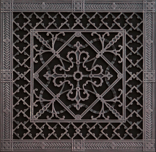
Install these chic air vent covers to bring more Art Deco flair to your house. These covers, which come in a range of sizes and finishes, are simple to install—just drop it into the opening with no tools needed! Taking a look at these 15 retro home patterns that are resurfacing. Use a period-style air vent shroud to add some style to your room. You'll enjoy this period-style scroll pattern air vent shroud if your home decor is more Victorian. It's made of cast aluminum and has a luxurious black finish due to a baked-on powder coating. It's also rustproof and needs no repair! Do you want to give your home a Victorian feel? The following directions will teach you how to build a Victorian screen home.
Ground Air Vent shroud (DIY)
Okay, I understand that this DIY floor air vent shroud isn't for everybody, and that's good. This idea would not have been my cup of tea if it hadn't been thrust upon me. We have kittens, you know. There are ten of them. Cats can also be jerks at times. And cats have a history of peeing on things when they're feeling extremely jerky. They pee down stuff, in this situation. And that's just what our cats did: they peed down the vents in our floor.
Now, I understand how revolting it is. I debated not posting it and our eventual patch on the site because it was so revolting. But, as you know, I tend to keep it real around here, and I think that if I'm having this dilemma, there must be other pet owners out there who are as well. So, if I can help any fellow feline lovers out there fix this heinous dilemma, I'll take the risk of missing a few readers in the process. Anyway, this concern began when we first moved into the house where we now live. We didn't have this problem in our old house because it didn't have floor air vents, so we were surprised to see our cats piddling down our cool, clean air vents in our new home. We did everything a cat owner could do in this situation—made sure there were enough clean litter boxes open, using feline pheromone diffusers, etc.—and it helped a bit, but we still had the problem on occasion. I ultimately decided to strategically position furniture to cover as many air vents as possible, but some air vents stayed exposed. We searched for floor air vent covers to buy to fix our dilemma, but the only ones that looked like they could fit were made of plastic and would crumble into a million pieces if stepped on. We had to come up with a plan because there was no way I was going to put up with this and keep our house smelling like we had so many cats, even if we did have too many cats. These are designed to go over regular 4 x 10 and 4 x 14-inch floor air vent signups. Since signups come in a range of sizes, if you don't have the same sizes as us, you'll need to do some weighing and estimating to ensure a decent match. We built them to fit snugly in the back and front so they wouldn't slip around, but we made the cover 3′′ wider than the floor openings to prevent pee from getting under the sides of the air vent, which are open to allow air movement.
“But people are going to fall right over these!” I can hear some of you shouting at the computer screens now. Let me ask you a question: how much do you walk on your house's floor air vent signups? Floor air vents are usually positioned in inconspicuous areas and/or parallel to a wall. When wandering around indoors, people naturally leave a foot or two between themselves and the walls. And as long as you don't make them the same color as the floor you're going to use them on, they'll be easy to find.

• Timber planks 10′′ x 3/4′ for the top of the air vent sheet. They usually come in 6-8′ lengths, but do the calculations to work out how many you'll need based on the number of air vents you want to protect. These are made of Pinewood, but any heavy wood would do (softer wood might split if it does ever get stepped on, but I still think the chances of that happening are pretty slim). • 1′′ x 3/4′′ wood planks for the air vent cover's foundation These may be difficult to come by, so you can have to break a wider plank down to size. If you do buy them, they usually come in 4-6′ lengths, so do the math and work out how many you'll need based on the number of air vents you want to protect. These are made of Pinewood, but any heavy wood would do. • Finish screws, 16 gauge, 1 1/2 inch • Weathered Gray Varathane wood polish (buy at Lowes) • Baby Gloves with Valspar Chalky Coating (buy at Lowes) • Uncolored Valspar Sealing Wax (buy at Lowes) Please note: I'm sharing the type and dimensions of the wood I purchased so you'll know what I used for this project, but you can use different types/sizes of wood if you can't find the same type/size wood at the hardware store or if you have scrap wood.
Instruments:
• Saw with no rope
• The Nail Gun
• Paint Brushes
• Cotton Rags
• Palm Sander
Directions: Cut the top and sides of the wood to match your floor air vent register's dimensions. For the 4′′ x 14′′ air vent register, we used dimensions of 17′′ x 9′′ for the top of the air vent shroud (two pieces of 10′′ x 3/4′ wood plank cut to fit) and 17′′ x 3/4′′ x 1′′ for the sides of the air vent shroud (two pieces of 3/4′′ x 1′′ wood plank cut to the 17′′ duration for the wide air vents). The top of the air vent shroud (two pieces of 10′′ x 3/4′ wood plank cut to fit) and 13′′ x 3/4′′ x 1′′ for the sides of the air vent shroud (two pieces of 3/4′′ x 1′′ wood plank cut to the 13′′ length for the large air vents) are the dimensions we used for the 4′′ x 10′′ air vent sing-up.
As seen above, nail the two top pieces to the two side pieces. Now comes the exciting part! Apply a wood polish and brush away the excess with a towel. Give at least a couple of hours for the paint to dry before going on to the next stage. Allow at least a few hours for the chalk paint to dry before going on to the next stage. Using the palm sander, distress the soil. It's completely up to you how much or how little you distress (or even whether you do it at all)! Using a wet towel, clear some pollen.
Apply a layer of sealing wax to the surface and brush away any residue with a towel. There's a lot of discussion on whether you can wax before or after distressing; I usually do it after because it covers the exposed wood as well as the chalk paint (and these will use all the protection they can get if my cats try to poop on them, which they haven't yet). Both of our air vent covers have been assembled and are ready to be mounted in the building! If you're having a similar issue with your cats as we were, I hope this DIY floor air vent shroud will come in handy! Our cats have been avoiding the freshly protected vents so far, and it's awesome to have them back in operation, particularly with the 100+ degree temperatures of our summers approaching! Thank you for coming, and please let me know what you think or whether you have any questions!

Pacific Registry Company sells decorative wall grilles and overhead registers.
And the tiniest information will make a huge difference. Decorate a mundane and uninteresting region of your home with something amazing. Most vent covers are dull and unknown, and they frequently neglect beauty and appearance in favor of functionality. Air vents, which are used to limit or re-direct airflow in your house, are frequently ignored by homeowners, resulting in missed opportunities to add elegance and decorative appeal to every room. Request decorative register and vent shroud made of aluminum, brass, wood, plaster, resin, and stone from our vast inventory of completely customizable decorative sign-up and vent covers. It's never been easier to fit vent grilles to your unique style; use our range of vents to accent all of them. If you've been unimpressed or otherwise uninterested in the vents in your house, it's time to think about how this frequently neglected detail will relate to the overall design and décor you're striving for.
CHECK OUT OUR INVENTORY OF DECORATIVE REGISTERS AND VENT COVERS, CEILING REGISTERS, AND FILTER GRILLS ONLINE.
COVERS FOR VENTS Our high-quality heat signups and grilles are simple to customize to suit your room, from unusual old homes to renovated houses. When a heat vent consumes a large amount of space on your floors or walls, it's important to balance it with a sophisticated, long-lasting heat sign-up or grille. Below, you'll find a range of refined types and sizes. Rejuvenation has vent covers and floor signups for your house.

When it comes to home decor, the slightest specifics will make all the difference, so consider replacing your old covers with one of our waterproof styles. The Classic Brass grille, which measures 4 x 12 inches and is made of sturdy cast brass, is one alternative. This grille brings refinement to the space with its sleek Revised Classic style and low profile. Combine it with other home accents like a BRASS PLANTER or a wall sconce. Wood floor signups are also available from Rejuvenation, and are suitable for having a Northwest Contemporary design look. The Wood Slat floor register is available in three sizes to fit your needs. To fit your furniture, pick from oak, maple, or cherry wood. Consider one of the Traditional Aluminum grilles in black enamel if you choose a Sleek Industrial look. Rejuvenation has all the home hardware you need in a range of classic designs in addition to these vent covers.
New vent covers and a floor register have a range of advantages.
Changing minor details inside the space will go a long way toward changing the overall appearance of the room, as previously described. Space is automatically updated when you swap your old vent covers and floor signups with one of this brass, aluminum, or wood alternatives. Change the switchplates to create a unified look; Rejuvenation has switchplates in a range of finishes to complement these floor signups and vent covers, as well as other fixtures and drawer, pulls to accommodate your house. Look through the collection for beautiful and long-lasting pieces for every room.
With registers and grilles, you can monitor the airflow in your house.
Airflow to and from the HVAC unit in your home is controlled and directed by signups and grilles, which keep your living room comfortable while concealing the ductwork. Lowe's has a large range of grilles, signups, and air deflectors to ensure that ventilation is directed where it is required most. Take a minute to calculate the size of the duct opening so you know what will work, and take note of the covering so you can find a fitting piece for the opening before you go shopping.
Inventories
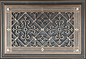
The distinguishing feature of these usually slatted covers, which can be found in the floor, wall, or ceiling, is a lever that allows you to open or close the air vent to alter airflow into the room. Floor signups come in a variety of materials, designs, and finishes, allowing you to use them as a decorative feature that often blends in with the rest of the room's hardware and fixtures. From scroll styles and oil-rubbed bronze finishes to light oak choices that blend in with hardwood floors, you'll find one that suits your room perfectly. Is your vent in your baseboard rather than on the floor? Lowe's also has baseboard signups that can match these gaps.
A grille's task is to draw air out of a room and return it to the heating or cooling system. It varies from a sing-up in that it lacks a damper to regulate airflow. Many small grilles will be mounted in the building, or a single wide grille will be installed throughout the ceilings or walls. They are available in a range of fabrics and finishes to match your personal taste.
Controlling the passage of air
Will you need to steer incoming air in a certain direction? Air deflectors mount to your vents to divert air, whether you're shielding plants put under vents or need to force air away from seating in the living room. These options vary from magnetically connecting to the sign-up to designs with multiway deflection, allowing you to quickly construct a calming environment. Are you looking for a way to help spread air more uniformly in a room? Ceiling diffusers are an excellent alternative. Want to monitor the temperature of a room without using the thermostat? Air vent covers prohibit air from accessing signups, causing it to reroute to other regions. A vent shroud can also help save electricity, and some come with a magnetic feature for simple installation.
Lowe's has the goods you need for efficient ventilation in your home when it comes to the air conditioning vents. Reggio sing-up and other brands are available to equip your home in both feature and design. With our Purchase Online, Pick Up in Store option, you can easily complete your heating and cooling project.
Visit Our Official Website
Additional Resources:
https://en.wikipedia.org/wiki/Register_(air_and_heating)
Location: https://goo.gl/maps/45C2MV4Tbo9hwKuA8

1 note
·
View note
Note
Do you have any tips for making animation-friendly designs? My designs are intentionally accurate to real-life cats, and I love them, but I know they would be super tedious to animate, or even use in a comic! How do you make such simple designs that are still so amazing and beautiful?
Well, it just takes practice and iterations I think! Mostly. But I have a few tips that I fall back on frequently I could share so Here’s my quick hot take on making animation designs:
Simplicity is your friend. I had a professor that used a term “simplexity” to describe the balance needed in order to make a character unique and easily recognizable, but also not hell to render out in a full animation. This is going to mean different things for different productions, for example something on the scale of Disney can have a character like John silver with a multi faceted robot arm whereas if we’re trying to do something low budget (*COUGHforfreeCOUGH*) you’re going to want to minimize the headache people have when drawing your character by leaning into the simple side of this term, so that they don’t want to murder you and will still be your friend after the project is over. (more under the cut!)
So what does this mean exactly? You’ll want to keep the line mileage to a minimum. For cats, this means limit the amount of detail and rendering you give the fur in your linework. I’ve seen Artists who break this rule magnificiently (like Raevi goddaMN GIRL) but for a design it is much easier on artists to streamline down to core body shapes and key character Accents in the fur (like tail shapes, cheek floofs ect). This can be pretty diverse, but I’d minimize it as much as possible (if possible down to three accents, more on this later).
For examples, On lionblazes design (line art only at this point) his Character traits are his tail shape, Mane, and Scribbly eyebrows, all aspects that mean more strokes are being taken and work done, but that are easily recognizable between frames, and artists. I also have brought up Dovewing’s design because it’s more complex in it’s line art, but I could simplify it down even more to just her butt shoulder and ear floofs and still recognize her character silhouette. In fact, paring it down even further would strengthen her recognizability.
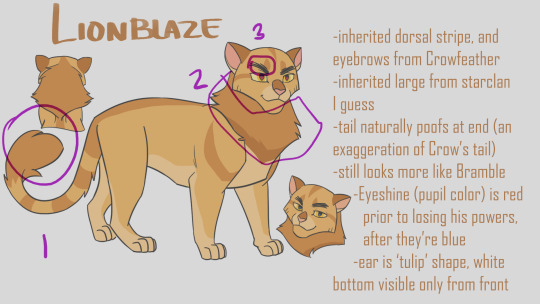

The amount of strokes you have people draw in cleanup will drastically change the amount of time it takes to render a character. Between Firestar and Bramblepaw in this shot Bramble easily took twice as long to line (or more!) thanks to his beautiful luscious curls.

Next! Principle I use in simplexity is the rule of three. For whatever reason, the number three is your best friend. It’s not as weirdly symmetrical as two or four, and maintains a unique organic-ness to it without getting carried away by five or seven. Now what am I even talking about? Pretty much everything. This is the secret of markings. This is the secret of character accents. This is the secret of color picking. The Rule of three is your best friend.
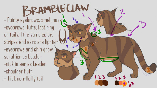
Take Brambleclaw for example. I gave him three stripes/markings on his face, and three on his side. It feels nice and natural and organic, without being overwhelming. I also gave him three specific fur accents in his line art, his ear tips/eyebrows, Belly floof, and shoulder puff. I used the rule of three in picking his colors, three main pelt colors, and three accent colors (eyes are always gonna be more complex if desired, people love rendering the shit out of eyes) and even so, three colors for the eyes. I used his lightest pelt color in only three places, and his Pink color in only three places, and his darkest color in only three places (eyebrows, Tail tip, and if I had thought to write it down, his paw pads). Even his forehead marking has three parts to it. You do it enough and it becomes really natural and subconscious. Of course, like all rules, you can still break it if you need to, but It has been one of my best friends.
Alright last thing to think about for now, (see what I did there? There are more things, but it helps people remember better to learn Three at a Time), are Shapes. Specifically using Simple identifiable shapes when constructing the body or face of your character. This is going to sound similar to the line mileage point, because they are related, but they are different. This is focusing on the macro details of a silhouette whereas Accents are about Micro details. This point also has the added benefit of helping characters look and feel related to each other if you use it potently!
Let’s take Hawkfrost and Mothwing for example. Specifically their faces. Hawk I designed first, and I wanted him to feel dangerous, and maybe a little twisted. So I decided to integrate a lot of triangles into his design because, a triangle’s shape language reads as dangerous. They’re pointy, and sharp, like teeth claws, and knives. We can’t in good conscious put an especially triangular object next to a baby because it inherently feels dangerous. They’ll poke their eye out with that tall prism. Other shapes have their meanings as well, Rectangles (cubes) are sturdy, and circular objects are the opposite of triangles, they’re the shape of eggs, fluffy pillowy things, and babies. They’re inherently safe, and soft.
Pull back from digression. Look at hawkfrost and his triangles. They have sharp claw like tips, which are emphasized even with a noticeable downward curving to their points. This motif is repeated multiple times, in his cheeks, his ears, his eyes, his chin, his nose. This becomes unifying, and inherently feels dangerous and curved, or twisted.
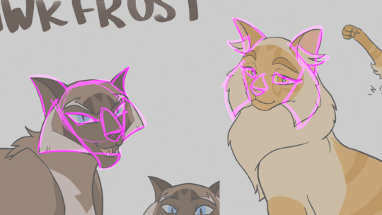
Now look at moth. She has triangles too, but I deliberately went through the effort to make them rounder, softer, inverting the angles of her eyes to feel sad and not cruel. Yet she remains similar in enough ways that she feels related. Her nose curves in a similar downward manner, her ears retain the out down curve without the dangerous point to them. The fur accents of her cheeks add to the roundness, making her feel softer while sharing hawks cheekwings.
Let’s take another example, Bluestar and Snowfur. They are proof that similarities do not have to be reserved to face shapes alone to give that strong feeling of relatedness. In some ways I think theirs is the strongest sibling bond I’ve read in the books, and that obviously translated to how I designed them haha! The idea behind their design was ‘curvy sturdy’ which is reflected in their circular based hourglass figures emphasizing Bluestar’s ‘broad shoulders’. I tried to make their heads more of a squashed circular shape, to give it more sturdy strength while feeling soft and maternal. Her ears are very rounded at the tips, and the particular downward turn is easy to identify and reflect in both cats. Lastly, their square “pants” because let’s be honest, both these she cats wore the pants in their families. There are also enough differences that in pure silhouette you would still be able to tell Snowfurs bushy tail apart from Bluestar’s thinning fur, and snows’ cheekfluffs from blues wide round jaws.

Of course I am not perfect at all of these elements, and there are even more things I could say that make designs unique and easily animatable while also identifiable. If you are looking for more or different suggestions, I liked Tenielle Flowers’ Video she released on the subject: https://www.youtube.com/watch?v=lO-kNlyHn8A .
And good luck!
542 notes
·
View notes
Text
Top 5 Tips in Finding Wall Mirrors
Wall mirrors are important in almost every home if not every area in your house. There is an interesting series of stylish, sophisticated wall surface mirrors anywhere you see. In a variety of size, colours as well as styles which provides you the versatility to choose a mirror that not just suits your individual preference however will additionally blend effortlessly right into your house. More at: https://www.mirroredfurniturelab.com
A wall surface mirror is an ageless look and one that will enhance your home whilst staying beautiful for many years. Declaration pieces make striking centrepieces in living areas, while extra minimalist alternatives will slot right into your existing interior conveniently. The right mirror on your wall surface can provide the whole area a new life. Here are the Top 5 Tips in Choosing Wall
Mirrors
1. What are the different kinds of mirrors? Wall surface mirrors include a touch of deluxe and sophistication to practically any kind of area in your house. Attractive wall surface mirrors are mirrors with attractive structures providing a trendy option to conventional mirrors. Mirrors do many features. Make use of one to augment, define, or highlight what is currently present in your space, or area it where it reflects a preferred sight. You can likewise make use of a mirror to open an area or to include some light. The three most important things you should look at as well as take into consideration when picking mirrors are shape, size, colour and design.
2. Shape As you may have already realised, shape plays a vital duty in specifying any room. While square and rectangular choices are typically the most common, you can discover wall mirrors in a variety of forms. It can produce a mood, highlight what is currently there or provide an illusion of something else.
An angular form such as a square or rectangular shape will help provide an orderly restrained appearance. A long horizontal shape will certainly offer to accentuate width, as it assists sweep your eye along a long line. A high upright form will promote elevation as it makes your eye travel up. A square or rectangular mirror provides the most conventional look, but choosing a mirror in an unusual form can bring attention to a wall surface even if the mirror is tiny or does not have an attractive framework. For a basic but striking appearance, opt for a circular or oblong wall mirror..
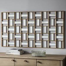
Utilize a spherical or rounded frame for a softer or maybe even wayward appearance, depending on the style of its frame. Fashionable triangle as well as diamond-shaped mirrors can include a quirky touch to an area. If you want to make a large design declaration, nonetheless, select a vibrant starburst-shaped mirror that makes sure to attract the eye. You can even create a form by organising numerous mirrors with each other just the way you would certainly with photos or framed art.
3. Dimension The very first decision to make when you're picking a wall surface mirror is exactly how huge it needs to be. The size of the mirror ought to be affected by a couple of elements. Size does matters since the dimension of your mirror can affect the influence you wish to create. The selection of dimension must also be based on whether you desire the mirror to be a centrepiece, an accent, or just work as the history.
A single small mirror on a huge wall will certainly look lost and trivial. Pick a dimension that is appropriate for the wall you have actually picked. If you desire your mirror to be a focal point in your room, ensure it is big sufficient to stick out, but likewise specify it by selecting a framework that makes it even more recognisable. If you want your mirror to become part of the background, you must choose one that is extra big to ensure that its feature then ends up being to make your room appear larger. Do not offer it a frame that draws attention to itself.
Smaller sized mirrors can be used as accents, capturing light below, mirroring a fascinating things there. They can likewise be utilised in teams. If you do intend to use smaller mirrors in groups, remember that with each other are acting to create a much larger shape as well as these might serve as a centrepiece in the room. You need to ask on your own, where am I hanging it?.
What dimension is the wall space? The size of the wall surface that you're placing it on as well as exactly how large an impact you want the mirror to make in your room. If you're hanging the mirror on a huge wall in your living room, dining-room or bed room and you want to make a strong statement, select an extra-large mirror, gauging between 25 and 31 inches on each side. If you're making use of the mirror as an accent on a little wall surface near your entryway, you might need one as little as 10 inches on each side. Action your wall surface so you recognise just how much area you have to collaborate with and also figure out how much of it you want the mirror to load.
4. Style Some wall surface mirrors don't have frames due to the fact that it's their size or shape that provides a solid visibility in your room. Your mirrors can reflect the style you already have in your room, but you can additionally develop terrific effect by selecting a style that is unforeseen and therefore functions as an accent. While the sizes and shape of a mirror issue, the framework plays an also greater function in establishing style.
When you're shopping for a mirror, nevertheless, you can also go with a design with a structure that packs a decorative punch all its own. Choose a straightforward wood, steel or plastic structure for a streamlined, structured appearance. An even more structure with simple lines or uncommon products is typically more suitable for an informal or contemporary interior. For an extra formal, significant look, look for a mirror with an ornate, gilded framework to act as a strong focal point for your space. An elaborate, carved or gilt structure is typically best used in a much more traditional or ethnic culture-inspired setup however can be made use of for comparison in a much more modern-day one. Whimsical frameworks and distressed looks function well for a country appearance, and even in an eclectic area. You can likewise locate wall mirrors with mosaic-style frameworks that feature little bits of ceramic tile for a fun, eye-catching appearance.
5. Colour If you pick a mirror with an attractive frame, pick a choice in a colour that collaborates with the rest of the area's style. A fundamental black, white or wood tone structure can collaborate with essentially any kind of embellishing plan. Gilded metals like gold or silver add a posh look that fits formal or modern decor well. If you're picking a wall surface mirror with a coloured frame, think about just how the structure's colour bets your wall surface shade as well as goal to develop a contrast that draws attention to the mirror. You can just choose a structure in a colour that's much darker or lighter than the wall, or opt for a coloured framework with a different undertone than the wall surface color to create a natural comparison.
1 note
·
View note
Text
cristalcarrington’s icon tutorial!
a little treat for day 28 of my filmuary challenge!

i’ve honestly lost count of which one this is, but welcome to another icon tutorial! here i’m going to breaking down my icon creation process step by step. i currently am a mac user and all my previous tutorials have been windows orientated (which unfortunately were all lost in the great url loss of 2017). my process hasn’t changed much since then, but i have picked up quite a few new go-to tricks and i’ll be sharing these tips in this post!
anyway! here’s what you’ll need-
photoshop (i currently use photoshop cc so be aware that options and tools may not translate onto other programs/versions of ps) and yes, i do pay for my photoshop but if you’re in need of a decent, safe download i might be able to point you in the right direction so hmu
patience (believe me some of these icons have taken me a painfully long time to create) just don’t feel discouraged if things don’t work out perfectly right away!
a creative mind. please be aware that this tutorial is only for educational purposes. under no circumstance directly replicate my icons! the one involved in this tutorial is clearly fair game, but please try to take creative liberty with your work. what i’ve found a lot of fun is incorporating bits and pieces of what other people do into my own work.
further resources
if you need more reference/help, here’s an icon psd for you to have a look around while reading the tutorial or instead of the tutorial. again, please do not re-upload or redistribute.
please consider reblogging this if you’ve found it useful. or checking out my resources!
starting off
so today, i’m going to tackle a screencap for my ongoing filmuary challenge!
i tend to get my screencaps from google, so for this i literally just googled “mirror mirror screencaps” and selected a image from google images. when i’m not feeling lazy, i tend to go through the whole movie (great screencaps can be found at screencapped or kissthemgoodbye)
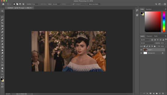
my first move is to open the screencap in the photoshop on it’s default canvas. the one i’ve chosen is normally the sort of screencap i’d go for-- one that has a central focus on the character and allows me to get a solid outline.
i tend to avoid screencaps that cut off the top of the characters head. i also tend to gravitate towards scenes that look easy to colour; if you choose overly saturated screencaps or screencaps that are too dark/light, then you will find it difficult to colour while conscious of the screencap quality.
base colouring
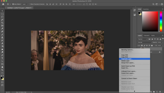
i then duplicate the screencap.
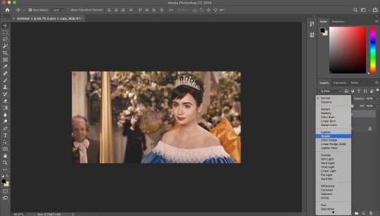
and then i set that duplicated layer to screen.
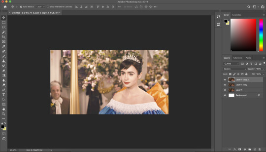
i like to make my icons super bright so i repeat this. it will vary depending on how dark the scene is. i prefer to do this to the screencaps as i find that it preserves the quality of the cap.
alternatively, you can use a psd-- my favourite as mentioned in previous tutorial is @blairsfelicity‘s icon psd which you can find in her tutorial here. my new method is just a whole lot lazier and i’ve been really enjoying the way my icons have turned out.
outlines
now here comes the menial part-- time for the outline.
remember to add a layer (unless you want to break your own heart by doing it directly onto the cap and being forced to start over (which i would NOT recommend by the way, crying over a screencap is as demoralising as it sounds)).
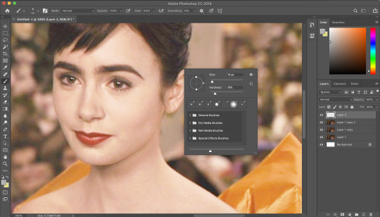
i vary between using the pen tool and a brush/eraser for my backgrounds. i like to shake it up depending on what i feel like doing or what the screencap would best fit. it also completely depends on whether i’m feeling particularly lazy or not-- if i have time to burn, i’ll use a brush. if i’m in a rush, i’ll use the polygonal lasso tool and refine my selection area with masks.
in this tutorial (due to my boredom of doing things over and over, this beautiful filmuary) i’m opting for the brush method. but if you want me to talk through polygonal lasso process which is a lot quicker and really streamlines the process-- then feel free to drop me a message and i’ll be happy to make another talk through.
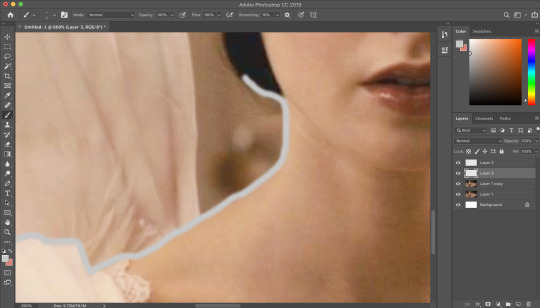
i like to use a brush for my erasing, on 30-50% hardness. i like to use a diffused/low hardness so my icon doesn’t look too sharp and the background and model seem to go with each other more. i’ll go for a small brush size when it comes to detailing (for example, when it comes to profiles, hair etc).
once i’ve outlined the model, i select the area around her with the magic wand tool and fill in the selected area with either a brush or a fill layer. then i merge the outline layer with the new colour layer.
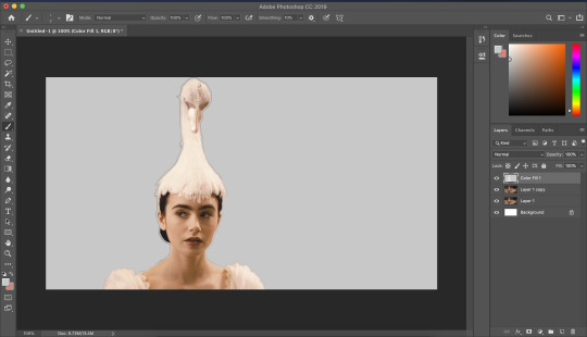
(these two examples are from another icon process bc im dumb and forgot to take screenshots)
there will be a full little line around the model once you’ve merged the layers. i just tend to fill it in manually with a brush.
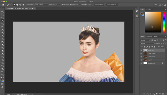
now here comes the fun part-- the colouring.
make those colours pop!
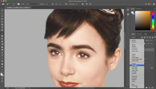
as you can see, the screencap has a lot of colours, but we need to make them pop. i take one of the colours, make a new layer and just paint until it’s vibrant and bold. once you’re happy with your colour selection, set the layer to soft light and adjust accordingly.
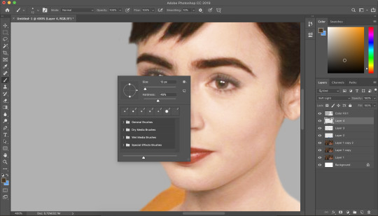
i tend to go for softer brushes when it comes to facial features. the lips, to make them a darker colour, i opt to set the layer style to multiply instead of soft light, and paint over the lip shape with a light pink/red.
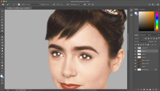
i always like to highlight the eyes to aid contrast in the screencap. i also like to fill all eyebrows in with a black (set on soft light) as well as the lashline, just to add further dimension and contrast to the model.
prepping the icon
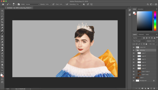
this is what my screencap looks like with the colouring complete. as you can see, each colour is on a separate layer. this is so i can adjust/duplicate each colour accordingly. once i’m happy, i place everything into a group together.
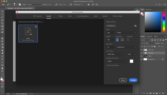
i make all of my icons on a 100x100px canvas.
i like to edit the screencaps on their original canvas as it helps with the quality of the screencap as well as allowing me to outline accurately.
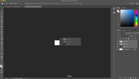
i just drag the files from one tab into another.
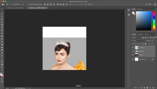
and then you can size it appropriately.
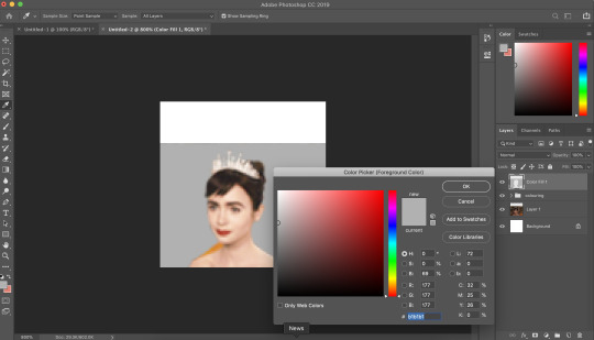
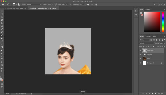
my next step is to select the same colour as the background and to paint over the white strip at the top of the icon. i do this directly onto my outline and then merge the two together. you now have the foundations of your icon to build onto!
final touches in the colouring department
there is honestly no direction that i could give you when it comes to these final colouring steps.
i like my icons to be very bright, so i target the contrast with levels and brightness/contrast layers. I like to also turn up the vibrancy to make the colours pop even more.
my preference is for the skin to be very neutral, so i try to combat the saturation of the skin with colour balance and selective colour layers (as well as another step i will explain later in the tutorial)
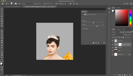
as you can see above, i place the final colouring all underneath the background layer as this makes it easier for me to place textures later on.
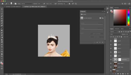
if you have problems with the model’s skin appearing too saturated, i’d recommend taking a solid fill layer of a black/white/grey and setting it to colour. place that layer just above the screencap and adjust it so it combats any saturation you might be experiencing.
textures and finishing touches!

clipping masks are honestly a god send for me. you can find them by right-clicking on the layers and selecting clipping masks. as you can see above, i use clipping masks to place a green texture on top of the icon’s background. i then layer above that by using further clipping masks, adding other textures and even layers to adjust the colouring of the background.
my favourite place to find textures are livejournal and deviantart-- soaked on livejournal is my go-to at the moment and i really enjoy evey-v’s icon textures. i also have my own resouces/textures that you can find here!
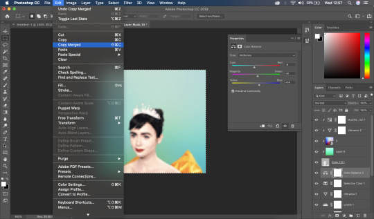

once i’m happy with how the icon looks, i copy all of the layers together and paste them under the background.
this is a super lazy way of sharpening the icon-- an alternative method is explained really well by @jennifergarner (aka the god of icons) on her icon faq page. i have used this in the past but after filmuary i’ve found a few little tricks.
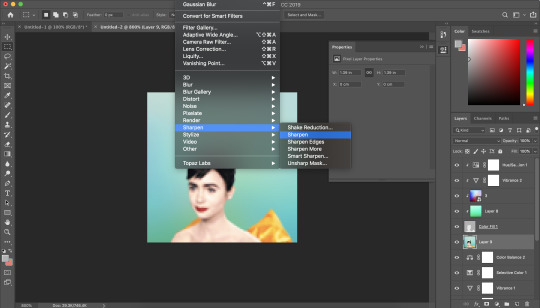
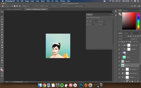
i then just sharpen the icon and adjust the opacity of the sharpened layer depending on my preferences.
and then there we go---

my chosen export settings are just to go for PNG every time. this helps preserve the quality of the icon and help it look super clean and tidy for whoever wants to use it.
and with that, that’s a wrap up of my tutorial.
for other tips and tricks, here are some of my asks that i’ve responded to;
do you have any tips for cutting short/curly/messy hair?
hey, would you mind sharing a psd icon?
what are some of your favorite icons textures?
can you break down how to use different types of textures?
67 notes
·
View notes
Note
hm it's A Lot so u can skip questions but abc's for lael !!
i did all of this out of hubris and pride so here u go enjoy
A: Aptitude1. what are your oc’s natural abilities, things they’ve been doing since young?
they’ve had a little scientist’s/engineer’s instincts from a young age! they’ve always been very smart and had a good eye for figuring out how systems and mechanical things function, through observation and taking them apart
2. what activities have they participated in?
this is so vague but like. a lot of magitech stuff? and robot fighting when they were in school. and as a kid a lot of running around in nature, exploring and observing and messing with everything.
3. what abilities do they have that they’ve worked for?
they have a natural knack for it, but all their knowledge of robotics, magic, and nature is stuff they took upon themself to study
4. what things are they bad at?
they’re not terrible athletic, and they really havent put much effort into developing people skills.
5. what is their most impressive talent?
probably to other people the fact that they do magitech
B: Basics1. what is their hair color?
black
2. what is their eye color?
dark brown
3. how tall are they?
about 5′7″
4. how old are they?
31
5. how much do they weigh?
no clue! im bad at figuring this stuff out. body type wise tho, they’re on the leaner side bc elf heritage but also. very squishy.
C: Comfort1. how do they sit in a chair?
almost never with both feet on the ground, at least with one leg up or crossed, sometimes with feet on the seat, but generally with limbs going wherever, one arm hooked over the seatback, etc. there is no order here
2. in what position do they sleep?
they can sleep anywhere and tend to either splay out with limbs everywhere or curl up tight around a pillow
3. what is their ideal comfort day?
hang out at home, read some books, eat their childhood favorites, and hang out with their parents, maybe fuck around out in nature for a bit
4. what is their major comfort food? why?
this chicken and vegetable soup that their dad would make for them when they were sick, it’s heavy and comforting and magically makes them feel a little bit better
5. who is the best at comforting them when down?
their parents, but in different ways– their mom does more of the physical ‘taking care of them’ stuff when comforting, and their dad gets more into the emotional comfort stuff
D: Decoration1. how would they decorate a house if they had one under their name?
they do have a house! although it’s also first and foremost a lab, but that’s pretty on brand for them anyway. it’s a lot of tools and practical stuff, and a lot of the furniture is based off of personal comfort or use rather than style. for decoration though there’s some blueprints and pictures pasted to the walls. the colors in general are warmer ones, and the place overall gives the impression of not being necessarily Nice but comfortable and lived in. it’s very much Lael’s Space
2. how would they decorate their child’s room?
they. would not have children.
3. how do they decorate their own room?
same with the house– very comfortable and useful, pictures and diagrams pasted on the walls, and lots of space for books and knick-knacks along with work room
4. what type of clothes and accessories do they wear?
they have sort of a Style but it’s also pretty chill and comfortable, made to be moving around in their workroom or working outdoors. lots of basic light-weight short sleeve shirts or button-ups, pants w lots of pocket space, overalls, tool belts, etc. if they dress fancier it’s pretty basic and streamlined, look-wise, nothing very flashy or fancy unless it’s the holidays and someone makes them.
5. do they like makeup/nail/beauty trends?
not at all, that’s a lot of extraneous effort they’re not willing to put in, esp since they dont necessarily see a lot of other people regularly
E: External Personality1. does the way they do things portray their internal personality?
pretty much, yeah. lael doesn’t see the point in trying to put on a nice face for anyone else. they’re a little softer than they appear on the outside tho.
2. do they do things that conform to the norm?
they dont care much about the norm, but they’ll go along with some stuff for the sake if it being easier (although it’s not common for them). they always tend to grate against norms a little bit in general tho
3. do they follow trends or do their own thing?
do their own thing. they’ve always been something of an outsider, even in their own community, so they don’t see the value in trying to follow what others are doing.
4. are they up-to-date on the internet fads?
the internet doesnt exist but. no. they dont really follow fads or trends outside of their own fields, where they keep up with trends but ultimately follow their own ideas.
5. do they portray their personality intentionally or let people figure it out on their own?
in some ways, yes-- they tend to broadcast their own aggressiveness and weirdness so that people know what they’re about and stay away if they’re not interested. other stuff they let people find out on their own, esp emotional soft spots and their occasional gentleness, etc
F: Fun1. what do they do for fun?
science! studying bugs and stuff. and they like gardening a lot, and doing science on the plants. when they were younger they went out more and also participated in some robot-fighting circles in their spare time.
2. what is their ideal party?
they’d think back to the days when they lived in gelt and there were some wild parties with fellow magitechnicians their age– nowadays they’d like something a bit more chill, but a good party for them would entail hanging out and drinking with other people/friends in their field
3. who would they have the most fun with?
mostly old school friends
4. can they have fun while conforming to rules?
not really, no– they dont have to break the law, but they’re always going to rub up against restrictions. everything is more fun when you have room to explore and make a little bit of trouble
5. do they go out a lot?
nope, they live out in the country and spend a lot of time working. they went out more often when they were young, though
G: Gorgeous1. what is their most attractive external feature?
those high cheekbones!!
2. what is the most attractive part of their personality?
their passion! when they care about something they Care, and it can be a little bit infectious
3. what benefits come with being their friend?
long intellectual conversations & having a friend that will 100% fight for you if you’re close enough
4. what parts of them do they like and dislike?
this is... not something they think about a lot, i’m not sure they are terribly introspective. but i think they like their own curiosity and novel approaches to problems, and dislike some of the issues they have interacting w others (but they dont think about it too hard)
5. what parts of others do they envy?
they’ll never admit it, but they’re jealous of people who can move through social situations with a ton of ease.
H: Heat1. do they rather a hot or cold room?
cold, they’re not a big fan of the heat
2. do they prefer summer or winter?
neither, but summer slightly more just because nature is much more active
3. do they like the snow?
it’s fine. pretty but also a pain in the ass
4. do they have a favorite summer activity?
bug huntin’! exploring nature! looking at plants and wildlife! taking notes!
5. do they have a favorite winter activity?
staying inside where it’s warm and working on projects. and they complain but they don’t entirely hate the rituals of going to see family during winter holidays
I: In-the-closet1. what is their sexuality?
bi/pan, idk if they have a preference label-wise
2. have they ever questioned their sexuality?
i’m not sure if they had a lot of expectations imposed on them in terms of what’s ‘normal’ sexuality-wise, but they def came to the realization of being not-straight at some point
3. have they ever questioned their gender?
im not sure they ever had a time where they didnt see themselves as non-binary, they maybe messed around w gender as a kid but fairly quickly settled on their current state of not giving a shit
4. would/was their family be okay with them being LGBT?
what’s homophobia this is fantasy land
5. how long would/did it take for them to come out?
idk if they actually came out ever, everyone just sorta knows
J: Joy1. what makes them happy?
magitech, exploring nature, weird bugs, learning new things
2. who makes them happy?
their family, their mentor, other magitechnicians who they can talk to and share ideas w
3. are there any songs that bring them joy?
songs that their parents would sing when they were young– either as lullabies or songs their father would sing while working
4. are they happy often?
lael’s emotions go all over the place, and i don’t know if they’re truly happy super often, but they’re overall content with the shape of their life right now
5. what brings them the most joy in the world?
those moments when they’re working and finally Get something or know exactly how something needs to work
K: Kill1. have they ever thought about suicide?
not really, no
2. have they ever thought about homicide?
…..yes, but more fantasizing than intent to act on it
3. if they could kill anyone without punishment, would they? who?
they would at least seriously consider it, and it’d be either their ex or whoever fucked gil up so badly
4. who would miss them if they died?
their family, a few friends
5. who would be happy they died, anyone?
hopefully no one? lael is not someone with a few friends, but while they certainly have people who dislike them, they have very few, if any, outright enemies. (to their knowledge?)
L: Lemons1. what is their favorite fruit?
they enjoy citrus but rarely get their hands on it, living in a more temperate climate. otherwise they like sour apples a lot! and blackberries
2. what is their least favorite fruit?
not a fan of pears (it’s a texture thing + they’re a bit too sweet)
3. are there any foods they hate?
not really, most of their food-dislikes are pretty mild.
4. do they have any food intolerances?
lael is lactose-intolerant! this does not stop them from consuming dairy products.
5. what is their favorite food?
they really like the beef stew the had when they were younger! they dont get it as often now tho, only when they get home
M: Maternal1. would they want a daughter or a son?
they don’t want kids
2. how many children do they want?
zero
3. would they be a good parent?
no, they’re too obsessed with work to take care of anyone else
4. what would they name a son? what would they name a daughter?
not only do they not want kids but they are notoriously bad at naming anything and should not be allowed to do so to an actual child.
5. would they adopt?
nope.
N: Never Have I Ever1. what would they never do?
i don’t think they could ever like.... willingly submit to someone else? whether that be a god or a ruler or a boss. they might go along with them in some circumstances but they could never be truly devoted to someone above them
2. what have they never done that they want to do?
3. is there anything they absolutely can’t believe people do?
kind of related to #1, they think it’s wild that people follow others w/o any questioning or thinking about it for themself. even w stuff as small as w/ reading a science book-- if lael has the ability to test something out for themself they will before they trust someone else’s perspective
4. what is the most embarrassing thing they’ve done?
once tried to impress a crush by giving them a bug. it did not go well.also that one time that they got a drunken tattoo (altho i dont think they regret it-- they just don’t show it off)
5. have they done anything they thought they’d never do?
lael never really thought of themself as the type to be a teacher, so the fact that they want to and are going to try to teach some stuff to arabella is unexpected for them, even if they themself suggested the idea
O: Optimism1. are they optimistic or pessimistic?
i think they alternate depending on the situation? they tend to be pessimistic when it comes to people and their motives, but optimistic in regards to progress/science/their own work
2. are they openly optimistic, throwing it on others?
they aren’t very openly optimistic, it only really shines through when they start talking about the future of magitech or some shit
3. are they good at giving advice?
not at all! unless it’s help with a project, then maybe. dont go them to them for personal advice though-- most of the good advice they have is just verbatim from other people
4. is there anyone in their life that throws optimism on them?
their parents, esp their dad, are much more optimistic about things
5. were they always optimistic?
they’ve always been pretty optimistic about certain things, like magitech. but they learned pretty young to not be optimistic about others, and they became even more pessimistic in that area as time has gone on
P: Personality1. what is their best personality trait?
their intense love of knowledge and passion for their work
2. what is their worst personality trait?
they’re kind of an asshole and care very little about what others think of them, for better or worse.
3. what of their personality do others love?
dm quote: “Other magitechnicians admire their ingenuity and focus, Gil and their parents love their quiet dedication and the joy they take in their passions”
4. what of their personality do others envy?
the fact that they seem to care very little of others’ opinions of them
5. do they hate anything about their personality/about other’s personalities?
they tend to dislike others who are ‘fake��� and not straightforward with their intentions. as for themself, the fact that they do not have a lot of self control, ESPECIALLY when it comes to their shit taste in romantic partners
Q: Questions1. do they ask for help?
not often, if they can avoid it, but at the end of the day they’re more concerned w progress than pride
2. do they ask questions in class?
they’re the type of kid to ask too many questions in class, actually
3. do they answer questions that make them a little uncomfortable?
they might, but they’ll generally call out the other person for asking uncomfortable questions as well
4. do they ask weird questions?
very! they did moreso as a kid, they’ve developed SOME tact now
5. are they curious?
oh yeah they’re SUPER curious about stuff, but only when it’s in their field of interest (ex: they dont care much about gossip at all, not when cool bugs exist)
R: Rules1. do they follow rules?
only when it benefits them or it aligns with their own beliefs.
2. would they be a strict or laid-back parent?
they would… not be a parent. but if they were, a fairly distant and laid back one.
3. have they ever been consequenced for breaking a rule?
almost definitely, but mostly stuff like “taking worms inside the house” or “getting in fights w others” (rarely) or generally being a weird chaotic shit as a kid. they break less rules now but mostly bc they care about keeping their job
4. have they broken any rules they now regret breaking?
hm. i don’t think so. they’re not the type to have many regrets.
5. do they find any rules they/others follow absolutely ridiculous?
they have Thoughts about some Taliare rules that limit magitechnicians and impede progress. they also have issues w bureaucracy in general
S: Streets1. are they street-smart?
they are generally pretty good at reading others and judging their intentions, but they’ve def focused more attention on book-smarts
2. would they give money to someone on the streets?
honestly? probably not, but more out of not wanting to interact with strangers than any sort of malice
3. have they ever gotten in a fight on the streets?
realistically absolutely yes, once as a kid and one or two times when they were going through their first round of magitech school.
4. has anything happened to them on the streets?
they probably got pickpocketed once or twice in gelt
5. are they cautious when out?
only a bit, but they’re very capable of protecting themself if it comes down to it (they’ve got a knife! and magic!)
T: Truth1. are they honest?
on principle, and sometimes to a fault
2. can they tell if someone is lying?
usually yeah, they can get a good read on others
3. is it obvious when they’re lying?
they rarely lie they, so they don’t have a ton of practice at it, and i think someone who knows them well or is pretty intuitive they’d be able to pick up on it
4. have they lied about anything they regret lying about?
i don’t think they lie enough for this to be the case? it’s mostly white lies if anything
5. have they told truths that have been spread against their will?
nope, not really.
U: Underdog1. have they been bullied?
when they were younger, yes. partially bc of being a half elf in an almost entirely human town (which made them a very easy target) and partially bc they were just a weird fucking kid
2. have they bullied anyone?
they’ve been MEAN to people but not actively bullied anyone. they did break a kid’s nose once but he deserved it.
3. have they been physically attacked by a bully?
i dont think so, i think it was more teasing and ostracism. any physical attacks were pretty mild or on their possessions. i think once someone tried to get physical but they were scared off by the only other non-human in town (besides lael’s dad), an older half-orc boy named Cyrus, and they never tried to attack lael again.
4. have they ever been doubted?
i mean, yes almost definitely, altho i cant give u an example
5. have they surprised people with being good at something?
i feel like when they were young and first showed talent w magitech they surprised some ppl. also, when they lived in gelt i think the fact they knew so much about nature and medicine was unexpected to ppl who just met them, but for anyone who knew them well it wouldnt be surprising at all
V: Vomit1. do they vomit often?
not really, unless they’re sick
2. do they get lots of stomach aches?
not really, they dont eat particularly out-there food and their stomach isnt overly sensitive
3. are they good at comforting someone ill?
lael isn’t good at comforting period, they’re more the type to just go through necessary medical stuff but they do not have very good bedside manner.
4. what do they like as far as comfort goes?
they like to be in a place they’re comfortable, like home, and with people that Get them, w like a nice blanket, and more physical affection than usual.
5. do they burp, cough, or hiccup most when nauseous? when vomiting?
i do not know or care
W: Water1. do they drink enough water?
they probably forget while they’re working. their mom gets on them about this when they come home tho
2. have they learned to swim?
probably only the very basics, they dont live around any large bodies of water so they’re not super proficient
3. do they like to swim?
not really
4. can they dive?
o def not
5. can they swim without holding their nose?
i would hope so?
X: Xylophone1. what is their favorite genre of music?
i don’t know if they’re super up to date on music? in a modern day setting they’d be into all sorts of electronic music tho
2. do they have a favorite song?
again, not modern day so idk
3. do they have a favorite band/artist/singer?
not in-game, but they’d probably be very into all sorts of weird electronic music and lo-fi stuff that mixes ‘real’ sounds, like snail’s house
4. can they sing well?
oh no they’re not very good at it at all
5. can they rap?
….probably not
Y: You1. how old were you when you created them?
21! i made them this year
2. what inspired you to create them?
i figured if i was gonna play a character in a magitech universe i wanted them to be related to that in some way. basically they were created with the idea of “i want to play a character with a robot arm” and literally their entire backstory and personality is descended from that fact.
the other thing is that i was learning about biomimicry-technology in german class and i thought it’d be cool to have an engineer character that very much loved and was influenced by nature
3. were they different when they were first created?
oh i first thought that their personality would be more stoic and distant, but in reality the most core thing about their personality is how fucking passionate they are about things
4. do you enjoy writing them more than other characters?
again, i dont really love playing one character more than others, i just love them for different reasons! but lael is particularly fun to play because it’s fun to not worry much about coming off as “nice” to others, and also I Love Magic. it’s also fun to play someone so passionate about their studies and work bc i can channel myself into that!
5. what’s your favorite thing about them?
man honestly it’s that aforementioned passion that they have for what they do, and their endless curiosity about how things work and how to make them better
Z: Zebra1. what’s their favorite animal?
spiders!!! they love creepy crawlys and bugs in general though
2. do they like animals?
yes but more in a scientific way than a ‘wants to have a lot of pets’ way. and it’s generally more reptiles/insects/arachnids than furry animals
3. cats or dogs?
cats
4. what’s their dream pet?
a tarantula! or a cool lizard
5. do they have any pets at the moment?
nah, but they have plants
1 note
·
View note
Text
A man’s perspective
There had been a series of events causing unrest both in my mind and in the country at large. IPC Section 497, #MeToo, Supreme Court’s judgement allowing women to enter Sabarimala temple are the events. And the factor that connects these three events is: Woman Rights.
Like it’s already easy enough to be a woman in India, the feminine gender is subjected to modern trends in oppression in this modern day India. Yes, our ways of life has changed; we no longer kill female infants nor refuse to educate them; but so has the chauvinistic attitude grown in such a way that it neatly fits into the modern picture.
India's Supreme Court has struck down a law that made adultery illegal, calling it arbitrary and saying it is unconstitutional because it “treats a husband as the master” and “the law gives a husband license to use the woman as chattel”
#MeTooIndia provided a streamlined way for women to bring out the abuse and harassment they underwent at their workplace and in their lives in general. The masses of women who came out and the bandwidth of their profiles was staggering to me, personally.
Women were traditionally restricted in a lot of places of worship with reasons citing that their bodily differences to that of men would deem doom to the sanity of those religious places. Some even claimed that the restrictions were for the sake of women as it might lead to health and sanity related problems. To make clear that the issue is irrespective of religion, I’d like to point out that women are not only restricted at Sabarimala and Shani Shingnapur temples but they face similar situations in some Jain (Guna, Ranakpur) and Islamic* (Haji Ali Dargah (Mumbai), Nizamuddin Dargah (New Delhi), Jama Masjid (Delhi)) places of worship.
Conventionally, marriage in India, has been a classical example for women being treated as not just the softer gender but also as the more vulnerable one when it comes to social stigmas and societal constraints. Though most people knew the amount of injustice the bride and her family were subjected to, it was traditionally accepted. Another infamy case is the disproportionate beauty standards that had crept into the minds not just men, but sadly, the society at large.
I believe this is the point where a woman is objectified in the first place. When the purity of skin was examined instead of the purity of her heart, when the adaptability of assets were checked instead of the adaptability of her character, when her face becomes the deciding factor instead of her smile, that is when the problems really start in the medley of society.
Now coming back to IPC 497; Why was it considered as gender discriminatory? It had provisions to punish only men subjected in adultery. But how does it objectify women? The law does not give any right to a woman to prosecute her adulterous husband, or the woman with whom the husband has indulged in the wrong doing with. I believe that this was a law better suited to the past mindset of India wherein the men were polygamous and women were treated as victims. But where it really failed was where it denied a fundamental right to a woman to move against the affair. Therefore it was commendable for the Supreme Court to modify it according to the dynamics of present day India.
More than 35% of women are subjected to abuse at their workplace and a portion of them are harassed. When it comes to harassment, it’s more about fear and power rather than feelings and consent. Right from casting couches in show-biz to promotions at corporates, it's everywhere. The common fear about “coming out” on these acts is the notion of societal charges against women being improper rather than what should’ve been those men being inappropriate.
#MeToo has provided a platform with which the women can express what happened to them so that, it doesn’t happen to anyone else. No legal action can be taken in India without a strong evidence and even the accuser can be jailed upto two years if the case is turned tables as a defamation case by the accused. While these factors slow down the pace of the movement, I think it will encourage only the true ones to come out. The ones who had it all within them for soo long, the ones who had to face the same pressure day in and day out at work, finally have a means to let it out. It’s not their fault yet they had to go through the excruciating agony.
Yes it has the potential to de-rail the reputation of any man involved with it. But in the longer run, it’s going to be in favor of women same as all the gender-biased laws in India have been. With the criminalisation of defamation, I don’t think this movement is biased towards favoring the women rather than just equalizing the loads.
I support the decision made by the SC to allow women into the religious shrines (taking away the sentiments of Citizens). Yes it is a fundamental right for any person to freely practice their religion in ways that they approve of. The SC clearly addressed the concerns of a normal citizen who thinks it's the bodily differences of a woman that restricts her from entering the shrines by stating that “No physiological and biological factor can be given legitimacy if it does not pass the test of conditionality”
No matter is something is right or wrong for them, everyone must be given a choice whether or not to take the path or not. Robbing them of that decision is equivalent to robbing them of the rights they enjoy as a citizen of India. Some people might think that it is idiotic to involve women in physic-enduring jobs such as being a fighter pilot or heavy machine operators; but let it be their choice. If they have the potential to do it, please let them!
The reason I talked about these issues in here was the general mindset of people around me was confused and misinformed rather than just the notion of oppression.
I know men are victims of gender inequality too, but it's clearly outnumbered. While we have to protect the rights of men, we should not refrain from stealing away the ones that puts the other gender down.
We, the modern millennials have yet not incorporated the stains of our past generations and the confusion must be cleared before we take sides. We must pave way for a future India where we would be harmoniously enjoying an equality everywhere. A world that is equally competitive for a man as it is for a woman, where a man has to compete toe to toe with the other gender without discrimination on either sides, where women are treated as the same without bias and prejudice.Men and women performing a good deed must be recognized without the gender play. Men and women who commit mistakes must be punished irrespective of their gender.
It all starts with the thought of the current generation. The thought of the girl who sits near you at class is as equally gifted as you are...the one that works besides you at workplace is as equally talented as you are...the one that you are about to marry has the same dreams as you do.
This Navarathri, a time when we praise the importance of three Goddesses who provide us with the joy of being a part of this world, we shall pledge to remove the notion of gender from the straps of society.

P.S: You might think that I am a feminist or I am overly biased upon the female version of the plight, but I believe in equality rather than any particular section of the world having the upper hand. I am someone who constantly thinks and believes that men can indeed outperform women in most of the activities. But that’s my own belief. That must not stop me from believing in the rights that a woman must possess.They have the right to compete and they have the right to win.
*I heard that a lot of mosques are now opening doors towards allowing women entry and that is a really laudable act. Info about restrictions were excerpted from http://indiavivid.com/no-entry-women-temples-india/
1 note
·
View note
Text
The reMarkable 2 improves on the original in every way, but remains firmly in its niche
I’d been asking for something like the reMarkable for a long time before it showed up out of the blue a few years ago. The device was a real treat, but had a few problems and an eye-popping price tag. The reMarkable 2 builds on the first with a more beautiful, streamlined device and several key new features, but keeps many of the limitations — some deliberate, some not so much — that make it a refreshingly specialty device. Costs a lot less this time around, too.
The reMarkable is intended to be a tablet for consuming and creating black and white (and grey) content: PDFs, sketches, jotted notes, that sort of thing — without all the distractions and complications of a full-on tablet or laptop. I certainly found that when I had a lot of content to get through and annotate, the device helped me focus, and it was useful for light note-taking and and other purposes ,like DMing a D&D game or sketching out a woodworking project.
With $15M round and 100K tablets sold, reMarkable CEO wants to make tech ‘more human’
The rM2, as I’ll call it, really is an improvement in pretty much every possible way. I’m honestly a bit baffled as to how they could make it thinner, faster, more battery efficient, better at pretty much everything, and yet drop the price from $600 to $400. Usually there’s some kind of trade-off. Not this time!
Specifically, the rM2 has the following major improvements:
Thinner (an already svelte 6.7mm reduced to 4.7mm; for comparison, an iPad is about 6mm)
Faster, dual-core ARM CPU (mainly for power savings)
Double the RAM (a gig, up from 512 MB)
Display response time halved to 21ms (comparable to LCDs)
Battery life more than tripled (a couple weeks, or months on standby, instead of a couple days)
Eraser on other end of stylus. Thank you!
What hasn’t been changed is the screen itself (that is, the resolution and contrast), the OS, and the general purpose of the thing.
The new device, left, and old one. Image Credits: reMarkable
Let’s start with the new design. To be perfectly honest, I wasn’t taken with it at first. The original’s softer white plastic case felt more organic, while the new one’s asymmetric chrome is more gadgety.
But it’s grown on me as also being more purposeful and focused, though of course it also now is rather more suitable for a right-handed person than a left. The original’s three enormous buttons always seemed far too prominent for the amount of utility they offered. I did sometimes wish for a home button on the rM2, but a new gesture (swipe from the top) takes care of that.
Image Credits: Devin Coldewey / TechCrunch
The power button at the top of the chrome strip is tiny, perhaps too tiny, but at least you won’t hit it by accident. The USB-C charge port is opposite the power button, on the bottom, and well out of the way of anywhere you’ll hold it, making charging while using easy (though you probably won’t need to).
Powerful magnets on the right side hold the stylus with a tight grip but no visible markings. Said stylus, I should add, is a very nice one indeed, with a weighty feel and rubberized finish. The new eraser function works great — definitely spring for it if you’re thinking about getting one of these.
Image Credits: Devin Coldewey / TechCrunch
On the back are four tiny rubberized feet that serve to prevent it scooting across the table while naked, and which help align the tablet perfectly in its folio case. Projections like these on such a thin, smooth device bother me on some level — I tried to peel them off first thing — but I understand they’re practical.
Overall the rM2 is extremely streamlined, and while it’s significantly heavier than the first (about 400 grams, or .89 lb, versus 350g, both lighter than the lightest iPad) it isn’t heavy by any stretch of the imagination. The bezel is big enough you can grip or reposition the device easily but not so large it takes over. I could have done with maybe a little less but I’m picky that way.
Don’t get me wrong — I’m just a real stickler for industrial design. The flaws I’ve mentioned here are nothing compared with, say, the straight-up-ugly iPhone 11. The rM2 is a striking device, more so than the first, and it does a great job of both disappearing and showing strong design choices.
Image Credits: Devin Coldewey / TechCrunch
The display is the same as the first, and as such is not quite at today’s e-reader levels when it comes to pixel density and contrast. E-readers from Kobo and Amazon hit 300 pixels per inch, and reMarkable’s is down at 226. Sometimes this matters, and sometimes it doesn’t. I’ve found that certain fonts and pen marks show lots of aliasing, but mostly it isn’t noticeable because as a larger device one tends to hold it farther from their face.
There’s no frontlight, which I understand is a deliberate choice — you’re supposed to work with this thing under the same lighting you’d use for a paper document. Still, I felt its absence occasionally when reading.
I can vouch for the new battery lasting much, much longer. I’ve only had the device for a week or so, meaning I can’t speak to the months of standby, but I was always disappointed by the original’s need for frequent charging and this one has been far better.
It is also much faster to turn on and off. The original went to sleep and shut down after rather too short a delay and took a while to start up. The rM2 turns on instantly from sleep and takes about 20 seconds to boot from a full off state. Fortunately it doesn’t need to be turned off, or turn itself off, anywhere near as often as its predecessor. Removing these on/off and battery worries really goes a long way towards making this a practical device for a lot of people.
An excellent endless legal pad and PDF tool
You can write neatly, I just don’t. Image Credits: Devin Coldewey / TechCrunch
Where the rM2 succeeds best is as a reader for full-page documents like scientific papers, legal documents, and reports, and as a rough sketchpad and notebook with the chief benefit of having effectively unlimited pages.
For reading, the experience is not very different from the original device. It works with fairly few formats, and PDF the best. You can skim through pages, annotate with the pen, and highlight text — though annoyingly you’re still just painting the text with a translucent layer, not digitally selecting/highlighting the text itself.
You can search for text easily and navigation is straightforward, though I’d like the option to tap and go to the next page rather than swipe. Changes are synced to the document in the reMarkable app, where you can easily export a modified version, though again you can’t directly select text.
Writing and drawing on the screen feels great — better than before, and it was already the best among e-paper devices. The iPad Pro beats it for full-color illustration, naturally, but the idea isn’t to meet the capabilities of other tablets, it’s to provide the intended features well.
Image Credits: Devin Coldewey / TechCrunch
The feel of the screen is smoother than the first reMarkable, but the texture change isn’t necessarily bad — one thing I could never quite get away from on the first was, due to its texture, the feeling that I was scratching the screen when I wrote. Nothing like that here, though the tactility is slightly less. As for the lower latency, it’s noticeable and unnoticeable at the same time: Certainly it’s better than all the other e-paper devices I’ve tested, including the first reMarkable. But even 21ms is noticeable and affects the way you write or draw. It isn’t “just like paper,” but it is pretty awesome.
I would never try to replace the small pocket notepad I use during interviews, but at a meeting or brainstorm I would much rather use this. The space you have for making little groups of names, flowcharts, random things to look up later, doodles of your boss, and so on is so vast and so easily accessible that it almost makes me wish I went to more meetings. Almost!
I realize showing this on video would be helpful to some, but the truth is even on video it’s hard to get a sense of how it looks and feels when you’re actually doing it. It feels more responsive than it looks.
A clutch new feature for writing and drawing is the integration of an eraser tip on the other side of the stylus. It works automatically, feels rubbery like a real eraser, and saves you a trip to the pen menu. Unfortunately you still have to open that menu to get to “undo,” which is sometimes preferable to erasing. Given the whole screen is multi-touch capacitive, I don’t see any reason why something like a two-finger leftward swipe can’t be mapped to undo, or double-tapping the eraser in an empty space.
Image Credits: Devin Coldewey / TechCrunch
Handwriting recognition is helpful, not that I have taken a whole lot of notes with the rM2, but it’s easy to see how it saves time when transferring mixed-media pages to your computer. It’s not like it would take you that much time to spell out the email address or name someone mentioned, it’s just nicer to be able to hit a button and it’s ready to copy and paste.
I definitely experienced transcription errors, but honestly, even I can’t tell my “u” and “n” or “r” and “v” apart all the time. I have a draggy style of longhand so I needed to focus a bit on picking up the pen from the surface rather than letting it trail at the lowest level of pressure.
A so-so e-reader
Image Credits: Devin Coldewey / TechCrunch
One aspect of the original reMarkable that didn’t thrill me was the handling and display of e-books and other pure text content. The rM2 improves on this and adds a very useful new time-shifting feature, but it still falls behind the competition.
The fact is that the reMarkable isn’t really intended for reading books. It’s formatted for content that’s already meant to be displayed as a full page, and it does that well. When it has to do its own text formatting the options are a little thinner.
With six fonts and six sizes per font, and three options each for margins and spacing, room for customization is low. The two most book-like text sizes seem to be “slightly too large” and “slightly too small,” while the others are comically huge, appearing larger than even a large-print book would have them.
Image Credits: Devin Coldewey / TechCrunch
Several epub books I loaded onto the tablet failed in various ways. Initial tabs on paragraphs didn’t render; in-text links didn’t work; line spacing is uneven; large white spaces appeared rather than partial paragraphs. The team needs to take a serious look at their e-book renderer and text options, and I’m told that they are in fact doing so, but that writing, drawing, and of course the new hardware have taken up their resources.
It’s less of an issue with articles gleaned from the web with the new Chrome extension. These are more consistently formatted and make articles read more like magazine pages, which is perfectly fine. I do wish there were options for a two-column view or other ways to customize how the pages are transcoded. I give reMarkable a pass on this because it’s a new feature they’re still building out and it works pretty well.
No chance, unfortunately, for integration with Pocket, Simplenote, Evernote, or any of the other common services along these lines. For better or worse reMarkable has chosen to go it alone. reMarkable as a company is wary of making the device too complex and too integrated with other things, since the entire philosophy is one of removing distractions. That makes for a unified experience, but it hurts when a feature is simply not as good as the competition with which the company has voluntarily entered competition.
Image Credits: Devin Coldewey / TechCrunch
One serious gripe I have, and one which will surely bother reMarkable’s existing customers, is that you can only have one device active at a time per account. Yes: If you bought the first, you essentially have to disable it in order to set up the second.
This is a huge problem and a missed opportunity as well. For one thing, it’s a bit cruel to essentially throw their oldest customers under the bus. You could probably figure out a workaround but the simple fact that the old device has to be kicked off the account is bad. Because it could so easily have been very useful to have two of these things. Imagine keeping one at work and one at home, and they stay in sync, or sharing an account with a partner and sending documents or handwriting back and forth.
I asked the company about this and it seems that it is a technical limitation at this time, and that multiple devices are on the roadmap to support. But for anyone planning on buying an rM2 now, it’s a material consideration that your original device will no longer be usable by you, or at least not in the same way — it isn’t bricked or anything, it just won’t sync with your account.
Hope and dreams (and hacks)
As before, what is exciting about the reMarkable 2 is not just what it does, but what it could do. The company has significantly expanded what the ecosystem supports over the last couple years, improved performance, and responded to user requests. Most of my complaints are things the team is already aware of, since they have an engaged and outspoken community, and are somewhere on the roadmap to be fixed or added.
There is also a healthy hacking community putting together new ways to take advantage of such promising hardware — though of course with the usual caveat that you could brick it if you’re not careful. If reMarkable doesn’t want to build an RSS reader into the device because of their fundamental philosophy against such a thing, someone will probably make one anyway. I look forward to experimenting with the device not as a carefully tuned platform but as an all-purpose greyscale computer.
The previous reMarkable was a very interesting device but one that was rather difficult to recommend widely at launch. But the company has proven itself over the last couple years and the device has grown and solidified. This upgraded version, better in nearly every way yet a third cheaper, is much, much easier to recommend. If you are interested in exploring a more paperless world, or want to force yourself to focus better, or just think this thing sounds cool, the reMarkable 2 is a great device to do it with.
from RSSMix.com Mix ID 8176395 https://techcrunch.com/2020/08/27/the-remarkable-2-improves-on-the-original-in-every-way-but-remains-firmly-in-its-niche/ via http://www.kindlecompared.com/kindle-comparison/
0 notes
Text
The reMarkable 2 improves on the original in every way, but remains firmly in its niche
I’d been asking for something like the reMarkable for a long time before it showed up out of the blue a few years ago. The device was a real treat, but had a few problems and an eye-popping price tag. The reMarkable 2 builds on the first with a more beautiful, streamlined device and several key new features, but keeps many of the limitations — some deliberate, some not so much — that make it a refreshingly specialty device. Costs a lot less this time around, too.
The reMarkable is intended to be a tablet for consuming and creating black and white (and grey) content: PDFs, sketches, jotted notes, that sort of thing — without all the distractions and complications of a full-on tablet or laptop. I certainly found that when I had a lot of content to get through and annotate, the device helped me focus, and it was useful for light note-taking and and other purposes ,like DMing a D&D game or sketching out a woodworking project.
With $15M round and 100K tablets sold, reMarkable CEO wants to make tech ‘more human’
The rM2, as I’ll call it, really is an improvement in pretty much every possible way. I’m honestly a bit baffled as to how they could make it thinner, faster, more battery efficient, better at pretty much everything, and yet drop the price from $600 to $400. Usually there’s some kind of trade-off. Not this time!
Specifically, the rM2 has the following major improvements:
Thinner (an already svelte 6.7mm reduced to 4.7mm; for comparison, an iPad is about 6mm)
Faster, dual-core ARM CPU (mainly for power savings)
Double the RAM (a gig, up from 512 MB)
Display response time halved to 21ms (comparable to LCDs)
Battery life more than tripled (a couple weeks, or months on standby, instead of a couple days)
Eraser on other end of stylus. Thank you!
What hasn’t been changed is the screen itself (that is, the resolution and contrast), the OS, and the general purpose of the thing.
The new device, left, and old one. Image Credits: reMarkable
Let’s start with the new design. To be perfectly honest, I wasn’t taken with it at first. The original’s softer white plastic case felt more organic, while the new one’s asymmetric chrome is more gadgety.
But it’s grown on me as also being more purposeful and focused, though of course it also now is rather more suitable for a right-handed person than a left. The original’s three enormous buttons always seemed far too prominent for the amount of utility they offered. I did sometimes wish for a home button on the rM2, but a new gesture (swipe from the top) takes care of that.
Image Credits: Devin Coldewey / TechCrunch
The power button at the top of the chrome strip is tiny, perhaps too tiny, but at least you won’t hit it by accident. The USB-C charge port is opposite the power button, on the bottom, and well out of the way of anywhere you’ll hold it, making charging while using easy (though you probably won’t need to).
Powerful magnets on the right side hold the stylus with a tight grip but no visible markings. Said stylus, I should add, is a very nice one indeed, with a weighty feel and rubberized finish. The new eraser function works great — definitely spring for it if you’re thinking about getting one of these.
Image Credits: Devin Coldewey / TechCrunch
On the back are four tiny rubberized feet that serve to prevent it scooting across the table while naked, and which help align the tablet perfectly in its folio case. Projections like these on such a thin, smooth device bother me on some level — I tried to peel them off first thing — but I understand they’re practical.
Overall the rM2 is extremely streamlined, and while it’s significantly heavier than the first (about 400 grams, or .89 lb, versus 350g, both lighter than the lightest iPad) it isn’t heavy by any stretch of the imagination. The bezel is big enough you can grip or reposition the device easily but not so large it takes over. I could have done with maybe a little less but I’m picky that way.
Don’t get me wrong — I’m just a real stickler for industrial design. The flaws I’ve mentioned here are nothing compared with, say, the straight-up-ugly iPhone 11. The rM2 is a striking device, more so than the first, and it does a great job of both disappearing and showing strong design choices.
Image Credits: Devin Coldewey / TechCrunch
The display is the same as the first, and as such is not quite at today’s e-reader levels when it comes to pixel density and contrast. E-readers from Kobo and Amazon hit 300 pixels per inch, and reMarkable’s is down at 226. Sometimes this matters, and sometimes it doesn’t. I’ve found that certain fonts and pen marks show lots of aliasing, but mostly it isn’t noticeable because as a larger device one tends to hold it farther from their face.
There’s no frontlight, which I understand is a deliberate choice — you’re supposed to work with this thing under the same lighting you’d use for a paper document. Still, I felt its absence occasionally when reading.
I can vouch for the new battery lasting much, much longer. I’ve only had the device for a week or so, meaning I can’t speak to the months of standby, but I was always disappointed by the original’s need for frequent charging and this one has been far better.
It is also much faster to turn on and off. The original went to sleep and shut down after rather too short a delay and took a while to start up. The rM2 turns on instantly from sleep and takes about 20 seconds to boot from a full off state. Fortunately it doesn’t need to be turned off, or turn itself off, anywhere near as often as its predecessor. Removing these on/off and battery worries really goes a long way towards making this a practical device for a lot of people.
An excellent endless legal pad and PDF tool
You can write neatly, I just don’t. Image Credits: Devin Coldewey / TechCrunch
Where the rM2 succeeds best is as a reader for full-page documents like scientific papers, legal documents, and reports, and as a rough sketchpad and notebook with the chief benefit of having effectively unlimited pages.
For reading, the experience is not very different from the original device. It works with fairly few formats, and PDF the best. You can skim through pages, annotate with the pen, and highlight text — though annoyingly you’re still just painting the text with a translucent layer, not digitally selecting/highlighting the text itself.
You can search for text easily and navigation is straightforward, though I’d like the option to tap and go to the next page rather than swipe. Changes are synced to the document in the reMarkable app, where you can easily export a modified version, though again you can’t directly select text.
Writing and drawing on the screen feels great — better than before, and it was already the best among e-paper devices. The iPad Pro beats it for full-color illustration, naturally, but the idea isn’t to meet the capabilities of other tablets, it’s to provide the intended features well.
Image Credits: Devin Coldewey / TechCrunch
The feel of the screen is smoother than the first reMarkable, but the texture change isn’t necessarily bad — one thing I could never quite get away from on the first was, due to its texture, the feeling that I was scratching the screen when I wrote. Nothing like that here, though the tactility is slightly less. As for the lower latency, it’s noticeable and unnoticeable at the same time: Certainly it’s better than all the other e-paper devices I’ve tested, including the first reMarkable. But even 21ms is noticeable and affects the way you write or draw. It isn’t “just like paper,” but it is pretty awesome.
I would never try to replace the small pocket notepad I use during interviews, but at a meeting or brainstorm I would much rather use this. The space you have for making little groups of names, flowcharts, random things to look up later, doodles of your boss, and so on is so vast and so easily accessible that it almost makes me wish I went to more meetings. Almost!
I realize showing this on video would be helpful to some, but the truth is even on video it’s hard to get a sense of how it looks and feels when you’re actually doing it. It feels more responsive than it looks.
A clutch new feature for writing and drawing is the integration of an eraser tip on the other side of the stylus. It works automatically, feels rubbery like a real eraser, and saves you a trip to the pen menu. Unfortunately you still have to open that menu to get to “undo,” which is sometimes preferable to erasing. Given the whole screen is multi-touch capacitive, I don’t see any reason why something like a two-finger leftward swipe can’t be mapped to undo, or double-tapping the eraser in an empty space.
Image Credits: Devin Coldewey / TechCrunch
Handwriting recognition is helpful, not that I have taken a whole lot of notes with the rM2, but it’s easy to see how it saves time when transferring mixed-media pages to your computer. It’s not like it would take you that much time to spell out the email address or name someone mentioned, it’s just nicer to be able to hit a button and it’s ready to copy and paste.
I definitely experienced transcription errors, but honestly, even I can’t tell my “u” and “n” or “r” and “v” apart all the time. I have a draggy style of longhand so I needed to focus a bit on picking up the pen from the surface rather than letting it trail at the lowest level of pressure.
A so-so e-reader
Image Credits: Devin Coldewey / TechCrunch
One aspect of the original reMarkable that didn’t thrill me was the handling and display of e-books and other pure text content. The rM2 improves on this and adds a very useful new time-shifting feature, but it still falls behind the competition.
The fact is that the reMarkable isn’t really intended for reading books. It’s formatted for content that’s already meant to be displayed as a full page, and it does that well. When it has to do its own text formatting the options are a little thinner.
With six fonts and six sizes per font, and three options each for margins and spacing, room for customization is low. The two most book-like text sizes seem to be “slightly too large” and “slightly too small,” while the others are comically huge, appearing larger than even a large-print book would have them.
Image Credits: Devin Coldewey / TechCrunch
Several epub books I loaded onto the tablet failed in various ways. Initial tabs on paragraphs didn’t render; in-text links didn’t work; line spacing is uneven; large white spaces appeared rather than partial paragraphs. The team needs to take a serious look at their e-book renderer and text options, and I’m told that they are in fact doing so, but that writing, drawing, and of course the new hardware have taken up their resources.
It’s less of an issue with articles gleaned from the web with the new Chrome extension. These are more consistently formatted and make articles read more like magazine pages, which is perfectly fine. I do wish there were options for a two-column view or other ways to customize how the pages are transcoded. I give reMarkable a pass on this because it’s a new feature they’re still building out and it works pretty well.
No chance, unfortunately, for integration with Pocket, Simplenote, Evernote, or any of the other common services along these lines. For better or worse reMarkable has chosen to go it alone. reMarkable as a company is wary of making the device too complex and too integrated with other things, since the entire philosophy is one of removing distractions. That makes for a unified experience, but it hurts when a feature is simply not as good as the competition with which the company has voluntarily entered competition.
Image Credits: Devin Coldewey / TechCrunch
One serious gripe I have, and one which will surely bother reMarkable’s existing customers, is that you can only have one device active at a time per account. Yes: If you bought the first, you essentially have to disable it in order to set up the second.
This is a huge problem and a missed opportunity as well. For one thing, it’s a bit cruel to essentially throw their oldest customers under the bus. You could probably figure out a workaround but the simple fact that the old device has to be kicked off the account is bad. Because it could so easily have been very useful to have two of these things. Imagine keeping one at work and one at home, and they stay in sync, or sharing an account with a partner and sending documents or handwriting back and forth.
I asked the company about this and it seems that it is a technical limitation at this time, and that multiple devices are on the roadmap to support. But for anyone planning on buying an rM2 now, it’s a material consideration that your original device will no longer be usable by you, or at least not in the same way — it isn’t bricked or anything, it just won’t sync with your account.
Hope and dreams (and hacks)
As before, what is exciting about the reMarkable 2 is not just what it does, but what it could do. The company has significantly expanded what the ecosystem supports over the last couple years, improved performance, and responded to user requests. Most of my complaints are things the team is already aware of, since they have an engaged and outspoken community, and are somewhere on the roadmap to be fixed or added.
There is also a healthy hacking community putting together new ways to take advantage of such promising hardware — though of course with the usual caveat that you could brick it if you’re not careful. If reMarkable doesn’t want to build an RSS reader into the device because of their fundamental philosophy against such a thing, someone will probably make one anyway. I look forward to experimenting with the device not as a carefully tuned platform but as an all-purpose greyscale computer.
The previous reMarkable was a very interesting device but one that was rather difficult to recommend widely at launch. But the company has proven itself over the last couple years and the device has grown and solidified. This upgraded version, better in nearly every way yet a third cheaper, is much, much easier to recommend. If you are interested in exploring a more paperless world, or want to force yourself to focus better, or just think this thing sounds cool, the reMarkable 2 is a great device to do it with.
0 notes
Text
I wouldn’t mind doing it three times a day
I was seduced by her lean look. Her streamlined body. The two independently adjusting wings on her head. Her bristles with stain eraser technology, which promised to softly polish my coffee abused teeth. I must be getting old; I just bought a new toothbrush and I can’t remember the last time I got so excited over a purchase.
As any toothbrush, of course she had a cousin that promised the same at a cheaper price, but the cousin had these comb-like rubber protrusions at the side of her head I didn’t like. To soothe my conscience I told myself that it was very unlikely those protrusions would be durable. But honestly? My choice wasn’t based on common sense. Not remotely. I was simply smitten by the beauty of what I already decided was my brush. Like the teenage boy driven by raging hormones, seeing his high school crush all dolled up for the first time; memories of feverish school dances. I wanted her. I had to have her.
She had to come home with me. This was destiny. I thought to myself as I affectionately fiddled her in my hand at the cash registers. Anxiously trying to spot the queue that would go fastest. Of course I picked wrong. Twice as a matter of fact. And as such my toothbrush was playing hard to get. Testing my patience for what I was hoping would be delayed gratification. But I knew she would be mine. Oh, how I knew. A comforting thought.
At home I grabbed a knife and, with trembling hands, carefully released her out of her plastic cocoon. Ever so gently taking her out of her package. There she was. In her full glory. All mine. My brush. I caressed her pristine bristles and was surprised by how firm they were. Not at all like the soft – dare I say – flabby bristles of my previous brush. No, hers were firm and rigid. Perfectly aligned and not spread apart after a prolonged period of intensive usage. Curiously, I started playing with her independently adjusting wings; pushing them down, lifting them up. At the same time or independently. Fascinated by the marvelous piece of technology that she was.
Hastily I made my way upstairs to the bathroom, where I locked the door to be alone with her. First some water to get her wet, then the toothpaste, then some water again – I don’t know why I do it that way, but I hear it is a common thing to do. – Then, for the first time ever, we made our destined contact. It was love at first brush. She was hard and rough, like the tooth brushes I remember from my childhood. Those brush-until-your-gums-bleed toothbrushes. I think there was a bunch of hoopla about brushes like that in the recent past. Claiming that softer brushes guaranteed better dental hygiene or some other slander that kept her and brushes like her away from me.
How I missed the sensation, the nostalgia that swept over me almost brought tears to my eyes. She was so good to me. Reaching in places I had never been touched before. Yes, she was all over my teeth. She was indeed the passionate brusher I was hoping she was. We brushed eagerly, diligently. Until the toothpaste we used disappeared in the sink and I turned to rinse my refreshed mouth under the tap. Satisfied, I gazed at my teeth in the mirror pseudo criticizingly, the outcome wouldn’t matter because I was already head over heels with her. But to my pleasant surprise I concluded that she had indeed made my teeth whiter. So she had that going for her as well! What a toothbrush. I couldn’t wait until the next time we’d meet.
Reverently I carried her to her bed, where I hesitated for a second. There she was, my old toothbrush occupying the new one’s space. With her simply structured pink body and bristles like the hairs you would see on an old rag doll. But I recognized she tried her best, and for that I respected her. As such it almost saddened me to so nonchalantly toss her in the bin. However the reality is that we never did have a good run together. Sexe sans satisfaction. We simply weren’t made for each other. New Brush gives me so much more. We are so compatible! I should give her a name. Claire?
39 notes
·
View notes
Text
cookies and christmas pjs
Hi! In less than three days, we’re jumping on (or, more accurately, “squeezing a toddler and many bags and a stroller and a car seat onto”) a plane and heading to Hawaii for the first time since our two-bowl household became a three-bowl one. There are aunties and uncles and cousins for Luke to meet for the first time, beaches to explore, galbi to chew on, and to say we–and even more, his grandparents–are excited would be an understatement. Our fellow passengers are probably less excited, though they don’t know it yet. (If you have any tips for entertaining a 14-month old in an enclosed space for five hours, I welcome them and our seatmates will thank you.)
But first, cookies! I had to restore some kind of holiday order to this place, lest we go the entire month of December without a post that is at least somewhat cookie-related. So here’s a little round-up of some favorite holiday cookie recipes, some old and much-loved and some I’ve been meaning to try, plus an update on that classic to rule all classics, the chocolate chip cookie. (Also, some gratuitous Christmas pajama photos, which have nothing to do with cookies.)
I had no intention of sharing another chocolate chip cookie recipe here, because no one needs me to tell them how to make chocolate chip cookies when there are so many impeccable versions out there already (most recently, this ripply, thin-and-crispy beauty from Sarah Kieffer that has been taking the world by storm!) But then I realized that the only CCC recipe here to date is the infamous David Leite New York Times recipe, which I continue to love but to which I’ve rarely adhered in the last five (!) years since I posted it, and it didn’t seem quite right to leave out the recipe that I actually make every time I crave this classic cookie.
So, here it is! This one hews most closely to Tara O’Brady’s recipe from her cookbook Seven Spoons, and it stole my heart because it uses melted butter, meaning no waiting for the butter to come to room temperature or creaming it with the sugars (my two least favorite cookie tasks) and, therefore, cookies even faster; the cookies it makes are thick and hefty, with crisp tops and edges but velvety, fudgy innards, puddles of chocolate on top and striated ripples within, and, if you can bear to let the dough rest a few days, warm, round notes of butterscotch and toffee underneath. There are a few quirks from David’s recipe that still make their way into my kitchen when I make these: It has more chocolate, and even though many have rightly pointed out that a mix of bread flour and cake flour should average out to the protein content of all-purpose, there’s something about the mix that I find adds a little extra depth to the flavor. But while I like to use chocolate chip cookies as a repository for as many flours as possible, you shouldn’t need to, so the recipe below is written with all-purpose.
As an alternative, for a little holiday version, I like replacing a third or so of the flour with a whole grain flour like sprouted wheat, white whole wheat, rye, or spelt, to add extra nuttiness, and a touch of rosemary to lend a little savoriness, akin to the sea salt on top, which makes the sweet sweeter and the dough deeper and richer. This makes for the extra craggy cookies pictured up top and at the end, while all-purpose flour will give you the softer, more tender cookies directly below. But rest assured, I love these pretty much any way they turn out.
Happiest holidays, friends! I hope it’s filled with coziness and all the cookies you could want.
a whole lot of cookies
rosemary caramel linzer cookies • macau-style almond cookies • classic gingersnaps
fig jam & goat cheese thumbprints • cranberry orange shortbread • coconut oil gingerbread folk
pan-banging ginger molasses cookies • chewy chai snickerdoodles • matcha shortbread
oatmeal raisin cookies • black and white cookies • dark & stormy sugar cookies
and
my go-to chocolate chip cookie + some variations
This is very lightly adapted from Tara O'Brady's recipe in her fantastic cookbook, Seven Spoons, and it is my go-to recipe: an easy, streamlined process that makes cookies that are thick and hefty, with a crisp edge and a fudgy, velvety center, chocolate puddled on top and rippled throughout, and a butterscotch note underneath. My only variations were to suit my personal preference--a bit more chocolate, a tad less salt and baking powder, and some notes on what flours I like to use.
1 cup (2 sticks, or 8 ounces) butter
3 ¼ cups (406 grams) all-purpose flour (though I prefer a combination of flours in the Notes)
1 teaspoon baking powder
1 teaspoon baking soda
1 teaspoon salt
1 ½ cup brown sugar
½ cup granulated sugar
2 eggs
2 teaspoons vanilla extract
16 ounces chopped dark chocolate, or a mix of chopped and chocolate chips
flaky sea salt, for topping
Melt the butter in a heavy bottomed saucepan over very low heat, or in the microwave in 15-second increments. Take care that the butter does not sizzle. (See Notes.)
In a bowl, whisk together the flour, baking powder, baking soda, and salt. Set aside. Pour the melted butter into a large bowl and whisk in the sugars until smooth. Add the eggs, one at a time, whisking until just combined. Stir in the vanilla. Use a wooden spoon or silicone spatula to stir in the dry ingredients until barely blended. When things are still looking a bit floury, stir in the chocolate until all of the ingredients are just combined. Use a large cookie scoop or your hands to shape the dough into large 2-ounce (or even 3-ounce) balls, then place in an airtight container and chill in the refrigerator for at least 30 minutes and ideally 24-36 hours. They can also be frozen at this point, which I love doing.
After the dough has rested, preheat the oven to 360 degrees. Line a large baking sheet with parchment paper or a Silpat baking mat. Space 8-9 of the dough balls on the baking sheet, or as many as will comfortably fit several inches apart, and sprinkle with flaky salt. Bake until the tops are cracked and lightly golden, 15-18 minutes, rotating the pan halfway through. They may take less time, depending on the size of your cookies, or more. Cool on the pan for 2 minutes, the move to a wire rack to cool completely.
I like to use chocolate chip cookies as a repository for all the random flours I have in my pantry, but I know that recommending two or three flours for an everyday recipe is a little fussy. Still, if you're curious, my favorite mix is about half and half bread and cake flour by weight (200 grams each), or, in the case of the craggy cookies pictured above, a mix of bread flour, cake flour, and a whole grain flour like white whole wheat, sprouted wheat, rye, spelt, etc. I find that a mix of flours adds a nice depth and nuttiness that I love. As long as it adds up to around 400-410 grams, I've found that all sorts of experiments will work and are delicious.
For a rosemary-walnut twist, add 1 teaspoon finely chopped rosemary to the melted butter before whisking with the sugars, and ½ to 1 cup chopped walnuts to the dough with the chocolate chips.
3.1
http://tworedbowls.com/2017/12/20/cookies-christmas-pjs/
a
you may also like

Source: http://tworedbowls.com/2017/12/20/cookies-christmas-pjs/
0 notes
Text
Ascended
(Going under a cut because fairly major blood/violence/self-harm descriptions, just in case)
Kate Lancaster is no longer human.
Or at least, she’s so close to not being human that it doesn’t matter anyway.
Her scars are gone. Scars from years of fighting, athletics, mishaps-
The scars on her knuckles, when the thoughts and the feelings after losing Jacqueline had been too much and she ran out into the city and punched a wall in an alley somewhere, over and over, until there was blood all over the bricks and she couldn’t feel her hands but she just couldn’t stop-
The lumpy burn scar on her shoulder where Liege Passion accidentally hit her with a fireball, the poor kid had been absolutely mortified, must have asked her if she was okay a million times-
The jagged lightning bolt down her shin where she dropped her favorite coffee cup and it shattered on the ground and in her haste to stop her idiot cat from getting a pawful of hot coffee and ceramic shards she had fallen full-force onto the wreckage-
The last ones to go were the scars on her forearms. They weren’t straight, horizontal ridges, like the ones she’d seen on others so many times- now, of course, they weren’t anything.
She could still remember the pain- almost thirteen years old, the sting of her parents’ deaths still fresh in her mind, alone in a house that was all stiff, rough furniture and the old, stuffy, dusty smells of poutpourri that filled her sinuses every day and every night until she could hardly sleep or think or breathe, accused of everything from laziness to possession when the scratchy, stiff, stinky fabric of the sheets sent her into a frenzy or her chin was grabbed and she was forced to look straight into their eyes, when the weight of her hair almost suffocated her and she couldn’t stand the way it was pulled and scraped and tied into ribbons and sharp barrettes every morning and she took the kitchen scissors to it, caught red-handed in the funeral-home-smelling, bedoilied bathroom sitting in a circle of strawberry-blonde scraps-
So she took the scissors to something else instead, late, late at night, biting her lips and tongue against the sobs, partly from the pain and partly from the storm of feelings inside of her, pushing the edges against the bellies of her forearms until the skin split-
Even now, every detail, every sensation of that night stood out to her.
But the scars were gone.
Ever since she had passed teenagerhood, her hair gleamed with a faint, pale purple in the right light. One morning, she woke up to a swathe of fragrant lilac cascading around her shoulders and halfway down her back, curling and waving and bouncing impossibly. After several panicked hours chopping and hacking, until the sink was clogged with shining purple and her fingertips were numb and she was back in that bathroom again, throat tear-heavy and eyes burning, it seemed to get the message. It was still lavender, and still unnaturally perfect, but now deigned to bounce and curl and wave above her shoulders.
The empty space in her life that was once filled with something furry, soft and alive still felt strange and awkward. She still stepped carefully when carrying her food to the coffee table, expecting Honey Mustard to dart out from behind the couch and twine around her ankles, meowing plaintively for her toast.
Two or three months ago, Kate had woken up sometime very late at night with an unshakable sense of wrongness. The black-and-white lump at her side was oddly stiff and still. She shook him, hoping, even in her sleep-addled state, that she was wrong, that he would lift his head, twizzle his ears and mrr back at her sleepily.
He didn’t.
She tried to convince herself that the sudden, violent thunderstorm that day was a coincidence. She tried very hard to ignore the fact that the thunderclaps coincided almost perfectly with her sobs, that the harder she cried the harder the rain came down, that when a despairing sound that was almost a scream managed to claw its way out of her throat, the sky was rent by lightning so bright it was almost blinding.
She tried, but she couldn’t ignore the multiple videos, pictures and news stories the following day, all illustrating in vivid detail how the churning clouds almost glowed purple, how the lightning crackled with opalescent colors around the edges, and rainbow fire roared up wherever it struck.
When she handed in her resignation, Lady Lune took a long, lingering look at her from behind her desk, fingers interlaced and vibrant teal eyes piercing and intelligent. In the years that Kate had worked for W.I.S.H., Lune had changed- she had gone through several powerups and outfit changes, of course, but the rigid, no-nonsense, almost obnoxious 19-year-old had grown into an intelligent and refined woman. The long, straight black hair was the same, and the smooth, dark skin, and her costume still resembled ultra-streamlined armor, gleaming white and glowing teal with silver accents, but there was something in her face. While still beautiful, she was undeniably mature.
Kate still remembered when her eyes were chocolate brown.
“Are you sure this is what you want?” Lune had asked her, for once dropping the businesslike tone of voice in favor of something softer and more sympathetic.
Kate had nodded wordlessly, airy lavender bouncing around her shoulders as if she was underwater. “I- yeah,” she muttered after a moment. “I’m... I love what we do here, I love fighting and helping and-- all that-- it’s just...”
There was a long moment of silence. Lune had learned to give Kate breathing space in conversations- one too many debriefing sessions had turned into shouting matches- but if they dragged on for too long, the other Magical usually cleared her throat or rapped her knuckles on the desk to get her back on track.
This time, she didn’t. Which Kate was extremely thankful for.
Once she had gathered her thoughts, she took a deep breath. “I’m scared,” she admitted. “The Stylus- the pencil form- is gone- I don’t need it anymore to transform or to do magic. It feels like... even when I do transform, it’s harder and harder to change back... Even just like this,” she gestured to her ripped jeans and graphic tee- “I think I’m almost as powerful as when I am transformed.... I just. I think it’d be safer for. You know. Everyone. If I wasn’t an active agent anymore.”
There was another silence. Suddenly, Lune pushed her chair back and stood up, hands on her desk. She stood like that for a moment, almost unsure- then she walked over to Kate and laid a silver-gauntleted hand on her shoulder.
“When you came to us, we were.... I hate to admit it, but we were a mess,” the taller woman said. “We were so wrapped up in obeying the Council and guidelines and even regular laws that we forgot why Magicals were granted their powers in the first place. You... You were the first step to change. You changed W.I.S.H., Kate- and because of that, you changed the world.”
Kate nodded, staring at the floor.
Lune sighed and withdrew her hand, taking a few steps back. “There was always a possibility that this would happen,” she continued. “Being chosen by something as powerful as the Infinispark... It was completely unprecedented. Kate- I wish I could do something to change this, but.... You’re more powerful than I am. You’re more powerful than... than anyone in the organization.”
“Heh- don’t remind me,” Kate replied, a note of sardonic humor entering her voice- for the first time in what felt like weeks.
“Well... Thanks, Lune. It’s been... You know.”
She turned and left the office, feeling her former director’s piercing gaze burning on her back all the way to her apartment.
Faceplanting directly onto her mattress, Kate wrapped herself up in the tangled sheets and weighted blankets, sighing heavily.
She would Ascend soon- she could feel it. Like her bones were filling with carbonation, her cells were turning into stardust. Gradually, to be sure, but steadily... inexorably.
Kate didn’t know if she would become a deity, like most Magicals who Ascended, or if the Infinispark was too powerful to have a consciousness attached to it. Maybe she would just... be gone.
Regardless, she would find out soon. Not today, maybe not tomorrow, but... soon.
For now, though, she wrapped her arms around her torso and focused on being alive.
2 notes
·
View notes
Text
cookies and christmas pjs
Hi! In less than three days, we’re jumping on (or, more accurately, “squeezing a toddler and many bags and a stroller and a car seat onto”) a plane and heading to Hawaii for the first time since our two-bowl household became a three-bowl one. There are aunties and uncles and cousins for Luke to meet for the first time, beaches to explore, galbi to chew on, and to say we–and even more, his grandparents–are excited would be an understatement. Our fellow passengers are probably less excited, though they don’t know it yet. (If you have any tips for entertaining a 14-month old in an enclosed space for five hours, I welcome them and our seatmates will thank you.)
But first, cookies! I had to restore some kind of holiday order to this place, lest we go the entire month of December without a post that is at least somewhat cookie-related. So here’s a little round-up of some favorite holiday cookie recipes, some old and much-loved and some I’ve been meaning to try, plus an update on that classic to rule all classics, the chocolate chip cookie. (Also, some gratuitous Christmas pajama photos, which have nothing to do with cookies.)
I had no intention of sharing another chocolate chip cookie recipe here, because no one needs me to tell them how to make chocolate chip cookies when there are so many impeccable versions out there already (most recently, this ripply, thin-and-crispy beauty from Sarah Kieffer that has been taking the world by storm!) But then I realized that the only CCC recipe here to date is the infamous David Leite New York Times recipe, which I continue to love but to which I’ve rarely adhered in the last five (!) years since I posted it, and it didn’t seem quite right to leave out the recipe that I actually make every time I crave this classic cookie.
So, here it is! This one hews most closely to Tara O’Brady’s recipe from her cookbook Seven Spoons, and it stole my heart because it uses melted butter, meaning no waiting for the butter to come to room temperature or creaming it with the sugars (my two least favorite cookie tasks) and, therefore, cookies even faster; the cookies it makes are thick and hefty, with crisp tops and edges but velvety, fudgy innards, puddles of chocolate on top and striated ripples within, and, if you can bear to let the dough rest a few days, warm, round notes of butterscotch and toffee underneath. There are a few quirks from David’s recipe that still make their way into my kitchen when I make these: It has more chocolate, and even though many have rightly pointed out that a mix of bread flour and cake flour should average out to the protein content of all-purpose, there’s something about the mix that I find adds a little extra depth to the flavor. But while I like to use chocolate chip cookies as a repository for as many flours as possible, you shouldn’t need to, so the recipe below is written with all-purpose.
As an alternative, for a little holiday version, I like replacing a third or so of the flour with a whole grain flour like sprouted wheat, white whole wheat, rye, or spelt, to add extra nuttiness, and a touch of rosemary to lend a little savoriness, akin to the sea salt on top, which makes the sweet sweeter and the dough deeper and richer. This makes for the extra craggy cookies pictured up top and at the end, while all-purpose flour will give you the softer, more tender cookies directly below. But rest assured, I love these pretty much any way they turn out.
Happiest holidays, friends! I hope it’s filled with coziness and all the cookies you could want.
a whole lot of cookies
rosemary caramel linzer cookies • macau-style almond cookies • classic gingersnaps
fig jam & goat cheese thumbprints • cranberry orange shortbread • coconut oil gingerbread folk
pan-banging ginger molasses cookies • chewy chai snickerdoodles • matcha shortbread
oatmeal raisin cookies • black and white cookies • dark & stormy sugar cookies
and
my go-to chocolate chip cookie + some variations
This is very lightly adapted from Tara O'Brady's recipe in her fantastic cookbook, Seven Spoons, and it is my go-to recipe: an easy, streamlined process that makes cookies that are thick and hefty, with a crisp edge and a fudgy, velvety center, chocolate puddled on top and rippled throughout, and a butterscotch note underneath. My only variations were to suit my personal preference--a bit more chocolate, a tad less salt and baking powder, and some notes on what flours I like to use.
1 cup (2 sticks, or 8 ounces) butter
3 ¼ cups (406 grams) all-purpose flour (though I prefer a combination of flours in the Notes)
1 teaspoon baking powder
1 teaspoon baking soda
1 teaspoon salt
1 ½ cup brown sugar
½ cup granulated sugar
2 eggs
2 teaspoons vanilla extract
16 ounces chopped dark chocolate, or a mix of chopped and chocolate chips
flaky sea salt, for topping
Melt the butter in a heavy bottomed saucepan over very low heat, or in the microwave in 15-second increments. Take care that the butter does not sizzle. (See Notes.)
In a bowl, whisk together the flour, baking powder, baking soda, and salt. Set aside. Pour the melted butter into a large bowl and whisk in the sugars until smooth. Add the eggs, one at a time, whisking until just combined. Stir in the vanilla. Use a wooden spoon or silicone spatula to stir in the dry ingredients until barely blended. When things are still looking a bit floury, stir in the chocolate until all of the ingredients are just combined. Use a large cookie scoop or your hands to shape the dough into large 2-ounce (or even 3-ounce) balls, then place in an airtight container and chill in the refrigerator for at least 30 minutes and ideally 24-36 hours. They can also be frozen at this point, which I love doing.
After the dough has rested, preheat the oven to 360 degrees. Line a large baking sheet with parchment paper or a Silpat baking mat. Space 8-9 of the dough balls on the baking sheet, or as many as will comfortably fit several inches apart, and sprinkle with flaky salt. Bake until the tops are cracked and lightly golden, 15-18 minutes, rotating the pan halfway through. They may take less time, depending on the size of your cookies, or more. Cool on the pan for 2 minutes, the move to a wire rack to cool completely.
I like to use chocolate chip cookies as a repository for all the random flours I have in my pantry, but I know that recommending two or three flours for an everyday recipe is a little fussy. Still, if you're curious, my favorite mix is about half and half bread and cake flour by weight (200 grams each), or, in the case of the craggy cookies pictured above, a mix of bread flour, cake flour, and a whole grain flour like white whole wheat, sprouted wheat, rye, spelt, etc. I find that a mix of flours adds a nice depth and nuttiness that I love. As long as it adds up to around 400-410 grams, I've found that all sorts of experiments will work and are delicious.
For a rosemary-walnut twist, add 1 teaspoon finely chopped rosemary to the melted butter before whisking with the sugars, and ½ to 1 cup chopped walnuts to the dough with the chocolate chips.
3.1
http://tworedbowls.com/2017/12/20/cookies-christmas-pjs/
a
you may also like
Source: http://tworedbowls.com/2017/12/20/cookies-christmas-pjs/
0 notes