#i kind of love the rgb effect i made because
Explore tagged Tumblr posts
Text
My fellow faith enjoyer friend said michael looks like the cornn flawk guy and promptly asked me to make it a reality
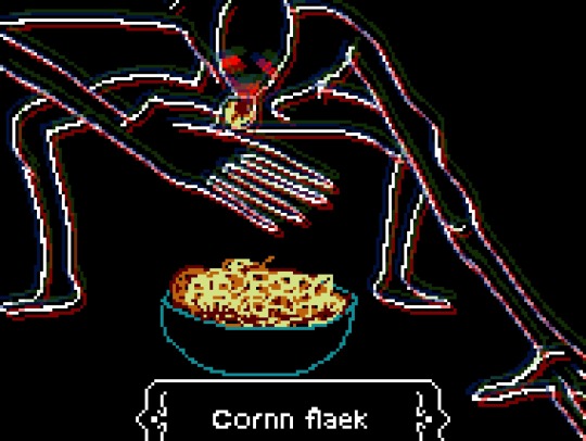
#i kind of love the rgb effect i made because#chromatic abberation doesn’t work on pixel art#added eyestrain tw after seeing in a rb#sorry for not realizing until now thank u#~~🍒🌹~~#faith the unholy trinity#faith game#michael davies#tw eyestrain
571 notes
·
View notes
Photo
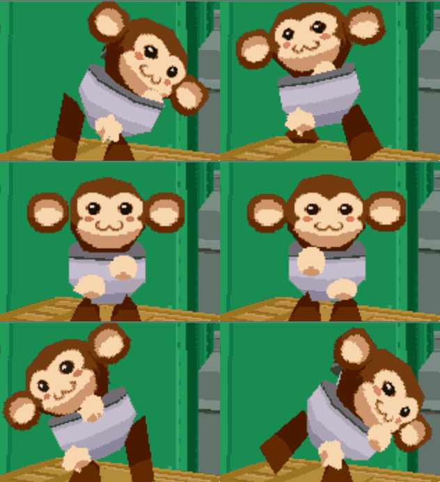
Guide to that elusive “PS1-pixelated-lowpoly”(but not really)
With the videogame playing population growing up we've finally broke from pixel-art nostalgia into the broadly called "low-poly" nostalgia. On closer look this broad categorization gets further described as “PS1 pixelated textures low-poly”, which is a bit better, but still is a really broad and a pretty wrong description of this style that’s so dear to a plenty of game-playing and game making individuals these days. I’ll try to dive into some of the technicalities and examples of this style in the attempt to find it’s characteristics and some actual technical requirements to meet this style.
Let’s start with the obvious, calling it PS1 low-poly is wrong, mostly because the same games were release on Nintendo 64, Dreamcast and PC. More so, games released later can be put into the same category, plenty of NDS or PSP games fit into the same style and adhere to the same economy principles. The only real surface level thing unifying these games is the game size, that is, the games came on CDs. The advent of a DVD format really changed up how the games look, so the graphical style we’re talking about here is called CD-3D in smaller circles.
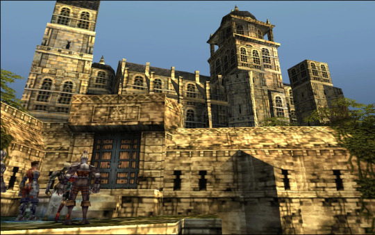
First let’s look at the games that fit the criteria would give you some information to describe the style, textures are obviously small enough to have visible pixelation (hidden by texture filtering) and models are obviously low-poly (that is around or less than 500 triangles for a character), but let’s see what doesn’t seem so obvious. Here’s Spyro and Crash, fan favorites
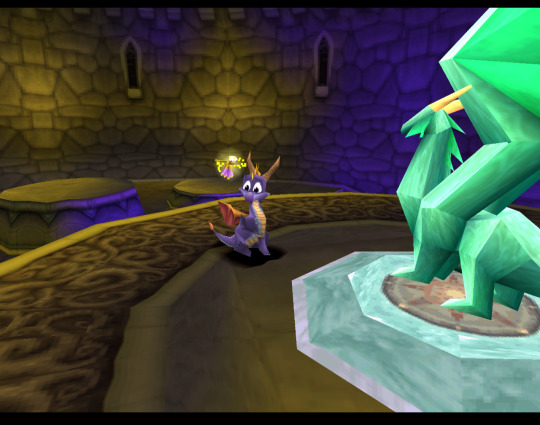
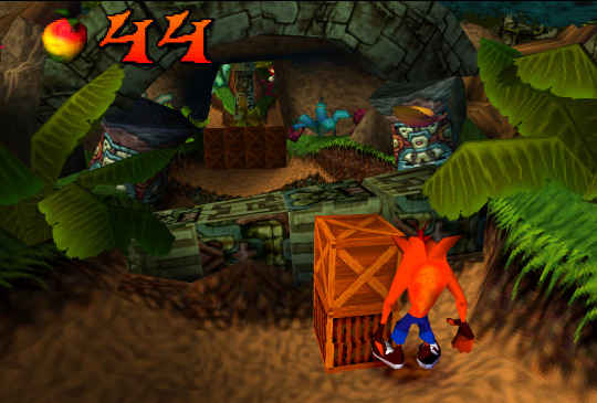
Both games check both points we’ve noted before, but what’s not obvious to an untrained eye is that these games both extensively use Vertex Color, the thing you’ll notice more and more in other games we’ll talk about. Vertex Color is absolutely simple, each vertex of a mesh can be assigned a RGBA value and they’re then linearly blended with other vertex colors. Notice how in Spyro the yellow and purple light is placed on places where texture is repeated, following that you can eyeball where the wireframe is and then you’ll see that the vertex color is used to simulate lighting. Crash himself is filled with Vertex Color, it’s a cheap way to avoid using textures, while having some control over the color of the thing, instead of it being a solid chunk. If you search-engine around you can also find some really fascinating notes on the development of the original Crash and the tricks they’ve pulled! The more ingenious way to use Vertex Color is to take a look at Spyro skyboxes:

Notice how the clouds are diamond-like in shape and are linearly gradiented to the next point in the wireframe.
Vertex color was used extensively and fell off with the increasing complexity of the meshes, delegated mostly to technical masking of stuff like foliage, it’s still a powerful tool for lower triangle counts.
Textures
Now, let’s talk about the textures. Pixelated textures look nice and crisp these days, at the age of 1080p being the norm, turning texture filtering really makes the games look crisp and feel right
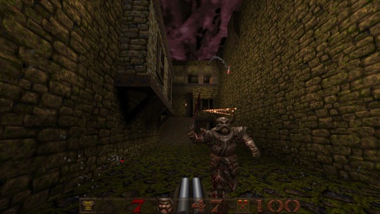
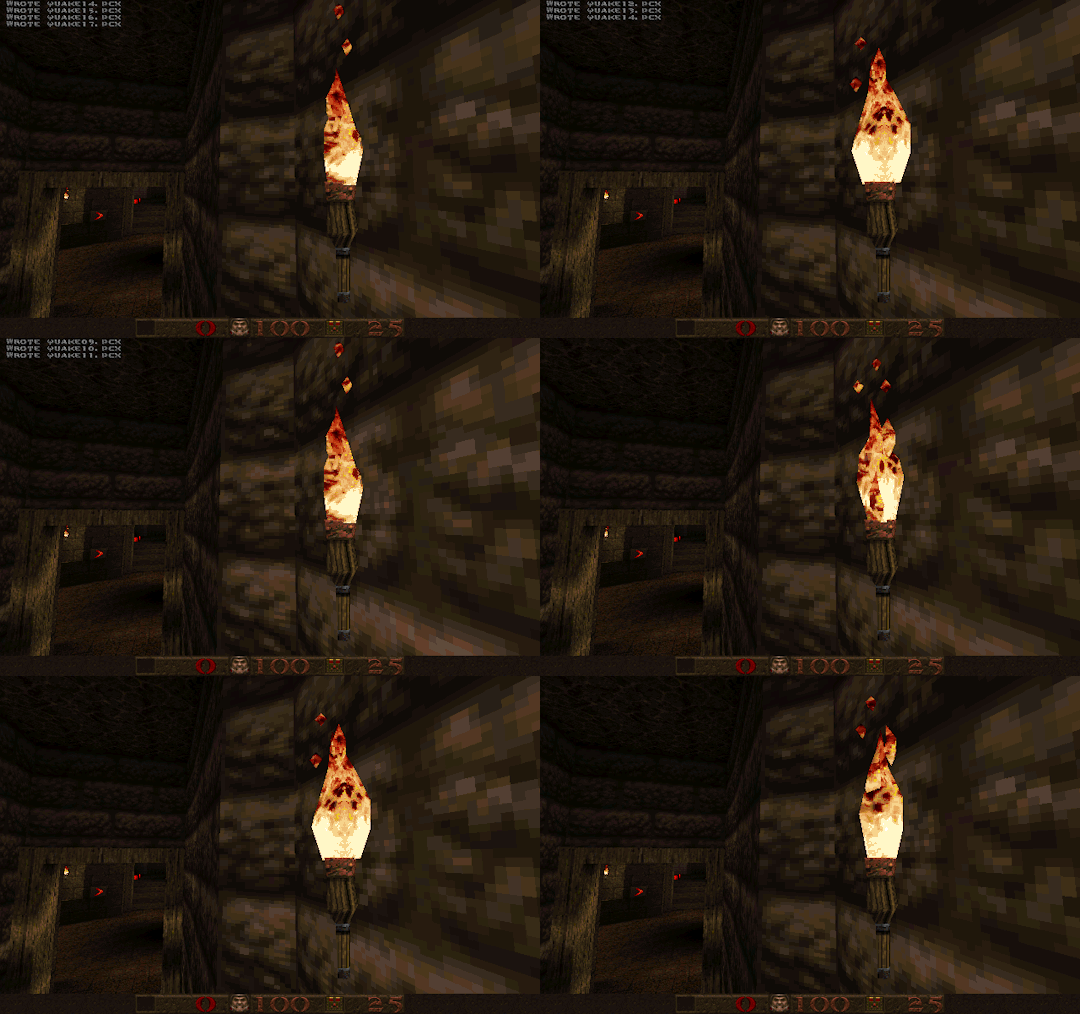
Quake 1 is a perfect example of CD-3D style, often undeservingly forgot in discussions about this style.
But this makes us forget that the textures were often authored with texture filtering in mind. Careful step gradienting to make textures seem smoother after being filtered is a craft in itself.
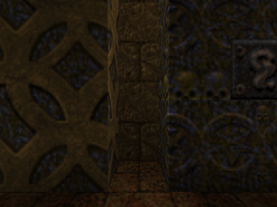
Texture filtering is not bad in itself, some games look better without it these days, because of the display resolutions, but it’s still a valid tool to apply, it can help push low-res texture a bit higher and produce a softening effect make those 4 pixels into a round circle or improve a visual effect.
Of course, some games took a deliberate approach of avoiding smudged look, like Megaman Legends, for example.
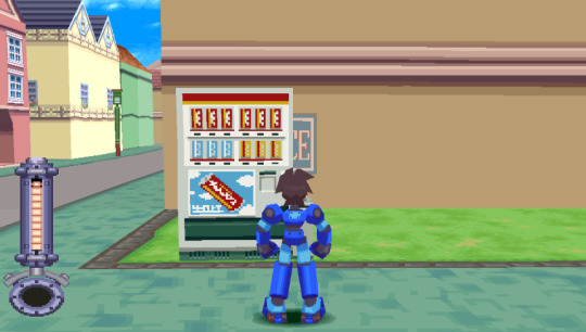
Via a very deliberate texture economy and unwrapping the developers were able to produce very crisp and pixel perfect textures (slightly warped by the infamous PS1 rendering), that look absolutely astounding when you render the game in a modern resolution. Pixel-aware UV Unwrapping, is being used in most games that are considered the pinnacle of CD-3D style, this technique is so powerful, that it was used to great effect in PS2 era games, PSP games and even modern games like Guilty Gear (for a different effect though). Let’s take a closer look,
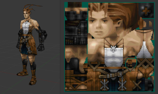
As you can see, our character is unwrapped in square pieces in such a way that a straight line on a texture will produce a straight line on a model. While Vagrant Story is an absolutely perfect in execution of this technique, it’s also used in a same way in Megaman Legends
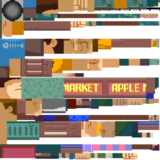
While I couldn’t find a reliable tool that works with modern 3D modeling software to allow pixel perfect alignment, just using a UV Checker will produce great results. This method also requires some thought put into your topology before unwrapping, but it’s strong point is that you can make changes into your unwrapping and geometry easily, making little tugs won’t break the whole thing.
As you can also note, Vagrant Story textures are authored in a single atlas, while Metal Gear Solid separates this atlas into smaller chunks like this:

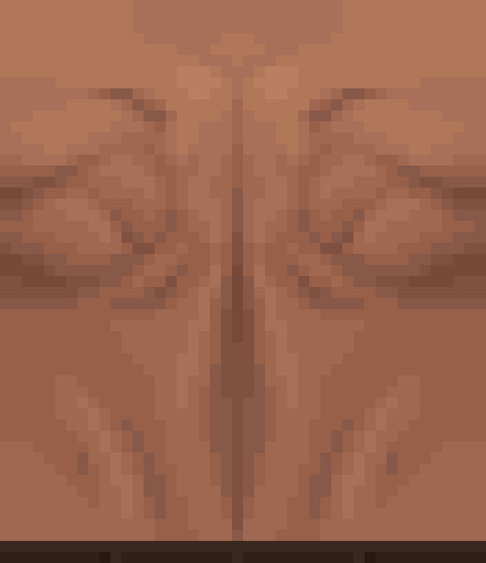
Allowing for easier unwrapping, since you can unwrap into the full UV space and then change the size of the texture to scale your results. The other important thing is that you probably want your characters in a T-pose when you’re unwrapping, since this allows for easier use of normal based unwrapping, considering your model would be authored with 4 to 8 sides for limbs and torso it could be box unwrapped and then tweaked for optimal results.
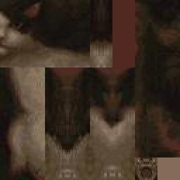
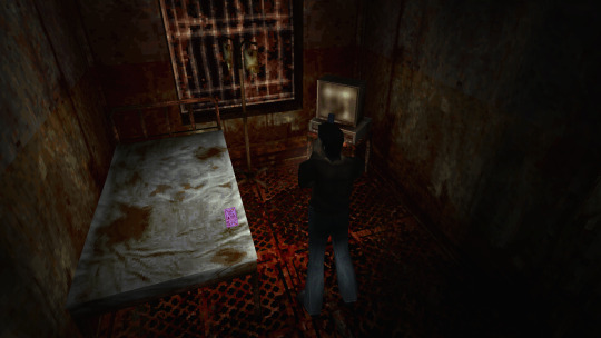
Silent Hill 1 used the same technique, and is also regarded as one of the best looking PS1 games.
While this is the best practice for this kind of look, it’s absolutely not required, Quake 1 used a really loose flat unwrap:
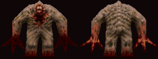
But it’s still looks bloody amazing in the end.
While the topic of using UV Unwrapping for crisper result is endless I’d also love to bring your attention to a certain Jet Set game
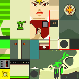
It also uses the same technique as Megaman Legends, but it tops it off with some cel-shading, producing crisp, stylish and iconic look.
Here’s some technicalities: Character textures are usually 256x256 for main characters, 128x128 for other characters, character usually have ~100-120 colors per full atlas. MGS breaks down the atlas into chunks so each chunks is usually 8 colors. So when authoring textures, make us of Indexed Color image mode or Save for Web.
Now let’s move from character textures to
World textures
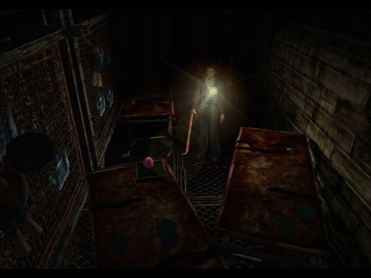
Universally regarded as best looking CD-3D games share the same trait, not only the characters look amazing, but the environments too. Despite hard limitations, the environments look very much affected by lighting. A lot of the times this is achieved with this one simple trick that was only improved with modern technology. That is, a lot of the lighting is baked into the textures
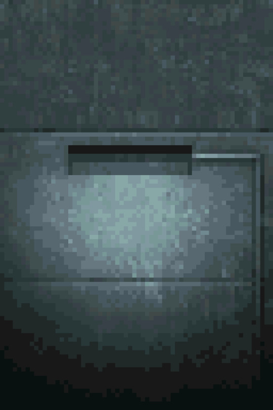
While this limits you on the amount of lighting scenarios or makes you produce more same-ish assets this certainly elevates the look. While nowadays baked lighting is not something that exciting, it’s also being done on a separate “layer”, so there’s no need to make a separate texture for every lighting scenario, however the resolution of a lightmap should not be higher than your texture, to not produce a cheap and uncanny effect. You still want to bake some fake lighting into your texture, which contradicts the rules of PBR, but since you’re not using normal maps, rules of PBR should not apply in the same way.
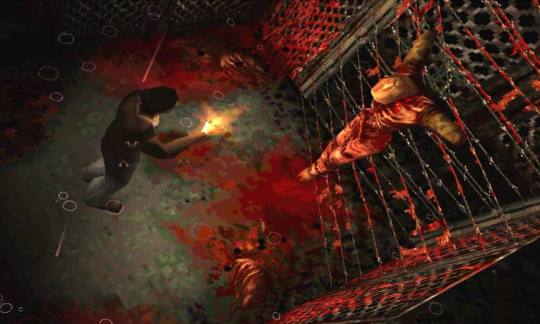
The other important tool to use, is the one we’ve talked about, that is, Vertex Color. Vagrant Story uses to great effect, while it’s environment textures don’t have lights baked, they use vertex color extensively to create a variety of moods and lighting scenarios.

Using best texturing practice, Vertex Color and making sure your lightmaps are matching resolution to your textures will produce the best results.
Now let’s talk why I don’t advise using a lot of normal maps for this style. The simple answer, it’s somewhat difficult to produce a normal map that will work with an unfiltered look, but it’s somewhat manageable to do it if you’re using texture filtering. The issue arises when you try make your normal maps unfiltered, this will make your result either a mess or a bunch of visual noise. If you’re trying to make sharp pixel-perfect textures and then will try to make normal maps to match you’ll get very harsh results. The only way I can see it working somewhat nice is to make a normal map that’s less detailed and then use it texture filtered to give some volume to your objects, while not trying to chase pixel details.
The suggested method is to do a rough sculpt -> bake it down -> use ambient occlusion and other masks to author a texture map with more details. Then use a detailed texture and less detailed normal map for optimal result.
As a closing thought, let’s talk about the
Meshes
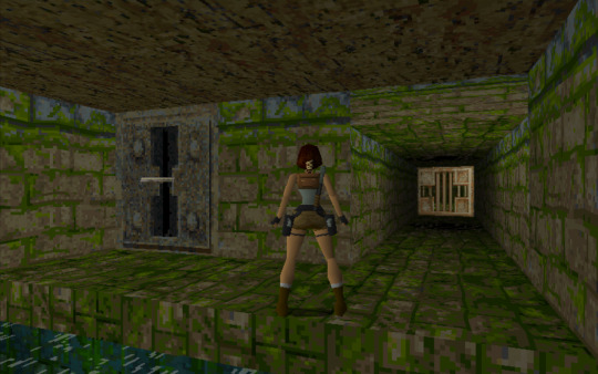
A lot of the time you can visually trace the wireframe of things, this makes it easy to pin the style as “low-poly”, but how lowpoly it really is?
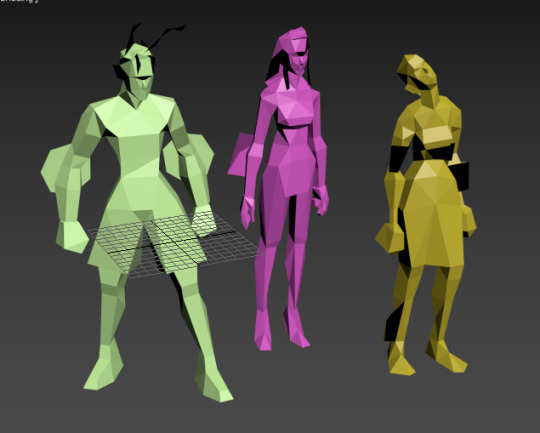
Characters in Vagrant story average 500 triangles per character. Characters in MGS go from ~450 for minor characters to ~650 for major characters. So 500-600 triangles is a solid baseline for a main character in a third person game.
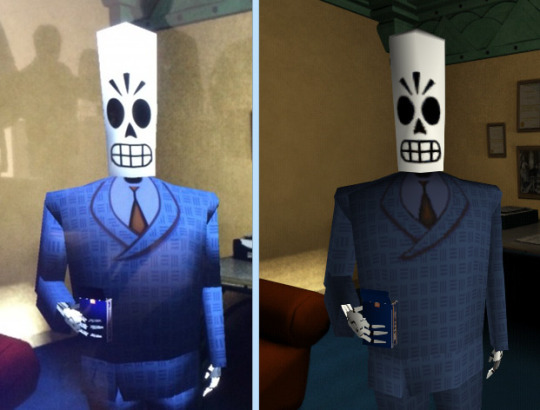
This limit brings out some great restriction for every aspiring 3D artist. You have to know your limb deformation techniques (search-engine “Limb Topology” and browse around the polycount wiki to find some great examples and deformation ready examples), but as you might’ve noticed, some games decided to not wrestle with skinning and deformation and straight up detached the limbs or even made their characters out of chunks. This is perfectly noticebla if you compare the OG Grim Fandango and the remaster, where they botched the shading and you can see the bits in all of their glory.
Another easy example is Metal Gear Solid. Characters arms are separate from their torse, but this is covered with other geometry or they’re of the same color and shaded closely.

This way of doing it was used in a number of other games and allows for unlimited range of motion, while not looking weird.
It’s easy to fall into the trap of adding more triangles and loops, but if you’ll follow the rule of “if it doesn’t add to the silhouette, you don’t need it”, you’ll keep to the style. Zoom out often and if an edge doesn’t add anything from the distance and is not critical to the deformation in a character, you really don’t need it.
These principles are so solid they’ve been alive for decades, in fact, one of the best looking PSP games “Peace Walker” sticks to these principles very closely, for example this soldier is just around 1500 triangles
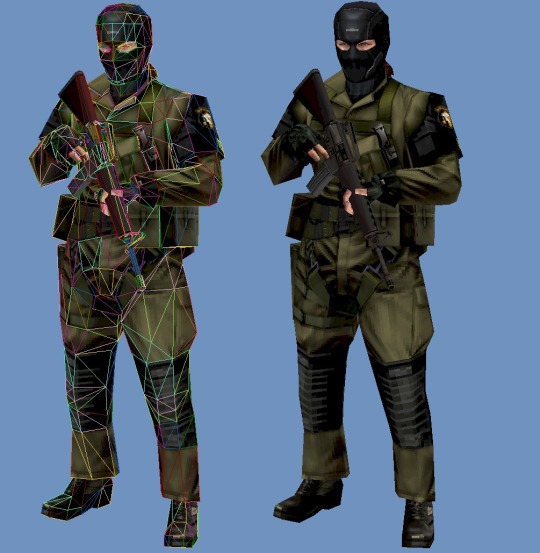
Spilling out of the “low-poly” territory it’s still made with the same economy principles used in CD-3D style, making use of every bit of texture and every triangle available.
Here’s another game of Metal Gear variety, Metal Gear Solid 2 is a direct heir to the design philosophy of MGS1, perfectly pixel-aligned unwraps allow for crisp detailing:
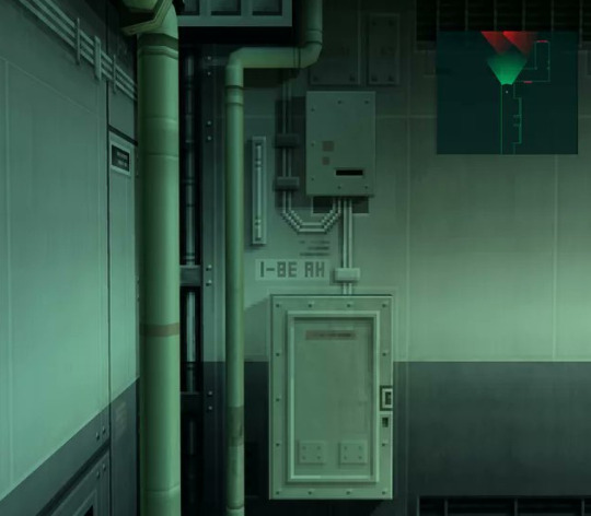
Another honorable mention goes to Animal Crossing on Nintendo 64
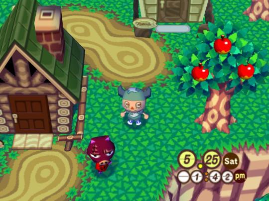
Animal Crossing combines meshes and sprites masterfully, uses pixel-aligned UV unwraps and makes up their own trick when creating landscape.

By unwrapping the repeating texture on each triangle of a hexagon they create these smooth patches of sand without the need for big or unique textures. It’s only 64x64 and 9 colors, but the mileage you can get out of it is insane!
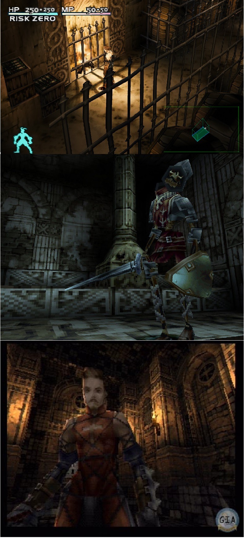
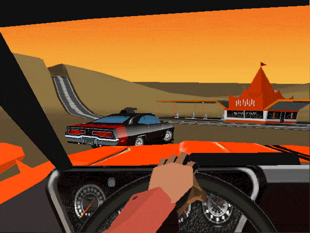
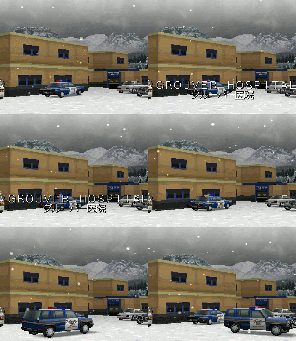
And this honestly sums up the CD-3D style perfectly, it’s the style governed by economy. There’s no need for insane textures for sharp lines, and millions of colors for smooth gradients. Now of course all of these are not rules, but recommendations, you can certainly bend the rules and improve on some aspects. Before we go, here’s some more pictures to get you inspired.
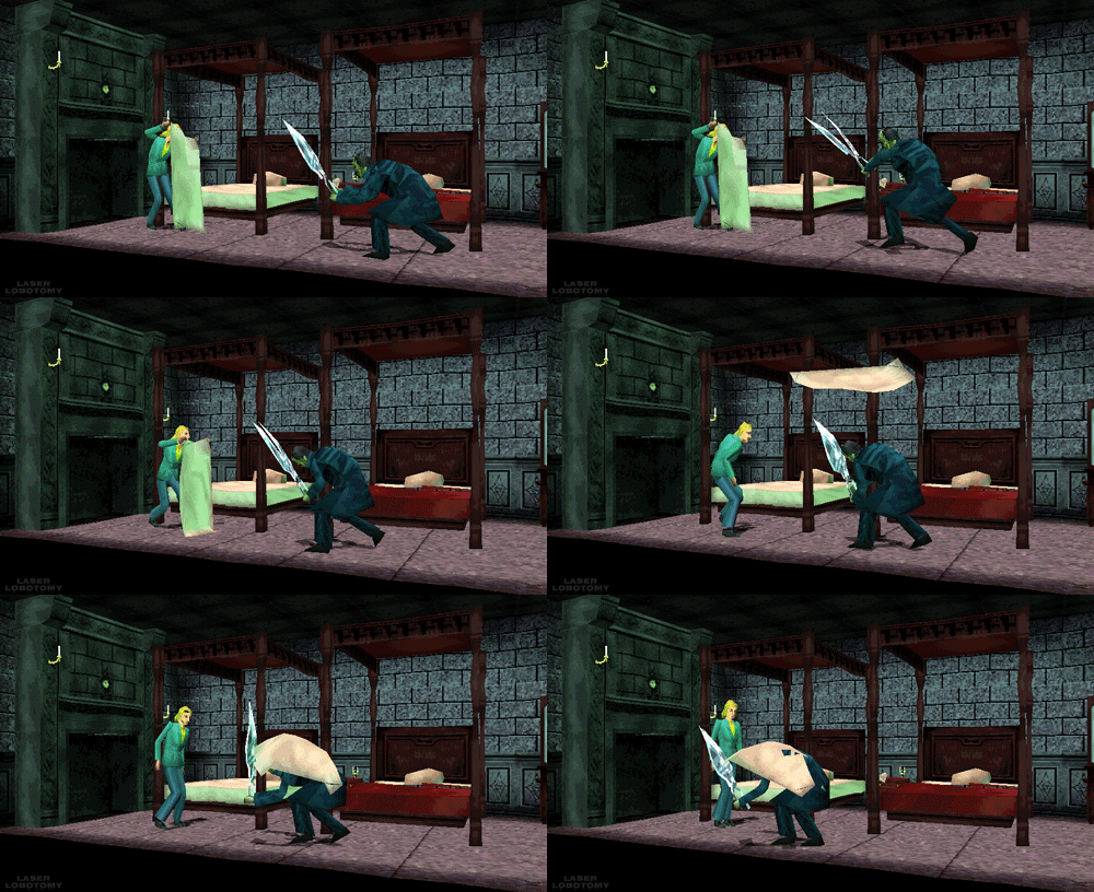
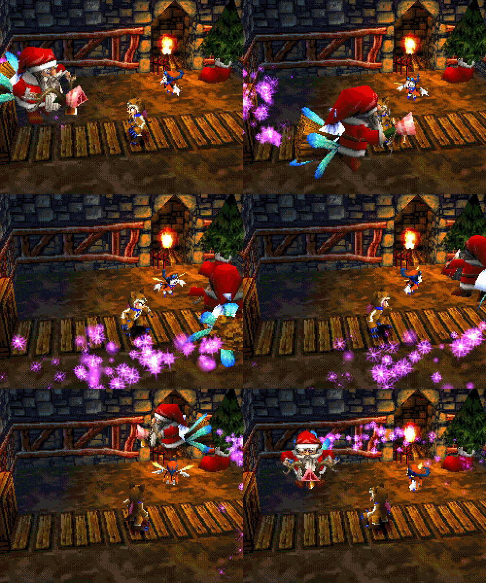
#playstation#psx games#psx#nintendo 64#low poly#3d#retro aesthetic#pixelated#gamedev#dreamcast#cd3d#retro
6K notes
·
View notes
Text
Not that anyone asked (but seriously I’d LOVE for someone to talk to me about PokeSpe (just no spoilers past vol 13)) but since I made an offhand remark about my Top 5 favorite characters, it occurred to me that I actually DO have approximately 5 top favorite characters, and I’m procrastinating on work, so I’m gonna ramble
**just in case, note that a lot of this will revolve around my childhood experience with gender in a “I’m AFAB (and present-day me still identifies as a cis girl) but I don’t fit in with what media is telling me girls are like” way, a brief childhood feeling of homophobia, and probably general TMI about my opinions and emotions throughout my life, haha
1. Yellow
Okay, so, I was a little kid when Pokemon Adventures started coming out in English, back when manga was released as single-issue monthly comic books instead of complete volumes. So I was rereading the same chapters over and over while anxiously awaiting the rest of the story (and wound up missing a bunch of issues anyway)
I enjoyed the RGB arc, I thought it was fun, but I didn’t LOVE the series until Yellow showed up. At that age my ideal crush was “a cute boy my age who would be nice to me” and Yellow was presented to the reader as a cute boy my age who was sweet and kind and gentle, but also good in a fight, as all shounen protags must be. Extra bonus points because they had just a few physically weak Pokémon and tried to fight battles in a way that minimized damage to their own and the opponent’s Pokémon, which meant they fought in a particularly smart and clever way. And I was considered “smart” for being good at school, so being a SMART cute “boy” my age who would be nice to me, Yellow was PERFECT. I mean, I loved the arc in general because of the clever battles, and the mystery of what had happened to Red, why these people were after Pikachu, why Yellow was so secretive about themself and their mission, etc was really engaging. But also I adored Yellow as a character and partly in a “I wonder if ‘he’ would like me??” kind of way X’D So to my tiny child self who didn’t even know it was possible to like-like someone of the same gender (because I hadn’t read Cardcaptor Sakura yet XD ), the reveal that Yellow was a “girl” was devastating—I had to cross out floating hearts on at least one drawing of us holding hands (scandalous!) and, while kind of stunned and shaken for a while, decided that what I’d felt all along was a deep, intense desire to be friends X’D (which probably wasn’t too far from the truth since I was pre-puberty and later turned out to be asexual)
(Also note that I never got the RGB issue that had the chapter where Red helps a little ‘girl’ capture a Rattata—later proven to be Yellow’s backstory—so the gender reveal really came out of nowhere for me.)
But anyways, I still love Yellow as a character for all the above reasons, without the crush aspects because I’m way older than them now.
Also when I reread the series ten years ago, I finally realized “wait, aside from surprising the reader, there’s no real plot reason for Yellow to pretend to be a ‘boy’ except that Green told ‘her’ to—so why did ‘she’ do it?”...and because at that time I didn’t even know that nonbinary genders existed, I decided it was cus they had low self-esteem and pretending to be a different person gave them courage (the same reading I had for Mulan at the time). These days I’m more inclined to “yeah, I think Yellow’s nonbinary,” but that other interpretation was deeply relatable to me and only made me love Yellow even more.
2. Bill
Bill’s definitely a character I’ve grown to love more as an adult, since I’ve gone from seeing myself as “a protagonist doing cool things” to “a side character just living their life who hopefully gets to do something once in a while.” But as a kid and now, I like him mostly for the slapstick and goofy expressions and the (early chapters Viz translations) outrageous accent X’D My brain desperately craves endorphins and the best way to get em is through a good laugh.
But also, I liked that he was introduced as a goofy character-of-the-week who got into ridiculous trouble and had to be rescued, but then kept being brought back, was slowly built up to be the “smart sidekick who explains things,” and eventually got to the point where he was participating in big battles (the Yellow finale on Cerise Island). I rambled about this in the tags of another post, but I liked that he was a character who was “weak” without being “useless.” As a kid who was good at school, I was obsessed with being good at things and had developed a black-and-white view of the world where either you were “strong/smart” or “weak/stupid” to the point that failing or just being not-so-good at anything was devastating (it still kind of is), because that meant I was actually “weak/stupid” when I was supposed to be “strong/smart.” So it was kind of awesome that this guy who kept getting into trouble and having to be rescued—and didn’t even want to BE part of the final battle—managed to hold his own and get through it and help out instead of being a burden that dragged everyone down. Seriously, he used a MAGIKARP effectively—the Pokémon everyone makes fun of for being “useless” and he used its one attack to save his life!
(Bonus points for all this happening in contrast to my devastating childhood experience of stanning The One Girl Character in every popular shounen series, waiting desperately for her to get to do something in battle, and then her one spotlight episode revolved around her struggling because she was so weak...not only was that actually happening to a boy for once, it was actually happening in a more satisfying/empowering way :’D )
3. Gold
I have extremely specific tastes when it comes to “the dumb shounen/action movie protag,” because as a kid I hated it when the main character was “dumb” because I was “smart” (re: good at school) and people who were “dumb” shouldn’t deserve to be the main character and have all the cool powers and save the world and stuff. As an adult, I hate it when male characters are dumb and/or jerks but it’s treated as fine or even sexy(??) and the other characters fawn over them, and I generally still kind of hate it when characters who are dumb and/or jerks get the big important role when there’s a female character RIGHT THERE who’s more competent (and OF COURSE she has to wind up falling in love with him)
But anyway, I have extremely specific tastes, and Gold is it X’D He’s the perfect combination of “unshakably confident in his own stupid/egotistic views” and “treated as annoying and/or comic relief by the rest of the cast” with a bonus dash of actually being really clever in battle (so my inner child goes “Ah yes, technically, he is ’smart,’ and therefore...worthwhile“) Making me laugh while also impressing me is like the key to my heart.
4. Crystal
I’m too lazy to look it up, but when Viz was publishing Pokemon Adventures as monthly comics, they must have switched to publishing it as trade paperbacks only and/or had a huge gap between the end of Yellow and the start of GSC, because for YEARS I’d thought Yellow was the end of the series and was shocked the first time I saw later volumes. (My dad was buying us the monthly issues at the local comic store, and either they wouldn’t have ordered the trade paperbacks or he wouldn’t have thought to check those shelves.)
Anyway, that’s a long lead-in to the statement of “Crystal would automatically be my #1 or #2 if I’d read her arc as a kid.” She’s a girl, she wears pants, she’s EXTREMELY smart (genius-level “book-smarts” about every Pokémon’s behaviors and weaknesses PLUS being clever in a battle), was tough as nails (she KICKED her Pokéballs!!), had no interest in romance or her appearance, AND had a short arc about losing her confidence and training herself back up to full power. I would have KILLED for a character like that when I was a little girl being told that “girls don’t like action shows like Dragon Ball Z” (but I was a girl and I did???) and that girls were supposed to be pretty and obsessed with fashion and dating, and that girls were never the main character of action series, just side characters who either did nothing or got one chance to do something and were pathetically weak (see above, and/or Sakura’s fight against Ino (Naruto), those couple filler eps where Téa/Anzu played Duel Monsters (Yu-Gi-Oh), Videl getting pummeled by Spopovich (DBZ), etc).
So anyway, she’s awesome, she’s exactly the type of character I would’ve loved as a kid. The only reason she’s behind Gold here is because at my age, “makes me laugh” > “the kind of main character I used to wish I could be”
5. Green (the girl trainer...I’m just too loyal to the Viz version to call her “Blue”...)
I’m trying not to rehash the same “I’m a girl but none of the girls in my shows/comics are like me!” childhood woes over and over, haha, but as much as I always enjoyed Green for being extremely clever and outsmarting the boys and being funny when she did so, she always lost points with me for being “pretty” and flirting to get her way, because that put her in the box of “girls are supposed to be pretty and desired by boys and obsessed with their appearance and romance” that was so foreign and disheartening to me as a kid.
But her staredown with Ho-oh at the end of the GSC arc TOTALLY got me. As a sad adult with anxiety, watching characters who are absolutely terrified overcome their fear, watching characters who are completely beaten down struggle back to their feet and keep fighting, is like my ultimate power fantasy. That sequence genuinely had me in tears.
Also her bond with Silver is super precious, especially since that’s like the first time in the series we’ve seen her be genuinely emotional and vulnerable with someone instead of teasing or manipulating them.
Honorable mention: Sapphire
I haven’t gotten up to R/S in my reread yet, and I only read that arc once over like a weekend ten years ago, but I’m pretty sure she’s gonna be a Top Fave cus again there’s that “I'm not like other girls!” childhood feel (last time I’m saying it, I promise)
It’s a story arc where one protag wants to fight the gyms and the other protag wants to win the beauty contests, but the one who wants to fight the gyms is the girl!! And she’s the typical “dumb but extremely good at fighting” shounen protag but she’s the girl!! She’s feral and illiterate and a total tomboy and wins all her fights and she’s a GIRL!!!!
--
Anyway, those are my kids and my dude and my probably way-too-personal reasons why. If you wanna reblog, reply, or send an ask about your own faves...please
3 notes
·
View notes
Note
i wish to know... about your zimverse ocs... they seem pretty neat...
anon u GOT IT i’ve been wanting to talk abt the gang for so long!!!!! when i saw this ask i lost my marbles!!! knowin that someone is actually interested in these guys makes me so happy!!! so!! here they are!!! also!! apologies that it took me so long to actually answer, i wanted to be able to say all of the lore for lizzie (who hadn’t had her chara arc in rp at the time) and by the time i got her arc done i ran flat outta spoons nbfkgb,, but i got my spoons back and whipped up a few lil pictures to go with this so hopefully that makes up for it!!! oki here we go!! under a cut because talking about five separate charas is gonna get long ndfjkv
ZAPPELINE VOLTAIRE

she/he/they | genderfluid | somewhere between 25-37 y/o zap is basically my main character! she used to be a scientist who worked on interdimensional research, more specifically what the theoretical effects of interdimensional travel/portals would be on the human body and the safety of all of that. at one point the lab she worked at lost funding, but she decided to fuck around there before it got demolished because why not! she did a few experiments on herself, including changing her natural hair color and making it so that she could see an extra color. the latter of which did not work out entirely as planned, because the rods in her eyes didn’t grow in quite right. so! now she has red-green colorblindness in her right eye, and something similar to tritanomaly in her left, which is why she wears those funky glasses!
gonna be honest, i’m still working on a way to properly explain the next bit without it getting super boring or incomprehensible, but tdlr the new colors corresponds to a wavelengths that interdimensional rifts emit, so now she can see interdimensional rifts! she noodles out a way to build an interdimensional portal using some leftover notes from one of her co-workers, and jumps through! she ended up getting too excited about the portal and forgets to make sure it’s stable, and it ends up collapsing the second she gets through. so now she’s stuck in the multiverse! fun! after a bit of dimension-hopping, mad science, and the entire plot of polychrome (a game concept im workin on!!), she lands herself in zimcon!
SPARKPLUG VOLTAIRE
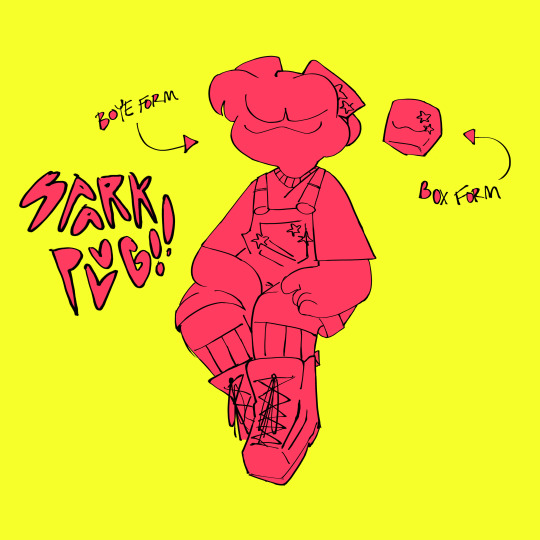
he/they | nonbinary | 5 y/o
sparkplug was originally built by zap to be her impulse control! this did not work! for context, zap used to be a really shitty supervillain before zimcon, so i kinda made sparkplug to be her sidekick/henchman? but in the way that’s like, supervillain is really nice and respectful to their “underlings” and basically treats them as equals and as friends, because i love that trope so fucking much. the original joke was “haha the supervillain has pack-bonded with the box!” but then the box turned into a kid and well! here we are. eventually after just. existing for a while they developed their own personality, and pretty much just became a regular kid! they arrived at zimcon as a box, but later on they end up asking zap for an astroboy-style body! as of writing this they haven’t gotten it yet, but that’s just because the rp’s kinda on pause right now. i do wanna say tho i have a special lil bit of art for it ready that hopefully yall will enjoy!!
ELIZABETH VOLTAIRE
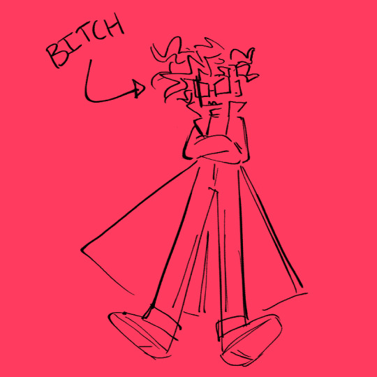
she/her | cis (ew) | 4 years younger than zap
god just. i hate elizabeth! i really do. she’s another version of zap who is basically just an evil boomer who can’t even be fun or dramatic about it. in polychrome, she takes over as the big bad of the game. i feel like she works a lot better in polychrome just because that’s what she was made for, tbh. she and zap used to work together at one point, but due to a lot of arguing, many disagreements and some other Events(tm), started hating each other. she’s literally no fun at all and i can’t really expand upon her all that much without going into spoilers territory so that’s about it for her.
LIZZIE VOLTAIRE
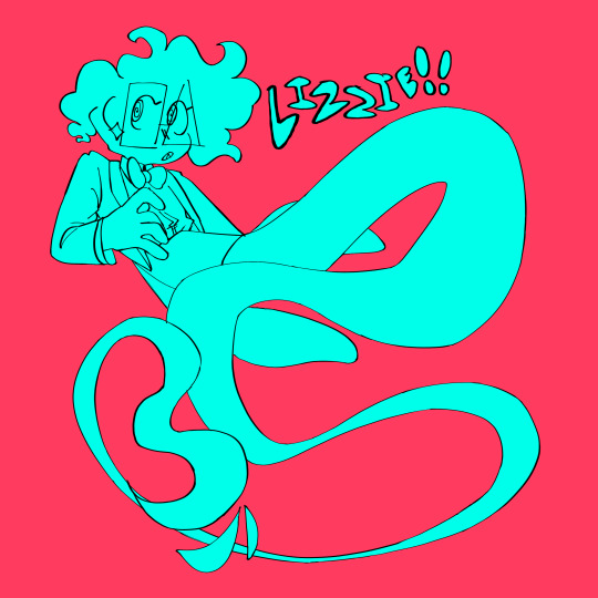
she/they | trans gal | 745-748 y/o
lizzie is a ghost! she’s an alternate version of zap that died before she could ever leave her home dimension. after she died, she was quite literally chained to her death spot for over 700 years. when she died though, she was given a contract that said she could be freed if she got someone to sign it, the person signing it would be able to have her do whatever they want, but once she finished the task she could be free. if the person signing felt that she wasn’t doing a good enough job, they could rip up the contract and she’d be sent back to her death spot. it sounds bad, but it was all she had so she tried her best to get someone to sign! unfortunately though, in the few months where there were still people around, she hadn’t been able to figure out how to get herself to be visible again. just before she figured that out, the world underwent some kind of apocalypse, and all the people were wiped out. so she had no choice but to just kinda sit there and vibe for 700 years.
that is until elizabeth came along! liz signs her contract, and lizzie starts working as a henchman for her. the elizabeth arc happens (which is basically elizabeth helps lizzie possess zap and tells her to erase the con members’ memories, she does this, people are pissed, lizzie gets knocked out of zap’s body, zap dies, comes back, and beats the shit out of elizabeth and later sacrifices her to a crab) and liz decides to send her back for not doing a good enough job. so she goes back to her death spot, and after a night’s stay makes a deal with an eldritch blonde twink to gain her freedom.
REGINALD SPECTER
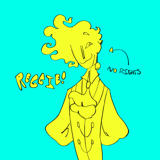
he/him | agender | a few thousand years probably (boomer)
bastard!! bastard man!! reggie is the one responsible for lizzie’s (and a few other peoples’) death(s). he has a job in the underworld which is basically just “take care of this huge monster that eats parts of people’s identity.” he found that feeding it souls worked best, so instead of finding lost souls he just decided it’d be easier to get some new ones. in order to kill people without getting caught, he disguises all his murders as accidents. lizzie’s happened to be a falling stage light that hit her on the head real hard. it’s not a cool or fun death and it makes her real mad ndjvkdf
lizzie was left there for so long because reggie pretty much just forgot about her. he left her the contract to give her some form of hope, which would keep her from fading away completely, but she was chained there so he could come back when he remembered. when liz signed her contract he got some sort of notice about it, and decided to come back to lizzie later for some shits and giggles. when they met up, he told her if she could find a soul to trade he’d give her her freedom. she accepts, and picks zap to trade, hoping that getting rid of her would help her earn liz’s approval (it didn’t). zap gets sent to this weird hell maze, and when a few others get in the way they get sent there too. lizzie eventually gets talked down from sending more and more people to the hell maze, and she lets them out. she’s tired of hurting people, and wants to give helping others a try! at the moment, reggie isn’t aware that lizzie let them out of the maze (and thus, isn’t gonna give him a soul to trade). if he finds out it’ll be bad, but for now she’s just vibing and trying her best to be nice!
reggie’s very much inspired by hate and dial from tpoh, and a lot of lizzie’s story is inspired by my personal theories on blondie/rgb’s death!! its basically “how many tpoh references can i cram into this: the arc.” it’s unbelievable the amount of shit i was allowed to get away with with nobody calling me out nfjdkvsf
aaaand that’s kinda it!!! i tried my best to make this short and readable, i wrote up something else earlier that was a LOT longer and im much more happy with this version. and if something i said doesn’t make sense or anyone wants to ask anything about these guys or polychrome id be more than happy to answer!!!! thank you so much for reading!!!! <3!!
#also MASSIVE shoutout to zimverse gang#if yall r reading this!! i love u guys i honestly never would have even like. gotten confident in my ocs if it weren't for yall#its!! a long and complicated thing that i don't quite know how to put into words but yall have given me so much confidence when it comes#to writing!! and just like. HHOUGH gettin soft in these tags huh#anyways!!! ily guys#and anon!!! ilysm!! thank you for asking abt them this was rlly fun to write up!!#i dunno you like. personally but you seem like a chad#oki!! its like three am as im writin this gonna queue it forrr rtha morninnn#if you're reading this i hope you have a wonderful day/night/afternoon!!#also im gonna get back to postin art soon i got a fuckton of drawings to share#been doin artfight too!!! ill do dumps of those in fours i think? i dont wanna spam dnvjkdfv#and im gonna try to finish the 2k requests soon!! ik its been like 6 whole ass months but im still goin#oki!! enough rambling!!! !!! gotta add my regular tags#ask#zimverse#zimverse rp#oc info post#hopefully that tag will work!#oki. goobnight o7#glowdart#glowcs
16 notes
·
View notes
Text
12-31-2020
Last day of 2020! Woot! Yeah, I’m just as tired of this year as everyone else. I feel like I was pretty lucky overall, my entire life didn’t collapse and my everyday social circle was wide enough that I didn’t get the full effect of isolation... but it was still pretty sucky. I’m glad it’s almost over, though I know that all of the world’s problems won’t be solved at midnight tonight haha. I haven’t written in a while because my Christmas lasted three days. Yup, three. And I was up til 6am on two of those days! I needed time to rest for sure. And, after all that, I was feeling pretty slumpy. I feel better now. The first day was Christmas Eve day. That was the day I planned to spend with my parents and brother. I did a lot of last minute cleaning and preparation and Christmas and I made brownies. For my birthday, I got this awesome copper brownie pan with little dividers. I was SO excited to try it because I hate baking brownies and then having them get all messed up when I try to cut them. IT WORKED. It worked so perfectly, I was kicking myself for not getting one sooner. The brownies tasted good too. They got eaten faster than my birthday cake haha. I was happy about that.

My mom made italian wedding soup for dinner (with vegetarian meatballs) for dinner and, thankfully, there wasn’t any drama. On Christmas morning, I actually got some time to myself, which was the best gift ever, tbh. I drank some tea, listened to some Christmas music and just kind of chilled out? I’m bad at relaxing, so I tried! 😝 I opened presents with Ben and my parents at around 1. My parents stayed up too late and slept in haha. Ben loved some of the surprise presents I got him, like an RGB keyboard. It was weird, this year I feel like I was thinking less about receiving gifts than I usually do at Christmas. I’ve never been a super materialistic person, but there’s always that little part of my chimpanzee brain that’s eager to know what’s in the shiny paper 🤣This year though, when I envisioned a “good Christmas”, I thought about having positive experiences, not getting cool stuff. I’m not sure if that’s genuine adulthood creeping in or just 2020 making me appreciate my time with people haha.


But yeah, we got off to a late start so I didn’t get to the Browns’ until later. Luckily, they were also behind haha. For my boss’s birthday, Mady and Julius got him a DVD of “Yellow Submarine”. Of course, that made him want to get high 🙄 I warned him that it was too early for that and that nothing would get done for the rest of the night if he took a weed gummy then, but he didn’t listen to me, of course haha. He convinced his wife to also take a gummy while she was cooking dinner! Then he went to bed before it was done 🤣 It was chaos. We didn’t get to eating dinner until midnight. Ben came over and had a good time except the stupid dog hates him and kept biting his shins. That pissed him off, but once he had a few glasses of wine, he chilled out. My brother, not the dog 😝 Unfortunately, I fell asleep after dinner and we were all pretty tired. We didn’t even get to open presents! The next day, the 26th, Austin and I reserved a row of seats on a little Christmas train that takes you on a tour of an elaborate Christmas light display at the ballpark in Grand Rapids. We were going to go with Mady and Julius and get Blimpie subs for dinner. At first, we thought that plans might have to change so that we could open presents, but everything somehow ended up working out! The lights were fantastic and whimsical and of course the Blimpie subs were good.

When we got home, we finally opened presents. We had really good hot chocolate and the whole thing felt like a magical dream haha. I was up too late again, but I didn’t care. :p

So yeah, I didn’t do much the day after that, but a rest day was necessary. Mady and Julius invited Austin and I to Detroit for NYE, but we decided to stay home. Again, I know that the world won’t magically become better when the ball drops, but I’m all for taking opportunities to change our attitudes. Soooo Christmas was pretty good, lets hope 2021 has more moments like those.
2 notes
·
View notes
Text
Recap - artifact555 video solve
In the early days of this blog, some of the solves weren’t documented as cleanly in one post as has become the pattern. In reviewing the solutions to Pangent’s publicly available videos, it was discovered that a few of them could use a newly compiled summary solve post. So here goes the first of those, enjoy!
https://www.youtube.com/watch?v=vVWfnqiuVXk Binary title: artifact555 Video begins with a warning about flashing images, and whoo boy, those happen. There’s lots of shots of the cube, glitching in colors and flashing, and interspersed with possible flashes of Lottie, and some more interesting effects. The sound is also ‘interesting’. The cube is alive. There doesn’t appear to be any coded content in the video, but the description has some things worth investigating. almost-binary in the description, replace the ‘O’s and 'C’s with '0’s and '1’s to get actual binary for: xV_OQ4CQqE8
This is a YouTube ID: https://youtu.be/xV_OQ4CQqE8 - A video with binary title 'theline’, showing Lottie 'speaking’ but the audio sounds computer-generated and states:
There are some things we as a species weren’t meant to know
This video also contains some pastebin links in the description, more on those later.
Back to the text in the description of 'artifact555’:
imgur bAqfpxr
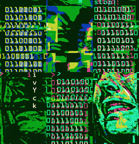
This is theoriginal MSPA ad which was the trailhead for this ARG imgur jbUD1v0
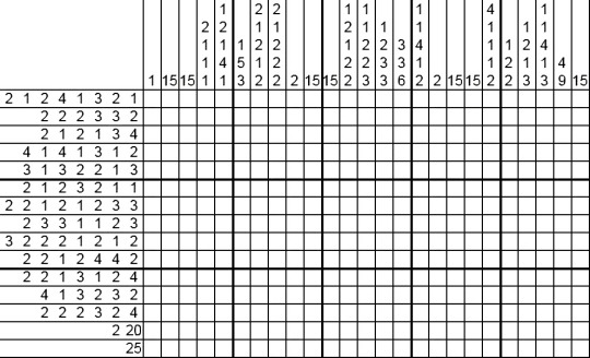
This is a nonogram, popular in those days. Can be solved manually or with tools like http://a.teall.info/nonogram/

Interpret the squares as binary:
011010110111101001110110 011000110110011101110001 011010000110001001110111 011110010111100101110101 011101000101011001101011 011000100110111001100010 011011010110101101110011 011001110111010101100011 011101100110110101101001 011011010110111101111001 011011010111001001100111 011110100111001101110001 011011000110111001100111 011001111111111111111111 kzvcgqhbwyyutVkbnbmksgucvmimoymrgzsqlngg Vigenere with key 'conscioushumansouls’ (and add spaces): i like it here it Isnt quiet can you hear the waves imgur 7Foyrsz

Kcode - read off the RGB values of each square In decimal they are: 49 53 32 104 111 117 114 115 32 102 114 111 109 32 116 104 101 32 99 101 110 116 101 114 32 111 102 32 116 104 101 32 115 111 117 114 99 101 0 15 hours from the center of the source xV_OQ4CQqE8 is a YouTube ID leading to: https://youtu.be/xV_OQ4CQqE8 unlisted video with binary title: theline Contains several Pastebin links in the description: PB CBiWsY85 https://pastebin.com/CBiWsY85 - hex title: themoth contains binary text encoded as Vigenere with key 'guineapix’ which decodes to:
I have a friend, let’s call her C. Let me talk about C for a minute. The wonderful and terrible thing about C is that she’s a moth drawn to flame. For a few years now I have supported her in everything she’s done. She’s reckless. If she were a character in a movie, she’d see an explosion and run toward it while most people are running away. She’d run into the burning building and inhale the smoke while taking notes on how it affected the building structure. And she’s probably the one who caused the fire in the first place. Metaphorically, I mean. She gets results only because she loves the danger of it. She’ll come up with a solution and write it down without knowing if it’s right or not. She’ll try it a dozen different ways, watch the entire thing fall to pieces in a dozen different, irreplaceably expensive ways. Destroy everything while taking notes on the wreckage. When she’s done she’ll clean up the mess and she’ll understand the problem on a molecular level, from the inside out. She’ll be standing in the catastrophe she created, with a thousand pages of notes on how to do it right next time. I believe she’s the greatest genius I’ll ever know. And she’s a disaster. A walking disasterpiece. Her mind makes leaps that other minds can’t, because they understand that actions have consequences. She knows that messes can be cleaned up, and systems rebuilt. So she plays with fire. Well, not every mess can be cleaned up. You can’t put toothpaste back in the tube. Now that I’ve typed that I’m not so sure. She could probably figure it out. She’d ruin a lot of tubes of toothpaste in the process. But hey, toothpaste is cheap. The Twitter archive is still broken because of her, but I suspect if she hadn’t been fired she’d have fixed it within a few days. And because of her we did figure out how to decrypt the deleted data. It’s a slow, manual process, but it’s all there in some form or another. I wonder if that was X’s plan all along, somehow. He remembered Sandy Bridge, and figured if there was smoke there there was fire. He followed a trail of clues and now he’s taken everything. It’s not C’s fault. She did what she always did. She made a mess so that we could learn something. Maybe something we shouldn’t have been messing with in the first place. There’s this object, Artifact 555, alias The Cube. I’m not going to ask where it came from or how X’s father got it, because I value my life and my career and I know that questions have consequences. I’m not going to ask what it is, either. But I don’t have to. C is asking. What I know is this: X, because he’s an asshole, sent the three of us photos of this thing. It’s hard to see and harder to look at but I’d describe it as a glass cubic box with reflective blue matter inside. When I looked at the photos of this thing, I was filled with a paralyzing fear unlike anything I’ve ever felt before. Afterward I was sick for two days. Leslie was sick too. Even her cat was sick. I don’t know how that’s even possible. I don’t want to know how that’s possible. But then, I’m not a moth drawn to flame. C was at the store when she saw the photos. Just on her phone, not even on a big monitor. She fell and hit her head. E had to come and get her. She didn’t walk straight for days. Now, a normal person’s instinct would be to get the hell away from this thing, and get the hell away from X, who used it as a weapon. Another kind of woman with another kind of mind would have changed her name, left the country, called in an exorcist and dedicated her life to rejecting satan and all his ways. Instead she signed the world’s worst contract and said she’d be back to work on the second. Because she’s a moth drawn to flame. She loves the mystery and danger of meddling where she shouldn’t. I know that right now every cell in her body is screaming out wanting to know what this thing is, even if she has to burn the world down around her to understand it. Well, that’s just who she is. X knew that too. He knew that if he shouted “DANGER” at her with a megaphone and police sirens and flashing lights five hundred feet tall, she’d come running toward that kind of danger. She can’t help it. For years, I’ve supported her in everything she’s done. I hope I never have to regret that.
PB i1pxP041 https://pastebin.com/i1pxP041 - hex title: gnixob (reversed: boxing) It’s almost-binary again, replace the 'C’s and'O’s with '1’s and'0’s then reverse, then decode as binary, then Vigenere with key 'argentina’ to get:
Another question. Let’s say there’s an object. Let’s call it “an object.” I looked at a few photographs of this object and became violently ill for reasons passing understanding. It was a couple days before I could walk without worry. The others in my group had a similar reaction. Here’s the question. What happens when I see this thing in person? And work alongside it for a long period of time? What exactly happens to my sanity? Happy Boxing Day.
PB sd7MrRX5 https://pastebin.com/sd7MrRX5 - hex title: analog Contains binary, Vigenered text with key 'argentina’:
Okay, I’m calm now. The Cube reacts to electrical stimuli. It even reacts in a predictable and reproducible way, suggesting that data can be imprinted on it for later use. X’s father must have known this. Someone must have run tests, suggesting this could work for data storage, if we could only understand how it works. Well, we don’t need to understand the Cube. And it doesn’t need to understand us. We’ve been thinking of this thing as digital, thinking how can we connect to it, like it’s a hard drive. But it’s not. It’s squishy, it’s meat, it’s liquid, it’s practically a brain. It’s analog. Do you understand? When I was a kid, we had cassette tapes. We had vinyl records. A vinyl record isn’t made with digital data. Vinyl doesn’t understand and interpret the music, it’s just plastic. And the needle is just a needle. There is no artificial intelligence there. But when a song is playing, you can etch the vibrations of that song onto that dumb plastic, and the needle will react the same way to play it back again. Magnetic tape is dumb too. It doesn’t need to understand and interpret the signals being sent through it. It just needs to be able to play them back accurately. VHS tapes of movies, cassette tapes of music. Did you ever record a computer program onto a cassette tape, and then play it back? You could just play the sound, all of this whirring and beeping, and your Apple II or Commodore 64 would understand what the tape couldn’t. The original analog medium is a book. The pages of a book don’t understand the data written on them. But the writer understood, and the reader understands, and that’s enough. We don’t need to understand the Cube. We don’t access that data by plugging in a cable. We don’t learn its language and it doesn’t learn ours. It’s a book. We write something on it, and then we can read it later. So. Let’s say I set up a server which reacts to data. And we test the Cube’s reactions to the same data. And we test it and test it and change the way we deliver the data to the Cube, until the reaction matches. We don’t need to speak the Cube’s language. We just need it to react in the right way when we speak ours.
PB 18E6yhak https://pastebin.com/18E6yhak - hex title: repair Contains binary, Vigenere’d text with key 'argentina’
Questions for this Christmas, asked of nobody but myself. The first question is whether or not data can have a soul. This is a question with two possible answers, so for the sake of argument let us assume the ridiculous - that the data of a soul can be saved, and that this does not disprove the existence of the soul as a theological concept and construct. Let us say that data can have a soul. The second question is, what if that data stream becomes broken and corrupted, in the way that souls also become broken and corrupted? If we save the data, do we save the soul? And if so, do we save it in a theological sense or merely on a technical level? What exactly would we be tampering with here? It’s four AM. I’m drunk. I should go back to sleep.
1 note
·
View note
Text
Did You Miss Me?: Darkiplier in 2018
For the most part, 2018 was a quiet year. In contrast with 2017, where we were gratified to see Dark's monochromatic visage throughout the year, 2018 carried playful hints and teasing of the elusive entity's presence but no confirmation. There were thumbnails and quick flashes that indicated He was continuing to pull strings, ensuring that His presence was felt but His face never really seen.
Throughout 2017, He'd show up during what us mere mortals consider major holidays or important events. Valentine's Day. Easter. Even Cinco de Mayo got a nod. And of course, the infamous Friday the 13th late in the year.
But 2018? He apparently decided to stay home in the void during our days of revelry, with the possible (though not confirmed) exception of the decidedly strange Fall in Love with Markiplier video for Valentine's Day. And for the TWO Friday the 13ths in 2018? He was a no-show. In 2017, He'd returned to shake things up in our safe little lives... and in 2018, He left us wanting more, like the skilled manipulative seducer He is.
Getting Over It, Part 8 included a thumbnail with Mark's dour expression and a suspiciously familiar colour scheme. The thumbnail for WATCH OUT!! had Mark reaching for us in a state of panic (which belied the contents of the video itself).
Try Not to Smile Challenge #3, while the smile-free serial killer laugh is creepy, it's not a Darkiplier moment. Though, him joking near the end of the video that people who didn’t smile at some point during the video are "soulless demons" does seem to be a Darkiplier reference of some kind (or maybe a Devilplier reference, since the Cuphead song was released just two months later)?
In Madison, when his game character watches a television that glitches and fades to static, Mark fearfully squeaks, "Darkiplier, is that You?!" While in the description for End My Suffering, just ten days later, Mark wailed, "What malevolent being did I piss off to be cursed like this!"
Brother Wake Up promised "I’ll try to help in whatever way I can but you have to wake up!" Which, while it fit perfectly with the title of the game, the description also fit pretty damn well into the channel lore too. And Umfend's description was likewise ominous: "You shouldn't have forgotten about me... I'll make you remember..."
Meanwhile, the title for the video of Welcome The The Game 2.0 doubles as a callback to an earlier Darkiplier moment: "Don't Play This Game". Horns of Fear did it one better, with the thumbnail featuring many eyes staring out at the viewer (again with an all-too-familiar colour scheme), while the title warned us "DON'T LOOK AWAY..."
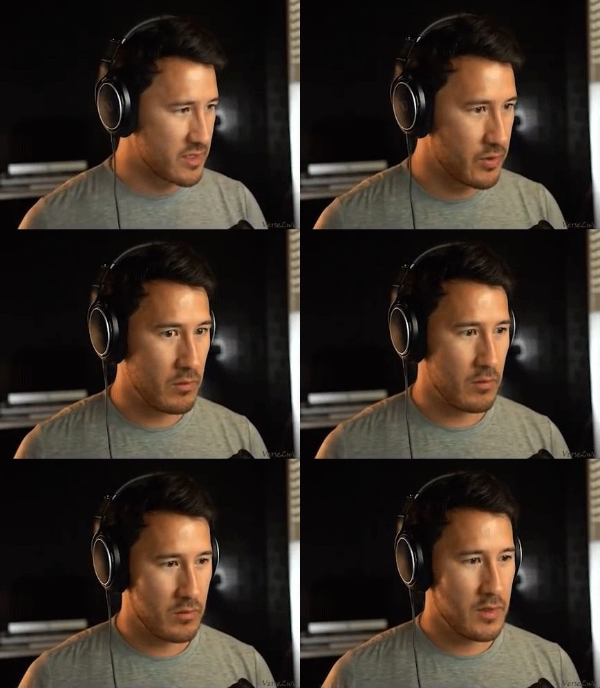
In the Warframe playthrough late in the year, Mark's camera briefly freezes. But in 3 Scary Games #9, his camera freezes repeatedly before glitching back to normal, and he implies that "there's something else" messing with the camera. In 5 Nostalgic Games, when Mark gives the definition of ubiquitous and bares his teeth while saying "We're learning today!", the video suddenly glitches.
The thumbnail for Markiplier has fled the country had Mark lunging at the camera, his face completely darkened by shadow. And the thumbnail for 3.75 Scary Games blatantly toyed with the fandom with text shouting "DARKIPLIER?"
And the fanbaiting didn't stop there. More thumbnails that hinted at Dark included a hand bathed in blue light reaching out to the viewer for the fittingly titled The Devil Haunts Me, and a cartoon of Mark cowering away from Dark's furious glare for You're Perfect.
Markiplier's Tour: The Movie featured the improv teacher stating that Markiplier wasn't at the shows. "I don't know who that guy was, but it wasn't him." Even the Markiplier Animated short I've Got Boobs?! features a brief scene of a shadowy Darkiplier rising from a well and whispering something unintelligible.
For the most part however, the teasing came directly from out of Mark’s mouth.
In 3 Scary Games #5, Mark jokes that a ghost (clad in the classic white sheet and glitching somewhat) is Darkiplier. 3 Scary Games #13, the first (jokey) game called "Death Trips" features RGB text and Mark narrating in an echoing voice. In Midnight Shift, a game where Mark is memorably being chased by mannequins, he jokes that an RGB poster on a wall is "expricitly [sic] Darkiplier". In SCP Containment Breach #57, Mark jokes when he sees the intro screen of a pretty lady in 3D with an open third eye, "Look at this Darkiplier ass thing... it's like Celine, straight out of [Who Killed Markiplier?]".
In 3 FNAF Fan Games, he even chortles that the game has “Darkiplier letters.” In Devil Daggers, he scoffs, “A high-pitched ringing in the darkness. That’s always good.”
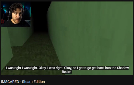
[Image captured by me, on June 3, 2018.]
Just before midsummer, I received a pleasant surprise. In Imscared: Steam Edition, Mark says "I gotta go get back into the Shadow Realm, the Upside Down." Which, personally, made me very happy at the time. Since I first became active on Tumblr in July 2017, I've been referring to Dark's void dimension as the Shadow Realm, while Mark has referred to it in the past as the Upside Down, making the link fairly clear in this statement. (Somehow, whether by happy accident or serendipity, my terminology and its proper context made its way to Mark. As a fan, I can't describe how pleased that made me, to know he might have actually seen something I’ve made.)
(But enough about me. I’m just an obsessive Darkiplier fangirl. So let’s get back to cataloging all the hinty goodness!)
By this point, you’re probably wondering, “Okay, so all those hints are decent. But where the hell is Dark in all of this?!” But that’s the point, my friends: He was there the whole time. In brief flashes of imagery, in hints and innuendo. Unseen, but his presence clearly felt as our expectations were played with by our channel host.
We expected a wild ride at the beginning, when Mark made two brief livestreams on January 5th, wandering through the theatre he was slated to play for the You’re Welcome Tour.
The first of the two, “What’s Going In?!”, he showed us the back area of the Paramount Theatre, using only improvised narration and acting to build an atmosphere of dread. He claimed the theatre was haunted, and that he could smell “the scent of death”, ultimately vowing to protect those who would be visiting the theatre to see him that night. He also declares the EXIT a trap, before being pursued by an unseen entity.
The drama continued with “...” (a title that is impossible to find using Youtube’s search options), that begins with an eerie quiet. Tyler eventually finds Mark’s dropped phone. He asks the viewers where Mark is, before going on a search. He’s eventually attacked from behind and the stream cuts off, leaving those who weren’t at the show that night to wonder how the matter resolved.
In Simulacra, there's a brief flash of Mark in his Big Mood outfit with text saying "WAKE UP". When the simulacra changes the colour of the cellphone's display and begins to speak in a calm, creepy voice, Mark reflexively responds, "Darkiplier?" and sounding unnerved at the mention of "behind your black mirrors", then being stunned as the screen appears to crack.

At the end of Simulacra, he gives an uncharacteristically downbeat speech, declaring that "We're all just digital copies of ourselves, idealized in a digital form. And maybe that's the way that life is just supposed to be. Maybe we should all just roll over and accept it, because there's nothing that we can do to change our fates, after all. And who's to say that it's not better for us just to wear the masks that are our digital personas, and live our lives as those? Maybe that is for the best."
The How To Make Slime video goes from harmlessly silly and takes a twist for the stabby. Mark declares "In order to appease the Dark Gods..." then he instructs the viewer to slice their palm and "whisper the words of power." The words in question? "They shall rise. They shall consume. All will be lost when they rise from the darkness of the ocean. Madness opens up to everything." When the making of the slime is concluded, he adds that "We all get to enjoy three years of peace before the Dark Gods consume us all."
I have no idea what that means, but I’m pretty sure it may involve Cthulhu chomping on my kidneys. (Then again, Darkiplier is a Lovecraftian monstrosity Himself. So, if it’s Him who’s one of the Dark Gods? He can have a kidney from me if He’s really that hungry. Kidneys are a redundant system anyway, so you really only need one.)
April Fool’s Day brought us the gag gift of The Official Markiplier Rock, with a suspiciously deep voice informing us that the rock is available in white. Additionally, the video warned to alert the SCP Foundation if the rock appears to start talking! (What? My rock has been talking to me since I got it, and there’s nothing wrong with me!)
Baldi’s Basics: Secret Ending featured an explanation about attaining the secret ending, with Mark’s otherwise normal voice echoing slightly with subtle white noise effects. (Hmmm...)
In December, for the charity livestream and archived in a video called Santa Spills The Tea, a Santa Claus that sounded suspiciously like Wilford Warfstache declared that Dark, the master manipulator and Big Bad of Mark’s channel, was a “sweetheart! He shouts a lot, but he’s just a big ol’ pussy. He can’t even possibly… he didn’t hurt anybody! He didn’t kill one person! If there’s anybody who’s on my naughty li— uh, on my list of people who’ve been bad, he’s the only one not on it.” (And mind you, in 2017′s Markiplier TV, Wilford sang a little ditty about how he killed Santa Claus and the kids wouldn’t be getting any presents that year. And Dark still convinced us to shoot someone in A Date With Markiplier, while apparently feigning regret. But heck, use your own judgement.)
Mark also dropped one heck of a hint of things to come in, of all places, Markiplier Tries Korean Beauty Products. There, the descriptive intro to the following year’s DAMIEN animated feature can be heard at one point. “Snow blankets the field, a pristine meadow of untouched white. No animals call. No birds cry. Only the steady rustling of wind through dead trees accented by the impact of his axe. A crack-like thunder rings out as the ancient pine finally succumbs to his murderous assault. The old giant crashes into the ground. Dami-”
Wilford Motherloving Warfstache was, of course, focused on the mustachioed entity. But there were elements to the short film that felt like Darkiplier was watching along with us. Particularly the VHS-style glitch at the end of the film.
Of course, there were only three videos that year that potentially contained Darkiplier himself.

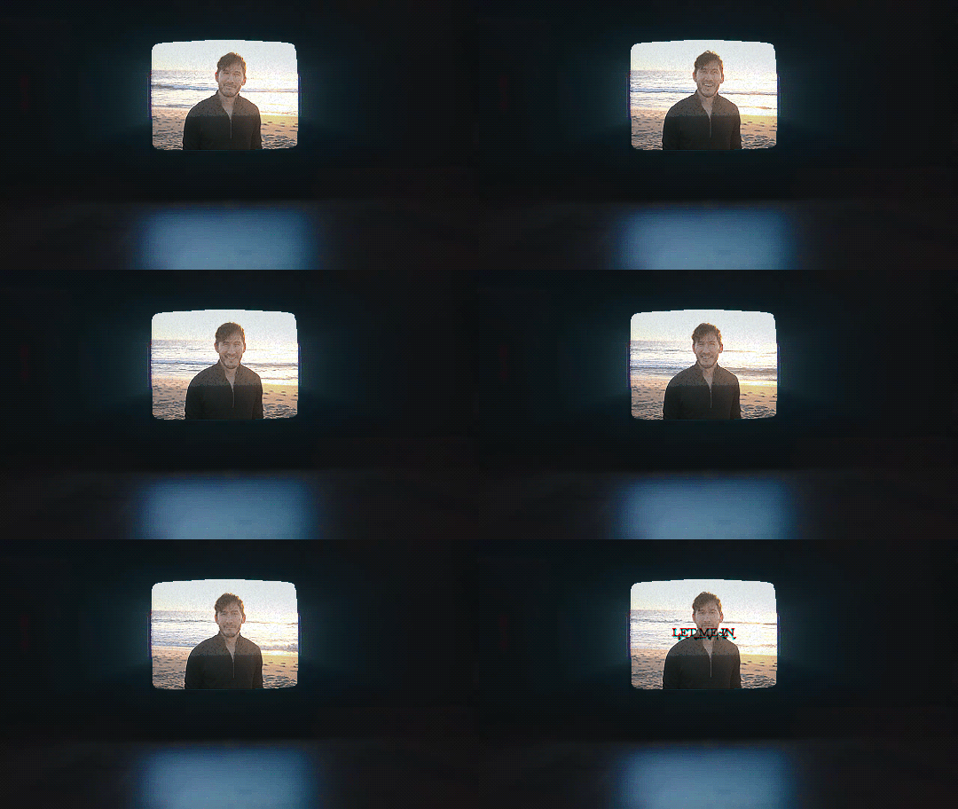
One candidate is Fall in Love with Markiplier. Yes, the name on the title is Mark’s... but is it really him? The entirety of the film is a fourteen minute staring contest with Mark, as he lovingly (and somehow also creepily) gazes at the viewer in different settings -- by the ocean, at a dog park, and in a bubble bath. The only spoken words are in the intro, over the strains of the music from A Date with Markiplier: “It’s scientifically proven that you can fall in love with someone simply by maintaining eye-contact for an extended period of time. So now, you can fall in love with Markiplier all over again in these three locations. Happy Valentine’s Day.”
The second candidate is World’s 5th Quietest Let’s Play, released just 5 days prior to the Let’s Have a Romantic Staring Contest video. Unlike the previously mentioned video, there’s more going on this time around. The game to be played quietly this time around is Bennett Foddy’s infamous rage-inducing creation “Getting Over It”.
He threatens the developer with the words, “You will see the inside of your entrails, when I drag them out of your abdomen and show them to you.” (Ah, how romantic.) He goes even further than that, saying soon after, “This is a representation of My sins... You will be purged in the fires of absolution, along with all of your ilk. I will burn the heretics that you are harbouring inside of your soul... I will destroy you.” (Now there’s the smite-happy Hellgod we all love!)
But He doesn’t stop there, snarling under His breath, “You will burn in the fires of My own hell! And I will choose your pain to last eternity!” However, He is ultimately defeated by the game, departing our company with “Alas, I leave you now, to slumber amongst the ancients.” (Aww, poor guy needs a hug. And I know just who’s ready to snuggle with Him...)
But the last of the video to potentially contain Darkiplier is... the four-hour long play through of Hearts & Heroes. Is it canon Dark? No, probably not. It’s a fan game, though the words of dialogue are acted out by Mark himself. But rather than simply recounting key phrases for you, here’s the Boss Battle between Mark’s team and Dark, edited by the lovely icedpinkpeebles (Mark’s goofy character names and all!):
youtube
So, what does all of this ultimately mean? Why did Darkiplier fade into the background in 2018? And, most importantly, what is He up to now?
The truth is I don’t know any more than you do. I can only guess.
But I can tell you this: We don’t know Darkiplier as well as we all think we do. Many of us (including me) fully expected Dark to raise hell following the events of the jokey Darkiplier vs Antisepticeye video in 2017 (because He did mention how He hates being mocked!). And while we did get more Dark at the end of that year, it was in the form of an origin story.
Whatever Dark’s planning, we’re not going to see it coming. Because He’s playing a long game. And when you’re immortal like He is, you have all the time in the world to get what you want. Be it for love or revenge, Darkiplier remains a force to be reckoned with.
But here we are, in the eye of the storm. Only time will tell before the final wrath of the hurricane makes landfall.
#markiplier#darkiplier#markiplier fandom#darkiplier fandom#iplier egos#dark egos#2018 recap#vid: simulacra#vid: how to make slime#vid: santa spills the tea#vid: fall in love with markiplier#vid: world's 5th quietest let's play#hearts and heroes
40 notes
·
View notes
Text
Basic Comprehensive Guide to Computer Hardware,
for all you beautiful writers or those who just wanna know about computers!
I’m tagging this as sasusaku because of the post I made earlier about helping writers with computer stuff. Hopefully that will help those lovely people find this post and save it as a reference. For your convenience, this long post is under a read more.
This post was made 9th July 2019 and will be updated with more information.
So first of all, we’ve got several major computer components: the Central Processing Unit (CPU),motherboard, main memory (RAM), secondary storage devices (such as an SSD or a hard drive), input and output devices (known as peripherals),and a Power Supply Unit (PSU).
Other important, but nonessential components include: the Graphics Processing Unit (GPU) (a non-embedded GPU), a Uninterruptible Power Supply (UPS), water coolers, wireless network adapters, and extra cooling fans.
The CPU:
The Central Processing Unit is the part of the computer that actually runs programs. It is the most important part of the computer, because without it, the computer cannot run software. When a computer is performing a task that a program tells it to do, we say that the computer is running or executing the program.
How the CPU works:
A computer’s CPU can only understand instructions that are written in machine language. Because it is very difficult to write entire programs in machine language, other programming languages have been invented.
The CPU is designed to perform simple operations on pieces of data. For example, reading data, adding, subtracting, multiplying, dividing, relational operators, etc.,
The CPU understands instructions written in machine language and included in its instruction set. Each brand of CPU has its own instruction set.
In order to perform meaningful calculation, the CPU must perform many operations.
The CPU does nothing on its own, and must be told what to do. That’s why we have programs! A program is nothing more than a list of instructions that cause the CPU to perform operations!
Although a program can be stored on a secondary storage device, it has to be copied into the main memory, or RAM each time the CPU executes it.
The CPU executes a program in a cycle of 3 steps:
Fetch: read the next instruction from memory into CPU.
Decode: the CPU decodes the fetched instruction to determine which operation to perform.
Execute: the CPU performs the operation.
Here’s what my particular CPU looks like:
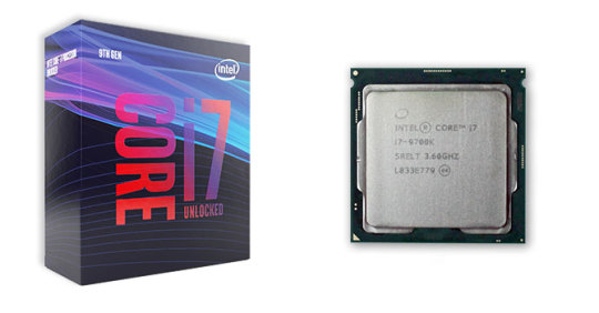
I have the intel i7-9700k processor, which has 8 physical cores. It’s a really good processor! It’s also quite cute. One of my favorite things is that inside my lighting software, iCUE (corsair utility engine) I can see the temperature of all my components, including all 8 cores inside my processor!
Motherboard:
The purpose of the motherboard is to have a central location for all the main components of the computer. Since they’re all mounted/inserted on this board, they can communicate with each other and work together! Sweet!
Here’s what my motherboard looks like, isn’t she cute?
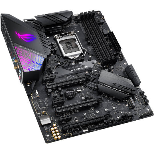
The square in the top middle of the motherboard is the CPU socket! That’s where you mount your CPU. There are lots of different types of sockets for different brands of processors. The 4 channels to the right of that square are the ram channels. The L shaped covers at the top left contain the voltage regulator (my particular motherboard also has a small fan right there to cool it off), and the plates below the CPU are heatsinks. The solid state drives are beneath these heatsinks.
Main Memory (RAM):
The Main Memory, or RAM (which stands for Random Access Memory), is where the computer stores a program and the data used by the program while the program is running.
For example, suppose you’re using a word processor like Microsoft Word to write something. While you are writing, both the word processing program and the piece you’re writing are stored in the main memory.
We call the main memory RAM because the CPU is able to quickly access data stored at any random location in the RAM. RAM is a volatile memory used for temporary storage while the program is running, so the contents of your computer’s RAM will be erased when the computer is turned off. Inside your machine, RAM is stored in chips. It’s really cute!
Here’s my ram:
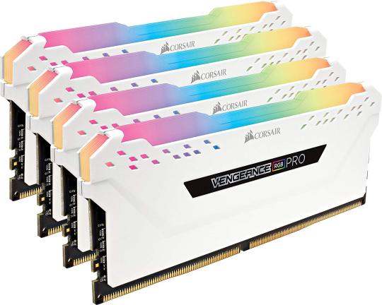
It’s the Corsair Vengeance RGB pro. My particular ram is 4x8, which means I have 4 sticks of RAM, each at 8GB. That means I have 32GB of RAM!
Secondary Storage Devices:
Secondary storage devices are used to hold data for long periods of time. Programs are stored here and then loaded to the main memory when needed.
So, we’ve got several types of secondary storage devices:
Disk Drive: Magnetically encodes data onto a spinning circular disk.
Solid State Drive (SSD): Faster than a disk drive. Has no moving parts, and stores data in solid state memory.
Flash Memory (flash drive, memory stick): Portable, no physical disk. Usually used by connecting it to a computer’s Universal Serial Bus (USB) communication port and appears to the computer as a disk drive, but does not contain a disk.
Optical devices (compact disk (CDs), digital versatile disk (DVDs)): Data is encoded optically as a series of pits on the disk surface. CD and DVD drives use a laser to detect the pits in order to read the encoded data. Optical disks hold large amounts of data, and for that reason, recordable CD and DVD drives are commonly used for creating backup copies of data.
Here are my SSDs, (solid state drives):
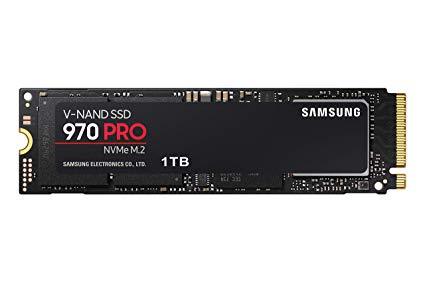
I have 2 of these Samsung 970 pros under the heatsinks of my motherboard, both 1 TB each. They’re a lot faster than a hard drive because they don’t have any physical moving parts. They’re also a lot smaller and cuter!
Graphics Processing Unit (GPU):
The GPU is designed to rapidly manipulate and alter memory in order to accelerate the creation of images. They can either be embedded in the motherboard (like most laptops or low-tier desktops) or be on a video card.
So pretty much, your GPU does a lot of arithmetic! It’s very powerful and necessary for playing heavy games or editing videos.
Here’s my GPU:
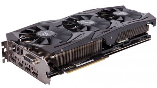
This is the ASUS GTX 1080 ROG STIX RGB GPU. Lots of acronyms there, but she’s really cute! She has 3 fans to keep her cool while I’m playing Skyrim and Ultimate Ninja Storm 4. She’s also got some HDMI ports and stuff on the back there. That’s how you connect your monitor or VR to her!
So a lot of you have heard of the GPU hype lately, I’m sure. So, there’s a couple types of GPUs.
TI: stands for titanium, and just means that it’s more powerful than the graphics card without it. So the ASUS GTX 1080 TI ROG STRIX RGB is more powerful than my GPU, the ASUS GTX 1080 ROG STRIX RGB. The TI versions of graphics cards have more shader processors (cores and shit) that are able to carry out specialized processing and rendering tasks that are required for your computer to display stuff on your monitor.
GTX: nobody really knows? Grand Tourismo Xtreme? Graphics Technology Xtreme? Sounds cool though.
RTX: Ray Tracing! Ray tracing is a rendering technique that can produce incredibly realistic lighting effects. Basically, an algorithm can trace the path of light, and then simulate the way that the light would react with the virtual objects it hits in the generated world.
Cooling Systems:
So, there’s a lot to unpack here. You can do mineral oil (submerge your entire computer in a fish tank of mineral oil! No thanks, that sounds really inconvenient for maintenance.) regular fans, water cooled, and I’m sure there’s much more shit I haven’t even heard of. Today we’ll be talking about fans and water cooling.
Fans: lots of different kinds. They spin to cool your computer down!
Tip: When cleaning your fans on your computer, you need to hold your fans still. When they spin, they generate power to the motherboard (think of it like a computer windmill) and can cause it to overheat and get messed up. A lot of people like to clean their fans using compressed air for convenience, but if you let the blades spin freely while you’re blowing air at them, they will generate too much electricity for the motherboard to handle.
There’s many kinds of fans, like SP (static pressure), AF (airflow), and ML (magnetic levitation). There’s a lot more that I haven’t really studied. I personally like my ML fans because they’re pretty and super quiet!
Water Coolers:
Water coolers take advantage of the basic principle of thermodynamics- heat moves warmer objects to cooler objects. As the cooler object gets warming, the warmer object gets cooler.
https://www.youtube.com/watch?v=gQ1lNwCKs-c
This wonderful youtube video bu Tao of Tech does a really fantastic job of explaining. I feel that the visuals he produces are much more effective than my typing.
This is my water cooler, the Corsair H150i Pro.
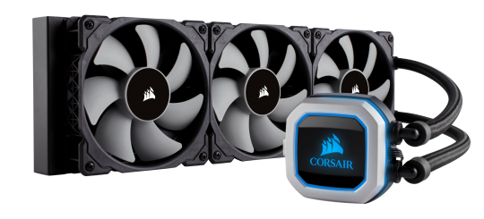
The block with the Corsair logo is referred to as the water block or the CPU block. This sits directly on the CPU on top of the motherboard. The fans sit on top of the radiator at the front of my case, although it’s possible to mount your radiator and fans in the top of the case as well.
There are two types of water coolers: AIO and Custom.
AIO stands for all in one. The water cooler above is an AIO loop. The water inside does not need to be changed because it’s a closed loop! I love my water cooler because there’s a lot less maintenance on it than using a custom loop!
A Custom loop consists of larger tubes, a reservoir, and a pump. You need to replace the water inside it every so often (I’d say like 6-8 months but I have friends who have left it in there for years). The tubes and all have to be cleaned out, and the custom loops are quite bulky. However, it makes it very easy to liquid cool both your GPU and CPU simultaneously and can in some cases be more efficient than an AIO loop. You really need to know what you’re doing when you build a custom water cooling loop, but they can look super cool and perform really really well.
One popular brand of cooling fluid (my computer science friends and I lovingly call it computer water, the forbidden drink) is thermaltake. There’s lots of different colors for you to customize your system!
Here’s an interesting video from JayzTwoCents on his custom loop with 2 year old fluid! He drains his system in this video. It’s pretty sweet.
https://www.youtube.com/watch?v=W8wwxGPGApU
I HIGHLY recommend JayzTwoCents if you want to know more about building PCs!
Input Devices:
Input is data that the computer collects from devices. An input device is a component that collects data, usually from the end user (you!) For example, keyboards, mice, touchscreens, and cameras are all input devices.
Disk drives can be considered input devices because programs and devices are retrieved from them and then loaded into the computer’s main memory.
Output Devices:
Output is data produced by the computer for people or devices. This data can be text, image, audio, or bit stream. An output device formats and presents output. This may be a video display (your monitor, or screen), or a printer.
Disk drives and USB drives can be considered output devices because data is sent to them to be saved.
Here’s my machine. Try to identify which parts are which!
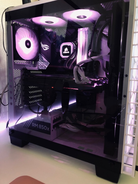
#audrey's life#computer science shit#reference#for writers#tagging this as sasusaku so my favs can find it#sasusaku
8 notes
·
View notes
Text
My Coloring Process: A Tutorial
At an Anon’s request I’ve decided to show my nonsensical way of going about this. It’s anything but perfect but it’s currently working for me, and maybe it’ll help someone out. It shows how I go from this:

to this:

I just wanted to start this off by saying how sorry I am for how wordy this got. My coloring process is kind of long and I decided to go over everything because I'm dumb and it just kinda became this whole long 1,000 word thing. My b.
For this particular scene I'm making 3 gifs. Everything's open, resized, cropped, and ready for coloring. I don't crop much, but I crop each gif around the edges so there's not that weird line around it. I just resize the gifs to be a few pixels bigger than tumblrs sizes and crop the rest. So a 540px gif would be 550px before being cropped down to 540px.
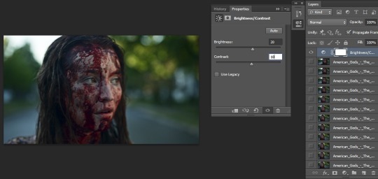
Anyway, on to coloring. I always ALWAYS start with a brightness/contrast layer. There's no reason why--after everything's all said and done it isn't even the bottom adjustment layer--it's just what I do and have been doing since I started making gifs and I’m afraid of change.
Depending on how bright the scene is on it's own dictates the settings I use. Usually I keep it at 20 for brightness and 10 for contrast. For darker scenes I up the brightness to 30, and even throw in another layer a little later in the process. But we'll get to that later.
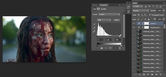
Next comes the levels layer. I like the settings 02, 1.15, 240, but I change it a bit depending on how dark or light the scene is.
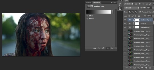
I tend to use at least one gradient map layer but, again, it depends on the brightness/darkness of the scene. Sometimes I use more than one, but sometimes it doesn't work well and kind of washes things out a little much for my tastes. For this set I'm using one set to soft light, and on 10%.
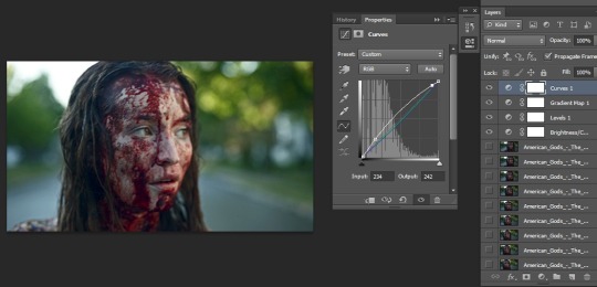
Now on to the curves layer. When I see people talking about this they mention numbers, but I don't really mess with that part? I usually just click near the middle for the red, green, and blue parts (around input: 130 and output: 130) and adjust with the arrow keys until I feel things look good. This time I ended up with
Red: I: 134, O: 128
Green: I: 136 O: 130
Blue: I: 135 O: 126
While you can definitely use curves for major color adjustment, and I suggest trying it out for yourself, I tend to keep that for selective color and color balance.That’s just personal preference, though.
For RGB I click in two places and adjust from there. Here’s what I ended up with for this particular gif.
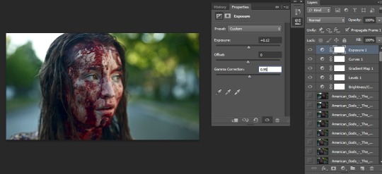
Here's where I'd add another gradient map layer (overlay, 10%) but I'm not feeling it for this set. Instead I'll go straight to the exposure layer. I've never messed with the offset settings. But exposure and gamma correction are pretty aces. The settings depend on the scene, but they tend to turn out a bit like this. Tbh it's a small adjustment but it's something I do and if I stop I'm pretty sure things will fall apart so I keep doing it.
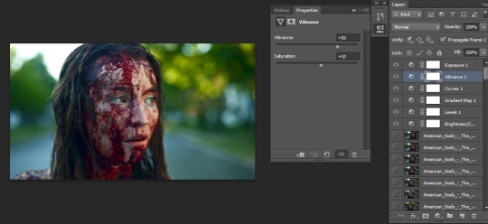
Now's when I start going back in the layers to add more, since the gif's as bright as I want it. For one reason or another I always add the vibrance layer above the curves layer, even though selective color always ends up between the two. But whatever. Depending on the gif I'll up the vibrance to about 50-60. I keep the saturation to 10 or lower. No idea why, it's just what I do. For this gifset I went with 50/10.
Did someone say selective color? Because that's what time it is. This is kind of hard to explain, since I don't usually mess with the numbers themselves. Arrow keys are the way for me, usually. And, tbh, there's just a lot going on. There's a bunch of things to mess with here and I tend to mess with it all, depending on the set. To keep from having to take like 100 different screenshots, I'll just type out the numbers I end up with and take a screenshot of the end result.
Reds: cyan: -28 magenta: 0 yellow: +6 black: +43
Yellows: c: 0 m: +26 y: +26 b: -11
Greens: c: +62 m: -29 y +60 b +20
Cyans: c: -2 m: +10 y +18 b + 11
Blues: c: -30 m: -16 y: +34 b: -3
Magentas: c: -27 m: +15 y: +34 b: 0
Whites: c: -21 m: -17 y: -20 b: -9
Neutrals: c: -4 m: 0 y: +2 b: 0
Blacks: c: 0 m: 0 y: 0 b: +1
And here’s that screenshot.
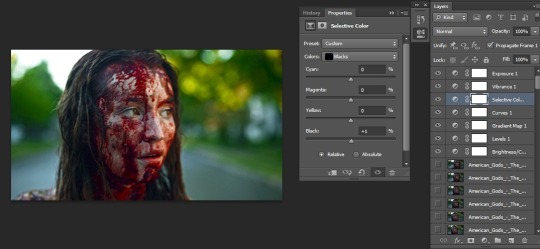
With everything how I want it so far I go to the gif layer underneath that first brightness/contrast layer and throw in a color balance layer. Why is it here and not in some other order? Who knows.
Again, I don't use the numbers and live my life by the arrow. I don't really mess with the shadows settings, either. Just midtones and highlights. Why? I have no idea about that, either. Here's the numbers
Midtones: -4, -2, +3
Highlights +4, +3, -3
And the result:
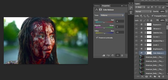
Photo filter time. Again, why? Could I just use other layers to get the same effect? Probably, but I do this anyway because I love making everything take forever. I use two filters, the first warm filter (it's called warm filter (85)) and cyan. Make sure preserve luminosity is checked. My settings change depending on how warm/cool the set is and how I want it to look. For a slightly warmer look I make sure the warm filter is bumped up to 15%, same settings for a cooler gif. I'm going for a warmer look today.
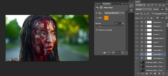
That's it for coloring. If I feel the urge to add another brightness/contrast layer, now’s the time I’d do that. The second b/c layer goes all the way to the top of the pile for some reason or another. But since I’m not doing that it doesn’t matter. If I wasn’t making a set I’d go about figuring out the start and end of the gif, sharpen things up, and save it but I am making a set so I’m not done yet.
To keep the process short I like to copy a single layer of the gif and paste it at the end of the next gif in the set. Then I go and make sure the little eye icon is clicked for each layer
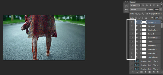
and make adjustments as needed. In the second gif I felt the street was a little too cyan for my taste so I went into selective color and made some tweaks. Then I went into curves and brightened it up a touch by clicking on the bottom square/dot thing and hitting the up and left arrow twice. For the third and last gif everything looked fine after the paste so I left it be.
And with that, I'm done. For an 8 gif (268px) set the coloring process is the same but since it's not usually the same scene I cut out that last paragraph and call it a day. All in all, you should experiment with things. Check out settings, test things out, find a way of going about things you like. There's a bunch of things I don't even touch that might be a setting you adore. Click on random bits and pieces and see how things turn out for you.
I hope I was able to explain things well and that this can help someone out. Sorry it’s such a long read. And if I didn’t explain something well enough feel free to ask me about it.
236 notes
·
View notes
Text
CHAPTER 1 aka “Stranger Danger”
I’m rereading The Property of Hate by @modmad and overanalyzing it to hell and back because i can’t stop thinking about the story and getting madder and madder about the PUNS I keep finding. I’m scratching the itch and trying to find All The Details. Current plan is just to go chapter by chapter, feel free to chime in with stuff I miss! There’ll be a masterpost up soon linking everything in one spot
SPOILERS are sprinkled around extremely liberally. Masterpost
Okay, so just a million things right off the bat on page fucking one
‘The Hook’ is of course a term for the beginning of a story. Grabbing one’s attention and convincing them to go off on an adventure, so to speak
Speechboxes! Everybody’s got their own distinctive ‘way of speaking’ in this story. RGB’s are rectangular, but those straight edges are offset by these really loopy, meandering, and elegant speech tails. It’s just. Such immediate characterization.
Like, even the pose. The way RGB introduces himself by crouching on her drawers like an incredibly dapper gremlin. It creates a similar contrast to his speechbubbles- prim and proper existing simultaneously with fae and kinda ridiculous
So considering we’ve got a fairly detailed picture of roses up on Hero’s wall on the comics opening page I think we can assume this is some type of Important maybe. Just off the top of my head, isn’t the rose Englands national flower? IDK how relevant that is outside of RGB being incredibly, incredibly British
Oh god damnit I just scrolled down to go to the next page and fffFFFUCKING BLUE ROSES ON THE BUTTONS okay. Blue rose symbolism! They don’t exist naturally. You won’t just find one in the wild outdoors, so they represent the impossible, the mysterious and achievable.

Seeing blue roses right off the bat = important story theme probably. Impossible dreams are my first thought. RGB’s seemingly hopeless plan to save a world everyone else has given up to be doomed. Hero’s wish to go the fuck back home please after she’s had her fill of deadly adventure. RGB and Hero are setting out to achieve the impossible, defeat Her, and save the World of Make Believe
Last point for the first page; RGB’s drool. Except it’s not drool, we later learn it’s equivalent to blood, and he bleeds emotions he’s feeling. While recruiting Hero, RGB’s prominent feelings are, unsurprisingly in hindsight, a fair load of sadness but tinged with a dose of cheer. His last Hero failed, and every single one before that, but he’s still daring to have hope, the absolute madman. What he’s actually dripping most though is what looks like curiosity- it may be mixed with a bit of anger, which I wouldn’t begrudge the guy. Angry that he has to start over, again, angry that his world is dying, angry that he’d the only one doing anything about it
Ok but imagine you woke up to find a man crouched on your bedside table smiling this super-wide “TRUST ME!! :)” smile and blood dribbling out of it and welling up between the teeth. Like, I’m laughing, but I’d be screaming
OKAY BUT FINALLY WE’RE PAST THE FIRST PAGE. We get a clear look at Hero’s drawings taped to the wall, and check it- one kinda looks like the Idea they run into a few chapters ahead. The other picture might also be showing the House of Paint? I mean, there’s a sun there so that’s off, but the clouds and steps leading up to Madras’ door look right
And now we get Hero’s speechboxes! They’re circular in contrast to RGB’s boxes, and colored orange. The balloon tails don’t loop-de-loop all over the page like RGBs but they’re not ‘standard’ either- there’s always this little jag to them closer to the text
RGB’s speechbubbles are actually one of the plainest/most conventional in the entire story
Excluding the tails of course. Those never ever take the most direct or efficient path to his face. Yeah, it adds an impression of silliness, but also speaks to the fact that RGB takes creative and weird solutions out of situations. I’ll laugh about the entire Click arc later but like really. REALLY. RGB DID ALL OF THAT
I love how Hero’s first actual words to RGB send him immediately into ?????????????. He keeps up this huge grin for most of The Hook and this is the first time his “I’m your friendly neighborhood TV nothing to see here!!” demeanor gets shaken up
the ladder hurts Hero’s feet, so why does she sleep on the top bunk? The bottom bunk doesn’t have any bedding on it so it’s not like she’s regulated to the top by any kind of sibling dibs
Weird... weird detail to be showing us modmad.....
“Are you a monster?” “the very worst one” that’s a lotta blue dripping off yer chin there, stop crying
The mom is a character for two (2) seconds and even she gets her own unique speechbox; blue, fuzzy and barely connected, which does a really great job of communicating that she’s basically still asleep without ever having to see her
‘happy boi about to bring newest kidnapping to the sky world’
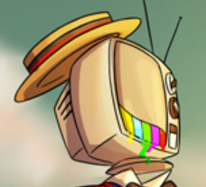
That’s a Mary Poppins reference, that is. RGB exclaiming ‘spit spot!’ earlier also got be thinking of Poppins

Clouds look so fluffy out of airplane windows, I’m honestly jealous
Doors! Gotta wonder where they all lead. Gotta wonder if they’ll get more use past this outside Hero’s recovery Time
I’ve just spend like 15m trying to figure out what the symbols above the doors are and I THINK it’s alchemy? “libra sign upside down” is luckily an easily searchable term, and that symbol in particular is for gas becoming liquid
I think the door beyond that has the alchemical symbol for gold? I’m not having luck on the others, including the door they actually go through here/its sister door Hero opens after the Elastic Valley fiasco.
RGB are you pissed that you had to tell this kid your name yourself? Are you upset about manners?? She’s like 7 dude cmon have you met a 7 year old. Thinking about it, possibly not, all the confirmed Other Heroes are definitely older- they all come across to me as adults
well, actually, who even knows how old Assok is. They might be the exception
The little ‘peephole’ eye popping open when the right key is close is nice atmospheric detail, but it kinda makes me wonder if there’s a person like. Seeing out of that eye. Whether someone gets a little notification every time one of these doors is opened
It’s the World of Make Believe! Stupendous! Break-taking! Modmad is exceptional at colors and beautiful environments full of personality! Hero’s last chance to turn back is gone!
Hero only being awake for 20 minutes before becoming Instantly Tired = biggest actual mood, my god. Me too sweetie
Except I can’t blame trees. And a sort of magical jet-lag effect. Yo, are sleeping tree’s making you sleepy the same sorta thing where when one person yawns everyone yawns
I just really like how this tail loops around RGB’s physical actual legs. It makes it seem like speech is a tangible thing that interacts with the world and that you could, like, touch or something. all it’s missing is a shadow

God, fuck me. That’s the yellow brick road. God dammit. Son of a bitch.
RGB, pg 14: do not touch me, do not look at me, don’t speak to me, you have tentative permission to breathe
RGB from the Market onwards: carries her multiple times (admittedly, almost always exactly like you shouldn’t), picks her up, swings her around, hugs her when she’s scared of the dark, ‘I Have Longer Legs, Hop On’ piggybacks, protecting her by putting his own bod in harms way, general Manhandling of Child
I kid, I kid, it’s more complex than that. For one, RGB doesn’t want Hero getting hurt cause she’s Important and has Heroing she can’t do if she’s injured. Second, that whole “don’t get attached” thing gets thrown out the window on like day 2
“I’ve only known Hero for a day and a half but if anything happened to her I’d kill everyone in this room and then myself”
RGB is honestly... super bad at not attaching to people. honestly, actually terrible at it
Ooh! Those flowers! I didn’t realize those always happen when Hero’s sleeping. They also look like she’s drawn them herself! That’s honestly… lethally adorable

Fun fact technicolor dream shell snail changes colors every panel
RGB bleeds static? What emotion is that? I dig it, unconscious is an emotion and i feel it in my soul

w...white noise.... god DAMMIT
ey, the tree’s look different in the light of day- all those blurry fairy light ‘leaves’ are gone now.

!! Hero glows the exact same way when she’s asleep! RGB, however, is not. Tree’s have leaves when they dream, huh
oh god tree’s have LEAVES when they DREAM
...we’ll come back to this thought when we get to the sick sun tree cause that thing is a whole other can of Lore worms
In a different direction, there must be some sort of difference between Tree Dreaming and People Dreaming, because dreaming trees do NOT trigger RGB’s weird stuntman nightmares
these particular trees are also see-through; i can’t remember if they’re all like this throughout the world? will have to pay attention and see
oh- OH. also just made the connection for why trees provide a saf(er) haven- bottled nightmares will very shortly be used to dispel fears. Dreams repel Fears! It’s best to sleep near tree’s because just you dreaming might not be enough to keep things at bay while your rest
And the chapter’s finished off with a new character and new speechbox to go with it! It’s the first to use a different font and text color to our main characters
Honestly though, what is UP with the Butterfly? It’s clearly keeping close tabs on them, and only speaks to Hero when RGB is unconscious or otherwise occupied. It clearly doesn’t wanna be seen by him, which is shady. It shows up like twice? And the other time RGB and Hero don’t even know it’s there and listening. Between that and the Eyes, like… does it have it’s own agenda and interests or is it an agent of Hate? Idk man maybe I’ll pick up on more Butterfly stuff on this readthrough

*notices that the plant it was resting on withers once it flies away* ... that’s no good. especially if that butterfly can do the same to trees
...... ah. it kinda can. Consider, please, Hate’s likely role in the demise of the Sun, and Her confirmed ability to smother them in [-----]
Butterfly’s parting words: “be wise”. Hero’s next and immediate action: doodle RGB’s face
And that’s the Hook! Join me next time when Hero has a fun play date with some new friends everything goes wrong almost instantly.
#tpoh#the property of hate#tpoh meta#the specific tag for this adventure will be...#tpoh time with Gill#i assure all of you i make these posts out of love
2 notes
·
View notes
Text
The top 10 Gaming Peripheral to Boost Your own personal Gaming Skill within 2019
youtube
COOL SQUAD In this modern-day world, it may be liable in order to access each as well as every little thing with modern technological innovation; for that reason, gaming peripherals work best game playing devices which comfort and ease typically the gamers who adore to participate in the ideal games using easy and accessible product that can be played their skills. Likewise I want to enhance this gaming knowledge with often the best gaming devices in the foreseeable future as well. However, right now there are lots of gaming equipment but some of the extremely heavy of them I possess spotlighted below which could enhance the ideal video games skills in the 2018 without any atoms involving uncertainty.
COOL SQUAD
Top 10 Game playing Peripheral
Wifi gaming Sensitive mouse - Logitech G502 Proteus Spectrum
Wi-fi gaming sensitive mouse are in some manner easy to be able to access for the avid gamers inside current gaming technique. These wifi gaming computer mouse button are free heading and also can easily be succeeded by the players. On the other hand, Logitech G502 Proteus Array is certainly one the best video gaming peripheral wi-fi mouse that I found. Very low modern-day optical sensor which presents rapid response to the actual movements on the hand while soon I transfer the idea. Similarly, it has custom lighting of 16. eight million colors which present it the like inhaling style. Moreover the illumination product is also sensor bottom part seeing that when I no longer use it, then the item will sleep until along with unless I move this again. Furthermore, it supplies super easy control which can certainly be customized by myself establishing. This customized strategy is structured on 11 buttons which will easily control all the particular programing in the foreseeable future gaming like that is presented in the 2018. Furthermore, it is the finest gaming system because that is easy to hold with transportable of typically the 3. 6 g coupled with comfortable design with regard to us to use because it has grip at the same time. Therefore, the Logitech G502 Proteus Spectrum is often the best games peripheral which usually is easy to gain access to which is easy to get because it possesses fair price i. age. $44. 99.
Racing Added wheels -- Thrustmaster T300 RS
Some sort of racing wheel is amongst the game playing peripheral which is utilized within the racing video video game. It gives enjoyment for you to the players in their very own move forward skills of actively playing online game. One of the actual best gaming devices is usually Thrustmaster T300RS. It is definitely a utilized for play stop 4 in addition to 3 having a great model of GT wheel. This steering wheel makes it possible for me to perform throughout quite smooth way such as We are driving live about the road. Promoted ovum on me to acquire the particular game in next degree without impediments. Similarly, it offers brushless motor which may present easy movement with out any chaffing. The position adjustment can vary from 270 to 1080 degrees with regards to the game motor vehicle. Not necessarily only this, it features dual seat belt which allows a smooth answer just like I am driving your vehicle on the road. Aside from this, you will find metal pedals which are flexible to help more than 6 roles according to the top. Similarly, it includes also the resisting pedal part with the brake pedal. Nonetheless these pedals can quickly be tweaked at altitudes also. Typically the voice connected with the motor is simply not sensible as I can simply give full attention to the game when playing the idea rather when compared with any noise interference. Consequently, Thrustmaster T300RS is the better video games device for race game titles.
Gaming Pedal : Fanatec ClubSport Pedals A HUGE SELECTION OF
Video games pedals are the video gaming peripherals which are applied on the bank account associated with the players comfort. Really fun gaming world is starting many accessible gaming pedals but Fanatec ClubSport Pedals V2 is one regarding the best games units for the players in order to comfort their skills with playing game. Fanatec ClubSport Pedals V2 can very easily be in shape by individual settings. These types of pedals are generally highly constructed with long-lasting and qualitative material. It includes one best option in which it is effortlessly variable almost in all information using angles. Moreover, the item is much more strengthened since it has braking system empathy to use it quickly while playing it. Provides me the comfortable even though playing game because this delivers pressure sensitive braking mechanism and that is connected with community cells. In addition to it, that has magnetic pedals along with high resolution along together with contactless sensors one typically the force of gas as well as clutch i465. It gives my family the concept of the long life mainly because We use it very around even than they have got fine performance. Moreover, the idea has condition option which often really helps make me to be able to feel like I actually traveling lively because it offers vibration motor which illustrate to lock the tires by way of this motors. Therefore, I adore this gaming peripheral regarding my personal gaming and also it will truly support me for future video game titles because these are agreeable to all video games.
Video gaming keyboard - Logitech Grams Pro Keyboard
These kinds of game playing keyboards are just useful for the sake of video games which is very smaller and light within fat. However, there are numerous gaming peripherals of controls but Logitech G Expert Keyboard is one involving the best video gaming gadgets. I really like this kind of games peripheral because the item makes me personally easy for you to use my skills intended for gaming world of opposition connected with sports game. Their result is as more rapidly as you 1 just click of your finger tricks to the keyboard and it is reaction is actually on often the screen. Moreover, its simply adjustable and can go without any tensions. The idea has fashionable small percentage for the computer mouse activity. Apart from this this has lightweight connection using PC so it provides great designs which can easily convenience me for applying my very own best skills whilst enjoying game. One associated with the best option these have i. e. it possesses numerous key pressing which will is most suitable choice for potential coming online games like 2018. This option gives myself the accessibility to whichever I would like to help intend inside game. The item has also RGB lighting effects with 16. 8M colours which can easily always be customized for every one essential. Therefore, it will be the best game playing products for improving the capabilities regarding games and will create me easily to remain competitive in future games.
Games Termes conseillés - Thrustmaster HOTAS Warthog
Joystick is one particular kind of the actual video games peripheral which is employed with the players in the particular games because of their gaming abilities. Similarly, there are several gaming termes conseillés which are used to the gaming purpose but I love the most is Thrustmaster HOTAS Warthog. I identified many amazing features which could make my skills a lot more compatible one. It features a permanent magnetic sensor that can easily produce typically the performance like Me participating in a real airplane since it has joystick buttons which usually required pressure like actual airplane. Apart from that, it can be easily detachable and so I can shift the idea according to my would like. It has lights which often have your five programing LEDs. These LEDs gives us the real impression regarding airplane with lean tyre along with 15 keys. Therefore, I really highly recommend that best gaming gadget supplies me comfort by simply using it and simply My spouse and i can improve my expertise with its programming. In addition, it will as well assist me throughout future releasing games with 2018 as it has often the technology of Area Influence AccuRate Technology.
VR Earbud - HTC Vive
Electronic Reality headset is employed by means of the users to experience these people in space natural environment. Truly they are made use of as video gaming peripheral to get the player's greatest expertise. It gives me a selection of flexibility to seat or maybe stand in space similar to twelve to fifteen feet. So, My partner and i feel quite simple and genuine presence inside the environment. Aside from this these earbud give me the true movements including virtual entire world because it gets the 3 DIMENSIONAL sound with route audio tracks. It can easily controlled at 360 degrees. Also, it really is used automatically upon normal devices without just about any additional adjustments. Therefore, the item becomes easier personally in order to enhance my skills about gaming peripheral. It likewise offers me for upcoming arriving features games which will can very easily be attainable on this THE BRAND NEW HTC Vive.
Motion Controller rapid Razer Hydra
A motions remote is one of the actual gaming peripheral which is usually used to control the particular game accelerometers. Similarly this tracks typically the motion. As a result, there are plenty of movements controller but Razer Hydra is one of often the best movement controllers that assist me to boost my gaming skills. Provides me sensation of the actual electronic world. It offers Magnetic action sensor which usually can locate my family the particular exact location in our arms. Similarly it paves how like I in the morning in the internet sport world by aiding me personally by three dimensional characteristics in the game. This has button with regard to maintaining the fluid which is definitely generally known as thumb-ergonomic and that has also some hyperresponse buttons which provide the particular and fast reaction through your just click. Separate from this, it gives you myself the free motions simply because it has six diploma freedom magnetic motion checking system. Besides this, provides the low magnetic discipline as well as little power ingestion. This is why it makes us easy to decide on the idea for the future approaching game titles because this is actually the best gaming equipment.
Gaming Cockpit - Fanatec ClubSport
The Gaming Habitacle are specific computer table than as usual office. They can be special designed regarding the cause of games purpose for the reason that players by no means get low energy while performing games because it will be any gaming peripheral. Even so, you can find number of sorts of gaming habitacle nevertheless the Fanatec Clubsport is just about the best cockpits which produce an easy access to be able to improve this gaming knowledge. It gives my family typically the total customization of my wish with every viewpoint I can rotate the item. Therefore it has abundance of change for generating position I prefer. Moreover this has colossal purpose which often is compatible for most sporting games. Therefore, We like this particular gaming logement because it is among the best gaming devices which suits my skills
Mechanical Move Gaming Keypad - Razer Orbweaver Chroma
It is usually one of the better gaming devices which will supply the lighting on often the mechanical keypads. Similarly, Mechanised Switches have got a setting that is optimized in the fixed of actuation and reset to zero points which can effortlessly make your performance regarding the actual game and definitely will enhance your own personal skills of activity. Nevertheless, The Razer Orbweaver Chroma is one of the particular best Physical switches game playing keypad which offers me typically the best option of something like 20 key mechanical keys that are installed with programs and can also easily improve my capabilities for the next stage. Apart from that, the idea gives me the solution of 7 key browse pads which can be also entirely programmed concerning my abilities. Similarly, provides me fourth there’s 16. 8M shades of gentle with the mechanical take some time which have also tailor made environment. Therefore, I actually like Razer Orbweaver Chroma because it is often the best video games peripheral which usually matches my very own skills.
Game playing projector instructions BenQ HT2150ST
Gaming projector are the actual gaming peripheral which they use intended for the sake of crystal clear game quality with authentic colors and they are extendable in you desired dimensions. In the same way, BenQ HT2150ST is among the very best gaming devices that offers me personally the great features. It offers a superior me the high image resolution involving 1080 full HI-DEF picture which can help to make my vision very clear to get game. It can quickly be spreadable on the can in big monitor. Similarly, they have good graphic quality without any problem connected with aging. Furthermore, it provides the best option associated with all-natural sound like I actually am in a digital world and playing the adventure as a real lifestyle character. For that reason I in person recommend this ideal video gaming device for egging about my skills with secure gaming projectors.
1 note
·
View note
Text
First Journal for Web Design Spring 2019
1/18/2019
My History with Web-Design:
The first time I ever considered web design was last semester during the intro to design class where we were told to design one. It was horrible, I had no idea how to even approach it and ended up just throwing pixels at a screen until I technically put in enough work to justify turning the project in. I never even thought about websites before then as I always saw them as inconvenient mediums to whatever content I wanted. This reminded me of when I first started in graphic design and literally couldn’t tell the difference between Futura and Baskerville by just looking at them because of how new this field of design was to me. The panic of the oncoming slaughter that would be known as class 576 pushed me to research as much as I could into the field, especially in how to physically make the websites with code. I focused on code in part because of my experience in Adobe programs. Before I can make an illustration in Illustrator, I need to know the mechanics of the program so that I can work at the speed of thought without being stumped. I saw learning how to code as just the web design version of that, though to a certain point I think I was confusing being able to do whatever I want in the browser with being able to design things that are worth making.
I’m coming into this semester very excited for learning how to design for the web.
The First Project Process:
The assignment was to make a website focused on three things that were our favorites in a category of our choice. I may have misunderstood the prompt a little as I thought we were supposed to make a site to house three article listing three of our favorite things in three different categories, rather than one website acting like the article itself listing the three favorites in only one category that the website is entirely dedicated to. I started in my sketchbook before touching the computer just to get some ideas out before I jumped into the computer with no direction and find myself a deer in the Adobe RGB headlights.
Making the initial wireframe in Photoshop was not an issue, save for some elements that found themselves on the same layers as each other which made editing later difficult because moving objects in Photoshop is difficult when they’re sharing layers. I wrote the colophon in my notes as analog paragraph styles instead of trying to work with whatever nightmare Photoshop’s version of styles must be like. I eventually started doing the text in Photoshop to save me the trouble of having to replace everything from InDesign everytime I wanted to change anything, as per Michael Jared’s recommendation.
The problems I started having in Photoshop was when I started working with photos. Usually, I love using PS for photo editing and photo-comps but using it as a layout software is frustrating as each resizing requires manual rearrangement of everything on the page. Making things more difficult was the problem of multiple objects being on the same layer coming back, as they had different rules for how they need to move I needed to constantly code switch between the free objects and the layered ones.
After there were a few basic sketches done using shapes and a system of values to denote the difference between images, texts, and sections, I started populating the file with content, slowly phasing out the shapes. I’m embarrassed to say that the design decisions I made were solely based on the intuition that I don’t have. I decided on a landing page design of a bleed image with some big text over it because that’s what I see on all the web design Instagrams, which is pretty much the only place that I get around to seeing any web design examples for my still shallow internal visual library. The placement of the text and images in a strict and boring grid was based on instinct and my incompetence with working in Photoshop for this purpose completely stunted my ability to explore any other options.
The minimalism in my designs come from my instinct to remove anything unnecessary out of a fear that the alternative is just a mess of content and design elements that I wouldn’t know how to make work. I’m retreating into minimalism because I’m often at a loss for ideas, inspiration, and confidence. I think this has worked out for me a lot in the past as I understand the way to make low detailed content work is to make sure there’s more attention given to each piece of that content, but at the same time I don’t want it to be something I have to do, but rather something I want to do. There is also the issue that I often find my work to be very boring and derivative. The landing page above just reminds me of YouTube, the website that I’m on the most. During the wireframe portion of this design, I was feeling very confident in it and I loved the way it looked. That is until I realized how simple it was and reflected on how little exploration I really did. I fluctuate drastically between feeling overly arrogant and wondering how I could ever survive in this program, something that I expect a lot of designers could relate to.
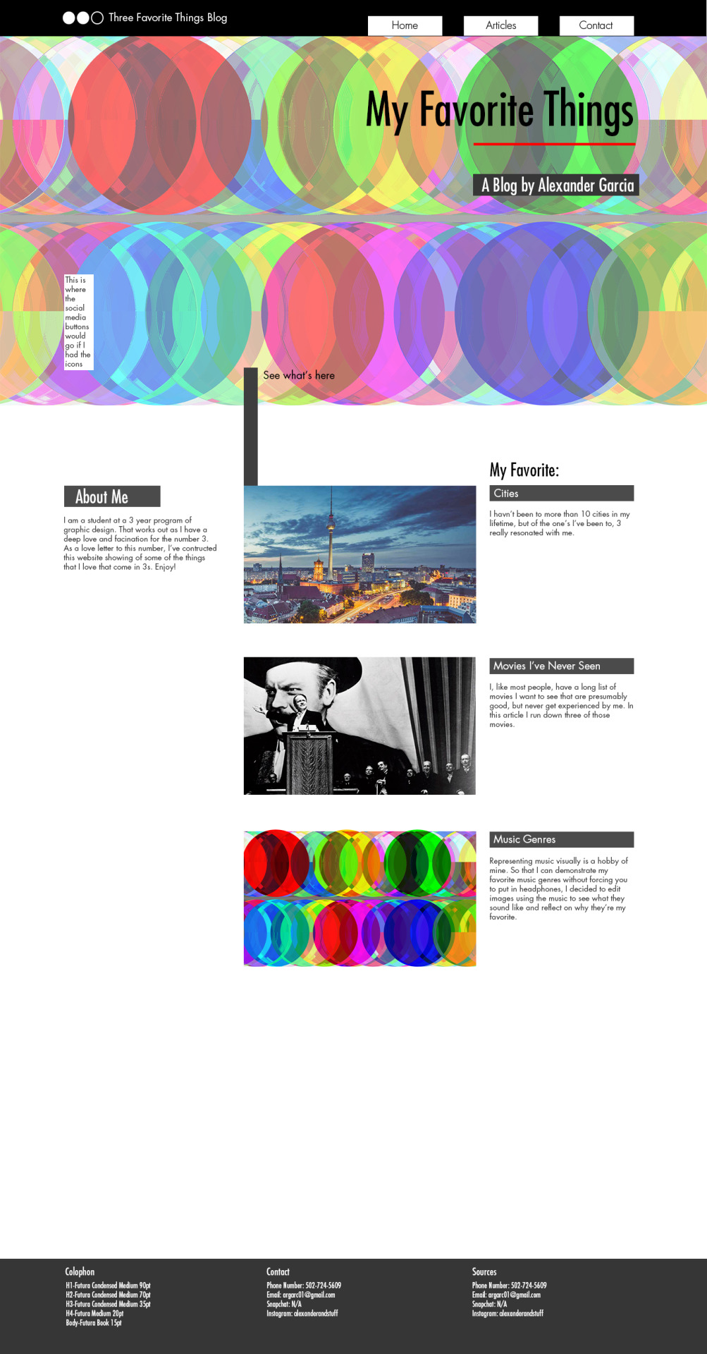
The image above is of the splash page for the website.

The image above is the article featuring my favorite music genres. The part of the project I’m still mostly proud of was my work with data-bending. I love the process of designing procedural rules for how art should be created rather than creating the final product itself. I put images into Audition and edited them using soundwaves similar to the genres I was showcasing as my favorite to demonstrate how they look in the context of the image I used here with basic shapes and colors. What I wanted was to mix specific songs with the image to produce a more specific result. When I figured out how to do that the final product did not look very good because of hardware compromises I had to make. When I tried to use the image at the highest quality it was 1 hour and 45 minutes long, which meant the song had to be just short of that in length to be mixed properly. I still don’t know if this would work in producing something aesthetically pleasing, you never do until you see the result, but I would like to have experimented with that if my computer had enough RAM for the operation. It’s normal for only 1 in 10 images mixed with sound to look any good at all in my experience, which means experimenting many times in a short time frame is critical to using the medium effectively.
On Code:
I’ve been reflecting on my resistance to learning a bunch of new programs for future projects. I think a part of it is that I struggle to learn new programs through experimentation, but rather extensive tutorials that walk me through the sensory overload of icons, options, and settings. Before the semester I put so much time into making code the thing that I learned that I was a little disheartened to learn I would have to do the same for a bunch of other programs, but I think it will be fine. When I decided to learn code I promised myself I would never limit my design to what I could do with code, but rather learn how to do it later, and as long as I approach these programs with the same philosophy, then while it might be frustrating and time-consuming to learn how to do what I want, it should be more than doable since they are designed for web design, unlike Photoshop. Apparently, engineers think Photoshop is designed for this kind of work, they’re wrong and that’s why I’m not an engineer, that and I’m bad at math.
One of the things I did in preparation for this class was learn how to code. I started to do this because the idea of using illustrator and XD to make images of the idea of a website rather than actually making the website frustrated me and sounded like it was adding extra unnecessary steps. I was approaching code the same way that I approached any adobe program, it was just something I learned the mechanics of so that I didn’t have to learn while I designed or limit my designs to what I knew how to code. This is the same as in illustrator or Photoshop where I need to sketch out a design and hope that it’s possible to learn how to do in the program. The key with code, that I didn’t realize before I started learning it, is that there are almost no limitations or hoops to jump through. If I want to do something with the website, I just type it and it happens, and if that something is complicated then instead of spending an hour on google looking for a setting that lets me do in like is Illustrator, I just break it down into smaller steps and do it. It makes me feel like I’m no longer being limited by the technology when I code because it’s so clear what I can and can’t do.
It’s not that I think my first project would have been leaps and bounds better without Photoshop, I don’t mean to blame Photoshop for my shortcomings with the design, but there were some things that I simply couldn’t do because I couldn’t figure out how the makers of Photoshop wanted me to do it, such as changing the colors of shapes, and Google was no help on this issue. The other reason that coding has felt natural to me is how intuitive it is to start with nothing and build out. In the Creative Cloud, I am given every tool to use right when I open the program, and it’s information overload. I often have nowhere to start and in worst cases, I get genuinely claustrophobic because I don’t know what I’m looking at until I spend at least 10 or so hours being walked through the interface by tutorials. Coding is the exact opposite workflow. Instead of starting with everything and adding rules, slowly making everything more organized and follow those rules and hoping you don’t miss anything, coding starts organized and with every rule and restriction you could ever have because of the defaults, and I work at my own pace to slowly usurp those defaults and write my own rules for how the website should be. It forces me to set the foundations for the design and work out, rather than forcing every idea I have into one document like I tended to get myself in trouble doing in the past. It also forces me to keep the design structured. When it’s in code I feel like there’s a backbone to the site, and I’m building the body on top of it, as opposed to InDesign which feels like I’m just throwing pixels at a screen blindly and hoping that it works. My brain just responds better to the amount of control you get with coding things, which is not something I expected when I first started learning it.
The disadvantage of code is a significant one. The organization and the foundational nature of it does not lend itself well to exploration. If I want to change something fundamental about the design, then I would have to do a significant amount of reworking, whereas with Photoshop I was able to change the core design ad hoc until I liked it. I had very little issue doing my initial sketch, or wireframe, in Photoshop, and I think it’s necessary to start with sketching in a notebook and then moving to a sketching application. So, in an Ideal world I would do the sketching and wire-framing in my sketchbook and Illustrator, and then make the final version in code where I’m not limited to what Illustrator is okay with me doing. I am hoping that Adobe XD will provide the best of both worlds. Where I can change things on the fly without cutting and pasting a ton of text and hoping I didn’t make a mistake when doing so, which is what Illustrator provides and being functionally structured enough that I don’t get overwhelmed, which is the benefit of code. I intend to try coding my websites after making them in these prototyping programs to polish my skills in code and to boost my self-confidence, but I will not make it a priority until it’s time to make fully functional websites, at which point I’ll get Susan to teach me GitHub.
Wrap-Up:
As I said before, I fluctuate between being overly confident and feeling like there’s no way for me to survive in this program. When I was coming into this class I was in the overconfident stage, and after critique where I saw everyone else's work, I’m shifting into the other stage. Based on the work that I’m doing in this class and in Typography 2, I’m starting to feel concerned that I haven’t actually improved in the past 8 months or so, but instead just learned a couple of rules to make something look good despite not having a great concept behind it. Whenever I do something that I’m very proud of It’s usually an accident that I run with, which is an observation I’m not totally uncomfortable with. I know that I’ve improved at least some despite my doubts, and I’m proud of my ability to see the beauty in mistakes when I’m working that often leads to the final works that I end up being the proudest of.
I had a lot of plans of doing a ton of self-directed projects this semester considering I have plenty of time for it, but after a couple weeks I’m deciding to cut those expectations of myself down in favor of focusing much more heavily on my classes and developing specific side skills that I’ve wanted for a long time, such as the ability to code and draw. I’m also making it my goal to become more proactive on social media and build a designer presence there to the best of my ability. With all that and finally getting the new computer I’ve wanted for so long this weekend, I think it’s been an acceptable start to this semester.
1 note
·
View note
Text
Exo’s performances at MAMA
I’ve always found that Exo’s performances at the Mnet Asian Music Awards were really iconic, and it’s been something I’ve looked forward to every year. I made a list of all their performances with the year, title and components of each performance, because I knew I wanted to make an edit (or, well, several edits) of them. One vague idea I had was to make it like a sketch in a notebook with all the details, so it would look like it was a plan/concept for the performance, kind of like a storyboard. I would have probably really overcomplicated that, so I went with something else.
2012: Time Loop 2012
Resources:
Font: Hacked
VCR Overlay / Noise
At first I wanted to do the same template for every performance. I wanted to highlight memorable moments from each performance, so this is what I came up with originally:
Now I look at it and I’m just not feeling it, but when I first made it I really thought it was awful. I thought a bit more about the performance, and the theme of it. Since it’s called Time Loop 2012, and they’re performing older song and “reversing time” so to speak, I decided to go with a VCR/glitch effect. I had actually done a test of this kind of effect a few weeks prior and I really liked it:

I think the test gif looks a lot better than the final edit (why does this always happen oTL)
The RGB split is done by using differently scaled copies of the image/gif and using the blending options. The glitch effect is done by using the wave filter on a few frames. The lines are added with a halftone pattern, and then I added some grain/noise as well. I think I followed one of the methods shown in this tutorial.
2013: Ein süßer Traum
Resources:
Font: John Hancock CP
Title Card
Old Film Countdown
Film Scratches Overlay
This one is based on the VCR shown at the beginning of the performance. It was kind of like a silent film with its captions (except it wasn’t silent.) So I wanted to go with that concept and make it look like an old film. This one was quite fun to do, adding little tweaks and stuff. I really wanted to use the same font as the one in the VCR. I tried several of those font identifier sites, googled silent movie fonts, and went through font categories that it could fit in, but I could not for the life of me find it. I got so frustrated and almost used a different font, but then somehow I found it (I literally don’t even remember how, but I was so glad I did.)
2014: The New Age of Exo
Resources:
Font: Lombok
Paper Texture
Watercolor Brushes
Something I really remember and love about this performance is how different the stage for every segment was. With every song, the staging and the lighting transports you somewhere else, and I wanted that to come through in the edit. I chose the font because it reminded me of the outlines of the boxes at the beginning of the performance. I really liked the paper and watercolor effect I did for the January 2017 edit, so I had been wanting to use the effect for a different edit as well, and I thought it worked well for this. Instead of using white paper as a background I drew from the dominant color of each stage. I did try it with white paper, but I didn’t find it as immersive:

And here’s another draft:

This is my favorite out of the edits, because it’s closer to what I had envisioned these edits to be in my head. I especially like how the Deep Breath one turned out.
2015: Light of Planet
Resources:
Font: The Kabel Font
I went with a neon theme, inspired by the title of the performance, the pink neon lighting in the Call Me Baby VCR, the lightsabers and the LCD panels or whatever it is on the stage right before the performance started and everything was dark. I made the font bigger this time, because it didn’t have the same effect when I just put it at the top left corner. With neon it’s kind of like go big or go home. For Call Me Baby and Lightsaber I blended different parts of the performances together. They turned out good. The Drop That and Love Me Right gifs aren’t that great. Lightsaber turned out the best, I felt really satisfied with it.
2016: The Sacrifice
Resources:
Font: Exodus (Striped)
This gave off a futuristic dystopian vibe. I had been font hunting prior to making these edits, so I found ones that fit quite easily. (This one gets bonus point for being called Exodus). At first I thought of making a gif of each member for the VCR and then putting it into one gif, but since there isn’t much movement and I wanted to include something other than their faces as well, I just took a few frames for each member. Kyungsoo and Lay weren’t in the VCR, sadly. The Kai & Sehun gif is actually just one long sequence, but of course it had way too many frames, so I divided it into three separate ones and just put them next to each other. Baekhyun’s solo was difficult to do. When you watch the performance... it’s not super enjoyable to watch, because the lighting and the angles are so bad you can’t really see anything. I think Baekhyun mentioned being upset about it too on his instagram. He had this whole mechanical heart going that really gave much more purpose to the performance, but you couldn’t see it at all. They really did him dirty.
2017: The Force Of The Planet
Resources:
Font: Metrica
With the theme and the “Kinetic Performance” as Mnet likes to call it, I wanted to use a font that was inspired by constellations. I almost used a different one, but the other one felt almost too whimsical and was more difficult to read. Maybe I can use it in a different edit some time. The font looked better when it was bigger, but I didn’t want it to distract from the performance too much, so I set it on overlay or soft light, whichever worked better for each gif and then duplicated it as needed, so it would be more prominent. I added a shadow to it to make it stand out from the background a bit more. For the title gif I colored the font using the colors of the planets (?) above them. It looks a little bit... cheesy. For Power I wanted to use two different parts. Since the light goes down and you just see their silhouettes at the ending, I tried blending the other part I wanted to use into that, which kiiiind of worked.
Overall these edits weren’t exactly what I imagined. It became more of an experimentation of different fonts and effects. The 2014 one was the closest to what I wanted to do.
1 note
·
View note
Text
Keychron Q1 Wired 75% Mechanical Keyboard Review: The Hotswap Mechanical Keyboard for Perfectionists
Keychron Q1
8.80 / 10
Read Reviews
Read More Reviews
Shop Now
An excellent keyboard by any standard.
Key Features
Tenkeyless
All metal construction
QMK and VIA compatibility
Gasket-mounted plate
Specifications
Brand: Keychron
Wireless: No
Backlight: RGB SMD
Media Controls: Yes
Num Pad: No, TKL
Switch Type: Gateron Phantom
Replaceable Keys: Modular hotswap
Pros
Stable and solid typing
Outstanding build quality
Ultra heavy base
Programmable keys and backlight
Cons
Expensive
Not travel friendly
Not wireless
Extremely thick
Buy This Product
Keychron Q1 other
Shop
// Bottom
As a veteran keyboard builder, I love the $169 Keychron Q1 75% ten-keyless (TKL) keyboard. Its near-perfect typing experience dominates the competition. While it's not right for those who need ergonomics and Bluetooth, it's perfect for typists who don't need a ten-key keypad.
Is the Keychron Q1 Mechanical Keyboard Right for You?
While wowing me with its marvelous and muted typing experience, the Q1 isn't without flaw.
If you're looking for the heaviest 75%, modular, hot-swap keyboard, it's the best in its class. But for those of you looking for ergonomics or wireless, there are more suitable options. A strong candidate that covers ergonomics and wireless is the Kinesis Freestyle2, a split mechanical keyboard.
Who Are Keychron?
Before I get into the pros and cons, you might want to know more about the company behind the Q1. Keychron is a newcomer to the mech market with a reputation for quality. Its first designs focused on products for the Mac. But it's since moved on to building general-use keyboards.
The Keychron Q1 is their newest flagship product, this time catering to the high-end, enthusiast market. Their selling point here isn't just hotswap sockets. Keychron has distinguished itself from the competition with an ultra-heavy case. To my knowledge, this is one of the heaviest 75-key keyboards ever made and probably one of the most gravity-challenged keyboards of 2021, period.
Although gasket-mounted plates, and other typist-oriented features, appear in multiple keyboards, such as the Mojo68, the Rama Works Kara, and the Ikki68 Aurora, I haven't seen them paired with heavier framed designs. Considering that gaskets reduce the shock of bottoming out, I'm surprised to not see them used with keyboards designed for stability. Potentially a heavy case, gasket mounts, and Poron could mean the triple crown for a stable typing platform. To date, no keyboard combines those three components.
Hardware Specifications
Image Gallery (3 Images)
Expand
Expand
Expand
Close
Dimensions: 145 x 327.5 x 21.6 mm
Weight: ~1,600 grams
Plate: 6063 Aluminum
Switch type: Barebones or Gateron Phantom Red, Phantom Blue, Phantom Brown
Ports: USB Type-C (USB-C)
Case material: 6063 Aluminum
Case colors: Carbon Black, Space Gray, Navy Blue
Sockets: Kailh Hotswap
Keycaps: Double-shot ABS, top-key legends
Cable: Black, detachable, braided, coiled USB-C
Extras: Keycap puller, switch puller, extra "Poron" material, additional keys for macOS, optional rotary encoder
Modular Hotswap Sockets and Gateron Phantom Switches
Image Gallery (2 Images)
Expand
Expand
Close
Keychron offers three default keycaps to go with the latest Gateron Phantom series switches. To be honest, I can't tell the difference between the Phantom series and the Ink series (I reviewed the Ink series in 2020). Both have the same weights, actuation curves, and colored transparent switch housings. A more relevant comparison would be to compare regular 2021 Gaterons to the Phantom switches. In my initial testing, the difference seems to be the Phantoms are smoother. My guess is that Gateron used lower friction plastic or lubricant.
Keychron Q1 Teardown
A teardown of the Q1 reveals several innovative design features. My favorite is the ability to customize the specific level of shock absorption of the keyboard. But aside from that, there are three other components that Keychron used to great effect.
Poron Gasket-Mounted Plate
Image Gallery (3 Images)
Expand
Expand
Expand
Close
Gasket-mounted plate designs float the plate, PCB, and switches on top of a series of Poron-foam gaskets. Whenever you type, the gasket depresses, softening each keypress. Typing hard enough causes the entire plate to drop a millimeter or two. The effect causes a reduction in the harshness of bottoming a key out. Although the keycaps are not silenced, gaskets also chop down on typing sounds. That's because a special advantage of Poron over other kinds of foam is that it exhibits extreme energy muffling properties.
However, the substance that Keychron refers to as Poron looks and feels exactly like neoprene. I'm not sure whether Keychron used Poron on the inter. Then there's a denser layer of a kind of urethane foam that also appears to be a Poron layer. This layer pads the interior of the aluminum case.
Keychron included extra Poron in its kit. If you want, you can increase the amount of Poron between the plate and the base. However, I found that this actually increased the sensation of bottoming out of keys. After some experimentation, I found that fewer pieces of Poron improve the comfort of hard key presses.
Screw-In Stabilizers Vs. Plate-Mounted Stabilizers
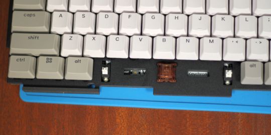
The biggest source of rattle and noise production on a keyboard is oftentimes the space bar. Different keyboard stabilizer types cause different kinds of problems though. Costar stabilizers are easier to remove but suffer from stability and noise issues. Cherry stabilizers produce less rattle but are difficult to service. Screw-in stabilizers offer the best of both. They produce less noise, are super stable, and aren't difficult to service.
Typing on the Q1's space bar feels, to overuse a word, solid. While screw-in stabilizers demonstrate a tremendous amount of side-to-side wiggle, the opposite is true of their typing stability. They are enormously stable, thanks to the fact that they are literally screwed into the motherboard. I suspect, though, that space bar removal is a big advantage here. It appears that the stabilizer's play allows for space bar removal from extreme angles. So you can pull it without the risk of damage to the keycap. I can't help but feel that screw-in stabilizers are the future of high-end keyboard design.
Poron Layer
Poron looks and feels like neoprene on first inspection. But pushing my finger into the material reveals the difference: Poron seems more durable and resistant compared to neoprene. Rather than yielding to touch as neoprene would, Poron feels almost solid and inflexible. I've read that there are different formulations of Poron, some offering consistency equivalent to neoprene.
The functional use of Poron on the base seems to further stabilize typing. I can't imagine there's a more stable typing machine out there.
Thick Aluminum Base
Image Gallery (2 Images)
Expand
Expand
Close
Another interesting feature Keychron's use of a weighted aluminum base. The base by itself weighs in at 872 grams, which is only 94 grams less than my steel-plate Varmilo VB87M 87-key keyboard. In other words, the base alone weighs more than a larger, steel-plated keyboard. The full keyboard weighs 1,623 grams, almost double my Varmilo.
The extremely heavy base makes for a stable, solid typing experience. Personally, I dislike the feel of metal-plate keyboards for touch typing. Because aluminum and steel are such great conductors of vibrations, you tend to feel on your other fingers whenever you strike a keycap. However, Keychron's approach here was to dampen each keypress while maintaining the solidity of a metal plate. The end result is solid and stable typing.
Lots of Customization Options
Keychron includes customization options for the case and switches. In future, two bare-bones models will be made: ISO and ANSI. At launch, though, only the case color and switches are customizable. The case colors include black, dark blue, and gray. As mentioned earlier, the switch options are a bit more interesting as they cover Gateron's latest switches: Phantom Red, Phantom Blue, and Phantom Brown.
QMK/VIA Support
The ultimate customization option is the ability to reprogram the keyboard from top to bottom. QMK or VIA can do just that, although it requires understanding how to flash your keyboard with firmware. It's not hard but there's a slight learning curve.
While I don't use VIA and have no familiarity with it, I am familiar with QMK. It's not hard to use, particularly if you're already familiar with flash ATMega32 processors. Those of you who have unlocked the bootloader of an Ender 3 will know what I mean.
But for those who do like to create their own custom layouts and color schemes, Keychron published their Q1 QMK source code on GitHub. The broad compatibility with QMK is probably because it uses an ATMega32 microchip, which is one of the most common processors used on QMK-supported keyboards. It's also commonly seen on 3D printers and other consumer electronics.
Backlighting and Animation Effects
Image Gallery (3 Images)
Expand
Expand
Expand
Close
The animation effects are about what you would expect on a high-end keyboard. The Q1 uses RGB SMDs instead of LEDs so there's a tremendous amount of color variation, like on all RBG backlit keyboard. However, it's worth noting that can set custom colors using QMK Configurator, so if you need a particular shade, that's possible. On top of that, there are numerous animations, including several multi-hued, rainbow-like variations.
While the backlight looks good, Keychron's standout feature is how they combined front-facing lighting with transparent switch housings. The combination allows for more intense animation effects, since the light is visible from the portion of the keyboard that faces the typist. However, while this is an interesting visual, I'd have preferred shine-through keycaps with front-printed lettering.
What's Not Good?
While great, not everything is perfect with the Keychron Q1.
No Function Layer Markings
Something I found irritating on the Q1: there are nonfunction layer markings on the keycaps. Because there's no documentation, this led to a lot of guesswork as to how to control backlights.
Expensive For a Keyboard in This Class
While $169 isn't the most expensive 75% keyboard, it's also a fair bit more expensive than the competition in this particular market segment. Razer, for example, sells a wired 75% for under $100. And while Razer's 75% isn't nearly as nice, $69 is enough to buy another low-end mechanical keyboard, such as the Vissles V84.
Front-Facing Lighting Paired with Top-Printed Legends
LED lighting scheme is designed for front-lit shine through keycaps.
That's partly by design as the keycaps aren't shine-through. The goal was to use a semi-transparent switch housing to allow for various visual effects.
No Capslock Status Indicator
Most keyboards include some kind of indicator that capslock is turned on. The Q1 doesn't provide any hint that you might be accidentally yelling at your friends and family over email.
The Future Will Mean Lower Prices
Gasket-mounted plates, screw-in stabilizers, and dampening material like silicone and Poron are the future. While the Keychron might seem like a good deal today at $169, next year there will be similar options for less money.
Should You Buy the Keychron Q1?
If you're looking for a high-end typist's keyboard, the Keychron Q1 beats the keycaps off the overpriced Razer BlackWidow. But if you want an ergonomic or wireless keyboard, look elsewhere.
For those looking for a low-cost hot-swap alternative, I suggest the Glorious Modular Mechanical Keyboard. The GMMK offers the same modular hot-swap design with a focus on entry-level keyboard enthusiasts.
Keychron Q1 Wired 75% Mechanical Keyboard Review: The Hotswap Mechanical Keyboard for Perfectionists published first on http://droneseco.tumblr.com/
0 notes
Text
Portrait of a Drag King
I think we managed to portray Mia very truthfully. The film really captures something of their energy, their refusal to be confined by a binary, and showcases the extent of their intellect and self-awareness regarding their gender identity. We initially aimed to represent them as a drag king, however with further research this changed. The final film needed to display Mia’s relationship with gender in a broader sense and I believe we’ve done this successfully.
On the whole, it was fairly difficult to find examples of documentaries on drag kings and non-binary people in mainstream media. The BBC had short documentaries available online but they were far too conventional to be any kind of inspiration for our own film. I looked for some amateur / small budget documentaries on Vimeo but again, they were too normal. Despite this, my background research at least provided me with and understanding of the existing media around drag/gender performativity and what I wanted to avoid when it came to the edit. It also helped to inform some of the questions I wrote to ask Mia.
Research about Mia came with the answers they provided to the questions. Mary and Bethany asked some of the questions I’d written, expanding with some of their own and also allowed Mia the freedom to go off-topic, as this was where we’d get a real understanding of their personality. On reflection I think the questions achieved what they had intended to achieve. Mia “rejected” the wording of some of them, but then expanded further on why this was the case. Having Mary and Bethany, two of their close friends conduct the interview, definitely worked in our favour as it meant that Mia soon relaxed and was able to talk openly, about very personal subjects.
The remainder of pre-production ran very smoothly with everyone taking on their individual roles. Natalia and Katie came up with ideas of what to shoot and transcribed the interview. Based off of this I began to construct a dialogue edit, whilst Mary and Bethany shot the B-roll. Their cinematography really captured the unpolished aesthetic of our film, using fish eye and zoom lenses to re-create the 90s camcorder look. Katie’s animations, Natalia’s additional footage and Bethany’s graphics all enhanced this handmade, artistic style.
Overall we worked very efficiently as a team, the only thing I might have changed would be maybe experimenting with shooting something more staged, but then equally this could have taken away from the authenticity of the documentary.
The structure of the film was largely found in the edit. Mia covered a wide range of topics in a lot of depth over the space of about an hour and a half, so it was quite challenging to condense it down into 5 minutes. After a lot of arranging and rearranging with the group’s feedback, I think I found an order that guides the audience from subject to subject with relative ease, given how in depth the subject matter was. I also think ending especially is really successful. The transition from “I’m still following that yearning” into the poetry gives the audience a moment to breathe, when the rest of the film is so relentless.
The picture edit was done in about two days after a lot of me panicking, getting in my own head and trying to force a narrative. Eventually I started getting stuff on the timeline and found that binary oppositions naturally sprung up - e.g Mia’s identity vs what they were expected to be; masculine drag vs non-conforming drag; typical performances vs gender performativity - which helped me keep the visuals vaguely relevant and gave the edit some driving force. We were all in agreement that in order to successfully reflect Mia, the edit needed to be colourful, energetic and playful so I brought in a lot of effects - ‘invert’, ‘colour correction’, ’chromatic aberrations’ (to split the RGB), ‘VR glitch’ etc - as well as lots of old archive footage I found online. Some of my favourite elements are the 1950s dating advice and sex ed videos which are so heteronormative and perfectly contrast Mia’s character. I also love the scrapbook effect given by the Katie’s animations and the PNGs of Mia’s own drawings which give the film a personal touch.
The feedback from the critique was very positive and the stylistic choices we made in terms of tone and aesthetic certainly seemed to pay off. All the improvements suggested such as the issues with pacing, I absolutely agree with. I should have left myself enough time to take a step back from the edit and watch it in a new light because as soon as it came to the critique, I could see that I needed just one or two more pauses to prevent it from being too overwhelming and disengaging for the audience. Also, Leo brought up that with some thoughtful sound design it could been even better. I definitely agree that had I more experience, I would have loved to bring the same level of creativity into the sound, but I think this is something we could certainly add to our film in the near future to make it even more engaging.
Link to feedback form: https://drive.google.com/file/d/1lN09U--8v_nUZpCpfQ2TCnUvlwMLfch4/view
0 notes
Text
Character Design - UV and Substance Painting
For today’s lecture, it was a combination of learning about textures and maps for UV and Modeling as well as being our first introduction into UV mapping and proper Substance Painting where we painted more to what we wanted to create for ourselves from the lecture.
But first, we had a lengthy discussion about some key information about the different types of texture maps those being:
Bump Map - Limited, doesn’t draw the illusion
Normal Map - Limited Geometry
Displacement Map - Extra Geo
From doing some extra research after the lecture, I discovered some information from the website PluralSight on these texture maps as I didn’t quite understand what they were about.
Elliminate Texture Confusion: Bump, Normal and Displacement Maps - https://www.pluralsight.com/blog/film-games/bump-normal-and-displacement-maps
Bump Map - Create the illusion of depth and texture on a 3D model. It’s the oldest type of map and the textures are created on surfaces of the object using grayscale and lighting tricks instead of manually creating the details/textures. Plus the detail that is made isn’t real.
Normal map - A newer and improved version of a bump map but also fake. Creates the illusion of depth through RGB information that corresponds with the X, Y and Z axis in a 3D Space which tells the polygon how it needs to be shaded.
Displacement Map - Creating extra detail (extra geo) for low resolution meshes. Mesh is subdivided or tessellated to create real geometry in the map. The newest out of all the maps but needs more time to render as your actually creating depth through creating 3D shapes in the geo and map.
Once we went through the different types of maps together, it was time for the main focus of the lecture which was to look more into UV mapping and Substance Painter. Because of our character design project, we looked at how we might make a prop for our character which we took influence for this lecture from Indiana Jones: Raiders of the Lost Ark’s Idol to create our prop. To start, we first grabbed a sphere in Maya and start to mess around with the faces by extruding them to form spikes, create holes for the eyes as well as little nubs for the hands and feet of the idol. To help make it look as natural as possible, we smoothen the prop all around in Maya by using the smoothing tool and adjusting its parameters to get it to a smoothness we all preferred. This process was nice and enjoyable being someone that likes to model in Maya as I’ve never learnt how to use the smooth tool before and knew it could be used at odd angles like the nubs of the idol to make it look so much nicer.

Once we finished modelling the prop, it was time to move onto the UV side of things which is where I had so much difficulty with. This was because the version of UV that I was using in Maya wouldn’t work properly meaning I was unable to unfold my model out to create the UV Map for Substance, The whole process would of followed with imaging the model as a plushie which we would have to divide the prop into two and create seams on the spikes, eyes and nubs so that they could be unwrapped for the UV Map layout to be painted on in Substance Painter. I understood the process entirely it’s just the application of it in Maya was a bit buggy which is something I would love to re-visit, practise and master at so that I can quickly make UV Maps in the future for more complicated models like a character.
Fortunately, we all used Jon’s model as his version of Maya managed to get the prop UV out for the Substance Painter which is what we used for painting for Substance Painter. In Substance Painter because we were making a rockier style of idol, I followed the same kind of steps from the previous lectures and started with a gold metallic paint for the first layer which I applied a steel texture to it to seem oldish looking. Since this was my first layer, I then put for my second layer a rockier texture/pattern on top of the gold and apply a black mask to it which meant if I painted over it, the gold would reveal itself in the software. This created a really lovely effect of god popping out of the stone creating a really nice contrast of colours which is evident in the final piece. On top of these layers, I did two paint jobs onto the model, one being a rust coat and a moss coat for the prop to give it some life and detail to it as well as being colours that would further enhance the prop if used graciously. With the rust cot brush, I painted a lot of detail into the eyes of the prop to show rust seeping into the model as well as little bits into the gold as well to show the gold deteriorating over time. The moss brush was used to go over the brown rust on the prop in addition to creating extra detail to the prop.
Final Idol Prop in Substance Painter

UV Map

Overall looking at the prop as a whole, i’m really impressed of how well it turned out in Substance Painter as it’s my best 3D Painting yet in the software from the usage of detail all around the model. Something like the back I made sure to focus on when creating the model as rarely people see what the behind is to something which is why I put a lot of work into making it look as normal as possible. Whilst I didn’t have enough time to import it into Maya with a HDRI background, I super glad instead that I worked more on the prop as at least it gives a really nice visual of what the prop will eventually looked like if I was to go about with the extra steps of importing it over. In the end, I’m really looking forward to making my prop for the character design project from my enjoyment of this process in the lecture.
Despite not reaching the Maya export bit of the lecture, there was a really important bit of information that I managed to catch which was how to align each export of each Substance Painter file to a object in maya.


0 notes