#i just have two artstyles lol
Explore tagged Tumblr posts
Text
I did this Twitter art trend with Funny ^^

#Soooo yeah i did not change artstyles#i just have two artstyles lol#Funny Pets#ファニーペッツ#私の可愛さを思い知れ#Funny Pets anime#funny pets show#funny pets funny#ファニー#Masudaverse#Ryuji Masuda#Wakako Masuda#増田 龍治#増田若子#fanart#art#artwork#digital art#digital artwork#artist on tumblr#ibis paint x#ibis paint#My art#FranOewn#Funny#Funny Pets plus#Funny Pets Plus: Poetic and lunatic#Funny Pets poetic and lunatic
23 notes
·
View notes
Text

They're judging their sibling's life decisions, and they are not impressed.
(And to think Jason and Dami have pit-madness in their system)
#color study#My fanarts levels depends on my adhd serotonin#Procastination it is#But they are so prettyyy so i am happy#dc comics#damian wayne#fanart#dc#robin#jason todd#red hood#If i dont doodle my artstyle revert to anime and i need to restudy human face anatomy and sometimes i love it sometimes i dont#Right now i love it#apparently if i want to put two days worth of work on a fanart it doesnt look bad huh#Also been using orange and red again on my skintones...i have been warching this youtube shorts guy that gives advice for art corrections#And its great#Had mild colorblindness so dont know how it looked on you guys but for me it looked good enough#if i make it orange again then just blame it tk artistic freedom lol
2K notes
·
View notes
Text
Next time we should just skip over ep 3 and do a chapters 84-87 reread
#Mmmmmmhhhh.#Well. If anything you can always tell when there's a ss/kk episode by the fact that it takes me two hours to watch it lol#What can I say. I'm a compulsive screencap taker#Mmmmmmhhh... I was right it wasn't as bad as I remembered it. Still moderately bad but not all bad.#It's just. I can feel the animators did their best.#I suppose it's just a difficult episode to animate within a short time frame since it's a specifically action packed one.#And the lack of time really shows. Like there *are* some detailed animated passages here and there. But then there's also these long static#shots that stretch on forever that are just... Idk. A little saddening to see I guess? Like the animators really ran out of time for them#There's also a big component of... I just can't vibe with the newfound artstyle. Like it looks soooo much worse than s1 in my opinion#Which you know‚ is only subjective! But eh... The distance between s2ep11 and this feels abyssal.#Everyone looks so ugly oftentimes. Like even in curated shots‚ they're just very rough and ungraceful.#Which like?? How could you look at Harukawa's art and come up with //that//??????? But it's whatever#And the pacing is so so off 😭😭😭 God please to death with 11 episodes long seasons give us filler episodes back. Please!!!!#The pacing is atrocious and it has not even to do with the animation. Even greatly animated episodes suffer from it.#Mmmmhh... I don't particularly like Fukuchi's vacting... He doesn't sound tired enough. Nor as pitiful as much as he should tbh#Among the three I feel like only Uemura really nails the job. I'm so sorry Onoken but I feel like even Akutagawa needs to sound vulnerable–#once in a while‚ you know? Although‚ if he's only going with how Bones depicts him‚ then I get why he would act him out like that 😭😭😭#There were so many reused shots too... The ones from the end of s2ep11... The s3ep12 kokko zessou one... Ss/kk running in the corridors...#Overall. Not as bad as I remembered it. But at the same time I get why I was so distraught because they really wasted the best four–#chapters of the manga just like that.#The “is his life that precious to you” moment was terrible 😭😭😭 Head in hands fr#Oh well. I babble a lot but it was okay. Like at least it wasn't season 3 kind of bad. And definitely wasn't t/pn s2 kind of bad LOL#I just hope ss/kk will be made justice in the future (╥﹏╥)#Especially since their new scenes (current manga events) are possibly going to be adapted in the first episodes of the new season.#If Bones pulls another s5ep3 on them you're going to see me on the news#Then again I have hope the arc finale will be adapted in a movie... Who knows...#Most of all I hope they change art style direction again D:#random rambles#Whaaaa it's so late already!!!#Edit: Oh also to not forget I've made like. One hundred posts. Maybe it's time to unfollow me now if you haven't already D:
9 notes
·
View notes
Text
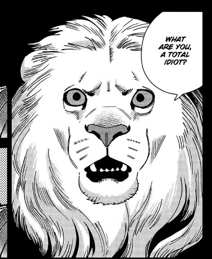
YAY FINALLY MEETING THE WINGED LION!!!! maybe ill get some answers finally
i still dont know whats this guys deal except that hes like a patron of the dungeon? but aside from that hes a total mystery to me. well maybe ill learn more soon!!
also. giga quad head marcille happened. not sure what to do w this info tho
currently at chapter 60!! god i love itzusumi so much...... i love all of them...........
#dunmeshi spoilers#im having a BLAST rn this is so awesome#i also started taking screenshots of panels i think are neat or funny to look back at l8r :)#god. something about the way ryoko kui draws animals is soooo good.... i want to absorb her artstyle so fucking bad#SHES SO GOOD AT DRAWING ANIMALS AND MAKING THEM BELIVABLE AND EXPRESSIVE AND GROUNDED#THE WINGED LIONS EPRESSIONS ARE SOOOO GOOD. GOD#also i love this panel and the next two. the winged lion is just so dissapointed and underwhelmed its so fucking funny#they werent lying this lion IS kinda cunty. havent reached the point where he has abs yet tho(<-that happened right?? or am i wrong lol)#he showed up in laios' dream and basically went 'you need to get your shit TOGETHER and fullfil the PROPHECY' and laios is just. so confuse
14 notes
·
View notes
Text
How, exactly, does Issun's glow work up close? 'Cause I know in-game, they kinda just fade it out, but like... He's got a bright fucking glow; like 800 lumens at least bright, and sticking my face really close to a light bulb has not caused the light it's putting out to "fade", so I'm just... Confused.
Can he dim it on command? We know the colour can change depending on his emotional state, to at least two different colours; red for when he's pissed and yellow for when he's trying to get attention (I think, this one's not super clear). But exactly how the Poncles work, biologically, is not something that's ever really covered in-game in anyway that really matters.
We know they're bio-luminescent and the colour of such can change. We know they have ant-like strength; they can jump wildly high, and Issun is shown lifting a full Sake jug at least 100x his size, and yeeting it several feet upward at one point. We know they have a close spiritual relationship with the Gods, a relationship they cultivate through artwork.
And... That's pretty much it. And I have so many fucking questions.
#Okami#Okami Issun#I *may* be drawing my boy up-close and getting a little frustrated#so far I have two versions of the piece (not counting the censored versions)#one with his glow and one without and I can't decide which I want to use because I don't understand how his stupid fucking glow works!#AAAAAH#He either can dim it on command or fading it out is just an artistic choice#I'm figuring the latter since he's not the only Poncle we see up-close#and they all have that faded out look when you're close to them#it's just like retina damage I guess lol#or maybe the artstyle of the game is displaying his glow when he's small as being way brighter than it actually is#for condensing reasons#so like when he's small it's 800 lumens condensed into an inch-tall body#but when you see him up close it's more dispersed#It's probably that#I don't know I'm very fascinated by these little creatures lol
2 notes
·
View notes
Text


OP you need to know how freakin fun this was to colour
unfortunately i don't have any printer paper right now (it's too expensive :/ ) so i had to do it digitally, i hope it's still cool tho lol
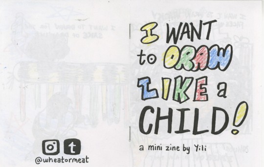
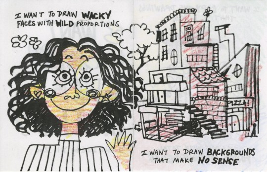

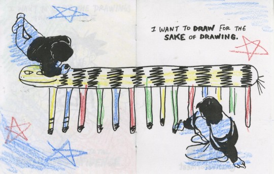
I made a little zine!
You can download and print it yourself for free here
#also excuse that the lady is pink#i was gonna give her a real skin tone but i already did that for the two people colouring the tiger-thing#and yknow sometimes you don't just want your people to look like people.#sometimes you want them in pink and green and every colour of the rainbow#and i think that's okay?#anyways#a share#colouring pages#zine#mini zine#added stuff#cool#silly#whacky#cute#interesting#fun#also yes i forgot what goku looks like. those colours are a total guess#i also have never seen hamtaro. i recognised the artstyle but i had to google him lol
66K notes
·
View notes
Note
You're more amazing than zombies
Made two imp cards that don't technically make imps


The devil token just has the exact energy I'm looking for and it's already established so I'll just keep using that. Also I was curious whether there's any imp tokens so I checked and this is literally the only imp token ever

Look at this beautiful little rascal
#asks#custom cards#imps#actually wait i just checked all the devil tokens and i can safely say i like this imp better than any of them#not entirely sure why#4 out of the 6 devils look okay. small. tails. bastards.#wait i think i got it: they're not silly and playful enough#two of them look angry and the other two are smiling but Wrong#the WAR one looks like its in pain and the SOI one looks threatening and also has weirdly detailed muscles#meanwhile look at this silly guy hanging upside down from a chandelier. with GIANT ears too lol#actually it does also have a threatening face. and the SOI one is fuckin riding a goat. maybe it's the artstyle? idk#not sure why i don't like the SOI devil but i like this imp. oh well
0 notes
Text
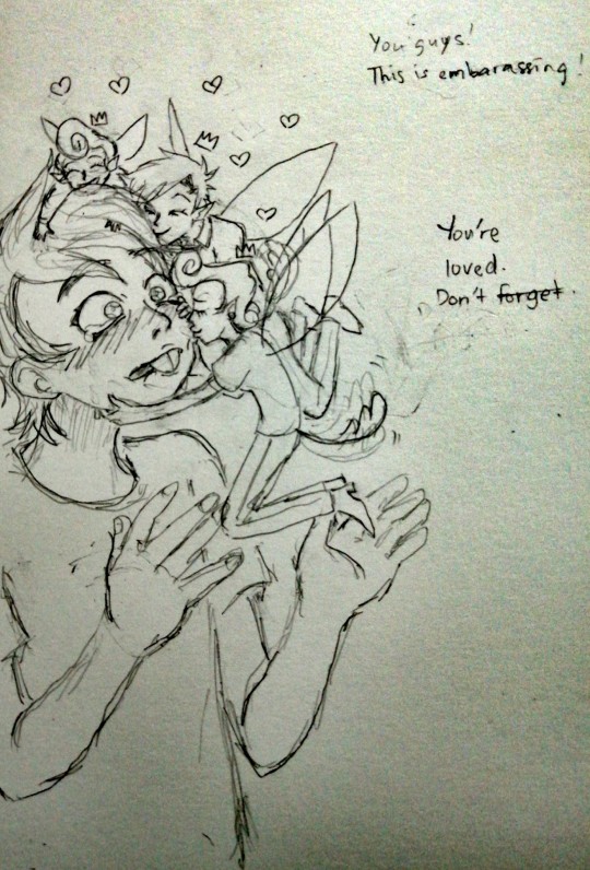
"You're loved. Don't forget."
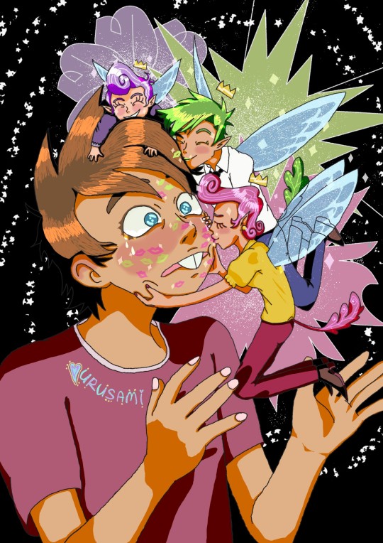
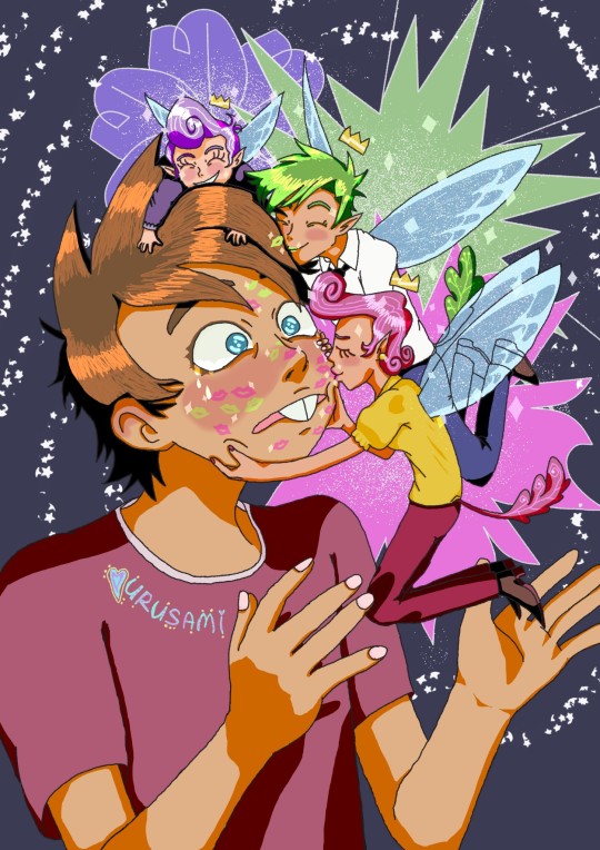
More ramblings and concept art below lmao.
I am devastated on thinking Timmy's fate in the series... I won't put my faith that they will handle it well, so I'll just indulge in fanworks to fill in this void. If they ever do it well one day, then I'll be there for the encore.
For now, I think you'll see a lot of somewhat depressed art on FOP for a while lol. Not continuous mind you! University is a bitch to get through. Whenever I'm free that is. Which is on long stretches of time unfortunately... Still, when I'm not posting trash, I'll be around observing quietly. You can guarantee that at least.
The work this time is inspired by @xblubotx (the adopted parents kissing Timmy one so cute omgosh) and @cubbihue FOP AU (sorry I have not memorised your AU yet). I admire that Blubot can adapt the FOP artstyle so well lmao. It'll be lightyears before I can do that 😭😭😭. Also, their Timmy fanarts break my heart, thank you. For the fairies design, I took inspiration from Cubbihue's AU. I think it's cute that they have tails, but there's not much I can say regarding their AU since its still developing. Take your time on that and have fun by the way.
The context for this one is just that Timmy is embarassed that Cosmo and Wanda are giving him the affection he is missing out from his parents. Poof is laughing from Timmy's embarrassment lol. (Not using Poof's new name because that is not that iteration of his character.) Timmy got a lot of fairy dust to remove from his face on that day...
Hm, are there side-effects to fairies kissing a mortal (on the cheeks hehe)? I kinda wish there was a comprehensive mythology book for stuff like that. There's some sources where I read that fairies kissing humans can actually result in their soul being whisked away to the other world (essentially dying yeah) and some sources say that fairies kissing you means its their way of marking territory or for good luck??? I wonder where those myths came from... but it is fascinating to think about. I guess Timmy will die young then /jk lol.
I got input from my younger sister that a darker color background is better than the dark blue one I used initially. I'm quite unsure on this, so I'll just post them all... I also don't think I nailed Cubbihue's AU on the fairy sizes... It's hard to accurately draw characters on a specific scale for me... Oh well, I can practice more. This took me 3 days at least. Also, here's a png version of the piece and two photos of the concept sketches.
I think that's all I want to yap about. Thanks for reading and have a nice day. See you when my homework isn't killing me.
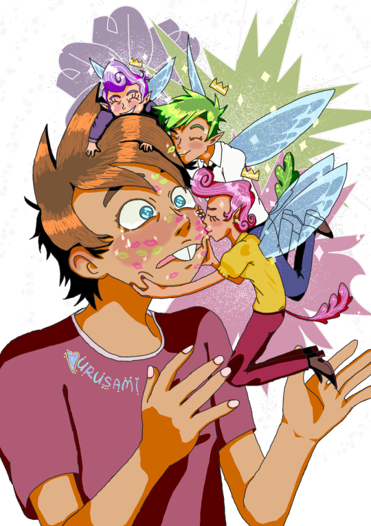
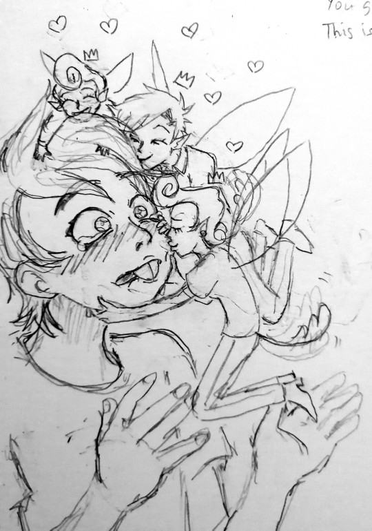
#the fairly oddparents#fairly oddparents#fop#nickelodeon#timmy turner#wanda fairywinkle cosma#cosmo fairywinkle cosma#poof fairywinkle cosma#fop timmy#fop wanda#fop cosmo#fop poof#fanart#nickelodeon fanart#cartoon fanart#infinite painter#usagifuyusummerart2024#digital art#fairy#fairies#fanart 2024#post and tags might change#oh yeah i forgor the reason timmy doesn't have his iconic pink hat is because i couldn't figure out a way to put it#with Cosmo and Poof in his hair lol
435 notes
·
View notes
Note
I recently started learning to use rpg maker (vx ace!) and as a result have become increasingly interested in pixel art. I hadn't really done pixel work since my teens - I do more digital painting and vector art - so while I'm a little familiar and can do passable editing, there's a lot I don't know.
One thing that's kind of perplexing for me is understanding the differences in style between two creators of pixel art. I studied art history and I'm used to the differences being things like brush stroke length or degree of realism... I feel like I'm lacking in lexicon in this new frontier lol
What nuances of an artist do you think are most important to style in pixel art?
This kind of stuff is not really officially studied (yet) so it's all a bit of opinion from me.
Usually in pixel art the biggest differences in styles are which limitations the artists choose to impose on themselves; colour count, resolution, palette... Or more stylistic choices like hue shifting, anti-aliasing style or no, dithering or no, etc.
I personally think there are a huge variety of styles in pixel art, as it's literally just a medium, and I hope you'll agree by the end 8)
Also (imo) there is some seperation between the styles of art for art's sake, and art for videogames, where things have to be clear and readable to be actually playable.
🎮 Old school games:
Sometimes referred to as something like '8-bit' or '16-bit' (relating to the NES era / SNES era consoles), these artstyles usually follow the rules and limitations of the hardware at the time.
This all falls under retro art, most popular styles include: NES, SNES, GB, GBC, C64
Notable artists: Nickwoz, Sandy Gordon, Franken, Cisco
📚 Old school art:
There were also events called Demoscene (still are), where developers would go to a big convention and share their demos. A lot of pixel art competitions were held here, where artists would draw live.
Generally they used to favour a high realism/semirealism style, with lots of texture/dithering, fairly high resolution (if the hardware allowed for it), and adjacent pixels mostly being different from one another.
There are even older styles than this but they are fairly niche and I'm not that well educated. If interested look into some of the old PCs/consoles.
⭐ Modern pixel art:
Usually using more colours and higher resolution, larger clusters of pixels instead of individual ones. Strong use of art fundamentals.
Artists to look at: Adam Ferguson (yes it is pixel art), Snake, Slym, 6VCR, Yes I do Pixels, Gijotto, SovanJedi, JoeCreates, Franek, @8pxl
the rest below are "modern" pixel artists too but I think they have other things in their style that are a bit different!
🎨 Painterly:
Some artists choose to emulate the natural brushstrokes digitally, and keep their clusters large and loose. Usually don't focus on the minute details as much.
@makrustic, @hexh-pixel, Umbohr, Gawrone
🟦 Dithering
These artists all use dithering / texture in ways that make their styles totally unique.
Deceiver, Night, Reo,
💥 Experimental
These artists are always trying new things and honing in on their unique style.
AJ, hby, @ilta222, Alphons
I could really go on for ever, there are so many different styles, cute pixel art, horror pixel art, 1bit (2 colours only), and then adding animation takes it even further, but I think you get the idea
If you want to learn more, the Masters of Pixel Art books have works /interviews from pixel artists of different eras, including demoscene and contemporary.
😊👍
283 notes
·
View notes
Note
hello! i hope you're having a lovely day so far; i've just been wanting to say that i admire your blog a lot; from your ocs, down to just simply your artstyle ,, it's so yummy and delectable, y'know y'know ?? honestly, i installed tumblr just 2 look at your posts, lol ... i get too scared to actually interact, though. i would give each and every single one of your drawings the most softest platonic smooch that's humanly possible. i would also give Noel the sweetest most lovingly gentlest kiss, and push Kuuya down a couple flights of stairs. (in a nice, kindhearted way)
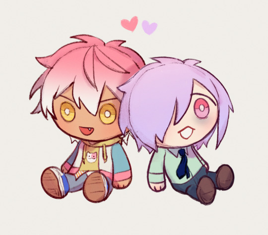
here is a tiny mini doodle for u btw .. they kinda look like cookies or a plush, yuh ouh. i wil maybe actually draw the two another time, if i remember how to draw human bodies. maybe one day, alas ....
oh, and also, go drink some water pls. love ur work, dev-dev, mwa ♡ ~XQ

😭....................................i'm honestly at a lost for words like💥💥💥💥💥 😭😭😭😭YOURE BEING TOO NICE RAAUYUGHHHHHHHH wdym you downloaded tumblr just to look at my silly stuff.......😭😭😭😭and you art is so CUTE eating it eating it eating it. stuffing my face with it. I LOVE THEIR EXPRESSIONS AND YOU GOT ALL THE DETAILS!!!!!!!!! LOOK AT NOEL'S PIERCINGS AND HIS WEIRD HALF ORANGE STRIPED SHIRT!!!!!!!!!!! KUUYA'S MESSY HAIR!!!!!!!!...........................if they were real plushies id buy the entire stock. speaking of. hands them to you MWAH
#ask#sstqrlight#yandere oc#noel posting#kuuya posting#love that you gave noel lil orange socks#your artstyle makes them look so scrungly (affectionate)#thank you for your art <33#i will be drinking my water
484 notes
·
View notes
Note
Um hi!! I just wanted to say I fucking love your work and everything you do and I’m so glad to say that you have officially made me into a papyri lover and I request that you continue to feed me with your amazing art and writing😇 (I’m literally folding for Rus and Dare’s relationship and not to mention Flipping fate has honestly got me hooked and never letting me go)
Also! If it’s not a bother do you have any tips on drawing the two skeleton brothers? (Aus don’t rly matter!) I just adore how you do it (sketches and the finished product) and I just wanted to ask ;,)
WAHHH THANKUUU 💖💖 Welcome to the ranks of Papyri lovers...!! (APOLOGIES IVE BEEN SLACKING ON THE PAPYRI CONTENT ;w; [and also. literally anything in general recently agdjcbdk]) ALSO sorry this took like. months to reply to agahamjdbhsmf,jj,,,, I made a whole thing. and then accidentally deleted said thing? so I had to remake it after moping for like a month.
Anyway, here is. a very messy breakdown and some tips!! That are hopefully helpful!!! It's mostly about faces but if you're interested I can also get into the nitty gritty of drwing skeletons but these are like. Sans and Papyrus specific parts (so mostly their skulls lol)


Skulls are both weirdly round, and weirdly angular (a sentiment that I read in a fic once and committed to heart apparently. Like... yeah. They ARE weirdly round and angled.) As always shape language is your friend (real bouba and kiki moments)
Sans has more of a... chibi face shape LMAO. If you've drawn those before it makes drawing him a lil easier imo. As for Papyrus...


He's a pain!! He's got lots of expressions and I usually have to redraw his face like sixteen times. His eyes are just like 2 fucking vertical lines and yet. AND YET. My beloved boy is so difficult. At least he has very expressive eyebrows. I also use the corners of his mouth to give him more range of expressiveness since he has no lips! Also the lines for his "individual" teeth... I can take it or leave it. Sometimes it works sometimes it doesn't!
I only give Papyrus lower eyelids because if you give him upper eyelids/lidded sockets he looks like Underswap Paps LMAO,,


Sans on the other hand has "lips" but doesn't use them hrkfhdk,, I always make sure to give him the little holes at the corners of his mouth as well.
Also that's all about their heads/faces so here's a note about how I do bodies which is. Shapes. These two are so Shaped.

Seriously though the best thing to do is just to try emulate other people's artstyles or pick out parts of them that you like and incorporate them into your works. Like how someone draws Sans' eyes? Try it and apply it!!
People also tend to draw the skeletons with slightly different facial proportions, so experiment with that and see what you like as well! I've gotten pretty good at eyeballing it and drawing them directly (with the exception of Papyrus around 40% of the time, wherein I have to redraw his face sixteen times before it looks good).
#SORRY IT TOOK SO LONG TO REPLY#GOD THIS ASK IS FROM FUCKING APRIL IM SO SORRY#inbox#my art#velwy.jpeg#undertale#tips! i hope it was helpful maybe.
164 notes
·
View notes
Text
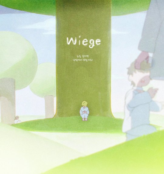
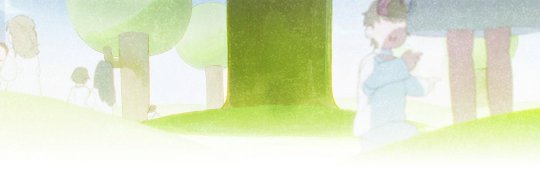
well people. . It's time, aka Akane's monthly revival because there's Luka content. And gosh do I have a lot to say about this. Except.. I'm not going to market these as theories, but as predictions. I think as an og fan I've seen enough to be this confident in my abilities LOL
Quickly, I'd like to address the lyrics and the title, because I will reference it later and I don't want to have to explain mid-prediction.
Wiege has two meanings, and both are so fitting:
1. Cradle. It feels.. perfect, for me. It makes so much sense. Luka was a cold child.. but I'd like to say only physically. I feel like he genuinely warmed up towards Hyuna and Hyunwoo as a child. And I'm going to bring an idea that might get me a bit of backlash but.. I've gotten worse, and that is, that Hyuna is at fault for Luka's approach on his feelings. (Audience boos) From the little we know about Hyunwoo, I feel like Hyuna treated both him and Luka.. at least a little bit similarly. Or at least, Luka couldn't discern a difference, if there was any. Luka is a tube baby, he probably doesn't know (and I am not babying him here, I'd like to add!) what "siblings" he has. For him, affection might just be all and the same. Yes, it wasn't Hyuna's responsibility to teach him, but I feel like a hint was there "Your life is mine", and she could've explained, in a way. But, back to our discussion, Hyuna was Luka's cradle. She burns as bright as the sun, while he's colder. But most importantly, she was his only true friend (Considering I don't think his relationship with Hyunwoo was extremely close, even though they were 'friends'), someone he thought truly cared about him. Hyuna was Luka's cradle, holding him close, comfortable... until at one point, he outgrows that cradle (Hyunwoo's death).
And the second meaning, beginning. In the picture we got, Luka is centered, he's in the middle.. but he's so small, and overshadowed by the tree. Luka is the best performer of the ANAKT, always first, but has no friends. But perhaps, he was better that way. Then, Hyuna comes, and it's a new beginning. He's finally not alone. What I've noticed in the new banner, Luka is missing, but across the tree trunk, in his place, is a taller shadow. Perhaps, a shadow of who Luka was, hopefully still left in there. Or, the other way around, it symbolizes his real self being left there.
And the lyrics:
When I close my eyes,
Play in paradise.
These, to me, remind me of the interview where Luka said his favorite game was hide and seek. In a way, his whole ANAKT life was a game of hide and seek: hiding all the time, but no one trying to seek him. Until Hyuna did, and found him. Something that intrigues me is the "paradise", which to me sounds like what Mizi once said: Dying in competition means returning to the Great Anakt, which I suppose is to them like Heaven.. or Paradise. This will be important later, so remember it.
And now, my predictions for the HyuLuka episode
! First of all, I think the song will be lullaby-like. When I first saw this teaser, with the lyrics, as weird as it sounds, it reminded me of Richard's song in The Hero in TAWOG, a song that always gets me to cry for some reason, and I've been really stuck on that . It would be interesting, because it would fit Luka's voice (as does everything else), but probably not Hyuna's, even though 6FU; would eat it.. which to me, sounds like their "love", where Luka loves her, but it isn't returned. I'd love to see more German in it than just in the title. And considering the nostalgic, pastel, very cutesy artstyle (that reminds me of the memory part from Jordan River animation!), it seems very viable. But the art style is also noisy, which gives an unsettling vibe. It feels like a 2020's dreamcore wallpaper.
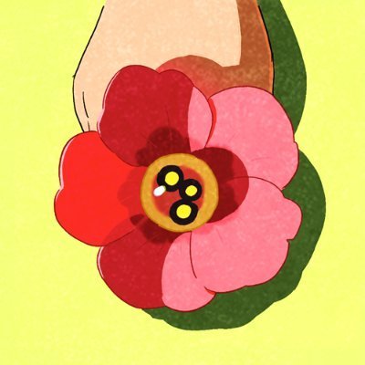
I might be crazy, but the hand holding the flower (with only 3 stamens, like the 3 friends) looks dark-skinned, like it would be Hyuna's or Hyunwoo's, but I doubt it would be his, considering it's the account's profile picture. If this is some kind of reference to.. perhaps, an unrequited Hyuluka but the other way around, with Hyuna still not over Luka.. probably won't happen, but God, would that be awesome.
So, how do I think the round will go?
First of all, I have to say, I'm not sure if this will be a round or a Mizisua type episode.😭 I'd say "oh the wait time is way too small" but also... do you guys remember the production announcement of Round 7? Yeah. You can never be sure.
This isn't necessarily a prediction, but more of a suggestion of what could be: It would be SO cool if it would be both.. in a way, merged. This idea just appeared in my mind and I was like OH. MY. GOD. Imagine if almost the whole thing was just them, as children, having fun, a whole backstory.. but then, when Hyunwoo dies, it pans on his face, and then it's back on stage, the loser's face instead of his. It would be so heartwarming, and then DEEPLY DISTURBING and traumatizing. I also really want some Luka and Heperu backstory so I can hate Heperu even more.
On the topic of the loser... It's going to be Luka. I'm an insane Luka lover and it was hard to get accommodated to this idea, but there is no way that he will survive. First of all, the shadow in the account's banner, in place of Luka. It's implications... are quite obvious. Second, the pattern of characters shown in Sweet Dream, and he is next. Third: "In my arms, you would be protected." I feel like Luka would consider the competition "In his arms". I don't think he would break his promise: hear me out for a second. He wouldn't let Hyuna die this way, because I feel like his sense of possession over her also comes with responsibility and protectiveness. And fourth, the Paradise lyric, to me, is a foreshadowing of his death.
I also think he will die by self sacrifice. First of all, there's no way Hyuna could defeat Luka by pure odds. Yes, her stats are better, but lets be honest, her mental power would NOT be as good infront of Luka, and also, the aliens wouldn't vote her. She's a rebel, wanted for so much time, with technically no guardian: they wouldn't want her to defeat their prince, probably. And second, I have made two categories:
The "perfects": Sua, Ivan, Luka
The "rebels": Mizi, Till, Hyuna
See something similar? Both the perfects that are dead, have died by self-sacrifice. The only other dead character, Till, has been shot while reaching for his freedom, so you can't say this is for all characters. And let's be honest.. Patterns are usually being followed in this series. Id also like to add, even though it's a reach, that in a tier of how 'perfect' they are, it'd be:
1. Luka
2. Sua - not so obvious self sacrifice
3. Ivan - obvious self sacrifice
So, I'd say that Luka's might be even more backstage, as if to sabotage himself in a way that seems viable. It also kind of goes in line with his character, he's not one to break facade on stage.
I think this episode will be quite a deep-dive into their true selves. We know the least about them, so this will be GREAT. I'd love to see a more morally gray Hyuna in this. (Since I'm genuinely kind of tired of only Luka being villainized in the ship, which honestly.. is kind of in line with the other perfects. Let's let Mizi, Till and Hyuna be little freaks too) I also want to see atleast a little bit of Hyunwoo, like a little snippet of his mind, what he saw in Luka.
In conclusion, I'm SO happy and hyped about this HyuLuka episode, they're so mysterious and I really really want to see more of L- I mean, more of them. Getting 2 episodes where Luka is present one after another is literally THE dream to me. Basically, Wiege is killing me and I'm gladly letting it.
@4listr Since you asked to be tagged and also, @rockwgooglyeyes I REALLY want your opinion on this
#alien stage#alnst#vivinos#alien stage Luka#alnst Luka#Luka alien stage#Luka alnst#alnst hyuna#hyuna alnst#alien stage hyuna#hyuna alien stage#hyuluka#hyunaluka#wiege alien stage#vivinos alien stage#hyunwoo alnst#theory#alnst theory#but this is just a theory.. a GAME theory
67 notes
·
View notes
Text
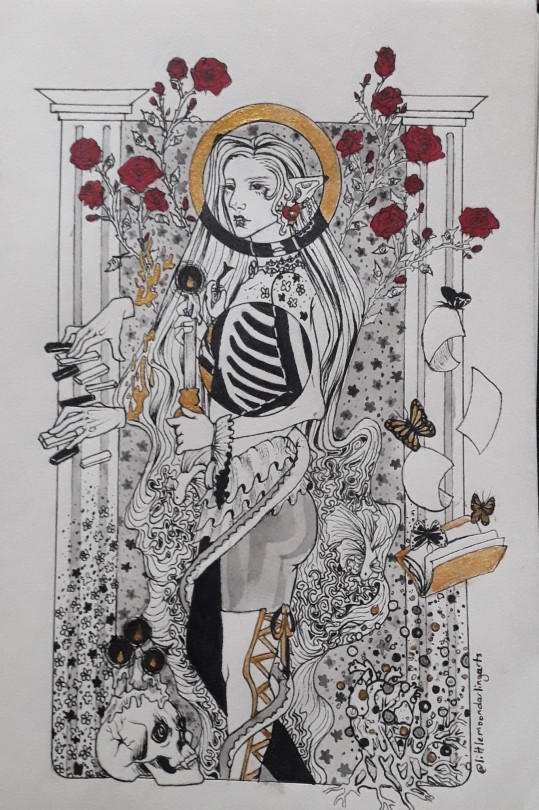
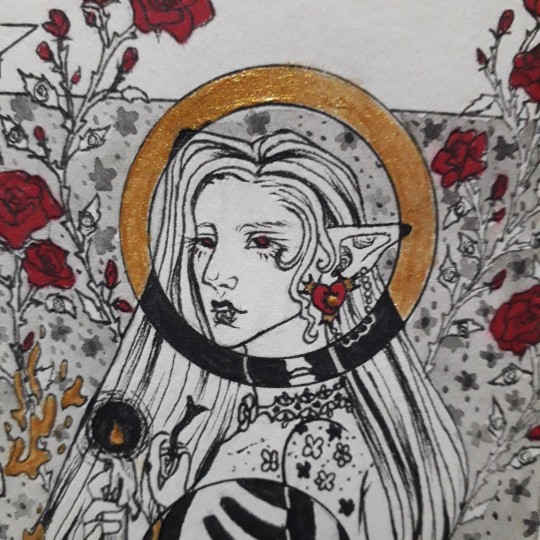
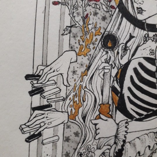
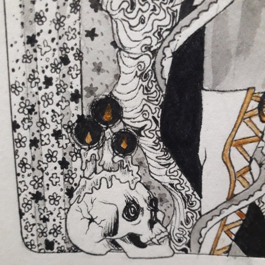
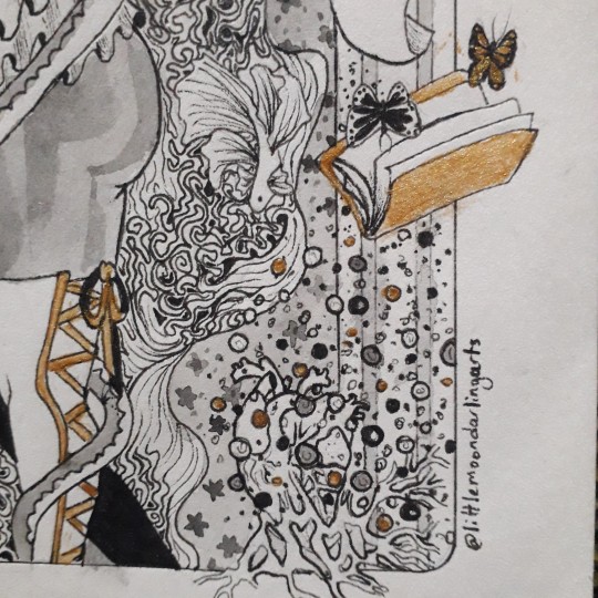
Did an artstyle study of the gorgeous art of @iliothermia and I genuinely learned alot so I'm very thankful that he gave me permission to do this 🙏🏻🙏🏻
As usual, rambles and process pics under the cut, be warned that I talk alot because this drawing was a true labor of love both for his art and Rouge
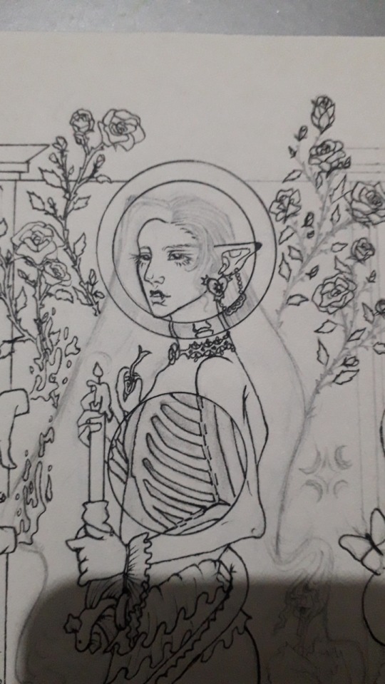
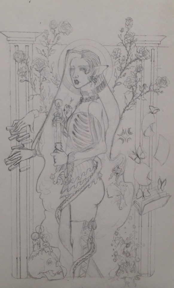
I wanted to use elements from his art but at the same time i know how deeply personal his art is to his own life and struggles and culture so i tried to be as respectful as possible (and if I failed at that please tell me I have no problem in deleting this) and tried to minimize my use of direct elements from his art to keep it to the skull which was heavily inspired by a drawing he has done, the waves which are such a beautiful staple of his art that I just couldn't not put it and the use of candles and small floral patterns and the style of the mold, but I tried to keep the rest to things that are symbolic to the character.
While he may have restraint to not explain everything, I'm not famous for that lol, so I will be explaining the symbolism behind my choices.
Part 1: the symbolism:
The red rose is Rouge's flower and it is heavily associated with him. The meaning of it being romantic desire and passion mixed with the thorns of it perfectly sum up his position as a beautiful black widow.
Voyeurism is a big part of this drawing and it is first noticed with the eyes motif on the roses' leaves, this symbolises his response to his trauma which left him feeling like an unwanted pervert on his own self. I can talk about this aspect of his story for hours but I'll spare you lol.
The X-ray cutouts are his complicated relationship with his own body and death, it is a thing that is constantly on his mind as he suffers from suicidal thoughts but at the same time he is always running away from it in fear, but he knows that eventually, he will have to stop running.
The candles melting represent him being only wanted when he is useful, when he is giving parts of himself up for others to use and abuse, when he is lighting their lives by slowly draining his own.
The piano is one of the rare things that bring him happiness and peace, but he needs to be heavily dissociated to be able to enjoy it which is represented by the hands being disconnected from the rest of the drawing and just floating in their own reality.
The snake represents two things, one is him being venomous to those around him, the mistakes he's made, the promises he's broken, the pain he's caused etc. But it also represents those who slowly wrap themselves around him in a warm embrace, presenting themselves as a saviour in his most dire times only to end up being the ones who will hurt him the most.
The book is about his obsession with keeping track of everything and of studying people, accidentally turning himself into an unwanted voyeur on their lives to the point where he has written the life stories of many people who would never want to be remembered through his eyes in his little books.
The butterflies are him, both in the way they are seen as "the good insects" and the beautiful delicate ones despite the fact that they eat flesh sometimes, it is also related to the way his simple presence for a few minutes in someone's life can create a whirlwind of change that will leave it unrecognizable, or he can simply be another body in their bed.
The hair turning into waves is meant to reflect the way he is always drowning in his own thoughts, a hand crafted constant state of misery.
The beta fish are some of the most beautiful and colourful fish out there, yet they are seen as cheap and easy first pets, leading to them being neglected and given environments that are too small and crammed, making their beautifully slow death the only thing they can offer to their owner. I don't think I need to explain more..
The skull is probably someone he's loved, or someone he's killed, or both.
The heart is his, it is rotten and covered in mold, any love he offers is tainted by his inability to heal and it is spreading to infect every aspect of his life.
Part 2: the inspirations:
The roses are a homage to the way Rachamim always places flowers in his art, either in the background or as a focal point of the illustration, most of the flowers he uses are cultural in nature, so I opted to not reuse any of them and changed it to a flower related to my oc.
Eyes are a repeated theme in his art, whether it be angel eyes, the evil eye or anything else, and as you can tell both of these are cultural and religious and while the evil eye exists in my culture, it does not in my oc's so I didn't use it. Instead I opted to pay homage to one of his beautiful merman drawings in which he used the plants to make an eye-like shape that stares at the viewer.
I thought I was being real smart in turning the hair into waves but yesterday I saw an illustration where he did the same so rip to me thinking i was being original lol.
The snake and butterflies are my way of replicating his use of animals while trying to not directly copy any animals that have a connection to himself or his culture/religion.
The beta fish is just to reference the ever present fishies in his art. I know he uses them because they represent friendship for him and they are the only animals safe from the evil eye (thanks for the fun fact) so I uh... I don't really know if this was disrespectful or not to be honest but I tried to use a different type of fish, idk this might still be slightly problematic and again I'm always ready to delete this if it makes anyone uncomfortable.
The waves are a direct copy of how he draws the gorgeous waves in his art, another case of something I fear may be crossing the line because the waves are drawn in the style of cultural jewelry 😭
The tiny flowers are an obvious reference to his own tiny flowers that decorate his art and characters.
The skull with the candles is heavily inspired by a specific drawing of his.
The cutouts are my way of paying my respects to my absolute favourite piece of art he's done without directly copying its concept because as far as I can tell, it is a very personal and emotional piece.
The mold style is a reference to his mold man (I forgot his name I'm sorry).
And the candles are another repeated motif in his art as well as the pillars and the pant style.
And ouf I sure do talk alot don't I? I just really love the amount of things I was able to cram into this piece and I haven't even mentioned everything😭😭 I will NOT be doing this again because I'm simply not as patient as he is and as proud as I am of the result, this was torture. I hope I didn't disrespect him, his art or his culture and I genuinely tried my best to be as respectful as possible but I might have some blind spots due to our experiences being so vastly different so again, please don't hesitate to inform me if you want this deleted!
#my art#art#artists on tumblr#oc#my oc#rouge#original characters#oc artist#oc artwork#oc art#lineart illustration#artsyle study#art style study#art study#idk how to tag this#anyway#hii#ty for reading#i hope you like it
239 notes
·
View notes
Text
The Crate
*Walks into room, collapses on face* It's been 3000 years but I finally finished it. Here you go! (If you noticed the artstyle changed halfway through, no you didn't, lmao) A comic featuring Astarion shooting his shot, and Tav missing the point entirely. Also a bonus snippet of my long fic where this comic is inspired by!
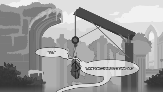
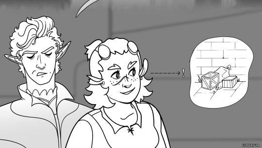
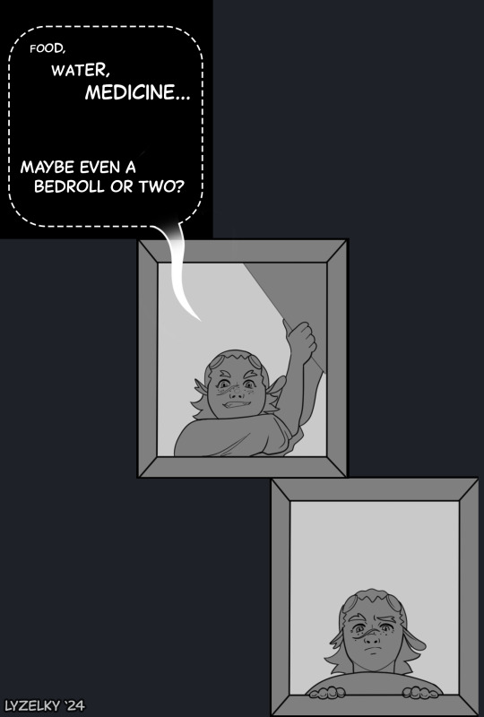
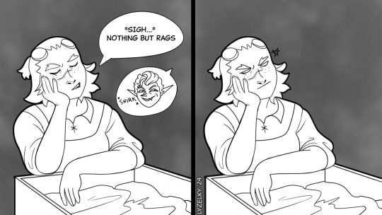
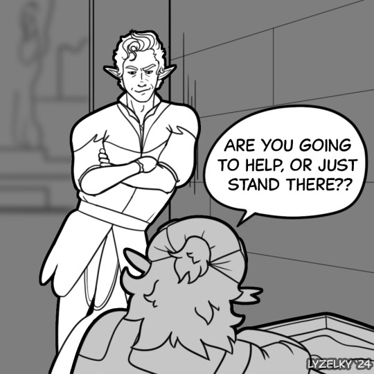
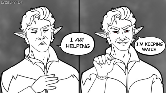
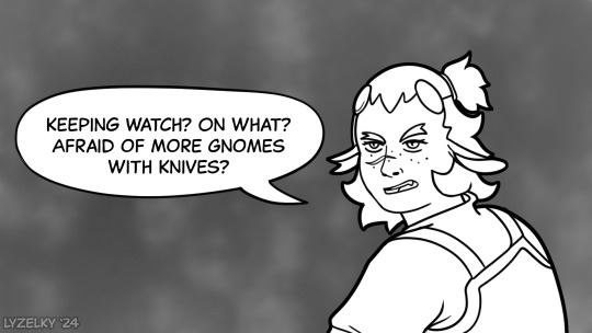
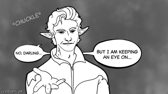
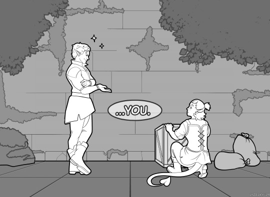
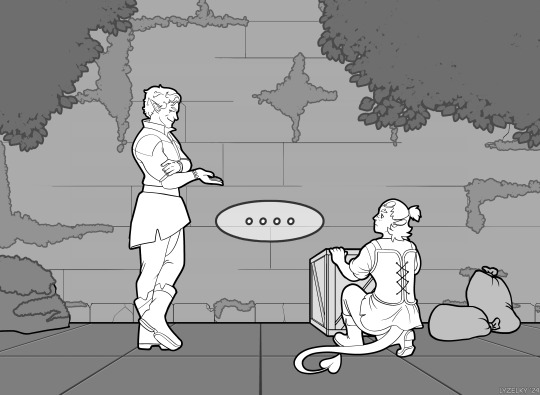
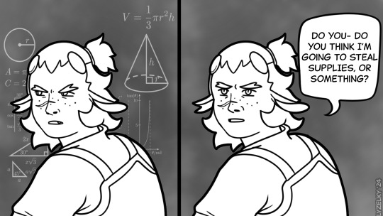
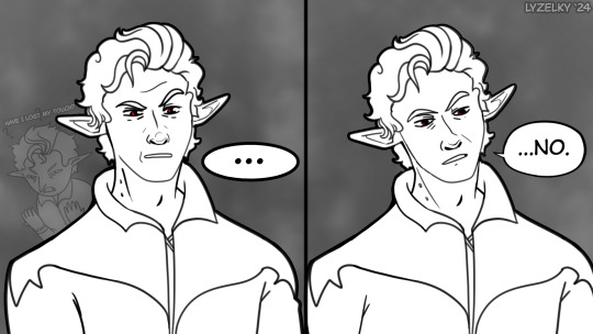
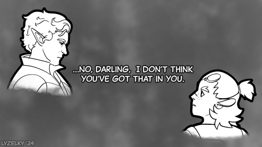
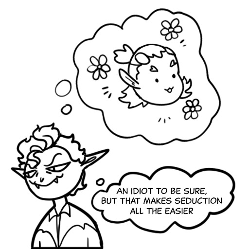
Local asshole already smitten, just doesn't realize it yet.
"Come on,” She says brightly to Astarion, “I think I saw some crates this way.” She half expects the elf to whine and request to rest alongside the others, but surprisingly he does as she asks. “So…what exactly, are we looking for?” He asks as she navigates her way towards a small pile of boxes. “Food, water… medicine, hopefully a bedroll or two.” She shrugs and opens one eagerly, only to wilt in disappointment when all she finds is rags. "Are you going to help or just stand there, by the way?” Astarion has not moved to actually assist with any of the actual searching; instead he’s chosen to lean against a nearby wall and observe. “I’m not just…standing here,” He scoffs, “I’m keeping watch.” “On what?” She asks flatly, “Afraid that there’s going to be some more gnomes with knives in these boxes?” This actually pulls a small huff of laughter from him. “No darling, but I am keeping an eye on you.” She opens another box and scowls down at it’s junk contents before what he’s said hits her. Tav looks up at him, mostly confused and honestly a little hurt. “I… Do you think I’m going to steal supplies, or something?” He’s still wearing that smirk— but at her question something in it falters, one sculpted brow quirking as he considers her. “…No, darling. I don’t think you’ve got that in you.” His tone is for once quite matter-of-fact, and tinged with the barest hint of amusement. Coupled with the strange way he continues to stare at her, it becomes increasingly apparent that some type of social cue has soared clear over her head.
Thank you all for reading!! So glad to have this done with, it was literally keeping me up at night. I've got some more stuffed planned, though maybe not as long as this, lol.
#bg3#bg3 tav#baldur's gate 3#bg3 fanart#my art#tiefling#tav#dnd#bg3 fanfiction#astarion ancunin#astarion x tav#tav x astarion#tavstarion#baldurs gate tav#baldurs gate 3
99 notes
·
View notes
Text
SUNTURINE NATION GET UP GET AWWWPPP
DOUBLE POSTING AND IDGAF‘ i’ve been losing my artstyle ever since i started getting doodly and cutesty anime-esque bc yk, hsr and fenrir brainrot so im drawing sunday (A CHARACTER I WROTE SO MUCH ABOUT BUT NEVER DRAWWW) to try and revive my og artstyle before it dies

SUNTURINE BRO SUNTURINE
Ok
Im going off to ramble again
Its funny how its the avgins that are said to have telepathic/mind reading abilities. and theyre hated because of that, (even though they do not) But halovians actually has those abilities and are well-regarded
Both are canonically attractive races too.
It's the settings that set their differene too +that info of the Avgins was spread because it was propaganda while halovians are idk, praised? Thats not the right word but you get the gist.
It's a nice thing to see of Aventurine and Sunday's character. Especially both having religious trauma.
They're more similar in character than you realize, just look into it.. but the ramble will be saved for uuuhhhh another tumblr day because im kinda tired to do a whole analysis on their character right now.


— have a sketch of sunturine, sorry this is sorta scamming buttttt

Also another funny thing to note,
Doves are often seen as symbols of peace and purity and are often used in many christian denominations. While pigeons… you know, little invasive suckers who’s nothing better than just some city pets that eats trash and dies.
I think this also connects back to the Avgin vs Halovian and their similarities in abilities. Both are heavily religious, attractive and charismatic. The telepathy thing too.


Its also my eyes headcanon for the two of them lol,
—- aventurine headcanons but i have difficulties recognizing faces so he sorta have the same face as sunday, ill get him his own face soon (+fenrir) he’s a bit slanted because i drwe him at an angle

#hsr#aventurine#honkai star rail#aventurine honkai star rail#fanart#hsr aventurine#aventurine needs a big fat hug bro#sunday hsr#sunday#sunday fanart#sundaynation get up#sunturine#sunday x aventurine#hsr fanart#drawing#religious trauma#artist on tumblr#if god exist then theyre cruel#doodle
84 notes
·
View notes
Text
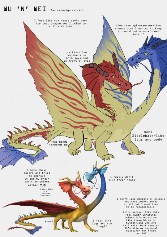


Concept doodles of The Nine Realms dragons because I fell into spiral with those lmao. I have no idea what to do with Feather so I'm ruling her out for now lmao.
I feel that one of the main problems with D:TNR is that this original dragons are done in one style, dragons from previous series are done in another style and dragons from yet another (Bubblehorn is from some series for really young kids from what I know) are done in yet another style and the creators lump it all together.
And the fact that I'm not fond of The Nine Realms artstyle at all is a private opinion. Mine doesn't rally fit HTTYD universe either but I think it's not hard to translate these design so I hope it works anyway lol
Most important text from pics under the cut:
WU 'N' WEI
I feel like two heads don't work for that dragon but I tried to roll with that.
I give them spinosaurous-like snouts bcuz I wanted to keep it round but non-deformed lookin' (lmao).
Catfish-like whiskers on both jaws and in front of eyes.
Knee bends forwards now (why do they bend backwards in canon design??? I don't understand)
More Zippleback-like legs and body.
I hate their colors and tried to improve it but my brain can't do colors either ಥ_ಥ I feel like it all crashes together...
Personal note: I don't like designs of animals who have colors 50/50 at all but I want them to be recognizable. Color pattern like this feel super unnatural unless it's mutation. Like those birds or butterflies who are half male, half female. It's also my personal headcanon for these two lol
I don't like pattern of their wings bit idk what to give them. I just don't want wings to be solid but different than body color, it just looks kinda awkward??
PLOWHORN
In my opinion, because only her wings are covered in armor they look out of place. Rumblehorns' armor looked more conected to it, because head also looked hard/armored. So I tried to connect her armor to her body a bit more
Horn is no longer made of crystal.
She doesn't grow crystals. Crystals grow on her because of her natural habitat
I give her a bit smaller head
Details of her unique wings. They are still made of skin and bones but folds in more bug-like style
BUBBLEHORN
Bodytype similiar to Terrible Terrors, maybe a bit shorter.
Horns like those of Deadly Nadder.
Eyes like parrots'. Idk why lol
Spikes and scales on legs and tail similiar to those of Night Fury
#httyd#how to train your dragon#the nine realms#dragons the nine realms#wu and wei#plowhorn#bubblehorn#gembreaker#mist twister#my art#fan redesign#not transformers#I tried#also sorry for bad english#nibbles
374 notes
·
View notes