#i hope it was helpful though!
Explore tagged Tumblr posts
Text
blehhh...

i made an aa/lawyersona of @snapscube :3 we all know and love the lawyer+silly girl duos of ace attorney but it's about time the silly girl became the lawyer


#that animation kicked my ass#SUPER fun though. i love ace attorney sprite work#i want to make my own aa ocs now...#but n e wayz hi olivia if youre seeing this i hope u have SO much fun with the rest of the games :]#i Will be keeping up with the aa liveblogging it helps keep me insane about ace attorney#bug art#snapcube#ace attorney#bug animated
15K notes
·
View notes
Text

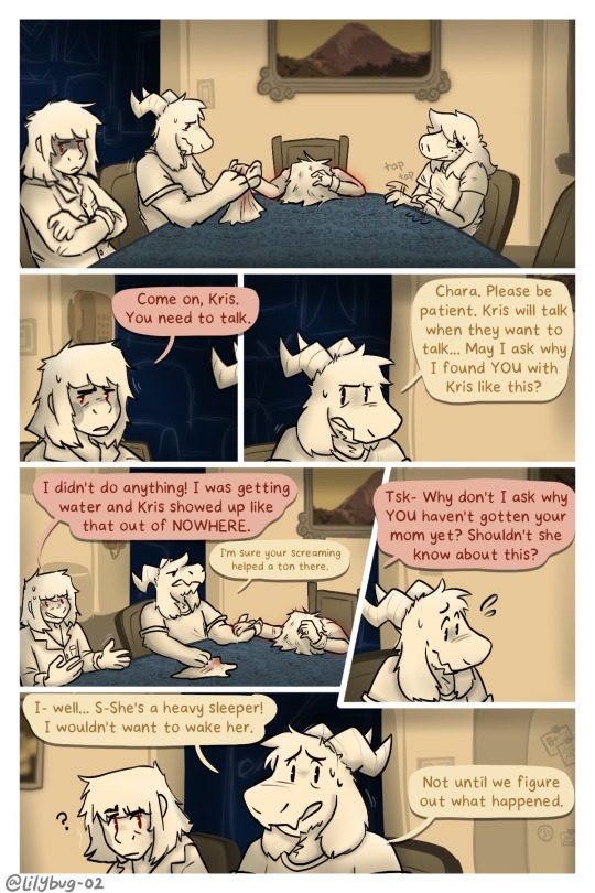
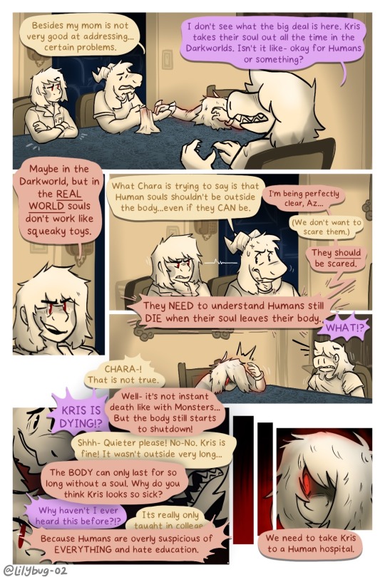
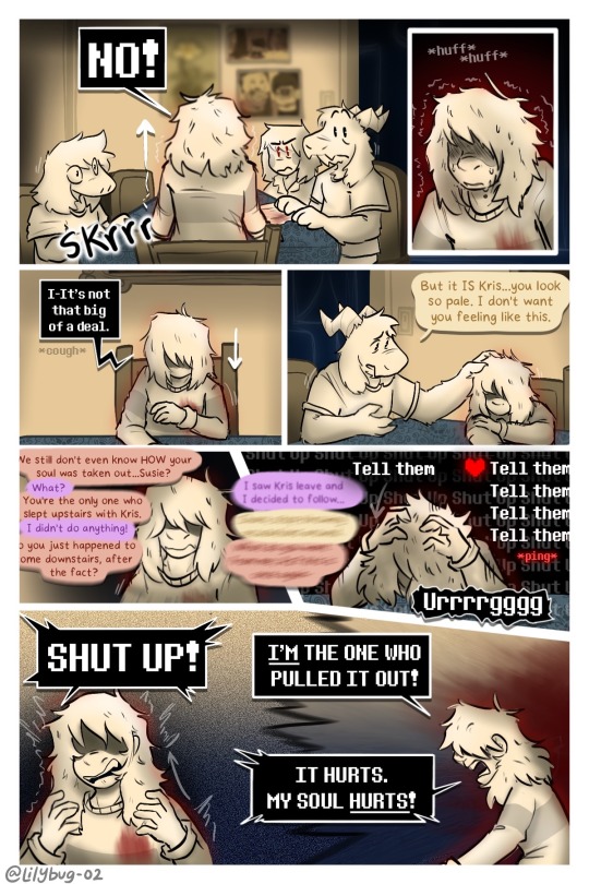
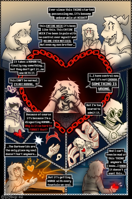
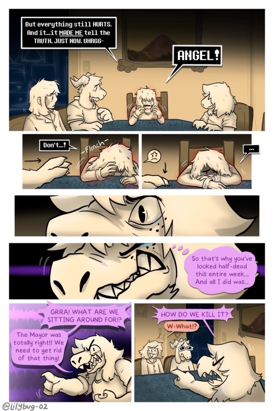
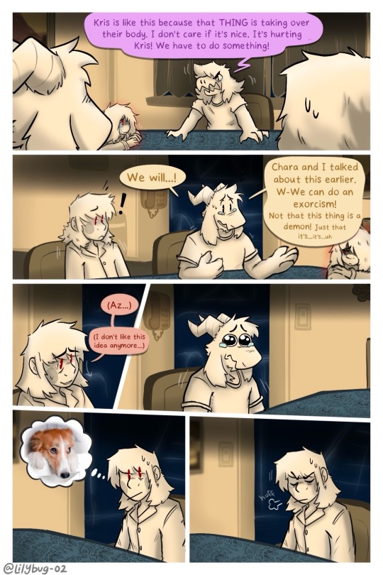
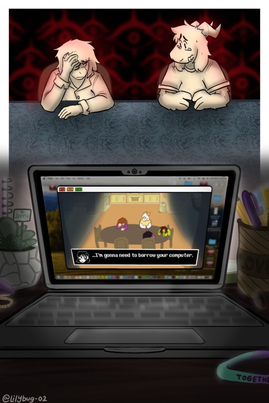
Pain is a great motivator…
Part 26 || First || Previous || Next
—Full Series—
Meanwhile Toriel:
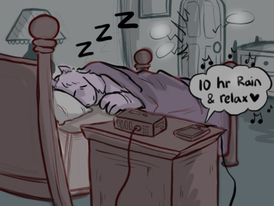
(Loud noises don't wake her up usually.)
Artist note: I’m so proud of this :))) I know it’s a lot of dialogue and reading, but dialogue is grueling work for me. I’m glad with the art and for the amount of pages I made in such a relatively short time span -w- page 5 was super fun to work on. A lot of blood, sweat, and hours here... :) The backgrounds were a big bore tbh, but I finished them! Yippie!
#CHARA WTF DO YOU MEAN “COMPUTER”????#lol i hope you guys dont hate me for what im doing in the next update.#IS THAT A MAC OS???#Yes......owo''#Kris and the Gang are LITTLE now. I've pixelated them and turned them into little game characters!#FINALLY!!#I never thought I would be going so far in the story to explain WHY Kris pulls out their SOUL and opens Darkfountains even when they killed#Berdly in Chapter 2. Pain can make people do horrible things.#Uhhhhhhhhh anyways. :3 I hope you liked it! I made this post a little too long for my liking and didnt get it out when i wanted too-#but thats okay! As long as people enjoy it :)#bread#art#deltarune chara timeline#deltarune chara timeline comic#seriously though#long post#man am I glad I switched over to the limited color palet! It helps me feel alot more relaxed uwu#This is....way over 16 hours of work q-q#chara#asriel#susie#kris#asriel dreemurr#kris dreemurr#kris deltarune#susie deltarune#deltarune#comic#my art
4K notes
·
View notes
Text
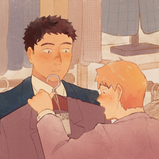
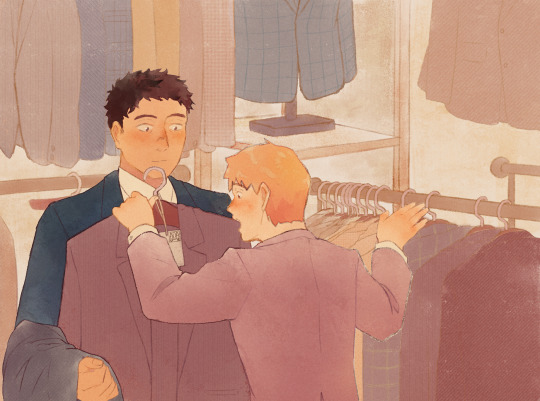
👔 Suit picking!
#serirei#mp100#mob psycho 100#reigen arataka#serizawa katsuya#mp100 fanart#myart#hope it's clear that Reigen is focusing on helping Serizawa choose a nice suit#while Serizawa is focusing on Reigen instead#can you believe it. rare serirei art from me??#sorry I suck at drawing Serizawa 😭 I think he looks nice here though#not sure if I want it to be closer or not then realized that this is tumblr so I can just post both
2K notes
·
View notes
Note
Do you have any tips for painting with gouache? like how do you get it to stay a nice solid color over a large swath of paper? and how do you blend it so seamlessly?
Of course, here's a few pointers off the top of my head:
1. I've used gouache for this in the past so it's possible, but the flat backdrop on my latest WIP is actually acrylic! A nifty thing I've found about putting a layer of acrylic down, is that it creates a barrier once dried and essentially makes the paper waterproof. This means you can work in gouache on top without it mixing with the background, and you can wet a section and completely wipe it clean with a cloth/tissue and it won't disturb the acrylic layer underneath. It also makes the paper more resilient, and you don't get as much pilling/tearing from the moisture
To get an even wash it's mostly getting the right consistency, I add just a little water - enough that the paint is less "tacky" as you drag your brush along paper, but not so much that it's runny or translucent. It takes a couple of attempts sometimes!
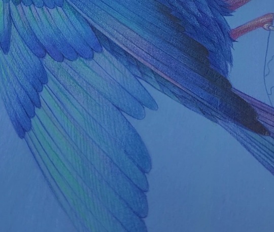
2. Also for the current WIP that I posted earlier, like the vast majority of my traditional pieces, keep in mind that it's mixed media. So I assume you're referring to the blue-green gradient on the bird and wondering how I got the gouache to blend like that - it's actually colouring pencils! I'll often switch between dry and wet media, even layer them back and forth, whatever makes the most sense to get the effect I want 😁
3. On that note, when you're working with paint, or any medium really, I can't recommend enough having a "test" sheet that you do both before and during a traditional piece. It allows you try out different medium combos, see what shade your gouache will dry into, and catch any issues before it ends up on your artwork. I often see artists being encouraged to just Bob Ross their way through a piece, the idea being that you'll just have happy little accidents that you'll naturally work into the piece - maybe, but you'll also possibly irreversibly wreck your hard work and have to start again. I don't know, I'm just a methodical person I guess, but seeing someone just directly apply something to the page when they're not sure what it's going to do makes me wince - no two art supplies are the same! All of those paints and pens have different chemical makeups, there's an unlimited number of ways what you're using could interact, good or bad.
Since it's already there, I usually reuse one of the leftover failsons from the process of making the wash background, then test everything on top of that. That way you can see exactly what shade the paint will dry on top of whatever colour the background is:
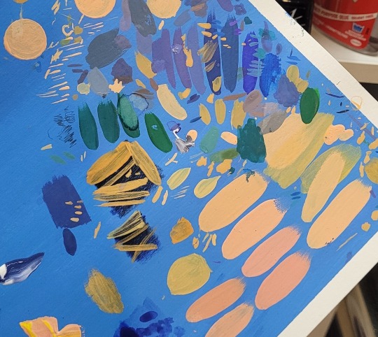
Doesn't need to look good, nobody sees it (usually) and you can also test the thickness of your brushstrokes while you're at it.
Anyway, I hope this helps!
#might have geeked out a little too much about art supplies but hopefully it's helpful :'D#I will be posting a process video of this WIP soon though which I hope will also give people some tips!#art help#art tips#art reference#asks
824 notes
·
View notes
Text

girl experiences gender euphoria and is immediately slammed by grief
for @litttlittt <3. this was supposed to be a portrait of caroline hill, but litta mentioned tim looking like janet when dressed as caroline and identity issues and angst and things spiraled
something about tim not knowing if he's his mother's child or bruce's or neither's.
figuring out the looks:
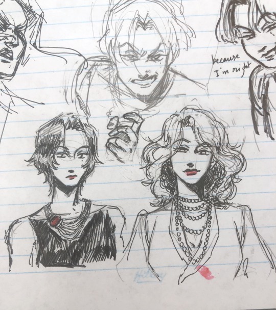
i wanted janet to have that poofy 70s hair
#tim drake#dc#bruce wayne#janet drake#sart#i'm picturing this as transfemme tim hence “he” and also compounding issues about bruce treating him as a daughter#which is exactly the gender validation tim wants and needs but isnt sure he deserves#but this also definitely works for trans tim#she gets to process that she looks like her mom!! and her mom will never get to know her daughter#would she have wanted to know her daughter? even though she showered tim with love when she was around#she barely knew her son#gender idk he's a girl 👍 hope that helps#i went down a rabbit hole looking up vintage dior necklaces -- hopefully something martha wayne wouldve worn#-- but dior necklaces are COMPLICATED#i almost drew pearls but i think that wouldve been too cruel to bruce lol#(a decent amount of my art--even when it's not femme tim--gets tagged 'gender' and i dont know what im going but im glad 👍)
3K notes
·
View notes
Text
HMMM it's actually a pretty hard task because personally every difference in storytelling interactions and etc in a new podcast hits me like a brick in the head but here are several that i enjoyed if you'd like
- Mistholme Museum of Mystery, Morbidity and Mortality
you're listening to an audioguide which is alive give or take and in fact is an artefact from this said museum. in the beginning it was difficult to get engaged in all that seemingly unconnected stories but then the plot picked up and it was pretty nice! it reminds me of malevolent in the way you are listening to all these descriptions with in-story explanation why you are doing it, and you kind of have a place in the world of this podcast. dancing around the spoilers here, but the moment when the audioguide realised to WHOM it was telling the stories, ahh that was good
- the Orphans
wellp it's nothing like the genres you describe so far but it has survival and a fair amount of horror? though it's sci fi? it is quite good bc the three full seasons it has explain the world and are in fact connected, but at the same time they sre independent stories and you don't need to wait for more (maybe)
- Spire
don't get confused with the name as you will find at least several business podcasts with serious men talking about something something, but look for the trirteen episode sci fi and mystery story. it has it's charm because of the sounds and sotrytelling, though you follow two main characters that don't live in one body but switch theirs. that one is actually my favourite, the voices are lovely and the plot is interesting. one flaw it has: the second season was supposed to be aired somewhen last year but it never happened and no news as far as i know. the first season is worth it though i highly recommend!
anyways, if any of these seems interesting for you i would love to discuss them or if not, i can also describe more of what i've listened! feel free to ask for that or even dm me i am almost always free and eager to chat about podcasts
looking for more character-driven horror podcasts like malevolent. tag with suggestions please raaaa
#audio dramas#spire pod#the orphans audio#the mistholme museum of mystery morbidity and mortality#these ones are one of which i remembered most so pretty sure than can count as favourite#ish?#though damn it's hard to look by criterias#i hope it was helpful though!
13 notes
·
View notes
Text


Get you someone who looks at you like Luo Binghe looks at Shen Yuan infodumping (ft. a lil bonus under the cut!)
(Piece chosen by this week's poll!)
[ID: A Scum Villain Comic. The first image depicts Plant!Yuan excitedly looking at and holding a book that has his demonic butterfly resting on the edge of it saying "Binghe, have you heard of the Iron-Shelled Muskrats? They're said to have near impenetrable skin and live in the deepest depths of the Abyss-" Image two depicts Luo Binghe resting his head on one of his hands and looking presumably towards Shen Yuan with a soft love struck expression. One of SY's butterflies rests in his hair. SY continues in the background, sort of faded out with text saying "Blah, Blah, Blah, place name...backstory stuff... " End ID]

[ID: A Scum Villain Comic. Characters drawn in chibi style. The top half depicts Plant!Yuan, now with an angry expression, gesturing out with one arm causing his butterfly to move out of the way. He rants "Oh, that reminds me, you will not believe this novel I just read. The writing was so awful-" LBH continues to look at SY the same way as the comic above, with a thought bubble above him saying "I would die for you". The bottom half depicts Shang Qinghua, pausing in surprise before taking on a concerned/dreading expression and saying "Something just happened.... A caption points to him saying "Author of said novel." End ID]
#svsss#scum villain#shen yuan#luo binghe#bingyuan#mxtx#plant baby sy au#myart#sy: i hope im not being annoying while ranting but I cant just Not tell Binghe about this#lbh: i love how a'yuan sounds when he's angry (at other people than me) <333#rip sqh unfortunately for him no matter the universe sy remains a hater 😔#fun fact even though he seems like he's spacing out these infodump sessions still ingrain themselves in binghes mind#and subsequently helps him during the abyss :D#svsss au
513 notes
·
View notes
Text
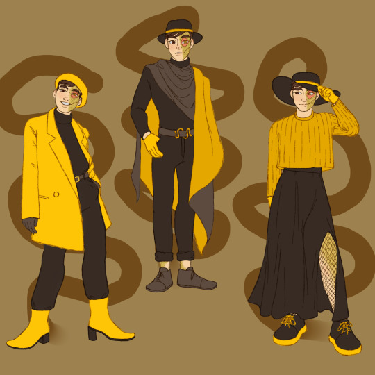

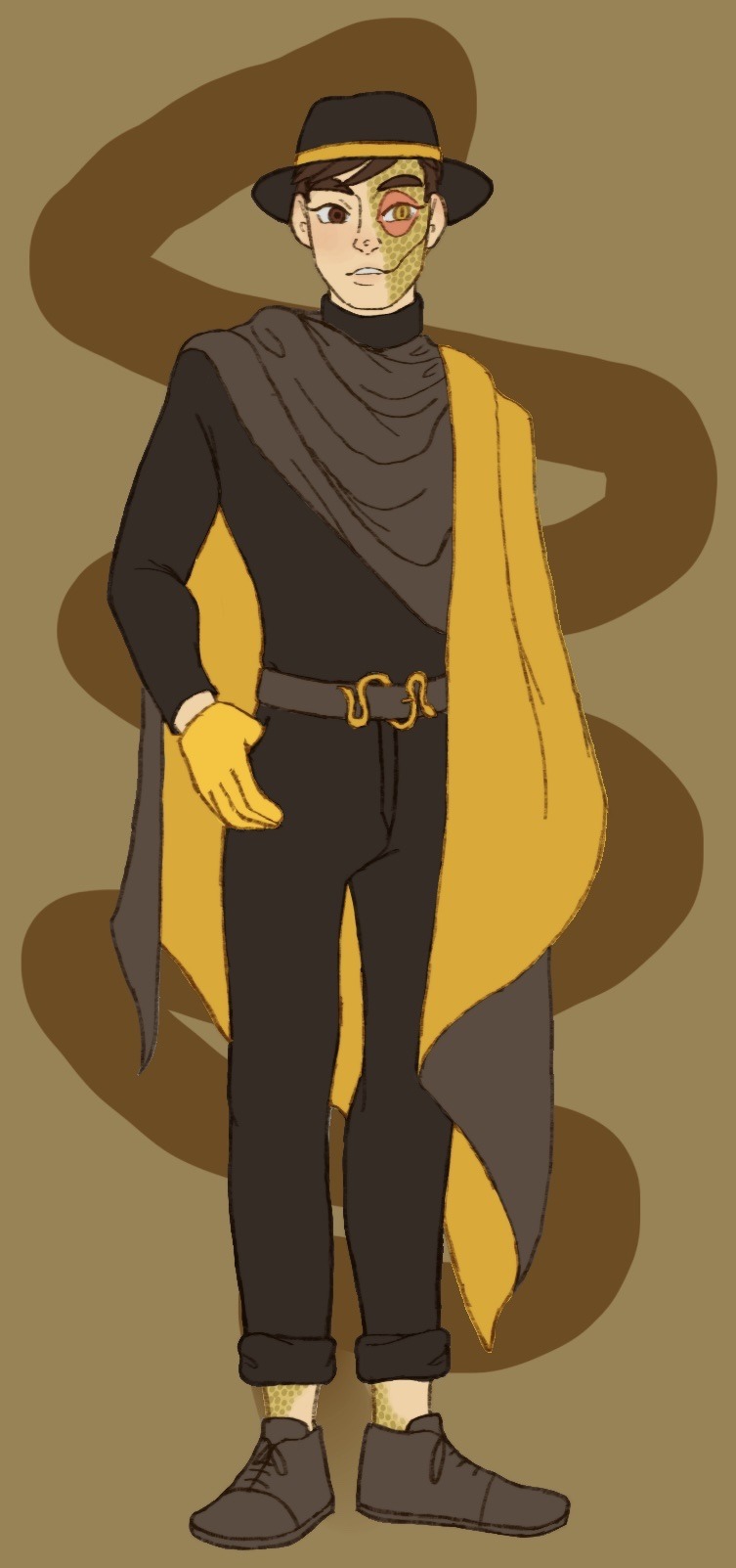
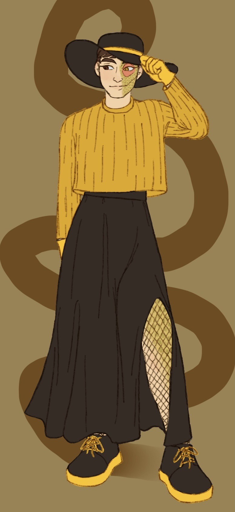
What do you mean I’m a bit late for Janus’ big day? Of course not, how could you say such a thing! I definitely didn’t forget all about it in my absence and only get reminded in the incorrect quotes video live chat; that’s not like me at all ;]
Anyways I decided to dress our sassy snake in some different outfits I think he’d like. He seems like the type to get all dolled up on his birthday and it goes with Thomas posting pics in outfits inspired by the sides on their appreciation days!
@thatsthat24
#sanders sides#janus sanders#ts janus#thomas sanders#sanders sides fanart#my hoard#I’ve returned!#the newest asides came out and I remembered how much I love it#so I’m hyperfixated again and I’ve not now peace since#it is nice to actually finish something again tho#I’ve been pretty busy working lately and now I’m starting to pack to move into my first apartment!#so not much time to really sit down and draw#and when I do have time I can’t get the motivation to actually draw anything#I want to get better about posting stuff on here#(even though it feels like I’m just dreaming into the void a lot)#even just silly little things or rough sketches I’ll never finish#I hope it’ll help me continue to draw and make things again#I forgot how nice it is#anyways if you’ve read this far thanks#have a cookie :] 🍪
2K notes
·
View notes
Text


hi ive been going through it a little bit

#school is actively kicking my ass and ive never been so busy but they are single handedly keeping me sane help#if you told me like three months ago that id be ahving yet another superhero phase i would have curled into a ball and died#its very comfy here in hell though thats for sure#i adore them sm jesus fucking christ#spiderman has been a fav of mine since i was a kid and watching the ultimate spiderman show on tv#and deadpool has been coming up in the ranks as of recently lol#again#hilarious that i watched dp/wv and came out hardcore shipping spideypool lmfao#i dont know how that happened but idc this is awesome#i wanna do mire finished pieces but i have basically no time so yayayyyyyy doodle dump#hope you all are well!#spiderman#spider man#peter parker#I SHOULD POINT OUT NOT HIS MCU VERSION PLEASE NO#deadpool#wade wilson#spideypool#spiderpool#marvel#ok bye
664 notes
·
View notes
Text
No wonder Emmrich.exe stopped working when Rook asks if the tea in the memorial garden at the end of their outing was set up to impress them.
Death-man brought Rook to this place to try and help them sort through some of the feelings they need to confront in order to healthily mourn the death of someone who presumably meant a great deal to them.
The “light refreshment” was waiting at the end as a deliberate part of Emmrich’s care as a death professional. When I was in funerals we had coffee, tea, and freshly baked cookies waiting for every family that came in for arrangements, visitations, services, or after-care meetings: they’re comforting little gestures that people tend to really lean into during a difficult time.
So yeah. Given the circumstances and the reason for the outing to begin with, it would be a lot like someone showing up at the funeral home to make arrangements for their mum, looking at my spread of coffee and cookies and being like “Ooooh… are you hitting on me? 👀”
I would have had the exact same reaction Emmrich did lmao
#though i definitely wouldn’t have recovered as smoothly#like no wonder he’s so fucking worried about rook the entire game#on the surface they are NOT well#denial is a normal part of grieving as it helps keep your brain safe until you can ably process the reality of a passing#but rook is talking to themselves#spending hours in an empty room#appears to go out of their way to avoid even mentioning Varric’s death#emmrich is seeing this and is seeing the worst case of complicated disenfranchised grief he’s ever seen#he even disclosed his own crippling fear of death in the hope it would help show them it’s okay to not be okay#and they’re over here like ‘omg cute you’re trying to rizz me up! 🤭’#rook might be emmrich’s 13th reason#emmrich volkarin#emmrich#dragon age emmrich#dragon age#datv spoilers#dragon age spoilers#dragon age the veilguard#dragon age the veilguard spoilers#da:tv#da:tv spoilers#veilguard spoilers#emmrook#emmrich x rook#emmrich romance#rook#grief#death#mourning#v does funerals
325 notes
·
View notes
Text
Mithrun being a mostly autonomous disabled person with caretakers is incredibly important to me, building up routine habits in order to "fully function" while also still requiring help is so real tbh
#I too have a caregiver even though I'm considered somewhat functional#I think people under estimate the amount of help people with certain disabilities need even if they're not fully visible#mithrun being capable of walking talking and being a leader while still having people around him who will remind him to eat or sleep#keeping him safe when breaking down#help him get dressed in the morning when he can't be bothered to remember how to do it himself#that is incredibly real to me#anyway I hope this post doesn't get destroyed#dmd tag#delicious in dungeon#dungeon meshi#mithrun#these are thoughts I shared with my bestie so shout out to sky for that
470 notes
·
View notes
Text
This may not go anywhere but I’m curious, please reblog to spread and maybe add what mcyt fandom you’re in!
I would add more but I can’t so, sorry 😞
Again this is *predominantly* what you listen to
An example of the last one would be cavetown, last I saw he was signed to either sire records or triple crown.
#bolt barks#tumblr polls#random polls#polls#mcyt#mcytblr#hermitcraft#esmp#qsmp#I’m too much of a coward to put dsmp honestly because they genuinely scare me sometimes#mcyt smp#minecraft smp#I’m hoping putting the major ones will help spread it. oof.#I don’t mind if dsmp enjoyers do interact though#I’m just scared of the fans who are like. majorly online.
358 notes
·
View notes
Text

Dewi needed Hornets help OKAY.
Bug Fact: The Planthopper insect can accelerate from 0 to 12 miles per hour in less than a millisecond. Video/Pictures Below
First || Prev // Next
Masterpost
The Planthopper essentially vanishes from view.

They are also an extremely diverse set of insects morphologically!

Interested in learning more? True Facts About Leafhoppers and Friends <- very humorous and educational video :D PG-13
#Hornet though she was helping a higher being! She didn't know it was a grub higher being of all things >:(#I like to think the bug laughs are like little chirps. It's just cute that way#Zote talks to anyone who will listen. Elder Bug is in this margin#Lets hope Dewi can come back#posting this at the hour of 11pm. no regrets#dewi's adventures in hollow knight#hollow knight#hollow knight au#hollow knight comic#hollow knight hornet#hk ghost#hollow knight quirrel#dewi#hollow knight hollow#my art
2K notes
·
View notes
Text
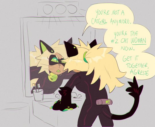


i wanted to draw a sillay comic of them with my grownup designs/hcs so here u go
#miraculous ladybug#marinette dupain cheng#adrien agreste#chat noir#cat noir#adrinette#ladynoir#dia draws#digital#fanart#they are in their 30s and dot have kids even though i KNOW in canon they would have kids because i simply do not like giving characters kid#hope this helps#i have to make adrien the most pouty pathetic girl ever#adrien prns are he/she/nya and marinette is she/it
3K notes
·
View notes
Text
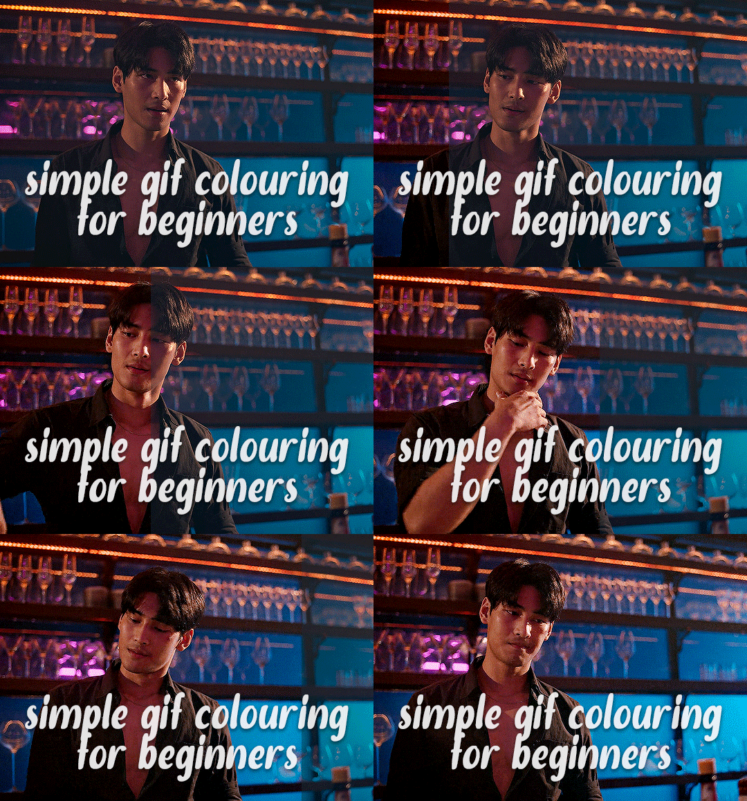
✨ Simple Gif Colouring for Beginners ✨
I wrote up my basic gif colouring process for a friend recently, but a couple of people here mentioned they'd also find it helpful! so, as requested, this is a beginner-friendly walkthrough of the way I colour my gifs :) it's aimed at brand new gif makers with no prior experience with photoshop or photo editing.
when I first started gif making I found colouring and photoshop in general suuuper daunting, so I've tried to simplify everything here as much as possible. hopefully this will be relatively easy to follow and not too intimidating!
a couple of things to begin with:
I'm only talking about colouring here - this is not a full gif making tutorial. I've linked to some of my favourites of those here!
I personally like to make bright, 'clean' looking gifs with vibrant but natural colours, so that is the style of colouring this tutorial is geared towards. most of gif colouring is subjective and about personal taste - the only thing that I'd say is possible to get wrong is skin tones, which I talk about a lot in this guide.
as I mostly gif Thai dramas, most of the advice is geared towards colouring for East Asian/South East Asian skin tones - but the techniques should be fairly universally applicable (and here are some tutorials that talk about gif colouring for other skin tones).
I'm not an expert! I'm not claiming this is the best or the only way to colour gifs - it's just how I do it.
this post is very image-heavy. if the images aren't loading (or the gifs are running slowly or cutting/looping weirdly), then try viewing the post in its own tab (rather than on the your dash or someone's blog) and refreshing the page.
okay, full walkthrough beneath the cut!
contents:
1. intro a. natural gif colouring goals b. very very basic colour theory 2. super simple colouring (the essentials) a. curves b. selective colour (and skin tone correction) c. hue/saturation d. saving and reusing colouring e. another simple colouring example 3. other adjustment layers a. brightness/contrast b. levels c. vibrance d. colour balance e. channel mixer 4. troubleshooting a. curves b. saturation 5. fin!
1. intro
the colouring part of gif making can be super overwhelming, especially if (like me when I first started!) you're completely new to photoshop and/or have no experience with colour theory or photo/video editing.
if you're opening photoshop and making gifs for the first time, I highly recommend getting used to making a few basic, uncoloured gifs to begin with. just to practice, rather than post anywhere (though you can always come back and colour them later if you want) - but it'll make the rest of the process much easier if you're already beginning to get used to working in timeline mode of photoshop. give yourself a bit of time to practice and get a feel for things like how many frames you tend to like in a gif, where you like to crop them for the best loop, what kind of aspect ratio you like etc* - so that you're not trying to navigate all of that for the first time on top of everything else!
* frames: for me between 60-90 frames is ideal, but 40-120 frames is the absolute min-max I'd personally use in a normal gifset loops: for the smoothest loops, try to avoid cutting someone off mid-movement or mid-word if possible. aspect ratio: for full-size (540px) gifs, I tend to go for either 8:5 (slightly 'skinnier' gifs), 7:5, or 5:4 (particularly big, thick gifs lmao)
✨ natural gif colouring goals
part of what can be so daunting about starting gif making is not knowing where to start or what you want to achieve. this is definitely something that gets easier with practice - the more gifs you make, the more you'll get a feel for what kind of look you like and the more instinctively you'll know how to get there. it also helps to see if any gif makers you like have made "before and after colouring" posts - these can help with getting a sense of the kinds of changes made through gif colouring. here's one I made!
in general, I like to make my gifs bright and 'clean' looking, with vibrant but natural colours. these are the things I'm usually hoping to achieve with colouring:
brighten dark scenes
remove muddy, yellowish lighting or filters
saturate colours
correct any skin lightening filters or overexposure
make lighting and colours as consistent as possible between gifs within a single gifset, especially gifsets featuring gifs from multiple scenes/episodes/videos
this guide is focusing on natural colouring, but of course there are many cool ways to make stylised/unnaturally coloured gifs. imo you'll need to master these basics first, but if you want to learn how to do things like change the background colour of gifs or use gradients or other cool effects, then @usergif's resource directory has loads of super helpful tutorials!
✨ very very basic colour theory
[disclaimer! I don't know shit about fuck. I do not study light or art. this is just an explanation that makes sense to me exclusively for the purposes of gif making.]
the primary colours for light/digital screens are red, blue, and green. having all three colours in equal measures neutralises them (represented by the white section in the middle of the diagram).
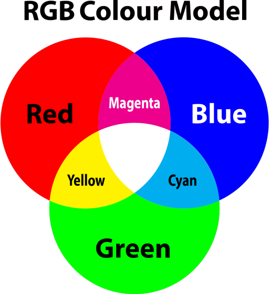
so to neutralise a colour within a gif, you need to add more of the colour(s) that are lacking.
in practice this usually means: the scene you want to gif is very yellow! yellow is made of red and green light, so to neutralise it you need to add more blue into your gif.
it can also mean the reverse: if you desaturate the yellow tones in a gif, it will look much more blue.
looking at the colour balance sliders on photoshop can make it easier to visualise:
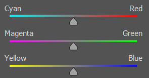
so making a gif more red also means making it less cyan.
removing green from a gif means adding magenta.
taking yellow out of a gif will make it more blue.
tl;dr:
neutralise yellows by adding blue (and vice versa)
neutralise reds by adding cyan (and vice versa)
neutralise green by adding magenta (and vice versa)
2. super simple colouring (the essentials)
starting with a nice sharpened gif in photoshop in timeline mode. (these are the sharpening settings I use!)
some scenes are much harder to colour than others - it helps to start out practising with scenes that are bright/well-lit and that don't have harsh unnaturally coloured lights/filters on. scenes with a lot of brown/orange also tend to be harder.
I usually save a base copy of my gif before I start colouring just in case I end up hating it, or find out later that it doesn't quite fit right into a set and need to redo it etc.
so here is my base gif!

it's an okay gif, but it has a bit of a yellow tint to it that I want to reduce.
colouring is easiest to do in adjustment layers, which can be found under layer -> new adjustment layer - or for me they are here:
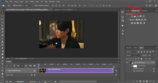
there are lots of different types of adjustment layers that do lots of different things - but for me the absolute essentials for colouring are curves, selective colour, and hue/saturation.
I also use brightness/contrast, levels, exposure, vibrance, colour balance, and channel mixer sometimes, depending on the gif - but I use curves, selective colour, and hue/saturation on every single gif.
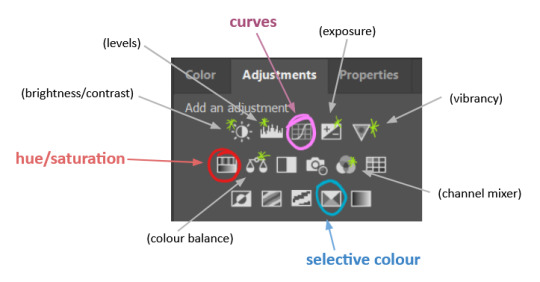
✨ curves layer
the first thing I always do is a curves layer. when you first open one it will look like this:
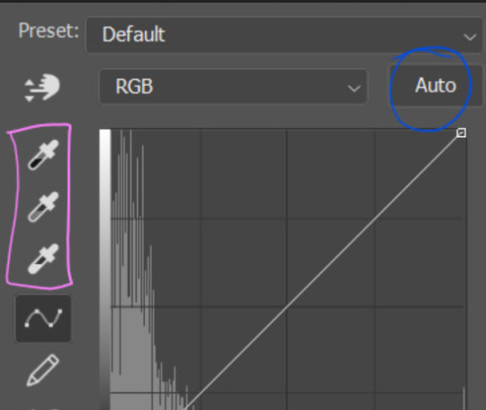
first I usually click the ‘auto’ button, just to see what happens. sometimes it makes a big difference (it usually brightens the gif a lot) - but on this gif it didn’t do much.
if it had made the gif look nicer then I would have kept it and added a second curves layer on top to do the rest of these steps.
the next step is selecting the white and black points with the little eyedropper tools.
the bottom eyedropper lets you pick a white point for the gif. click somewhere super light on the gif to see what happens - for this gif, I clicked on the lampshade on the left. if it looks weird, I just undo it and try somewhere else - it usually takes a few goes to find something that looks good.
here's what that did to the gif:

then I pick the top eyedropper and use it to pick a black point by clicking somewhere really dark, again playing around until I find a black point that looks good.
here's what the gif looks like after picking the white and black points:

this can take some experimenting, but you can make super easy drastic changes to your gif just with this. in this case, the curves layer took out a lot of that yellowy tint.
and this is what the curves graph looks like now:
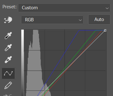
you can click and drag those lines to make further changes if you want - I usually leave them alone though. the colours of the lines indicate which colours have been changed in the gif - for example, you can see from that steep blue line on the graph that blue has been added to neutralise those yellows.
next I usually do another curves layer and just press the ‘auto’ button again to see what happens. usually it brightens the gif a bit more, which I like.
‼️if nothing is working: usually with a bit of fucking about a curves layer works well - but sometimes you can’t find a good white and black point anywhere, and instead your gif turns wacky colours and nothing looks good. this happens more often with very heavily colour tinted scenes :( the troubleshooting section at the end goes over some options, including starting with a levels layer instead.
✨ selective colour (and skin tone correction)
skin tones are made up of a mixture of yellow and red.
removing yellow (or adding blue or red) to a gif will make the skin-tones too red - and removing red (or adding cyan or yellow) to a gif will make the skin-tones too yellow.
adding blue to this gif with the curves layer took out the yellowy tint, which I wanted - but it also took the yellows out of Kim's skin tone, which I don’t want. so I need to put yellow back into the skin tones specifically - without putting it back into the rest of the gif.
selective colour layers let you select an individual colour and adjust the levels of other colours within that colour. you can change how yellow the green shades are, or how much cyan is in the blues, for example.
I need to add yellow back into the red tones to correct the skin tones on this gif. this is the case for most gifs in my experience - the vast majority of the time, unless a scene is very heavily tinted in another colour, a curves layer will add blue/remove yellow.
in the 'colors' dropdown, select the 'reds' section and drag the 'yellow' slider higher - this will add more yellow into just the red shades within the gif.

the amount of yellow you need to add back into the reds depends on how much yellow was taken out of the gif initially - I just play around with the slider until it looks right. if you're not sure, it helps to have some neutrally-coloured (not white-washed!) reference photos of the people in your gif to compare to.
here's the result. Kim's skin is a lot less pink toned and much more natural looking:
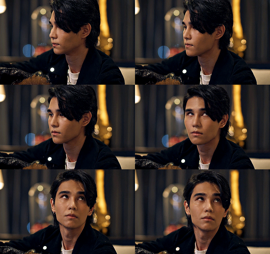
✨ hue/saturation
this adjustment layer lets you adjust the hue and saturation of the gif as a whole, and also of each colour individually.
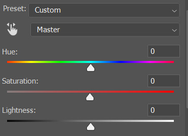
I don't use the hue or lightness sliders unless I'm trying to do something more complicated with the colouring.
clicking the dropdown menu that says 'master' lets you edit the saturation of each colour individually. this is useful if your gif is still super tinted in one colour.
I thought the yellows on this gif were still slightly too bright, so I switched to the yellow channel and desaturated them slightly. (remember if you do this then you need to go back to selective colour and add more yellow into the red skin tones to balance out the desaturation!)
then I increased the 'master' saturation of all the colours to +5:

I usually find the right amount of saturation is somewhere between +5 and +12, but it depends on the gif.
‼️if the gif feels undersaturated, but the saturation slider isn't helping/is making the colours worse, try a vibrance layer instead.
done!
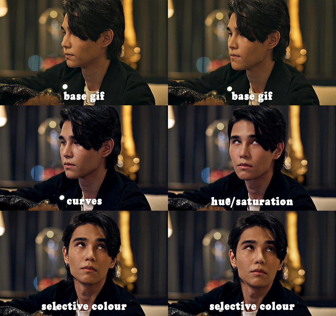
✨ saving and reusing colouring
you can copy and paste adjustment layers between gifs to make your colouring even across each of your gifs for one scene - so if you're making a set of multiple gifs of the same scene, or you think you might want to gif the same scene again in the future, you can save it as a psd so you can reuse the colouring again later.
each gif's colouring will then still need tweaking - different cameras/angles/shots of the same scene can still start out with slightly different colouring.
I recommend uploading the gifs as a draft post on tumblr so you can see what they all look like next to each other and catch any inconsistencies.
✨ another one! (speedrun!)
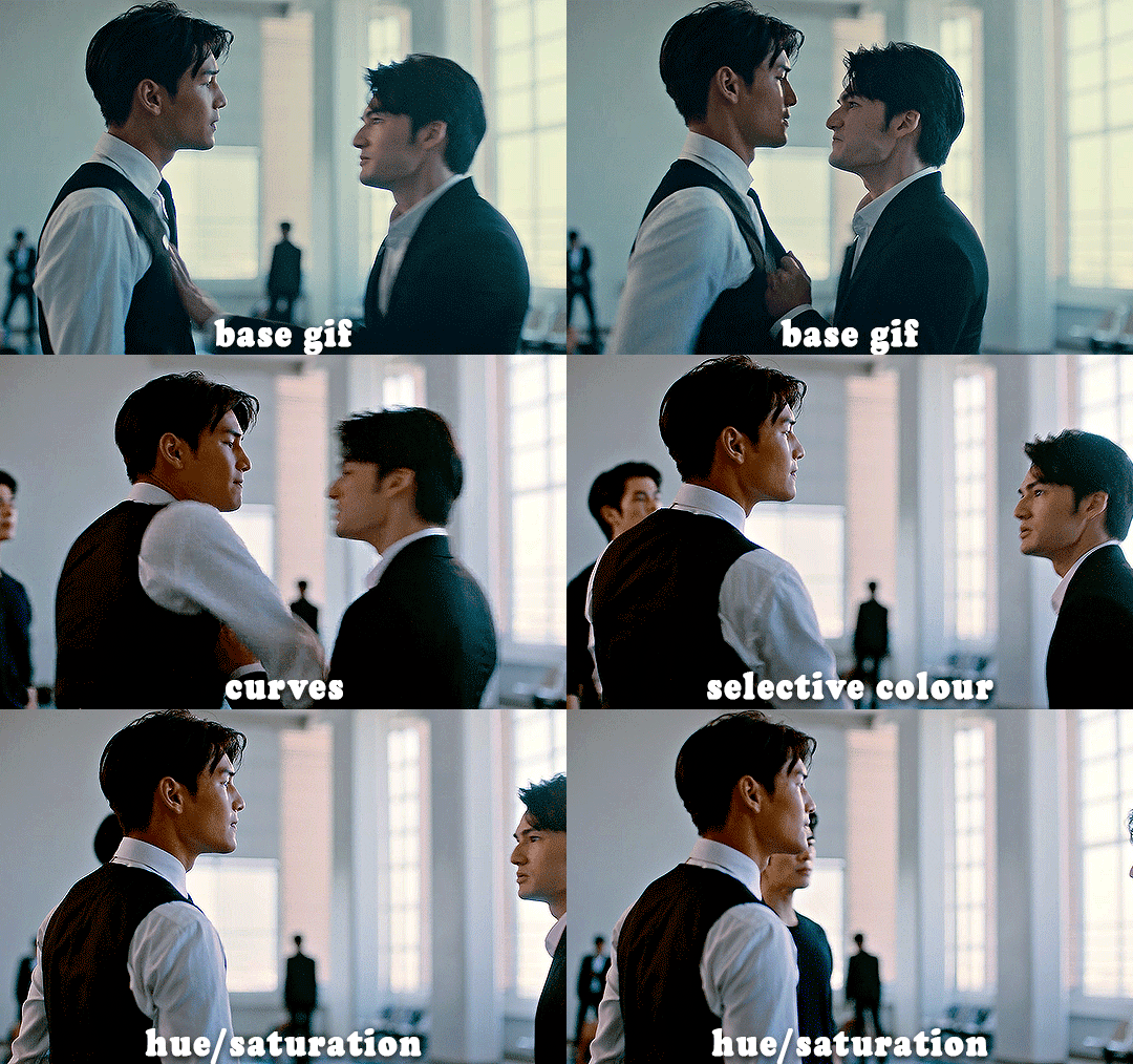
HI KEN!
the white point for the curves layer was in the window behind them.
the curves layer removes the muddy yellow tint, but again it makes their skin tones (especially Ken's) very red toned, which is adjusted by the selective colour layer.
3. other adjustment layers
imo many many gifs can be coloured really nicely with just those three adjustment layers, but some need different adjustments.
✨ brightness/contrast
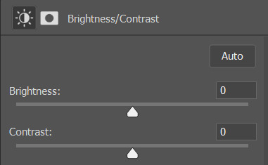
pretty self explanatory!
I personally usually avoid using the 'brightness' slider because I rarely like the effect - I only tend to use the 'contrast' one.
the 'auto' button is sometimes useful though, especially if you’re struggling with the curves layer.
✨ levels

levels alters the white and black points of the gif, like curves - but unlike curves it doesn't also alter other colours.
use the sliders beneath the graph to alter how dark/light the gif is. you can slide the black slider further to the right to make the blacks darker, and the white slider to the left to make the whites lighter.
levels is a good place to start if your curves layer isn't working.
(I'm going to hit the image limit for this post lol so here are some screenshots of a table I made to demonstrate this rather than actual gifs. sorry!)
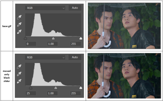

on both sides, I dragged the sliders up to where the big jumps are on the graph - this is usually a good place to start!
✨ vibrance
vibrance... makes the colours more vibrant. it's more subtle than saturation.
it's really helpful for gifs that feel grey. sometimes adjusting saturation just makes the greys kind of weirdly tinted, but a vibrance layer can fix that.
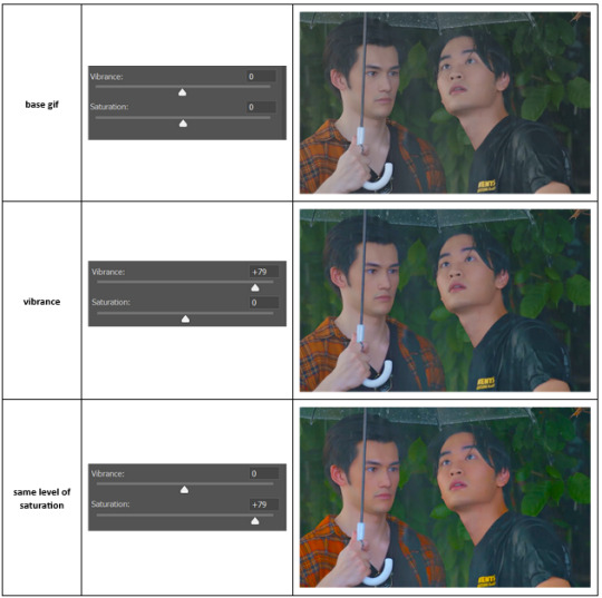
vibrance is much more subtle!
✨ colour balance
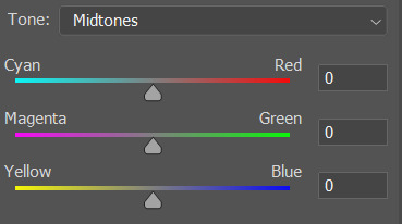
colour balance affects the overall balance of colours within a gif.
it's good for scenes with heavy tints.
I tend to stick to the 'midtones' dropdown, but you can also alter the colour balance within the shadows and highlights if you want.
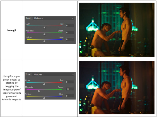

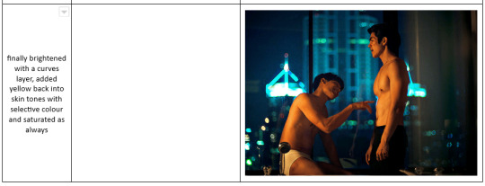
✨ channel mixer
I avoided channel mixer for such a long time because it scared me. but it's great for scenes that are very heavily tinted in one colour.
basically, it works with the levels of red, green, and blue within a gif. you select an output colour and then play around with the levels of the colour you selected within each other colour.
kind of the reverse of selective colour?
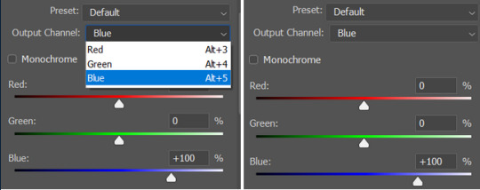
so in the 'blue' channel, the levels of blue are at 100%, and the levels of red and green are at 0% - but you can impact how much blue is in the reds and greens and blues.
this tutorial explains it well - but imo the best way to get to grips with channel mixer is just to play around with it a bit (sorry)
(when I made this guide for my friend, I also made a slightly more complicated gif colouring walk-through that included using channel mixer. there isn't space to include it within this post, but if anyone is interested I could always upload it as an 'intermediate' gif colouring tutorial - lmk!)
4. troubleshooting
‼️curves
usually with a bit of fucking about a curves layer works well - but sometimes you can’t find a good white and black point anywhere, and instead your gif turns wacky colours and nothing looks good. this happens more often with very heavily colour tinted scenes :(
for example, with this base gif:
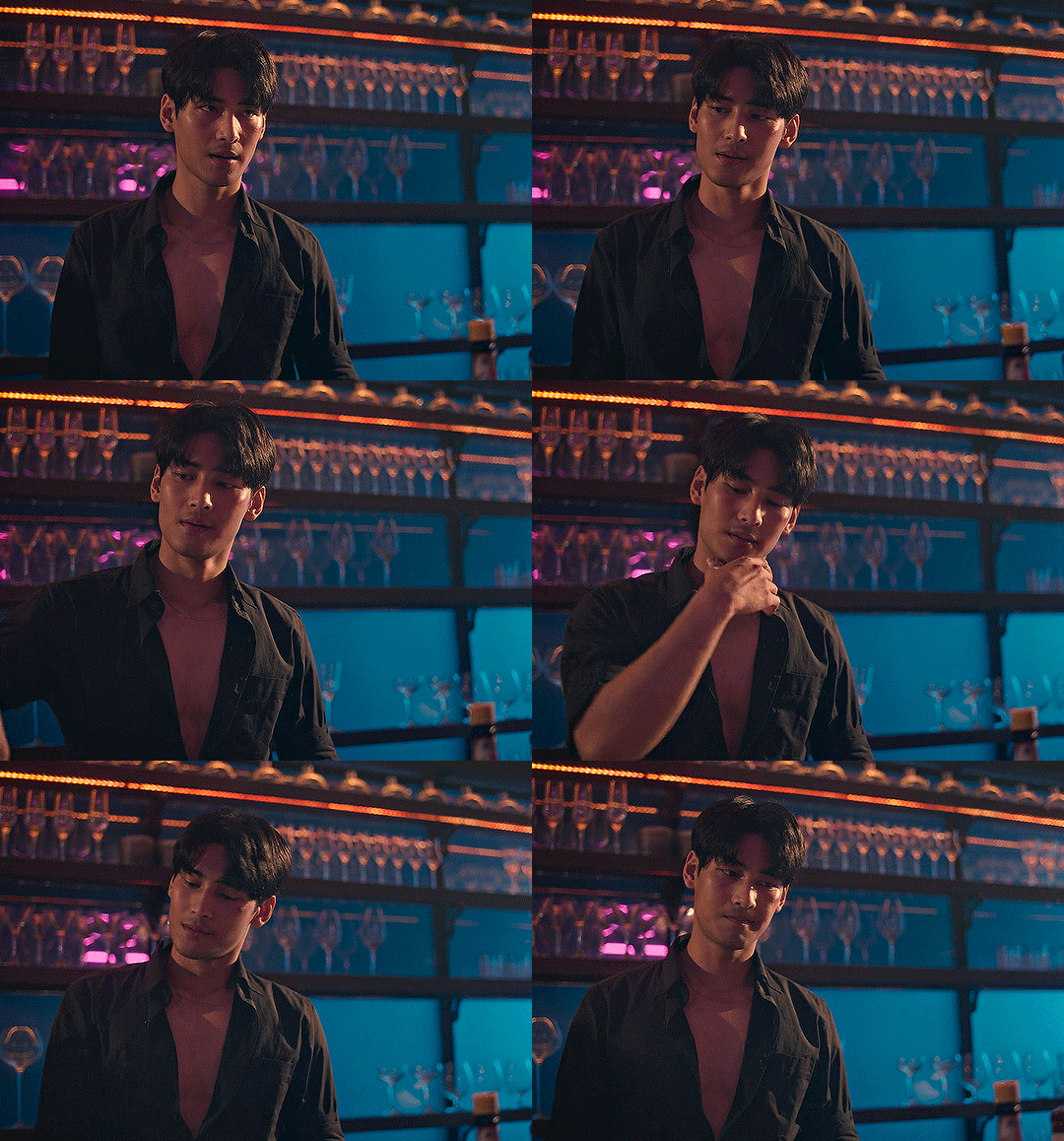
using many of the brightest points as a white point turn it wacky colours, like this:

yikes :(
some options for these cases:
try brightening the gif first with the 'auto' button on the curves layer or with a levels layer. having a brighter gif to start with can give you better options for picking a white point.
try finding an alternate, whiter/brighter white point. look for places the light reflects - on this gif, using the light on Porsche's cheekbone works well as the white point. it also helps to find places that would be white if the scene wasn't tinted - the lightest part of a white shirt is often a good place to start, for example.
skip the curves layer, and instead use a levels layer to alter your white/black points, and colour balance or channel mixer to balance the colours.
‼️over/undersaturation
if your gif (especially the skintones) is looking a little washed out or lifeless, it might be undersaturated. boost that saturation - or if that's not working, try a vibrance layer.
oversaturation is often easiest to spot in the mouths and ears of any people in a gif. if the mouths are looking unnaturally, vibrantly red, then you've gone too far with the saturation.
5. fin!
and done! I hope this was coherent helpful to somebody.
if there's anything that I've missed or that doesn't make sense pls feel free to shoot me an ask or a message and I'll do my best to help! I've also collated a bunch of additional reading/resources below.
happy gifmaking 🥰
✨ some links!
photoshop basics by @selenapastel
gifmaking for beginners by @hayaosmiyazaki
gifmaking guide for beginners by @saw-x
dreamy's gif tutorial by @scoupsy-remade (includes instructions on how to blur out burned-on subtitles or annoying video graphics)
beginner's guide to channel mixer by @aubrey-plaza
how to fix orange-washed characters by aubrey-plaza
colour correcting and fixing dark scenes by @kylos
does resampling matter? by usergif
how to put multiple gifs on one canvas by @fictionalheroine
watermarking using actions by @wonwooridul
resource directory by @usergif
#i got a couple of asks about this so i figured i'd type it up as a post#it's been sitting in my drafts for a while now though i'm so sorry omg.#i had to replace my laptop and it took me a while to get round to downloading photoshop on the new one#but i hope this is helpful!!#gif making#tutorial#photoshop tutorial#colouring tutorial#coloring tutorial#gif colouring#gif coloring#photoshop resources#gif tutorial#gif resources#userbunn#uservik#darcey.txt#darcey.gif#usergif
761 notes
·
View notes
Note
I have memory issues espec converning asks sorry if I've asked this before but how would Woodsy react if he met BFDI Woody
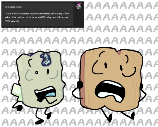
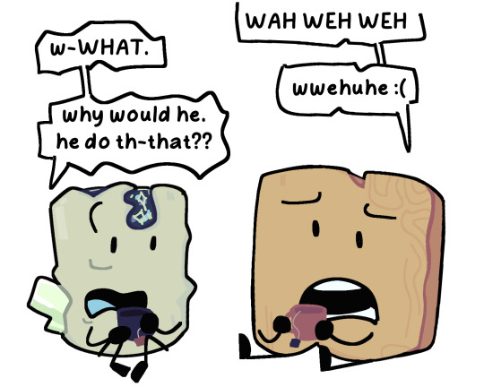
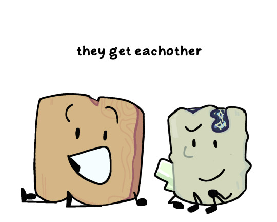
guys the similarities were. COMPLETELY. BY ACCIDENT. i saw petrified wood and was like "haha scared of everything would be a fun gimmick" AND THEN woodsy wasn't even supposed to be his name it was a placeholder and i got attached
genuinely forgot about woody's existence until like a month or two after making woodsy bro
#hope this doesnt get out of target audience but like YEA#they UNDERSTANDDD each other and they can like. help each other through their troubles#do you get what i MEAN!!!!#not a ship though#also hi guys fun fact woodsy is aroace!#object oc#osc#woodsy#gary woodsy asks#woody bfdi#i love their dynamic a lot actually
209 notes
·
View notes