#i also don't typically post a lot of my sketches
Explore tagged Tumblr posts
Text
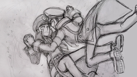
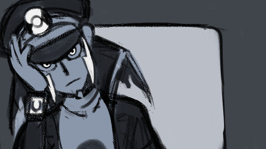
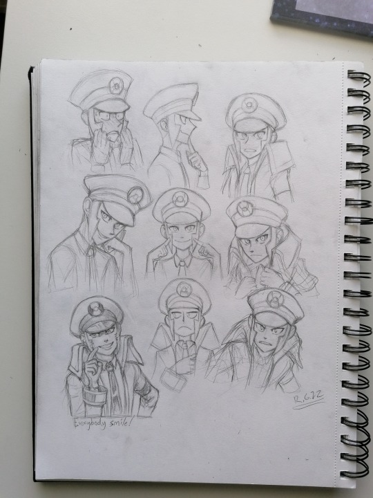
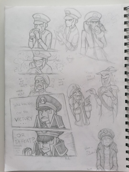
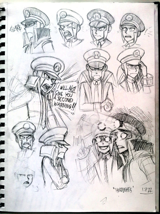
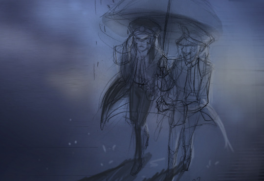
major spoilers for reverse: 1999, chapter 7: vereinsamt
also best understood if you've finished chapter 7! but with that all said:
(cw: suicide)


so anyways they make me sad :]
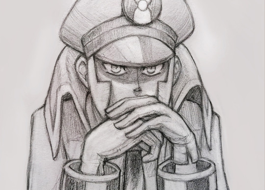
#kurikuri art#reverse 1999#reverse 1999 fanart#vereinsamt#reverse 1999 spoilers#vereinsamt spoilers#cw suicide#37 reverse 1999#sophia reverse 1999#210 reverse 1999#6 reverse 1999#6 is one of my favorite characters in the whole game btw#i read his backstory during 1.4 and the fucking FEELS#of Course i had to draw something angsty as shit with him Eventually :weary:#unrelated that one panel is the best 6 i've ever drawn tbh#i also don't typically post a lot of my sketches#but i wanted to share this and there's no way in HELL i'll have to energy/will to full color it all#so hi. here's how i normally draw things (affectionate) <3
40 notes
·
View notes
Text
I've had this in my drafts for months, and I just saw a post complaining about fan artists (while having the nerve to start out with, "I love fan artists so much but...") who draw characters this way or don't draw them that way, so I figured it was about time to share this.
You know that unwritten rule in fandom that says you shouldn't demand that fic writers cater to your tastes? "Don't like, don't read"? Here's a reminder that the same goes for fanart.
Sometimes, I see complaints that fan artists don't draw character A exactly how they look in canon/in a particular slice of canon/according to someone's specific headcanons. Sometimes, I see complaints that character A is being depicted, say, without enough body hair, or with the wrong body type, or as a different age than they appear in canon.
If you find yourself getting upset with fan artists over things like this, I hope you'll take a moment to:
mind your own business
consider how fucking hard art is
I think a lot of people who haven't spent time in the art trenches have absolutely no clue how difficult it can be to draw a human, period—let alone human features you haven't already practiced a million times.
This can be especially true for artists who don't have a lot of drawing experience. When I was a kid, I mostly drew women, so learning to draw more typically masculine features was a challenge, and it took me many years to even get okay at it. It takes a lot of practice to figure out how to draw a variety of facial structures, body types, hair styles, ages, etc.
For a example, I have never known an artist who doesn't think drawing children is a bitch and a half, and wrinkle placement can mean the difference between drawing something that looks like an elderly human versus a shriveled apple.
Simply drawing body hair can be very time consuming. You also have to understand hair growth patterns and direction and take into account if the person's body hair is very curly or more straight, etc. If I just want to do a really quick sketch, maybe I don't feel like spending 10-20 minutes adding body hair. Maybe some people don't like body hair so they don't want to draw it. Maybe some people have carpal tunnel syndrome or medial epicondylitis and the extremely repetitive motion of adding body hair to characters is physically painful. You don't know. And it's not your place to tell them they're wrong.
Fanart, just like fanfiction, is about drawing the things we like—NOT catering to what other people want or think we should be making.
So feel free to talk about how much you love it when fan artists draw characters in ways you like! But don't be a jerk by demanding people draw what you want, and don't put down those who don't cater to you. You can have all the personal preferences you want in fanart, but it's rude and entitled to force those preferences on others fans or act like you're a better person because of your tastes in the appearances of fictional characters.
#NEWS FLASH: ART IS HARD#please stop making it even harder for people who just want to have fun drawing their blorbos#if you want to see a character portrayed a certain way then you're welcome to try and draw them like that#art stuff#fanart#fan art#there needs to be a ''don't like don't read'' for fanart#don't like? keep scrolling#idk#dldr#fandom wank#fandom
265 notes
·
View notes
Text

THE ONE WHERE . . . I INTRODUCE Y'ALL TO LEO!
SOOOO…i have mentioned leo in like, 90 different posts atp and never actually made a "leo intro" (mainly bc i have weird feelings ab sharing him heavily to the rest of the world lol) but! i figured now would be the best time to get into explaining him to y'all.

LEO , commonly given the last name SCOTT (depends on the dr!) is actually originally the main character's love interest in a hockey romance book i've been in the process of writing. after getting #sickandtired of annoying ass book men i gave up and began drafting one of my own. the main character is literally me (i mean, for christ's sake her name is sloane mackintosh,) and eventually, i began thinking of him in other "au"s (i used to do this a lot on wattpad - i mean DRs but the term AU is usually more digestible to ppl that may not be aware of reality shifting. Anyways.) and began kind of placing him in everything. a list of the drs he is my love interest in is follows;
BETTER CR : (fc silasj2004*) the hockey romance book pretty much as a dr. small changes occur but basically he's the exact same as leo in the book lol
PARENT DR : (fc jack schlossberg. yes. i am one of those girlies. i am not ashamed! at least he has morals + a backbone y'all this could be much worse) the "backstory" is my better cr dr. i'm now a mother of 3 (amelia or mimi, aged 5, giselle or gigi, aged 4 and i'm pregnant with vincenzo, our final kid,) and it follows our life after what would be the events of the book. i sort-of made it also as like a WAG dr in a sense bc leo is a professional hockey player! (but he retires 2 years before this point in time so idk where my thought process is w this lol)
FORMULA 1 DRIVER DR : (fc pato o'ward MY!!!! mclaren man ln4 U ARE NOTHINGGGGGGG) leonardo dempsey, son of actor patrick dempsey (my forever celebrity crush ugh he's so fine) and driver for aston martin aramco f1 team under #99. i essentially took l*nce str*ll's daddy's boy backstory and gave it to leo bc he is indeed a daddy's boy. the only dr leo and i are enemies to lovers bc i'm too obsessed w him otherwise LMFAO
MARVEL DR : (fc marcello hernandez (MY MAAANNNN)) leo scott, secretly the speedster superhero 'comet'. hired by my dad as essentially a bodyguard (leo's not intimidating AT ALL idek how the hell this is supposed to work LMFAO) as comet and knows me out of costume as his sister's roommate (mj is also in every dr ever and actually is here in this cr. i can never leave her out i love her DOWN) basically marichat vibes (god i miss marichat)
POP STAR DR : (fc marcello hernandez, again) leo sinatra, nepo baby great-grandson of frank sinatra (there's a whole, incredibly large bit of lore ab this LMFAO + he's also a great-grandson in my better cr dr too bc i need my man RICH!) and Saturday Night Live cast member. basically i go on snl and immediately fall in love. i've stolen the 'unlikely couple' weekend update sketch for us & he does domingo, which is my song lol we're funny for it idk
THE FCS, in color photos:


i'm missing like, 18 other drs that i can think of but some important info about him;
he's half oaxacan mexican. i've tried my damnedness to find a way to make it obvious but when i was 'designing' him (aka drawing him out) i used jack, silas (*NOTE: he is leo's typical fc if i don't have an designated one for him) and marcello as references to make him look the most like him as i can. the fcs are kind of loose for him but i need a way to like fully visualize him. so. yeah. his 'color palette' (weird way to put it but idk how else) makes him tanner than all three of them i fear. all of the fcs i use (other than jack schlossberg but like. idk his main celebrity lookalike in the better cr is him so i kind of had to) are latino, but i feel like it never ever properly translates when i talk about him bc his name is fucking leopold scott. like. huh.
he's also tall AS FUCK lol and built like a tank lowkey (think tom welling clark kent GOOD GOOGLY MOOGLY) but it's mainly bc he's a hockey player. in every vers he's like. 6'3. shortest he is is w marcello as his fc and even then he's 5'11. (note in pop star dr he gets a lot of comparisons to jacob elordi for some reason??? idk my fans are weird)
he's got big brown baby cow eyes. every. single. time. like that is this man's defining trait and you know what? i would not change that for the world lol
his position in hockey is a goalie! he uses the number #29 and plays for our college and later for the new jersey devils before being traded to the anaheim ducks. after he retires he becomes a firefighter!!!! (which is sooo hot btw)
#mack yaps#(about shifting)#mackleo#reality shifting#shiftblr#shifting diary#shifting motivation#shifting things#shifting antis dni#mack's better cr#mack's parent dr#mack's f1 dr#mack's pop star dr#writeblr#writers on tumblr#leo is of course the mmc of the book i'm writing so#writeblr it is LMFAO
62 notes
·
View notes
Text
Music comms are CLOSED!! Check out the waitlist here!!
Ok y'know what, screw it. My brain seems to require three-four pieces at one time (genuinely cannot figure out why that is), and with the fact I only have two queued up right now and the game I'm composing for doesn't need any tracks at the moment, I'm getting composer's block again. So we're OPENING my music requests!!
I'm actually stunned at how many people seemed interested in getting a piece of soundtrack music for their f/o. I'm opening it to non-mutuals, and it's totally free! If you're concerned about paying/tipping for work, I'm always happy to receive content for my selfship, but I will not accept any money, and there's no pressure to tip content anyway. Again, this is for fun!

This is how it works:
Fill out this google form with the title of your ship, some songs you like, instruments, etc etc.
You can message on Tumblr or Discord (@/slipperson on Discord) on top of submitting the form too! I'll reach out myself once I get started on your piece.
I'll sketch out a draft, which is exactly like sketching out a basic pose for art - it'll typically only use piano/minor percussion. Sometimes I'll even give a simple concept before I flesh out a draft. I'll send it to you for approval.
If changes are needed, I'll refine the draft and re-update. If not, I'll go on to fleshing out the instrumental - this means adding instruments, changing volume (for example, in my first example, I used a lot of "dynamics"/volume changes to simulate the swelling of instruments). This is like adding the flat colors in a piece of art!
I'll send it to you again - I'll make changes upon your request, but if approved, I'll finally go ahead and mix the final draft. This means putting it through an audio program (audacity if you're curious!) and polishing the sound. This is like rendering the lighting!
After it's done, I'll send it to you for once last listen. Upon approval, I'll post it to Soundcloud, link it on Tumblr, and tag you in the post!

Important bits:
No comship/proship/aged up-or-down/RPF ships. Live action characters are fine as long as it's not the actual person. Familial/platonic ships are totally okay!
If you are a minor/ageless blog, I'm willing to write a piece for familial/platonic content, but not QPR/romantic.
Downtime is 1-2 months after I first open your request. I may finish it sooner, but no later than 2 months. This is because music generally takes awhile--30 seconds of music can take me 4-5 hours to concept! I also tend to work on 3-4 pieces of music at a time.
I will give frequent updates. Don't be afraid to reach out if you're curious on the status!
My work is never cleared to be used commercially or in AI programs. We're a bunch of selfshippers on Tumblr, so I know we all hate AI, but it's worth the mention. I tend to be strict on copywrite - it'll stay under my name, all rights reserved - however, you are free to use your piece wherever you'd like as long as it's not commercial use, used in a monetized campaign/video/form of media, and not used in AI.
I may put these tracks on a streaming service at a later date - not on Spotify, as the service is TERRIBLE with allowing their work to be remixed into AI. Something like Bandcamp or Soundcloud for Artists. If you are uncomfortable with this, please let me know.

Examples:
I will have my queue/completed list on my carrd here.
Thank you so much for your interest!! I'm actually so stunned I got so much love for this, and I'm excited to celebrate your ships with you!
heart border
#self ship#fictional other#yumeship#self ship community#silver musics#silver talks#SoundCloud#love letters 🎵
57 notes
·
View notes
Text
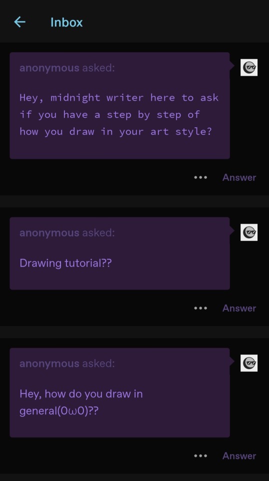
ok, i will do a drawing tutorial i guess!
first, i start with what i call the "exoskeleton" - basically a rough of the pose/anatomy of the character. i don't like to get too exact with it, so it's pretty rough. typically i just draw out the torso as one or two shapes and add arms and legs!
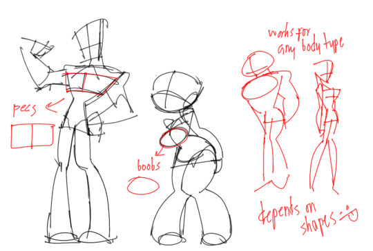
also, shapes typically change based on the body type/gender of the character i'm drawing. i tend to draw guys more top-heavy, and based on the chest size i use either a sort of rectangle or circles. but you can mix and match and do whatever! (i can do a full post on how i draw body types if anyone's interested.) but universal traits for any gender that usually show up in my art are long legs and "cankles"/larger ankles!
anyway, after the exoskeleton is done i draw the character sketch. then the lineart, which is sometimes just a cleaned sketch. i try my best to use lots of flowing lines to avoid "chicken scratch". like this:
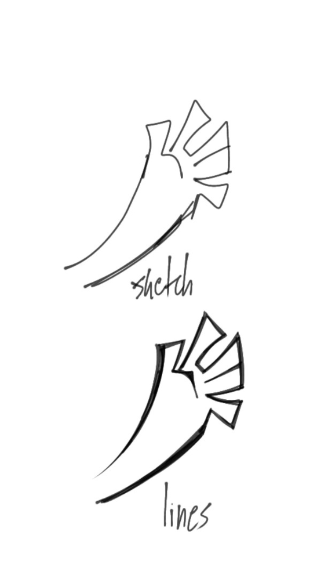
lines can be sharp or rounded depending on the character design. sometimes i don't clean up at all!
after that i put a solid color over the entire character and color off of that. like for rio, i used orange as the solid color - using a color that's in line with the tone you want the piece to have is really good for a cohesive pallete imo.
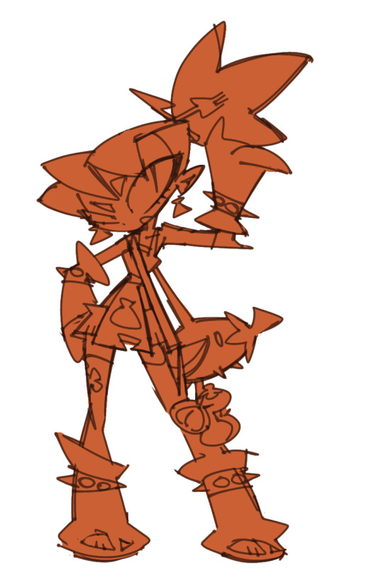
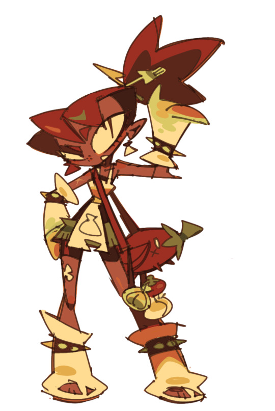
choose an off-white and use that for all of the whites of the piece, that also helps with cohesive-ness imo. using a group of 3-4 similar colors and 2-3 contrasting colors and building off of that is also good for larger pieces!
i would explain in more detail but i'm super lazy and tired and dumb, but if anyone asks any more specific questions i'm happy to answer :]
130 notes
·
View notes
Text
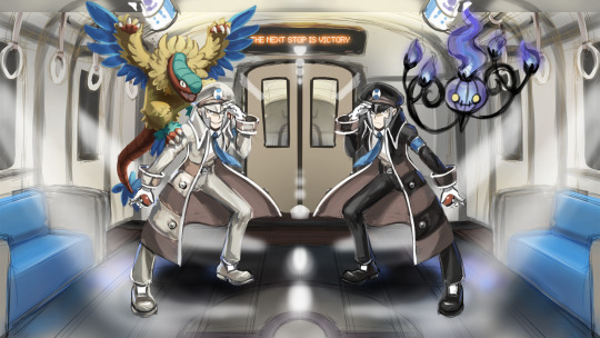
Submas sketchdump! Vol. 1
April-June 2022
Literally dumping all the presentable works as promised, whether I'm proud of them or not! This is where I started, even before the first thing I posted online (That subway station one). Many of these are not on Twitter yet so there's lots to see!
The top piece above the header is my very first digital Submas artwork!! I never finished it bc I didn't know how to pull my vision of as I wanted & started modeling the train and didn't finish that either, whoops! I really want to remake this later and make it super cool!
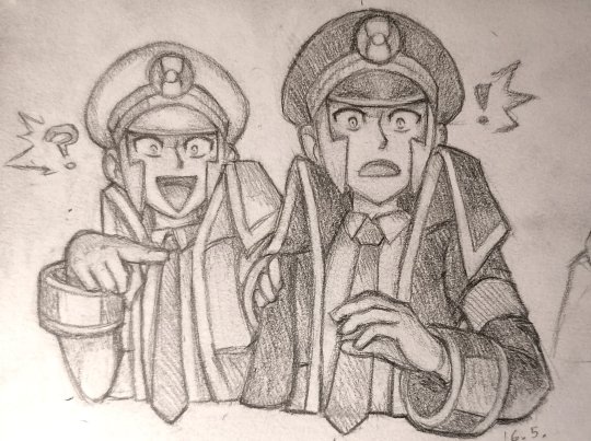
^^^ My reaction to breaking 500 likes & 100 followers in a single day with my first tweet (the battle subway one) all the way back in May!! I was completely floored by all the attention, oh how it skyrocketed my excitement and anxiety! Crazy times, I was so super nervous to be there with so many amazing artists and doubted if I could ever survive there ahahah!! Many had joined the community much much earlier than me, so I had arrived with a late train to PLA/neo Submas hype!
Next up is a bunch of stuff I haven't posted before:

One of my fav sketches! Been saving this for so long bc I really really want to finish this one day!
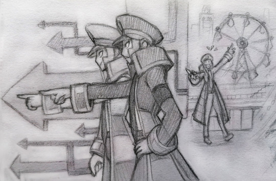
One of the first submas sketches with an actual story behind it! The subway bosses are running late for their flight because they didn't pass the safety check! The irony!! This would never happen as bosses are always on schedule. But Emmet hadn't noticed a wild Joltik hiding under his coat, so he set up the alarm and they got examined and interrogated of smuggling! How embarrassing for them! The bosses resolved the situation by catching the Joltik, but will they be able to catch their flight anymore?? Maybe if Elesa can distract the stuerts performing the safety protocol for a minute!
More sketchbook stuff...
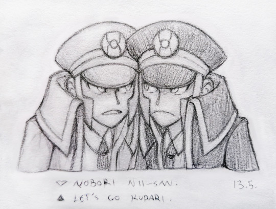


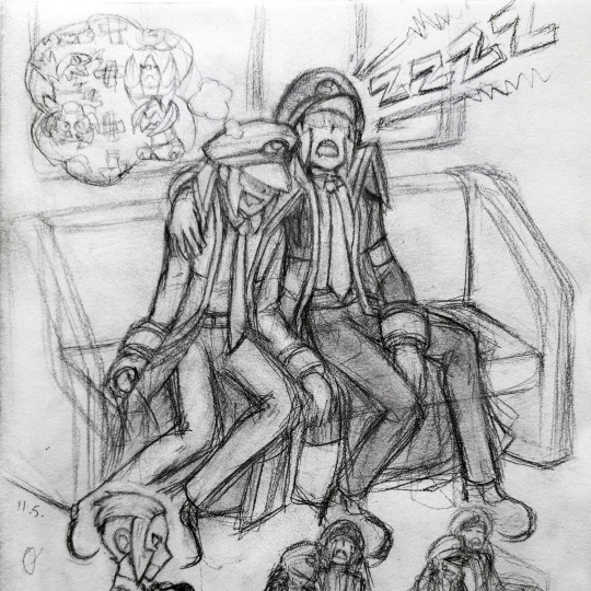
In case you can't make any sense of it, Emmet's dreaming of different combinations of pokémon. Meanwhile Ingo snores louder than the train! HONK SHOO!
Top 7 every submas fan draws at some point!
Submas trademark posing
submas sleeping in a train
sad Emmet
Emmet with Joltik
Ingo with a cool solo pose
Emmet being chaotic & Ingo reacting to it
a bunch of mirrored submas poses
I sure have a full bingo card lmao, most of them you can see here XD
Next up is a sad man...

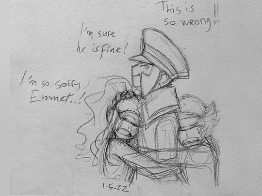
Stay strong our friends!
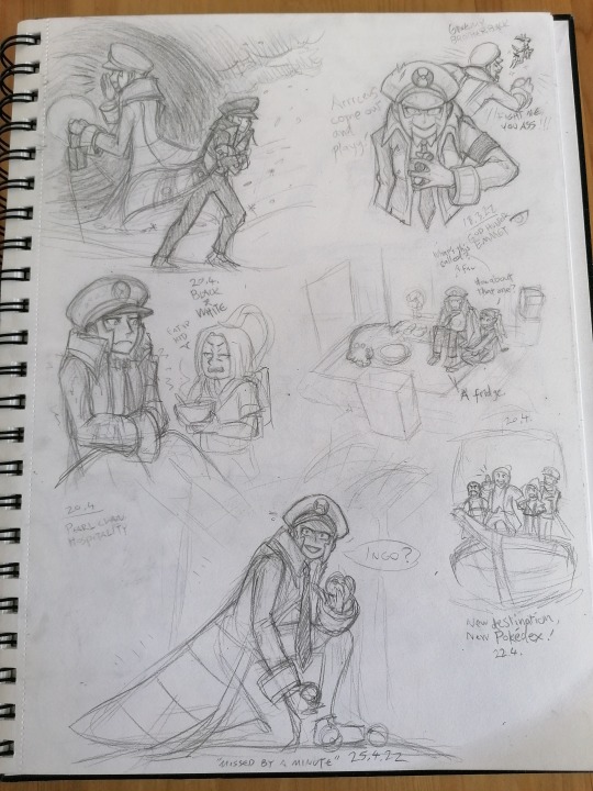
My typical sketchbook pages, crammed and messy as usual. x)
Post-PLA exploration:
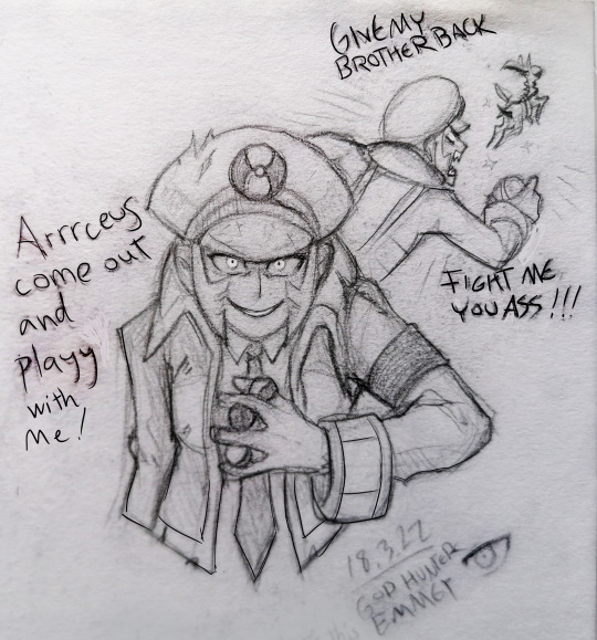
A few examples of how my pencil sketches evolve.

I've done so much art experimenting with submas. I really like this black & white painting but I don't think I'll finish it anytime soon.
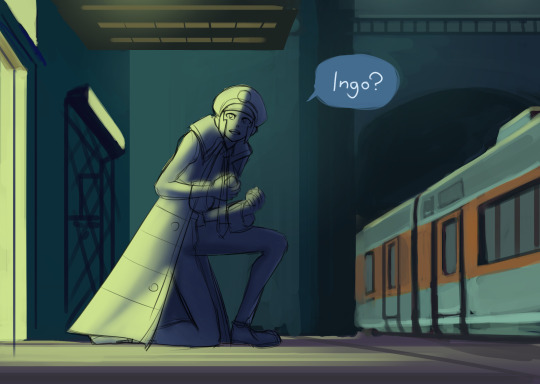
Where did you go?
The way I draw the twins' faces has changed a lot. They started with softer features and somewhat neutral emotions, because I wasn't as familiar with them or comfortable drawing them yet. Now there's hundreds of submas sketches, and they still keep evolving! My style is also kinda hard to pull off well, so their features differ from picture to picture.

This one was inspired by some submas music videos, can't recall their names anymore. The glowing eerie eyes and yellow&orange + black&white color schemes were neat!


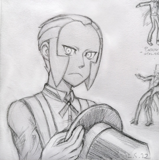
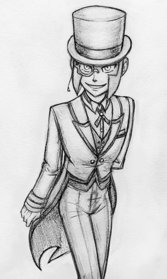
I keep telling myself I need to draw more butlers, these twinks look so lean and neat and have more color and are posh with their monocles and have fun tailcoats!
(...why eyeglasses are not called binocles??)

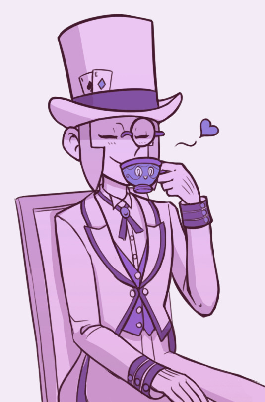
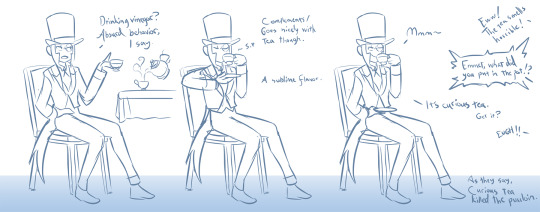
I was there for the vinegar chaos. Good times!
That's all for now, I hope you got something fun out of this! Still got loads more art to share but I'll save them for another time. Next round I'll bring in my first submas comic!
#submas#sbms#submas ingo#submas emmet#pokemon ingo#pokemon emmet#subway boss ingo#subway boss emmet#ingo and emmet#sketch dump#chandelure#archeops#sinistea#submas butlers#butler ingo#butler emmet#too many ideas#butlermas
1K notes
·
View notes
Note
How long do you typically spend on a drawing? Of the ones you've posted, which took the longest? Which was the quickest?
It really depends on what I'm drawing and how "finished" I do them

For example these kind of skectches don't really take me much time to do (specially when the poses are very simple), I can do a bunch of these in a few minutes no problem, then there are the ones when I add grayscale or colors that take a little longer

Then there is this kind of drawing that are finished with lineart, colors and shadows but each of them took me a different amount of time
The Gemini one took me hours to make (how many I dont really remember) I spent a lot of time on the sketch mostly because I was trying to figure out how Leo's arm worked, then spend around 3hrs doing lineart and chossing the base colors, and I had to do it twice because...
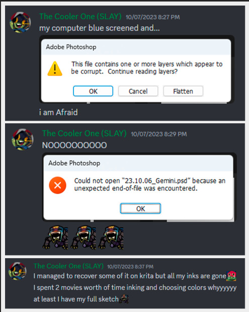
reasons...
The bottom left with Coin Toss Michael, took me less, even when it was a challenging pose I managed to figure that out quick enough, the most time consuming part were the chains because I hand drew them. I don't remember how long it took me to do but I did it in one or two sittings, probably took me aorund 5 hours to make (and maybe thats too much, might have been less)
And the bottom right was a fast one too, probably managged to do it in under 3 hours (I think the hardest part was to match proportions with Trainee that is cropped out)
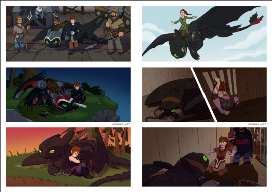
And then there is things like this, I actually have the proccess recorded (minus the sketching and planning) and can tell you that it took me around 15 hours to make these two pages (I might one day edit that and make a speed draw)

But again, it really depends on what I'm drawing because this commission (that aparently I haven't posted yet) that I also have some of the proccess recorded, it took me around 2:30 hours to do inks, colors and shading
Most of the time I dont really time myself, when I know more exact times are when I record my screen for future speed draw videos (that I always forget to edit) or because I was watching something in the background so I know it took me X amount of movies or episodes or youtube videos so... ¯\_(ツ)_/¯
Oh! there is also this lil animation I did that took me 4 hours, I only know that because it says so in my tags
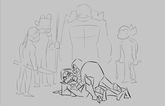
#hmmmm i should edit those videos#i have more that i thought saved#might do it for my patreon soon#anyways hope you enjoyed the info dump#dg rambles#dg asks#dg art
173 notes
·
View notes
Text
Uniquely recognizable
a post on making fantasy people species that stand out but still feel enough like their mainstream counterparts that your audience won't get confused.
Like me, a lot of you want to use the standard fantasy people in your projects. gnomes, orcs, elves, goblins, dwarves, etc. But you don't want to use the same old typical designs you see in every fantasy roleplay game, movie, show, book, video game, whatever. Those designs have become iconic and ingrained in the common understanding of what those fantasy people are supposed to look like.
But it gets tedious, doesn't it? Sometimes it feels like the only difference between elves in different media is the size of their ears. Sometimes it feels like every fantasy people group is designed to be as close to human as possible and then their fantasy traits are just an afterthought. You're tired of it! You want to do something new!
But where is the line between a unique looking elf and a personally unique fantasy people that need their own name? How far can you alter the standard orc before it stops being an orc? And what are gnomes, anyway?
in this post, I'll be showing off a few of my own fantasy folks and talking about the balance between a recognizable design and a unique design. Including one of my own folks that began as something typical and gradually became something else, until I had to come up with a new name to avoid confusion.
first up: Goblins! what are goblins? if you asked a handful of random people, what traits would they consider the most typical of a goblin?
small, usually green, big ears, lanky limbs? frequently a large nose, sharp teeth, and yellow eyes? those are all common traits for goblins in media across the genre. here are a few sketches of easily recognizable goblins: (including one of my favorites, the goblin design of @pocketss)

(image description: three sketches of goblins. The only one directly labeled is the pocketss goblin, which is very small, has a round head and thin pointy nose, and large leaf shaped ears. it is wearing a little coat. the other two goblins are more typical of fantasy roleplay and video games, having large noses, crooked ears, and short bodies with long arms. one of them is wearing a mechanic outfit with overalls and goggles. the other is wearing a hooded rogue outfit. end description.)
these are all different from each other, but they're similar enough that you could glance at any of them and say "oh that looks like a goblin!" You've probably even seen similar goblin art from other tumblr artists, or your favorite fantasy media.
so now let's look at how I draw goblins:

(image description: a frog-like goblin standing in a cheeky pose, leaning on an invisible surface of some kind. They're nude, but have no external sexual traits. Their belly is a pale yellow while the rest of their body is light green with darker green stripes. They have a round face, yellow frog-like eyes, a small nose, long whiskers, and big bat-like ears. next to them on either side are lists of traits that are common for goblins in fantasy media, contrasted against the more unique traits of this goblin design. end description)
this is one of my fantasy people that I consider the most recognizable. They've got a lot of standard goblin traits! green skin, yellow eyes, sharp teeth, big ears, lanky limbs, and they're rather small. On the other hand, they also have several traits that make them stand out from the common depictions of goblins.
They're amphibious, they have whiskers and a frog-like vocal sac in their throat. their skin comes in different colored patterns like real life frogs. and they're also hermaphrodites in the scientific sense. my goblins don't have set biological sexes from birth. they change between laying eggs and producing sperm based on various environmental factors.
But I think it would be hard for anyone to take a glance at this design and not recognize it as a type of goblin. it strikes a pretty good ideal between the typical and the unique, in my personal and somewhat biased opinion.
Moving on from this, let's look at my depiction of gnomes. They're kind of on thin ice with that title, I don't think they're as easily recognizable. But at the same time, I'm not sure I can come up with an alternate and more fitting title. Gnomes are weird. I see them depicted in only a limited handful of ways in mainstream fantasy, and far more varied ways from independent artists. Gnomes come from a mythology where their name could have referred to several small fae things, or been easily exchanged with other small fae things and similar creatures. The most common depiction of them is probably the garden gnome, which has little in common with how gnomes are depicted as a playable race in roleplay games. but here are three ways I usually see them depicted:

(image description: three sketches of gnomes. the first gnome is labeled "dwarf lite" and resembles a short humanoid with a sturdy body, pointy ears, and a short thick beard. they are wearing a pointed cap and a durable work outfit with gloves and boots. the second gnome is labeled "mousey" and resembles a small humanoid with a hairy face, larger semi round ears, and a long skinny tail. they also appear to have small claws on their fingers and toes. they're wearing a collared shirt, vest, and simple pants. the third gnome is labeled "elf hobbit" and resembles a short humanoid with pointy ears and long hair, wearing a cloaked adventure outfit. end description.)
common gnomish traits include a larger nose, pointy ears, some form of facial hair, and a short torso with somewhat longer arms. The most common versions in mainstream media are the "dwarf lite" and "elf hobbit" versions, like no one can quite decide if gnomes should primarily be tinkerers or spell casters, and which role they're depicted with determines whether their design is more dwarf-like or elf-like. But the mousey with a tail gnomes are more common from independent artists. It reminds me of some illustrations of the Borrowers, and I do wonder if the artists had them in mind.
here's my gnome design:

(image description: a gnomish woman sitting casually and looking upwards with a smile. she has a pig-like snout and ears, as well as four-digit hooved hands and feet, and a stiff short tail. she is wearing a wrapped head scarf over her hair, an off-the-shoulder shirt, and long pants with a climbing belt. on either side of her, there are trait lists comparing the expected gnomish traits with my own different gnomish traits. end description.)
My gnomes do match the concept of being small, agile, magic using folks with a prominent nose. But mine are also not as small as typical depictions of gnomes, and I've gone the porcine route to connect them with my orcs rather than leaning into the typical dwarf lite or elf hobbit depictions. I would not expect every new viewer to see this design and say "oh, obviously that's a gnome." because the pig-like traits are very atypical for depictions of gnomes. But at the same time, they have enough in common, and gnomes are varied enough in other media, that it doesn't take too long to adjust the audience view so they accept this as a gnome. at least I hope it doesn't lol.
and finally let's look at a fantasy people design where I got too into my unique ideas and had to rename them because they just lost the most recognizable traits of the original thing.
I will admit that in middle school I was a Twilight fan and I thought the vampires in that series had a lot in common with elves, so I decided I also wanted elf vampires. Cringe, I know. But the elf-vampires kinda got away from that origin as I built up my world and characters, and I just couldn't keep calling them vampires! I had to think of a new title. But I also didn't want to work too hard at that new title, so I just took some letters out of "strigoi" and I'm going to say it shares in-story linguistic origins with the word "drow", so both of these groups were named after an old elvish term for "those who live below/ in the dirt/ at the roots". Stroi and Drow almost sound kinda similar. Close enough to claim linguistic drift, at least! So they are vampires no more, and I am quite happy with how they fit into my worldbuilding.
for comparison, here are a few typical vampire designs:

(image description: three bust portrait sketches of different vampires. First is an undead human, looking like a common human man wearing a coat, but his eyes are red and he looks very tired. second is a nosferatu, who is bald with crooked pointy ears, a sunken face, and big sharp teeth and clawed fingers. he's wearing a dark robe. third is the fantasy dracula, looking more similar to an elf with sharp teeth and red eyes, but his features are more angular and he has more facial hair than the typical elf design. he is wearing a fancy cloak. end description.)
and here's the elf-cousin stroi that just stopped being a vampire a very long time ago:

(image description: an elf-like man with curly red hair and a long tail. He is standing on his toes. His outfit consists of a simple pair of pants, a shirt with a broad neckline, and a slouchy square cardigan. on either side of him, there is a list of common vampire traits and a list of stroi traits. end description.)
vampires are typically some form of supernatural immortal being, usually undead, often having fangs and venom and special weaknesses. They usually have magical powers like shapeshifting and entrancement. They pretty much always survive on a diet of blood and nothing else and they're generally nocturnal.
when I created the stroi as vampires at the start, I designed them as blood drinking elves who came from a cursed bloodline, all descended from some revived dead warriors. In concept, this is a pretty cool idea! but as I got more and more into speculative evolution and fleshed out my world and characters and all my story ideas, I ended up changing a lot of details for these folks and eventually they just no longer resembled vampires! I don't think a single person would look at this design and think "that's a vampire". no, they're more likely thinking "that's a funny looking elf", and they're right.
my stroi are living creatures in a perfectly normal way, though they have long lifespans. Unlike the elves, they live on the ground and are primarily carnivorous, so they do have sharper teeth and they do consume blood as a result of consuming raw or less cooked meat. They are not strictly nocturnal or diurnal, taking their own shifts to be awake at different times of day, taking oddly timed naps as all carnivores do. They can use magic, like anyone in my setting, but they have no powers unique to them, and certainly no special weaknesses. They don't even have venom, unless you count normal mouth bacteria. So you see, they just don't share enough traits with vampires to justify the title. People see the word "vampire", and it gives them some very particular expectations that my stroi simply cannot fulfill. Their lore has changed too much.
and sometimes this is necessary for the creative process. coming up with a new title for your fantasy people when you realize they no longer fit their origin can be very difficult! but it's so much worse to keep clinging to that origin and trying desperately to maintain the traits that people expect to see even though it doesn't work for your project anymore. I couldn't even stick with my idea that the stroi could still be vampiric if they were brood parasites for the elves. it's another cool idea, but it doesn't fit what I'm writing at all.
Learning to let go of your old ideas and move forward with the new ones is an important skill. Maybe you really really wanted to have elves in your story, but you leaned so hard into some new traits, got invested in all of that, and months or years down the road you look back and realize your elves aren't so elf like anymore! you wanted them to be wolf-like, but you got so excited for your wolf-elves that you ended up with something else entirely. it happens! and it's okay to let go of the elves and move forward with your awesome wolf people. maybe you just have to go do some research on wolf people in mythology now and figure out if there are any other non-werewolf creatures you can take the name of and use as further inspiration to flesh out your wolf people. or maybe you'll have to come up with a whole new title from scratch.
the most important thing to remember is that you should be enjoying your creative process! whatever that ends up looking like.
49 notes
·
View notes
Text
Some comm/patreon changes!
I've already talked about this extensively on my Patreon mainly, since this focuses on my Patrons primarily. But I might as well make a post about it here for future Patrons/Commissioners! For the longest time I've had a lot of confusion regarding the difference between my colored sketches and my complete fullbodies other than price. This is partially my own fault lol, I tend to put too much effort into my pieces regardless of sketches or fully rendered pieces. Initially my colored sketches did have less quality when I first started out, so I priced them less, but as time went on I perfected my craft and now both versions take the same amount of time. My colored sketches at this point don't have much difference from the complete fullbodies in terms of quality, the only difference is the lineart brush I use lol. Because of this it led me to taking too much time on pieces and getting burnt out more often, making people wait too long on their rewards/comms. So I'm effectively making sketches real sketches again, and gonna stop tryharding lol, and in by doing that, my other typical commission options are also getting changed. The price of my Patreon rewards aren't changing since they are already discounted to begin with, but I am lowering my normal commissions to match this! I've opened up a bunch of slots for a lil bit of wiggle room with rewards, but these go into effect as of now! It won't charge you until the 1st of October tho so it's a good idea to reserve a slot now ahead of time if you wish to grab something! :3 https://www.patreon.com/marbelle And then even though my commissions are closed/thru Patreon only atm, if you are curious just to look here is my commission page! https://marbelleblog.wordpress.com/ Here are some examples of what I'm talking about, old to new style;


29 notes
·
View notes
Note
Hiya!!!! Just wanted to pop in and say I LOVE your art!! You're an incredibly skilled artist, and I desperately wish I had better connection on tumblr so I could look more closely at your designs
I actually had a couple questions! Feel free to not answer if you don't wanna, but they popped into my head as I was scrolling through your art ^^
What's your design process like?
I've noticed a very high interest in SeaWings and especially with your Moray and Shark designs, I was wondering if there were any fish you really want to incorporate into a design but haven't had a chance to yet?
Your pinned post mentions a long list of marine life - could you explain that list a bit more? What leads you to putting something on the list? Is it in a specific order? What are a couple of your favorite entries and why?
Thanks for sharing your exquisite art with the world - I look forward to seeing more!!!
Urgh I wish I could say I had a proper process but I'm a little all over the place. Generally I tend to follow these steps when conceptualizing WoF characters:
a. Read up on that specific character, usually by skimming through the books/reading the wiki. What is the most basal information I can work with. For Listener, I know she is tall, curvy, and looks like a successful hunter. She's got some spunk and spontaneity to her character, although she's occasionally ignorant and air-headed. In the end, she's a devoted friend with a strong sense of justice and empathy. At least, that's my reading of her.
b. Start sketching! Play around with shapes and motifs. What does this character feel like to me? What color are they if that's never been specified? What shape are they? What sort of theme do I want them to have? Can I incorporate their name into their design? How does their personality reflect their visual appearance? Translating personality traits into physical ones is a "whatever feels right" sort of deal for me. Listener felt loose and round to me and I wanted to give her a tom-boyish look with some little quirks that I felt made her endearing and lively. This is also where personal headcanons come in. Now Listener has the equivalent of a dragon bob-cut. Now she has buckteeth, a snub nose, and hey- her name is Listener, so why not give her big ears?
c. Clarify and refine. The original sketch is typically a huge mess of gestural drawing so I'll go over it/redraw it a few times and clarify any details I might have skipped. Sometimes I try a different pose or expression to see if it still looks alright under different conditions. Maybe I flip the canvas lol. I might end up changing minor aspects of the design at this point, or scrapping it entirely if it isn't working. For Listener's design I clarified the shape of her snout, ears, and shrunk her earrings.
*
2. Yeah I've drawn a lot of SeaWings by this point, lol. I'd like to say it was a coincidence, but maybe my subconscious would argue otherwise. I think it's because all the SeaWings have such large named families consisting of prominent characters, so if I draw one, then I feel compelled to draw their mother, or brother, etc... As for what fish I'd like to base a SeaWing on, I have no idea! I tend to, rather uncreatively, base a character's design off their name. Although, I've been working on a Indigo design with betta fish inspiration.
*
3. OH BOY, the List. The List is actually a Google slideshow I've been working on and off of for the last five years. It's a list compiling aquatic organisms (extant or extinct) that I find strange, whether it be due to their appearance or behavior. Think animals like cookie cutter sharks, giant isopods, stoplight loose jaws, and siphonophores. If it looks weird or does weird things, it's going on the List. I've always had a fondness for unusual sea creatures, and I love to make organized lists! The List serves no actual purpose beyond my own amusement. It's arranged alphabetically and each slide consists of a name (common and scientific), a photo or two, and a brief description of the species and any explanation for their unusual appearances or habits. It's very informal, but I'm working on tidying it up and adding actual scientific information rather than a funny quip from me. Most slides only feature a picture and have yet to receive a thorough description. There's currently 346 entries so it's hard to pick a favorite, but here's some highlights:
Fried Egg Jellyfish (Phacellophora camtschatica) It looks like an egg. It's great.

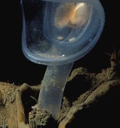
Predatory Tunicate (Megalodicopia hians) Most of it's relatives are vase-shaped filter feeders, whereas this one is anything but.
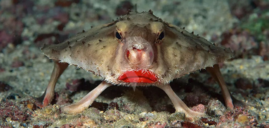
Red-lipped Batfish (Ogcocephalus darwini) Just look at this thing. Who put lipstick on it.
*
Annnnd that's about it. Sorry for the long posts, I have no idea how to be concise! Thank you so much for the kind words! It's honestly surreal to be here.
19 notes
·
View notes
Text
This post is primarily meant for all the doubters, naysayers and people in denial who ganged up against me when I first declared my suspicions that wannabe Malfoy revealed on @candlelightgames' Instagram post might be AI generated.
I will point out some of the most obvious signs of AI usage after the break but first I want to quote Owen Wilson: "Wow!" Usually half the AI image detectors fail to do their job, but never before have I seen such a unanimous decision - all 7 out of 7 online tools that I managed to find are saying that the Project Spellstruck's first character art is most likely AI:


Now, onto the analysis. People are still expecting clearly visible errors from generated images, such as irregular amount of fingers or something going through another object, but AI has come a long way and it's becoming harder to point out obvious signs without focusing hard. It's even able to create a vague resemblance of symmetry and repeating elements. AI generated art isn't often published "straight out of the oven" either. Artists-prompters make the AI do a lot of inpainting and add their own little touch-ups until the images are more or less presentable. A character has 16 fingers? Just mark the problematic area you want to be regenerated, maybe even make a rough sketch over it and then have the program do its job again. Even Bardick's design evolution, CL has demonstrated, looks very similar to the typical AI-assisted workflow I just described:
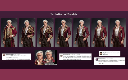
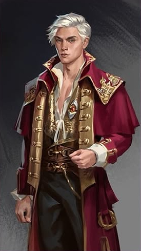
It's hard to put into words what makes art feel and look AI, but don't worry, doubters, I can also point out some strange elements that strongly hint at this character art being largely made by AI.
Below is the highest quality image I could get, so you can come back to it and zoom in if you want to see the clean version without my scribbles:

The coat's lapels
In the corner of the left lapel there's this triangular piece:

Whatever it's meant to be, it's a single solid object and not nearly as incoherent as what's happening on the opposite side:

The triangular shape seems to be made up of 3 disconnected sticks and the ends of the golden protruding lines that flow into that corner, become intrusions, although they don't line up very well either. Try to explain what the artist was attempting to do here. It's a very clear example of AI making up some fuzzy incoherent details. No need to find any further evidence really, but let's move on.
Occasional double vision effect around the edge of the golden hem, creating parallel running lines (a typical thing I've noticed image generators tend to do):


The pants and belt
That wobbly dotted line is the edge of his pants:

I've also traced the lines of the belt buckle, so you can see exactly how much it makes sense upon closer look. Not a lot, right? Also, the prong melts into the buckle, doesn't even go through the belt's hole and there's more fuzzy scribble around it.
Shadows
The shirt's collar creates shadows to both sides of it:

The lighting source seems to be behind the guy as the corner of the collar is further from the viewer than the shadow it casts:

Some other shadows are suspicious as well but not so obviously bad to confidently demonstrate them.
This is not an attempt to turn anyone against AI, but merely an analysis to show the most obvious signs that this dude was probably more or less generated by AI. If you like this kind of artificial art and are fine with Candlelight or any other studio/artist using it, then I won't stop you from enjoying it. If you have a hard time recognizing AI art then I truly envy you, ignorance is bliss as the saying goes. However, please don't come to proudly demonstrate your ignorance and argue with me or even worse, try to make fun of me because you think I'm wrong in saying that this character art was generated with AI. As I've now proven, it most likely is. It's too early to turn into an overprotective fangirl over a project we still know barely anything about.
#Thanks for coming to my TED talk#No wonder neither brother Shvarts wanted to answer my questions on AI#I hope it turns out to be just concept art but for now this game isn't worth any more of my time#If CL plans to release the game on Steam then AI generated content must also be disclosed there#CL is still welcome to prove me wrong by demonstrating how everything is professionally in separate layers in the PSD or similar file#candlelight games#project spellstruck
19 notes
·
View notes
Note
your pirate au is everything, I just discovered it and. my heartttt </3 /pos your art style is incredible too, the way you draw hair and your design for Pearl's wings are both just. woah. mind blown. gorgeous.
Just want to point out a few things I love!! :)
The quotes from the sketches page: "how do you reunite with someone you thought was dead" <- MY HEARTTTT "almost died" "wings are clipped"
That one instance [screenshot from this post below] of Grian's eyes being depicted as purple after he joins Scar's crew (and presumably whatever incident left him almost dead/"injured and unconscious"), as opposed to the brown they were as a kid? The strong implication that something (or someone? the watchers perhaps? I'm assuming it's something to do with the old crew that took them in as kids) were responsible for it.
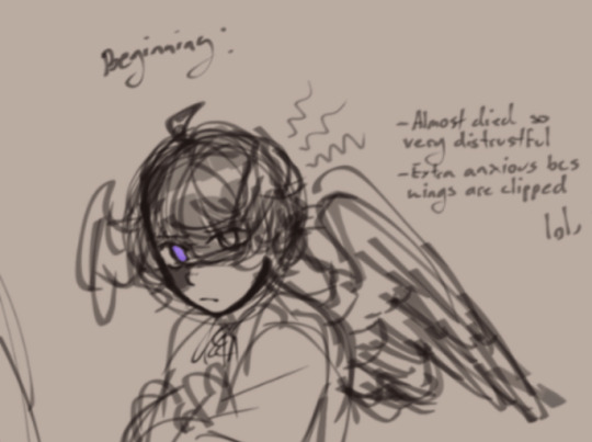
"...one day things go awry"
And excuse me again for taking a screenshot [from this post], but the one image in which Grian's eyes are obscured by a bandage, complete with a watcher symbol and a glowing purple eye?? And Pearl's eyes being purple too? And they're both dressed in purple robes... just. insane /pos
The watchers are typically depicted as an oppressive force, and yet they both look happy. IDK. Something something juxtaposition, childhood innocence versus the purple symbolising something that's very widely regarded as cruel or even evil.
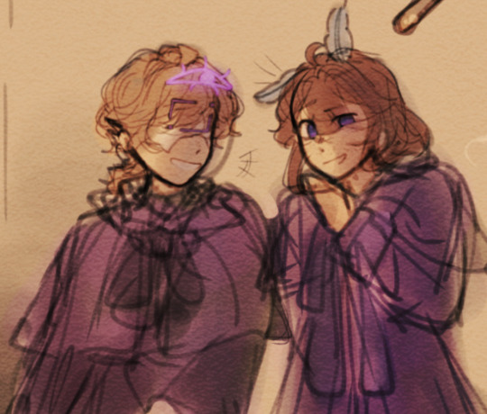
All this is to say I really really love it so far!!
and also... absolutely zero pressure at all! but would you perhaps be willing to share some crumbs on the story? :)
SEFJJRHPORDHJ Awww gee! You've made my day! :D Never thought people would really notice the little details
I'm not very good at detailing moth wings which is why I went for more of a starry feel, so I'm glad you like it 😆
And since you've asked so kindly, I could share some ideas rotating in my head,
When you're a kid, I don't think you realize as much the cruelty adults are capable of. Especially when they've been treating you kindly for the most part, and the progression to harsher conditions and punishments is slow. (Pearl would've been the first to notice.)
Grian and Pearl were already stealing to survive, having nothing but each other, so when the given the offer to be spared from their decimated town, and leave as a pirate, they took it. Grian would regret that a lot later :D
I've also been pondering over the idea that no one, including Grian, realized he was an avian, because he wasn't born with wings. So was taken from his nest by hunters who'd thought he'd been stolen (hybrids aren't always treated well, and sometimes hunted down in this au, though by the time they're adults that seems to change a bit), and then taken to an orphanage (which he'd run away from) when they couldn't afford to raise him for very long.
On the other hand, Pearl was born with her traits and would live in hiding with her parents for the first few years of her life, before it'd just be her mother and her, and then just Pearl as hunters had gotten to them.
So when the two met, Grian would often use the fact that they look similar to his advantage, like "Well I'm her brother, do I seem like a hybrid? Then neither is she!"
I think in return for certain protection, Pearl would've taught him some of the basics of the alphabet and reading,
And later when they're recruited to be raised as pirates, maybe Grian would be better at the magic stuff, whereas Pearl would be better at the fighting aspect. Idk I just like the thought that they'd cover each other's bases :D
And during the beginning of the period of time where they're separated, I think there would be mishaps where they expected the other to be there, the way it'd always been.
Something something, survivors guilt and Grian maybe not being as kind and trusting as he used to be, and never making promises. Still loyal although all his presence has ever achieved is death.
Something something, Pearl still clings to the feather he'd once given her, keeps searching because she knows he's alive - he has to be alive, still wonders about if she had just been stronger—
and maybe Pearl sees a bit of her old sun in Gem, and maybe Grian learns to trust in others and himself again with Scar.
Iwouldrambleabitmorebutwe'rekindofinapickleatthemoment-
#I'm literally stopped on the side of the road because the car started emitting smoke#is this a sign to not become a writer#thanks for the ask!#the ice cream is melting D:#grian#pearlescentmoon#sky duo#skyblings#they mean everything to me ༼;´༎ຶ ༎ຶ༽#pirate au#ramblings#hermitblr#trafficblr#ask
27 notes
·
View notes
Text
FIXING BIT CITY - PART 1
okay this is a very long post and i apologise - i didn't mean to have this many thoughts on bit city but i do so i would really appreciate if you read through this whole thing and hear me out completely:
so, i think we can all agree that the smosh main channel right now isn't doing so well, this time last year, most of their videos on main had a good 1 million+ views, especially after food battle. but nowadays, most of the bit city sketches get from 400k - 900k on average views, 2024 youtube sucks is the only bit city sketch to get above 1 million views.
i think a big reason for this drop in numbers is for 2 reasons, 1. the fact that smosh put hold on all their other sketches that they were doing on the main channel for bit city, and took a whole 2 month break for it, for the end result being, well, average. and the 2nd reason being is that, well, bit city as a whole isn't the best show and while it has it's strong points, it's not a good enough show on it's own that will make your average viewer want to tune in and it's also just, not, that good. now im a big smosh fan and i only want the best for the channel, which is why im gonna try and break down the reasons why bit city isn't really working and how to fix it, hopefully if we spread this around a little bit in the smosh fandom here on tumblr, we'll be able to spread some news (ill post this on reddit as well).
okay now the breakdown. let's start with the concept of bit city, from what i've gathered, bit city is basically trying to be the 'snl'/late night with jimmy show of smosh, the all in all sketch show that has a bit of everything (like a variety show). now i don't watch snl much but from what i know of it, snl episodes have a typical format that they fall into, they start with a cold open, followed by a monologue, then 2-3 sketches, then commercial break which is where a lot of commericial parodies happen, then a musical performance, then weekend update, and sometimes an addtional performance by a musical guest, and then credits. and you can see smosh borrowing some of those segments for bit city, now this as an idea is great. i think that smosh could pull it off if they wanted to, they have a whole multiverse (literally) of characters to choose from for sketches, they have multiple cast members who are great at hosting and who are able to carry segments on their own, and they have a good enough budget to pull different parts of these segments off.
however, where smosh breaks away from the snl format is the fact that they have structured their show more like a late night show would, having a host and a guest, now this is where smosh starts to lose me a little bit. not because i hate the idea, but because, late night humour is very different from sketch comedy, late night tv's comedy typically relies on topicality (meaning the current things going on in today's society like politics, pop culture, etc.), interviews with guests and recurring segments (think mean tweets on jimmy kimmel), yes they do have sketches, but the format of the sketches is very different. that being said, i think waht smosh was going for in the end, which was a 'late night' esque show where the 'guests' are characters or impressions by the cast, is a geneuienly great idea.
where bit city starts to fail or let me down is the execution, now they cast chanse and angela as the hosts, which i do actually really like since i think they both have a lot of personality, they both are entertaining to watch, and they have a good dynamic which viewers can watch and be entertained by. so i think it was a good choice to have them be the hosts. where i think bit city starts to really lose me is, well, the bits, the sketches.
so far, there have been 6 episodes of bit city, and so far, the bits and characters that have stayed in my head and that i think are truly memorable include the one direction reunion, the "straight eye" cast, the kardashians bit and the ianthony bit (although i personally was let down by that it was very popular in the fandom so im including it), that is it. every other bit has been either average or forgettable, in fact, the only episode of bit city which i think lands on every level is the straight vs gay episode.
why? let's break it down.
bit city as a show follows a general structure, the show opens with a 'cold open' of sort where angela says something like 'XX PERSON DID WHAT?' and chanse replies with something along the lines of 'yeah bitch' or some one liner response, after that they have a bit of bantering between chanse and angela which goes on either too long or too short, before cutting to their first set of commercials, after that they return with their first sketch or bit which is typically an interview or a reunion with the 'guest' being either an impression or character by the cast, in the middle of the interview they cut to the commericals again before returning to the bit again, after the bit hits it's "climax" of sorts, then they cut to a third set of commercials, before returning for either an improvised segment with members of the cast as themselves playing games ie. straight vs gay trivia. or the 'hot goss' section where they have tommy read off a teleprompter some jokes about modern day pop culture before interviewing another guest (sometimes they cut to commercials here as well but not always), before having the show come to an end with chanse jumping over a car.
now, let's go bit by bit (pun not intended) on every part of this show and break it down bit by bit (okay this time intended).
the cold opens - imo this is one of the weaker parts of the show, i get what they're going for with it, but it just feels so dry and bland, i get that they can't do a full opening monologue and they need something to open the show in that way, but eveyr joke in the cold open section has since fallen flat for me, so really, my only advice here is get better writers or write better jokes.
the banter/improvised section - this is one of the better parts of the show which i do like (althooguh i do think that it does in some cases go on for way too long) but it's mainl because chanse and angela are such likable people that it works, recently they've started adding in some bits to this section like the rib cam and the erewhon taste testing, so i think if i have any real advice for this section of the show, it would be to a. shorten it and not make it drag on as long or b. if you're not gonna shorten it, then at least add more improvised or bits like the rib cam to this part of the show, this would be also be part of the show to bring back segments like smoffice or let's do this on a smaller scale (although ill add more about let's do this later) to have somehting entertaining for this part of the show
commercials - the commercials are one of the most disappointing part of the show to me not because they're bad, but because they could be so much more. like the concept of parody commercials in a sketch show is SOO good, for one, it can help point out flaws in advertising and commercial industry in general, but they can also just be the perfect ground space for character building ro for expanding the smosh universe, but every bit city commercial, the the humour jsut feels so, generic? and it falls so flat every time. and this falls into one of my main critiques of the show, which is, so much of the show feels like such average level humour, like this is smosh, the channel which literally thrives off of characters and over the top bits, so why aren't they utilising that? i can't think of 1 commercial which has stayed in my head or which i would call memorable in this show so far, besides maybe the straight vs gay 'straight boyfriend os' commercial (but even that cuold have been better imo). my real advice for the commercials in the show is a. cut it down, don't have 3-4 commercials in every bit city episode (especially if they're gonna be so average), but b. if you're gonna have this many, use them to expand the smosh universe. have commercials like idk, Mr. Pervert's coffee shop, now hiring, or Fred Dart's new single just launched, anything that will actually add value to the smosh universe and not just be some one off. but if they want to do one off commercials, they could also return to their 'apple product commercial' esque skecthes, like the apple vision pro sketch they did? yeah, do that and split it up into 4 parts instead of all at once, and you have 4 commercials for a bit city episode.
interviews - the interview segments have been okay so far. i liked the one direction reunion, i liked the kardashians one, i somehwat enjoyed the old smosh reunion (but im not that much of an og smosh fan so i didn't enjoy it as much as others) and i really liked the 'straight eye' cast one. i think my main critique for the interview sections of bit city is the same for the commercials in that, it could jsut be SO MUCH more. i for one would love for them to maybe do stuff like a 'smosh the sitcom reunion' with all the characters like kevin, krungle, young sebastian, chosen, etc. or a 'chosen special' where chosen gives us a deep dive into being a chosen, waht it takes to be a chosen, who is or isn't chosen, etc. these sketches in my opinion would be a. more funny than just random pop culture references, and b. interesting deep dive into the pre-existing characters of smosh. and that's not me saying that i think they need to completely erase the pop culture elements of the show, im jsut saying, lean into more of the smosh specific character work of the cast instead of focusing more on the pop culture elements, you can still have reunions like the hsm or the teletubbies reunions (which btw i think were top tier smosh sketches) but just don't make that the focus of the show. also i do think at one point having actual guest features for this section of the show could be interesintg, but seeing how things are going right now, i don't think that will be happening in the near future.
improvised 'games'/recurring segments of the show: so far, what i think they're trying to do in the second half of bit city episodes is try to have one of those 'recurring segment' bits like they have on late night tv with the smosh cast, basically where the cast and host s play improvised games, now this isn't a bad idea but imo it is kinda pointless. liek i don't hate it as a segment, but i think it takes up a lot of run time which could instead be used for stuff like, idk, actual sketches? but if they are trying to do bits like this, i think what would be better is to bring back the 'google search history/watch history' sketches they used to do for this part of the show, since it actually fits quite perfectly. also, my advice for this segment of the show to elevate it a bti more is to really lean into the audience participation part of the show, i think they're trying to do that with the 'crew stories' part but so far they're kinda falling flat/hit or miss, so i think what would be better is to do stuff like have audiecne shots liek they do in real late night tv, play games which involve the audience, or if you wanna involve the crew stories,maybe do it in the format of like in the live show for under the mistletoe (or maybe it was UTI i dont remember) where they have one crew memeber or audience memebr on stage interacting with the cast in characters (like in UTI they had lisa's exes) or just have the crew member tell a story from their life and show them in the audience. that would be better imo.
hot goss - now for every episode where they don't do an improvised game or recurring segment, they do hot goss, which i think you can tell is trying to act as like the 'weekend update' of this show btu more leaning into pop culture elements, which, im sorry, i love you tommy, but this segment is very hit or miss. i don't hate tommy as a host, i think he has a lot of personaltiy which makes him likable and entertaing to watch at times, but this segment is just, very glass half full for me. i liked the stephen king's son episode i think that was well done, but i think my real advice for this segment is the same for the rest of bit city which truly is lean more into the character element of smosh, do stuff like 'deep dive into krungle's dating life' or 'GERALD CAKES TELLS ALL' stuff like that. or if you really want a segment to be about pop culture, then i think a better way to do that would be to maybe bring back the teleprompter bits that they used to do in smosh pit weekly back in like 2016 or so, OR, just get better writers (also cut it down - we do not need like 10 mins+ of amanda being chappell roan and sabrina carpenter's agent - which btw is SUCH a good idea for a character, but as all bit city bits, it fell flat).
--> ,however, i think a better way to do this type of 'weekend update' type show is bring back a smosh pit weekly esque segment - smosh weekly or bit city weekly - and THAT'S where you bring in the topical element of bit city, it's a much better way to do it imo. and you can still keep hot goss if you want to for as i previously siad the character gossip deep dives or the pop culture characters, but alos have this weekly show drive the 'topical' parts of bit city.
chanse jumping over a car - really have no commenrs on this one, i like it as a bit, i think it'll get old really quickly, but for what it is, i like it
@lilac-hecox @smoshkidtv @guessitrunsinthegenes @wazurenaide
#bitcity#smosh#courtneymiller#shaynetopp#ianhecox#anthonypadilla#ianthony#SMOSH#angelagiarratana#chansemcrary
14 notes
·
View notes
Note
Hi!! Your art is so fucking cool! Can I ask what the process looks like for form line? Ex. What do your sketches look like when they are really rough? How do you go from idea -> final product. 💕
Hadih, thanks so much for your question!
Honestly, it's sort of hard to explain? I do have some sketches to sort of give an idea though.
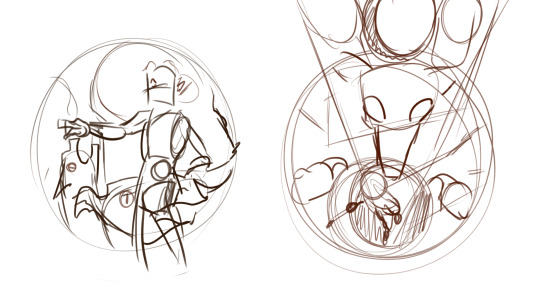
This sketch I posted a couple days ago is a pretty good example of what my initial concept sketches sometimes look like.. As you can see, they're pretty chaotic and very rough, and usually these sketches are more about getting the idea down then actually making the formline itself. There aren't formline shapes just yet, although I do sometimes sketch out elements or shapes like eyes or bodies or paws/hands that will usually have an ovoid in it, because those elements tend to be a focus or centerpiece. The sketch is obviously not final, and things can change along the way to account for space and balance as well as what I'm trying to convey. (These sketches aren't entirely accurate of course because they're for pieces that are meant to be fusions of character illustrations and formline art, but they're the best thing I can find on my pc at the moment)
The rough sketch helps me figure out the flow of the piece, and once I'm satisfied with it I try and get to putting down the shapes and silhouette, and it's here where I try to find the balance with my rough sketch and how the shapes can fit and behave in the piece to the best of their limits while also still conveying the message I want to send. The most common shape I start with is the focus shapes, which are usually ovoids.
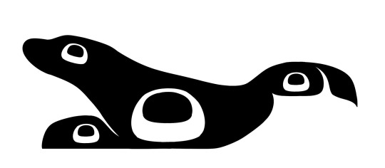
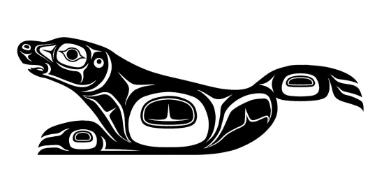
This rough of my harbor seal formline which I sent to my aunt for review sort of gives a better Idea of what I mean when I say I try and focus on where the centerpoints will be. Ovoids are usually a focus, so you can see them pop up a lot; in the body, the head, the eyes, the tail, etc. Ovoids are so important and probably the most common shape in formline art, and one of the most common feedback I get from my aunt is to adjust how the ovoid looks in any one of my pieces; she often compared them to a loaf of bread! You don't want your ovoids to look like a loaf of bread! (Her words, not mine). I feel like I've gotten better at drawing ovoids though, because she gives it as feedback less and less nowadays. Ovoids usually also have to have a bit of weight/perspective to them; it's hard to describe but essentially the top of the ovoid should usually be bigger/thicker/have more weight then the bottom.
From ovoids, the next shapes are usually circles, u-shapes and crescents, then usually y-shapes/trigons. It can be difficult, because the key is to make sure the shapes flow together and feel cohesive, as well as to make sure the negative/positive space balance feels right. Also a fun tidbit, trigons are most typically used to essentially fill space; it's always important to make sure that they are binding bigger shapes like u-shapes and ovoids and not stealing all the space and attention.
The lines in this stage tend to be very rough and messy, and I always try to go over the next rough draft with a smoother and cleaner pen.
Once the initial shapes are done, I'll usually send the piece to my aunt (sometimes I send them earlier on, when I'm in the middle of working out the shapes) for feedback! I am still a student in formline work after all; basically all of my teachings come from my aunt, who has a lot more years of work in formline art then me. She'll give me feedback and tips of what she thinks I should fix or experiment with. I adjust and fix and sometimes even completely delete and redo parts of the piece with her guidance. The list of things she tells me to change decreases with each piece, so I like to take that as a sign that I'm improving!
Once the black and white version of the design is done, I move onto coloring. Usually I already have a color scheme in mind when I go into a piece, so I'll mess around and put down colors and see how well they contrast before I color it. Typically, a piece will have about 3 colors; one for the background, one primary color, and one secondary color. I use a clipping layer to color the entire formline piece with the primary color, and then go in with the pen tool and bucket tool to use the secondary color. Adding in the secondary color is tricky but important because it once again falls into balancing positive and negative space/colors and the transitions between the two.
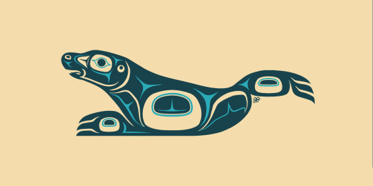
Once coloring is done, the project is basically finished! Unless there are some other plans I have for it, ie using it for an overlay in a bigger piece, colouring is usually the final stage.
And that's about it! I hope this helps you understand a bit; this isn't a perfect explanation as this is just from my own artistic POV and other nations and artists have their own process, but I hope it helps nonetheless!!
Edit: I forgot I posted other WIP formlines here before 😭 here and here!! You can sort of see me figure out the flow and balance of the designs in between the WIP and the finished piece!
#indigenous art#formline art#indigenous culture#the process of balancing shapes is a lot harder and more complex then I can describe in a tumblr post#it really is a balancing act that can take a long time to learn and i think i still have a way's to go to perfect my abilities#In that way it's sort of hard to describe and put down how exactly I do formline art I think? Bc of how close and thoughtful the process is#there's something very personal and honestly almost spiritual about finding that balance and figuring out how to convey the message you're-#trying to convey even if the piece doesn't seem that way (the amogus one lol). that's the most clear way I can describe it.#i am rambling a lot oops.
81 notes
·
View notes
Text
Making of Ashes to Ashley
Recently I posted my comic Ashes to Ashley, and got such a tremendously kind and loving response that I felt like sharing a little bit more about where it came from.
The story is about a transgender awakening, where the quiet and somber Ash explodes out of the closet as the loud and colorful Ashley. This was always the plan, however the details changed along the way. Quite quickly I realized that I was writing about myself and my own trans journey. I never played in a band and I don't imagine I'll ever grow bunny ears (sadly), but still Ashley is undoubtedly a reflection of myself. I just allowed life to become a stage and gender performance a rock concert.
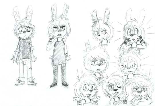
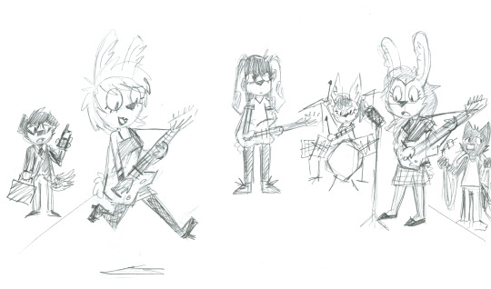
Above are the first idea doodles I drew late at night in early April. I quite enjoyed giving Ashley lipstick and prominent eye shadow, since I hadn't ever done a character like that before. The idea was a bit of exaggerated femininity that accidentally becomes raw punk expression. One or two people have pointed out the Um Jammer Lammy similarities, and they are absolutely not coincidental. Initially I imagined Ashley would've been more reluctant about her transformation, which is why she looks a bit more annoyed in some of my sketches, but the story became more bright and funny if it was made immediately clear that this all happens off of her own volition.
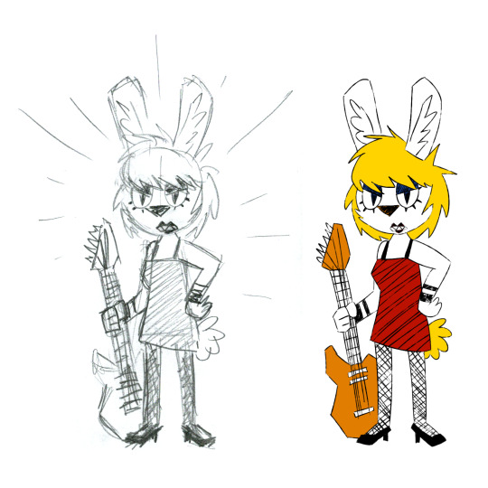
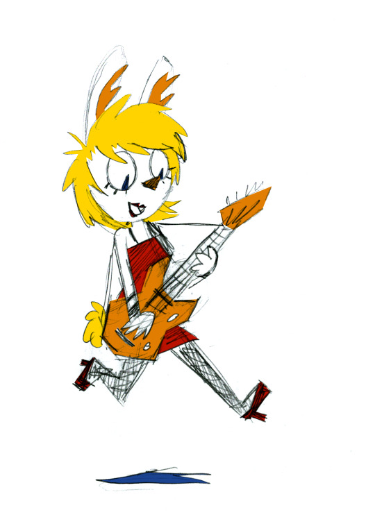

Some method and color tests. My girlfriend suggested I instead go a lot more raw with it, which is why I ended up adamantly using an ugly sponge brush built into Photoshop. Sapphic Disaster are some form of punk-shoegaze band, so combining rough pencil linework with crunchy texture coloring felt like a fitting visual representation of them. This also side-stepped the biggest problems I've always had with drawing comics – dealing with inking is a boring waste of time, and working digitally always makes me fixate on perfection. By just using pencil on paper I had to stick with whatever errors couldn't be saved by a regular eraser, in fact I dedicated myself to only using an old worn down Bic mechanical pencil and embraced the idea that the comic would consistently look a bit off and amateurish. Of course I allowed myself the luxury of cleaning up my drawings digitally before coloring, but that can only take you so far. This way of working helped me make fast progress and kept each step engaging, I've never had as much fun drawing a comic as I had with Ashes to Ashley.
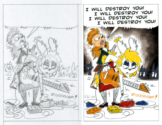
Here's a before and after from initial scan to finished panel. I often only tidy up around focal points like faces or hands, and allow the rest to remain as it is, usually parts like the legs or Ashley's ears.
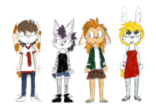
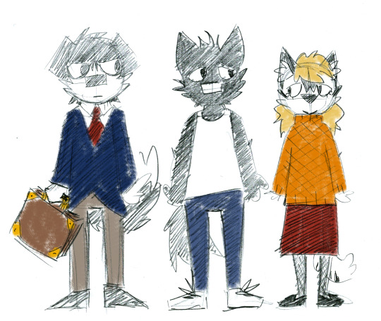
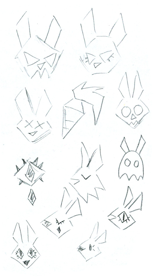
Character references and my initial color picks, they went through small changes as I went along. I liked giving all the band members different sorts of rabbit ears to make them all look distinct from each other.
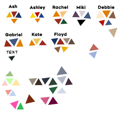
Here's some ideas for the Sapphic Disaster band logo and the comic's color palette, notice how Ashley is more vibrant than Ash.
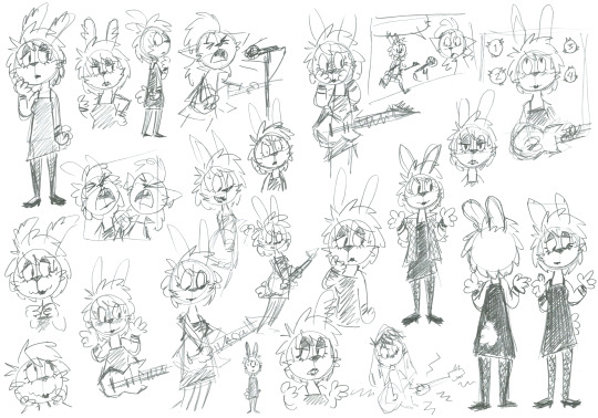
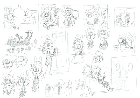
While working I filled up numerous papers with doodles trying to workshop panels and layouts. It's too much to show all of them here, so I composed a few collages of my favorites.
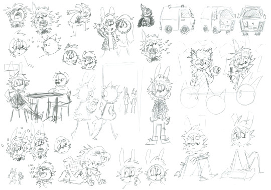
It was pivotal for me that Ash would always look painfully cute. The sketch of the table scene with Floyd shows a rare out-of-character confident and laid-back Ash. In the presence of Floyd?! Never!
I was very concerned about the reader recognizing the old Ash when first seeing Ashley. She may be all excited about being a girl, but her nervous cluelessness remains. I ended up going back and redrawing two panels in Ashley's introduction to strengthen this impression.
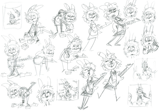
For those not in the know, shoegaze is a rock subgenre that centers around noisey guitar textures, typically achieved through heavy use of effect pedals at the musicians feet; hence the name. When Ashley plays her guitar she produces a cacophony of strange sounds, the reader will have to imagine what they actually sound like, but I always imagined their opening number "I Wanna Be a Girl" to sound like a couple of amateurs trying to recreate Lush's Blackout.
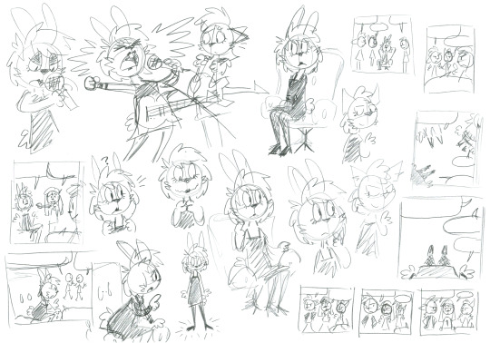
The page where the band go around looking for Ashley while she's receiving her makeover was shoehorned in at a later stage for pacing purposes. That's why Gabriel is suddenly back to pulling cords after previously claiming they're all set, oops!
One of the core rules to this story is that everyone is always overly supportive of Ashley's transition no matter what. This is what makes the otherwise stern and serious Floyd especially funny, my girlfriend was pivotal in sprucing up his dialogue, adding bits like "have you seen the health care waiting lists?, "I know an endocrinologist who owes me a favor or two" and "give me 35% more danger"
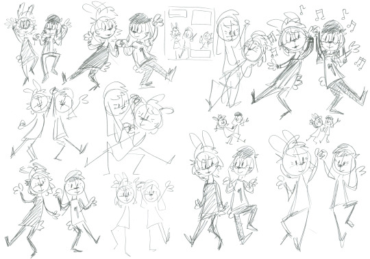
Towards the end I discovered that Ashley and Debbie dancing was apparently the most important panel in the entire comic, judging by how much I tried to perfect it. (For the record, my favorite panel is when Ashley screams into the microphone that she wants to be a girl.) Maybe Ashley and Debbie dancing should've replaced the final full-page panel? Well, we got a lot of cute doodles out of it regardless. Just kiss already!
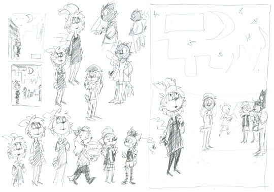
Initially I imagined Ashley to be standing alone in the "could this be the real me" final panel, but I realized her odd family of friends was equally a part of the real her. She was always right where she needed to be, she just needed to find herself within that place. (I ended up giving Ashley a cigarette because otherwise it looked like she was praying.)
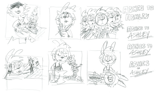
Here are some ideas for the cover illustration, of course in 1:1 format to look like an album cover. Up until last minute I planned for the comic to have You Made Me Realize as its subtitle to distinguish it from eventual follow-ups, which is why the You Made Me Realize EP cover art is paraphrased in the top-middle. I ended up just going with Ashes to Ashley to keep it clean and simple. The title Ashes to Ashley was blurted out immediately by my girlfriend when I first showed her my concepts for the story. It's perfect, she's perfect.
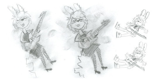
I drew two Ashes and two Ashleys for the cover art and let my fingers smudge all over the latter. While most obviously riffing on the cover for My Bloody Valentine's Loveless, it's equally taking from the Ecstasy of Saint Theresa's Pigment.
And there you have it.
However I never intended this to be the full extent of Ashley's story, just a satisfying and complete end of a chapter. I've already finished writing the next story, Today Forever, and I hope I can get it out to you all soon enough. Your love for Ashley keeps me going.
/Kiki
52 notes
·
View notes
Text
lmao so RS just confirmed she STILL does not, in fact, have a buffer.
FAST PASS SPOILERS AHEAD
.
.
.
.
.
.
.
.
.
.
.
.
.
To kick this off, let's be real, 2 weeks is NOT enough time to build up a reasonable buffer.

When she took that 2 week break after the wedding episode went up, I knew 1 of 2 things was going to happen:
She was going to piss away the entire break on social media not getting anything done
Even if she DID get anything done and a reasonable buffer of more than 3-5 episodes built up, the episodes likely wouldn't be very high quality as you can't turn out shitloads of decent quality panels like that in just 2 weeks.
I think Rachel really just needs to acknowledge and take ownership of the fact that she is not good at managing herself, her time, or her team. When she started LO in the Originals section, she even admitted to not having a very strong buffer.


Now yes, in her defense, she hadn't fully transitioned to drawing LO full time when she started, but even still, she seems to treat her FastPass episodes as her buffer rather than creating an actual buffer.
A buffer is not "well I still have 3 episodes locked to the general public" or "I have the next couple episodes sketched up".
A proper buffer is "I have the next several episodes finished and exported and ready for their respective release dates." This ensures that they aren't racing to meet deadlines during the release period after pre-production (which is a surefire way to screw yourself over or write yourself into a corner) and that if anything happens in real life that prevents them from working on future episodes, they can still put out new episodes because they have a cushion of episodes still waiting to be released. Webtoons typically recommends its creators have anywhere from 9-15 episodes of buffer ready by the end of the pre-production phase. That usually means 3 free episodes, 3 FastPass episodes, and at minimum, 9 more episodes sitting on the backend, adding up to a minimum of 15 episodes. It sounds like a lot, but when many WT series run for 40+ episodes per season, 15 is a small number. Especially for a comic like LO which had 90 episodes in its S2 run and 116 in its first season. S3 of LO is already 37 episodes in.
She's also basically admitted to just writing as she goes in the past because most people working on their webtoons in productions like these have at least a decent skeleton of a story going on that they don't have to write as they draw. Writer's block doesn't happen in webcomics unless you're writing as you're going, same as how it doesn't typically happen in animated movies because you should already have a basis to work off of before you start the brunt of the visual work that needs a narrative structure to exist.

Now, all that aside, the reason I'm bringing this up again (as I've talked about her buffer range before) is because I've once again been proven that Rachel doesn't have a shred of a real buffer.
And the smoking gun this time was the horse.
This stupid fucking horse.
Now, besides the fact that we're a little sus this is meant to be an in-comic jab at all the criticism of LO pointing out how Persephone always looks like an MLP character-
-but that pony toy drawing didn't make its first appearance in Episode 241, it made its first appearance on Instagram. Not as a preview for episode 241 or as an official LO drawing, in her own words, 'just a pony'.
instagram
As always, this is still just an estimation based on what goes out in LO and what Rachel posts to her IG/Twitter, but this pretty much tells me her buffer is STILL only 1-2 weeks ahead of time, because that pony drawing time lapse was posted two weeks ago. When we checked the actual timestamp of the post the day the episode it showed up in went up (Episode 241) it was ten days old.
Not to mention, the timestamps on those reddit posts? A month old. Granted, we had been making MLP jokes in the ULO/antiLO community prior to that, but the fact that this "my pretty pony" gimmick came out so soon after someone did literal art of Persephone crossed over with MLP, it really just furthers the suspicion (in addition to shitloads of other instances) that Rachel is snooping in on these crit communities to try and "clap back" at them through her comic. Which is something she'd only be able to do with a limited buffer anyways as it allows her to change things on the fly in response to criticism or whatever hurt her feelings that week.
That said, I won't be certain of this 1-2 week buffer estimation until we see when cowboy hat Hades shows up.
instagram
I'm calling it now - it will be showing up in this week's episode which goes up April 22nd.
Place your bets, folks.
#lore olympus critical#lo critical#anti lore olympus#antiloreolympus#essay post#unpopularLO#unpopularloreolympus
173 notes
·
View notes