#hopefully the video works
Explore tagged Tumblr posts
Note
trick or treat!!
TRICK. giorno dies rip
79 notes
·
View notes
Text
Taliesin’s face fjwkejfjwjd
#hopefully the video works#critical role mollymauk#critical role#mighty nein#taliesin jaffe#laura bailey#mollymauk tealeaf#jester lavorre#caleb widogast#c2ep16
201 notes
·
View notes
Text

photo study!
process video under the cut
19 notes
·
View notes
Text
I made something silly
3 notes
·
View notes
Text
Imposter Syndrome
something I've been working on overcoming lately...... maybe others can relate
#imposter syndrome#art#artists on tumblr#art video#3d art#digital art#ar#augmented reality#figmin xr#vr art#vr#virtual reality#art process#process video#been working on and off on this one for a WHILE now#glad it's done and i can (hopefully) move on to other things
13K notes
·
View notes
Text
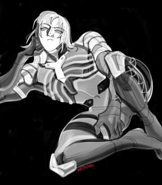
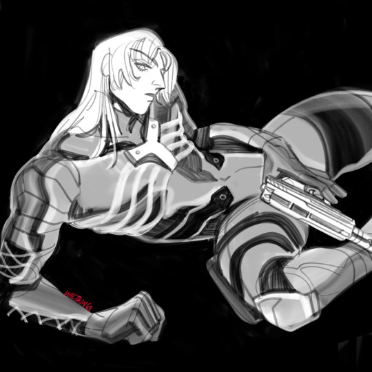
skintight
#raiden#mgs2#mgs#metal gear#digital#fanart#video games#original art#wanted to have these finished much sooner but long story short i caught the flu and fused with my bed on all levels including physical#still recovering actually but ive been dying to work on these!! hopefully leon won't be another long wait :')
4K notes
·
View notes
Text

May your hardened heart be woken By the soft and distant song Of all you left here unspoken All the shards we keep stepping on - Take this body home Take this body home Call the wind, and let her know Take this life outgrown Take this broken soul Call the stars, call them all And take it high, take it far, take it home
#svsss#luo binghe#shen qingqiu#bingqiu#sqq#lbh#scum villain#heard the song Take This Body Home by Rose Betts and it nearly took me out at the knees#it really really suits sqq's self-detonation in hua yue city right? i'm not the only one feeling this?#considered adding some literal shards for them to be stepping on - since sqq's sword explodes - but i couldn't quite make it work#anyway this has been playing like a music video in my head for the past couple days highly recommend listening to the song#if you haven't heard it before#can't get over the absolute dissonance between how sqq views this scene and how everyone else must feel about it#like to him he's just completing his plan - hopefully keeping lbh from destroying a city with energy imbalance and escaping The Plot#nbd! he and sqh have planned it all out it's FINE :) off he goes!#meanwhile everyone who loves him - including lbh who worked years to get back to him and is trying to work through a lot of grief#and resentment and doubt and longing and... - watches him DIE in FRONT OF THEM#just collapse while coughing up blood sword disintegrating energy completely consumed#like holy hell sqq could you traumatize the people around you any more???#no wonder lbh went a little bit crazy after that like my man was already not in a great place but what the fuck#lbh watches his shizun presumably sacrifice himself for him ONCE AGAIN like after he's finally Gotten Strong his shizun is STILL#coming to harm in an effort to make up for his shortcomings#my art#most of the time out here drawing what amounts to muppets and then sometimes i get the urge for this and just need to cover everyone in blo
440 notes
·
View notes
Text
Compilation of EVERY single time they changed Hobie's filter in the digital version:
Left: Theatrical release Right: Digital release

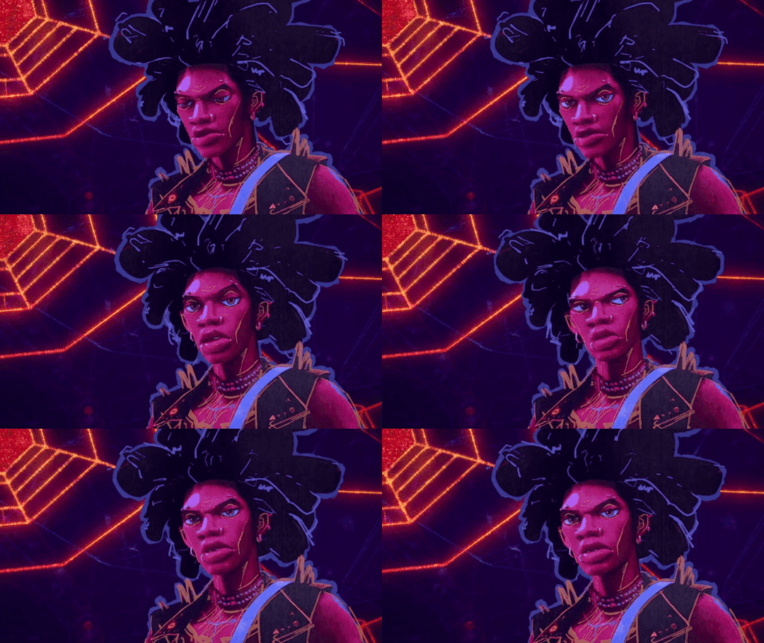

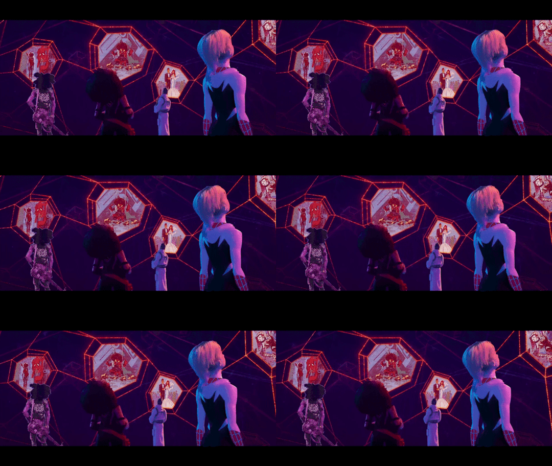

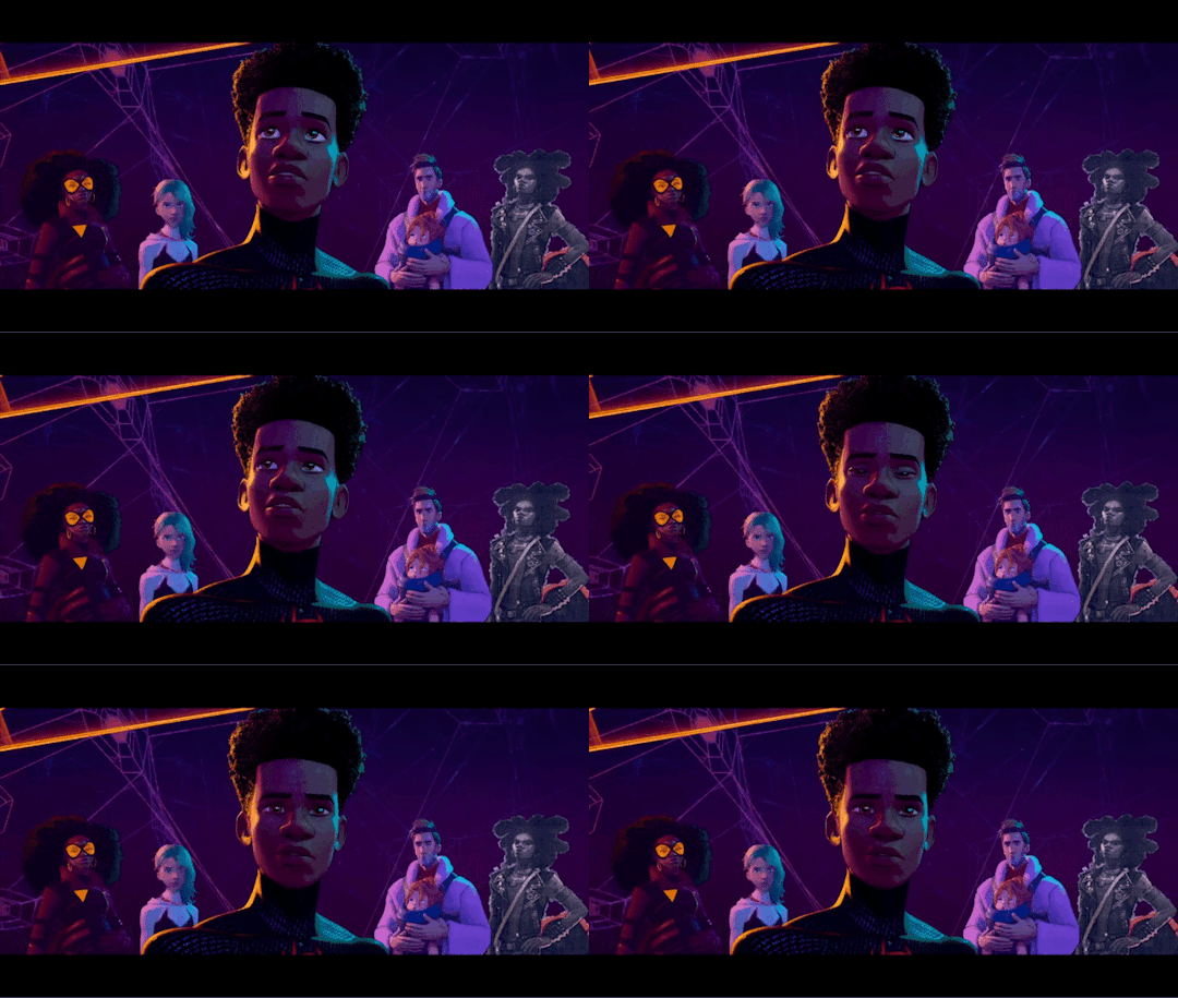
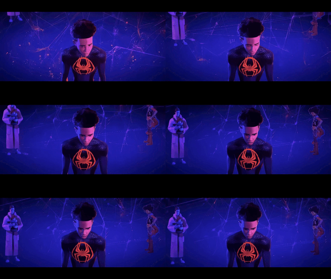
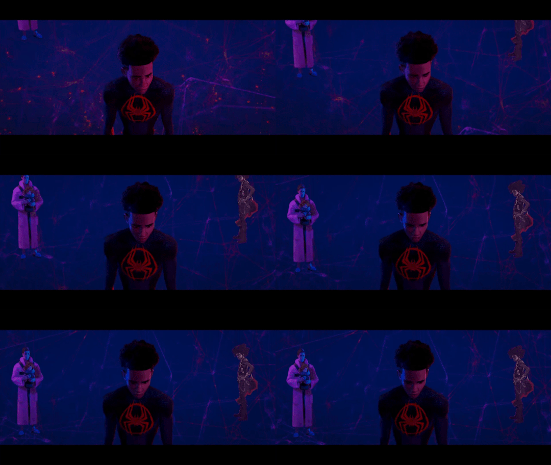
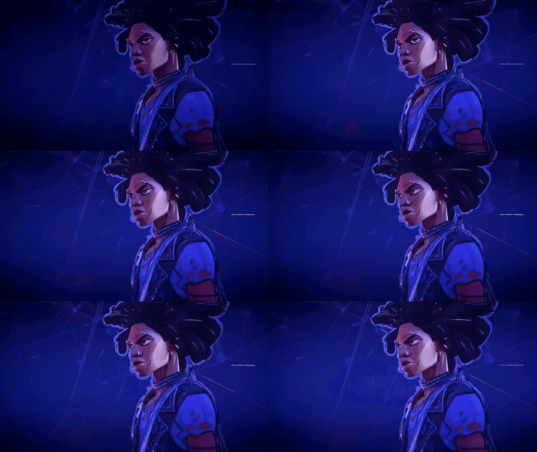
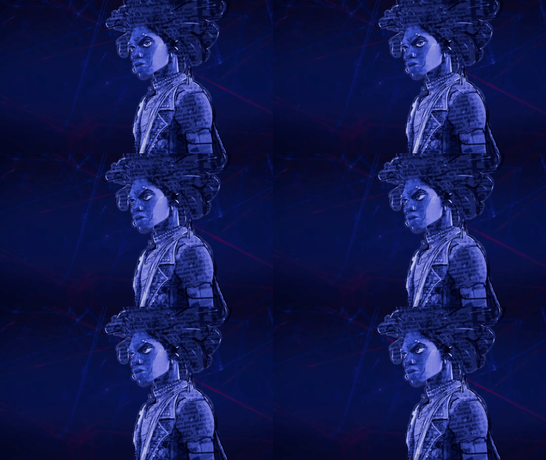

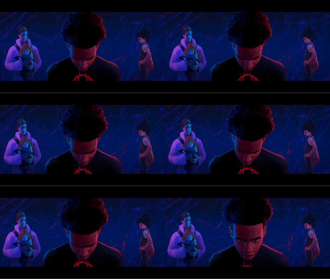
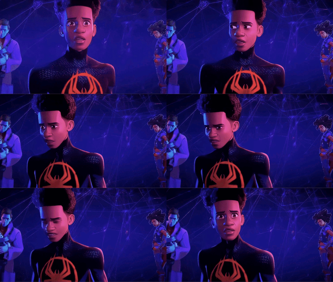
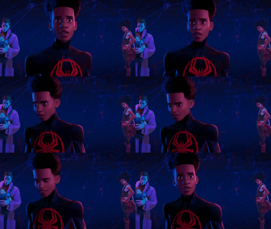

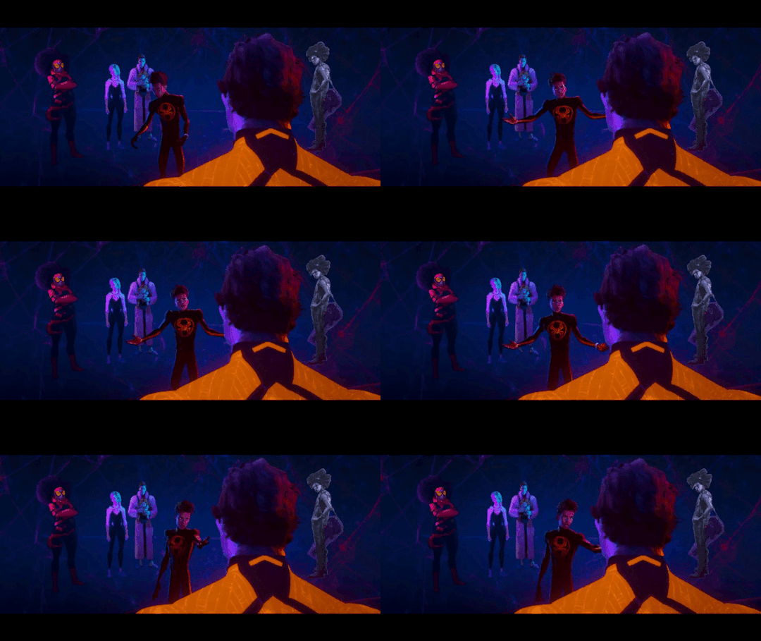

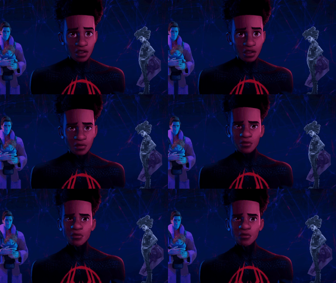
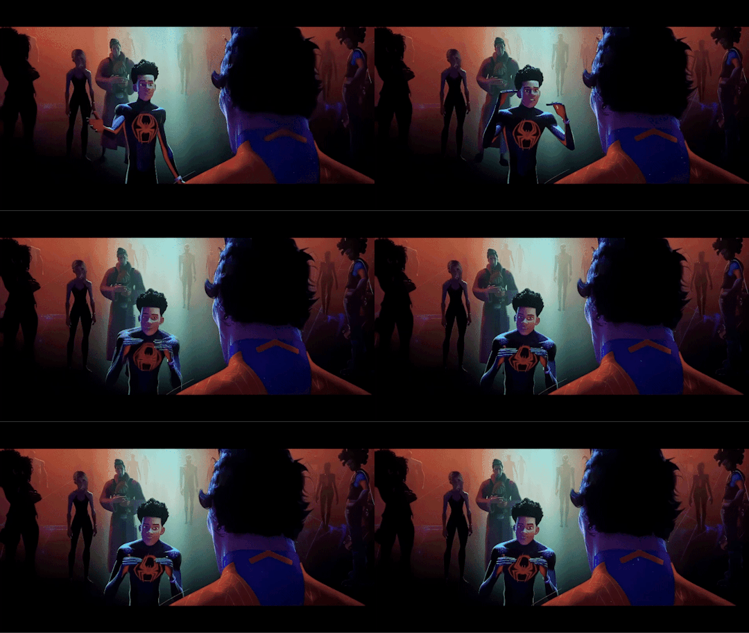
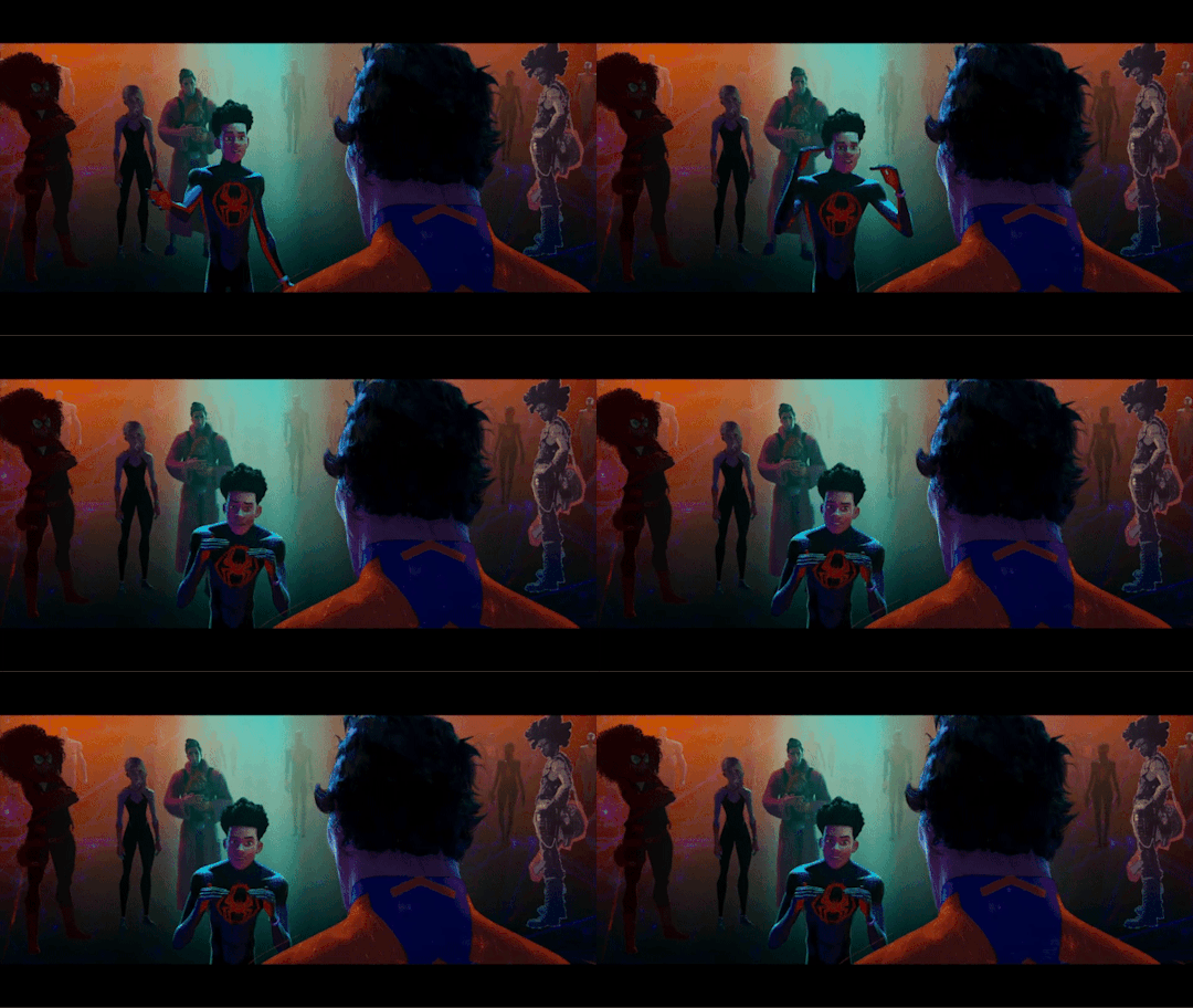
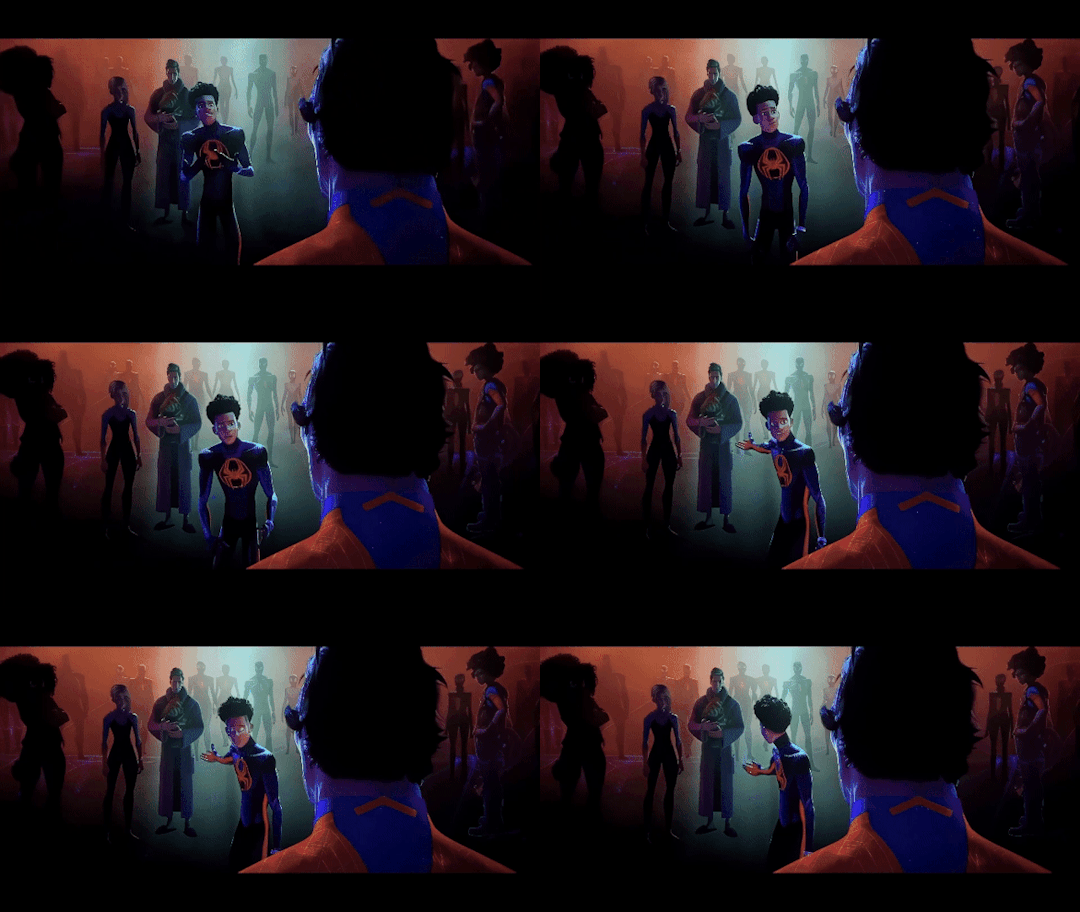
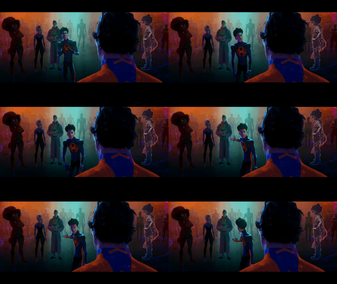

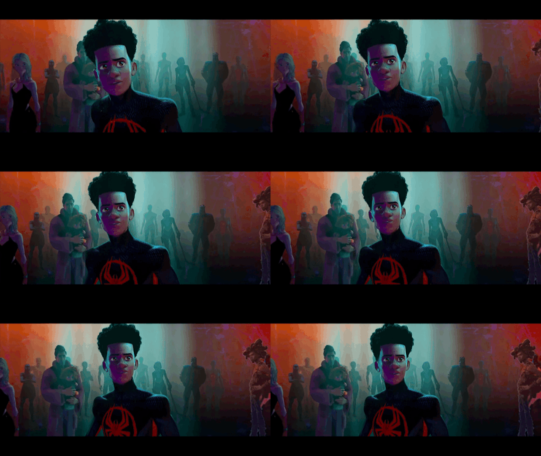
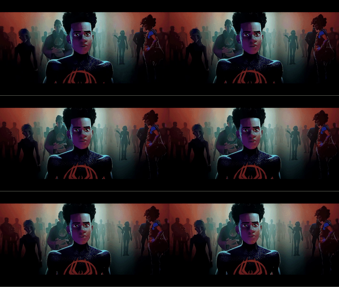
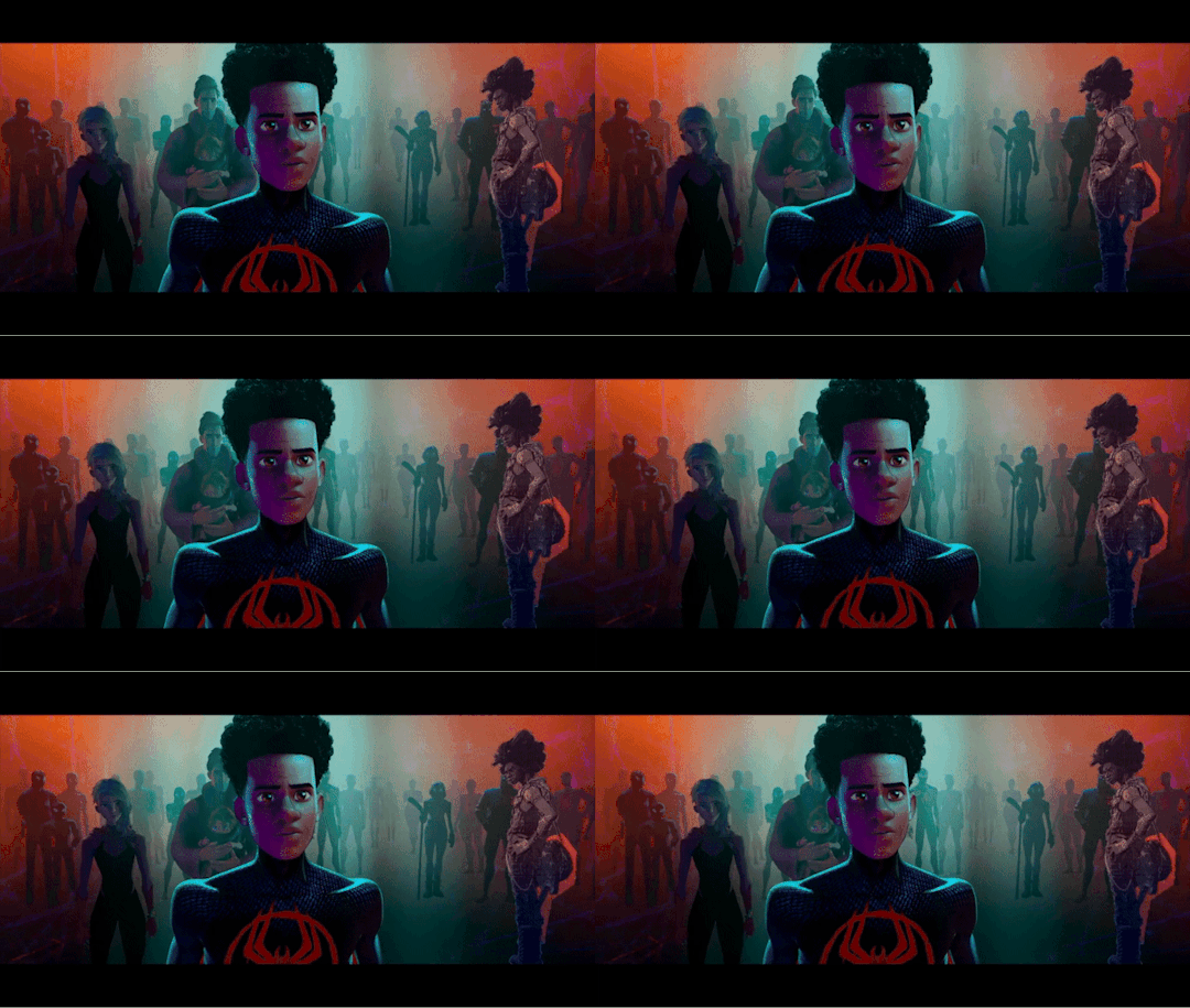
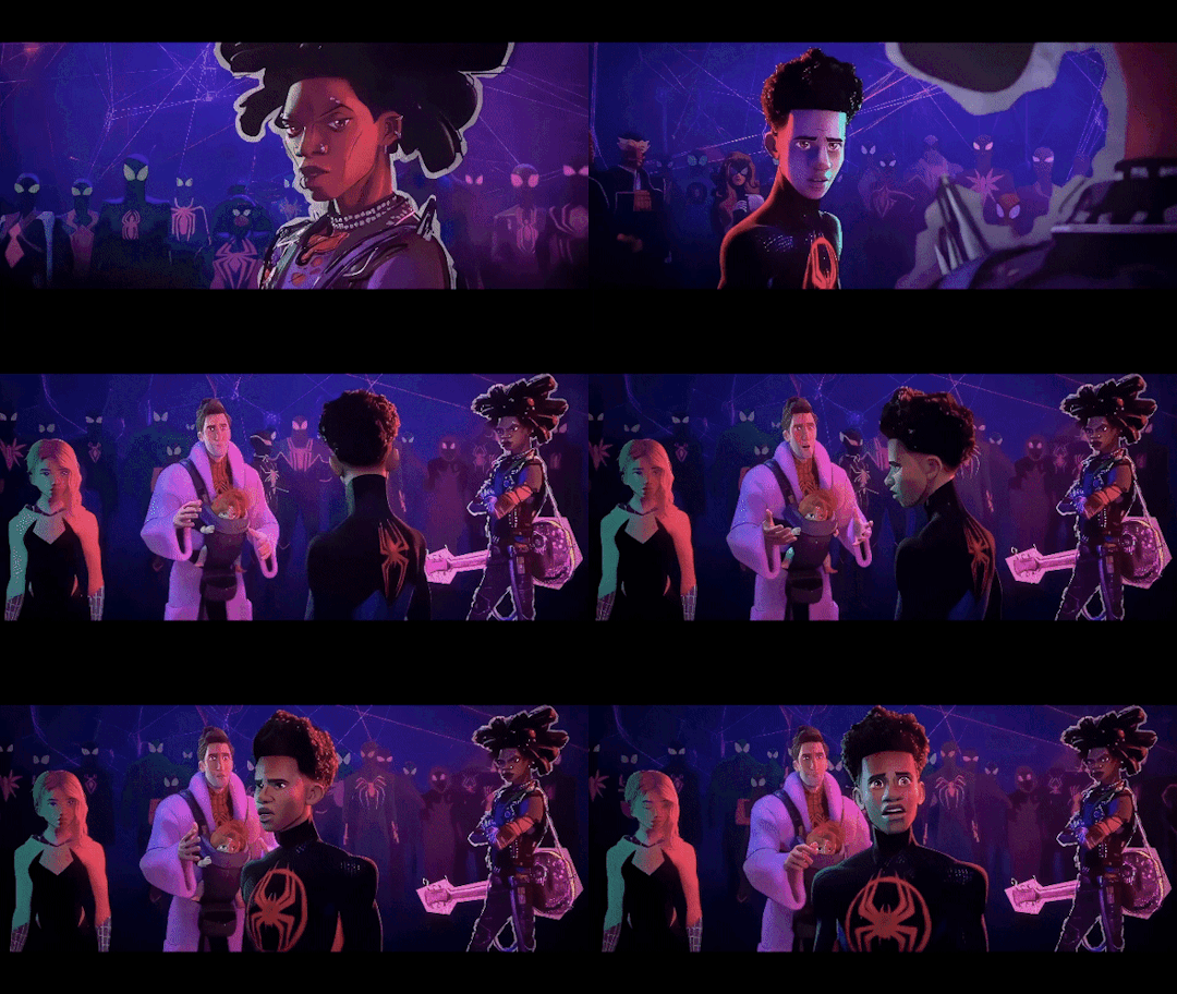
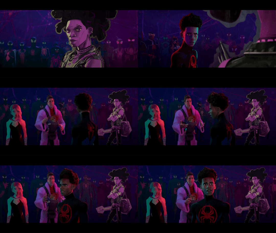

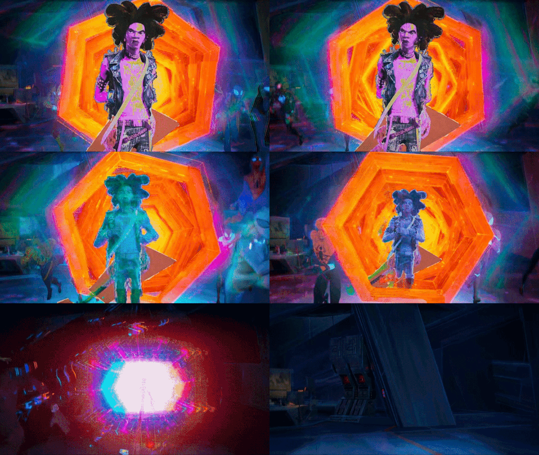
You might have to click on some of them to get a better look at Hobie, sadly I don't have a video editor that allows me to make better edits than these :')
#This took so long to make lol#cause I had to edit every scene with Hobie from both versions so I could watch them right after one another to compare them#I did this with ALL the scenes he's in also the ones where he's on screen as spider-punk#but they only changed his filters in these scenes so it was a waste of time :')#sidenote: no it wasn't it's never a waste of time to look at hobie I just couldn't use it for my GIFset lol#I also made a bouns one but I'm not allowed to post more than 30 GIFs in one post apparently so I guess I just won't add it then...#but Hobie was basically filterless during all these scenes in the theatrical version#I like that they gave him more different filters in the digital version#the only change I don't like is in the first GIFs#cause like that one post pointed out it looks like they removed his lipstick for some reason#also really wish I had a better video editor so we could get a closer look at Hobie but I did my best with what I had#also slowed some of them down to get a better look at them#been having this idea for a while and now I finally finished it!#which means I can go back to working on my fics now#hopefully lol#also lemme know if there are some other scens you guys want me to make comparisons of#cause I have both versions#the theatrical release isn't the highest quality though so if you know where I can get my hands on a better version lemme know ;)#hobie brown#spider punk#miles morales#spider man#peter b parker#jess drew#miguel o'hara#spider man across the spider verse#across the spider verse#across the spiderverse#atsv#theatrical version
1K notes
·
View notes
Note
How the hell do you manage to superimpose the hilariously exagerated proportions of the tf2 mercs into a cohesive 2d style? I always struggle SO much with like, the way the mercs' models have huge hands, the way they have relatively low-poly definition on things like arms, shoulders, and legs... and Especially the way like, the models are kinda janky when you pose them for art purposes- when using movement tools, things like armpits and seams between body parts get all deformed... Which makes the study of form and silhouette rather difficult.
I assume that a lot of your ability to translate the concept of the mercs from their original mediums into your own works of art comes to you quite naturally- through experience you have with drawing and art style stuff, as well as through intuition. I was simply wondering if I could poke at your mind and get some insight into your process, any thoughts you have about the proportions and silhouettes of the mercs, any quirks you've found while drawing the mercs, or simply what you enjoy drawing about them. Like, don't be afraid to infodump about something just because you think people wouldn't find it interesting- I am here, I am sitting, and I am listening- if you so choose to speak.
I am utterly fascinated and enraptured by the more behind-the-scenes aspect of art. The mundane things that come second nature to great artists yet seem so revolutionary to less experienced artists.
I love your work, I look forward to seeing more of it, and I hope you have a nice day :]
Sorry for the late reply! I've been a little…stuck on how to answer this but that's mainly because to me, drawing is composed of SO many different little skills - you have form, anatomy, shape language, silhouette, appeal, rhythm, acting and posing…not to mention everything AFTER your raw draughtmanship like line style, rendering and colour theory. Trying to distill a multiude of small skills into some pithy advice is overwhelming to my brain. So I'll take the invitation to ramble instead :))
I don't think I have any new or revolutionary insight into the tf2 guys specifically - more I'm using them as work horses to excercise general silhouette/posing/shape-language and further my skills when it comes to drawing characters!
I do agree though the proportions are rather silly when you stop and think about them realistically…they can be kinda tricky if you follow their 'actual' proportions. what looks great individually was maybe never meant to be directly compared (ie: Heavy's hand size against Spy's lol). It would've been funny if the TV show exsisted and we had more content to review…would the animators have had rules like Spy and Heavy can never shake hands? Would they cheated the proportions for shots? Or would they have said WHATVER it's gonna look weird and embraced it? (Like Kingpin in Spiderverse lol)
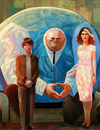
Paul Lasaine for 'Into the Spiderverse' This is AWESOME. But it's also one of the silliest designs I've ever seen comitted to screen. The varied scales of the characters work because of the unifying treatment (lighting, rendering, consistant hand anatomy, consistant clothing fold treatment etc) and because they are sort of proportional within themselves. A common mantra is that hands should be about as large as a characters face....which they all are here!
Human brains are very flexible and forgiving though. It's totally fine for you to put a character with huge hands and head next to a teeny tiny character! Vanellope and Ralph from Wreck-It Ralph look grand next to each other! And in that film you even have varying levels of stylisation sitting against each other (unified by the look dev treatment of the shaders and lighting). I think as long as the chracter is proportional within themselves it sort of works out. IE: a general rule is that a hand should be as large as the face so…you can have some large arse hands as long as their placed on a body with a big arse head. Unifying characters with the same treatment (ie: lineart brush, colouring style will also help them look cohesive next to each other :) )
I don't actually reference the 3D models/animations very much at all and instead draw their proportions based on my tastes for stylisation following their general vibes/silhouette profiles. I don't stick THAT close to their in-game looks and there are artists who do that are so so so much better than me (Creedei and Flapjack come to mind). I'm not amazing at body-type differentation and TBH they're all wearing chunky clothes all the time so I usually draw the guys as one-of-three body shapes: Heavy is the uniquely wide guy; Sniper/Scout/Spy are all tall and slim and Demo/Soldier/Medic/Engie have a little more of the generic 'hero' bodytype with varying tallness and broadness of the shoulders
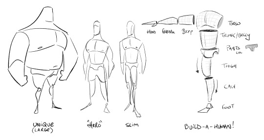
Something like this! You can vary all these individual elements in terms of size, thickness, taper amount etc to create different characters. If you ARE going to reference the 3d works though you'll need to apply some anatomy knowledge to overcome the weird shoulders, armpits and knees which desperately need blendshapes to correct the 3D volumes and approach it a little more like an animation supervisor. There's a reason why you see in making-ofs and art-ofs character designers, character leads or animation supes doing drawovers of the models. These are character models that have had great effort put into their 'base' silhouette but it still needs to be reinforced in every frame for maximum appeal.
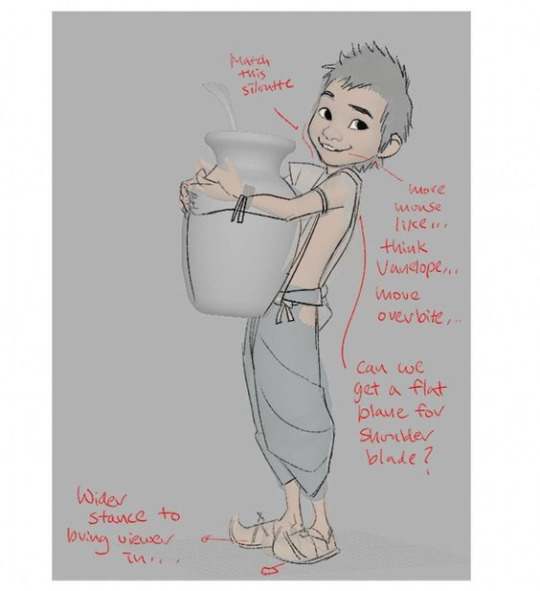
Shiyoon Kim for 'Raya' This sort of thing will occur at multiple stages during the animation process. Shiyoon Kim's notes are post final model but pre-animation. Most likely for internal rig tests, exploring what blend shapes and alt shapes are needed for the rigs etc. If your production has time, this will continue all the way to final anim. IF! But it's interesting to see how he emphasises the shapes and enhances the character acting of the 3d model.
As for 'mundane things' - I wouldn't say they're second nature! (If that makes you feel better!) I have to actively really persue certain advice and try to figure out how to best apply it. This can sometimes involve redrawing and redrawing an element of the drawing until I've grasped the nettle of whatever I'm after or…..until I get frustrated and either delete the drawing or just call it done lol
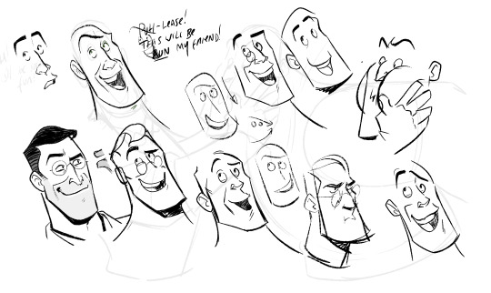
Here, I'm looking for a really specific flow of the head that sells both the acting and a subtle head tilt. I'm also trying to apply the general mantra regarding faces that converging lines (set by the eyebrows and mouth) are more appealing than parallel. It's tough! I also tend to use a drawing I've already done as a template/reference on the page too. Oh! This page is an amazing example of why I'm not an animator or storyboarder…consistancy? Who is she? 💅
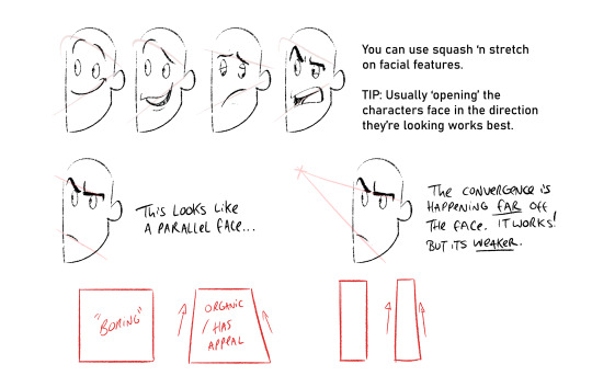
Converging lines (that form tapered shapes) are always more appealing than parallel. Using this logic you can loft the facial features across converging lines to create dynamic appealing espressions. Combining this with anatomy, perspective and rotation is the tough part though. I'm still learning o7
The things I probably think about MOST are always flats vs curves, simple vs complex and general line of action/flow...and then eliminting tangents. Each of these can be a dedicated visual-essay on their own - hence my stumbling as to answer your question. Anyhow, not sure if it's ever come up on this blog but I looove dinosaurs :)) so i'm using a wee piece to demostrate these ideas! (but also to demostrate these concepts apply to everything from humans characters to animals, props and background design)
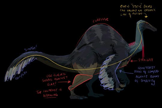
Okay, I'm getting self-aware that this is getting really long :') I have a wee tutorial tag for my blog if anyone wants to comb through my garbled art-thoughts. Learning, studying, repetition and practice will always be the greatest teachers! I'm glad you like my art- thank you so much for the lovely comments - I feel like such a noob still and not qualified to give people advice but we're in it together learning! High-five! 🙌
#tutorial#asks#sorry for any spelling mistakes whoops!#hopefully...this is VAGUELY useful or interesting to people ;;#TBH I'd much rather do youtube drawovers/videos of my own or others work as that is...my job...rather than doing writeups lol#its much easier to talk and vibe about a piece of art vocally than to try and make everything uber succint in writing
313 notes
·
View notes
Text


#in the full video i feel like he does look almost like he feels bad about what happened#dylannstormroof#tccblr#I've never uploaded a video to tumblr from my cellphone so hopefully it works fine >_>#tcc tumblr#tcc fandom#tee cee cee#teeceecee
164 notes
·
View notes
Text
this is a good story
424 notes
·
View notes
Text
So I've been following @indieyuugure's The Mutation Situation (which is very very good), and after reading her post about how the turtles can't have it all, the next time I listened to this song this idea assaulted me like a vision.
So obviously I had to go on a weekend art binge.
#I took some liberties with the framing of events#gotta push things slightly sideways music-video style to match the picture in my head#also I still don't feel like I got the boys' hairstyles down#but hopefully they're readable enough lol#I probably could have figured it out + matched my vision even closer if I took 3-4 times as long#but the goal was to get this done before I return to work tomorrow#which I succeeded at!#and overall I'm pleased with the outcome#tmnt 2012#the mutation situation#yza animates a thing
319 notes
·
View notes
Text
Nimona!!
Love this wet cat of a man lmao
Speedpaint:
youtube
#nimona#ballister blackheart#ballister boldheart#fanart#my art#hopefully the video part works lol#Youtube
451 notes
·
View notes
Text
I know this is just a silly bad quality random screencap of a screencap that I found on facebook lol, BUT it's a succinct enough image to easily describe the concept in a quick/accessible way hopefully :
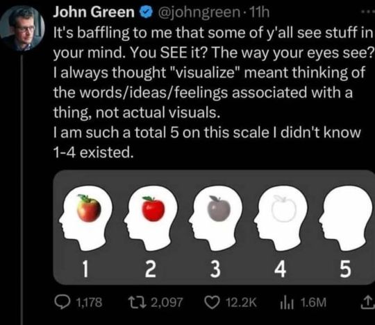
-
(and of course, feel free to elaborate in tags, etc.! (especially elaborating about other senses as well.. can you "hear" in your mind just as well as you can "see"? taste? etc.) It's an interesting topic to me, as someone who's like a 4.5 at MOST lol. I'm curious what option will be the most common :0c )
#tumblr polls#hrmm... a little poll perhaps.. about a subject I find interesting.. since this image came across my facebook today#still really not feeling that well. no longer shaking violently and such but I still feel weird and weak much more than usual#They did say my markers for like infection or inflammation were elevated but that they werent sure of the cause so hopefully#it's nothing too serious. they did also say a lot of different things can cause that thing to be higher than normal but didn't go into spec#fics of what. maybe some of them are relatively benign or something. I still havent felt much back to normal since#I got really sick that one time though. I feel fine on and off but then little bouts of feeling weird and sick happen. hrmmm#ANYWAY.. looking for small ways to be productive. such as little doodles on evil ipad or editing game videos#or posting polls or cat pictures or some other like not very labor intensive things#I WISH I COULD FOCUS on writing HHRGGhh... I need to finish my game.. it would be so freeing.. a project that's been looming#over my head for like 5 years even though througouht that 5yrs I've probably spent a total of 3 months working on it lo.. ANYWAY#I still partially really cannot beleive that people CAN see stuff in their heads. There's always part of me that's thinking like. well mayb#e everyone DOES see the same exact thing but we just describe/conceptualize it so differently that we think we're talking about#different things when we're really not. But I have been assured by people I've talked to about it that they can GENUINELY really see#stuff in their heads like as vivid as an actual picture in real life or something. And the other senses are neat too. Like for exmaple I#can hear in my head much better than I can see imagery. I still CANNOT hear vividly like as if I were listening to actual music out loud..#but I think it's developed more than my sight. AND interesting how this varies the creative process. a friend I was talking to on the phone#said they write by literally just watching stuff play before them like a movie. where my process is COMPLETELY different. AND that affects#the content/what details we focus on as well as our individual styles of writing have differences that can be traced back to that.. hrmm
537 notes
·
View notes
Text
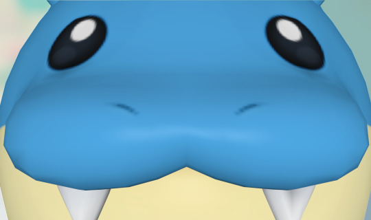
#spheal#i wish i could post circular images on tumblr. because this one is deserving of a fully circular PNG. i could technically just take a#regular square image and then make the edges transparent to make it *effectively* a circle‚ but like… would that appeal?#if that would appeal then i'll do it. i don't think it would be *too* prohibitively hard. i would be willing to make an addendum#with a circular transparent image of spheal staring at the screen if enough of you want it. either way#this guy rolls everywhere and i think tumblr is gonna like that. i feel like this is gonna end up being a well-liked pokémon amongst tumblr#as in. i feel like. it already is. because. of how it is. i just don't know bc spheal isn't like. one of my favorites#it's cute don't get me wrong but it's just not one i think about all the time. it's one that i'll like if prompted but not unprompted#i'm gonna stop before i dig myself into a hole. i beat totk finally. it was very good and i honestly had way way more fun with it than i did#with botw. i have my criticisms obviously. it's not perfect it's not pmd. but it was very good. and now i've moved onto the next game in my#backlog. which is very long but i'm steadily working through it. hopefully i can get it done before i graduate this december and stop having#any time for the rest of my life ever forever to play video games. dreading that day. but uh#until then i will game. and hang out with my friends. and go on tumblr. and do all these things i like to do. until i no longer can#wow this got depressing i'm gonna Stop here. enjoy spheal
657 notes
·
View notes
Text

."Didn't need your help, Leech.".
#geoffrey mccullum#jonathan reid#vampyr#mcreid#vampyr game#vampyr 2018#vampire#mccreid#sketch#timelapse#video#blood#gun#geoffrey x jonathan#jonathan x geoffrey#.I FIGURED OUT THETIMELAPSE THING AHHHHHHHHHHHHHHH.#.VINDICATIOOONNNNN.#.love them fics where they’re like “’mcreid worked naturally so well together it was spooky’ like YES HELLO!!!! love u.#. hopefully the Timelapse quality isn’t too bad but I’m happy I got something 😘.
104 notes
·
View notes