#hope to mix markers pens and paint
Explore tagged Tumblr posts
Text

amber eyed shapeshifter
#art#traditional art#artists on tumblr#shapeshifter#felines#bobcat#birds#owl#great grey owl#parsleydraws#parsley draws#prl#this was really fun to make!#hope to mix markers pens and paint#more like this in the future ^_^
70 notes
·
View notes
Text
Woman I would die for and her crazy ass partner


#THE PRISM DRAWING IS HEAVILY INSPIRED BY MEL FROM ARCANE#CAN YOU TELL I HAVE A TYPE#anyways I just. wanted to draw her a little dressed up and it ended up rocking my shir#shit#prism is SOOOOO freaking beautiful u guys#AND SO FREAKING INTELLIGENT!!!!!!!!! GOD. she's an engineer and freaking. AWESOME about it#i absolutely adore her as a character i hope so hard she's got a major role next game#and my phoeeeenix#constantly changing bits about their design#I'll be happy with them someday i SWEAR#i really like the shading on both of these tho#it's a mix offff highlighters and alcohol markers with some paint pens and gel pens#also they're both sketched in highlighter#cannn you tell I love mixed media#alas#ieytd#[agent moose's art]#i expect you to die#roxana prism#agent phoenix
24 notes
·
View notes
Text


Once more unto the breech dear friends, once more
#lots of big changes coming up again#although it’s scary to jump into the unknown out of everything you’ve built it is the natural progression#you cannot grow if you do not go#annoyingly lol#this has kind of made me feel better about leaving what I know behind#if you see this I hope you have the courage to grow <3#my drawing#my sketchbook#artist alley#drawing#sheep#flowers#meadow#nature core#mother nature#growth#river#stream#art#painting#gouache#markers#mixed media#Pen and paint
3 notes
·
View notes
Text
Puppeteer AU Fanart
(Mixed Media Traditional)
(Sorry for glare)

I am a fan of @rorydrawsandwrites 's Puppeteer AU and decided to draw some fanart. I also decided to do it traditionally because I haven't made a full piece in traditional in a little bit!
I hope you like the art!
----------------------------------------------------------
Materials used (for those interested):
Grumbacher Mixed Media Sketchbook
Ohuhu Alchohol Markers
Crayola Colored Pencils
Masters Touch Premier watercolors
Grabie Paint pens
----------------------------------------------------------
If ur reading this hi!
Likes and reblogs appreciated
Please follow for more fanart and fanfics related to TADC (specifically Caine)
#the amazing digital circus#tadc#tadc jax#tadc gangle#jax#gangle#puppeteer au#tadc puppeteer au#puppeteer gangle#puppet jax#puppeteer au fanart#tadc fanart#the amazing digital circus fanart#rorywritesanddraws#jaxangel06
129 notes
·
View notes
Text

I miss this face.
Tech deserved a happy life on Pabu with his brothers & sister. Well, darn it...all the Clones deserve so much more! Why can't the Empire just clear off and let them just live their lives? Of course, we know that doesn't happen. I'm so nervous about this season of The Batch Bad...I don't want anything bad to happen to anybody! (Except Hemlock...I despise his smug face.)
I wanted to draw a super happy Tech in his casual outfit, just enjoying a beautiful day on Pabu with his handy data-pad & one of those fun-looking Pabu fruits. Pabu flowers remind me of Bougainvillea, which grow a lot in Southern California (making me reminisce about my home state). I also just wanted to draw Tech in general, as he is one of my all-time favourite Star Wars characters.
I hope everybody likes this! I enjoyed creating this piece.
Drawn with Sakura Pigma Micron pens, and then coloured in with a mix of Copic Markers & Ohuhu Markers. The clouds were done in Photoshop Elements, because I am terrible at painting clouds.
Star Wars/The Bad Batch/Tech © LucasFilm & Disney
Fanart © me, Jacqueline E. McNeese
#star wars#the bad batch#tech#star wars the bad batch#star wars tech#the bad batch tech#tech tbb#tech fanart#star wars fanart#the bad batch fan art#star wars pabu#pabu#tbb pabu#clone force 99#star wars clones#ct 9902#i love tech#i miss tech#my fanart#copic markers#ohuhu markers#traditional art#pabu flowers
161 notes
·
View notes
Note
can you do a breakdown on how you color? i find interesting how you mix many textures and colors in a piece
Ofc! Color is my favorite thing about drawing. :D
I made like a very brief rundown with the technique I use for a majority of my drawings but ofc it still varies a little.
Usually the only cases my process diverges is in the rendering. The color jitter (can be applied to most brushes in most Programms though the water color 6 brush is like my special angel child) makes a rlly big difference during the rendering due to there already being a lot of texture and Color variation and is something I always do.

After step 4 I usually only stick to either the textured ink for a lot of control, to the velvet for a lot of texture and depth or the classic soft for a more soft gradual end product where the color jitter only shines through.

With the first and third the key word really is color picking.


An example for the third brush. I here I made the overlay extremely faint and used the underpainting peeking through as a way to separate the parts of the coat rather than the lineart (at least from the first to the second picture). Using hue as contrast without making a clear dark-light contrast can be a bit difficult if it‘s done solitarily in a painting but due to color having different depth-perceptions (cool colors seem further away, appear darker even if they have the same value) it is fun to play with esp in combination!
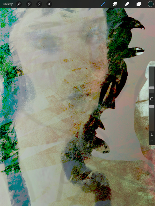
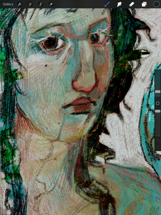
Using the velvet brush is my favorite atm. You can use really vibrant colors and apply them similarly to how you would with ballpoint pens or coloured pencils. It‘s really easy to draw subtle changes in hue without having to be too particular about having the right color and building up the colors leaves you with both a direction that signals to the form of the subject and a rich multitude of different colors that appear completely different than a flat color can.
For this I recommend starting either darker or lighter in order to build up the color in one direction of the other!
Another tip is also to use blur to reduce the sheer amount of color variation of the color jitter if you‘re going to redefine most of the shapes anyways.
Here‘s a speedpaint where I use most of the things I‘m talking about. Flash warning for the sheer amount of color adjustment making the screen flicker at the beginning.
I also didn‘t mention gradient maps yet. Very useful for further color adjustment and in order to bring a very busy composition together color-wise!
Color still is a very individual thing I feel like. There isn‘t one way to color and the way my process is right now is very much fit to my understanding of it. I feel like the decisions you make when rendering; experimenting with colors you thought wouldn‘t go together, breaking the rules you have, figuring out how relative colors are simply because they cannot be isolated. It‘s trial and error but also learning practical lessons that make color make sense to you as you go along.
I hope this makes sense! Color is so fun and I‘m always excited when I get an ask about it. :‘D
Also the jittery water color 6 and Textured Ink brush is free I believe. The bottom two are from a paid brushpack from a creator on instagram. I‘d say only the water Color 6 brush really is something that I find uncommon. The other three can be easily swapped for any other brush that has similar properties. (Pressure sensitivity + texture for the first two and flat marker + texture for the last). I‘ll repost this with a link if anyone‘s interested!
#art#art process#coloring#color theory#artwork#starling‘s art#Ask#flash warning#for the speedpaint#Just to be safe!
48 notes
·
View notes
Note
Heya pookie, I really love your drawings and the way you paint. Like rghh your art is just so scrumptious please don't ever die. ♡(ӦvӦ。) I'm also really thankful I came across your account last year, because you and your arts were one of the inspirations I had to get back and relearn drawing again after I had an awful burnout for 2 damn years.
------- I've been meaning to ask this for a while now, but I was too embarrassed/nervous to even reach out to you. So I hope you don't mind me asking...
What materials do you use for drawing? Like what kind of paint and papers do you use?
I've been struggling to find a good art medium for a while now, I even tried acrylic markers and it didn't go so well... And tiny acrylic pens are such a pain in the aft to draw with because of how small they are lol. So it would really mean a lot...
Hello!!! I am also a fan of your account ever since you drawn Black Airachnid! Queen!!!💜💜
Anyway, sure I can list some supplies I use and the sketchbooks. They will be pricey (obviously)
Sketchbooks I always use mix media, they are sometimes good with using markers and acrylic paint. The acrylic paint on these papers don't heavily bleed through the papers but expect them to sound crunchy when you turn the page lol. The size of the books is up to you!
Some markers I use for outlining are Inklink Pen from Kingart. They come in all different sizes and help make drawings pop up with the outline. The sizes really help in case you want to outline small details without worrying if the markers bleed over it.
As for pencils, I just use plain old mechanical pencil. I used to have a set of "Artist'sLoft" fundamentals pencils that have different points (example, H2 I used for sketching since it is light while 4B is dark used for outlining or shading) In my opinion, you don't need to buy them to be honest. You can be cheap by buying mechanical pencils of a variety of points too. It's just to save money. [ You don't need a fancy one. Like the one grey mechanical pencil. I buy a whole pack, and they tend to be cheaper. Don't be like me😒]
I had used acrylic paint as I started to pick up the brush about a year or two. There are different brushes to use for acrylic (Mix Media brushes I think). I buy all of these in Walmart. However, when painting, one of my biggest pet peeves is that the paint literally dries up too fast. Also, cleaning the brushes is a pain, too. If you like painting, use the Mixed Media sketchbook.
Color pencils I brought from a pack called "H&B" but I think you can buy cheaper ones. It really only matters if you understand color theory, and then the results would be amazing regardless of the quality of the supplies. I myself am still learning🥲
As for markers, I use Dual-Tip Acrylic Markers from Pagather. They are new to me, so I'm still trying to experiment with them. They are good with the Mix Media sketchbook as they don't bleed through the pages. I so far like it. (Forgot to mention the old markers I used for the perfect Cell drawing. That one I used was azure Quality alcohol based markers. Truthfully, they're good at first. However, they dry up too fast. They are a waste of money if you tell me as they dried up for me less than a week. So I wouldn't recommend) So don't buy alcohol markers. They even bleed through the mixed media sketchbook
That's really about it I use art materials. I hope this somehow helps you, friend!💜 Don't be shy to ask me things! I'll be happy to reply when I have the time. Peace! 😁
6 notes
·
View notes
Note
Hello! I am on a great expedition to find my artstyle, and I just wanna say I really like the way you do coloring and lineart! May I ask what markers you use and how your process of drawing goes? I have no idea how to go from pencil sketch to color, lol
Hey hey! Sorry for the late response 😬
I use alcohol markers (some copics and some deli sketch markers) and water-based markers (faber-castell pitt artist pen brushes). Alongside that i use highlighters, color pencils or acrylic paint. I loveeee mixed media.
As for my process, i start with a pencil sketch and after that i usually go in with my alcohol markers (which is almost always the skin). Since im working with a traditional medium i need to layer a few different colors to get the right shades. I do the layering most frequently with the water-based markers. After the flat colors i do the shading. When i shade i just eyball things (which is probably incorrect lol) and usually use two shades for the shadows. It could be light blue and darker blue or different shades of purple. Tho i also use my many shades of grey. This all sounds complicated but i just go with the flow yknow?
After the shadows i do the lines. You may notice that i dont do black lines, its cuz i suck at em. So i just take the very same water-based markers and do the lines. I pick two different colors to do this. Now, when i need to define some details i mayyyy use a fineliner. And after all that i add some pizzazz with colored pencils.
This may be a lot but notice how often i say 'usually'? Its because all of this isn't set in stone. I experiment, play around with things and i believe that's the only way you can find your own work process. Experimenting!
Either way, thank you so much for interacting with me and i hope my ramblings were at least somewhat helpful lmao
Carry on my brave soldier 🫡
3 notes
·
View notes
Note
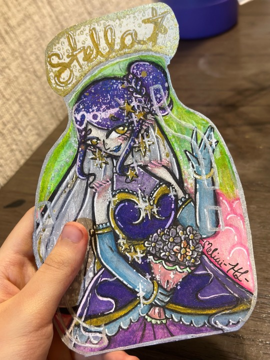
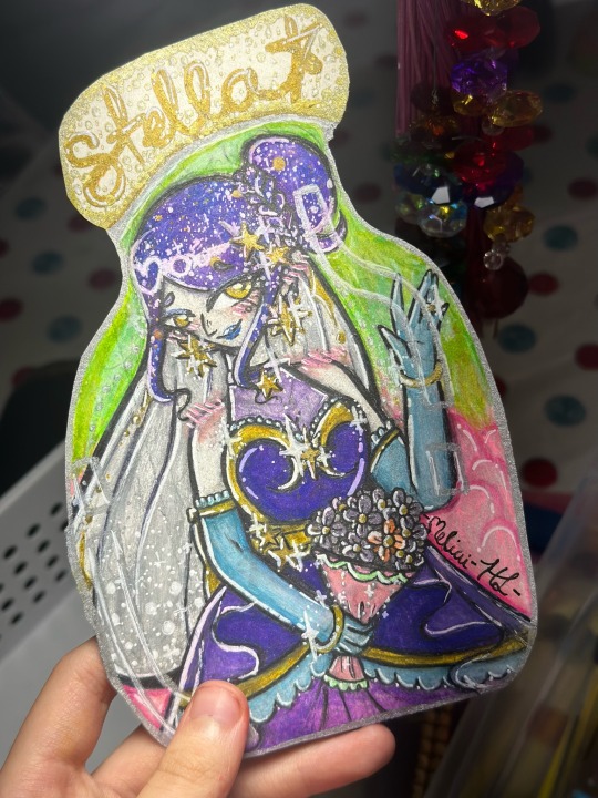
Hello Arcadekitten!!! I read the Stellamb wedding post(s) and it got me wondering about how Stella’s wedding dress would look like… I absolutely love Sweet No Death, so I knew I had to make some artwork of it!! And, because I absolutely suck at explaining things through text, here is my interpretation of Stella’s wedding outfit in traditional art! ✨💫🌟
Materials Used: Mixed Media Paper, Ink Fineliner Pens, Alcohol Markers Gel Pens, Paint Pens, Highlighter and Mechanical Pencil
Time Took: 1 week
I don’t know if you’re okay with people sending fanarts and stuff to you, but I absolutely love your work and well, I’m quite proud of this piece (even if I probably shouldn’t be lol) as I worked extremely hard on this and wanted to share it with you! I hope that’s okay ❤️
A little artist “#Deep Dive tm” because I put WAY too much effort into the tiniest details and I am NOT gonna let them get overlooked 😤 /jk
-Stella’s dress is made with her signature colors rather than white, because I felt that with her being a Star Witch and all, a species that mostly has extravagantly colorful clothes (in my humble opinion) she felt that just going with plain white on what is possibly the most important day of her life would feel… well, a bit redundant, so she opted for a more ‘colored’ ballgown, with lacy gloves and a pearled veil and all. The local tailor and dressmaker is a bit confused, but Lambchop is definitely not complaining! ;) 💕💓
-(Well, that, and I also felt that the color blended WAY too much with her skin tone and changed it, but that’s my little secret hehe 👀😉)
-In my mind, Stella can make her hair look like it has a small galaxy within it! With actual moving stars and little twinkling lights. ✨💫✨⭐️🌟I think that she usually saves it for special, grandiose occasions, buuut since she’s not the kind of person who would THROW a grand, special occasion, she never unveiled it before her wedding day! (Poor Lambchop’s heart nearly gave out on the spot right then and there! 😭❤️)
-I didn’t add her usual Star hair clip because she already has like… 10 stars in her design already lmao /lh ⭐️
-As you can see, her bouquet’s… cloth? Fabric? I’m not sure what to call it… thing? The stuff that her flowers are wrapped in are Lambchop’s colors! Thought that it would be a neat visual detail… also, I can totally imagine Stella requesting that specific color scheme from the local florist! 💐🌷🌸
-Speaking of flowers… I decided to color in one of the moon daisies a little bit… differently hehe ;) It’s a small reference to the beginning of the game, where we see Stella change the color of the one rebellious moon daisy, from orange to lavender, except this time… she keeps it and uses it in her bouquet! 💖💗
-I like to think that it symbolizes Lambchop versus the rest of the townspeople… and Stella’s way of acknowledging him as a “real person”, at least compared to the others… one who is different, one who is unique… the one that she’s going to marry 💍🩷
-(it’s so absolutely sappy when she tells him so that he just couldn’t resist kissing her right then and there)
-And finally… (this is the last one I promise) I cut out the entire drawing to make it look like a potion bottle, partially because Stella is a witch, and partially because I had this cute lil idea that she stores all of her happiest memories into a magical bottle and takes it out whenever she feels sad, so that she can ‘experience’ it again and feel happier. Of course, with Lambchop by her side, she never really has to use it!💞🩷💗
-And yes, I also made the bottle have Lambchop colors as well 🐏 Just a nice little thing tying em together more visually… ❤️
…And I am SO SORRY for ranting!!! I worked incredibly hard on this piece (traditional art is NOT my strong suit, lol) but I wanted to make something special for one of my favorite games and one of my favorite game devs! So here it is, and I hope that you like it! 🤞❤️😁
(P.S: Any ideas for Lambchop’s wedding design?)
Oh my goodness this is BEAUTIFUL!! The artwork itself is just stunning!! You took so much time on it and it really shows, especially with all your attention to detail in it(and I LOVE hearing your explanations for some of the choices you made!! They're just so darling!) Everything about this is stellar and I'm in love with it, thank you so much!! ♡ ♡ ♡
Also I TOTALLY AGREE Stella would not wear white for her wedding!! Color all the way!! ♡
As for Lambchop's outfit...I think I've got it envisioned in my head but I haven't quite drawn anything for it yet! Top hat, definitely. I think his suit isn't black. Probably brown! Bowtie on the neck. His pants are more like shorts and are cut juuuuust above the knee! Still wearing long socks with garters. He looks incredibly dapper--as he should!! It's his wedding!
Hopefully he at least looks good for the photos before he decides to get any mysterious red stains on his outfit. (It's fine. Stella could clean them with the snap of her fingers, but still!)
76 notes
·
View notes
Text


Day 4: Star Wars
May The 4th =]
Queen Padmé Amidala in my art style!
First time drawing her and I really enjoyed making this one!
Used watercolours, ink pen, acrylic markers and gold paint for accents on my Canson mix media sketchbook.
I hope you like it!
#shaya fury#art by me shaya fury#art#traditional art#traditionalart#traditional illustration#star wars#may the fourth be with you#detchartgames
11 notes
·
View notes
Text


my day to day materials [pictures included are my own]
I thought I should start by detailing what I use the most during my grimoire and book of shadows work, as I spent a lot of time searching for the right products that would suit what I want and wanted to use them for
my grimoire and book of shadows books were purchased online via Etsy [but they do have their own website] from a beautiful bunch of ethical creators - same base deign but changes in the stone on the cover to differentiate the two
the store is called KarmaRipon, a UK-based sustainable seller who create handmade bound books to sell among other items [ https://www.karmaripon.co.uk/ ]

For my backgrounds/designs and other drawings, I use a mix of things
* Posca Paint Markers: I have these in silver, gold, white and black in a variety of sizes. The one I recommend for blacking out pages such as in the photo is the 8mm chisel marker. These have no transfer through to the other pages and create gorgeous opaque coverage too
* Fineliners: I use these in smaller and more detailed drawings, as well as adding finer details to other pieces within my pages. I use a mixture of UniPin and EuroElement fineliners, ranging from .003 upto 2.0 thickness.
* Metallic Oil-based Markers: I also use these on occasion, however they do leak through the page due to being oil based, but the bronze colour is to DIE for! The set I'm currently using is from Pēbēeo and includes white, black, silver, bronze and gold.
For my normal writing I use a UniBall eye fine gel pen, all the look of a quilled page without all the trials of using one. Eventually I may invest in a fountain pen for my writing but that may be something I look to later in my journey
anyways, I hope that's a helpful insight if you're struggling to find inspiration for designs, materials or books whether now or in the future, and feel free to ask any questions about the supplies or the process and I will answer them as best as I can!
#tarotblr#witch#baby witch#witchcraft#witch community#witch blog#witch stuff#journal#grimoire#book of shadows#art#gothic#dark#witchtok#witchblr#beginner witch#journalling#art materials#tarot witch#tarot#magick#blog#blogger
5 notes
·
View notes
Text
Naegamigiri/Naegirigami/Tonaegiri/FINE ARTS OF FINE PALS
Makoto, Kyoko, and Byakuya have artisitic abilities. However, they're better at some things than others. Makoto: He's more of a doodler and occasional crafter. Like, he's made a fake plant with a toothpaste cap once for a school project way back in elementary school though, for the life of him, he cannot remember what the project was about or even for. His doodles are primarily people and animals. Not the best doodles but not doodles that look like a toddler did it. He's good with using color pNot to be super serious with it but just because it's been a while and he wants to use one again or something. encils and just basic pens though he also has used crayons for fun. He takes eons to sketch as well and his lines are very scrappy. Also, he's done some doodling him and Kyoko holding hands or something or him and Byakuya holding hands in a notebook once cus he saw it in the movies and he wanted to try it out. And, because of that, he likes doing those specific doodles. He finds it fun to do and can tell Kyoko and Byakuya don't mind. He's a sap, dang it.

Kyoko: Perpetual sketcher. She uses pens, never pencils. She's too powerful to erase. She's also solid enough to draw with a permanent maker with confident lines if she wanted to. Kyoko rarely does this though. While Makoto's doodles are more archaic and rudimentary, Kyoko's are way more fleshed out with some shading and cross hatching if she's feeling like sketching more. Tons and tons of crosshatching. It's a nice rhythm and it helps her think sometimes though she doesn't have to do this. She just choses to if there aren't too big of stakes. Like if she's making a list for something. Sometimes has a sticky note she has on board and just crosshatches on the dang thing for thinking purposes while she writes lists for instance. Also, though she's good at drawing, she doesn't do it much due to being busy but also because she wouldn't know what to draw besides plants. She feels weird drawing people she knows but also isn't one to make her own oc's. That's not to say she can't draw people. She's pretty good which Makoto points out to her. Thus, she eventually gets more comfortable drawing her own classmates with the hopeful encouragement of Makoto since she never really thought about it before. For the most part though, she's pretty casual with the drawing.

Byakuya: He's a landscape artist at heart. He's pretty good with landscape sketches and painting. They're pretty detailed too. Is also good at architecture drawings as well and can make a mean floorplan. He likes his cool colors and likes painting snow of all things the most. He enjoys rendering it. His main painting mediums are gouache and water colors. Markers are not his thing and he mostly uses color pencils as some mixed-media highlights if he's feeling a bit more experimental. People and animals are where he struggles though. AKA, his art reflects his social skills. Badunsh! Even then, Byakuya barely draws or paints much anyway since he's busy doing the financial heir stuff. He could recreate a mean Bob Ross painting though. He's got that much skill in him.

#danganronpa#danganronpa art#danganronpa fanart#danganronpa headcanons#danganronpa makoto#makoto naegi#danganronpa kyoko#kyoko kirigiri#danganronpa byakuya#byakuya togami#naegirii#naegami#togiri#naegamigiri#naegirigami#tonaegiri#the naegamigiri rambles#text sector#yet another headcanon that got born cus it's very cute#also they need to draw each other!
14 notes
·
View notes
Note
what supplies do you use for traditional?? coloring materials, pens, sketchbook, paper, etc?? looks great!!!
Thank you so much for asking! I hope you find my reply helpful! And sorry if my English is bad з:
Actually I use a lot of stuff for my drawings. It depends on what affect I want to achieve in my artwork. But every material has its pros and cons.
Recently for coloring I started using acrylic markers. Their colors are vibrant and if you made a mistake it's much easier to correct with markers. But they don't really mix together. That's why there's a difficulty when you're trying to achieve more complex colors. The color palette is limited. It's very similar to the tempera and acrylic paints. But they're mixing together much easier.
Often I use watercolors for my artworks. I like watercolor affect and more pale colors but I think I'm not skilled enough to use them. Coloring process takes a lot of time.
For the line work I was using micron pens but they're very expensive for me right now. So recently I bought simple calligraphic pen and ink. I still need more practice with it tbh but I like how lively the lines started looking.
I usually use 190 g/m³ paper. It's suitable for various materials.
Hope you find this helpful! 🌻
9 notes
·
View notes
Text


Hi! These are Kat and M. M is the kitsune (fox) and Kat is… well, the nekomimi (cat). That one was probably obvious because her name (not her real name) is just “cat” with a k.
I did these with alcohol markers and honestly? I think this is the second or third time I’ve colored something successfully with alcohol markers. Oh, and this white paint(?) pen I got in a tube of colored pencils.
(Random rant stuff below)
So, Kat and M are twins. Not identical in any way except their skin tones. M wears a mask that says “Anxiety Sux”. Originally, M was this… chaotic character in terms of her original design(s) (there was two other ones before this).
To put it into words, M was a mix of different things that I liked. Whether it be fandoms, daggers, or pancakes, it was put into her first and second designs. Her “mask” used to be a piece of tape that said ANXIETY for the anime/manga Komi Can’t Communicate.
I kept the “covering her mouth” thing, but changed what exactly covers her mouth. She used to have part of her skull showing on her right side for Undertale. I gave her an animatronic cat ear (on her right, again) for FNaF, and a normal cat ear on the other side.
She used to have two fox tails (still does) but one was purple because I have a Sonic OC that is a purple fox. There was a Cuphead handle, Mike Wazowski’s horn (the other horn was the handle), magic sparkles, a snake tattoo, a book on her hoodie, candy corn on her hoodie, a bunny face on her hoodie, and more that I can’t remember.
Kat, however, was based off of a picture I found on Google + Wattpad roleplays in comments. Here’s the image:

Now she’s just my inner child with part of my personality. My eyes are mostly green and brown, so I split the two colors between the characters since they each have different parts of my personality.
If y’all want a more in-depth rant on my characters, please tell me. I would love to know. If you’ve got questions, my asks are always open. I hope you’re having a good time wherever you are!
#artists on tumblr#rant post#writers on tumblr#kitsune#nekomimi#neko#neko girl#kat and m#my art#my ocs#my writing#my post#traditional drawing#traditional art#traditional illustration#traditional sketch#markers#not my art#the last picture is not mine
2 notes
·
View notes
Text
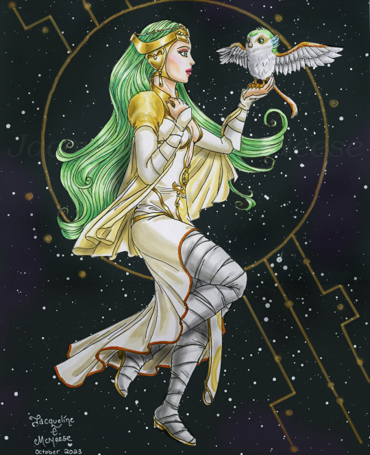
"We are the ones who guard the power. We are the middle, the beginning, and the end." - The Daughter, from the mural (Star Wars Rebels)
I've watched the season finale of Ahsoka three times now (1st was by myself, 2nd time was with my son, and the 3rd time was with my Mum). A certain scene near the end of the episode - after a realization of what it was - made me think back to two certain special episodes: one from The Clone Wars and one from Rebels. This idea came to me on Sunday (October 8) night, so I quickly sketched out The Daughter and Morai, then coloured it in on October 9 (Monday). I always found the "Mortis gods" or "The Ones" rather interesting. I've always liked characters that have a small or short appearance, yet their character is important. The Daughter is so tall in her human form: 2.13 meters (or 6'9")!
I hope everybody likes this. Please let me know if you do Star Wars fan art (or anything sci-fi or from Dragon Age or Naruto). I'd love to see your work! Thank you to everybody who supports my art. You truly mean a lot to me. It is what keeps me going as an artist.
This was drawn with my usual mediums: Sakura Pigma Micron pens, then coloured in with a mix of Copic Markers and Ohuhu Markers. The background is acrylic paint on black posterboard. I actually cut out The Daughter & Morai from the paper I drew them on, then glued it to the painted posterboard. An interesting way to do mixed mediums, yes? The gold paint is actually metallic & shiny in real life, but sadly scanners kill colours and metallics. (Well darn, scanners sometimes kills the line art.) The actual art piece is 11.25" x 14".
I have another Ahsoka series fan art that I created last week. I will share it next week. I had posted it on my Instagram, but Insta is horrible to so many artists (especially if you do traditional art), because the Algorithim of Doom buries your work so deep that nobody sees it. My art basically fails on Insta. So I believe that from now on, I'll only submit my artwork here on Tumblr.
Star Wars/Clone Wars/Rebels/The Daughter/Morai © Lucasfilm Animation & Disney
#star wars#star wars fanart#star wars art#sw art#sw fanart#star wars rebels#star wars rebels fan art#star wars clone wars#the clone wars#clone wars#clone wars fan art#mortis gods#mortis arc#star wars mortis#star wars the ones#the daughter#morai#star wars the daughter#star wars morai#sci fi art#space art#green haired goddess
162 notes
·
View notes
Text

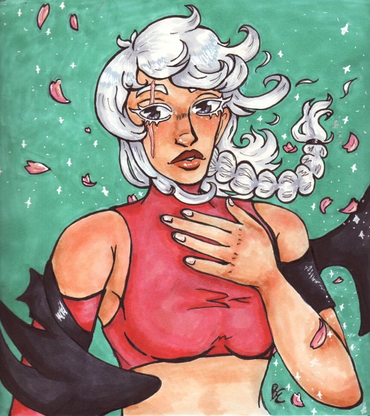
first two art fights!!! my skin toned copic i used the most died after this tho so i may switch to using pencil crayons or paint for a few art pieces bc some people rly dont have a lot of options for not-pale white characters :/ i was gonna mix it up anyways tho esp since my good inking pen also died, the one that doesn't smear with the alcohol markers sniffs sniffs.
anyways hoping to get more done soon, its been a rough start of the month with the whole unemployed thing really hitting hard now
#my art#artfight#art fight#team vampire#team werewolf#i have 3 more revenges i wanna do for sure and then hopefully ill do some more drawings#txt
6 notes
·
View notes