#high-resolution JPEGs
Explore tagged Tumblr posts
Text
Top Tips for Actors and Models: Choosing the Best Headshot Photographer
The purpose of this blog post is to help guide actors and models on the importance of headshots and how to find the best headshot photographer for you. As a model or actor, you know the value of great headshots as they are essential to your career, and they can be a career game-changer. In this post, we’ll share a few tips to help you find the best headshot photographer to meet your specific…
View On WordPress
#actor headshots#actor portfolio#different types of headshots#facial expressions in headshots#finding a headshot photographer#hair for headshots#headshot investment#headshot photographer#headshot pricing#headshot session tips#high-quality headshots#high-resolution JPEGs#image delivery#importance of headshots#makeup for headshots#model headshots#model portfolio#online proofing#personalized headshot session#photo proofing#posing for headshots#posture in headshots#retouching headshots#retouching preferences
0 notes
Text

*continues to throw more OCs at you*
#my art#i have a tale of woe about the resolution#my original file on this was CRISP and high res#but then i fucked up and did too many edits on it that make it look worse but i only had a test back up file from before i did that#so i had to scrape off a jpeg and do small fixes to get this file#files dont like to be double jpeged unfortunately
29 notes
·
View notes
Text
Calling queer creatives!
My partner and I have been working on a queer arts and literary magazine project for the last few months and we would love others in the community to contribute.
The magazine, Queer In Time, will publish its inaugural issue sometime in the spring, and submissions close on March 1, 2025. We are searching for visual art, photography poetry, prose, fiction and nonfiction writing, but we are open to multimedia submissions as well.
We invite BIPOC, queer, and trans creators to explore the theme of utopia. What does a utopian world look like to you? How can we collectively strive towards it? We are looking for work that pushes boundaries, challenges norms, and imagines a future where we all thrive.
Some guidelines:
We prioritize and center BIPOC, queer, and trans voices.
Submissions should align with the theme of utopia.
We do not accept work that contains discriminatory rhetoric, including but not limited to racism, ableism, transphobia, homophobia, and fatphobia.
We welcome experimental and unconventional pieces, as well as traditional forms.
We accept multiple submissions from the same creator.
Include a brief bio (100 words max) with your submission.
Visual/Digital Art and Photography should be high-resolution images (JPEG, PNG).
To submit your work, follow this link: https://forms.gle/BNjXwawHnnaihM4G8
#zine#lgbtq#poetry#prose#literary magazine#queer#bipoc writers#bipoc artists#queer writers#queer artists
109 notes
·
View notes
Text
Okay but like, the thing is it would be SO EASY to justify within the existing WoT Lore too: 'a shard of the dreamworld where the souls of great heroes and villains are meant to rest in between reincarnations is threatened by [INSERT GENERIC COSMIC THREAT HERE] so those champions are called upon to fight against it'. Different Alts are different incarnations summoned from 'the dream', 'the well of history', or whatever to help. Alternate Universe Alts? Other turnings of the wheel we didn't seeing the main series (whose to say their wasn't a turning where Rand was raised Aiel or Perrin was an Asha'man?). Holiday events? Team bonding exercises to get all the fractious champions to work together. A plot? Barely needs to hang together. Give Lanfear a obligatory turning on the others to do her own thing/take over the universe and you're good.
And the longer it went on the deeper the pulls they could justify. And their are SO MANY CHARACTERS they would never run out if they where willing to reach far enough.
Man I've said this before, but if they made a WoT Gacha I would be so ruined so quickly.
Like can you IMAGINE the Halloween specials they would be running right now? Cute Sheet Ghost Rand? Witch Nynaeve? Perrin with FUZZY WEREWOLF EARS POKING OUT OF HIS CURLS?
#WoT Shitposting Hour#I am Anti-Manifesting THis By The Way#I am not kidding I would waste so much money gambling for high resolution JPEGs of my WoT favs it's not funny#okay it's a LITTLE funny
39 notes
·
View notes
Note
Okay so, got any advice on making pixel art? Anything at all?
I want to draw two of my characters in a style of the game they're based from, which happens to be a high-detail pixel game called Coffee Talk (for example, this is Freya, one of the regulars)
I don't have much experience with pixel art so far, I have some, but only minor stuff.
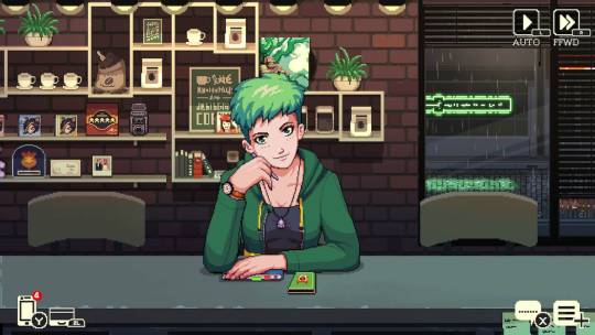
Sure!
If I was planning to do this, I would first search for a clean reference of a character from the game. That means without any jpeg artifacts and not blurry at all.
Then i would bring it into Aseprite (or whatever program you use), take my marquee select tool (M in Aseprite) and select one "pixel".

Doing this I can see that the pixel is actualy 2x2 px, which means the base sprite was scaled up 2x. So I will go to my image settings and scale the image by 50% (ctrl + alt + i) so I can have the art at its original resolution.
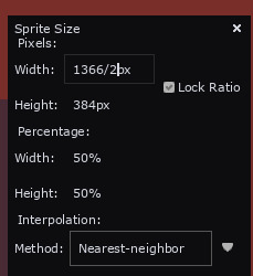
This is much much easier to work with and study for a pixel artist.
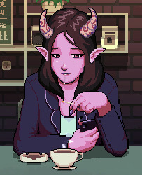
Then I would do my art side by side like this:
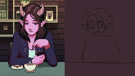
Studying from the original and mimicing stylistic choices when I can
You could also just edit the sprite (this is totally ok to do as long as youre honest/upfront about it, just like any study. So many beginner artists get started with sprite editing, its such a great way of learning).
I want to make a special mention to this website called Spriters Resource, if you're looking for game sprites (especially retro stuff) you may find it here!
If i don't know how to do something i always go on spriters resource and search games I like, so I can learn how they do it. This website is a goldmine for beginner pixel artists
Feel free to ask me any specifics in the future!! and GL
254 notes
·
View notes
Note
(stage whisper) how'd you make those pieces look like screenshots? what rules do you use for the lighting/color palette? do you use any sort of filter? please please pls I'd like to learn
I'm not sure what options every program has, but on procreate here's my process:
-work at a high resolution so it doesnt get too crunchy when you intentionally crunch it later
-keep any foreground and background figures on their own layer group for later depth adjustment
-Use a no-pressure, small round brush for lineart to give even lines with no weight variance
-keep colors on figures to flats and shadows, shadows are very light grey set to multiply. In brighter settings, a clipping mask 'add' layer of the light source's colors set to low opacity over the figures can make things pop.
-turn on alpha lock for lineart and use a soft brush to make the lines have a red sheen where light touches most. Then duplicate lineart, gaussian blur the duplicate at a low %, and merge them back together.
-if there are any figures not in focus, blur them now (diff types of blur can be fun here but gaussian works fine for static figures).
-save the whole image as a jpeg and reopen it. -start with a 1% gaussian blur on the whole thing
-open up 'glitch' and select 'diverge', set zoom to 0%, and play around with the shift levels (usually about 15% for the filter lever, and around 10% red shift, 2% others).
-open bloom and play with bloom levels until it feels right (i usually do between 20-30%, max transition, and between 25-40% for size and burn depending on image)
-add a low % noise filter over the whole thing
-1% gaussian blur one more time
-maybe a low % gradient map if you feel like it needs color equalizing
here's what they look like before and after i filter them (but before i crunch the resolution down, which blurs the glitchy bits)
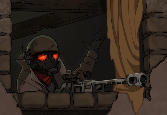
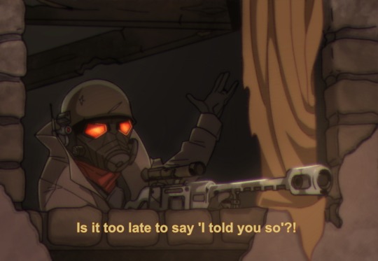
67 notes
·
View notes
Text
The mercs as actual job applicants I got at my work where I have to process other people's job applications god help me
Scout: The resume is a really high-quality high-resolution png photo of himself
Soldier: The resume is a crusty 144p jpeg photo of himself
Pyro: The resume does not contain his own name
Demoman: Under "hobbies" put "animes"
Heavy: Under "Hobbies" put "kicking"
Engie: The resume is his PC specs and nothing else
Medic: Normal-looking resume but his picture is upside down and his email is musclepenis69 at yahoo dot de
Sniper: Under "Reason for looking for a new job" put "quit previous job"
Spy: Under "Work experience" put "blockchain miner"
610 notes
·
View notes
Text
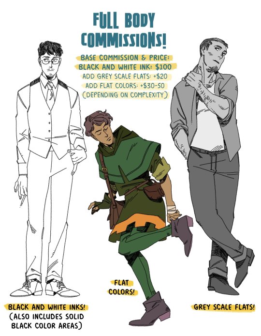
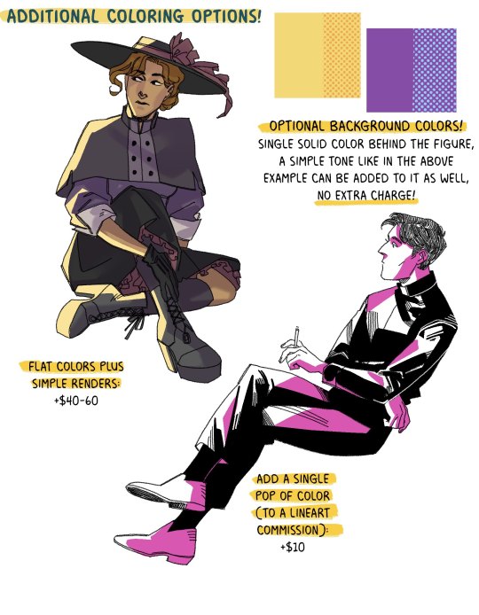
full body commissions, at long last!
the base price is $100 for a single figure, and then you add on the price for colors if you want that! flat color prices vary on complexity. if you have someone in a suit, then it's just +$30, but it's more like a complex period costume, then it's closer to +$40-50 (same for simple renders)
(simple renders are not an additional fee on top of the flat colors! I realize that it might be a little confusing, flat colors + simple renders is it's own thing, which starts at +$40)
anything over $100 can be paid either in it's entirety up front, or $100 up front, and the rest once completed (for this, I'll send a lower resolution jpeg of the finished illustration when it's finished, and the high res png when the payment goes through)
visual references are a big help! either art of the character, or things like a face claim or actor. if you have a character from a specific time period, please also send references of the clothes you'd like them in! if you have a pose in mind, feel free to tell me! It can be anything from standing around, to sitting down, jumping, etc.
these prices are for private commissions only! which means you can go ahead and get 'em printed or whatever for your own personal use but you can't use them commercially
currently, I don't have prices for a commission with a second full body figure! if you really want something like that, we can work out a price.
I'm also using a dead line weight in these examples, but if you want something that looks more like the inking style that I use in Trikaranos, just let me know!
🍊 commissions will be on a 10x15 in canvas at 300dpi :)
🍊 email me at [email protected], and we can talk details! I use paypal for payment, do not send me money ahead of time because this is not my paypal email and I use invoices.
if I don't reply in like, a day, feel free to message me here and I'll give you my other email where we can hash out details because sometimes, the perils of having an email on public display is that people will sign your email up for junk mail and it takes a minute to mark it all as spam
things I'll draw: established characters, ocs, your favorite dead roman or greek hero, I'm cool with it all!
things I won't draw: generally, I'm not too keen on drawing anyone under 18, as you may realize from the fact that many characters on my blog are vaguely in their 30s. like, it's not a hard rule, but I will fully admit right here that I'm better at drawing people over 20.
(also! again. money this month sucks, and the economy is honestly just a huge bummer for literally everyone everywhere. if my prices for full body comms are out of your range, I'm cool to do payments in $50 a month installments!)
#also my finances are a little yikes this month: if you get a full body commission i'll also throw in a little thank you head sketch of your#character. but that's a secret. shhhh.#commissions tag
154 notes
·
View notes
Text

what my mom sees when i, her oldest child, say i need to show her something "very important" then i pull up a glossy high resolution jpeg of my son, Silver the hedgehog, for her to look at
#rabbit.txt#as soon as i saw that template i knew what i had to do.#silver the hedgehog#sonic the hedgehog#idw sonic#idw silver
213 notes
·
View notes
Text
My Photography in 2024 by the numbers
📸 Total photos taken
In 2024, I took 18,277 photos, that's about 50 photos a day!
In 2023, I took 23,721 photos. So I took 5,444 fewer photos this year than last year.
Photos taken this year make up 27% of my photography archive, which is 65,814 photos total.
💽 Raw Photo Storage
Photos taken this year take up 677GB.
That's about $9.30 of storage at current hard drive prices (per diskprices.com, $13.75/TB)
In 2023, photos took up 914GB of storage, so we're down 237GB from last year.
Photos taken this year make up 25% of my archive storage, 2.64TB.

💾 Keepers
In 2024, I exported and posted 1,129 photos, about 4.25 photos a day.
In 2023, I exported and posted 1,600 photos, about 4.4 photos a day. So, while I exported 471 fewer photos (about 30% fewer), I maintained my usual posting rate.
Exported photos from 2024 take up about 11GB on top of the 677GB above. JPEGs are far smaller than raws!
🪩 Klout
Flickr
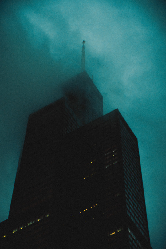
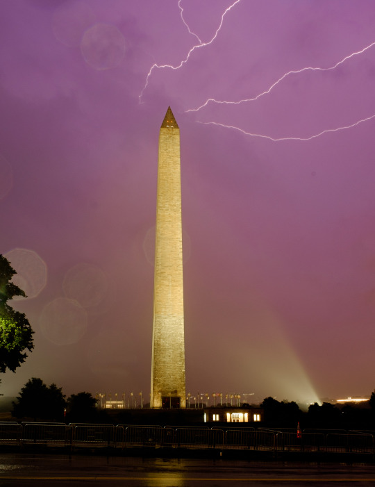
My photos received about 616,000 views, 18,500 likes, and were featured on Flickr's Explore page 19 times. That's up 130,000 views and 4,800 likes from 2023. My most popular photo was The Sears Tower
Tumblr
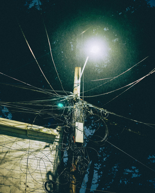
All but one of my top 10 posts of the year were photos, with I think we need to put more lines up there topping the list at about 1,800 notes.
My top photography post is still my 8 minute long exposure from Lake Placid from 2022, which topped 115,000 notes this year. None of my posts from this year broke into the top 10 posts of this blog by notes.
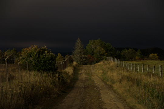
Electric Phallus Friday remains a thing every week. No, I do not run the daily blog for it. Tho, I bet I know who does. Thank you.
Google Maps
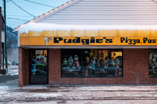
If you're looking at places around DC, or places I have travelled, on Google Maps you might spot some of my photos. My photos have 10.8 million views on Google Maps, with Kenilworth Park and Pudgie's Pizza in Corning NY both breaking a million views each.
IRL
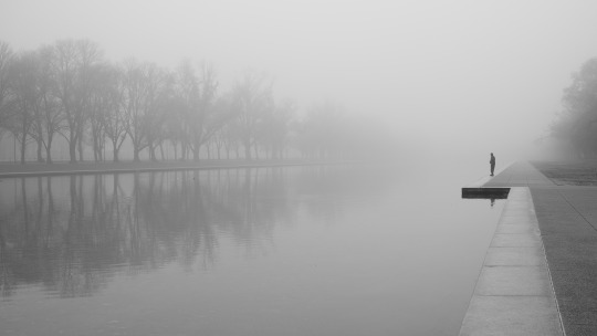
My photo Alone at the Reflecting Pool was a winner in the 2024 Exposed DC photography contest and will be featured in The DC Public Library's People's Archive soon.
⚙️ Gear
Cameras
In 2024, I used at least 10 cameras*:
Fujifilm X-T2 (248 edited photos)
Fujifilm X-E1 - Full Spectrum Converted (99 edited photos)
Fujifilm X-H1 (56 edited photos)
Fujifilm X-T5 & Full Spectrum Converted X-T5 (1,478 edited photos)
Film Cameras, mostly Nikon F3 (83 photos)
Panasonic LX100II (2 edited photos)
Panasonic S5 II (60 edited photos)
Panasonic GX85 - 590nm Infrared Converted (145 edited photos)
Sigma DP2 Quattro (45 edited photos)
Sony RX100 VII (35 edited photos)
This year I upgraded by trusty Fujifilm X-T2 to an X-T5. I had gotten the Fujifilm X-H1, which has the same sensor as the X-T2 (which I love), but with IBIS. An X-T2 with IBIS would be my ideal camera if it existed, but it doesn't, and the X-H1 handling is so different that I didn't enjoy it. I ended up selling the X-H1 and handing down the X-T2 to @dykedotexe.
This year I rented the Panasonic S5 II and Sony RX100 VII, both of which are fine cameras that I probably wouldn't rent again. I would love a high resolution Panasonic S5 body, maybe at CES?
Lenses

For full data, see the Read More
Top used lenses:
Fujifilm 33mm f/1.4
Fujifilm 16-55mm f/2.8
Fujifilm 56mm f/1.2
Viltrox 27mm f/1.2
Fujifilm 18mm f/1.4
The only surprising entry here is the 16-55mm. It's a standard zoom and the lens I've had for the longest. So, it's certainly my Old Faithful lens. However, I don't think I realized how much I was using it.
My most common lens combos are:
Fujifilm 18 & 33 - I travel with this setup frequently. They're both nearly perfect lenses I feel very comfortable using. Plus, they're fairly small.
Viltrox 27 & Fujifilm 56 - I tend to like longer lenses more than wider, and these two lenses are probably my favorite. So, you'll catch me with this a lot. Tho, it's a heavy setup.
Fujifilm 16-55mm - if I'm gonna be on a tripod or unsure of what to bring, this is the lens. It's big, heavy, and slow compared to all my primes, but I know it'll work. Fujifilm recently released a version 2 of this lens that I might need to pick up based on these numbers!
*in this section, edited photo counts are taken from Lightroom, a difference source than the Keepers section above. The numbers in the two sections are not comparable. Edited photos may not have been exported and posted.
🙄 To Improve in 2025
In 2024, my projects in Lightroom rarely got cleaned up. I still have imports from March that I need to curate and edit. 7,400 photos (40% of what I shot this year) sit in my Lightroom unedited.
This year, I'd like to curate my photos before editing them, separating out the keepers & removing photos I don't want to edit. Of course, they'll all be in the archive still. But, I think this would help wrap up projects rather than letting them sit around forever.
Thanks for all your support in 2024. I'm working on improving all kinds of things in 2025. I'm currently working on my posting system, which should bring some cool things when I wrap up.
Lens usage data
Viltrox 13mm f/1.4 (23 edited photos)
Fujifilm 16-55mm f/2.8 (313 edited photos)
Fujifilm 10-24mm f/4 (41 edited photos)
Fujifilm 18mm f/1.4 (167 edited photos)
@dykedotexe's Fujifilm 23mm f/2 (17 edited photos)
Panasonic G 25mm f/1.7 (145 edited photos)
Viltrox 27mm f/1.2 (179 edited photos)
Sigma DP2 Quattro - 30mm f/2.8 (45 edited photos)
Fujifilm 33mm f/1.4 (556 edited photos)
Sigma 50mm f/2 - L Mount (60 edited photos)
Zeiss Planar T* 50mm f/1.4 - F Mount (83 photos)
Fujifilm 50mm f/2 (35 edited photos)
Fujifilm 56mm f/1.2 (194 edited photos)
Fujifilm 50-140mm f/2.8 (28 edited photos)
Viltrox 75mm f/1.2 (61 edited photos)
Fujifilm 70-300mm f/4-5.6 (157 edited photos)
23 notes
·
View notes
Text
Tidbit: The “Posterization” Effect of Panels Due to the Consequences of GIF Color Quantization (and Increased Contrast (And Also The Tangential Matter of Dithering))
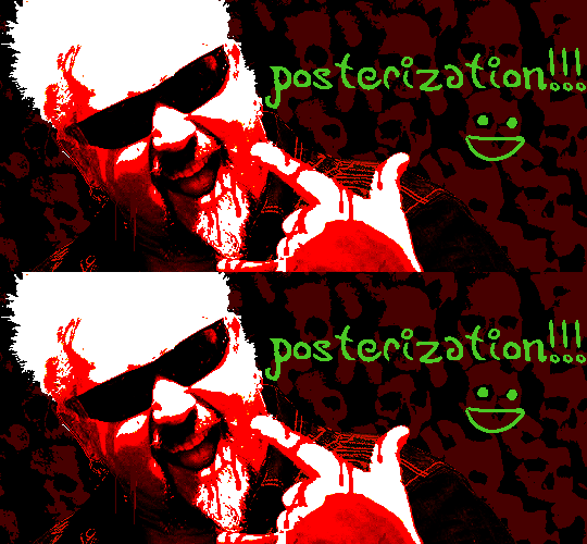
There���s this misconception that the color banding and patterned dithering found in panels is an entirely deliberate, calculated effect Hussie manipulated the image into looking with some specific filter, but this isn’t the case, exactly. It wasn’t so much a conscious decision he took but rather an unavoidable consequence of the medium he partook in: digital art in an age where bandwidth and storage was at a premium.
Not to delve too deeply into the history and technicalities of it, but the long and the short of it is back in the early nineties to late aughts (and even a bit further into the 10s), transferring and storing data over the web was not as fast, plentiful, and affordable as it is now. Filesize was a much more important consideration than the fidelity of an image when displaying it on the web. Especially so when you’re a hobbyist on a budget and paying for your own webhosting, or using a free service with a modest upload limit (even per file!). Besides, what good would it be to post your images online if it takes ages to load them over people's dial-up Internet? Don't even get me STARTED on the meager memory and power the average iGPU had to work with, too.

The original comic strip's resolution was a little more than halved and saved as a GIF rather than a large PNG. That's about an 82.13% reduction in filesize!
So in the early days it was very common for people to take their scans, photographs, and digital drawings and scale them down and publish them as smaller lossily compressed JPEGs or lossless GIFs, the latter of which came at the cost of color range. But it had a wider range of browser support and the feature to be used for animations compared to its successor format, PNG ("PNG's not GIF").
You'd've been hard-pressed to find Hussie use any PNGs himself then. In fact, I think literally the only times he's ever personally employed them and not delegate the artwork to a member of the art team were some of the tiny shrunken down text of a character talking far in the distance and a few select little icons.
PNGs support semi-transparency unlike GIFs, which is why Hussie used them to preserve the anti-aliasing on the text without having to add an opaque background color.
While PNGs can utilize over 16 million colors in a single image, GIFs have a hard limit of 256 colors per frame. For reference, this small image alone has 604 colors:

For those who can't do the math, 256 is a pretty damn small number.
Smaller still were the palettes in a great deal of MSPA's panels early on in its run. Amazingly, a GIF such as this only uses 7 colors (8 if you count the alpha (which it is)).
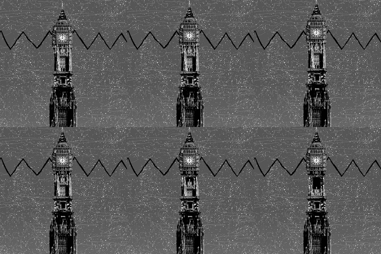

Not that they were always strictly so low; occasionally some in the later acts of Homestuck had pretty high counts. This panel uses all 256 spots available, in fact.
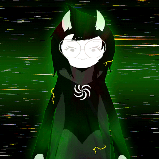
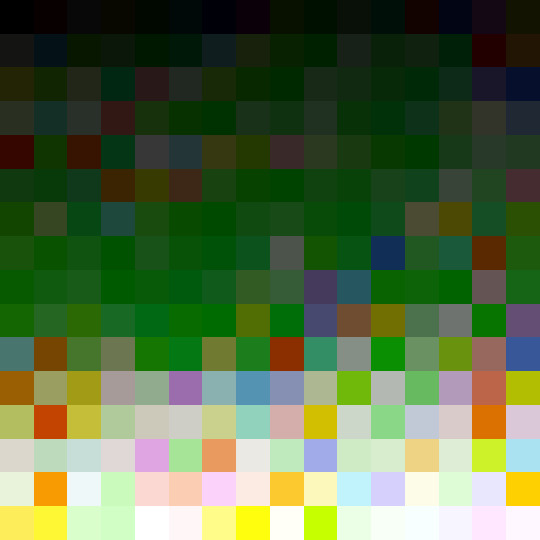
If he had lowered the number any smaller, the quality would have been god-awful.
To the untrained eye, these bands of color below may seem to be the result of a posterization filter (an effect that reduces smooth areas of color into fewer harsh solid regions), but it's really because the image was exported as a GIF with no dithering applied.

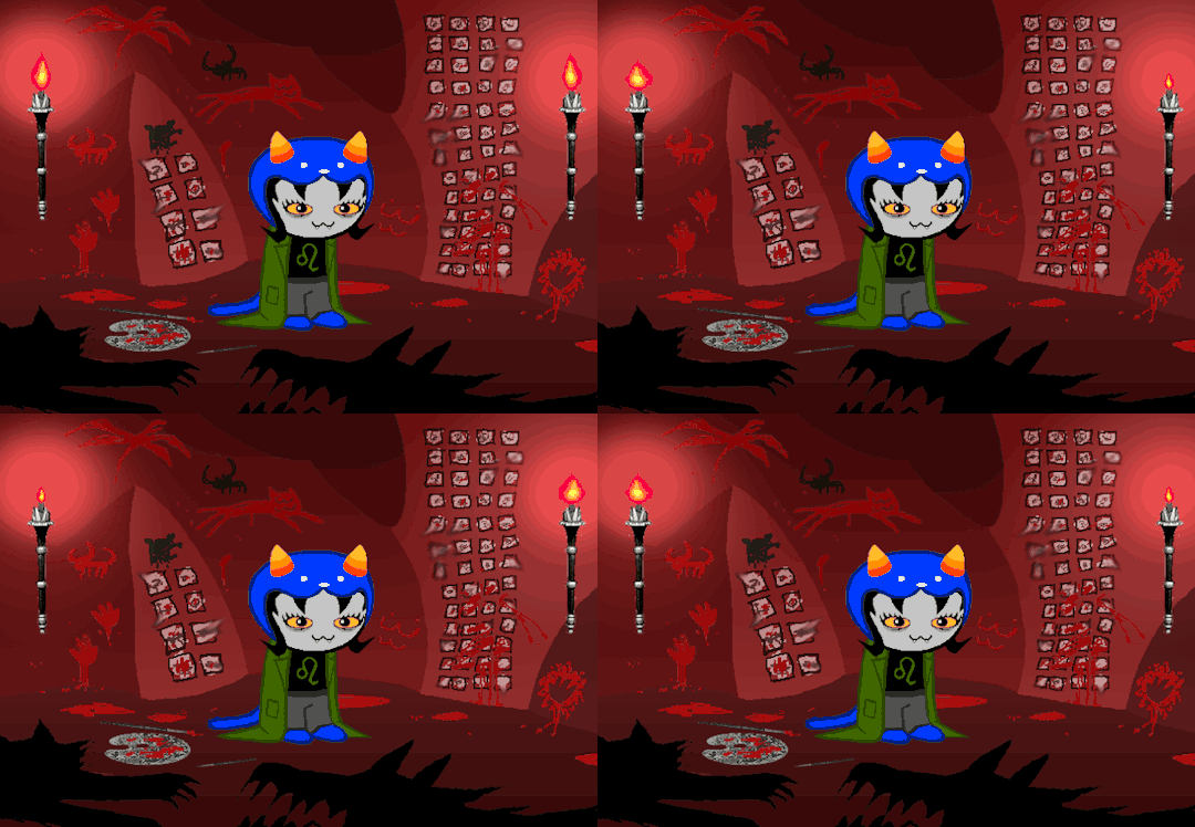
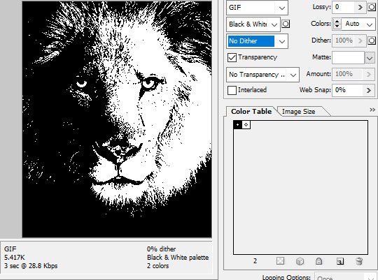
Dithering, to the uninitiated, is how these colors are arranged together to compensate for the paltry palette, producing illusory additional colors. There are three algorithms in Photoshop for this: Diffusion, Pattern, and Noise.

Above is the original image and below is the image reduced to a completely binary 1-bit black and white color palette, to make the effect of each dithering algorithm more obvious.

Diffusion seemingly displaces the pixels around randomly, but it uses error diffusion to calculate what color each pixel should be. In other words, math bullshit. The Floyd-Steinberg algorithm is one such implementation of it, and is usually what this type of error diffusion dithering is called in other software, or some misnomer-ed variation thereof.
The usage of Pattern may hearken back to retro video game graphics for you, as older consoles also suffered from color palette limitations. Sometimes called Ordered dithering because of the orderly patterns it produces. At least, I assumed so. Its etymological roots probably stem from more math bullshit again.
True to its name, Noise is noisy. It’s visually similar to Diffusion dithering, except much more random looking. At least, when binarized like this. Truth be told, I can’t tell the difference between the two at all when using a fuller color table on an image with a lot of detail. It was mainly intended to be used when exporting individual slices of an image that was to be “stitched” back together on a webpage, to mitigate visible seams in the dithering around the edges.
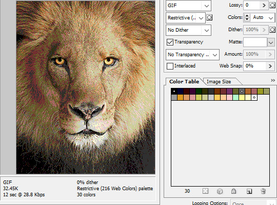
To sate your curiosity, here's how the image looks with no dithering at all:
People easily confuse an undithered gif as being the result of posterization, and you couldn't fault them for thinking so. They look almost entirely the same!
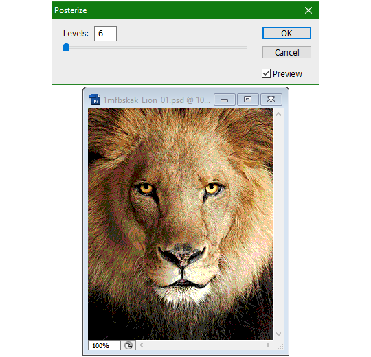
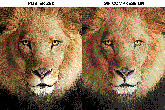
Although I was already aware of this fact when I was much younger, I'm guilty of posterizing myself while editing images back then. Figured I may as well reduce the color count beforehand to help keep the exported GIF looking as intended. I view this as a complete waste of time now, though, and amateurish. Takes away a bit of the authenticity of MSPA art, how the colors and details are so variable between panels. As for WHY they were so variable to begin with, choosing the settings to save the image as requires a judicious examination on a case-by-case basis. In other words, just playing around with the settings until it looks decent.
It's the process of striking a fine balance between an acceptable file size and a "meh, good enough" visual quality that I mentioned earlier. How many colors can you take away until it starts to look shit? Which dithering algorithm helps make it look not as shit while not totally ruining the compression efficacy?
Take, for example, this panel from Problem Sleuth. It has 16 colors, an average amount for the comic, and uses Diffusion dithering. Filesize: 34.5 KB.

Then there's this panel right afterwards. It has 8 colors (again, technically 7 + alpha channel since it's an animated gif), and uses Noise dithering this time. Filesize: 34.0 KB.
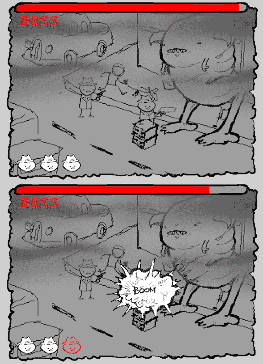
The more colors and animation frames there are, and the more complicated dithering there is, the bigger the file size is going to be. Despite the second panel having half the color count of the first, the heavily noisy dithering alone was enough to inflate the file size back up. On top of that, there's extra image information layered in for the animation, leaving only a mere 0.5 kilobyte difference between the two panels.
So why would Hussie pick the algorithm that compresses worse than the other? The answer: diffusion causes the dithering to jitter around between frames of animation. Recall its description from before, how it functions on nerd shit like math calculations. The way it calculates what each pixel's color will be is decided by the pixels' colors surrounding it, to put it simply. Any difference in the placement of pixels will cause these cascading changes in the dithering like the butterfly effect.
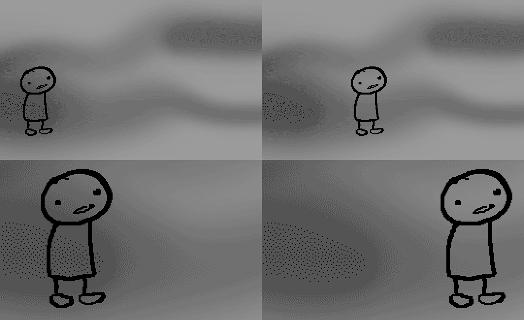
Diffusion dithering, 16 colors. Filesize: 25.2 KB
This isn't the case with Noise or Pattern dithering, since their algorithms use either a texture or a definite array of numbers (more boring nerd shit).
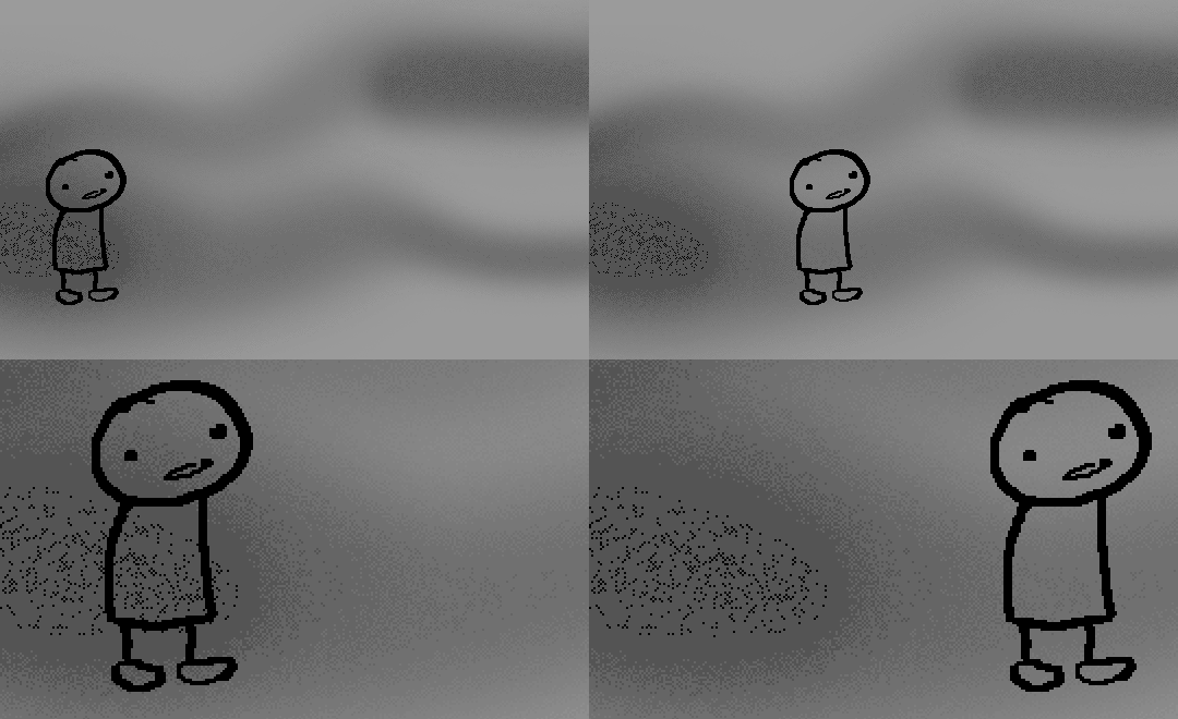
Noise dithering, 16 colors. Filesize: 31.9 KB
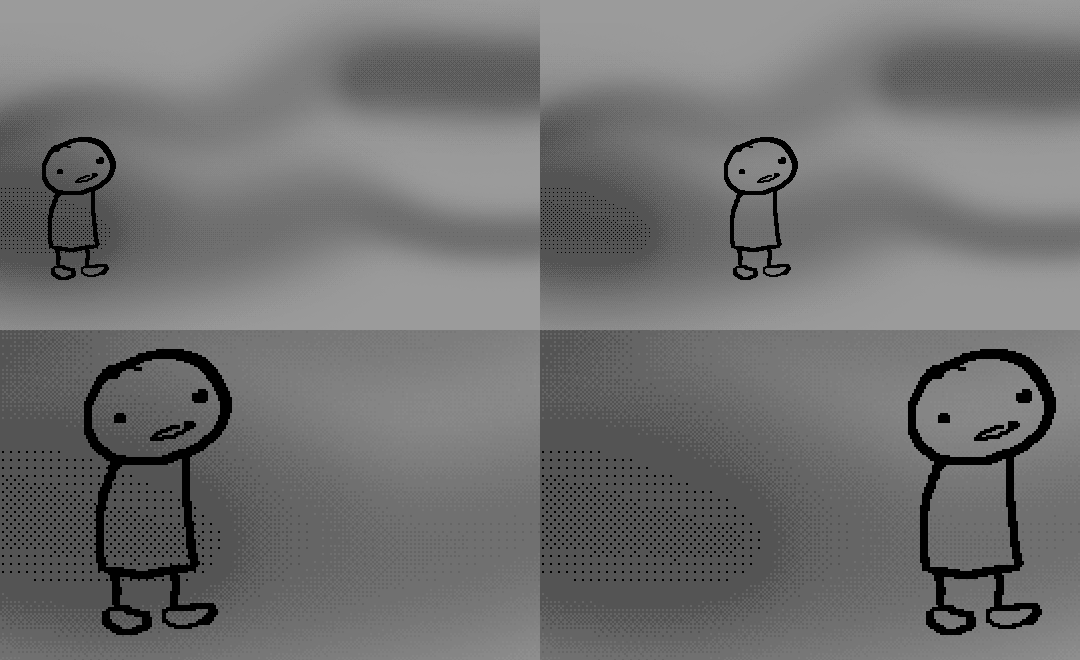
Pattern dithering, 16 colors. Filesize: 23.1 KB
There's a lot more I'd like to talk about, like the different color reduction algorithms, which dither algorithms generally compress better in what cases, and the upward and downward trends of each one’s use over the course of a comic, but since this isn’t a deep dive on GIF optimization, I might save that for another time. This post is already reaching further past the original scope it was meant to cover, and less than 10 images can be uploaded before hitting the limit, which is NOWHERE near enough for me. I should really reevaluate my definition of the word “tidbit”… Anyway, just know that this post suffers from sample selection bias, so while the panels above came from an early section of Problem Sleuth that generally had static panels with diffusion dithering and animated panels with noise dithering, there certainly were animated panels with diffusion later on despite the dither-jittering.
Alright, time to shotgun through the rest of this post, screw segueing. Increasing the contrast almost entirely with “Use Legacy” enabled spreads the tones of the image out evenly, causing the shadows and highlights to clip into pure black and white. The midtones become purely saturated colors. Using the Levels adjustment filter instead, moving both shadow and highlight input level sliders towards the middle also accomplishes the same thing, because, you know, linear readjustment. I'm really resisting the urge to go off on another tangent about color channels and the RGB additive color model.
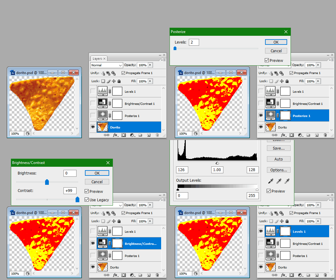
Anyway, there aren't any examples in MSPA that are quite this extreme (at least in color, but I'll save that for a later post), but an image sufficiently high in contrast can be mistaken for being posterized at a glance. Hence the Guy Fieri banner. In preparation for this post, I was attempting to make a pixel-perfect recreation of that panel but hit a wall trying to figure out which and how many filters were used and what each one's settings were, so I sought the wisdom of those in the official Photoshop Discord server. The very first suggestion I got was a posterization filter, by someone who was a supposed senior professional and server moderator, no less. Fucking dipshit, there's too much detail preserved for it to be posterization. Dude totally dissed me and my efforts too, so fuck that moron. I spit on his name and curse his children, and his children's children. The philistines I have to put up with...
In the end, the bloody Guy Fieri recreation proved to be too much for me to get right. I got sort of close at times, but no cigar. These were some of the closest I could manage:

You might be left befuddled after all this, struggling to remember what the point of the blogpost even was. I had meant for it to be a clarification of GIFs and an argument against using the posterization filter, thinking it was never used in MSPA, but while gathering reference images, I found a panel from the Felt intermission that actually WAS posterized! So I’ll eat crow on this one... Whatever, it’s literally the ONE TIME ever.
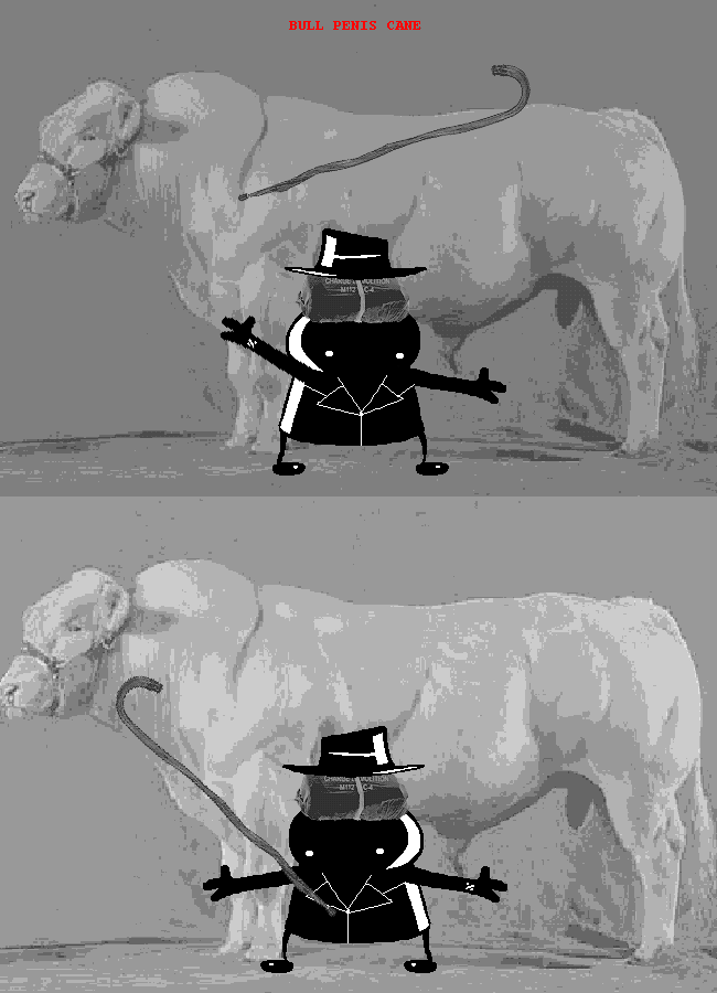
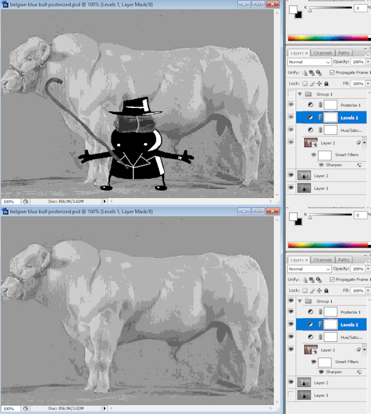
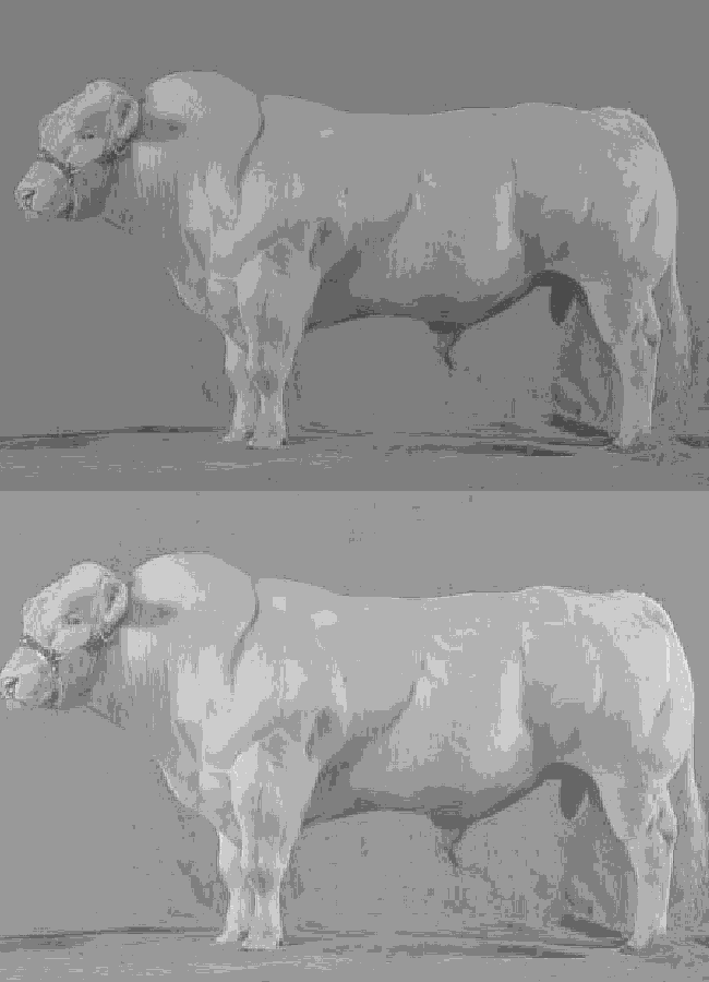
I can tell it's posterization and not gif color quantization because of the pattern dithering and decently preserved details on the bomb and bull penis cane. There would have had to have been no dithering and way fewer colors than the 32, most of which were allotted to the bomb and cane. You can't really selectively choose what gets dithered or more colors like this otherwise.
Thank you for reading if you've gotten this far. That all might have been a lot to take in at once, so if you're still unclear about something, please don't hesitate to leave a question! And as always, here are the PSDs used in this post that are free to peruse.
361 notes
·
View notes
Note
Hello, nice art but if you sell digital versions of your art could you atleast make them lossless pngs and not jpegs?
Hello, Glad to hear you enjoy the art!
If you are experiencing issues with something you have purchased I would like to ask you to contact me on Etsy so I can better look into it. This is rather vague and I would like to be able to pinpoint what I should fix.
I offer only a few digital items: PDF copies of my books and phone wallpapers. Due to Etsy's upload limitations, the file sizes for the books need to be optimized so that you can actually download and view them on your device.
I used a guide to walk me through the making of the phone wallpapers and I tested them on a couple of phones and for that purpose they seemed to work fine.
I also intentionally keep the resolution to the digital files I sell high enough for the product to be good for its intended purpose but low enough so that it's at least harder for people to exploit them. It's sad that I have to think about this but it is what it is. It's a tough thing to balance.
Digital items are rather new to me so if there is anything I can improve on I would like to know!
21 notes
·
View notes
Text
Thank You My Friend
Hey everyone, we were given a wonderful suggestion for an event in the server, and with Sam Mowry’s passing, we feel that it would be all the more appropriate, especially since our server has worked with him in the past.
From now (7/24/24) to 08/21/24 23:59 MST, we will be hosting the following event “Thank You My Friend”. Sam Mowry, the voice of Alexander in Frictional Games’ *Amnesia: The Dark Descent*, has tragically passed due to health issues on 07/20. Prior, he has brought to life one of the most memorable villains in modern horror game history, whose influence has been held over games and fans alike.
We’re calling for Mr. Mowry’s fans to come forth and visually depict their own headcanon of the Baron Alexander von Brennenburg *(aka Ayandra the Apostate)*. We will then place everyone’s work in a collage honoring Mr. Mowry, proudly featured from our server, *Amnesia: We’re Still Alive*. Please submit your art as a high resolution (150dpi or above) in either JPEG or PNG format in our Events channel, or you may link your work privately to any of our mods. Please submit the name you wish to accompany with your work as well.
Any further questions, please ask here or ping any of our mods. Thank you, let’s honor our favorite antagonist together!
https://discord.com/invite/FanVVN8B (link does not expire)
#amnesia the dark descent#amnesia (game)#amnesia tdd#alexander von brennenburg#sam mowry#frictional games
40 notes
·
View notes
Note
Aspiring artist here and super new to it, and absolutely no pressure, but I was wondering how you go about sizing your comics for best quality + sharing? Your art is always so CRISP and gorgeous what's ur secret to defeating the Compression Gods *eyes emoji*
Hahaha, I don’t really have a lot of Hot Tips but I’ll do my best.
When I’m laying out my canvas for a comic I’ll usually go by pixel and start with 850X9000. When I tried doing a little Webtoon for a minute the images they let you upload are 850x1100, and that’s really close to phone screen size so it’s a good starting place to make art for that size specifically.
I draft the comic by just handwriting and sketching out panels without worrying about spacing. Once I have a draft I’ll go through and organize it better, I start with speech bubbles cause they always take up a ton of room. Then I add panel frames and often I’ll move the sketches around to accommodate the speech bubbles.
Finally I go through and chop up the comic by cropping down on the panels I want to include for each image and saving it as a png which is a lossless format. I’ve varied the size I crop to depending on how long a comic is. Sticking around 1100 pixels tall is best because again it’s close to phone screen size and your art won’t get too crunchy.
Then I post it!
For non comics I make things very pixel dense, like 6000x6000 or more and always try to save as PNG. JPEG is a format that will always lose some data every time you copy and paste it, so some artists post those on purpose to make sure people can’t easily make off with their art. I’m a ding dong and I just post the high resolution most of the time cause ¯\_(ツ)_/¯.
Once I have a finished piece I’ll make a blank black panel at 850x1100 to position over the art and that’s what I crop down to to make closeups.
36 notes
·
View notes
Text
Post-Processing Guide: Image Quality
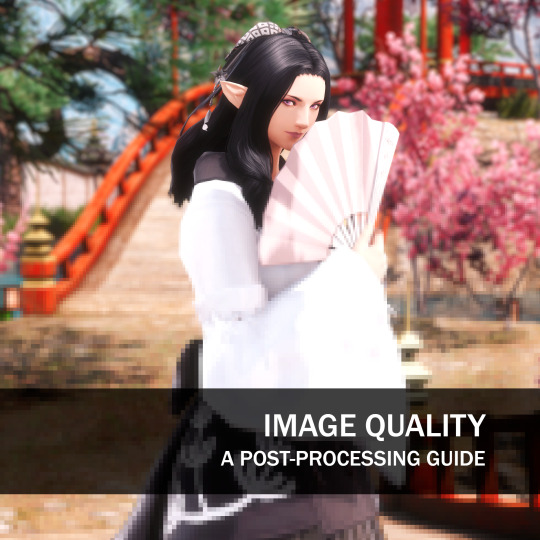
So you went and took that perfect screenshot! Now it's time to share it around, but you noticed a certain graininess, a certain fuzziness when posting it on Twitter or Eorzea Collection. So what's going on? Well, let's understand some concepts related to digital images: namely formats, how they influence images in simple operations like crop and resize, and how to prevent loss of quality.
Resolution
This is the easiest concept to explain; the higher the number of pixels, the more detail the image will have. For example, a screenshot taken at standard 2K resolution (2048 x 1090) will have 2,211,840 pixels, while a 4K (4096 x 2160) will pack more details at 8,847,360 pixels.
That also affects file sizes, if you ever hear me crying about the size of my screenshots folder.
There's a myriad of resolutions and formats out there; for more information, check out this Wikipedia entry about display resolutions.

Digital Image Formats
There are many different digital image formats, but the 2 most common for XIV photography are JPEG and PNG - each with its own advantages and disadvantages.
PNG is a lossless format, meaning no data is lost when the image is saved. This results in higher-quality images, but also files that are larger.
JPEG is a lossy format, meaning some data is lost when the image is saved. This data loss can result in artifacts, such as blockiness and color banding. However, JPEG files are smaller than other formats.
The issue with JPEG is that its data loss is cumulative: Each time that you edit and save the file, a little bit of information is lost. Also, depending on the chosen compression level, the loss is quite noticeable. The image below shows how much noise (wrong data) is actually introduced by each compression level:

Crop and Resize
When you crop an image, you are removing pixels from the edges, often to give focus to a specific subject. In this scenario, the loss of information is irrelevant.
But when resizing- often to decrease the size of the image to better adapt it to a target site- you're losing detail, and the chosen interpolation algorithm may influence how much of the original image is used to help determine the result. Here's an example with a 20% resize, using raw pixel mapping on the left and linear sampling on the right. Notice the antialiased result that creates a much better effect:

Keep in mind that different programs may present the interpolation options in different ways. For example, this is how GIMP displays its options when resizing:

So with all that said, how should we proceed to preserve as much as possible of the original data?
How to Prevent Loss of Quality
Use a high-resolution image. The higher the resolution, the more detail the image will have, and the less likely you are to lose considerable quality when cropping or resizing. Nya Nya has an excellent guide about resolution upscale (a method that allows you to take a 4K screenshot on a 2K native resolution, for example) here. I highly recommend a read!
Use a lossless image format. Lossless formats, such as PNG, do not lose any data when the image is saved. This will help to prevent loss of quality when cropping or resizing.
Keep resizing to a minimum. The more you resize an image, the more likely you are to introduce artifacts or jitter. If you need a close-up, for example, take a close-up screenshot and resize it a little bit instead of cropping around a small area in a larger full-body image.
When scaling down, use interpolation methods that take more data from the original image into consideration, like Linear or Cubic, instead of raw interpolation.
Resize and save images in the expected resolution of a target site. For example, Eorzea Collection uses 339x570 for its vertical shot; cropping and resizing your image to this resolution will prevent artifacts from being introduced by the site's own resizing algorithm.
TL;DR: Keep the resolution high, the changes to a minimum, and save as PNG.
Let me know if you have any questions!
261 notes
·
View notes
Note
I bought a copy of the First Report artbook and was planning on scanning at least the character art (I absolutely LOVE settei/character references and this book is full of them). There's so much good artwork of Ai in particular and I can't wait to scan it!
I was gonna ask though, do you know if the artbook has been scanned in its entirety yet? I was just going to focus on making really high-quality scans of certain parts, but I might scan the whole thing as well if that hasn't been done yet.
I LOVE FIRST REPORT SO MUCH RAHHHHH I NEED YENPRESS TO DO A TRANSLATION OF IT LIKE WITH GLARE X SPARKLE!!!! The fact that they DID translate Glare x Sparkle gives me hope that they will but. auughghghg. i need it to happen soon!!!!
AS FAR AS I KNOW, there's no scans of the artbook around! There IS a digital version that I've archived as images so we do have digitized versions of all the art, but it's not the highest resolution ever and it's a bit jpeg-y. So I would definitely not say no to some nicer scans of it, if you're able to do it! 👀
7 notes
·
View notes