Don't wanna be here? Send us removal request.
Text
Online promo
It’s time for personal promotion!
If you’re interested in my artworks and may be you want to find some personal information about me then check out my firstly my website and social networks:
http://www.aadesigns.tilda.ws/
https://www.behance.net/AidanaAidar
https://www.facebook.com/profile.php?id=100004568478365
https://www.instagram.com/aidana_aidar_designs/
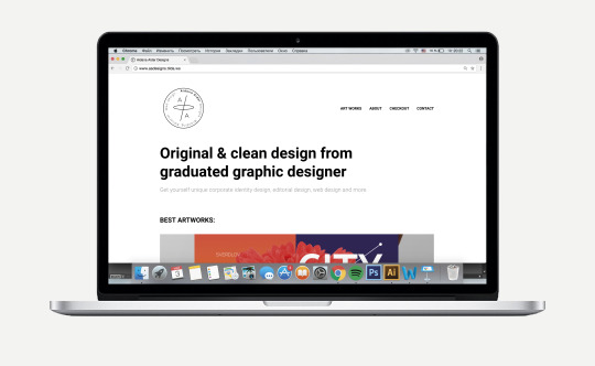
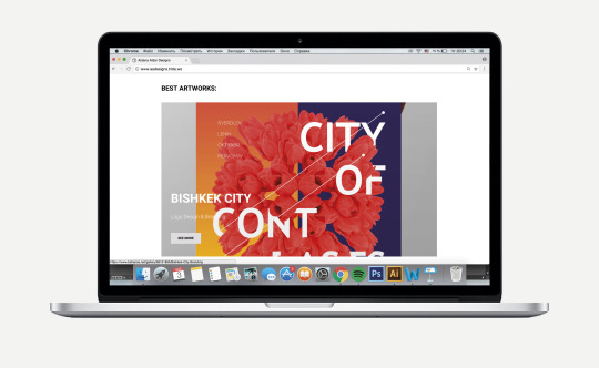
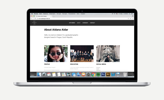
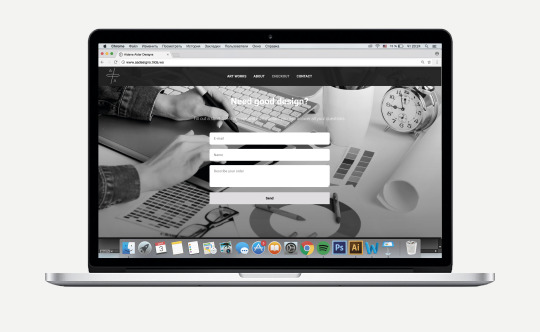
Also some words about the working process: platform - tilda.cc
0 notes
Text
PC: Budgeting workshop
Budgeting workshop I suppose was the most useful workshop. For me it was always problematically to define an appropriate price for a particular work. On this workshops we were discussing questions such as:

What and how should designer charge?
This largely depends on how skilled you are and how many customers you have. Obviously, when you’re starting out you’ll be charging almost nothing. Every time you’re slammed with work you need to up the price. I think this is a really good strategy for the designer that is just starting out: start with really low rates and when you get busy enough increase the amount you charge. Some rates really depend on the client and their needs, it is important to concern time spent, whether it is a big or small organization, the usage of the logo - whether this logo would serve worldwide or in a small town, for a long or short period of time, and the amount of applications where logo might be used.
Flat rate or hourly billing?
Flat rate system might be fair enough in the beginning of designer’s career. But hourly billing I think is more fair rather than flat rate, designers who go flat rate spend huge amount of time on working on multiple concepts and get money only for one final. Also this IS how most service industry firms work. There are also possibilities of changes and corrections in design that have to be considered as plus to required time spent.
How to avoid being stiffed?
Unfortunately being stiffed is something that always was and will be in every working field. However there are ways to avoid this. The main one is to require a deposit before you begin work. It’s simple: if someone wants to hire you for a $300 project, tell them you require a $150 deposit before you start. That’s it. This one little step will eliminate 95% of people that will eventually stiff you.
Should designer have contracts?
I suppose that every serious company or organization require contracts for every services they pay for. This is also a way to avoid to be stiffed. Of course it is possible to skip contracts for small projects, but it is needed to have contracts for huge clients. In the event that you are stiffed there will be lawyers willing to help you collect. In which case, they will be able to get good use out of a contract in a trial.
I’ve done contracts for two times, and it was needed more for the clients. It was a new built hotel that required a contract from me with the full description of my services, prices for every piece I was going to design for them and the list of deadlines. They needed it not to find me stiffing them, but to record all their spending and budget properly. I also added some rules that both sides had to follow.
What if client doesn’t want to pay for project?
That is also a problem that every designer confronts. There are sometimes occasions when client does not like any of designer’s proposals and says that he’s not going to pay for the work. In this case you’d rather have to beat this money out of him or to have a proper contract. Anyway I think it is always possible to find a compromise.
0 notes
Text
PC: Speculative Design workshop
“Let's call it critical design, that questions the cultural, social and ethical implications of emerging technologies. A form of design that can help us to define the most desirable futures, and avoid the least desirable.”
- Anthony Dunne & Fiona Raby
I think that this workshop was the most unusual and exciting one. First of all we were really thinking of stuff. The session started with introducing ourselves and express our thinking about piece of pepper, we needed to create associations with it. That was an interesting beginning. After introducing there was a little exercise when we had to split into groups and define differences between classic design and speculative design. It wasn’t that difficult actually, however we had some tarts.
Then we began to understand what speculative design is and how it works. Tutors showed us some videos like:
Auger Lotzeau, Audio Tooth Implant, 2001
Superflux, Uninvited Guests, 2015
Auger, J. (2013)
Definition of speculative design
Metaheaven Sealand Coins, 2004
Studio Smack, The Arctic Leisure Resort, 2014
As I understood there is no precise definition of what speculative design is. But I understood that speculative design aims to explore how things should be by finding a solution to a problem and improving the current status quo. It is not just a design for improving skills.

Second session was fully about practice. I cooperated with Zuleykha and we were working on the experimental video that showed how pigeon sees the world around him. Other teams also showed worthy works.
0 notes
Text
PC: Video Mapping
Video mapping workshop took place at our uni for three times.
First session wasn’t really exciting. I expected teacher to explain how vide mapping’s done and may be advice some programs that we could use for video mapping. Overall the whole session was about watching video mapping examples for three hours, that we actually could see at home. However there were some worthy video mapping examples.
Second session was much more pleasant. I understood the way video mapping is done and found out what softwares are used for the creation of video. Also there was a documental video about a man that created video mapping structure by hand and worked almost for free just for aesthetic intentions.
Third session was fully about practicing - we were downloading software and learning to work with it. I did not manage to understand this sophisticated software at all. I suppose that coding, prototyping and even video making is not really for me. lol. Anyway it is impossible to understand something for the first and the last time.
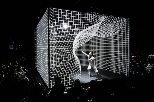
Overall I liked these sessions and concluded one thing for myself - vide mapping can’t be a project for one time or for one semester, when you can just make a research, download software, cut paper stuff and project. No. It is a full course that is almost equal to one year university education. Well, at least I would need the whole year to be proficient in video mapping.
0 notes
Text
PC: User Experience Workshop with Martin Kopta
This workshop was more about the design process itself, how to design properly, steps of idea generation process and other important aspects.
Tutors introduced us to the Revamped Double Diamond which is a design process framework based on the Design Council’s Double Diamond. It aims at making sense of the design process and providing guidance and clarity in order to enable people to tackle design challenges. The framework incorporates tools, methods and techniques from various sources to do so.
This part of the workshop was really useful and made me think of whether I worked properly before or just did things by themselves without thinking of any thinking system?

The second part of the workshop was practical and our tutors became our clients. We needed to brainstorm about the problem of waiting in queue in grocery stores, to think of how can we make the process better and easier. Being a frequent guest of grocery stores and standing in lines for 15 minutes I began to think intensively trying to generate something useful. However it was quite hard because clients didn’t give us any data such as deadlines, budget or statistics.
0 notes
Text
PC: Human Centered Design with Zdenek Mikovec
The workshop started with an explanation of what Human Centered Design is, also the tutor introduced him and his company SAGElab. He also presented some of his ideas and products. The most interesting part of that workshop was the presentation of the new service design prototype. Kind of a services and I don’t really remember the name of it, but the main idea was about an interesting item connected to the menu and that is ruled by old lonely people that set up the dish they are going to cook, the number of portions and the time it’s going to be ready. Then people might see the invitation and book it, finding the location thus making old people happy and getting delicious food in a friendly cozy atmosphere. I personally think that the idea is genius, regarding that most of old people are not friendly with applications and other innovations so the prototype was designed to be simple, understandable and easy to use. Also it might be a very good solution for old people loneliness issue.

The second part of the workshop was more practical. We were splitted into groups of 3 and started to brainstorm & discuss ideas for one of Zdenek’s interactive game. Main aim of the process was to generate ideas, discuss them with the team and get and give feedback to each other.
0 notes
Text
PC: User Research Workshop with Dominika Potuzakova
The workshop began with an explanation of what is User Research, why we need it and what we were going to do for this workshop. Then we were separated into groups of maximum 5 people and began to brainstorm about the problem of public transportation system in Prague. I and my group mates began to think of issues we confront with through the time we were in Prague. The only issue I had was actually a racist attitude from the driver or other passengers in trams. Anyway, I’m used to this so then we went outside the college to interview tourists about public transport, how do they rich the destination, what apps they use and if there is something they don’t really like about Prague’s transport. Also we had to record their reaction on our questions. There were a couple of people that didn’t really want to answer or just didn’t know English. Very nice people, isn’t it?
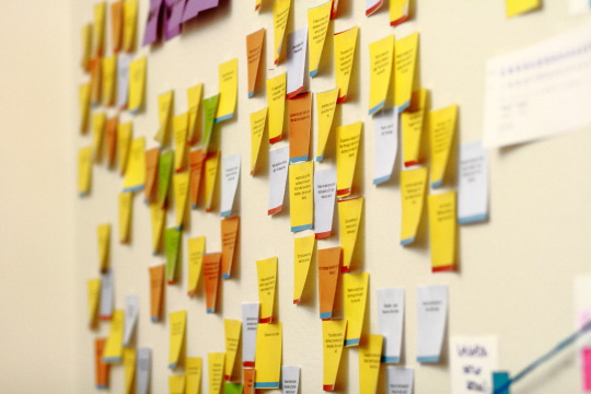
The second part of the workshops was about splitting into the same groups and collecting all recorded data. We created kind of a board with stickies and data on them to see the overall picture and understand the main issue and solution. We started to fulfill the board with ideas we had, and to my pleasure the main solution was my idea of creating a interactive stand on every bus or tram station for lost tourists. This stand was supposed to have the main screen with sensor showing the location and search bar where people can input the needed destination and get the information about how to reach there, what tram or bus to take, and just the map with the directions. Kind of a big screen with Google Maps app with the access to internet. Really helpful for people who don’t have an access to internet or even a phone with them.
Overall, I liked the process of creating a map or board with all the collected data and brainstorming the final idea the most. This data board made of stickies on the wall is really useful way to generate ideas. Feeling yourself like a detective that looks for the answer by researching photos and newspaper extracts hanging on the wall (lol).
0 notes
Text
PC: Illustration Workshop with Franco Huller
This workshop took place on the first week of our semester and it started with an explanation of what illustration is. Then we had to find a phrase from any newspaper and try to illustrate it. I found: “The concert of great musicians”. First illustration depicts gramophone which is the main musical reward that only great musicians may receive. Second illustration depicts a piece of famous trousers, shoes and a pose with microphone of a well-known and one of the greatest musicians - Elvis Presley. The third illustration shows the concert of one of the greatest Russian singer Alla Pugacheva, which wasn’t the aim actually, but after I saw the final outcome I understood that the figure reminds me of her.
Then we had to participate in a little exercise: illustrate “Dinner and wine in church with Hitchcock”.
Our final mission was to work digitally on the illustrations we had and display them on the windows thus creating kind of a gallery view. I decided to change phrases a little bit to add more sense.

Overall, I liked the outcome but the process seemed to be a little useless and boring. I suppose that this workshop could be really interesting if it took place on the first year of HND when we did not really understand what graphic design and illustration was. Or at least exercises could be more interesting may be. Also, I did not enjoy it because of my personal preferences, illustration is my main weakness and I didn’t really wanted to show that to my group-mates (lol).
0 notes
Photo
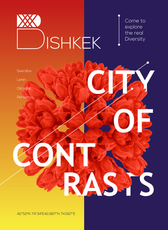
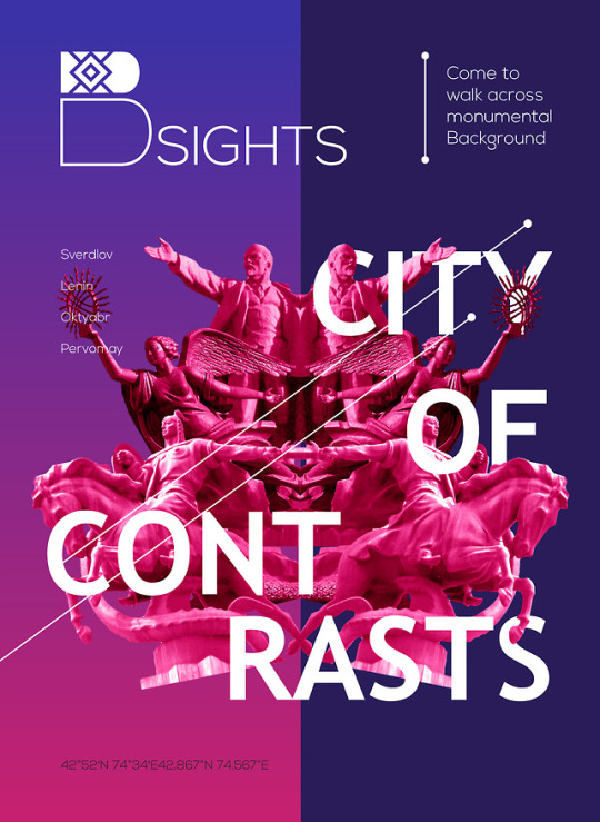
FGP. Week 8 - Start working on identity campaign & final branding
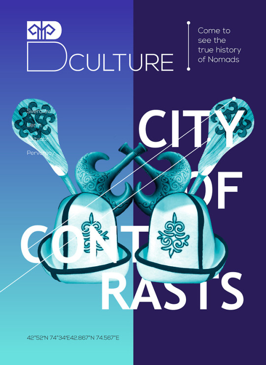
These are the first set of campaigns, that actually might be also used in booklet and other applications. Overall there are six campaigns.
The main color on the right creates a unity between pieces and gives and understanding that all of them are considered as one brand.
On the top there are dynamic logos on the left and some welcoming phrases on the right. 4 main districts of the city are described under the logo. Coordinates of the city are depicted on the bottom of the posters.
0 notes
Text
FGP. Week 8. Branding & Campaign
Visual language mood board. I chose this vibrant visual language because of it contemporary approach, attractive view and smart color choice. I think this motives might bring freshness and modern feeling to the identity of Bishkek.
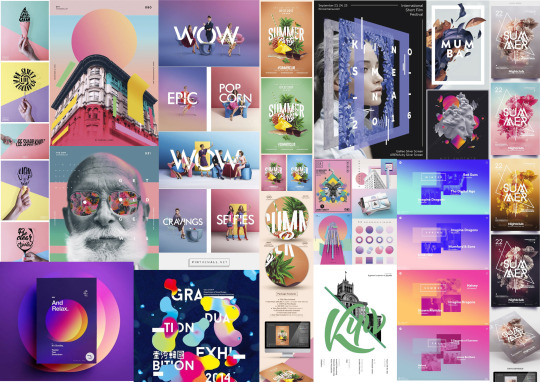
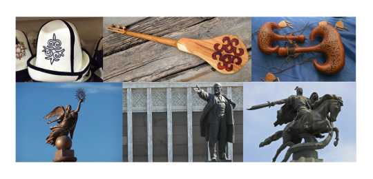
Experimentation with logo, forms, and visuals. I made the visuals to be reflected symmetrically because it has to express some dual effect, because “contrast” (which is the main idea behind the identity) is something ambivalent.
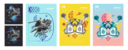
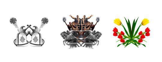
Official colors:

Check finals in the next post =)
0 notes
Photo


FGP. Week 7 - Present final slogan, fonts & colors, icons
0 notes
Photo


FGP. Week 6 - Present final logo & logo variations
0 notes
Photo


FGP. Week 4 - Develop 3 concepts
All three concepts have their own tone of voice and at the same time reflect city’s spirit perfectly. That is why to chose the final concept was a really hard task.
0 notes
Text
PC: Final Show poster proposal
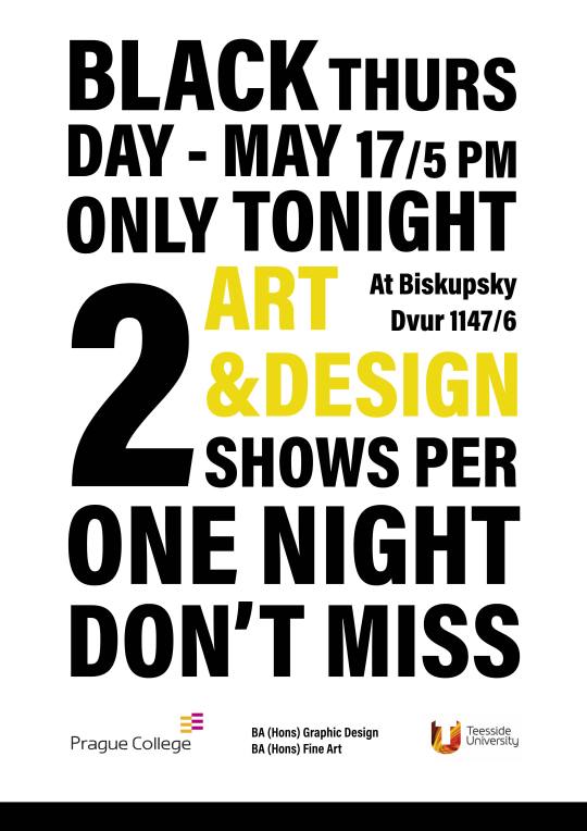
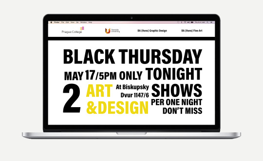
Concept: ‘Sale 2 for 1′
Inspiration:

Final proposal:
‘Black Thursday’ like ‘Black Friday’
Profitable proposition
Screaming letters
Art & Design highlighted
0 notes
Text
FGP. Week 5. Interim Presentation
Interim presentation was quite useful for understanding the present status of the process, finish the research stage and define the future direction.

Present status: Choose and develop final concept
Aims and goals for completion:
Present final logo, logo variations
Present final slogan, fonts & colors, icons
Start working on identity campaign & final branding
Finish identity campaign & final branding
Present final brand book & booklet
Print poster, booklet, video ad campaign
Submit the work
Self evaluation:
Throughout the whole process it was interesting to research and experiment with visuals. All three concepts have their own tone of voice and at the same time reflect city’s spirit perfectly. Survey was also an interesting part, I managed to cooperate with citizens and gained a lot of useful and positive data for further development.
Working for something that is closely connected to your roots is really inspiring and also helps to understand the uniqueness and diversity of my home city. I’m looking forward to develop the chosen concept very excitingly.
Presentation feedback and outcome:
Teacher’s feedback helped me to define the chosen project, to improve missing elements and to correct some mistakes.
0 notes
Text
PC: Positioning Workshop with Petr Knobloch
Part 1 - Positioning
For this workshop I chose to present the positioning of a really talented American graphic designer Ari Weinkle.
“I’m Ari Weinkle, an artist and designer from Boston, MA. In my work, I look to break apart and re-appropriate different forms such as the human figure, geometric and organic shapes, and typography. Through the process of fragmenting different entities, I am continually searching for new and unique juxtapositions between shapes, colors, and patterns. My work is mostly experimental, often digital, and usually weird.”
I really like how he presents his work, he uses no text and presents his artworks using one picture for one big screen. His website shows a variety of artworks using really clean and simple structure, there is a clean symmetry and big images without any text. It perfectly show his skills in a simple but professional manner. Even though his artworks don’t really carry a solution for any serious issue or any contribution into something, they create an aesthetically pleasant joyful view and expression.
Considering my present status I’d say that now my main representational mean is online portfolio Behance - Aidana Aidar. Most of my artworks there are branding projects. I suppose that first three projects define my current situation the most and also present my main area of specialism and my style. Soon I’m going to fulfill the page with three more branding projects.
Part 2 - Make a written & visual statement
After my graduation I’m going to come back to my home city and start to develop Graphic Design sphere in this country. I know that it may sound too presumptuously but I will try all my best for this movement begin to arise. So, when I come back I’m going to gain some experience by working for some organization, working in team and just connect with people. But my main aim is actually to succeed more as a freelancer and to be recognized by the citizens. I’m not that ambitious person but I do understand that clients, at least in my home city, mostly people consider your background and reputation before addressing to you. For this purpose I was thinking about launching big projects and exhibitions which is the main way of promoting a good designer. Finally my main aim to succeed as a Corporate Identity designer is to dot my home city with contemporary and effective logos and to be proud when passing them by.

Planner
1 month - Start to gain working experience by working in team or organization
2 month - Keep fulfilling the portfolio
3 month - Start to promote myself as a freelance graphic designer in social media and gain clients and audience
4 month - Rent the studio, design it
5 month - Design a third logo for a local company
6 month - Keep travelling
7 month - Launch a project for contribution into the culture of the country
8 month - Design a fourth logo for a local company
9 month - Attend professional events for qualification development
10 month - Start to design autobiographical portfolio - book
11 month - Start to set the exhibition for self promotion
12 month - Choose and modify the projects and materials
13 month - Plan the way of presenting, positioning and production
14 month - Get in touch with sponsors and partners, all the stuff for exhibition organization
15 month - Rent the place, start to position exhibits and getting ready for the event
16 month - Start the promotion of exhibition, invite potential clients
17 month - Launch the first big scaled Exhibition
18 month - Design fifth logo for local company
0 notes
Text
Bishkek City Branding - Survey
It is necessary to consider citizens’ opinion and desires, understand the tourists’ imagery about the city and country. That is why I launched the survey with the most important questions:
https://docs.google.com/forms/d/e/1FAIpQLSfYJxTpwh3J_SlLYhXYVHfnTs20KHPqeM0RqGJQGQEUSTtt0Q/viewform?usp=sf_link
Launched on 08.02.18 - Finished on 12.02.18
Amount of answers – 111


0 notes