#font type
Explore tagged Tumblr posts
Text
this is a longshot but does anyone know what the font is that was used for the original underland chronicles/Gregor the Overlander books? specifically these covers/this font?

#rita rambles#tuc#the underland chronicles#gregor the overlander#font type#typeface#i know any of us still blogging about gregor in 2024 are all down bad so *maybe* someone out there will know#im debating getting a tuc themed tattoo and my first thought was to do this font#bc these arent even the covers for the editions i have but they are what i picture when i think abt this series#but i cant visualize this tattoo well enough to feel confident in making that choice yet#and also id need some way to show the artist the text and this probably isnt the best way
39 notes
·
View notes
Text


Now, you can take that as a gift, or you can take it as a curse. And that's up to you.
Eliot Spencer and Parker Doing the Things Others Won’t
Leverage (2008-2012)
04x01 The Long Way Down Job
05x09 The Rundown Job
#this parallel came to me like a fever dream last night#and I had to share the sadness with others#and then this sent me on a spiral about communication types between the ot3#Parker and Eliot understand each other so well#and a lot of what they have is silent communication#like that nod in the rundown job#between Parker and Hardison#direct communication#necessary and developed when figuring out their feelings#between Hardison and Eliot#physical and indirect communication#(ex: handshake bumping each other bickering)#I could write an essay#but instead I will leave you with this gifset#leverage#the long way down job#the rundown job#inde gifs#inde gifs: the long way down job#inde gifs: the rundown job#Eliot Spencer#Parker#inde gifs: leverage parallels#leverage parallels#fudge I need to reaclimate to tumblr fonts and heirarchy#I had no idea where to put the quote#graphic design degree and for what#inde gifs: leverage ot3#leverage ot3
2K notes
·
View notes
Text
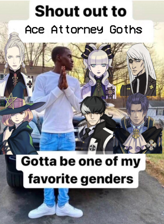
was drawing just now and thought of this
#edit: its been months since i made this post and no one noticed i used the silly ultrakill font 💔#im eating watermelon as im typing this#it’s pretty good#tag yourself im enoch. he’s literally me.#no one gets him like i do#also barok is there as an honorary goff because he’s like ace attorney’s dracula lmao#also i like how most of them are from tgaa lmao#ace attorney#the great ace attorney#dai gyakuten saiban#goth#courtney sithe#esmeralda tusspells#maria gorey#enoch drebber#simon blackquill#barok van zieks
1K notes
·
View notes
Text
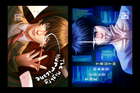
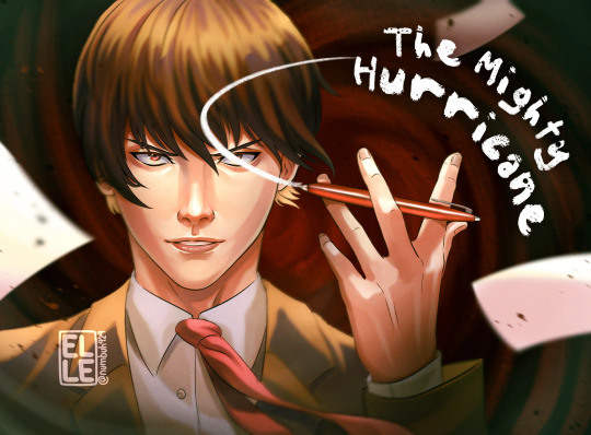
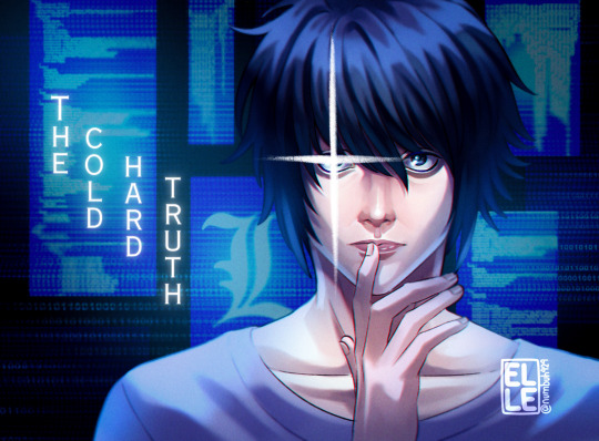
The unstoppable, mighty hurricane and the immovable, cold, hard truth.
#death note#death note art#death note the musical#Light Yagami#L Lawliet#death note fanart#death note musical#lawlight#dn musical#digital art#elle draws#more musical art! I love u forever death note musical#been trying out new things with my rendering again lately sorry if I'm all over the place#kinda wanna talk abt the decisions that went into the movement of the text because#originally it was just supposed to be simple serif type in the empty space beside them but listening to their solos on repeat while working#really influenced it and I couldn't shake how much I wanted them to match the movement lol#esp with light like I just wanted it to be small text but hearing jeremy j belt 'HURICAAAAANE' made me go fuck it it's the mighty hurricane#*increases font size significantly*
1K notes
·
View notes
Text
Side Order Typeface: Complete!
HEY. do you remember when Nintendo made a typeface for Splatoon 3's Side Order and never elaborated? It looks a little bit like this:

Well I went over to the lovely @splatoongamefiles and asked for the font file. They gave me the file, all nice and simple, BUT it was completely unfinished... I really liked it, so I finished it myself!!!
This is what it looked like when I started:

and this is what it looks like now!!!!!!!

It took me 6 months because I apparently started working on this in february, but it only took that long because of my laziness! I did, however, know nothing about this kind of thing before except for my vague interest in typography and fonts. I used a free font-making software called FontForge and I had to learn it from scratch and with no help. So I think all in all, it turned out pretty good!!
I also decided to name the typeface since when I downloaded it, it was called something silly and just for the files so I named it Spire after the Spire of Order which I think works very nicely!!
Now I'll talk about what's changed because I did upload beta version 0.2 of this recently!
added uppercases A, D, G, H, I, K, M, V, W, X
added symbols " # $ % & ' ( ) * + - / < = > [ ] ^ _ ` { | } ¡ £ ¿ × ÷
added all the accents you can see above, but not ALL of them because im lazy
fixed lowercase k so now it looks like a normal letter
B - adjusted sizes of the upper and lower sections as well as sharpened corners of the lower section
K - slightly lowered the crossbar
L - curves of the corners are now slightly smoother
z - raised the top right corner by 1 pixel so its no longer 1 pixel wonky...
@ - increased the gap on the left side
deleted all the original file's kerning and did it myself >:)
and lastly! here's the link to download the typeface!!!!!! if you do use it somewhere credit is always appreciated :))))
p.s. if there are any specific characters/glyphs that I haven't added but u really need please dont hesitate to let me know!!!!
#splatoon 3#side order#side order typeface#splatoon#splatoon side order#splatoon typeface#splatfont#typeface#typography#typefaces#type#font#fonts#i didnt remove the copyright on the file because i couldn't figure it out so fingers crossed nintendo doesnt come for my ass!!!!#or maybe they'll discover it and pay me 1 miiiillion dollars >:)#ANYWAY im suuuuper happy with how it turned out and i hope you all enjoy it :)#reblogs really appreciated bc i really want lots of people to find it and use it!!!
747 notes
·
View notes
Text
when artists say "fuck ai" of course we fucking mean generative ai that's scraped and trained off of our work in an unauthorised and disrespectful manner!
no we don't fucking mean shit like ai used for advanced computations, agriculture, medicine, computer controlled opponents in video games, none of that shit
it's meant to replace DANGEROUS AND IMPRACTICAL LABOUR not THE HUMAN SPIRIT AND CONDITION
#i didn'[t mean to type this in biggest font but here we are#this post is especially for the person who ERM AKCHUALLY'd rose tbh
309 notes
·
View notes
Photo

502 notes
·
View notes
Text

rate my shirt design
#anyway Team Dark my beloved#shit post#almost wrote 'shirt post' lmaoo#sonic the hedgehog#shadow the hedgehog#sth#sonic#i downloaded the sonic type font for this#rouge the bat#e 123 omega#team dark#they really are ride or die#i love them
197 notes
·
View notes
Text

Digital lettering Hand-drawn animation
#cyber#sci-fi#high tech#cyberpunk#lettering#digital lettering#animation#hand-drawn animation#street art#projection#art#digital art#font#type#typography
156 notes
·
View notes
Text
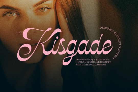
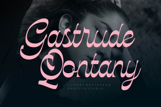
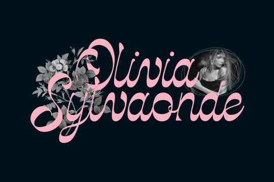
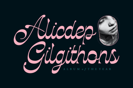
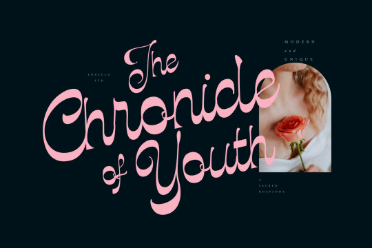
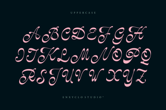
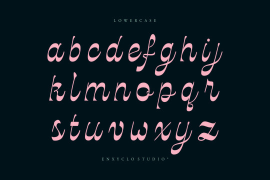
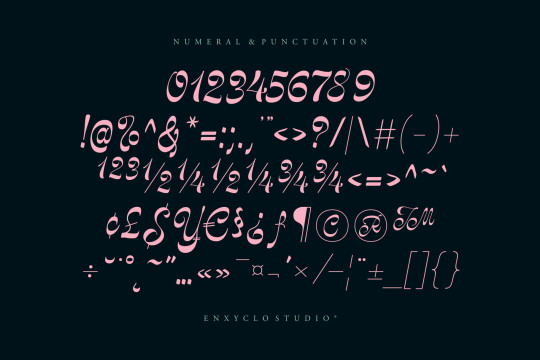
NCL Kisgade font designed by Enxyclo Studio
#fonts#calligraphy#typography#oldschool#design#retro#webdesign#script#handwritten#calligraphic#handwriting#font#type#typeface#lettering#handlettering#brand#branding#branddesign#brandingdesign#weddingfonts#weddinginvites#savethedate#weddingdetails#weddinginspiration#businesscard#businesscarddesign#visitcard#visitcarddesign#autograph
160 notes
·
View notes
Text
"why is there no design in anything anymore" there aren't designers anymore. like that is the answer. there are maybe 3 people on the planet still employed in graphic design and they are paid less than half of what their time is worth
#.jtxt#“did you see the new paypal logo” i did. i also saw everything else.#graphic design in 2024 is finding a nice font online and buying it and then typing your company's name into microsoft word#you can only generate profit by extracting value and where is the easiest source but to exploit and remove labor#an entire artistic field has been basically deleted. but so it goes
182 notes
·
View notes
Text
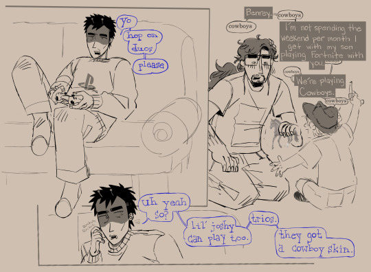
benrey moving in with gordon postcanon cliche
#hlvrai#gordon feetman#benrey#benry#joshua freeman#i dont know if you can do trios on one console. dont look into it too hard#i thought giving benrey little alien antennae would be cute so i DID IT!!!#i dont know why i wrote out benreys font instead of typing it.#symphonart
631 notes
·
View notes
Text


behind your kids' favorite cartoon music!!
#my art#stardew valley#sdv#stardew#stardew fanart#stardew valley fanart#sdv sam#stardew sam#stardew valley sam#sdv fanart#was supposed to put a magazine type beat design over sam but#god forbid you make me do any sort of graphic design#i CANNOT do that#i legit spent like 30 minutes looking at magazines for refs#and then another 40 to look for fonts#dont even get me started on formatting LMFAO
168 notes
·
View notes
Text


Typography Tuesday
PLANTS & FLOWERS
This week we bring you a few experimental fonts made with flowers and plants from The Making of Artistic Typefaces by 50 international designers published in 2016 by SendPoints Publishing in Hong Kong. Shown here:
Blossom Type: handcrafted with natural flowers with Photoshp for color correction by designers Nikita Shchykin and Alice Mourou of Oddity Studio based in Hong Kong.
Wanto 3 Aroma Living: letterform overlaid with a flower arrangement from Victor Design Corp.
Garden, Flowers, and Ice: as the name implies, this font, designed by Manuel Persa of Voluminica based in Asturias, Spain, is made using wild flowers placed in letter-shaped silicone molds, filled with water and frozen, and then removed from the mold.
Good Vibes: typographical wooden frame filled with living moss, designed by Camilo Rojas of CR-eate based in Miami.
Good Enough: original clay pottery with small plants as an illustration in the Dutch Volkskrat Magazine from the design studio Autobahn based n Haarlem and Rotterdam.
View more designs from The Making of Artistic Typefaces.
View more Typography Tuesday posts.
#Typography Tuesday#typetuesday#fonts#organic typography#The Making of Artistic Typefaces#SendPoints Publishing#type desingers#type designs#floral typography#flowers#plants
151 notes
·
View notes
Text


Emuhlee. Elizabeth. Prentiss. That’s not your wife, even if she looks just like her…
#ppl on Twitter are saying we’re getting the jealousy trope and I think I would simply pass away#that’s JJ in a different font#girlie has a type…#dr jill gideon#emily prentiss#criminal minds#criminal minds evolution#cm evolution#paget brewster#cm17#cme2#cm edit#criminal minds edit#felicity huffman#jill gideon
148 notes
·
View notes
Text
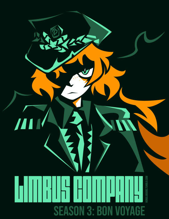
ur always chasin that damn Whale🙄‼️
#pachidraws#limbus company#ishmael#ishmael lcb#i pulled out adobe illustrator for this. i have like 3 comps i am supposed to do instead. but its ok bc i like this#fun fact! those fonts aren't imitations I genuinelt identified and found the limbus company fonts#off of memory/random chance#if ur curious said fonts are dimensions and bebas neue#both by Dharma type#Thank you graphic design major. this is the ONLY thing it's ever done for me#pachiposting#im so happy ishmael looks like this. shes so cool i love her. doing all that work on the hat with pen tool was worth it#this is all with a trackpad btw. if u even care (i was possessed i think)#i love ishmael i want her#hope u enjoy
669 notes
·
View notes