#exhibition of original images
Explore tagged Tumblr posts
Text
東京〜…大阪にもきてくれるかな??
2 notes
·
View notes
Text

📸 Man Ray, ( 1890 - 1976 ).
Dora Maar, 1935.
#man ray#photographer#artists on tumblr#dora maar#1935#fotografía#surrealista#surrealist art#artes visuales#para ti#fotógrafo#arte#art#art exhibition#quotes#digital art#ilustración#ilustration#ilustrador#imagen#imagenes#fotografía original#fotografías#digitale fotografie#photography#book photography#photoblog#photoblr#image not mine#post
192 notes
·
View notes
Text

Painting sweet perfection by Lara Wasiljewa ( 1973 ) 🤓
#oil paintings#original painting#oil painting#painting#famous paintings#art#artworks#artistic#artwork#fine art#great paintings#sheep#landscape#pictures#love art#great artwork#great artist#great images#art exhibition#fun art#creative art#creative people#crrative ideas#great pictures#artist#artists#artists on tumblr#paintings#creative#creative arts
22 notes
·
View notes
Text
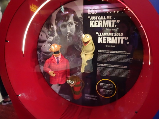
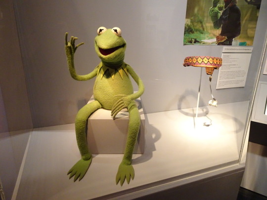
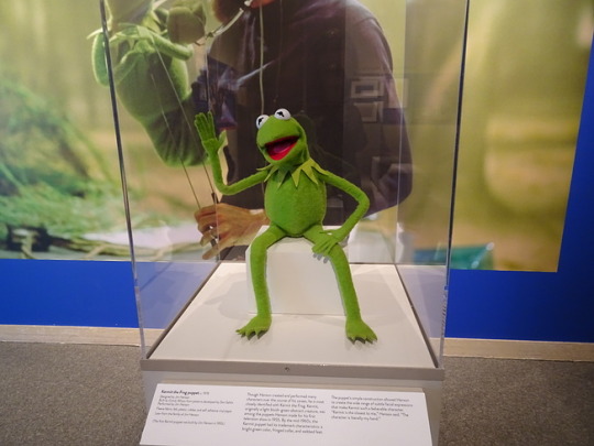

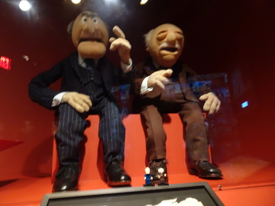
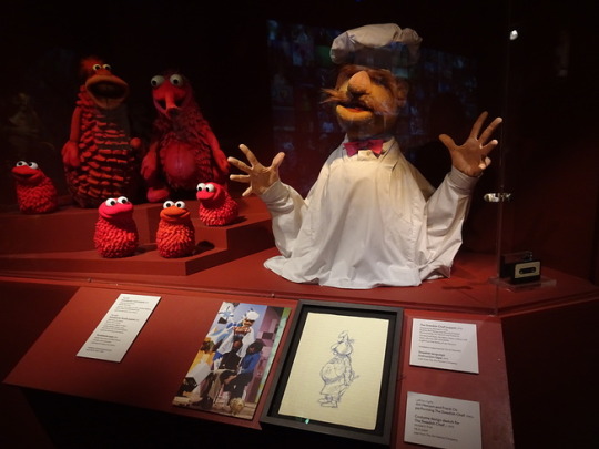

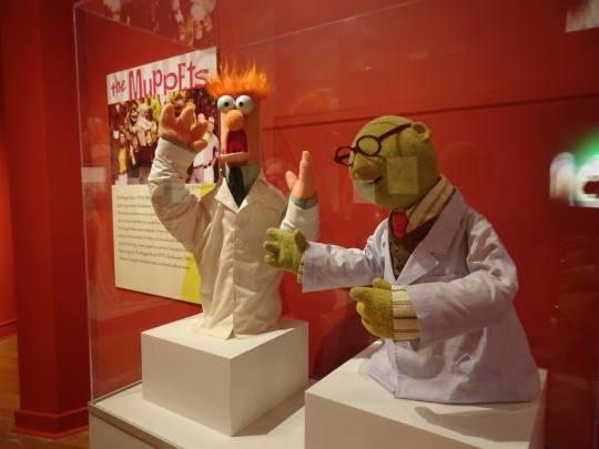


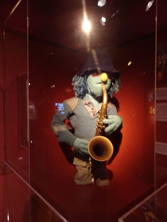
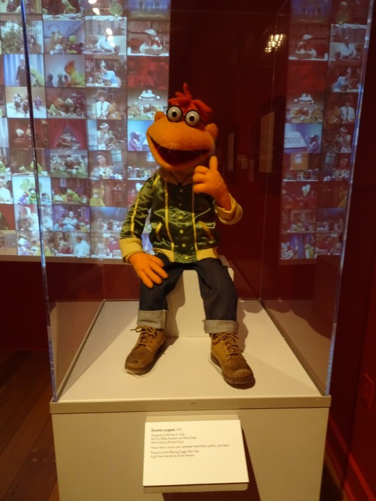
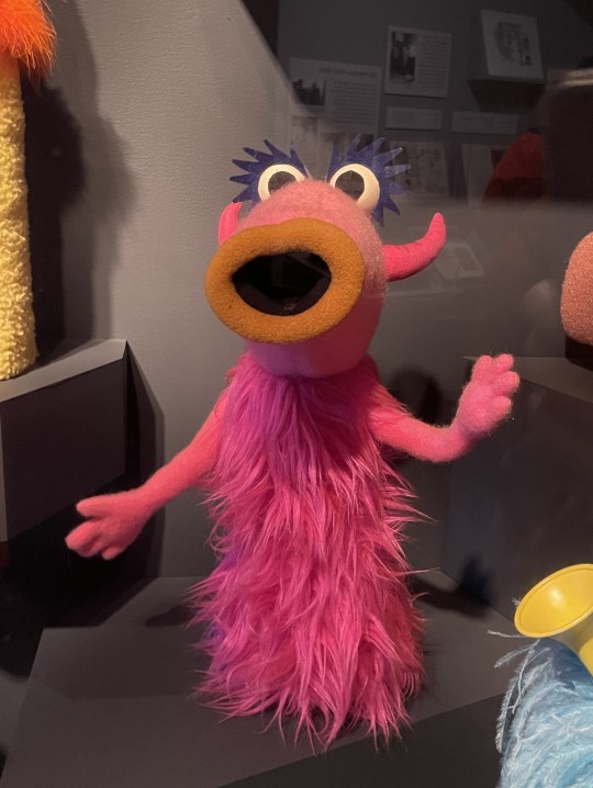
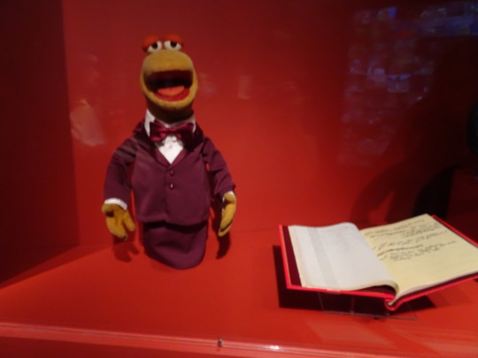
And, of course, no Jim Henson exhibit is complete without Muppets from The Muppet Show! This year, I got to see three different Kermit the Frogs, including the original; Rowlf; Statler and Waldorf; a family of Koozbanians; the Swedish Chef; the original Java puppets; Bunsen and Beaker; the Country Trio; Miss Piggy (in her wedding dress from The Muppets Take Manhattan); Zoot; and Scooter. Aside from all the Kermits, I think the Country Trio were my favorites. If they look familiar, you're not mistaken--they're made in the likenesses of Jim Henson, Frank Oz, and Jerry Nelson.
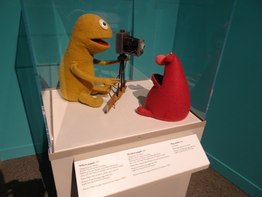
Bonus puppets under the cut include the Beautiful Day monster; a Snowth; You Are My Sunshine; Nigel (The Muppet Show's orchestra conductor); and Wilkins and Wontkins from the Henson-produced series of Wilkins Coffee commercials.


#Muppets#The Muppet Show#Kermit the Frog#Rowlf the Dog#Statler and Waldorf#Swedish Chef#Bunsen and Beaker#The Country Trio#Java#Miss Piggy#Zoot#Scooter#Beautiful Day Monster#Snowth#Wilkins and Wontkins#Museum of the Moving Image#The Jim Henson Exhibition#The Jim Hension Exhibition: Imagination Unlimited#original post#my stuff#Wilkins and Wontkins aren't from The Muppet Show and the Java puppets aren't the ones from The Muppet Show#but they're going in this post anyway
37 notes
·
View notes
Text
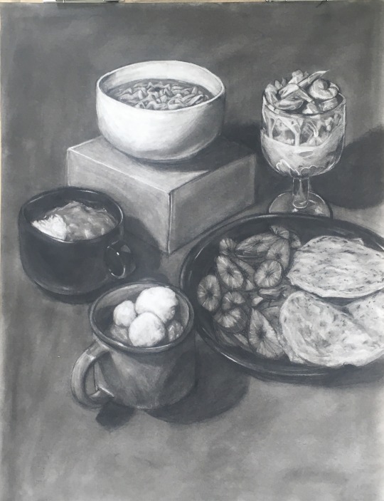
Food as a Love Language
#did this in like. march i just kept forgetting to post Whoops#anyway this got me into an art exhibition B)#image description#id in alt#ramen#curry#pupusas#platanos#plantains#lafun#food#food drawing#charcoal#charcoal art#realism#still life#traditional art#traditional illustration#original art#m'art
51 notes
·
View notes
Text


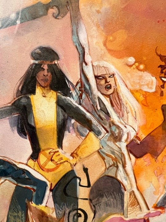
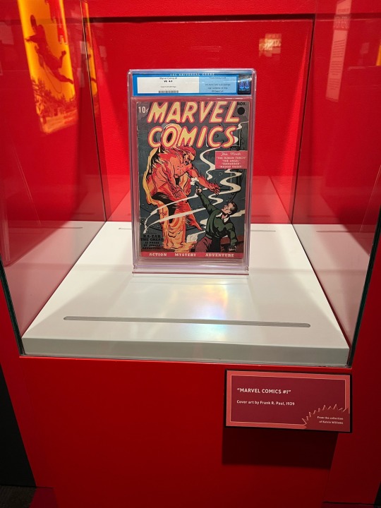
also went to a marvel exhibit today btw <3 comics win <3
#im exhausted actually mainly bc of the heat (100F i was not made for this)#i was going to play more transistor (rimi if u see this i did get to thats my star i love you so much did you know that and im ueueuuee#over it) but i might just pass out…#this exhibit was super cool btw. even though the xmen section was much smaller than i wish there was a small dani section and kamala section#and also sienkiewicz original art in person very cool to see the textures and colors and techniques!!!!#and original comic art and covers <3 again very cool <3#unfortunately due to the mcu the only merch was avengers related :/#esha.txt#there’s an image of me doing the Go into the dark point at a big image of cyclops from uncanny xmen 1 btw.
8 notes
·
View notes
Text
[Image Description: Two digital art drawings of Sara Berry from 35MM: A Musical Exhibition. Image 1: Sara is drawn as a young white woman with bright green eyes and long, straight blonde hair. She is wearing a sparkly pink prom dress with long white gloves and a gold crown on her head. There is a sash across her chest that read 'Prom Queen' and she is holding a bouquet of flowers in one arm. She has a necklace around her neck. She is doing the parade wave with one arm and smiling widely. There is a spotlight on her. Image 2: The image is flipped to be a reflection of the first image. In this image, Sara is holding a knife instead of waving and her mascara is running down her face. She is smiling widely but with a dangerous gleam in her eyes. There is blood staining her dress and gloves with bloody handprints on the skirt of her dress. The flowers are losing their red petals. The lighting of the photo has also changed to be more dramatic. There is a red spotlight on her. Image 3: The same image as the first one. Image 4: The same image as the second one, but flipped to be right-side-up. End ID.]
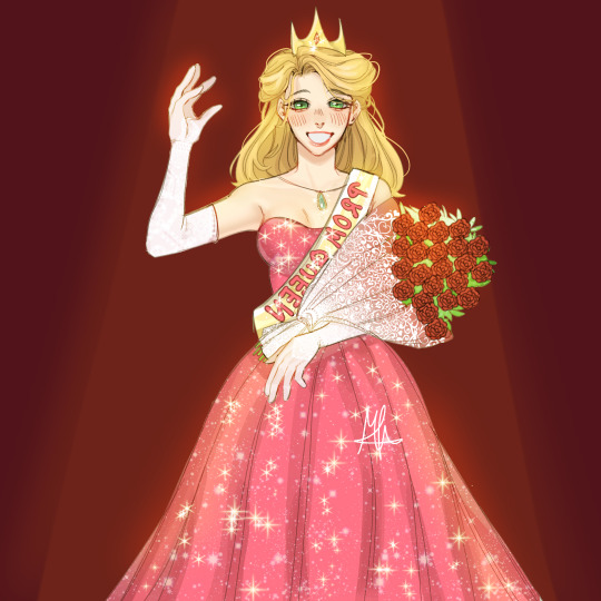


Redraw of my Sara berry fanart!
Original:
Remember to:
Check Sara ☑
Choose Sara ☑
Vote for Sara Berry ☑
#@ op: please consider adding this id to your original post. see my pinned post for details.#art#fanart#artists on tumblr#ballad of sara berry#sara berry#35mm a musical exhibition#35mm#35mm fanart#gore#blood#described#image description#described by me(at)
180 notes
·
View notes
Text
So, I saw this image on Facebook, and it was supposedly showing what Queen Nefertiti would have looked like in real life:

Now, I thought this AI generated garbage was just truly terrible on a number of levels; first off, she looks wayyyyyy too modern - her makeup is very “Hollywood glamour”, she looks airbrushed and de-aged, and as far as I’m aware, Ancient Egyptians didn’t have mascara, glitter-based eyeshadows and lip gloss. Secondly, her features are exceptionally whitewashed in every sense - this is pretty standard for AI as racial bias is prevalent in feeding AI algorithms, but I genuinely thought a depiction of such a known individual would not exhibit such euro-centric features. Thirdly, the outfit was massively desaturated and didn’t take pigment loss into consideration, and while I *do* like the look of the neck attire, it's not at all accurate (plus, again, AI confusion on the detailing is evident).
So, this inspired me to alter the image on the left to be more accurate based off the sculpture’s features. I looked into Ancient Egyptian makeup and looked at references for kohl eyeliner and clay-based facial pigment (rouge was used on cheeks, charcoal-based powder/paste was used to darken and elongate eyebrows), and I looked at pre-existing images of Nefertiti, both her mummy and other reconstructions. While doing this, I found photos of a 3D scanned sculpture made by scientists at the University of Bristol and chose to collage the neck jewellery over the painting (and edited the lighting and shadows as best as I could).

Something I see a lot of in facial recreations of mummies is maintaining the elongated and skinny facial features as seen on preserved bodies - however, fat, muscle and cartilage shrink/disappear post mortem, regardless of preservation quality; Queen Nefertiti had art created of her in life, and these pieces are invaluable to developing an accurate portrayal of her, whether stylistic or realistic in nature.

And hey, while I don't think my adjustments are perfect (especially the neck area), I *do* believe it is a huge improvement to the original image I chose to work on top of.
I really liked working on this project for the last few days, and I think I may continue to work on it further to perfect it. But, until then, I hope you enjoy!
Remember, likes don't help artists but reblogs do!
#Nefertiti#Queen Nefertiti#Ancient Egypt#Facial Reconstruction#art#artist#digital artist#historical#history#historical figure#ancient egyptians#artistic interpretation#historial facial reconstruction#Neferneferuaten#Queen Neferneferuaten Nefertiti#illustration#digital art#digital illustration
7K notes
·
View notes
Note
Yo dawg why won’t it let me send pictures in?
Ah fuck, probably a setting I missed while messing around with the submission and inbox stuff. Should work now I think?
#mod post#sorry about that. Mod vs technology (exhibit A)#I was going to originally have it so all images can be submitted only but this might be easier in hindsight lmao
0 notes
Text
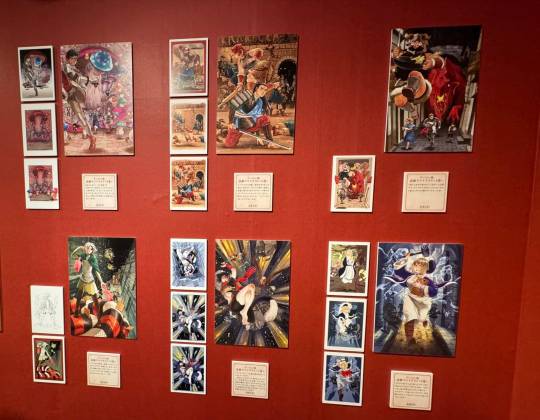
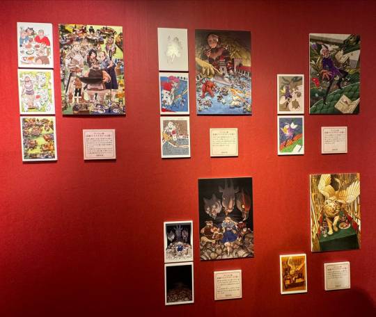
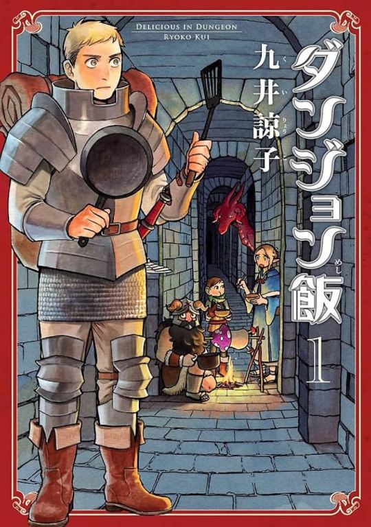
Ryoko Kui Exhibition & ''Delicious in Dungeon'' Exhibition
"Delicious in Dungeon" Artwork
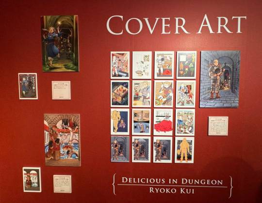
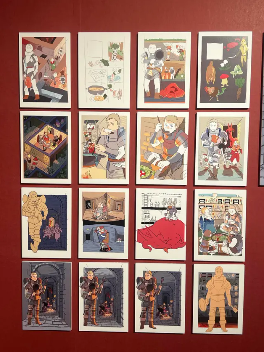
Cover illustration draft, vol. 1
Since this was the first volume, I tried out a few different drawings and had the editor and designer choose which ones they wanted, then made small adjustments. I personally liked the top-down draft, and the one of the cooking processes (back cover) the best. But looking back, I sincerely think it's good that we didn't go with those. (Kui)
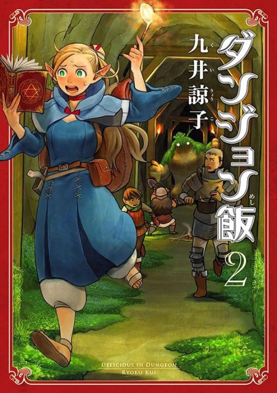
Cover illustration draft, vol. 2
The format was decided for volume 1. So, volume 2 came together quickly. (Kui)
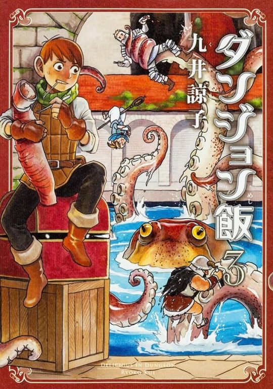
Cover illustration draft, vol. 3
I thought it might be cool to make the character Chilchuck darker in the foreground, and the background brighter! But it didn't quite work out the way I had imagined. I think it could have been a bit better. (Kui)
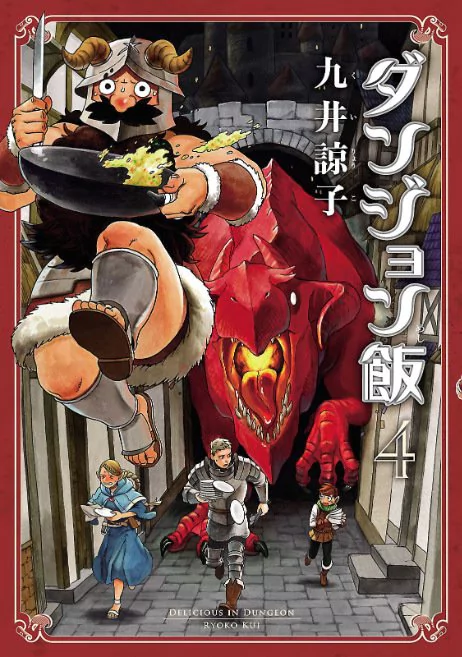
Cover illustration draft, vol. 4
I remember that the overall shape of volume 4 came together very quickly. The character Senshi's hands didn't fit nicely, so I moved them backwards and to the side. (Kui)
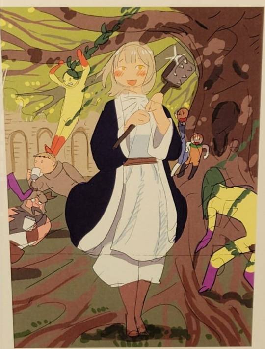
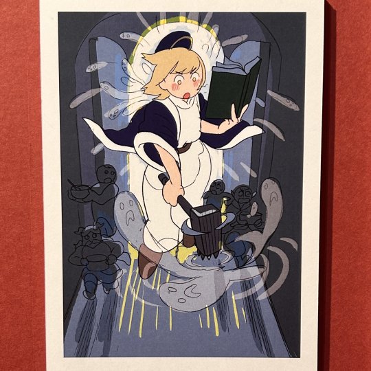
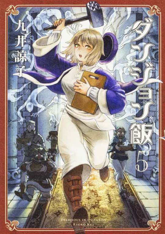
Cover illustration draft, vol. 5
I thought people might start to think "how many have I bought?" so I wanted to create a slightly different impression with this volume. I decided to put the character right in the center and try putting it together all in blue and green hues. (Kui)
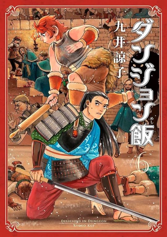
Cover illustration draft, vol. 6
With the Red Dragon defeated, have we reached the halfway point in the story? With this in mind, I thought of how many volumes were left to go, and the number of characters, and decided to pair up the characters Namari and Shuroiro. In hindsight, it would have been fine to have them on one cover each. (Kui)
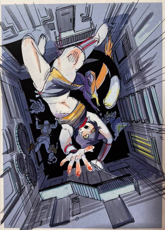
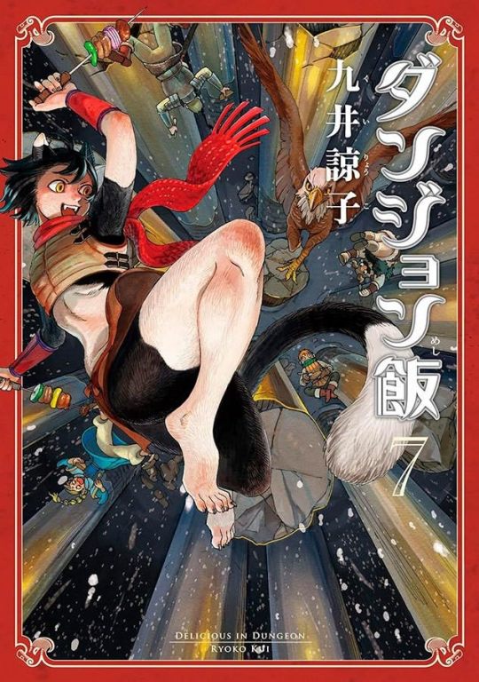
Cover illustration draft, vol. 7
The image is of focus lines converging on the character Izutsumi. This is the kind of cover, with upside down characters, which I've always wanted to try once(?) I submitted it as a trial, thinking that at this point the cover wouldn't dramatically influence sales. However, in the end, we decided it would be better not to have it upside down. (Kui)
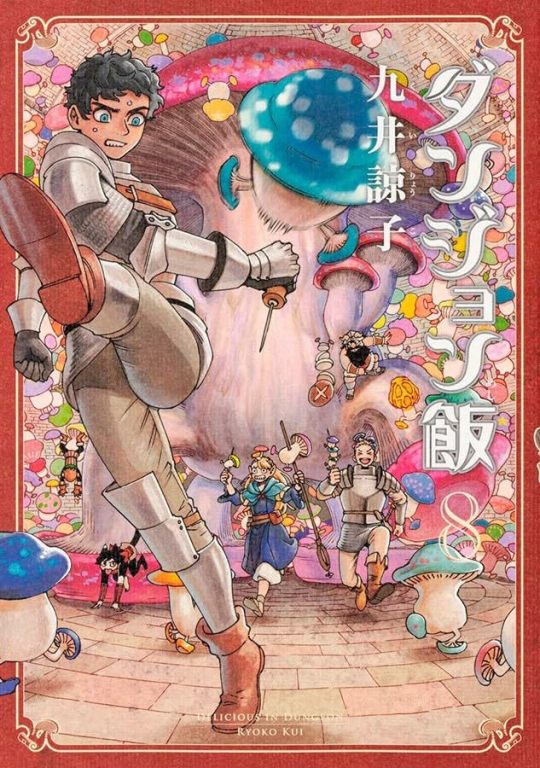
Cover illustration draft, vol. 8
I tried blurring the mushrooms in the foreground, then I accidentally saved over it, and couldn't go back to the original. I remember apologizing that it was probably tacky, when I submitted it. (Kui)
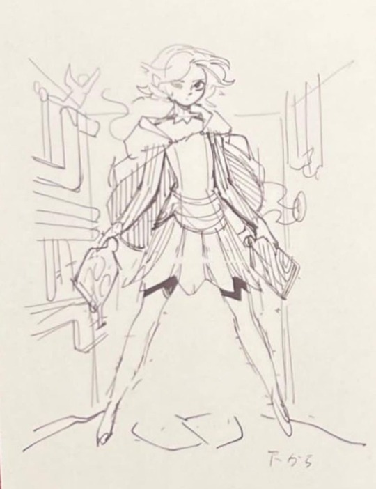
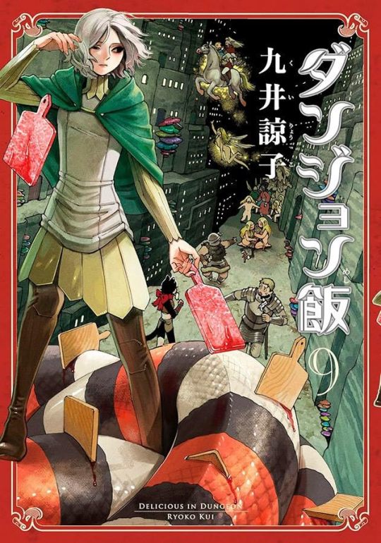
Cover illustration draft, vol. 9
I don't think snake meat is marbled at all, but if it has an unfamiliar look, people might not recognize it as meat… so I made it look like beef to make it easier to understand. (Kui)

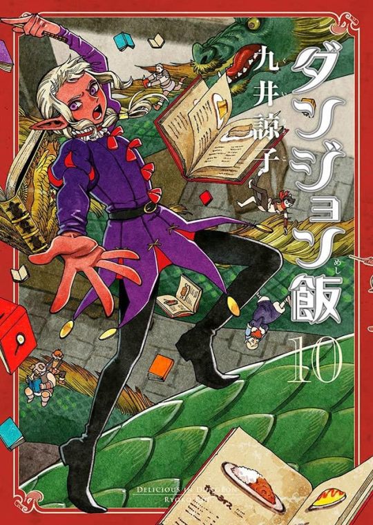
Cover illustration draft, vol. 10
I thought it might be interesting to have more than one of the main characters on the cover again, so I added the character Falin. I remember it wasn't badly received, but it still ended up just being Thistle on his own. (Kui)
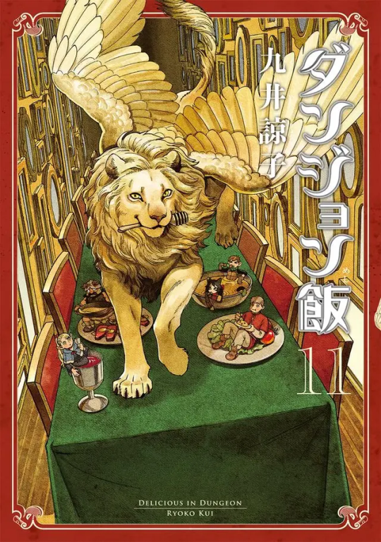
Cover illustration draft, vol. 11
I wanted this cover to be covered in shiny gold. After I finished it, it didn't have enough color, so I painted the tablecloth green, and it ended up looking like Christmas colors. (Kui)
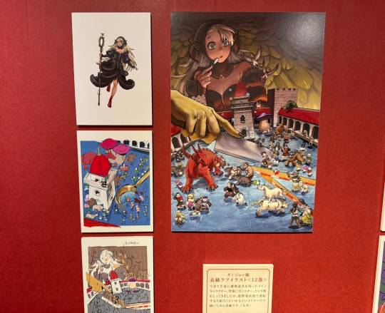
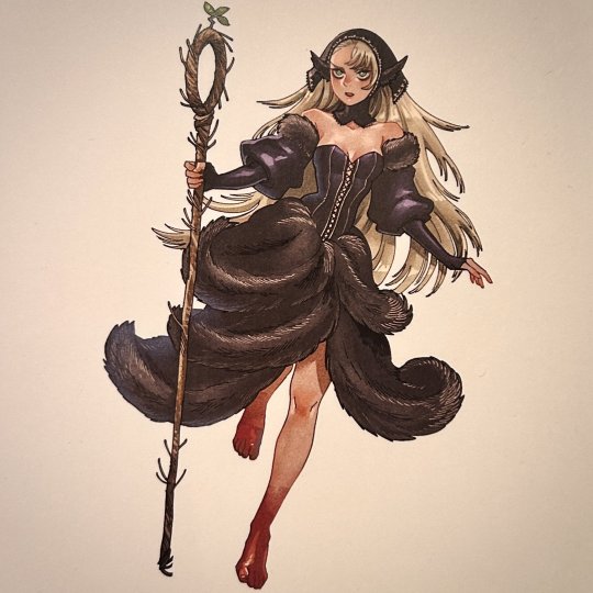
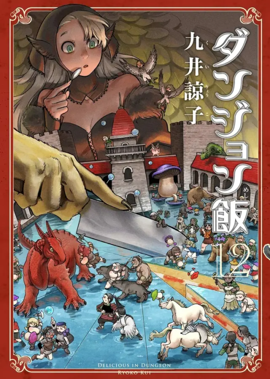
Cover illustration draft, vol. 12
Up to this point, the covers have featured one of the main characters holding cooking utensils in the foreground and a monster in the background, but I thought it might be interesting to reverse the format just before the final volume, so I drew this cover with that in mind. (Kui)
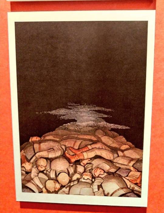
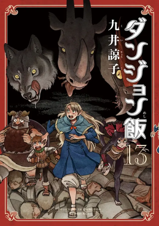
Cover illustration draft, vol. 13
volume 13 was meant to be the final one, but it was too thick to be published as a single volume, so we decided to split it into two. The question of “so, what should I draw next!?" may be at the forefront of volume 13. (Kui)
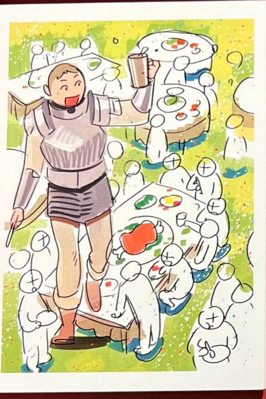
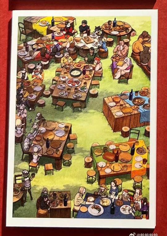
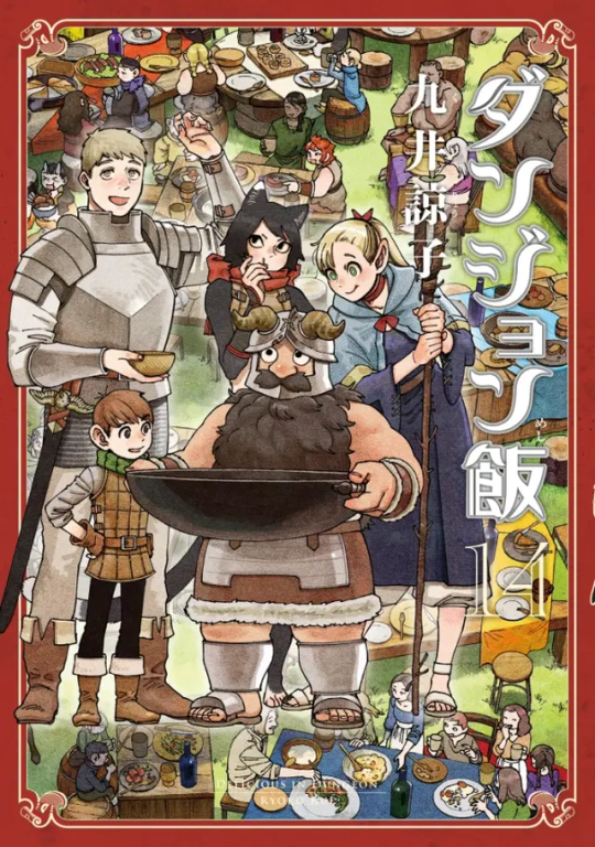
Cover illustration draft, vol. 14
I had decided that the final cover definitely needed to have everyone eating together on it, but because I was publishing two books at the same time I was pressed for time, and it was difficult to have a cover with so many characters on it. I also submitted a rough for an illustration that didn't need me to draw any crowds, but such obviously easy ideas are never adopted. (Kui)
TV anime "Delicious in Dungeon"
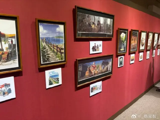
About the ending illustration.
I drew these based on the director's instruction "This kinds of pictures." I hardly ever have the chance to draw color illustrations, so it was a valuable experience for me. (Kui)
[Kui's commentary is from the english pamphlet]
#Longpost#long post#Dungeon Meshi#Delicious in Dungeon#Dungeon Meshi Spoilers#Delicious in Dungeon exhibition#Dungeon Meshi exhibition#exhibition#cover art#Ryoko Kui#Laios Touden#Marcille Donato#Chilchuck Tims#Senshi#Falin Touden#Namari#Shuro#Toshiro Nakamoto#Izutsumi#Kabru#Mithrun#Winged Lion#If you have better images from the exhibition please share with me 🙏#I'll look for some later cause i'm pretty sure I've seen better images of the cover drafts before
2K notes
·
View notes
Text
[Image Description: Three digital drawings of Sara Berry from 35MM: A Musical Exhibition. Image 1: Sara is standing in front of a vanity mirror with lights on the edge of it. There are several photo booth strips and Polaroid pictures stuck in the edges of the mirror. There is lipstick and a ticket on the counter. She is smiling in the mirror, lipstick smeared around her lips like blood. She is drawn as a silhouette wearing a dress and pears around her neck. On the side of the photo are the words: "There's 7 reasons this crown's not good as got!" with the names Julie, Anne, Eunice, Raquelle, Mariana, Patricia, are Quiara crossed out. Image 2: The same as image 1, compared side by side with image 3. Image 3: An older version of the drawing. In this version, the lighting is more noir-style as opposed to purple as the new drawing is. In this drawing, there is a smartphone on the counter showing the time 7:02 with a notification on the screen. In this drawing, the names are not crossed out and Sara's hair is down. End ID.]

35mm fanart in the year of our lord 2024?? Crazy stuff!!
Redraw of this piece from Nov 8 2021 the side by side is making me rabid btw. She’s purple now 🫶


#@op: please consider editing this description into your original post. see my pinned post for info.#fanart#35mm: a musical exhibition#35mm musical#sara berry#the ballad of sara berry#described#image description#described by me(at)
40 notes
·
View notes
Text
Meta has engaged in a “systemic and global” censorship of pro-Palestinian content since the outbreak of the Israel-Gaza war on 7 October, according to a new report from Human Rights Watch (HRW). In a scathing 51-page report, the organization documented and reviewed more than a thousand reported instances of Meta removing content and suspending or permanently banning accounts on Facebook and Instagram. The company exhibited “six key patterns of undue censorship” of content in support of Palestine and Palestinians, including the taking down of posts, stories and comments; disabling accounts; restricting users’ ability to interact with others’ posts; and “shadow banning”, where the visibility and reach of a person’s material is significantly reduced, according to HRW. Examples it cites include content originating from more than 60 countries, mostly in English, and all in “peaceful support of Palestine, expressed in diverse ways”. Even HRW’s own posts seeking examples of online censorship were flagged as spam, the report said. “Censorship of content related to Palestine on Instagram and Facebook is systemic and global [and] Meta’s inconsistent enforcement of its own policies led to the erroneous removal of content about Palestine,” the group said in the report, citing “erroneous implementation, overreliance on automated tools to moderate content, and undue government influence over content removals” as the roots of the problem.
[...]
Users of Meta’s products have documented what they say is technological bias in favor of pro-Israel content and against pro-Palestinian posts. Instagram’s translation software replaced “Palestinian” followed by the Arabic phrase “Praise be to Allah” to “Palestinian terrorists” in English. WhatsApp’s AI, when asked to generate images of Palestinian boys and girls, created cartoon children with guns, whereas its images Israeli children did not include firearms.
5K notes
·
View notes
Text
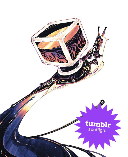
Creator Spotlight: @camberdraws
Hello! My name is Camber (any pronouns), and I’m a mixed media illustrator located in the southwestern United States. I love drawing everything, but I have a special interest in depicting strange creatures and environments, often accompanied by abstract imagery and mark-making. Professionally, I’ve worked creating concept art and 2D assets for museum exhibits, but currently, I am engaged full-time as a software developer and make standalone illustrations in my free time. I’ve been posting art on Tumblr since I was a teenager, and the site has been very welcoming towards my work to this very day!
Check out Camber’s interview below!
Did you originally have a background in art? If not, how did you start?
I’ve had an interest in drawing since I was barely sentient, but at thirteen years old I decided to become “serious” about art. I was all about reading tutorials and doing a ton of studies. I would tote my heavy instructional art books to school every single day (my poor back!) Despite all this, I decided to forgo art school in favor of a bachelor’s degree in Computer Science at my local college. Alongside my major, I received a minor in Art Studio with a specialization in fine art, which totally changed my views on creating artwork and drastically changed my style.
How has your style developed over the years?
As mentioned previously, my style did a 180 after I studied under some very skilled fine art professors! As a kid, my drawings were very realism-heavy and inspired by video game concept art. I mostly worked digitally, too. During college, I was thrown for a loop when we were instructed to do strange things like, for example, make a bunch of marks on paper using pastel, WITHOUT looking, and then turn said marks into a finished piece of art! I quickly and deeply fell in love with abstract work, and especially appreciated images that are not easily parsed by the viewer. Since then, I’ve made it my goal to combine abstract mark-making with more representational subject matter.
What is one habit you find yourself doing a lot as an artist?
Hmmm, one habit I really enjoy as an artist is strictly tracking the amount of time I spend drawing! I currently work a full-time job wholly unrelated to art, so I have to be careful with my time if I want to spend enough hours drawing each week. I created a spreadsheet that allows you to enter the amount of minutes you’ve drawn each day and calculate how much drawing time you still need to reach your weekly goal (I aim for 20 hours a week.) Having such a clear, numbers-based objective keeps me motivated to work like nothing else!
Over the years as an artist, what were your biggest inspirations behind your creativity?
I know this is a common inspiration, but Hayao Miyazaki’s work has been rewiring my neurons since I was a child. Seemingly all of my artistic interests can be summed up by the movie Princess Mononoke: it has strange/abstract creature designs, a strong focus on nature and environmental storytelling, and a mix of dark and hopeful themes. Additionally, I’ve been deeply inspired by video game series such as Zelda, Okami, Pikmin, and Dark Souls. But arguably, none of these have influenced me more than Pokemon! I’ve been drawing Pokemon since I could barely hold a pencil, and I haven’t stopped since! I believe my love of designing creatures originated with my endless deluge of Pokemon fanart during my childhood.
What is a medium that you have always been intrigued by but would never use yourself?
I’ve always been fascinated by 3D mediums and am so tempted to try them out! Whether that’s 3D models created digitally or sculptures made from clay, I profoundly admire artists who have this skill. Oftentimes, it feels like I don’t have time to delve into a totally different artistic paradigm. However, I feel very strongly that learning new skills can enrich your current work. I should take that advice and someday give 3D mediums a shot!
What is a recent creative project that you are proud of?
I am in the process of creating an art book (a dream of mine!) and have been executing smaller drawings of concepts I find interesting from both a visual and storytelling standpoint. A recent drawing for said book is that of a snail made of ink with an ink bottle as a shell, and it went absolutely viral! I’ve never had an experience like this as an artist before and it has been spectacular! I was able to open a shop using my newly acquired art printer and sell many prints of my snail. Creating something original, directly stemming from my interests, and having that resonate with so many people has been unreal. I couldn’t ask for more as an artist!
What advice would you give to younger you about making art that’s personal or truthful to your own experiences?
I would tell my younger self to chill out and experiment more! I was so caught up in the idea that I needed to have a realistic style to be considered “good.” I also believed that technical skill was the only measure of how worthy my art was. That’s not to say technical skill doesn’t matter, but I now firmly believe the creativity and voice of your ideas far outweigh the skill of execution in terms of importance. Technical skills should elevate ideas, not the other way around. Once I began to revel in strange ideas and stories for my work, depicted oftentimes in odd styles or mediums, I truly found my voice as an artist.
Who on Tumblr inspires you and why?
My peers here on Tumblr inspire me more than anything! Sharing my work with contemporaries and giving each other support brings me joy like no other, and keeps me motivated to continue creating. I wouldn’t be where I am today without them! @beetlestench, @theogm-art, @trustyalt, @ratwednesday, @phantom-nisnow, @svltart, @mintsdraws, @mothhh-hh, @jupiterweathers, @thesewispsofsmoke, @picoffee, @fetchiko, @kaisei-ink, and @pine-niidles just to name only a few!
Thanks for stopping by, Camber! If you haven’t seen their Meet the Artist piece, check it out here. For more of Camber’s work, follow their Tumblr, @camberdraws!
1K notes
·
View notes
Text

A great picture but I couldn't trace the artist. Most likely AI but I'm not positive 🤔
#artworks#pictures#art#artistic#artist#painting#ai art#great images#beautiful painting#great painting#nice image#creative arts#creative#imagination#happy pictures#rainyday#flowers#beauty#modern artwork#great artwork#beautiful#pretty lady#artistic expression#scenic#paintings#original painting#art exhibition#pictures of beautiful women#artists on tumblr#art aesthetic
6 notes
·
View notes
Text
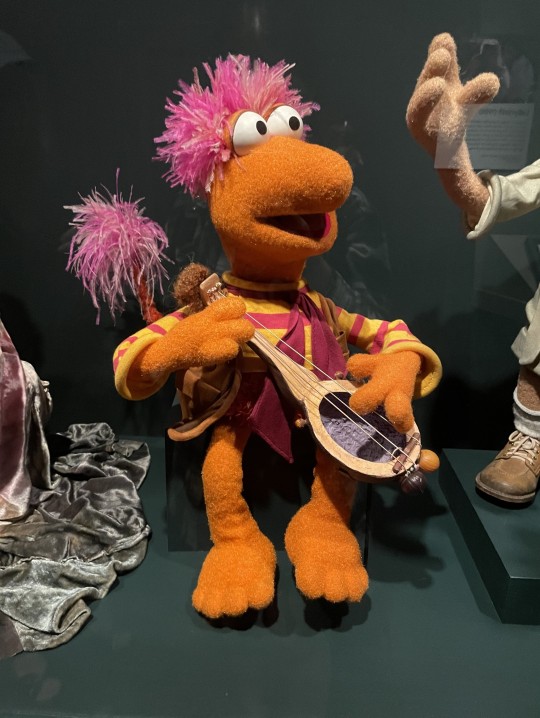
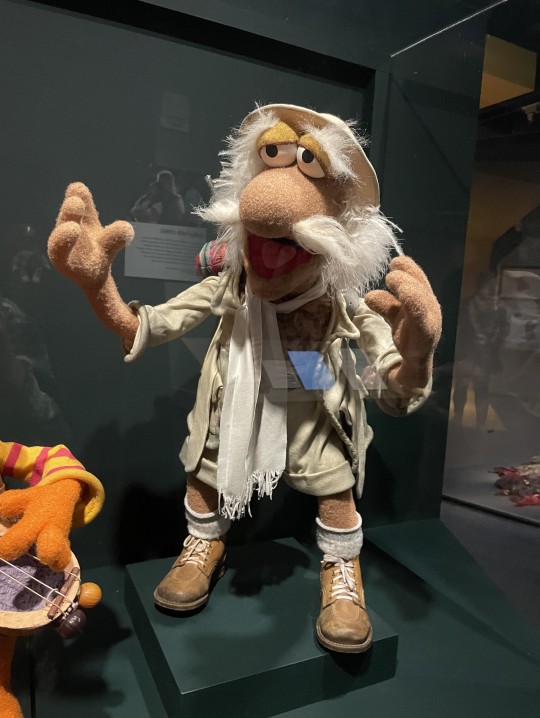
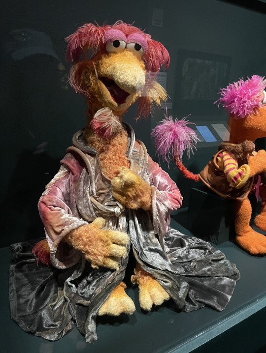

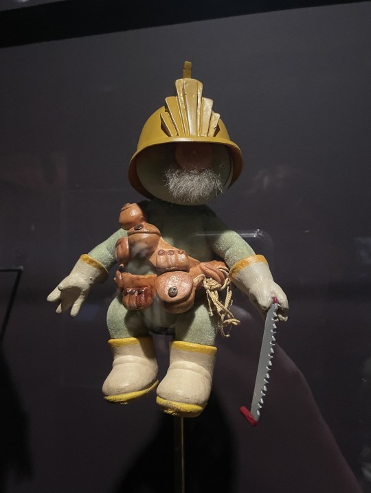
I got to see in-person Fraggles this year! Gobo, Uncle Traveling Matt, and Cantus are at the Museum of the Moving Image in Queens (along with three Doozers and Convincing John, who for some reason is displayed elsewhere in the exhibit), and Red and Wembley were part of The Jim Henson Exhibition: Imagination Unlimited, the MOMI's traveling Jim Henson exhibit. Now that that exhibit's reached the end of its tour, I'm curious to see what's going to happen to it 🤔
Bonus Doozers and Convincing John underneath the cut:
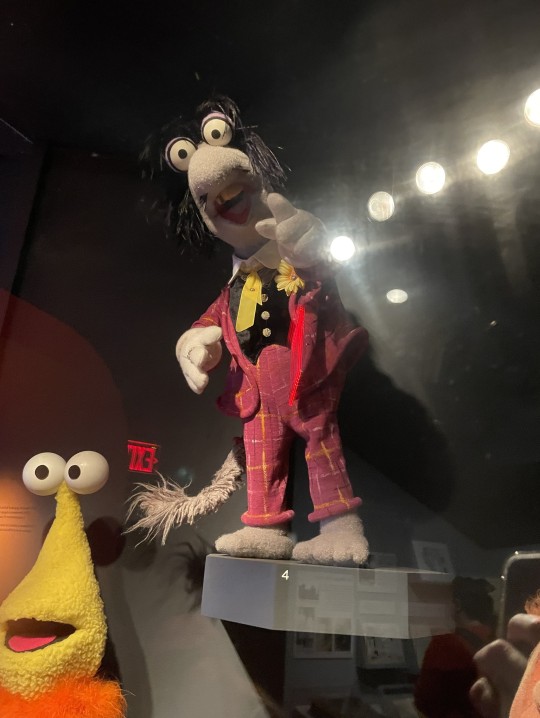


#Fraggle Rock#Gobo Fraggle#Uncle Traveling Matt#Cantus#Red Fraggle#Wembley Fraggle#Museum of the Moving Image#The Jim Henson Exhibition#The Jim Henson Exhibition: Imagination Unlimited#Doozers#Convincing John#I canNOT get over how TINY Wembley is!#original post#my stuff
26 notes
·
View notes
Text
I don't know if you're ready for this BUT American Duchess and the Bata Shoe Museum just launched a collab collection called In Bloom.
They made 3 styles in several colours using 3 styles from the the 18th, 19th and 20th centuries from their current exhibition "In Bloom: Flowers and Footwear", and are currently in pre-sale, with estimated deliveries between July and August 2023.
Let's take a look:
We start at the 18th century with the Primrose shoes, based on their Dunmore model, accurate for 1770s-1790s they are embroidered on satin and are $179 USD while in pre-sale and later will be $199. The original style is in black and pink silk satin, and OF COURSE that's my favourite variation, but the green ones are a close second.

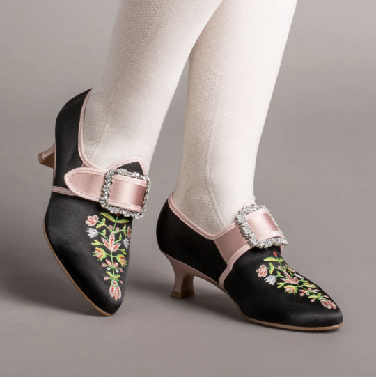
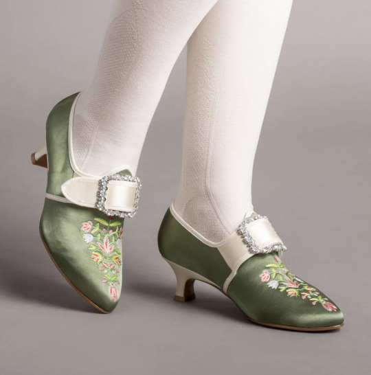
Images from top: 1780s shoes, Bata Shoe Museum / Primrose shoes, American Duchess.
From the 19th century we have this style called Flora, accurate for the late 19th century (1870s-1900), are $230 USD while in pre-sale and later will bee $250. This embroidered boots with satin ribbon laces are probably my favourite style from the collection. Of course my fave colour is black, which is also the colour of the original piece, but the lavender ones are just *chef kiss*:
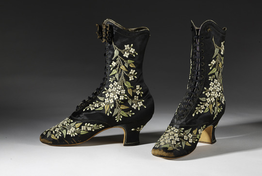

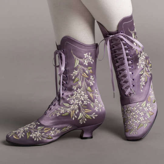
Images from top: the original French embroidered boots by Francois Pinet, late 1870s-early 1880s, Bata Shoe Museum. / Flora boots, American Duchess
Finally, the 20th century style is the Daisy, accurate for the 1920s-1940s. A vintage style full of flowers and colour, this T-strap style is perfect to pair with a simple dress from any decade and have a very decent 6.3cm heel, so you can dance all night in these art deco shoes.
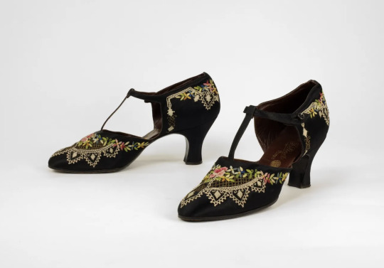
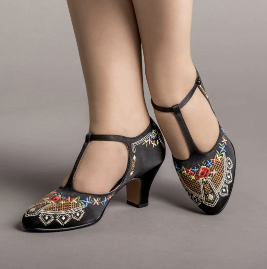
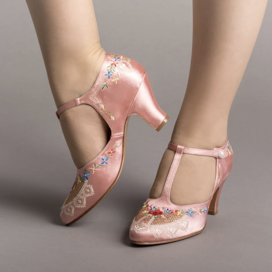
1920s shoes, Bata Shoe Museum / Daisy shoes, American Duchess.
The sales from the In Bloom collection will support The Bata Shoe Museum in their study, outreach, and conservation of historic footwear, and we're here for it.
More info:
"In Bloom: Flowers and Footwear"
Read more about the collaboration at the American Duchess Blog.
Buy the whole collection in pre-sale here.
Which style are you looking for the most?
#shoes#accessories#in bloom#florals#18th century#19th century#20th century#historical shoes#american duchess
8K notes
·
View notes