#digital mockup
Explore tagged Tumblr posts
Text
A digital mockup of a 3 color print that may or may not happen. My plate is quite full. I constructed as much as possible from the same ratios, angles, & shapes as possible. The gold texture is a stand in for the gold foil or ink I'd like to use if this makes the leap to real media.
#art#digital art#art deco#tiger#tigers#stylized#illustration#printmaking#printmaking planning#digital mockup#mockup#wildlife art#paleo panthera#palaeosinensis#big cat#big cats#box cats#box tiger
230 notes
·
View notes
Text
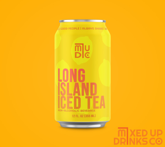
Brand packaging mock-ups for an established alcoholic drink company that is venturing into non-alcoholic beverages. The four values of Mixed Up Drinks Co. are "Great times. Good people. Always Share. Better Together."
The product design is focused on bold colors, geometric lines and shapes, and simple patterns.
This digital design brief was found on the BRIEFBOX, where artists can find design prompts to hone their skills and expand their portfolios.
Programs Used: Adobe Photoshop; Adobe Illustrator (Creative Cloud)
Fonts: Righteous, Bebas Neue (Google Fonts)
#art#digital art#branding#marketing#briefbox#product design#packaging design#adobe photoshop#photoshop#adobe illustrator#illustrator#creative cloud#portfolio#my art#stacie poindexter#brief#packaging#brand#brand design#designer#digital design#graphic design#graphic designer#advertising#mockup#digital mockup#brand mockup#packaging mockup#original design#brief box
5 notes
·
View notes
Text
Cross - Digital Mockup
There's a giant glowing cross near my house that looks out over a forest and field. I really wanted to capture just how haunting it feels, especially as a trans and queer southerner.
I intend to paint this with acrylics, but I wanted to get the basic concept and color blocking out there before I get caught up in Art Fight.
1 note
·
View note
Text
🍴🍴🍴🍴
i really like how the lineart came out so here it is on its own :>
#dungeon meshi#dunmeshi#falin touden#chimera falin#laios touden#marcille donato#senshi#chilchuck#izutsumi#my art#im thinking of getting this riso printed once im back at school but my mockup looked soo bad 😭#the digital mockups are usually not v accurate#so i still might well see#but im v proud of this :D#ive liked this manga for abt a year and a half now and im finally doing fanart for it ahgsdkjfl
4K notes
·
View notes
Text
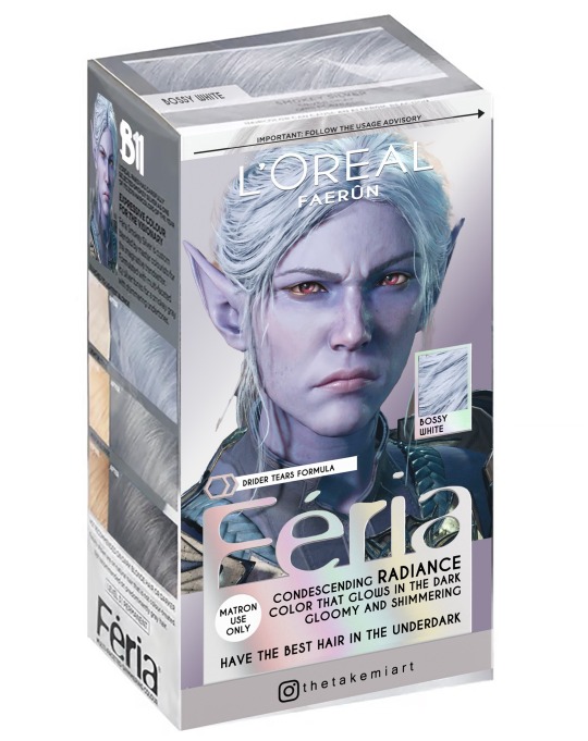
My Lords, Ladies and Gentlemen!
Faerun Shabby Boutique has an exceptional and exclusive offer for you!
Discover our exclusive box hair dye pack including “Snarky Silver”, “Bossy White” and “Petulant Blonde” hair colors.
Only available at Shabby Boutique in Faerun!
(Not FDA approved. Do not stay next to any fire sources after applying the product. The glow in the dark effect might be radioactive, use at your own risks. The life changing effect do not mention if it is for the better or the worst, we are not responsible for any side effects)
Follow me also on Instagram!
#digital art#mockup#fanart#hair dye#bg3#baldurs gate 3#baldur's gate 3#baldur's gate fanart#bg3 fanart#baldurs gate fanart#astarion#astarion ancunin#bg3 astarion#neil newbon#minthara#minthara baenre#bg3 minthara#minthara fanart#emma gregory#shadowheart#bg3 shadowheart#shadowheart fanart#jennifer english#faerun#bg3 memes#baldurs gate meme#baldur’s gate 3 meme#meme
2K notes
·
View notes
Text
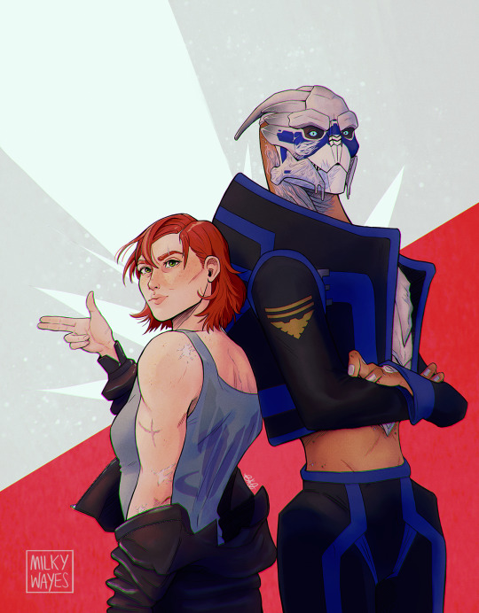
badass weekly anniversary edition [prints]
#mass effect#mass effect fanart#shakarian#femshep#commander shepard#Garrus Vakarian#shepard x garrus#video games#alien#art#digital art#artists on tumblr#milkyart#they're the patron saints of badassery and everyone knows it.#that's why they were the logical choice for this very special cover for badass weekly's 1000th anniversary!#LOL I could've done a mockup but I don't want anything to distract from them so
2K notes
·
View notes
Text
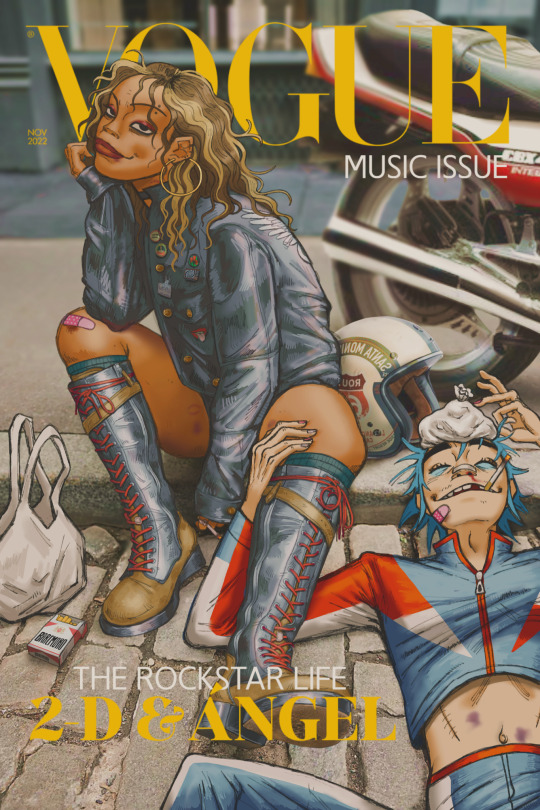
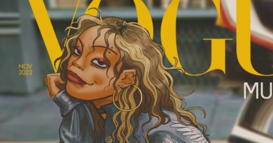
two stupid losers end up on cover of vogue
#i finally finished this damn thing oh my god. ngl i enjoyed it less and less the more i rendered but it was a learning experience nonetheles#my art#art#gorillaz#gorillaz oc#angelica valentin#ángel#angel#2d gorillaz#my ocs#ocs#artists on tumblr#digital art#illustration#vogue mockup#fashion magazine#magazine mockup#magazine#vogue#oc x canon#i have no idea why the quality is shit but tbh idegaf anymore 😭 cant figure it out and im tired. need this out ‼️
481 notes
·
View notes
Text
THERE'S GONNA BE A SHEZOW COMIC ADAPTATION???
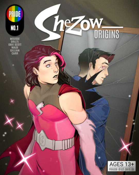
This one's for you, anon who asked me a few months ago ❤️
#shezow#guy hamdon#comic#comic cover#mockup#cartoon#nostalgia#I wanted to try my hand at my own shezow design! Unfortunately#I am not a very good outfit designer#so there might be a she-design coming one day lmao#art#digital art#my art#mousse.png
513 notes
·
View notes
Text
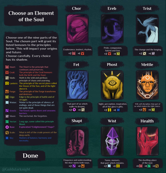
Book of Hours x Disco Elysium - Which one is your signature skill?
First time posting here. Have mercy on me. :)
Here are some portraits of the elements of the soul from BoH in the style of the skill portraits from Disco Elysium with a little character creation mockup. After posting this on the Discord server, I was encouraged to post it on r/weatherfactory. There I was encouraged to post it on Tumblr.
#book of hours#disco elysium#weather factory#cultist simulator#digital art#digital illustration#mockup#art
351 notes
·
View notes
Text
I was so impressed with the first keychain I made that arrived today that I immediately started designing a new one xd
I have an idea for a set of matching Life series pairings keychains. Here's my first concept with Treebark/Renchantyn, but I have at least 4 other pairings planned :3
And here are the mockups provided by the page I'm using to order these:
If you guys would be interested, I couuuuld think of organizing a preorder and hooking you guys up with some! Just let me know by leaving some engagement so I can more or less guess how interested you guys would be ^^
(also, in case you guys aren't into Treebark - so far I'm also planning Majorwood, Scarian, Shinyduo and Ranchers. And I might think of a few more :3)
#life series#trafficblr#wild life smp#lifeseries#3rd life#last life#secret life#limited life#double life#treebark#renchantyn#rendog#martyn inthelittlewood#dogwarts#majorwood#shiny duo#ranchers duo#scarian#desert duo#fan merch#keychains#acrylic charms#acrylic keychains#mockup#preorder#interest check#mcyt#mcyt merch#digital art#life series fanart
81 notes
·
View notes
Text
"You are my creator, but I am your master--obey!"
okay phew now that the cut is here i can actually get silly with it
frankenstein ? theyre going to have to call him freakystein once im done with him
okay ill shut up now <- lying
yeah this is basically a mock-movie poster/cover for frankenstein, with the border things mimicking the style of those silent film text frames
and hey, if youre still here, heres a sneak peak at some storyboards im making ;)
theres one and a half pages done right now, but im sure this'll easily stretch into 3+ pages
oh and if you want to see more of the frankenstein stuff im doing, i have it all tagged under #freakystein lol
#art#:3#my art (real)#frankenstein#freakystein#victor frankenstein#adam frankenstein#frankenstein's monster#frankenstein's creature#frankenstein mary shelley#frankenstein fanart#can you tell this is for frankenstein yet?#sorry lmao#digital art#storyboards#storyboarding#movie poster#poster mockup
74 notes
·
View notes
Text
More Volya sketches! My Shadar-kai paladin noble in Waterdeep.
I played him the first time on Saturday, I've never played a noble character in my whole life, and it was so fun
#made a fun mockup thing with some random ass medieval paper i found on google lol#sketches#dungeons and dragons#dungeons and dragons art#dnd#dnd art#d&d#d&d art#dnd oc#shadar kai#myart#myoc#myocs#original character#ocs#volya#digital drawing
297 notes
·
View notes
Text
*tosses wip I started but will never finish*
#colour mockup#just wanted to see what colours looked like#anyways does summer hibernation exist? because I feel like that#galacta knight#kirby#glitter gallery#my art#kirby fanart#digital art#swap au#Kirby swap au
111 notes
·
View notes
Text
𓈒༷♪˚.✧ How to make a mockup like this for smaus, ocs, etc. (step-by-step tutorial ☆ no Photoshop, easy, free) (requested by @lovebittenbyevans) ✿
guys this took me two hours to make and you could probably get this done in like, 30 minutes :) I hope this is coherent <3 Please look back this image for comparisons, if my explanation is not well explained, etc.
first of all, if you dont already have one, make a free canva acount. once you're signed in, hit the purple "create design" button on the sidebar. A pop-up will appear with different design template options. For this design, we want the dimentions to be 1080 x 1080, so you can either make a custom size or choose the instagram post (square) template by either searching or scrolling through the list.
2. Now you have a blank page. Zoom in with the slider at the bottom of the page if you need to (Mine is currently zoomed in 41%). Click on the page and change the color to an off black (hex code #111111).
3. Now that the color is changed, click the "elements" tab and search "line". Click the shape and it will add it to the page automatically. These line are particularly hard to navigate and hard to get it at the right angle and length so this part might take a little longer than the rest.
4. stretch it from top to button and turn in a 90 angle so its straight on the left side of the page. Change the color of this as well to a grey tone (hex code #2F2F2F).
5. Now we'll add the Instagram logo. Click the "text" tab then click the purple "add text box" button. Write "Instagram" in the box and change the font to "apricots". This is the closest font I could find that resembled the logo font but if you find a better one, feel free to use that instead. Make the font size 19.3 (you can do this manually or do it in the text options). Change the color to grey color (hex code #707070). Add it to the upper left corner of the page like this:
6. now we're adding icons and a menu inside the border we just made. Click the "elements" tab again and search for "instagram home icon" and add the element by sketchify to the page. Click the home icon, an options icon with pop-up above the page. Look for the "Position" button and click it. Scroll to find the advanced options and you can manually type in the width and height at 26.6 and 28.7.
Move it inside the border, under the logo (photo below). Change the color again (the hex code is #707070).
7. Open the text tab and add a text box. Change the font to Canva Sans and write "Home" in the box. Change the font size to 18.1 and align with with the house icon. It will look something like this,
8. Go into the elements tab again and search "instagram search icon". Scroll until you find the one by sketchify and add it to the page.
9. Shrink it so the W and H is at 36.6 and 31.3. Move it below the home icon until a purple "67" pop ups and aligns under it. Change it to the same color as the Home text and icon (#707070). Go ahead and Duplicate the the "Home" text box and clicking it and a pop-up will show up then edit the text so it says "Search" and align with the searcch icon we just added.
10. You know the drill. We are continuing to search up more icons in the "elements" tab. Search "instagram compass icon" and choose the one by sketchify (are u seeing the pattern?). Add it to the page and change the width and heigth to 33.1. align it under the search icon just like how we did before and change it to the say colors as the other icons.
11. Do the same as before and write "Explore" in a text box and align it with the icon. We're doing the same thing for all of these.
We'll be using the same search prompt for all of these icons so just change the type of icon you're looking for like we've done before hand. Next look for the Instagram reel icon and add the outlined one by sketchify and change the W and H to 31.2 x 30.9. Change the color to the ones we've used before, align it underneath the icons above and add your text ("Reels").
12. The next icon is an outlined, "sent" one. W and H is 31.1 x 27. The text will say "Send". Then an heart outline by sketchify; W and H is 34.2 x 29.1 and the text is "Likes". Next is the "create" outline icon by sketchify, W and H is 36.8.
(p.s if you are struggling to align the icons and text correctly, shoot me a message and I'll send you the X and Y positions ;D)
If you followed it through, it should look like this,
13. Now onto step 13, we'll be adding the Threads logo. You don't have to add this but to make it look more like the actual website, I will be adding it. Open the "text" tab and add a text box. Write an "@" symbol in the box and change the font to Nanum Sqaure and the size to 24.9. Add in the bottom corner below all the icons we just added to our page. We need another text box now (Color is still #707070), write "Threads" and align it to the "@" symbol.
14. We're adding another icon now. Search "Instagram menu icon" and find a wireframe menu icon by sketchify. the W and H are 42.5 x 24.6. Add a text box that says "More". It will look like this:
We are a quarter way done now :D
15. Search in the elements tab "circle frame" and look for the one with a little border around it.
At first, the circle will be green and inside the circle will be white. Change the white to color of the background of the page (hex code #111111) then change the green to a grey color (#8D8986).
16. Add a new text box, change the font to Canva Sans and the size to 22.8 and the color is white. I just wrote "user.name" in the box. the W and H will be 153.3 x 35.7.
Enter the "elements" tab and search for a blue checkmark and find the icon by Victor Aguiar. The W and H is 28.1 by 28.
17. Search in the search box for a rectangular shape and add it to the page. Place it next to your username and checkmark icon and make the W and H to 149.6 x 38. Add another and place it next to the other rectangle shape. the W x H is 111.4 x 36.7.
Change the color of both boxes to #2F2F2F. Add a text box and write "following" then change the W and H to 82.6 x 21.8 and fit it inside the first box. Add a second text box and write "message" in it then change the W and H to 77.8 x 21.8. Change both text colors to #7A7A7A
18. Add another text box. Write "<" and turn it upside down and place it beside the "following" text inside the rectangle. Adjust the size as you need to. I also like the round the corners to around 8 so its not so pointy and square.
19. Add 3 new text boxes. Write the amount of posts, the amount of accounts you're following and the amount of followers your have. Write "20 posts", "30 following" "40 followers". Bold the numbers and change the text W and H to 116.4 x 32.7. These are just place holders that I use.
20. Open the "elements" tab again and search "frame". Choose the first one.
We want the height and width to be 268 x 252.4. Place it at the bottom of the page but we want some space between the frame and the page.
Now we'll duplicate the frame we just placed (the icon between the comment and trash can on the pop up above the frame). Place it next to the previous frame but we want to leave a bit of space between them like this:
If its a little wonky, don't worry. You can always adjust it so it looks right.
Duplicate the frame again and place it next the second frame you just placed, same distance between. Make sure they're even. Now we have a row.
Select all three frames and duplicate them. Move them above our original frames but leave a little space between them.
Again, if they're uneven, adjust them as you need to.
21. Select the line again from the elements tab. Stretch starting from the top frame to the last frame and make the color grey (#2F2F2F).
Because the line is stupid hard to navigate, use something like a text box to mark where you want it to end like this:
Delete the text box and the line with be where we want it.
22. On to the highlight reels. Seach for "add button" and find the one by Barudak Lier.
Change the heigh and width to 81.1 and move it above the border.
Search for circle frames now and add this one to the page (The same one we used for the pfp), change the width and height to 85.4 and move it next to the add button. Since this is a generic, blank template, I add about 4 of these highlight frames but you can do however many you want. You can change the border color to a gradient or leave it grey.
Add a text box now. The font will be Canva Sans, the size will be 18.1 and the color will be white. Change the text to "Add" and place it under our add button. Make more of these text boxes to place under the circle frames. Depending on which frame its under, write "Highlight 1", "Highlight 2", etc. etc. or you can give them different names and such.
23. Add another text box, write "name" and bold it, change the size to 19.1 and the W and H to 69.2 x 28.8. The font will be Canva Sans and the color will be white. It will go under the amount of posts, followings and followers.
Add another box. The font is Canva Sans, font size to 20.1, the W and H is 40.8 x 31.3 and the color is white as well. This is our "bio". Place it under "name".
Yay!🎉🎉🎉 You're halfway done!
24. Search for a shape in the elements. Look for the rectangle again and add it. Change the width and height to 460 x 760.4 and the color to an off black/grey color (#191919), placing it like this:
Get the same kind of square frame we used before to make the profile grid and make it the same size as the rectangle we just added. Place right up against the rectangle like it's its other half. Add another line like before and span across the upper half of the black rectangle as a border then add a circle frame inside the border.
Add a text box, "user.name" and align it with the frame. The text is white and the W and H is 111.5 x 25.9
25. Add more circle frame along the inside of the rectangle to resemble the comment section. Make sure the W and H of the frames are 46.1.
Add more text boxes that align with the frames you just made and write "username" again and bold them. Add even more text boxes that align with the usernames and write "comment". These are place holders for when you decide to use this template.
Add another rectangle on the lower part of the rectangle and make the color black. and search for "instagram heart icon", "instagram comment icon" and "instagram send icon". Make sure the lines are thick. Find the heart icon by sketchify, and the the comment and send icon are by Mirazz Creations. Make the lines white and make sure the W and H are the following:
Heart icon: 38.7 x 32.9
Comment icon: 35.2 x 35. 8
Send icon: 35 x 32
Next, look for "instagram bookmark icon" and find the one by Adricreative. Change the color to white and the W and H to 29.7 x 40.2. Move it to the other end of the rectangle.
26. Now add three circles frames and change the W and H to 37.2. Move them below the heart icon and have them overlap each other some. Then, add a text box and write "liked by username and 1000 others". Change the font size to 13.6 and change the font to Canva sans. the color will be white. Align this with the three overlapped frames.
27. Look in the elements tab for an emoji icon and choose the one by Soni Soukell from Noun Project. The W and H will be 32.8 and the color is white.
Now add a another text box and write "Write a comment". The color will be white, the font size will be 14.2 and align with the emoji icon you just placed.
Search for "next arrow button" by Pixeden and make the W and H 42.8 then add it to both sides of the post.
And you're all done with your template! All that is left to do is fill it but before doing that, duplicate the page so you always have an extra blank mockup if you want to use it again.
To fill the frames, upload an image (or use a Canva stock photo), drag and hover it over the frame and it will fill the frame.
Hope this was helpful and you you successfully made one :D <3
#requests#text#smau#template#mockup#moodboard#instagram#instagram moodboard#instagram mockup#graphic design#canva#psd#free tutorial#tutorial#instagram au#social media au#free psd#photoshop#resources#fanfiction resources#graphic design resources#graphic design tutorial#psd tutorial#photoshop tutorial#au#au ideas#mockups#digital design#digital design tutorial
68 notes
·
View notes
Text
Hey, it's Pit too!
Just a mockup on how Dark Pit would maybe look in my redesign/mock up of a sequel to Uprising would look like next post would probably be outfit alternates because I like the idea of him having his design shift to slightly mirroring Viridi after time! Like hos laurel wreath being given by viridi as actual leaves that are constantly shifting into fall colors as they fall off.
Though even as he would be slowly becoming more distinguishable over time, to still be confused with Pit no matter what would be a treat
#kid icarus#3ds#artists on tumblr#digital art#doodle#fanart#nintendo#nintendo 3ds#redesign#art wip#artoftheday#art of tumblr#art#digital drawing#mockup#design
90 notes
·
View notes
Text
Bendito Mockup / Supply.Family / iPhone (IN02) / Mockup / 2024
Download
#bendito mockup#supply.family#iphone#in02#mockup#2024#device#digital#mobile phone#shopsystem#typography
152 notes
·
View notes