#design by numbers
Explore tagged Tumblr posts
Text
Digging into Design by Numbers in between finishing up Creative Code. Feels a bit like finding something which was missing.
You can find more about Design by Numbers here, and the software still works (ran it on my Windows 11), see video below: running an example code by Tom White.
1 note
·
View note
Text
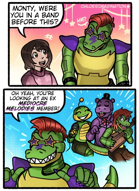
My FNAF theory is Monty was a mediocre melody
#myart#chloesimagination#comic#fnaf#five nights at freddy's#fnaf fanart#fnaf movie#montgomery gator#security breach#mediocre melodies#happy frog#mr hippo#Monty happy Abby taking interest in his history !!#I have a feeling a vibe Monty was a medicore melody#or at least one of the reject animatronic designs#there’s a couple reasons why I feel this#his accent matches the melodies and even carnie who’s definitely from fallfest#how one of the endings has Mr hippo becoming his number 2#Monty’s backstory of being a small time musician#I think the dots are there#maybe SOTM will reveal something on Monty’s true origins
6K notes
·
View notes
Text
names not numbers
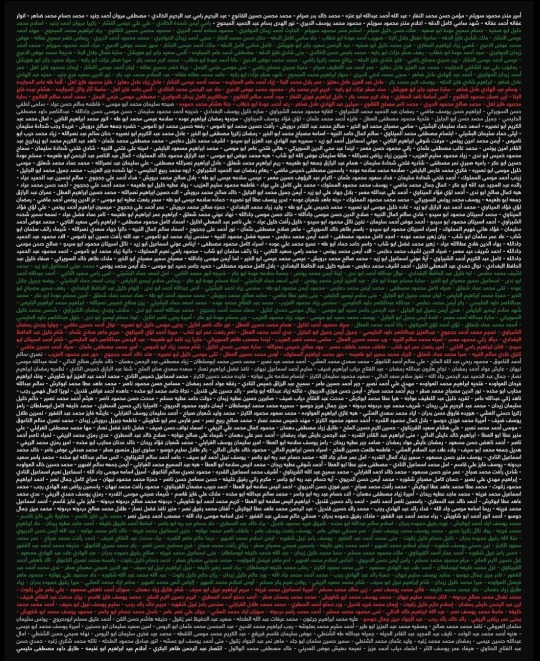
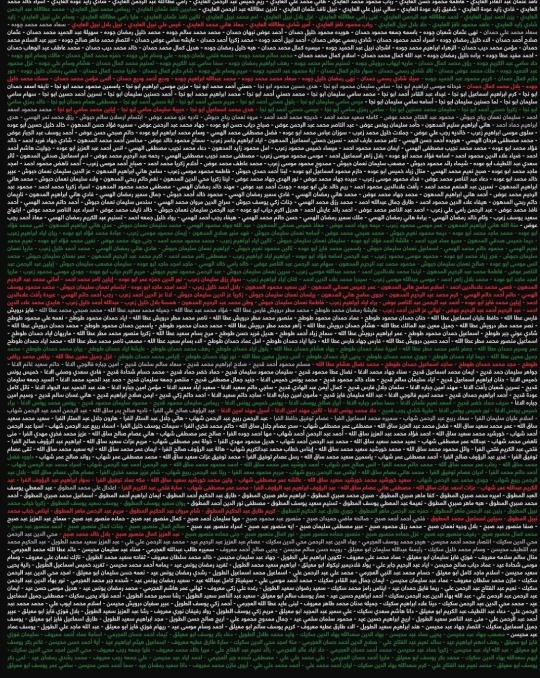
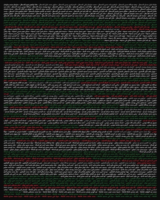
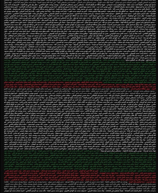
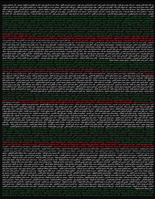
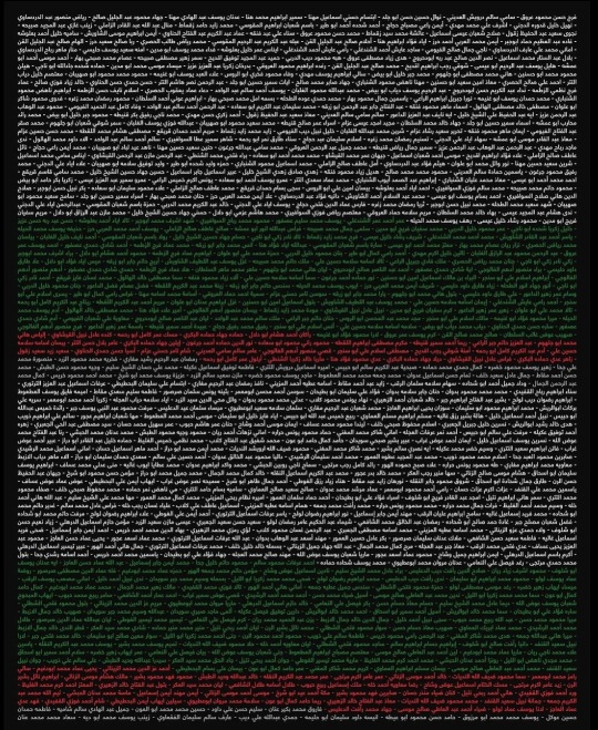
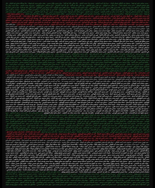
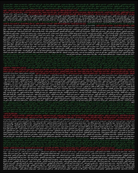

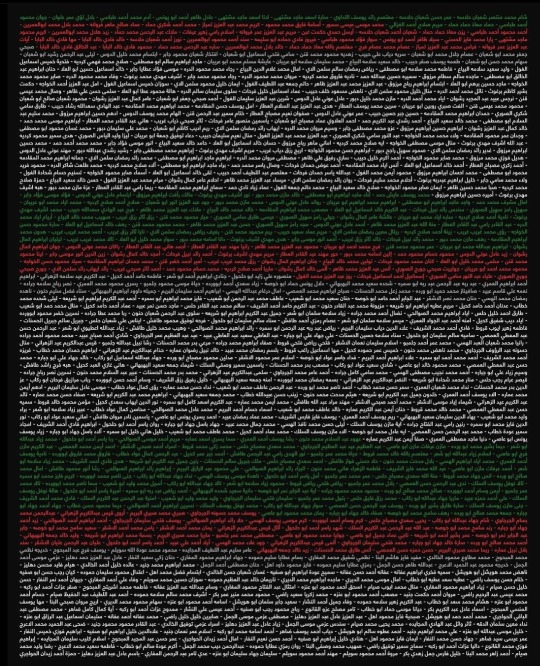
The Palestinian Ministry of Health released a report on Thursday, including the names of more than seven thousand Palestinians who were martyred in the Israeli bombing of the Gaza Strip.
Red color highlights 0-4 years old age group
Green color highlights age group 5-17
White color highlights the age group between 18 and 59 years old
Gray color highlights the age group over 60
These are not just names, but people killed in the midst of a brutal war. Remember their names.
(Designed by @georgedeebstudios on insta)
#palestine#free palestine#israel#gaza#free gaza#gaza strip#genocide#from the river to the sea palestine will be free#ethnic cleansing#gazaunderattack#design#insta#instragram#art#occupation#israel is a terrorist state#israel is an apartheid state#share#names#we are not numbers
36K notes
·
View notes
Text


i love learning cursive just to write text for exactly one character
#fun umbral lore. i can barely read cursive#if you want to hide anything from me then write it in cursive and i will literally never be able to read it#or write it. i had to google cursive text generator and copy it for this#ill settle on textbox designs also eventually#god its been so long since i've drawn the manor gang i think#saw this post and i immediately thought “cyn”#it has nothing to do with her being my number 1 blorbo. bite me#murder drones#art#murder drones n#murder drones v#murder drones j#murder drones cyn#serial designation n#serial designation j#serial designation v#they're so gay also they blushed immediately after this and made out probably im still torn between like 5 different ships#curse you fanfics for putting these ideas in my head
9K notes
·
View notes
Text
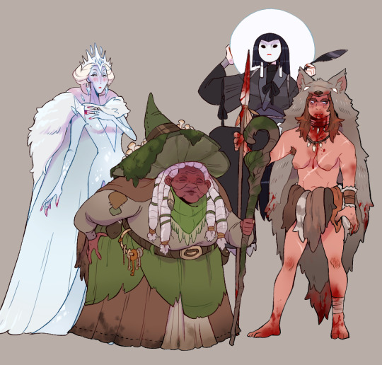
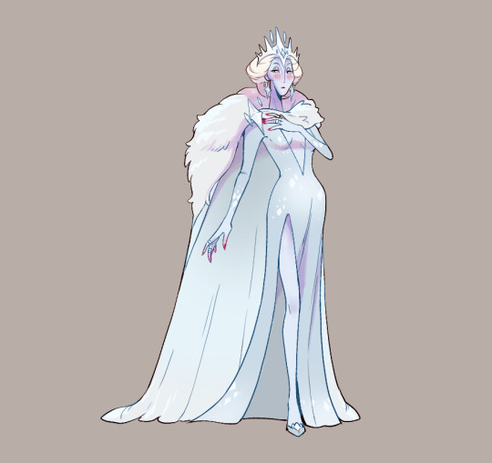


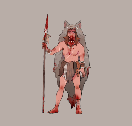
girly time at the witch conclave
#artists on tumblr#digital art#fanart#worlds beyond number#worlds beyond number fanart#character design
4K notes
·
View notes
Text


triplets! cute!!! they must have some difference between them… but i can’t see any…
greyscale versions under the cut!


#marshdoodles#isat#in stars and time#i am number 1 triplets enjoyer apparently#i just think they’re cute designs heart emoji#but GOD it’s a pain (mild inconvenience) to greyscale them#i have to manually edit chagrin’s colors because Oops they don’t have the same values as the others!#anyways the colors for them are a reference to the splatoon testfire colors. since the theme was rock paper scissors#but i ended up changing depit’s shade of blue so idk how well it fits#someone on the discord suggested i make a daily triplets blog and. as funny as that would be i don’t think i’m strong enough 💔#maybe someday…
3K notes
·
View notes
Text

uncle ekko
#arcane s2 spoilers#who up act 2ing they arcane#IM COPING#IM DELUSIONAL#theyd be so cute#(delusional)#me: oh boy cant wait for ekko act 2!#(ZERO MINUTES OF SCREENTIME)#its ok act 3 will be all ekko trust#(DELUSIONALLL)#im coping so hard#drew this on my dying macbook#the colors on this screen are very fucked#so they might be rly ugly#forgive me...#i havent drawn ekko since i first watched arcane#i missed you... my son...#im your number one fan#since your BIRTH#(i liked him since i was a kid when he was released to lol)#i remember that day...#i was like 9...#and the login screen for league was the ekko splash art...#i fell in love. PEAK DESIGN!!!#KING!!! KING COME BACK#arcane#arcane s2#arcane season 2#arcane spoilers#arcane season 2 spoilers
2K notes
·
View notes
Text

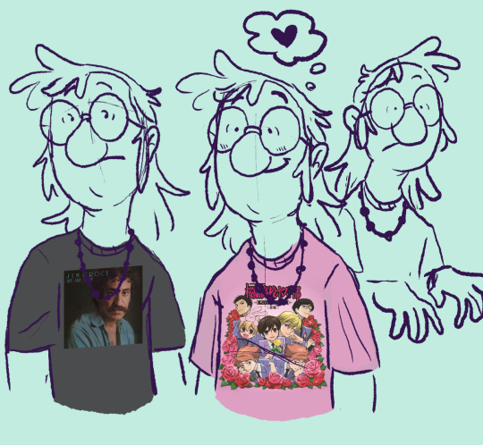
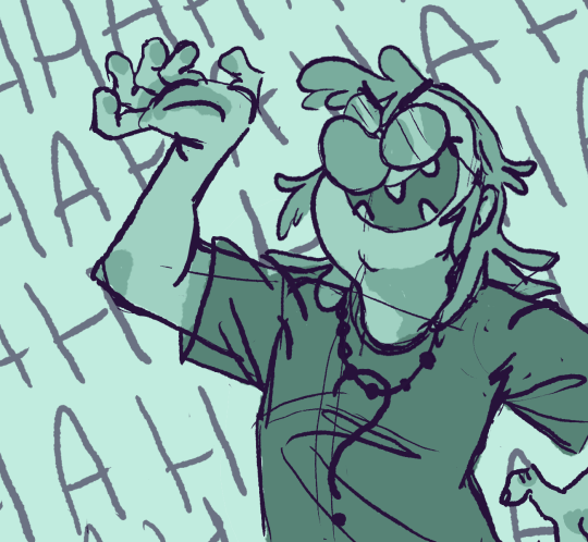
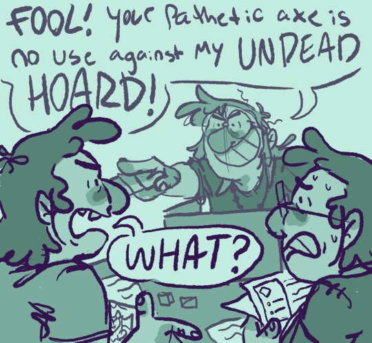
relativity fidds my most beloved and bestest friend
#i like him very much#he's just really cool#he's also the worst type of dungeon master#where his number one goal is to put the party in mortal danger at all times#this is a fact#gravity falls#relativity falls#gravity falls au#fiddleford mcgucket#fiddleford hadron mcgucket#stan pines#stanley pines#ford pines#stanford pines#myart#character design
3K notes
·
View notes
Text

they'll get there eventually
#was this an easy design for my first animation? no#but aint that the way#worlds beyond number#the wizard the witch and the wild one#wbn interlude#interlude 3: matsuri#ame the witch#suvirin kedberiket#eursulon#2d animation
1K notes
·
View notes
Text
Forgot to post this here💀
#kk’s art#shitpost#animation#sorta#k animates#murder drones#md#serial designation n#serial designation v#serial designation j#The number 1 j haters
1K notes
·
View notes
Text

THE JUICE WAS KRAZY BRO
credits to loser @schyrosoreffs for a better shogun kai design 🔥🔥
#ninjago#thiss shit is notm y design HELP ME#shoutout to penis my number 1 ninjago fan#kai ninjago#kai smith#ninjago fanart#lego ninjago#ninjago kai#lloyd garmadon#ninjago lloyd#lloyd ninjago#ninjago rebooted#ninjago tournament of elements#kazus art#watermelon brothers
3K notes
·
View notes
Text
re: that fucking staff post. obviously death to algorithms, but i also wanna interrogate the wider underlying assumptions of their logic there cuz. is 'success' having lots of followers & lots of popular posts??? why is that the end goal of using this website. i don't open tumblr to get attention from strangers, i open tumblr to read funny jokes and interesting commentary and to see cool art. encouraging clout-chasing will only increase user engagement if you successfully get people literally addicted to the associated dopamine hit. what if we didn't have to do that!!! what if a website could be a place you went to on purpose because you had fun there!!!!
#yelling at clouds#you cannot be tiktok. we already have tiktok.#there is a limited number of people on this earth with smart phones and the free time to rot their brains online#your goal cannot be Endless Growth you stupid fucking capitalists#like sure the site is confusing at first. because you have to learn how to use it.#be better at explaining it do not fundamentally change it there is no such thing as universally intuitive design
13K notes
·
View notes
Text

combining two of my favorite things
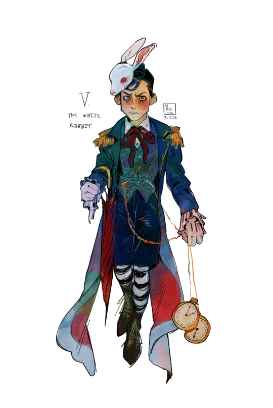
I FORGOT THE SECOND CHAIN
#artists on tumblr#digital art#art#fanart#character art#character illustration#five hargreeves#number five#the umbrella academy#tua five#tua fanart#alice in wonderland#the white rabbit#lewis carroll#classic literature#character design
1K notes
·
View notes
Text
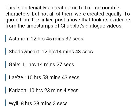

spent like an hour trying to find a post abt the disparity of origin companion's content in bg3 and couldn't so, hey, this fucking sucks
#baldur's gate 3#bg3#the fact that the astarion favoritism is baked into the game itself is so darksided oh my god#bc what do you mean wyll has TWO THIRDS THE AMOUNT OF DIALOGUE???#anyways this thread was also how i found out that astarion is the only one with durge specific scenes#and bc the writer was being forced into crunch and writing for both of them. lol#ETA I know abt Wyll being recast/rewritten and Karlach being added last. the post I linked goes into all of that in detail#as well as linking to another post that goes into even more detail and explains where these numbers came from.#you do not have to tell me. or accuse me of making shit up to make people mad. i know and i'm still mad lol#game design is very complicated yes but there's many ways they could've avoided giving the one black character the least amount of content
6K notes
·
View notes
Text


soap
#number one: fuck kim kardashian! fuck her and her family’s impact on women’s self esteem and self image - they’re not the sole perps of#this but fuck do they have a large impact that they continue to abuse#number two: fuck skims as a result!!#number three free the bush!!#anyway this is also price tbh he’d have just phrased it different#in fact it’s all 141 of them but they’d have said it different so we’re going johnny on main#cuuuute knickknacks tho but i’ll wait for someone to steal kim’s design i think#johnny soap mactavish#soap mactavish#johnny mactavish#johnny mactavish x reader#soap x reader#johnny soap mactavish x reader
541 notes
·
View notes


