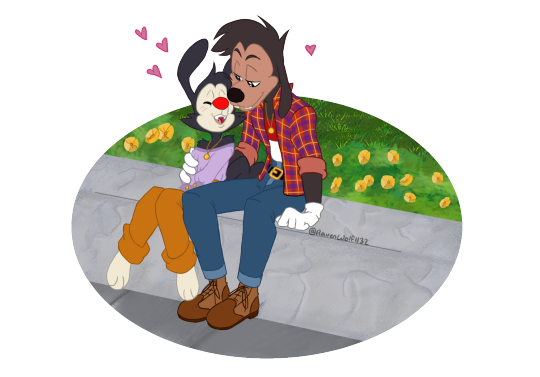
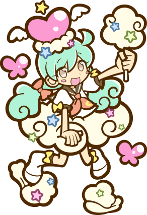
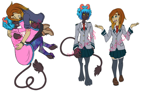
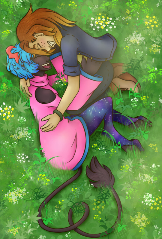
#currently the drawing is on base color. main flat body color
Explore tagged Tumblr posts
Visit Tumblr Blog
Explore Tumblr blogs with no restrictions, modern design and the best experience.
Last Seen Tumblr Blogs


Fun Fact
If you dial 1-866-584-6757, you can leave an audio post for your followers.
Text
something just happened to me today. I just spent 12 hours on a drawing
#pinescreeches#and the worst part is that most of it was lineart. Because i was doing it in an ineffecient way#And redoing like half of it#currently the drawing is on base color. main flat body color#to be fair it is like. 9 slugcat headshots#but jesus christ. somerhing happened#love being so detail orientated i literally have to put it in everything (lying)#artists who draw quickly and a lot. please give me those skills#like how do you guys still make it look good!!! whenever i do something low effort its so messy. And off proportion . and asymmetrical#cons of disabilty ig. cant do shit easy at all#and having bad precise movement. or good hand cordination#speaking of which i still have that visual example of my essential tremor . i should post it
5 notes
·
View notes
Note
Do you have any tips for drawing DU drow? i really like there face composition ( i think that's the word? ) and want to try to take a swing at drawing them myself!
Oh boy, I can try!

Here's some faces I doodled really quickly and split from the guidelines so you can kind of see the process. The main thing you gotta remember with him is that his bone structure may be strong, but his features themselves are fairly Small. Small eyes, small nose, small mouth - I think that's what gives him that "cute guard dog" look that folks seem to like so much. Also while his brow-bone juts out a bit, the rest of his face is fairly Flat.

His skin has a brownish-gray tone as a base and is supposed to be very reflective. Usually, this means it has a blueish hue as highlight, but depending on the environmental light that color could honestly be anything. I take a lot of liberties with this and just strive to give his skin a "bejeweled look". I also apply some red patchiness throughout most of his body, but it really stands out around his eyes and ears the most.
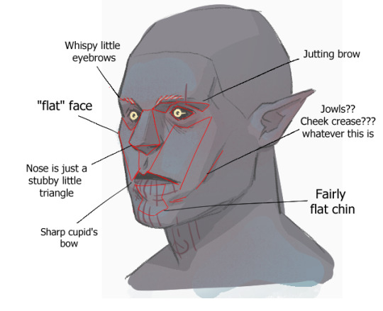
I've changed how I draw his face a little since I started doing bg3 art, he used to have thicker eyebrows, different lips, and a more "herculean" face in general, but it just wasn't giving me the look I wanted. These are roughly the "guidelines" I follow for him currently.
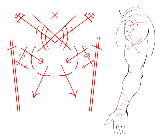
And of course his very annoying chest and arm scars LOL I frequently get these wrong myself so I don't ever expect art of it by others to recreate it 1:1. Mind you that these are supposed to follow the curves of his body, which is why they may look weirdly straight here.
The ones around his wrists are also completely improvised every time I draw them, so they don't have any kind of set pattern that I follow at all.
Hope this was helpful!
520 notes
·
View notes
Text
EMERGENCY COMMISSIONS!!!
Alright guys! You like my art? You want some for your own? Well, today's your lucky day!
I'm starting commissions!
I really need your help. I need to start doing commissions between finding a new job and my current one that pays Jack Shit™. As it is already, I'm struggling to make my part of the rent, not including utilities.
So without further adieu~


(It was difficult to find pieces I was actually proud of.)
Things I will do:
Dungeons and Dragons (Player characters, scenes you want immortalized, concepts, you name it. I just need the details of what you want)
Fan Art
Transformers
Jojo
Steven Universe
The Owl House
My Hero Academia
Etc. (these are all Fandoms I'm a part of)
OCs (Once again, you need to provide details, how tall/old they are, hair color, eye color, skin color, etc.) - Including Furry Art
Various P/0rn* (I will veto anything that squicks me out) - Best to keep it Vanilla, but what I will allow is;
Bondage (Leather, Shibari, Machines, Etc. )
Double-penetration
Tentacles
Breeding
Anything else will have to be negotiated
*I warn you, while I’m willing to do p/0rn, I don’t draw it very often. If at all. Quality and Time may vary (In other words; this option will most likely get expensive. If you have the money and patience, go for it)
What I will NOT do:
Various p/0rn
R/ape/non-con (dub-con is on thin fucking ice so its best to just not)
Watersports/Scat/Farting (no kink-shaming, but I have to be in a VERY specific mood to even remotely enjoy watersports alone. If that’s your thing, you do you, boo, but for me… ew.)
Anything with feet being the focus (can't draw feet, especially in the detail most of these clients want)
Zoo-philia (furry art is ok because the characters are perceived to be sentient and of age)
NO PEDO - I will fucking report you
Landscapes, Cityscapes, Room Design, Machines/Mecha - This type of art is difficult for me and not one I have a lot of confidence in. If this is the art you’re looking for, I suggest looking for someone specializing in Landscape Art. Because I assure you, it will not be as good as you think and you will most likely be wasting your money on me. If you have the money to spare, don’t mind a long wait or the quality, and would like to humor me, then by all means go for it. (Transformers gets a pass because I’m in that fandom)
Prices:
$10 initial labor cost and $10 per every extra hour standard - this is how much I make at my current job and, as you can see, that ain't enough! So yes, this charge is non-negotiable.
10% p/0rn charge of the total price - I don't usually draw p/0rn. Period.
50% of the total price for each additional character
There will be a down payment upfront at half the estimated value of the piece, adjustments can be negotiated upon full payment.
We can negotiate prices based on my schedule and your budget. This means the longer I take to make the piece might not affect the price as I am only charging by hour not day. BE WARNED: the quality of the art piece may vary. This is the first time I'm doing commissions.
Sketch
Bust: $5
Half-body: $10
Full body: $15
Lineart
Bust: $10
Half-body: $15
Full body: $20
Flat color
Bust: $15
Half-body: $20
Full body: $30
Full color
Bust: $20
Half-body: $35
Full-body: $50
How to contact me:
Email: [email protected] <- This Email will ONLY be used for commissions. Anything else will be deleted.
Yes, you may use Tumblr. I will redirect to my email for further communication, but if you would like to message me or send in an ask, feel free.
Payment Options* - I will send a link through email when payment is due, please select the payment method you will be using
Zelle
Cashapp
Venmo
PayPal
*For now, Zelle and Cashapp are my main forms of payment options, but I'm open to others as well.
#my art#commission#commissions#transformers#steven universe#jojos bizarre adventure#gravity falls#the owl house#my hero academia#dungeons and dragons#I will edit this as I go along
5 notes
·
View notes
Text
So a few people thought my last post was a sprite edit when it's in fact all drawn by hand, and I thought this was the perfect excuse to share my (current) process in drawing puyo style art!
This is by no means the definite way to draw in the puyo style, and there's still a lot of things I need to work on too, so take this with a grain of salt bc I'm not perfect at this.
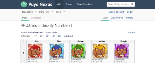
To start off, once I have a base idea on who I want to draw, I head to the Puyo Puyo Quest card index on the Puyo Nexus Wiki to find cards for references. For the Amitie goddess one specifically I used Sandra, High Priestess Deena, and Legamunt as my main references.
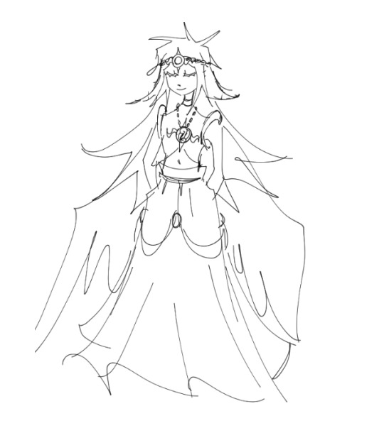
After I find references I begin to sketch out (in this case) a design for the character and then begin drawing the main sketch layers for the puyo style art. At this point you can really see that I was heavily going off of HP Deena's 6* art before making a change.
Normally I go through 2 passes of sketch layers before beginning on the lineart, but I accidentally combined the first pass onto the 2nd one at some point so unfortunately I can't show you what that looked like.. ;_;
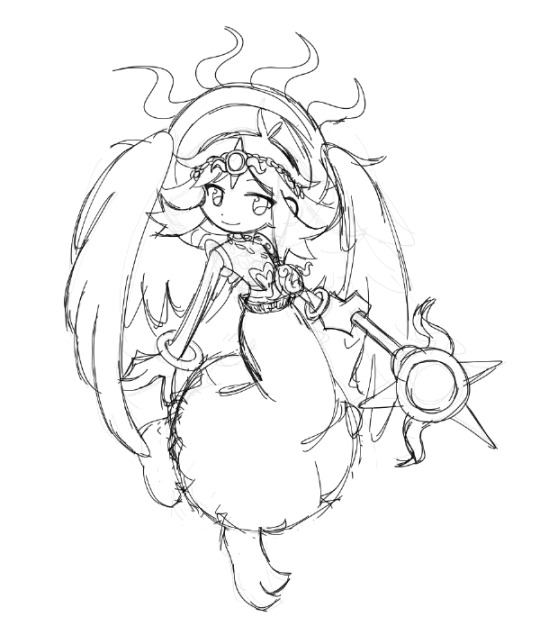
With the help of a few friends I decided on a final outfit, and created the final sketch I would be going over in with lineart!
From here is where things get a little tricky. Puyo Puyo as a series, while having a consistently similar art style for the past 10 years is not entirely the same in every game. For example compare the manzai demo sprites between PPT1 and PPT2! They're a whole lot different! This follows through as well in Puyo Puyo Quest, as different artists draw varying quest renders, many of them having differing lineart styles. For example here's Steam City Arle's 6* compared against Elisa's 5*:
Steam City Arle has much thinner lineart compared to Elisa, whose lineart is very bold and a different color as well! In Elisa's 7* render, the lineart for her changes to become much thinner and more similar to SC Arle. Another thing with these cards is that Arle's hair lineart is a different color against the dark purple lines, allowing it to blend in with the already busy outfit she's wearing. Elisa's 6* and 7* does this as well!
When I do lineart I tend to try to stay on the thicker side when I am drawing things like body parts, clothes, and hair, while using much thinner lines on things such as accessories, details, and highlights.
Coloring and shading is also something that varies! If you were to look back at Arle and Elisa's art, Arle has much more highlights and a slight shadow gradient on the underside of her clothes, while Elisa has mainly flat colors with highlights only on her hair and the pink floaty objects around her. An important thing to keep in mind however when coloring is that there are very minimal shadows in almost every render! The few times shadows are used prominently (disregarding full power renders) are on the hands, the eyes, underneath bangs, the insides of clothing, or as a gradient.
Highlights are also used very minimally, used mostly to highlight clothing articles, large accessories/effects, hair, and non skin colored body parts (ex: wings, tails, horns, etc). Skin is almost never highlighted!
After all that, I put down a clipping layer and color the lineart. Many puyo puyo quest renders use a dark purple color for their lineart, but many others use different colors such as dark green, dark blue, or even brown!
When coloring lineart, most of the time the only lineart that is a different color from the rest is the hair. However, there are exceptions to this such as changing the lineart color for transparent objects like glass or on softer surfaces like wings, clouds, pillows, etc. Background effects such as auras and smoke also use differing lineart colors, and sometimes are also lineless to allow them to blend in better as background pieces!
Now it's all done! I hope that what I wrote made sense and helps a few people because drawing in the puyo style is super duper fun to do!
Thank you for taking your time to read this if you did, and I'm sorry for the really long post ;_;
54 notes
·
View notes
Text
You won't believe these 10 incredible photos are pictures of Earth
https://sciencespies.com/space/you-wont-believe-these-10-incredible-photos-are-pictures-of-earth/
You won't believe these 10 incredible photos are pictures of Earth

The Landsat project, a joint venture between NASA and the US Geological Survey, is the longest continuous space-based record of Earth in existence. A total of eight Landsat satellites have been launched into space since 1972, with a ninth set to launch in September.
In that time, the satellites have captured more than 9 million images of the planet’s surface, which have been used in more than 18,000 scientific papers, according to NASA’s Earth Observatory.
To celebrate the upcoming 50th anniversary of the Landsat project, the Earth Observatory is running a public competition to choose the best Landsat pictures of all time.
People can pick their favorites from 32 final images – so that’s exactly what we’ve done.
Winds trigger pond growth
The Atchafalaya Delta. (Joshua Stevens/NASA Earth Observatory)
This striking image of the Atchafalaya Delta in Louisiana was taken by Landsat 8 on 1 December, 2016.
It is a false-color image, meaning that the colors have been altered, which “emphasizes the difference between land and water, while allowing viewers to observe waterborne sediment,” according to the Earth Observatory.
It is one of 10,000 Landsat images of the region taken between 1982 and 2016, which were used in a study published in Geophysical Research Letters that looked at the role wind plays in pond expansion on the Mississippi River Delta Plain.
Where the dunes end

Namib-Naukluft Park. (Joshua Stevens/NASA Earth Observatory)
This image, captured by Landsat 8 on 13 November 2019, shows the striking color contrast between the Namib Sand Sea, the world’s only coastal desert, covering more than 10,000 square miles (26,000 square kilometers), and the rocky mountains of the Namib-Naukluft Park, both in Namibia.
The sand appears a reddish-orange color due to the presence of iron oxide. The Kuiseb River, which is prone to flooding, stops the sand from spilling over into the mountains, according to the Earth Observatory.
Yukon-Kuskokwim in colorful transition

The Yukon-Kuskokwim Delta. (Joshua Stevens/NASA Earth Observatory)
This image of the Yukon-Kuskokwim Delta, where the Yukon River spills into the Bering Sea in Alaska, was taken on 19 May 2021, by Landsat 8. The colors on land have been enhanced in this photo: Green highlights the area of live vegetation; yellow is bare ground; and light brown is dead vegetation.
“The Yukon Delta is an exceptionally vivid landscape, whether viewed from the ground, from the air or from low-Earth orbit,” Gerald Frost, a scientist at ABR, Inc – Environmental Research and Services in Alaska, told the Earth Observatory.
From Russia with questions

The Markha River. (Joshua Stevens/NASA Earth Observatory)
Landsat 8 captured this photo of bizarre ripples in the hills surrounding the Markha River in northern Russia on 29 October 2020. The alternating light and dark stripes are visible throughout the year but are more pronounced in winter.
Scientists aren’t exactly sure why the pattern exists. It could have emerged because of the constant freezing and melting of permafrost or due to some kind of unique erosion from rainfall or snowmelt, but NASA remains unsure, Live Science previously reported.
Ginseng farms in northern China

Farmland in Heilongjiang province. (Joshua Stevens/NASA Earth Observatory)
On 25 September 2017, Landsat 8 captured this image of blue, purple and yellow structures covering large areas of farmland in Heilongjiang province in northeastern China.
The structures are plastic shade covers used to grow ginseng – a slow-growing root plant that looks very similar to ginger but can’t survive in direct sunlight. In many Asian countries, ginseng is believed to have a wide range of medicinal properties, and farming the plant has become a multi-billion dollar business, according to the Earth Observatory.
Painting Pennsylvania hills

Tectonic plates in central Pennsylvania. (Joshua Stevens/NASA Earth Observatory)
This impressive image combines a satellite image of folded mountains – warped mountains formed at the boundary between two tectonic plates - in central Pennsylvania, taken by Landsat 8 on 9 November, 2020, with a digital elevation model to highlight the topography of the area.
The mountains are part of a unique geological region of the Appalachian Mountains, known as the Valley and Ridge province, which stretches from New York to Alabama. As well as showing off the unusual shapes of the mountains, this natural-color image also reveals the autumnal palette of colors created as leaves turn red and begin to fall from deciduous trees, according to the Earth Observatory.
Jason and the Bloomonauts

(Joshua Stevens/NASA Earth Observatory)
This stunning natural-color image of an algal bloom surrounding the western Jason Islands, an archipelago in the South Atlantic Ocean, was taken by Landsat 8 on 18 October, 2020.
The milky blue swirls are caused by the rapid growth of photosynthetic algae, which thrive in the nutrient-rich waters that have been enriched by the Malvinas Current – a spin-off of the Circumpolar Current of the Southern Ocean, which draws up nutrients from the deep ocean, according to the Earth Observatory.
Lake Natron

(Joshua Stevens/NASA Earth Observatory)
This striking aerial photo of the blood-red Lake Natron in Tanzania was taken by Landsat 8 on 6 March 2017. Lake Natron is an alkaline lake. The dramatic color is fueled by molten mixtures of sodium carbonate and calcium carbonate salts from nearby volcanoes that enter the water via hot springs.
With temperatures averaging 104 degrees Fahrenheit (40 degrees Celsius) and less than 19.7 inches (500 millimeters) of rainfall a year, it is one of the harshest environments on Earth, according to the Earth Observatory.
Icy art in the Sannikov Strait

(Lauren Dauphin/NASA Earth Observatory)
This fascinating photo of the Sannikov Strait – a body of water sandwiched between the New Siberian Islands north of mainland Russia – was taken by Landsat 8 on 5 June 2016.
The strait connects the Laptev Sea to the west with the Siberian Sea to the east; the strait remains covered in ice for the majority of the year, Live Science previously reported. This photo shows the ice sheet breaking apart during the summer melt and creating a picturesque panorama of icy puzzle pieces.
Where batteries begin

(Lauren Dauphin/NASA Earth Observatory)
This colorful array of cuboids found in the Salar de Atacama – a salt flat surrounded by mountains in Chile – is actually the world’s largest lithium plant, photographed by Landsat 8 on 4 November 2018.
Lithium is the main component of batteries needed to power our cars, cellphones, laptops and other rechargeable gadgets.
This plant pumps lithium-rich brine from below the surface and diverts it into evaporation pools, where the sun evaporates the water away, leaving pure lithium. The different colors are a result of the varying stages of the evaporating process, according to the Earth Observatory.
This article was originally published by Live Science. Read the original article here.
#Space
3 notes
·
View notes
Photo
INTELLECTUAL PROPERTY AND MENSWEAR
by Josh M
It is surprising that in this tremendous field, ranking conservatively among the first five in the United States, such unregulated and primitive conditions obtain that unreserved pilfering is tolerated and openly permitted.
The leaders of this gigantic segment of our commercial life who have labored so effectively in strengthening the weak spots of their organization, have completed ignored a situation that is eating away at the very roots of its existence. Style and creation constitute the life blood of this multi-billion dollar business. Without them, the industry would fade into obscurity. Yet, for some unknown reason, style piracy is treated more indulgently than much lesser offenses involving deprivation of one’s rights and property.
Samuel Winston, Inc. v. Charles James Servs., Inc., 159 N.Y.S.2d 176, 718 (Sup. Ct. 1956).
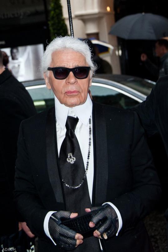
“There is no justice in the fashion business,” Karl Lagerfeld once remarked.
Indeed, many clothing designers in the United States would agree. Recent years have seen a proliferation of “fast fashion” chains, offering an array of inexpensive, unauthorized copies of designer clothes. Thanks to digital photography and fast production, these chains can offer nearly indistinguishable copies of a designer garment months before the original even reaches stores.
To make matters worse, these practices are legal. Although intellectual property (IP) law in the United States covers a wide range of artistic works, inventions, designs, and images, it offers effectively no protection for fashion designs.
On one hand, proponents of protection rely primarily on traditional arguments for protecting IP: copyright for fashion designs would encourage greater innovation by ensuring that the profits from a design went to the designer and not to those who merely copied the work. Unestablished designers and labels especially need protection, they argue, as copying stymies their efforts to build a brand. On the other hand, opponents of protection argue that unique features of the fashion industry make IP protection for fashion designs counterproductive. The fashion industry, they argue, thrives on imitation, and IP protection would impede the formation of trends and slow the rate of change in fashions, chilling innovation and hurting the industry.
Much ink has been spilled on IP protection in the context of the women’s fast-fashion industry. Kim Kardashian’s relationship with Fashion Nova, and her lawsuit involving Missguided, is nearly household knowledge at this point (well, at least for me). This article, following a brief discussion of the IP protection available in theory to clothing designers, briefly addresses IP protection—or a lack thereof—in the “Menswear” industry, and touches on considerations for consumers.
A brief overview of IP protection in the United States
Clothing designers can seek IP protection in three main areas: patent; trademark (and trade dress); and copyright.
A patent is used to protect “any useful art, manufacture, engine, machine, or device, or any improvement therein not before known or used.” If possible, clothing designers will typically seek a design patent (as opposed to utility patent), requiring the designer to show “novelty, non-obviousness, ornamentality, and non-functionality.” There lies the rub. First, clothing is inherently functional; it serves the purpose of covering the body (for better and for worse). Second, designing an article of clothing that is non-obvious is nearly impossible given the derivative nature of the industry. Finally, even if a designer jumps these legal hurdles, it typically takes the Patent and Trademark Office (PTO) over two (2) years to review each application. By that time, we may yet again be reaching for low-rise, flat-front pants.
A trademark refers to:
any word, name, symbol, or device … used by a person, or … which a person has a bona fide intention to use in commerce and applies to register … to identify and distinguish his or her goods, including a unique product, from those manufactured or sold by others and to indicate the source of the goods, even if that source is unknown.
At base, the mark must be distinctive. That is, it must be “(1) inherently distinctive or (2) have obtained distinctiveness by way of acquiring a secondary meaning.” Trademark law provides a great deal of protection for certain types of designs when there is a logo affixed to them and protects the designers from others using the logo or anything substantially similar that would lead to a consumer being confused. Consider, for example, the “Supreme Box Logo Tee.” While trademark refers to a symbol or a name affixed to the article, trade dress offers protection to the overall look and feel of a non-functional product. This includes the protection of features “such as size, shape, color or color combinations, texture, graphics, or even particular sales techniques.” A distinctive color can be a protected interest in the fashion industry. Tiffany’s aquamarine blue, for instance. But it’s not easy. Off-White’s numerous efforts to seek IP protection for its “signature” red zip-tie highlights the difficulty of obtaining trademark and/or trade dress protection under United States law.
Copyright protection would “offer[] the most protection,” but currently “is extremely limited.” Section 102 of the Copyright Act provides that copyright protection extends to “original works of authorship fixed in any tangible medium.” Problems for clothing designers arise because this type of protection does not extend to “useful articles,” a category which encompasses clothing designs. Because clothing articles are inherently “functional” and serve the utilitarian purpose of covering the body (again, for better and for worse), it is extremely difficult for designers to find refuge in copyright protection because the bar to prove that their design is “non-functional” is exceedingly high.
The scant IP protections that are available under United States law help to explain the proliferation of certain trends in the fashion industry, i.e., Louis Vuitton placing its logo on, well, just about everything that it makes, Bottega Veneta utilizing its trademarked, signature weave, or Christian Louboutin tending to use lacquered red soles on all of its high heels.
IP Protection in Menswear and Considerations for Consumers
If your eyes glossed over reading the last section, I can summarize it for you briefly: intellectual property protection in capital-M “Menswear” is effectively nonexistent. In an industry where adjectives like “staple,” “timeless,” and “versatile” abound, the vast majority of clothing is inherently functional, non-distinctive, and useful – particularly, from the perspective of the rest of the world. This may, depending on your perspective, create issues.
For example, I would characterize the late Eidos x NMWA cut as distinctive – perhaps even revolutionary – in lieu of what was available on the ready-to-wear market. Since then, less expensive replicas have appeared. Was the Eidos x NMWA cut ever capable of IP protection? Probably not.
Because of this complete lack of protection, we, as consumers, must decide – is this something that is worth protecting? For me personally, I feel that even if the law doesn’t recognize in clothing the same kind of inspiration and creativity that it recognizes in art and literature, I can recognize it myself. And when I do recognize a piece that contains an idea, I want it straight from the person who thought of it, rather than an imitator.
Of course, each person will draw their own boundaries between imitation and development. One person may view, for instance, all garments inspired by U.S. military designs as knock-offs and only want the original vintage pieces. Others may view the same design made in a different fabric as an innovation. These things won’t get decided in court, so we don’t have to agree on them. But it’s part of my appreciation of my own clothes. I enjoy them a little bit more knowing that what I’m wearing came from someone who had an idea.
This article represents the views of its author, who has little training or experience in intellectual property law, and is not legal advice.
14 notes
·
View notes
Note
May I ask? Have u given any thought to the flags and size of planets such as zhene koyu or vaonaa?


Below the cut ^-^
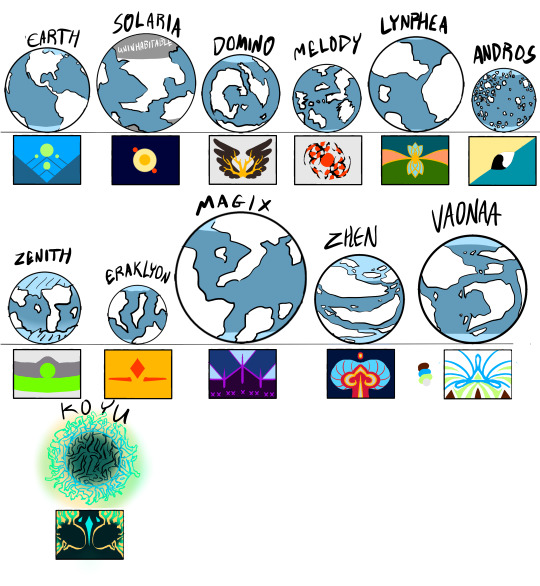
Zhen flag is reference to their planetary animal and planetary colors. Vaonaa’s represents their oneness and connection that the prevalent wind on the planet provides. Koyu is the crown jewels, the planet’s form, and the dark eyes that are characteristic of Koyuvians.
Eraklyan’s don’t technically have a wedding dress, usually they just wear a nice gown, and modern weddings with use a more traditional clothing style. Bloom here is in a royal gown, so the average Eraklyan would have shorter sleeves/dress, a less ornate vest, and no cape. Eraklyan Weddings are heavy on tradition, and have a set structure of courtship, engagement, ceremony, and post ceremony. Courtship isn’t dating, but a declaration of the intent to be married, engagement is the actual contract between the couple, and the ceremony consists of spoken vows and exchanging of personal jewels. Each person on Eraklyon has a gem given/assigned to them at birth, in the past personal jewels were thought to hold a person’s soul. Worn as jewelry( bracelet ring, piercing, everything except a necklace), these gems are given to the other as part of the wedding, if a person is not Eraklyan, they will pick out a gem at the start of the courtship. Instead of wedding rings Eraklyans propose/signify marriage with necklaces(the necklaces are separate from personal jewels, only necklaces can be used for marriage) Bloom has the heart of Eraklyon which is a specific jewel that been passed down through the people who marry INTO the Eraklyan royal family. The average Eraklyan engagement jewel is basically the same shape tho usually smaller. Eraklyan women also put their hair up after they are married or for the wedding, in ancient times sometimes the wedding day would be the first time an Eraklyan woman had tied her hair up in her entire life. Modern times have relaxed this custom but its still pretty common for unmarried women to leave their hair down most of the time and married women to wear their hair up more often than not. Sky initiated their courtship period in the first movie, Bloom(and Domino) misunderstood and thought he was officially proposing. He proposes in season 5 with the Heart of Eraklyon.
MOVING ON TO ZHEN
History: Zhen is a very rigid planet social customs-wise, but they have a long history of political unrest and war. The planet is divided into small feudal states, and each one is constantly on alert for invasion or offense from the others. Through a very clever scheme, a prince of a larger state convinced another state to send him one of their princesses/princes as a peace treaty. Then claimed the prince/princess never arrived to the palace(they did, were not harmed and hidden away in the lap of luxury) and propositioned a different state for a marriage peace treaty. Eventually he revealed he had kept the royals safe and alive and had legally binding peace contracts with each of the states he had tricked. Zhenese have an intense code of honor and will follow rules/contracts the way the fae do even if its inconvenient for them lmao. He became the leading power, and forced the other states to send him some of their family to stay at his central palace. Zhen was then at peace for longer than before in their history, eventually developing the central system of government with a central royal family. Local rulers still send a portion of their family to live at the palace complex as a tradition and a safety measure, though the family and their Regent will switch off visiting the hub. Unfortunately, the most recent Emperor and Empress were assassinated and their daughter, the closet heir, disappeared, thought to be captured or killed as well. Leaving the royal families to claim a right to the throne and fight it out. Ho-boe left a week after the assassination on one of the last ships before the rival states set up blockades for each other’s fleets/communications.
Cimate: Zhen is on the cold side and has numerous mountain ranges littering the continents with very flat land in between them. Their coastlines are ragged with a lot of good bays to use as ports. They have a lot of rivers in the mountains which generally combine into one major river across the plains. They grow a lot of grains, and are excellent hunters, surviving on a very high protein diet (it’s theorized that Zhenese evolved their sharp teeth, hearing, and low center of gravity with heavy musculature to become more ideal hunters in their environment) During peace, Zhen exported a lot of unique furs, minerals, and their woodworking skills(they don’t have a lot of forest to use for export but they are master craftsmen) Their clothing is usually wool, from the Zhenese Argali, a sheep/goat like animal with orange/red wool and blue(ish) horns. These animals are the most prevalent species on Zhen and are wild, domestic, used for wool, skins, dyes, meat, household objects, and even their bones are used whenever possible.

Clothing: traditional dress is still worn on Zhen instead of Magix modern styles. In general: Thick sock/shoes with leather soles tied around the ankle, loose cotton pants, a pleated wool skirt, a shirt with a square stand up collar and long straight sleeves, a short sleeved jacket or structured tunic layered on top, sometimes a wrapped belt. Hair styles are complex and accessorized. In warmer areas the skirt and sleeves are shorter, and usually only a lighter jacket is worn. In cold weather they wear a wrapped fur hat, several layers of wool shirts and skirts. Royal wear always features the planetary colors, a complex headress, and wide skirts with several layers. and stupidly wide sleeves (usually they cover the hands entirely but if a royal is doing anything they usually roll them up) royal coat/tunics feature a lot of embroidery, usually of geometric patterns, as well as draped tied from the shoulders(usually white). For a wedding Zhenese wear black yellow and white. Black is only worn for weddings and symbolizes the seriousness of the relationship that being officiated. They also have a hat with a bead veil and a pin through the hair with fabric/paper hanging from them onto the shoulders. The beads on the hat are strung in a very specific order, reflecting the planets reliance on rules and order, the veils can taken weeks to make because if a mistake is made all the beads have to be taken off and started over. A braided chord with threads of the planetary colors is knotted around the waist to represent the planet and culture as a whole. Married Zhenese have a short thread of beads they hang from their hats or hair pins.
VAONAA
History: Generally known for their spirituality and rich knowledge, Vaonaa has a fairly standard history. Fighting slowly stopped and the various groups on the planet were united after the incorporation of magic into their culture.(yes i know this is unrealistic leave me and my idealistic alien planets alone) One substantial difference is that Vaonaa developed an electoral system of government as opposed to a monarchy. Consisting of three groups (elders, adults, and youth) they’re all part of a larger group called the Council. Each individual group has to have an equal ratio of men/women/nb. Each county has one person elected and the other person assigned(like jury duty). The council is the main authority on everything and is a full time job. The Vaonaar is like a president/prime minister temporary position, every time a council member is appointed they submit a name of their most trusted person, if the council deadlocks over a decision a name from the list the Council members provided is randomly chosen to resolve the deadlock over a period of a few weeks so they actually have time to hear all the arguments and read relevant materiel. there are also more local officials like police/librarians/parks and rec etc.
Climate: Vaonaa has a lot of flat grass land, with a high proportion of mesa formations. as a result of these steep valleys Vaonaa has strong wind currents. They coatline is relatively smooth, and they usually have to use rivers as ports because bays aren’t super common. They have many different types of grasses, and are especially known for their high quality textile production. They export their textiles, precious stones, and metal work.

Clothing: Vaonaaj usually wear deerskin, suede, wool, and cotton. Tunics tied together at the sides, leggings, and poncho styled blankets, and wrapped or metal belts are the basic clothing items. Beaded necklaces and earnings are common accessories for everyone. Hair is worn in either one or two braids. In warm weather, a short tunic and soft moccasins are worn In colder weather a woven blackets is wrapped around the body or tucked into the belt, leggings are added under the tunic, and wrapped skins are layered over the moccasins and leggings and secured just below the knee sometimes the blanket has a smaller buttoned on hood but i didn’t draw that. Royal Vaonaaj have a longer tunic with stitched details and beaded sections.a more complex belt, and a rectangular blue vest/shawl worn under the belt. For weddings, Vaonaaj wear a loose tunic/dress and wrapped leather around their feet instead of mocasins. strips of fabric and jewelry is in the four colors Vaonaa considers sacred, white, green, blue, and rust red. White and blue represent the wind, blue also represents royalty and honor, green represents the grasses that cover most of the planet and are used in making textiles, the rust red represents a grounding connection to the earth something the people tend to forget because they are so dependent on the wind and all. Married Vaonaaj keep a colored thread woven into their hair, in modern times this is usually done through magic.
(PSA: I almost exclusively based this planet/culture on Navajo native Americans, with some tweaks because fantasy alien planet. I am not native, if any of this is inappropriate please let me know.)
(second less important psa: its like super hard to find clothing references for native american cultures before European contact so if any one has some good sources pls lmk)
KOYU
History: Koyu is thought to have begun as a dwarf planet with a highly poisonous atmosphere struck by an asteroid and pushed further towards the sun it was orbiting. This increased the radiation levels which caused the dormant fungal growth on the asteroid to begin growing at exponential rates. The growth also filtered out the toxins in the lower atmosphere but eventually reached a state of equilibrium and was unable to grow any bigger. The outer reaches of the formation are still technically living matter, but the inner reaches have dried and kind of fossilized creating a porous tangle of branches around the planets core. Koyuvian’s eyes have evolved to be intensely receptive to any light in their environment because the inner tangles are very dark and fire cannot be used as the dried growth produces poisonous smoke when burned. many plants and animals on Koyu are luminescent and are some are farmed and used as light sources. water runs through some hollow sections of the growth like vertical rivers. others are used as highways or roads. especially large knots of tangles usually become cities. spaces that don’t have as many branches of growth are known as the voids and are avoided because its easy to get lost or fall and especially dangerous animal/plant life occupy those spaces.
Climate: The outer reaches of the planet is very hot, and has a lot of dangerous radiation, so people don’t live there. The inner reaches of the planet don’t have direct sunlight and can be pretty cold, but there are still pockets that have a decent amount of warmth due to insulation, being closer to the radiation, or the planet’s core producing some heat. Koyu exports some of their unique animal and plant life, and Koyuvian mushrooms are some of the most highly sought after produce/garden items in the magix universe but they are almost impossible to grow off planet. Koyu has very small mineral reserves but will export Koyuvian Diamonds for jewelry and technology which are formed in high heat high pressure vent branches of the tangles.

Clothing: Koyu’s main priority for clothing is mobility, so their clothing is durable simple, and easily fastened or unfastened as needed. usually a shirt with a vest/coat, loose pants, a long piece of fabric around the waist that can be used as a rope in emergencies, and rough sole socks are worn. Koyuvians rarely wear shoes. In warm areas a rectangular fabric with a hole for the head is worn over the shoulders and secured with a wrap of fabric around the waist and lower chest.the pants are thin fabric loosely fastened with small leather cuff, usually with a slit up the side for ventilation. In cold areas a long sleeves undershirt is worn with a lined coat usually the sleeves can be buttoned or left hanging. the pants here are a thicker material with no slit and a fur lined leather cuff at the ankle, the socks might be a tad thicker but have to thin enough for the Koyuvian to have some grip. The royals are usually the only ones with any embroidery since detail work like that is hard to do in the dark lmao. Royal dress also usually features sheer material and an extra skirt layer . The veil is able to easily detach from the crown in case it gets stuck in anything and the sleeves are secured at the wrist and neck but can also be unbuttoned if they’re in the way. For weddings the bride and groom (or what have you) are dressed in dark colors, and a blindfold. because sight is so crucial to Koyuvians survival, removing it during the ceremony puts the bride and groom in a state of vulnerability, the metal disks attached to the blindfold ring as the couple moves, their goal is to find each other, and then find a Basket, a natural formation in the Tangle that looks like a small nest, its usually used as a temple/sanctuary. They have their friends and family watching over them to prevent any serious danger but they aren’t allowed to help the couple. The reason for dark colors is for camouflage from wild animals but the gold on the breast is so the family can spot them. The couple find a basket, share a small meal there and the marriage is official. Married Koyuvians have small tattoos on their wrists.
#winx#winx bloom#winx musa#winx club#winx icy#eraklyon#zhen#vaonaa#koyu#winxems#askems#anonymous#world building
163 notes
·
View notes
Text
The protagonists
Special note about the main characters of The service of the Demon that aim to provide the readers with the clearest image of Sebastian and Ciel. All facts are based on the first several chapters.

Illustrated by Katrin-Vates.
Thanks @k-s-morgan for the translate this!
Sebastian Michaelis

Real name: Andras Race: Baatezu (demon) Age: More than 3000 years Sexuality: Bisexual Native land: Baator Status: A Great Marquis (temporarily resigned) Mission: To sow discord Position: One of Baal’s assistants; a legendary warrior. Currently: Serving 543-year sentence for spreading the Black Death on Earth. Starving.
Physical Appearance
Body: Like in canon, Sebastian is fit and has a sporty physique, without the abundance of muscles. 6.1 feet, 185 lbs.
Dressing habits: Depends on his mood. The more conceited he feels, the catchier clothes he picks. However, overall, he prefers darker shades and a classical style. His favorite colors include black and red, sometimes maroon и gold.
Body language and voice volume: Sebastian’s voice and gestures are always clear and smooth, he’s not fond of needless movements. However, during his most furious moments, he’s harsh and unpredictable.
Peculiarities: Sebastian has a path of hair from the navel to his crotch, as well as on his legs, even though he shaves it off after chapter 20. He has a firm, somewhat stiff body, with prominent collarbones.
Cock: Larger than average, 7 inches erect; ordinary but long, rather stiff and firm.
Personality and social skills
Main characteristics: Passionate, cruel, self-confident, persistent, spiteful, rebellious, painfully blunt; he is always eager to laugh at someone’s misfortune; has a penchant for tyranny and dictatorship; is a sadist and a masochist.
Temper: Stress-resistant choleric. He can lose his temper but he also has enough self-restraint to control himself in the majority of situations.
Attitude to others: Sebastian hates people, viewing them as brainless animals; he has clearly defined inner and outer circles yet he treats even the former with suspicion and mild prejudice.
Likes: Physical and moral violence, fierce battles, wars, fire, weapon, stylish clothes, the smell of blood, cats, sex, classical music, massage.
Dislikes: People, stupidity, lies, messiness, naivety, devotion; feeding cats since they die from his cooking; Mephistopheles.
Combat Skills
Physical strength: Mild. For a demon, he’s rather strong, but his strength is not considered particularly impressive.
Magical strength: Low. Sebastian’s pretty bad in everything related to spells. He knows only the simplest ones.
Speed: High.
Agility: High.
Endurance: Extremely high.
Weapon: Cold weapon, such as swords and daggers, but he also frequently uses his hands, claws, teeth, etc.
Additional Info
Hobbies: Bullying people.
Habits: Sebastian often adjusts his gloves and his clothes. He also touches his buttons from time to time as he’s extremely meticulous about what he looks like. At times he strokes his hips and pockets since he misses having his sword.
True Form

Illustrated by @modest-artist
The most prominent characteristic is his prolonged beak, as well as his impressively big wings and horns. He lacks a nose, having two blood-filled cavities instead, and he has a wrinkled face.
His hands are purely black, as if they’re woven from darkness, with sparse feathers and long claws. His hair is long and thick, reaching the floor. His human body has pigmented skin (of black, pale, and pink hues, especially in the groin area), as well as pubic plumage.

Illustrated by @lady-ghost-draws
Prototype
The character’s prototype is the illustration of Andras, the Great Marquis of The Goetia: The Lesser Key of Solomon the King.

Andras and his magical seal. Done by Louis Breton, “Hell Dictionary” illustrator.
He is the Great Marquis who appears as an angel with the head of a raven of the black night color, riding a strong black wolf, with a sharp and gleaming sword in his hand.
His aim is to sow discord.
If the caster is not careful, he will kill them and their comrades. The mighty Marquis Andras rules over 30 Legions of Spirits.
Ciel Phantomhive

Real name: Sirius Race: Human Age: 18 years Sexuality: Ciel is still undecided but leans toward homosexuality. Homeland: England Status: An heir to a noble aristocratic family who is currently considered missing. Currently: Ciel is undergoing a severe crisis due to the loss of support of his relatives and fear for his life. He is forced to work as a butler of Earl Michaelis.
Physical Appearance
Body: Ciel is older than his canon version and therefore, his physique is also different. He is thin but not excessively so, his body is mostly athletic. He’s quite strong in spite of his slender build as he is able to pick up Sebastian and even carry him for a while, albeit with difficulty. 5.7 feet, 136 lbs.
Dressing habits: Modest yet tasteful. The tragedy made him a little paranoid and he doesn’t like to stand out much. However, with Sebastian’s appearance, his self-confidence increases and he begins to love bolder images. His favorite colors include black, different shades of blue, light blue, and silver.
Body language and voice volume: Similar to Sebastian, Ciel’s voice and demeanor are clear and smooth; he’s not fond of making any unnecessary gestures. He’s incredibly graceful and sophisticated and he likes to feel beautiful for himself.
Peculiarities: Smooth pale skin, taut but still mostly soft buttocks. He has rare and soft body hair. Puberty is not complete yet as Ciel is still growing.
Cock: Slightly bigger than average: 5.9 inches erect; gentle, with abundant pre-ejaculate, but strong and firm.
Personality and social skills
Main characteristics: Proud, graceful, rebellious, dispassionate, moderately self-confident, thoughtful, determined, narcissistic; does not shy away from lying to others and often plays with people. Honor is not merely a meaningless word for him, but the world is cruel and Ciel prefers to follow its rules.
Temper: Ciel has a sanguine personality with a penchant for melancholic qualities and a touch of phlegmatism. He has excellent self-control but is capable of experiencing vivid emotions.
Attitude to others: Ciel treats people with justified suspicions yet he also looks down on them a little. Currently he’s moderately introverted and he prefers to avoid the society because of his reluctance to socialize.
Likes: Mystical stories, desserts (especially with chocolate and strawberries), good tea, gothic attributes, classical music, stylish things. He likes to look at the stars and drink occasionally; is a secret admirer of romance novels.
Dislikes: Stupidity, untidiness, flat humor, corsets, overly smug personalities; Sebastian when he’s being a jerk.
Additional Info
Habits: Ciel constantly puts his bangs across his right eye and he often bites his lips; he smokes despite knowing about his weak lungs when he’s feeling especially shitty.
Hobbies: He loves reading romance novels when no one sees it, preferably with a cup of tea.
Thank you for reading!
You can read the original here.
#my fanfiction#kuroshitsuji#black butler#sebastian michaelis#ciel phantomhive#sebaciel#Sebastian x Ciel#the service of the demon
69 notes
·
View notes
Text
Dome’s Way Home
Dear Locket, Entry 5
While it's not exactly the most thrilling for me, it's now blatantly clear to me that there is more than the Sp-Tem(s) exist in this place. I also have reason to suspect that they are sentient on some level. Of course, the word I could be looking for is sapient but I have no way to check even if it is. The flashes of explosions break the field of vision and the calls of many different things echo above. It's very clear to me this is a war front and not some happenstance battle of two giant beasts. What worries me is that I'm slowly moving forward to that locations though it's angled off from my path.
However, the main fear I have about this is that war is an organized institution, or however you would describe it, and it requires some form of societal structure. I'm not saying it has to be advanced or even something like ours but a group with a unified reason to fight against another is near textbook war. This should go without saying that I am by no means at this point an expert of how things work here so for all I know this is a territory battle between two apex preditor groups that just because of the very alien way of these beings has caused me to confuse it for war. Hell, what the fuck do I know?
Way before I reached my current position where the battle is as clear as it is now, I decided to do a few other tests. The first one was just for documentation, however embarrassing it may have been, of testing sexual functions. I covered in either my first or second entry that many psychical functions don't affect me. This being the need for sleep, lack of fatigue, food and water, and the need for restrooms. Also, besides the auto weapon, no physical strain has been happening to me. This left one obvious bodily function that I needed to test while inside this undefined place.
To make a very uncomfortable story short, the answer is yes. I did feel an increase in body temperature during the progress as well as self-lubrication. Climax also happened with the excretion of climaxal fluid. Thought this was a humiliating process an interesting thing to note after is that I did feel a form of physical fatigue after climax. This, however, has made it clear that my bodily functions are still working, they just seem to be in a form of suspended animation until some very exact stimulus activates them. Why sexual stimulation is one of them, I don't know but it's very strange to me. That is to say, slightly more strange than literally everything else that's been going on.
Now on to the real reason why I'm writing this entry, I have found some semblance of a civilization in this deranged world. I call it a semblance because all that's left seems to be shattered domes that I can only guess served as some sort of shelter. This is built in the center of a mass of intersecting paths which only seems to suggest that these paths weren't built. They just seem to have been here beforehand. That would explain why these paths just stretch on endlessly without any seeming purpose or reason of existence.
There's something unspeakably horrific about this. It all seems so humanoid. Of course, it's not like any human structure I've seen but once more drawing back from old history, there was a group of people known as Esca-to. They were a group of nomadic people who lived in frigid temperature. I'm not quite sure how one would live in the cold without technology but they survived there for hundreds of thousands of years, supposedly. Then again, there wasn't a climate on Gee-Gerotous that could be considered cold. It is pretty temperate all over.
Anyways, the Esca-tos lived in the upper Northern Hemisphere of the planet Earth where it was mostly fridged. There was a lot of ice and snow that covered everything. Well, because of the climate in these areas, there weren't as many basic building resources. So instead of wood or clay, they used compactable snow. These igloos basic structure featured a dome of compacted snow with a relatively small crawl space for a person to get in.
Now, this information is the only common beliefe from what we have. Ancient historians disagree about much of this, especially the condition to why Igloos were the common form of housing, if they were even the common form of housing, if the Esca-tos were even the pioneers of this form of housing, and much more. Hell, there isn't even an agreement if the word Igloo was even used to refer to these housings. This is just the current working theory. It's hard to be 100% about anything if you don't have an active site to investigate, which brings me to this ruin (though I don't think snow would preserve well over thousands of years).
The site was massive, and I'm still quite impressed with how many different paths intersected in this one area to create as much space as it has. Many of the domes have caved in over time. In total there are 13 large domes and it's hard to tell how many smaller ones existed. It seems that before whatever was here simply abandoned this site, many of the smaller destroyed domes were piled together. Of the small domes that still exist there are about 15, only slightly more than the big ones. I guess the ones that weren't destroyed when they left are now the ones that caved over time.
It's important to mention that the terms small and big are absolutely relative terms to each other. I'm a decently sized woman, 5'8 (173cm), and the "crawl spaces" open up to well over my body size. If I was to estimate the size of the entire platform this was made on is about 5.5km*6km. The size kept within each of the large domes are larger than what most usual household sizes are from my world. Each large dome could house many families with enough space to segregate each family with walls to allow privacy. However, looking at some of the basic structures found in the domes that haven't completely collapsed suggest that they were used to only house one being.
The most intact large dome had only the entrance collapsed and some of the very center of the ceiling which fell into the housing. It took quite a while to move much of the mysterious crystal substance which seemed to compose everything in this world. Upon entering the first thing I saw was a bed structure. For the first time ever it was something that wasn't purple! Drape over a rectangular base was a golden "fur." Touching it wasn't comfortable at all. The fibers were like needles and I did puncture the tip of one of my fingers. If I die from an infection because of this, I'm going to be pissed. Well dead but I'm going to be pissed while I die that is if suffering doesn't consume me which it most likely will.
Carefully pulling it off saw what was underneath. The case was hollowed out and there was some kind of comforter. It was seamed together with a hardy pelt. It did bend and flow like a pillow but it wasn't quite as soft. I made a knife as a tool from my weapon, which only took a bit of focus, and cut it open. I pulled out what looked to like scales. Their color was a glistening velvet, green, and sea blue. They were surprisingly malleable. Each segment was lined and seamed together. Honestly, it looks now a bit more like a sofa than a bed but it really doesn't share a similar look. Maybe if I flipped it but it's just a crystal flat surface. I don't understand its design.
I glanced around the room and much of the furniture was very much overside for me. Many of the chairs were like the oversized bar stools that go up to your waist. These were quite a bit larger, going up to my chest. I lifted myself up onto one and looked at the desk. There was an assortment of little nick-nacks. An object I recognized was an object to represents the physical property for every action there is an equal and opposite reaction. Known to us as the Casacal's Formation, named after the physicist from the group that uplifted our civilization to our current technological level, it has a set of objects evenly held together and lined up, in which one pulls one side of the formation letting it go and collide with a part that is resting which will cause the other end to launch out, pull back, and hit the resting part of the formation causing this to happen until one stops it or friction drags to a stop. Here, its called "Newton's cradle."
Another object was some weird singularity. Contained in a black tinted glass container, there is a swirling mass of energy that expands, contracts, and then condenses again in a flash of light before separating into two other masses of energy colliding and begin the cycle again. On the base on which the glass sphere containing the singularity it's labeled as "Matter Apperation Separation Cycle." It certainly doesn't seem to be scientific like Casacal's Formation as it didn't seem to be any kind of natural source causing the separation and recombination of the energy contained inside. There is also a warning on it saying to be careful when handling. I can only assume because the energy could cause massive damage if broken. I decided to put this in my bag in case I need a makeshift grenade.
There were three other objects on the desk. Two of the items seemed to be a computer. At least that what I think it is. Another object is a complicated assortment of in grove details, crystals that aren't purple (I'm sure God doesn't even know where the fuck those came from), and a broken set of what appears to be wires. Looking at what I would assume to be the computer tower, there's a massive empty section inside plus a bunch of other things that look like this world's tech. There's another object that looks like what I would think are fans. They are weird inserts with tubes running into them that have slits that air could pass through.
I don't know for sure but it all seems to be intact. All that appears to be damaged is what I would guess to be an internal power source. Near the possible internal power source and a possible computer tower is what could possibly be a monitor. It is really fucking big and very flat and has some kind of thin film screened over what reflects back as, what else, purple. I can see myself in its reflection and boy have I seen better days. This isn't important!
This old thing (I assume it's old) has really sparked my interest. Hopefully, somewhere around here there are instructions about this thing or at least manufacturing notes. Actually, wouldn't manufacturing notes be rarer than basic instructions of the product? Oh god, I'm beginning to treat this journal like it's a person that can answer my questions. I'm losing it. FUCK, focus you, dumb bitch. Alright, beyond the rest weird furniture that is around this place there doesn't seem to be anything else of interest. There are still quite a few other locations for me to check out. For now, I'll cut this and do another entry on the rest I find in the other caved in domes. I'll also check the crystal piles as well.
#Update#Purple#Story Tag: Beginnings of Rapture#Story Tag: Locket account#Chapter 1: You were better off not knowing#Simple Pondering#There's something here#Echo Echo#Time tag: Uncertain#Area Tag: ?!?
5 notes
·
View notes
Photo


i could have sworn there was another ref in between that second and third one, but... apparently not. i based the redo heavily on the previous (third) one, because it wasn’t even a year old. it made it feel less like a complete redo.
interestingly, their proportions have changed the most, but this wasn’t much of a conscious decision. when i first designed outis, my main priority was to give them immediately contrary proportions to dupe, so my concept of their design has always been “short face, short body, long legs, thin tail.” it usually takes me a bit of time to ease into less “chibi” proportions for a character, though... i suppose it comes with viewing them less as cartoons as they develop. the other big differences (obvious design flanderization aside) are that they got lighter and that the spikes along their back stopped going as far back -- the former is because they always had a blank canvas motif as their core concept and i have no idea why i chose such a dark color in the first place, and the second is because i place “beats” in designs to keep the proportions somewhat consistent. design “beats” can be likened to the neckties many cartoon characters used to wear; it gave an easy, fixed point of reference for shot cut-offs and proportions.
the main changes in this reference were that i made the their default coloration to something brighter instead of the subtle rainbow... there is some appeal of the opal look in the concept art that i miss... and i finally illustrated the exact quality of their crests with words and visuals, because that ask about if they were “tubes or flat” has been eating away at me ever since i got it. i also tried to refrain from certain notes i usually give myself, such as the “x” detail in their irises, but to note some things i find intuitive... like their body shape. i am not a fan of when people draw outis like a caricature of a bodybuilder, if only because it is very contrary to their gender.
my remaining reservations about their design are mainly that it’s very simple, yet this reference ended up cluttered with so many small details that have been recurrently missed or caused confusion, and that the neutral colors in their design aren’t intuitive enough. i try not to use pure white for character palettes, which means that within the scope of “pale grey,” the tone i pick for them can vary a lot, equally so with the “dark grey” of their eyes and scutes. i’m unsure how much it matters, as they were designed deliberately for a story in which both of these colors would be heavily influenced by the color identities of their current environment, but it bothers me.
i should also note: the difference between their current and concept designs are in part because i completely scrapped and rewrote the main canon for them after some consideration. it still revolved around the same core themes, but the radical shift in their framing meant that outis was suddenly much older canonically.
50 notes
·
View notes
Photo
Some fun news- I’m officially opening up commissions!
As a note, I’m new to this so these prices may change. For now, I’m going to take up to 5 and see how it goes!
More details and examples below! Please read through most of this, but if it’s really too much for you, the tldr is: you can send me your commission request and I’ll let you know if I can take it, the exact price, and estimated timescale. If you do not read through this, however, you may miss some things I reserve regarding payment, refunds, usage, ect. and if you ask too many questions that are directly answered here, I will have to simply direct you back to this post.
You can contact me through this blog, my main blog, or email at [email protected] with questions or inquiries. If anything here is confusing at all, do not hesitate to ask for clarification!
Pricing and examples: (Mostly reiterations of above)
*All prices are in United States currency (USD)
*Prices may vary slightly based on the complexity of the request
Ex. A Flat Color piece may cost slightly less if your character has a very small color palette or no intricate details that require more time to fill in separately; contrastingly, a character with a very complex design that requires more research and attention to detail may cost slightly more
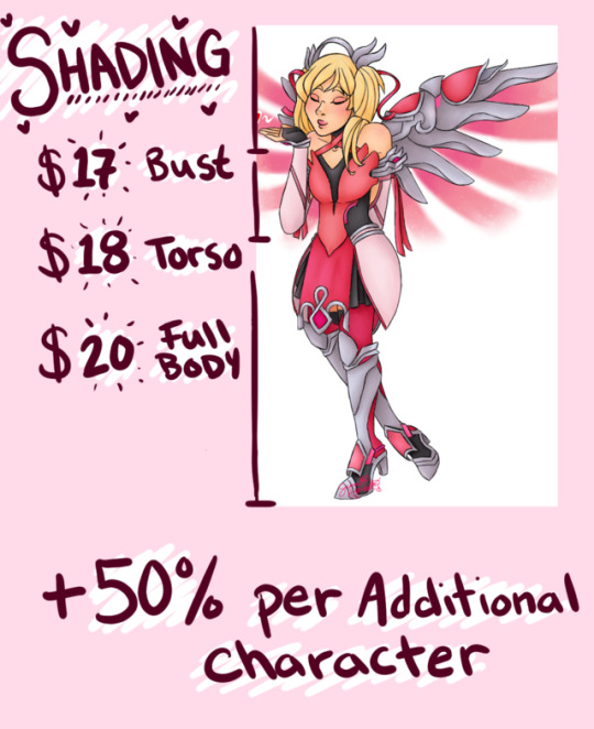
*Each additional character in a piece adds an additional 50% of the cost
Ex. A full body and shaded piece with one character would start at $20, while a piece with two characters would start at $30
*Again, these are general starting prices – please contact me with your request and based on the details you provide I can give you an exact price before you commission me
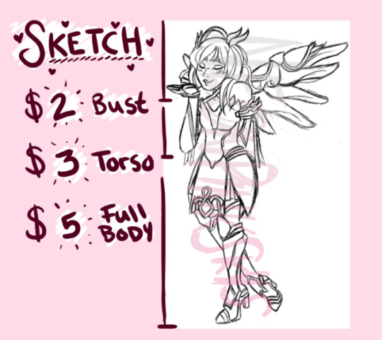
Sketch: Rough scratchy lines; not colored in, but I can make the lines whatever color or gradient you want.
-Bust: $2
-Torso: $3
-Full Body: $5
Ex. (Except the middle bottom example, these were all pulled from pieces that were finished beyond the sketch and were for my use only; sketch commission works will be cleaner than many of these.)
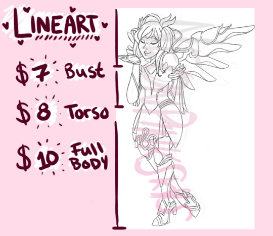
Line Art: Solid, smooth lines throughout; not colored in, but I can make the lines whatever color or gradient you want.
-Bust: $7
-Torso: $8
-Full Body: $10
Ex.
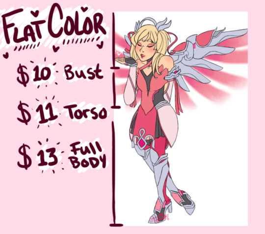
Flat Color: Line art filled in with flat colors, no shading; lines can also be colored.
-Bust: $10
-Torso: $11
-Full Body: $13
Ex.
Shading: Line art filled in with smooth shaded colors; lines can also be colored.
-Bust: $17
-Torso: $18
-Full Body: $20
Exs. 1 2 3 4
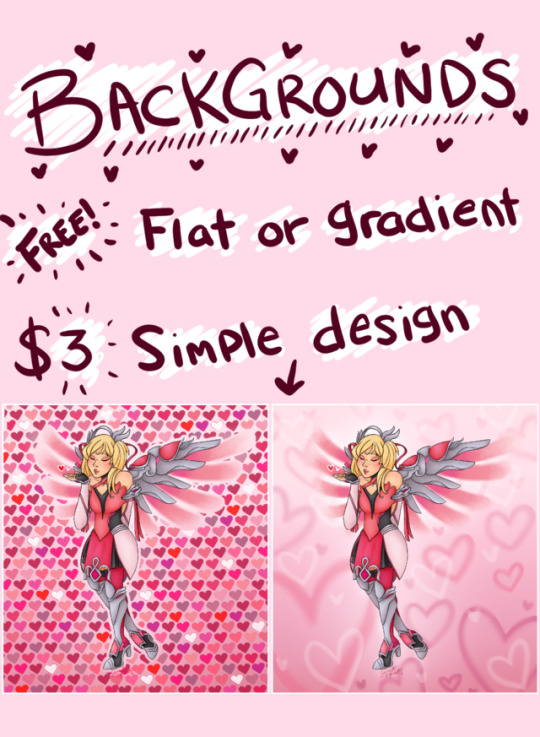
Backgrounds: Fills the space behind and surrounding the characters
-A single flat fill-in or basic color gradient is FREE for any piece
-A simple pattern or design is APPROXIMATELY $3 and will vary by complexity
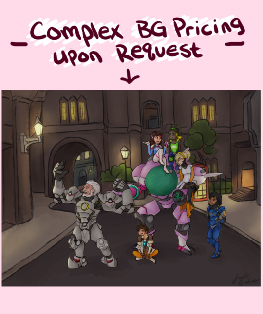
-I do not have as much practice with complex, more realistic backgrounds. Thus, I don’t have many examples, nor can I provide a general price for one since I do not do them often. However, if you have an idea for one I can work out a price for it based on what you want!
Ex.
*The Overwatch example image I used for the complex backgrounds was done in a slight rush because it was for a graded school assignment that was more focused on what I wrote to accompany the piece than the quality of the work, so while it does give an idea of what I can do please take it with a grain of salt – I will NOT rush your commission and will strive to produce the best result I can!
*Additional examples can be seen by browsing the #art tag on this blog; keep in mind, though, these works are from throughout the years with the earliest being 7 years ago!
Payment:
*To restate, all payments must be in United States currency (USD)
*Currently, my preferred payment method is through PayPal
*I will send you an invoice with a detailed outline of pricing and the total cost for you commission
*Payment is due in advance
-For sketches, I cannot give a real ‘progress shot’. The best I can do is a sort of ‘stick figure’ outline to make sure I have the pose like you want; otherwise, payment is due before I really begin working on it.
-For the remaining commission types, I will show you a very rough sketch before payment is due and once you approve of it, I will not continue until payment is received.
*I AM NOT PRODUCING A PHYSICAL GOOD. All my art is digital and once completed to your liking, you will receive an email containing the image file (default as a .png file, but let me know if you’d like it saved another way). As such, there will be NO SHIPPING of anything. Please ensure upon payment that if PayPal asks anything for shipping information, you select that no shipping is required.
*If you have ANY issues with the work, PLEASE contact and discuss with me before going through PayPal looking for a refund.
Timing:
*Currently, I CANNOT set a hard deadline for any work. I am a recent graduate who needs a full-time stable job to support myself and will be going BACK to school again in August. This is a hobby currently, not a career, and thus I cannot spend all my time on commissions. However, I can give you an estimation based on each individual request. I may often set these a bit longer than I really expect just to give myself some wiggle room and not resort to rushing anything. If I exceed my estimation by a significant amount, I will discuss refunds with you.
*If I have a major life issue or emergency, I may need to halt working on commissions entirely for an unspecified time. If this happens while I am working on your commission, I will contact you to discuss solutions or refunds.
Additional details:
*All work-in-progress shots will be heavily watermarked to ensure they are not stolen. However, the final piece will have my signature in a small spot on the artwork. It will not be incredibly noticeable or take away from the work, and under no circumstances are you permitted to remove or alter my signature in any way.
*Once you have the file, you may utilize the image however you like for personal use. However, the image may not be used by the commissioner or anyone else for any personal profit or monetary gain. The image should be credited to me wherever used, preferably linked back to my Tumblr or Twitter.
*I reserve the right to decline a commission request for any reason.
*After you have approved of the progress shot and I continue with your work, no refunds are available! I will do whatever I can to make sure the sketch is to your liking and can continue to work with you throughout the process to make sure the art is to your liking, to the best of my ability.
*If something comes up and you desperately need a refund for personal reasons, please contact me and we can work something out. I understand things happen.
*I reserve the right to use a commission piece for myself, such as in a portfolio or posted on social media. If posted, it will be indicated as a paid commission piece. You can decide if you want to be tagged or linked on any postings, although if I am for whatever reason uncomfortable with my personal art post leading back to your selected tag/ website I can refuse this. You are still able to personally post the piece wherever with credit, however, even in this case.
Things I WILL NOT draw:
-Nudity or pornographic material
-Excessive gore or disturbing works
-Offensive material
*You can contact me with any requests, but I reserve the right to deny them if I feel I am unable to properly depict it in a satisfactory way, or if I feel uncomfortable with the material. If I am uncertain in my ability to draw what you are picturing, I will let you know in advance, but I am willing to attempt whatever except as listed above. It doesn’t hurt to ask me for anything, though!
Things I WILL draw, but may not be the absolute best at:
-Male figures
-Complex backgrounds
-Robots/ mechanical parts
-Complex anatomical poses (however, having a reference pose will help this immensely!)
-Animals (Maybe? This is more because I have not had practice with animals in quite a while but I’m sure I can accurately depict them) *Applies to furries as well, just not really any practice but I can try!
*Most of these are due to lack of practice in those topics, but I can make my best attempts!
This is all very experimental in nature to me, but I will do my absolute best! I ask for some patience and understanding while I learn the ropes of commissions a bit more. Thank you to anyone who shares this, even just that means a lot to me! And to anyone considering commissioning me and those who do – you are amazing, and I cannot express how happy it makes me!
(I may return to edit this post as I remember any details I forgot to include, but I will most likely not be removing anything)
#open commissions#commissions#art#digital art#artists on tumblr#commission pricing#npsdraws#neonpinkskys
8 notes
·
View notes
Text
Tips for painting underwater scenes & dolphins
@floridabottlenose asked:
Hi! My name is Jaynee, and I also enjoy creating digital paintings of cetaceans. I've seen some of your recent digital paintings of cetaceans, and they were absolutely beautiful, and very realistic. Unfortunately, I can never get my digital paintings to look so stunning - do you think you could give me some tips on how to improve my cetacean art? Any help would be much appreciated! Thanks!
I guess some of my biggest issues are with the shading/highlighting and colors. For one thing, I have trouble getting the shading/highlights positioned right, and I see in some of your art, the cetaceans may have several shades of blue (similar to the colors of the water) in the shading, but I can't find out how to properly mix those extra colors in. I currently will paint a solid color, then paint some lighter shades for highlights and darker shades for shadows, and finally use a "blend" tool to smudge them - does this sound right, or do you have a suggestion on a better way to do shadows/highlights?
[link to art examples]
First off, thank you so much ;w; And I’m more than happy to help! Over the years I’ve found some ‘rules’ to painting underwater (it’s probably called physics) and personally they’ve helped me a lot in rationalising my underwater art, and make it more realistic. I hope these assorted ramblings and tips make sense and can be useful!
ABOUT UNDERWATER COLOURS
I think use of colours is your main point of improvement. I’ve noticed that in your paintings you make your dolphins grey (the totally desaturated kind), like one might see in a scientific illustration. However, the way a dolphin is depicted in such an illustration is as if they were suspended in a more-or-less evenly white lit room. Needless to say, this does not happen often in real life. Which is exactly why adding this third minke (illustration) looks so weird:
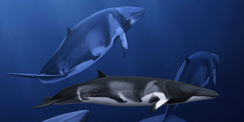
Especially since dolphins are more or less grey in colour, they almost never actually appear grey in real life. Shine some orange sunset-sunshine on them and they look orange brown. Put them underwater and I can assure you they are completely in shades of blue. This largely has to do with three important ‘rules’ that apply when painting dolphins (or really anything) underwater. (Note: for simplicity’s sake I just assume the water is blue, but the same applies for waters of a different colour.)
1. The further away from the viewer = the more blue
You may recognise this phenomenon from landscapes. Looking out my window, the nearby trees are colourful with high contrast, while the ones near the horizon are a low-contrast, washed out, whitish. Surprise surprise, today the sky is greyish white. You’ll also see this with faraway mountains looking blueish when the sky is blue. The hazier the air, like when it’s misty, the greater the effect. On clear days, even objects a considerable distance away may still have most of their colours. Have some scarily textbook examples I took on holiday:

The same goes underwater. The further away an object is, the more it takes on the colour of the surroundings, and (as a result) the more contrast it looses. The murkier the water, the greater the effect. The closer an object is, the more it retains its own colours, and the stronger its contrast. Knowing this, it is important to think about where the viewer is located in your painting. Let’s think of it as someone being in the water with a camera, taking a photo of a dolphin (which is your painting). Is the photographer right there in front of the action? Or are they far away, zooming in? In the first case, the dolphin should be crisp and colourful, in the second case they should be washed-out blue.

Now, in no case are anyone’s eyes every glued to a dolphin’s skin, so you’ll always have at least some loss of contrast and colour underwater. Just, the more you add, the further away the dolphin seems. It’s mostly a case of picking the right colours from the start. I always pick my background colour first, and then based on that & their position choose colours for the animals. You can still make small adjustments by lowering the dolphin’s opacity, or adding a low-opacity layer of background colour on top, to make them seem further away.
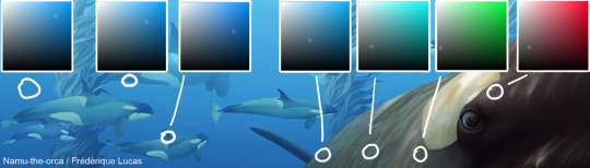
Let’s go through this example, from right to left. In sunlight, killer whales are kind of brownish, not pure black. So the closest part of the whale is a very low saturation red. Now the next colour swab is weirdly green. Very low saturation again, but still, green. This is because, as we move along the whale’s body, the colours shift from sunlight’s red to the background’s blue hue. To go from red to blue, one passes through green (and then that cyan-ish colour that’s next). The colours are still pretty desaturated, even the furthest part of the whale is mid-saturation. But! By now it’s nearly the same hue as the background, just a tinge more towards cyan. Now we move on to the background killers, and you can see that both have the same hue as the background. The little whale is only darker in colour, because she’s closer than the big bull in the background, who’s further away and thus has less contrast (i.e. lighter shadows).
2. The deeper (further away from the surface) = the more blue
A dolphin might be two inches from your face, but if you both are 100 feet down you bet your ass they’re gonna be blue either way. Water has this wonderful tendency to filter colours out with depth. It’s a pretty well known phenomenon: red is the first to go, blue the last. Seemingly colourful, bright red fish can appear a camouflaged greyish brown in their natural environment. Which is exactly why cameramen take along huge lights underwater: without them all the corals and pretty fish would just appear in shades of blue.
You can see this effect with a pod of dolphins at the surface. Close to the surface they appear grey, or even warm brown if the sun is shining well. Podmates swimming deeper are once again blue. The same effect is also used on the kelp pillars in my painting:
The kelp is in the distance, so it’s all more or less blue. But you can see that the deep (dark) part is a real blue hue, the same as the background, while the hue of the shallow (light) part has significantly shifted towards the kelp’s true colour, namely golden brown.
3. Shadows are blue
So let’s say you have a painting of a dolphin close to the viewer, at the surface - there’s still going to be blues in there. Shadows fall where the primary light, usually the sun, does not reach. Yet shadows are not pitch-black holes of total darkness. ‘Secondary lighting’ gives light and colour to shadows. Since the surroundings are all blue, all secondary, reflected light that falls on the shadows is also blue. As such, the darker the shadow the more saturated blue it is.
A funny exception happens when there are multiple dolphins swimming side-by-side, with the light coming in at an angle. The shadowed side of dolphin 1 would be facing the brightly lit side of dolphin 2. This light would be reflected back onto the (supposedly) shadowed side of dolphin 1. You can see it beautifully on these spinner dolphins.
ABOUT PAINTING DOLPHINS
So, this is quite a bit shorter and less structured than the above part. Mostly because my advice is really very boring when it comes to understanding where light and shadows fall on dolphins: draw dolphins. Lots and lots. More specifically, draw by studying photos, preferably photos taken at odd angles or with strong lighting. These things reveal a lot about the 3D shape of a dolphin. With practice (and good references!) you’ll start to build up a mental map of where the bumps and dips are, how the cheeks curve, the eyes bulge, the chin bends. Once you understand their shape, you are free to shade them according to your chosen light source. One day I want to make a tutorial on this exact topic, but for now I’m afraid this will have to suffice!
Regarding actual painting techniques, I would discourage you from using a blend tool to blend colours together. I used to do the same thing for a good while, but I must say I vastly prefer the result I get from actually painting the transitions. Lots of strokes, low opacity - at some point it starts blending nicely. Also, be careful what colours you pick for your shadows and highlights. As all the colour stuff above has hopefully shown, hues shift across the animal. Highlights, midtones and shadows all have different hues. In the case of my kelp killer whale, the highlights are reddish brown and the shadows blue. Picking shadows and highlights in the same hue as your base colour makes a painting feel flat.
Okay, I think that’s all for now?? If I’ve forgotten anything I’ll try to add it. I hope this helps! And feel free to ask if anything is not clear.
47 notes
·
View notes
Photo

12 Elegant CSS Pricing Tables for Your Latest Web Project
Pricing tables are an important part of any website which sells some kind of services and products. You can use them to quickly list the features, similarities or differences between 2, 3 or 4 different products at once.
These tables give users all the required information they need when choosing between different products and services. This in turn can result in more business for you. In a way, tables are a win-win tool for both businesses and consumers.
One common problem that you might face when trying to add tables to your own website is that creating them from scratch can be a bit difficult. The table has to look good and it should also be responsive.
In this post, we have listed some of the best CSS pricing tables available on CodeCanyon that you can start using in your projects right away.
CSS Pricing Tables on CodeCanyon
There are currently over 110 CSS pricing tables listed on CodeCanyon. Many of them follow a unique approach when it comes to designing pricing tables. This means that you can easily pick a unique responsive pricing table design that makes you stand out from the competition.
The price of these tables starts from as low as $3. New tables are added to the collection every month. You can pick the right table for your business from the best sellers or the trending section.
We will also list briefly review some of these tables below to give you a quick start.
Best CSS Pricing Tables on CodeCanyon
Here are the top 8 CSS pricing tables that you can buy right now from CodeCanyon:
CSS3 Responsive Web Pricing Tables Grids
These CSS3 Responsive Web Pricing Tables are one of the highest rated and top selling tables on CodeCanyon. They offer a lot of features to back this popularity.
The tables are available in 20 different colors and two different styles. They are responsive and Retina ready. So, they will look good on devices with different screen sizes and resolutions.
You can make one of the columns active so that it pops out by default. This is useful if you want to highlight a popular plan or product on the website.
The columns have an extra hidden ribbon. You can display it on individual columns and edit its appearance using CSS.
Other features of the table include tooltips, yes/no icons and animated hover states. The table fully support old browsers like IE9.
The plugin description page links to a video that showcases all the features of this table.
Responsive Clean Simple Pricing Tables
Depending on the look that you are going for, sometimes simple tables with minimal use of colors can look great, instead of tables with lots of animation and elements.
These responsive clean simple pricing tables will be perfect for you if you want to create some basic tables.
As the name suggests, they are fully responsive and built entirely using CSS. There are seven different color options available. The main accent color of the tables can also be changed easily.
The tooltips are created using HTML custom data attributes with CSS tooltips.
The table supports all major browsers and comes with jQuery fallbacks for older browsers.
Round Pricing Tables
These round pricing tables are ideal for people who want to display multiple products or services on a single page.
These tables take very little space and still convey all the necessary information. This is because the services or features of a plan are shown only when the users hover over the tables.
The tables have a clean design without a lot of clutter. The animations are powered entirely by CSS and you can easily change the color of different elements in CSS itself. The tables are very lightweight because they don't rely on images to create the layout.
You should visit the description page and take a look at the screenshots of the table or the preview video.
Kote—Featured Tables Collection
If you are looking for modern and responsive CSS tables then Kote—Featured Tables Collection is perfect for you.
This collection has 34 different tables that should cover almost every scenario where you can use a pricing table.
The first set of templates contains tables that are packed closely together with the middle table popping out from the group. The middle pricing table also has a subtle pulsating animation applied to it to draw attention.
The second set of templates contains tables with a distinct header, body and footer. They have a simpler design with properly separated tables.
The third set of templates uses fully colored tables with background images that blend perfectly with the background. The downloadable zip archive contains separate SVG files for these backgrounds and other icons.
Overall, this collection of tables is suitable for anyone who wants to have a lot of design options available when creating a pricing table.
Colorful Pricing Table
Most pricing tables generally use different colors for only the header and the footer of a column. However, colorful pricing table uses a unique approach of adding a nice background color over the entire table. This gives the tables a unique catchy look.
These table have four distinct layouts to showcase your plans and products. All these styles are fully responsive so they look great even on mobile devices.
The smooth animation, fully colored columns and flat design used in creating these tables makes them unique among all the tables listed in this post.
You should visit the table description page and check out the preview video to see if the table are suitable for your projects.
Horizontal and Vertical Pricing Tables
If you are looking for unique layout options to display pricing tables on your website then these horizontal and vertical pricing tables are definitely worth checking out.
There are two things that make these tables stand out. First, they allow you to create pricing tables that are laid out horizontally. Most CSS pricing table solution only focus on vertical layouts. Second, the tables rely on a well thought-out combination of colors and animation to give you that feel of professionalism.
The smooth transition of colors when you hover over different tables is very satisfying to watch. The tables are divided into three distinct sections for the header, the main body and the footer. The tables are also fully responsive so they look great on all devices. Take a look at the live preview to experience it all yourself.
Modern—Bootstrap 4 Pricing Tables
Bootstrap is a popular framework used by many websites to quickly create their frontend. If your website has also been created using Bootstrap, then it makes sense to use pricing tables that were made specifically for Bootstrap.
This will make their integration into existing websites a lot easier and keep the size of CSS file a bit smaller. One of the best ways to quickly add Bootstrap based pricing tables to your website is to use the modern Bootstrap 4 pricing tables.
There are nine different table layouts with 6 different color options. The tables are fully responsive just like their parent framework.
You can present your products and services with a modern, clean and unique design using these Bootstrap 4 pricing tables.
Loki Pricing Table Generator
Not everyone is comfortable when it comes to making changes to HTML and CSS to customize a pricing table. The Loki Pricing Table Generator solves this problem by giving you the tools to easily customize the basic features of the pricing tables.
There are 8 different table layouts. However, you can change various aspects like the primary, secondary and background color to make them unique. Similarly, you can change the font size for the pricing, features and title etc.
The generator also gives you the option to change the text of different rows and columns without actually touching the pricing table markup. In the end, you can simply click on the Code button to directly download the HTML and CSS file for the table created.
Free CSS Pricing Tables
Before I start listing a few free CSS pricing tables, there are a few things that I should clear up.
There aren't a lot of dedicated libraries and frameworks out there created specifically to generate fancy pricing tables. You will have to look around for a while before you can find some pricing tables that look professional and go well with the overall design of your website.
Keeping these points in mind, it might simply be easier for you to buy one of the premium pricing tables, which come with different templates and clean, professional design. You also get lifetime free updates for any pricing tables you download.
If you still want to give some free CSS pricing tables a try, then the ones I listed below will be a good start.
Pricing Table with Hover Animation
This pricing table enlarges the table that users are hovering over with a nice and smooth animation.
Responsive Pricing Table
This responsive pricing table uses Flexbox to create the layout. Minimal use of colors and other styling elements makes it very easy to integrate with the design of existing websites.
Pricing Table with a Prominent Header
This multi-colored pricing table comes with prominent headers to display a big title for the product or service as well as its price.
The pricing columns are properly separated from each other and they don't have hover animation applied to them. There is a little badge that you can add to the top of a column to indicate the most popular plans etc.
Pricing Table with Enlarged Column
A common practice to highlight a popular product or service in a pricing table is to enlarge its columns to make it stand out. This pricing table helps you do exactly that. It has a very simple layout with a subtle background animation on hover.
Best Practices to Keep in Mind When Creating Pricing Tables
Pricing tables are generally placed at a prime location on a website and they are used to highlight the main products and services that you offer. Therefore, it makes sense to follow all the best practices when you create these tables.
Here are a few things that you should remember when creating pricing tables:
1. Make the Tables Responsive
A lot of traffic on website generally comes from mobile devices nowadays. There is no fixed resolution that you can target when creating pricing tables. Therefore, it is important to make sure that your pricing tables look good on all screen sizes. The premium CSS pricing tables from CodeCanyon are already responsive so you won't even have to worry about it when using them.
2. Use Fewer Words
Pricing tables are meant to give users all the necessary information they need about different products at a glance. Use them to list the most important distinguishing features of these products. Other details can be mentioned somewhere else on the website.
3. Include a Prominent Call to Action Button
Hopefully, the pricing tables that you create will give users all the necessary information that they want before making a purchasing decision. Once they decide to buy one of your products and services, you should make it as easy as possible for them to complete the purchase. The best way to do that is to include a button to make the purchase somewhere in the pricing table itself.
Final Thoughts
As we discussed at the beginning of this post, pricing tables are a great way to drive more business by allowing users to quickly compare different products and services.
Creating a responsive and nicely designed pricing table from scratch can be a daunting and time consuming task. That is why you should consider using one of the premium CSS pricing tables available on CodeCanyon.
Which pricing table do you like the most from the ones we mentioned in the post? Let us know in the comments.
by Monty Shokeen via Envato Tuts+ Code https://ift.tt/37mt8Zq
0 notes
Text
Kurotsuki au?
Logline:
In a story based loosely on several grim fairytales: the adventures of one troubled grey wolf, a foolishly gullible prince and a beautiful bold princess unfold in a series of misfortunate events. It is a journey that will bring them together and pull them apart in unruly circumstances. After all, life and death come hand-to-hand.
Characters:
Princess Camellia Gabrielle Travers: Trapped in a tower for most of her life, Camellia views the world in innocence and purity. She longs for an adventure of heroics and love, enduring endless hours of loneliness for her chance at greatness. (Tsukishima Kei)
Huntsman Elric Nathan Harrods: Honest and softhearted by default, Elric isolates himself in the forest in solitude. Away from heartless people in the village, away from his family who never cared. He revels in the forests ethereal woods, in his freedom. (Kuroo Tetsurou)
Prince Bennett Abel Coleman: Spoiled and childish by nature, Bennett has lived a secured and privileged life of a prince. His parents and kingdom adored him and marveled at his feet. That is, until he invokes on a journey to find his missing fiancée. (Currently undecided)
Zahra Adila: Known as the Good Witch of the Enchanted Forest, Zahra’s secret compels her to intwine the story of three others together and connects them in ways she could never have predicted. (Currently undecided)
Prologue:
Servants and attendants scurried back and forth throughout the palace as the piercing wails echoed within the castle wall. A maid bearing a bucket of water and white towels making haste along a vast hallway in the direction of the royal chambers where Good Witch Zahra and laboring Queen Ava awaited her arrival. Turning a corner at the end of the hall, she happened upon a cluster of chambermaids gathered in excited hush whispers. She heaved a heavy sigh, trying little to school her expression of distain.
“What a joyous day it is!” One with starry eyes exclaimed, swaying on the heels of her flat black slippers. Slippers that should be at work. “An heir is being born right at this second! Can you not believe it?”
“A joyous one indeed.” Another replied, still not at work by-the-by; her supple lips curving into a lighthearted grin. “I reckon the King and Queen will throw a feast for such a grand occasion.”
A chambermaid whose hair flared atrociously in wild fiery curls, quietly twirl a strand around a finger in a reserved manner. “I wonder if her royal highness is birthing a prince or princess?” She mused, skillfully drawing the group’s attention towards her. “Either one will undoubtedly end up beautiful, no?”
The maid sneered at the chambermaid’s mulling; leave it to the gingered harlot to reflect on beauty before well-being. Unimpressed and slightly crossed, she stood tall with her chin held high and marched her way towards the inattentive gathering of servants. As she strode by, deliberately cutting through the cluster of procrastinating parrots with a pointed countenance plastered in her expression, she carried an air of superiority. Her body and aura screamed, “Stop lazing around, get back to your duties!”
“What are your thoughts on the newest arrival, Lady Anya?” She hears one of the chambermaids ask her in an attempt at cunningness; traces of her former accent present in the girl’s speech.
Lady Anya graced her a glance over her shoulder, indifferent to her challenge. “Well Maid Adara,” She started, offering a soft smile laced in venom. “Proper servants of this kingdom never ponder our time on needless worries such as discussing unnecessary telltales. We live to serve and bend to the will of our masters because we are their humble domestics.” With this, Lady Anya carried on with the task at hand, satisfied with her answer. By any luck, her small speech should motivate those snorting piglets in fulfilling their assigned roles.
As Lady Anya politely knocked onto the queens’ door thrice, she noticed that her highness’s wails have ceased since before her entrance.
The Good Witch answered Lady Anya’s knocks, young in appearance while old in age. Zahra’s lips pressed into a thin line as her vibrant earthy orbs studied the maid in eerie stillness, Anya besting the impulse to fidget under the witch’s sharp stare. She truly was a talented enchanter to behold the youthful face of twenty.
Good Zahra leaned forward and stretched a hand out towards her, swiping strings of Lady Anya’s locks that had come unfastened from her bun behind her ear. “Be wary of the girl with a mane of blazing fire; her envious flames will scorch all who near.” She cautioned lightly, soft snow colored hair caressed the maid’s cheek in a tickling manner. Soundlessly, Zahra retreated two steps and held the chamber doors wider for Lady Anya to enter.
“I…Pardon me?” Anya stuttered in confusion, feeling as though she had misheard the white witch.
“Come afore both Her Highnesses patience run thin.” The witch directed, long pale fingers wrapping around the maid’s toweled wrist and thrusts her way through the doors. “One shan’t keep Royals awaiting.” She led her into the chamber, old and plain dress swayed as she walked.
“My dearest Queen Ava, your handmaiden has graced us fresh water and pristine towels.” Good Zahra announced, dipping into a low curtsy as she entered. The maid followed suit.
Lady Anya had never seen her fair Lady so disheveled in all her life serving by her side; the queen’s normally flowing locks were wild and unkempt, twisted and knotted and frizzed. Her fair complexion seeming dull under the candle light, the bedding gown she wore drawn high above her thighs and blood stained the queen like crimson paint. A look certainly not fit for a woman of her status. The queen sat in her cot, lovingly cradling a cooing babe.
“Isn’t she lovely?” The queen marvels in awe. “My little Camellia.
—————
Okay, so I did this short story thing in my English class as a project and I really liked this idea. So, I was thinking of rewriting this as a kurotsuki au with a fairytale twist kind of thing. Of course I’ll be changing a some of the plot and scenarios but main idea is gonna stay the same; just need to switch the names as well. Let’s see how many people want to me to post a fanfic on it! Comment or like if you do!
P.s. if anyone is wondering, I’m gonna be switching the princess as prince for Tsuki’s manly sake.
#kurotsuki#tsukishima kei#kuroo tetsurou#kurotsuki au#fairytale au#haikyuu!!#fairytale twists#prince Tsukishima Kei#huntsman Kuroo Tetsurou#should i do it#???#I love the plot tho#I’ll be adding more characters#don’t worry#kurotsuki may be ooc#sorry not sorry
2 notes
·
View notes
Text
[center][b]Rules[/b] [spoiler] 1) You can claim as many slots as you like. 2) Paypal/USD is greatly preferred. 3) If paying with Paypal, I will be PMing you with my Paypal account once the slot has been claimed. 4) I only take 6 to 10 slots at a time and I don't take anymore until at least 3 commissions are done. 5) You must agree to my Terms of Service. 6) If prices increase after you have already claimed a slot, you only have to pay what the price was when you claimed the slot. 7) Work on commission will not begin until payment has been received (either in full, or a percentage up-front for commissions over 50 USD). 8) First character is full price, any extra character is 20% off. [/spoiler]
[B]Terms of Service[/B] [spoiler] Anyone who commissions me must agree to these terms of: -I have the right to refuse any commission for any reason. -I have the right to cancel a commission. -I am allowed to use your tattoo as a reference in my shop portfolio, with this your name will always be stated next to it to give proper credit to you for your pony/Character. This can go for regular commissions as well. -You will receive a full refund if you cancel the commission before I start or I cancel the commission for any reason without starting on it. -You will receive a partial refund if you cancel the commission after I have already begun, Amount refunded is based on time already spent on the commission. -I have full rights to my works and may post them on any site. Tattoos will stay on PI only. (Currently only post art on 5 sites, Tumblr, DA, YouTube, sometimes my FB and here if you see it anywhere else it is not me.) -You may post your commission on other sites, but may not claim the work as your own and you may resize, crop, and add backgrounds to your commissions, but you may not trace over it to make new images or recolor the original. -Please do not remove my signature, it's usually pretty small and on the left or right on the arm or leg. (Only on Art Commissions)
Drawing Process and Deadlines: -Please do not rush me. -I will send a sketch for you to approve before lining your commission. -You will be notified if your commission is delayed for any reason. -It can take me anywhere between a day to 2 weeks. I am officially a full time freelance artist! [/spoiler]
If you have any questions, feel free to PM me.
[I][U]To make this commission sheet easier to read and organized I have put a stranded price on all categories, all categories prices may or may not change due to Art style Chargers EXCEPT [b]Sketches[/b]. Please read the Art style Charges before you order.[/U] Thank you![/I]
[B]Art style Charges[/B] I have 3 Art styles to choose from.
Simple/Standard (Price does not change) Cell Highlight and Shade. https://photos.smugmug.com/My-Art/i-dTmJksD/0/314bdf00/X2/Com-2%20of%202%20Toxic-X2.png
Detailed - +$5 Detailed is a mixture between Cell and Soft. (My main art style) https://photos.smugmug.com/My-Art/i-5kZDpQQ/0/a4bcd8b6/X2/Com-%20LOL%20or%20WOW-X2.png https://photos.smugmug.com/My-Art/i-Wnq8tsP/0/551d650f/X2/Com-%20Pretty%20lady%20copy-X2.png
Extra details/Painted - +$15 (Available for all fully rendered pieces except Digital Painting, DP comes with this opinion already in the price) https://photos.smugmug.com/My-Art/i-DvGVW62/0/355f225d/X2/Painted%20hair%20Examples-X2.png
[b]Examples of work[/b]
❥Sketches (+$3 for detailed hair for whole category) Bust $10
Waist up $15
Full body $20
(Not blood, it’s ink she’s my OC from BATIM) https://photos.smugmug.com/My-Art/i-9hD7cn3/0/4dadac5a/X2/You%20called-Nylah-X2.png https://photos.smugmug.com/My-Art/i-wMFKSZm/0/c5ed5422/X2/YCH-pony%20in%20the%20clouds-X2.png https://photos.smugmug.com/My-Art/i-TQpXNMp/0/a6d4a413/X2/finished%20COM%20Ruby-X2.png
❥Line Art Bust - $15
https://photos.smugmug.com/My-Art/i-S4fnbNk/0/bca2353b/X2/Com-Lined%20bust-X2.png https://photos.smugmug.com/My-Art/i-9GbfHz2/0/591a7efd/X2/Com-Pirate%20babu-X2.png https://photos.smugmug.com/My-Art/i-kWRwCg2/0/bfdd2d58/X2/Com-3-X2.png
Waist up - $25
Full body - $30 https://photos.smugmug.com/My-Art/i-7ZKC2Wj/0/b0034a71/X3/Com-full%20body%20lining%202-X3.png https://photos.smugmug.com/My-Art/i-L7MRqJF/0/2f70a59f/X2/chibi%20Gentle%20heart%20LA-X2.png
❥Flat color with rendered eyes Bust - $25 https://photos.smugmug.com/My-Art/i-bHgxdxZ/0/d3910c61/X2/Gilsten%20copy-X2.png https://photos.smugmug.com/My-Art/i-DGmZ489/0/b7a3009d/XL/Com-Soturi2-XL.png https://photos.smugmug.com/My-Art/i-XbMqHqw/0/2c988fd9/X2/Sona%20MM-X2.png
Waist up- $30
Full body - $35 https://photos.smugmug.com/My-Art/i-QXkMLKp/0/672b6784/XL/Human%20sona%202017-XL.png https://photos.smugmug.com/My-Art/i-z5wd8xd/0/e8b45ccd/XL/Prizes%20for%20Easter%20Event%202019%20Anthro%20bunny-XL.png https://photos.smugmug.com/My-Art/i-DG7jKgJ/0/6edc9099/XL/Prizes%20for%20Easter%20Event%202019%20Pony-XL.png https://photos.smugmug.com/My-Art/i-NFkpSsk/0/d9ac1ed7/XL/Big%20wife-XL.png https://photos.smugmug.com/My-Art/i-XW9tRMW/0/d3e9de3e/XL/Sonic%20Sona%2017-XL.png https://photos.smugmug.com/My-Art/i-QXkMLKp/0/672b6784/X2/Human%20sona%202017-X2.png (My old chibi style but good examples) https://photos.smugmug.com/My-Art/i-xHcSRjz/0/c2dd3e60/XL/Com-%20Lex%20Rialo-XL.png https://photos.smugmug.com/My-Art/i-C5gcxzG/0/7c5c1709/XL/Com-%20Chibi%20flatcolor-XL.png https://photos.smugmug.com/My-Art/i-K9fJr3c/0/1574485d/X2/Com-Sungyoon%20Chibi-X2.png
❥Fully rendered
Bust - $30 (Example with painted hair) https://photos.smugmug.com/My-Art/i-mtp8SzF/0/9124cbd6/XL/Couple%20YCH%20Finished-XL.png https://photos.smugmug.com/My-Art/i-Wnq8tsP/0/551d650f/XL/Com-%20Pretty%20lady%20copy-XL.png https://photos.smugmug.com/My-Art/i-5kZDpQQ/0/a4bcd8b6/XL/Com-%20LOL%20or%20WOW-XL.png https://photos.smugmug.com/My-Art/i-dTmJksD/0/314bdf00/XL/Com-2%20of%202%20Toxic-XL.png
Half body - $35
Full body - $45 https://photos.smugmug.com/My-Art/i-v64BpqP/0/c5031c70/XL/Com-%20Realm%20of%20Synovia-XL.png https://photos.smugmug.com/My-Art/i-6s8J849/0/d5f307a2/X2/Commission1-X2.png https://photos.smugmug.com/My-Art/i-mmSHZ9N/0/4c2a5027/X2/chibi%20Gentle%20heart%20Public%20post-X2.png
❥Mini Chibis - $10 (Flat color only) https://images-wixmp-ed30a86b8c4ca887773594c2.wixmp.com/intermediary/f/125dcb8e-4cc2-4e34-8112-c38a71a43464/dcz2sqv-74fb94fa-532c-4fd9-a270-c97f4cd1fb68.png
❥Chibi (Style in progress of change, temporarily unavailable) Flat color - $20 (WIP Style) https://photos.smugmug.com/My-Art/i-b3GCWZD/0/1978a838/XL/Razzle%20and%20Raydon-XL.png
Fully Rendered - $30 (Example is Simple with painted hair) https://photos.smugmug.com/My-Art/i-TdqpcHx/0/9b57bc62/X2/Sticker%20SU%20Edition-X2.png
❥Sprites Flat color $10
Fully Rendered $15
❥Digital Painting (Current example/WIP) https://photos.smugmug.com/My-Art/i-BV7Mzs8/0/3e434107/X3/WIP%20com-X3.png https://photos.smugmug.com/My-Art/i-dJ9BLgf/0/b65a2603/X3/Nikolai%20paint-X3.png
Painted $35 WIP
Bust - $35
Waist up- $55
Full body - $75
❥Icons Flat color $15
Fully Rendered $25 WIP
❥Pixel Art [b] NEW [/b] Simple and Detailed style only
Icons
Flat color - $15
Fully rendered - $25
Busts
Flat color - $30
Fully rendered - $35
Chibi
Flat color - $15
Fully rendered $25
❥Custom adopts/Outfit design $25 colored sketch simple/medium level detail/design $35 colored sketch high level of detail or lined art, simple detail/design $45 lined art, medium to high level of detail/design $55+ determined on a case to case basis (usually extremely complicated designs)
https://photos.smugmug.com/My-Art/i-5P3Q9N7/0/8365504d/XL/YCH%20Christmas%20dress%20%28SOLD%29-XL.png https://photos.smugmug.com/My-Art/i-DJSrwWj/0/c586caaf/XL/Dress%20one-XL.png https://photos.smugmug.com/My-Art/i-NznMKH3/0/a0de2601/XL/Dress%203-XL.png https://photos.smugmug.com/My-Art/i-XFNw3xb/0/b67f42bf/XL/Dress%20model%20-XL.png https://photos.smugmug.com/My-Art/i-3HVzTH9/0/28904e68/XL/Dress%206-XL.png https://photos.smugmug.com/My-Art/i-NCNG4w9/0/5fa6dc99/X2/Dress%20for%20prize-X2.png
❥Reference Sheet [b] NEW [/b] Simple and Detailed only! Flat color Package: 2 Full body poses, and 3 busts. Simple/$130 Detailed/$165 Add outfits your OC/FC already owns for $5 Add outfits designed by me (Price may vary)
NEW [B]Adoptable work[/b] (Currently unavailable until currently project is completed) PM me with any questions you have! I'm not sure in pricing yet. Current references: I've worked with one person and still am working with her and will soon have 2 adoptables going within 2 or 3 months. Along with many other projects I have. Offering one or more of the follow: Relining Templating Genes/Markings Items mutations Icons for items Clothing designs Banners (Currently unavailable)
[b]My specialties:[/b] Cartoons/Semi realism, TMNT, Ponies, Feathers, Foxes, Galaxy, Sky, Wings, Clouds, Hair, Eyes, Humans, Aliens, Anthro, metals, jewelry, lace, flowers, and clothing I can give almost anything a-go!
[b]Things I won't do:[/b] Mecha (I need to practice more first) Too much Gore (I do light Gore) Other Feral (May do some times, I need more practice) Realism WIP
[B]Slots Available[/b] 1. 2. 3. 4. 5. [/center]
0 notes
Text
Skillshare class projects
A list of classes I would like to try out :). Although Skillshare is basically the same as Youtube tutorials, just that it costs money, as this guy has said.
Creative Ways to Generate Story Ideas Using Prompts: Choose a random image, dialogue, or setting. If you don't have a story, base a story around those prompts, if you have an existing story, find a way to incorporate them into the story. Create one or several ideas, whether with just one prompt or more, and post the ideas. If you feel comfortable, comment on other people's ideas, see if you can bounce ideas off of them. (Skillshare) Didn’t see much happening here, but concept is interesting. Currently 48 students, beginner level.
Creative Ways to Generate Story Ideas Using Fanfics: Come up with your own fanfic idea? Take the characters from a story you like and place them in a different setting, situation, interchange their roles, etc. If you want to create an original idea make sure that you change enough so as not to relate it to the original story (names, backgrounds, locations, important plot points, etc.) If you feel comfortable start bouncing ideas off of the other classmates for a both a fanfic or an original story. If you’re going for an original idea I recommend asking either your classmates or myself if we recognize the premise or if a character reminds us of some other character.
How to find story ideas: Writing about yourself. Writing about your surroundings. Where to get new ideas. What is a good idea? Exercises. (Skillshare)
Real life lore | Kursgezzagt |
Storyboarding for film: illustrating scripts and stories. SKILLSHARE. Storyboard a new ending to your favorite film. It's up to you whether you change or keep the plot. Be sure to include ... The scene: Introduce us to the final scene in a few sentences. The storyboard: Using the template or a setup of your own, storyboard the final moments. Think about how different shots, angles, and story contribute to your narrative and change the story. The rationale: Share a few lines about why you illustrated the shots as you did. Project specs ... Your final storyboard should include 4-16 frames. Use the 16x9 template, or create your own. Upload your image files as .jpgs.
1 ) Set the scene. Select your film. Think about your favorites, research clips on YouTube, or browse your Netflix queue. Then, quickly distill the major plot points so that we're ready for the ending scene you'll storyboard. Share: Share a 3-5 sentence description of the plot up until the final moments.
2 ) Draw your storyboard. Using the provided template (see Additional Resources below) or one of your own, start drawing! If you're new to storyboarding, don't worry about transitions, movement, or too much annotation. Just get across the key visual moments that communicate your story. You may also find it helpful to rough out a quick script as a guide. Share: Your storyboard, drawn either digitally or by hand.
3 ) Reflect on your rewrite. What do your shots communicate that the original film didn't? Why did/didn't you choose to change the plot? If you were to do this exercise again, what would you change? Share: A few sentences reflecting on this storyboarding process and your artistic choices.
Writing a character study (Wattpad)
I often get ideas from different interactions I have in my life. I was walking my dog, when I saw a cute guy with a phone in his back pocket. It slipped out and it was the exact same as mine, model, color and everything. I picked it up and raced after him. We flirted a bit and parted ways. But I always wondered, what if we had switched cellphones? What would have happened from this if we had gone further?
Important to write about things that you know or things that you experience, since then you have a deeper understanding and is better equipped to write about it. I’m a great people watcher, seeing someone and making up a backstory about why they’re doing what they’re doing. Why is he in a taxi? What happened with his eyes? Did he secretly want to be a pirate? Is he waiting for someone? Or maybe behind those cool sunglasses he is crying and having difficulty breathing?
Be a people watcher. Make backstories for the people you observe.
Write a backstory on all characters.
Keep a phone or pad handy for jotting down ideas you get while observing people.
Dot down little things like descriptions or characteristics.
Expand observation to include other things that can inspire you e.g. hobbies, songs, articles, etc.
If the idea is really sticking with you and you remember these certain people or aspects that happened - it’s still in your mind even weeks after. Then that’s usually how I know if it’s a good idea, when it’s really sticking with me in my mind.
If struggling coming up with characters or a story. Then you should look around you. Interactions, people watching, but also hobbies that you’re in, music you’re listening to ... Stuff that really inspires something in you, makes you feel something. Things like that. There’s ... All around you there’s inspiration.
Remember that everything on your pad isn’t your entire story, it’s just a platform of jumping off base. You can combine different ideas, different people, something that will make it your own thing.
How do I start a story? Blank sheet of paper, but where do I go from there? Using all these interactions that you have and ideas, putting it onto the page. There’s two types: character based and plot based. The first kind is about the characters or the people who are driving the story forward. The second kind is certain aspects of a story; you have a conflict that will eventually create this, and that is driving the plot forward.
In the first kind, the character’s personalities are really the focal point of it. It can be someone who’s really shy or extroverted or maybe they have a really aggressive personality and dominance, or maybe they’re really submissive and they don’t really want to go out into the world. Things like that. The challenge about this is keeping your personality throughout, but then also how they’re changing and evolving as the story progresses. Because you want a beginning point, but by the end you want to have a conflict resolved.
A trouble spot is that sometimes when you use just one word for a character, like if they’re an angry character, then your characters becomes very flat because you’re only using one word. So you have to add multiple dimensions to your character. So he’s not just angry, and if he is angry, as the story evolves, how does that anger influence his interactions with other people. and maybe if he is angry at someone, they get into a fight, then what happens. Is he still gonna be angry afterwards, or is he going to be changing? Is he gonna realize that his anger is part of the issue, of his problem? So things like that, where you’re creating different dimensions.
So I’m not a flat character. I have many flaws, many good characteristics and not good characteristics. So make sure you’re adding that into your own characters.
How many characters do I need? I usually do my heroine heroine and then I’ll do supporting characters, the peopel around them. Like their best friends, their parents and siblings. So you don’t have to go that in depth as with your heroine heroine necessarily, but you want to be creating some kind of structure of who these other supporting characters are. If you’re not sure with where to start and am feeling a bit overwhelmed with this, I say start with your main characters, and then go from there. As you’re writing your story you can always add characters or even subtract characters.
If you’re not sure about who your main characters are, I say go back to your main story idea and ask, who is the character that’s driving your story forward? So that’s gonna be your main character.

The process of writing a character study. At this point it’s up to you. You can either use your notes that you have on other people that you found interesting, or if you don’t, just dive right in.
who they are and how they are feeling
act out what you’re writing to get a better understanding of what you / the character would do or feel
https://www.skillshare.com/classes/The-Creative-Writers-Toolkit-Writing-a-Character-Study-Learn-with-Wattpad/1452701491/projects E4 8:52
Name: go to the internet for a name, try to find something you feel would fit their personality.
Physical description: hair color, eyes, height, things that make her her. Body type. Is it curly, frizzy, or ...? if you’re struggling to picture it in your mind or deciding, just pull an image from the internet. Or when you’re outside and you see someone you like, then just use that.
Personality: takes a couple days. I’ll make a baseline and then add to it. What makes the character, what they wear, manners, etc. Like huge bookwork but doesn’t like homework. She’s a messy person, doesn’t make her bed, while her brother is very neat. Also very laid back person. So clothing wise she likes things loose, shirts aren’t tucked in, etc.
Habits / mannerisms: like what they eat or when they are nervous, etc. Small things that they do. They eat oatmeal every morning, that’s a constant routine. When she’s nervous she twirls her hair. I always put in why they twirl their hair. She’s very protective of her brother and feels a great bond with him. She not only looks out for him, but that they’re in this together. Put in who they are and what they’re feeling inside. If you’re struggling finding out body language they would do, I would say study yourself. If you’re in a situation, what do you do in that. How would I stand? What would I do in that situation? I’ll act out what the characters are doing in the situation.
Background: from child to what age they are now in the story. With this you can know throughout your story where your character is and how they’re making those decisions. And it makes it very consistent throughout.
any siblings and stuff when they are together
Her attitude - background
Where did she grow up?
As a child she was very afraid of things, so she relied on her brother a lot. I later found out that with this, then she now as a senior, she’s applying for colleges, she has this fear of the future. So the conflict comes from her background. She’s so reliant and now she’s entering this new stage in her life where she’s not going to be with her brother, and how is this going to affect her.
Talon moved to beach town from Texas.
Flaws: what does the description from the stuff happen to her.
She’s a messy person, but how does this messiness affect her as a person? She doesn’t get her homework done on time, for instance she had summer work that she has to get done for school, she waits until the last minute, she then tries to get her brother to help her, then her friends, but they won’t. So that’s how she actually ends up talking to Talon and really connecting with him, since he helps her with her homework.
Internal conflict: fears and what happens to her and how she progresses
Fear of the future and not knowing with college coming up what she’s going to do. By the end of the story she has a better understanding and learns that fear is okay, it’s
External conflict: what happens with the outside
Resolution: both conflicts change in the end
youtube
Henry wants to make a documentary about historical landmarks, but he is afraid of physical aggression. He learns he can’t do this alone, he needs someone to help him, a producer, and a friend. Now I don’t want my story to be about Henry making a film, that’s just a circumstance even though it adds to his character, that’s not what I’m interested in. What I really care about is Henry’s relationships and how he interacts with other people, and about the fact that he’s a loner and an outsider. So I want to bring another person into Henry’s life, and I think it’s going to be a young girl, since I think a young child will more likely accept him as he is. I’m creating another character at the moment, a little girl named Lana who has her own goals: to become a famous TV producer. This story will be about Lana and Henry. It’s almost a boy meets girl story, but without the romance.
Then I write a three act structure to get the ball rolling. Act one: Henry hires Lana as his producer. Act two: Lana leaves Henry halway through production for a better offer. Now given that we know that Henry gets sad when people laugh at him and is afraid of physical aggression, this is where the conflict and drama could be added to heighten those elements. What if Lana makes fun of Henry? He’s just not cool enough for her? And she leaves him to be with cooler folks? What if worse than that, she unwittingly shows him some physical aggression? That sounds scary, but don’t you want to push boundaries with this character? Don’t you want to go to the absolute extreme? Act three: Henry finishes his documentary, wins an award and gives it to Lana, to thank her for her input. Lana decides she wants to carry on working with Henry.
The reason I’ve put this in there is because I think Henry is a very kind and sweet person, and we said he had a positive and sunny nature. So I think that whatever happens to him, he is not going to become bitter and hold a grudge about it. And actually this resolves the conflict. He is the one who steps out and offers the hand of friendship to Lana. It also shows that he’s grown as a character, he’s discovered that the important thing wasn’t making a documentary or winning awards, but it was actually the relationship created throughout the process. So as a character he’s gone on a little journey.
How does your character react to conflict? Your character drives the plot.
How would that character create plot? Knowing their weaknesses. Knowing things they struggle with. What situation could you put them into to create an interesting dramatic situation. It can be something very simple. (...)
0 notes