#could just do a layer on top with a mask. set it to color mode.
Explore tagged Tumblr posts
Text
was gonna post my “sansa and serena institute absolute primogeniture in the north” timeline but then i remembered how many fucking sons and grandsons Beron has and at first i was like “fuck those guys i’m leaving them off” but now i’m like “shit maybe…..i should work them in anyway.” this is what i did instead of my job all day btw. anyways here are the sigils i made up, they are a rough draft because i am not an artist but god i wish i was:
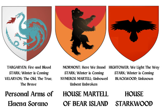
ELAENA SORANO
The dragon is for her grandmother, Elaena Targaryen
The blue is for her grandfather, Alyn Velaryon, and the sigil of her brother and father’s house, House Longwaters
I wanted the darker color to be red like the Targaryens but i could NOT get the Kingsguard sigil to get to that bright red lmao. I also thought of making it gold like Elaena’s streak in her hair, but I haven’t tried that color yet. We’ll see how it works tomorrow.
I like to think the arms stick around amongst her descendants, the way Brienne finds Dunk’s arms. Robb calls his banners and there’s like three different Umbers using Elaena Sorano’s arms as a sort of “fuck you, we don’t even kneel to dragons why would we kneel to lions” kind of thing
HOUSE MORMONT MARTELL
Bear is for Janna Mormont, Ruling Lady of House Mormont
The orange and red is supposed to look like the sun of Dorne, for Olyvar Martell, Janna’s husband
I think it’s missing that ✨spark✨tho but i can’t figure out what
Sigil is made by a younger son of Janna and Olyvar, who establishes his own cadet house on Bear Island
Obviously their words have to be something metal like I WISH A BITCH WOULD bc it’s coming from a Martell AND a Mormont
HOUSE STARKWOOD
the crow and color is supposed to be indictative of the Blackwood sigil for its co-founder, Jason Blackwood
Now that i’m looking at it, there’s not enough Starkiness so I think i’m gonna change the red background to a white or grey one to fit the winterness
The Karstarks already have “the sun of winter” so i can’t use “the fire of winter” or “the daughter of winter” lol. i’ll figure something out but it’s honestly not important it’s not like the Blackwoods have words either lmao
#canon divergent au#getting on my soap box#do u see how ugly this shit is in canva.#i miss photoshop so much.#could just do a layer on top with a mask. set it to color mode.
7 notes
·
View notes
Note
Hi! Can I ask how you did the double exposure gifs for your merlin set? They're beautiful btw!
heyy, thank you!! of course!
it's actually not very hard, the trick is to find the right shots for this. here's how i did it (reference gifset), under the cut.

for this tutorial i will be: — using photoshop cs5 on windows — assuming you know how to make gifs using the timeline — have basic coloring, sharpening, groups, and layer masks knowledge
I. CHOOSING THE RIGHT SHOTS
the ultimate trick to pull this off is to choose the right image. in order to do the double exposure, you need a silhouette shot that has these:
a defined and dark silhouette with a background that is not too busy
enough contrast between the silhouette and the background
the silhouette should take at least 50% of the space
not too much movement
here are a few examples of why they work and why they won't:
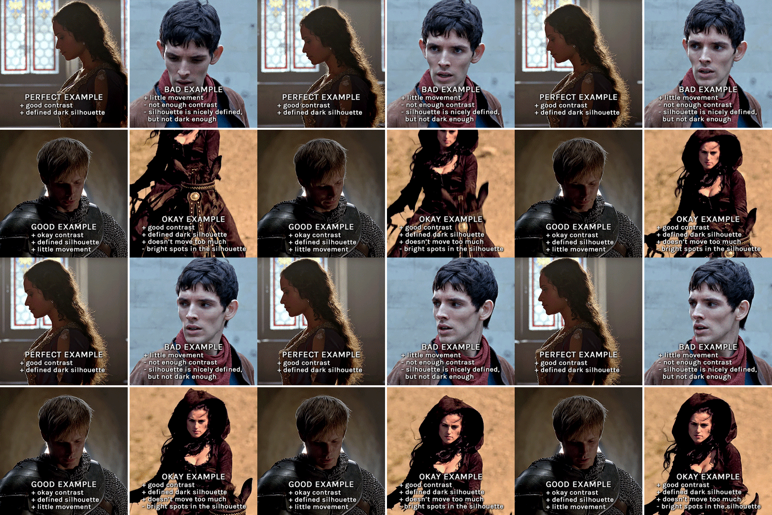
gwen: perfect example since this shot is already quite contrasted with a defined silhouette. there won't be a lot of work needed to make this one work.
merlin: not a great example because even tho there's a somewhat good contrast between him and the background, the silhouette is just too bright, not dark enough.
arthur: another good example, even if there are some bright spots on his face and armor. since he's not moving too much, you can definitely brush some black over him to make his silhouette darker (i'll explain/show later)
morgana: this one could work because the contrast is great, but of course her skintone is very bright against the black clothing. that being said, since the movement is not too bad, it could be possible to brush some black over her and move these layers with keyframes (as mentioned for arthur's example). i haven't tried it tho, but i think it would work well enough.
once you have your silhouette shot, you need another gif for the double exposure. what works best, in my opinion, are:
wide, large shots
shots with no to little camera movement (no pan, zoom, etc), but the subjects in the shot can have little movement of course
pretty cinematography/scenery shots
i find these are easier to find and make it work, it's not as "precise" as with silhouette shots. it's mostly just trial and error to see what works best with the silhouettes.
II. PREPPING THE SILHOUETTE
for the effect to work, we want a silhouette that's dark as possible. i'm gonna use the gwen and arthur shots as examples.
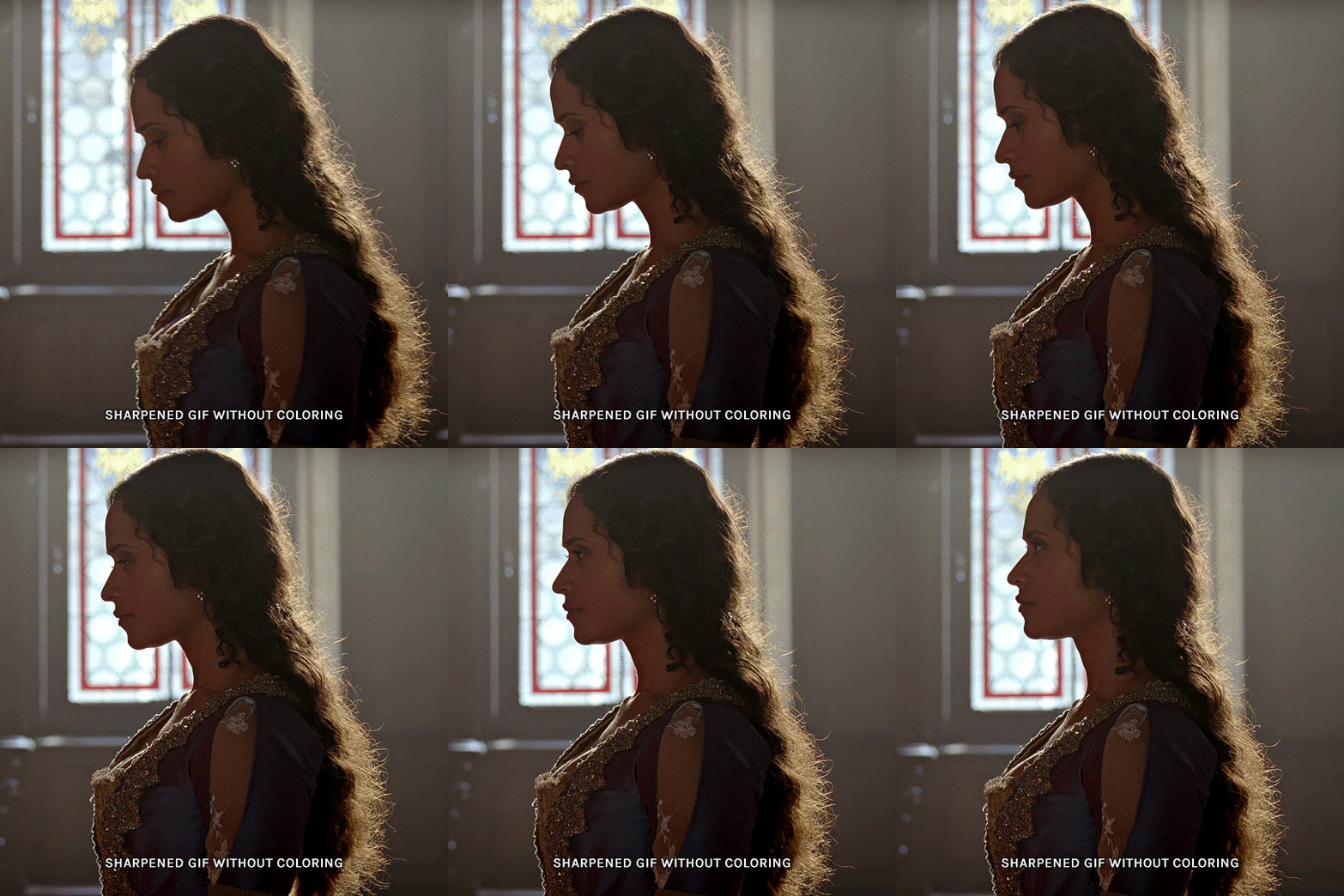
for the gwen gif, i started by sharpening, and then upped the contrast by quite a lot so her silhouette is mostly black, while retaining some nice details. i've used only 3 layers here:

selective color layer: in the blacks tab, playing with the black slider (value: +10)
brightness/contrast layer: added a lot of contrast (+61) and a bit of brightness (+10)
black and white layer: on top, its blending mode set to soft light and at 20% opacity. gives a bit more depth and contrast

then for the arthur example, i've also sharpened it first, and added contrast layers in this order (the skintone looks horrible, but it won't matter soon lol):
levels layer: black slider at 0, grey slider at 0.76, white slider at 104
selective color layer: in the blacks tab, black slider at +10
brightness/contrast layer: brightness at +1-, contrast at +47
black and white layer: on top, its blending mode set to soft light and at 20% opacity. gives a bit more depth and contrast
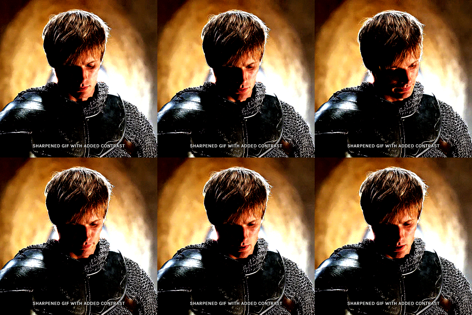
as you can see, half of his face is still quite bright. to correct that, create a new empty layer and put it between the gif and the coloring layers.
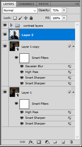
using a really soft brush and the black color, brush some black over his face and body on that new empty layer. you can edit the layer's opacity if you want, i've set mine to 71%. since arthur doesn't move much here, there's no need to keyframe this layer's position. for the morgana example, this is where you'd need to play with keyframes to make it work. here's where i'm at now after this:
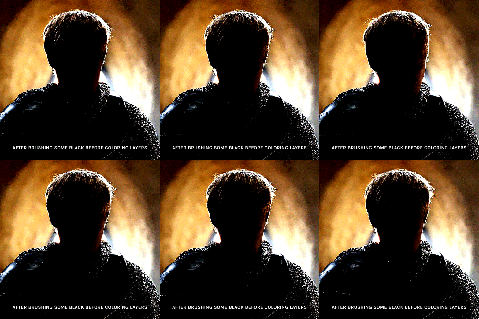
you can always edit this layer later if you need, after doing the double exposure blending.
once the silhouette is all ready, you can put all layers in a group and rename it (i've renamed mine silhouette).
III. BLENDING
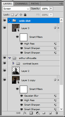
now the fun part! import the wide/scenery shot in photoshop, then resize it to the same height of your silhouette gif. make sure the gif is a smart object layer, and sharpen it. finally, bring this gif onto the silhouette canvas (by right clicking the smart object > duplicate layer). once you have both gifs onto your canvas, put the wide shot gif layer in a group, and set this group's blending option to screen.

you can then position the wide/scenery gif the way you like it in the canvas. this is how it looks for both examples after i've done that:

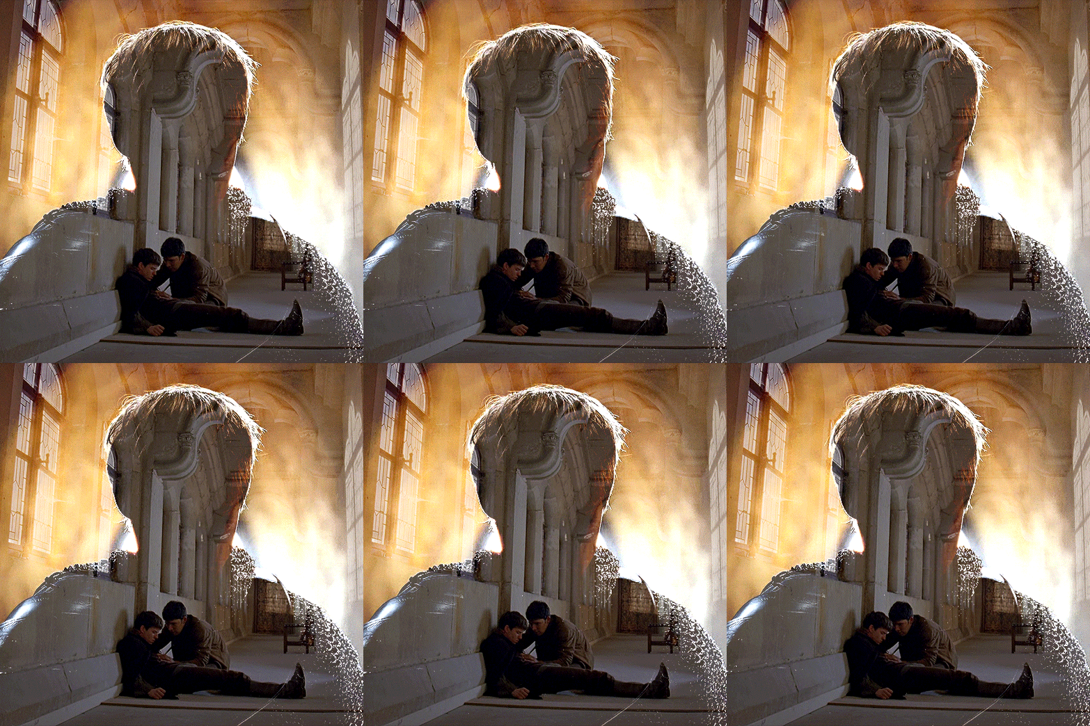
if the blending mode screen doesn't give you the best result, so you can play around with other blending modes (such as lighten and linear dodge in these particular cases), but generally speaking, screen is the real mvp here haha.
IV. COLORING
now that the double exposure effect is done, we need to color the gifs to bring them together. i went with simple coloring here, simply enhancing the colors that were already there. just make sure that the coloring layers for each gif are in their respective groups. here's how i've colored both examples:
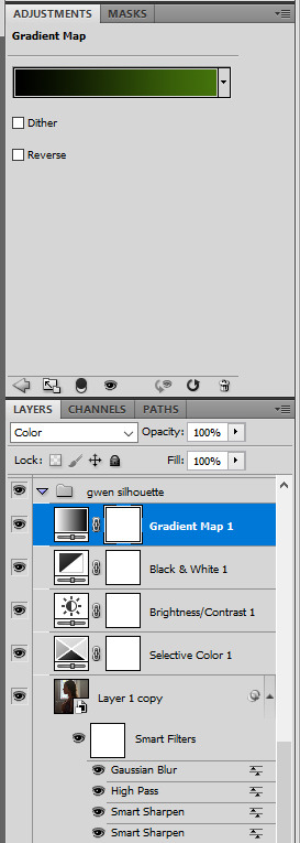
gwen silhouette group: i added a gradient map layer on top of the contrast layers in black to green and set the blending mode to color
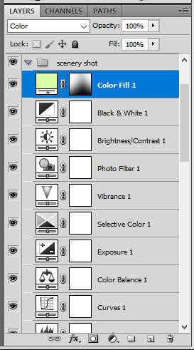
scenery shot group: multiple coloring layers, with a green color fill layer (blending mode set to color), with a layer mask so it only affects the top half of the gif
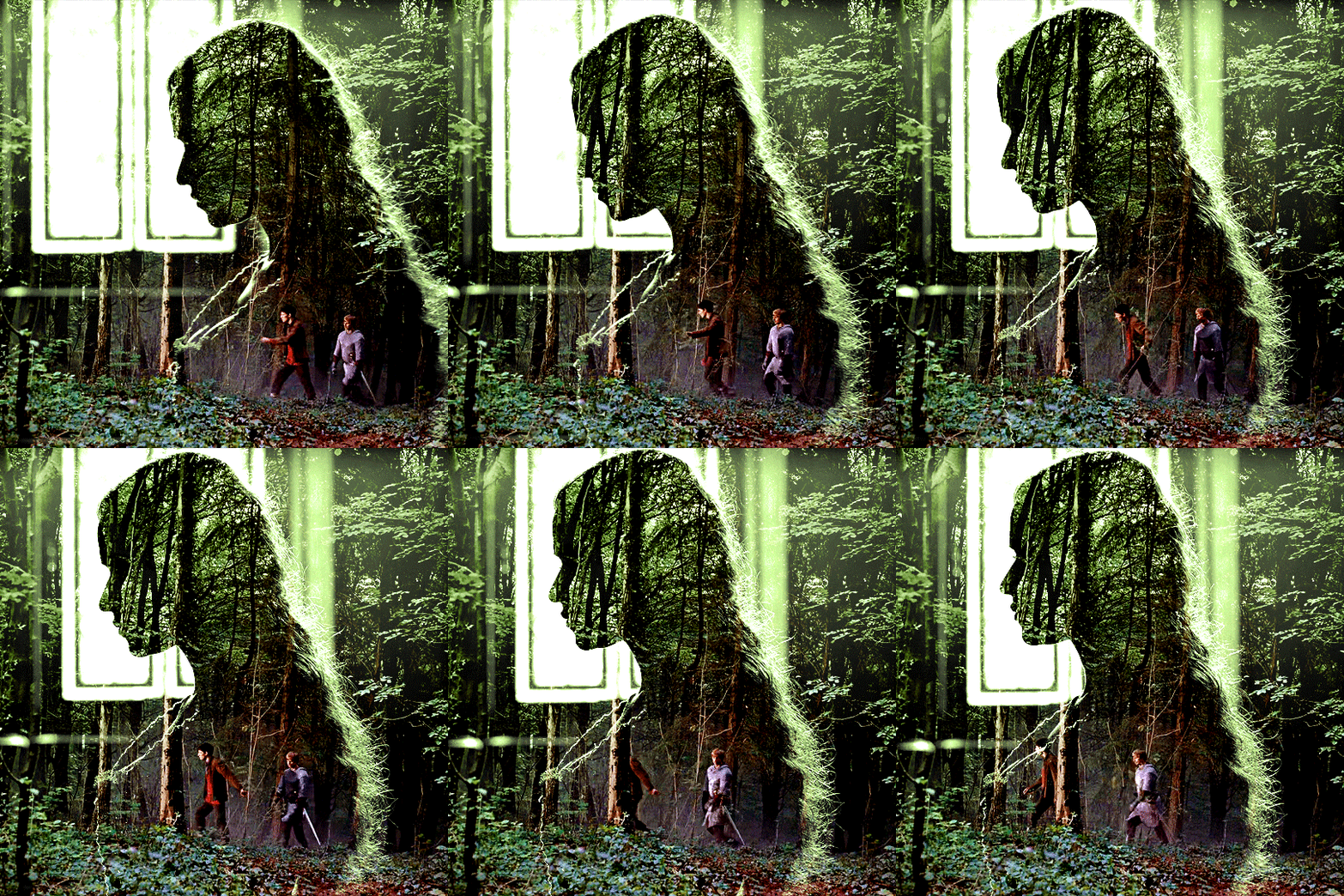
for the arthur gif, i did something very similar but with warmer colors. i didn't use a gradient map for arthur though:
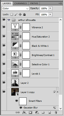
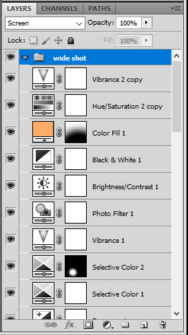
arthur silhouette group: i made the yellow warmer, closer to orange/red, with a hue/saturation layer, and added more vibrance. didn't feel like it needed a gradient map layer here though.
wide shot group: basic coloring layers to enhance colors from the merlin & daegal shot, and an orange color fill layer set to the color blending mode.
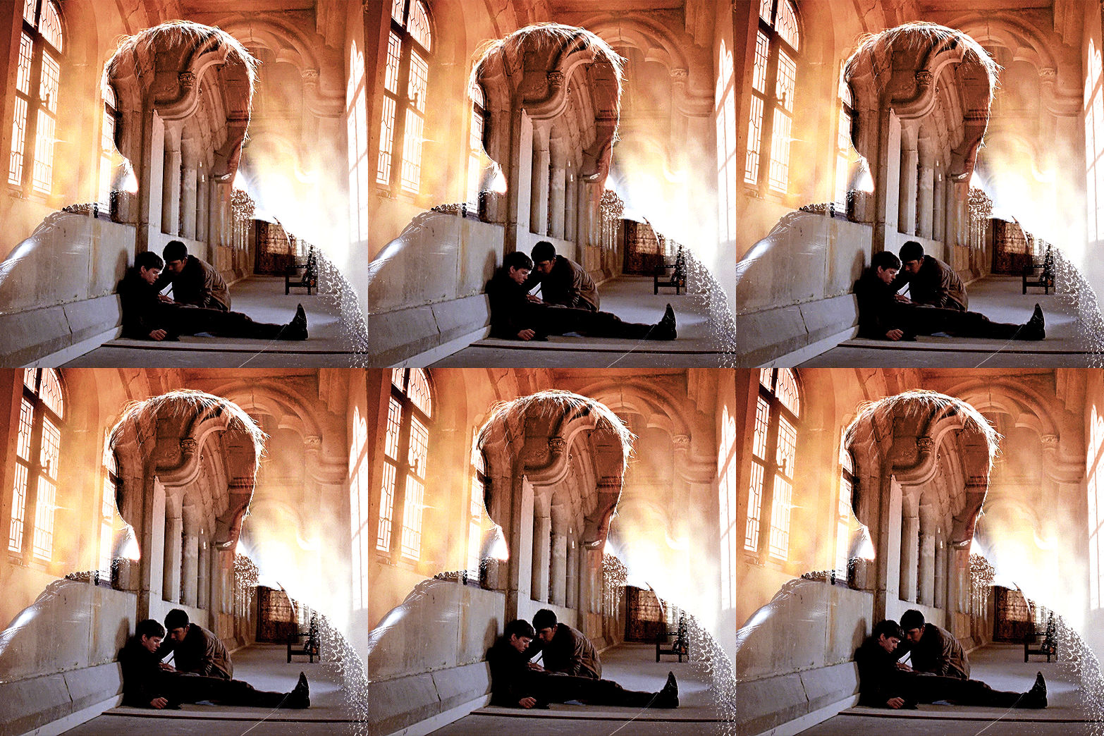
at this point you're pretty much done. just need to add some final touches and typography (if you want).
V. FINAL TOUCHES
a small and completely optional detail, but i wanted to soften the edges of the wide gifs. to do so i've duplicated the smart object gif layer and removed the sharpening filters (right click on smart filter > clear smart filters). put this layer on top of the other smart object layers (but still below the coloring).
then with this same layer still selected, go to filter > blur > gaussian blur... > 10px. this will give you a very blurry gif, but we only want the edges of the canvas to be softer. so add a layer mask to this layer. with a very large and soft brush (mine was at 0% hardness and about 800px size), brush some black onto the layer mask to remove the blur in the middle of the gif.

you can play with this layer's opacity or gaussian blur amount if you want (by double clicking on the gaussian blur smart layer filter). here how both examples look with this gaussian blur layer:
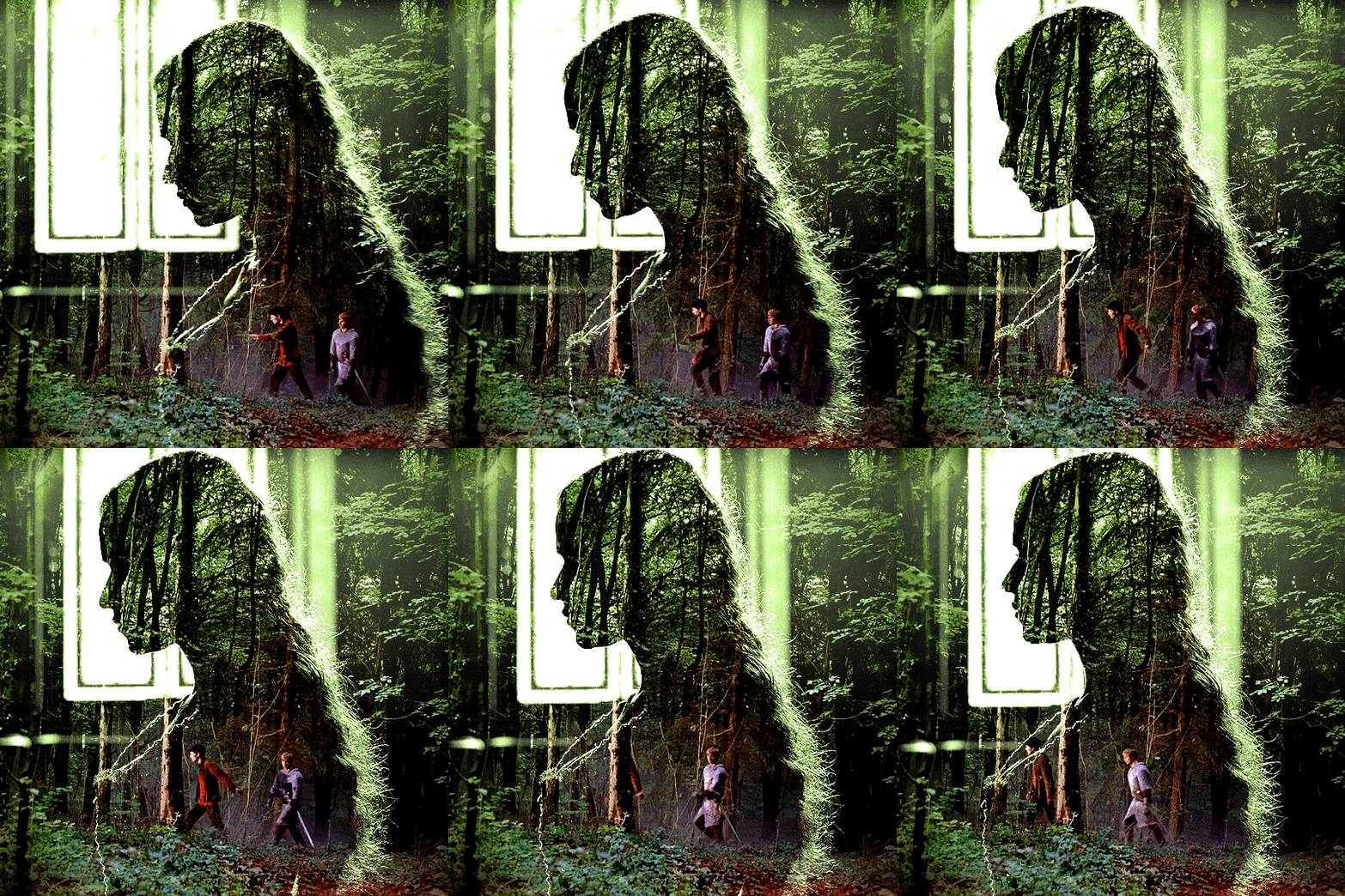

you can also mask some of wide/scenery gifs if you'd prefer, so it shows less outside of the silhouette. just put a layer mask on that whole wide shot group and brush some black or grey on the layer mask. it's what i did for the gwen gif, with a very soft brush and i set the mask density to 72% (i kept the arthur one as is tho):

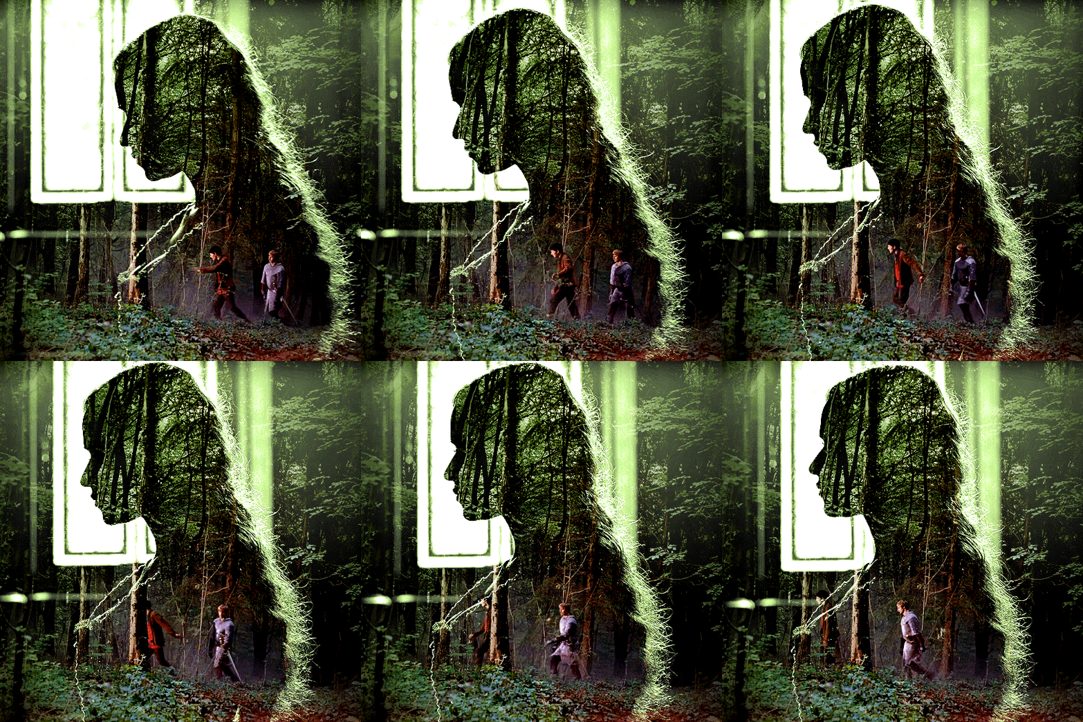
and that's how i did it! hopefully that was clear enough :)
#alie replies#*ps help#resource#tutorial#allresources#*gfx#usercats#usersmia#userrobin#userfaiths#usertina#usermoonchild#userchibi#uservivaldi#usertreena#userraffa#userriel#userelio#usermadita#usersmblmn
1K notes
·
View notes
Text
How do you do that? LOL I have no idea what I’m doing (maybe) An Art Tutorial
Folks have commented on my more rendered art recently and I’m flattered. I literally have no idea what I’m doing. Well, I sorta do. I am mostly using masks in Procreate. I’m technically using the Debaser Pack by True Grit Texture Supply, but you don’t really need it. All you need is some texture layers. You could even do this just by making halftones of solid color layers. I used to do a lot of digital photo collage back in the day and at one point had a huge library of scans of paper and fabrics and also random textures I saw on the street. Wood, stone, sidewalk, metal, foliage, water. Took out my digital camera (yes, it was that long ago) and snapped a photo to use. There’s also a lot of free halftone textures online.
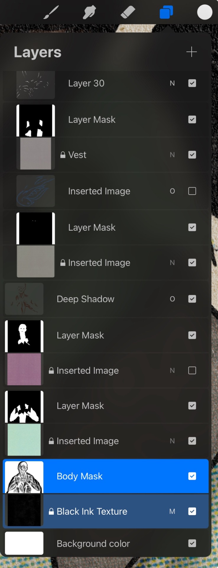
I have a few “overlay texture” layers. I “Create Mask” and then invert the mask so I can “paint” the color on. For my more simple stuff I do just that. I add a “Deep Shadow” layer in Overlay mode of a dark brown (or teal if it’s white) to make sure the darkest shadows are truly dark. The white areas are just the mask erased. It helps that fallout ghouls are skrungly and textured to be begin with. Sometimes I select areas and add little bits of black spray paint in lots of very transparent layers.
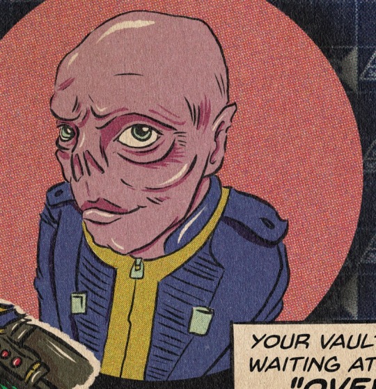
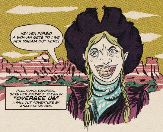
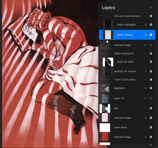
Everything is rendered under a multiply layer of a hi-res scan of vintage newsprint.
So how about the more detailed things that came about from an embarrassing amount of shirtless photo references??? In a lust-fueled haze I realized I can have a dark layer (in my case, a “black ink texture scan” with an inverted mask underneath a color layer. The color texture layer is around 70% opacity, give or take. On that black ink layer mask I add the white highlights to the tops of forms and use the smudge tool to distribute it across the specific form. Once in a while I shut off the color layer so I can see the bare rendering layer on its own and fix things.
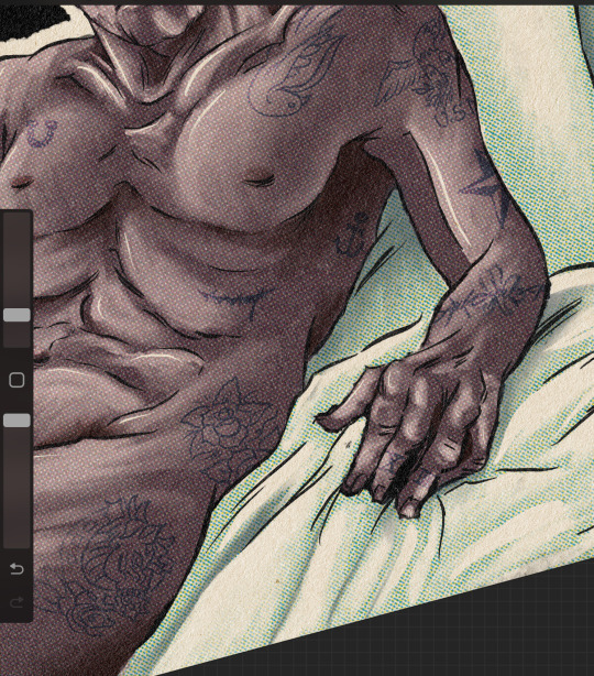
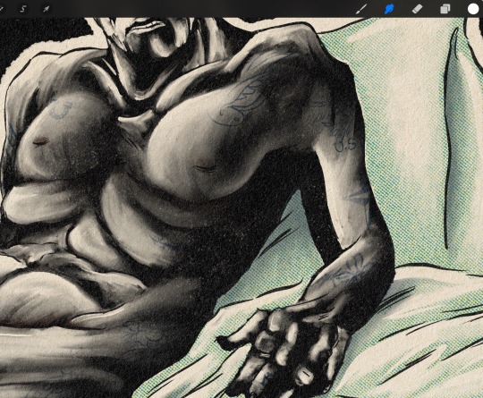
So I just sort of pet him. For hours.
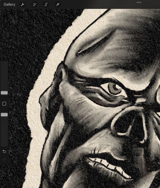
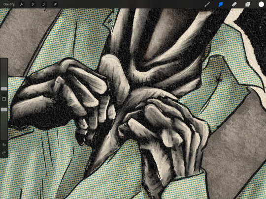
Focusing on the LIGHT areas instead of the shadow really is a game-changer! Before, my digital art looked super muddy because I was invested in adding dark. If areas are very very dark I add that dark brown overlay layer. For tattoos it’s a dark blue overlay mode layer, but with a mask on it so I can softly erase areas to make it look more set in to the skin (without destroying the original art). Very bright areas and the tops of forms I add a “highlight layer” of pure white gestural lines.
Moral of the story is just play around and do whatever. The old times of having a beautifully perfect anime-style drawing with very formal layers of shadow, highlight, color has been dead for ages. It’s what kept me away from pursuing digital art for literal years.
#and I’m getting better every day what the fuck i guess persistence and lust fueled haze pays off#procreate#layer masks#my art#art tutorial
32 notes
·
View notes
Note
hi, this edit is cool, would you please tell me how do you make the circle shape and text like that in the second gif?
https://mikelogan.tumblr.com/post/727834848573669376/forgiveness-is-warm-like-a-tear-on-a-cheek-think
hi!! i'm so sorry this took me so long to answer, but i've hardly been on my desktop for the last couple months and haven't been giffing. finally getting around to this and thank you for the kind words!

in this tutorial, i'll show you what i did as well as another way to achieve the same effect:
once you've made your gif and colored it the way you want, you can get the circle effect one of two ways. i'll show you how i did it first and then a more "normal" way lol
i actually had this circle texture laying around and for whatever reason, i decided to use that. so i popped that onto the canvas and used ctrl+T to center it both vertically and horizontally
then i used a glitter texture over the top of the circle layer and applied a clipping mask so that the glitter only shows up on the circle and not the entire gif. to do this, make sure your glitter (or whatever texture you decide to use) layer is ABOVE the circle and then right-click on the glitter layer and select "create clipping mask." you should see this lil arrow on the layer now:
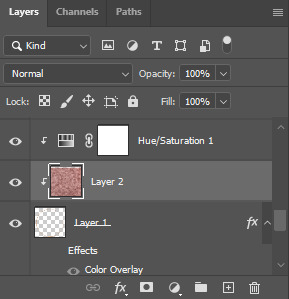
as a quick note about textures/overlays: chances are that if you just google "glitter texture png" or something similar, you'll find tons, but the png portion is important because pngs have transparent backgrounds. this wouldn't work if the circle texture was a jpeg because its background is not transparent and the overlaying of the glitter texture would appear on every pixel, basically just taking the shape of the entire jpeg rather than just the circle.
i have a resources (basically anything downloadable, from overlays to actions to psds) tag on my gifmaking sideblog as well as one specifically for textures and overlays. i also utilize the websites freepik, pngegg, and pngwing for pngs (especially freepik).
to make the glitter layer the same pink/purple color i used, i ended up using a hue/saturation layer above it and also applied a clipping mask to that layer so it only affected the glitter layer. this step is totally optional depending on the coloring you're going for. you might be happy with the glitter texture exactly as it is. you could also skip the hue/saturation layer and instead apply a color overlay to the glitter layer, select the color you want, and set it to screen or another similar blending mode. to do this, double-click on the glitter layer, select color overlay from the menu, choose whatever color you want, make sure the opacity is set to 100%, and adjust the blend mode to whatever you think looks best.
the "normal" way to do the circle would just be to use the ellipse tool (right-click on the rectangle tool and choose ellipse) and input your desired dimensions. to get a perfect circle, the width and height have to be the same as one another. then you'd continue on with the rest of the process.
for the text, create your main text layer. these were my settings for a 540px canvas:
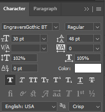
i also added a drop shadow to the layers with these settings (double-click the text layer to bring up this menu):

then i duplicated the text layer 6 times. select the first duplicated layer (the second line), use ctrl+T and your arrow keys (i only used the down arrow) to move the text down the desired amount of space. i made sure i moved each line down exactly 25 pixels, which is equal to 25 presses of the down arrow. i just think it looks nice when they're equally spaced. with each subsequent layer, i just dropped the opacity.
starting with the original text layer, i used: 100% -> 80% -> 60% -> 40% -> 20% -> 10% -> 5%, but this was just my personal preference.
anyway, that's pretty much it! but if you have any additional questions on this tutorial or any other set, just send me a message and i'll do my best to get to it much quicker than this one 💙
24 notes
·
View notes
Note
hello! I just found your blog via your recent titanic gifset with hozier lyrics and it truly is the most gorgeous thing I have seen on this site in recent times... so so amazing! could you talk about the fonts you used and a bit about the coloring/blending process? thanks so much and hope you have a wonderful week. - A
hello! this is such a sweet ask— thank you so much! i'm so thrilled to hear that you love my silly little titanic gifset 🤍
i spent,,,,,, way too much time on it as a way to try and distract myself from a) politics and b) the bomb cyclone. we live in a time.
anyway! it's probably the most labor-intensive set i've ever made: lots of frame by frame coloring, layer masks, etc., and honestly i would love to talk about it!
all of the gifs were challenging to some degree, but i'd be here for another two weeks if i went through the whole set, so i'm going to narrow the focus to just the second gif. info on how i made this guy below the cut!

i tried out probably six different scenes before i settled on the two that i used: rose wading through the corridor (top blend gif) and jack and rose embracing (base gif). i went with them because even though there's a lot of motion in each gif, they lined up more neatly than any of the other options— rose sort of wades through the embrace while staying pretty much centered in the gif
so, scenes selected! however, the color and lighting situation was... well. it was this:


dingy! dark! the hallway lights are a problem! me @ me girl what are you doing!
basic coloring/lightening on both gifs took me from here:


to here:


a good start, but i needed to drastically reduce the brightness behind rose in the base gif and manufacture some blue tones for the top gif to match general color scheme of the set. to that end, i turned each gif + coloring into a smart object, converted to frames, and sat down to do so much goddamn frame by frame coloring
for rose, i used a black color fill layer, normal, 65% opacity

for the embrace, i went with a custom blue gradient map, soft light, 100% opacity

once each gif was back in smart object form, i got to work fine tuning the color: amping up the blues, doing a little bit of lightening, making sure rose's hair really popped. after that, i did some final layer masking to make sure the blend was nice and soft


don't worry about how long the scroll bar is! everything is fine! yes there are multiple copies of both smart objects! it’s all good! <— actively lying.
the before vs. after is pretty great though:


on to text! i wanted to use a different (but complementary!) font for the large text on the gifs that didn't have orpheus/eurydice. i went with against— a little rounder, but still in the same vein as sunroll. the small text on all the gifs is tw cen mt std
to get the fancy color effect on the large text, i slapped a color overlay (bright blue, multiply, 61%) on a white text layer set to difference. to make sure the blue stayed blue, below that text layer, i duplicated the layer, cleared the layer style, and set the blend mode to color. as a final step, i went back to the top text layer with the color overlay and added a drop shadow (pale pink, normal, 29%)
the small text got the same color overlay + base color layer treatment, except the overlay (pale pink, linear burn, 100%) was different
there you have it! one (1) gif from the set that consumed two wholeass weeks of my life!
if you'd like more technical information on my personal giffing/coloring process, i have an absolutely massive tutorial that covers everything from start to finish. for blending, becca @nataliescatorccio (one of tumblr's undisputed giffing queens!) has a great tutorial that goes into more depth than i did here
all that said, blending/coloring/giffing in general really are just a matter of trial and error; practice and patience are your best friends
thank you again for the very sweet ask! i really had fun breaking down the work that went into the set 💕
11 notes
·
View notes
Note
do you think you could please do a tutorial for your greys anatomy edit (kinda similar to your brittana edits) i'm shocked if no one has ever asked you before for tutorials (and if you do i'd love to see them) your edits are so gorg and you're incredibly talented !
Totally! Bare with me, this is my first tutorial in like 8 years. Haha. I'll show you how I made this one:
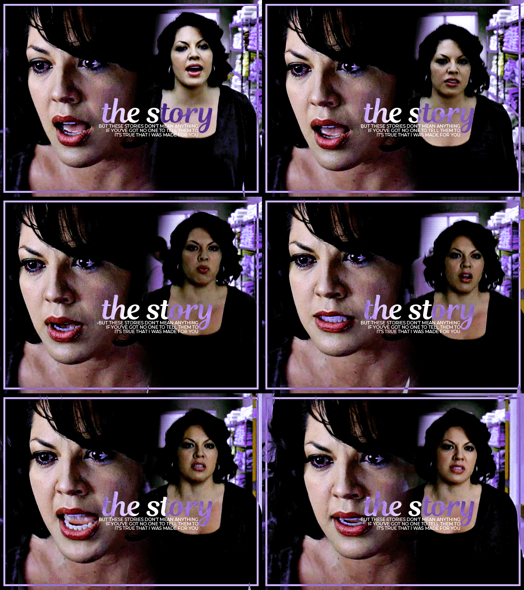
For reference, I use Photoshop CS5. (My computer hates the newer versions. It'll run three different video editing softwares but hates photoshop. Idk lol.)
Okay, first you want to make 2 gifs with the same amount of frames. That's important. And then you want to convert them to a smart object.
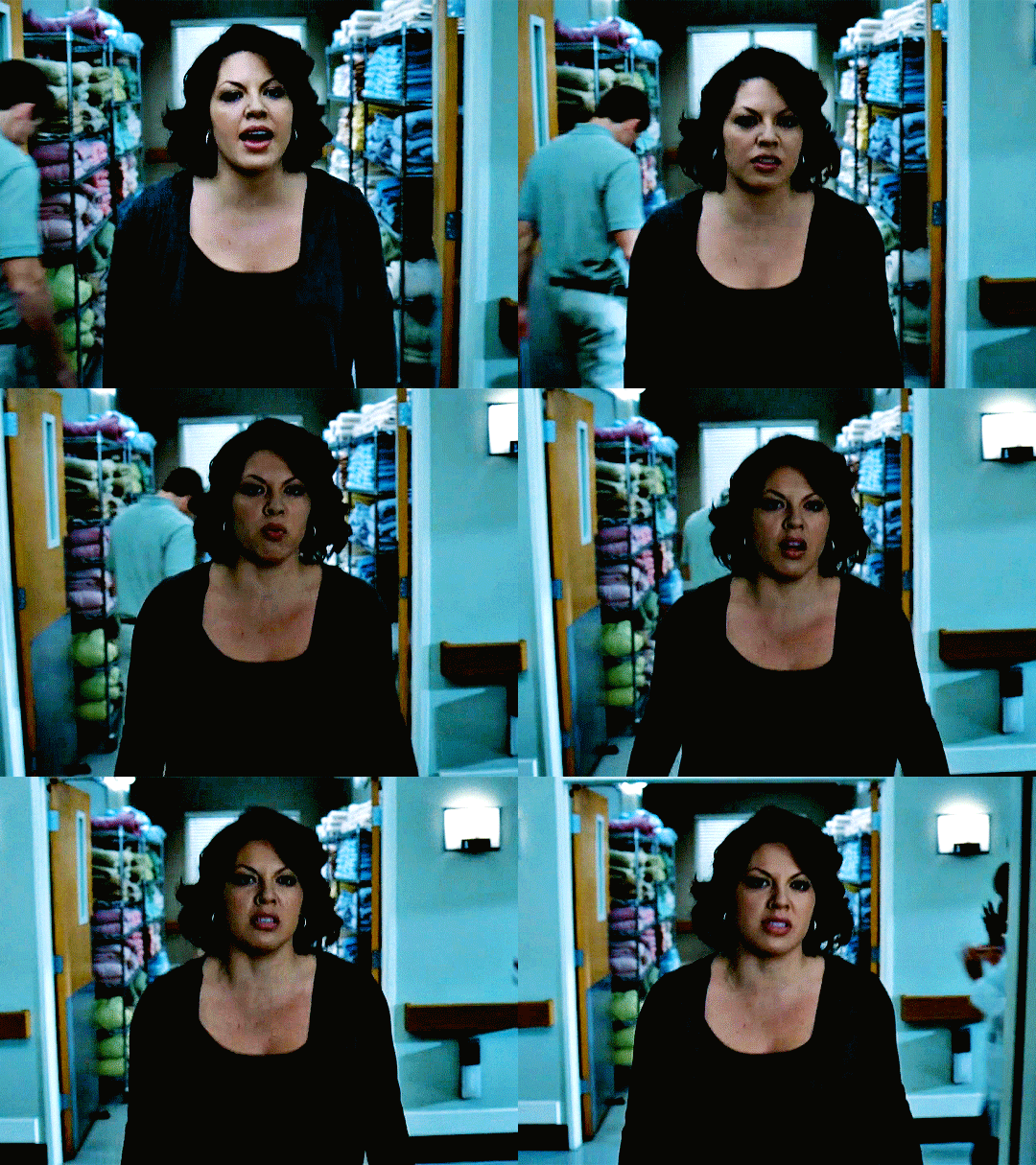
So we have these two gifs.
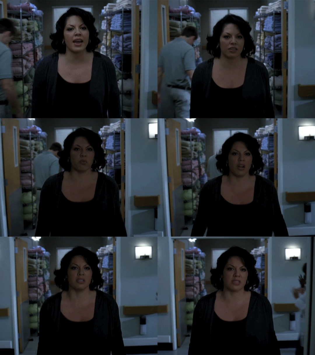

Now, depending on what you're doing, you can do this next step now or you can color your gifs how you like, save them separately and then reopen them with all the coloring on them. Sometimes I do this if I'm working with a lot of effects but since these two gifs have the same coloring, we're going right click on one of them (it doesn't matter which one tbh) and you're going to select "duplicate layer"
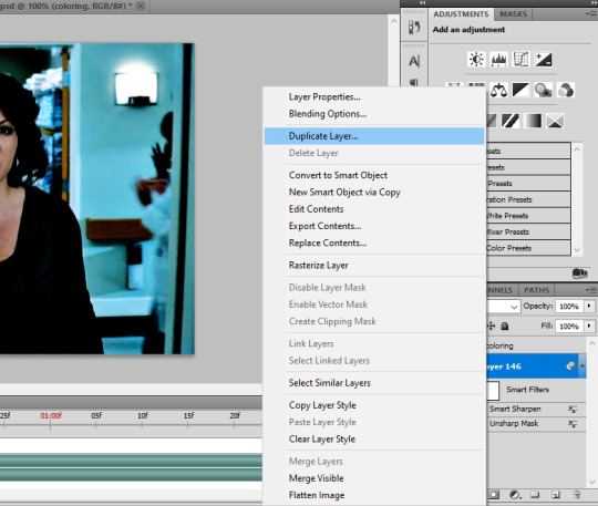
A little box will pop up and this is where you're going to select the project name that you want to essentially paste this gif on top of.
Set the top gif to Screen.
The first thing I usually do is sharpen them. So I use Smart Sharpen and Unsharp Mask with these settings:
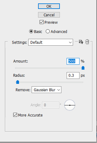
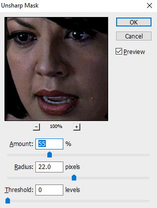
With Unsharp Mask, you have to tweak them depending on the gif, quality, what effect you're going for, etc.
Then we add some basic coloring:
Now, I have a base for specific shows because all shows are colored different. Grey's is more blue toned whereas Glee is more yellow toned. However, since coloring is a bitch sometimes, I'll add a PSD that I use ALOT. You can download it here.
So now that we've sharpened and added some coloring, this is what we have (separately):
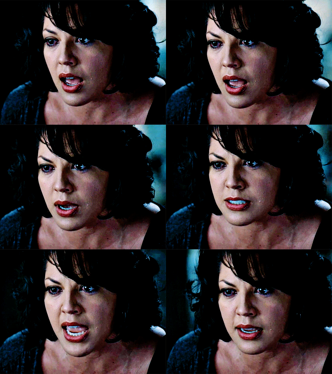
This is what it looks like after I set it to Screen (and I moved the top gif a little to the right.)
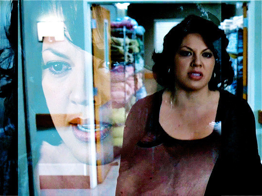
Obviously, we need to get rid of those lines and make it so that each gif is more visible.
So now we blend.
On the top gif, you're going to add a layer mask to that gif. So with that top gif selected, you're going to select the mask button that looks like this:
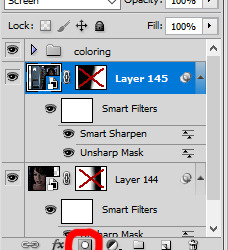
Select your brush tool and use a soft brush to erase what you want from the background of each gif. (Make sure to repeat the previous steps to get a layer mask on the bottom gif.)
I have this now, after using the brush tool.

As you can see, it's very blue and I wasn't feeling blue for this gif so we want to change blue color. That's where the Selective Color comes in.
We're going to get rid of that cyan tone. So you're going to add adjustment layer and select Selective Color.
All I did for this one was adjust the cyan tones in the drop down box.
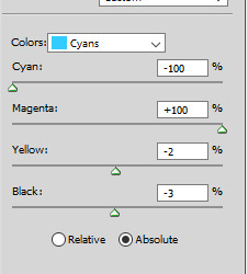
Now we have a pretty purple tone!
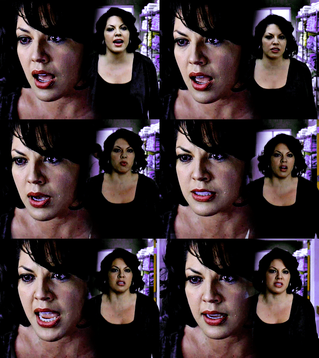
Now, we're going to add a light grey squareish box this to outline.
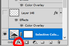
Set the blending mode to exclusion. To get the bar (and we'll do this again with the text) you're going to select the FX icon.
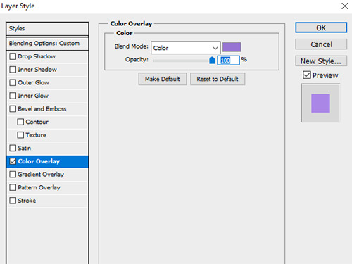
Select Color Overlay. A box will popup. You're going to set the blending mode to Color and then select whatever color you want the bar to be. (If it comes out with too much white, adjust the color of the bar itself to a darker shade.)
Lastly, we're going to add our text. For this gif I used Magnolia Script and Montserrat.
To get the purple effect on the "The Story" text, you're going to do the same thing you just did for the bar.

Voila! I hope this helped. If you need any further assistance, I'm always happy to help!
#tutorial#gif tutorial#blending tutorial#usergif#completeresources#mine#also anon you’re so fucking sweet
127 notes
·
View notes
Note
I would love if you could give some tips on making blended gifs with two dominant colors - for example your friends cheesecake set. I would love to make like that but I have no idea were I’m going wrong
friends cheesecake set
hi!! blending is honestly so hard to give tips on bc it's so dependent on the scenes but i can try! below, i link some tutorials that i have used and try to explain the methods i personally use :)
btw this is very image heavy with gifs as visuals to try and explain my processes!
the tips i give assume you have basic giffing knowledge and at least some knowledge and experiencing of both blending and coloring. if you have any questions on anything i explain, please don't hesitate to come ask!
firstly, here are some very very helpful general blending tutorials that i have used in the past: this one and this one go pretty in depth (both by the lovely @yenvengerberg.
secondly, here are some coloring/color manipulation tutorials that i love:
general color manipulation (different methods) again by @yenvengerberg
manipulating the background by @fionagallaqher
coloring gifs for rainbow sets! by @rhodeys
now, as for combining the two techniques, i use trial and error. again, both blending and coloring are very fickle and the methods can change based on the scene i'm using.
there are two ways that i blend gifs with two dominant colors:
color the gifs separately and then blend
or blend the gifs together and then color the whole gif
first method: color first and then blend —
i usually use this method for gifs with little movement and where the colors can be easily manipulated (see the coloring tutorials i referenced above).
an easy way to tell what colors are dominant in a gif, go to the hue/saturation adjustment and turn saturation all the way up to 100.
for instance, this gif of anakin has little movement and i can see the background has hints of blue.
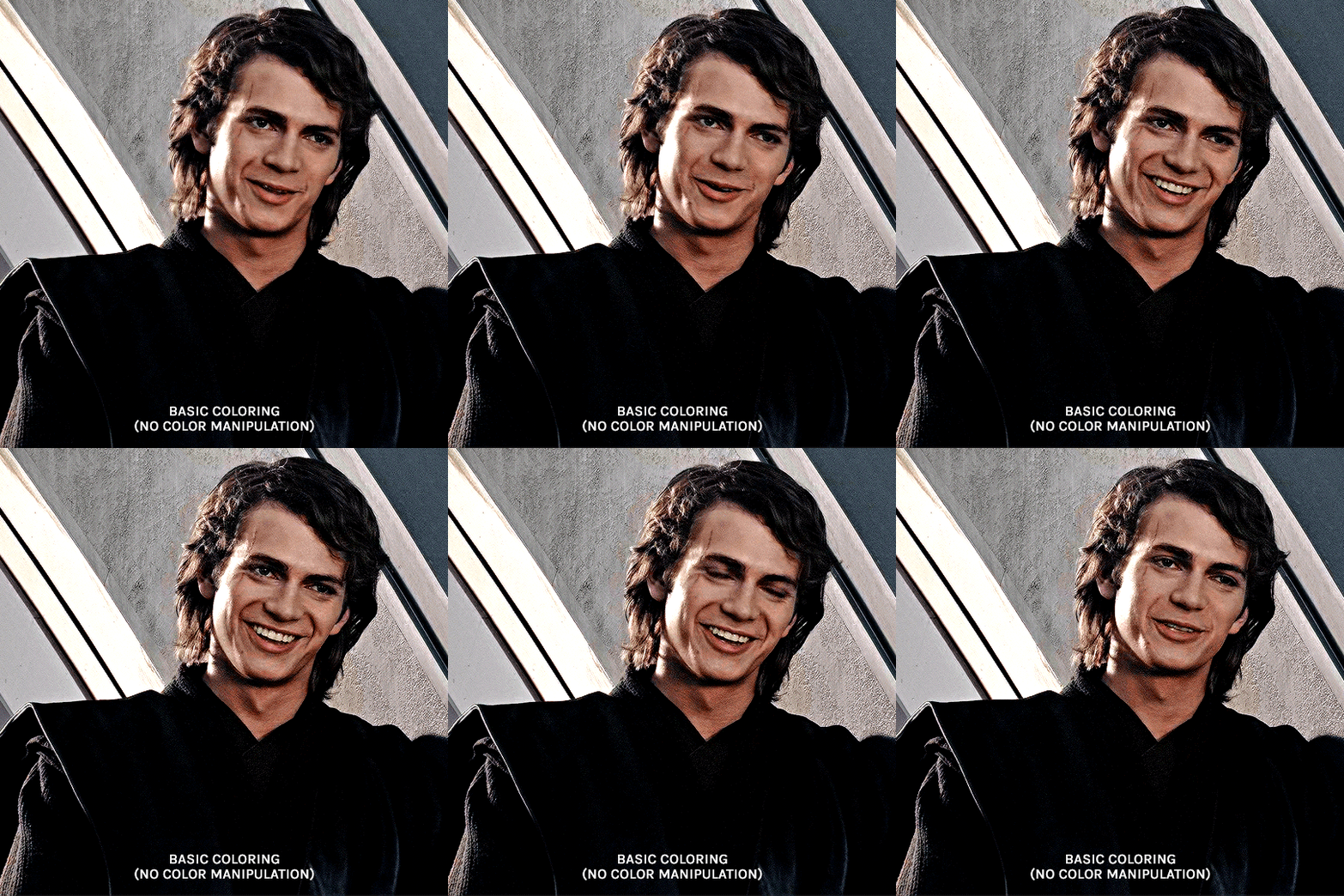
this gif will be easy to manually color on its own, seeing as i can use selective color and brushes to color the background. here is the same gif but now i have colored the background, and i used the method outlined in this tutorial:
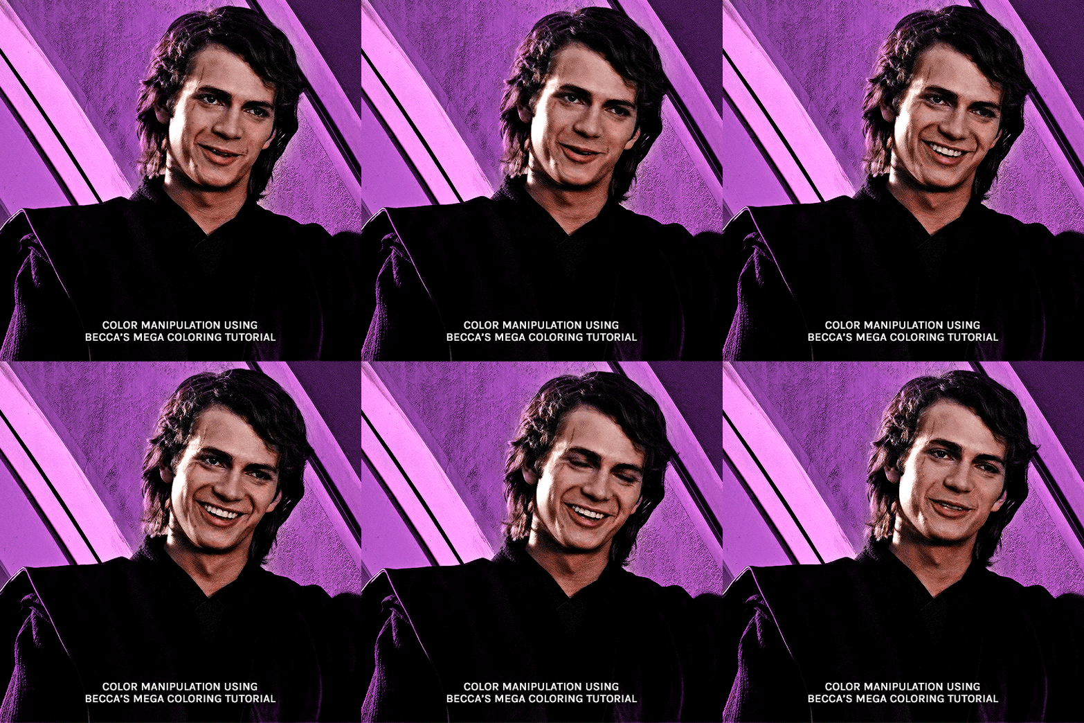
NOW, moving onto the second gif. the second gif/scene i chose also has little movement and a background that can be easily manipulated:

using the same method as the first gif, i'll now color this padme gif on its own.
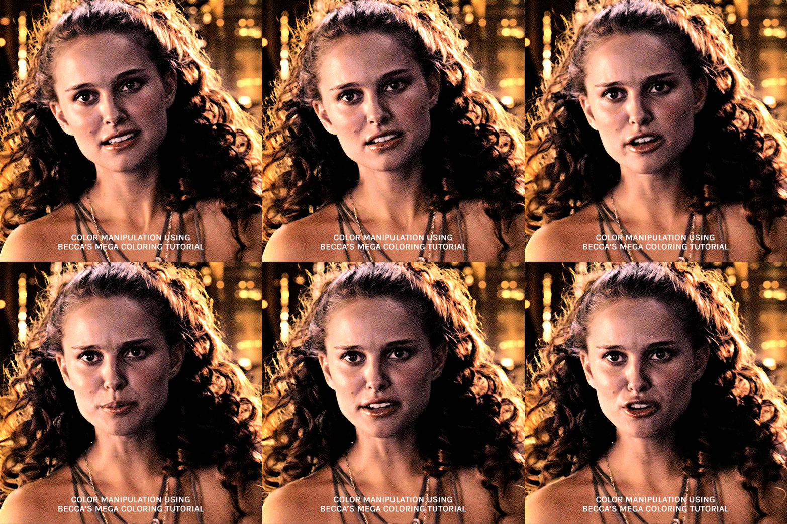
TIME TO BLEND!!! after converting the two gifs to smart object and putting one on top of the other, i set the top object to screen. for this example, i put the padme gif on top of the anakin one. this is what the blended gif and my layers panel looks like:
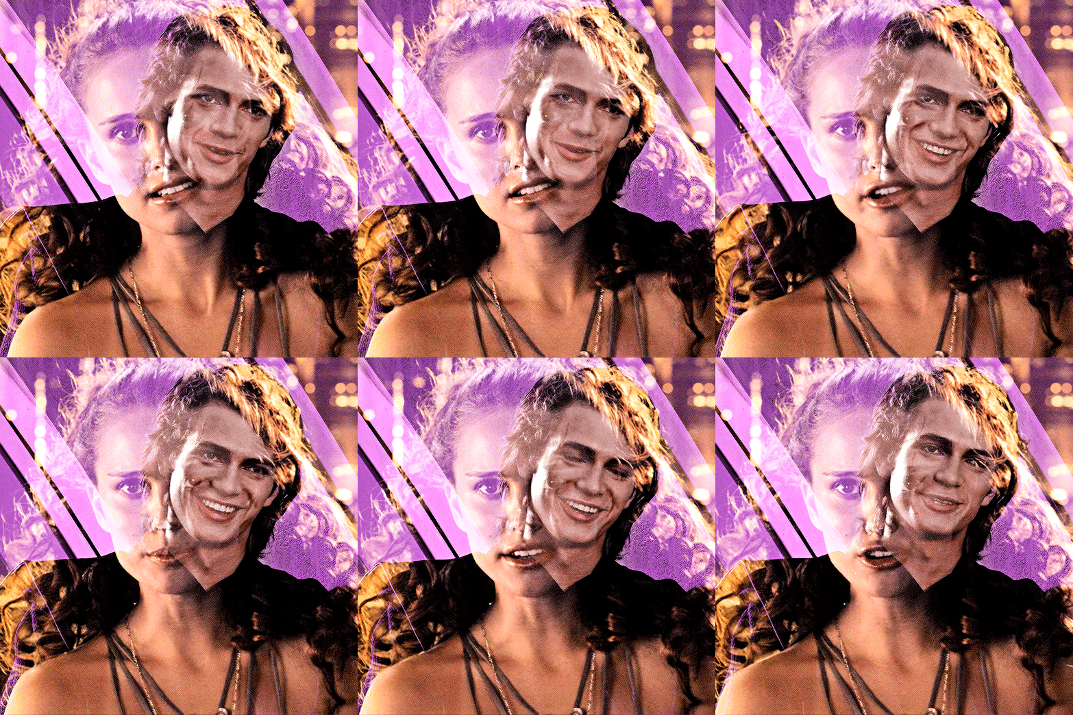

now, i'll create a layer mask on the padme gif and get rid of any parts i do not want or expose any areas of the anakin gif i want to see.
next, as you can see, the left side of padme's face is purple and pretty transparent. so in order to make it more visible, i will add a blank layer in between the two smart object and use a black brush to paint the areas i want to see (see this tutorial!!)
and here is the final blended gif:

now, you can totally stop here, but for me, it's pretty purple-heavy and i'd like to see some more orange. so i simply take an orange brush and color some areas i'd like to add more orange, and then set the layer's blending mode to color.
and HERE IS THE FINAL PRODUCT!
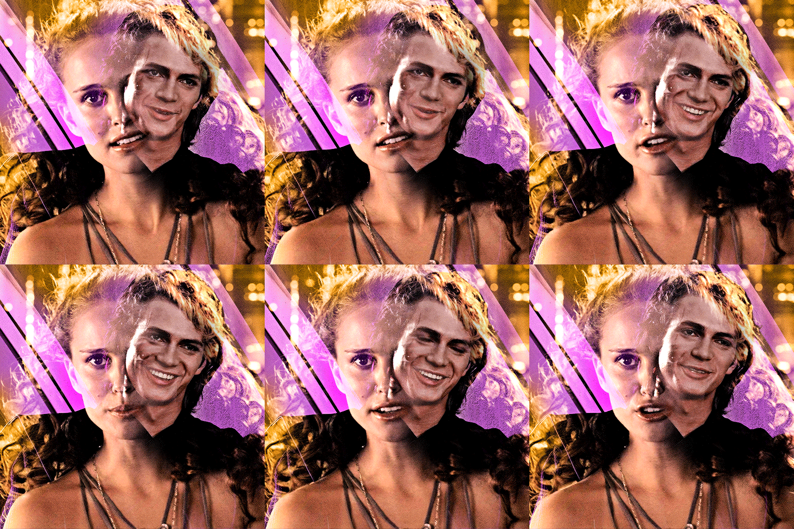
second method: blend first and then color —
i usually use this method when at least one of the gifs/scenes i want to use has colors or a background that is difficult to manipulate. or sometimes i do this because i just don't know what i want my coloring to look like and blending first gifs me a better sense of the whole gif.
there are two different ways you can blend first and then color. using the brush tool or the gradient tool.
brush tool:
using the brush tool is the best method when there is little movement and when you have distinct subjects to color around.
for instance, this gif of rhaenyra. while there is little movement, the background is a similar tone to her skin so it would be difficult for me to use selective color.
i could possibly use a brush to color the background, but i do not know how that will blend with my other gif and i don't know what coloring will work best overall. this is why i want to blend first!

and now for my second gif. similarly to the rhaenyra shot, the background of this alicent shot has very similar tone to alicent's skin color, so selective color would not work:
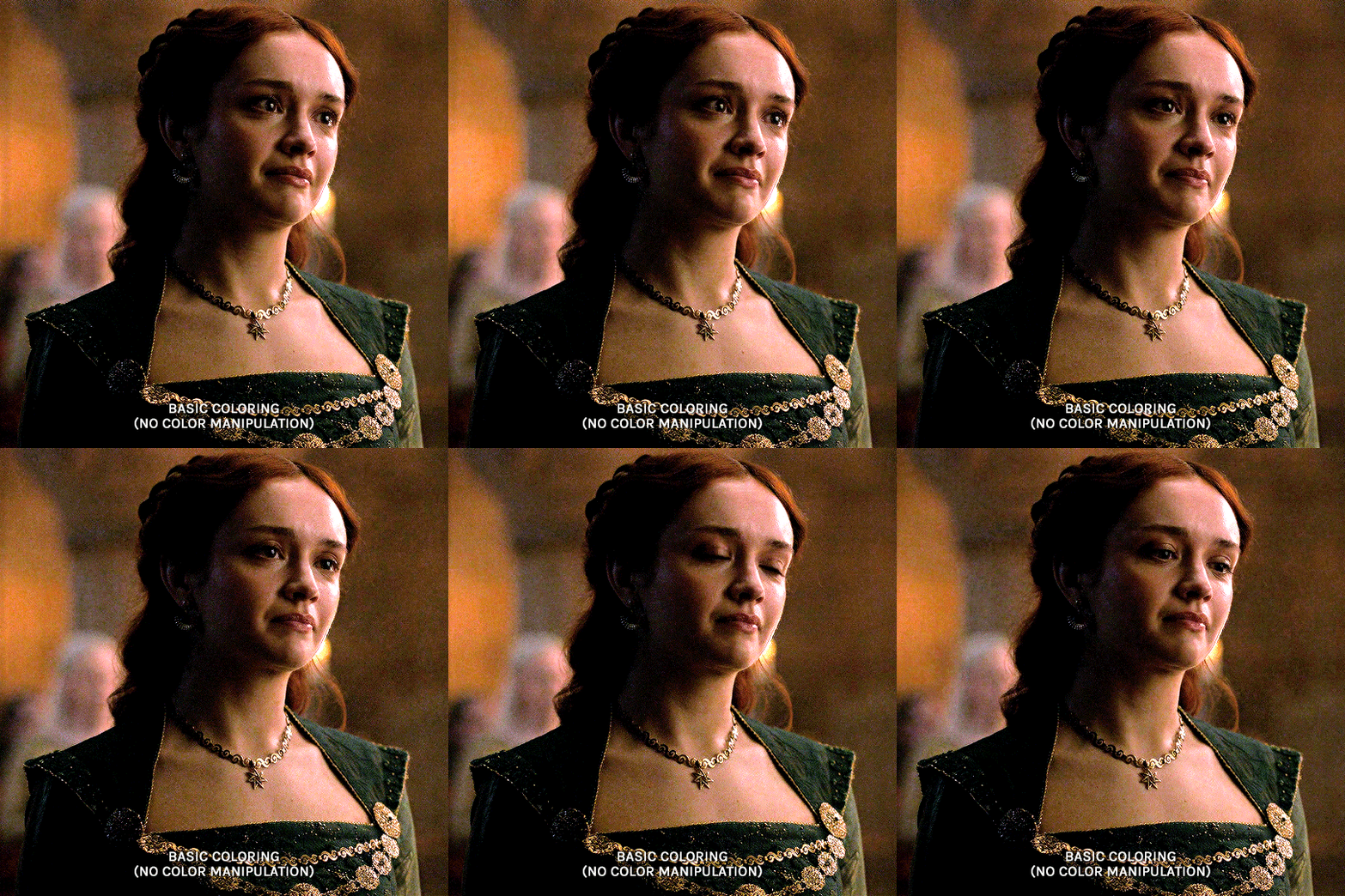
TIME TO BLEND!! i do the same thing as the last method (placing one smart object on top of the other) and this is what it looks like:
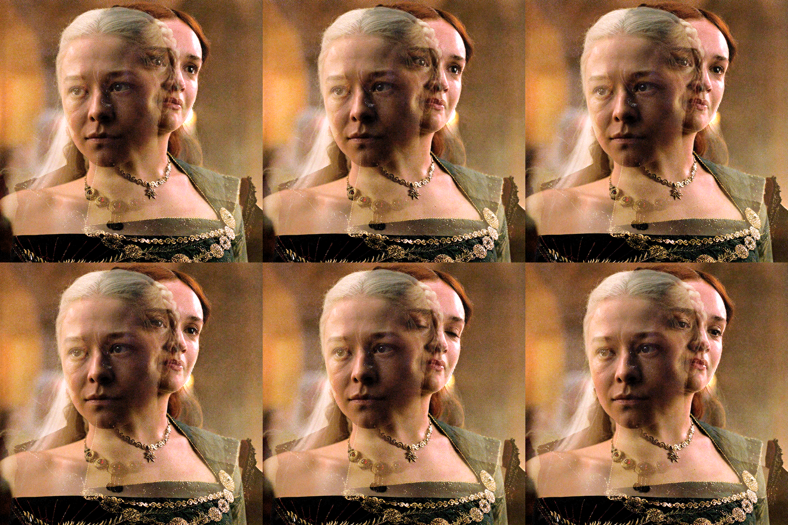

following the same steps as last time, i erase what i don't want and paint over areas i want to be more visible. this is what i came up with:
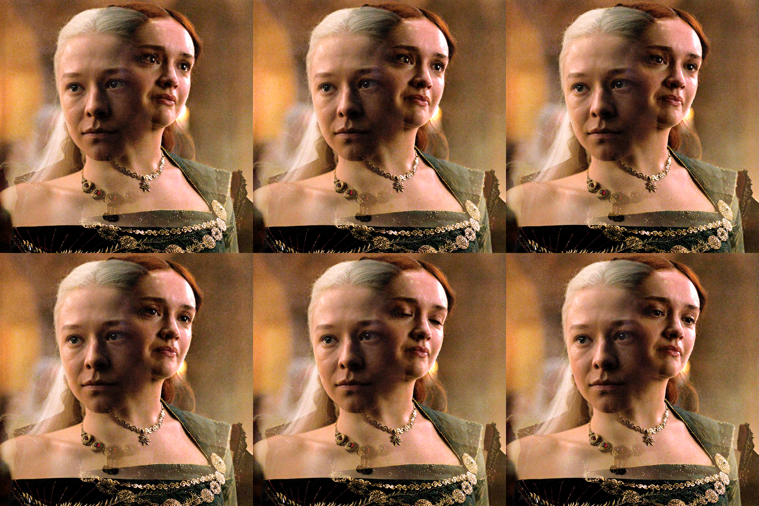
because there is that orange light on the left hand side of the gif (on rhaenyra's side), i decided to play into that and go with orange as one of the colors. sometimes the color scheme i go with depends on the colors i find in the gif bc that's just easiest!
now is when i use a brush to color the background! i color the left side with an orange brush and set the blending mode to 'color':

for the second color, the background on alicent's side is kind of neutral so i'm going to pick any color i want! i decide to go with green bc that is her color lol, and i do the same method, coloring with a green brush and setting the blend more to 'color'.
this is what i came up with:

you can totally stop here, but i like adding colors to the bottom, orange on the right and green on the left, so it kind of ties it all together.
HERE IS THE FINAL PRODUCT! (notice how in the bottom left corner, there is some hints of green. similarly for hints of orange in the right corner)

gradient tool:
another tool i use is the gradient tool (not to be confused by an adjustment layer).
this tool is really good for blended gifs that have lots of movement or where there are subjects that are difficult to draw around with a brush.
for example, this blended gif of yennefer has lots of movement so the brush tool may not be the best method.
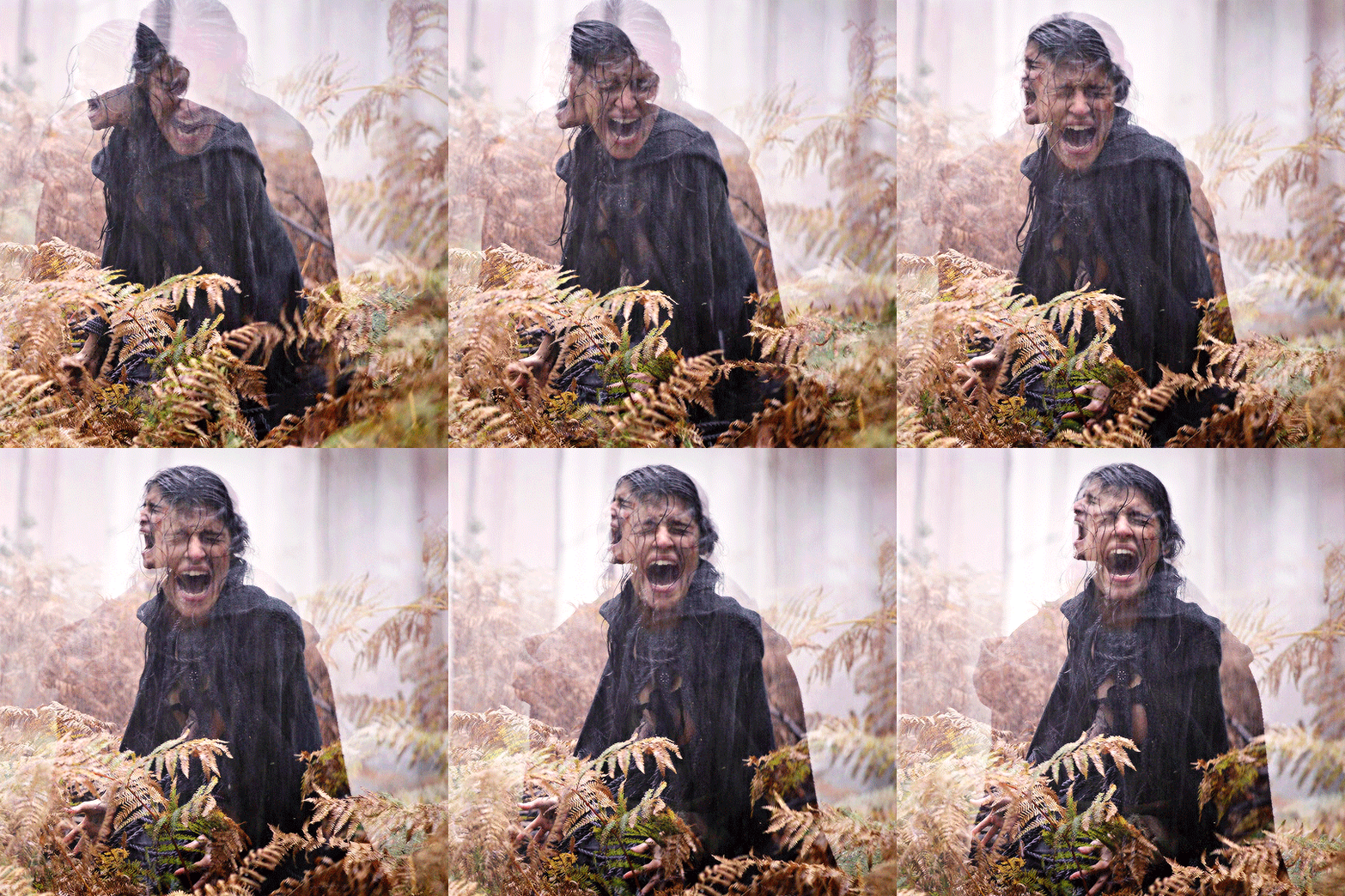
here is where the gradient tool comes in! i add a new layer and draw a gradient in the direction i want. this is what my gif and layer panel looks like:
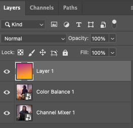
next, i change the blending mode. this heavily depends on the scene and also what looks good to your eye, but i usually alternate between 'overlay', 'soft light', or 'color'.
for this gif i chose 'overlay' and this is what it looks like:

again, you can stop here...BUT i want to go back in and intensify the pink/purple color at the top in the white areas. to do this, i am going to use a large soft brush and paint areas, setting the layer's blending mode to 'color.'
HERE IS THE FINAL PRODUCT:

and those are my methods!! if you made it this far, thank you for reading and following along. i hope that this was at least somewhat helpful and huge shout out to @yenvengerberg who's coloring and blending tutorials basically taught me everything i know.
if you still have any questions at all pls feel free to hope in my inbox :D
#ps ask#ask#anon#userabs#usermorgan#tuserheidi#useraish#rogerhealey#usershreyu#userkosmos#angelblr#tuserabbie#userelio#*tutorial
142 notes
·
View notes
Note
HELLO could you tell me PRETTY PLEASE how did you make the halftone colored effect on your latest gr63 poster? tysm!
Of course!! I love talking about my graphics!!
I learned how to create the halftone effect from a guide I cannot find right now but my steps are as follows. heads up that I work in photoshop so everything is photoshop specific I fear.
Under the cut since there is a ton of images here o7
For the halftone effect
Import image of my choice and convert it to a smart object. This guide should theoretically work without a smart object with clipping and/or layer masks but smart objects look better + they keep my workspace more organized
In the smart object I create a new layer with a solid fill of #808080, convert it for smart filters (Filter > Convert for Smart Filters) and also set it to Hard Mix in the layer blending modes menu
Open the smart filters menu for the layer (Filter > Filter Gallery) and I create two layers, first Halftone Pattern with the following settings and on top of it Torn Edges with the following settings
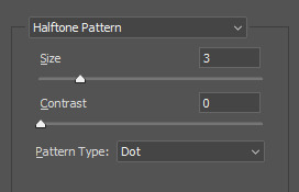
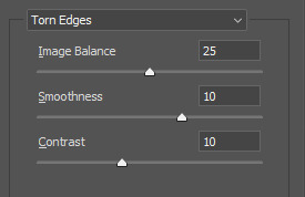
You can fiddle with these obviously but I have never changed these since I started using this for my halftone effect
4. Now your image probably looks like this, really wonky and bright
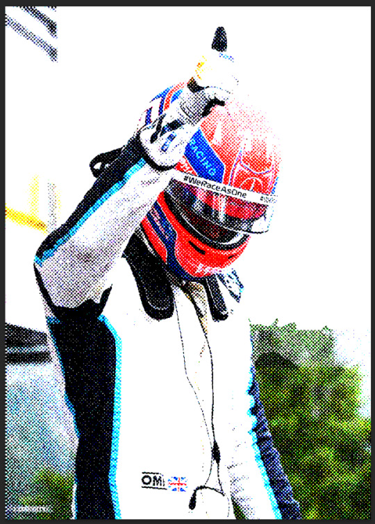
To fix it I create a new adjustment layer, usually Levels but I have used Curves before as well and fiddle with it until I like it. Dont be afraid to use multiple and just mask it! For example here Tadejs jersey is white but the background is black so to keep the texture I masked the jersey and adjusted it separately.
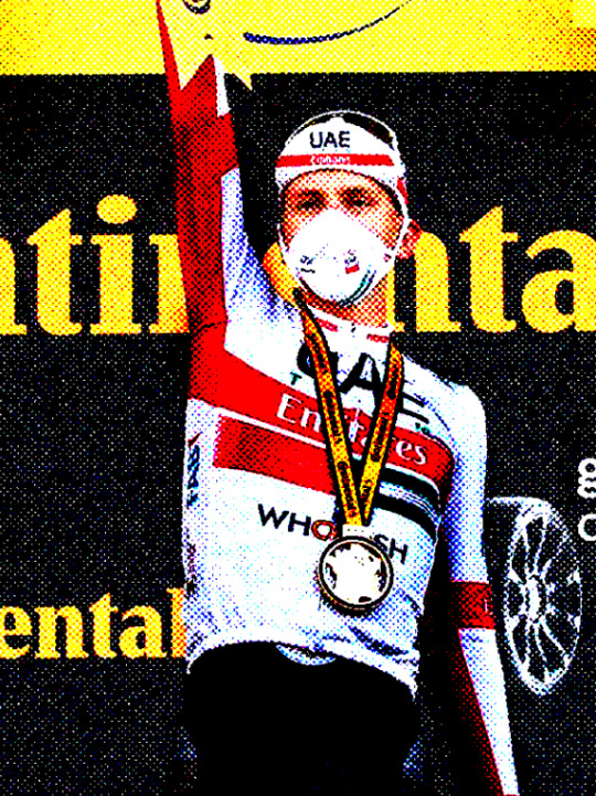
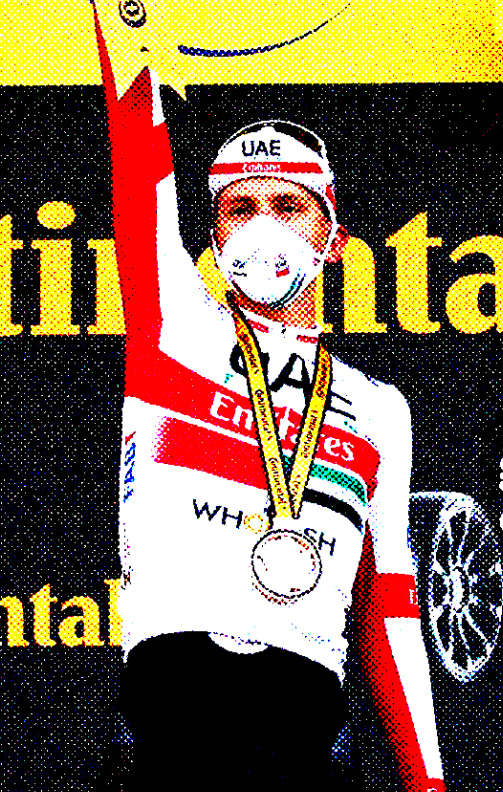
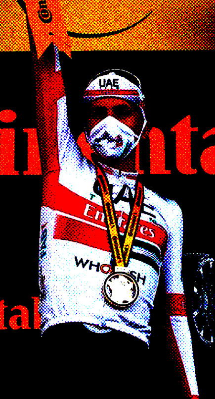
Final effect vs adjustments to keep the background texture vs adjustments to keep the jersey texture. By combining the latter two I achieved what I wanted
If I want my image in grayscale I also add a Black & White adjustment layer in between my initial image and the Levels layer, though for the effect I achieved with the George graphic we dont want that.
Gradient colors
First of all I make all my multicolored graphics using gradient maps. I am not particularly knowledgeable so my apologies but I cannot even try to begin explaining gradient maps.
So for a multi colored effect I create a gradient map once I have an image that I am satisfied with and adjust it until it looks good. Important that the color fully on your right on the gradient map is the color you want to have in the background which in my case is the beige I use everywhere.
After that I save my smart object as I would usually do (Ctrl + S) and exit to the main graphic and ideally, it should look the same in your graphic as the smart object looked.
Unfortunately I cannot help with color choices/color theory for the actual gradient map since I barely understand what is going on myself lmao. Fwiw personally I think Synth (@/jamesvowles) is awesome with colors and how they work together in his paintings so maybe he could be of any help o7
Solid colors
This is for cases like this, where all my colors are solid flat, no matter how many colors
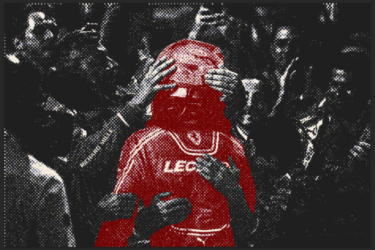
This is where the Black & White adjustment layer mentioned comes into play. For when I do solid colors only, even with multiple like in this graphic, I create a new color layer on top of all my other layers, fill it with the color of choice, and set the blending mode to screen. no idea why screen works, someone smarter with blending modes would probably be able to explain though.
For different colors I just mask out the areas I want the color to appear in.
Final step is to combine all my layers into a folder and under that folder I create a new solid color layer with the background color of my choice, in my case beige, and set the folder blending mode to darken. Once again, I have no idea how it works but it does and that what counts to me haha, someone smarter with blending modes would be able to explain most likely.
On a final note, do experiment!! Oftentimes I like getting to the point of where I would have usually used a gradient map (so no B&W layer) and then see what I can do with blending modes! Thats how I ended up with this image of Primož, its just a yellow color fill layer set to Hue blending mode
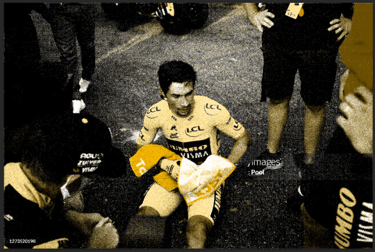
Hopefully everything makes sense, feel free to ask more if you are confused or want to know more about any part of my graphics <3
#ask#anonymous#eric.graphics#thank you for asking about my graphics I love talking about them!! do ask more if you want to i get stupidly excited about this
8 notes
·
View notes
Note
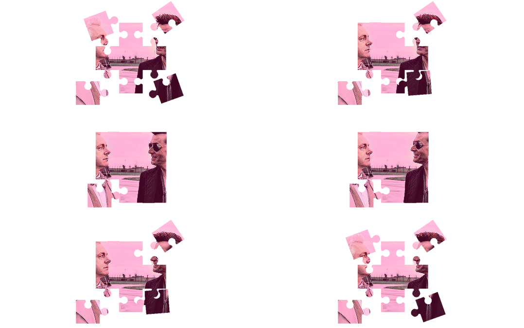
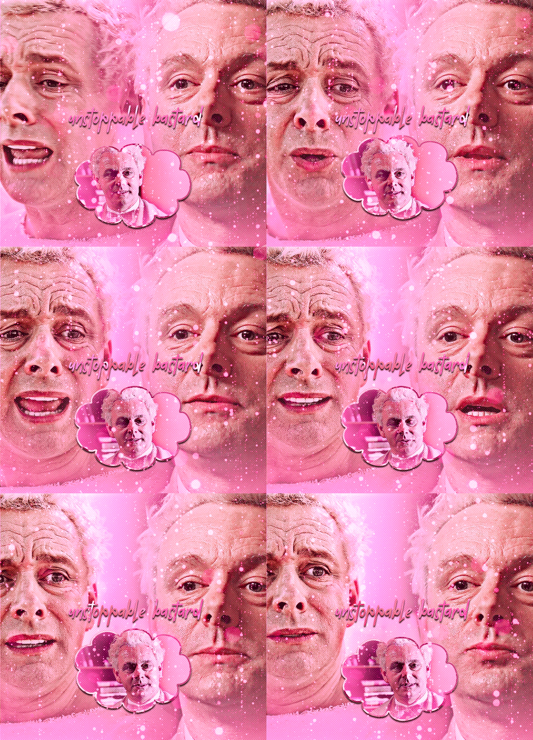
hi! sorry if you've already answered that but, i saw your good omens (the unstoppable bastard/immovable dumbass one) and i really loved it, i found it so artistically and aesthetically beautiful. frankly i am in awe with it and i was wondering if you'd be willing to share some tutorials on the effects you used for the gifset (like the puzzle piece and heart for example)? do you maybe already have a tutorial tag that i could go through? thank you so much!
hi! first of all, thank you!
to do a similar effect like i did in this post or something like the transition in the last gif of this lovely edit firstly you will need to either find (on stock sites) or make yourself (from a youtube video or using shapes in photoshop) a gif that has a simple shape and a transparent background.
a little tutorial under the cut (assuming you know the basics of gifmaking) (this may not be the best/most efficient way to do it but it's the way i'm used to).
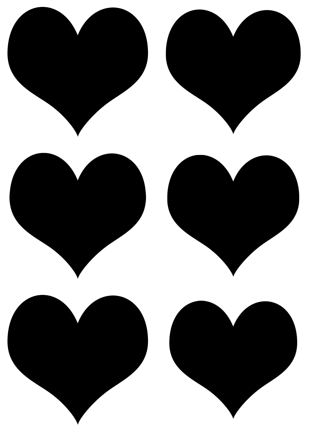
for example, i made the heart gif using photoshop's custom shape tool, repeatedly pasting it on different layers, resizing so it would look like a beating heart and making frames from it (you could probably find something better on the internet):
the puzle was something i found on some stock, deleted the frames i didn't need, removed white background and painted with black brush (not really necessary since we'll be dealing with shapes, just easier to work with) so i got this:
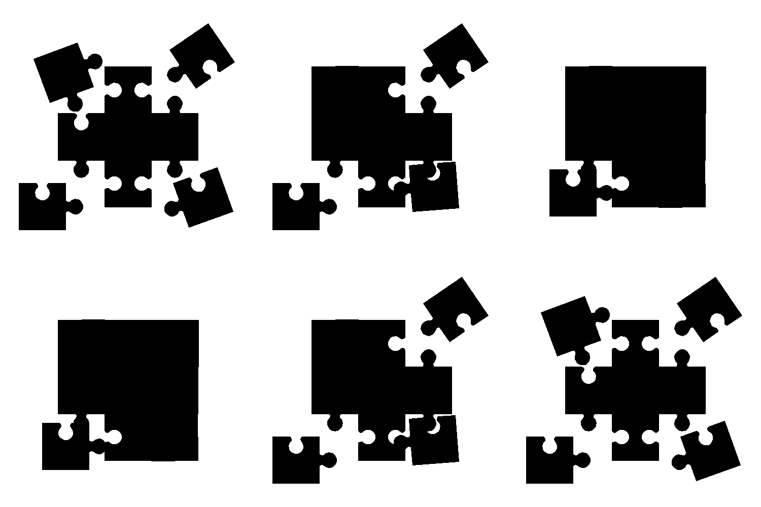
i made the rest of the small gifs in the same way: floating cloud moving the base photoshop cloud shape up and down, moving the strip (also found in the custom shape tool) like in this youtube tutorial and manually rotating the shape of a star shape i found on some stock.
now that you have you desired shape gif, select all the frames and make sure they have the same delay time:
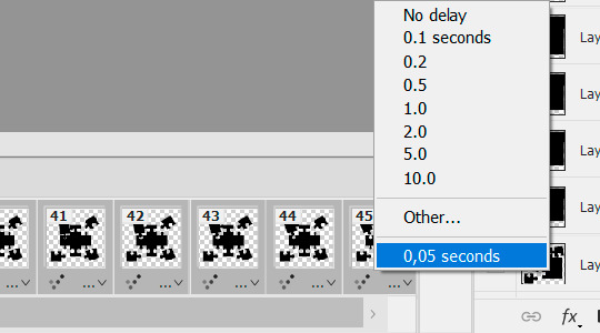
press convert to the video timeline:

select all the layers:
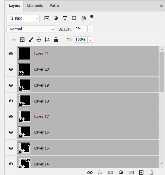
filter > convert to smart filters:
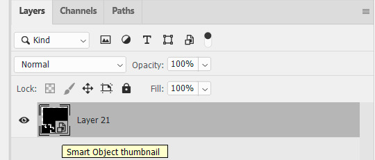
upload the exact same amount of frames for your scene gif (i'm using 45 frames here), resize, set delay time exactly the same as you did for your shape gif (i set 0,05 but it doesn't really matter, they just need to match) & convert frames to smart filters as you did for the shape gif. this is where i usually do my sharpening (not on the sceenshot because i reused another gif, but that's not relevant here).
now put the shape gif on top of the scene gif, resize it and position it to your liking (i switched the colors for better visibility):
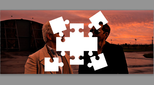
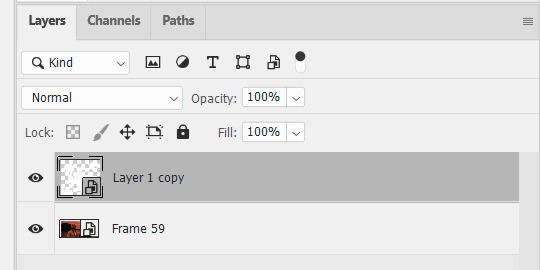
your timeline shoud look like this & the duration of both sets should match because you used the same amount of frames and set the same time delay:

the gif currently looks like this:

after you're more or less satisfied with the position of the shape gif (you can change the opacity back and forth to figure it out), put the shape gif under the scene gif:
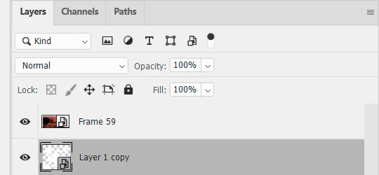
right click on the scene gif > create clipping mask. now you have this:
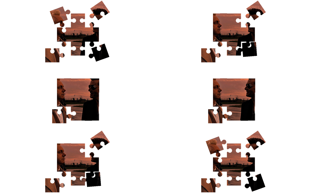
color it to your liking:
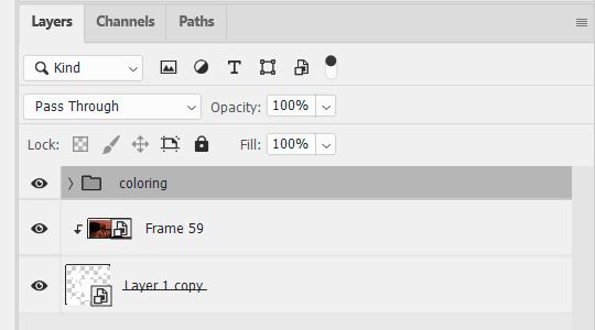
optionally. to make a border like i did make 2 copies of the shape gif and put them on top of the colored gif:
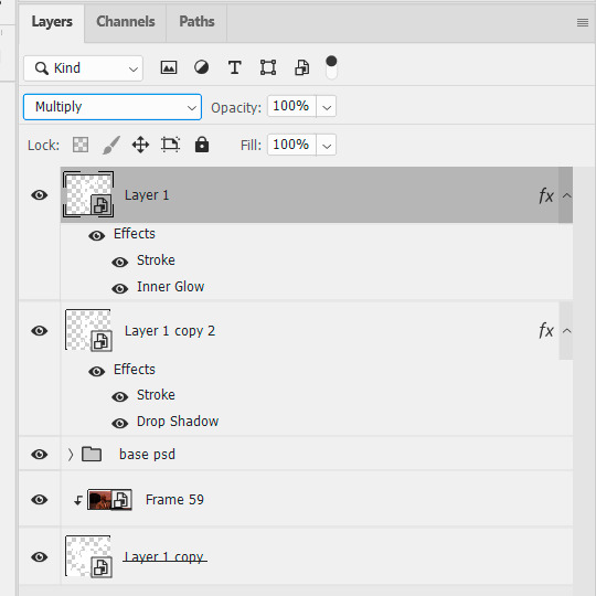
change blending mode for both: multiply if your shape gif is white, screen if your shape gif is black. set layer style for the first one:
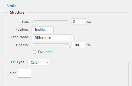
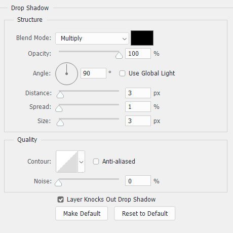
and for the second one:
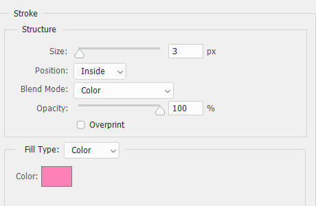
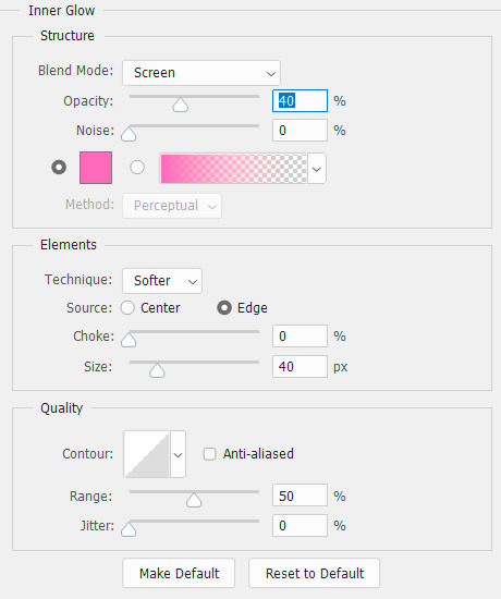
(use any color you want and/or skip inner glow alltogether).
currently we're still in video timeline and our gif looks like this:
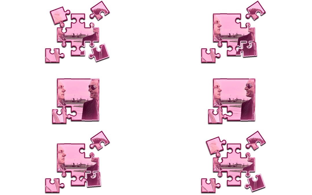
time to put it on top of a bigger gif. click here:

convert frames > flatten frames into clips. now convert to frame animation:
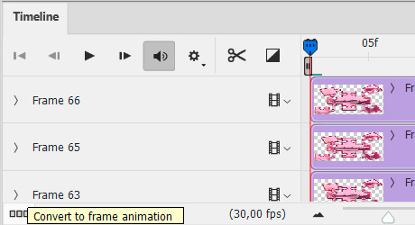
delete the frame that has the least amount of delay (0,07 in this case):
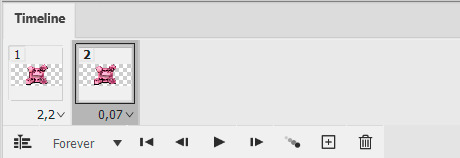
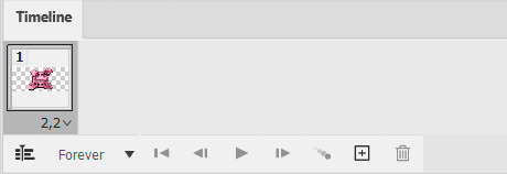
make frames from layers (in the timeline menu on the right) and you get a variety number of junk frames before the actual gif starts that you also need to delete (i have 28 in this case):

make sure there's no junk after the gif, set your delay time and delete unnecessary layers if you want (or not, it doesn't really matter):

select all the remaining layers and group them (easier to work with later):
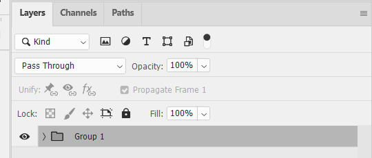
now select all the frames, go to the timelines menu > copy frames. open the gif you want to paste them on top of, select all of its frames, go to the timeline menu > paste frames > paste over selection > ok.
postion it how you want to and that's finally it.
#it really is much easier to do than it might look like from my explanation#replies#ps asks#ps tutorial#cowboycoven2
21 notes
·
View notes
Note
Would you do a shading tutorial? How do you set the light and that wonderful white glow? What brushes are good and what program do you prefer? It would be nice if you could teach us how to do it so nicely 🥺 (btw Have a nice day!)
You too!
And sure! I love talking about art! Gonna put a keep reading on this one, though, it's gonna get a little long:
So, before I do any kind of shading or lighting I build up the illustration to this point, where I've settled on what the base shapes look like and what kind of colors I want to use as a base:

Once I have those local flat colors down, I do a pass of initial light and shadow before I start painting for real. This usually consists of multiple layers layered on top of each other, set to the multiply blending mode (that I totally always name and didn't do so after the fact for educational purposes). What multiply tends to do is darken and blend your colors with whatever color you put on the multiply layer. In this case it makes the color darker with a blueish tint.
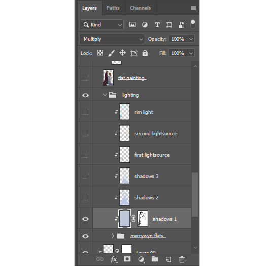
Not sure how to explain this process if you've never used an editing software before, but I think it's fairly similar no matter what program you use. I lock the layers to the grouped flats so the shadows and light only appear on the figures and not on the whole canvas.
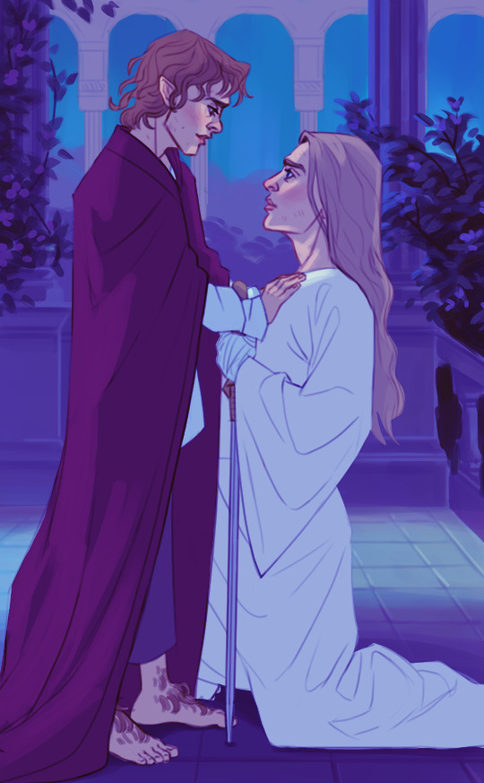
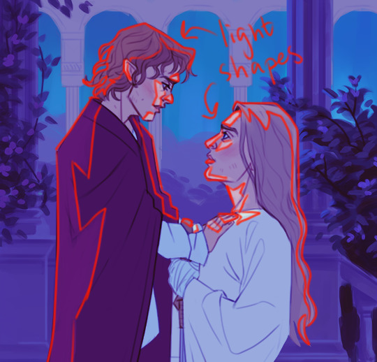
When painting it's usually a good idea to go from big shapes to small. I tend to flood the object(s) with whatever is my shadow color and then "carve out" the lights using a mask. You can just erase away if you want, but I recommend learning about how masks work because then you can more easily play around with the shapes.
I've noticed that doing it this way creates bigger and more consistent shapes rather than doing it the other way around. It also shortcuts you right into dramatic lighting territory lol, which was the goal here.
After that it's simply a matter of creating more layers with the same multiply setting to deepen shadows wherever it's needed. I also might add something like bounce light, subsurface scattering, ambient or secondary light sources to give some more life to the colors.

Final stage is render and clean-up, where I merge all of the shadow/lighting layers with the flats and lineart to have the entire object on one layer. I was terrified of doing this for the longest time, but it really makes the process so much easier. I always leave a copy of the original setup layers should I need to go back to it.
At this point most of your colors, shadows and lights have been sorted out so you can simply color pick from the source as you paint.

This is also where I add the rim light! Super effective way to make your object pop and add some drama! It's a fairly straight-forward process where you sort of outline the object with what is usually a pretty stark contrasting color. Don't forget that rim lights are *not* outlines, though! It's a light source, so it affects the object just like any other light. It doesn't only hug the outline of the object, but seeps into it at points where the light can reach:

You can play around with different blending modes for lighting, sometimes you get a really cool effect!
Lastly, that faint glow? Just a layer of using a soft airbrush in the same color as the light and paint it on top. Don't lock this layer to the object so that you can have the brush spill out a bit around the edges to create that soft glow effect.
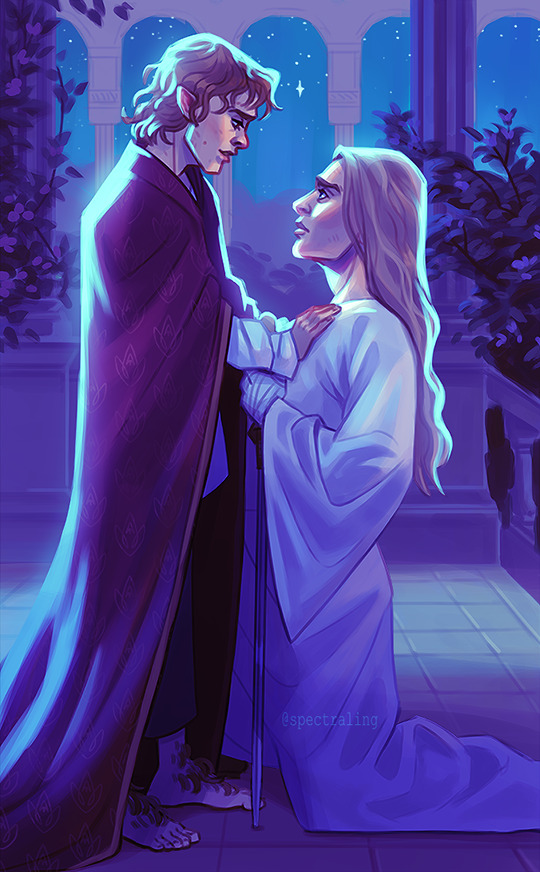
And then you're pretty much done! There's a lot more to it, but I'd say that's a simple breakdown of how I usually approach paintings in the shading/lighting stage.
I don't make things out of thin air, though. One of the most important aspects of painting and drawing is reference! Go look at nature! Look at tons of paintings, drawings, photographs, illustrations and anything else that inspires you. For this particular piece I was very inspired by "The Garden of Hope" by James Gurney.
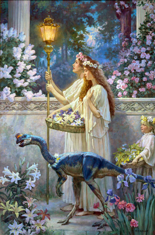
As for brushes and program it doesn't matter too much honestly, I'd say use whatever you're comfortable with. I still use Photoshop against my better judgement out of habit, but there's a bunch of alternatives out there like Procreate or Clip Studio Paint. You could also use something like Krita if you don't want to pay for it.
In my case I almost exclusively use the hard round brush (and airbrush as needed) that's default in Photoshop because it works fine for the kind of style I tend to go for, but there's....thousands of brushes out there. Just google it, you'll find free packs. Kyle T Webster has a pack that's pretty well-known, and that I also use occasionally. I'd say start with what's in the program of your choice by default, just to get a feel for it. It's easy to become overwhelmed by all the textures and shapes of custom brushes, but it can also be a lot of fun to play with so go ham if you want!
Hope that was somewhat helpful!
3 notes
·
View notes
Note
hello :3 could you make a tutorial on your hyunjin day gfx please :3
oh wow! sure, i don't make gfx that don't have gifs much so my process is kind of a mess but i'll try to make it a bit understandable! lol
basic photoshop understanding is needed here, like knowing how to use layer masks & clipping mask the most, also how to cut the background of pictures!
we're making this!
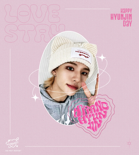
under the cut bc it's kind of image heavy, if something isn't clear pls let me know so i can explain better <3
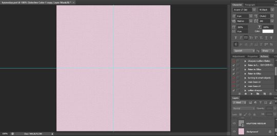
I started on a blank canvas of 540x600px and colored the background with the shade of pink i wanted to work with, on top of that i added a half tone texture image i found online (i think from deviantart? or maybe another place idk) changed it's blending mode to lighten, adjusted the size and then reduced the opacity of that layer so it didn't look too much in my face. this is what we have so far (ignore the cyan lines, it's only a guide to center everything in the canvas)
now i go to the left panel and click on the shapes tool and choose the ellipse one and draw an elipse in the canvas, the size of the ellipse depends on you tbh, i didn't make it too big bc i knew there was going to be a lot happening in my canvas and i needed the space to work so it's your choice how big you'll make it. once i made the ellipse, i made sure it was centered and proceeded to work on the picture i used
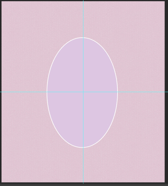
the settings my ellipse had

now the hyun pic! i opened it in another tab on photoshop, and with the pen tool i traced all of hyunjin's shape as if i was working on to erase the background (you can use the quick selection tool or the wand, i prefer the pen tool to erase backgrounds tbh) and then i went right click -> layer via copy (this is very important!) and when i had two layers (the original picture and the new layer of only hyunjin) i dragged them to my gfx canvas, and then resized it around the same height my ellipse was
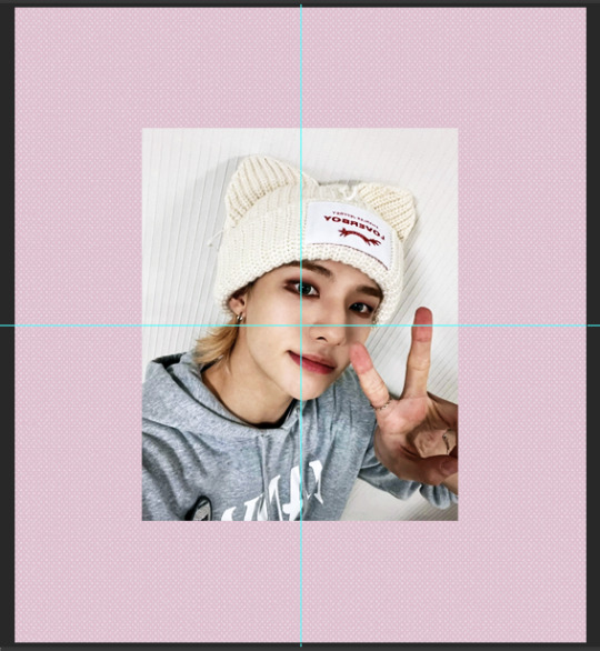
make sure the pictures are ON TOP of the ellipse!!! now select only the layer of the full picture and then right click -> create clipping mask and the full picture will be inside the ellipse
your layers panel should look like this

and your canvas like this
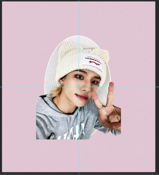
we're almost there! now we select the layer that only has hyunjin and we add a LAYER MASK to it, and with a black brush we paint the parts we want to erase
your layer should be something like this

and the canvas like this
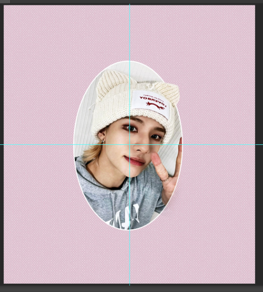
now i added some decorations, found the sparkly lines i used around the image on pinterest! they are called monoline frames and there's lots of them to pick tbh, the one i found had a white background so i just inverted the color of it and then changed the blending mode to screen so only the lines of the frames were visible and then erased anything i didn't want with a layer mask, it would have been easier to find just a transparent image but pinterest doesn't have those so i had to make do lol
the layer panel now looks like this for me

and the canvas
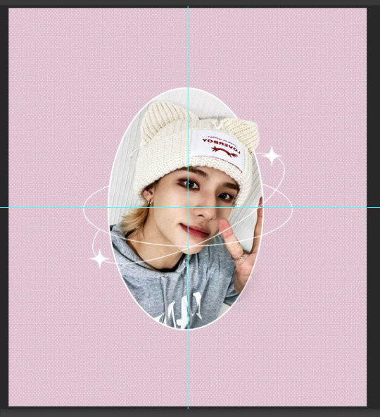
after this i worked on the typography! for the "love stay" i used the font called "Cleo Folk", i arranged it so on the layers panel it would be under the layer of the ellipse, then for the text that says happy hyunjin day i used the font "Gobold Extra 2". i added some lines using the line shape tool too
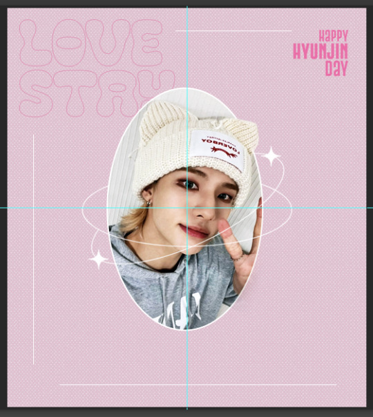
the heart shaped thing that says "hwang hyunjin" is a custom i made myself messing around and if you want to know how just let me know! but you can just use a warped text, it won't look like it's inside a heart but it'll still look pretty ! after that i added my watermark in the corner and saved it as png and all done! for the other image on the set the process was the exact same!
finished result!

i hope this helps? if i missed any detail please let me know!!
17 notes
·
View notes
Note
hello! i really love your gifs!!!! im still learning how to do some effects and i wanted to ask if you could make a tutorial on how you did the blending for this post? https://www.tumblr.com/jikyu/733643818578198528/baby-dont-stop-2018-nct-u-for-berryjaellie?source=share i understand if you dont wanna hehe thank you so much for sharing your work <33
hi, thank you so much ! i'm not like amazing at tutorials but i'd be happy to share with you my layers & process for this particular set (she saved a psd for once ... everyone cheered!) and give some general advice + i'm going to direct you to this tutorial by @woozis who i think does a great job of explaining things and has more experience with gif blending specifically (this was my first set using 2 gifs in this way; normally i use blending for static gfx or using overlays that aren't 2 gifs from the same source content, which are both great ways to practice) . i highly recommend utilizing multiple resources to get a feel for how different creators do the thing you want to learn, but at the end of the day i basically just start throwing stuff into photoshop and watch it come together in real time with anything gfx related lol . anyways, with that big intro out of the way, let's talk about how we made this set using this gif as the example:

so step one for me working with this content aka music video was just picking out the clips i liked and knew i wanted to use in the set . when it comes to gif blending the 2 gifs you're using need to be the same exact amount of frames or you need to be able to get them there, so basically after i had just pulled as many gifs out of the mv as i roughly thought wanted to use, i imported all of them into ps to see the frame rates and started mix-and-matching the ones that were around the same length to see what would look the best layered over each other. this is very personal preference based but in this case i liked that they were executing similar choreography from different angles and in different outfits and settings. for this gif, i ended up with these 2 separate ones:


these are sharpened but no coloring added yet - as you can see one of the clips is black and white so that can be a great option for blending because you can add whatever color you want over it. of course, if the original content isn't b&w you can just put a b&w filter on it and do the same thing - i recommend this if you want to put gifs together that aren't already color compatible. anyway, once you have your gifs you convert them both to timeline and just drag and drop one over the other. it's usually not going to matter which one you put on top, but that's the one you're going to use the blending effect on, so i went with the black and white gif over the color.
to blend the gifs, i set the blending mode to 'screen' on the top gif. for this one i kept the opacity at 100% but on other gifs in this set i brought it down to around 85% depending on how it looked. then i added my coloring to the base gif + i deepened the blacks on the top gif (note that you need a clipping mask for anything you want to do to the top gif without doing it to both). this is where you'll want to start messing around as you go, screen is my most used option for these purposes but sometimes overlay or multiply looks cooler, and you can mess with whatever opacity you think looks best. here's what my layers look like at this point with that top gif selected + what the gif looks like blended before and after coloring:


already pretty cool! but i wanted to add color to the black and white to really bring the effect home. i used the eyedrop tool to grab the blue from the lighting in the bottom gif (for the other color overlays in this set, i used the red from taeyong's hair) and added that into a solid color layer over the b&w gif with a clipping mask, and set the blending for that solid color layer to 'overlay' (again, you can try different ones for the look you like best)


this is my finished blended gif, from there i just added the text! the actual process of making the gif isn't what is so time consuming imo it's more just about finding the clips that will work together and testing out what you like the look of. this one is probably my favorite blending result from the set and there are plenty of things that i feel like don't look perfect, but ultimately i'm happy with the result and i think the set looks cool anyways -- so i encourage you to just give it a try and chances are it's going to turn out looking nice!
hopefully this was helpful, happy giffing (and feel free to tag me in your works if you try this out) !!
#erimail#.resource tag#gif help#again not a great tutorial girlie over here so if this makes no sense i am so sorry <3 ajkdgbjhsdbg
5 notes
·
View notes
Note
hi alie! how are you? i was wondering if you could explain, or link a tutorial that does, how you did the first gif and the checkmarks on this (/post/713604672591659008/pscentral-event-14-your-url-insp) beautiful gifset please?
hello!! i'm good, thank youuuu ♡ and yeah, sure i can! i didn't follow any tutorial for this gifset, so i'm gonna try to explain my process as best as i can.
the first gif is fairly easy, it's just a bit time consuming. the second one for the animated checkmark uses some keyframes. i use photoshop cs5, which is rather old, so hopefully my directions still work for more recent ps versions!
tutorial for these two gifs under the cut:

gifs in text
i'm gonna assume you already have basic gifmaking knowledge, so i'm gonna start from this base gif already colored:
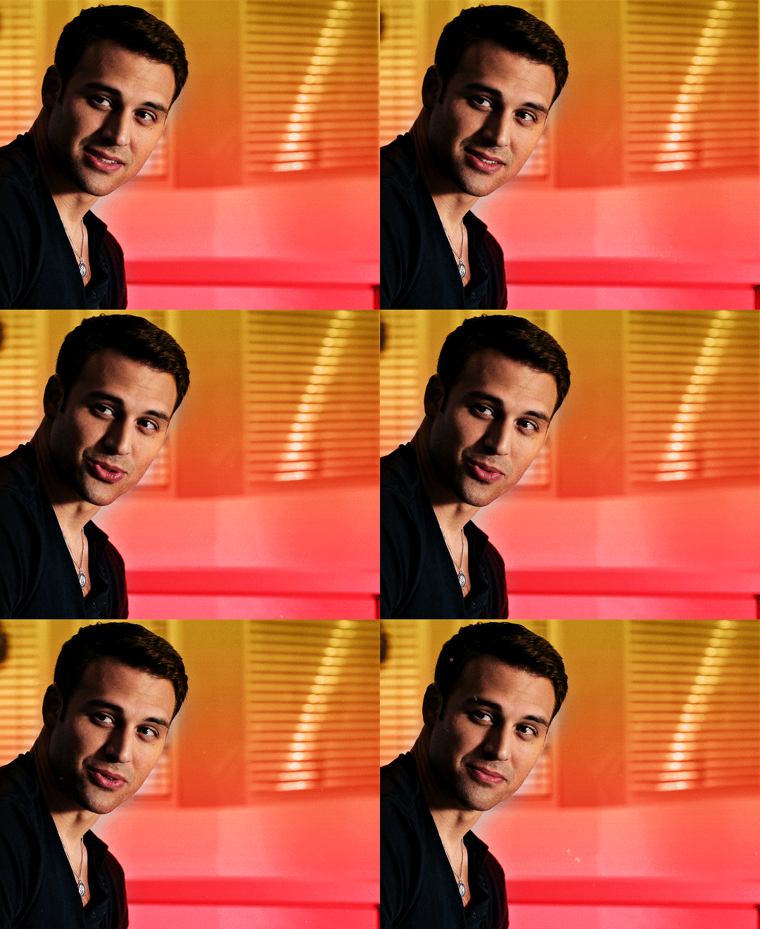
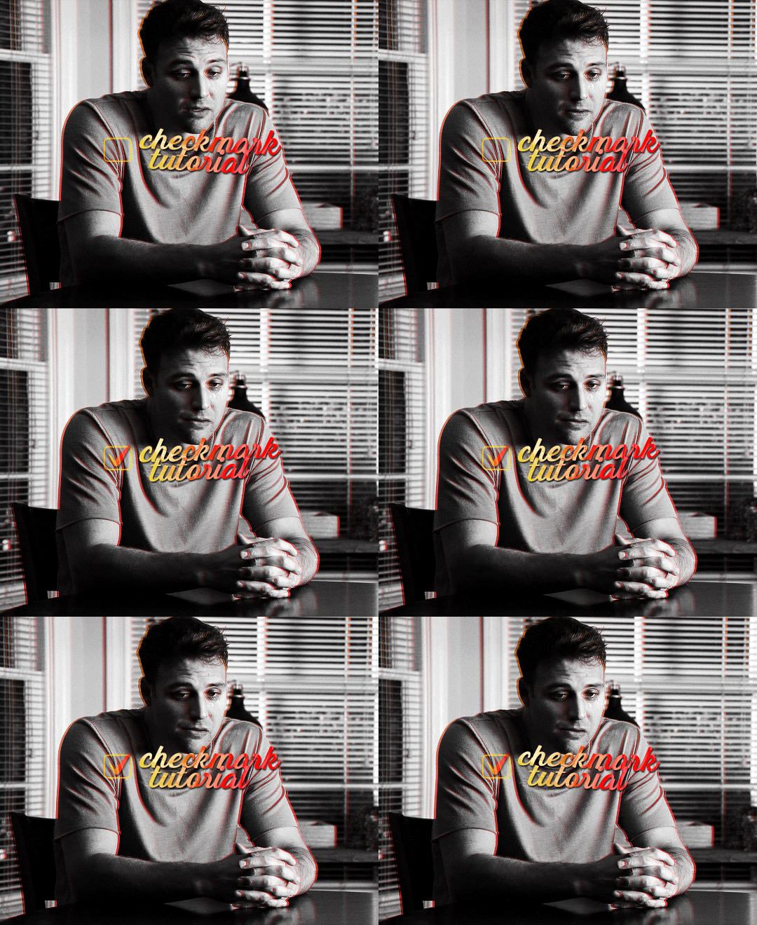
i started by finding a big and very thick font that i liked. for this gifset i used a font called barle. i placed my text the way i wanted it, but i used one text layer per letter, because i wanted one different gif per letter. once i had my 9 text layers placed, it looked like this:
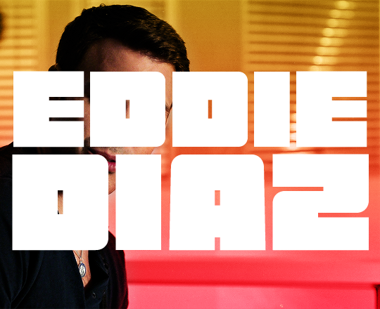
then, you need to create a group with a layer mask for each letter. for this, i simply hold the ctrl/command key and click on the letter layer's thumbnail. it will create a selection of the letter.
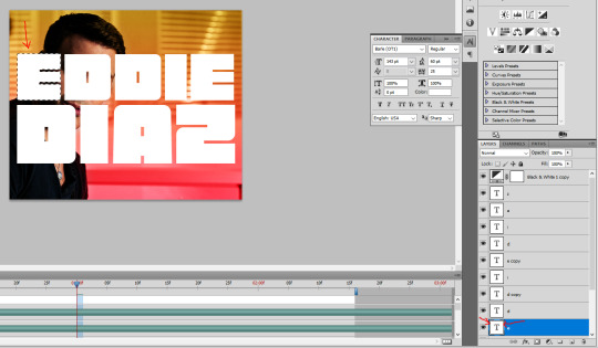
with this selection on, i click on the folder button to create a new group, then on the add layer mask button. it will create a group with your letter where you can put anothet gif in.
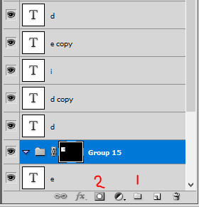
then you just need to rinse and repeat for every letter.
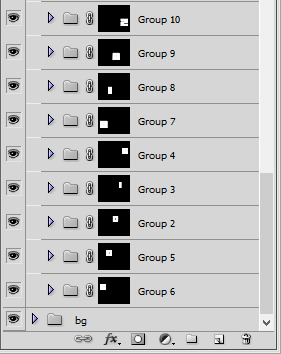
once you have all of your letter groups done, you can select all of the text layers and put them in another group. we'll use these layers again later.
then you just need to bring your second gif onto this canvas and put it in the right group/folder. i usually just bring a smart object gif onto my main canva, slide it in the right folder, then resize, sharpen, and color the second gif in there.
you can just drag this layer once it's inside the group to position it the way you need it. and also use ctrl+T to resize it (drag the corners while holding shift to keep the right propertions). once the gif is positioned, you can go ahead and disable the E text layer you used to create the mask (but don't delete it!). i kept the coloring very minimal since it's a black and white gif, and the layers should look like that:

and this is the gif so far with the first E done:

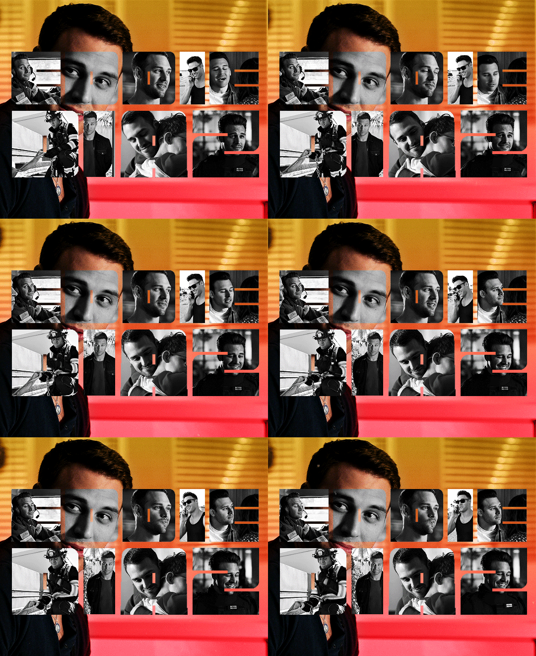
then you just need to do the same for all other letters, pretty straight forward! for the first D letter, i wanted eddie's face to show instead of using a different gif, so i simply put a black and white layer in that D group. my gif looks like that at this point:
then what's missing is the outline, and it's pretty easy to make. go back to the text layers you created at the beginning. enable them all, and make sure they are on top of everything else. double click on that first text layer to bring in the layer style options, and add a 1px stroke with the color and blending mode you want. I went with yellow and the hard light blending mode. these are my settings:
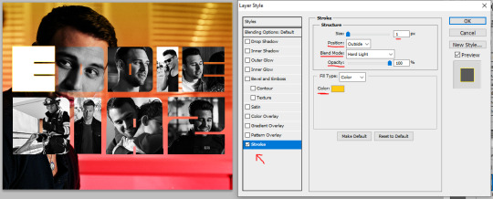
back to the layers panel, keep the text layer's opacity at 100%, but bring the fill to 0%. this will make online the online show up on the gif.
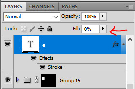
to apply this setting to other text layers, you can right click the first text layer and select "copy layer style". then select all of the other layers and right click one of them and go "paste layer style". once all the text layers have their outline it should look like that:

to move the outline a bit, make sure they are in a group and select this group (i renamed mine "outline"), then just nudge it by a few pixels with the arrows on your keyboard. i transformed the outline group by about 4px left and up on mine. i also duplicated the whole group because i wanted a deeper color for the outline.
and this is my final result!

animated checkmark
starting with my base gif, i added some animated text and a little box for the checkmark to go in (drew a shape with the rectangle tool and gave it a stroke, the same way i did it for the previous gif):
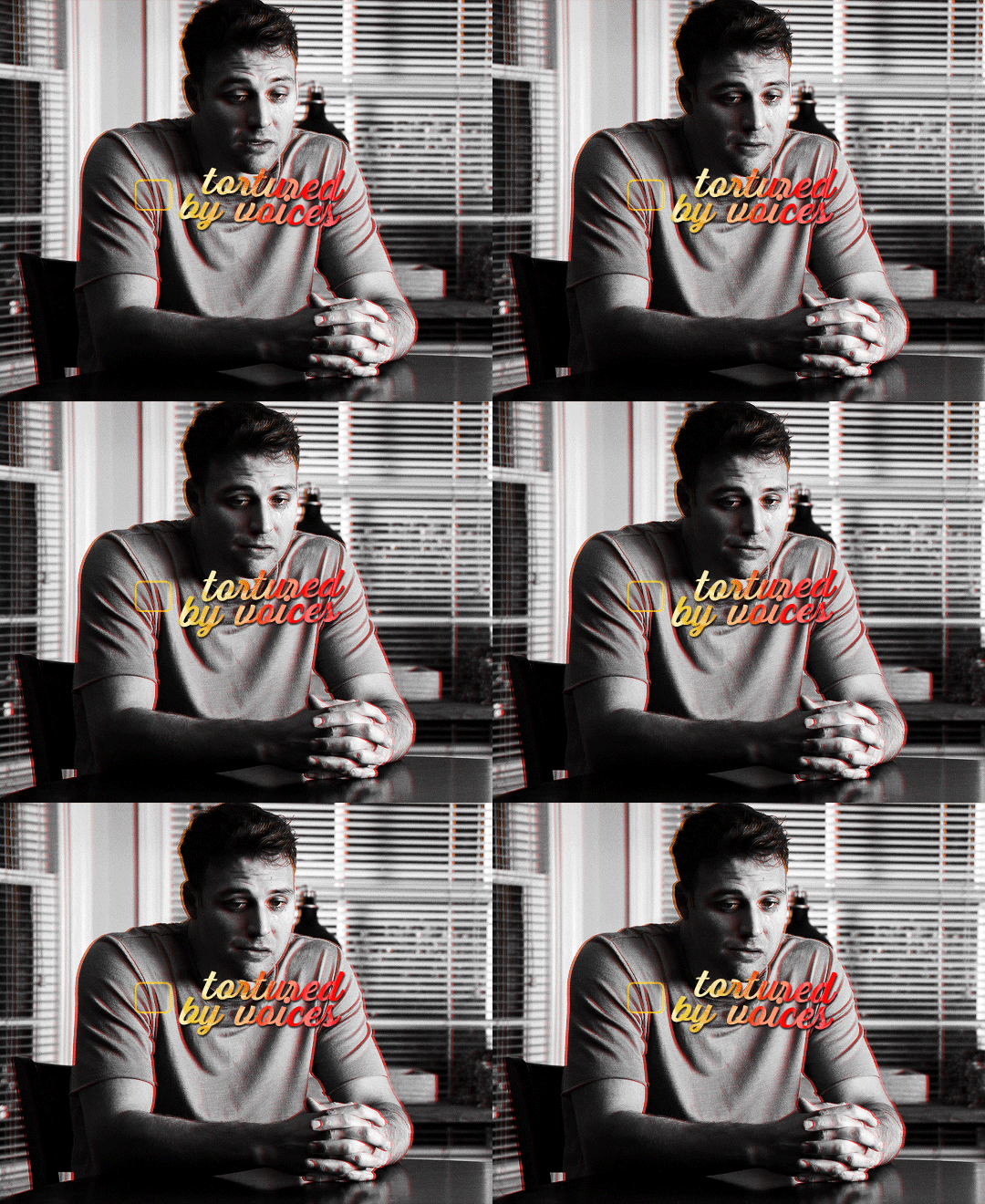
for the actual checkmark, you can try to find a brush or shapes to download, but i didn't feel like looking it up lol, so i drew the shape myself with a regular brush that comes baked in with photoshop. the best way to draw a custom shape, in my opinion, is to draw the shape as a layer mask on a color fill layer. that way you can always change the color or add layer styles later (like i did).
so on my canvas, on top of everything, i created a color fill layer (layer > new fill layer > solid color) with whatever color i wanted (you can change this later if you need). you will get a new color fill layer, with a layer mask already attached to it. i put this layer at 75% opacity so i can see the gif under it and it's easier to draw the shape in the right spot:

i then selected the layer mask thumbnail and the brush i wanted to use, one of them (not sure i remember which one, sorry haha!):
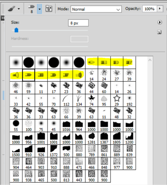
with the black color selected, just go ahead and draw a checkmark where you want it on the canva. you can always use the brush in white to erase it and start over with the black color if you're not happy with it. but once you have a checkmark you like, it should look like this:
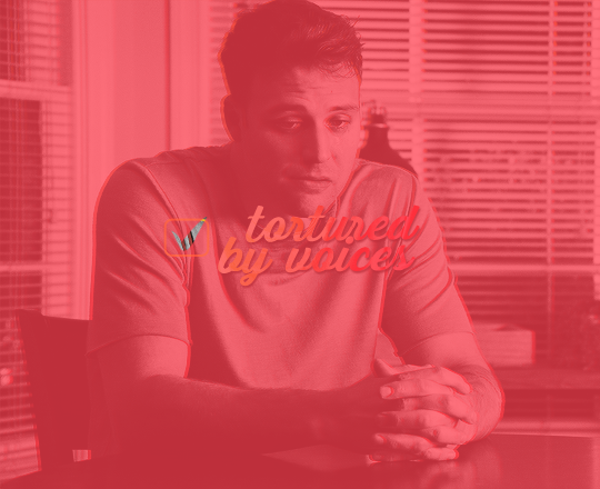
now you just gotta invert the mask so the checkmark is colored, to do this just click on the color fill layer mask you just drew on and hit ctrl/command + i. the mask will get inverted and it will look like this:
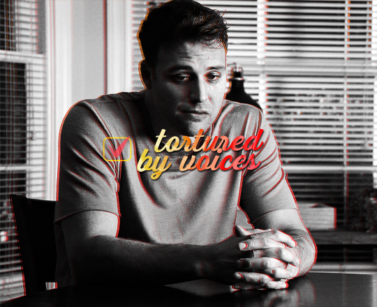
then you can add whatever layer style you'd like to the checkmark (and put the layer opacity back to 100% if you want). i added a gradient and a drop shadow to mine, and changed the blending mode from normal to difference to make it match with the text, so now it looks like that:
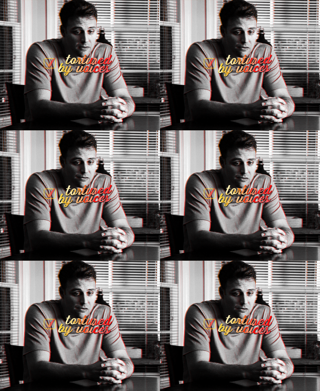
animation time! this is where you need to use a bit of keyframes, but i promise it's not complicated.
for this animation i wanted to mimick a checkmark being drawned. when you draw a checkmark, you usually do it in 3 steps right? your startung point, then a line down, and then another line up to the end point. it's what i tried to mimick here.
to animate it that way, you need to draw a shape that will hide the checkmark and then move it around to mimick the drawing animation. to do so, create a new group (i've named mine "checkmark") and add a layer mask to this group. you also need to unlink the mask by clicking on the little chain icon next to the mask thumbnail:

now the next steps are a bit of trial and error until you get what you want, i'm gonna try to explain it as best as i can (bear with me haha):
1- go to where you want the animation to start, aka where you want the checkmark to start appearing. for me it was a few frames after the start of the gif.
2- then, with a black brush that wasn't too big nor too soft, i brushed a bit over the checkmark to erase it for now (you may have to go back and edit this after the animation is done). no need to do a huge shape, just big enough to cover the checkmark. if you go back to the move tool and click on the mask thumbnail you have just created and click and drag in the canva, you should be able to move the mask around. this is what you want for steps 5 and 7. basically, on your mask thumbnail on the checkmark group, what is brushed in black will erase what's in the group, and the white part will reveal what's in the group. for now just make sure the shape you just drew is covering the checkmark.
3- once the checkmark is hidden, click on the stopwatch icon next to layer mask postion to start the animation. this will automatically create a keyframe where your cursor is on the timeline (the yellow diamond)

4- once your starting point is done, you want to go a bit further on the timeline with your cursor.
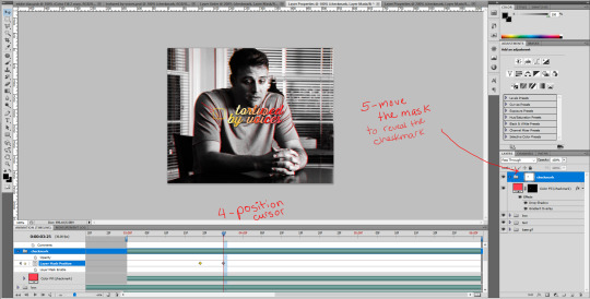
5- then move the mask shape so it reveals just the smallest part of the checkmark (make sure you click the checkmark group mask thumbnail first before moving the mask). once you move the mask with the move tool, a new keyframe will automatically appear where your cursor is on the timeline (another diamond). make sure you drag the shape down the checkmark to mimick it being drawn.
6- go a bit further again on the timeline, where you want the animation to end.
7- and move the shape again to reveal the checkmark (make sure you click the group mask thumbnail first before moving the shape). again, a third keyframe will be automatically created. i dragged the shape up from the bottom of the checkmark to mimick the drawing of the checkmark.
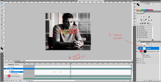
your animation should be done here after these 2 movements, so play it in a loop and see if you are satisfied with the animation you have created. if you don't like it you have options:
you can go back to the group layer mask and edit it with the black or white brush;
you can also go back to each keyframe by positiong your cursor over it and move the mask around in a different way;
and you can select the keyframes (yellow diamonds) and move them around on the timeline. if you push the keyframes closer together, the animation will be faster, and if you space them out more, the animation will take longer. it's up to you!
this animation thing is really just trial and error. you could probably do the same animation with a checkmark you find online, as long as the image file is in a group and the animated mask is applied to the group. and don't forget to unlink the mask before animating a movement or it won't work properly!
and this is what my animation looks like:

that's about it, i hope that was clear enough omg. never realized how hard it is to explain these things in english lol. let me know if you have any questions! ♡
#alie replies#*ps help#photoshop#tutorial#resource#completeresource#uservivaldi#usersmia#userkarolina#userrobin#user.tee#userkosmos#thingschanged#usermaria#userraffa#userjaelyn#userhallie#userk8#userdean
301 notes
·
View notes
Note
Hi! Would you share some tips on how to achieve the colouring of this gif set maybe? /720060252150808576/for-pscentral-event-16-pride-colorsand It looks so beautiful! I love how you coloured Buck so much! Have a great weekend!
hi!! first of all, sorry this took a minute. life, you know. anyways thank you so much for your kind words, i'm so glad you liked the set!! and i'm always happy to share techniques and resources so never hesitate to ask!
since you asked for tips and not a tutorial, i'm going to assume you have a handle on the basics and try to keep this fairly general. if you want a more in-depth explanation for anything just let me know!
so most of this was achieved with a combination of adjustment layers (mostly the love of my life selective color) and color/gradient layers, and a whole lot of layer masking. my first tip is use timeline mode and familiarize yourself with the stopwatch controls, particularly the layer mask position stopwatch. i'm just gonna direct you to the first half of this tutorial if you're unfamiliar. this set would've taken me waaaay longer if i'd had to rework the masks frame by frame, since i was moving the masks for multiple layers on each gif
now for the colors themselves, tip #2 is don't rely only on solid color/gradient layers for colorful gifs. it's certainly possible to get something decent with just a base coloring and a fill layer set to blending mode>color, and that may be what you want depending on context (that's exactly what i did with poker buck in the first gif!). but that's gonna be a really stark (heh) effect, and for the brother, babygirl, and bisexual gifs i wanted them to look soft and warm and glowy, so for those i adjusted the backgrounds to fit with my blue/purple/pink palette AND used color fills and gradients on top of that
for example, on the gif of buck and maddie hugging, in addition to my base coloring i have two selective color layers to shift the background from yellow/red closer to pink and bring out the blue in buck's shirt, a violet photo filter to tone down the reds even further, and and pink solid color layer set to soft light at 49% opacity (all of those were masked so that maddie's face wasn't bright pink or whatever)
that's all under the gradient layer that went on top (which is set to hard light, 50% opacity). below on the left is that same gradient set to color, 100% opacity, without any of the other adjustment layers underneath. it certainly doesn't look bad, but it's a very different look to the one on the right, which is the one i went with


this brings me to my next tip, which is play around with blending modes. i'm sure you know they all have wildly different effects, but don't shy away from any of them, cause today might just be the day that hard mix gives you the look you want. like normally when i'm doing a glowy gradient on top of everything i go for lighten or screen, but i happened to mostly use hard and soft light in this set (this video is a godsend for understanding the different blending modes - if you have a free afternoon i definitely recommend browsing this guy's channel. you will learn so much)
the last thing i'll mention is the gradient i used. rather than generating a gradient fill in photoshop i took this texture (which i wish i could link the source to but it's from a pack i downloaded ages and i have no idea where i got it):

made it bi:

and then stretched/rotated it differently in each gif so that there was some variation. having that softness and slight variations in vibrance and luminosity helped with the overall warm glowy feel i was going for, which i don't think i would have have gotten just by using a gradient fill layer
and that's about it for the colorful gifs in that set. as for the others, the first gif really is as straightforward as it looks: a blue->purple gradient set to color on poker buck, and a pink overlay on buck in turnouts, blended so that the colors overlap and mesh together.
the black and white ones were also very simple. this tutorial explains how to do the colorful outline thing if that's new to you. that's all i did for the small b&w gifs. for the baby boy and braincells gifs i used the same technique only instead of using a a black->color gradient map in the group set to lighter color, i used the same gradient as above set to multiply over the black and white gradient map
i hope at least some of that was helpful!! again if i need to elaborate on anything i'm happy to. my 'process' is really more me throwing things at a gif to see what sticks so i may not always be able to give the most coherent explanation but i will try! thanks again for the ask anon and have a great rest of your week 💖
4 notes
·
View notes
Text
This is PART II of the GIF tutorial.
Part I
In the part 1 i talked about all the settings I used to create this specific gif, adding some more of the same color balance, curves, levels and selective color the final result is
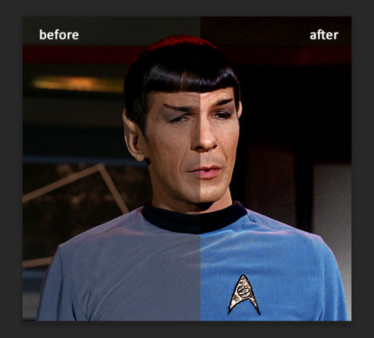
Could do, but not really what i want to. If you want to go with natural colors or smt, then yeah, it will do. But that's me and if I don't enhance blue I will probably die or smt.
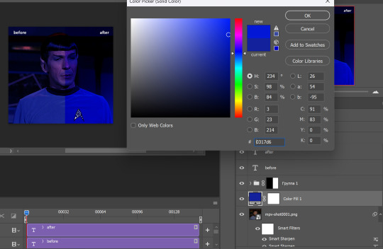
I could use color balance to do it, or other tools, but I prefer using new fill layer - solid color. Choose the color you want.
You see, this gif does not have much movements and it will be easy to use fill layer and erase parts you don't want to. If you have a gif where character moves you will need to adjust it for each layer :\ But it's fun, just takes forever of your time.
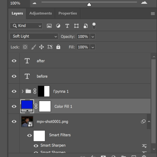
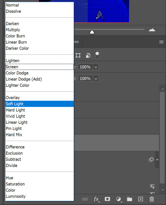
I put it under adjustment layers and set blending mode to soft light.
there are blending modes if you don't know where they are, just press where 'soft light' is (by default you will have it on 'normal') and you will see them all. Play with them, you will love them
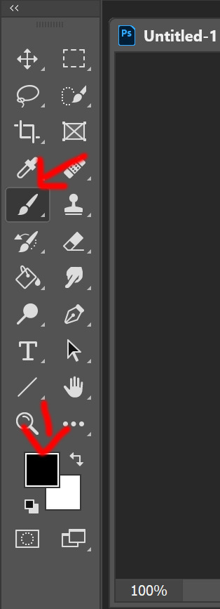
Now, the blue is BLUE. But his face also is blue. And for that we will choose 'brush tool', press 'D' so foreground/background colors are black and white. Depending on which layer you select it might be white and black, so you just swipe them so the black is on top. Then go and click on the white box near the color fill layer, erasing it can be restored after
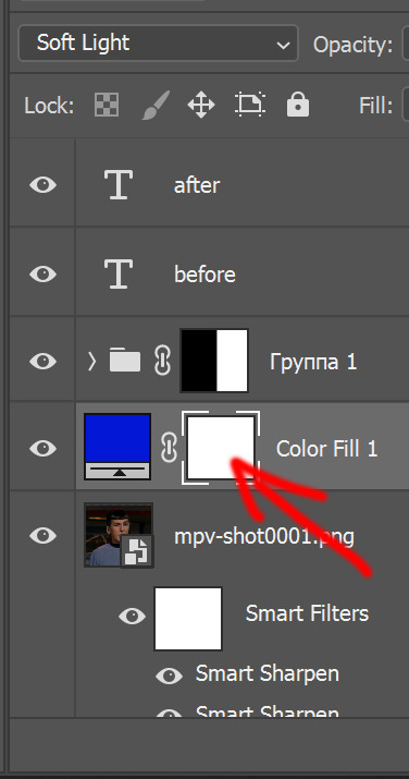
Since I want his Spock's uniform be super blue and the background too, i just draw over his face.
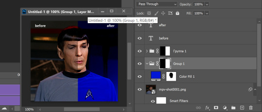
Basically, by clicking this vector mask tool you can add those white boxes and erase using black color, or undo it by drawing over the image with white color. And vice versa, if the box turns to black it is invisible (ctrl+i) unless you use white and draw over it, by that you make parts of the layer visible.
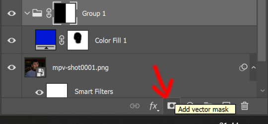
I love vector masks, they are my best friends, yeah i don't really have friends *sad emoji*
But before saving or smt, play the animation, erase more if needed. At this point we have this (and I realized i did not reverse frames in the beginning, so i will fix it later)
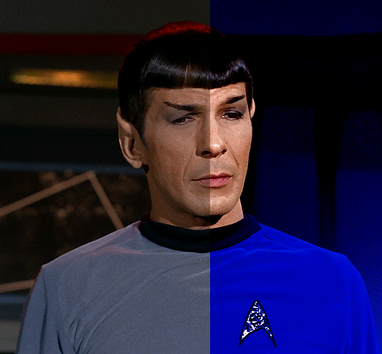
Using vector masks you can change background color as well, if you want it different.
But also, you can change already this by those tools explained before, or hue and saturation. This blue is much easier to edit.
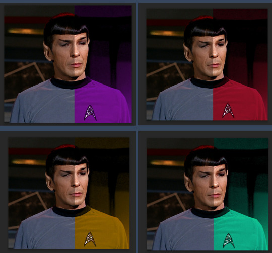
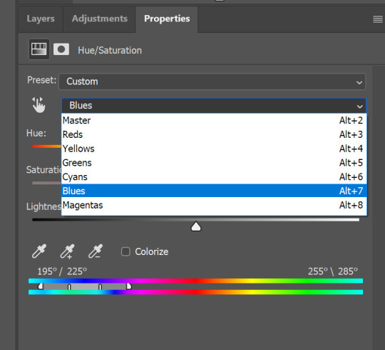
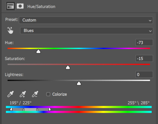
Play with the sliders, drag them from one point to another until you like the result. And if the background looks off for some, you can always add more tools and change settings to look pretty.
You might ask, why we went through all the tools and settings if we could just color it? :D a good question, but without it the result would look like
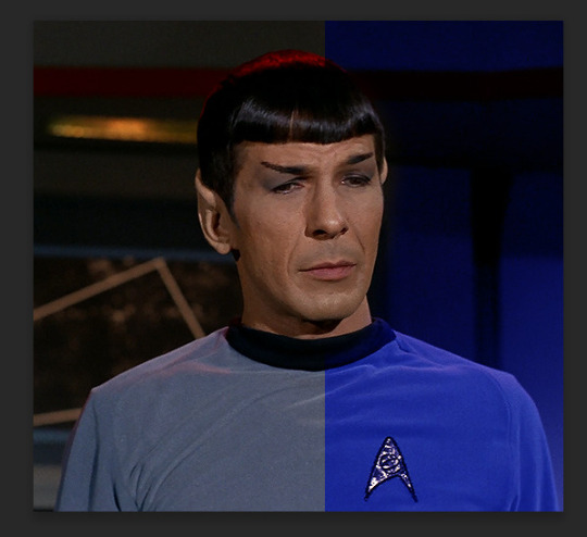
and while the blue is great, everything else looks not as good, and also, I wanted more blue.
So that's it, we have finished the gif!
Now add some text
If you are worried about you might make mistake somewhere while typing, you can always go to chakotaya.net and use transcripts from there :3 You have star trek, doctor who transcripts and some other stuff i never checked. Like, all the love to Chrissie who put so much work into it and made it possible to have all the scripts in one place <;3 AMAZING!
So, choose text, click on the gif somewhere (don't worry, we will position it after) and copy paste or write down text you want.
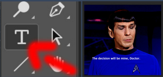
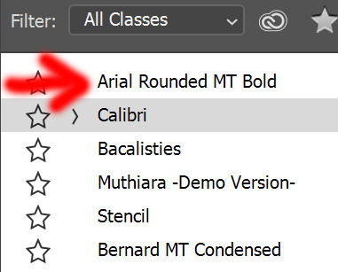
I do not like calibri font for subtitles when it comes to big gifs, so i choose Arial round MT bold with these settings
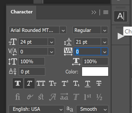
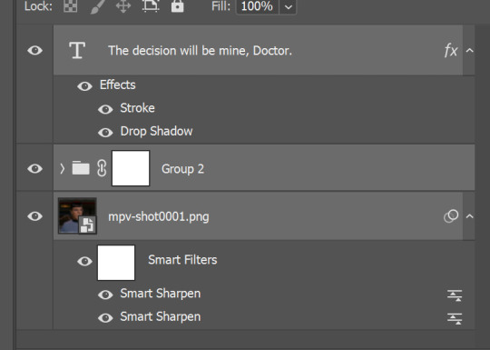
Now, you need to add some more, outline and shadow. Double click on the text layer, in a menu that pops up choose Stroke and Drop Shadow, I used these settings
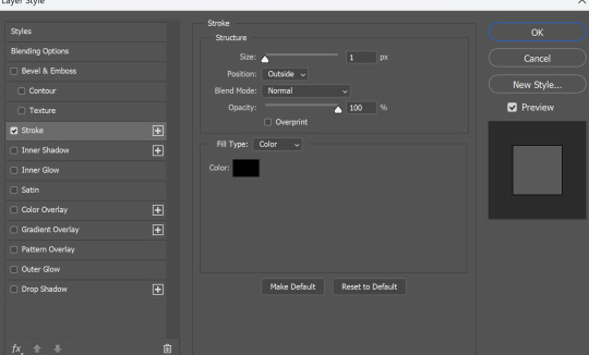
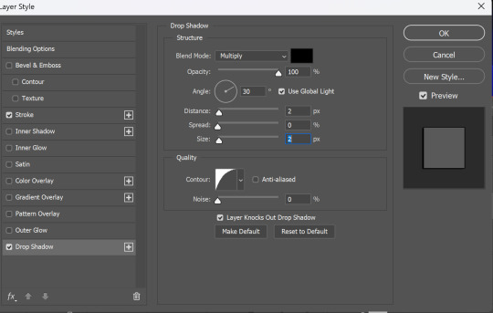
And you are finished, now text positioning. You can either press and hold 'ctrl' button and drag text layer wherever you want, or press move tool and do the same. After you positioned it press the second button from this picture to align text layer in the center.

so now we have this
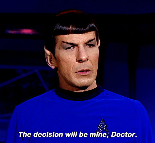
it's time to save it! YAY! If you read to this line you must be really patient, i respect you :D
select all the layers and convert it to smart filters
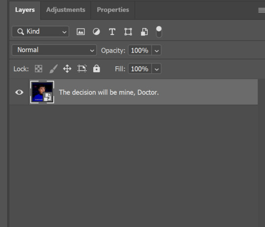
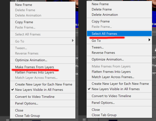
click on those 4 lines on your timeline and choose flatten frames into clips, so not you have this, you have to convert timeline, press those tree empty boxes at the bottom

After that click on those 4 horizontal lines again and make frames from layers - select all layers
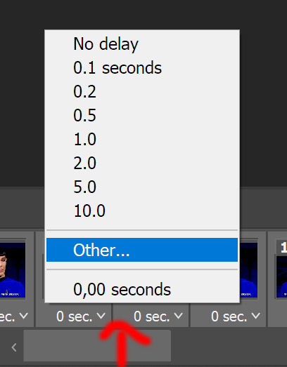
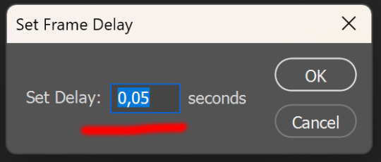
open menu by clicking on 'time' on one of the layers - other - set to 0.05, that's the best option for the gifs if you do not skip layers.
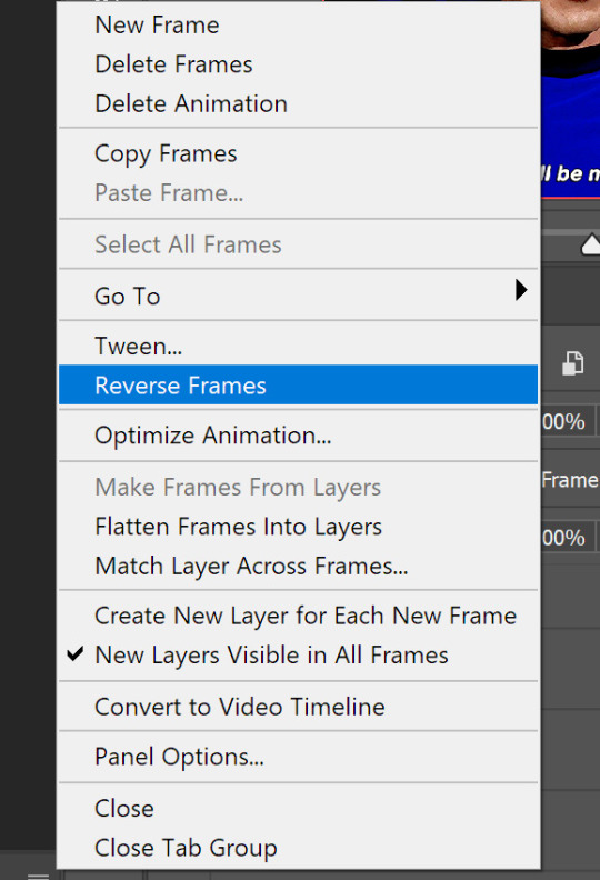
and since I did not do it in the beginning, we need to reverse layers, as gif is playing backwards.
now you can save the gif, go to file - export - save for web
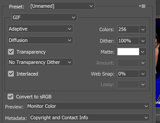
I did not need it here, since gif is playing 'forever' by default, but make sure that it is set to 'forever'. And those are settings I save gif. Sometimes you need to change adaptive to selective, but i live diffusion there since i do not like how pattern looks like.
That's it, we are finished! Thank you for sticking up to this point
a few advices by the end.
do not skip frames
always set to 0.05 so your gifs look good and are not too slow (for animated tv and movies it is different)
always choose the best quality of the video you can get, the better quality is the better gifs turn out to be.
experiment and enjoy the process! HAVE FUN!
FIN!

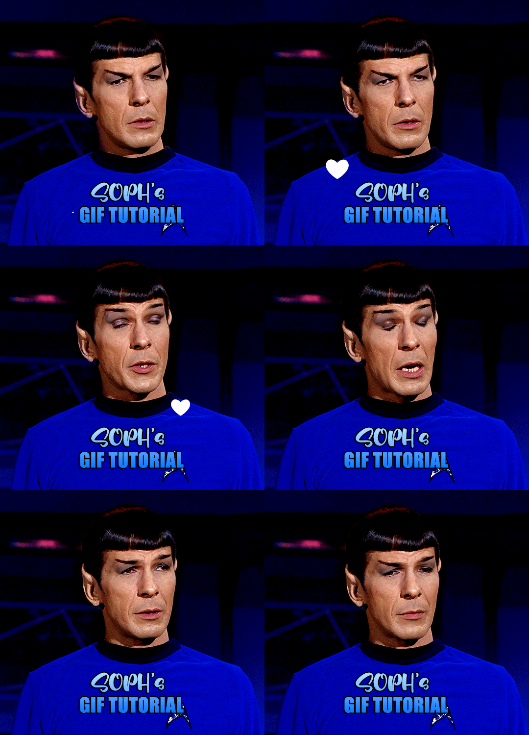
a very foking detailed GIF tutorial you asked for and how I color my gifs
However, I color them individually, so there will be explanation of tools I choose instead of showing what settings I used for this specific gif in this tutorial.
I will go through entire process of how I create gifs, the process of gifmaking can be different for others and there is no obligation of how to create a gif. Basically, do it however you like and enjoy the process.
this is part I, part II is here\in reblogs.
First, you will need to prepare everything, you choose the moment you want to gif and make screencaps. I use mpv player to create them, here is a great tutorial on how to install it. So I won't go over it, just follow it and or use another player which allows to make screencaps, such as kmplayer.
Once you make screencaps go to photoshop - file - scripts - load files into stack - browse - select screencaps and upload them.
At this point I will also add that I use keyboard shortcuts a lot, you can set them up to your preference, that is much easier for me and might be for you too, and I am so used to them that I forget where are some settings. You can do it from edit - keyboard shortcuts, you may set up anything there.
You will have all screencaps uploaded into one file. Once I have it I change canvas/image size, I also remove 10 pixels from each side, because I hate that some files have that weird black line which looks awful on gifs. But that's up to you. Use proper dimensions for tumblr, that is important since your gifs will look 'not good' when you upload them. I will go with 540x500px this time. (correct dimensions for tumblr are 540px for big gifs, 268px for two gifs along each other and 177-178-177px for the three gifs together)
Go to images - image size (crtl+alt+i) and change the size.
After that I make animation, because without it we would not be able to convert all the screencaps into smart filters. Go to windows - timeline
you will have something like this by default

click on create frame animation - then on 4 horizontal lines which will open menu - make frames from layers

click on convert to video timeline (that 3 horizontal lines and 1 vertical line or whatever it is, right under the first layer) you will get something like this.

now, this will be animated. If you choose convert to video timeline right away it will not be animated.
Now, select all the layers - filters - convert to smart filters
You will have something like this, and if you play it - it will be animated anyway. That way you can edit ALL the screencaps at once.

I usually start with sharpening, settings may change according to the files I have, for some you will need more sharpening, for some less. I go with filters - sharpen - smart sharpen and usually that's enough
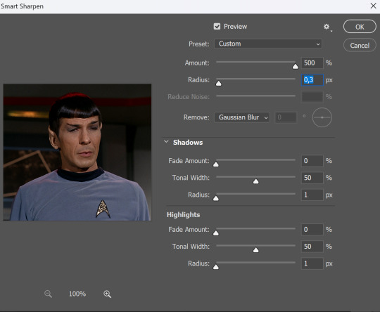
but I sometimes add more sharpening, just change radius to 0,2. So, repeat the action.
You will have it like this
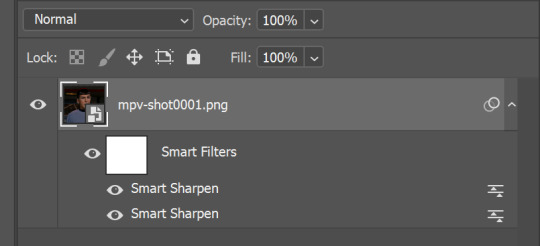
and at any point of making gif you will be able to change settings for it, if after coloring it will look not as good as you wanted to.
I will not go into a lot of details about coloring for this gif, because does not matter how good the coloring on this gif will be, it won't work as good on another gif.
There is no right way to start coloring, you may start with curves, levels or selective colors depending on the screencaps you want to edit.
Well, this time I did start with layer - new adjustment layer - curves. (yeah, i guess by the end of the day we all do lmao) (Always use 'layer - new adjustment layer'. That's the only thing I suggest to remember when you color. ) Just to brighten gif a little bit, but you also can change colors with it.
those are not settings I used for this gif!
Curves have option to edit colors, just press RGB and you will see options for RED, GREEN, BLUE. Upper slider adds the said color, the slider at the bottom removes it. That's a great tool if you have a very red\yellow\blue\green scene, with those settings and moving sliders here and there you will be able to add the color you want, for red scene I suggest to use more green and blue, as well as for yellows but with less green. Just move them to see what fits your gif better.


there are also eyedrop tools which will help you to edit picture, with the first one you need to find the darkest part of your gif and click, it will adjust your picture according to it. If there's too much red, it will make it bluer, etc. The middle one is the one I use the most out of them, cos it changes the midtones, it's great if you have very yellow picture, just press the yellow part and it will make it bluer\greenish, depends on the picture, and then you can adjust it to make it look better. And the last one you can use to lighten picture as well, just find the brightest part of the picture and press it. It will adjust other colors accordingly.
I like to play with settings, I could add more darkness to the gif by levels, by selective colors making dark colors even darker, but sometimes I just use layer - new adjustment layer - black & white. Putting it on soft light blending mode and changing opacity. Idk, I like the effect :D Also, by using these, you will be able to darken part or lighten specific colors
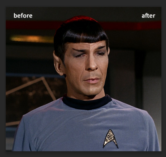
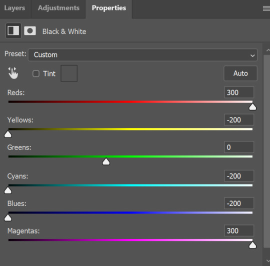
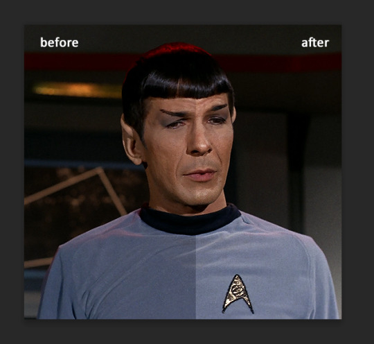
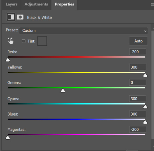
so yeah, play around and figure out what is the best way for you.
after that I used layer - new adjustment layer - selective colors. I think this is one of my favorite tools out there, I love it, I usually end up with 30 selective color layers if I make a super complex gif :D
You can change colors with it, make them more vibrant, or less.

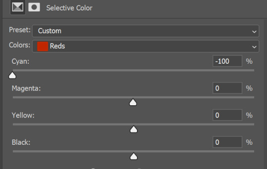
for each color you will have 'cyan, magenta, yellow and black' and by dragging sliders you can change colors, make them darker or lighter for the lovers of those paster gifs :D
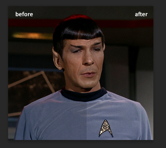
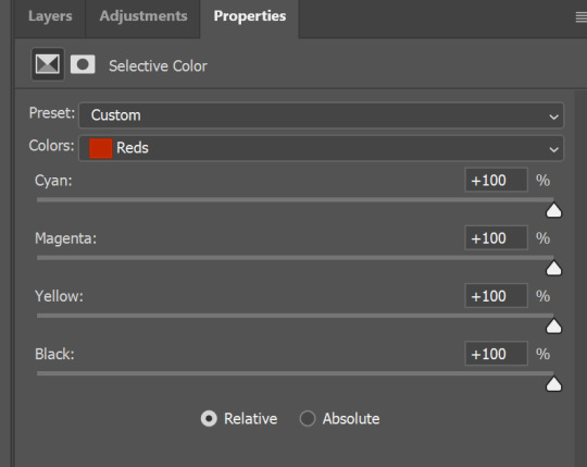
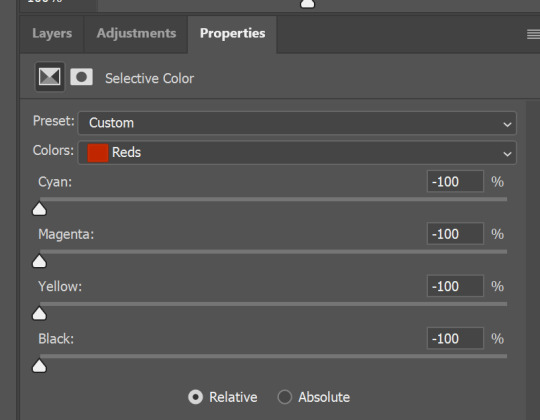

But don't worry, that's not where I will go with the gif, so it will look better, i promise.
You know how much I love making blue even more blue. So I go with more selective color layers to enhance it.
You do not have to use just one, and you won't be able to make it with just one sometimes. So add as many as you like to get the result you want.
next is one of my favorites - layers - adjustment layers - levels
with it you can darken colors or lighten them, there's also auto, as well as on curves, which will find the most suitable settings for your picture.
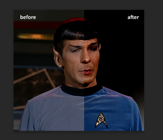
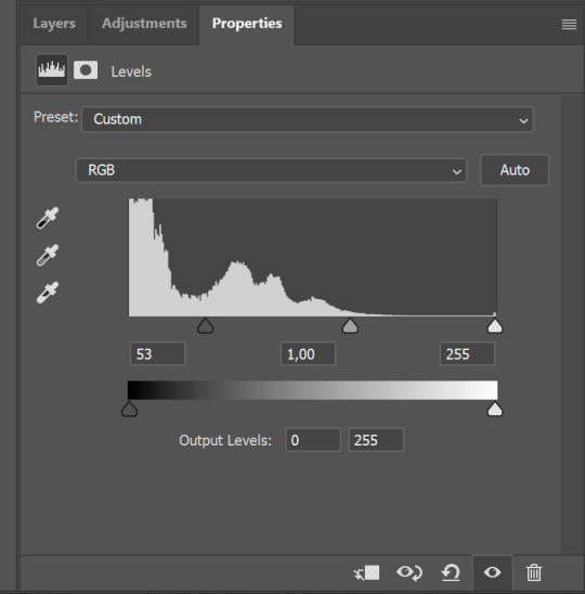

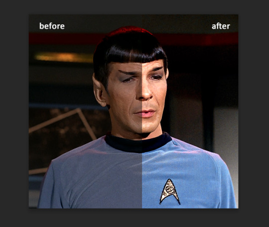
I hardly ever change the middle slider, cos
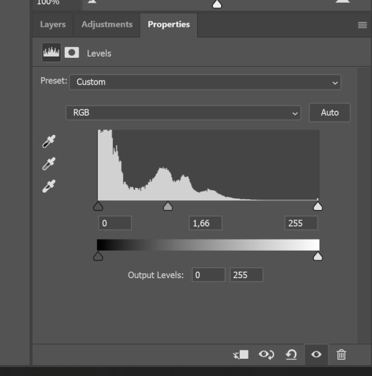
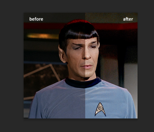
nope.
so, we are at this part of the gif by dragging sliders.
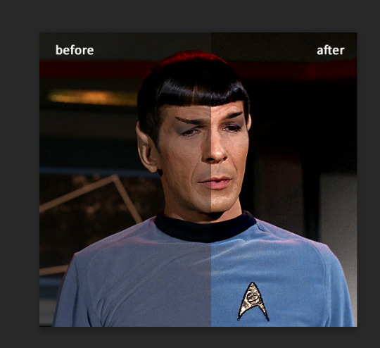
next one I used is layers - adjustment layers - color balance. right now I will stop adding directory, this tutorial is already long enough, so most of the things are there in layers - adjustment layers.
Absolutely love it, most of settings do the same things but a little differently, this one changes colors but also entire picture, not just part of it. You have shadows, midtones and highlights
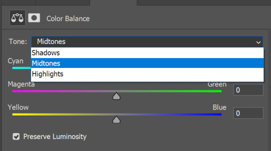
Each of them is really great when you have a yellow\red\blue\green picture to edit. And each of them has 3 sliders cyan\magenta\yellow.
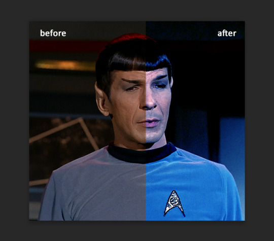
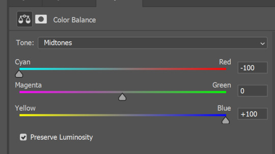
You see, if you drags sliders the other way it will make picture more yellow.
END OF PART I
since tumblr

129 notes
·
View notes
Text
Coloring Tutorial
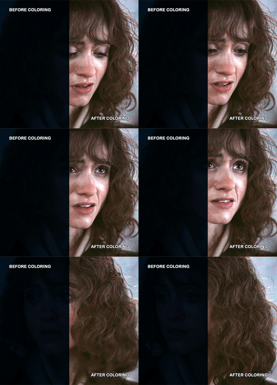
Hello, this tutorial is for the wonderful @djoharrington and those of you wondering how I colored this set. I’m going to be talking about how to color the first gif only to keep this tutorial from getting too long. The other two used the same coloring method with only minor adjustments made to keep them looking similar.
Yes, this scene really is that dark before coloring.
Quick notes on what I’m using:
mpv player for screencapping — not mentioned in tutorial
Photoshop 2021 for editing
I mention mpv player because I’m giffing 4k, and it’s one of the few players I’ve come across that take continuous caps that don’t end up looking washed out. It makes for easier coloring.
This is me coloring literally any Upside Down scene:

Step 1: brighten the hell out of this gif
You can use a throwaway layer to get you started. I used an exposure layer (which I eventually kept and adjusted during the original process of coloring this scene) with end settings of: exposure at +5.25, offset and gamma correction at default.


Now we can see all the beautiful details of Nancy’s face. Well, most of them.
Step 2: photo filter layer 1
The way I offset this horrid blue tint they use for Upside Down scenes is a photo filter layer (several for this particular scene). For now, just the one. Put this below the exposure layer!
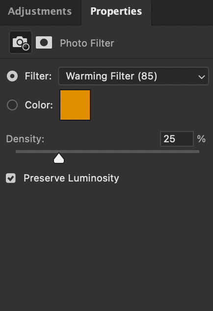
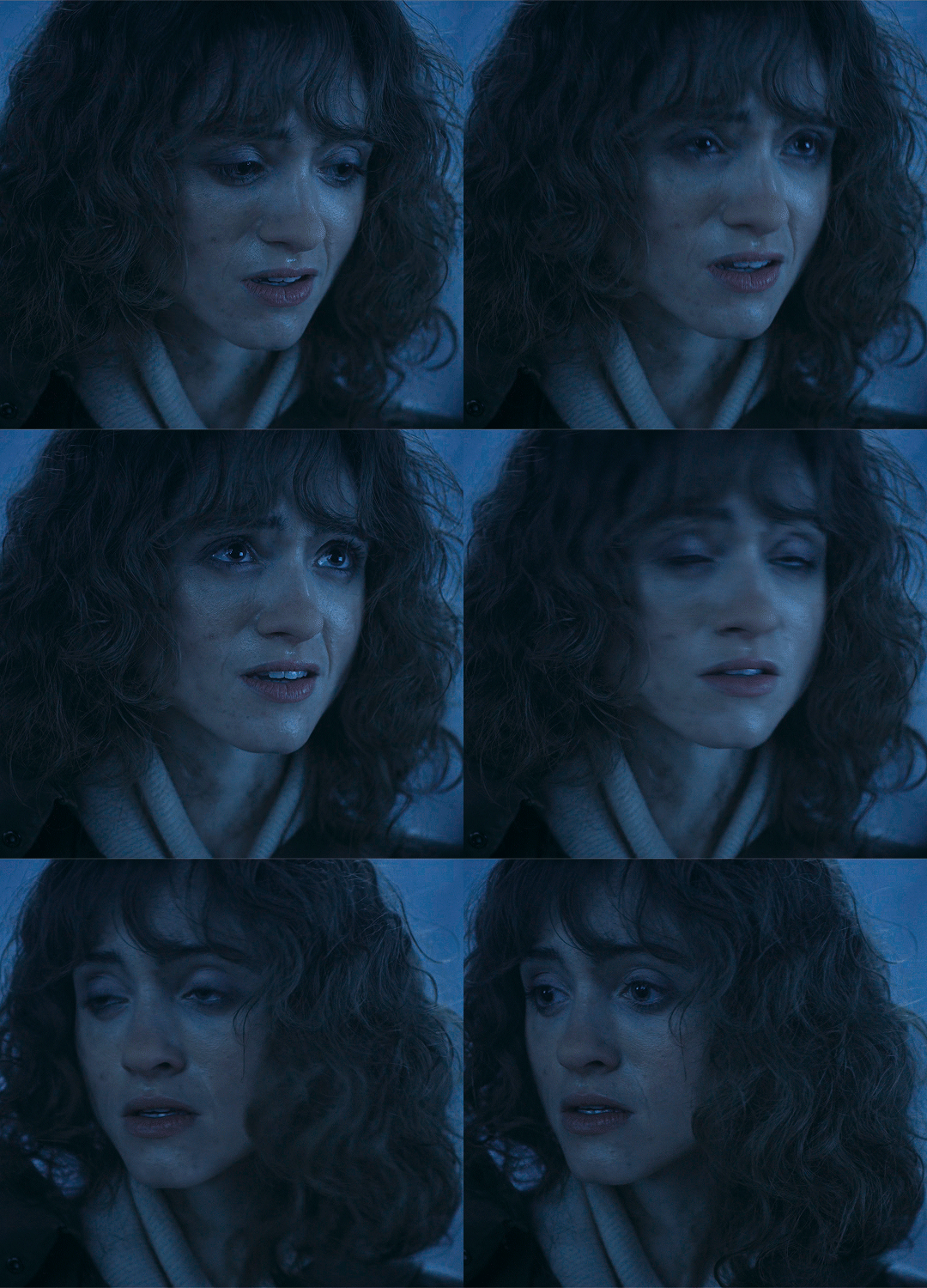
This brings a bit of color back to Nancy’s face and warms up the blue tones that are so prevalent in Upside Down scenes.
I don’t change the blending mode, opacity, or fill, just keep as is.
Step 3: curves layer 1
I clicked around a lot with this layer. Mostly in an attempt to get rid of the blue and adding more color to Nancy’s face. Didn’t get the result I was looking for with this layer until I added other layers. But I managed to brighten the gif a little more and add some contrast.
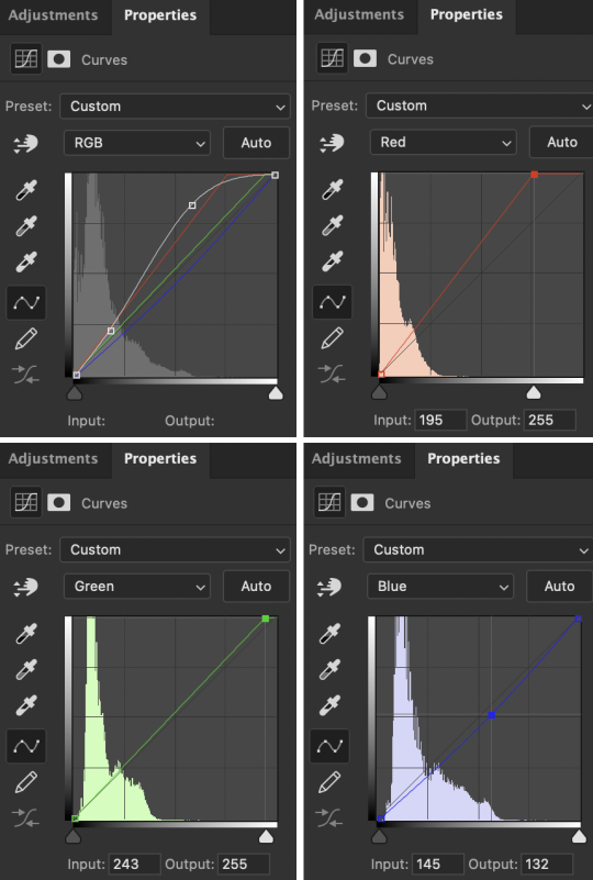

Step 4: hue/saturation layer
Put this layer below the photo filter layer! I used this layer to balance out the colors I pulled from the curves layer. Brought back some warmth/purples by adjusting cyans and blues.


Step 5: selective color layer 1
Ended up a little more purple than I wanted with the hue/sat layer, so I used a selective color layer (set between the hue/saturation layer and the photo filter layer) to get rid of the purple by, again, adjusting cyans and blues.
Make sure to have “Absolute” marked!

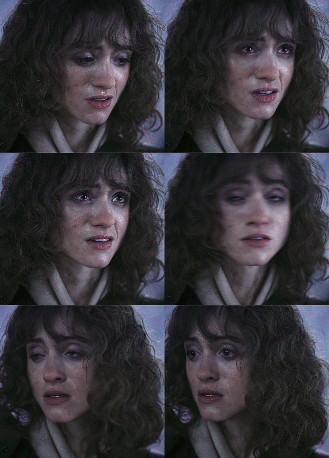
This is better! There’s a lot more color that isn’t blue in Nancy’s face now that I can work with and manipulate.
Step 6: color balance layer
This one goes on top of the curves layer (should be the topmost layer at this point). Only adjusted Midtones and Shadows, adding a little more red and yellow in her hair and face.
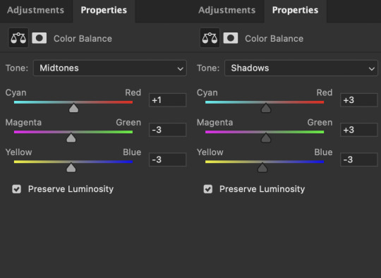

This looks a lot more natural. Now we just have to brighten it up again.
Step 7: exposure and curves layer 2
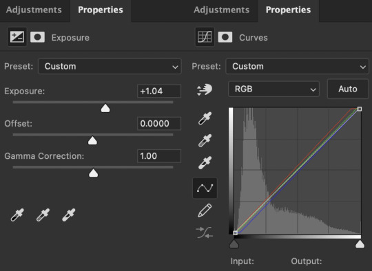
I don’t touch the RGB mode on this curves layer. I mostly adjust the Red, Green, and Blue modes by adding a little more red and green while sliding the bottom corner on Blue to add more yellow to the shadows.
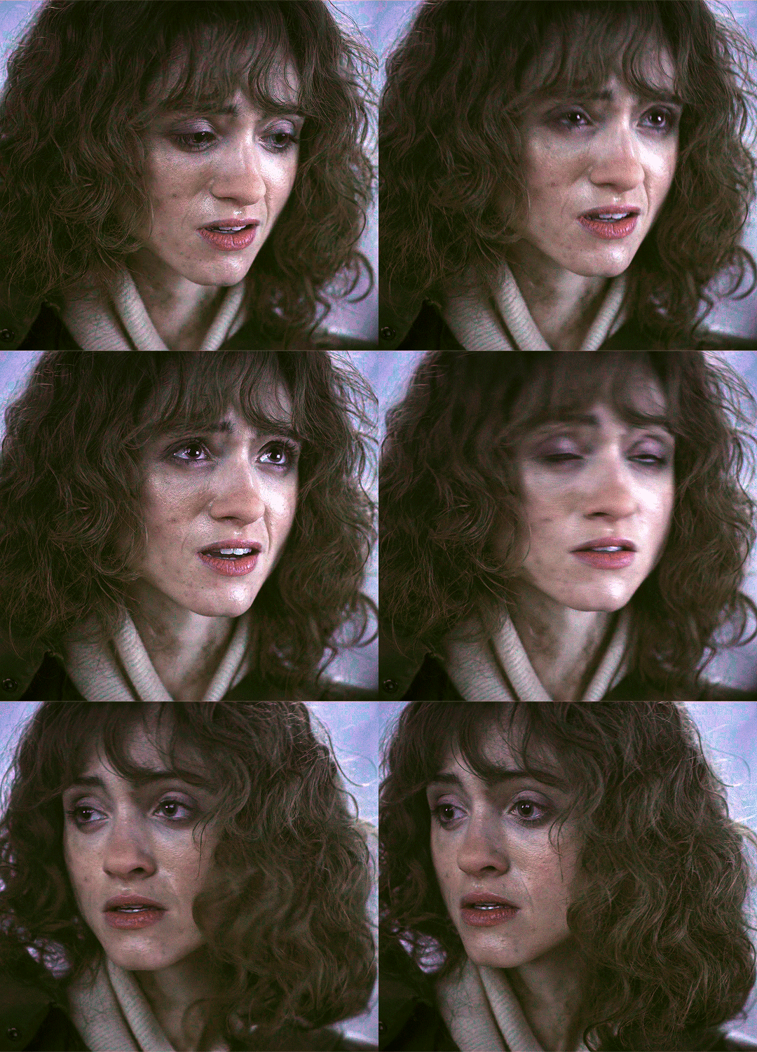
Technically, I could stop here if I wanted, but the purple is still pretty prominent in the gif, especially in Nancy’s eyes, and it’s hard to adjust that without adjusting the color of the entire canvas since there’s movement in this gif. If Nancy were more of a still subject here, then layer masks are an option. Alas…

So I adjust the colors and try to get rid of the purple. The gif as a whole kind of looks washed out as well. I want more color here.
Step 8: photo filter layer 2
I set the opacity to 55%. I want warmth, but not too much.

Step 9: selective color layer 2
This is where I end up seeing the most change. Even small adjustments go a long way here.

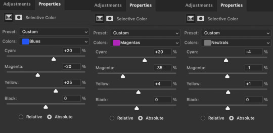
It’s mostly the cyans, blues, and magentas which makes sense given how overwhelmingly blue this scene was, then almost overwhelmingly purple as I started making adjustments. Red and yellows are important for anything to do with the face and hair. This is where I add a more “natural” shade to Nancy. Literally anything that isn’t fucking blue is an improvement to me at this point, given how it started out.
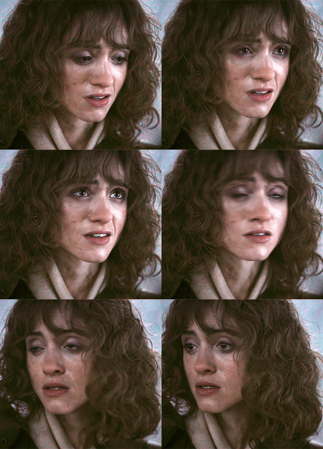
Blue is back in the background where it belongs and not in Nancy’s face.
I think this is where I originally stopped. Like this looks pretty good to me, but I also wanted to make sure the other two gifs could be colored similarly, and they were for the most part. But there was only so much adjusting I could do to Nancy’s face in the third gif without adjusting the entirety of the scene (and set), so I had to go back and adjust her here to get a similar coloring.
(A lot of this set was back and forth, adjusting the colorings until they matched. It took so long. Especially with the stupid Upside Down visual effects in the background. I’m a bit of a perfectionist, so there were a lot of minor adjustments and a lot of nitpicking until I ended up with a result I liked.)
So last and final step.
Step 10: selective color layer 3
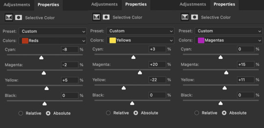
I ended up adding more red to the face, hair, and shadows to keep the first and third gif similar in coloring. And this is where we get our final product.
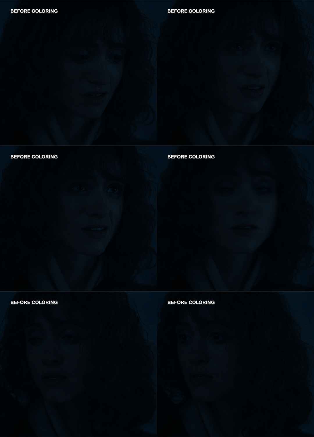
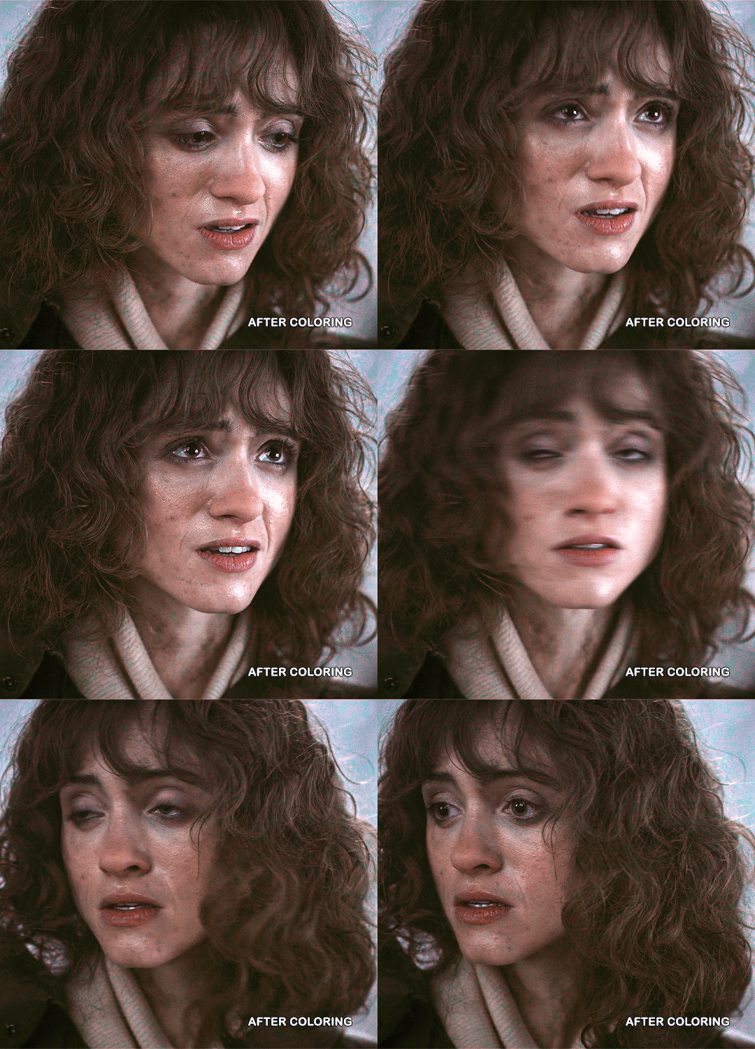
And the side-by-side comparison again.

Anyway, here you have it. This is the end of the tutorial. I can in no way guarantee that this method will work on other Upside Down scenes (trust me, I’ve tried), but hopefully you’ve learned something!
And hopefully I’ve explained myself well enough that you can apply this :)
#text#photoshop#tutorials#coloring tutorial#gif tutorial#photoshop tutorial#*tutorials#Stranger Things#djoharrington#requested#1k
1K notes
·
View notes