#convert color image to black and white
Explore tagged Tumblr posts
Visit Tumblr Blog
Explore Tumblr blogs with no restrictions, modern design and the best experience.
Last Seen Tumblr Blogs


Fun Fact
Tumblr Inc. is funded by 13 investors.
Text
#online image converter#best free photo editor online#meme generator#convert color image to black and white#free online meme generator
0 notes
Text
Fellowship Cloak Weaving Draft
Hi all! I've been kind of quiet on this blog, but I have something really exciting to share today: after six years, I FINALLY figured out the weaving draft for the Fellowship cloaks from Lord of the Rings.
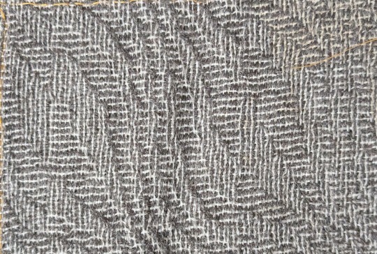
This is a problem I've been trying to figure out since shortly after I made my Legolas cosplay in 2018. The cloaks that the nine members of the Fellowship receive in Lothlórien look like a nondescript gray fabric from far away, but zoom in and you'll see a very complex pattern of horizontal and vertical bars of dark gray and white.
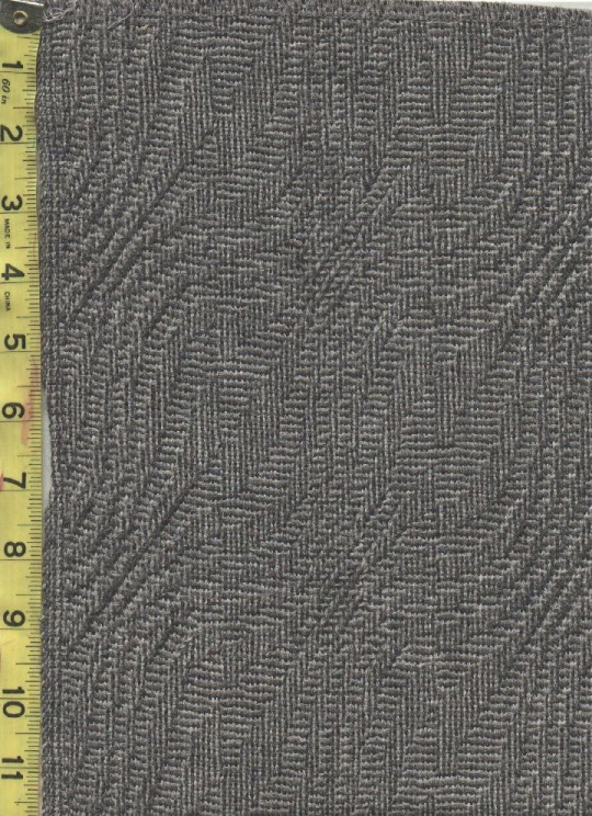
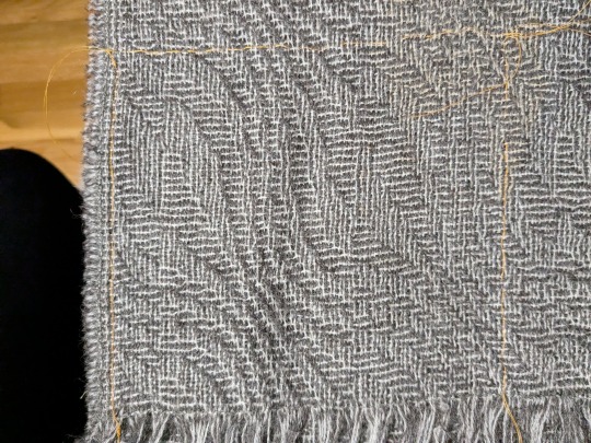
(First image from Alleycatscratch, second is a photo of the scarf of the same fabric I bought from Stansborough where I was attempting to trace the pattern repeat with orange thread)
This is going to be a long post, so I'm just going to lead with the completed draft:

Imagine me Will Smith wife posing at this for the last 24 hours.
It's got the correct size of pattern repeat! It's got the five individual ripples! It's got that dumb little pattern break in the middle that breaks up the center of the leaf motif! I am OVER THE MOON about figuring this out, especially starting out with very little knowledge about weaving drafts in general. More ramblings about this type of draft and my thought process below:
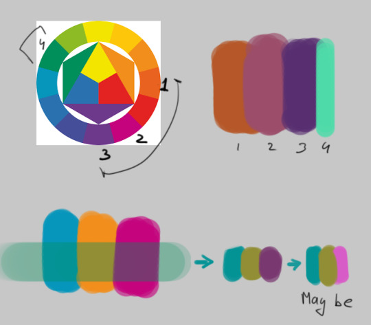
This particular pattern is known as "shadow weave," a subset of color-and-weave where the pattern is created from the interplay of different warp and weft colors plus the weaving draft itself. To get an idea of how that works, let's start by looking at plain weave in one color:

The solid purple bar at the top indicates the color of the warp threads, and the solid purple bar at the right indicates the color of the weft threads. So far we've got our basic under-over-under-over pattern in a single, solid color (purple). But what if we add an additional color (green) to the warp, and alternate those colors? Then we'd get a speckled fabric like this:

The visual effect looks pretty much identical regardless of if you start with green or purple. However, if you also alternate purple and green in the weft, it produces a very different effect depending on if you start with purple or green (note the differences in the bar on the right):


So cool, now we can make either vertical or horizontal stripes! If you double up on the colored threads in some areas, you can even flip between the two and start dividing the fabric into "blocks," like so:


Note that with all these changes, the only thing we've been doing is changing the order of the colors in the warp and weft. The actual weave structure itself is still just regular ol' plain weave. The pattern that we've created in the pictures above is called "log cabin," which you can read about here. But similar effects can be created by skipping shafts/picks in the weaving draft as well. So how do we get from log cabin into the more complicated and general category of shadow weave?
It's weird to describe how to convert a given pattern into shadow weave. There are multiple very good books with chapters on shadow weave as well as books entirely dedicated to it. Despite my best efforts, all these explanations still got so technical so fast it feels like, to me at least, asking a 6 year old to recite an entire Shakespeare play verbatim immediately after confirming that they can, in fact, sing the alphabet song. So I'm going to give my best shot at explaining it, and if it doesn't make sense, just blame it on me and check out some of the linked books above if you're really curious.
Think of shadow weave as a beauty filter for a black and white drawing. If you create a pattern out of black and white blocks/pixels/whatever, the shadow weave "filter" can be applied to it to create a similar pattern that preserves the shapes in the original, but makes them out of vertical/horizontal lines instead of solid color blocks. So in some of these books you'll find mention of converting a twill or an overshot pattern into shadow weave - that's what this is referencing. The original pattern (usually designated with light yarn) gets a secondary shadow pattern (in dark yarn) inserted into in between every other thread (also called an "end" when referencing warp yarns).
I got stuck at this point for literal years. I could find examples of weaving drafts using shadow weave, but couldn't figure out how to generate ones of my own. I imported some of the drafts I found in books into weaving software and poked around to see if I could push the patterns in the direction I wanted by changing individual elements. My experiments in changing individual warp ends and weft picks always ended up looking like stretched or compressed versions of the original pattern (when I was being careful), or incomprehensible garbage (when I was being daring). I even bought a sample of the fabric from Stansborough in the form of a scarf, thinking I could brute force it by using a magnifying glass to figure out the interlacements. I was able to figure out how large the pattern repeat was (approximately 160 x 80 ends), but otherwise I got nothing but eye strain. I ended up tabling the project and coming back to it every couple years, banging my head against it until I gave up.
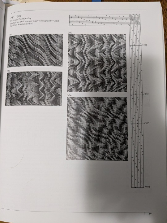
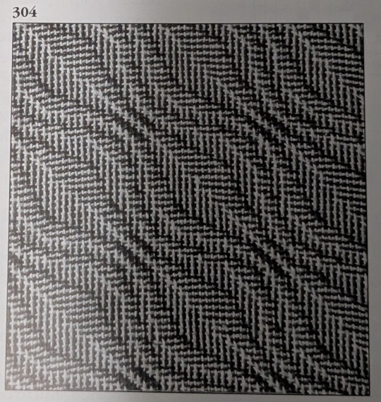
Until one day last week when I was flipping through the Strickler book and saw this page:
And I was like

HOLD UP
IT'S HER
...or at least a close cousin of her. BUT IT WAS A START.
So the first step was to identify what about this pattern needed to change in order to make this look like the Fellowship cloak. Overall, the main differences were:
Pattern repeat on Strickler 304 was too small - it was 42 x 42 ends and I needed it to be somewhere in the ballpark of 80 x 80 before altering the repeat.
The Fellowship pattern has a weird vertical dividing line that runs down the middle of the leaf motif, effectively doubling the width of the repeat by creating two similar looking but different leaves. This was the change I was least concerned about, as flipping between vertical and horizontal lines is pretty a straightforward process as shown above with the log cabin draft.
Strickler 304 also has a different number of waves (peaks and valleys, or whatever you want to call them) compared to the Fellowship pattern. There are 3 waves in Strickler and 5 in Fellowship. Figuring out how to add these extra waves was the biggest obstacle for me to address.
And finally, a couple of things I didn't need to care about for the weaving draft: 1) the Fellowship pattern is elongated in the warp direction, but this has more to do with a little extra spacing between weft picks as compared to the warp threads. When weaving this you'd just need to make sure you don't beat it very hard and you'll get that tall rectangle shape instead of a square repeat. 2) Both patterns have mirrored symmetry around a diagonal line drawn through the center, meaning that for treadling I could "tromp as writ" or basically just mirror the threading diagram to get the treadling instructions. For reasons I can't figure out, the Strickler pattern isn't exactly tromp as writ but looks close enough to it that the effect is still there. But I don't really care enough to figure out why - the important thing is that it gives us a threading diagram to start with!
So to start with, here's what Strickler 304 looks like in my weaving software:

(By the way, this is Fiberworks PCW Bronze. The trial version is free, and the only difference between that and the paid version is that the save/print options are disabled. I'm not sure they know about screenshots, bless their hearts.)
This is a design for 8 shafts and 8 treadles, thus the 8x8 square in the upper right corner. And you can see in the threading diagram (upper horizontal bar) and treadling diagram (right bar) that the curvature of the waves takes a similar shape to the curves of the final pattern. We just have to figure out why. And since I had already tried changing individual warp ends and treadling patterns without much success, I needed to approach in a different way.
What ended up helping me see the forest for the trees was de-shadowifying the pattern. It's relatively easy to get the black-and-white version of the pattern from the threading draft - you just need to delete the shadow, which means removing every other warp end. This is what deleting all the dark ends from the warp and light ends from the weft looks like:

We can also see with a little more detail how the threading diagram is similar to the curve in the pattern. The pattern is 21 pixels tall, but it's been chopped up to repeat over 8 shafts, like so:

OKAY COOL COOL COOL. EVERYTHING'S COMIN' UP MILHOUSE IVORIVET. From this green squiggly line we know two things:
The final number of warp ends in the shadow weave pattern is double whatever the height of the squiggle is. In the case of the Strickler pattern, we're going from 21 to 42. Since we know that we need our final height for the Fellowship pattern needs to be 80, the squiggle for that pattern needs to be around 40 pixels tall.
We needed to stitch three repeats of the Strickler threading diagram together in order to see the full squiggle. How many waves does the Strickler pattern have? Three. How many waves does the Fellowship pattern need? Five. How many shafts do we have to work on? Eight. What is 5 x 8? 40!!!
So how about we make a NEW squiggle, only 40 pixels high instead of 21? (We're gonna drop the pixels in blue, since threading diagrams won't work if you put a single end through two shafts.)


Next, we're going to chop up that squiggle and use it to create a new threading diagram in Fiberworks. I'm also using "tromp as writ" here to create the treadling pattern.

LOOK AT THAT. IT'S GOT MORE WAVES!! FIVE OF THEM!
And then we add back in the shadow by creating a space for a new end between each existing end:


And then add in the shadow. I'm using 4 as my number for the shadow offset since we're using 8 shafts. So shaft 1 shadows to shaft 5, shaft 2 shadows to shaft 6, etc.

And we're going to apply tromp as writ again to get:

AYYYYYY WE'RE GETTING CLOSE! I'm fairly certain that the reason why the Strickler treadling wasn't exactly tromp as writ had something to do with centering the pattern repeat a little more than this, but I don't really care about that so I'm going to leave this treadling the way that it is.
From here out, we need at add that weird vertical dividing line that chops up the center of the leaves. So we double the pattern repeat along the horizontal axis, and offset a 40 pixel section in the middle of the threading diagram by 1 pixel. I've also colored in the differences between the dark and light ends to help differentiate the original and shadowed curves a little bit more. (I also tried offsetting the colors of the warp ends by 1 as well like what we did in the log cabin example, but I ended up liking the way that this looked more.)
THERE SHE IS!!! MY PRECIOUS!!

From here on out, there is still a ton of work I need to do if I actually want to weave this cloak from scratch. I did buy roving in quantities that could be used to spin both the dark and light yarn (dark gray Gotland for the dark yarn, and dove gray merino + white alpaca for the light yarn), but there's still the matter of, like, handspinning a cloak's quantity of extremely fine yarn. I did start spinning the Gotland several years ago as fine as I could possibly manage, and got through maybe 20 ounces of it. However, I'm a much better spinner now and I'm not sure if the my skeins from several years ago would be suitable for weaving, or if it would be worth replicating what I did back then vs. just starting over with a new standard. There's also the possibility of just... buying weaving yarn if I want to skip that step, which would definitely save me a significant amount of time.
Anyway, thanks for reading this far and I hope it helped break down why this was so exciting for me!
#lord of the rings#lotr#weaving#lotr cosplay#shadow weave#handweaving#hand weaving#cosplay#fiber arts
882 notes
·
View notes
Text


Here are some painting tips, as promised. I hope they will help beginner artists!
Composition
Position of characters on the sheet
Choose the location of your character to be beneficial to the appearance of the art in general, you can accentuate the important places where the viewer should look first by using perspective and composition.
Tone sketch
Set the lights based on references, but adjust to your own, favourable lighting.
Contrasts come in many forms. Contrast in color (warm and cold), values (dark and light), shapes soft and hard, straight and curve, etc.
Less is better. Work on the details of the most important part of your work while cutting down everything else. If you do strong detail in one place, don't forget to add looser detail in another so the viewer's eye can rest. For example: If you are detailing a portrait, don't detail the background as much. Next to a place of high detail, there should be a place of low detail so that the picture does not look overloaded.
All in all, you can twist and break perspective, anatomy and shapes to convey your idea better. No rules are made of steel, they should support your imagination, not restrict it
Anatomy
Break down objects into simple shapes to arrange them in space.
Check references! plasticity comes first, then structure (muscles are important, but proportions and line of movement come first).
Take a photo of yourself, you will be able to understand how to perform your pose naturally. Color/light.
Light is part of the composition, put it in a way that highlights the important things. Air perspective
General rules of composition. From the general to the particular, first prepare the general scene, correctly place contrasts and accents, make everything important in contrast, and take the unimportant into an aerial perspective. (aerial perspective, or atmospheric perspective, refers to the technique of creating an illusion of depth by depicting distant objects as paler, less detailed, and usually bluer than near objects.)
When all the points are ready we can start working out the details.
When all the details are finished again it's back to the overall picture, looking at it from a distance. Check if the accents you wanted to draw attention to are working. They should have the highest contrast. Check if the contrast is not created by objects on the edges, where you don't want the viewer to pay attention. For example, if you are painting a portrait then the focus should be on the face and not on the details of the clothes or details in the background. (You can always convert the image to black and white and check the contrast)
Save the stages of your work to check against the initial idea and see what things have changed for better or worse!
#digital art#art tips#beginner artist#small artist#digital artist#art advice#art tutorial#art guide#step by step#drawing basics
764 notes
·
View notes
Text
How to make a multi-colored, multi-tip scatter brush in Clip Studio Paint — correctly

They made it annoyingly specific in CSP and I keep forgetting every time. So this is a note-to-self + whoever else needs it:
↓
What we don't want:
1. When a brush tip is created from black / white on a regular RBG layer, it will only paint in black / white.
It will only use the selected color if Color Mixing is checked — bad if you wanted an opaque brush, because this makes the brush tips transparent when they overlay one another, as in the orange leaf clumps ↓

Troubleshooting: If the brush paints in grey / B&W as shown in the top row of leaves, check the Blending Mode in brush settings. Here, it was set to Brightness instead of Normal.
↓
The correct way:
https://tips.clip-studio.com/en-us/articles/679 CTRL + F → [2] A: How to create brush tip images that allow for freely changeable colors
↓
1. MOST IMPORTANT! Draw your brush tip on (or convert to) a Gray or Monochrome layer.
(Usually doesn't matter, but if your brush has gradients etc. choose Gray. It also helps to NAME and TAG it so you can find it.)

2. Edit → Register Material (J) → Image... → Check "Use for brush tip shape" on.

3. Brush settings → Brush tip → Add brush tip shape
(Here, I'm adding it to a pre-made brush that already has some color & size settings. Note that the brush stroke is displaying in color — GOOD! If the layer wasn't properly made B&W, the brush tip will show in black & the stroke will display in black.)

4. Should look like this. Can add more tips, test the brush settings you like & Save all settings as default.


443 notes
·
View notes
Text

hi! someone requested me to do a tutorial based on this gifset!
this tutorial requires an intermediate knowledge of gifmaking. i won’t teach you how to do gifs from scratch, there are other tutorials for that out there.
[tutorial under the cut]
THE BASICS
AN INTRODUCTION
first off, the gifset in question is based on this gifset by @/eddiediaaz and i got permission from them to explain the process. i won’t be sharing the template because it’s a near replica of theirs (that isn’t shared to the public) and i don’t feel comfortable doing so, but you can recreate it by yourself just like i did!
also, ESL, so please pardon any mistakes.
THE FONT
Circular ST (Medium & Black). download it here & here.
CLIPPING MASKS
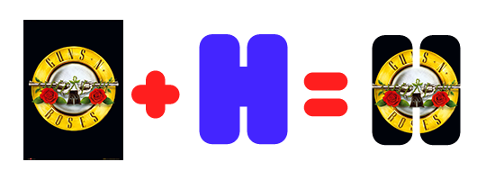
clipping masks are the way i put images and gifs inside of shapes. i used that method in the first and second gif of the Spotify gifset as you can see here. what does a clipping mask do? basically, it links two or more layers together in a way it follows the “shape” of your base layer. ie, everything that is shown follows the “shape” of your main layer and nothing more. your base layer can be anything: a shape, an image, a gif, a text, an adjustment layer, really everything. let’s see an example:
CLIPPING MASKS & SHAPES

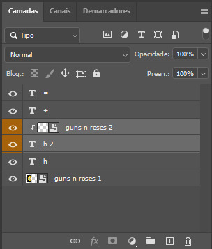
the original image (Gun 'n' Roses logo) is intact, as in, it’s not cut like a circle, something that cannot be undone. instead, everything outside the limits of the blue circle is just hidden. if i delete the base layer (the circle layer), the original image will appear as it originally is, as an rectangle. talking about layers, let’s see my layers panel (some things are in Portuguese, but i think you can understand):
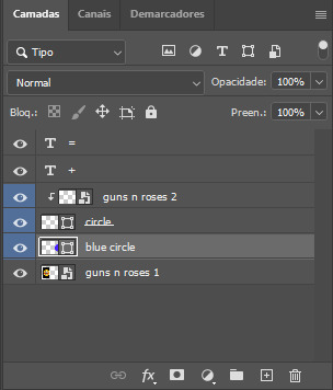
notice the little arrow pointing downwards to the “circle” layer. that is the clipping mask symbol. the base layer always needs to be below what is being clipped. if the base layer is deleted, the chain is broken and every layer clipped will now act independently and have its original shape. you can have as many clipped layers as you want. you can also have multiple chains going on in a .psd, each one with its own base layer. to clip a layer, you just need to press ctrl+alt+G or cmd+option+G while having the layer you want to clip selected (NOT your base layer). or, you can go to LAYER > CREATE CLIPPING MASK.
CLIPPING MASKS & TEXT
let’s see the same example, but with text instead:
A TIP
because adjustment layers are clippable, you can completely gif by using clipping masks. this is very useful when you have more than one gif inside a canvas and don’t want an adjustment layer to affect everything besides a certain layer/element.
let’s take my first gif of the Spotify gifset as an example.
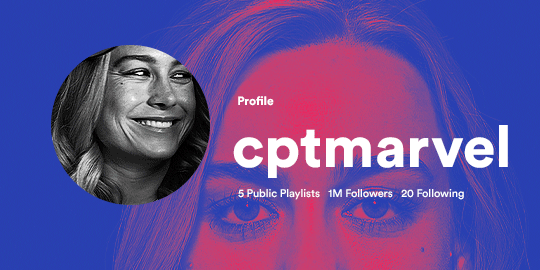
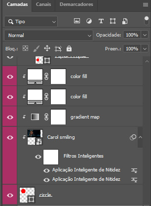
the circle is the base layer. the “Carol smiling” layer is my gif converted to a smart filter. above that “Carol smiling” layer, there is a black and white gradient map and two color fills of white so i can achieve the coloring you see. all those layers are clipping onto the circle layer, making my now b&w gif have the shape of a small circle as well. those layers are in a folder in the .psd of my first gif, so i don’t have multiple files sitting on my PC to assemble just one gif. i could have giffed that small gif separately and pasted it onto my canvas as well, but i like to do this way so i can adjust everything i want in real time instead of redoing a gif over and over every time i want to change something.
HOW TO MAKE EACH GIF
all gifs are 540x540px.
THE FIRST GIF
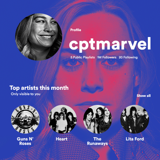
the first gif has 6 elements. the elements are: a big gif serving as a background (a close-up of Carol), a smaller gif inside a circle (a b&w gif of Carol smiling) as a profile picture and four static images for the featured artists. i giffed as i normally do (loaded screencaps, resized the gif, sharpened the gif, etc) for my background gif. to achieve the coloring, i’ve added a gradient map (layer > new adjustment layer > gradient map) purple to pink. to the profile picture, i made a 160x160px circle in the top left corner. the color of it doesn’t matter. the next step is a matter of taste: i giffed the smaller gif in the same .psd thanks to clipping masks that i explained earlier, but you can do it in a separate canvas too. for the featured artists, i made four circles with 98x98px each. for the images, i had to check Spotify for their selected PFPs. after that, i googled “[band/artist] spotify” to find the images. the PFP of bands and artists in the Spotify app are displayed in black and white, so you might have to make them b&w if you happen to find them only in color. to make the artists PFPs pop a bit more, i transformed them into smart filters and added a bit of sharpening to them (intensity 10 x radius 10). you can adjust the colors and the brightness if you want, too. the sizes of the texts in the gif are: 58px (username), 20px (top artists of the month), 15px (name of the artists), 12px (only visible to you + show all + profile) and 11px (following and follower numbers).
SECOND GIF
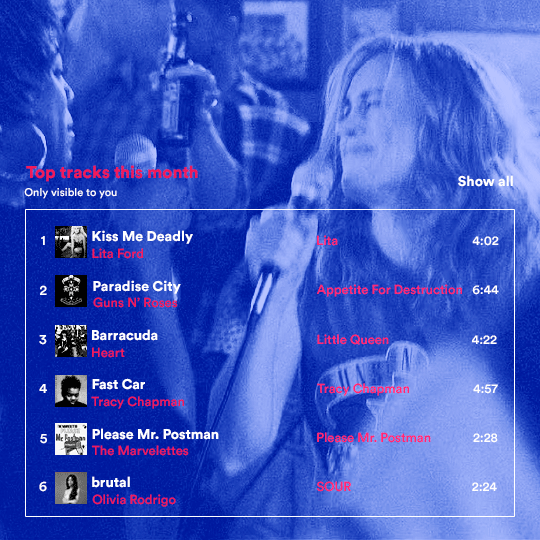
for the chart, i created a black rectangle (490x308px) that i set its blending mode to lighten (thus making it transparent) and i added an internal white stroke. i added the text and the little squares next to the top 6 numbers. the font sizes are: 17px (top tracks this month), 11px (only visible to you), 14px (song title, show all, top 6 numbers), 13px (artist/band, album title, length of the song). i added the album covers — that i made b&w — by clipping images onto 32x32px squares. for the coloring, i added a gradient map (dark purple > light purple).
THIRD GIF
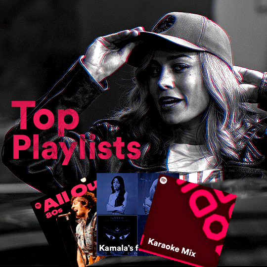
there are three types of playlists in this gif: a Spotify original playlist, a playlist made by a user and a Mix. you don’t have to follow this formula if you don’t want to, but in the case you do, here’s how i did it: browse Spotify for an original playlist of theirs. chances are, if you google the playlist’s name, you can find its cover on Google Images. at least, i found the “All Out 80s” cover that i used in my gifset. you can also create your own. for the user playlist, just pick four songs and find their (album) covers, also on Google. create a square canvas on Photoshop and make four squares, each in one quadrant of the canvas. paste your images onto your canvas and clip the images to each square. then, add a gradient map (black + whatever color you want) to all those images and title your playlist (font size: ). save that collage as a PNG and load to your gif canvas or merge all the layers+transform into a smart filter and drag the smart filter layer onto your gif canvas. now, the trickiest one. while you can invent your own Mix, i wanted to use a real one, but i had no idea on how to find them. thanks to reddit, i discovered that, if you search “made for you” on Spotify, you will find their Mixes! some of them are very whacky and specific! i just picked the Mix that made the most sense for Carol from that (gigantic) list. before doing the next step, i would advise you to google the name of the Mix you picked to see if you are able to find the cover of it with good quality. i wasn’t able to find mine (Karaoke Mix), so i just screenshotted my Spotify app, pasted that screenshot into Photoshop and cut the Mix cover and pasted that onto my canvas. the quality wasn’t great, so i transformed the cover into a smart filter, added a bit of gaussian blur and then sharpened it (intensity 10 x radius 10). the color wasn’t what i wanted either, so i used Hue/Saturation to change the hue. because the original image for the Mix was smaller than i wanted and i stretched it to make it bigger, the quality of the text and the Spotify logo was botched. i painted over the Mix cover and created a text with the font i linked earlier to replace its now pixelated title. i also painted over the little Spotify logo, found a logo in the internet and pasted over the Mix cover about the same size of the original logo. to achieve the “3D effect” of the gif, i made my b&w gif, the base. then, i duplicated all layers and added a gradient map (black > pink) and merged all the layers of that duplicate. i made a second replica of my gif, now with a different gradient map (black > blue). i set both replicas to the ligthen blending mode. you will notice that the replicas will "disappear" and only the original b&w gif will remain. if you move the replicas a bit, that colored border will appear. this doesn't work much in very bright gifs without a lot of dark areas, btw.
FOURTH GIF
this gif used an altered (by me) version of this template. (i changed the fonts to match the rest of the gifset, too.) for the color text effect, you will have to gif with the timeline bar. take your gif’s length and do the math to find how many frames are ⅓ of it. take your lyrics’ layer and cut it into three equal parts or close to it by using the scissors icon in the timeline panel. in each third, change the color of just one line, line by line. when you play your gif, the colors of the lyrics will change like in Karaoke. you can do the same thing with frames iirc, though. i explained the timeline method because that’s the one i used in this gifset and use in general gif making. for the coloring, i added a gradient map. to make the colors pop a bit more, i add two gradient maps: the first one is in black and white, the other is in color. that adds depth to the blacks and darker colors of the gif.
FIFTH GIF
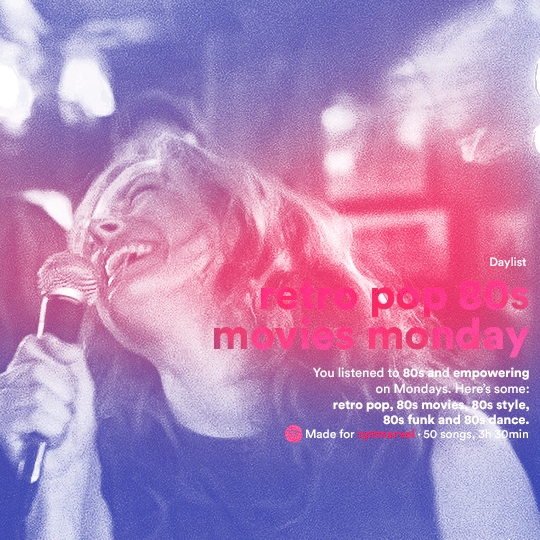
like in the Top Playlists gif, i wanted for my Daylist to be real as well. to achieve that, i listened to my Carol Danvers companion playlist (that you can listen here) for a long time until my Daylist refreshed itself. (Daylists refresh in certain times of the day — don't worry, Spotify will tell you when.) then, i just copied what it told me — the title and the genres i listened to generate such a Daylist, plus the genres i should check it out. you can invent your own Daylist if you want, but because it is generated by AI, i find very difficult to mimic its crazy titles, but you can try! you can also search in the web for other people’s Daylists if you want, but usually people don’t tell you what they listened to to get those playlists and nor what was recommended for them to listen to and i, at least, find that information important for the gifset. be aware that Daylists aren't available for every country yet (like in mine), but i found a way to work around that. the browser Opera GX offers a free "VPN" — not exactly a VPN, but it works close enough — so you can set your location to the US and listen to in-browser Spotify. i recommend not log into Tumblr while using Opera's VPN as there is a myth (that could easily be true!) that Tumblr terminates people's accounts that use a VPN. font sizes: 43px (daylist title), 13px (text), 12px ("daylist" & "made for"). for the flare effect, i searched for flare overlays on YouTube and downloaded one of those videos with 4K Video Downloader, a free software. i loaded the overlay into Photoshop and added a gradient map (purple > pink) over it, thus changing its color. i pasted the overlay onto my b&w gif and set its blending mode to screen. voila!
that's it! i hope you liked it and that i was able to express myself well. if you have any questions, feel free to contact me, i love helping people about their gifmaking questions! 💖
#*#*tutorials#gifmaker tag#dailyresources#usergif#completeresources#alielook#userairi#userhallie#userbess#userrobin#usershreyu#userzaynab#tuserju#tusermalina#tuserheidi#usertina#userabs#userbuckleys#usermagic#userjoeys#antlerqueen#userarrow#flashing gif tw
450 notes
·
View notes
Note
Haii!! Just wanted to drop in and say how much I love your work. I spent a good chunk of my night scrolling through your blog heh! I absolutely adore how you color and on that, I was wondering if you had any tips you’d like to share to keep the palette cohesive? Perhaps tutorials you watched or observations you made.
I hope you have a wondering day or night!! Lots of love 💕 (Can’t wait to devour more of your art!)
Hi! Thank you so much! ^^
One of the most reliable ways to keep your values and composition in check is by constantly checking your work in grayscale and at a tiny size. If you shrink your image down to the size of a battery and convert it to black and white — and you can still tell what’s going on — then you're on the right track. But if it turns into visual chaos or becomes unreadable, that’s a sign there are issues with tone or too many unnecessary details.
As for color — I really like working with analogous palettes and adding one accent color. I’m also a big fan of "glowies" and often try to include them in my art. Combining those techniques, you can get things like blue-purple interiors lit by warm yellow sunlight, or beige characters standing out against green backgrounds.
An accent color doesn’t always need to be the light source either — sometimes placing a cool color like blue in the shadows of a warm object (like red) can make the whole thing feel more vivid and interesting.
And one last trick that helps me a lot is "color unification." If your palette feels messy or disjointed, you can simply glaze everything with a single color. It helps pull the image together and sets the mood: a yellow glaze creates a sunny feel, blue gives an underwater vibe, and brown or grey can make it feel grounded and indoors.
117 notes
·
View notes
Note
hi! would it be possible to post a tutorial of how you created the shapes in this set /post/753222419295158272 thank you :)
sure I made the gifset a while ago so don't have the psds saved but i decided to make a new gifset with a similar shape effect and show you how i made that :)
tutorial below the banner/cut

first start by making and colouring your base gif as you'd like. for the example i'm making today i'd like a pink gif.
for simplicity i'll put all the colouring layers in a group so it is easier to see what's going on with the shapes, but this is not a step i usually take.

once you've got your base gif ready search for the image/shape you would like to appear on your gif. in this case i searched for glinda's crown :)
make sure the image has no background and save it. if needed go to https://www.remove.bg/ and remove the background from the image then save it.
open your saved image in photoshop and drag it onto your gif. typically i drag it on the gray area outside the image canvas so it will land in the centre of the canvas.


if the image is too big resize it by using the transform function (ctrl +t)

right click the image layer and go to "Blending Options" (you can also do this by double clicking the layer (but not on the layer name as this will prompt renaming the layer)


go to color overlay and change the colour to white with blend mode normal and click ok

convert the new image layer to a smart object by right clicking and selecting the relevant option

change the blending mode of the new smart object to 'difference'

go back into blending options now and change the color overlay to the desired colour with the blending mode set to 'color'

at this point you can also add a stroke and drop shadow


this results in the below result

i noticed a bit of background missed from remove.bg

so i now add a layer mask and mask over the errant mark


and that's the basics of how to make a shape like the one in the gifset you linked. you can now add any text or other embellishments you may like.
a few other tips:
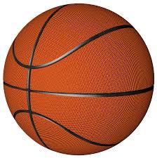
play around with your stroke settings, i did this a lot when making the so highschool gifset (e.g. i think the basketball one used the centre option)
the stroke option will outline what doesn't have a solid fill. to get each part of the basketball outlined like it is in the gifset i used an image like the first one below where the lines on the ball were also transparent to get the strokes i wanted (if that makes sense). if the whole image was solid, like the second image the outline would just be a circle basically.

in most cases the method i showed here is the best method, but for the so highschool book image i did something slightly different where instead of doing a straight smart object i also duplicated the shape on top with all the details left in. i applied the same effects to the bottom layer as above and on the duplicated layer also set that to difference and added a color overlay like the above


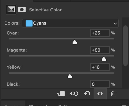
gives a result like this:

you can tweak how this looks a bit by using a selective colour layer clipped to the top layer. i wanted a bit more definition on the hat so i ended up with this after tweaking the neutral and blacks channels

overall my advice is to experiment and see what you like as that is what i basically do :)
#asks#resources#ps help#usergif#allresources#yeahps#completeresources#resourcemarket#dailyresources#tutorials#photoshop tutorial#*mine#i hope this helps/makes sense
138 notes
·
View notes
Text
Trans girl invents new lossless image format
Over the course of a couple of days I put together something pretty significant: a new image format and compression technique. I'm calling it ShrinkRay (the extension being .sr) and it is made for a more efficient representation of pixel art. With this image: https://www.tumblr.com/potionslushie/759045761554055168/ as a test it compresses ~17% better then png and when converted back to png it still has some (albeit smaller) compression gains. Additionally since part of the compression is indexing colors I was able to trivially implement palette swapping with palette files (so far .hex only which means a lot of Lospec palettes).
So what does this have to do with p2chat? Well the compression gains will make sending and receiving chat images significantly faster but also the recommended limitations of ShrinkRay: maximum 256x256 px (with a scaling factor), maximum 10 colors including black and white as presets, will form the basis for p2chat's prototype limitations.
Whats next: cleaning up the code, documenting it, running further tests and putting up a repository. Later on though I have further compression ideas regarding simple shape implementation and a layer/frames system that's highly optimized. Though I'll be doing more important PierMesh work before that.
All that said I'll leave you with one last detail: all the code for this comes in at just under 128 lines.
Addition: it now supports animation/layers
363 notes
·
View notes
Text

Hi! I got asked if I have an icon tutorial so I thought I'd do my best to go through my (probably way too long) process :) I'm going to show how I made that icon up there 👆
When I first started making icons I used this great tutorial by @/strwrs and then slowly added my own preferences to make this chaotic process 💕
First for getting screencaps of things i normally just google "[name of show/movie] screencaps" but one of the ones I use a lot is this site.
1. Open the pic in photoshop and crop it
Here's the full image:

Here's where I'm cropping it:

I like to make the size of my icons 250x250 but it can be more of a preference thing, a lot of people use 200x200 or I've seen 100x100 too.
I also like to crop a little above the image sometimes to give more space above the head
2. Removing the background
Removing the background is way easier on animation than on real people sometimes so I can show 2 examples even though I do it the same way...
First I go to select > select and mask:

Then I use the quick selection tool to select as much of the head as i can and the brush tool to remove/re-add parts that got missed so it should look like this:


(is the quick selection tool great? not all the time but when it works well it's great 🤡)
For something like this where her hair has a lot of texture in it and it's difficult to get a good outline, I'll zoom in really far and use the brush tool to get as many of the big pieces as I can so it looks a little more natural when the background color is added

Sometimes there can be a white/black line around the icon that got missed from erasing the background and you can use the brush tool to erase that as well.
3. resizing and sharpening
Now everything should look like this:

I'm going to go to the right where my layers are at and create a new group by clicking on the folder at the bottom
Then I drag the layer mask up to link it to the group instead of just the image and drag the image into the folder:

Next I like to sharpen before I resize the image so I open the group and highlight the image layer and then go filter > convert for smart filters and then for sharpening: filter > sharpen > smart sharpen with these settings:

Now with the image layer still highlighted i go to image > image size and set it to 250x250

4. the fun part ✨
Now we can add the background color and everything else ✌️
I have a lot of previous templates saved to save me time so what I normally do is open a psd template I have then highlight the group layer i just made then right click > duplicate group and have the destination be the psd and then I can just change the colors of gradients i've already made (For this tutorial though I'll show you how I make the gradients/paint layers)
For coloring this is pretty much what my process usually looks like (im probably going way overboard with it but oh well lol) it really depends on the pic being used, some don't need to be colored as much.
I have found that over brightening/upping the vibrance isn't necessarily a bad thing sometimes (not all the time though) because of how small the icons are it kind of helps the image stand out more when they're used but it's up to you!
(I also put all the adjustment layers into one group because it gets a little chaotic if I don't)

Next we're going to make a gradient ✨ first i go to the adjustment fill button (?) and pick gradient

Then I just pick one of the generic photoshop options that kind of has the look I want ( it doesn't matter too much since it will be edited so it can be any color)

Now to change the color of the gradient click on the color part in the gradient section and you'll see this

I deleted the bottom middle square because I didn't want it, but to change the colors double click on the bottom left or right squares and a color wheel will pop up.
When I pick the lighter color i normally just go up to a lighter section above the darker color
This is the change i made, you can move the middle diamond slider to have the darker or lighter color be more prominent

Next is playing with the angle/scale until it's how you want it, these are what mine ended up being

I also normally adjust the angle so that the lightest part of the gradient is in the top corner where the light source is coming from in the icon pic to make it look more natural
Next I add a solid color layer over the coloring layers with a color that's similar to the background gradient color im using and switch to the brush tool with black paint and with the layer mask selected on the solid color layer paint over everything i don't want colored with black
Then I do a second solid color layer set to a lightish brown, normally on just the hair, to add a bit more contrast

then i set the color fill layer that matches the background to either overlay, soft light, or color (depending on which one looks best for the image) and adjust the opacity/fill to where I want it.
I always set the brown layer to soft light with the opacity at around 80%
And NOW just when you think I might be done...I'm not...because I have to make this process as long as possible 😂
Now I do another color fill layer but this time over the entire image group layer. I normally make the color a slightly lighter color than the darkest part of the background color, set it to soft light, lower the opacity/fill to about 50% or lower, (depending on how much it changes the pic) and then right click > create clipping mask so it only effects the image and not the background
This kind of just tints the image a little with the color to bring it together a little more

Now the icon looks like this:

You can add more fun stuff like doodles/background textures i've used these and these but there's a lot of resource blogs like @/completeresources and @/allresources that have long lists of different textures
If i wanted to add a texture though i would put it over the gradient layer and set it to overlay or soft light


And to add a doodle you just put it at the very top of everything and resize it/turn it using the move tool :)


Then you're done! you can go file > export > quick export as png and thats it 👏
Hopefully this makes sense! I've uploaded the template i made in the tutorial here if that's easier to follow but feel free to ask if you have any questions!
#icon tutorial#dailyresources#completeresources#icons#tutorial#tutorial*#photoshop tutorial#usertana#userzo#tusertha#ps*
78 notes
·
View notes
Text
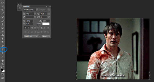
what i use: potplayer for capturing frames photoshop cs6 (can find it for free here or in other links on the tag) qbittorrent torrenting sites (this, this, eventually this) sharpening action arial rounded mt bold for subtitles
assuming you know how to torrent, if possible download what you want to gif in 1080p or the highest possible resolution etc etc
frames
open video in potplayer, go to the moment you want to gif and go back a couple frames (10-20) from when you want your gif to start (i usually just spam press D a bunch) (to see which key you have to press to go back on frames, right click > jump (to) > previous frame
now press CTRL+G or open frame capturing through right click > video > video capture > capture consecutive images...
my settings for capturing frames
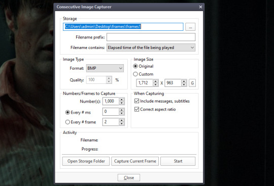
(important to turn off subtitles before doing this or they'll be captured on the image too)
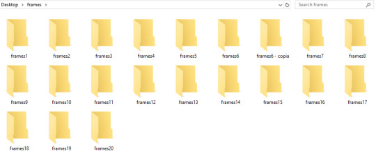
the folders i save it to -> i created a bunch of frame folders that i fill up since the way frames load in my photoshop require me to load an entire folder into it. so i capture an entire gifset's frames into one folder and then load up the entire thing
press 'start' on the consecutive image capturer, then start playing the video (best to mute it since the video might start playing slower), wait until the part you want to gif is over and stop the video, press CTRL+G again to stop the capturing
2. photoshop
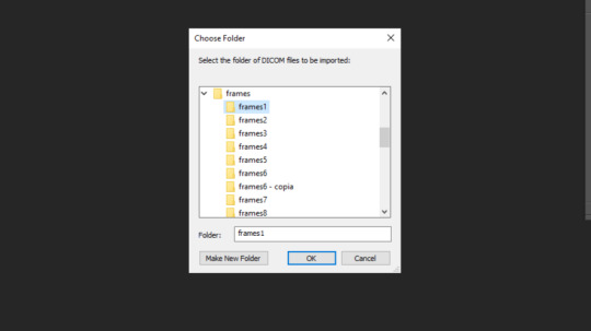
depending on your photoshop you can either 'load files into stack...', which opens up a folder and you can manually choose which frames you want to load, or 'load multiple dicom files..." (what i have to do), where you select an entire folder to load its contents into photoshop
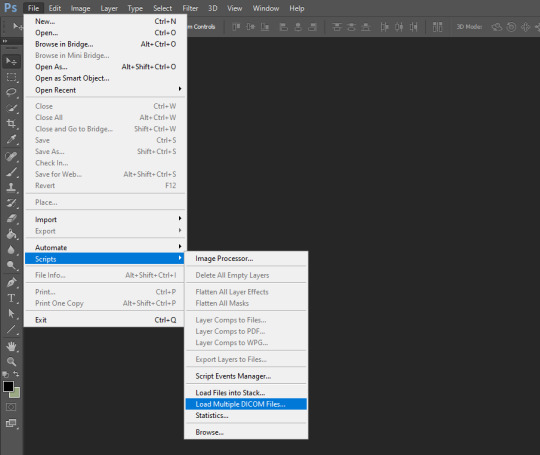
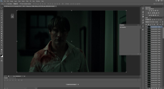
once you do either of those things, you got this
now click 'create frame animation' on the bottom
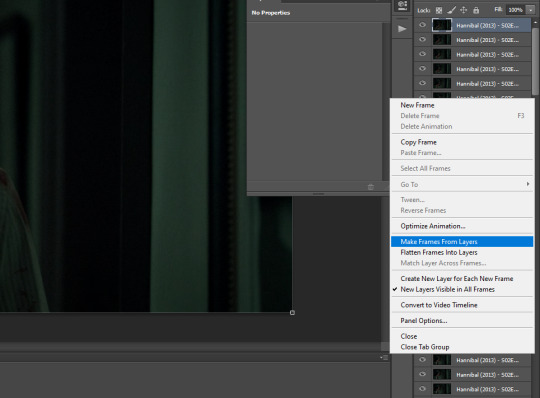
now we click on the three bars and 'make frames from layers'
!! if you loaded up frames with 'load frames into stack...' at this point you also have to click 'reverse frames' since they load in reverse order with this method for some reason
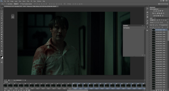
now we got our frames on a timeline and delete anything you dont want in your gif. if you have frames for multiple gifs on the timeline, go to image > duplicate and duplicate for however many gifs you got and delete the unnecessary frames from each one
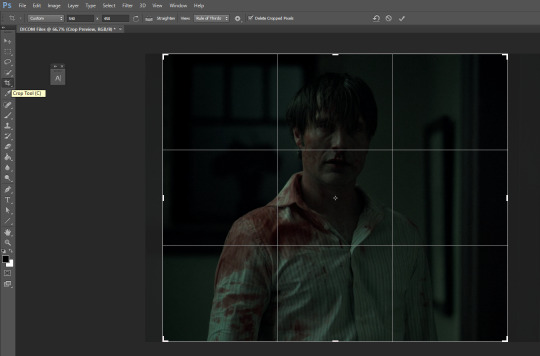
crop tool, type in dimensions up top (in accordance with tumblr's dimension graph, so if you want a wide gif like the one on the top of this post keep it 540px). i usually crop my gifs to between 540x400 and 540x500. once centered on how you want to crop, press enter or double click on the image to crop
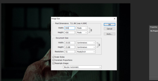
press ALT+CTRL+I or go to image > image size... to resize
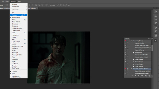
open the actions tab if you don't have it already open, go to 'load actions...' and find where you saved the sharpening action you downloaded from the top of this post
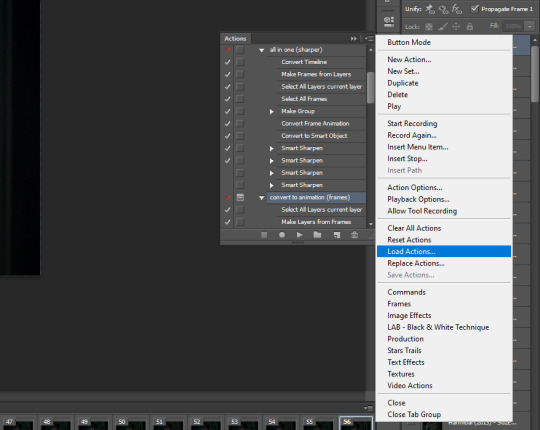
i only use "all in one (sharper)" and "convert to animation (frames)", but unchecked the "canvas size" option on the latter one since we resized the gif ourselves
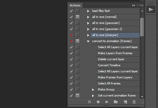
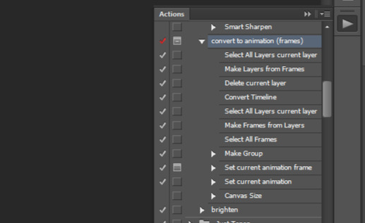
select 'select all layers current layer' on the action (the other steps we already did) and press play
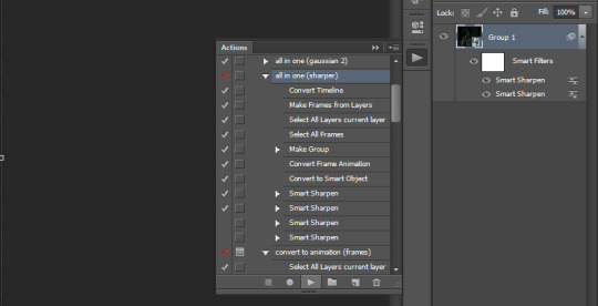
our gif frames will turn into a group so now go to "convert to animation (frames)" and press play again
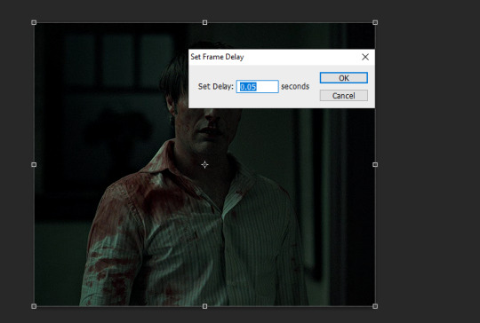
this will pop up at the end, leave it at 0.05 (maybe 0.06 if the gif is going too fast)
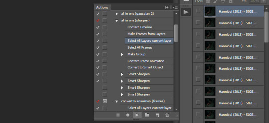
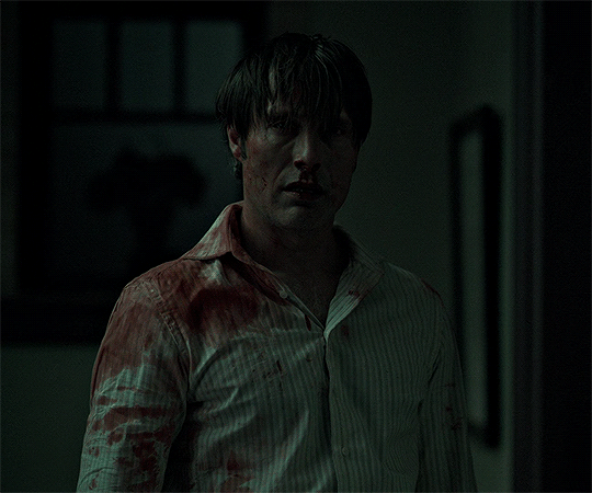
if we were to export the gif now it would look like this
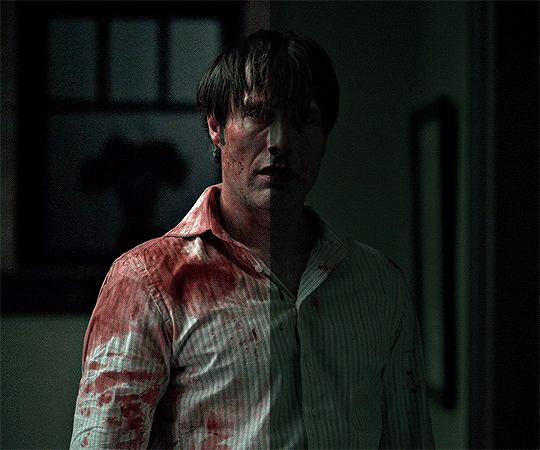
now comes the coloring, which is personal preference. the reason i chose hannibal for this gifset is to show the white balance tool that works great in tinted scenes
open a 'levels' layer and selected the bottom eyedropper. then click it on a place on the gif that should be white but isn't (i clicked on hannibal's shirt collar). the gif coloring will change accordingly
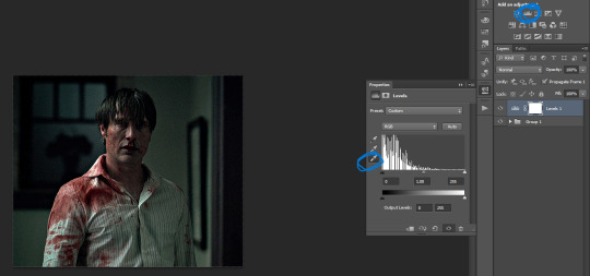
then pick the top eyedropper and click on anything that should be black but isn't (you can click on multiple places and see how the color changes, keep trying until you find one that looks good)
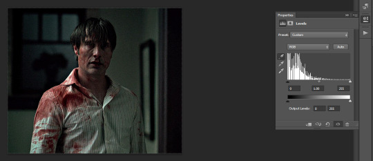
the coloring difference with just those two clicks
and then the coloring is up to you, i usually just add more levels layers and color balance
here's all of the layers i applied to color this
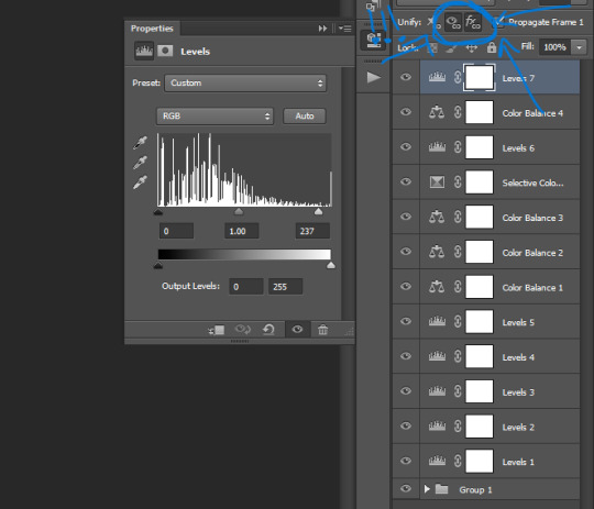
VERY IMPORTANT to get into the habit of selecting those two thingies on each layer you apply (on the subtitle text layer select all three) so that the coloring stays the same on all frames
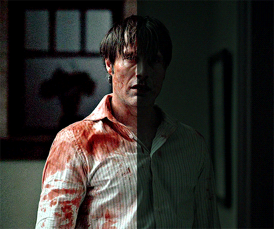
difference
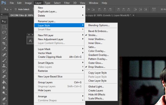
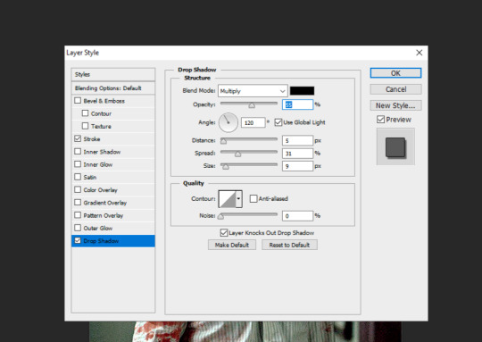
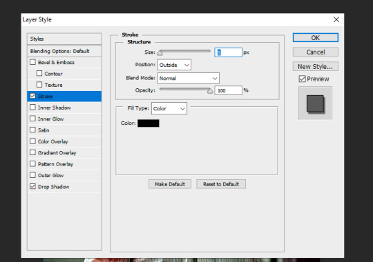
+ subtitles settings using the text tool
shadow and stroke to make your subtitles readable
saving the gif. click ALT+SHIFT+CTRL+S or go to file > save for web... here are my settings
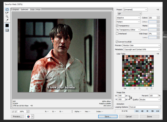
that's it
365 notes
·
View notes
Text
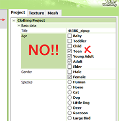
tips for 4t3 converters/CAS clothing creators
3 main things:
non-recolorable presets
DDS. settings
Adult to Teen conversions
disclaimer: i'm not a CC expert, but these are things i've noticed and learned these last couple months converting cc. special thanks to thornowl and the other converters in the TS3 Creators Cave discord.
Non-recolorable presets:
we obviously know that ts4 lacks a CASt tool, so ts4 creators rely on recolors. In my conversions, I do include a couple of the item's recolors. these usually are patterns that CASt does not have.
one thing I've noticed more and more converters doing is putting such item recolors in the 'Overlay' tab in TSRW.
let me show you what that looks like for a non-recolorable preset:
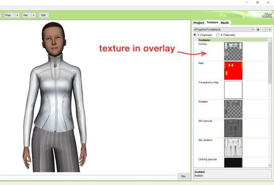
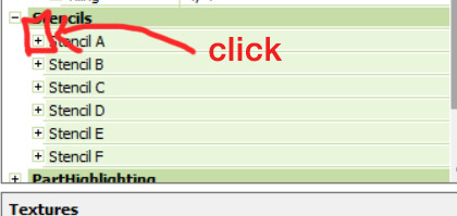
it looks over-saturated, and almost crunchy. but there's another place you can import the recolor into: stencils.
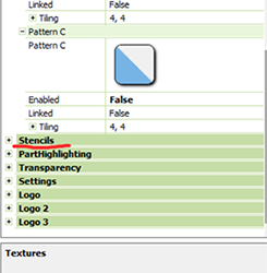
stencils will be found at the bottom, under patterns. hit the plus sign next to stencils to open it.
opening it will show you this:
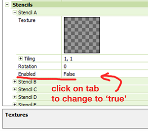
by default, it will be enabled as false. import your recolor into the texture tab as you would do for any other texture tab. make sure you tick the 'false' to 'true.' stencils override overlays, so if you want to use an overlay, enable stencils back to 'false.'
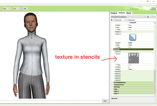
here's what the recolor imported into stencils looks like:
here's the two side by side:
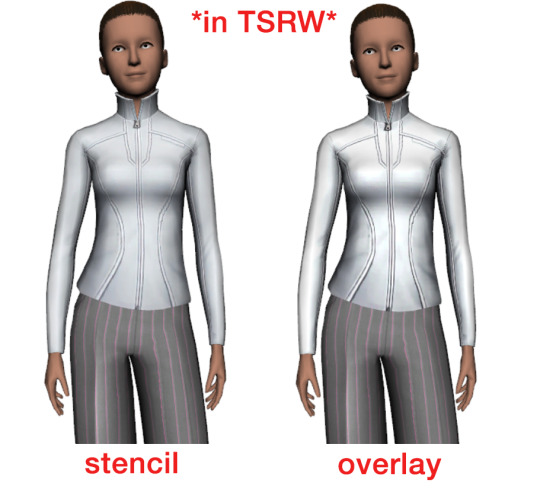
see how different they are? let's see how they are in game:
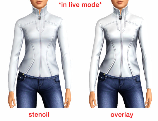
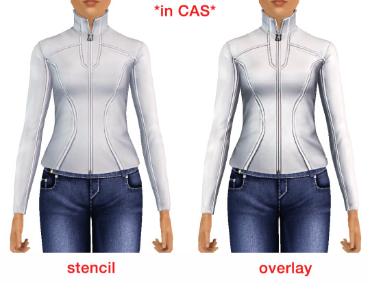
click on the pictures to really see the difference in quality. since TS3 uses DDS. format, it compresses the texture, which results in the crunchy texture. importing the recolor into the overlay tab makes the DDS. compression more noticeable. it ultimately is up to you and whichever one you prefer, but do keep it in mind.
the overlay tab is good for small details that you want to maintain on all recolorable presets, like zippers, buttons, tags, etc. just look at EA clothes for reference, especially their shoes and male clothes.
another thing you can see from the images are the bumps on the mesh. doing normal maps can help you keep those same details on the recolorable presets without importing the recolors.
-----------------
DDS. settings:
something I also see and used to do myself is bloat package files with large file sizes, specifically normal and specular maps, as well as masks. the Sims 3 Tutorial Hub provides a link to plain maps, but the file sizes are unnecessarily big.
let's look at some of EA's maps in TSRW:
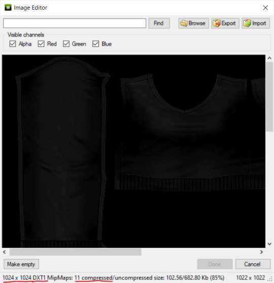
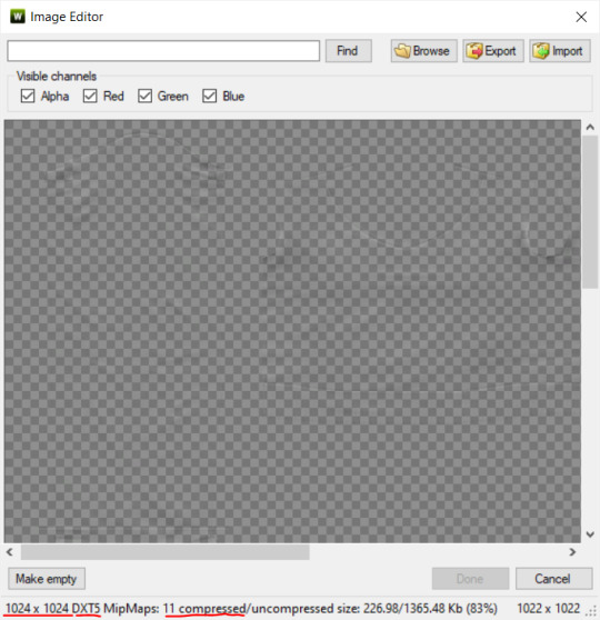
here's the specular from one of the basegame sweaters. notice the image size, DXT format, and compression size.
a lot of converters don't want the shine on regular clothes, so we use a plain, black specular map. but ask yourself, why do you need a 1024 x 1024 purely black specular map with no details?
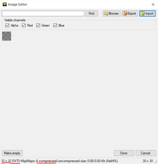
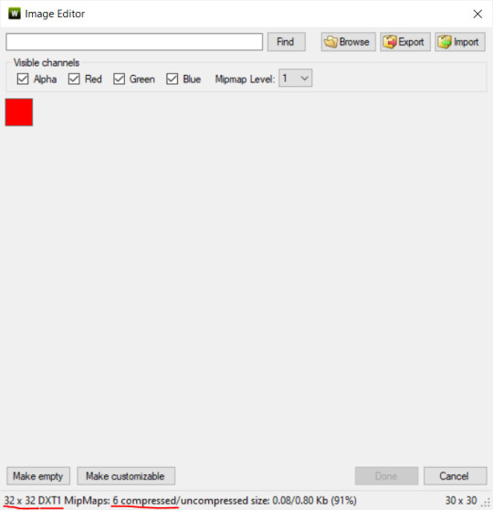
let's try sizing it down:
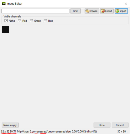
notice the difference between the image and compression size. instead of bloating the package file, we can keep it down by using a 32x32 plain black specular map instead, since there aren't details we want from the specular map.
same goes for normal maps:
and masks (meant for 1 channel only):
now, notice how I underlined the info about DXT MipMaps. see how the normal map has a different number there compared to the specular map and mask.
the reason these textures use different DXT is because of the colors and alpha channel.
here's how my DDS. settings appear when saving:
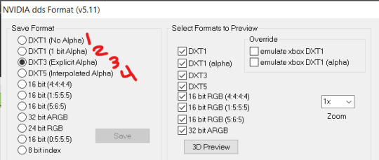
DXT1 (no alpha): this keeps only the 3 color channels and has the strongest compression. it results in half the file size as DXT3/5. 3 channel masks should be saved with this, as they don't need an alpha channel.
DXT1 (1 bit alpha): this includes an alpha, but only black or white. it also results in half the file size as DXT3/5.
DXT3: this one is rarely used for TS3 textures. it really is only used for overlays. it compresses the same as DXT5, but may not be the best for images with smooth-blended alpha regions (Neely).
DXT5: multipliers and normal (bump) maps should only EVER be saved with this. it's best for colors but has a larger file size. this is why it's important to reduce the multiplier and normal map image size, especially if you don't make a normal map.
if you DO decide to do a specular and normal map, they should be regular image size, 1024x1024, and saved in the right format.
here is more information on which textures should use which compression.
-----------------
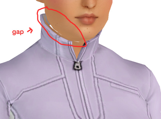
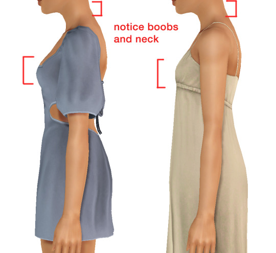
Adult to Teen Conversions:
the default for converters is obviously AF and AM. a lot of people want the items for teens too. I've seen several converters just enable it in TSRW:
please don't do this. it's honestly the lazy route. you can hardly ever get away this, specifically because of the body differences between adult and teen.
some major issues with this include gaps, seams, and unnatural body characteristics:
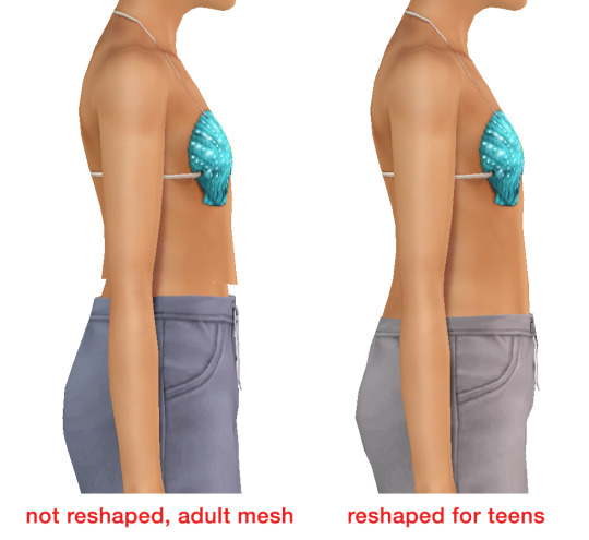
so please, either skip the teen mesh entirely or spend the time reshaping the mesh. @/sweetdevil-sims has a great tutorial on converting meshes from AF to TF here. the inevitable seams on TF meshes are also now fixed, thanks to @/thornowl with their new version of mesh toolkit.
@pis3update
---------------
here are reduced file sizes and corrected settings of the plain mask, specular, and normal:
download
Sources:
Neely, G. ‘Buckaroo’. Working with DDS/DXT Files. Available at: https://www.buckarooshangar.com/flightgear/tut_dds.html (Accessed: 28 May 2024).
207 notes
·
View notes
Text
In today's digital age, the need for efficient image conversion tools is more crucial than ever. Whether you're a designer, marketer, or simply someone looking to enhance their online presence, having the right image converter at your fingertips can make all the difference. Enter Luletools, your ultimate solution for seamless and hassle-free image conversion.
#online image converter#meme generator#best free photo editor online#convert color image to black and white#free online meme generator
0 notes
Text
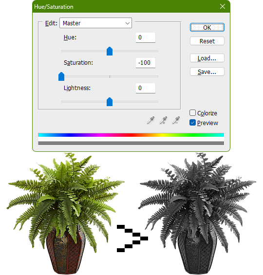
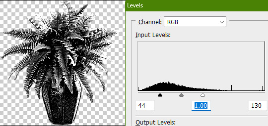
Tidbit: The "Threshold" Effect of Desaturated Objects Due to Increased Contrast
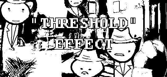
If you've ever asked how to replicate an effect like this...
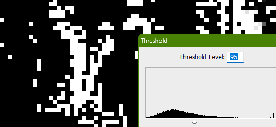
...it's likely someone told you to apply the threshold filter, which converts any light colors to pure white, and any dark colors to pure black. And it's perfectly fine to do so. It's simple, straightforward, efficient. But I take issue with the assertion that it's definitively the only conceivable way Hussie did it when the evidence points to the contrary. Scrutinize the following examples under a microscope:
Did you see it? The singular detail that distinguishes these images from ones that have been thresholded? Congratulations if you noticed that these contain not only black and white pixels, but GRAY pixels as well! A threshold filter's conversion is binary; a pixel is either black, or it is white. No in-between. The presence of these gray values rules out its use, then.
One thing is clear, at least: these images are black and white in the traditional sense of the term, i.e. "grayscale", even if it's in drastic form. They've been stripped of any color, hue, chroma. Completely desaturated, in other words.
So from this observation, we can reason that they were converted to be grayscale at some point in the process of editing.
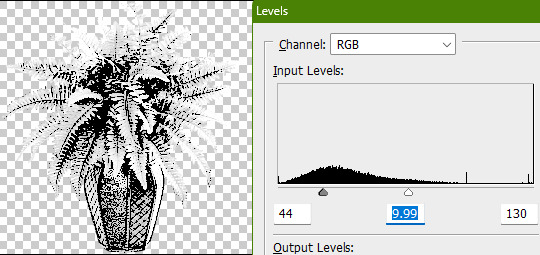
Of course, this is still lacking in the pure black and pure white departments. If only there was a way to adjust the intensity levels and push them both to their extremes... oh wait, THERE IS! Using the Levels adjustment tool!
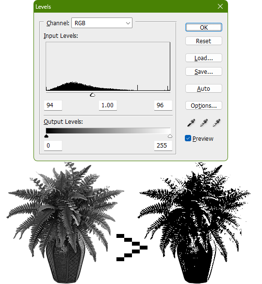
Pushing the black input levels slider to the right makes all dark colors turn darker, and conversely, pushing the white input levels slider to the left makes any light colors turn lighter. This is a great way of increasing the contrast and adjusting the brightness. Speaking of which, the Brightness/Contrast adjustment tool in Photoshop with "Use Legacy" enabled also accomplishes a nearly identical effect.
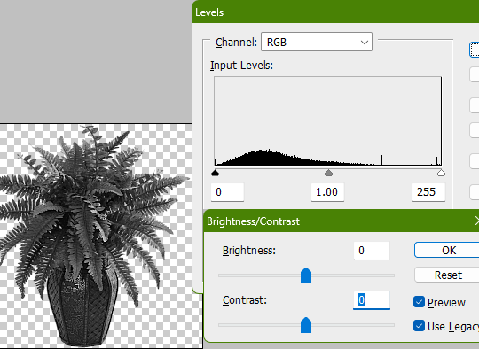
This timelapse demonstrates how the Brightness/Contrast adjustment is basically equivalent to using the Levels one when used this way
I say nearly identical because raising the contrast all the way to 100% with Brightness/Contrast makes it actually identical with the Threshold adjustment tool. The black and white input levels sliders can't fully join in the middle because of the gray input level slider occupying the space, hence why there are some stray gray pixels even when pushing them to their limits.
Well, there could be several reasons explaining why there could be gray pixels other than the contrast not being high enough to clip them, but I'll spare you another needlessly complicated and overly technical rambling on how I can tell it's most definitely the Levels adjustment tool always.
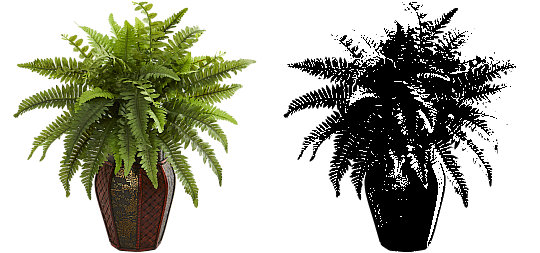
This post is getting a little long, so I'll stop here and elaborate a little more on pertinent things under the read more link, like semi-opaque pixels, scaling down, sharpening, and the gamma slider. Also here's the potted plant PSD if you wanna check it out I guess.
ADDENDUM
Semi-opaque pixels
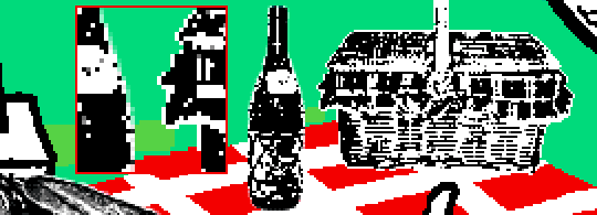
When separating objects from a background, it's usually easiest to do so with a magic wand selection tool, which selects regions of similar colors. There's an option to make the selection anti-aliased, smoothing the edges of whatever you've cropped. Unchecking it will make the pixels hard and jagged. The wine bottle and picnic basket are a good example of each, respectively.
If you've already cropped out something with anti-aliasing enabled, there's still a way to sharpen the edges after the fact. Duplicating the layer multiple times will increase the semi-transparent pixels' opacity. Do it enough times and they'll eventually become completely opaque. An analogy would be stacking multiple panes of tinted glass on top of each other. Stack enough of them and you wouldn't be able to see through anymore.
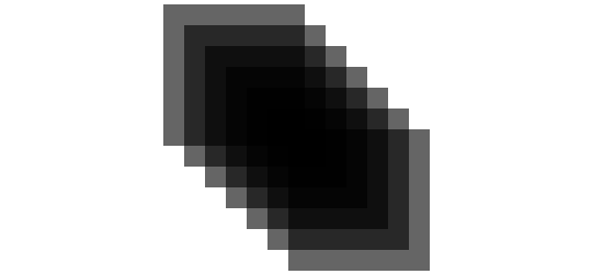
These semi-opaque black pixels would appear gray on a white background, and so would semi-opaque white pixels on a black one. That's the reason for the gray pixels around the edges on some of these examples.
Scaling down/Sharpening
Suppose you've already gone ahead and went through the whole rigamarole of editing the object to be black and white before deciding firmly on the size of it in your composition, and now you think it could be a little smaller. You could always resize it and scale it down, but with the interpolation method set to none/nearest-neighbor, it's going to look kind of shit, and with it set to something else like bilinear or bicubic, the anti-aliasing is going to make it a bit blurry (introducing these gray values). You could increase the contrast again, or you could use the Sharpen filter to do it.
Not to suggest that this particular example was scaled down after editing, it's just the one that looks closest to it since I'm too lazy to make one.

Sharpening repeatedly will bump up the contrast, plus Photoshop's Sharpen filter has the added benefit of hardening any semi-opaque pixels as well, making the edges sharper.
GIMP's Sharpen filter doesn't do that latter part, unfortunately, but if the layer has an opaque white background, it'll do the same.
Gamma slider
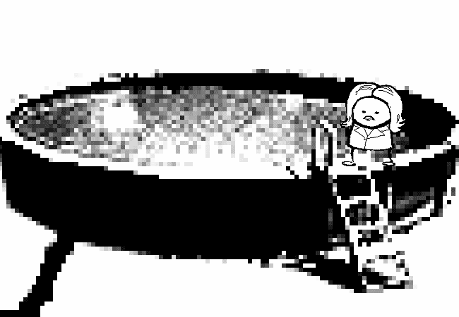
This effect might not be so obvious, but really take a good look at these board games:

Actually, maybe this Problem Sleuth bonus panel shows what I mean better:

The dark values are cranked up very high, and so are the light values a bit, but there's an inordinate amount of midrange values that are on the lighter side than what would be normal. That's because of the midtones input levels slider, the gray slider, the gamma slider, whatever.
I'm toot tired to explain any more than that, so make of that what you will. The end.
483 notes
·
View notes
Text
How to Add 3D Models to TS3
Required Applications:
Blender - https://www.blender.org/
TSRW - https://www.thesimsresource.com/workshop/
Milkshape & Plugins - https://sims3tutorialhub.tumblr.com/resources
NVIDIA Texture Tools, Photopea, or GIMP (or anything else that allows you to save an image as a .dds file)
Recommended:
S3PE - https://www.simlogical.com/ContentUploadsRemote/uploads/189/ - Used to make = object base game compatible and available in CAW
Sims3Multi Pack Extractor - https://modthesims.info/d/364038/delphy-s-sims-3-pack-multi-extracter-updated-5th-sept-2009.html - Used to convert a sims3pack into a package file
This will also require showtime, since the object we will be cloning will be from that pack. I'm not sure if there's a base game object with a light/illumination map that we can use. If you don't want the windows of the building(s) to light up or anything lighting up on whatever object you are adding then you can try and find a base game object to clone.
Step 1: Export .obj file from Blender
Step 2: Import .obj into Milkshape
Step 3: Rename object in Milkshape to group_0, then export file as .wso (in order to export it as a .wso, you need to have the TSRW plugins for Milkshape installed)
Step 4: Open TSRW - Create New Project - Choose Object
Step 5: Under The Sims 3 choose Uncategorized Objects under Object by Category. In the search bar, type in 'hill' and choose the 'Sign City Hill' object. Name your project (make sure to rename both project name and title)
Step 6: First, choose where you want your object to show in the catalog. I just choose decor (function category) and miscellaneous decor (function sub category). Go to the mesh tab and using the button of the box with the green arrow, import your .wso file. For the first pop-up click yes. For the second, click no.
Step 7: Under Group 0, click on the three dots beside 'material'. This is where you will import your textures. Before doing so, you must make sure the images are in .dds format. Simply add your image into any application that supports importing/exporting .dds files. I personally save with BC3/DXT5 compression and don't keep mipmaps. Some say to save the mipmaps, but because I use 2K textures it adds a lot more to the file to save them so I don't. Once you've got them in the correct format, import them into the object's materials. For the detail map I simply import a small blank white texture. The diffuse is the main color texture, the multiply map is the ambient occlusion map (if you do not have it, I'm pretty sure you can just add a blank white texture too), and the self illumination map is what allows part of the mesh to light up. If you do not want anything to light up you can just add a plain black texture. Click done and exit out once all textures are replaced.
Step 8: Click the drop down that reads 'high level of detail' and choose the shadow lod. Click on the blue arrows beside the import icon. A pop-up will show; check the box under medium detail and click ok. You will see that once you've done that, the object's shadow will change.
Step 9: Click file - save as and save .wrk file (just in case).
Step 10: Export to Sims3Pack
Extra - Make Object Base Game Compatible
1. Convert .sims3pack to .package using Sims3Multi Pack Extractor
2. Open S3PE and open package file you want to edit
3. Find OBJD tag and double click on it
4. Change group number to 0 and click ok.
5. Save package
Extra 2 - Make object appear in CAW
1. Open S3PE and open package file you want to edit
2. Find OBJD tag and highlight it by clicking on it once
3. At the very bottom of the window, click on 'Grid'
4. Click the arrow beside 'CommonBlock' to open the tab
5. Beside the version, change the C to E and click commit
6. Reopen the 'Grid' and go back into the 'CommonBlock' tab. If you scroll down, you will now see 'IsVisibleInWorldBuilder', change it from false to true.
7. Scroll down until you find 'BuildCategoryFlags'. Replace the number with 0x00008000.
8. Click commit and save the file.
Let me know if you have any questions! TSRW is very finicky and sometimes things can go wrong. There are some things that I may not know how to fix, but I will try my best to help.
50 notes
·
View notes
Note
Hi! I don't know if you already have a tutorial but would you mind sharing your gif making process? Thank you!
hiiii anon!
thank you for sending this in :) it's my first time getting a tutorial request hehe i tried to explain each step i do as best as i can.
i'll put the gif making process and tutorial under the cut bc it's image + text heavy
before starting, i'd just like to share what i use in creating gifs:
i'm on mac (i used to do them on windows... the ps steps are the same if you're using one)
i'm currently using photoshop 2022
i use 9xbuddy or video downloadhelper extension on firefox mainly for downloading videos
best quality to download for hq gifs is ideally 1080p and above. (although you can get away with 720p for smaller gif sizes)
i use mplayer-osx extended to get the screencaps/frames for my gifs (if i'm not doing the import option in photoshop)
for this tutorial, i'm using the latam highlights video from louis' ig reels to make today's gif. on to the tutorial / process!
please click the screenshots i've included below and zoom in on the texts on them to see them clearly (apologies for the quality!)
IMPORT YOUR FRAMES. once you've downloaded your video, open photoshop and click FILE > IMPORT > VIDEO FRAMES TO LAYERS
SELECT THE PART YOU WANT TO GIF. the shorter, the better because you want to keep it crisp and keep the file under 10mb when you save it after all the layers. here are the settings i use:

toggle the smaller arrows under the bar to select the parts you want to gif. once you have your frames loaded, it should show you a timeline table at the bottom and their corresponding layers on the right side. (if you can't see the timeline, go to WINDOW > click TIMELINE)
3. DELETE EXTRA LAYERS, CROP PARTS YOU WANT TO FOCUS ON, AND RESIZE.

after cropping the parts of the gifs, resize them according to the tumblr sizing to prevent your gifs from looking blurry once you upload them. you can use this size guide for your reference :) the gif's height can be any size as far as i know. go to IMAGE > IMAGE SIZE > INPUT THE SIZE. for this gif, we'll do 540 x 540
4. CHANGE GIF SPEED and CONVERT TO SMART OBJECT

once you've selected all frames
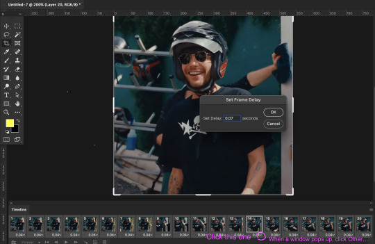
set the delay to 0.07. this is usually the natural, normal speed for gifs on here. it depends on the number of frames you have but i usually do .07 or .05 (sometimes .08 haha)
with all your timeline frames still selected, then select all the layers on the right side. go to SELECT > ALL LAYERS
then convert them to smart object so we can edit all the layers all at once. go to LAYER > SMART OBJECTS > CONVERT TO SMART OBJECT
5. SHARPEN (one of my fave parts!)
this is the basic one that most users use:
STEP 1: go to FILTER > SHARPEN > SMART SHARPEN

radius usually goes from 0.3-0.4
STEP 2: Repeat STEP 1, but this time change the settings to:

you can stop here but i like my gifs crispier and to have more texture! i use the sharpening settings from this tutorial or these sharpening action packs from user brainwasheds. i highly recommend these! i mix and match the settings when i'm not happy with how they look on my gifs. but for this gif we'll use the sharpening settings from this tutorial.
in addition to the settings from that tutorial, i also added FILTER > OTHER > HIGH PASS at 3.4 radius, then set the opacity to 60-80
then lastly add FILTER > ADD NOISE > NOISE at gaussian setting with 1.5 amount, then set opacity to 20-30
6. BRIGHTENING, COLORING, BALANCING, ADDING TEXTURE
now for the fun part!
STEP 1: BRIGHTEN UP THE GIF this is my go-to way to increase the brightness. go to LAYER > NEW ADJUSTMENT LAYER > BRIGHTNESS / CONTRAST then change its blending mode from NORMAL to SCREEN
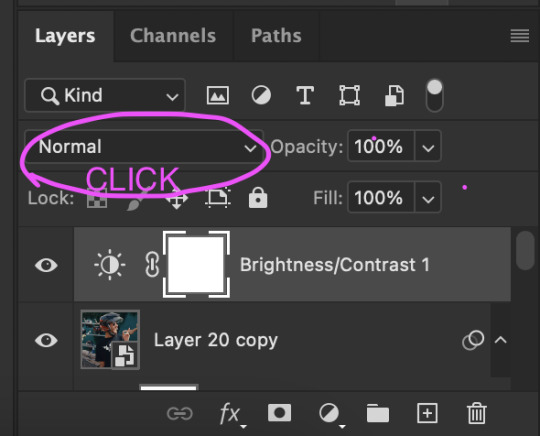
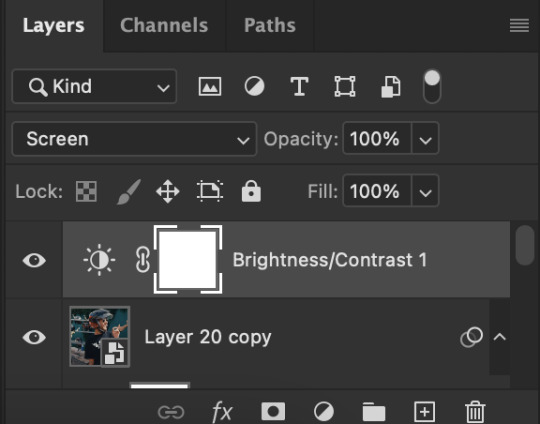

you now have a very bright, highly saturated gif but we'll fix that lol
STEP 2: ADD CONTRAST BY FIXING THE BLACKS AND WHITES add a new adjustment layer > LEVELS

i usually play around with these. middle and black arrows add shadows and contrast while the white arrows add highlights/brightness to the gifs.

these are my settings! these are not definite bc it varies depending on what you're working on, so adjust them accordingly. next, add another adjustment layer > CURVES

i usually zoom in to locate the darkest / black area using the black dropper. then once that's done, do the same and locate the brightest/white area. this adds further contrast to your gif that wasn't done in the previous step.
STEP 3: COLORING (my fave part!!!) add a new adjustment layer > SELECTIVE COLOR this is the part where i like to neutralize the skin color when it gets too yellow or red, make the colors pop, and sometimes change them too. louis' skin was looking too red heavy, so i wanted to reduce that! i start with balancing out the skin color with REDS & YELLOWS.
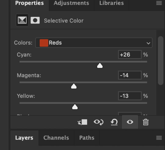

these are my settings for this gif! adjust them and observe the changes it makes on the person's skin. if you know color theory, it's helpful to see how it affects the colors on your gifs. putting the arrows more on the left side, adds more 'cool' tones, whilst putting the arrows to the right side, adds more 'warm' tones.
i like to deepen the blacks on my gifs further so, go to selective color's BLACKS and on the black scale, add more to the right! for this one, i added +10
add a new SELECTIVE COLOR adjustment layer. for this one, we'll make the surrounding colors pop more!

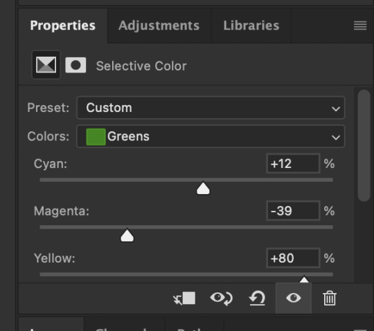

for these settings, i made the leaves more vivid while the teal(?) wall, i adjusted them made it more blue.
next, add a new adjustment layer > COLOR BALANCE this is where you can make further adjustments on the overall colors of your gif. you can also change the color tone of your gifs here if you want to make it more 'cool' tone or 'warm' tone looking.


earlier's color theory applies here as well!
6.5. OPTIONAL STEP: ADD TEXTURE/OVERLAYS after the last step, you can save your gif as is but again, i like adding textures to my gifs so we'll add one. i use the textures/overlays that i got from here :)
i like to use film, grainy textures! add the texture you want on top of all the layers.

then change the blending mode to LIGHTEN or SCREEN. adjust the opacity to 20-40%. for this gif i used screen with 40%.
7. EXPORT AND SAVE YOUR GIF time to save your gif! click FILE > EXPORT > SAVE FOR WEB

this is my default setting for my gifs. i also tick the interlaced option sometimes.
here's the finished gif:
there you go anon! :) if you have any more questions, just lmk or you can directly dm me off-anon if you want.
i also get inspo, guides, and other tutorials over at @usergif
94 notes
·
View notes
Text
FRESH DRAWING GUIDE:
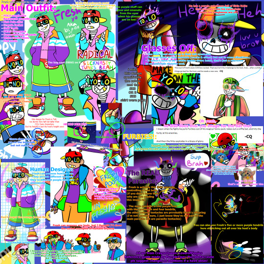
Hello everybody, I've come to give you all this absurd reference guide for drawing Fresh. yep. I decided to spend hours slapping this together.
If I got anything wrong or should add anything PLEEEASE lemme know! All ideas welcome!
If you want to see my "research" on this character, let me know in the replies, because there's so much to talk about with him and I'd love to do a character analysis or two, I couldn't put much about his personality or source posts in this because it's just a drawing guide!
Link to all the full images
Transcript and close-ups of the text on the image: (May be in a strange order)
Fresh was created by @loverofpiggies (CQ)
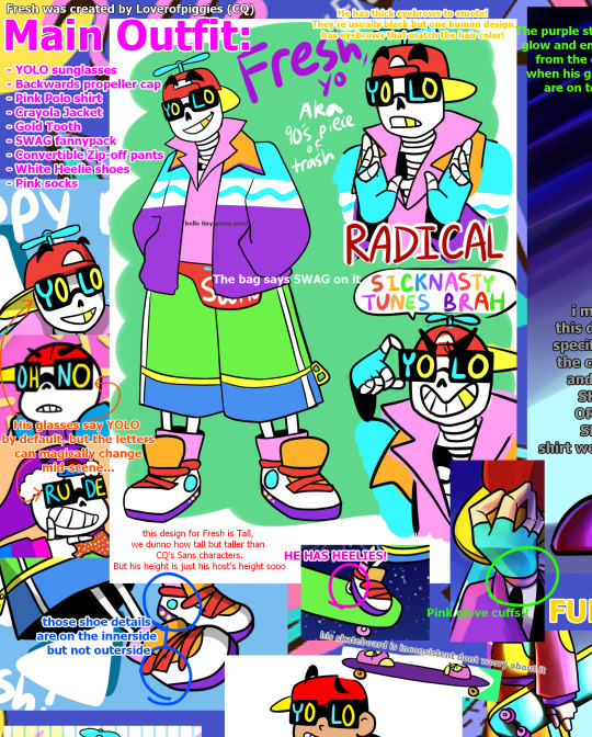
Main Outfit:
YOLO sunglasses
Backwards propeller cap
Pink Polo shirt
Crayola Jacket
Gold Tooth
SWAG fannypack
Convertible Zip-off pants
White Heelie shoes
Pink socks
He has thick eyebrows to emote! (The eyebrows are usually depicted with black hair but one human design has eyebrows that match the pink hair color!)
The bag says SWAG on it
His glasses say YOLO by default, but the letters can magically change mid-scene...
this design for Fresh is Tall, we dunno how tall but taller than CQ's Sans characters (or just Geno since he's literally sans undertale with some added steps). But his height is just his host's height sooo it can vary.
those (cyan and yellow) shoe details are on the innerside but not outerside
HE HAS HEELIES!
Pink glove cuffs!
his skateboard is inconsistent dont worry about it
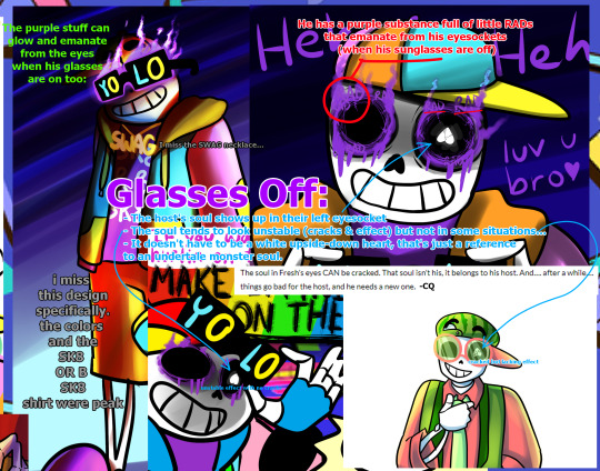
Glasses Off:
The host's soul shows up in their left eyesocket
- The soul tends to look unstable (cracks & a sortve stroboscopic effect.. i couldn't think of a better word.) but not in some cases...
It doesn't have to be a white upside-down heart, that's just a reference to an undertale monster soul.
He has a purple substance full of little RADs that emanate from his eyesockets (when his sunglasses are off)
"The soul in Fresh's eyes CAN be cracked. That soul isn't his. it belongs to his host. And.... after a while.... things go bad for the host, and he needs a new one." -CQ
(example of soul with unstable effect with no cracks) (example of soul with cracks but lacking the effect)
The purple aura(?) can glow and emanate from the eyes when his glasses are on too
i miss this one design specifically. the colors and the SK8 OR B SK8 shirt were peak
I miss the SWAG necklace...

Fresh leaves a rainbow cloud of smoke when he "poofs". Either teleporting him and his host body somewhere or leaving his host behind.
Human Designs:
Fresh can possess humans too.
They all look physically different because they're different people that he's possessing.
Fresh can possess pretty much any body, but I thought I'd show the varied examples of humans anyway
Don't forget the orange jacket flaps! or his hat propeller!
I dunno what's up with the multicolor tongue thing. I think it was extra parasites in the host's mouth? I feel like it was scrapped at some point... but I could be wrong

FURBIES!:
Oh yeah, he also does this: (no image for the bat tho)
"I mean when he fights he pulls Furbies out of his magical fanny pack. takes out a wiffle bat. and hits the furby at his enemies.
And then the furby explodes in a blaze of glory." -CQ
Despite using some furbies as explosives, he seems to 'care' about and treat these two like precious babies:
This one is potentially named McFreshby The Fresh Furbrah (Fresh is mentioned to have one named that, and this is the only other furby he's been depicted with)
It can also do THIS: (roll its eyes back into a spookier look)
This is DJ FurBs. that's all i know about him
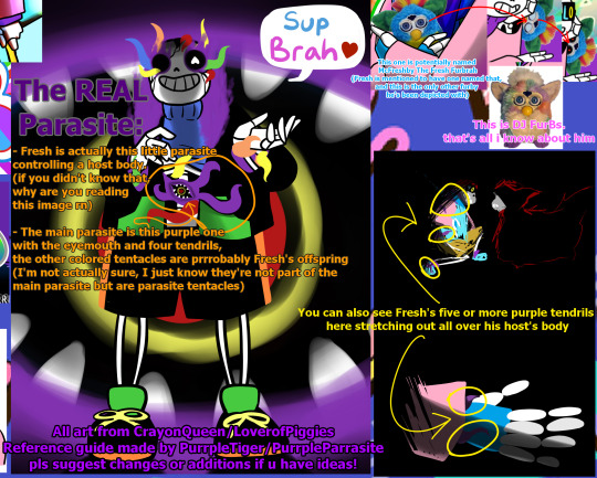
The REAL Parasite:
Fresh is actually this little parasite controlling a host body. (if you didn't know that why are you reading this post rn!?! but nah I love new Fresh fans, welcome!)
The main parasite is this purple one with the eyemouth and four(?) tendrils, the other colored tentacles are prrrobably Fresh's offspring (freshmageddon moment?) (I'm not actually sure, I'm just pretty sure they're not part of the main parasite but are parasite tentacles)
You can also see Fresh's five or more purple tendrils here stretching out all over his host's body
All art from CrayonQueen/@loverofpiggies
Reference guide made by PurrpleParrasite/@purrpletiger
pls suggest changes or additions if u have ideas!
That's all!
#fresh#fresh lucidia#fresh parasite#underfresh#fresh sans#sanzy fresh#true!fresh#eyestrain#bright colors#parasites#furby#dude why do people want to have sex with a 90s parasite#WHAT IS THAT LAST TAG WHY DID IT GET SUGGESTED HAHAHAHAHA#I JUST TYPED 90S LMAOOO WHAAT#DID I TYPE THAT ONCE A WHILE AGO AND FORGET BUT TUMBLR REMEMBERED???#90s aesthetic#luv this character sm#undertale au#utmv#underverse#fresh is really cool in underverse 0.7#someone send the RADs and heelies and glove cuffs parts to Jakei#or dont lmao shes a busy woman
654 notes
·
View notes