#conceptual art is not just a concept! it’s the execution too! how the art *communicates* the idea! Jesus
Explore tagged Tumblr posts
Text
Take a shot every time an AI bro equates taking inspiration from an artist to whatever the fuck AI does
#my friend has been fighting an uphill battle for two days now#with two AI bros#god bless her#one of them even started blabbing about conceptual art and how ThE iDeA is the most important part of the creative process#as if Piero Manzoni or Duchamp or whoever the fuck only made their art with iDeAs and nothing else#conceptual art is not just a concept! it’s the execution too! how the art *communicates* the idea! Jesus#and I *do* think ideas are a big part of conceptual art! but!!! the context is important! the execution is important!#Piero Manzoni didn’t use anyone’s shit but his own to further his ideas! and he got to explain it to people! and and and!#please don’t come after me if Manzoni isn’t a conceptual artist I am stupid and not super into contemporary art#also shout out to that other idiot who tried to equate AI to *a tool* like photography#tell me you’ve never had a creative thought in your life without telling me you’ve never had a creative thought#bookmark'd#fuck ai all my homies hate ai#uuuuugh I could babble for hours about these people
13 notes
·
View notes
Text
How CISOs can master the art of cyber security storytelling - CyberTalk
New Post has been published on https://thedigitalinsider.com/how-cisos-can-master-the-art-of-cyber-security-storytelling-cybertalk/
How CISOs can master the art of cyber security storytelling - CyberTalk


EXECUTIVE SUMMARY:
Powerful stories can mean the difference between stagnant security that incites adverse outcomes and 10X better security that fully protects the environment.
Bridging the divide
Due to the volume of cyber threats and the impact that they can have, Chief Information Security Officers are now regularly invited to corporate board meetings. More than 90% of CISOs report attending such meetings – a trend that’s expected to continue as new cyber security rules take effect.
However, when asked to lead boardroom cyber security discussions, CISOs’ points or requests are commonly dismissed, as board members lack the context for and interest in the material at-hand.
This disconnect with and diminishment of cyber security widens a chasm that can potentially lead to egregious cyber security gaps and gaffes. If the board does not understand the need for email threat prevention tools, for example, a stealthy attack could undermine the organization.
Chief Storytelling Officer
In turn, the CISO needs to become the Chief Storytelling Officer – someone who can clearly convey cyber security concepts in a way that builds favorable sentiment and consensus around solutions.
As CISO Tom August adroitly notes, “…a confused mind always says no.” It is incumbent upon CISOs to help board members connect the dots in the language of business, not just the language of security.
Storytelling transforms the abstract into the tangible and comprehensible. Yet, the real feat is to ensure that cyber security storytelling not only informs and expands viewpoints, but that it inspires action.
Cyber security storytelling best practices
So, how can a CISO develop storytelling capabilities and transcend communication gaps?
The key lies in starting with the ‘why’. As many an expert has observed before, change of any kind is a participation sport. For people to participate, they must buy into it via the story that’s told about it. A story provides the opportunity to facilitate an emotional connection with the ‘why’.
CISO stories should also have a ‘throughline’ or a connecting thread that brings various ideas and examples together. The throughline is a core message that stakeholders should be able to easily convey to other stakeholders. It should be memorable and repeatable.
In telling a story, CISOs need to humanize cyber risks. CISOs need to show the impact of failing to take certain actions vs. moving forward with certain actions. Claims should be supported with data and metrics, although not with so many metrics that the audience loses interest.
The final messaging in a CISO’s story should point the board in the direction of the response that is required.
Nailing the narrative approach
Think of the narrative approach as savvy and strategic, rather than a watered-down version of reality for cyber security simpletons. The objective is to create a shared understanding, a shared sense of purpose and a shared interest in solving a business problem.
As cyber security threats and needs change, and as the business itself changes, so too should the narratives that cyber security leaders tell. CISOs should aim to continuously educate the audience and to bring them along on a shared journey.
In conceptualizing the CISO role as that of a Chief Storytelling Officer, at least in the context of board-level discussions, CISOs can reshape dynamics and empower organizations to make informed decisions that ultimately enrich cyber security and ensure resilience.
For more on this topic, click here. Lastly, to receive thought leadership insights, groundbreaking research and emerging threat analyses each week, subscribe to the CyberTalk.org newsletter.
#analyses#approach#Art#board#Business#change#chief information security officer#CISO#CISO role#CISO STRATEGY#CISOs#communication#cyber#cyber security#cyber security leadership#cyber security management#Cyber Threats#cybersecurity#data#Difference Between#direction#dynamics#email#email security#Environment#hand#how#Ideas#impact#information security
0 notes
Text
Lately, all I want to do is write, I don't know what else to do with myself. I make a document and stare at it. I write one sentence. I write another. My head blurs. I stare. And that's all I got. I want to write. That's the only thought I have, just a long empty impulse.
I think this is shit. I’ve been foggy and blurry and hesitant and confused and unclear. I think this is shit and so is everything else I've been writing. I guess that was the point of this to begin with, I need to get better at writing. I started this days ago. I can get a concept but the execution kills itself. I don’t know what the fuck i want to say or what im trying to say. I’m just bleeding, I’m just drooling.
I’m sitting in this backyard, smoking a cigarette on a lawn chair that belongs to someone else. There are absolutely no stars out here. Before me is a red fence, crisscrossed low power lines, and the tops of a red house and a blue house. I feel sad. I feel like I miss something. But I realize there is nothing I’m missing.
And I’m thinking, and I want to write it, but it’s all conceptual. I have no tangible thoughts. It doesn’t make sense enough to write.
But I want to write.
I used to write “poetry” (quotations because it never followed a rhyme scheme, it never had any rules at all, it was just the structure of line, line, line, and it excuses the nonsensicality of it). I started that freshman year. Just for me, just to get things down, release things. I never planned on showing anyone. I showed my sister, Hayden, and a couple other people. I just wanted to show myself, what I saw, what I thought, what I felt. Writing those was an impulse. I would pause, sit down to type while I was walking, get it down. I needed to.
When I'm making art with someone, and they say theirs is bad, I say that cheesy thing—art is only for you, it's about expression. I encourage abstract art because it doesn't need to be a replica of a sight. It can be, sure, but, when people get insecure—Hayden would get insecure—I would say it's just about expressing. I do believe that.
But with writing, I get the frustration. I was always relatively comfortable with art. And I understand artists. It's about communicating a feeling. Sometimes, yes, it's a replica. But the artists i know, the artists i know well, like Kalico, it's about expressing a feeling.
It's this thing, these things that you paint or draw, characters, they're symbols. They represent a concept. Kalico has foxes, wolves, fish, and this big creature with a dog face and a long neck and droopy ears and antlers and stars. They show up differently and in different pieces. It is the representation of a concept. I have characters and certain things I do in art.
But writing is completely different. It’s words, language, there are rules. It's different.
I need to get better at writing so that i can tell you, anyone, everyone, what i mean, how i mean. I want to communicate.
I bottle things and don't know how to let them out. I write. But I don't know what I'm getting at. I have the feelings and I have the concepts, but I don't know what the words are, or how to string them together, what order to put them in, what are the phrases, the metaphors? What the fuck am i trying to say? I have a much too limited vocabulary about things. I need more words, phrases, better metaphors, the right structure, tone, flow.
A collective of thoughts and feelings and ideas and moments spread around a document. I usually do it in one go and then go back and edit. But my thoughts have been like a school of fish, and I just can't get a hold of one.
And when I get it I make monstrous spelling errors because my hands can't keep up with my head and dear god I need to get this out. And then I lose my grip.
Things slip through my fingers. They pass. Sights change. I lose my train of thought. Things pass. I take out my phone or my computer and I jot things down.
This document started as a concept and “Love—limited vocabulary Boots on your mantle and a framed Fuck The Beatles sticky note”. I started, I tried, I got part way through the thought, and it was left unfinished, just that. I lost it.
Things move so swiftly it's impossible to get it all down. But I attempt. It is an impulse.
I hang onto moments and live in them, but, inevitably, they pass. That makes me so sad sometimes. There is no solution. When I write, it is an attempt to immortalize. It's begging, it's pleading.
Every time I write, not just journal, when I try to write a piece, something I'm gonna share, it always feels like I'm begging, I'm pleading. I squirm and choke and writhe and pray and beg. I can’t just keep saying that. I need to get better at writing.
I want to get better at writing because I need to write.
“Why did I write it down? In order to remember, of course, but exactly what was it I wanted to remember? How much of it actually happened? Did any of it? Why do I keep a notebook at all? It is easy to deceive oneself on all those scores. The impulse to write things down is a peculiarly compulsive one, inexplicable to those who do not share it, useful only accidentally, only secondarily, in the way that any compulsion tries to justify itself. I suppose that it begins or does not begin in the cradle. Although I have felt compelled to write things down since I was five years old, I doubt that my daughter ever will, for she is a singularly blessed and accepting child, delighted with life exactly as life presents itself to her, unafraid to go to sleep and unafraid to wake up. Keepers of private notebooks are a different breed altogether, lonely and resistant rearrangers of things, anxious malcontents, children afflicted apparently at birth with some presentiment of loss.” Jane Didion
#writing#this is from January 9 2022#I just think it’s true and kind of cool#I used to write shit like this constantly and then I stopped and I’ve been writing stories#I want to try to write more stories#and I started journaling again after I stopped for awhile#I’ve definitely gotten better#I got depressed af last winter with a hint of mania and was writing stories constantly for 8 or so hours straight#like from wake til sleep#for a good couple months#I’m glad I started in the first place#and like started trying to get better instead of just word vomit#I started writing instead of talking for awhile#this was basically that but I never showed it to anyone#I hope this is relatable#finished with a#Jane Didion#quote
1 note
·
View note
Text
1995 Animation Magazine article
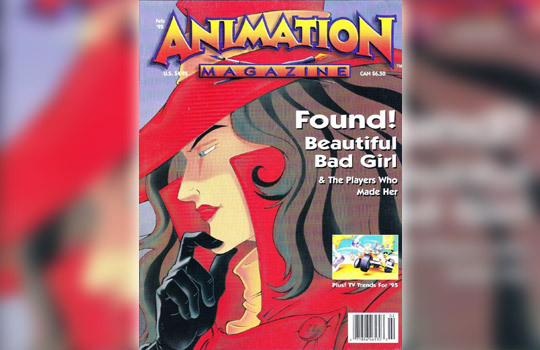
After months of trying to find a library to supply this over interlibrary loan, I’ve finally managed to get a copy of the cover story from February 1995′s Animation Magazine, about Where on Earth. Aside from the truly cringetastic headline on the cover, the article itself is poorly written and just as poorly researched (for example, saying that Carmine appears on the cartoon), but it does have snippets from interviews with several execs at both Brøderbund and Dic.
A scanned copy of the article (featuring some concept art of Carmen, Ivy, Zack, and a nameless goon in regrettably low quality) is available in my online archive, or read the text (with some spelling and punctuation corrections) below the cut.
Lady in Red by Morrie Gelman, special to Animation Magazine
The commercial television version of Carmen Sandiego, the lady in the stylish red hat and shoes who steals national treasures such as all of the sushi in Japan is, surprisingly, the most successful program ever produced by DIC Entertainment. Maybe not so surprising, since with more than 4 million units sold since 1985, Where in the World Is Carmen Sandiego?, currently out in a junior version on CD-ROM, is computer software’s best-selling history and geography title ever.
Carmen is the first software character ever to make the leap to television. In addition to the DIC-produced Where on Earth Is Carmen Sandiego? educational/entertainment series for Fox, Where in the World Is Carmen Sandiego?, a game show, is in its fourth season on PBS.
It was four years from the time Andy Heyward, president and C.E.O. of DIC, spotted Carmen as a computer game designed by Brøderbund Software to provide young people with exposure to world geography and cultures before it ever got on commercial television.
Heyward read a story about Where in the World Is Carmen Sandiego? in the business section of the Los Angeles Times. He went to the Northern California community of Novato, where Brøderbund Software is based, and met with company officials. He said at the time, “I would like to option the property,” and then took it over to CBS.
DIC had the property in development at CBS for three consecutive years. It was still in the running when Heyward had lunch with Margaret Loesch, president of Fox Children’s Network at the Big Boy restaurant in Burbank.
“CBS developed it and at the final bell decided that educational programming was too risky,” Heyward recalls.
At a NATPE in the early ’90s, Barbara Kriesman, the FCC attorney in charge of the Video Services Division, was the main speaker at a children’s seminar. The seminar was focused on compliance with the recently enacted Children’s Television Act requiring broadcasters to air programming that meets the educational and informational needs of children. Stations were told, in effect, they would lose their licenses if they did not comply.
It was clear that Fox had to protect itself. Margaret Loesch is a very competitive person. She was ready to take a chance.
Heyward told her of DIC’s developing Carmen Sandiego with CBS. She asked if it was picked up yet and he said, “No, it wasn’t.”
Loesch said Fox would pick up the series if it could have an exclusive.
According to Heyward, Loesch made “a big pitch” on why Fox would be a more competitive environment for Carmen Sandiego. Heyward listened and agreed, finally saying, “OK, let’s go.” The show made its debut on Fox’s Saturday morning line-up from 11:30 to noon last February as Where on Earth Is Carmen Sandiego?
By Heyward’s evaluation, Carmen has been more successful than any “educational” show, ever, especially because “kids don’t think of it as an educational show.”
That it be highly entertaining was DIC’s hope and aspiration from the start.
“We work very hard to get a lot of stuff in there that kids learn from,” Heyward says. “The production has not only cel animation but computer graphics, source footage and live action.”
Heyward confirms that “Carmen Sandiego is far and away the most successful program we’ve ever produced.”
For Robby London, senior vice president, creative affairs at DIC, Carmen Sandiego is the company’s “flagship” program and one of his “favorite, favorite topics to talk about.”
While London admits that everybody always says that some show or another is “unique,” that label is totally valid for Carmen.
Some of the things that make Carmen unique are the many disparate production elements not often seen on Saturday morning television.
Carmen includes regular cel animation to carry the narrative forward. Silicon Graphics Inc.’s computer animation takes characters from place to place throughout the world, allowing viewers to learn about the places. Within the SGI platform, still photos are used, such as source footage of Franklin Delano Roosevelt making a speech, along all sorts of other visuals, including graphs.
Another component is “limited animation,” which is quick, little, perhaps 5-second, images of a rather silly animation that is in a completely different style from the regular cel animation. Live action appears throughout the episodes in terms of the players playing at home on the computer against Carmen Sandiego. This is the whole basis by which DIC tells the story.
Michael Maliani was executive producer and producer of Where on Earth Is Carmen Sandiego? the first season of the show. With DIC currently working on the third season, Joe Barruso, who previously directed the show, is now producer.
Maliani, who was in at the earliest stages of development, remembers that “What we were trying to do was make something entertaining and educational. We wanted to be different. We really wanted to make it interesting to watch. That’s why we wanted to have so many elements.”
Kids like variety, Maliani contends. With that in mind, DIC decided to produce Carmen with different media, including standard cel animation, other computer graphics and some live-action added in. “We thought we could show the educational stuff without being boring,” Maliani explains. “We didn’t want to make the show a lecture. We wanted to weave the education into the plot.”
Like the computer game, the DIC series is full of visual and spoken clues about the mysteries Carmen Sandiego, her cunning cat Carmine and her gang of goofball thieves stealing such ambitious treasures as the roof off the Taj Mahal and statues from Easter Island. Viewers (players in the computer game) get help in trying to stop Carmen and her henchmen form the ACME Detective Agency. The DIC series (and now Where in the World Is Carmen Sandiego? Junior Detective Edition on CD-ROM as well) features the young characters Zack and Ivy who report to The Chief. The plot of each episode (and the objective of the computer game) is to follow geography-based clues and “bag the bad guys, recover the stolen loot and put Carmen Sandiego and Carmine in the clink.”
Along the way, viewers learn such facts as the height and location of Mt. Everest, and that the Sphinx in Egypt has the body of a lion with the head and breast of a man.
“We knew we were going to fit right in the 6 to 11 age demographic,” explains Maliani, “but we wanted to make Carmen a little more sophisticated so we could get the older kids.”
A major difference between Carmen the computer game and the commercial TV series is in visualizing the capers. The computer game offers as a premise that the Eiffel Tower or the Taj Mahal is stolen. DIC’s production team had to estimate the weight of the Taj Mahal and then figure out what it would take to lift it.
DIC’s researchers established that four Russian helicopters could hoist the estimated weight of the Taj Mahal roof.
The next problem was how to accomplish the feat. DIC’s solution? Use a laser to cut off the roof. Add hooks to it and lift it off.
“We had to figure this stuff out,” Maliani notes. “It’s kind of fake but almost real.”
London explains that many shows on Saturday morning have had a degree of pro-social values. One of the things that is different about Carmen from all these other shows, according to London, is that Fox and DIC took the “conservative high road” that pro-social is not sufficient to fulfill the mandate of the Children’s Television Act.
“Carmen can’t just show good moral values and teach little lessons in living,” he points out. “It must have a measurable curriculum that actually teaches information, not just lessons in living.”
Among the consultants on Carmen is Dr. Peter Kovaric, a professor at UCLA in the Graduate School of Education, who is also director of the school’s educational technology unit. Kovaric is an acknowledged expert on using technology, such as television, to teach kids.
He reviews all Carmen scripts and helps DIC’s production team conceptualize shows. “It’s an exemplary relationship,” affirms Kovaric.
“One of the very good things about Carmen is that it is a commercial venture and is reasonably successful. That may help lower the reluctance of broadcasters to try something new and different,” he observes.
DIC also employs Barbara Wong, a teacher and principal of Baldwin Middle School in the Alhambra (Calif.) school district. Wong credits the DIC production team with being “very concerned” about having quality programming for kids. “They’re very in tune with people like myself and very open.”
Carmen, she points out, “has a lot of elements in it that readily apply to a teaching situation.”
Wong explains that while Carmen is not a “surrogate teacher,” the show does quality as “a nice addendum – a nice resource to have.”
Wong gets screen credit as Curriculum Consultant. Kovaric is Educational Consultant.
According to London, Carmen, in addition to gaining an educational seal of approval, invariably wins its time period. In the Sept. 1993 to July 1994 Nielsen data, Fox’s Saturday morning line-up, which includes Mighty Morphin’ Power Rangers, X-Men, Bobby’s World, Tiny Toons, Taz-Mania, Eek the Cat and Carmen demonstrates the last is one of the top shows not only with kids 2 to 11 but with persons 6 to 17.
It averaged a 6.0 rating with kids 2 to 11 and 5.1 with the older demo, suggesting that as an educational program it’s holding its own handily against traditional animated entertainment, including action/adventure.
Another measure of Carmen’s appeal is that in the same Nielsen measured time-span, “the lady in the red hat” has more viewers than Beekman’s World and Bill Nye combined – not only with kids 2 to 11 but with persons 2 and over.
“It’s by no means a loss leader,” emphasizes London. “It’s not even number one by default. It really holds up Fox’s ratings.”
Maliani, who is senior vice president in charge of development, knows he risks sounding hokey but points out that in his 10 years with DIC he has wanted to try “to make a difference.” In Carmen Sandiego, he says, “we have a property where you could actually learn.”
In large measure, Maliani speaks for everyone connected with the Carmen Sandiego property when he comments: “This is the one show that really meant a lot to me and I gave it my all. I gave it everything I had and everything I could think of creatively. I wanted it to be special.”
————————————
Carmen Sandiego began life as a computer game – a history, geography, educational title – by way of Brøderbund Software Inc., Novato, Calif., a diversified consumer software company. Founded by Douglas Carlston, Brøderbund is one of the hottest names in educational software publishing.
For the recent holiday season Brøderbund published Where in the World Is Carmen Sandiego? Junior Detective Edition, an icon- and dialog-based CD-ROM product designated for 5- to 8-year-olds.
But Carmen Sandiego isn’t just a game. The software series inspired two TV shows for kids: DIC Entertainment’s animated adventure Where on Earth Is Carmen Sandiego? On the Fox Kids Network, and the PBS game show, Where in the World Is Carmen Sandiego? produced by WGBH Boston and WQED Pittsburgh.
Brøderbund constantly works at new ways to update the original product. Software titles include Where in the USA Is Carmen Sandiego?, Where in Space Is Carmen Sandiego?, Where in Time Is Carmen Sandiego? and Where in America’s Past Is Carmen Sandiego? in addition to the signature Where in the World Is Carmen Sandiego?
Brøderbund has creative input on every Where on Earth Is Carmen Sandiego? script, but not necessarily every storyboard.
Ken Goldstein, publisher of Brøderbund’s Education and Entertainment Products Group, describes his company relationship with DIC Entertainment as “very healthy.”
He was deeply involved in the first season of the DIC/Fox series, establishing the working relationship and the new ground rules. Since then he’s passed on regular contact to his staff, yet still signs off on every set of script notes (drafts of every script are read by Brøderbund staff and every storyboard reviewed).
For the most part, the DIC series scripts are different from those used by Brøderbund, but there’s some synergy. Brøderbund has introduced a new character into its most recent software, Stretch the Crime Dog, described as “a lovable, clue-sniffing, crime-busting canine” who works for the ACME Detective Agency.
Reciprocally, the software is now using agents Zack and Ivy and The Chief from the DIC animated TV series.
“Carmen is a perennial for us,” notes Goldstein. “It really is an evergreen product, a premier intellectual property. I’m delighted to manage its existence.” According to Goldstein, Carmen Jr. will probably go Gold in the software business, which is 100,000 pieces, within a couple of months.
Brøderbund, Goldstein also reports, does a lot of licensing, including T-shirts, mouse pads and backpacks, among other items. Carmen is also very much an international product. Goldstein says Carmen software is “very big” in Spain and Mexico, and also especially popular in Israel.
There’s a Japanese version of Carmen, plus a cartridge version on Nintendo and Sega, which has not done as well as Brøderbund would like. “I don’t think it’s the right venue for that product,” Goldstein remarks.
Brøderbund is stepping up to a new level of international distribution on March 1, opening its own Brøderbund Europe office and publishing localized versions of new Carmen products from that time forward.
By Brøderbund’s design and demand, there are no guns or other weapons in the Carmen Sandiego TV show or software. The Carmen character does have henchmen, but, points out Goldstein, “it’s very much ‘Three Stooges.’ They botch things and they use such things as big suction cups, funny gadgets and outlandish vehicles, but there are never any guns, no bombs, no grenades, no violence. They never threaten the detectives. It’s all a game of wits.”
Brøderbund also has been very careful not to portray stereotypes, to make sure with the software that all different types of international cultures are reflected positively. DIC is equally sensitive about portraying stereotypes and respecting different cultures.
“Computers have revolutionized the teaching world, and now classrooms will never be the same,” suggests one reviewer of Carmen software.
“Programs like Carmen let students explore their own paths of learning,” points out another.
Morrie Gelman is the president of Ventures in Media, a market research, information packaging and television development firm.
32 notes
·
View notes
Text
Simultaneously a premise and hypothesis, at the centre of this project is a claim about what aesthetic experience can do for feminist critique. I take aesthetic experience to name not only the generative, thought-producing process of “the expression of the imagination,” as Percy Shelley defended the “vitally metaphorical” poetic language that “marks the before unapprehended relations of things and perpetuates their apprehension,” but also—and more significantly, according to the terms of the discussion to come—the dialectical modes of perception and aesthetic judgement that Theodor Adorno describes in Aesthetic Theory and Notes to Literature. Speaking about the aesthetic concept of interpretive understanding, Adorno maintains that
if that concept is meant to indicate something adequate, something appropriate for the matter at hand, then today it needs to be imagined more as a kind of following along afterward [Nachfahren]; as the co-execution [Mitvollzug] of the tensions sedimented in the work of art, the processes that have congealed and become objectified in it. One does not understand a work of art when one translates it into concepts—if one simply does that, one misunderstands the work from the outset— but rather when one is immersed in its immanent movement; I should almost say, when it is recomposed by the ear in accordance with its own logic, repainted by the eye, when the linguistic sensorium speaks along with it.
The power of “the ‘cognitive yet nonconceptual character’ of poetry” to draw the subject into its internal dynamics is not missed by Ngai, who, drawing on Shierry Weber Nicholsen’s reading of Adorno, underlines that “the enigmatic ‘muteness’ of poetry is thus linked not just to its refusal of communicative language, but to its turn toward a mimesis that involves the subject, in a ‘silent internal tracing of the work’s articulations,’ assimilating herself to the object’s form.” Because the poetic works that comprise the focus of this study emerge from experiences of simultaneously abstract and material relations, they not only tell us about the formal characteristics of gender relations as they are lived and felt on both highly personal and all-too-disinterested scales, but do so in a way that allows us “extra-conceptual” access to a perceptible world understood in dialectical relation to the abstractions that both emerge from it and in turn define it. Thus, I aim to show how what Vishmidt has called, “a rationality premised on sensuous non-knowledge,” or a form of experience beyond the concept, is made possible in these works, as well as how this “non-knowledge” may help to show, often with painful specificity, how gender oppression is inextricably bound up in racial oppression and the reproduction of class relations.
Amy De’Ath, Unsociable Poetry: Antagonism and Abstraction in Contemporary Feminized Poetics
10 notes
·
View notes
Text
Spider-Man 2099 v4 #1 and 2099 Omega Thoughts


This is literally the third time I’ve purchased a comic book called Spider-Man 2099 #1 in 5 years. Technically more if we include reprints. Isn’t that kind of ridiculous?
Fun fact, I wasn’t buying any comics (sans some pre-OMD Spidey and Deadpool Classic trades) between 2009 and 2014. It was the 2014 Spidey 2099 run that got me back into the game, for good or ill.
This issue wasn’t nearly as good at series. And Omega was…lol…it was so bad and essentially an extension of Spidey 2099 I’m covering them together.
I remember fondly my hype when I saw Miguel in ASM v5 #25 and my hype for this one shot, back when I didn’t realize it was just part of a larger event.
Oh boy did this let me down.
Let me start with some superficial praise.
The art for Spidey 2099 and Sandoval on Omega were decent. And there was some interesting ideas pertaining to the world of the future, such as the removal of money and instead having everyone’s value depend upon what they can contribute. A society built upon meritocrisy, albeit with harsh reprisals if you can contribute little. Also the idea of corporations fixing things so only insiders can gain employment speaks to the corporatocracy of the 2099 universe (one severely undermined when we consider Doom is ultimately in charge anyway…). People intentionally using drugs to keep up their work productivity is another great idea, and a genuinely interesting twist upon the original depiction of the rapture drug from Spidey 2099 v1 #1. Finally people essentially enabling identity theft in exchange for drugs was an interesting sci-fi concept.
But beyond that…this was bad.
When I began covering this event proper with 2099 Alpha my dominant critique was ‘who is this for’.
A reboot of the 2099 line over 20 years since the original line ended and less than 3 years since the revival of it ended? A reboot intended to modernize the 1990s’ take on the future, a take that frankly proved 99% accurate anyway. And finally a reboot that alternated between doing spotty world building, killing off new characters, tie-ins to modern canon events and most of the time communicated its ideas in confusing and baffling ways.
I put forward that it was doomed to displease the old 2099 fans like me because it was erasing what we knew and loved. But it was also so poorly communicating its rebooted vision that new people were going to be alienated.
I’m only slightly going to backtrack on what I said. Because the Punisher 2099 issue was if you like the greatest argument in favour of the reboot. It wasn’t just the best issue in this mess, it was a bona fide awesome story just in general. It actually dived into an aspect of futuristic sci-fi that the 1990s 2099 series (to my knowledge) would’ve struggled to cover as it pertained so much to 2010s life and technology.
More poignantly though, the problem with this event is that there was no over arching vision between the titles. Not every one shot had the same problems but they all in different ways displayed problems that smacked into the very premise of this event.
F4 2099 was literally pointless as it spent a whole issue introducing a new F4 then killed them.
Conan 2099 could’ve been virtually the same if Conan was like 20 years in the future not this new future we rebooted.
Arguably Punisher 2099 relied upon familiarity with the Jake Galloway Punisher 2099 before it subverted your expectations.
Ghost Rider 2099 was fun but the writer clearly LIKED the original take on the character to the point where he essentially minimized changes to the rebooted version making the act of rebooting the character pointless in the first place and failing the mission statement of the event.
Venom 2099 was a weird tie-in for Cates current Venom mega arc involving Knull that was nonsensical as it proposes that Knull is still en route to Earth and thus in theory there is no tension in Cates’ run. Moreover it wasn’t much of a futuristic take on Venom himself and fundamentally hurt as there was no Spider-Man for Venom to act as a dark reflection of.
Doom 2099 in fairness had a cool twist, but a cool twist that didn’t make sense in and of itself and was also reliant upon familiarity with the original 1990s character.
And then we come to these issues.
These issues I’m sad to say just absolutely fundamentally fail conceptually.
He’s incredibly passive and very bland as a character so newer fans coming in with no knowledge or attachment to the Miguel O’Hara of old are unlikely to warm to him. His defining trait is being someone who cares enough about the suffering of others that he will not actively take part in it, but will also not actively do anything to help like his brother Gabe. This is then set up for his brother to die, cue a less good retread of Peter Parker’s origin story but minus much action of Miggy in costume. On paper the idea of a guy experiencing Peter’s ultimate failure and from this being motivated to OBTAIN super powers is interesting but it’s just not examined all that much in the story. What I’m saying is at a time when there is a sea of Spider-Heroes to read about on the stands this version of Miguel O’Hara is lame, derivative and the execution of his character half-hearted.
Then on the other hand you have the older fans’ perspectives. Obviously old Spidey 2099 fans are unlikely to take to this new version just on principle. But when you realize you lost the old character for THIS guy…oh boy does that sting.
Original recipe Miguel O’Hara was cool because he zigged where Peter zagged. He was kind of an asshole, but one with limits on how little he cared. And he became more heroic over time, but never the same type of hero as Peter. And above all he was a sarcastic, sardonic, cynic who you could tell was thinking ‘I can’t even with this Spider-Shit right now’. Case in point, he was okay with straight up killing opponents. He was more unique and much more compelling than this version, as were his cast. Lyla is basically the Aunt May of this story and not the source of humour that she was even in the first 3 issues of the 1990s run. She also lacks her iconic Monroe look, and isn’t even consistent with how she looked in ASM v5 #35.
Losing a cool character for a lame one would be bad enough but then the story straight up invalidates both itself and the entire goddam event.
It does this by having the rebooted Miggy start to see visions of the pre-rebooted (prebooted?) 2099 timeline, meet an aged version of his prebooted self and then have even more flashes of the prebooted timeline. *
Wow…Just….Wow…
Let’s pretend that the vision of 2099 in this event was a temporary thing, an Age of Apocalypse or a House of M just for 2099 and the plan was always to go back to how it was before when the story wrapped up.
That makes this entire event pointless. See the reason AoA worked (and HoM in theory could have worked) is because it was a temporary change of pace.
That doesn’t apply to the 2099 line, a nostalgic, discontinued line of comics and characters that are unlikely to get a full on revival and who’s last attempt at a revival wrapped up over 2 years ago.
THIS event should’ve been a nostalgia trip for the old fans and a chance to introduce that line to a new generation. Instead it discarded the old in favour of something new which was seemingly intended to go nowhere.
Good job Marvel, any new fans you MIGHT have gotten hooked just got fucked over and people like me who pre-ordered this event thinking we were going to get the characters we knew and loved also got fucked over.
And in fact the entire exercise was an example of intentional redundancy.
Jesus fucking Christ.
Oh and it doesn’t make a lick of sense.
So Miguel was thrown back in time when his timeline was starting to be erased and replaced with the rebooted timeline, then he was erased in ASM v5 #34, which began this new rebooted timeline…but he is alive in it, remembers it, can give his past self visions from the old timeline...
…I’m a Doctor Who fan and that’s not any kind of wibbly wobbley timey whimey nonsense. It’s just regular ass nonsense, just like the Man-Spider monster Miguel encounters who repeats ouroboros to him, the same word ReedDoom said in the Doom 2099 issue. How and why would the Man-Spider creature say that to Miguel. How would prebooted Miguel know it said that? How and why would rebooted Miguel see Spidey 2099 in costume spray painting that?
Shit what the fuck does ouroboros even mean?????????
*one google search later*
A snake eating its tail as a symbol of endless infinity…what the fuck does that mean?
That Miguel makes himself Spider-Man 2099 always?
There was a cool idea in the Omega issue wherein we learn Doom essentially erased everyone’s memories with magic so they’d forget the Age of Heroes altogether, but the rise of the characters in the one shots represented that spell breaking down. Too bad it doesn’t add up given how Venom was always going to exist and existed SINCE the Age of Heroes and people obviously remember Thor as there is an entire tribe dedicated to him!**
However the Omega issue’s biggest sin is showing us how truly pointless most of the issues of this event were. Honest to God you only need to read Doom scenes from Alpha and then Spidey 2099 and Omega. Those are the only plot relevant issues out of this whole event.
Over all, these issues and this event have been a humungous, insulting disappointment. Check out some of the art but literally nothing else sans the Punisher.
*I mean if you want to get technical the 2099 universe has technically been rebooted multiple times. The version of it presented from 2013-2017 actually differed from the original 1990s version in various ways, e.g. Miguel’s love life panned out very differently. When I refer to the pre-rebooted/prebooted timeline I’m referring to the version from 2013-2017, just to be clear.
**There are other contradictions in these 2 issues as well, like how poverty and bad health have been erased but…we see they haven’t as there are multiple examples of both in the one shots.
#2099#Marvel 2099#Spider-Man#Spider-Man 2099#Miguel O'Hara#Doctor Doom 2099#Doom 2099#Doctor Doom#Victor Von Doom#Peter Parker
18 notes
·
View notes
Text
Amazing music photographers around the world
We’re currently facing a world crisis unlike we have seen in a generation. Due to shutdowns of pretty much all normal life, the music industry has completely shutdown touring. Festivals and tours all over the world have been cancelled, and the loss of income to all of those connected to that industry will be devastating.
This is my very small attempt at trying to help out some of my favourite photographers, nearly all of whom are affected by these shutdowns. I’ve tried my best to link to all their print stores, instagram and websites, but if there are direct ways you want to help them, please reach out. Give them a follow. Share their posts. Tell them how amazing they are. Spirits are low right now, and boosting someone’s spirits is one of the best things we can do to get through this.
We’re all in this together. I hope you discover your new favourite photographer.
UK/EU
Bethan Miller // Cardiff, UK
Bethan Miller is a Cardiff based photographer who works within music, event and wedding photography. I’ve followed Bethan’s work for years, and seeing her come as far as she has, and being a full-time freelancer is incredible. She tours regularly with rising UK band Holding Absence, and her work with them truly captures their moody-vibe. PRINT STORE // INSTAGRAM // WEBSITE

Corinne Cumming // London, UK
Best known as ‘Captured by Corinne’, one of the music industry’s NICEST humans on the planet, London based Corinne is also an incredible photographer, from her work with Rock Sound with some of your favourite bands, to her unmatched stunning studio work with Drag Queens. I feel so proud when I see her work - we would often share the pit together when we were newbies and now she’s a full-time photographer and owner of her own studio, Hot Dog Studios.
INSTAGRAM // WEBSITE

Isha Shah // London, UK
Honestly, a true legend. Isha’s work is so vibrant, innovative and quite genius. She’s able to work with a range of artists and musicians, and also inspires other creatives with her creative collective, Platform London. Never afraid to speak up, Isha’s no BS attitude makes her so unique, and honestly my feeds would be way too quiet without her.
INSTAGRAM // WEBSITE

Jennifer McCord // London, UK
Finding beauty in the minimal, Jenny’s work is emotive in the way she photographs some of the most delicate moments, no matter whether she’s shooting live music, portraits or weddings. Seeing her grow from shooting hardcore shows to working with Ellie Goulding, Jenny is IN DEMAND, and there’s a reason why.
PRINT STORE // INSTAGRAM // WEBSITE
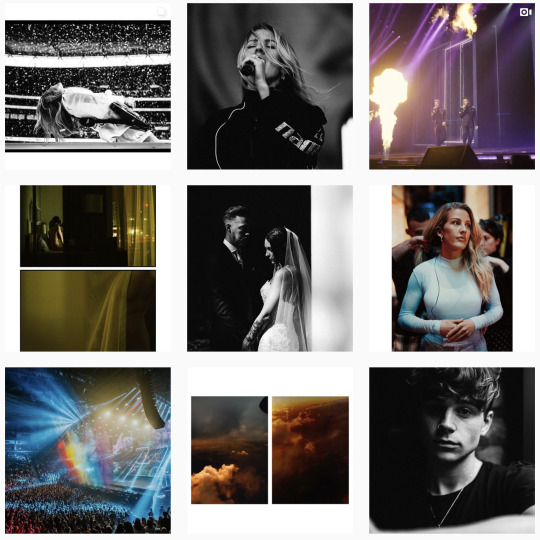
Phoebe Fox // London, UK
It blows me away that Phoebe (SHOTBYPHOX) is only 22. She has toured with artists such as Anne Marie, SWMRS, Anteros and The Amazons and is a powerhouse of beautiful content. Her work is clean, bold, and simply stunning.
INSTAGRAM // WEBSITE
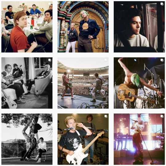
Zac Mahrouche // London, UK
Zac shoots a lot of live music, but also creates some really beautiful editorial/fashion photos. I can always look to Zac’s work for inspiration, and I love the way he presents his work across socials.
INSTAGRAM // WEBSITE
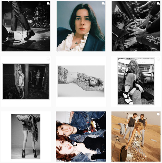
Doug Elliott // Brighton, UK
The moody cold tones of Doug’s work make it really atmospheric and cinematic. It’s been amazing to follow Doug’s journey over the years and see him work with artists such as Against The Current.
INSTAGRAM // WEBSITE
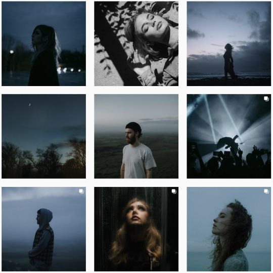
Martyna “Gingerdope” // Stroud, UK
One of the most unique viewpoints in music photography come from Gingerdope. She captures some of the most delicate, overlooked moments on tour, and has introduced me to some of the UK’s best indie bands.
ONLINE STORE // INSTAGRAM

Ellie Mitchell // UK
Ellie is a machine, and seems to be always touring! I admire how she works within particularly male-dominated genres and has become one of the most consistent music photographers out there.
INSTAGRAM // WEBSITE

Arne Desmedt “CardinalsMedia” // Antwerp, Belgium
I’ve followed Arne’s work for a while, and he always delivers stunning, dynamic live photos across multiple music genres. His portfolio is an endless stream of incredible shots.
INSTAGRAM // WEBSITE

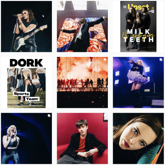
Sarah Louise Bennett // London, UK
Another amazing woman working in the music industry, and killing it with every shoot she does. Sarah is so hardworking, producing stunning covers/features for Upset & Dork magazines and continuously setting the bar high.
INSTAGRAM // WEBSITE
CANADA
Brandynnleigh // Calgary, AB
One of THE most creative photographers out there, I love the concepts and essence of her work; there’s a story within every photo and there’s a vintage feel to them that works perfectly. Brandynnleigh is based in Calgary and shoots live music as well as portraits, conceptual projects and landscapes.
INSTAGRAM // WEBSITE

Lindsey Blane // Vancouver, BC
Ok, I’m biased, because Lindsey is one of my closest friends but also a ridiculously talented human, a bit of a workaholic and someone who gives every project 110%. When we met, we were both working at a camera store (in different locations) and she stalked me on Instagram and messaged me on Christmas Day 2016, and within weeks she was sleeping on my sofa a couple times a month, so she could come over to Vancouver from Victoria and shoot some shows/build her relationships with artists. It’s paid off and seeing her work with some of the biggest artists in Canada is mindblowing.
PRINT STORE // INSTAGRAM // WEBSITE
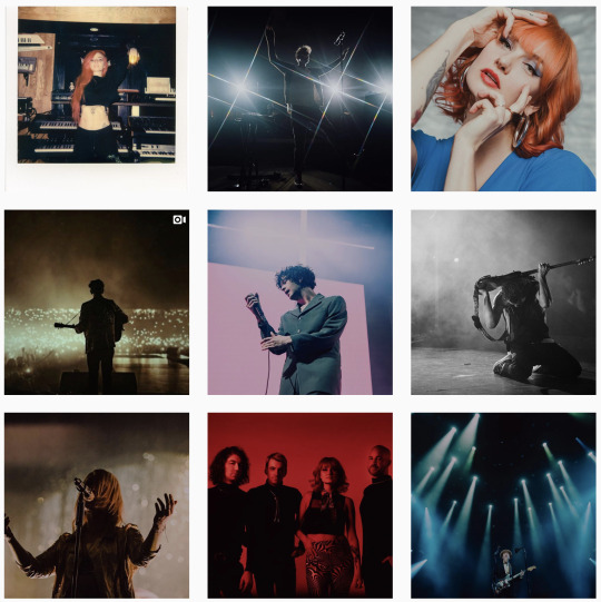
Brandon Dacosta // Toronto, ON
Brandon works with a range of indie artists including Canadian bands Bearings and Belmont. His work is so energetic and he checks off everything live music photography is all about. Brandon always delivers stunning content, and as a photographer who tours so much, he will need as much support as possible!
PRINT STORE // INSTAGRAM // WEBSITE

Shayla Lee // Edmonton, AB
A multi-talented incredible human, Shayla has continued to develop her own unique style and approach to her work, particular with electronic and EDM acts. We were introduced by Lindsey Blane (she threw us all in a car and took us to Bumbershoot) and have been great friends since. Shayla is also a writer and runs her own blog, Femme Riot. She attends more festivals than I knew existed and creates weird and wonderful photos/collages.
INSTAGRAM // WEBSITE // FEMME RIOT

Timothy Nguyen // Vancouver, BC
One of the most humble, kind humans I’ve had the pleasure of calling my friend. Having road-tripped down to Seattle for Warped Tour and Bumbershoot, Tim is always so much fun to be around, and you can always lean on him for advice. An amazing photographer with a big heart, you’ll see him catching no sleep and shooting 5 gigs in one night.
INSTAGRAM // WEBSITE

Kelli Anne // Vancouver, BC
My favourite Kiwi, and potentially one of the funniest people I know, Kelli has come a long way since she started taking photos on her phone at concerts. She is now one of the most consistent live music photographers, continuously producing incredible content. Her portrait work is always STUNNING and I’m jealous of how she achieves those warm dreamy tones.
PRINT STORE // INSTAGRAM // WEBSITE

Bailey Morgan // Vancouver, BC
I’ve only known Bailey a short amount of time, but she is slowly becoming one of my favourite photographers. She has a heart of gold and creates beautiful visuals, working mainly with music, portraits and families. She recently set up Rebel Gal Creators, a collective of womxn photographers.
INSTAGRAM // WEBSITE // REBEL GAL CREATORS

USA
Heather Hawke // Los Angeles, CA
Heather is more than just a photographer. She works within the music industry in PR, runs her own magazine - Decorated Youth and writes thoughtful articles and interviews. She also has really great taste in music. She’s a hard-working powerhouse, and a wonderful human. Support her work!
INSTAGRAM // WEBSITE // DECORATED YOUTH

Sara Feigin // New York, NY
I met Sara at a gig in London waaaaay back. She moved back to the States, where she is currently working as a photographer and writer. Her artist portraits are among my favourite, and she continues to blow me away with her consistency.
INSTAGRAM // WEBSITE
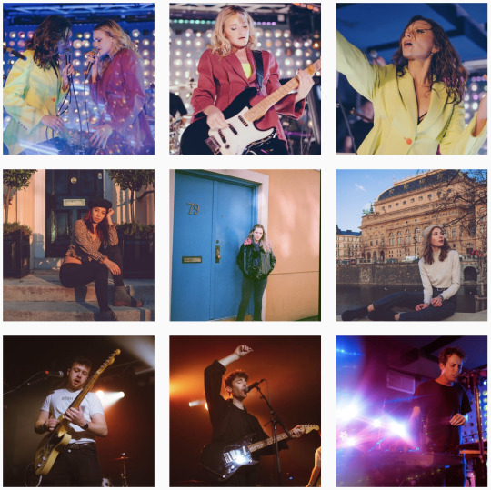
Kaytlin Dargen // Fargo, ND
I know her as ‘kaydargs’, I’ve loved her work for so long. She has such a unique style and perspective, always putting out incredible work. She works with lots of bands, and I loved her recent album cover for Hot Mulligan. A true artist, and a big inspiration of mine.
PRINT STORE // INSTAGRAM // WEBSITE

Carter Howe // Los Angeles, CA
Carter’s work feels like a movie - dramatic and emotional. I love how her photos are so well executed, and how she finds beauty in the ordinary.
PRINT STORE // INSTAGRAM // WEBSITE

Alyson Coletta // NJ
A live-music photographer who’s work continues to always make me feel like I was at the concert she shot. She always captures ‘the moment’ whether it’s an arena or tiny sweaty show. Message her to buy any print off her IG/website!
INSTAGRAM // WEBSITE

Maggie Friedman // New York, NY
One of the most active music photographers, she’s probably shot at least five of your favourite artists. Minimum. A content-machine, Maggie’s work is always outstanding. You can buy a print buy messaging her!
INSTAGRAM // WEBSITE
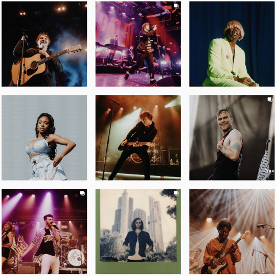
Melodi Ramirez // Austin, TX
A versatile photographer, often switching between bad-ass live music and strong bold portraits.
INSTAGRAM // WEBSITE

Cina Nguyen // Washington, DC
Known as her handle ‘ilikeyourface’ on IG, Cina creates art-pieces with her surreal, dreamy photos. I could honestly look at her work all day.
INSTAGRAM // WEBSITE

Victoria Sanders // Chicago, IL
Victoria Sanders does’t just photograph concerts - she’s an advocate for pushing for more women in music, and cofounded The Photo Ladies, bringing together a community of women around the world who work in music. Oh and she takes amazing pics, of course.
PRINT STORE // INSTAGRAM // WEBSITE

Gina Scarpino // New York, NY
Inspirational portraits & live music photos, Gina’s got a real eye for visual concepts, and I always admire how well she executes all of her work.
PRINT STORE // INSTAGRAM // WEBSITE
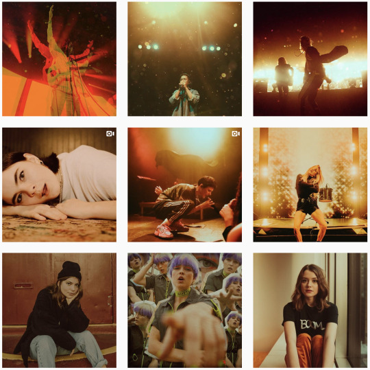
Natalie Somekh // Newport Beach, CA
Natalie has a vintage feel to her portraits + live music photos which are super dreamy. Message her for prints!
INSTAGRAM // WEBSITE

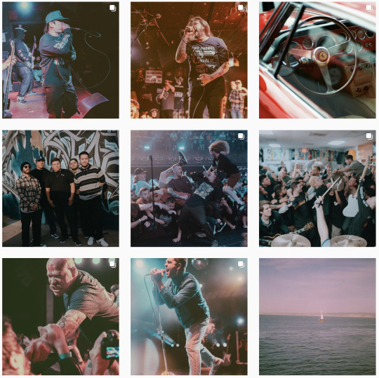
Kat Nijmeddin // Los Angeles, CA
Kat is a photographer/designer who works with Pure Noise Records. I really love how energetic her photos are, yet her tones are soft and pastel colours which create a really cool style. PRINT STORE // INSTAGRAM
#music photography#music photographers#concert photography#concert photographers#photographers#photography#freelance photographers#kat nijmeddin#natalie somekh#gina scarpino#victoria sanders#cina nguyen#melodi ramirez#maggie friedman#alyson colletta#carter howe#bethan miller#jennifer mccord#corinne cumming#sarah bennett#phoebe fox#zac mahrouche#timothy nguyen#doug elliott#lindsey blane#kelli lane#bailey morgan#kaydargs#brandon dacosta
2 notes
·
View notes
Text
Creative Problem Solving Interviews
To get a sense of how design professionals use creative problem solving techniques to tackle industry challenges, I interviewed three experts and asked two questions:
How do you generate ideas? (How, when, and where are you inspired? What inspires you? What obstacles do you face in coming up with a new idea and how do you overcome those obstacles?)
What process(es) do you use to solve problems? (Describe the steps of your problem-solving process. Explain your journey from inspiration to implementation.)
Niall Fitzpatrick - Photographer
How do I generate ideas / What inspires:
There are different specialities in photography. Folks that go deep in a very specific specialty; and others that take a broader array of interests, are perhaps two extremes. I tend lean more toward the latter. I'm very interested in exploring daily settings (people in action, portraits etc., for example); and street and landscape photography. I let the project lead me to an extent. That said, being "prepared" is essential. I like to build a story with my photos. I’m always looking for a way to use the moment and timing to describe the project. This requires a few essential elements:
Base idea framework: having a conceptual framework for what I want to achieve - a loose framework with not too tight an expectation. This allows me to follow my eye and the surroundings to evolve the story I’m trying to describe.
Inspiration: The surroundings, people, landscape, and light - these are elements of my inspiration. But really the biggest element of inspiration comes from taking the time to "see." It's tempting to hurry through a photo shoot; or settle for a "good" shot. But I find that for inspiration to flow I need to take time to see. This can manifest in different ways: Looking at the setting from different angles or perspectives, snapping to warm up with 'no expectations'; sitting and watching; exploring and walking; ultimately getting in the 'zone' which is when I'm thinking less and doing more. Ideas beget ideas.
A willingness to follow the flow: Things often don’t go to plan. A subject shows up late; the sun doesn’t come out; the scene isn’t what you anticipated. I like to follow the moment – see what happens naturally. How can I use it? These elements often present subconsciously “in-the-moment” but the critical element is a willingness to be flexible.
What obstacles do I face?
Lack of focus is a critical blocker for me - feeling rushed in process or not being prepared.
Bringing Energy: In addition, particularly when people are involved in the shoot, making sure I have energy to bring to the project, to motivate others and or direct the subject. A tired me is a less creative me.
Being Prepared: Finally, it is critical to be prepared. Being prepared includes a fluidity with the camera. If I put my equipment away for a period of time and then pick up and shoot it invariably means I am not 'one' with that camera. This leads to basic mistakes: overlooking critical settings; shoot perhaps at wrong settings; slow and focused more on camera than subject. The more I use a camera the more fluid I am - hence why I try to shoot daily.
I overcome obstacles by:
Being practiced and fluid with the camera
Well rested
Creating an environment of relaxation for both myself and the subjects of my photos (where people are involved)
Where possible researching the setting
Timing the setting (golden hour, planning for ideal light, etc)
Continual study of photography; in particular examining and understanding the art of others
What process(es) do you use to solve problems?
In photography problems arrive in a variety of possible categories including:
Subject not presenting as expected or not willing to participate as expected
Lighting (how is the light at this time - soft, harsh, other)
Setting (physical surroundings) not as anticipated
The objective (why am I here not going as planned)
When I approach a shoot I try to keep these things in mind so I’m prepared. The best way to ensure you can overcome a problem during the creative process is to be prepared and focused. The journey from inspiration to implementation involves ensuring I am ready; have timed the shoot (conditions), can take advantage of light, and know how to engage my subject. It’s also important to have a mastery of the technical approach. Knowing how to use in-camera or post-processing techniques to achieve the desired outcome. In the end though –inspiration often comes from the moment. Implementation comes from practicing technique such that one thinks less about the camera and more about the objective.
Alecia Lewis - Graphic Designer
1) Idea generation, inspiration, and obstacles:
Idea generation and inspiration: I'm often inspired by people - the more you know and understand and develop real conversations and empathize with them and how they relate to things. That's true communication and that's what really inspires me to do great works that connects people with ideas. Of course, I also subscribe to several design blogs to see trends and see what's new and how others are solving similar problems. Often, I just think "Man, they're so clever, how do I improve on that?” Really, I'd say my most creative pieces were thought of after hanging out with a big group of friends. Then, on my way home or laying in bed, I'll think about a project I was working on, and instantly the ideas start to form. I substantiate my ideas with a real understanding of best practices and commonalities, or biases that already exist around us, almost capitalizing on them.
Obstacles I face are really deadlines and ignorance. People who contribute to my work as a designer, while they provide their expertise of the market, often aren't aware of design principles, design thinking, or best practices for that matter. They've often not even Googled design terms like "hierarchy". Just the other day, the executive who claims to be a strategist with all of the experience says, "Oh, well, I don't know your lingo." My lingo isn't some revolutionary terms or design speak. It's founded in basic, standard terminology that designers use. With all of their experience "working with designers", you would think they would have compassion or respect and would, at the very least, Google things like "design principles" and see that not everything can be the same size. In order for your CTA (call to action) to actually evoke an action in their audience, it needs to stand out, not be surrounded by everything else.
As a designer, I’ve exposed myself to the executive’s field and researched best practices and developed personas. I ask questions about the piece - where it lives, why it lives there, how the viewer gets to it, etc. Oftentimes people haven't thought about the process in a holistic way, but I, as a competent champion of effective communication, have knowledge of the sales cycle, market strategy and economics, and I always approach things in that way.
I overcome those obstacles in a variety of ways. Just as I'm designing a print or digital piece, I take the same path to addresses my frustrations - define, identify, research, understand, relate, concept, create, execute, test, evaluate, complete. Essentially I try to put myself in their shoes, understand the problem from their perspective, and address it by provided validated information that supports my views, and enlighten them to why I make the choices I make.
Sometimes people recognize the effort, applaud, and move on. Other times they could care less and just want it their way. I'm not always right, but I do always have a purpose so it keeps me motivated. I will say though, this is also the reason that I changed jobs - because I worked with people who didn't care to be better, do better, or communicate better, so I changed jobs to find more purpose - to use my creative talents to advocate for something I believe in, which is affecting positive change in the world.
So now when I feel defeated by idiots, I still have the reward of doing good work for a good cause. Oh, and the deadlines - well, everyone thinks creativity is like science. “It should only take 2 hours. Last time it took 2 hours, so this time it should.” Well creativity isn't a science, it's a journey. Every new piece is a new story, and it's extremely frustrating when the story has to be told too fast and you skip parts. Because if you skip too much it doesn't make sense.
2) Process to Solving a Problem:
Every designers process is different, but the good ones are similar and start with
Defining the problem: So many times people who request work have no idea what problem they are actually solving - which seems insane, but is absolutely true. Literally, they'll say "I want x" and I start asking questions and they actually want "7%dg".
Next, you identify your audience: understanding them, their likes/dislikes, why they do what they do, what they need/don't need... relating to them and almost becoming them.
Research and more research: Now that you really know the audience, you do a real competitive analysis - you look to see what competitors are doing right and wrong, and understand the real value proposition so that you can differentiate your solution from theirs.
Create: Because we can relate to the audience and understand the market, we get to create - you could use any word here like develop or ideate - either way, this is the sketching, the inception of the idea, the concepting phase - this, to me, is the most fun part.
Execution: which is the creation of the piece, the development of the idea - massaging the good ideas and eliminating the bad ones that may have had potential but don't solve the needs of the audience.
Testing: this is when you send the piece out and actually obtain feedback. Often the feedback is measured in sales initiatives and lead gen numbers, but really it should be like an email. You send two out and judge the outcomes compared to each other. Then you deliver to the world because now your work is validated. It helps the viewer, it dismisses alternatives, it is validated. Now it should be approved to be printed or coded and sent out to the masses.
Reflection: Then the key is to look back - and reflect. This is the retrospective, which rarely happens, but always should - this is the discovery of the process, it's efficiencies and inefficiencies. You get to find out if the piece and audience are really who you think they are. Seeking a true understanding of what worked and why it worked, or what didn't, and being honest with yourself that we're not all brilliant every time, but we need to grow from the feedback and let it continue to nourish your next iteration,
Completing the Cycle: then the cycle is complete because you've solved the initial need or provided the initial solution, while also informing the next piece.
So often, defining the problem, the persona development of the audience, the research, ideation is skipped. The testing and retrospective -- all of these phases are skipped because someone says, "I need X" and incompetent people say, "Designer, you have 2 hours to give me X" while no one asks questions are challenges the reasoning. So "X" is not a true solution. It's an unsubstantiated demand that will likely produce some success, but not the success that a truly validated, well thought-out initiative could have provided.
So I'll say the general process is, "get assigned, ask a million questions, research, design, revise based on feedback from non-designers, attempt to educate them, revise more, then send out to the public to be forgotten about" lol ...but real designers like me have adapted. For instance, I don't know every audience member but I've formed a generalization that I can attribute to the brand, then I ensure that I understand the holistic nature of the piece, and then design.
Also, I'm not even sure these are all of the steps, but, that's basically everything. The funny thing too is it's on my list to put something like this together for my company - to truly show the executives how much more productive and proficient our company could be if we followed a real process, and to also explain to them why things take so long - because good design can't be bottlenecked by time. It has to be well-informed in order to inform the right audience and produce the best results. I'll also add: the creative team I'm on is referred to as "Creative Solutions" because we aren't a "service" department, we don't cater to people's needs of X - we are presented with a problem and create solutions that solve those business needs.
Ashley Stacey - Photographer
1) Idea generation, inspiration, and obstacles:
Ideas often come to me while I’m shooting, which can be both a blessing and a curse. A blessing because it’s often the person and or landscape that inspire me – anything I can do to that helps bring out the very best in that person is my goal. So, if that means switching from what I had planned to a completely different set and/or position to make them more comfortable, then that’s what we do. I’ve been the subject in front of the lens and know how uncomfortable it can be sometimes – making a last-minute change that allows comfort (and ultimately confidence) to shine through is worth every obstacle that may come with that change. Which brings me to the “curse” part of this question – these last-minute changes can introduce obstacles with lighting, composition, props, etc. To get around this, I try to move as quickly as possible rearranging sets or re-positioning the subject – my hope is for a seamless shoot where the subject doesn’t even notice we ran into the obstacle(s) in the first place.
2) Process to Solving a Problem:
The process I use to solve a problem depends on the problem. For example, if it’s around creativity, I think about past shoots I’ve done - what worked and what didn’t. I also try to put myself in the shoes of my clients and think about if I were them – what would make me happy? My clients hire me (hopefully) having looked at some of my work, which means they like my “creative eye”. If it’s something that I like, the hope is that ultimately, they will as well. On the flip side, if the problem revolves around business operations, I think about whether I can relate the problem to my corporate experience – if so, I incorporate what I’ve learned from past experiences in my next steps.
1 note
·
View note
Text
October 2018 in Review
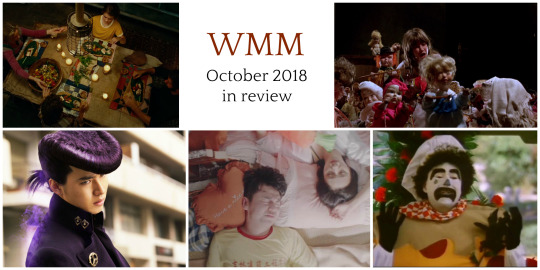
October was way more hectic than I thought it would be and I didn’t watch as many movies as I usually do. I spent a week in Korea (a post about my visit to the Korean Film Archive will be up soon!) And I was motivated to watch a lot of new movies (a.k.a. was on a long-haul flight).
You may have already heard the news, but the irreplaceable Filmstruck is shuttering this month after two wonderful years. Fair warning: I’ll probably spend a good deal of this month (November) trying to watch as many new-to-me movies in my queue as I can. I think I’ll try and write them up quickly over on my letterboxd, we’ll see!
Also, though The Vamps was intended to be an October series, the month’s general hecticness meant I didn’t get the final essay finished before the end of the month. So, in November, you all have that post to look forward to. (See if you can guess who it is! Hint: she’s a Dane.)
The reviews below are essentially transcriptions of the notes I took right after watching the films. They’re presented in the order in which I watched them.
Enough blathering, on to the movies. BELOW THE JUMP!
Dolls (1987)
29 May 1987 | 77 min. | Color
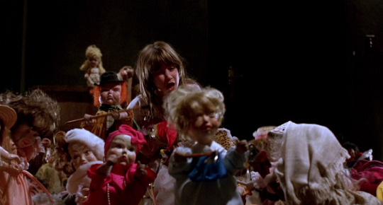
As a long-time devotee of the Band family’s productions, I’m always down for a Band film I haven’t seen. (When I was a kid, we probably spent a dozen times what it would have cost to buy Pet Shop (1994) renting it from Dollar Video.)
Yes, I did talk about haunted doll movies in my last roundup but this one was more fun, okay? The cast of characters are a great larger-than-life assortment of weirdos. I wish that 1980s English punks would just keep popping up in horror films after the 1980s. I particularly liked the performance of the little girl’s father. In most other movies, it would be a terrible performance, but in Dolls, it’s pitch perfect.
Dolls is a fairytale story that creates the atmosphere of a child’s viewpoint. The dolls are scary and do scary things, but, of course, they can be reasoned with.
As with many Full Moon movies, Dolls had a great balance of scares and campy humour. The doll designs are gross and fun–especially their wet, bloodshot eyes.
Dolls is a great choice for someone who watched a lot of Are You Afraid of the Dark? growing up and wants a “grown-up” version of that.
Funland (1987)
16 October 1987 | 98 min. | Color

After watching Dolls on Amazon Prime, this film was recommended. From the plot description and the featured image, we expected a fun slasher film. And, with William Windom (who I’m pretty sure took time off of Murder, She Wrote to make this movie!!!) in the cast, we couldn’t resist. What we got was… a… comedy? I guess?
There’s no doubting that there are some talented performers in this movie, but it’s just not funny. The only reason I’m writing about Funland at all is that it’s a good example of the kind of cheesy movie where you can see what could have been a good (or at least more interesting) movie underneath the movie that was actually made.
How exactly do you think: “I’m gonna make a movie about a killer clown fighting mobsters!” and then come up with this movie? I wrote a much longer complaint but, I won’t subject you to it. In short, Funland doesn’t execute its plot very well.
I definitely wouldn’t recommend this one. However, I am curious if any Atlanta natives have feelings about this movie? It seems like it features a lot of locals.
Flying Air Canada
The movie below are what I watched on my plane journeys to and from Seoul. I was flying Air Canada and I need to rant for a sec before moving on to my thoughts on the films.
There are a lot of reasons why captions (or subtitles, if you’re British) are necessary. They’re needed by lots of people, including people who aren’t d/Deaf or hard of hearing. If you want to learn more about why captions are good Jessica Kellgren-Fozard has you covered.
Personally, I have sensory processing disorder (SPD). This prompts me to have captions on when I watch most things. At home, I do this because not every movie or TV show I watch has decent sound mixing. It seems to be an art a lot of film/video makers are neglecting nowadays. Ho hum. I keep captions on so I don’t need to constantly change the volume. On a plane, my SPD is significantly worse because the noise of the plane is so loud that there’s little to no chance of me catching dialogue without raising the volume too high for my own comfort. Unlike the airlines I travel on within the US, Air Canada’s captioned offerings are practically nonexistent. That’s why so many of the movies I ended up watching were foreign-language (or ASL) films–they came with English subtitles.
Now, Air Canada, listen: Most of the movies you had on offer are definitely available with captions elsewhere. Even in theaters they likely had open-caption screenings. What is the deal? Seriously.
Anyway, sometimes I take for granted that we do some things right in America.
Okay, back to movies.
Mary Shelley (2017)
9 September 2018 | 120 min. | Color

This film didn’t have captions, which honestly might have weighed negatively on my experience of it. I was excited to see Mary Shelley. Mary and Percy Shelley are two of my absolute favorite literary historical figures and I love their work. This movie was a let down. It seemed like it was meant to be a character piece but the characters felt more like types than people. Also, don’t get me wrong here: I give no ground to fuckboys, but the depiction of Percy Shelley felt particularly oversimplified.
A Quiet Place (2017)
9 March 2018 | 90 min. | Color
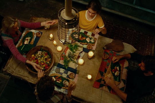
Everybody raving about this movie was totally right. Definitely check it out if you haven’t already. Even if you’re not big on horror, it’s worth a shot.
How Long Will I Love U (2018)
18 May 2018 | 101 min. | Color

Scrolling through Air Canada’s film options, I got the feeling that time-travel romance is pretty popular right now in China and Korea? I think I picked the right one to watch in How Long Will I Love U. The premise put me in mind of The Lake House (2006), a movie I don’t like but can never resist watching when it’s on TV. This movie is a lot better than The Lake House. The premise is pretty cool and the plot is spurred on by a proper sci-fi concept. The leads are very cute together. I love that the main characters both kinda suck but become better people in getting to know one another. The special effects are good looking, conceptually fun, and not excessive.
I highly recommend this one. It’d probably be a great date movie or a Friday-night-with-some-Chunky-Monkey-and-a-cuddly-pet movie.
JoJo’s Bizarre Adventure: Diamond is Unbreakable — Chapter 1 (2017)
4 August 2017 | 119 min. | Color

Listen. I have friends who are big fans of the JoJo manga and anime. I have never read any of the manga and couldn’t get past the first episode of the anime. That said, when I saw Takashi Miike directed this live-action adaptation of a story arc in the multi-generational JoJo series, I hit that play button right fast. Then, to my surprise, I enjoyed it! I often struggle with the visuals in live-action adaptations of anime and manga, but I loved how Diamond is Unbreakable played with the characters’ unique styling and design. The superhero-like story drew me in a lot faster than the anime and might just get me to look into some of the manga.
This movie might be a hard sell for a lot of people but if you wanna see something that’s out there and imaginative with supernatural overtones, Diamond is Unbreakable might be fun for you. Don’t worry–it’s easy to follow even if you don’t know who Joseph Joestar is. (Yes, that really is a character’s name.)
Un Traductor / A Translator (2018)
19 January 2018 | Color
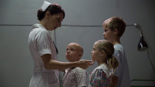
I had no idea that following the Chernobyl disaster, some of the victims were sent to Cuba for medical treatment. I also had no idea that the program continued until 2011?! So, Un Traductor was a modern history lesson for me! Un Traductor is a model film for propaganda filmmaking–and I mean that in a fully complimentary way. The film does an admirable job of communicating how life for Cubans changed with the fall of the Soviet Union and how they adjusted to persevere.
You can probably gather from what you just read that this isn’t a fun watch, but it’s worthwhile if you have any interest in modern Cuban history.
A Casa Tutti Bene / There is No Place Like Home (2018)
14 February 2018 | 105 min. | Color

I don’t have a lot to say about this one frankly. It’s a decent family dramedy. Massimo Ghini and Sabrina Impacciatore both turn in good performances. *shrugs in Italian*
That’s all for this month’s roundup! Are you all ready for Noirvember? How about Kicksgiving? If you’re a Filmstruck subscriber, what are you marathoning this month?
#2010s#month in review#monthly roundup#roundup#1980s#horror#Horror Movies#horror film#full moon#dolls#charles band#albert band#funland#Amazon Prime#mary shelley#biopic#biography#period drama#period film#a quiet place#how long will i love u#chinese film#China#romance#romantic comedy#sci-fi#scifi#science fiction#JoJo#JoJo's Bizarre Adventure
3 notes
·
View notes
Text
Kings of the Court is the Culture Bearer of Local Basketball Communities

Kings of the Court needs no introduction at all, but if I may celebrate what this huge mission is all about... Us Filipinos who are basketball fans whether we are professional athletes or weekend ballers, we all grew up with the prestige quality of KOTC’s basketball empowerment. They just create the most elegant organized basketball leagues from our home towns up to a higher level of the sport. And seeing the company expand to not just being the core platform of basketball life, and now creating a new access to the sport dream through merchandise or should I say, flags we can wear, it represents their readiness in adapting to whatever decade we may be at. We had a conversation with the Maker of Kings of the Court himself.
So, do you believe you are the culture bearer? Hehe.
If we’re talking basketball culture for the weekend warriors like you and me, I guess yes? But streetwear is a whole different animal. It’s not like we can put our logo in a shirt and people will automatically buy. It’s a different taste, different approach, and trends are ever-changing. KOTC Clothing is a startup and a process I go through everyday and enjoy.
That’s a really bold statement and it gets me super pumped up!!! How’s LIFE and how’s WORK?
Life’s good! I have my 7-month daughter Lianna Lane who’s growing up way too fast. KOTC as a league and sports organizer is completely on hold, but somehow we’ve pivoted to digital where we do graphic design & video editing, handle social media pages, manage paid ads, and execute online marketing campaigns.
Our Kings of the Court PH page is very active as well and I’m happy that we’re consistently visible as a brand. From 120,000+ FB followers in March 2020, we’re now over 215,000 today giving people NBA and local basketball content daily.
In terms of clothing, most of my time is spent on learning the streetwear culture - research, learning the different vibes and styles, branding, e-commerce, production, and a whole lot more. And like I said, enjoy it. I meet a lot of people and learn a lot, taking my “title” away and putting on the apprentice shoes once again.
I want to be an expert in all facets of the clothing business so when I do hire people, I would be able to mentor better and be more aware of the challenges they might encounter.
This is the perfect time for you to speak volumes about KOTC’s heart and soul!!
“Empowerment through elegance and prestige. To make sports dreams come to life. To be Kings of the Court”. This is our guiding principle in bringing the brand where it is right now. It’s like the league was one big book, a saga if you may, and every season was a chapter you turn. Every initiative, prize, league feature, segment, as well as our branding (Gold = elegance; Black = serious and powerful) were all based on this mission statement.
What we did to our leagues and events, I want to transcend to our clothing brand. I want to bring the best stories in every design; stories of basketball empowerment to every person who bears our pieces. With streetwear as our subculture, this is also an opportunity to expand our boundaries in creativity… all with a good cause! Every purchase allows us to help local communities by supporting Mike Swift’s dream to paint 1,000 courts. As of writing, we have collaborated and refurbished 8 courts.
Okay, that’s super crazy to hear. Can we reveal who you are??
Yes! I’m Cholo Legisma. A 5’2 guy who’s never built for the sport but very passionate, competitive, and gritty enough to start and build KOTC.
Without KOTC, who are you?
A 5’2 guy who’s never built for the sport but very passionate, competitive, and gritty enough to start and build <different name, but same concept>.
Hahahaha makes a lot of sense. Talk about BASKETBALL and SPORT as a whole… Go!
Basketball binds people together and it’s truly a culture; a timeless sport that connects generations. Because of its roots, branches grow in the form of lifestyle, sneakers, art, music and pop culture.
What do you think your role is, for your community?
To further champion the union of basketball & fashion. To have anything you wear is an expression of yourself whenever you’re out there.
I envision people to be more conscious of their off-court style, the before-and-after game looks, especially when you play in prestigious leagues such as ours. KOTC’s goal has always been to give you the professional/bright lights experience, so why not push the needle for fashion, #KOTCFits in our term, and metaphorically converts “tunnel walks” into red carpets.
Soon, leagues will not just be about stats, game photos, videos, articles and prizes, but segments for your fits and sneakers as well.
Any super crazy up and coming launches or ideas that we’re privileged to know about??
We’ve just finished the brand’s first ever collab, with Sumptuous.ph. I’m very happy with the turnout as it gave me new perspectives in terms of art and streetwear. Our next collab is Gunner, then we’ll have another one in August, plus there are other brands in the works. Likewise, we’re starting to do retail with partner stores in Manila and outside.
When doors open, KOTC clothing will be integrated into our events - collection releases and collabs through 3x3 and 1v1 tournaments. We’ll be visible to the art and streetwear scene through concerts, expos, and more. Portion of our office will be converted into a studio and we’ll have a spot for a mini shop where people can visit us anytime.
In my mind, when can I visit that studio? Pretty exciting. This is the perfect time where you can speak about your core beliefs in LIFE and WORK!
I feel like my life is a stage and I want to always perform. Being the best is not enough, I always want to be the f*cking best (It didn’t make sense, but it did show you how passionate I am haha).
I agree haha. Lastly, we all want to know the history of KOTC and how it was architected and curated to become what we believe it is to be [culture bearer of local basketball communities].
Actually, “Kings of the Court” was on the bottom of the list when me and my partners were conceptualizing the name. It was unique, but it might be alienated rather than be attractive. Besides, it may sound “trying too hard”.
But then, I thought this was the best opportunity to put elegance and prestige to the recreational level, to empower weekend warriors. It was an opportunity to show that organized leagues aren’t only for the physically gifted. By sticking to the brand and principles, we somehow pulled through.
Thanks to my partners who did UFC-type posters and NBA-type writeups, my video editing ala NBA Jam Session, the prizes and of course, social media, it felt our first season of 8 teams was like a storyline from WWE and participants were so engaged to play. The rest, as they say, is history.
Listen man, I appreciate the opportunity and the time! It is an HONOR, so thank you!
Written & Interviewed by Four
0 notes
Text
MA SHUAI ON WINNING GOLD AT YOUNG STARS 2019

At AD STARS 2019, Ma Shuai, Zhang Ruoyu and Sun Hanchen represented Shanghai Normal University at the annual Young Stars program – and won Gold.
AD STARS’ Young Stars program gives university students from around the world a taste of what it’s like to work in advertising. Last year, their brief was to sell Busan as the ultimate tourist destination using social media – with just 30 hours to create a solution.
There was one team that stood out above the rest: Ma Shuai, Zhang Ruoyu and Sun Hanchen from Shanghai Normal University. We spoke to Ma Shuai about what they learned from the experience…
How did you hear about the Young Stars program?
As a student majoring in advertising, we pay attention to international awards, which is a channel for us to learn practical tips in creativity. Since AD STARS has been becoming a more and more influential event and award show in China, we would often hear relevant news about it, hence the interest. Students always value the participation more than the honor, so we try to join in a variety of competitions so as to earn the opportunity to watch and even be part in these big events, such as OneShow Youth or D&AD Young Blood. That's why the local competition jointly held by Young Stars and China Advertising really fascinated us. It not only let us know this platform of communication, but also provided us with a convenient way to take part in it.
What was the hardest part of the Young Stars competition? What did you learn?
The first steps were the most troublesome. We didn't want some forms of expression which are just funny or dazzling, but a solution that can really help. For this purpose, we spent so much time finding out a powerful insight. As we only knew what we don't want, we just kept coming up with ideas, denying them, and doing that again and again. I was really anxious when we saw that other teams were already in the execution phase and we were still arguing with each other. In fact, we argued over everything right up to the last second: details as big as the choice of interactive mode, and as small as the use of a simple picture. Maybe this can be seen as a reflection on the pursuit of perfection.
In terms of the result, logics and insights matter more than appearances. I used to come up with an idea, then dress it up with conceptual expressions to make it seem like it fits creative demands. I won't do that anymore.
Your campaign was called, ‘Busɒŋ— Melody of busan shape’. Why do you think it won Gold?
Perhaps because of its simplicity? We really persisted in achieving a most simple mode ── our goal was to reduce inconvenience, so we started by assuming that our audience will be reluctant to specifically download new apps, will be reluctant to use certain functions through complex interactions, and will be reluctant to spend more time experiencing the fancy effects ── all should accompany the behavior of the audience themselves, happen unconsciously. Based on this understanding, we chose maps and music as entry points without much effort.
Besides, I think our idea fits the theme of "tourism" quite well. It is not an idea packaged with travel-related descriptions, it really accords the behavior patterns and interests of the visitors as an audience. First of all, in our idea, what the tourists get at the end is produced entirely along with their travels, which makes the concept of "musical memory" very attractive. Secondly, the fact that everyone can obtain unique output also makes the audience more willing to share. This appeal is completely active, rather than wishing a social communication just by generating some commemorative pictures or words with no personality.
Finally, the use of new technologies. The idea of automatically generating music at different altitudes in different terrains is quite a fantasy, and we checked a lot of references about music creation AI to confirm the feasibility to achieve this. We knew the idea might be too wild to be anything more than a draft, but new technology always takes ideas to higher dimensions. Looking at the creative awards of recent years, a growing proportion of new technology is on display, and ad agencies are also setting up their own proprietary technical teams. Since it is a creative idea, we want to let ourselves always have the courage to consider the highest possible, the apex. We hope this will keep us curious about learning!
Would you recommend Young Stars to other students?
We're already doing that! More than any other competition, Young Stars is a precious platform for advertising students to communicate and to learn. We are very lucky and grateful to have the opportunity to participate. I hope that more and more Chinese students will join in this event in the future.
Are you still at Shanghai Normal University? What is your dream job once you finish studying?
We have graduated in September this year, and this award is a memorable highlight of our school days. I'm now pursuing my Masters degree and the other two have commenced their careers.
My dream job should be in an art museum! Considering that art museums are non-profit organizations, I might try to create some art experiences with the brands’ advertising budget before doing that with my own money...

What is your favourite advertising campaign?
Poetry POS Machine: it was a public welfare action presented by Tian Yu Kong for UnionPay. They put poems written by children into UnionPay's POS terminals, where people pay 1 RMB using the UnionPay APP and could get a special poem printed on a normal receipt. These children poets, who come from less developed rural areas, spend little time with their parents during years as the latter move to the cities to work, and the proceeds from this campaign will fund their educational programs.
What I admire is that it was not a condescending charity ad as usual. For children, they bridged a channel where children can get help dignified with their own talents. For audiences, this simple, innovative, meaningful action has more appeal, and more value through spreading and sharing. For brands, UnionPay, as a state-owned enterprise, took the initiative to shoulder social responsibilities, thus enhancing the brand image of UnionPay's mobile payment.
Do you have a creative hero?
Ma Xiaobo, head of SGAD+! Someone who can tell every story in a fascinating way is really cool, not to mention the fact that his copywriting can strike a deep chord with all people, not just the target audience. His pieces embody everyone's empathy, beyond the "hit" tricks of marketing.
What is your favourite memory of Busan?
I took my friends to visit the Busan Museum of Art, where we were happy to get guide books in Chinese. As a tourist city, Busan's inclusiveness and service construction always impresses everyone. Speaking of which, there was a little story: on one bus ride, the driver greeted me in Chinese and said he had studied at a university in China years ago. We talked about our lives in our respective countries then left contact address. The day before the competition began, he came specifically to encourage me and wished me the award ─ a little warmth in a foreign land.
To be part of Young Stars 2020, you must come up with an idea to promote Korean home meal replacement brand ‘Mitus’. For more information, visit our website or contact [email protected]. The deadline is 23 September!
0 notes
Text
NESTLE CERELAC CAMPAIGN
#SAVESYOUTIMEFORTHEMOREIMPORTANTTHINGS is a mock campaign created for Nestle Cerelac.
The objectives of this campaign is to present Nestle Cerelac as a quick yet healthy solution, to help parents save time on having to prepare meals for their baby to have more precious time spent with their baby.
The problem is that Nestle Cerelac is perceived to be boring. Flavors are too basic and plain: wheat, grains, bananas...
Parents tend to think if it’s so simple and plain, they might as well make from scratch.
Hence, I decided to use that as its unique selling point and brand it in a way where spending precious time to create fond memories with baby is more important.
By using Nestle Cerelac as a base, which is loaded with nutrients sufficient for babies, saves them time then having to make it from scratch as it is quick and simple to make just by adding milk formula or hot water.
The visuals would work as a poster series, capturing the fun times and memories parents can create with their little ones.
POSTER SERIES
Visual 1:

Visual 2:

Visual 3:
Visual 4:

Note: The images used are sourced from Google and edited on Adobe Photoshop.
CRITS:
1. Joanna Dorai:
Consider a key message that is closer and clearer to the role of the product... In reality, parents would spend time with their kids with or without the product. Or, they could be too busy to spend time with kids anyway, let alone prepare a simple meal. In this way, the headline doesn't quite sell the product.
So think about what the product really solves - yes it is a quick and nutritious meal. The question is, so what? And why would people care?
Therefore perhaps think about what Cerelac (quick nutritious meal) would mean to them as a busy parent. For example, busy parents need a quick fix for their children's meals. The problem is the instant format makes them feel like it is less nutritious which makes them feel guilty for spending so little effort in preparing an important meal for their children. The challenge then is how do we make the simple act of pouring in hot water or milk formula feel like a respectable effort? Explore if this will inform better your copywriting and art direction.
2. Gabrielle Moey:
It's nice that you use another approach (sentimental element) on this as you are right, I think people generally see this as quite a boring product. I think your poster conveys that mum and kids relationship/memories very well. But looking from the branding perspective, I think your key message could be improved.
Right now I see 2 key messages - "The More Important" & "Saves you Time". Perhaps focusing on just one can help expand your vision more and help you further communicate the message to your audience.
Once you have your narrowed down key message and target audience, I'm sure that you will come up with a more clear direction of design that works for that particular audience.
3. Annabelle Foo:
Choice of visuals are warm and captures the heart of spending quality time with family.
Convenience of the product is clear & straight to the point.
Suggestions/Feedback:
Although the visuals revolve around a similar theme, try using images without watermarks on them! (Visual 3 & 4)
The messaging behind #SAVESYOUTIMEFORTHEMOREIMPORTANTTHINGS can be expanded more to highlight the values that your visuals are bringing out. Like you said, the series captures the fun parents have with their little ones - these important things are actually little things that a parent would never want to miss out on in their child’s life - like when their baby learns to crawl for the first time or when a toddler utters words. However in reality, these moments take time and it’s easy for them to go by.
You could expand these situations into different headlines of your visual instead of having a similar headline since it’s already in your visuals! You have a really strong concept going on already, and if you boil it down even more to a single sentiment, I think it could be #NeverMisstheLittleThings or even #LittleThingsTakeTime which is where the main benefit of Nestle Cerelac also comes in - convenience!
That way, the hashtag also becomes catchy/memorable and also most importantly easier-utilised on social media platforms.
3. Eunice Loke:
Layout is clean Question: If the time spent to make porridge from scratch and make cerelac and add stuff is the same, why would I want to buy this? Problem: boring and plain Solution: Spice it up 4. Basil Cha: Definitely a great cause, about creating time to spend with parents and kids- Think it needs a bit more depth. The direct solution is that the solution saves much more time that can be spent with kids, but how can the brand actually encourage this relationship between parents and baby even more? Feels like parenting is a chore and this solution is just helping your burden but what if we position it as “my favorite things” instead of “the more important things” e.g. My favorite thing is playtime and I have more of it because I spend less time prepping meals. “These are a few of my favorite things” Advertising has gone past straightforward directions, need to tap into your audience. Is it stay-at-home moms? Working moms? What are their biggest pain points, what are their joys? When we understand our audience we know how to reach them. (Similar to evangelism no? HAHA)
Try not to use pictures with watermarks on it (if not have to Photoshop them out with the Clone Stamp tool – you can explore this) but there are tons of free stock images now like Pexels and Unsplash. Also if you’re targeting Malaysian people use Asian families not white people? 5. Yae-ber Neo: Hashtag as campaign title ought to be careful with use of hashtags as campaign titles. Think from the perspective of a user on Social Media what would catch your eye, readability, length and message all play a part. Study the more successful hashtag campaigns and discover the big idea that drives their campaign to relate with the target audience.
Execution: Elevate your execution by photographing on your own, examiners appreciate this better because then you can also incorporate a stronger conceptualization to back your execution. If you have to use a stock photo, do make sure to get those without a watermark. Visual hierarchy: arrangement of your items (visual, headline, body copy) should lead your reader to understand the message just as you plan for. Choice of size, colour, contrast, alignment and placement will do the trick! Headline: your headline ‘for the more important things’ is not bad, the treatment however can improve. The visibility is not as clear as your slogan/subhead, ‘saves your time’. Experiment with choice of colour, outlines, drop shadow etc. to see how you can make your key message (headline) stand out. Colour: Creating a colour palette that you stick to would give overall brand consistency. Body copy: should give it a little more breathing space, have more negative space on each side, look a little cramp atm, and enlarge the bottom box. 6. Sarah Ann Toolseram: Choose the right images. Change The font or change colour to give allowance for printing errors. Pictures are appropriate for target audience -Feeding can be a bonding activity. -Saves you time from prepping the meal or feeding the kid? So you can have more time for fun things.For the more important things -TaglineDesign consistency. 7. Damien Chung: I Understand the idea behind it, the motivation behind it. It’s a good thought. Personally, I don’t find the selling point really convincing for me. It’s basically the same as milo or rather powdered milk (since it’s for babies), or baby food. Perhaps what can be done is not shifting away the focus from the boring flavours but instead find a way to highlight it and make it interesting. Because parents might actually find the process of making food for their babies even more so interesting and also worthwhile, rather than finding ways to save time on it. From that satisfaction, it might then translate to them having fun with children. Preparing food is also considered “an important” thing 8. Ian Lai:
I really like the concept of focusing on the important things, like special moments with your child. But “#SAVESYOUTIMEFORTHEMOREIMPORTANTTHINGS” doesn’t work as a campaign hashtag, it’s too long and hard to read and remember. Something simpler like “#theimportantthings” would be easier to remember.As for the visuals/ads, I think that it can be stronger to drive home the message of focusing on the important things. Right now parents spending time with their kids is too generic. You want to really guilt trip parents with the visuals. For example, baby’s first steps. It would really suck for a parent to miss it, and every parent can relate to it. Copywriting can really drive the message across, “Don’t miss baby’s first steps just because you’re busy preparing her dinner.”“Saves you time for the more important things” is a good tagline for the campaign. Every ad could end with that as a tag. The typography can be more simple and tasteful, no need to have different font sizes or dancing letters (a bit high school word art). Also a better font choice for the body copy would help
0 notes
Text
Great Interiors With Cork Flooring

The benefits of pleasing interiors are easily recognizable to everybody. Combine great aesthetics with healthy design choices and the result can be a sublime living or working space. However, choosing the right materials is not always an easy task. In today’s rush-rush environment, it is advisable to try and use as many environmentally friendly materials as possible. On just the matter of looks, cork flooring could be an amazing solution. Combine it with natural cork’s functionality and versatility as well as added cork underlayment and the formula for an exceptional flooring is complete. Looks meet functionality.
How to Design With Cork Flooring
Designing interiors is an art. In fact, some might even go as further as to call it a science. The designer’s job is to enhance the interiors of a building to meet the wants and needs of the people who will use the space. The owner’s personality and desires are the top requirement and must be incorporated into the décor as well. Before a task like this can begin, thorough research and planning should be made. An idea using a cork flooring requires a certain degree of creativity and practical application. The phases of interior design are: 1. Conceptual development – in this phase creativity is most wild. This is where all the ideas are thrown onto the table for consideration. You can go as big or as small as you want because the next steps are there to bring concept to reality. 2. Space planning – this means creating purposes for each individual space. Not every room has to share the same concept as another. 3. Site inspections – this is necessary in order to see which ideas are able to fit into the actual space. Not every single one of them will fit. Only the best ones can go forward. 4. Materials research – now that the designer knows what fits where, he or she can now decide what materials can be used or will best enhance the space. Whether it be classics like ceramics, or somewhat new ideas like a cork flooring. 5. Communication – communicate all of the above aspects to the clients. As they are the payers of the project, the final say in theirs. Compromise is a part of the course, but always be aware of their needs. 6. Execution – the final phase is the actual moment of turning planification and ideas into realities. This is when clients will get to see their dream projects come into life.
Functionality With Cork Underlayment

Everything said and done there will still be a necessity of practicality. For example, floors are there to provide a solid surface to walk upon, but that does not mean sacrificing of warmth and comfort. What is the solution to that? A cork underlayment. This solution is one of the best for a couple of reasons. First of all, it is environmentally friendly. Just like with everything made out of cork, pollution is out of the equation. The provenience and production means are of green nature as well. The second reason why cork is the solution is the capacity to maintain warmth. It has a very high insulation potency while also being a fire retardant. These kinds of characteristics rarely come bundled up together. Last but not least, it has a noticable ‘give’ when pressed upon. This will be a huge advantae for your joints and is a pleasure to walk on. Walk on a cork floor barefoot and not worry about the surface being too cold or too hot, and not experiencing feet ache after long periods.
When designing an interior with maximum comfortability as a factor, cork underlayment will surely come to mind. Another great characteristic of it is the acoustic insulation. Noise is a sound vibration that the human ear picks up. It is commonly described as a wave. Cork can reduce vibration, pressure, and sound. The only other material as good in this domain is rubber but at way higher prices. Rubber is also very toxic especially when burned as waste. Cork material, naturally deriverd from the oak tree, is not only good at deadening sound but also at muting echo from other noises in the surrounding area. For example, TV sounds, music, and conversations. This would prove to be an especially thoughtful feature in apartments for that coveted quiet feature. Combine all of the above with the fact that cork is one of the cheapest and long-lasting materials available and you will surely understand why it is regarded so highly.
0 notes
Text
Her Creative Process: Caterina Bianchini

Caterina Bianchini is a Designer and Art Director based in London. Her work challenges current design norms by experimenting with unique typographic layouts and beautifully curated colour palettes. By using a varied approach to projects, she has created a unique style of design that has received acknowledgement awards in the design industry.
Working with clients like Red Bull Music Academy, Generator Hostels, Nike, Adidas, Boiler Room, Topshop, Ministry of Sound, and Selfridges, the studio was founded with the ambition to create inspirational, conceptual design with intelligent and simple execution.
How did you end up in your chosen career?
I was always very artistic, so I left school early and went and studied medium format and film photography. From there I applied to university to do Communication Design and got in! I think that’s where my interest in Graphic Design came from. It was something I felt I knew I could do, it seemed natural to me. I used to teach myself new skills, and one month I decided I wanted to learn how to edit video, so I sat and played on After Effects until I understood how to edit.

When do you feel most creative? Be it a time of day, particular season, or after a really great taco.
Sometimes if I have been working on one particular project for a long time it drains me, so I find I get a build of creativity at these times. Sometimes after working all day on something, I come home and work on a poster or a new typographic idea I have. I also find I am most creative when I’m not actually thinking too much about what I’m doing. I find that this work is something that then feels more natural and unique in execution.
Where is your favorite place to create, and why?
Hmm, that’s quite hard. Sometimes at my desk at home I make a lot of good work because there is absolutely no distraction around me. But if I go and work in my studio then I find I’m influenced by things I have walked past or seen that day, so it sometimes helps when I feel like I don’t have as many ideas as i usually would. So my favourite place to create is a desk, but between two locations!


Is there anything special you like to eat, watch, or listen to while you make things?
I love music, it’s really one of the most important things to me. So I am always listening to music, usually a radio station like Worlwide.fm or NTS, or a mix. I have so many of them it’s hard to say which is my favourite, but the sites I use are Soundcloud, Libra Mix, and Youtube.


Typically, what does your creative process look like?
Usually I will work with pen and paper and think about what something means or what it is trying to say, then I will build this into a bigger concept/get into Illustrator and start playing with type and colour. I think colour is a really hard thing to get right, especially with branding, so this always takes a little longer.
Who and what are you inspired by?
I am inspired by people and objects, packaging, old signs! I see a lot of things that inspire me in some way when I’m out and about. People that I admire are John Baldessari, Kenya Hara, Kandinsky. I love the late photographer Ren Hang, the typographer Jean Pierre Graber.


How do you get past creative block?
I usually leave what I am doing and come back to it. I find if you just keep pushing things around a page your design gets worse and so do your ideas, you also achieve about 10% of what you normally would be able to. I think if you find yourself working against it, you should go out and have a walk, watch something, read? Anything really, just try not to think about what you were working on and then come back to it. If you do that you will find that you will get so much more done and in a shorter time.
How do you deal with perfectionism, self-doubt, and comparison?
Sometimes I compare my work, but I think you have to remember you’re an individual and an artist in your own right, so comparison doesn’t come into it. Trust your intuition and gut and go with what you think looks best rather than what other people say. That way you're creating something more unique and eye-catching, rather than something that has to approved across every level of graphic design.


Do you have any tips for someone who wants to do what you do (and be really good at it)?
Just keep creating. If you have an idea, design it up! Even if it isn’t for a client. Keep your brain constantly working and thinking about and on design. Surround yourself with people who are creative as they will inspire you and can prompt you to try new things or do more!


What are you working on now, and what’s coming up next?
Lots of things!! I have a lot of new branding projects and packaging projects I am about to release, I am also travelling a lot over the next few months and teaching a lot of workshops!
CONNECT WITH CATERINA:
Website | Instagram | Twitter
#graphic design#graphic designer#Typography#illustration#print design#branding#Brand Identity#Packaging#Packaging Design#web design#Editorial Design#color#creative#creativity#creative process#creative women#her creative process#interview#art#design#visual arts#Visual Communication
1 note
·
View note
Text
THE MAGRUDER AND GLENCOE CASE, PART III
[Note: If the reader has taken up reading this blog with this posting, he/she is helped by knowing that this posting is the next one in a series of postings. The series begins with the posting, “The Natural Rights’ View of Morality” (February 25, 2020, https://gravitascivics.blogspot.com/2020/02/the-natural-rights-view-of-morality.html). Overall, the series addresses how the study of political science has affected the civics curriculum of the nation’s secondary schools.]
The last posting left the reader with an assignment. It reported the chapter titles and number of pages each of those chapters contained for a 2013 edition[1] of the Magruder American government textbook. The reader was assigned to review the information and see if he/she could derive any conclusions as to what this blog has been claiming – that the writing of such textbooks are guided by the natural rights construct of government and politics.
Unfortunately, this writer can’t hear what the reader discovered, but below is what the writer gleaned from the listing. But before sharing it, the reader should be reminded what the natural rights view promotes. Central to that view is a belief in natural rights or natural liberty – hence the name. So, if Magruder’s is so guided, perhaps its chapter titles and page allocation would reflect it.
If one looks at the titles from Chapter 19 to 21, accounting for 100 pages of 769 pages of text material (roughly one seventh), those pages are dedicated to the concept of rights. Chapters 19 and 20 seem to be solely concerned with individual rights and Chapter 21 incorporates a concern for justice that at least has a communal angle to it. After all, justice does demand a societal landscape. But overall, given the number of pages all three chapters dedicate to rights, one can safely assume the author, William McClenaghan, has a strong concern over this topic.
To compare this one element to the 2019 edition,[2] a listing of its chapters, page allocations, and topics is needed. In that version two important changes take hold. First, the author is another person, Daniel M. Shea – a professor of government at Colby College. Shea has divided the text differently as the following list indicates:
Name of Text: Magruder (2019 edition)
Topic/Title Number of Pages
1. Foundations of Government 34
2. Beginnings of American Government 61
3. The Constitution 51
4. The Legislative Branch 73
5. The Executive Branch – the Presidency and Vice Presidency 34
6. The Executive Branch at Work 62
7. The Judicial Branch 26
8. Protecting Civil Liberties 64
9. Citizenship and Civil Rights 38
10. Government by the People 78
11. Elections 58
12. Government and the Economy 50
13. California State and Local Government 62
14. Comparative Government 24
Total = 715 pages; 102 pages dedicated to rights (Topics 8 & 9)
The first difference one can detect between the 2013 and 2019 editions is that the text is divided differently. Instead of 25 chapters, there are 14 topics. Each topic, within the text, is divided into “lessons.” In the opinion of this writer, this newer outlay takes into account that American government is usually a semester – as opposed to a yearly – course of study.
There are 180 school days in the school year, 90 in a semester. Many weeks of the school year are not made up of five days. For example, Thanksgiving week is only three days (the writer’s local school district recently cut that down to two days). Many secondary schools operate under the assumption that every course taught can follow the same format in that tests are assigned a specific day of the week so as not to overload a student with too many tests on the same day.
So, a teacher’s test day in biology might be on a Monday, social studies on a Friday, language arts on a Wednesday, and so on. Usually the approach used divides the course into units that last a week and attempt to cover a chapter or topic per unit. That means a chapter needs to be covered – given the practical constraints of the calendar – in a week’s time.
Now if the reader puts him/herself in the shoes of the average high school student – a person who cares next to nothing about the topics covered in Magruder and understands that government is one of six or seven courses he/she is taking – the contents of such a textbook can seem overwhelming. The course, American government, in Florida is usually offered in the senior year and some of the other courses that senior might be taking include pre-calculus, physics, and English literature.
Also figure-in applying to colleges and the general exhaustion of this type of schooling for last twelve or more years the he/she has already experienced. All that is a challenge, but it doesn’t end there. Now think of that government teacher with about 25-30 students in any given period with all this going on in their students’ lives. Those teachers’ charge is to teach American government in such a way as to promote a general view of governance and politics that reflects some conceptualization of the subject matter.
The conceptualization might be in line with natural rights thinking – probably is – but some might opt for some other perspective. Some might be guided by critical theory, a Marxian view, or federation theory. Now if that teacher promotes a federalist message – one that highlights a communal and collaborative sense of the subject – can he/she count on the text to be of assistance or does it provide yet another obstacle?
This writer’s first impression of the above lists of chapters/topics (2013 and 2019) is that the content puts almost all of its emphasis on the structure and processes of the central government in Washington. That is, it has the mechanical view previously described in this blog. That view highlights how that government responds to the input generated from its societal environment (both domestically and internationally).
Only two chapters in 2013 and one topic in 2019, at or toward the end of each text, are dedicated to local government and most of that attention is on the state level. That is a problem for the teacher adhering to federation theory. Federation theory, in its advocacy for an engaged citizenry within communal settings and collaborative arrangements, holds the quality, social capital, as an important social attribute.
Social capital, using the thoughts of Robert Putnam, is characterized by having an active, public-spirited citizenry, egalitarian political relations, and a social environment of trust and cooperation.[3] With that sense, one is apt to engage in politics, but, to be realistic, that is highly dependent on a political landscape that one can expect a realistic chance of being effective.
For most citizens, effective participation is limited to involvement with local government – usually city or county government, not national government. Why? Most people do not have the resources to affect national policy, but they do have the resources to influence local politics and policy formation. So, if the goal is to promote participation which in turn enhances social capital, shouldn’t the emphasis in civics education be directed toward local governance? That’s what makes sense to this writer.
On the other hand, he judges the above distribution of attention – as indicated by the page distribution of the texts – is geared not to participation, but to observation. If successful, the above content seems to be geared toward informing the average citizen so that he or she will be able to watch national news and understand it. With that viewership, a citizen can be an informed voter and able to translate personal preferences into voting decisions.
Does this emphasis characterize the whole text? No, at least in the 2013 edition it does have students consider a more interactive role – a feature this blog will address in the next posting. To emphasize, these exceptions are just that; they make up few entries in the textbook and are easily lost and ignored, given the overall challenge of “teaching” a 700 plus page textbook in fewer than 36 weeks (fewer than 18 weeks in a semester).
This writer wishes that the emphasis of Magruder was clearer. While the 2013 edition does contain an element that encourages engagement, it is an exceptional element and it is not picked up in the 2019 edition. But it is worth reviewing this effort to give the reader a sense of how the materials emanating from the establishment views this concern.
The reader is reminded that a previous posting asked if the establishment of civics education has been opting toward a more federated posture. That drift is detected in the standards that have been issued of late – such as the C3 Framework[4] – but does it appear in that all-important component of the curriculum, the textbook? The next posting takes a further look.
[1] William McClenaghan, Magruder’s American Government (Florida Teacher’s Edition) (Boston, MA: Prentice Hall/Pearson, 2013).
[2] Daniel M. Shea, Magruder’s American Government (Boston, MA: Prentice Hall/Pearson, 2019).
[3] Robert D. Putnam, Bowling Alone: The Collapse and Revival of American Community (New York, NY: Simon & Schuster, 2000).
[4] National Council for the Social Studies, Preparing Students for College, Career, and Civic Life (C3) (Washington, D. C.: NCSS, 2013), accessed April 16, 2018, https://www.socialstudies.org/c3 .
#William McClenaghan#Daniel M. Shea#Magruder's American Government#Robert D. Putnam#National Council for the Social Studies#civics education#Social Studies Education
0 notes
Text
Artist Spotlight: Dutch Visual Artist Pleun Van Dijk on Creating Art at Roskilde Festival
London-based Dutch artist Pleun Van Dijk describes herself as a “researching artist;” someone who explores the world around her through observation, experimentation, and analysis that is then reflected in her multimedia work.
As an exchange student at the Royal Danish Academy of Fine Arts, Denmark felt like home to her; this tender feeling has followed her ever since. Pleun has collaborated with Roskilde Festival on the “Human/Non-human” exhibition. She also staged a performance called “Replika” where visitors could watch how performers continuously repeated the same movements while working on a human production line.
Through various artistic mediums, Pleun tackles important issues such as body positivity, beauty standards, skin perfectionism, sex, and youth.
We spoke with Pleun Van Dijk about her connection to Denmark, her work at Roskilde Festival, and what inspires her:
Tell us about yourself, your connection to Denmark and/or Scandinavia, and the Roskilde project.
My fascination for the rapidly changing world around me is endless. By analysing and observing moments of transition, I try to generate new thoughts and thereby show a different perspective on a topic. Although my inspiration sources are very diverse, the main focus ever since my graduation from Design Academy Eindhoven in 2016 has revolved around the question: “What does it mean to be human?”
I lived in Copenhagen for a year when I went on my exchange to the Royal Danish Academy of Fine Arts, School of Design. I have always been attracted to the north and Denmark made me feel at home from the first day onwards.
This feeling hasn’t changed over the years and is one of the reasons why it was so great when Roskilde Festival invited me to join their exhibition. It’s an honor to present my work in Denmark, and an exceptional chance to develop and execute a new concept.
You work in different mediums; how do you choose the medium for the project
Coming from a multidisciplinary background, I’m always eager to discover new mediums and tools. I enjoy the freedom to work in different fields, which allows me to choose the medium that communicates the new concept in the best possible way. In some cases, the story is best told through a video. In others, I give the audience a more comprehensive experience with an interactive installation.
Who or what inspires your work? What are you challenges and joys in the creative process?
I consider it important to be present. That’s more difficult than it might seem, since we are part of a world changing so rapidly that we almost can’t keep up with it. Before placing my work in context, I find it important to understand the world around me and ground my thoughts. I try to conceptualize the “now” by analyzing and observing moments of transition within society.
After investigating the new developments, I take them a step further into the future and transform them into a speculative scenario. By taking new thoughts out of the abstract and shaping a possible (or impossible) outcome, I hope to give the viewer the opportunity to anticipate these new developments.
Going through a creative process is wonderful but also full of unexpected challenges. One of the most difficult, as well as amazing, parts is to create something out of nothing. Some projects start with a given set of guidelines, others are completely open. You have to jump in the water and make sure you don’t drown.
An idea never suddenly occurs to me: I need in-depth research. I need to plant a seed and create a context for the concept to grow. That first phase is one of my favorite parts because it allows me to discover and explore unknown grounds.
To translate the concept into a visual piece is the next big challenge in this process. It’s something I’m still struggling with. I want to express everything in one project, but every time I realise the impossibility of this desire.
Your project “The Body Garden” deals with the investigation of the human body waste. What does the body waste reveal about people?
In “The Body Garden,” I’ve researched different perspectives by collecting my own body materials for a month. Then I went into a lab to extract what normally stays hidden. Every day we are being exposed to an almost endless stream of photos and images of clean and polished bodies, stripped of anything that might make it look grotesque. This gives us the illusion of a finished and controllable body, but that’s not reality.
The human body is in a constant state of renovation. Everything that lost its function will be pushed off, therefore we constantly shed skin, hair, saliva, snot, and sweat.. With “The Body Garden” I explored the potential of the body becoming a garden. We mainly see our leftovers as a valueless waste material. Would this still be the same in a context where we lack of natural resources; for example, on Mars? What is the regenerative potential of growth on our body?
How do you feel about body-based propaganda? How can we oppose the fashioning of the body?
We are constantly confronted with the desire for perfection and the idea that youthfulness is superior. We can’t stop the process and we also can’t escape it. The main thing we can do is question it.
The “perfect human” only exists in the context of the “normal human.” Whenever the “perfect” becomes the new “normal” our desires change to match it. The dream for perfection will be a never-ending one.
In “Transcience” you say: “pleasure is the new norm” and “the definition of sexuality is often being mixed up with sexiness.” Can you discuss further?
The social relationship between sex and reproduction has changed. First there was sex without reproduction it now we’re shifting towards reproduction without sex. We don’t have sex with procreation as the main result and therefore the focus is on pleasure.
We often mix up sexuality with sexiness, where sexiness is more focused on the beauty standards of our visual appearance. Sexuality expresses the experience, feelings, and stimulations from the inside out.
In your project “Reborn,” you questioned if we are capable of reconstructing ourselves. What were your conclusions?
“Reborn” is one of the two graduation projects I did at Design Academy Eindhoven. I explored if our idea of evolution still fits in modern society. This resulted in a series of five sculptures as well as a written thesis.
The word “evolution” is often connected to the idea of improvement. In my opinion, this is a questionable way of thinking. We are so eager to move forward, but there is no progress, there is not even deterioration. There is only change.
We often forget that we are not an end result of evolution but just a phase in between what we have been so far and what we will become in the future. By deconstructing and reconstructing the human body I wanted to show the possibilities of the human as a modular system. This gives us the opportunity to anticipate new developments before they sneak into our lives.
How do you envision humans in the future?
A relevant, interesting, but impossible question! What we can say is that the scientific and technological developments are going so rapidly that it’s almost impossible to stop them.
According the story of Icarus, we shouldn’t fly too high and shouldn’t fly too low. The solution to a problem is fundamental to improvement but has often more consequences than the solution it solved. That’s why I think we have to discuss the possible outcomes and effects on society before scientific development is proceeded.
So even though it’s impossible to fully envision the effect of our alterations in the long term, I consider it to be important to discuss. We need to decide what we want and carry responsibility for the generations to come. Artists and designers can help us to comprehend the new developments by transforming them into speculative future scenarios.
What message were you trying to convey with your Roskilde Festival “Replika” performance?
About a year ago I was asked to create a new work for the “Human/Non-human” exhibition at the art zone of Roskilde Festival. It was a beautiful chance to go back to Denmark, experience this amazing festival and create a new work. It was a unique opportunity to get not only a good platform to present in, but also a budget to develop the piece with the guidance of a personal curator.
In “Replika – staging a human production line” I continued on the topic of human evolution and focused on the idea that every little change we make will have a huge impact over a long period of time. Starting from a realistic representation of a human baby, I looked at evolution as being “a copy of a copy of a copy.”
I designed the process not knowing what the exact outcome would be. Small variations between the first two sculptures could lead to a large mutation further on in the production line. “Replika” is an ongoing project; the last sculpture will never really be the last one.
See more of Pleun Van Dijk’s work on her website and Instagram.
Artist Spotlight: Dutch Visual Artist Pleun Van Dijk on Creating Art at Roskilde Festival published first on https://medium.com/@OCEANDREAMCHARTERS
0 notes