#colored this and semi rendered this in like an hour
Explore tagged Tumblr posts
Text

@hot-scarian-summer-2024 Day 3 - Dark Nights are Upon Us - Haunted - Murder Mystery
scar you should not be blushing right now
#a little late today expect this to happen again LMAO#desert duo#grian#gtws#fanart#mcyt#goodtimeswithscar#gtwscar#hermitcraft#scarian#hotscariansummer2024#colored this and semi rendered this in like an hour#i can already tell that theres going to be stuff i hate tmr but i have to go to sleep :(#day 2 angst is still not done#this has been really fun for me experimenting with colors and textures ngl#nhyhu.art
691 notes
·
View notes
Text

girl help i accidentally left my art crunchy
#happy halloween#happy late halloween#digital art#shadow scribbles :)#oc hours#oc: spectra#oc: artluver23#oc: revenge/katrina#oc: james#semi rendered#look it’s super lazy bcuz I never even meant to color it#this was an accident#just ignore the fact it’s like 720p
0 notes
Text
yan! zombie hcs
cw : gore, parasitic infection, zombie apocalypse, zombies are a tw on their own, confining, infection, non-con somno mentions but nothing descriptive, kinda pervy zombie if you squint
— yan! zombie who hadn’t known you at all pre-apocalypse. they were a shut in degenerate who, despite their appearance, was actually pretty cleanly and organized. they only went out to obtain groceries and to their weekly therapy appointments.
— yan! zombie who, when the apocalypse started, was fucking ecstatic. no more work! no more social interaction! no more paying bills! but their excitement would only last so long.
— yan! zombie who, within the first month had to leave their apartment to scavenge for food and first aid supplies. they’d watched enough youtube videos and how to’s to know what to get. but, upon leaving their apartment, they realized that maybe a zombie apocalypse wasn’t so great after all.
— yan! zombie who ran into a hoard on their way back to their apartment, and unable to defend themselves they were bitten in several places. they were able to push their way through the hoard (not without sustaining further injury) and reach their apartment, bleeding heavily and littered in bitemarks.
— yan! zombie who fought like hell to resist the virus even though they knew it was futile, causing the strain to mutate and develop further.
— yan! zombie who succumbs to the virus after hiding away in their room and feeding into their miseries, wrappers and bloodied bandages surrounding them.
— yan! zombie who, thanks to the virus mutating, is able to think semi-clearly, but has lost the ability to speak and write. they still have full control over their limbs as well.
—yan! zombie who hears someone enter their apartment and finds their mouth watering. they’ve never fed before! how wonderful, their prey has walked right into their grasp!
— yan! zombie who finds you scavenging in their apartment. they’re immediately hypnotized by your presence, watching as you scour their supplies and as your nose scrunches at their odor.
“ew… it smells like something’s died in here…”
— yan! zombie whose viral instincts demand they take you as their mate. they can feel the virus taking over their mind as they take you by surprise and render you unconscious.
— yan! zombie who ties you up with some sheets they tore apart and watches you as you rest. you were just so fascinating and lovely. and you smelled so good too! surely a bite wouldn’t hurt…
— yan! zombie who doesn’t bite you, and instead goes off to hunt, returning with chunks of flesh in their teeth hours later.
— yan! zombie who, upon their return, finds you in a panicked state. your eyes meet theirs and… now you’re thrashing..
— yan! zombie who grunts and stalks off to grab you some food, head hanging low and cursing having been turned into one of the undead. they return with an armful of snacks and drops to their knees in front of you, slowly opening the wrappers.
— yan! zombie who feeds you, upset at how much you were squirming in the beginning. it seemed that you were allowing them to feed you thankfully! they cant have their mate becoming malnourished :))
— yan! zombie who you slowly warm up to, quietly talking to and explaining what you needed them to get on their trips to the outside world. it was kinda nice being provided for..
— yan! zombie who becomes your friend. they mimic your speech patterns and relearns how to speak, causing their strain to mutate further.
— yan! zombie whose flesh starts to mend itself, taking an unnatural, almost translucent color. their veins turn an inky black and they find themselves releases something similar to pheromones that wards off other undead.
— yan! zombie who feels a painful sensation in their nether regions when they find something you do attractive (which is everything) and has to remove themselves.
— yan! zombie who gives into their instincts while you’re sleeping, careful not to wake you.
— yan! zombie who turns you once they feel like they can’t wait any longer. you need to be together forever! they’ll take care of you, so just be patient while their strain rots your brain <33
#idk how well this is going to be liked but i have other ideas for them :))#tw yandere#tw: yandere#yandere drabble#yandere x darling#yandere x y/n#yandere x reader#yandere x you#yandere monster#yandere teratophilia#yandere#yandere hcs#yandere zombie#yan! zombie#yandere oc#yan oc#yandere original character#yandere terato#yandere monster x reader#yandere imagines#yandere blurb#yandere fanfiction#yandere headcanons#yandere scenarios#yandere oc x reader#yandere oc x you#yandere oc x y/n
1K notes
·
View notes
Text
For Sappho

MDNI
Kyoka Jiro x Reader
Smut 🔥 From the First Five ask game IRL Request Contains: gn (fem leaning)/afab reader, mentions of insecurities, semi-public (fitting room) sex: fingering, oral, wearing lingerie. [wc: 1.2k]

“So,” you ask your girlfriend Kyoka Jiro as you walk out of the movie theater and back into the mall, “what did you think?”
“It was very…Sapphic.”
“That's definitely a good way to put it.”
You'd just spent the last two hours watching the sexual tension build between the two fem main characters, only for the movie to end with them calling each other ‘good friends’ before one ran into the arms of the lackluster male lead. It shouldn’t have ended that way.
“At least the fight scenes were cool,” you add.
“Yeah,” she drifts off as the two of you take the escalator back to the main floor.
You don’t often have the day off together so you take advantage of the opportunity and go for a walk around the shops. Stopping here and there.
While passing a popular lingerie chain, you pause at a 5/$30 underwear deal. You could use a few more pairs. Kyoka notices and goes in ahead of you.
The walls are lined with lace and straps that feel foreign to you. Neither of you hates the idea, but with some body/gender/or just general insecurity on one or both sides it’s just not something you���ve ever worn for each other. A pink blush dusts her cheeks as you touch the hem of a more see-through set.
Just over Kyoka’s shoulder you notice the line they made for the movie you’d just seen. A few of the pieces looking like something you’d willingly wear.
It wouldn’t hurt to try something new. It might be fun to be the reason she blushes.
“Hey, I’m going to look around a bit.”
“Okay, I will too,” she responds, “meet you at the changing room in ten?”
“Perfect,” you say before making a beeline to the movie-themed rack you’d been eyeing. You pick out a few options, curious to see how they’ll fit. For good measure, you add a few other sets from around the store. Some are maybe not your style, but you’re not entirely sure what your style is yet so it seems worth it to try a wide range of things. When you’ve amassed a nearly daunting stack of garments, you head to the fitting room.
The attendant beams at you in a way you can only imagine someone smiling if they’re being paid to. She counts your items before looking over your shoulder.
“Would you and your friend like a room together?”
“Uhh,” you watch as your friend approaches, “yes. Yes we would like a room together.”
“Right this way,” she brings you both back to a large stall filled with mirrors. Taking one side, Kyoka takes the other.
“Okay,” she says nervously, “I guess try something on and we’ll both turn at the same time to look?”
You agree. You’re not really sure why she’s nervous about this, she looks gorgeous in anything.
Sifting through the pile, you find the ones you’re the most excited for. They’re subtly like your favorite character in the movie, mimicking the colors and general shape of her outfit without outright copying. It’s well done, you think, as opposed to a tacky costume.
Trying them on you feel…confident. It fits perfectly. You look strong.
“Okay, I’m ready.”
“Just a sec,” she answers, fiddling with the straps of her first outfit choice. “Okay, ready too. Three two one and turn?”
“Three,” you both whisper together, “two,” you feel giddy, “one.”
As soon as you turn, you’re rendered breathless. She’s picked the set based on the other main character and it looks amazing. Every strap and piece of fabric wraps perfectly around her body.
“So, what do you think?” she asks, her cheeks pink and eyes staring widely in amazement at you.
“I….” you stammer, “wow.”
It takes everything in you to not jump on her.
But then again, why shouldn’t you? You are just friends in here, afterall. No one will suspect a thing.
You close the short distance between the two of you, pushing her into the thin wall. Her head tilts to meet your lips more easily. Passionately, she kisses you with all of the tension that’s built up through the movie into now. Your hands run down her body, over every curve accentuated by the lingerie you never knew you’d be so into. She does the same, sliding her soft hands down the front of your the underwear you’ve just tried on.
Tentatively caressing before pressing harder over your clit, making you choke back a whimper. You continue making out with her while she swirls her finger tips over you. Parting your lips, sliding a finger in. You move to do the same, working your hand down the front of her underwear before she drops to the floor in front of you.
Just the sight of her wearing that staring up at you makes your knees weak.
Carefully, she pulls the underwear down your legs and you step one foot out. Her fingers returning to explore you while she kisses her way up your thighs. Stepping one foot onto the ottoman in the small space, you run your fingers through her hair as she presses her face into your folds. Licking and sucking as she continues to finger fuck you in the fitting room.
In almost no time, the tension building in you peaks. Growing wetter and wetter before you find yourself pulsing around her fingers. Gripping her hair and biting your lip to keep quiet.
After holding your breath for far too long, she pulls back and you relax into the wall. Taking a slow breath, as quietly as you can manage.
She stands with a smile, wiping her mouth on the back of her hand. You kiss her, tasting yourself on her lips. A few more quick pecks before you spin her around, pressing her towards the furniture. Her hands grip the plushy cushion while her back arches at your touch. You run your hands over the delicate layers of straps and lace covering her body.
Teasingly, you slide the fabric off to the side. Gently brushing your fingertips over her lips. Her pussy’s cute, blushing like she is. You flick your tongue over her clit, eliciting a stifled moan.
knock knock knock
“Are you doing alright in there,” the fitting room attendant asks, “I can get you other sizes if you’d like?”
You look at Kyoka, nodding slightly at the door for her to answer before burying your face between her legs.
“N-no, I mean yes! Everything’s fine,” she blurts out, “it’s just a lot to try on!”
“Okay, I’ll leave you to it!”
She lets out a small pant, barely able to hold back. You continue fucking your tongue into her while your thumb rubs circles over her clit. Her body shifts against you, shoving your face further into her while she grips the stool beneath her. When her movements slow, you pull back. Letting her catch her breath before you pull her into your arms.
A few quick kisses is all you have time for before getting dressed.
“You need to buy that,” you gesture at the lingerie set she’s carefully peeled off.
“Yeah,” she waves at the pile of delicate fabric, “I think we need to buy all of this.”
You couldn’t agree more.

masterlist
I haven't shown fics I've written to anyone irl since high school (and even then, it's because we were writing them together) so sending this to the person who requested it will be new. Eeeep!
#first five game#jiro x reader#jiro smut#bnha smut#jirou smut#my hero academia smut#kyoka jiro#kyoka jiro x reader#jirou kyouka#jirou kyoka smut#jirou x reader#sapphic#my hero academia x reader#mha x reader#bnha x reader#mha x you#jiro x you
34 notes
·
View notes
Note
Hi and thank you if you answer this one!
Is it just me or does any content with Gwen/Elyan/both of them gets so much less attention from fandom?
ArWen is much less popular than Merthur, despite it being canon. As an artist, who loves drawing Gwen, it's sad to say that Gwen/ArWen arts don't get as much likes and reblogs than Merlin/Arthur. I don't even want to start on Elyan.
And I wanted to know what if it's about art quality? I tried many different stuff with Gwen. Fast and lively sketches, full rendered arts I spent hours and hours of my life, etc etc. Many experimental things to see if there's any difference. But a simple sketch with Merthur gets much more attention in just minutes :/
I can't understand if that's racism towards the character? Or people in fandom just generally love gay characters, absolutely ignoring one of the main characters who IS a female? ://
It really is frustrating to see. As an artist I, of course, love attention (there aren't much who doesn't). But I also don't want to be stuck drawing two same white dudes just to get more likes&reblogs, considering that I myself AM NOT a white man and I do want more diversity in art.
And there's this dilemma in what should I draw to satisfy fandom's needs or should I draw for myself only and suffer from no attention
Thank you for your submission and for sharing your experience.
I am sorry that you have had to go through this, especially with working countless hours making artwork only for it to go unappreciated.
First of all, it is important to know that this is not due to you personally or the quality of your artwork, but it is an issue with the fandom and how they interact with certain content. So please do not blame yourself!
What you have said is right. The fandom is largely dominated by fans of the white characters or non-canon ships (who are mostly white themselves). Whilst there are fans of Arwen/Gwen/Elyan, there are not nearly as many fans for characters such as Merlin, Arthur or Morgana.
Of course the racism has affected the situation too.
It is likely a mix of both things. As there are more fans for the white characters, they are only interested in seeing content of the people they love. This is not a bad thing, but it does impact the way they interact with content. And with racism they usually do not want to see any content of the Black characters.
With the fandom being majority Merlin/Arthur/Merthur fans it is pretty easy for them to gain a lot of interactions with their content and it has often led to certain posts becoming viral (or at least semi viral with thousands and thousands of reblogs).
It is a really difficult situation to be in when you are constantly trying to get your work out there and appreciated. The fandom needs to be a lot more welcoming to content which celebrates a wider part of the show and the characters.
I have a post about this planned which I will share soon but I am striving to do this within this page. It is so important to support creators and artists of color in the Merlin fandom.
For now, there are a few things that I would suggest:
Try to follow and interact with artists who also focus on Gwen/Elyan. Finding a circle where you are on the same page as other fans may be helpful in building up your page and interactions.
No doubt you are doing this already but make sure that you are tagging correctly. For example on Gwen artwork, do not solely tag Gwen related things. Often the hashtags for Black Merlin characters get bombarded with non-Gwen related posts. Many fans follow Gwen tags to see Gwen content but end up unfollowing as posts about her are usually lost in a sea of white Merlin characters.
Make sure you are on different social media platforms. I have spoken about this before but on each site, the fandom is different. One site may be more welcoming and supportive of your artwork than another.
I know this is difficult as this is something which is out of our control and we have to rely on others to support us. It would not surprise me if you have already tried these things, but if you have not, I hope that they do help.
I also hope that other artists share their own tips about this!
My future post will be asking artists what this page can do to help other artists (of color) in supporting them so please look out for it or feel free to submit something here.
#bbc merlin#merlin#gwen pendragon#arthur pendragon#sir elyan#sir lancelot#sir leon#sir percival#sir gwaine#morgana pendragon#uther pendragon#camelot#king arthur#merlin fandom#once and future fandom
28 notes
·
View notes
Text
‼️‼️ EMERGENCY COMMISSIONS ‼️‼️
ALL PROCEEDS GO TO THE SAYBROOK-ARROWSMITH FIRE PROTECTION UNIT
Hi everyone! As all of you are aware, Western North Carolina and Eastern Tennessee have been devistated by Hurricane Helene. This is an incredibly important event for many, many reasons, and one that brings great grief to my heart.
I am Appalachian, though currently I live in Illinois, and it breaks my heart that I cannot be there to support my community during its darkest hours. But, that does not mean I can't do something about it.
One of my coworkers volunteers with a fire department up here, and I just spoke with the fire chief. Their goal is to help the Chimney Rock Fire Department get new supplies, trucks and equipment to help in the rebuilding process, along with bringing supplies for the community.
They have had such an outpouring of support from other departments that they are trying to get ahold of semis in order to bring everything they've been given! And that is where we come in: Every dollar towards this endeavor helps. Every donation to this project helps rebuild communities in Appalachia that should have never had to endure such terrible conditions. I will spare you my rant, but the short of it is: Appalachians are people, deserving of support. They cannot do this alone, and it is up to us to support them however we can.
With that in mind, I've decided to open my commissions. Every dollar I make off these commissions will be going to the fire department. If I continue to make commissions after the trip, the fire department has assured me they will send the money where it needs to go in order to help the community of Chimney Rock.
If you CANNOT support, that's okay! I totally understand. I was in the very same boat until recently. What you CAN do is reblog this to all your blogs and spread the word as much as possible. Appalachia needs all of us to begin to heal.
SO! Let's Talk Commissions
First up: Art Commissions
Pictured under the cut is my regular commissions sheet. Also pictured is some of my other work that has special pricing. Let me explain.
Paintings: I will run a special on them, 75 dollars for a fully rendered painting (normally they start at 175). Additional characters will be 30 dollars each.
Cell Art: Send me a photo that you would like to have done, and I will work on a color palette with you. These will cost 75 dollars.
‼️HALF MUST BE PAID UP FRONT AND THE OTHER HALF WILL BE PAID AFTER THE FINALIZED SKETCH‼️
WHAT IM WILLING TO DO:
OCs (must have an image of them OR a detailed description)
Characters from ANY fandom (NOTE: I normally draw humanoids. I'm still learning the ins and outs of drawing mechs. This is to say that if you want something non humanoid, i will gladly take it, but it WILL take longer)
Ships
Landscapes and Nature
Animals
Furries (this will add 10 dollars to the final price because I struggle greatly with furries)
Anything else I'm missing is negotiable, just know depending on what it is, I reserve the right to add 10 dollars to the final price
WHAT IM NOT WILLING TO DO:
NSFW
Gore
Body Horror
Incest
Zoophilia
Xenophilia
Underage shit
Second Up: Fic Commissions
Fanfiction is going to be more strict in terms of what I can and cannot do, simply because I want to ensure that I can deliver a quality product to you and not butcher your favourite characters. I will link my AO3 after this paragraph. There isn't much there yet, but I feel like it is a good sample of my writing style.
PRICES:
500-1.5k words: 10 dollars
1.6k-2.5k words: 20 dollars
2.6k-3.5k words: 30 dollars
3.6k-4k+ words: 40 dollars
The price will be agreed and paid before I start writing. If I accidentally go above the agreed upon word limit, there will be no extra charge.
FANDOMS:
Transformers One
Transformers Prime
Stardew Valley
Red Dead Redemption 1/2
Yakuza
Wolf 359
Welcome to Nightvale
Assassins Creed: Valhalla, 3, and the Ezio Trilogy
X-Men (Specifically First Class, Apocalypse, Days of Future Past, The Last Stand, and Dark Phoenix)
Bluelock
Demon Slayer
Blue Eye Samurai
WHAT IM WILLING TO DO:
SFW fics
Fluff
Most tropes, will be discussed when discussing the commission itself
NSFW fics (there are some kinks I am unwilling to do, we can discuss these in private) (‼️ YOU MUST BE ABLE TO ENSURE TO ME THAT YOU ARE 18+ ‼️ I RESERVE THE RIGHT TO REFUSE IF I AM SUSPICIOUS OF YOU LYING ABOUT YOUR AGE. just a disclaimer)
Major character death, major injuries, the angstiest shit you can think of
Song fics (i love these)
Horror
Ships
THINGS IM NOT WILLING TO DO:
Dub-con/non-con
Underage nsfw
OCs
Zoophilia
Xenophilia
AUs
Incest
Alright! I think that about sums it up!
‼️AGAIN! If you cannot contribute monitarily, you CAN contribute by spreading the word. EVERY single dollar helps this endeavor, and all of it will be going to heal my home.‼️
I cannot express enough gratitude to every single person who has done something to help Appalachia, nor can I express the grief that weighs heavy on my heart every single day. Appalachia is defined by its strong communities and its insistence to survive against all odds. It will survive this, but we must do what we can to help.
And, as always,


#emergency#emergency commissions#appalachia#hurricane helene#disaster relief#mutual aid#leftism#transformers#transformers one#red dead redemption 2#red dead redemption 1#red dead redemption community#welcome to nightvale#wolf 359#w359#wtnv#assassins creed#transformers prime#stardew valley#yakuza#bluelock#x-men#demon slayer#blue eye samurai#north carolina#chimney rock north carolina#blue ridge mountains#digital art#artists of tumblr#fanfiction
16 notes
·
View notes
Text
Pretty sure it’s COVID. So let’s talk science, history, statistics, politics and facts. It’s got me a little rattled. I’ve had COVID at least once before. I slept 48 hours, dealt with flavorless food for a week and it was gone. The incubation period was a little over a week. This time, I presumably got it from Mrs. Doc who came down with it first. Within 12 hours both I and our youngest got it. We may all have been exposed at the same time, given her weakened immune state. Hard to say. But 12 hours is lightning fast. I then gave it to an employee. I try to never breathe on people, as I have a thing about being breathed upon. Still, standing shoulder to shoulder with him, within 48 hours he got it.
Viral infections have no cure. No vaccine. A vaccine is made up of dead, crushed cell parts of the bacterium, injected into the host (you and me), it allows the bodies soldiers a snapshot of what to look for so when it sees it or any mart of it, it can isolate and destroy it. mRNA doesn’t do that at all. It modifies YOUR genetic markers, changing you, hopefully to be resistant to the virus. That in my not so expert opinion is a wildly dangerous theory that should NEVER have been tested on the population.
So, 12-48 hours incubation. Where else have we seen this? 1918 with the Spanish Flu. That too was a Corona/SARS virus. It was a naturally occurring hybrid of swine and avian flu. The incubation period was an estimated 12 hours. Diagnosed, the patient was dead within 12 hours. It attacked the young, vibrant and healthy. Starting with cold like symptoms, observers witnessed a plaque build up of White Blood Cells presenting as mucous on the back of the throat that quickly spread to the bronchioles rendering them worthless. The patients would turn a deep purple to black color and then, just prior to death, all of that mucous/WBC plaque would simply vanish. They literally suffocated. In 1918, the average daily death toll in Philadelphia was 426. That’s per day. Let that sink in.
From 1918-1926 the newly established Department of Public Health, along with the US Army and the insurance company Mutual of New York conducted a study. What they found was the wearing of (cloth) surgical masks did nothing to slow or abate the spread. Also, the imposition of quarantine was a death sentence for those not infected, living in the same residence.
The US government has had in its labs since 1967, COVID-19. It was by direction of Dr. Fauci, approved by President Obama that the bio weapons lab at Ft. Detrick be shut down and those agents/experiments be outsourced to among other places, Wuhan, China. That is China, a communist country/enemy of the US.
Dr. Fauci and Dr. Collins funded the Gain of Function research of COVID-19. There are two very similar definitions for the term Gain of Function. The civilian definition is that it is the ability to understand what makes a given virus/bacterium tick so that we can then either kill it or render it ineffective. Sounds good. The military definition is the same but the goal is to enhance its virulence all the while we can control/target it to a given enemy. Think mustard gas and gas masks in WW I.
Now, think back to 2020 when this thing sprang out of nowhere. No one stopped to ask how Dr. Fauci knew immediately what it was. Nor did anyone bother to question his constant reversals on whether or not wearing a mask was necessary. He just knew because he is smarter than the rest of us. At least, that is what we were told.
Immediately, the US Army deployed a Surgical Field Hospital to NYC. Dozens of refrigerator semi trailers were brought in as holding containers or the onslaught of dead that they were sure were coming. A month went by and due to great expense, having seen only 100 patients, none of who had COVID-19, the Army packed it in and went home. The CDC brought in Dr. Birx who changed the way we count Cause of Death. People who objected quit and were immediately silenced. No longer interested exclusively in COVID-19 as the Primary COD, we now actually paid hospital groups to test the dead for COVID-19. Literally, you could die in a horrific car crash, and post mortem be tested for, pop positive and then have that secondary, tertiary or ancillary finding become the Primary COD. Philadelphia 1918, 426 per day. Philadelphia 2020, you weed through and filter out the extraneous bull shit diagnoses and what you end up with is a probable 23 per month. A monumental intentional inflation of numbers. Now pay attention because here where federal law and policy matter.
In 2012 President Obama signed into law the new Smith-Mundt Modernization Act. That allows the government to pay “news” sources - like ABC, CBS, NBC, CNN, MSNBC, etc., to report propaganda pieces that can be patent lies. Now think fear mongering, suspension of inalienable rights, and the liberty to exercise those rights.
Federal law requires that there be no other known cure available, in a time of “national emergency” to suspend and waive requisite testing of new drugs or vaccines. There were again doctors: immunologists, who spoke out against mRNA and pointed to other drugs that could prove effective. Just like those at the CDC who opposed Dr. Birx, these experts were shut down, silenced and in several cases imprisoned.
Sound like “conspiracy theory”? Think twice. Look up nuclear testing on US military from 1946-1962. Having signed a record of non disclosure many went to their graves carrying that secret. That non disclosure was finally lifted in 1996. MK Ultra, The Tuskegee Experiments, etc.. Would the Democrats diabolically unleash this upon the world to rid themselves of Trump? Both Charles Schwab and Bill Gates insist this is exactly what happened - and they are both in favor of it. I’m not saying the Democrats did this, I’m only looking at history, their party history. Figure the odds. And so many want to turn healthcare over to these monsters?

15 notes
·
View notes
Text

“When you pass through the veil of fantasy, there’s a world with a rhythm for you and me.”
Concept Illustration/Splash Art for Color Your Judgment: Chapter 1 — younger Aamon, Ariadne’s “paint-splattered apron”, plus some details and initial sketches that I love 🥹
I tried a more semi-realistic style with this one because I wanted it to look like it’s an artwork from the official in-game lore 😆
Some notes:
• Aamon’s just eighteen here and not yet the Duke of Aberleen—of course he doesn’t have his scar nor his resting mean face yet 😆
• I purposely drew him at the right-side angle of his face (where he won’t have the scar later on) to symbolize and represent this ‘other’ side of his—the Aamon before all that’s happened in his life, the Aamon that used to be free, the Aamon that “he could have been” (cc: Aamon’s in-game lore).
• Notice how he’s still got a little bit of his cheeks 🥹 Current Aamon has cheekbones and a jawline so sharp it could wound me.
• Look at that smile on his face 🥹 I wanted it to look like a smile that’s just bloomed, and I wanted his general expression to look like someone who’s just realized he’s actually having fun, and maybe falling in love just a little bit. Nevermind that it took me two hours to draw just to capture what’s supposed to look like a captivated or enthralled face lol
• His shirt! I absolutely love those loose white undershirts that noblemen wear. I just had to do this for me 😩
• That paintbrush stuck in Ariadne’s hair to pin it into a bun LOL resourceful queen


—
Q: Girl, why is the update for Color Your Judgment taking so long?
A: ahahaha… so I have this ambitious project… where I intend to include a concept illustration/splash art for each chapter… so ahahaha… I’ve been drawing instead of actually writing…
No, but, really. I am first an artist before I’m a writer, and I want to flesh out and visualize Ariadne as if she were an actual character in his lore 😆 JKJK
Here’s a WIP of this pre-render 🤍

#mlbb#mobile legends bang bang#mobile legends#mlbb fanart#mlbbfanart#mlbb aamon#aamon paxley#aamon#fanart#fanfic#mlbb fanfiction#artists on tumblr#digital art#digital painting#ibispaintx#splash art#original art#original character#digital artist#small artist#art#artwork#Spotify
8 notes
·
View notes
Text
The Lasting Effects on Writing Concentration That an Aggressive, Near Insatiable Childhood Obsession with Neopets: The Darkest Faerie Can Inflict on a Man
The first console that I ever owned was the PlayStation 2, and while we had many games, most of them were nearly and completely unplayable. Mostly because I was like, eight.
That's why I made my sister play them.
Maybe "made" is a strong word, it was technically her console-- her games-- but I definitely begged her to play certain games more than others, just so I could sit and watch on the teeny tiny little box television, its frame decorated with neon orange and white acrylic paint, and SpongeBob stickers.
I had a couple favorites I liked to cycle through, Spyro: Enter the Dragonfly, SpongeBob SquarePants: Battle For Bikini Bottom, and Madagascar: Escape 2 Africa -- but no game was I more annoying about than Neopets: The Darkest Faerie.

Just a Bit of Background Research
Neopets: The Darkest Faerie is a third person, single player action-adventure game released in 2005 and developed by Idol Minds Digital Entertainment for publishment on the PlayStation®2 system.
The console game is based off Neopets.com, which was an extremely popular fantastical pet collection and care browser game published to the internet all the way back in 1999. While still active today, it has gone through multiple dubious changes and similarly perhaps questionable owners. However, the current owner of the site, Dominic Law, is looking to really dig in and overhaul the site for a modern era, with a budget of four million dollars.
I did play on the Neopets website when I was younger, but not as much, or as well as my sister knew how to. I more just played the minigames to earn Neopoints for my sister's account-- Neopoints being the sites currency.
Nostalgia Brained
despite my lack of relative interest to the site, I was completely enamored as a child with Neopets: The Darkest Faerie.
The game was, and still is, fantastic.
The graphics are... well. PlayStation®2 graphics, with the console's technological limitations making for a better experience when played on a much smaller, less detail-oriented television screen in the early 2000's than the ones we have today.
youtube
But despite the game generally being a little blurry, in my nostalgia-coated opinion, it still holds up pretty well. With its characters and semi-open world all being taken and expanded on directly from the Neopets website and put into 3D; there's a lot of gorgeous design and color and creativity given to the environments and the anthropomorphic Neopets inhabiting them.
You can even switch between the two main characters, a knight named Tor and a sorceress named Roberta whenever you want, only having to press two buttons at the same time once you get to the third act of the game where they meet. This allows you to instantly be able to change between their respective brute melee sword attacks and ranged magic attacks.
youtube
There's magic, and monsters, and multiple heroes and villains, all thrown into a medieval fantasy setting-- and despite how many video games I've either played myself or watched others play over the years, I really can't think of a single other game like it, in both gameplay and soundtrack.
"I'll Do it Myself"
Being a game made in 2005, there is nowhere to buy the official Neopets: The Darkest Faerie soundtrack like you can with many modern-day games. The cinematic scoring producer of the game, Jack Wall, doesn't even have the soundtrack listed on his website with his other projects, or on his Spotify. The In-Game music producer Keith Leary doesn't even appear to have a website or Spotify.
This has left the creatives of YouTube to render their own easily accessible versions of the music.
In 2019, user monster860 uploaded their three-hour seven-minute render of the OST to YouTube, "This music was rendered using the tool I wrote, so it might not be totally accurate."
Then, in 2021, they uploaded an eight-hour five-minute render of the soundtrack, "This is the new and improved Neopets: TDF soundtrack video! Now featuring all of the variations, adding up to 8 hours, and also in stereo. In addition, certain issues are fixed, such as the flute part in the Bazaar District music not having the trills."
While not being technically official, it sounds very much like how it does in-game, and the inclusion of all the minor variants, as well as any cut and discarded tracks make this cataloguing of the game's OST perfect to study to for me.
Cause and Effect
In last week's post about Darkwood, I talked about how the horror game's OST was such an essential part to the horror atmosphere, that the intense focus I carried in-game, transferred out of the game when simply just listening to the soundtrack, and that it helped me with concentrating on my work.
Neopets: The Darkest Faerie OST has a similar effect, but in a different manner.
youtube
I have kept my PlayStation®2 specifically for the purpose of playing this game every couple years or so, with my oldest save on the disc being from 2014, and my newest being just from last month, 2024. I have beaten the game in entirety at least three or four times, and created a new save file much more than that.
Because I have played the game so incredibly often since childhood, whenever I have the soundtrack on, I can remember exactly where each song plays in the game.
It of course helps that monster860's video has its chapters titled with song currently playing, which is where it is found in the game-- but most of the time as I'm writing in a different tab, just through memory I am able to recognize the specific area, what its main color palette is and what character is available to play, and how far that specific song is in the game.
Instead of the soundtrack promoting a bit of healthy fear in order to get me working, the Darkest Faerie OST is calming, comforting really.
Don't get me wrong though, there are a lot of really fun and intense tracks in the game, my favorite specifically being "Brightvale Battle" at 4:39:32. Just starting off with that call and response melody at the beginning, on what I assume to be some sort of keyboard, is immediately effective at grabbing one's attention, which is apt for fight music. Then a little later into the song at 4:40:05, when the flute comes in on top of all the lower instruments, it sounds pretty and adds a bit of contrast while still feeling just as powerful as the heavier drums.
My absolute favorite piece of that song, however, is when the piccolo comes in at 4:40:41. It immediately pierces through the other instruments, sharp and passionate, and extremely impactful for how little time it actually stays in the song.
There are so many songs on the soundtrack just like this one that definitely don't inspire the horror that Darkwood's does but are comparably exciting-- and I think this drive that I get from more of the battle tracks, in combination with the calmer, atmospheric tracks-- in further combination with the nostalgic familiarity I have with the game and its idiosyncrasies-- leads to the Darkest Faerie OST promoting a similar concentration on the direct task at hand for me.
Recommendations
Honestly, I definitely would recommend for anyone struggling with concentrating when writing to try listening to the soundtrack of a beloved childhood videogame, or one that just meant a lot to you at some point. I'm not certain it will work like it does for me, but it'd be interesting to see more people talk about what their specific "work music" is and the story behind it.
Unfortunately, with the game being so old and so niche, the only way to play Neopets: The Darkest Faerie legally now is through buying a PlayStation®2 that works, and then also the disc. This is a lot to ask, I recognize.
If anyone is interested though, there are countless playthroughs on YouTube, so just find a commentator that doesn't annoy you and enjoy!
With the 25th anniversary of Neopets coming up, along with Dominic Law's aforementioned four-million-dollar plan to renovate the site, hopefully there is at least a miniscule possibility for a remaster of the game. I realize this is incredibly unlikely but considering both Spyro and SpongeBob: Battle For Bikini Bottom got their remasters semi-recently, maybe it's not completely out of the cards.
#blogs#music#study music#neopets#neopets: the darkest faerie#the darkest faerie#playstation 2#videogame ost#video games
12 notes
·
View notes
Text
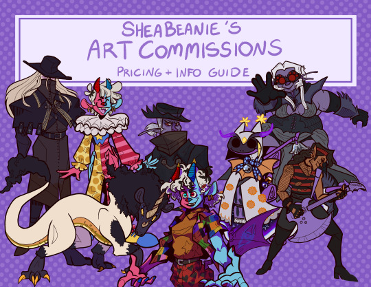


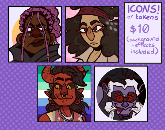
Commissions are OPEN!
SLOTS: Slot 1 - OPEN Slot 2 - OPEN Slot 3 - OPEN Slot 4 - OPEN Slot 5 - OPEN
Please read my Terms of Service before messaging me.
More Information/Rules below the cut:
Contact me via Discord (Shea Bean#0020) OR through Tumblr messager. I will respond within 24 hours.
Prices are in USD. Payments are made through Paypal Invoice EXCLUSIVELY. I will not accept payments by any other means.
PRICES:
Character Art -
Lines/One Color ... $20 bust / $35 full body
Flat Color ... $35 bust / $50 full body
Full Render ... $50 bust / $65 full body
Backgrounds ... +1/2 of the original price (if character is $20, background is $10, etc.)
Character Reference Sheet -
Starts at $80 (includes one full body render, two bust expressions, a block of information, and color palette)
Additional objects or expressions are +$10 EACH
Icons/Tokens -
$10 for flat color + a simple background
***Prices may vary depending on complexity and number of revisions needed during the commission process.
What I WILL draw:
Humans
Animals/Furries
Robots/Mecha
Gore
Semi-N/S/F/W
Monsters (Depends on what they look like.)
N/S/F/W (Depends on content.)
Fan Content
⚠ Complicated Designs
⚠ Complicated Clothes
⚠ Anthros
What I WILL NOT draw:
Characters intended to be or appearing underage in any sexual or suggestive context.
Extreme F/etishes (Ask)
Any sort of hateful content, such as racism, transphobia, homophobia, and characters with N4z1/Soviet/etc. imagery or paraphernalia.
If you are unsure if something is allowed, please ask! I am willing to negotiate certain arts.
Examples (with theoretical prices):
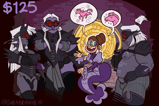
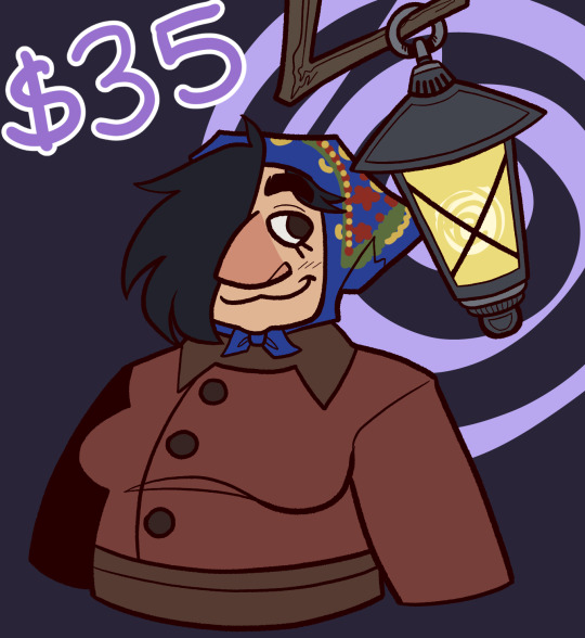
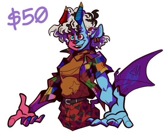
#commission#commissions#art commissions#digital art commissions#commissions open#dnd commission#dnd commissions#d&d commission#d&d commissions#character art#character commission#character commissions#digital art#my art#icon commissions#dnd character#d&d character#open commissions
40 notes
·
View notes
Text
Luco Notes
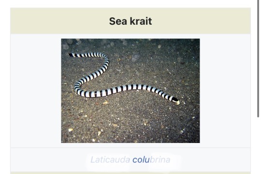
He/They - 30s - Semi-Aquatic alien that has similarities to earth fauna
Their name is based on the scientific name of the Sea Krait, an anagram of the first half Colubrina > Luco.
i stared at that for so long trying to figure out a name for this guy LMFAO AGHH
His home is on the land area of his planet, but spends most hours of the day in the ocean if he’s not doing a job.
Luco collects their poison in many vials; not needing a lot to paralyze or kill a person. Sea Krait venom is one of the most potent of venoms. His bite is usually painless . Prefers injecting targets with the vials by needle or putting it in their food or drink.
I wanted to base his personality somewhat on how sea kraits act in nature; they are actually docile and non-aggressive animals that only attack in self defense or if they’re searching for prey. Luco is easy-going and actually friendly but he uses his personality to ease into people’s walls and strike when they’re most comfortable and when they let their guard down. Their method of betrayal varies, they’re usually loyal to the person who pays the most and pays upfront with consistency.
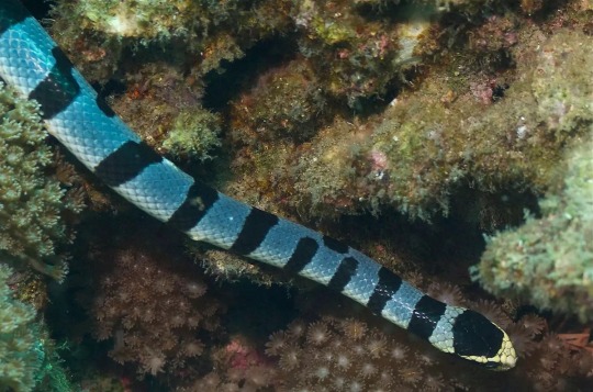
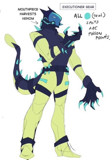
As for the ‘executioner’ outfit they have; it’s often used and originally made for underwater hunts. Often times it’s used in a method where the target is lured or ‘lost’ in a secluded area and Luco comes from below or along a hidden area in the colorful corals and strikes. The wetsuit is also space-travel safe so he takes care of it very well. Not everyone knows of his special suit because the services rendered in it are more high stakes and also uses a lot of time and planning in order to get it just right.
They don’t seem to be romantically involved with anyone currently and tries not to hang around too long with a person because they fear they may get too attached. Many one-night stands but they DO have their favorites despite trying not to stay in one place. They can be sweet and love to leave little gifts; they give everyone they meet their own special and unique color item. He is especially interested in those who reciprocate. It takes two to tango, baby! Luco also does enjoy teasing and slithering his way into someone’s heart also. His love is a poison that can linger.
Character Relations
Lone Starr knows them from various body guarding jobs, along with seeing Luco on his free time since they seem to get along. They drink whiskey together and have spent the night in a bed with each other before but nothing came of it. Is aware of his actual ‘job’ but turns his cheek to it.
Shuuti has hired Luco as a body guard before, she loves when they give her bouquets of peach-colored carnations. She appreciates his work as a guard but has shown Luco not to mess with her. She is aware of his true character.
Neo has not encountered Luco personally but may have seen them swimming on random planets.
Solare has had Luco reserve a room for themselves at his Inn but does not know much about them.
Luco is sort of unaware that the star siblings are siblings, they do think it’s odd that they have similar colors but are so different from each other. Luco likes to spend long hours watching people here and there at bars, spending time tasting whiskey from planet to planet.. He doesn’t seem to be in a rush to go anywhere and lives modestly.
35 notes
·
View notes
Note
1 - 23 :3
cracks knuckles okay
1. how would you describe your art style? uhhhhhhhh, maybe "safe" is the word rn. whenever I think of my art style, what comes to mind is just how little I've been pushing things with it. I wanna change that ;D
2. what's your favorite thing about your style? I realize I like to use semi-realistic proportions, its cool how comfortable I've gotten with drawing faces and bodies
3. what's your least favorite thing about your style? It's so static man. same thing I said for the first question, I don't think anything really looks bad, but it just is lacking in creativity in comparison to the older art that should be looking worse than what I do now. I prefer my older stuff ;D (looking at you inktobertale2021.. where did it all go wrong)
4. favorite thing to draw? regular ol people. human characters are def more in my comfort zone, which explains why I keep hitting skeletons with the humanization ray (also I prefer to draw feminine characters)
5. least favorite thing to draw? I can't even say I rlly dislike it cuz of how rarely I even do it, but I am procrastinating so hard on learning backgrounds..
6. warm colors or cool colors? cool colors are my fav, but i find it easier to work with warm ones (I used to put a cool overlay over all my warm toned drawings hgdhfg)
7. show us a WIP behold, the wip ever. this drawing... was supposed to be posted on august 2022. and then, it was supposed to be posted on dec 21st, dream and nightmares birthday. (atp if I do end up wanting to finish this idea again, I'll probably just scrap it and start over)
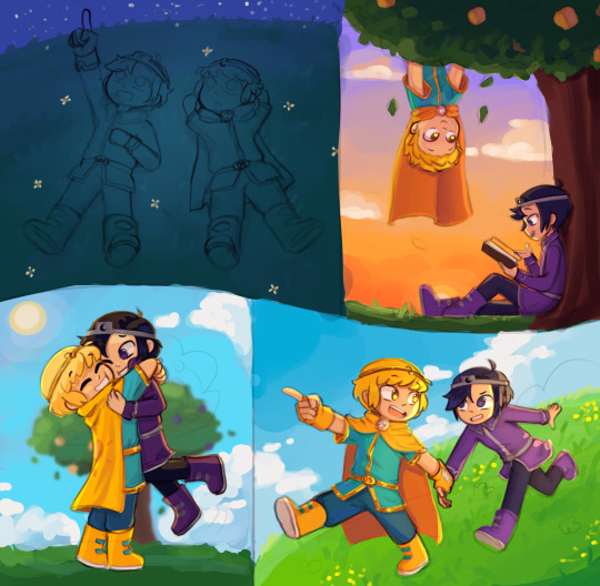
8. what's the most fun and least fun parts about your process? most fun is flat color and rendering. (though I rarely do the latter anymore) and for least fun, tbh a lot of the sketching part tends to be difficult for me, sometimes its cool tho
9. show us a finished piece alongside the original sketch example from when sketching was fun
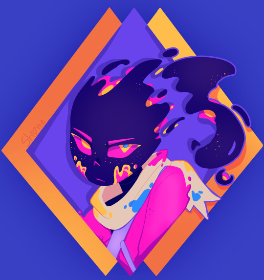

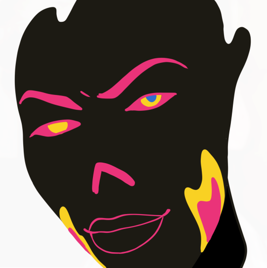
10. how many different sketches do you usually have until your piece is finished? I think I do need to make more of at least thumbnail sketches tbh.. I usually just make one and keep editing it, trusting the process. (and that fails like 70% of the time. woww wonder why sketching isnt fun for me-) 11. show us the last thing you drew, be it a finished piece or a small doodle can this count,,
12. show us an old drawing first deltarune drawing. here's the redraw I later made of this :3 (also old hsgdhgf)

13. how long do you usually take one a piece? depends. I'll have like 276478923 wips started, and then I get a random idea that I just have to do right at that moment, and I'll get it done in like 1-4 hours. meanwhile old sketches start to rot and maybe if its lucky I'll revisit it before my motivation dies and my style is too different to wanna continue from where I left off 14. digital or traditional? digital all the way, i've gotten too dependent on the transform tool + liquefy ;D (and many other things tbh but I'd be here all day if I tried comparing them more jhdjdf)
15. if digital, what program do you use? procreate, the layouts on other drawing programs scare me
16. favorite media to work with when drawing traditionally pen on paper (am I understanding this right wdym media-)
17. what do you love getting compliments about? I like when people enjoy the humanizations I come up with, and also original designs in general 18. are you satisfied with the attention your art usually gets? hmmm yeah
19. how often do you draw? very often, I just don't have finished things to share most days
20. a piece from this year that you're really proud of :3
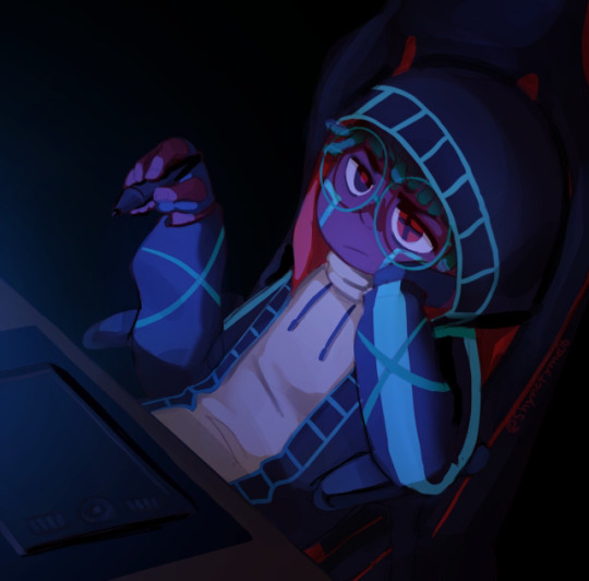
21. something you would like to improve on the dynamicness (well, the lack of it) of everything, as said before
22. what inspires you? Ink sans and a ton of creators in this fandom (also animated shows and movies, I love animation)
23. what's something you hope people notice when looking at your art? idk tbh, just notice it at all and I'm happy :>
#shy rambles#ask game#long post#twinribbonz#yaayyyyyyyyyyyyyyyyyyyyyyyyyyyyyyyyyyyyyyyyyy#another sign to look for more references#my problem may be going from imagination too often
8 notes
·
View notes
Text

Maestro.
D: Bradley Cooper. 2023.
There’s a reason Carey Mulligan, playing Felicia Montealegre, a renowned actress who married legendary composer and conductor Leonard Bernstein (director Bradley Cooper) in 1951, has top billing over the film’s ostensible subject. Maestro is less a biopic (and can be surprisingly perfunctory about Bernstein’s accomplishments as when he walks into a room declaiming “Well I finally finished ‘Mass’!”) than a love story that deserves to be called “Scenes from a Marriage.” Mulligan fully captures a smart charismatic woman who with eyes wide open falls for a brilliant, charming genius whose bisexuality is only semi-closeted and forms a life and family with his and her contradictions, and Cooper matches her, playing Bernstein as an artist with an intuitive understanding that his art and life demands he be everything he is. As director Cooper peerlessly delineates the heady rush of finding the perfect person. The couple’s courtship is a heady black and white rush that is like a sped-up version of Before Sunrise and also captures the dynamic vivacity that Bernstein bought to his composition. And when many years later as, amid a happy busy life (and the film’s switch to color), Felicia starts to realize how many of the marriage’s compromises are hers, Cooper doesn’t let the film even suggest their union was a “sham” or “cover” marriage or that they were never the most important person in each other’s lives. For two exhilarating, painful hours they become the most important people in ours.
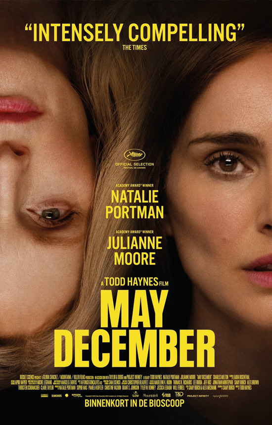
May December.
D: Todd Haynes (2023).
If Bradley Cooper looks at an unusual marriage with rose-colored compassion, Todd Haynes employs a forensic pathologists scalpel to dissect the family started by Gracie Atherton-Yoo (Julianne Moore balancing affection and delusion) when at 36 she had sex with 13-year old Joe (Charles Melton, heart-rendering in a breakthrough performance) was imprisoned for child rape, and had their first child behind bars, after which she left her previous family and married him when he turned 21. They became tabloid-famous (the script is loosely based on the Mary Kay Latourneau story) and after things died down have achieved something like normality (aside from the occasional turd-sent-in-the-mail type of harassment) when Elizabeth Berry, a television actor hired to play Gracie in an independent film, (Natalie Portman) embeds herself with the family as “research” sparks a crisis in which love is inseparable from exploitation. And since Portman (who functions as a stand-in for the filmmaker) unsparingly depicts Berry’s own turns from empathy to perverse manipulation of the family, Haynes suggests the film itself isn’t to be trusted. He keeps the movie on shifting sand as we watch a family story without any adults in the room.
#maestro#bradley cooper#carey mulligan#may december#todd haynes#natalie portman#julianne moore#review#kevrock
2 notes
·
View notes
Text
Professor Layton vs Phoenix Wright - Game Review
Tl:dr - Professor Layton vs Phoenix Wright presents an inspiring and enchanting world beautifully executed and scored. Even where the story fails in its egregiously drawn-out third act and glaring plot holes, I constantly find myself returning to this title to be visually and musically inspired.
In regards to game play, Professor Layton vs Ace Attorney provides enough intrigue for veteran players of either series while also serving as a soft introduction for newcomers.

My first interaction with Ace Attorney was several years prior to me stumbling upon this title…probably 2008-9ish. However, I had never spent more than an hour with it. It wasn’t until one lazy summer day in 2015, while wandering the ways of Walmart I found this game. It intrigued me with its catchy box art and semi-familiar brand name. I remember thinking to myself, “I know about Ace Attorney (sort of). And I’ve heard Professor Layton is quite popular…why not?” Almost immediately following the completion of this game I purchased and played every single mainline AA game up to that point. I was sold. Professor Layton on the other hand…I decided was less up my alley after playing an additional 1.5 titles (Miracle Mask and 2 hours in The Curious Village). With this in mind, my review below will reflect thoughts colored as an AA fan rather than a PL fan.
Review
First and foremost, how does this game stand on its own without regard for the brand names and gameplays it leverages?
The music in this game is beautiful: catchy, pleasant, and memorable, with absolutely gorgeous medleys and mash-ups of each series’ iconic themes. It’s as if these series were meant to exist together.
Visually, this game is a masterpiece. The characters, design, and style — the world of Labyrinthia — is so enchantingly rendered and visually engaging with just the right touch of whimsy. The overall color pallets were sophisticated without forfeiting color or brightness — like that of a classic children’s storybook. The use of 3D graphics brought a unique charm to the entire presentation too — one that would become a pleasant staple in all future AA games. For the puzzle sections, there was an absolutely adorable chibi execution in both 2D and 3D drawings, along with delightfully whimsical illustrations for the non 3D elements.
The character designs in this title were also highly inspiring, both in terms of concept and visual execution. I have not encountered another AA game to date that pushed the idea of “witness singularity” quite as uniquely as the 10-as-1 Vigilantes. Though the commonplace humor and banter between Nick and his clients/opposition was largely toned down in comparison to his native titles, I found the trade-off for competent (and likable) prosecution quite agreeable. Inquisitor Barnham was such a breath of fresh air from the, what I feel to be too often, narratively pumped up prosecutors that specialize in throwing out mundane objections dipped in ad-hominem attacks (Franziska, Sahdmadhi, Barok van Zieks etc). Dare I say, Barnham actually felt competent as a prosecutor, unlike Franziska. Then there’s Darklaw — I love everything about this character. Her name, her concept, her (real) name, her outfit (specifically the regalia version), her personality, her presence, her voice. I can’t tell if I want to be her or want to be her girlfriend. As far as Espella and the Storyteller… they were the least compelling characters in the game as she was lackluster and he was just an a**hole they tried to redeem at the very end.
Gameplay-wise, this title offers the puzzles of Layton and the courtrooms of AA. I’ve seen other reviewers largely agree the puzzles are collectively easier in this game than in other Layton titles. Personally, I didn’t mind this. I thought they were engaging enough without becoming too much a narrative roadblock to the plot like I felt they were when I played Miracle Mask. Maybe this isn’t the title to pick up if you want to spend a solid 20 minutes figuring out a single puzzle, but it’s a decent taste to what you can expect from an exclusively PL game. And regardless, it’s still largely enjoyable. The courtroom battles of AA are also a little more succinct than what you could expect from a full fledged AA game, but I still found them fun, engaging, and a decent representation to the AA experience. Until the last act…
As visually compelling as this story is, the narrative is where I find this title fumbles the most. The premise holds great promise for ⅗ of the game (yes, that number is chosen very specifically) but the final act, in both its telling and gameplay, is unnecessarily convoluted and drawn out. The third act is almost longer than the first two acts combined (hence the ⅗), and not for good reason. There are several instances where you are forced to trudge through 2+ hours of interrogation that position the dialogue for the “dramatic reveal” you, as the player, already figured out an hour and a half prior. This happens in AA games regularly (the player figuring out the plot twist before the game does), but never to this degree of offense. It doesn’t help either when much of this interrogation feels like the developers mistaking convoluted storytelling for gameplay. The number of times you have to “press” statements, and re-”press” statements (in which little to no new dialogue was added from the character being pressed) is absurd. On top of that, the story just wouldn’t end. This is a common frustration I encounter concerning Japanese storytelling in video games and anime: where 2-3 additional “twists” and drawn-out explanations for things are jammed into the final act just to extend the conclusion by another hour or two. There’s an art to knowing when to end things.
Back to the narrative’s conclusion however…yes, it ties its bow on all the major questions itself purports, but this sense of satisfaction is short lived in the face of two glaring plot holes.
*spoiler warning*
I’ll keep this brief. The people of Labyrinthia are hypnotized by exposure to a special ink, and through that hypnosis they are unable to perceive pure black. For that reason, the bell tower draped in a pure black tarp, and a bunch of machinery used to simulate “miracles” and “magic” remain imperceivable by the denizens. However, the hypnosis only makes the objects “invisible,” it does not actually remove or displace the mass of the objects. Shadows (I hope you see where I’m going with this) are not pure black, and would therefore be visible. Labyrinthia isn’t just some simulation, it exists— outside and exposed to the elements. Outside where the sun is. Outside where the light from the sun would cause objects to cast shadows. All that machinery that existed in Labyrinthia, though imperceivable to the eye, would still cast very noticeable shadows…everywhere. On top of that, you expect me to believe that no one, in an entire decade, accidentally crashed into the hidden belltower while crossing what they perceived to be an empty clearing?
*spoiler over*
Admittedly, these plot holes are cleverly disguised with the dramatic and emotional climaxes of the story, and don’t cause the entire experience to implode... until several minutes into the credits. There, as you ruminate the revelations, the flawed logic may just begin to naw at you. In conclusion, if you can look past the plot holes of the narrative, this game still offers a (temporarily) satisfying conclusion. The game is fun and the game is beautiful. It’s definitely a title worth playing regardless of your familiarity with the properties.
#Professor Layton versus Phoenix wright#professor layton#phoenix wright#Ace attorney#AA#PWAA#PL#level 5#capcom#video games#game#review#eve belduke#darklaw#maya fey#Luke triton#espella cantabella#opinion#flamingtunapictures#3ds
1 note
·
View note
Photo

BEAGLE gaiting movement well bred wall art akc breeds Copper Vacuum Insulated Tumbler, 22oz Your favourite breed art print - head or body conformation - groomer gift - Other Breeds Available - dog breeder gift - regional specialty or national specialty prize gift idea Artwork by Ivy Fox Illustration Follow Ivy Fox Illustration on social media https://m.facebook.com/IvyFox.illustration/ https://www.instagram.com/ivyfox.illustration/ Find your dog breed: Personalized Pet Portraits: https://ivyfoxillustrates.etsy.com/ My website: https://ivyfoxillustration.com/ Art Prints Merch Original PaintingsTravel mugs are great for dog shows! Stay hydrated AND rep your breed on a daily basis with this personalized tumbler. With a 22oz capacity and copper vacuum insulation, our tumbler keeps your favorite beverages refreshingly cold for 24 hours, and soothingly hot for up to 6. Its stainless steel exterior is condensation-resistant while the powder coating adds extra style points. .: See-through push-on plastic lid .: Material: Durable, double-wall stainless steel vacuum construction with copper insulation .: BPA free .: 22oz (0.65 l) .: Durable powder coating .: Note: black design elements on black bottle may differ in tones. Use transparent background .: Note: semi-transparent design elements do not always render correctly on dark-colored bottles .: Note: The print provider cannot guarantee that the design placement will line up with the cap handles as shown in mockups A drawing of a PLOTT HOUND! This makes Great gift for dog lovers, Plott Hound and other hound fanciers, and all alike. This drawing is a movement illustration of a Plott Hound. It is imperative to me that the breed’s correct gait be represented completely, and that the dog is drawn to match its breed standard. Don’t see your breed yet? Keep an eye out for the future additions to my AKC All-Breed Series! About the Breed The origins of this ancient breed have been the subject of conjecture for centuries. Even the breed name is a shrouded in mystery. Some experts say it derives from the Gaelic word beag (“little”), while others point to the French term for the sound hounds make while hunting: be’geule. There are reports of small pack-hounds employed to hunt rabbit and hare in England long before the Roman legions arrived in 55 B.C. An English authority called the Beagle the “foothound of our country, indigenous to the soil.” By the 1500s, most English gentlemen had packs of large hounds that tracked deer, and smaller hounds that tracked hares. The smaller, more compact hounds were ancestors of our modern Beagle. The phrase “foot hound” is vital to understanding the Beagle’s broad appeal for hunters in England, the Continent, and North America. Unlike larger pack hunters like foxhounds or Harriers, the Beagle could be hunted on foot—no horse was necessary. Those who couldn’t afford to feed and stable a mount, and ladies and gentlemen too old spend a hard day thundering across the countryside on horseback, could easily keep up with a pack of Beagles on foot. Beagles imports began arriving in America in the years after the Civil War, and their popularity among U.S. rabbit hunters was immediate. The AKC registered its first Beagle, named Blunder, in 1885. To this day, “beaglers” in woodsy areas of North America still swear by their breed’s great nose, musical voice, and enthusiastic approach to rabbit hunting. Breed standard: Size: Beagles come in two sizes: the 13-inch Beagle (no taller than 13 inches at the withers) and the 15-inch Beagle (between 13 and 15 inches at the withers). Head: A Beagle's skull should be fairly long, with a slight dome at the back part of the head. The skull should be relatively broad and full. There should be a distinct separation between the top and bottom of the face when seen from a profile. The ears should reach almost to the end of the nose if drawn out straight, and they should be rounded at the tips. The eyes (hazel or brown) should be large, set far apart, and have a gentle, pleading expression. The muzzle should have a square shape. Body: There should be no wrinkles in the skin around the neck and throat. The shoulders should slope downward into a relatively short back. The dog's chest should be deep and broad but proportionate to the rest of the body. Legs: The Beagle's front legs should be straight, not crooked. The hips and thighs should be strong and muscular. Tail: The tail needs to be fairly high on the rump and carried in a jaunty fashion, but it should not curve over the back. Coat: The coat should be of a medium-length and lie close to the body. The coat should feel hard to the touch. No silky fur here. Color: The standard is vague here, saying only that any recognized hound color is OK. The most common color is the tri-color (black, white, and tan), but it can also be red and white, chocolate tri-color (solid chocolate brown instead of black), and shaded tri-color (varied shades of brown instead of black). So, too, is ticking.Contact Email: IvyFoxIllustration@ gmail(dot)com ———— Tags and other miscellaneous info: ———— Ivy Fox Illustration Ivy Fox dog art Museum of the Dog American Kennel Club Showsight - Where Champions Are Celebrated American Dog Fancier InfoDog Best In Show The Canine Chronicle AKC Gazette best pet portrait artist watercolor fine art unique art Akc meet the breeds Westminster kennel club dog show national dog show crufts grooming intergroom superzoo petquest groom expo dog sports well bred dogs purebred preservation breeders ethical breeders breeder of merit akc grand champion Ch – Champion of Record – earned by gaining 15 points in conformation wins. Points awarded is determined by the number of other entries the winning dog defeats. A dog must win at least two majors (by winning at two different shows under two different judges where there are enough entries defeated to equal 3-5 points by the AKC point system. OTCh – Obedience Trial Champion To earn an obedience title, the dog must have a passing score of 50% of possible points or better, and an overall passing score at three different competitions under three different judges. CD – Companion Dog (First Level Obedience Competition, basic obedience exercises) CDX – Companion Dog Excellent (Intermediate Level Obedience Competition, more advanced obedience work) UD – Utility Dog (Advanced Level Obedience Competition, difficult obedience work, including hand signals) UDX – The highest obedience degree AKC presently awards TRACKING TD – Tracking Dog TDX – Tracking Dog Excellent VST – Variable Surface Tracking HERDING HIC – Herding Instinct Certificate HT – Herding Tested PT – PreTrial Tested HS – Herding Started HI – Herding Intermediate HX – Herding Excellent HCh – Herding Champion AGILITY NA – Novice Agility OA – Open Agility AX – Agility Excellent MX – Master Agility Excellent NAJ – Novice Agility Jumper OAJ – Open Agility Jumper EAJ – Excellent Agility Jumper AKC Unofficial Titles CGC – Canine Good Citizen ROM – Register of Merit – A dog or bitch must earn a number of points specified by the DPCA rules, and also meet the numbers of champion and major pointed progeny required by DPCA. The requirements for bitches are less than the requirements for the dogs because males have the opportunity to produce a far larger number of offspring. ROMC – Canadian ROM ROM/C – designates that the dog has earned an American and a Canadian ROM. TT – Temperament Tested TC – Temperament Certified AOE – Award of Excellence-A dog must meet qualifications in conformation, obedience, and also be OFA´d to earn this award. New competitions are being added and rules for competitions change, for the most up to date rules and regulations, check with the AKC and the DPCA. Miscellaneous American titles often seen on pedigrees and in advertising. BIS – Best in Show at an All-Breed Show in conformation. BISS – Best in Show Specialty (where only dogs of the same breed are competing in conformation) BOB – Best of Breed BOS – Best Opposite Sex BOW – Best of Winners (best between Winners Dog and Winners Bitch in breed conformation class competition) WD – Winners Dog – the winning dog overall of the regular classes of his sex. WB – Winners Bitch – the winning bitch overall of the regular classes of her sex. RWD/RWB – Runner up to the winners dog and bitch, if the winner becomes ineligible for the award then the runner up will receive the points awarded from that show. Special – A dog that is already a Champion that is competing for Best of Breed only. A Champion cannot compete in the classes where points are earned (because a Champion has already earned them!) RTD – Registered Therapy Dog TD I- Dog has passed Therapy Dog International´s testing HEALTH CERTIFICATIONS OVC – Ontario Veterinary College OVC Hip Certification – A dog may be preliminary screened at a younger age, but will not receive a certification unless the dog is at least 18 months old. It was told to me by a tech in the radiology department of OVC that they consider hips to either be bad, in which case they are rated on a scale from 0 – 4, with 4 being the worse, or they are “good” in which case the animal will receive a certification number (if 18 months or older. Therefore they do not follow the U.S. rating system which includes “FAIR”, Good, Excellent”. Their exact words were “the hips are either GOOD or they are NOT. OFA – Orthopedic Foundation for Animals OFA Hip Certifications – dogs within a specified range of normal hip x-rays are certified OFA-Excellent, Good, or Fair OFA – Elbow Certification – Certified by OFA for normal elbows on x-ray, only one grade recognized as normal. Check with OFA for proper procedures and positioning for hip and elbow x-rays. A dog may be preliminary screened at a younger age, but will not receive a certification unless the dog is at least 24 months old. OFA is also now doing certifications for other canine health concerns such as normal thyroid levels, check with OFA for accurate data and rules concerning these. CERF – Canine Eye Registry Foundation-dog is certified to have normal eyes. Re-certification must be done annually. vWD – Von Willebrands Disease free-meaning the dog has been tested and found free of vWD, a bleeding disorder, vWD free ratings also are often given with a percentage listed. For the best information on Von Willebrand´s Disease, contact Dr Jean Dodds, who is the leading research specialist in blood disorders. Dog show prize idea
#Show dog#Beagles#Beagle#Beagle gaiting#Beagle movement#Beagle standard#Hound dogs#Dog show gear#Dog breed#Crufts dog show#National dog show#Well bred dog#Ethical breeder
0 notes
Text

A SEMI-SATISFACTORY RENDERED SKETCH? Whoa, I totally didn't accidentally spend, like, two hours on this!
Tbh, I feel like the shadows on this are kinda VERY wrong, but I mainly wanted to see the colors on her outfit and try to be less reliant on my line art. So mission accomplished!
#my art#art#bumblemuncher's art#oc art#digital illustration#stillunamed#alesbean?#begins summer overthinking everything#thinks bugs could kill her for she has the constitution of an anemic fly#do bugs have blood?#Comes out of summer camp knowing ten different ways to take down a god#Still can't talk to cute girls
0 notes