#cmyk triangles
Explore tagged Tumblr posts
Visit Tumblr Blog
Explore Tumblr blogs with no restrictions, modern design and the best experience.
Last Seen Tumblr Blogs


Fun Fact
Mobile Tumblr US users spend an average of 4.04 minutes per session on the app.
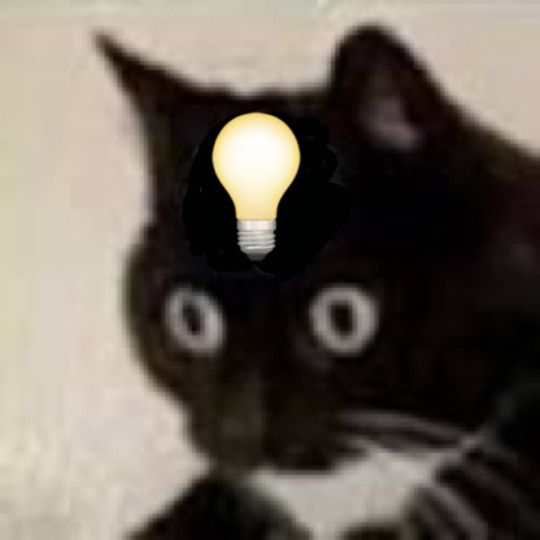
Text
They both have immense survivor’s guilt

#my art#artists on tumblr#digital art#art#gravity falls#artwork#myart#bill cipher#pyramid steve#cmyk triangles
198 notes
·
View notes
Text


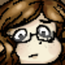
read abt the poole pyramid yesterday and ofc since i have gravity falls brainrot there was no way it wasn't gonna get dream demon-ified. The thought of this Weird Thing just stalking random kids is really fun to me and really gets the creative juices pumping
I like that it looks different during the day vs at night, maybe it can see better during the day but it's harder for it to hide itself
I was gonna use a 2D shape closer to what the story describes but i thought the bit of pyramid poking out of the middle would make an interesting "beak" like what was described in the second sighting
I just threw this together real quick on my phone before i hit the hay so i'll probably mess with this more on my pc tomorrow but for now i think this is a good starting point
#i haven't ded used if the black part is also a pyramid or if it's just a triangle#i feel like a pyramid would make more sense but i think a triangle could be more interesting#like it moves and morphs around that 'core' pyramid to look at different things#i was gonna give it legs but i was having trouble making it look good. again its like midnight im not working at 100% here#sassy speaks#my art#my ocs#not sure what it's full name is. it's def Poole Something or Something Poole#Poole Key? like the K in CYMK? Key Poole?#*CMYK oops im tired#eye shape is up for redesign too#no eye looks weird but tbh it might be a better option. maybe it can have more arms instead of eyes idk
4 notes
·
View notes
Text
Making a Gamut Mask in CSP
Strap in folks! I'm going to show you how to make a "gamut mask" and palette using nothing but a color wheel and Clip Studio Paint!
*I made this tutorial using CSP Pro 1, but the same principles should apply for any version.
Introduction
First, what's a gamut mask? The term comes from physical painting and printing, where artists only have so many pigments to work with. A 'gamut' is the set of all colors that can be mixed from a certain set of pigments. Painters and printers have been looking for 'wide' gamuts for a long time -- so they can make the widest variety of colors from the fewest number of base pigments or dyes. Some base-color sets you may have heard of are CMYK, RGB, or RYB.
One of the easiest ways of making a painting harmonious is to use color theory to limit the number of colors of your palette. The technique of covering up, or 'masking' your reference color wheel also lets the artist see what intermediate colors can be mixed and still remain part of the cohesive palette. And in the physical world, where more pigments means more tubes of paint you have to spend money on, it's important to know exactly how few pigments you can get away with.
In digital art, painters have access to every possible RGB color right out of the gate, which can sometimes feel overwhelming or make it harder to see relationships between colors. So let's try gamut masking! Using this tutorial, you'll make a general-purpose file you can change and adapt to your liking for future projects!
Part I: The Setup
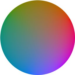
In this tutorial, I'm using a color wheel image obtained from Björn Ottosson's blog, showcasing the OKHSL color space. I like it because the OKHSL space has perceptually constant lightness and saturation per hue. Try out his comparative color picker here. (I also like this image bc it has a transparent background)
You can use whatever color wheel you like! Just one thing is important-- it should gradually become more unsaturated toward the center of the wheel. This saves you some manual color mixing down the road.
Here's our basic layer template. To get started, follow this:
Open your color wheel in Clip Studio Paint. It will be the only layer.
Select the "Frame Border" tool (U), pick the shape or subtool you think is best. I've picked 'polyline' since I'm making a triangle. (HINT: if you want an elliptical/circle shape, click the wrench in the tool properties window, then the "Figure" submenu, then you should see the option to choose an ellipse shape.)
Create the frame shape on the canvas over any section of the wheel. If it's not quite right, choose the "Operation" tool (O) and adjust the rotation, corners, or size of the frame!
You'll now see your frame border shape over the color wheel. Drag the color wheel layer into the Frame folder and it'll be masked!
That's the very basics! Here's some extra steps I took to make it extra helpful:
*In the Frame folder, I added two correction layers: a Hue/Luminosity/Saturation and a Color Balance. The first is in case I want to work with darker/lighter tones. The second is if I want to apply a tint to my gamut while preserving the color relationships of the mask! eg: if I want to make a painting that's overall blue, but still want colors that 'feel' red, yellow, etc compared to the strongest blue.
*I've created a uniform neutral grey layer at the very bottom, so I can judge tones and colors without bias.
*("Folder 1" was unused, just some layers not relevant to this tutorial)
With that mask, you technically have everything you need! For each new painting you want to make a palette for, just edit the shape of the Frame Border layer and change the adjustment layers to your liking. Then you can save it as your favorite image type to use for reference!
But let's talk about how you can further use the mask...to be continued!
100 notes
·
View notes
Text
Hold on. I'm thinking about that Organic/Robotic/Divine triangle chart thing I did again
And I think I can connect it to the whole RGB/CMYK conflict idea I have
18 notes
·
View notes
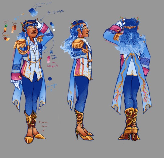
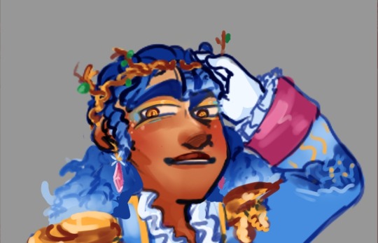
Text
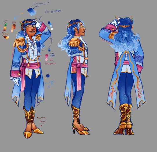
Marquis Fluff reference The Midnight Soirée chapter 1 to 5
It's Fluff's turn!
Kirby 1-2
A warning for spoilers for the Midnight Soirée. Please go read that first if you're interested in the story. Please enjoy
Back reference without Fluff's long hair.
Colour Pallete:
All Fluff's colours are saturated, and compared to Kirby, who uses all colours - Fluff only uses the CMYK colour palette except the green for the leaves. (Cyan, magenta, yellow and key colour. The key colour is usually black or brown, with the latter fitting in here. And well, the cyan is more blue, but I ended up using it for Fluff's eyeshadow.) CMYK is known as print colours and are subtractive, which means the more colour you add, the darker it becomes. The opposite is RGB colours, which are additive colours. The more colour you add, the closer it becomes to white, with white being every colour. RGB is used in electronic displays like TVs, phones and computer screens, and eye cones are also RGB. Though very rarely, people are born with four cones rather than three. Animals like the mantis shrimp have sixteen colour receptors and can see in more colours than we do.
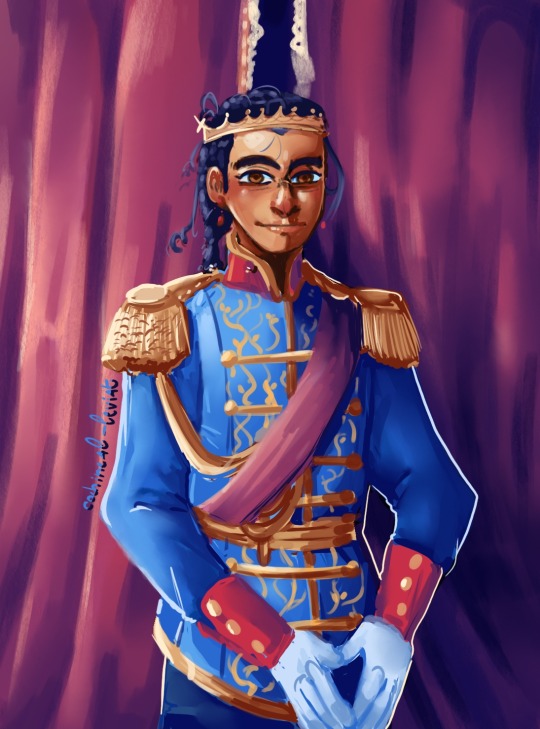
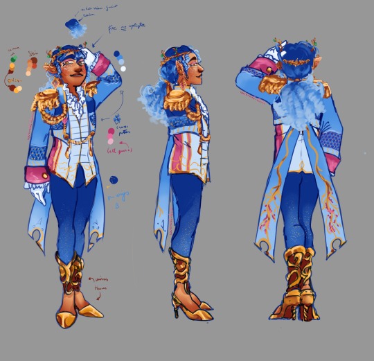
Clothes:
From top to bottom: we have his wooden crown. In my extra trivia chapter from the Midnight Soirée, I explained how all fae royalty wear flower crowns when they marry and afterwards. But since Fluff is a bachelor, he does not wear a flower crown. So, he dons a crown of wood instead. A few small branches grow from it, resembling horns, as Fluff's true form has four horns.
All the gems on his person are diamond-shaped. This is because the shape of a diamond represents perfection, which is also why I used the diamond pattern on his jacket. Although with the shading, the diamonds look like triangles, considered half or incomplete perfection. They also resemble cushions, which refers to Patchland being made from arts and crafts.
The jacket of a concerto maestro with their long tailcoats inspired Fluff's overcoat. Fluff's coattails resemble broken clipped dragonfly wings; the top half is missing, and Fluff's pouldrons are very prince-like. Kirby never thought Fluff was a prince because his crown was humble compared to the royalty Kirby knew. Duke Dedede wears a singlet, which is normal for Dreamland Nobility. A passage in Chapter 1 explains this as crowns are passed down the aristocracy family tree from the head of the family to the next heir.
Before designing the characters, I had already visualised the starlight tights, which fit well with Kirby's starry night cape. They resemble Lapiz Lazuli, which are some magnificent stones. They have these golden flecks in them and crushed are called Ultramarine, which is a very vibrant dark blue powder. It was believed that wearing lapis lazuli warded off bad spirits, and in Ancient Egypt, they crushed the stone to wear the powder as eyeshadow.
Fluff's shoes are styled like flowers/vines that wrap around the foot and legs like boots but have the appearance of high heels. It is both elegant and intimidating. A fun detail is that they, from the front, resemble hooves from a bovine. Which is not the correct animal, but hell, why not? It is one of the few drafts I kept from the first sketch because it fits well.
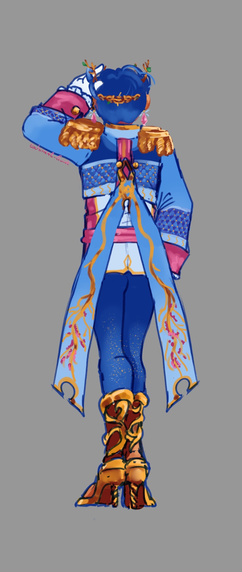
Without the sash. Marquis Fluff gave his sash to Kirby in chapter 2
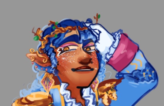
Close up from face. I had a lot of fun designing the makeup for Fluff in this AU.
Fluff's glamour is constructed out of many things. However, as a fae, Fluff has no hair shine as a human like Kirby does. Neither do Fae have eyelights. You can see it best in this close-up. The only light that reflects back is on Fluff's clothes or gems. This is why the only light is at the bottom of Fluff's hair, as it is a gradient. This is because the fae use an illusion to hide their true yet ever-changing eldritch forms. So Fluff's eyes and hair are fake, so his skin and really everything about him. It is all magic, which is why, throughout the night, he changes appearances so rapidly and why his expressions can go from warm to cold/deadly so quickly. He mimics human expressions and mannerisms while filling the rest with fae manners. The fae are an adaptive species that outwardly change like nature as nature, even if we don't see it, is constantly adapting for survival.
As for why Fluff decided to adapt to his form - who knows? Partly, it is to resemble the portrait that hangs in the real world in the debilitated mansion's foyer.
(remember this bad boy? Yeah, it's old but I still love the colours)
All the features that have been added or changed are meant to lure Kirby in. Fae are said to tempt people with their magical beauty and, in some instances, transform to fit the human's preferences. In some myths, it is even said when someone casts their eyes on a fae they have already lost as they are that beautiful.
Fluff took something Kirby was familiar with and was already bewitched by. Or perhaps the portrait is magical of itself and was the first part of the curse. Who knows.
Chapter 3 & Beginning
Fluff with his hair done up and a few other things. Fluff looks more elegant/handsome with his pair-up. It might be because I've been staring at Fluff's reference model with his hair down, so putting up his hair is refreshing.
Fluff was sure at this point that he and Kirby would be together as husbands, so he felt more free to express himself and put more thought into his appearance. The diamond skin from Chapter 3 to Chapter 5 is not part of his makeup, as that was his glamour starting to slip. Luckily for him, it was something that could be considered beautiful. Although the lights can look creepy in the dark as they are essentially glowing freckles. The pointed ears are also from his glamour weakening but he does not feel ashamed to hide them since Kirby knows he is Fae. Fluff's first appearance was meant to attract and yet hide his true nature so here he is much more open.
Also, diamond earrings = symbolise perfection. Fluff looks a lot more sheep-like with his nose.
Midpoint Chapter 4 and 5
Here, Fluff is without his maestro jacket - seemingly vulnerable as he wanted to be left alone. Despite his obvious otherness, he seems more down to earth in his upset state. We also see his shirt and hands without his blue coat/gloves covering them, so that's neat. I had a lot of fun designing the ruffled shirt. I wanted to ensure it was not a stale design when I eventually disregarded the jacket for Fluff's angry/hurt role in those two chapters.
Oh yeah, Fluff is pissed, alright. Well, he is more hurt, but he gets to be angry too. Even if he understood deep down, it was a misunderstanding. He was so close to one's goal, and finding someone who he could love and loves suddenly reject him stung. As did Kirby returning after they rejected him. Fluff did away with all the makeup and jewellery. Even his crown of wood/thorns is gone. His hair is messy, and his eyes and cheeks are covered in cracks. Yeah, Fluff does not care anymore how he is perceived in that moment. Still, he holds onto his glamour just a little longer for sentimentally. Because as hurt as he is, he did enjoy his time spent with Kirby. He also stopped glamouring his natural red peepers, and from this point, he never hides them behind the yellow lenses he conjured from the beginning of the night. They have horizontal pupils like sheep do.
The pin in his bun is a button.
Thank you very much for looking at my art & reading. I hope you have a wonderful day or night further! Happy spooky month (*^▽^*)
#kirby series#kirby gijnka#my art#art reference#The Midnight Soiree (Kirby fic)#RosenRotAU#faerie#fae folk#fae#Fantasy medieval#Prince Fluff#Marquis Fluff#Fae Prince Fluff#glamour#fae lore
50 notes
·
View notes
Text

(@nonexistent-triangle)
me: man i sure wish there was a way to replicate digital images on physical mediums rather than with light, using subtractive mixing
the nefarious CMYK inks:


me: man i sure wish i could view images on a digital screen using an efficient 24-bit color display
the nefarious RGB tri-color LEDs:


32K notes
·
View notes
Text
Mastering the Art of Creating a Vector YouTube Logo
YouTube has become a powerful platform for content creators to showcase their talents, share knowledge, and entertain millions of viewers worldwide. A visually appealing and professional logo is crucial for establishing brand identity and attracting an audience. Creating a vector YouTube logo offers several advantages, such as scalability, versatility, and high-quality output. In this article, we will explore the art of mastering the creation of a vector YouTube logo.
Understanding Vector Graphics:
Before delving into the process of creating a vector YouTube logo, it is essential to understand what vector graphics are. Unlike raster graphics (such as JPEG or PNG), which are composed of pixels, vector graphics use mathematical equations to define shapes and lines. This unique characteristic allows vector graphics to be infinitely scalable without losing any quality, making them ideal for logos.
Conceptualization and Sketching:
The first step in creating a vector YouTube logo is conceptualization. Take the time to brainstorm ideas, consider your brand identity, and think about the message you want to convey through your logo. Once you have a clear vision, start sketching rough outlines on paper or using digital sketching tools to give your ideas a visual form.
Choosing the Right Design Software:
To bring your sketched concept to life in vector format, you'll need a design software that supports vector graphics. Popular options include Adobe Illustrator, CorelDRAW, Inkscape, and Affinity Designer. Choose the software that suits your preferences and skill level.
Creating Basic Shapes:
Begin by creating basic shapes that form the foundation of your logo. Use the shape tools available in your chosen design software to create circles, squares, triangles, or any other shapes that align with your concept. Keep in mind that vector graphics allow for smooth curves and clean lines, so ensure your shapes are precise and well-defined.
Adding Details and Typography:
Once you have the basic shapes in place, start adding details that enhance your logo's aesthetics. This may include lines, gradients, patterns, or custom illustrations. Additionally, carefully select a font or create a custom typography style that complements your logo and reflects your brand's personality.
Color Selection:
Choosing the right colors is crucial in logo design, as they evoke emotions and contribute to brand recognition. Opt for a color scheme that aligns with your brand's identity and resonates with your target audience. Ensure your colors are well-balanced, visually appealing, and consider using Pantone or CMYK color values to maintain consistency across different platforms.
Refining and Finalizing:
After adding all the necessary elements, it's time to refine and finalize your vector YouTube logo. Pay attention to details, adjust proportions, and ensure everything is visually cohesive. Zoom in to check for any imperfections or inconsistencies and make necessary tweaks. Once you are satisfied with the final result, save your logo in a vector file format (such as SVG or AI) to preserve its scalability and quality.
Testing and Implementing:
Before unveiling your logo to the world, conduct tests to ensure it looks visually appealing and functions well across different devices and platforms. Try scaling it up and down, viewing it on various screens, and experimenting with different backgrounds. Once you are confident in its versatility, implement your vector YouTube logo across your channel, social media profiles, website, and any other relevant platforms.
Conclusion:
Mastering the art of creating a vector YouTube logo requires a combination of creativity, design skills, and attention to detail. By following the steps outlined in this article, you can create a professional and visually captivating logo that represents your brand effectively. Remember to continuously refine and adapt your logo as your channel evolves, ensuring it remains a powerful symbol of your content and identity on the vibrant platform that is YouTube.
1 note
·
View note
Photo

Nature morte : le cirque de la perspective géométrale Dessin numérique / digital drawing, 2018 103 x 103 cm – (40 x 40’’) (catalogue n° : RR 18.51) ©RGV 2018
Un tirage «Beaux-Arts» signé, numéroté et encadré (+ scellés ARTtrust) One “Fine arts” print signed, numbered and framed (+ ARTtrust seals)
Nature morte mentale CIRCUS La multiplication des pointes
Solution = #1 (jaune / vert)
#still life#geometry#colors#pyramids#perspective#transparency#opacity#flat colors#sticks#stands#drops#shadows#triangles#question mark#lines#outlines#CMYK#flat projection#polyhedron#pyramidal frustums#matching#digital drawing#fine arts print#Roger Rockette
11 notes
·
View notes
Photo

CMYK 90′s aesthetic
#gracie does art#original#cmyk#colorful#long hair#color block#traditional#traditional art#art#artists on tumblr#prismacolour markers#prismacolor#copic markers#copic#markers#triangle#triangles#aesthetic
2 notes
·
View notes
Text
Testing out procreate on my fav QPR duo

#my art#artists on tumblr#digital art#art#gravity falls#artwork#bill cipher#pyramid steve#cmyk triangles#billford#if you squint#billford implied
260 notes
·
View notes
Note
I love your art so much! Do you have any of your brushes for sale, or any tutorials, especially on colour?
Hi!! Thank you so much! 💕
Honestly, my go-to brushes are all procreate brushes with slight adjustments (like stabilization, etc.) my personal preference is brushes that kind of mimic graphite pencils. The best thing you can do is find a brush that suits you & get very comfortable using it! Specific brushes won’t necessarily improve your work, it’s all about practice! (But yes, a nice brush does help!)
I do have a video on my favourite brushes:
I’ve never really made any tutorials, but I’m happy to try and relay what I know and what I’ve learned so far!
Colours are a big part of illustration! I could probably ramble on for hours, honestly—in any case, it’s always helpful to know fundamentals of colour theory. Once you learn and apply it, it becomes intuitive! I’m gonna stick to RGB colours because CMYK is it’s own thing (printing!)
There’s a handful of basic terms like hue (pure colours), shade (adding black to a colour), tint (adding white to a colour), tone (adding gray to a colour) and also opacity (transparency) that help us understand and define the complexity of colours.

My colour choices are more often than not a gut feeling—but that does come from practice! There’s loads of colour palettes available online like this one, but if you wanna come up with your own, there’s some neat ways to do that using a colour wheel! Colours can broken down into primary, secondary and tertiary colours. We can also categorize them as warm or cold. With this we can make colour schemes!
Some basic schemes!
Complimentary: two colours, opposites on the colour wheel
Analogous: three colours side-by-side
Triadic: three colours that form a triangle, evenly spaced
Monochromatic: using one colour (using different shades)
(Bonus) Monochromatic with accent colour : using one colour as a foundation and having an accent colour (similar to analogous, but one colour is used for a majority of the piece while the accent colour is used sparingly)

It’s also important to keep in mind that values (a colour’s range from dark to light) will look different on different colours. Sometimes, you’ll put two colours together and think ���huh, something about this feels off” and it turns out, the colours just happen to be very close in value and melt together. Switching your piece to grayscale just to check on your values every so often can help with contrast and muddiness! A light tone on a darker tone will look brighter than it really is. Colours can also influence each other and trick your eyes.

Environment is also a big part of choosing your colours for a piece. Determining what the setting is important! A sunset will make a drawing warmer, while a scene set in the night will usually have colder tones. Using only local colours (true colours, like green grass or blue sky) vs non-local colours (atmospheric perspective, accent colors that give depth, etc) can help enhance your drawing too. Don't be afraid of artistic interpretation!
Also, there’s always the option to use gradient maps (at least on procreate & photoshop but I’m sure it’s available in csp and other programs) where you draw in grayscale & apply a gradient map. The gradient map basically applies a color to every value (e.g all the shadows become blue and the highlights become orange) it can look really nice (and help out if colours just aren’t working that day yk)

Another thing, when I’m drawing (and this is specific to me!) I tend to start with pretty desaturated colours. Once my illustration is done, I’ll duplicate & merge my layers to do colour edits. Most programs give you the option to play with curves or colour balance—menus that allow you to play around with the hue of the shadows, midtones and highlights. I tend to make my shadows more cyan-blue, my midtones a little warmer and my highlights warmer as well. Of course, this depends on the mood of the piece, whether it’s warm or cold, lighter or darker, etc!
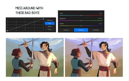
You can always make adjustment layers on top of your work; a low opacity yellow, magenta or blue (or anything your heart desires) overlay to tie all the colours together.
I hope this helps a bit!! Happy to answer more questions to the best of my knowledge :^)
104 notes
·
View notes
Note
um yes i would like to know what a pallette calculater is
Original post
Short explanation: It basically allows you to get equivalents of a color from a "full" color space to a more "limited" one. I called it a calculator because it kinda involves Numbers and well, calculates a color to another one!
Long explanation under the cut! To be able to explain how this works fully I have to get very technical.
To be able to explain this in its full depth, on how it works and all, I'll try to explain 3 basic terms: Primary colors, Gamut or Color space, and Color Wheel.
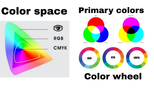
Primary colors are, by definition: a set of colorants (substractive method) or colored lights (additive method) that can be mixed in varying amounts to produce a gamut (color space) of colors.
I'm sure you may have heard of stuff like Blue, Red, and Yellow (RYB) being primary colors in school, or the regular Red, Green, and Blue (RGB) primary colors that are used to display on screen, or maybe you have noticed that printers tend to have 4 ink cartridges: Cyan, Magenta, Yellow, and Black (CMYK)
Well, by this definition you can mix these sets of 3 (or 4) colors to result in any color you might want! If you mix red and yellow you get orange! Add some blue and suddenly you get brown!
* Also it's important to note: RGB is only an additive color space, it only works with lights, when you combine all the colors to their max intensity you'll get white. Meanwhile with RYB and CMYK which are substractive primary colors, when you mix all of them you'll get black (or something very close to it)
Primary colors don't NECESSARILY have to be RGB, CMYK, or RYB. These are just the most popular ones because they have some of the widest gamuts you can get for screens (RGB) or paints and inks (RYB or CMYK, although CMYK is a bit more complete)
And that's where limited color palettes come up! When someone makes a Limited color palette they tend to choose a set of colors which they use for the entirety of their piece, those are their primary colors!
Each set of primary colors can get you a different Gamut or Color Space, which is the whole range of all the colors you can make with those primaries.
A Color Space is usually represented with a weird blobby triangle shape, but in reality it's much more "3D", because a lot of these representations tend to miss out on the Luminosity/Vibrancy/Intensity factor.

A Color wheel is just a simple wheel that shows all the hues you can get with the primary colors. These are the wheel of colors you see on any basic art program color picker.

Now that you know all that, I guess the next part will be more understandable: what I'm doing is selecting a set of Primary colors based on the usual CMYK colors, because CMYK are the primary colors that computer programs use for a substractive system, and because CMYK color sliders go from 0 to 100 (RGB color sliders range from 0 to 255), which matches the maximum opacity a regular layer can have.
When you set 3 layers on top of each other with Cyan, Magenta, and Yellow, and put them on Multiply layer mode, you can simulate the substractive color combination of all of them!

Now onto the calculator! The calculator makes use of the CMYK color sliders! My main drawing program, Clip Studio Paint, has it! I know that Photoshop does too, and there might be other programs that have it or some web app that gives you CMYK values, but they're NEEDED for this process!

The color sliders are basically to check the "amount" of Cyan, Magenta, Yellow, and Black that's required to get the color you need!
In the file for the "calculator", I made a very rudimentary color wheel, mostly so I could somewhat preview the gamut my limited palette can get.
So what you do is replace Cyan, Magenta, Yellow, and Black primary colors. This would effectively narrow down the Color Space to one within those new primary colors!

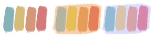
For this one I made a Very Extreme Cold Palette, the Magenta has now become a grey-ish purple, and the Yellow is a mid saturation lime green, I made the Black a Dark Blue-Green, and I left the Cyan and White (background) untouched for this one.
This reduces the gamut GREATLY, specially for colors that require a lot of Yellow and Magenta. Each color in the original palette is equivalent to the color in the same position on the new palette.

When picking a random color and checking the CMYK color sliders, you'll see the percentage of how much amount of each of these primary colors is in the "mix". I then decide change the opacity of each of my new primary colors, while being on top of each other in Multiply layer mode (except for the Black), to match that of my sliders. This will get me an equivalent of that color in that reduced color space I made.
Here's a bunch of equivalencies I made!

And then I draw a character with this new palette! Sorry, it's Ranboo again.

As you can see, despite the fact that at first sight the red-magenta on the original palette looks very grey and muddy in the first comparison, once you put all the colors together in a drawing your brain will see it as a bit more of a red! This is all because of Color Theory!!
I hops this clarifies stuff and serves as a bit of a learning experience, if it were for me I'd have explained all this on the og post, but it was pretty late and I was tired.
5 notes
·
View notes
Text
CMYK: Shape

Drawing from comic Solo Leveling.
Analysis
The Image above is a great example of many different forms of shapes in design. The most notable use of shape in the image is that of silhouette. Silhouette consists of simply a shape which is easy to define even without detail. For instance the arms of the almost alien looking being in the picture are made up in some places, just black. Nonetheless, the arms are still recognizable. Another form of shape found in the image is Positive and Negative shapes. Positive and Negative shapes are used to create interest in an image, an example of this type of shape would be the aura of the character. (The red swirly thing behind them), by using the Positive and Negative shapes properly in this image the alien looking monster looks even more menacing. A use of shape in this type of artistry is that of rectilinear or a boxy shape created using straight lines. Although found in the subject of the drawing, to me the most prominent use of this is in the framing of the drawing. Although the artist had no control over the format of the digital canvas used due to the requirements of a webcomic of this sort, the artist made the absolute best use of it, to frame his work.
Glossary
Abstract Shapes and Abstraction
Abstract means no recognizable objects. Abstraction is a sliding scale from realism to completely non representational. Abstract shapes can be used in backgrounds and textures.
Biomorphic
Biomorphic is a free-form pattern or design with a shape suggestive of a living organism, especially an amoeba or protozoan.
Curvilinear Shapes
Curvilinear shapes are s-curves.
Distortion
Distortion is exaggeration, contortion, reform, slant, twist, or warp in ways that depart from reality.
Idealism
Idealism asserts that the physical world is less important than the mind or the spirit which shapes and animates it.
Non-objective Shapes
Non-objective shapes have no object as a reference and no recognizable subject matter. Non-objective shapes are often used to simplify design shapes. Geometric shapes such as a triangle, square, and circle are abstract until you put them together to represent a house or a smiley face.
Positive and Negative Shapes
Positive space is the subject, focal point, or areas of high interest in any composition. Negative space is the area around the areas of interest. All compositions balance positive and negative space. Yes, stuff in the negative space can point to the focal point to make it most obvious. Positive and negative create a whole. Every composition is a combination of positive and negative space. Wield the positive and negative spaces with control and story-telling magic to become a design master.
Realism or Naturalism
Realism, or naturalism, attempts to represent subject matter truthfully, without artificiality or exotic or supernatural elements. In the visual arts, illusionistic realism strives for the accurate depiction of lifeforms, perspective, and the details of light and color.
Rectilinear Shapes
Rectilinear is a boxy shape made with straight lines. For example, the screen you are looking at is a rectilinear shape filled with little square pixels, and pixels are also rectilinear. A storyboard is a series of drawings in a linear set of rectilinear frames.
Representational
Representational means objects that players can name. The object represents something from the real world, or something that has the verisimilitude of realism.
Silhouette
Silhouette is a profile or shape that is easy to identify.
Squash and Stretch
Squash and stretch are shapes profiles that emphasize motion. The stretched position shows the form in an extended condition. When you do a sit up your belly squashes and your back stretches.
13 notes
·
View notes
Text
CMYK: Shape


Analysis
Shape in design, seen as the outline of a character or figure, can be utilized in character concepts and design in order to help portray a meaning or symbolism and aid the recognition of a character. An example in which shape is used in character design is in Steven Universe. In both images shown above, abstract shapes, such as triangles, squares, and circles, are very obviously seen in the designs of the characters. These shapes go further by helping to imply or solidify the main traits in that character. For example, in the bottom image, Garnet (top left) is made of squares and she is very stable and dependable, Amethyst (bottom left) is based off of circles and is very friendly and outgoing, and Pearl (top right) is based off of cones and is uptight. In addition to showing the personality of the characters, these shapes also allow for strong silhouettes. Each character in the top two pictures has a unique set of physical traits that distinguish them from other characters in media. The last thing I want to point out is the use of biomorphic designs of the characters. Even for the characters who are based off of boxy shapes and sharp points have a soft and organic flow to them. this allows the characters to appear more alive and dynamic. Overall, the use of shape in design is very well done in this series and all of the characters as a result have very organic, diverse, and memorable designs. I will use shape in my design profession to create dynamic and unique silhouettes and to utilize the subconscious perception of shapes in my work.
Glossary
Shape is the external form or appearance characteristic of someone or something; the outline of an area or figure. As a verb, to shape is to give a particular form. As artists, we shape our characters outward appearance by using shapes.
Abstract Shapes and Abstraction (see Non-objective Shapes) means no recognizable objects. Abstraction is a sliding scale from realism to completely non representational. Abstract shapes can be used in backgrounds and textures. The background pattern in this Minecraft image is abstract. The character is still recognizable as a human, but the doctor’s human form is abstracted in the game of Minecraft to conform to the blocks of the game world.
Biomorphic is a free-form pattern or design with a shape suggestive of a living organism, especially an amoeba or protozoan.
Curvilinear shapes are s-curves. Curvilinear shapes inform Jessica Rabbit’s character design and can represent a winding river vanishing into the distance.
Distortion is exaggeration, contortion, reform, slant, twist, or warp in ways that depart from reality. Look at the Minecraft Human body example. The figure of the Minecraft doctor is distorted by the shape of the blocks.
Idealism asserts that the physical world is less important than the mind or the spirit which shapes and animates it. Idealists choose the soul, the mind, or the psyche over the body, the material, and the historical. When ideals (of appearance, or proportion for example) regulate the way an artist represents the world, her work can be described as Idealistic. The leading artists of the High Renaissance - Leonardo, Raphael and Michelangelo - are all associated with varying forms of Idealism, as were ancient Greek sculptors. How do you think idealism affects avatar customization?
Non-objective shapes have no object as a reference and no recognizable subject matter. Non-objective shapes are often used to simplify design shapes. Geometric shapes such as a triangle, square, and circle are abstract until you put them together to represent a house or a smiley face. One Minecraft block, away from the game, is anon-objective shape. Inside the game that same block, depending on it’s color and texture could represent a part of a landscape, sheep, or sword. The block as part of a character or environment inside the game would no longer be abstract.
Positive space is the subject, focal point, or areas of high interest in any composition. Negative space is the area around the areas of interest. All compositions balance positive and negative space. Yes, stuff in the negative space can point to the focal point to make it most obvious. Positive and negative create a whole. Every composition is a combination of positive and negative space. Wield the positive and negative spaces with control and story-telling magic to become a design master.
Realism, or naturalism, attempts to represent subject matter truthfully, without artificiality or exotic or supernatural elements. In the visual arts, illusionistic realism strives for the accurate depiction of lifeforms, perspective, and the details of light and colour.
Rectilinear is a boxy shape made with straight lines. For example, the screen you are looking at is a rectilinear shape filled with little square pixels, and pixels are also rectilinear. A storyboard is a series of drawings in a linear set of rectilinear frames.
Representational means objects that players can name. The object represents something from the real world, or something that has the verisimilitude of realism. A cartoon bunny can represent a rabbit without being realistic. Representational is a sliding scale from realism to almost abstract. 2 dots and a curve can be arranged into an abstract pattern or they can be arranged into an emoji that represents a smiley face.
Silhouette is a profile or shape that is easy to identify.
Squash and stretch are shapes profiles that emphasize motion. The stretched position shows the form in an extended condition. When you do a sit up your belly squashes and your back stretches.
4 notes
·
View notes
Text
CMYK: Shape


Analysis
Clone High is an animated show that came and went on MTV, but has gained a cult following for its unique design among other things. I wanted to use this cartoon as an example of shape in design. On the surface the audience sees very clean and straight shapes to define and establish the simplistic look of the show. However, when viewing the character design deeper, each character i given a unique look through shape. For instance, Abe (white and blue shirt) is given vertically stretched shapes for his legs, torso, and neck to imply the character is more insecure and lacks confidence. Contrast this to JFK (red and white sweater on the left), whose shape is stretched more horizontally and squashed vertically to evoke a different energy that rivals Abe. Abstract shapes, such as the semicircle for Joan of Arc’s head (pink hair) are also used to indicate a flatter, more edgy personality. Additionally, the second image shows Gandhi (on the far right), whose head is perfectly shaped like an upside-down letter “G” to imply a wackier, more fun personality compared to the rest of the cast. Each character is given different shapes and figure to create strong silhouettes, allowing the viewer to recognize the characters solely based on their outline. The last thing I want to address is the distortion in each character’s body and figure. Looking at the slant of Joan’s back, JFK’s exaggerated muscles and hair, and Cleo (black skirt) with her very thin arms, legs, and waist all work to satirize the look and feel of high school teenagers as well as explain the idea that all of the characters are clones of historical figures.
Glossary
Shape is the external form or appearance characteristic of someone or something; the outline of an area or figure. As a verb, to shape is to give a particular form. As artists, we shape our characters outward appearance by using shapes.
Abstract Shapes and Abstraction (see Non-objective Shapes) means no recognizable objects. Abstraction is a sliding scale from realism to completely non representational. Abstract shapes can be used in backgrounds and textures. The background pattern in this Minecraft image is abstract. The character is still recognizable as a human, but the doctor’s human form is abstracted in the game of Minecraft to conform to the blocks of the game world.
Biomorphic is a free-form pattern or design with a shape suggestive of a living organism, especially an amoeba or protozoan.
Curvilinear shapes are s-curves. Curvilinear shapes inform Jessica Rabbit’s character design and can represent a winding river vanishing into the distance.
Distortion is exaggeration, contortion, reform, slant, twist, or warp in ways that depart from reality. Look at the Minecraft Human body example. The figure of the Minecraft doctor is distorted by the shape of the blocks.
Idealism asserts that the physical world is less important than the mind or the spirit which shapes and animates it. Idealists choose the soul, the mind, or the psyche over the body, the material, and the historical. When ideals (of appearance, or proportion for example) regulate the way an artist represents the world, her work can be described as Idealistic. The leading artists of the High Renaissance - Leonardo, Raphael and Michelangelo - are all associated with varying forms of Idealism, as were ancient Greek sculptors. How do you think idealism affects avatar customization?
Non-objective shapes have no object as a reference and no recognizable subject matter. Non-objective shapes are often used to simplify design shapes. Geometric shapes such as a triangle, square, and circle are abstract until you put them together to represent a house or a smiley face. One Minecraft block, away from the game, is anon-objective shape. Inside the game that same block, depending on it’s color and texture could represent a part of a landscape, sheep, or sword. The block as part of a character or environment inside the game would no longer be abstract.
Positive space is the subject, focal point, or areas of high interest in any composition. Negative space is the area around the areas of interest. All compositions balance positive and negative space. Yes, stuff in the negative space can point to the focal point to make it most obvious. Positive and negative create a whole. Every composition is a combination of positive and negative space. Wield the positive and negative spaces with control and story-telling magic to become a design master.
Realism, or naturalism, attempts to represent subject matter truthfully, without artificiality or exotic or supernatural elements. In the visual arts, illusionistic realism strives for the accurate depiction of lifeforms, perspective, and the details of light and colour.
Rectilinear is a boxy shape made with straight lines. For example, the screen you are looking at is a rectilinear shape filled with little square pixels, and pixels are also rectilinear. A storyboard is a series of drawings in a linear set of rectilinear frames.
Representational means objects that players can name. The object represents something from the real world, or something that has the verisimilitude of realism. A cartoon bunny can represent a rabbit without being realistic. Representational is a sliding scale from realism to almost abstract. 2 dots and a curve can be arranged into an abstract pattern or they can be arranged into an emoji that represents a smiley face.
Silhouette is a profile or shape that is easy to identify.
Squash and stretch are shapes profiles that emphasize motion. The stretched position shows the form in an extended condition. When you do a sit up your belly squashes and your back stretches.
1 note
·
View note
Text
CMYK: Shape

Shapes are used to convey ideas to a reader through design alone. From this we can analyze images like this main menu from Invisible Inc. In this image we can see many forms of shape such as rectilinear shapes for the font and the buttons, and the agents to give the air of officiality or seriousness in the game and characters. The characters themselves are representational of humans. This gives the player some thing to relate to and to be familiar with. We see silhouettes of screens, technology, buildings and even a map, this can show what's used in the game and what is at stake. There is also an aspect of squash and stretch, particularly in the character that is Internationale the one furthest on the left, as she seems to be running squashing her shape slightly to make her more drawn out. Lastly the curvilinear shapes that come in the form of the planet in the bottom right showing the more organic and hopeful part of the story. I cant wait to shape design in the future!
Shape Glossary
Shape is the external form or appearance characteristic of someone or something; the outline of an area or figure. As a verb, to shape is to give a particular form. As artists, we shape our characters outward appearance by using shapes.
Abstract Shapes and Abstraction (see Non-objective Shapes)
Abstract means no recognizable objects. Abstraction is a sliding scale from realism to completely non representational. Abstract shapes can be used in backgrounds and textures. The background pattern in this Minecraft image is abstract. The character is still recognizable as a human, but the doctor’s human form is abstracted in the game of Minecraft to conform to the blocks of the game world. https://youtu.be/MKs-YdefY1E The Human Body by GEO-CRAFT in Minecraft Education Collection
Biomorphic
Biomorphic is a free-form pattern or design with a shape suggestive of a living organism, especially an amoeba or protozoan.
Curvilinear Shapes
Curvilinear shapes are s-curves. Curvilinear shapes inform Jessica Rabbit’s character design and can represent a winding river vanishing into the distance.
Distortion
Distortion is exaggeration, contortion, reform, slant, twist, or warp in ways that depart from reality. Look at the Minecraft Human body example. The figure of the Minecraft doctor is distorted by the shape of the blocks.
Idealism
Idealism asserts that the physical world is less important than the mind or the spirit which shapes and animates it. Idealists choose the soul, the mind, or the psyche over the body, the material, and the historical. When ideals (of appearance, or proportion for example) regulate the way an artist represents the world, her work can be described as Idealistic. The leading artists of the High Renaissance - Leonardo, Raphael and Michelangelo - are all associated with varying forms of Idealism, as were ancient Greek sculptors. How do you think idealism affects avatar customization?
Non-objective Shapes (see Abstract Shapes)
Non-objective shapes have no object as a reference and no recognizable subject matter. Non-objective shapes are often used to simplify design shapes. Geometric shapes such as a triangle, square, and circle are abstract until you put them together to represent a house or a smiley face. One Minecraft block, away from the game, is anon-objective shape. Inside the game that same block, depending on it’s color and texture could represent a part of a landscape, sheep, or sword. The block as part of a character or environment inside the game would no longer be abstract.
Positive and Negative Shapes
Positive space is the subject, focal point, or areas of high interest in any composition. Negative space is the area around the areas of interest. All compositions balance positive and negative space. Yes, stuff in the negative space can point to the focal point to make it most obvious. Positive and negative create a whole. Every composition is a combination of positive and negative space. Wield the positive and negative spaces with control and story-telling magic to become a design master.
Realism or Naturalism
Realism, or naturalism, attempts to represent subject matter truthfully, without artificiality or exotic or supernatural elements. In the visual arts, illusionistic realism strives for the accurate depiction of lifeforms, perspective, and the details of light and colour.
Rectilinear Shapes
Rectilinear is a boxy shape made with straight lines. For example, the screen you are looking at is a rectilinear shape filled with little square pixels, and pixels are also rectilinear. A storyboard is a series of drawings in a linear set of rectilinear frames.
Representational
Representational means objects that players can name. The object represents something from the real world, or something that has the verisimilitude of realism. A cartoon bunny can represent a rabbit without being realistic. Representational is a sliding scale from realism to almost abstract. 2 dots and a curve can be arranged into an abstract pattern or they can be arranged into an emoji that represents a smiley face.
Silhouette
Silhouette is a profile or shape that is easy to identify.
Squash and Stretch
Squash and stretch are shapes profiles that emphasize motion. The stretched position shows the form in an extended condition. When you do a sit up your belly squashes and your back stretches.
1 note
·
View note