#carrd tutorial
Explore tagged Tumblr posts
Note
Hello, Haylin!, it's my very first time asking for a carrd made by you and I was wondering if you could make me a coquette or a combination of cottagecore and fairycore for this carrd!, I hope you have a great day and stay safe and healthy, reminder to take care of yourself and take breaks if needed but hopefully you don't have any issues.
from — clementine ★
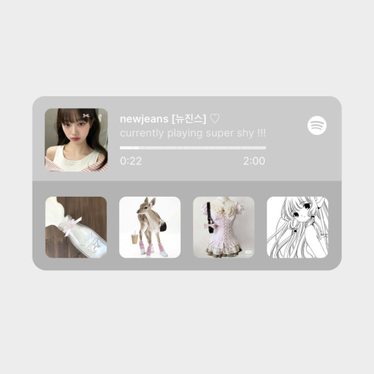
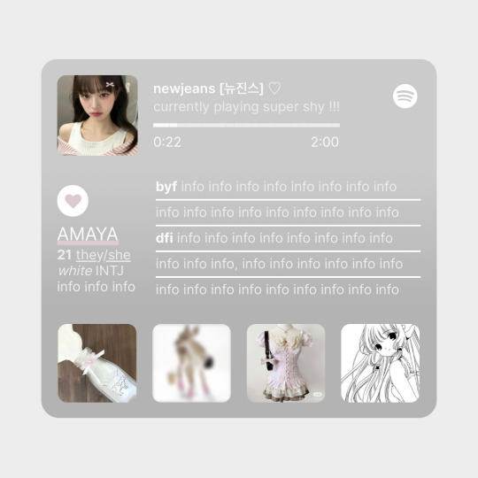
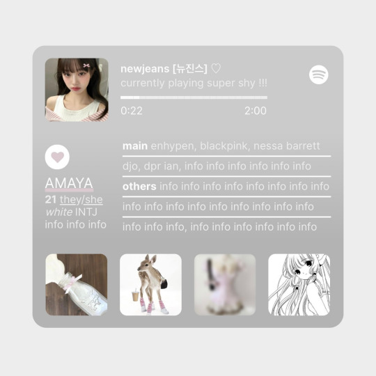
hi clementine!! tysm and ofc!! i made this coquette themed carrd that can double up as a fairycore / cottagecore carrd if you change the pics and colors, hope this is good!! :))
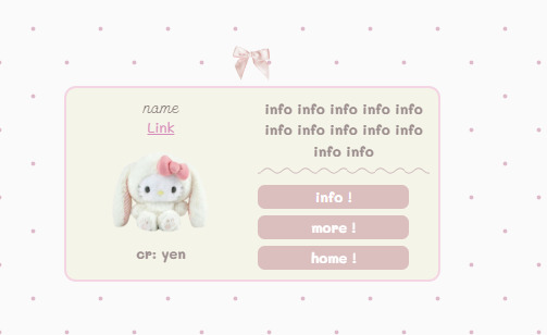
get the carrd here look at it here!
REQS ARE OPEN FOR CARRDS!! only req i have is to be following me to ask for a carrd! and I DO CARRD COMMS!! so if you have a specific carrd you want made message abt my prices and what i take!! use my referral code also to help donate and get some money off on buying pro here / use the code manually HXYLIN !
#carrd commissions#carrd stuff#aesthetic#carrd templates#carrd icons#carrd inspo#carrd moodboard#carrd theme#carrd material#carrd packs#carrd req#discord chat#discord server#discord app#discord mobile#carrd template#request#carrd tutorial#free carrd template#carrd profile#strawberry#cutecore#commission#taking commisions#f2u
231 notes
·
View notes
Text
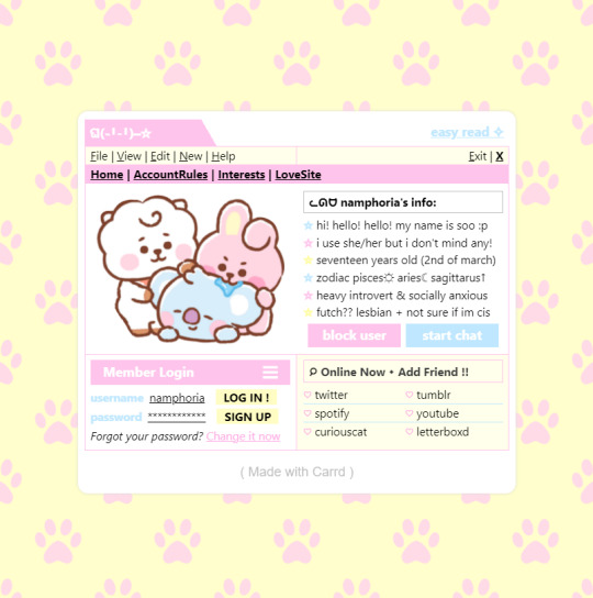
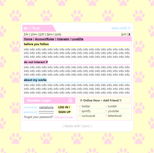
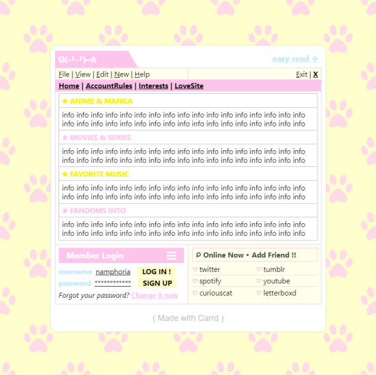

w w w . carrd . co // ⋆ 𐙚 ₊ ˚ 🐇 ⊹ ♡ ˚ .
✿ CARRD INSPO // © misamory
like or reblog if saveㅤ⿻ㅤᐢ..ᐢㅤ♡ㅤ2023.
#⋆ ˚ 。 just an rkive — ★. *#♡✮☁️✧˖°💿⋆。°✩#carrd.co#carrd inspo#carrd template#carrd templates#carrd icons#carrd stuff#carrd material#carrd resources#carrd moodboard#carrd inspiration#carrd#carrd layouts#carrd symbols#carrd help#carrd tutorial#carrd theme#carrd things
1K notes
·
View notes
Text
Some blue banners
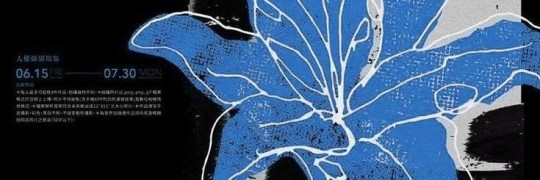
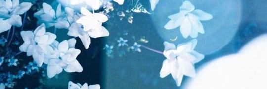


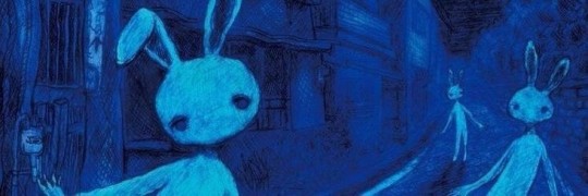

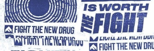



#discord server discord chat discord roleplay aesthetic banners tumblr banner banner design template aethstetic black and white#tumblr banner#banner design#banners#discord server discord chat discord roleplay aesthetic banners#design#design tutorial#carrd stuff#carrd moodboard#carrd graphics#carrd resources#carrd inspo#blue#blue aesthetic#aethestic
55 notes
·
View notes
Text
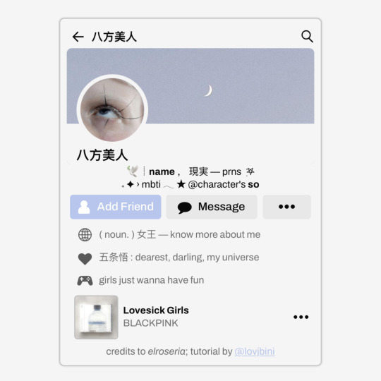
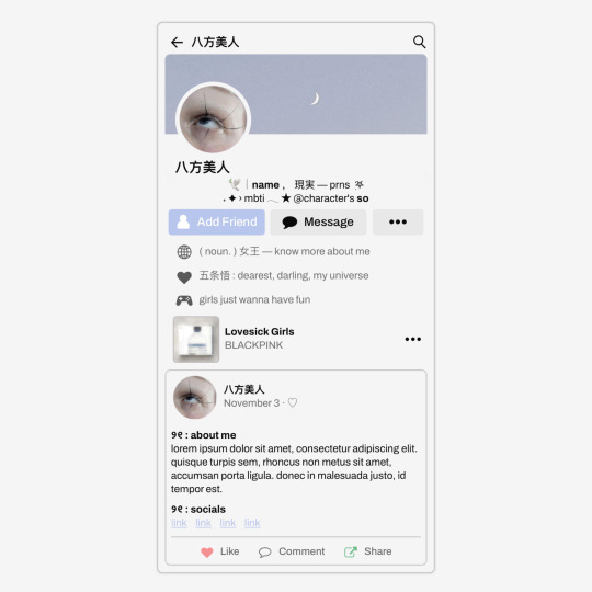
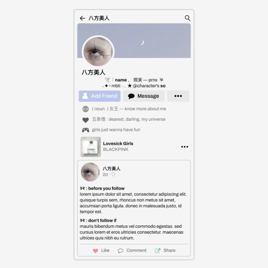
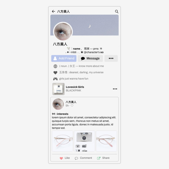
✩ CARRD INSPO by LOVJBINI // © elroseria
like or reblog if you useㅤෆㅤ2024.
✎﹏ please, put “ © elroseria – tutorial by @lovjbini ” in the description if you use our tutorial!
CLICK HERE FOR TUTORIAL
#lovjbini#carrd#carrd.co#carrd co#carrd inspo#carrd tutorial#carrd template#carrd layout#carrd tutorials#carrd templates#carrd layouts#carrd theme#carrd themes#carrd design#carrd designs#carrd stuff#aesthetic#simple#kpop#macbook#pastel colors#pastel aesthetic#kawaii#blue#pastel blue#light blue#facebook
426 notes
·
View notes
Text

𓆩♡𓆪 divider tutorial ˖˚
꒰ step one ꒱ ↳ first, find an image or two on a search engine or pinterest/something like it. it's best to use images with plain color (like white or black) backgrounds.
꒰ search terms to try ꒱ ↳ lace trim ↳ lace divider ↳ floral divider ↳ heart divider ↳ clouds divider ↳ bow/ribbon divider ↳ divider clip art
꒰ step two ꒱ ↳ either copy and paste the image or download and upload the image into remove.bg. use erase/restore as needed.
꒰ step three ꒱ ↳ you're done! pretty simple, right? good work \(^_^)/

#aesthetic dividers#tumblr dividers#post dividers#carrd dividers#divider packs#divider#page dividers#text dividers#cute dividers#tumblr layouts#divider tutorial#graphics tutorial#rentry tutorial#carrd tutorial
87 notes
·
View notes
Text


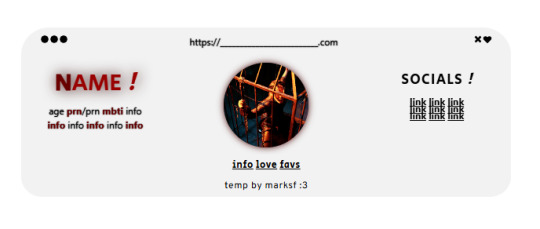
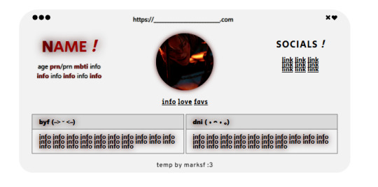
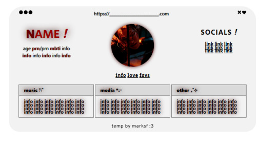
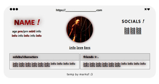


carrd.co template ! ($0+ pay what u want)
non-pro friendly ! preview . buy | refferal code - MARKLEE ♡ kofi
please, do not remove the credit or claim as your own ! you can move the credit but please keep it on the site <3
#marksf#marksf templates#carrd template#carrd#carrd stuff#carrd inspo#carrd resources#carrd commissions#carrd inspiration#carrd templates#template#carrd.co#free carrd template#carrd material#carrd moodboard#carrd layouts#carrd symbols#carrd help#carrd tutorial#carrd theme#carrd things
64 notes
·
View notes
Text

⋆𐙚 ₊ ° ⊹ 🎼
𑜞᭄ೃ

𝓘 𝓰𝓪𝓿𝓮 𝓶𝔂 𝓫𝓵𝓸𝓸𝓭, 𝓼𝔀𝓮𝓪𝓽, 𝓪𝓷𝓭 𝓽𝓮𝓪𝓻𝓼 𝓯𝓸𝓻 𝓽𝓱𝓲𝓼
#͏͏͏ ͏͏͏ ͏͏͏ ͏͏͏ ͏͏͏ ͏͏͏ ͏͏͏ ͏͏͏ ͏͏͏ ͏͏͏ ͏͏͏ ͏͏͏ ͏͏͏ ͏͏͏ ͏͏͏ ͏͏͏ ͏͏͏ ͏͏͏ ͏͏͏ ͏͏͏ ͏͏͏ ͏͏͏ ͏͏͏ ͏͏͏ ͏͏͏⠀#taylor swift#kpop moodboard#kpop icons#kpop layouts#crafts#design#fashion#diy#emoticons#locs#pfp icons#alternative moodboard#moodboard#soft moodboard#coquette moodboard#messy moodboard#carrd tutorial#carrd pngs#carrd inspo#red moodboard#white moodboard#dark academia#grunge#edgy aesthetic#pastel moodboard#vintage moodboard#summer moodboard#pink moodboard#messy locs
120 notes
·
View notes
Text
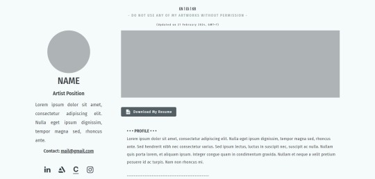
made a carrd template tailored for multilingual professional artists to build their own portfolio website or anyone to use as an online resume.
Demo: https://1686962758f6e15b.demo.carrd.co
Buy it: https://carrd.co/buy/a8b580166e4d17d4
#carrd#carrd.co#carrd inspo#artist carrd#carrd templates#carrd template#carrd moodboard#carrd graphics#carrd layouts#carrd bios#carrd resources#carrd stuff#carrd material#carrd tutorial#carrd inspiration#carrd icons#carrd help#carrd theme
63 notes
·
View notes
Text
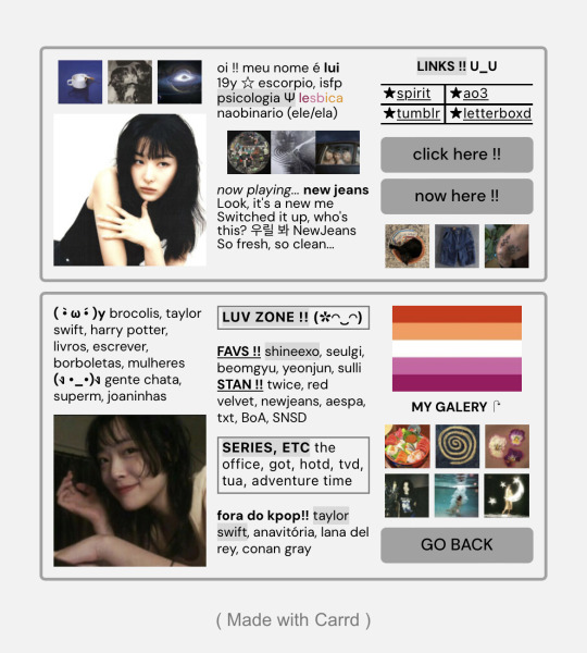
carrd inspo ## simple
#carrd#carrd inspo#kpop carrd#webcore carrd#carrd moodboard#messy locs#caard#card#blue carrd#carrd icons#carrd inspiration#carrd stuff#carrd material#carrd bios#carrd tutorial#carrd.co#carrds#carrd resources#carrd layouts#carrd overlays
146 notes
·
View notes
Text
🐝 * ― 𝗖𝗔𝗥𝗥𝗗 𝗧𝗨𝗧𝗢𝗥𝗜𝗔𝗟: 𝗠𝗨𝗦𝗜𝗖 𝗣𝗟𝗔𝗬𝗘𝗥𝗦 important note: only works if you have a pro or a pro plus account, and can use the 'embed' element.
― STEP ONE: PREPARING YOUR MUSIC
if you want to have music play on your carrd, the most important thing is, of course, the music. just make sure you have whatever song you want to have played in your files, and if you don't already have it, make sure to download it. now, the next step is to share your file so you'll get a direct file link you can later use in your music player code. personally i'm gonna be using and explaining the dropbox method for this, but there are other ways to do it as well. upload the music file to your dropbox ( either directly or to a special folder, whatever you prefer ) and then click the share button. then create link and copy link and you'll end up with a link that should look something like this: https://www.dropbox.com/scl/fi/j904wa1i2e229tdfa4rkb/ok-3.gif?rlkey=jy7822s2rrgaszj3jduggxn9k&dl=0 to create a direct download link out of this one, take out the 'www' and instead replace it with 'dl' so you'll have something like this: https://dl.dropbox.com/scl/fi/j904wa1i2e229tdfa4rkb/ok-3.gif?rlkey=jy7822s2rrgaszj3jduggxn9k&dl=0 save this link somewhere or keep it handy because we're gonna need it again a little later once we actually start working on the carrd.
― STEP TWO: GET THE MUSIC PLAYER ON YOUR CARRD
for the next step, we're gonna be looking at different music player codes. there are a wide variety of ready-to-use ones already available ( for example here ) or if you are good at coding, you can always create your own as well. whatever you prefer and feel more comfortable with. once you've found something you like, copy the code because it's finally time to actually put it all on your carrd. if you have multiple sections and want your music to be played in all of them, either use a header or a footer and if you only want it in one, put it in the one you want to use for this. click on the little '+' to add an embed element to your carrd ( it's the one with this symbol: '</>' ). scroll down to the 'code' section and paste the code of the music player you've previously copied there. next thing you need to do to make sure it plays the song you want is to locate the '<audio id="audio" src="link here"audio"></audio>' and replace the link with the direct file link of your music. to see if you've been successful, you either need to publish your site or save it as a template ( in case you aren't ready to publish it yet but still wanna check if everything worked as planned ) and it should display the music player and play your music once clicked.
― STEP THREE: CUSTOMIZE IT ( optional )
the last, and optional, thing you can do is customize it to your preferences. this is best done if you have a little knowledge and understanding of html coding, but minor things like changing colors can totally be done without it. for example, if you want to change colors just locate those within the code ( titled 'color' or 'background-color' and they should have a hexcode number right beside it ) and change the hexcode to whatever you want to use. or if it includes text, you can change the font size ( aptly titled 'font-size' ). you can just play around with different settings to see if you'll get something you like ― most of it within the '<style></style>' section of the code is pretty self-explanatory.
#guide.#carrd help#carrd tutorial#tutorial#carrd#rp help#rph#type: guide#( just did this for one of my own carrds so i thought why not make a tutorial if anyone else is interested in this )
270 notes
·
View notes
Note
Heyy!! I love your carrds so so much they're so pretty!! Can you please make a f2u non pro discord nitro themed carrd please please please
HELLO HOPE THIS IS GOOD!
non pro freindly discord nitro themed carrd
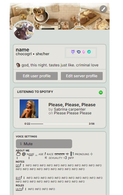
get the carrd here look at it here! here is also the image i used for the nitro badges!
REQS ARE OPEN FOR CARRDS!! only req i have is to be following me to ask for a carrd! and I DO CARRD COMMS!! so if you have a specific carrd you want made message abt my prices and what i take!! use my referral code also to help donate and get some money off on buying pro here / use the code manually HXYLIN !
#carrd commissions#carrd stuff#aesthetic#carrd templates#carrd icons#carrd inspo#carrd moodboard#carrd theme#carrd material#carrd packs#carrd req#discord chat#discord server#discord app#discord mobile#carrd template#request#carrd tutorial#free carrd template#carrd profile#strawberry#cutecore#commission#taking commisions#f2u
1K notes
·
View notes
Text
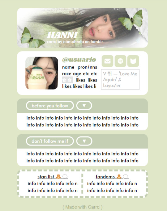
✿ CARRD INSPO
like or reblog if saveㅤ⿻ㅤᐢ..ᐢㅤ♡ㅤ2023.
❛ please, credit me as "namphoria on tumblr" if you remake! ⁾⁾
#⋆ ˚ 。 just an rkive — ★. *#♡✮☁️✧˖°💿⋆。°✩#carrd.co#carrd inspo#carrd template#carrd templates#carrd icons#carrd stuff#carrd material#carrd resources#carrd moodboard#carrd inspiration#carrd#carrd layouts#carrd symbols#carrd help#carrd tutorial#carrd theme#carrd things
2K notes
·
View notes
Text
youtube
HOW TO ADD IMAGES!
As requested by anon, a little basic tutorial of how I edit templates to make it seem like an image is bursting out of a container. Tumblr refuses to upload the video so Youtube it is... I hope this helped!
If there's anything else anyone's interested in learning about carrd/how I edit, let me know. <3
14 notes
·
View notes
Text

✩ CARRD INSPO by LOVJBINI // © crdais
like or reblog if you useㅤෆㅤ2024.
✎﹏ please, put “ © crdais – tutorial by @lovjbini ” in the description if you use our tutorial!
CLICK HERE FOR TUTORIAL
#lovjbini#carrd#carrd.co#carrd co#carrd inspo#carrd tutorial#carrd template#carrd layout#carrd tutorials#carrd templates#carrd layouts#carrd theme#carrd themes#carrd design#carrd designs#carrd stuff#aesthetic#simple#website#blue#white#wonyoung#jang wonyoung#ive wonyoung#izone wonyoung#izone#ive#ive moodboard#izone moodboard#wonyoung moodboard
549 notes
·
View notes
Text


‧˚₊꒷꒦︶︶︶︶︶꒷꒦︶︶︶︶︶꒦꒷‧₊˚⊹
୨୧ ⎯⎯⎯ CARRD TUTORiAL 。
❥ ~ LiGHT iNSPO : ✅ !
❥ ~ HEAVY iNSPO / COPYiNG : ✅ !
❥ ~ REPOSTiNG : ❌ !
‧˚₊꒷꒦︶︶︶︶︶꒷꒦︶︶︶︶︶꒦꒷‧₊˚⊹
9 notes
·
View notes
Text
My Carrd tutorial 💗
my carrd
so first i started with a blank canvas, but i deleted the center text
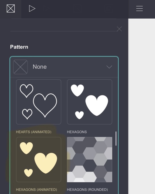
for the background colour/ style i didn’t want it to be white so i just chose a very light pink that was a bit off the white ?? ( #F9E9EC ). i pasted the colour i was going to use for the hearts and then chose a colour on there.
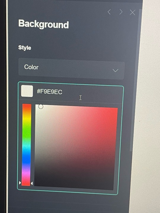
then for the background i chose animated hexagons (under the patterns option) and went to redketchup (a colour picker) and chose the same colour as wonyoungs lips ( #9B384A )
then i edited my page. my style is box, position is center, width is 22, padding for both vertical and horizontal is 0.5, corner rounding is 0.5. My border is the same colour as the hearts, ( #9B384A ), and the width is 2. i added a drop shadow, the colour is the same as the hearts and border. the angle is 0° and the blur is 2°. Then i went to mobile and changed it to manual, with my size being 11.
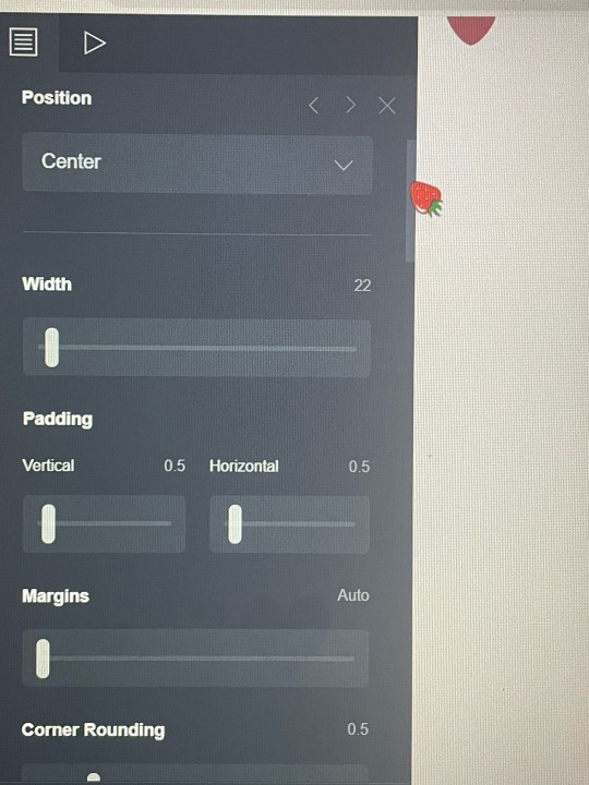
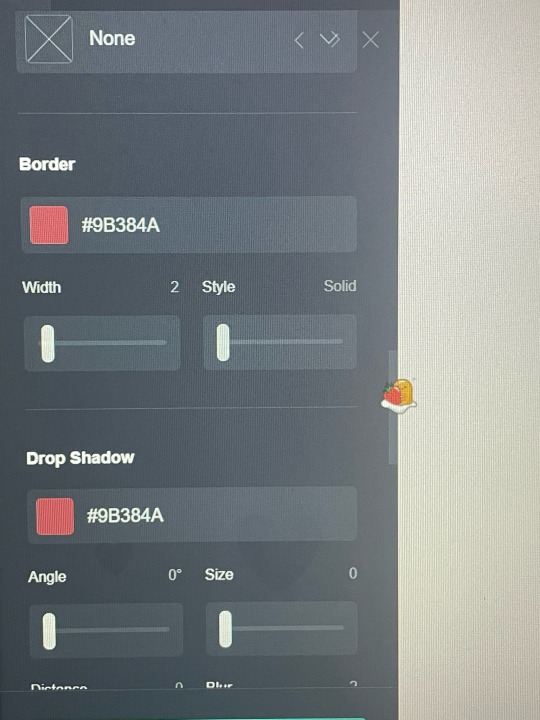
then i chose container and changed the type to columns, both 50%. next i went under appearances and changed the padding. vertical and horizontal both go to 0.5. I changed corner rounding (under margins) to 0.5 as well. Next i changed my border colour to another colour i chose off the same wonyoung photo ( #7C5655 ), with the width of 2.
Your container will show up stacked in the mobile view if you do not edit the mobile layout. you’ll want to change the mobile to manual, then the layout to default. if you don’t change it to default it could stack it (below is before and after, the after having the default layout rather than the stack). if you’re working on computer it will look like the default layout until you change to the mobile option (the phone option at the top right corner) but for iphone users or whatever it will automatically stack it.
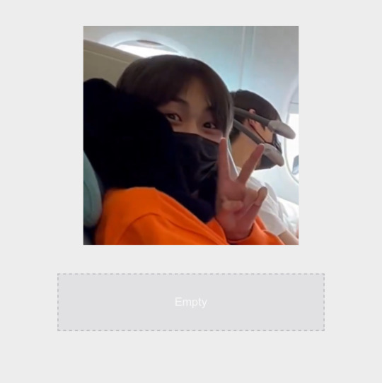
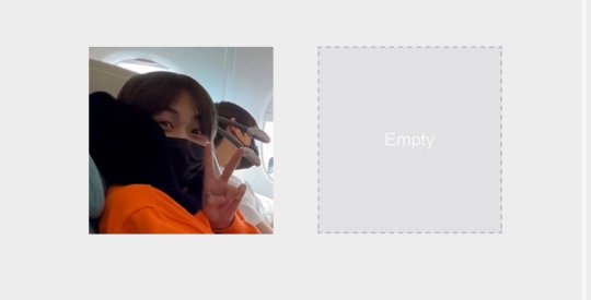
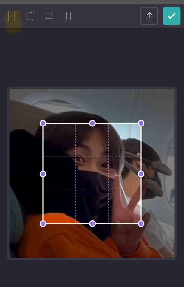
i then chose to add an image (go to the + and choose image) when you go to add a photo it will ask you about cropping but i didn’t crop it, if you press the top square-like option twice it will get rid of the little cropping thing. you can drag the photo and drop it on whichever side you desire. (for my first photo i chose the left side, and for the next i chose right side)
Now you add a text (under the +) you can choose whichever font you want (i chose abril fatface) and the font colour will be the same one we’ve been using (for the hearts, etc). you can make the size of your text however you’d like, for my name i used the side 0.875, for the drop shadow i chose a colour that was similar to the font colour, but way lighter. (i chose #E3274C) i made the angle 245° with the blur at 1.25. i also changed the mobile to manual (do this for like everything).
i used a new text box for every different thing (likes, dislikes, my name, everything) also make sure it’s all centered (under alignment)
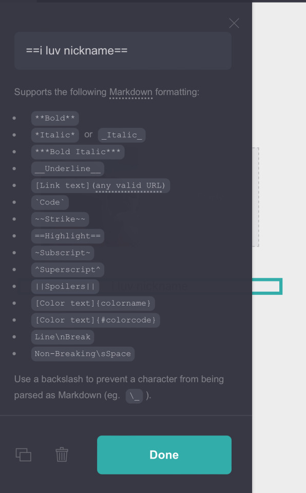
For the next text (the highlighted bit) i made it the same font and colour, just changed the size to 0.6, line spacing to 1.5c and gave it the same drop shadow as the text before. to highlight it there is a formation that you follow. this is what it should look like.
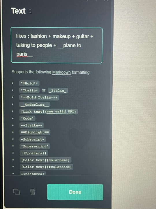
For my age and pronouns i used the same font size (0.875) that i used for my name, and same colour (same colour for all the text). for my likes i used the same size as my highlighted text (i luv nicknames) which is 0.5. i decided to underline the song title just to make it stand out a bit more. i followed the same formatting as listed above. see below for reference.
I copied and pasted my likes and just changed the text, same for the dni.
for the quote i wrote i did the same process of changing my container to columns. only difference was that i made my left column 75°. i copied and pasted my name’s text (if you don’t know how to copy and paste, it’s the button beside the trash can). i dragged the text down into my new container and onto the left, larger, column. for the heart you go to the + and choose Icons, it will show you the email option but all you have to do is tally down the options and change the type. i chose the heart (which is 8 down from the email) you can choose whichever icon you want, add as much as you want. i just chose the heart because it looked cute and matched my background. i dragged the icon into the smaller column, the 25% one.
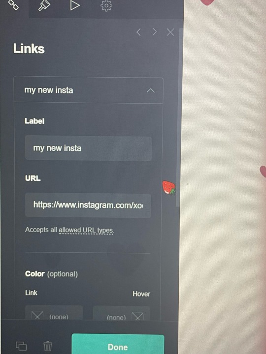
for the next container i didn’t ch abe anything about the container type, i left it a default rather than choosing to do columns again. i inserted my photo, cropping it to the height i wanted. i then added a link, where is also found under the +. when you tally down the links you can change the label and url. then you want to go to appearance. I made the style underlined, the colour and the font the same. the text size is 0.75. and the drop shadow is #E3274C, angle 245°
The next part i only did for every other container (the quote, the tumblr acc container), which is a drop shadow. the drop shadow is the same colour as the one we used for the text dropshadows. ( #E3274C ). the angle is 90°, distance 1.75, blur 2.
for the title (“my tumblr accounts”) I just copied and pasted my pronoun text and dragged it down above my final container .
And finally i went to the + and added a divider, dragging it up to go under my instagram link and above my tumblr title.
OKAY I THINK THATS IT??? pls tell me if you have any questions or whatever. this is a pretty basic carrd, but i think it’s pretty. it seems a bit difficult but i promise its not, for the top and bottom column (my tumblr acc one and intro) you can just copy and paste it, and whatever.
@baevsxii i hope this answers it♡
#sincerelysays!#i thought carrds were so complicated#but then it got a bit easier after i actually started😭#don’t know how to add page breaks or whatever tho#or anything interactive#carrd tutorial#kpop carrd#carrd#carrd inspo
6 notes
·
View notes