#but the image and post follow the same previous formats so its going in that tag
Explore tagged Tumblr posts
Text

"There's still much to be done. Please rest assured, I am here to guide you through it." — Jinhsi
Being the Magistrate of Jinzhou, Jinhsi bears her noble and weighty share of duties. Through repeated ages, the Lament has preyed upon mankind's vulnerable hope. Yet, grasping the nettle, she strives with all her might to forge a path toward tomorrow.
src: wuthering waves EN twitter post
#wuthering waves#wuwa#jinhsi#wuwa official#wuwa drip marketing#mod post#please note that since her element isnt listed like the last few im hesitant on calling this proper drip marketing#but the image and post follow the same previous formats so its going in that tag#either way THIS IS DRIVINVING ME CRAZYYY NOT WHAT I EXPECTED
21 notes
·
View notes
Text
LILIUM'S 2023 GAME LIST:
Hey! Better late than never! I actually have been editing this list since november, but I lost some of the things I said about the last games and it took me this long to remember what I had written. The risks I run because my mind flows better when I write with pen and paper. So, seeing how well the last list did on my memory, and because I got bored of talking to myself, I shall torture the unlucky ones who have found this post with both my video game taste and my rambles about them. I am so sorry in advance.
It's the same as before: they are ordered chronologically, from first played/finished to last, not ranked in how much I liked them. If I dont say a lot its not because I didn't like it, or that it was bad. At times I didn't want to give too much away. This time I tried to write each segment right after finishing them, or the following days, so that's why I talk way more or in more detail about each game and my own opinions. And who knows, maybe this will be a yearly thing. I like it, I'm Having fun. And hopefully some of these games get the love they deserve by whoever reads this.
So, once again, and now with more words:
1) Mothmen 1966
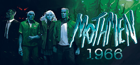
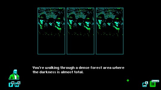
Mothmen being in the title was enough for me to give it a go, so it's good to say that the game is also good. It is divided by chapters, each one from the perspective of one of our three protagonists, showing the perspective of these vastly different people even if they are connected in some way. The game goes from a visual novel style to changing the gameplay to be interactive while also maintaining its format, something that I found entertaining. Its visuals are a treat, and I believe they enhance the horror presented in the story. All of the parts in this game work in its favor. I cannot believe I am actually saying this, but to get an achievement you need to take an L. I am not joking. It is part of a puzzle and me being good at it made me miss an achievement. No hard feelings, I had a good laugh about it as I was going back to the save file and doing it again. Sometimes, sucking is the way to go. I may have spent way too much time trying to win the Impossible Solitaire. But I will, one day, you'll see.
2) Roadwarden
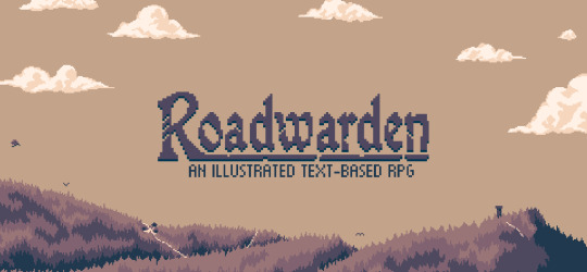
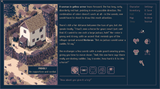
You know a game is good when I play it for hours uninterrupted and is the main reason I turn on the computer.
Roadwarden is, as the title image says, an illustrated text based RPG, in which you take the role of a Roadwarden who is tasked to explore an unknown peninsula to expand a merchant's guild's influence, establish its safety, and find out what happened to the missing previous roadwarden.
Let me tell you, this game is amazing from both a mechanical and storytelling level. Mechanically because the game keeps track of so many things, it will remember even an answer you gave at the very beginning, and it'll become an integral part of your character. Even little thoughts as you are about to sleep will shape who you are playing as. On the story telling level, so many of the quests and towns are interlinked that holding back on finishing certain quests is the way to go, although in some cases having as many done as possible will no doubt help. The characters and towns are all unique and memorable, each with history that shapes them and how they interact with each other and you, the outsider. Both gameplay and story service each other to present an experience unlike any other, enhancing each other at every opportunity. The art and soundtrack set the perfect atmosphere for each moment. And the world building. Man, the world building, it's just. So well done, you actually believe this is a real place that existed before you arrived, and that it will continue to do so after you leave. It wasn't waiting for you, it did not kick into gear just because you showed up. It has its own issues, its own history, its own people, nature, culture, and you can feel that with each written word, each piece of information. I can't even explain properly just how good the world building is.
I just really fell in love with being a guy on the road taking care of these settlements' problems, getting to know their inhabitants and gaining their trust, all while falling in love with the game. There is one quest that I do not want to spoil, but the ending was so. Fitting, in a way, that I was surprised I didn't see it coming. Even as I saw the achievement name once I completed it, I looked back and just. I just smiled like damn, good job.
If you want to really take in this entire world and its people, I would personally recommend playing in Casual, since any other difficulty setting will put a limit to the days you'll be allowed to stay, and I must stress that this experience must not be rushed. Unless you dont mind a time challenge, in which case you do you. Also don't know about your memory, but I needed to take notes, and some highlights are: "Efren marry me", "We should have all stabbed Thais full Julius Caesar style", "Eudica and Efren my beloveds" and "Thyrsus is my Warlock Uncle". With that being said, the Journal mechanic is a god sent, and I can't be more grateful that it exists. Finally, a journal that doesn't get stuck in the first sentences of a quest from when you first got it.
Oh boy, those are a lot of words. Can you tell I really liked this game? I can't wait to see more from this developer.
EDIT: THE GAME HAS RECEIVED A HUGE UPDATE THAT I HAVE YET TO PLAY, BUT OH BOY IT'S MAKING ME WANT TO REPLAY THE ENTIRE GAME AGAIN.
3) Exhibit of Sorrows
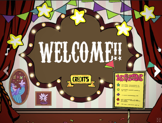
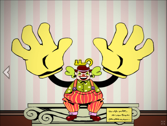
A short game set in a clown exhibit, with a point - click and drag gameplay. I'll keep this one short, since this game can be played for free in both browser and for download in Itchio, and it is a neat little thing that you can beat as fast or as slow as you want. You interact with each exhibit, clicking and dragging the mouse depending on what you need to do, each with a little buddy that you need to help or have fun with to get the key, and proceed to the next screen. Its length and artstyle make for a fun and interesting experience, pacing itself beautifully. It is effective in every way. And come on, they are clowns, they are so cute and look like plushies. I love them all.
4) The Firebrand
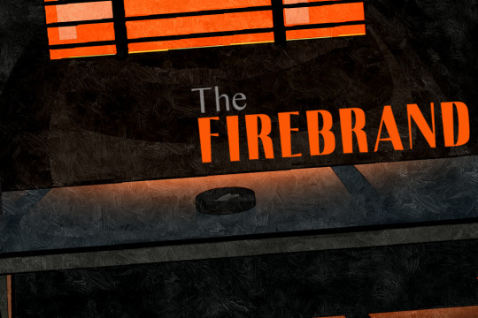
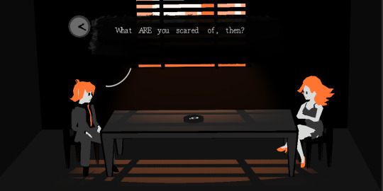
A game about a detective interrogating a woman with different word prompts that he writes down in his notebook, all which branch into more questions and answers. You'll uncover the story and the truth of this conversation as you play along, finding out stuff about the woman, the detective, and even the world they live in. It is an interrogation against a clock that keeps on ticking, and luckily the developers give us the chance to check out a dialogue tree and how to get both the Normal and True Ending. With that in mind, the questions that don't lead to either of these are worth reading, as they serve to paint a bigger picture. And hey, you can also get the Bad Ending while you do it.
5) Royal Alchemist
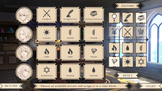
Royal Alchemist is a visual novel in which you, the protagonist, are tasked with tutoring the three princes of a nation. You will fight for your life against the challenges this new position presents and also the stat checks you will have to pass at different points of the story, both of your character and the princes. Speaking of, each one of them represents a different route, with their recommended order (which I highly request following as stated by the creators: Aurelius, then Serin, and finally Nazir. Trust me, they were made to be experienced like this, you wont regret it). You will experience the constant back and forth, the battle of swords and wits with Aurelius, the emotional build up with Serin, and to describe the main appeal of Nazir's route before playing it would be a spoiler. The romance in this VN is some of the best I've experienced. I have never read about two characters holding hands in such an intimate way, it made the pure build up of a route worth every second. And the Princes aren't the only interesting characters, this visual novel is full of fun and complex characters, all with their own personalities and roles. From Raphael, the butler who might as well be the patron saint of patience, to Viola, the infamous head merchant. It has a mechanic of stat raising and, as stated before, there will be points in the story where you will need to reach a certain level of a skill to be able to pass. But don't worry, there is an official guide made by the developers which is a life saver, which not only has each stat requirement for each route, but also with neat additions like character profiles and more. The only criticism I'll give it is that some scenes are cut short when they could have been expanded on and it would have had a better effect, not only in terms of an emotional connection, but also to further enforce the bond between the player and the relationship developed in the route. But besides that small complaint, this visual novel is one I would gladly recommend.
6) Fear & Hunger
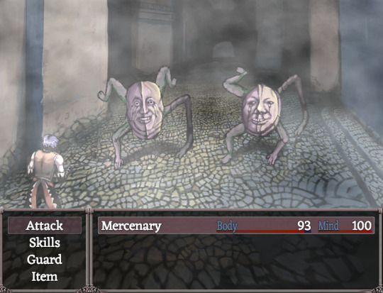
God, this game. This game hates you on a mechanical level. This game will put the fear of god in you every time you get further away from a save point, every time you think "yeah I can take this enemy no problem" and next thing you know you are eating dinner with your creator; every time you think "oh neat, a new area" and proceed to eat shit and die for the next hour because you just lost a fucking arm and a leg and can't outrun your enemies anymore. And you refuse to start another run because you are just that stubborn, and you will suffer through the consequences of your early game actions. No this is not my personal experience what are you talking about. It is a bleak and grotesque horror rpg game, made with RPG Maker. You will accompany whichever poor soul you choose as your playable character in their trip to the dungeon of Fear and Hunger, for whichever the reason their story presents. Should you play this game? Be mindful of the triggering content, first and foremost. This is a dark game, and it does not shy away from depicting it. From enemy designs, gameplay mechanics, to the way of worshiping gods, to specific game overs, and so on. Its hard and you will feel it unfair. This game will not hold your hand, and when you think it does it will put its teeth around your wrist and tear it off your body, its saliva infecting your wound with poison and leaving you to rot. I love this game.
7) Clash: Robot Detective
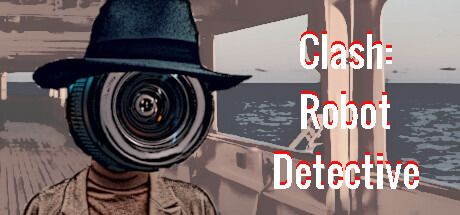
Fun fact: I never look into games that much before playing them, which in this case led to the asssumption that I was going to play a robot. So I named my character Flesh, because I thought a robot named Flesh was funny and also cool. Turns out, I ended up playing a human named Flesh. Which was somehow even funnier, and ended up becoming a pattern when I played the extras, which have a different protagonist, and I decided to commit to the bit and named them Blood. Flesh and Blood, my favourite human beings.
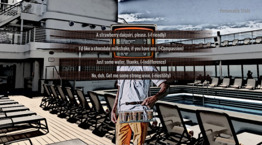
You play as the extremely new assistant to our titular detective Clash, who asks for your help in solving a mystery taking place in the cruise ship you are vacationing on. Depending on the different dialogue options, you can play as the good or the bad cop, and Clash will balance you out in this act, which leads to different and interesting outcomes.
I have to say, the artstyle drew me in. I am a sucker for these types of illustrations, and I'm glad that the writing and story were as good. I was invested not only in the case, but also on Clash as a character, who I will longingly stare at from a distance because I respect his boundaries and preferences.
Keep on going, you majestic robot detective, I can't wait to see what kind of trouble you get into in the future.
8) EXCUSE ME SIR (Demo)
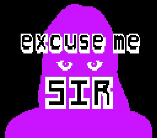
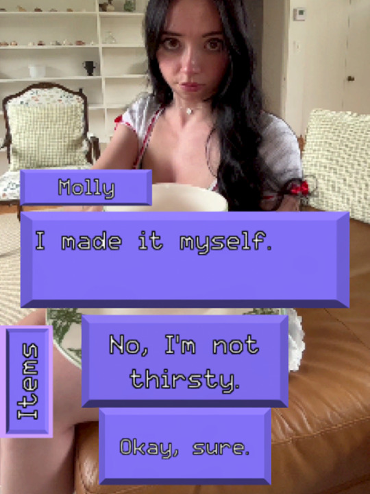
Long awaited (at least for me) DEMO from Airdoft (creator of FAITH) and , and it all came about because of her videos and a single tweet.
The demo is short, but it shows the great potential of what a game like this could grow into, and I cant wait to see it become a finished project.
EDIT: Sadly, the game has been canceled, so we won't be able to see this concept grow into a finished game. Hopefully it'll inspire others with its style and presentation.
9) (Don't) Open Your Eyes

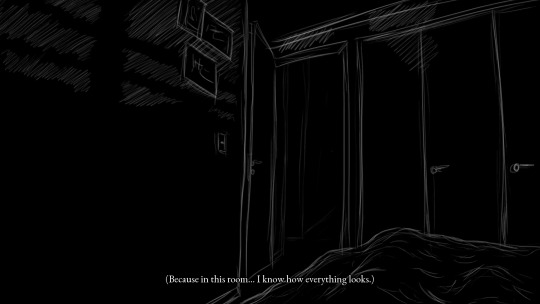
In this room, you know how everything looks. Does that include your midnight intruder?
This entire VN is a one sided conversation between you and something that may or may not be there, shaped in the darkness of your closed eyelids. Both of you are gripped by the same question, the intrigue eats away at you. Your imagination runs wild trying to give shape to this anomaly, and it is so desperate for you to find out.
There is only one way to do so:
Don't open your eyes.
10) Fortress
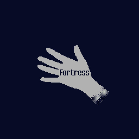

Man, short and effective is the way to describe this one. It has such a fantastic grip on atmosphere and tension that I admire. It truly captures the feeling of returning to a place where an impactful childhood memory took place.
Using the same location and making you play through it at different times of the story was done so well. I was ready for things to happen just because they did in the past, the first half of the game, and expected them to happen again.
In the past, I was ready to shoot on sight. As an adult, I couldn't bring myself to pull the trigger, not even to see if I could. I don't know why, months after playing it, this little thing has stuck with me the most.
11) The Shadows That Run Alongside Our Car
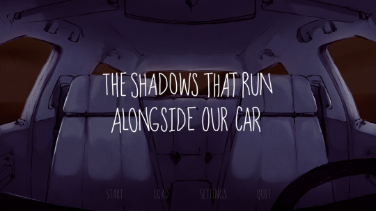
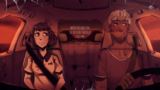
You leave the gas station with a stranger, either on the wheel or sitting next to you. The silence hangs heavy between you two, the road is empty, the sun is setting, and the end of the world is now. Time to break the silence, you get to choose who. In this visual novel you get to decide how this conversation at the end of the world unfolds, a game of perspective between our two characters, who may hide certain details about themselves or reveal them, if they give you the choice. After all, what would you gain by hiding a secret in this car ride? It could be your last.
12) Attack of the Murder Hornets
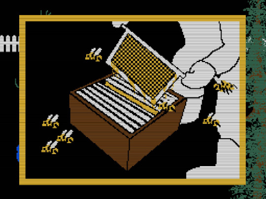
Hornets are evil, evil things of nature. They are coming for your bees.
They are coming for you.
BE READY
13) Baldur's Gate: Enhanced Edition (+ Siege of Dragon Spear)
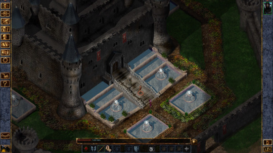
There has to be a saying that goes: If you can't play the game everyone is talking about, go play every single game in it's series that came before it. Because that's what I did, even if I already wanted to play the Baldur's Gate games before the third one came around. But it was definitely a good push. The game's story has a much smaller scope than I expected, or maybe that's just how I feel now that I am currently playing the second game, but I think it works in its favor.
I think the reason I don't have much to say, besides the fact that I had lots of fun, is because my head is still processing Siege of Dragon Spear (with its much bigger scope) and what I am currently seeing in the second game. What all I'll say about that one now is man, what a way to start a sequel.
My suffering came mostly from the ruleset used (which I was unfamiliar with) and the fucking paralysis spell. Fuck it. ALL MY HOMIES HATE THE PARALYSIS SPELL.
In terms of characters, I didn't end up using most of the available NPCs in my party, even if I made the effort of recruiting them all, mostly because the ones I had I liked a lot. I liked Rasaad and I was pleasantly surprised he had a romance in the expansion AND the second game, which I am enjoying a lot. Jaheira and Khalid never left my party, same with Imoen who I kept treating like a sister because come on, the setup of being raised in the same city since birth and being childhood friends was perfect. I love Baeloth an unhealthy amount, he is so perfect in the expansion I made an effort to keep him in the party even if I had high reputation. In the expansion my party was insane looking. Like Oh yes, the Hero of Baldur's Gate, her monk companion Rasaad, Jaheira and... a gnome nobody knows why he is around, Baeloth the entertainer I guess, and a GOBLIN? At one point I did switch Jaheira for Viconia, only because Baeloth was one point of reputation away from leaving the party. I swear, the grip that man has on me. The story from Viconia's POV must be so funny: She gets recruited and instantly tells me she is fucking off, gets recruited again only because I dont want an idiot entertainer to leave; and then when she is about to be killed, who comes to her rescue? THIS DUMBASS. She must be like: GOD, DAMN IT, I CAN'T ESCAPE THIS BITCH. I am her surface curse.
My closing thought for this game is: Whoever made the TOSC maze... Who the fuck hurt you? Same goes for whoever made that final boss. WHY?!
#game recommendations#mothmen 1966#roadwarden#exhibit of sorrows#the firebrand#the firebrand game#royal alchemist#fear and hunger#fear & hunger#clash robot detective#excuse me sir#(don't) open your eyes game#dont open your eyes game#Fortress game#the shadows that run alongside our car#attack of the murder hornets#baldur's gate 1#baldurs gate#baldur's gate#lilium post#game recommendation#game review#sorta?
21 notes
·
View notes
Note
Is tumblr an ok-ish place to just like, info dump about my world and it’s lore, or is there a better place I could do it?
Tex: You can put anything on tumblr so long as you don’t violate the Terms of Service - I’ve seen moodboards, essays, sketches, stories, bullet point lists, gif sets, audio clip compilations, and pretty much anything that the various posting formats can support.
It’s not necessarily something like a catch-all or one-size-fits-all, but I think it helps to think of various websites as boxes with different utilities, much in the same theme as scrapbooking parts. For example, tumblr supports images well, Archive of Our Own (AO3) supports text well, and have the shared similarity of ability to tag posts or works for organizational purposes.
The internet is one, very useful, format to worldbuild, because it has the ability to utilize tools such as hyperlinking and digital archiving. In a previous post, there is a detail about how to organize a digital file structure for one’s worldbuilding to keep track of things, available here. One practice I have noticed among some worldbuilders is the blend of digital and physical spaces; or rather, online and offline.
Offline digital worldbuilding is such things as word documents, saved images, and programs that perform the function of notebooks that don’t require internet access and/or an internet browser. This is frequently supplemented by personal archiving habits, such as a dedicated peripheral drive like a USB, and regularly copying over digital files onto that device whenever significant changes are made or else on a schedule. This is useful for happenstance events like computer failure, websites going defunct, or related issues.
Offline physical worldbuilding is such things as notebooks, drawings or paintings, boxes of ephemera, scrapbooks, and physical copies of the canon media (if the worldbuilding has its roots in fandom). This can include CDs, DVDs, photos, and craft items such as textiles or sculptures. For people that have had difficulties in maintaining digital records in particular, physical copies are often a good method of maintaining linearity of thought - i.e. printing out a Google Doc and putting that into a folder.
Because there’s so many different medias and platforms you can use for worldbuilding, it’s more a matter of which suits you best and for which purpose. Tumblr is a useful component of a worldbuilding methodology portfolio because of its capability to create dedicated posts that can be mixed media, tagged, and archived if one wishes it. As of this time of posting, users cannot currently download an individual post, but it’s impossible to predict a website’s roadmap as it adapts to the changing needs of digital spaces.
One thing I would note is that tumblr need not be engagement driven, in the same way other online spaces tend to be (e.g. twitter). You can make a blog, add restrictions in the form of locking viewing to only logged-in users or adding a password to view the blog, and with the recent update (as of this posting), users can also toggle preferences on how public a post is and also ability for others to reblog a post.
If you’re looking for engagement, this is fuelled by reblogs, which generally depends on the blogs that you follow and interact with, usually by reblogging their posts and also by talking to them. That is, however, a subject of micro-cultures and subcultures therein, which becomes a little bit off-subject to your question and not really within our domain.
30 notes
·
View notes
Text
Angstober 10: Can't Go Home
Ugh, I'm so behind at posting these. 😅 I've been producing flash fics fairly reliably, but getting into the right mindset for editing them is another matter.
Anyway, this is another instance at poking at that one ever-growing plot bunny. Links to previous installments: [1], [2], [3], [4]
Alita longed to go home, and she didn’t even know what she meant by that.
The capital steered up a whirlwind old memories. The kind of memories she’d firmly believed were her sister’s domain. She had been, after all, too young when she was spirited away to the outskirts of the kingdom. How could she possibly retain anything but the vaguest impressions of being a babe here at court, hiding behind her mother’s skirts or bouncing on her father’s knee? Surely every image that ever flickered in her mind was at least halfway a product of her imagination.
And yet now that she walked the marble-lined paths of the indoors garden, she was struck by the familiarity of it all. She’d round a corner, and recognize something: a red-barked tree with its leaves eternally gilded, or a peculiar formation of rose bushes. A scent in the air. A particularly slippery patch of stone under the soft soles of her shoes. All of it felt like something she’d once had and could never get back again, even though here she was, existing awkwardly in the middle of it all.
Perhaps it was her imagination. After all, it had been a decade. Even more than that. It seemed inconceivable for the palace to spend all that time suspended in limbo, awaiting her return. Within this buoyant heart of the kingdom, changed happened rapidly. Styles went out of fashion as swiftly as summer butterflies back in Longhills changed their colors. It must be true for gardening as well as hairdos and dresses.
Longhills. Another home she painfully missed. The comfort of her uncle’s mansion, the predictability of her days there. Long evenings by the fire. Books and chess. Helping the old cook, Ghilta, around the kitchen even though she wasn’t supposed to. Feeding seeds and fresh peas to the starlings that lived in the garden right outside her room. Planting gardenias and lilies. Finding purpose in every moment of the day.
Here, she had nothing to do except follow her uncle around—and even that wasn’t always an option. Like now. He’d brought her here to the gardens so that they could discreetly observe the courtiers, then find a secluded place to discuss the recent developments. However, they’d barely stepped inside when a servant called after them, an old man with a bushy beard and the King’s personal insignia plastered proudly over his blue livery. He’d spoken to Uncle Rythan in a whisper too low for Alita to hear and pushed something into his hands before disappearing behind a wall of vibrant succulents. Alita watched her uncle grow tight-lipped and still.
“It won’t take long,” he had promised her, neglecting as usual to explain what it meant. “You just take a walk here, all right? Keep your eyes and ears open and make sure not to wander too far from the gates. I’ll be with you anon.”
At least an hour had elapsed since, if her inner clock could be trusted at all. Alita had done her best to follow her uncle’s guidance, strolling back and forth along the same semi-circular path, except she must have got lost in thought and taken a wrong turn at some point, because she could no longer see the entrance. Everywhere she turned her gaze, there were trees and blossoms, hedges and complicated arrangements of rocks. She heard no voices and saw no bejeweled fabrics.
Helplessly, she looked around once more. Now how was her uncle going to find her? The entrance was in the western part of this fake park, she remembered that much. It did little to help her, though. If this was a real garden, she could have relied on the position of the sun and the natural growth patterns of plants to orient herself. Here, it was useless. Everything was artificial. Whatever light filtered through the vaulted stained glass ceiling got hopelessly distorted by the kaleidoscopic mosaic.
What a stupid fool she was, to get lost in what was essentially a single big room full of plants! Alita drew a shuddery breath, wrapping her arms around herself. Uncle Rythan had misjudged her. He should have brought Norra. Her sister would take to court like a bird to the sky. So what if she would be a little distracted? Uncle Rythan didn’t need as much input as he’d claimed he would. They’d hardly been talking at all this entire week.
I don’t know what I’m doing, she admitted to herself with a sinking heart, and the thought applied to so much more than her current predicament.
The paths and the trees that had felt so achingly familiar a moment ago were now a strange maze, a trap closing in on her. Alita gulped. She needed to retrace her steps—an obvious, sane choice—but she’d been stuck in place for a little too long and she didn’t know whether she should go left or right.
Norra would go for a third option. But there wasn’t—
Wait. No. There was.
Between two swirling flower beds, there lay another path, a narrower one leading deep into a copse of unnaturally lush lilac trees.
Weren’t there lilacs in front of the entrance, too?
It was this, or do nothing. Alita squared her shoulders and stepped forth. The lace-trimmed hem of her dress kissed golden sand instead of marble; her silk-clad feet drowned in the softness. Was this passage even made for the noble guests’ walking, or was she intruding upon the servants’ territory? How absurd was this thought?
The trees closed rank in front of her, branches covered in thorns that lilacs weren’t supposed to have. She pushed one aside, then another. A thorn caught on one of her narrow sleeves, digging deep into the seam and her goosebump-covered flesh underneath. Alita yelped.
“Who goes there?”
She froze at the sharp male voice, then hastened to step back. Too late.
The branches unfolded in front of her, as if by magic, revealing a small clearing. Two men stood there, intimately close together. One of them was of a smaller height than average, with a nondescript face and shrewd eyes. The other...
Alita barely suppressed a gasp.
“Your Highness.” She fumbled with her skirts in the best version of a formal curtsy she was capable of. She suspected it wasn’t a seemly sight. It never was with her, no matter how often she practiced. “I’m so incredibly sorry to intrude—”
“I’m certain you are.” It was a wonder no leaves shriveled or frosted over from the chill in Prince Cassar’s voice. “I would expect nothing less from a court guest devoid of any rights or privileges, intentionally caught in the act of spying on the heir to the throne.”
“I wasn’t...” She made the mistake of looking up. Under the weight of his glare, the words withered in her throat.
What had she got herself into?
#warden's random scribbles#writeblr#original fiction#snippet#angstober2023#day 10#fantasy#court intrigue#homesickness#writers on tumblr#my writing
5 notes
·
View notes
Text
Behind Time's Shawl: Exploring the rhymes and reasons of Mesoamerican Day-Signs
So sometime ago, it occurred to me that, perhaps, the signs of the Meso calendar could be traced to something geographical, cosmological even. That's not a new idea, the charge of certain "landmark signs" has been well-known for a while now, with sources as early as the Relación de Meztitlan describing some of the matter.
But perhaps the other signs have a story to tell, too.
This's gonna be a real simple post, much less dense. That's mostly because, as the tags indicate, this is the outtake of an effortpost. Perhaps eventually I'll get to formatting it here or on my neocities, but for now this will serve as a side-blog for explaining and elaborating on a few of the things I write about, or my diverse whims.

The Maya Rhombus

Here delineated, the relationships glimpsed by my hand. The vertical lines denote conceptual opposition, i.e. things complimentary yet inverse, while the horizontal ones instead connect causalities, sets of concepts that follow from one another.
Going clockwise from the top and following the vertical arrows, Ik' (wind) can be said to repel Eb' (rain), as it sweeps clouds off the sky.
You'll notice I'm skipping the second (Ak'b'al-Chuwen) and third (K'an-Ok) columns to the previous pair's right; I cannot provide much description here, other than the vague suggestion that those concepts might be connected in a similarly oppositional way. The Maya area is far from one I'm well-versed in.
Next comes Chikchan (snake), strongly related to fire through K'awil and the Vision Snake, made from smoke, and Muluk (water). Here follows Kimi and Lamat, death and rabbits; the glyph for the latter can be interpreted as three corn kernels, seeds of life, and rabbits generally are known as quick-footed and, primordially, prolific, lively, active.
To the left of Eb' comes B'en (reed) and its pair, Imix (lily or crocodile, wrongly glossed in the image as "stone." oops). Reeds stand tall, with teeny flowers, while lilies are low to the surface and display grand beauty, though less foliage; were it to be crocodile, the opposition would be between that which is static and that which moves, plant and animal, water-air and water-land, for reptiles are the skin of the world. Next, Ix (moon) and Ajaw (day-sun). There's not much more I need to elaborate here. Men (eagle) and Kawak (storm), carrying similar connotations as Ik'-Eb', though with the additional thing where eagles are connected to the sun, to the wind and clear skies; calm, one could say, and rage.
I also skipped Kib'-Ets'nab'. Manik' and Kab'an haven't vertical parallels due to their placing at the left and right corners.
Horizontally, top-to-bottom, Ajaw-K'an (corn), sun and growth, light and plantlife. We skip over to Ets'nab' (knife)-Kimi, the blade and its outcome. One final skip is made to Kib' (vulture)-Lamat, the herald of rot and death which consumeth the herald of life and growth; Kib' has also been interpreted as "owl," which could be taken as further support here. Finally, Men-Muluk, the free skies and the earthly waters — I realized this while finishing this section, so this squiggly line was not included in the diagram.
Ik' and Eb' similarly don't have horizontal pairs, as they're at the top and bottom corners. I skipped Imix-Ak'b'al, Kawak-Chikchan, Kab'an-Manik, Ix-Ok and B'en-Chuwen, for that same lack of knowledge and/or late-night brain. It happens.

The Central Mexican Rhombus

The axes are similar here: vertical lines are complimentary opposites, the horizontal ones are relational — that is to say, the paired signs share a domain. As before, Reed and House haven't a horizontal pairing due to their vertical cornering, while Flint and Rabbit have the converse situation.
Vertical relationships are as follows, going from leftmost to rightmost: Earthquake/Rubber-ball and Rain as, well, the movement of earth and that of water, or that of the sun and that of the divine liquid; Vulture and Flower as rot and blooming and growth, consumption and production; Eagle and Reptile/Knife as, uh, bird and reptile, sky and earth, flight and ending; Jaguar and Wind as Teskatlipoka and Ketsalkoatl, dusk and dawn, night and day, dark and clear smoke; Reed and House as monte and city, perhaps as Chichimec-Toltec (the former are known, at times, to wield decorated reed staffs); Twistgrass and Lizard as starvation and food, cold and warmth; Monkey and Snake as forest and dryland, canopy and ground; Dog and Skull/Death as flesh and essence, change and staleness; Water and Deer as wetness and dryness, reaching below and growing skyward.
Horizontal relationships from top to bottom, in turn, are: Jaguar and Twistgrass as darkness, tamelessness; Eagle and Monkey as exaltation, abundance and fortune; Vulture and Dog as passage, the Eaters of Filth, those who return to the earth that which is dead; Earthquake/Rubber-ball and Water as cleansing, as movement eternal; Flint and Rabbit as birth and death, the cutting winds and the fast winds, the stone-hard earth and the soft earth; Rain and Deer as movement, as running, nourishing that which is in drought; Flower and Death as transformation, as constants of life, as each nurtures the other; Reptile/Knife and Snake as, well, Reptile and Snake, as the skin of the earth; Wind and Lizard as living, as changing, growing, metamorphose, as shedding the dry skin for a new shape, or shedding the wet skin for a dry one.

Aight that's that. No proper sources this time, 'cause half of this is more of my own understanding of the things, though the foundations do have the following: The Central-International sign lists are from a collection of codices, notably the Magliabecchiano, Telleriano-Remensis, Huichapan/Antämatsits'i (and, if you really wanna go there, the Florentinus), while the Maya one is from wikipedia Miller and Taube (1993: The Gods and Symbols of Ancient Mexico and the Maya: An Illustrated Dictionary of Mesoamerican Religion). Both contain some associations.
#mesoamerica#effortpost outtakes#semiotics#oh wow. something historical for once!#what marks the occasion?
1 note
·
View note
Text
GIGS No519 Interview Toshiya [Bass]
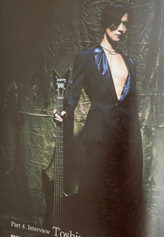
Despite the hidden gimmick elements in the new single “Oboro”, which brings to the fore “simplicity” and “clearness”, Toshiya’s bass sound has a strong presence. With his words, we are going to start the second half of the solo interviews.
“[Oboro] is a song that holds both DIR EN GREY’s essence and novelty. For me, rather than that uniqueness and novelty, I felt this is going to be the core song of the album.”
Notes before reading: This is Toshiya’s solo interview from GIGS No519 June issue released on April 27th.
You can buy the magazine at Amazon Japan. Feel free to correct me if you spot any mistakes or any confusing parts. Links or credits to this post when the content is reposted or captured in other SNS is appreciated :) ----------------- *Toshiya’s interview comes after Kaoru’s, Die’s and an analysis of the latest gear, that’s why in the introduction of his interview the “second half” of the solo interviews is mentioned.* Text by Yukinobu Hasegawa Photos by Reishi Eguma. -You were already composing and arranging songs for the new album and from that, “Oboro” was first announced as a single. What kind of mindset did you have when you tried to move on to the next album from the previous one “The Insulated World”,released in 2018? T: At the beginning, I didn’t have any specific image of the album as a whole. -I think you want that (image) to appear naturally while you are doing the creation work. T: That’s right but as I feel like I’m always making songs, whenever I start, I only have the mindset of “let’s make something good”. -The songs you composed (from early stage) have not been released to the world yet but, what kind of songs did you make? T: Surprisingly, simple songs. Not very detailed. But I think it depends on the song. I started writing songs thinking I wanted to make something different from the previous DIR EN GREY, but there were some parts that seemed too different for me. So, I feel like I'm still searching for the direction of them. -Looking back at the various songs that you’ve made in the past, I feel like you tend to prefer an avant-garde* approach. So, I was a little surprised when you told me you were working on a simple song.
* Avant-garde is a tend for music that sounds nothing like the music we're accustomed to, experimental, considered to be at the forefront of innovation. T: Ah, I see. But basically, I think I'm a simple person. I've made songs that feel avant-garde but it’s just that such songs were easy to be accepted/used (by the band). I don't know the specific reason, but I think it's probably because the range of the band will be expanded. However, many of the songs I make myself are very simple. -Even if you say "simple", I think people feel differently about it. For example, Shinya also says his drum playing is “simple" but it's actually very difficult. How does that simplicity that you mentioned feel for you? T: That's right…..I'm wondering how to describe it, but to put it simply, it may not be something very DIR EN GREY-ish. I think many of the simple songs I make are like that. -What do you think that is “DIR EN GREY-ish”? T: Our band is probably "heavy" or "intense"…. Another things that is often said (about the band) is “complexity”, I think that’s the image of the band. With that in mind, the songs I make aren't very DIR EN GREY-ish. Of course, when I write a song, I'm aware of that. -Do you dare to make something that it’s far apart from those ideas? T: It’s the other way round. I’m not trying to do something close to that, but I’m like “I have to take it in the direction of DIR EN GREY a little more". But from that point on, I started thinking, "How about getting too close?”, "It's more interesting to be in a slightly different place." Well, I might just think those things on my own (laughs). -Are the avant-garde songs born from those thoughts? I think musical input and stimulation are also important when you are composing. In 2020, we were in a situation in which you couldn’t do many public activities but, how did you get that input during that time? T: Basically, even with this corona situation, there are some things that haven’t changed much. If I had to say something, I can spend more time on composition and production as there are no tours or live performances. Regarding the input part, it seems to have changed, but I feel like it hasn't changed. Besides, I don’t think it’s something I’m conscious about so, I haven’t changed anything in my music because of Corona. -Last year in August, “Ochita koto no aru Sora” was released in a digital format but, I think this song has a complex pattern in the development of the next step. What was in your mind when you were arranging and recording this song? T: Riffs are also the main melody of the song so I basically listened to the guitar riffs and arranged it so I could put my own play in some parts. In terms of sound making, there isn’t much change. Making in a basic way the feeling of my favourite distortion, it feels like mixing various things there. -For the past few years, you've been actively experimenting with various bass effectors every time you record, but have you tried several of these in the "Ochita koto no aru Sora" recording? T: Basically, I don’t remember which one I used anymore (laughs), but the basic system hasn’t changed, the head is an ampeg cabinet from the 70s, I think it was SWR. In the recording of the previous album "The Insulated World" the bass I used was also a dingwall one. That bass can be used for almighty (pedal). *1.A bass cabinet is the box with the speaker. 2.Ampeg is a manufacturer best known for its bass amplifiers. 3.SWR Sound Corporation is a specialist manufacturer of bass guitar amplifiers, preamps, speaker cabinets, and acoustic guitar amplifiers. 4. Dingwall Designer Guitars is a canadian manufacturer of bass guitars. 5. Almightty is driver pedal for bass.
- “Ochita koto no aru Sora” was a song with a positive message. Did you find a new direction as a band giving shape to this song?
T: There might some different aspects now but at that time, it may not have changed. I don't think we can completely overlook that, so I can't say anything about it. However, “Ochita koto no aru Sora” itself was made completely to be a single. That's why there may be new things, but surprisingly, I have a strong sense of putting out what was inside us in that way. In what way is it the opposite? Does it feel “new”?
-There are various elements, but I feel that each one is like DIR EN GREY-ish. However, it resonates very much that the lyrics leads from a negative perspective to a positive one.
T: I see. Regarding the lyrics, I think it’s a continuation of the taste of other songs we’ve done so far, but I don’t know because I haven’t asked. However, although the flow of the lyrics are not the same in content, I felt like it was written from a close place.
-The song that follow this one is the new single “Oboro”. Kaoru wrote the original melody but, what was your impression when you first listened to it?
T: I don't think it's much different from the finished form in terms of feelings. The intro had this kind of atmosphere from the beginning. I think it's a song that holds both DIR EN GREY’s essence and newness. However, I personally felt that "this is the core song in the album" rather than being unique or new. As a result, “Oboro” became a single, but at first it wasn’t written with that purpose. We suddenly talked abour releasing a single and after that, as we all agreed that it was a good song for that, we decided to choose it as a single.
-From what part of the song did you feel that it was going to be the core of the album?
T: I felt that this ballad-type atmosphere and feeling really stands out in the album. Because of that, we decided to release it as a single, but we haven't released many singles like this, so I think it made a good change.
-The fact that you feel that a ballad with a melody it's going to be the core of the album….does that mean that the other songs are the opposite of it? It seems to be quite an atmosphere where this amazing song was born! (laughs)
T: Well, I can't say anything about that because not all of them have come out yet (laughs). However, it's easier to make a slightly up-tempo songs, so I wonder if there are many songs like that for now. Even if I actually make a song, I don't know if it will be included in the album, so I can't really say anything about the direction of the album or the feeling of the songs. However, "Ochita koto no aru Sora" was made to become a single, so there are a lot of parts of it that hit the target. And as for "Oboro", I felt that it was meant to be release as a single, but also that it was meant to be kept for the album.
-For example, do you change the arrangements and the bass approach if it's an album song or a single song?
T: Yes, it changes. It's completely different for me if is going to be a single or if it is going to be a song for the album. Even if I make the original melody, it’s different on how much time it takes. Singles are harder to do. You can work more relaxed if it is a the song for the album. For singles, I feel that the part I am aiming for as a bassist is very strong at the time of elaborating the arrangement.
“If you think that everyone has slowed down in many ways, I think you can start running again. I think it's better to act than to think. So, I'm looking forward to the future.”
-Did you do a lot of trial and error in your part when you made the bass arrangement for "Oboro"?
T: It’s really a minor part. It feels like the details are boiled down when it seems to be a bass phrase like that in a rough flow. The bass in the demo of the original song had many root-playing (basic) phrases so, how to elaborate them from there? what do to with the cadence? However, “Oboro” has a bass line that snuggles up to the song, I think this phrase has the strongest awareness of song melody.
-While focusing on that sustain-based roots playing components, some bass phrase will come up when you are doing the arrangements but won’t turn out very showy. And when it comes to the ending of the song, it will show fierceness while increasing the distortion of the sound. I felt it was a carefully selected phrasing.
T: I think it’s easier to hear it at the ending of the song, but that distortion is actually there during the whole song. Not only the ending part is distorted but also the beginning. However, when all the instruments came together, I don’t think that distorted feeling could be properly heard. Even if it's distorted that much, surprisingly, it goes well easily. I usually have two patterns at the time of recording. For example, even if you use the same distortion effect, the distortion is applied with a little shallow sound like a hunting sound. So, this time, it was a way of finding what I felt comfortable with when it got mixed with the sound of the band.
-So the reason why you can’t hear that distortion in the first half or the middle of the song is because it got completely blended once the sound of the band got together?
T: That's right. I think there is a perception that if it is distorted, the sound will inevitably be drawn into it. However, if it's distorted that much, it gives a plump low feeling and you can see the phrase. It's simply because we don't stack as many guitars as we used to. Sometimes the sound of each instrument can be heard firmly, so the approach can be focused on what you want to hear. To put it simply, I think it's a big thing that the direction of the band has become simpler. So, in recent years, I think the balance of the band is very good at the time of put together each member’s part. I think that vocals are especially attractive in "Oboro".
-Kyo is very fast adding the lyrics, I’ve heard that he finished recording his part before the instruments (recording) were done.
T: That's right. "Oboro" already had the vocals done at the stage of recording the bass. However, although he recorded it first, in the end this part will be the last one. After all, it seems that there are parts he wants to record again once the other parts (instruments) are added. However, even if it is not the final form of the lyrics, if they are already included, the nuance of the phrase will change. Maybe it’s the same with the other members. I think everyone ends up arranging their parts for the lyrics.
-So, the idea was to keep the bass of "Oboro" as simple as possible?
T: Whether you're playing or listening, it was a simple form that seemed comfortable. I think a phrase that requires a lot of work is also good. If there is a song that suits that idea, I wonder if I should take a laborious approach. In that aspect, I thought the dynamic of “Oboro” feels as pleasant as possible. However, I was allowed to play a bit with it. I think the proportion and the sense of balance are also good.
-Did you choose to record some takes while changing your approach?
T: "Oboro" was decided by the current phrase from the time I did pre-production work at home.So, when I recorded in the the band's pre-production room, I just made a few minor corrections when I made the actual recording. As for the mix, regarding my part, it was a good feeling from the beginning
-Neal Avron has been appointed as a mix engineer this time. Did his mixing work significantly change the nuances of the bass sound?
T: It has changed. But the biggest change depending on the engineer is the sound of the drums. More like, I feel that the personality of the engineer can be understood in this aspect. Personally, I think the vivid and deep sound of the "Oboro" drums is good.
-A remake of your song "T.D.F.F" is recorded as one of the couplings. What kind of mindset did you have approaching this song including the arrangement?
T: As always, I thought about the phrase from the perspective of what it would sound like if it were done by my current self. When we do a remake, I listen to the original version of the song to confirm what I was playing at that time. Sometimes it's interesting to discover that I was playing it live with the wrong idea(laughs).
-The person that you were at that time is brought back as well?
T: There are times that happens when we rethink our approach. It was like this at that time, but I think it's different to do this phrase now, or to do it with a different feeling. Some of the old songs are due to youth, I have a variety of knowledge and experience now. So, there are times when I change to an approach with a completely different interpretation, and there are parts where I want to play faithfully to the original. For example, keep faithful to the main phrase that would change everything if you changed that. At the time of "THE UNRAVELING" (released in April 2013), I had a strong desire to change everything if I wanted to remake it, so I changed it completely, but in recent years I have been thinking about the original carefully and the idea is to put my current sense into that. Because when you're making a song, it's your song, but it's not only yours. In that case, it’s better to capture our thoughts and the memories and the thoughts of the fans together in order to shape that song in a good way. If you want to make a bold change, I think you should use that idea to create a new song with it.
-The other coupling song is a live track from the concert without audience at Meguro Rockmaykan. What do you remember about this?
T: It's one of the first stages I've stood on since I became a member of DIR EN GREY, but the Rockmaykan with no audience felt strange. When the live starts, there is only one thing to do, so it's not much different from usual. But I’m not sure if there is something extra in it. It’s not about the call and response (from the audience), I think that the tension inside me is different depending if there are fans or not. After all it is more interesting to have audience. It can also inspire you. I think that such a form of live is also a possibility in times of Corona, but it doesn’t have to be like this every time. However, I learned a lot from this new experience with this new way of expression. Besides, it was a confirmation that there are various things that can be done in a situation like this.
-After this, there is a concert with audience on May 6th. How are you feeling now?
T: I'm looking forward to it and I'm happy. Above all, I am very grateful to be able to perform in front of the audience. Something that used to be normal is not normal anymore, so I wish I could do it with a new feeling.I think the world has simply changed due to Corona. Until now, everyone was running, and I think there was a huge difference between each person’s position. However, because it's all gone, to put it the other way around, everyone restarted from the same position. How does each person perceive that? Of course, the negative effects of corona are huge, but just thinking negatively does not change anything. So, if you think that everyone has slowed down in many ways, I think you can start running again. I think it's better to act than to think. So, I'm looking forward to the future.
190 notes
·
View notes
Photo
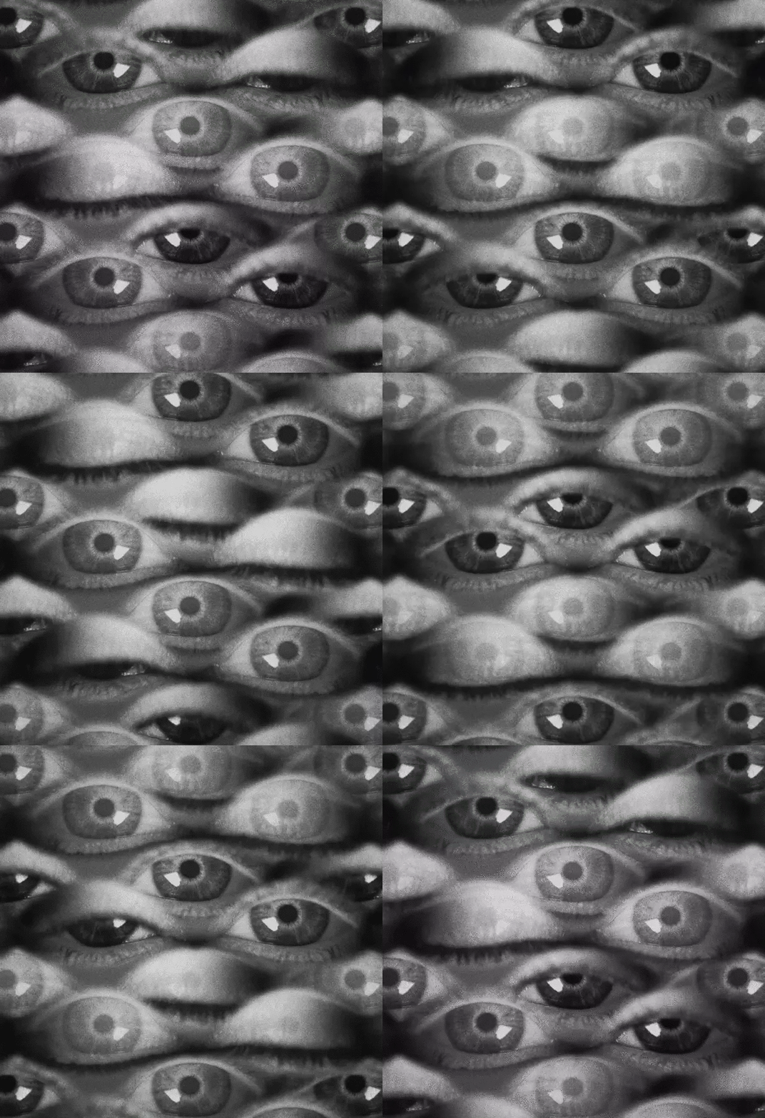
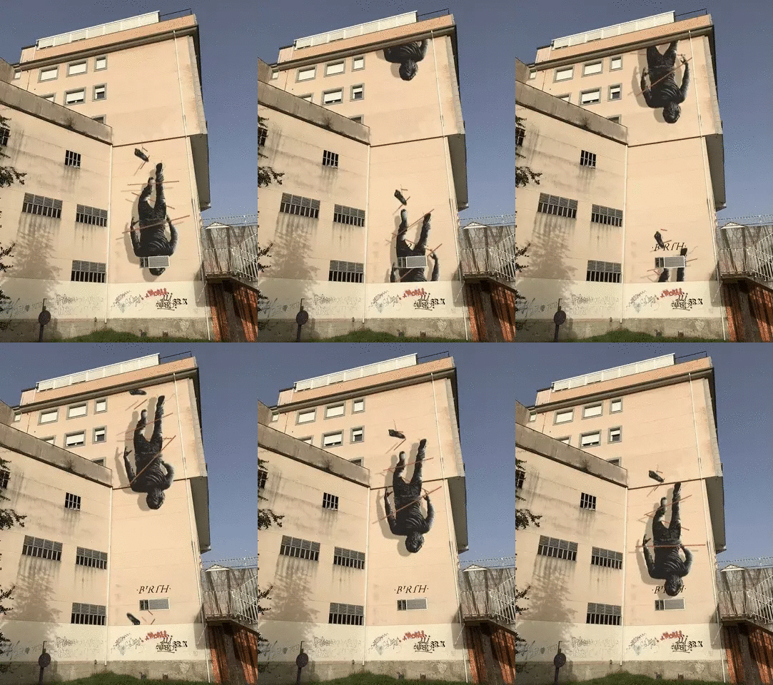

Interview with my friend A.L. Crego
I have not met A.L. Crego. I have not spoken with him on the phone, in fact I do not even know what he looks like. But I can confidently call him my friend. Three years ago when I started this blog he immediately disagreed with me in the comments about things I was writing and I loved it. As a person putting ideas out there, you treasure things like that....because you know someone cares. We have had many back and forth discussions over the years....if we had lived in Paris in 1911 we would be having arguments at La Rotonde (not to compare either of us to Picasso).
A.L. Crego is a motion artist who does a wide variety of things. He has now become a very visible and active figure in the NFT Movement. He recently completed a large and very successful project in which he animated the work of a number of well know street artists on the building themselves, something he has done for years. His Tumblr page is a good place to start to see his work, which is largely surrealist in nature -- another Spanish artist following in the footsteps of other great Spanish surrealist artists.
---------------------------------------------------------------
How long have you been creating gif art?
In a conscious and intentional way since 2014. Previously I haven't pay too much attention on one hand for its common use that was mostly ads and funny little videos, and on the other hand because it was a 'standard' format we accepted as something part of the web so I never stopped to analyze its potential. The key point for me was about 2010-2011 when the concept of 'Cinemagraph' was brought to life just giving it a name. It's format is .gif but its characteristics are different so I saw there the midpoint between photography and video, which gave born another format of art.
Art mutates when a new format appears. I was using and studying this format since then but it wasn't until 2014 that I decided to publish some of them.
What is your background?
In general terms, bachelor, 2 years of stone sculpting and two attempts of photography and audiovisual mediums. I say attempts because I gave up both of them as I was feeling that I was looking for something else more than studying all the previous history, style and isms, which is nice to understand where everything comes from and to be aware what are the key points on the history to use as reference, as a map. But in some way I felt limited as I was using digital tools since I had my first computer with 14 years, and I was being taught things I learnt by then. Even more in this times we are living where we are 21 century people, been taught by teachers from the 20 with 19 century methods.
A constant line that feeds my background is literature and music overall and later Street Art, next to more temporal interests as everything related with mythology, alchemy, history, psychology, neurology, biology, human condition in general... I don't have studies buy I'm a studying guy!
I always like to highlight that all these years that internet got strong and social networks appeared, I decided voluntary to be out of them. First reason was to keep my privacy safe in a growing world where it seemed that some "curtain" felt and everybody accepted that intimacy was now 'ex-timacy' and correct to show their private life, (this shocked me). Another reason was about the psychological effect that social networks were having on people I had around and everywhere in general. I started to notice patterns and "waves" about series, aesthetics, styles, and I was seeing clearly that if I go there, I will become permeable to all this "Amniotic Culture" I was trying to avoid.
This fact of being far (but study them closely) helped me a lot about researching and developing my own ideas and style, for the mere fact that I was using all this time and attention Social Networks require, on drinking from another sources. The B-side of this is that I was 'out of the radar' of mass people as this social networks are designed to live inside them. My idea of internet and spreading ideas is not in this way.
Where do you live and work?
In the north west of Spain, Galicia. Now due to Covid I travel less but before it, I was working and traveling many places as I only need a camera and a computer. This allows me move to work anywhere.
Do you think that animated gifs are a new art form?
I think so, despite the fact that the format existed since 1987. But as every new format of art it takes its time to be considered as art. The first photographs were not considered art until many years later. Same happened with film, same with CGI. Is nice to have in mind that gif format is the last strictly digital format of the three main ones on the web: picture, video and gif. Photography has about 200 years of history, video about 130, CGI about 60. Finally gif has 33, and used as art itself no more than 10-15. In the same way anybody takes a picture of anything does not convert it into art, is the same with gifs. One thing is the format, another is the 'art'. Everybody can take a picture, record a video or do a gif. The difference is on the how, the why, and from my point of view overall, the what.
Do you think that there is a difference between pure .gif files and the .mp4 files that people post on Instagram?
The first, big and obvious difference is the format. Is not the same a painting as a picture of a painting. Here happens the same. For example, if you treat a gif with Cinemagraph technique, you are converting in picture some parts of the image, so they still remain and with the texture and totally stillness of a picture. If you convert this gif into a mp4 this still parts, despite not having motion, will convert into a video texture (noise, subtle motion in pixels, etc) so the main characteristic, among the perfect loop, is lost. Another point is that you must play a video, a gif is always running. Waterfalls are always running and this characteristic is something that is inside our human nature, we react nice to "bucle" motions as waterfalls, fire, etc. We find pleasure on this. Of course if it's a video the perfect loop is lost and the visual mantra disappear. And another key point here is the soundtrack. In a video you can use sound to enhance or give another meaning to the piece that you can't with gifs. For me this is another characteristic that give meaning to gif. For me gif is silence, the sound is generated by the motion, the melody are the details and the beat the perfect loop. You can "hear" almost every gif.
The difference between a gif and a video is the same that between a waterfall and a hose (if this works).
What do you think are the characteristics of good gif art?
For me first and overall the perfect loop. Not using it is not using the only format that has this characteristics. Of course there can be gif art that is not perfect loop, but from my point of view and in my work is a must. It's a new way not only of creating but also of thinking. Imagine an still scene is easy, imagine an A-B point action is easy. For me the challenge is about thinking an idea that is perfect looped where all the elements interact and eventually come back to its initial point. Succeed doing this is where the perfect loop appears and you are not able to find where is the start point of the action. Like a visual mantra, that it's repetition leads you inside the piece. Gif art is nice to use the power of the hypnotic movements. Another point to have in mind for me is the flow of it, the frame rate I mean. Depending on the idea and the kind of animation this should vary; is not the same fps to achieve something with flow than if you want to achieve a more 'retro' old style. Another thing is about dithering and color palette. This second one is essential to understand as it affects the final file. When we work with photo and video we are using millions of colors but when rendered as gifs all the gradients, lights and even colors will change if there is a previous understood of this point.
As summary: If motion doesn't add, change of enhance the meaning of the piece, is expendable.
I'd would like to add that I'm not really supporter of this kind of gifs generated automatically that just move a still image itself. I understand that this 'technique' is used as a tool for certain motion (I use it) but not to move a whole image. I feel the same as if somebody hold a painting in front of me and moves it randomly. If the work was born still, it must remain still. A good example of 'inner motion', this means that the motion is implicit on the image despite not being in motion, are the photographs of Cartier Bresson for example. Giving motion to this pictures for example, will kill it because it will break the concept of 'perfect instant' .
'Instant' differs etymologically from 'moment' in the motion. So, still image (painting, photo, sculpture, etc) is an instant, videos are stories with a-b point, and gifs are moments, the mid point.
How would you describe your gif art?
I usually condense it as "Visual Mantras", as the technique and the aesthetic vary depending on the idea , but in all of them the perfect loop and the intention of hypnotizing is always present.
In another terms about aesthetics and themes I think ‘Industrial Nature’ can fit nice. I use a lot of industrial elements but I like to mix their mechanics with the biological natural ones.
How long have you been creating and selling NFTs?
I am selling NFTs since mid 2019, but it wasn't until October 2020 that I focused more on it and dug into the ecosystem to find new paths to focus my work.
Do you think that NFTs are a positive for gif artists?
For me, and the main reason I jumped into cryptoart and NFT, is that now I can certify my digital work as original. Even more to gif works as they were always understood as something banal and minor for the context of its born. Gif art was born prostituted, used mostly for ads and to claim our attention on the internet, next to the highest glamour of painting and traditional art, and 3d, photography and video these last decades. Even worst if we realize that gif format was the only visual format born by and for the internet.
NFTs are totally positive for gif artists because despite being a digital/online native format it never had its own ecosystem to live in. I feel that I was creating creatures for an ecosystem I was waiting to drop them there. Now with the blockchain, NFTs and cryptoart, I found the place where they can live, being watched by everybody and have the certify that is my work. Until some months ago my work was "free" on the web and I had no control over it at all. This was a huge problem I was suffering since my first month into gif art as people use it indiscriminately with no credit at all. It's ok, and I always defend that my work is to be seen, to be shared, but I was looking for the way to be able to have this link with my work without losing the option of being available for everybody. NFT totally changes this.
What do you think will happen in the future as NFTs get even more popular?
In general terms I think it will happen the same as when print got more popular. People will use it more, a lot of crazy and useless things will appear, tons more of different uses and useful purposes, (not only on art). This opens a new door a lot of people was waiting so the future is unpredictable but we can feel where things are going. NFT arrived to stay and the concept of decentralization is something that was always present on the internet since first days but born inside a centralized system. NFTs are being a way for people to understand the 'peer to peer' philosophy and this makes people think in different codes, so we can expect a lot of new horizons, in art, music, design...
What do you think of the environmental impact of NFTs?
This question can goes really deep but in general terms I think that is something that is being oversized due to the hype and the boiling point we are, and it's understandable because is not false that it has an environmental impact, as everything does. But on the other hand I have two main areas in mind. The first and the obvious from my point of view is that when something is new and developing is less efficient, in the way that it requires more effort to achieve the result. But at the same time, the more this technology is used the more is developed and all this issues are part of it. The first car was not electric.
The second point that usually reverberates in my mind and that it seems that 'hard critics' omit is that they are not having in mind that this NFTs we mint, give us a profit that can be used offline to do another things that can be useful to solve this problem, for example, investing part of this money on living on our own in a minimal and clean way (not working for huge multinational that their environmental impact is tons times more than NFTs and then being part of an ONG to feel clean) and on using part of this money on looking and researching new ways to mint and to keep this digital ecosystem more efficient and clean. Every development needs time.
-------------------------------------------------------
If you have found this content valuable considering getting me a cup of coffee
97 notes
·
View notes
Photo
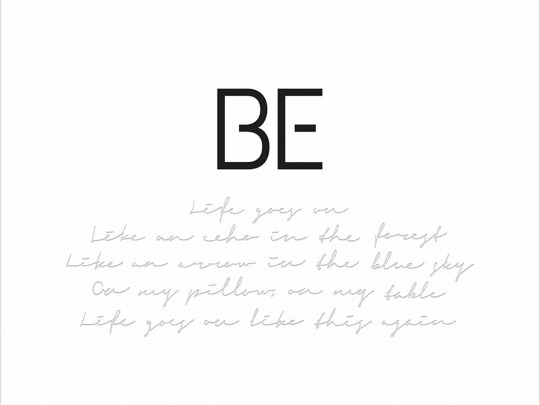
The Life of BTS Writes a Story Review of BE 2020.11.30
BTS released its new album, BE, on November 20 after RM announced the band’s plan to produce the record on BANGTANTV’s Log (ON) on April 17. The group was working on the album even as “Dynamite”, the single they dropped on August 21, was topping the Billboard Hot 100. This order of events is given a fresh new meaning when “Dynamite” closes BE as opposed to standing alone as a single. While the group was busy sending messages of hope by reminding us of the past where heading out happily after a cup of milk was possible and giving us a glimpse of the future that will eventually come, they were recording the emotional ride they have been on while being off stage via different tracks on BE. Such changes in emotions can be seen through different portrayals of Jung Kook’s room—the way it looks during the first verse of both “Dynamite” and “Life Goes On,” the title track of the new album. Jung Kook is captured looking chipper as he ties his shoes getting ready to go out and dances in his sunshine-filled room in the music video of “Dynamite”, but in the latter’s video, Jung Kook stares blankly out the window. BE tells the story of how Jung Kook and other members navigated their lives, which includes their time singing “Dynamite,” during the pandemic by stepping out of rooms that are distinctively less colorful than the scenes in the music video of “Dynamite”.
The seven tracks, not including “Dynamite”, embody BTS’ emotional shifts and draw what looks a lot like a V curve, with “Skit” separating each section of three songs. The album opens with “Life Goes On” where BTS asks, “there’s no end in sight / is there a way out?” to live through a reality devoid of hope and arrives at “Stay” where the group expresses their intense longing for a reunion with the fans by saying, “Thinking of you now / No matter where you are / That’s not important.” And during this journey, BTS responds to the physical limitations imposed on their daily lives by saying “They took away this whole year” while also trying to put a positive spin on it by singing, “Thoughts can change by thinking,” in “Fly to My Room”. What follows is “Blue & Grey”, where they reveal inner feelings of depression and anxiety with the line, “Still don’t know this sharp blue / Hope it’s not covered over I’ll find the exit.” “Skit” then offers a shift in direction, and the next song, “Telepathy” reveals their eagerness to meet people again, highlighted by the lyrics, “Every day’s the same and I’m happiest when I meet you.” BTS also takes a moment to let out their complex thoughts on work to reach “Stay” ultimately. It is only at the end of this process that the optimism in “Dynamite”, which feels like a conviction of hope in a time of pandemic, appears in full.
“Life Goes On” allows those who don’t know whether they should hold on to hope or give up on hope to feel what it is like to go with the flow when you don’t know what to feel. Those who want to find a reason to be positive in life affected by the pandemic can find solace in “Fly to My Room.” But it is when you listen to the album as a whole that you can get healing from the pain the pandemic has inflicted on us. The soothing ambiance offered by “Life Goes on” transitions into heavy, slow, and dark tunes in “Blue & Grey,” which is followed by faster rhythm and airy sounds in “Telepathy” and “Stay.” Then the album finally culminates in “Dynamite” where the bright sunshine lifts you up. The record in its entirety offers the chance to experience at least indirectly the emotional ride taken by global superstars BTS themselves. “Dis-ease” is the classic example of the storytelling style BTS chose for the album; the moment they let out their angst and fully devote themselves to work is when the song reaches its climax. When BTS sings, “Get up one more time / It’s morning again we gotta go out / Let’s go one more night,” towards the end of the song, the arrangement drives up the song’s tension for the peak moment, “Everyday I console myself / We’re all the same people ain’t so special / Ay man keep one, two step keep calm and let’s heal up” which tops the song off like fireworks. This ironic way of storytelling mirrors BTS’ life at the moment. There are a lot of thoughts about work and life on their mind, but they try their best to work through them. And just as they do this, their energy transforms into a musical blast.
With “On,” the single track on their previous album “Map of the Soul : 7,” BTS says “Where my pain lies / Let me take a breath.” The album covers how BTS has traveled from the past to where they stand now, and “ON” tells a story of the members having to live with the “shadow” that comes with enormous fame as discussed in “Interlude : Shadow” on the very same album. With BE, BTS finally tells the story of their lives that are still unfolding. It’s not clear whether their questions about work asked in “Dis-ease” now found answers. It’s not known how long this will last, just like no one knows when this pandemic will finally run its course. We have no way of knowing if they are still in the mood expressed in “Blue & Grey” or they’re feeling the positivity of “Fly to My Room.” One thing that is clear is that while they battle work as one would with “Dis-ease,” they still wrote songs like “Telepathy” and “Stay” to send their messages to the fans, and kept busy getting ready to perform “Dynamite” on numerous stages. BE is the album that ties together all of their real-life events, both on and off stage, as one narrative. They started as an idol group and now their lives are intertwined inseparable from their music, their very existence becoming the stories they tell.
The way BE sets up different songs is directly linked to the musical changes BTS has undergone, and thus, are evident in the album. As the members’ stories take center stage, the arrangement focuses on getting their lines and melodies across and adjusts itself flexibly to each member’s part without following a certain trend or form. The arrangement filled with sounds of guitars, synthesizers, bass, drums, and pianos or sounds similar to real instruments is fitting to songs like “Fly to My Room” and “Blue & Grey”, in which auditory shifts accompany each member’s part. The smaller number of sounds used in
BE
compared to previous albums further emphasizes vocals, such as by accentuating the sound of Jung Kook inhaling in the beginning of “Life Goes On.” If J-Hope’s part in “Fly to My Room” reminds you of a gospel song, it’s not just because the synthesizer highlighted the gospel-like vibes but also because j-Hope’s voice that faithfully delivers his emotions as if giving witness to an epiphany with the line, “Thoughts can change by thinking.” Just like the auditory shift that takes place with SUGA’s rap part in “Blue & Grey” where the drums begin to layer, the arrangement of BE evolves constantly in line with each member’s part.
BE also takes on new challenges in format.. The chorus in “Blue & Grey” has such long melodies that it has no clear ending, and it fades out for the post-chorus that triggers an image of a lonely winter night with gloomy vocals. The post-chorus might seem like an abrupt shift but many devices contribute to giving this song the bleak wintery night vibe: RM’s somewhat distant rapping delivered through left and right on stereo that echoes through the room as well as the vocal recording that applied different echoes depending on lyrics and the solemn sounding cello. “Life Goes On” progresses in a similar fashion, starting with percussions ringing right next to your ears that create multi-layered sounds and taking you to an imagined space by blending the chorus and synthesizer. The story they tell resembles confessions about emotional states or specific circumstances, and the melodies unfold and rap flows in new ways as the story progresses While there are a lot of shifts, there is consistency in that sounds build the same sense of space. “Stay,” while being an EDM piece, ends on a rather blue note after phasing out beats that earlier set the stage for the dancefloor stomper. It makes sense given that the song is Jung Kook’s imagination of performing in front of the fans; Festivities in the song are interrupted by the fading out of vocals and overall sound layers. “Telepathy” offers a catchy hook in a song filled with bouncy spirit, just like “Dynamite” does. But the difference lies in that “Dynamite” brings out the explosive energy through repetition of melodies and variation of rhythms and that “Telepathy” phases itself out by reducing the number of sounds. “Fly to My Room” is about coming to terms with life in the pandemic, but the acknowledgment doesn’t necessarily make such a life enjoyable. Adding vibrant melodies isn’t a solution to challenges that accompany work, which are conveyed in “Dis-ease.” Such are the mixed feelings we experience in life—in which we have no control over a break or our approach—that are clearly expressed in the album by highlighting each member’s part and various shifts. Despite the numerous musical turns, the album has been produced in a way that ensures its consistency throughout the entire work; “Life Goes On” leaves you with the chorus where the seamless melodic flow seems like it’ll just keep on going.
In “Skit”, BTS is talking about how they’re practicing their debut song for performance eveon on the day after “Dynamite” became No.1 on the Billboard Hot 100. After they topped the chart with “Dynamite”, they came back with an album filled with songs seemingly the polar opposites of their hit single. Life seems to be on a loop but changes suddenly appear, and previous routines end up different because of this newness. BE is an acceptance of such peculiarity of life rather than an answer to it. BTS began with K-pop and now have become superstars of pop, and they’ve harnessed the power of their own story in the album by choosing neither path. The team that began its journey with “No More Dream” and have traveled to “Dynamite” leaves an open ending as to where they will head next. Still, the next chapter will be shared regardless of what it shapes up to be. That is why they can leave us wondering what comes after BE.
Trans © Weverse
142 notes
·
View notes
Text
Yu-Gi-Oh! Duel Monsters GX Episodes 65 and 66 Subbed (Finalized)
(Check out my Subbed!GX Stream Masterpost!)
Hell Kaiser Ryou! Chimeratech Overdragon
Since his defeat to Ed in the Pro Leagues, the life in Kaiser Ryou has faded. But at the invitation of a suspicious promoter, he participates in an underground duel--duels in which, crucially, one risks their life to treat their savage audience to a show. As Acidic Last Machine Virus causes his Machine-Types like Cyber Dragon to rust, the Kaiser is not only cut off from summoning any Monsters, but it causes him to take damage. With each drop in his LP, an electric current flows through his body, exciting the spectators...
Judai’s First Dream Duel!
Lost in the forest, Judai’s consciousness starts to fade from hunger, causing him to reminisce about his duels thus far--taking down Instructor Chronos’s Ancient Gear Golem with Flame Wingman during his Entrance Exam, battling the then-Blue elite Manjoume and his V-to-Z Dragon Catapult Cannon shortly after his enrollment, battling Misawa’s seventh deck with the right to represent the Academia on the line, and his first loss in the face of Kaiser Ryou’s Cyber End Dragon...
~~~~~~~~~~~~~~~~~~~~~~
*crashes onto your TL months late with non-corporate coffee*
And these two are finally up and finalized! Sorry for the wait, if you were looking forward to ‘em--as I mentioned in my post on Sunday, they were pushed back a bit while I did one final lookover on 1-64′s scripts and hardsubs so I could actually call them “finalized.” I’d started to get them out of the way while waiting for some potential editing help, then just decided to finish it after scrapping the last little thing I hoped to work on (I planned to break briefly after 66 to do these re-finalizations anyway, but the timing happened to work out). More details there.
But leaving that aside, here we have a pretty popular episode in Hell Kaiser Ryou’s debut, as he’s pushed to the brink by Mad Dog Inukai after Monkey Monkey Mountain Saruyama invites him to his first underground duel. They do a really good job of portraying Ryou as having lost his mojo post-Ed, showing a realistic view of what the big leagues in sports are like when that happens to you and you lose out on sponsorships/etc, and so when he gets cornered and Saruyama drills into him how he never once thought of winning since that duel, wanting to just stick with his respectful dueling, a spark lights up in him and... well, RIP Mad Dog. (Also, s/o to Takeshi Maeda for really selling Ryou’s shift in mindset by the end, and to his dub VA for sounding similarly good, imo.)
66 is probably less popular in comparison, treating us to our first clipshow of the series, though 66 episodes in isn’t a bad time (could be worse, VRAINS jk). It’s endearing enough, though--kinda nice seeing SAL again; Judai’s hunger-induced visions give us Chronos, Misawa, and Manjoume making monkey noises; and the duels featured were important for Judai early on. I also like the bit of new animation as vision!Ryou follows up with Judai about respecting his opponents; goes with what I’d noticed before about Judai adding his Fusion Undone/De-Fusion strategy to his own dueling after losing to him. (also Judai making a signpost sweatdrop from his aloofness pls)
Part of the initial delay with these were the footage fixes I wanted to work on, as well as a couple visual translations here/there which were fun to work on. Really want to thank @paradoxi-kay for their great work as always in helping to translate the cover of the copy of Duel Magazine that Judai comes across early in 65, and starting the one on Shou’s copy that I finished up. List of everything worked on below the cut, as usual, if you’re curious.
Enjoy, folks! I’ve gotten some work started on 67 already, and my plan is to try and work on some double releases to make up a bit of time, lol. I’ll be posting these two on NAC in the next couple of days along with the re-finalized hardsubs and scripts/DVDRips; while I work on getting 67 and 68 done, I’ll also start some work on prepping softsub MKVs (also to go up on NAC) for everything I’ve fully finalized, since it’s been a while on that front.
Fixes/Edits! (65)
As Judai wanders in the forest early in the episode, he comes across a stack of old Duel Magazines; the front cover shows Ryou and is an issue from his winning streak days before his more recent loss to Ed. Thanks to @paradoxi-kay‘s great work in typesetting my translation onto the cover I blanked (which I detailed here), you’ll see it in English in the hardsub above. The translation was first applied to the close-up of the cover that comes after #2 below, and then I took the translated cover and made it its own image that I put into the earlier shot as Judai approaches it while they’re all still tied up (detailed here). The text reads, “Exclusive!! Kaiser Ryou Marufuji / Breaking down his Cyber Dragon deck!!! / In this issue: / -Duelists Du Jour / -Pro League Battle Data! / -Reader-Submitted Best Duels! / -Strategic Attack Decks by Type!” (Really appreciated Kay’s input on “Du Jour” because my original translation for that, “Duelists Who Are All the Rage,” wasn’t as catchy, lol.)
As Judai picks up one of the older Duel Magazines and flips it open, we see on the back cover an ad featuring the three Phantasms--it’s actually an in-show ad for Shadows of Infinity (since the episode aired around the time the pack came out in Japan); I detailed the process in blanking and translating it here (shared above). The ad reads, "The Three Phantasms Descend!" featuring Uria and Raviel’s names on their images.
As we go to the Red dorm as Shou narrates about the Kaiser’s slump, we see a magazine page describing what happened to him since his loss to Ed; I covered my blanking/translating this in the link shared in #2.
We then see that it’s Shou reading the page from his own copy of Duel Magazine, this one more recent than Judai’s featuring Ed on the cover, though it features the same SOI/Phantasms ad on its back cover (now showing Hamon and its name as well). Like with Judai’s issue, I used the Japanese cover and the dub’s edit as reference to just redraw Ed and Diamondguy enough to remove Ed’s name; Kay had started the translation placement and I finished it up. For the SOI ad, like with #2, I added in the dub’s edit in pieces, tweaking it to match the original image more (since they again oddly edited the text out or redrew Uria/et al weirdly to do so). We do now see more of the ad which shows that the trio’s names are on each of them, the English of which I added.
As Asuka snatches the magazine from Shou to work on cheering him up, to be consistent, I also worked in these cover translations to the magazine as she lifts then curls it up, using the dub’s blanked Phantasms edit as a base that I touched up a bit while adding back the Japanese cards. Detailed more in #2′s link. (We now also see that the ad reads on, “New! Shadow of Infinity - On Sale November 11th [2005]!”; the IRL booster pack came out in Japan on Nov. 17th, 2005, a few weeks before 65 aired.)
Asuka then lifts the curled-up magazine into view in a close-up, with the SOI/Phantasms ad visible which I also applied my translations above to as needed, using the dub’s blank edit as a base that I redrew parts of to touch up and match the Japanese image more. Detailed more in #2′s link.
As Ryou meets Monkey Saruyama, he introduces himself by handing out his business card reading, "Saruyama Promotion - Representative Monkey Saruyama;" as detailed in #2′s link, I cleaned it up using Photoshop’s Clone Tool, then slapped the translation on using Calibri as the font.
As Ryou contemplates attacking Acid Slime with his Cyber Dragon and Mad Dog Inukai taunts him, as Mad Dog then slides in on a split-screen to “clear his doubts,” there’s a quick frame as Inukai takes over the screen where there’s a gap between his pecs and the split-screen edge. I fixed it by just drawing in the rest of his chest in Photoshop to fill his side of the split-screen.
As Inukai starts his turn and activates his Contingency Fee Magic Card, there’s a frame where, as he’s sliding his hand with the card into the shot, the card itself slides ahead in his hand before his hand does; as a result, you can see a bit of the background just under the card before his hand catches up to the card in the next frame. I fixed this by just duplicating the first frame here over it in Vegas.
Two here--first, after Ryou has his Proto Cyber Dragon attack Clone Slime, as Inukai begins to explain its effect, there’s a quick frame before the shot goes from a close-up to a slow zoom as he moves where his neck vanishes (new meme format go); I fixed this by just duplicating the previous frame in Vegas, while also correcting one of his looping lip-flap frames so that the scar on his chin is above the shading under his lip. Then, as Inukai goes into Clone Slime’s effect and the shot slowly zooms out, we see Clone Slime on his Disk in Attack Mode when it’s in Defense Mode right now; fixed it by placing a proxy in Defense in AfterEffects for a frame, then re-keyframing that frame to the zoom-out in Vegas to put it in place.
After Acid Slime slips out of Inukai’s Cemetery as Clone Slime’s effect activates, Inukai moves to grab it before the two Slimes switch out, but Clone Slime’s still in Attack Mode on his Disk; fixed by placing the Defense-Mode proxy over it in AE, then moving it as he moves his Disk and applying a brief brightness increase as the light from Clone Slime being replaced with Acid Slime grazes it.
As Proto Cyber Dragon’s attack approaches Acid Slime in a quick shot, the card under it in Defense Mode is reversed (the name box should face to the left to match how it’s placed on his Disk); fixed by first applying the correctly-facing proxy in AfterEffects and moving it as the shot moves, then masking Acid Slime back in over it, along with the light coming from the attack as it starts to shine over its card.
As Ryou explains Overload Fusion’s effect, just before it starts to zoom out as he then chooses the six Monsters he’ll fuse, there are a few frames I noticed where Ryou’s whooshing hair throughout this shot suddenly stops whooshing; I fixed it by just masking in his whooshing hair from the previous frames for a few.
As Ryou taunts Inukai about how his Acidic Last Machine Virus will bother him no more, Inukai starts to slide in on a split-screen, but until his split-screen has fully slid in, there’s no border on its edge; I fixed it in Vegas by first masking out the border once it’s fully slid in, then moving it in another video layer with his split-screen for those nine frames.
As Ryou explains Chimeratech Overdragon’s multiple attacks, we see it reversed on his Disk; fixed by slapping on the correctly-facing proxy in AfterEffects, then re-keyframing it to the slow zoom in Vegas for the 94 frames it zooms out in (phew).
One error that I hoped to fix but scrapped happens as Chimeratech Overdragon’s first attack closes in on Inukai’s Multiple Slime, where we see a Defense-Mode card under it despite it being in Attack Mode the way Inukai summoned it (and since he then takes damage from the attack); couldn’t quite figure out how to light up the floor I’d redrawn under it with the ensuing explosion, and had sought a bit of help to get it right but ultimately that fell through. (Incidentally, not only did the dub not catch this as they dubified its card, but they reversed the card, at that, lol.)
Fixes/Edits! (66)
(Note: These are all flashback-related, and I detailed most of them [including a few new ones] in my post from Sunday that I linked just under the summaries; I went on to apply the fixes I’d applied in 66 to the respective episodes, so I’ll be brief here. Reinserted fixes from a while back are in italics.)
(Episode 1 Flashback) I reinserted the fix I did to replace the blank Normal Monster on Judai’s Disk in Flame Wingman’s spot with its card as Antique Gear Golem crashes onto Chronos. [Ep. 1 Flashback End]
(Episode 22 Flashback) As Misawa attacks with Litmus Death Swordsman to start his flashback, I reinserted the fix I did to detail the blank cards on his Disk with Diamond Dragon and Litmus Death.
As Misawa finishes explaining Wingbeat of Giant Dragon’s effect and it zooms out to Litmus Death, I reinserted my fix to his reversed card on Misawa’s Disk to flip it right-side-up.
Reinserted my fix to the repeat of #3 as Skyscraper fades.
Reinserted my fix to another repeat as Misawa explains Spirit Barrier’s effect.
R-R-Reinserted my fix to the r-r-repeat again as we see Misawa’s Disk while Judai explains Cyclone Boomerang’s effect (gotta love reused animation!) [Ep. 22 Flashback End]
(Episode 4 Flashback) As Judai prods Manjoume into choosing a card from his hand for A Hero Appears’s effect, I fixed Manjoume’s blazer looking semi-faded for a frame on his split-screen.
As Judai’s LP take a hit from V-to-Z destroying Burstlady, I fixed the four frames where the upper part of his Disk is missing the little bottom part that extends out a bit and Judai’s vanishing Disk wrist grip.
A bit complex, but I fixed Judai’s briefly-still-missing-then-vanishing-again wrist grip, the shading near his Cemetery slot, Judai’s arm becoming part of his Disk, and his wrist grip suddenly consuming his whole wrist. (Detailed in that Sunday post)
Reinserted my fix to the Attack-Mode Winged Kuriboh on Judai’s Disk to put it in Defense Mode as he discards two to activate Evolutionary/Transcendent Wings.
As Judai swings his arm around telling Winged Kuriboh LV10 to “send [V-to-Z’s] energy right back” at Manjoume, I reinserted my fix to put its Defense-Mode card in the spot on his Disk colored like the Monster Zone it’s on for a few frames.
A bit complex again recycling the Judai shot in #9, but I fixed his again-vanishing Disk wrist grip and half-Disk arm, his wrist grip suddenly consuming his whole wrist again, and his yet-again-vanished wrist grip, miscolored undershirt, and his half-Disk elbow while restoring some previous detail to his Disk. (Detailed in that Sunday post)
As Judai summons Featherman–to Shou and Chronos’s surprise–and has him lunge at Manjoume for the finisher, I reinserted my fix to keep the black faraway box that is Featherman on his Disk both as those two slide in on split-screens and as they slide back out. [Ep. 4 Flashback End]
(Episode 8 Flashback) I reinserted my fix to remove Featherman from Judai’s Disk as his LP drop from Cyber Dragon destroying it.
Reinserted my fix to a repeat of #14 as Judai’s excited about Ryou’s Time Capsule.
As Judai draws for his turn, I added a Fusion card over the dark-orange rectangle briefly in his hand as he draws it.
After Judai’s first hit on him, I fixed the error as Ryou Special-Summons another Cyber Dragon as a Monster in face-down Defense Mode on his second Monster Zone (detailed in that Sunday post).
Reinserted my fix adding Cyber Twin Dragon to Ryou’s Disk over a yellow rectangle.
As the screen zooms in on Judai after Ryou declares Cyber Twin’s attack, I added Thunder Giant to Judai’s third Monster Zone, then reinserted my previous fix adding it as it zooms back out while Judai uses A Hero Appears.
Reinserted my fix adding a few quick lip flaps to Judai as he says, “Partner,” out loud.
As Judai thinks about how Evolutionary Wings would evolve his Winged Kuriboh and we then see Bubbleman on his field, I added a missing Bubbleman card to his Disk.
Right after #21, I revised my previous fix to replace the Defense-Mode Mudballman on his Disk with an Attack-Mode Bubbleman, after I accidentally put it in Defense Mode before.
As Ryou grabs Power Bond from his hand before activating it, I reinserted my fix adding Ryou’s two missing Cyber Dragons to his Disk and then one over the blank Normal Monster card in his left hand.
As Ryou slips Power Bond into his Disk, I reinserted my fix adding those two missing Cyber Dragons onto his Disk. [Ep. 8 Flashback End]
For the Ep. 67 preview, I added my translation of the notice left on the Red dorm by Napoleon which I’ll be using in the episode proper.
#GX#yugioh#yugioh gx#ygo#ygo gx#Judai Yuki#Ryou Marufuji#Chronos de Medici#Jun Manjoume#Daichi Misawa#my subs#i do have to wonder if the staff had a dartboard of ideas of who would spur the flashbacks in 66#and they somehow landed on bringing back SAL for a bit lol#he's nice enough to snap Judai out of his hunger visions#also s/o to that one dub voice for... somehow surviving that dartboard decision
11 notes
·
View notes
Text
[S] Cascade After the Death of Flash
Most of us familiar with Homestuck are familiar with [S] Cascade. This seminal flash animation concludes Homestuck’s fifth act and is still considered by many fans the most important, climactic animation in the comic (even ahead of its successors [S] GAME OVER and [S] Collide).
Many of us may also be familiar with the extraordinary circumstances of the animation’s release. A user called Vivi on the now-defunct MSPA Forums made a commemorative comic documenting the occasion, which, to my view, really captures the essence of the release-mythos. In short: On October 25th, 2011, Homestuck updated after a year-long hiatus with a thirteen-minute flash called [S] Cascade. As fans raced to watch it, the influx of pageviews crashed Newgrounds, the site where the flash was hosted. Hussie temporarily uploaded the flash to megaupload.com. Megaupload.com crashed. The Homestuck website crashed; the Homestuck forum crashed; livestream.com crashed as fans who had “gotten in” tried to stream the video; and, finally, the Homestuck fandom crashed Twitter. [1]
Today, it is hard to imagine Homestuck fans crashing Twitter. Back in 2011, Twitter was a lot smaller, and Homestuck was a lot bigger. But it wasn’t just the long year of building anticipation and the mad scramble to watch the flash which cemented [S] Cascade as one of Homestuck’s most iconic pages. The Flash itself is aesthetically ambitious beyond any previous flash in the comic [2]. Not only does it combine detailed illustrations contributed by fan collaborators with an absolutely fire soundtrack; it manipulates the traditional Homestuck “panel” in a completely unique way.
Among the various stunning moments in the flash, I find Bec Noir’s dramatic release of the red miles one of the most memorable. The YouTuber Precision F-Strike captures my same reaction when I watched [S] Cascade for the first time in this video around 1:20, exclaiming: “My screen is getting bigger! My screen is getting bigger!!” What made this “expanding panel” trick so dazzling upon my first watch? The release of the red miles marks the first instance in which [S] Cascade modifies the traditional size of the Homestuck panel. By no means does it mark the first time the comic as a whole has deviated from its own standard panel size; elongated panels, multiple panels, and links-to-panels have all been regular features of the comic up to this point. However, [S] Cascade is the first page to modify the panel size during a Flash sequence, changing in motion. This novelty, combined with the surprise of the effect, sets the reader up to expect a flash of epic proportions—and [S] Cascade delivers.
After expanding for the red miles, the panel never quite shrinks down to its original size. For the rest of the animation, the plot unfolds within an extended panel-space ripe for dramatic exploitation. At 2:53 the panel shrinks back down to show Bec Noir’s journey to post-reckoning earth, then grows again to get back into the action. At 4:22 it shrinks and breaks into multiple panels to illustrate Bec Noir wreaking destruction in the troll’s session. The proliferation of these moving rectangles mimics a film reel, reminding us that we have technically already seen these events, but underscoring their importance as a conglomeration of memories for the trolls.


Transitioning to the human sessions’ Derse at 4:38, the panel blows up again to its traditional size and adopts an exterior “wallpaper.” This “wallpaper”, as I’ll call it, shifts with the content of the Flash for the next few minutes. It shows the exterior of Derse as Rose and Dave fly through, then it takes on the red and yellow colors of the quest beds; the black and white colors of The Tumor; the red and blue colors of the “mass of two universes” device; and finally the fleur-de-lis pattern of the Felt mansion. During the sequence between Sn0wman and Slick, at 6:08 Slick’s bullet actually pushes out the corner of the traditional frame, extending it back into the full extended-panel space. Then again, during the climactic moment at 10:02, panels grow and shrink and replace others, flashing in time with the soundtrack, drawing the plotlines together and anticipating the finger-frame with which Jade creates the Fenestrated Plane. The animation finishes with John and Jade busting through the Fenestrated Plane, which cycles through the comic’s own panels, culminating the meta-referential panel distortion with this final act of “escaping” from and through the Homestuck panels themselves.
As a result of the extended panel-space established at the release of the red miles, we get to experience the majority of [S] Cascade’s action (and gorgeous artwork) on an enlarged canvas. Just as we go to the cinema to see movies on the “big screen,” Homestuck deploys its own big screen at the start of the flash. Then, all the growing and shrinking between segments contributes to the narrative flow of the flash. The “shrunk” portions leave room for the panel to blow up again once the next climax comes. I think the “wallpaper” effect employed mid-flash is especially effective, as it allows Hussie to continue utilizing the extended panel-space while keeping the frame small in advance of the Sn0wman’s death, at which point it expands again. It’s also important to note how Hussie manipulates our other preconceived expectations, aside from panel size, to enhance the animation’s drama. The website itself gets a special [S] Cascade color scheme and header. In the unfamiliar layout of this Cascade-ified website, readers prepare themselves for the best and the worst—then their expectations are thrown off balance again, for good measure, with the expansion of the panel and the big-screen execution of the flash. With all of this in mind, it’s easy to see how [S] Cascade generated such a massive response.
As you may be aware, as of January 2021 Adobe has discontinued its support for Flash Player, with all major web browsers following suit. This means it’s near impossible to run flash content on any normal computer, and it won’t be long before flash only exists in archival projects. Luckily, the new denizens of the Homestuck website have worked to keep all of the story intact despite the changing media landscape, with some interactive flash pages broken down into videos or screencaps and animations converted to embedded YouTube videos [3]. If you are interested in experiencing Homestuck’s flash content as originally released, a fantastic project called the Unofficial Homestuck Collection has worked to archive the entire comic in a custom browser which natively runs Flash (all you need is 4GB of space on your computer and some time for the assets to download). This archive has been invaluable for my art historical investigation into the comic [4].
As it stands, though—unless forced by a concerned friend to download The Unofficial Homestuck Collection browser—new readers to Homestuck can’t experience the Flash games and animations in their original format. The same goes for folks rereading the comic. In the case of [S] Cascade, significant losses must be mourned. The effect set off by the red miles (the surprise and novelty of your “screen getting bigger”) is hampered by the embedded YouTube format. When you open the [S] Cascade page, now, it presents you with a mid-flash thumbnail, a YouTube play button, and YouTube framing elements such as a watermark and title (pictured above). You can’t avoid already seeing the extended panel-space of the flash page with this new format. Even though the panels within the embed begin in their “shrunk” state and grow to fill out the video frame, the expansion can never be a surprise to the same degree it was in the original Flash format. Flash animations were unornamented by watermarks, titles, and scrubber bars. They were so indistinguishable from regular static panels and gifs in terms of size, image quality, and framing that this gag (pictured below) actually worked. The indistinguishable quality of flash animations from regular gif panels created the necessary environment for [S] Cascade to surprise us by suddenly growing and filling the screen. That drama is inevitably lost in the flash’s new format.

On the other hand, the YouTube format presents some obvious benefits for readers. For one thing, you can now scrub back and forth in the animation, pause it, and even see its timestamps. This is beneficial to any reader who wants to revisit key moments and enormously helpful for someone like me analyzing the animation in detail. I would argue that the inability to pause the animation in its original format contributed to its monumental quality—readers couldn’t pause to breathe, and the comic took merciless control over the pacing—but of course the inability to pause something is also terribly inconvenient. Furthermore, the video format solves an issue that plagued Homestuck readers (including myself) throughout the comic’s lifetime: it’s inaccessibility on mobile devices. Adobe Flash famously failed to transition into the world of mobile touch-screens after Steve Jobs decided not to support it on the iPhone, writing a letter denouncing the software for its errors [5]. With Flash no longer functioning, the reformatted pages in Homestuck are all compatible with mobile devices, meaning readers can now enjoy the comic while lying sideways in bed like we always dreamed. Among other considerations, Adobe Flash was a complete pain to work with [6] for many large-scale projects, and its technical limitations cannot be ignored. On the whole, the death of Flash speaks to a greater evolution in our 21st century media sphere—the growing importance of mobile browsing, the shift from web-hosted games to apps and game launchers, and the increasing “convergence” of platforms into all-purpose devices. While much of Homestuck’s impact and charm resulted from its innovative use of Flash, like the example I’ve given in [S] Cascade, the unique bubble of history in which Flash existed should be fondly remembered and effectively preserved as we continue to navigate the comic’s legacy.
————————————————————————
Happy 4/13! If you liked this post, you can follow the blog on tumblr for updates or, if you don’t frequent tumblr, sign up for the mailing list to receive an email whenever I publish a new mini-essay!
————————————————————————
[1] I unfortunately can’t say I was around for the original [S] Cascade release (I started reading the comic about two years too late). However, even during the Gigapause, what I’ve called its “release mythos” was still widely retold. The events themselves are documented here: https://fanlore.org/wiki/Cascade_(Homestuck). Thank you to @imploder for having saved Vivi’s comic on tumblr!
[2] Hussie wrote about the making of [S] Cascade on his tumblr, now archived here: https://wheals.github.io/tumblr/tumblr.html#about-eoa5-part-1. This gives some insight into the massive undertaking. Previously, the longest animation in Homestuck was [S] Descend, an animation which Hussie calls “Cascade Lite” in his author commentary in Homestuck Book 3. [S] Descend was the first animation to significantly incorporate multiple plotlines moving along at once. Hussie describes this narrative style as an “action-collage” (also in the Book 3 commentary). [S] Descend was also (to my recollection) the first time Hussie significantly incorporated assets from contributing artists into an animation, which he explained was partially to keep the production moving faster. Ironically, during the production of [S] Cascade, organizing contributors turned out to be much more of a hassle—but ultimately Hussie deems the myriad of captivating art styles “a big plus” in his post.
[3] Although some are completely broken, now :(. RIP silly flute refrain.
[4] I seriously cannot overstate how grateful I am for this project.
[5] This article does a great job of explaining the history of Adobe Flash and its eventual demise.
[6] Hussie goes over some of the issues he had with the software in the post referenced at [2]
48 notes
·
View notes
Text
How to Get Roleplay on F-List: A Guide
Hey all. So I’ve had a few people ask me how on earth to get RP over F-List, or for those that have tried, say its too confusing. While F-List is a much different format than I think a lot of people are used to, it’s a pretty reliable source of RP once you get used to it. So I’m going to walk you through, step by step, how to start from nothing and get a profile set up to start RPing. F-List is 18+ Only and is a Restricted To Adults® Verified website. You can learn more about it by clicking the RTA logo at the bottom of f-list’s main page.
F-list’s main landing page can be located at https://www.f-list.net/.
Note that my f-list may look different from yours because I’m using dark mode (which can be set in the account tab) and I’m a subscriber, so I don’t see ads.
Step One: Make a Profile
Making a profile, or as they’re known on F-List, a character, is your jumping off point for getting started. There are three main factions on F-List: Anthro Characters, Canon Characters, and Original Characters, with subcategories of each. You also have hub profiles. There is a right way to make a hub profile, but that’s not something I’ll be talking about on this post. Hub profiles are pretty universally disliked on F-List and are often seen as a mark of laziness, and I do not recommend making one to look for RP on. You should make a separate Profile for each character you want to play as. If you have a normal account, you can make up to 150 different characters. If you’re a subscriber, you can make significantly more than that depending on your tier.
Choosing a name for your character is very important! You want something attention grabbing, but since each character has to have a unique name, this can get a little tricky. Today I’m choosing to create a Link from the Legend of Zelda Ocarina of Time. As this is a popular character, it can be difficult to track down a good name. You can be clever with naming conventions, while making it obvious who you’re playing, or you can add in underscores, hyphens, numbers, etc. It’s really up to personal preference. I advise not getting too abstract with your character name. Just pick something easy to read and to the point. Once you’ve decided on a name, click the create character button to open up the character editor.
Step Two: Holy Fuck Dude That’s a Lot of Shit To Fill Out
Take a deep breath. The character editor is very intimidating to those that haven’t used F-List before. Perhaps you have used F-List for it’s old intended purpose, just to list your kinks to link people to when RPing on other sites. Your first instinct might be to scroll down there and start picking kinks willy-nilly. Stop. In the grand scheme of things, this is not as important for getting Roleplay and if you do it incorrectly you might actually hurt your chances.
Now that we’ve calmed down you’ll notice two things at the top of the page. A big white text field, and this guy:
This, more than anything on your profile, is the most important thing. If you have this on profile, you will almost never get any roleplay. This is your character icon, and it’s the first step on your journey to doing this whole thing correctly. All you need to do is find an image that’s 300x300 pixels or smaller and upload it with the Choose File button. Then scroll down to the very bottom of the page and hit save. Search on google, and if you have a hard time finding something of that size, A great site to use is https://lunapic.com/ to edit pics if you don’t have Photoshop or Gimp. Choosing or creating an image with some sort of transparency layer is recommended because it makes your icon look more polished, but you don’t really need to do that. This isn’t an image software guide so I’ll leave that to you to figure out. If all you can do is crop an image into a square, that will do perfectly. But you need to have something here. Besides your character name, it’s the first impression you’re going to give to people when using the site. I have honest to god had people message me on empty profiles that having nothing but a character name and an icon.
Sourcing your images is a bit of a grey area on f-list. It’s not really an art sharing site, but if you choose fanart that someone doesn’t want to be reposted, it can be removed by the mods if you’re reported for it. So we’ll just use some official art that already has a transparency channel and crop it using Lunapic.

Step Three: How To Set the Profile Up
If you’re following along, you should have something like this by now. This already gives us an idea of who you’re playing, and what they look like, and while you might get a couple of weirdos messaging you already, there’s still a lot to do. So let’s go over what to do next.
Now that you’ve already created a character, it will be listed under the character tab. Further characters will be listed in alphabetical order. Navigate to your character and click the “Edit” button underneath their icon.
We’re back to the big scary page. Remember that big text field? We’re going to ignore everything else and focus on this first.
F-List uses standard BBC code tags with [square brackets.] You can find some buttons that will give you tools like bold, italics, color, hyperlinks, and quote blocks. There are many different ways to create eye-catching descriptions. I would say the three basic ways are minimalist, inline based, and heavy BBC code. We’ll go through the first option in detail but if you’re interested in the the latter, there is actually a few F-List profiles that teach coding and even have a few templates to use. User beware, though. Many F-List users use these templates and they can sometimes look a bit generic as they are overused.
Templates: https://www.f-list.net/c/profile%20templates
Coding Help: https://www.f-list.net/c/profile%20references
If you want to make an inline based profile, having access to software like Illustrator, Photoshop, GIMP, and similar content is good to have as well. You can also make a blend of the three styles of profiles. I’ll link some examples of my own profiles for reference. Some of these have text included in the inline. Some of them just have an image with the text written out underneath. Again, it’s really up to your personal preference.
https://www.f-list.net/c/Rival%20II/
https://www.f-list.net/c/Lion%20Heart/
https://www.f-list.net/c/The%20Fire%20of%20Tamaran/
Now would also be a great time to familiarize yourself with the rules. Keep an eye on these, especially if you play contentious content.
https://wiki.f-list.net/Code_of_Conduct
Some big things to look out for and not to do: Photographs and realistic images of animals are not allowed. Even Nonsexual ones. Photographs and 3D renders of minors (even nonsexual images or nonsexual profiles) are not allowed. If there is even a hint of the character being a minor, do not use photographic or 3D renders. (For example: Tom Holland’s depiction of Spiderman. Even though Tom Holland was an adult when he played the role, the character is a minor.) Sometimes these can run into a lot of grey areas, but it’s better safe than sorry!
Step Four: Creating A Minimalist Profile
We’ll start with a short description. It’s really important to make sure your character’s name is present in your descriptio, especially if it’s not the profile name. If you’re feeling particularly lazy, you can copypaste something from a wiki or official description. Let’s start with something like this.
Link had humble beginnings as a boy that lived in the forest with the Kokiri. Known as the boy without a fairy, Link led a simple life until one day, the dying Guardian of the forest, the Deku Tree, set him upon a Quest to save the Kingdom of Hyrule from darkness. Arming himself with the elemental powers of Hyrule and the legendary Master Sword, Link journeyed through time to the Dark Era of Hyrule to challenge the evil Ganondorf and save his Kingdom from evil.
Shoving this into the Description box and hitting save will generate something like this.
You might notice that this looks like crap. And it does! however, we can very easily fix that with the power of just three simple BBC tags. Those being [center], [color], and [sub]. plus a little something extra I’ll explain in a moment. Let’s add those in like so.
[center][color=green][sub]Link had humble beginnings as a boy that lived in the forest with the Kokiri. Known as the boy without a fairy, Link led a simple life until one day, the dying Guardian of the forest, the Deku Tree, set him upon a Quest to save the Kingdom of Hyrule from darkness. Arming himself with the elemental powers of Hyrule and the legendary Master Sword, Link journeyed through time to the Dark Era of Hyrule to challenge the evil Ganondorf and save his Kingdom from evil.[/sub][/color][/center]
Instead of hitting save at the bottom of the profile this time, we’re going to click “Preview BBC Code” to get a look at what our coding has done.

Fancy.
But it could use a little work. When I’m making minimalist profiles, I like to make the lines of text a little shorter so it’s a little easier to read and looks nicer. Make sure each line of text is about the same length as the previous (minus any BBC tags)
[eicon]blank[/eicon] [center][color=green][sub]Link had humble beginnings as a boy that lived in the forest with the Kokiri. Known as the boy without a fairy, Link led a simple life until one day, the dying Guardian of the forest, the Deku Tree, set him upon a Quest to save the Kingdom of Hyrule from darkness. Arming himself with the elemental powers of Hyrule and the legendary Master Sword, Link journeyed through time to the Dark Era of Hyrule to challenge the evil Ganondorf and save his Kingdom from evil.[/sub][/color][/center] [eicon]blank[/eicon]
You’ll also notice that I placed an eicon tag with a “blank” body. Eicons are essentially image macros that can be used all over the site. Using the blank one here is a good way to put a block of empty space on the top and bottom so the text isn’t too crowded by the frame of the description box. Another couple to keep in mind are [eicon]under construction[/eicon] or [eicon]WIP[/eicon] if you want to save your work now and get right to chatting and exploring the site. This signifies that you’re still working on your profile and more will be added later. You can create your own eicons by going to Account > Icon gallery. Keep in mind each eicon must have a unique name across all users. Inputting this into the description and checking how it looks in the preview, we end up getting something that looks like this:
Looks like we got a bookmark while we were setting the profile up. That means someone saw us while browsing new characters and decided they want to keep an eye on our profile and are likely interested in RPing! If you like, you can disable bookmarks per character in the character editor under settings. Generally speaking though, bookmarks are your friend and it’s how people will find you to RP later.
Optionally if you want to add an inline, just upload an image of your choice in Account > Inline Images. You can then add it in the character editor using this button.

This isn’t a tutorial for creating inlines, but a general rule is to make sure it’s sized well, and transparent images tend to look better than non-transparent images.
Step Five: Character Details
Opening the Character Editor once more, a couple basic things should be filled out. We will take this section by section.
Settings: Some general tweaks to change and edit. Personally, I like to turn my timezone off, and besides that, I like to have my Guestbook and Bookmarks turned on as well, but all of these settings are up to you. A big one a I suggest turning on is “Custom Kinks Sort First.” This will come up later but it’s good to turn it on.
Character List: For now, you can ignore this part. You can use this to have certain characters grouped together and will show up in the sidebars of these characters. I haven’t run into any limits for how many character lists you can have, but keep in mind a character can only belong to one list at a time.
Images: If you have any images you want to upload, this is the place to do it. Headcanons of body types, additional art you’ve drawn or found, can be added here. You can add descriptions to each image that will appear when a user hovers over the image. Keep in mind, again, that usage of fan art is a grey area on F-List. It’s not an image posting site, but some artists do not want their art reposted at all.
Profile Info: You don’t need to fill out every single detail here. Bits that aren’t filled in will just not appear on your profile. It’s a good idea to fill out your gender, and in many cases, your orientation. Both are under General Details. Filling out RPing preferences is also a good idea. It’ll keep people from approaching you IC using first person posts if that’s not your thing.
Step Six: Kinks and Custom Kinks
This is probably one of the most overwhelming parts of the process. My first tip: Ignore the Kink section for now. Instead, skip ahead to the Custom Kink section.
Custom Kinks are a good way to tell people what you really want. Click the Add +1 Custom Kink button to make a new custom kink. You can fill out the basic title of the kink, and a description. Or if you prefer to leave the description blank, just press the spacebar. Select what category you want the kink to appear in (Fave, Yes, Maybe, No.) Try to avoid using inflammatory language against different races, genders, identities, and don’t kinkshame. This is a site based primarily around finding rpers that have the same interests and kinks that you do. Save the profile when you’re done and we’ve got something like this.
And really, you can probably start roleplaying like this. Maybe add a couple of images, and tweak a few things. So if you like, skip to the next step. But for now, I’ll go over the kink list.
The most important think to remember is you don’t have to add every single kink to your profile. Try to select the most relevant things, and avoid redundancies.
For example, I’m not interested in Vore of any kind. So I can put the kinks Vore (Being Predator) and Vore (Being Prey) Into my No category. Or, if I want to make it even more simplified, I can add a custom Vore kink and put that in my No category. Likewise, if I don’t want to do any sex driven play, I can probably go ahead and just put sex driven there and ignore most of the kink list. Kinks that are not relevant such as Vaginal Sex (Receiving) on a cis male can also be ignored. Kinks are broken up into sections, and while it is a lot, just take your time, go through it sensibly, and take a break if you want to. Remember you don’t have to add every single one to your profile. This will ultimately be easier on you and make your profile easier to read.
After a bit of editing, this is what my kink list ends up looking like:
You can try exploring the Subfetish editor but it’s a little confusing to navigate and isn’t very necessary. And now, your profile is done!
Step Six: Using F-Chat
So now that we have a profile set up, it’s time to find some partners. Regardless of what way you want to connect, if you prefer script or para, the main place you’re going to find RP is through F-Chat. There is currently both a desktop and mobile client. if you select Chat you’ll see the option for both, and clicking on them will take you to instructions on how to set those up. We will however be using the Browser client in this example. Go ahead and select F-Chat 3.0.
You will be taken to a landing page with a drop down of your characters, with the first character you created selected as the default. (You can change your default character in your account settings.) You can have up to three characters online at once. Keep in mind this goes by IP address, so if you have a roommate that also uses F-List, those will count towards your total number of online characters. If this becomes a problem for you, just use a virtual machine or connect to the internet via a different method, such as with data. (F-List is not that much of a data drain.)
Here is what you’ll see when you open F-Chat. You’ll see I already have people in my friends list and my bookmarks (that I’ve blurred out for courtesy.) These will appear the same on all the characters you sign in as. I will be notified whenever one of my friends signs in or sets a status. You can set these notifications to show only on the console if you’d like to in the settings. Let’s set a status first.
Here, you have the options of selecting from the default Online status to Looking, Away, Busy, and Do Not Disturb. These all do what you’d expect, with Do Not Disturb turning off the sound that would play when you get notifications from personal messages or pings.
The Status Message is an optional addition, and it’s great for if you’re looking for specific things or want your friends and bookmarks to know what you’re doing. Be careful not to post anything that breaks F-Lists code of conduct. F-List does have an aggregate of every status you ever posted logged on their server, so throwing a temper tantrum and posting something inappropriate and then taking it back later might still get you in trouble.
While the Character Search Option is available to you, I’ve personally never found it very effective. You can search users by kinks, but keep in mind it doesn’t search by gender or orientation, or what species or even if they’re canon or original. Instead, we’ll go right to the settings tab.
General: Just your general settings. You have a few options here to tweak and while most of it is personal preference, I’ll highlight a few to keep in mind.
Disallowed BBC Code Tag: good for if you find a particular colour particularly garish as a text colour, or if you find an eicon that you no longer want to see anymore. Enter Sends Messages: I have this set to off so I can avoid accidentally sending a message for when I post. When this is enabled, just press the send button on screen to send messages. Otherwise, if you want to linebreak in one post, just press Shift + Enter. Animate eicons: If you’re running a slow computer, or have a slow connection, turn this to off. Eicons are used as memes a lot in F-Chat, and some of them can get a little ridiculous. (Someone has compressed the entire Shrek movie into an eicon and uploaded to the site in very poor quality for example.) There can also be bright flashing colours or even nsfw images. In general these eicons are all 100x100 pixels in size, but some users like to tile them together to create bigger images so it can sometimes get out of hand. This is something up to personal preference, and while I have Animate eicons turned on, I can see why some people wouldn’t like it. Idle Timer: If you are the kind of person that walks away from your computer without changing your status, or you have fallen asleep with F-Chat open, it’s good to set this to a reasonable time. If you’re in Online or Looking, after you’ve been inactive for the depicted number of seconds, your status will be set to Idle. This is so other users know that you’re not ignoring them if you don’t respond to their messages. A downside to this is if you’re tabbed out or multitasking, it’ll set you to idle when you may not intend it to and going back to the window switches you to Online again. It can be a little spammy if you’re constantly switching between Online and Idle. Font Size: If you find F-Chat’s font too big or too small, you can edit that here.
Notifications: While this section is pretty self explanatory, I’d like to specifically go over the Custom Highlight Notify Words.
Now, because each profile has to have a unique name, you might want to select additional pings. For example I might want to add Link,Zelda,Hyrule,Hero,Hero of Time to my list. Everything is comma seperated and not case sensitive. There are a few things to keep in mind.
Common word pings: If I add Link to my list of pings, I might get pinged whenever someone talks about a url link, or a chain link, or any other common use of the word link. It therefore might be better to not use the word. If you have a profile name that is a common word, it might be better to also uncheck the option for Notify Messages Containing your name.
Similar Profiles: If there’s another Link in chat, then I will be notified everytime someone refers to him by name as well. This is less of a problem on more niche characters, but it’s something to keep in mind! You can set pings by room, so perhaps a solution to this is using Link as a highlight word in the Canon Characters room, but not using it as a highlight word in the Nintendo room. More about how to do that later.
Hidden Users: Pretty self explanatory once click over. If you keep seeing an ad you dislike, you can hide all advertisements from said user (re: character) going forward. Keep in mind this is not your block list.
Import: If you make two profiles and want to have these settings copied from one to the other, just log into the profile you want to import to, and select the profile you want to import from. Make sure to go back to change your pings if needed.
Lastly, we’ll be looking at the channel section.
You might be starting to be overwhelmed again, and that’s okay. There are a lot of options, but most of the time, you’ll only want to select the options that are relevant to us. Check off the list of rooms you want to open a tab for. These will begin to be added to your sidebar. the number in brackets signifies the number of users thats joined that room. By default, this list is most popular to least popular, but I personally prefer alphabetical. There may be some channels that you find inappropriate, offensive, or contentious, but your best bet is to ignore those parts of the site. It’s an Adult site that is heavily moderated by a mixture of paid and volunteer staff. Every effort is made to ensure that no real people get hurt, but it is understood that as an adult, you are responsible for curating the content that you consume. This is one of the fundamental principals that F-List is built upon.
For now, I’m going to go with Canon Characters and Canon Characters OOC from this list.
You will also notice an Open Room tab. Unlike the Official Channels which are moderated by F-List staff, Open Rooms are chat rooms created by the userbase, and moderated by the userbase. While the standard F-List code of content is applicable to all areas of the site, special rules may apply in these rooms, and you’ll find things like rooms dedicated to certain kinks, species, and fandoms. I can try searching for a few things I think might be applicable to me, such as Hyrule, Zelda, Nintendo, and Elf. Some of those get hits, and some of those don’t. I can also check them off to add them to my list. (Note that search terms have to be entered one at a time. I cannot search for multiple things at once.)
Once you’ve selected the channels and rooms you want to join, you can click and drag on the tabs to reorder them on the sidebar. If you’d like to pin a chat, You can just press the little push pin symbol, which will then turn green. (You can do this for User Messages as well.) This means when you sign out, these chats will still be there when you sign back in. Note that settings and pinned chats are device by device only, and furthermore, channels and logs will not carry over between characters.
Make sure to read the description of each room you join. There are often specific rules (such as no ooc talk in the canon characters room, and no male characters in the lesbians room.) Clicking the gear will allow you to change settings on a per-room basis.
Step Seven: Actually Finding some RP
Now, after all that effort, we’re finally ready to find some RP. You have a few options on how to do this.
You could just join a few rooms and set your status to looking with a status message on what you want, but this is considered very passive. You may get some people that reach out (As you saw, someone had bookmarked my Link less than an hour after I made the profile before logging into f-chat.) But your best bet is one of three options.
Look at the Ads: Whenever you’re in a room that allows ads, you will sometimes notice a differently coloured message fly by looking for roleplay. This is an ad. If you see one that seems to fit what you have to offer, you can right-click on their username and select “Open Conversation.” A chat window will be open under the PMs section on your sidebar. You can view this conversation like you would a channel. Keep in mind that users are not notified if you open a conversation with them, only if you send them a message.
Create an Ad: Make sure you are in a room or channel that allows ads by checking the description, you can select the ad tab in the lower right hand corner above the text input box to write an ad instead of a chat message.

Making a normal chat post saying “hey does anyone want to roleplay with me” is considered spam and could result in the mods having a word with you.
You have similar tools to what you do in the character descriptions, and clicking each one will automatically place the tags in the text box, with the eyeball being a preview and the question mark being a how to. You want your ads to stand out, but you don’t want them to be too obnoxious. Take a look at what kind of ads other people are posting to get an idea of what’s expected.
Talk to Others: And lastly, you can just play in public rooms or chat with people in ooc channels. This is a great way for others to sample what you’re like to play with and vice versa, or even just to get to know potential partners. In my general experience, you’ll have more luck finding people to play with long term in the user created Open Rooms than in the Official Channels, but ever case is different. There are a vast number of styles, methods of RP, and types of partners you can find.
That’s basically the ins and outs of F-List! The more you’ll use it, the more you’ll understand how it works and the social etiquette on the platform. Like many sites, it certainly has it’s share of dark corners and flaws, but all in all it’s a pretty good website to find people to play with! Have fun!
#cherp#mxrp#rp#tumblr rp#flist#no tea no shade for tagging other RP sites#just giving people more options and I've been asked about it a few times
70 notes
·
View notes
Text
gradient text/ a little bit of an html tutorial
I’ve been coding in html for a while, so I wanted to give you guys some helpful tips for dealing with making and styling your gradient text on Tumblr :)
So first up, I’d recommend any non gradient stuff you want in the post be done first. You can leave it in rich text mode and use the Tumblr interface to edit it how you want. I’ll show you how to make all these same edits in the code later, but doing this step now is just a lot easier :)

then you’re gonna want to go to this website to make your two color gradient text:
http://jsfiddle.net/j7vLfbw1/22/
you just have to paste your text, choose your colors, and click run, then copy the code that appears underneath :)
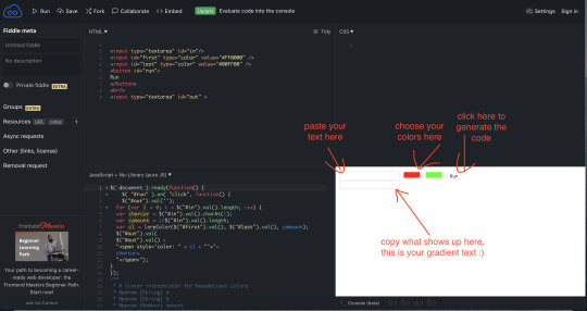
for choosing your colors, you can make them exact colors from your post if you like! clicking on the color options will give you this:

but if you click show colors this window will appear (I am on a Mac, I don’t know what it looks like on PC)
If you have your art or gifs or whatever you are posting open on your screen you can click the eyedropper in the bottom row and select a color right off the image. If you have a hex code or rgb value, you can go here in the window to enter it:

you can get the hex code of a color in photoshop, or you can go to https://html-color-codes.info/colors-from-image/ and upload your image :) I’m not using the hex codes of the photo for this example, because I think brighter colors will be easier to see for this purpose.
once you have your code copied you can go back into your post and switch to the HTML editor

If your gradient text is the first thing in the post, put your cursor at the beginning of the blob of code you see and paste, likewise if it’s going to go at the end. If you want it somewhere in the middle, look for the text right after where you want to put your gradient text, and follow the tags backwards (to the left) that don’t have forward slashes (they look like this <>) until you get to one with a forward slash, like this </>
</> this is a closing tag, <> this is an opening tag, so you’ll want your gradient text code to appear in between the closing tags of the previous thing and the opening tags of the next thing.

pasting where the cursor is placed above will put the gradient in between the second and third line of text. If you click preview it will look like this:
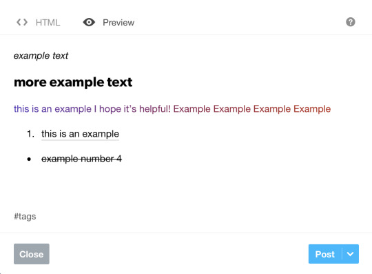
Now for the part you’ve probably been waiting for: how the heck do I edit this blob of code? I’ll tell you a bit about the relevant HTML tags and they will be put in bold so you can pick them out easier :)
Each letter of your gradient text will be between its own <span></span>
If you want to place a line break in your gradient text, find the first letter you want to go on a new line in the code and trace it backwards (to the left) until you reach a <span> and place <br> right before it.
For non gradient parts of your text, a similar idea applies, find the words you want on a new line, trace it back to a closing tag (</>) and place <br> right after that closing tag.
For the rest of the tags, you will need to insert an opening tag before and a closing tag after. to turn your first line of gradient text:
<span style='color: #4d22b4'>t</span><span style='color: #4e21b1'>h</span><span style='color: #4f21ae'>i</span><span style='color: #5121ac'>s</span><span style='color: #5221a9'> </span><span style='color: #5421a7'>i</span><span style='color: #5521a4'>s</span><span style='color: #5721a2'> </span><span style='color: #58219f'>a</span><span style='color: #5a209d'>n</span><span style='color: #5b209a'> </span><span style='color: #5d2098'>e</span><span style='color: #5e2095'>x</span><span style='color: #602093'>a</span><span style='color: #612090'>m</span><span style='color: #62208d'>p</span><span style='color: #64208b'>l</span><span style='color: #652088'>e</span>
into italics, add <i> before the first <span> and </i> after the last </span>

Now your text is italic!
Here are all of the tags for the other styling you are able to do with the rich text editor. They follow the same rules of how to put them in your code as the italics:
<b></b> bold
<i></i> italics
<h2></h2> headline
<a href=“”></a> link (put your url link in between the quotation marks)
<strike></strike> strikethrough
<p></p> another way to put text on a new line (it’s the paragraph tag)
<ol><li></li></ol> ordered list (1,2,3,4, etc.) <ol></ol> goes around the entire block of text that will be in the list, a different <li></li> goes around each individual list item. the same principle applies for unordered (bulleted) lists
<ul><li></li></ul> unordered list (bullets)
<blockquote></blockquote> indented text
I applied some of these to my blob of gradient text so you can see what it looks like :)


And there you have it! There are plenty of other little things you can do with HTML, but these are all the ones that Tumblr lets you change in the rich text editor. If there’s anything else you’d like to know how to do, my asks and dms are open for questions!!
bonus tips:
Once you switch to the HTML editor, you can’t switch back to rich text or you will lose your gradient and possibly some other formatting, so leave it in HTML mode once you’ve started!
Also, your gradient text will likely go away if you try to go in later and edit your post. I’m not sure why it does this but it can be quite frustrating. To be safe, it’s good to copy and paste the final code of your post into a note in case you need to add it back while editing the post down the line :)
#hope this is helpful!#gradient text tutorial#html tutorial#tutorial#gradient text#html#mystuff#mytutorial
69 notes
·
View notes
Text
A Comprehensive Guide to Archive of Our Own Filters
It’s complicated, I know. I’ve been using the website for years and there’s still stuff I don’t understand! I thought it’d be a nice idea to add a little guide for the filters on here for all those who need it. Enjoy!
What is Archive of Our Own?
Archive of Our Own, called Ao3 for short, is an “archive for transformative fanworks, like fanfiction, fanart, fan videos, and podfic.” (Official Statement on the website.) It’s a place where fans can find and enjoy work from the others within their own fandom, as well as upload their own work!
What are Filters?
On Ao3, Filters allow users to narrow down their searches so that they can find the specific things they’re looking for. BUT, the Filtering system — as well as the tagging system — on Ao3 can get a little complicated.
That’s what this guide is for, so continue on!
Understanding Filters
After selecting a fandom to search in, you’ll see the following image, slightly varied depending on if you’re on desktop or mobile:
(I’m on mobile and I used the Naruto fandom as an example.)

Upon clicking the Filters button, you’ll see a number of choices and drop-down menus:
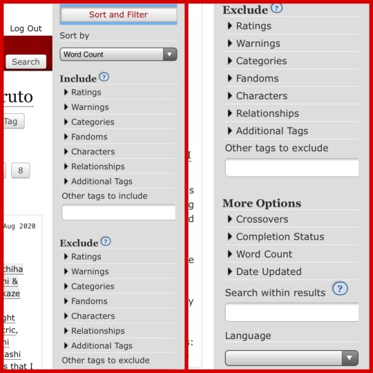
I’ll be going over these in order!
What is Sort By?
The first option you see is the Sort By menu. Upon clicking the drop-down menu, there are nine things to choose from. What Sort By allows you to do, is choose the order you want your search results to appear in. If, for example, you want the longest fanfics with a bunch of words to appear first, you would click the Word Count option.
If you want the most recently updated fanfics to appear first, you would click the Date Updated option. If you want the fanfics to appear in an alphabetical order (A-Z), you would either click Title or Author.
NOTE:
Numerical Order — Word Count, Hits, Kudos, Comments, Bookmarks.
Alphabetical Order — Author, Title.
Chronological Order — Date Posted, Date Updated.
Include or Exclude?
After Sort By, there are two sections: Include and Exclude.
If there are tags you want to see, make sure to select them under the Include section.
BUT, if there are tags you do NOT want to see, select them under the Exclude section.
What are Ratings?
Content ratings are used for games, TV shows, and movies. They rate how suitable the work is for its audience, and Ao3 does the same.
Ratings are as follows from most widely suitable to least suitable:
General Audiences - E for everyone can read it!
Teen and Up Audiences - 15 and up, leave the children behind.
Mature - 18 and up, sorry teens, adults only!
Explicit - Even some of the adults left the room. 🤐
Not Rated - In limbo, the author decided not to use a rating.
What are Warnings?
Warnings are assigned to works that contain triggering content that can make readers upset or uncomfortable.
Ao3 Warnings are as follows:
Major Character Death - If a work includes an important character death that doesn’t happen in the source material.
Graphic Depictions of Violence - If a work includes gruesome scenes, blood, murder, death, torture, or fighting.
Underage - If a work includes minors participating in illegal acts, specifically regarding sex.
Rape/Non-Con - If a work includes scenes where non-consensual sex takes place.
No Archive Warnings Apply - None of the above warnings are included in the work.
Creator Chose Not To Use Archive Warnings - For one reason or another, the creator does not disclose the warnings in the tags, or the warnings just don’t apply.
What are the Categories?
Ao3 Categories allow you to pick the relationship dynamics you wish to search for, or exclude from your search. They are as follows:
M/M - Two male characters in a relationship.
F/F - Two female characters in a relationship.
F/M - One female character and one male character in a relationship.
Multi - More than one kind of relationship and/or a relationship with more than two people.
Other - A relationship that’s not covered by the above categories.
Gen - Fics that aren’t primarily about shipping or explore different types of character relationships.
What are the Fandoms?
Obviously, fandoms are the different fan communities for pieces of entertainment media (musicians, games, tv, anime, etc.) Since you usually select the Fandom you want before filtering, this might confuse you, but it does have a purpose.
The Fandoms section allows you to choose other fandoms within the one you’re searching for. This is for crossover fanfics, or fics that take inspiration and story elements from more than one source material.
When you click the Fandoms tab, it shows you the top ten most used fandom tags under the fandom you’ve already picked. My example fandom was Naruto, so Naruto is the first fandom that shows up.
What are Characters?
The Characters tab shows you the characters in the source material of the fandom you’re looking in. It shows the top ten most used character tags within your search and the amount of fics that they are tagged for in parenthesis.
Select their names to include/exclude different characters.
What are Relationships?
Under the Relationships tab, it shows you the top ten most used relationship tags for the characters within your fandom. The relationships might include characters from other fandoms as well as the commonly written Blank Character/Reader or Blank Character/Original Character fanfics, if that’s what you’re looking for.
Select any of them to include/exclude from your search.
What are Additional Tags?
When you click Additional Tags, it shows the top ten most used tags in general for your fandom that don’t apply to the prior sections. Here, you’ll probably find the Alternate Universe tags, the Angst tag, the Fluff tag, and other common subjects found in your fandom’s fanfiction community.
Other Tags To Include/Exclude?
If the tag you’re looking for couldn’t be found in the previous options, then type it into the Other Tags search bar and you’ll likely find it. If it's a common tag, then it’ll show in an autofill selection pop-up underneath the search bar. If it doesn’t show up there, then you can still type it in yourself and see if you can find any fanfics that fit your search.
...
Now, after all that, there’s still a few more things to tackle, and that would be the More Options section. Under More Options, there are miscellaneous things you can choose to further refine your search.
Crossovers?
We talked about crossovers earlier! Under this section, you can choose one of three options: Include Crossovers, Exclude Crossovers, and Show Only Crossovers.
Include Crossovers allows crossover fanfics into your search, Exclude Crossovers removes crossover fanfics from your search, and Show Only Crossovers is for if you’re only searching for crossover fanfics.
What is Completion Status?
Completion Status is how much of a work is finished. Here, you have three options: All Works, Complete Works Only, and Works in Progress only.
All Works includes both complete and incomplete works in your search. Complete Works Only filters out any works that are not finished. Works in Progress Only filters out any works that are finished.
What is Word Count?
Under Word Count, you can decide how long you want the fanfics in your search results to be. Depending on the amount of words you specify, it will filter out any fanfics that do not fit into your range.
There are two search bars. The first search bar is labelled From. The second is labelled To.
If you put a number in the From search bar, your search results will only show you fanfics with a word count that is equal to and more than the number you searched for.
If you put a number in the To search bar, your search results will only show you fanfics with a word count that is equal to and less than the number you searched for.
Putting numbers in both search bars will give you fanfics with a word count that falls between the two numbers.
What is Date Updated?
Under Date Updated, you can search for works that were updated within a specific time period.
Like the Word Count tab, there is a From search bar and a To search bar. Clicking on either of these search bars should cause a mini calendar to pop up, where you can select the date that you want to specify.
If, for some reason, that does not happen, then the date format should look like this: YYYY-MM-DD.
If you put a date in the From search bar, your search results will only show you fanfics that have been updated on that date and afterwards.
If you put a date in the To search bar, your search results will only show you fanfics that have been updated on that date and previous.
Putting dates in both search bars will give you fanfics that have been updated within the time span you have searched for.
What is Search Within Results?
The Search Within Results search bar allows you to further specify what you want. Here, after you select all your tags, any thing you put in this search bar will be found in the title or summary of your search results. You can search for specific authors or specific phrases, if you want. NOTE: all the stories you search for will have all the tags you selected.
There’s a small blue question mark next to where it says Search Within Results, and that gives you instructions on how to use special characters/symbols to include or exclude which words you’d like or would not like to find.
What is Language?
After choosing all the different tags and all of that, you have your last selection option. Here, you’ll see a drop-down menu where you can choose one language that you want all of your search results to be in.
Anddd… done!
When you’re ready, click the Sort and Filter button and your search results will pop up!
I hope A Comprehensive Guide to Ao3 Filters has been helpful for anyone confused about the filters and search options. If you’ve got anymore questions, don’t be afraid to ask.
ℋ𝒶𝓅𝓅𝓎 ℛℯ𝒶𝒹𝒾𝓃ℊ!
Taxomin, out! ⭐️
#ao3 fanfic#how to use ao3#ao3 guide#confusion#filters#tagging#archive of our own#fanfiction#ao3 writer#how to#guide#questions#help
56 notes
·
View notes
Text
“Finding the Captivating Dialogue for You”
④ How-to-do Feature ┊ ᴬˡˡ ᵒᶠ ᵃⁿ ᵃⁿᵉᶜᵈᵒᵗᵉ ˢᵒ ᵃʳᶦᵈ ᵃⁿᵈ ᵃˡˡᵘʳᶦⁿᵍ ᵃᵗ ᵒⁿᶜᵉ··· ᶜᵃⁿ ᵇᵉᶜᵒᵐᵉ ᵃ ᶜᵒᵐᶦᶜ ᶜᵃᵖᵗᵘʳᶦⁿᵍ ᵗʰᵉ ᶜᵒʳᵉˢ ᵒᶠ ᶜᵒˡᵒʳᵉᵈ ᶜᵒʳⁿᵉᵃˢ·
꒰⁺˚₊·₍₍loading...₎₎ ✎...۪۫❁ཻུ۪۪ -ˏˋ 🃏 ˊˎ-
༘✶ ㊉ ㈦〘 ��Ⅿ 〙⋆。˚𓆟 ༉ ║ Posted : 06/15/21° 。༄ ‧₊˚ ๑ ㅤ ㅤ ㅤ ㅤ •ଓ.° 。❍ ㈩ ㊇
- - ——— ꒰ An article by Nicole “Nikki” Elaine S. Chua ꒱
ㅤㅤ ㅤㅤ₊·͟͟͟͟͟͟͞͞͞͞͞͞➳❥ ࿐ྂ—͙❬₊° ᶦ ᵃᵐ ᵃ ᵇˡᵒᵍᵍᵉʳ ᵃᶠᵗᵉʳ ᵃˡˡ·“= ‹⸙͎
Cure your boredom by finding something new! Enter the world of art and stories combined! Find the story to obsess over, only here on WEBTOON! Hold on, let me just shake out all the interpretative literary devices I had from my previous articles... There, much better! Welcome back to your favorite bunny—Nikki’s Tumblr blog! It feels a bit different here compared to when I am on Amino, to be honest. Yes, when I formally write without too many literary devices, my blogs smoothen like this, like it was polished with sandpaper or something. Anyway, I loosen up in order to display my love for something I’d like to offer to this world—one of those precious gems that have not been excavated in the realm of fandoms. Today, in this article, let’s enter the world of Webtoons and figure out 𝙝𝙤𝙬 𝙩𝙤 𝙨𝙩𝙖𝙧𝙩 𝙤𝙣 𝙒𝙀𝘽𝙏𝙊𝙊𝙉 (𝙇𝙞𝙣𝙚 𝙒𝙚𝙗𝙩𝙤𝙤𝙣𝙨) 𝙖𝙨 𝙖 𝙧𝙚𝙖𝙙𝙚𝙧!
Oh, hold on your horses! You’re asking what do I mean by Line Webtoons? My apologies for not explaining that before I bring you along this own carpet ride. To begin with this sudden class session, webtoons are webcomics that have a vertical reading format. In Korea, “manhwa” is often something you’d hear when the locals there refer to comics. These webtoons originated from South Korea, and now, they are rebranded by different companies with their hit titles. One of those brands is Naver Webtoon, and internationally, it is known as Line Webtoons. In 2019, it has now become WEBTOON, for short! Korean webtoons that are from Naver Webtoon have been officially translated into English, Chinese, Japanese, Indonesian, Thai, Spanish, French, and German languages in the present. At the same time, all these countries of the world wide web get to also be webtoon creators, too!
Comics are a mix of art and writing in multiple panels. Though unlike those readable from right to left, or the complete opposite of that, webtoons take advantage of vertical scrolling to reveal shocking key plot points and add more aesthetic in the blooming & stunning art they provide to the audience. They don’t upload once a month or year—in WEBTOON, there’s always something to read daily! Most WEBTOON series upload once a week, depending on its creator. As a reader, you’ll surely enjoy the vast options of webtoons to choose from reading at your own pace. There are many interesting genres, art styles, character designs, pairings, story lines, and themes to look forward to. The best part is, 𝙮𝙤𝙪 𝙘𝙖𝙣 𝙚𝙭𝙥𝙡𝙤𝙧𝙚 𝙖𝙡𝙡 𝙩𝙝𝙞𝙨, 𝙛𝙤𝙧 𝙛𝙧𝙚𝙚! There’s a perfect story to dwell into for all kinds of people, so if you’re curious in knowing how to begin reading, let’s go ahead and jump into the app!
ㅤㅤ ㅤㅤ╔═━─────────━▒ ۞ ▒━─────────━═╗
ㅤㅤ ㅤㅤ╚═━─────────━▒ ۞ ▒━─────────━═╝
𝗦𝘁𝗲𝗽 ⓵: 𝗗𝗼𝘄𝗻𝗹𝗼𝗮𝗱 𝘁𝗵𝗲 𝗪𝗘𝗕𝗧𝗢𝗢𝗡 𝗮𝗽𝗽 𝗼𝗿 𝗮𝗰𝗰𝗲𝘀𝘀 𝘁𝗵𝗲 𝗪𝗘𝗕𝗧𝗢𝗢𝗡 𝘀𝗶𝘁𝗲.
The first step to get started with WEBTOON is approaching its services, first! You If you haven’t encountered WEBTOON yet, you could either take a little peak behind its digital pages online. I recommend downloading the app to enjoy the WEBTOON experience to the maximum level. If your first language is not English, perhaps a more comfortable version of the app made for your location fortunately exists! Search for WEBTOON on the playstore, and you will spot the application in a flash. It is only 21 MB or megabytes big, so it is not painful to the phone storage.
However, if you want to save space, you can always take the other route and access the WEBTOON site here. You can search for WEBTOON on your device’s browser, and the link you see immediately will lead you to the destination you desire to land onto. The site is mostly used by personal computer users and those who cannot download the app. It functions the same way as the app, but not all the features, events, and other cool activities can be done here. So, I still suggest to head over to your device’s playstore to get the application!
𝗦𝘁𝗲𝗽 ⓶: 𝗦𝗶𝗴𝗻-𝘂𝗽 𝗳𝗼𝗿 𝗮𝗻 𝗮𝗰𝗰𝗼𝘂𝗻𝘁 𝗼𝗻 𝘁𝗵𝗲 𝗪𝗘𝗕𝗧𝗢𝗢𝗡 𝗮𝗽𝗽.
Any app would instruct the user to create an account to use its services. For WEBTOON though, this is very worth it, for it gives you a chance to use your account to comment on WEBTOON episodes you adore, or subscribe to the series you want to follow and support. You can create an account using your email address and the password to access it personally. Just the same as any other process in signing-up for an account, you will type your own username. You could also your very own Facebook, Twitter, Google, or LINE account to enter, and your name on the site you’ve chosen to log-on with will become your name on WEBTOON.
It is editable, so don’t worry if your username so happened to be humiliating, and you absolutely must change it! Though, if you don’t want to create an account just yet, users can view webtoons with a press of a finger without signing up for anything, if you’d press the return key on your phone or if you’re browsing on the site. Once you submit your approval that you’ve read and understood the Terms of Use & Privacy Policy of WEBTOON, you can finally set foot on the real fun of webtoons!
ㅤㅤ ㅤㅤ╔═━─────────━▒ ۞ ▒━─────────━═╗

ㅤㅤ ㅤㅤ╚═━─────────━▒ ۞ ▒━─────────━═╝
𝗦𝘁𝗲𝗽 ⓷: 𝗧𝗮𝗸𝗲 𝘁𝗵𝗲 “𝗙𝗶𝗻𝗱 𝘆𝗼𝘂𝗿 𝘀𝗲𝗿𝗶𝗲𝘀” 𝗾𝘂𝗲𝘀𝘁𝗶𝗼𝗻𝗻𝗮𝗶𝗿𝗲.
Okay, do not get confused! We’ll get to the rest of the areas of the app in a little bit! There’s a lot of things to do, now that we’ve finally arrived on WEBTOON platform itself. Though before being hyped at the things you are seeing right now, I’d like you to scroll down to the bottom of this “For You” section, and dig up the “Find your series” questionnaire to answer it. This is so that you can have an idea of what to expect here on WEBTOON, as well as what to read first. This is a questionnaire that will also introduce you to stories that you’d enjoy, without getting totally overwhelmed with content to stretch out into. No pressure in choosing, it will not affect how your account is set-up! Don’t worry about the results either. Answer as natural and honest as you can! This step is only applicable to those who are on the WEBTOON application. It is also optional to the reader, specifically if they are already used to reading webcomics and know what to expect.
Once you enter, it’d ask what are the genres you like. There is horror, comedy, thriller, fantasy, drama, romance, superhero, slice of life, action, and sci-fi. To clarify, slice of life does not literally mean a splitted life! It is a genre for stories that showcase the everyday life of a person, that are either relatable or engaging to read about. Choose as many genres as you want—it’s totally fine to check everything, or to choose one specific genre. Then, you can choose which art styles you prefer from the choices you see in front of your screen. Again, don’t worry about picking art styles—this is not a critical survey! Go ahead and pick many art styles you find pleasing to the eye. Then, you’ll get a list of webtoons recommended to you by the WEBTOON management! Easy, right?
You can take note of these titles given to you, or you can press on the webtoons you find interest in, and you will be taken to the webtoon’s contents in a jifty. That’s where you can read the description of the title’s plot, and you can instantly start reading if it strummed your heartstrings. You can continue discovering more stories to read from here, since the freedom is yours. Even so, there are still parts of the application to discuss that may give you an extra hand later on. Stick around this article for more of that, especially when you need an enthusiatic tour guide like me!
𝗦𝘁𝗲𝗽 ⓸: 𝗖𝗵𝗲𝗰𝗸 𝗼𝘂𝘁 𝘁𝗵𝗲 “𝗢𝗿𝗶𝗴𝗶𝗻𝗮𝗹𝘀” 𝘁𝗮𝗯.
If you’re still following me, you may exit the questionnaire that you entered into a while ago. Now, if you scroll up, we’re back seeing graphics moving sideways at the front page. Oh, did you something catch your eye there? These graphics that WEBTOON fans usually call as “banners” (or, for me, personally—anyway,) are another way to gain interest in choosing stories to read. Long story short, when I became a WEBTOON reader, my all-time favorite webcomic from WEBTOON was first shown to me on a banner. (A very epic one, too!) Most of the webtoons shown here are in the “Originals” tab! From “For You,” press the Originals tab next. These are the tenths of webtoons that you can also read here on WEBTOON. The image is just one section of that. If you can observe, there are the seven days of the week stated at the top of these webtoons, under the word, “Daily.” You might be asking why is this section called, “Originals.” All these webtoons found under this tab are in partnership with the WEBTOON management, and these stories release new episodes weekly!
ㅤㅤ ㅤㅤ╔═━─────────━▒ ۞ ▒━─────────━═╗
ㅤㅤ ㅤㅤ╚═━─────────━▒ ۞ ▒━─────────━═╝
That simply means that the creators of these webtoons are working together with WEBTOON to share their stories with us, and what’s the best thing? They get to tell their stories, while fulfilling their dream full-time job as a paid webcomic creator! Their work is now known as “WEBTOON ORIGINALs,” though before, they used to be “Featured Webtoons.” Everyday, various webtoons of different genres update with new parts to continue the story from where they left off previously, so there’s definitely something to look forward to from Mondays to Sundays. There are also more choices here than those in the questionnaire, so if you weren’t contented with what you got from answering questions, you can also come here to pick out stories. There are also webtoons under “Completed,” and we’ll get to those in a bit. If you’d ask me what I usually do on Originals, I read everything in general, so I never run out of things to read, but I’m more fond of fantasy genres. You can also choose webtoons from all days of the week, so you can keep reading something everyday before going to school or work, or perhaps, when you’re about to sleep.
𝗦𝘁𝗲𝗽 ⓹: 𝗘𝘅𝗽𝗹𝗼𝗿𝗲 𝘁𝗵𝗲 “𝗖𝗮𝗻𝘃𝗮𝘀” 𝘁𝗮𝗯.
Now, there must be another question in your head. “How are these webcomic creators chosen to be featured, or have their work included under WEBTOON ORIGINALs?” There are a couple of ways, though, we’ll focus on this canvas of ideas for this article. Usually, creators are discovered on the fan submissions area of the application. Yes, you heard me right! If you are someone who loves drawing comics as well, then you can give this opportunity a shot and meet other aspiring creators here on “Canvas!” So, let’s move from the “Originals” tab and head straight into the “Canvas” section. The webtoons here are under the word, “Spotlight.” It’s simply because these webtoons are uploaded by other webcomic creators who are not affiliated by WEBTOON, yet. So, you could say that this is the wider scope of webtoons to look through. The best thing about “Canvas” which used to be “Discover,” is the fact that we can support these writers and/or artists by reading their stories.
WEBTOON is a platform perfect for people to test the waves of being a webcomic creator. At the same time, they are given the chance to gain a community of a readers that you could also be a part of! However, since these webtoons labeled as “CANVAS WEBTOONs,” are not fully paid by WEBTOON, there is no guarantee that they’ll upload episodes every week. They are free to upload on their own running schedule, but in return, they are also free to create any story they like, as long as it follows the WEBTOON guidelines. Just a brief heads-up, you must have a computer or laptop, in order to upload your own webcomic on WEBTOON. For us readers, it’s a big chance for us to find stories we’ll fall in love with—the one that will make us invested and devoted to how the story continues. If you give the CANVAS WEBTOON more support, who knows? You might be a part of their life accomplishment journey to doing what they love for a living. Very heartwarming, I see.
𝗦𝘁𝗲𝗽 ⓺: 𝗜𝗳 𝘆𝗼𝘂 𝗮𝗿𝗲 𝗶𝗻𝘁𝗲𝗿𝗲𝘀𝘁𝗲𝗱, 𝘁𝗮𝗸𝗲 𝗮 𝗴𝗹𝗶𝗺𝗽𝘀𝗲 𝗮𝘁 𝘁𝗵𝗲 𝗿𝗮𝗻𝗸𝗶𝗻𝗴𝘀 𝗮𝗻𝗱 𝗴𝗲𝗻𝗿𝗲 𝘀𝗲𝗰𝘁𝗶𝗼𝗻𝘀.
We’ve already seen all the webtoons that the app has to offer to us. Despite that, there’s a chance that you still don’t know what stories pique the elements you like in a plot. Now that you know that there are more webtoons to search for on the WEBTOON app, you might need a guide or factor to know what’s the best story to try out. This is why the rankings and genre sections exist on the app! You can view the rankings of WEBTOON ORIGINALs and CANVAS WEBTOONs in their respective tabs. For ORIGINALs, you can click on the badge-like icon to the top right, while in CANVAS, you can see the rankings immediately. If you want to see the complete rankings list for CANVAS WEBTOONs, pressing the arrow at the right side of the rankings preview will do the trick! This step is for users who cannot decide based on what gem of a webtoon preview has caught their attention. If you'd like to find out what webtoons are popular overall, or in their corresponding genres, be sure to use this feature to weigh the odds. We are people who are influenced by whatever is loved by many, after all.
ㅤㅤ ㅤㅤ╔═━─────────━▒ ۞ ▒━─────────━═╗
ㅤㅤ ㅤㅤ╚═━─────────━▒ ۞ ▒━─────────━═╝
If ten genres weren't enough choices during the questionnaire, well, thankfully there is more to play with! In the genre sections of both types of webtoons on WEBTOON, which you can see alongside the rankings, you can also view webtoons listed under the supernatural, mystery, sports, historical, heartwarming, and informative genres! So, in total, there are 16 genres to step into, and that's a plenty! In that said area, you can tell which genres have the best stories based on how many people read each webtoon. You can also sort these webtoons by interests, likes, or date. Just press the "Genres" button next to the "Daily" or "Spotlight" text on either tabs. The "sorting the webtoons by interests" option would depend on what your account has read, so far. These features are really handy to introduce to you new webtoons to take your eyes on or pay attention to.
𝗦𝘁𝗲𝗽 ⓻: 𝗨𝘀𝗲 𝘁𝗵𝗲 𝗳𝗲𝗮𝘁𝘂𝗿𝗲𝘀 𝗼𝗻 𝘁𝗵𝗲 “𝗠𝘆” 𝘁𝗮𝗯.
I suppose you've already chosen a webtoon to read, or maybe you're already into collecting webtoon titles to remember reading. Regardless, let's make things a little easier. You'd need your account, first! If you haven't created one yet, head to the log-in page and go back to Step No. 2. Catch up here when you're done, alright? If you’re already here, let me take you a stroll around this “My” tab. This section has list of features that are for the account’s convenience and personalization. It tells you what webtoons episodes have you recently read, downloaded, commented, and unlocked. It also states what webtoons have you subscribed to. Oh, yes, you can do all these things for your favorite stories on WEBTOON! To try that out, go to your chosen webtoon to read. As a reader, you are given the chance to rate the webtoon from 1 to 10—whether it is an ORIGINAL or CANVAS-type. That also makes heads turn away or stare closer at the stories, to see if they are worthy of their time.
Just like how subscriptions work on Youtube or any other platform, subscribing to a webtoon with your account means that you’ll get notifications whenever it uploads. It’s also easier to access subscribed webtoons through the “My” tab, instead of continously searching for your favorite stories all over the application or site as if you’re in a never-ending maze. You can track down the episodes you’ve downloaded for offline use as well, which comes in great situations where wifi is not available. Be aware that downloaded episodes will remain on your account for 30 days only, however. After 30 days, you may download the episodes again. Commenting on episodes can give you interaction with other readers’ ideas—those reactions, arguments, discussions, and, well! You could even talk about romantic pairing wars and all that’s fizzling in the premise of the story. With this section of the app, your account will be able to be fit and active, while it gives access to more parts of WEBTOON—including the possession of fast pass coins to unlock episodes for early reading! Wait a minute. Why must we, and how do we do that?
ㅤㅤ ㅤㅤ╔═━─────────━▒ ۞ ▒━─────────━═╗

ㅤㅤ ㅤㅤ╚═━─────────━▒ ۞ ▒━─────────━═╝
𝗦𝘁𝗲𝗽 ⓼: 𝗧𝗮𝗸𝗲 𝗮𝗱𝘃𝗮𝗻𝘁𝗮𝗴𝗲 𝗼𝗳 𝘁𝗵𝗲 𝗳𝗮𝘀𝘁 𝗽𝗮𝘀𝘀 𝗰𝗼𝗶𝗻𝘀 𝗲𝘃𝗲𝗻𝘁.
Fast pass on WEBTOON allows you to read episodes before they are publicly released. In other words, you can gain early access to your most awaited ORIGINAL WEBTOONs’ episodes, especially when they get on that gripping cliffhanger that makes you want to go crazy with what happens next! The question is, how can we use fast pass? We can do that with coins called, “fast pass coins.” This in-app currency will permit you to avail one fast pass episode every five coins. In order to get coins, however, there is real money transactions involved. Though, do not fret, because you do not need to spend a dime or a single peso over buying fast pass episodes! WEBTOON offers users to gain five or more fast pass coins through events in the app.
These vary from having to log-in in 7 days, or read similarly themed webtoons that are featured per event. It’s free to do, though, they do not come by all the time—events do not run forever, after all. So, take on the challenge when it arrives, and get yourself some fast pass episodes to enjoy! One benefit in taking part in fast pass coins events is reading new stories that you’ve never tried peaking into before, because who knows when will it become your top webtoon choice in the future? Take it for me—one webtoon became my favorite when the first fast pass coins event entitled, “Climb the Tower challenge,” occured. I participated and had climbed 100 episodes, and now here I am chilling with floors and betrayal!
If you haven’t asked, all fast pass coins given to each webtoon will have a part of its value given to the creators of the said stories. In other words, it’s like directly supporting the artists, writers, and creators of the stories you love! This step can only be done to ORIGINAL WEBTOONs. CANVAS WEBTOONs do not have fast pass, though its creators can provide Patreon accounts where fans can donate or give thanks for their eloquent and awesome stories to tell.
𝗦𝘁𝗲𝗽 ⓽: 𝗗𝘄𝗲𝗹𝗹 𝗶𝗻𝘁𝗼 𝘁𝗵𝗲 𝗖𝗼𝗺𝗽𝗹𝗲𝘁𝗲𝗱 𝘄𝗲𝗯𝘁𝗼𝗼𝗻𝘀 𝘄𝗶𝘁𝗵 𝘁𝗵𝗲 𝗱𝗮𝗶𝗹𝘆 𝗽𝗮𝘀𝘀 𝗳𝗲𝗮𝘁𝘂𝗿𝗲.
Remember when I mentioned “completed” webtoons prior to this step? It’s interesting that there also webtoons that have ended, so there is a section for WEBTOON ORIGINALs that have ended in the “Originals” tab. Here, you can still binge-read completed webtoons for as many times you want to, and you can also gain a collection of read finished webtoons on your proud wall. The satisfaction is there when you finish a story—but, wait a minute. We are familiar with fast pass, now, what’s up with this daily pass? For some completed webtoons, they are readable with the daily pass feature. This makes a webtoon’s episodes first episode public for reading, but the twist is, to read the next episodes, you must come back everyday to continue. Episodes in the middle until the end of the story are locked, and can only be carried on if you’ve lended a daily pass entry for it to be opened for a limited time. Then, you can access the next episodes in the following days. Tedious as it may be, you could also pay for fast pass coins to read these specific completed webtoons quicker.
However, if your route is free reading, it is also a fulfilling experience to follow a story as if it was still uploading everyday, instead of reading it in one sitting. This is the patience, yet satisfaction, that can be acquired from daily pass. That is also the goal of WEBTOON for implementing such a feature to their application. You don’t have to pay for anything if you don’t want to speed up your time in reading. This step is definitely for you, if you’re already reading ongoing webtoons, but want to find more stories in the completed section. Trust me, the stories we got here with the daily pass feature were real hits back in the day—somehow, the dust on their covers will be swept away when you touch it. It’s worth it, so why not give it a shot? I heard that one completed webtoon here was recently adaptated into an anime, another has been published physically, while the other was given a live-action K-drama on Netflix! Let’s see if you can figure out which stories these are!
𝗦𝘁𝗲𝗽 ⓾: 𝗞𝗲𝗲𝗽 𝗿𝗲𝗮𝗱𝗶𝗻𝗴 𝗮𝗻𝗱 𝗱𝗶𝘀𝗰𝗼𝘃𝗲𝗿𝗶𝗻𝗴 𝘄𝗲𝗯𝘁𝗼𝗼𝗻𝘀!
So, once you’ve found your beloved webtoons, fully invested into them with your account, made use of fast pass, and indulge into daily pass, the only thing left to do to begin on WEBTOON is to stick to it! Keep being a WEBTOON reader, and enjoy as many webtoons as you’d like. As you keep being on the application or site, you will encounter more features of WEBTOON, and maybe, as you stick around, more surprises & stories will be coming your way. There’s the fan translation area to explore, where you can translate the webtoons you’d love to support and be a contributor to its spread to other languages. There are thousands of CANVAS WEBTOONs being promoted in the front page for explorers to uncover reading. Spotlights at the bottom of the front page compile webtoons together, and you’d get to see more webtoons that may be under the spotlighted theme you adore!
You will be a part of this passionate WEBTOON community, and I’d like to thank you if you keep engaging into this craft as a reader. WEBTOON is a group of people who loves comics, and webcomics alike. It’s a place where creators and readers get to connect, at the same time, reach for their dreams. This is where their imaginations sprint wild—the happiness, sadness, anger, fear, worry, doubt, cheer, and excitement at every panel scrolling down your devices. You will be joining along with its growth, as well as all webcomic creators trying out on the platform, that WEBTOON sincerely cares for, wherever or whoever they are. You can witness how its stories will not only become panels and dialogue, but also animation, live-action, physical books, and other media types all around the world.
Do continue finding the captivating dialogue for you in WEBTOON, because for sure, it will become the message you will hold onto for life. Dramatic Nikki aside, thank you very much for reading this article! I had a blast—almost like I was going to be blasted on a rocket ship to Mars, while I was writing this feature. I hope my steps were able to help you get started on WEBTOON, and I’d like to bid you all the best on your personal voyage here. I believe each story of how we became attached to something is very significant, so take this moment to make it a memorable event in your life. Once more, thank you for reading! Come back again in another blog in the unknown future, where my fantasies become realities! A Nikki reminder: don’t just be ordinary when everyone is doing wrong—be unORDINARY, right & just, and continue to climb without holding back!
· * ✫ * ⊹ * ˚ . . · ⋆ * . * . . · . · . * · . · · + . ㅤㅤ ㅤㅤ ㅤㅤ ㅤ ㅤㅤ ㅤ ㅤㅤ ㅤㅤ ㅤㅤ ㅤ ㅤㅤ ㅤ ㅤㅤ ㅤㅤ ㅤㅤ ㅤ ㅤㅤㅤㅤ· ** ˚ . . + · ⋆ * . * . . · . · . *
ㅤㅤ ㅤㅤ. . + · ⋆ * . * . . · . · .˚ ⊹ · * ✧ ⋆ · * . · . · · .. . .
ㅤㅤ ㅤㅤ ㅤㅤ ㅤ ㅤㅤ ㅤ ㅤㅤ ㅤㅤ ㅤㅤ ㅤ ㅤㅤ ㅤ ㅤㅤ ㅤㅤ ㅤㅤ ㅤ ㅤㅤㅤ ㅤ ㅤㅤ ㅤㅤㅤ· + ㅤㅤ ㅤ ㅤㅤ ㅤㅤ· * ✫ * ⊹ * ˚
ㅤㅤ ㅤ ㅤㅤ · ** ˚ . . + ㅤㅤ · ⋆ * . * . . · . · .˚ ⊹ · * ✧
ㅤㅤ ㅤㅤ ㅤㅤ ㅤ ㅤㅤ ㅤ ㅤㅤ ㅤㅤ ㅤ ㅤ ㅤㅤ ㅤ ㅤㅤ ㅤㅤ ㅤㅤ ㅤ ㅤㅤ ㅤ ㅤㅤ ㅤㅤ⋆ · * . · ㅤㅤ . · · .. . . · + .
ㅤㅤ ㅤ ㅤㅤ ㅤㅤ ㅤㅤ ㅤ ㅤ. · + . *
ㅤㅤ ㅤㅤ ㅤㅤ ㅤ ㅤㅤ ㅤ ㅤㅤ ㅤ ㅤㅤ ㅤ ㅤㅤ ㅤ ㅤㅤ ㅤㅤ ㅤㅤ ㅤ ㅤㅤ ㅤ ㅤㅤ ㅤㅤㅤㅤ ⋆ * . * . .
ㅤㅤ ㅤ ㅤㅤ ㅤㅤㅤㅤ ㅤ . · ·
ㅤㅤ﹙dedication. ﹚ ୨˚୧ ˚ ༘♡.↳ ₊˚‧
This blog is dedicated to you who is like me, and him who is like her. Both webtoon characters that I salute the most—and that beautiful set of panels that has become my lifestory. May you be in work for ten years or five years, I will cherish you, with this shining sword—diamond, ADAMAS.
ㅤㅤ ㅤㅤ ㅤㅤ ㅤ ㅤㅤ ㅤ ㅤㅤ ㅤㅤ ㅤㅤ ㅤ ㅤㅤ ㅤ ㅤㅤ ㅤㅤ ㅤㅤ ㅤ ㅤㅤ ㅤㅤ ㅤㅤ ㅤ ㅤㅤ ㅤ ㅤㅤ ㅤㅤ ㅤㅤ ㅤ ㅤㅤ ㅤ ㅤㅤ ㅤㅤ ㅤㅤ ㅤ ㅤㅤ ㅤㅤ ㅤㅤ ㅤ ㅤㅤ ㅤ ㅤㅤ ㅤㅤ ㅤㅤ ㅤ ㅤㅤ ㅤ ㅤㅤ ㅤㅤ ㅤㅤ ㅤ ㅤㅤ ㅤㅤ ㅤㅤ ㅤ ㅤㅤ ㅤ ㅤㅤ ㅤㅤ ㅤㅤ ㅤ ㅤㅤ ㅤ ㅤㅤ ㅤㅤ ㅤㅤ ㅤ ㅤㅤ ㅤ ㅤㅤ ㅤㅤ ㅤㅤ ㅤ ㅤㅤ ㅤㅤ ㅤㅤ ㅤ ㅤㅤ ㅤ ㅤㅤ ㅤㅤ ㅤㅤ ㅤ
ㅤㅤㅤㅤㅤㅤㅤㅤ﹋﹋﹌﹌﹌「 🗼 」﹌﹌﹌﹋﹋
ㅤㅤ ㅤㅤ ㅤㅤㅤ ㅤㅤㅤ ┊彡 Credits
➥ Cover Edit
➫ WEBTOON app
ㅤㅤ ㅤㅤ ㅤㅤ ㅤ ㅤㅤ ㅤ ㅤㅤ ㅤㅤ ㅤㅤ ㅤ ㅤㅤ ㅤ ㅤㅤ ㅤㅤ ㅤㅤ ㅤ ㅤㅤ ㅤㅤ ㅤㅤ ㅤ ㅤㅤ ㅤ ㅤㅤ ㅤㅤ ㅤㅤ ㅤ ㅤㅤ ㅤ ㅤㅤ ㅤㅤ ㅤㅤ ㅤ
➥ First Blog Dividers
➫ Soara Academy
ㅤㅤ ㅤㅤ ㅤㅤ ㅤ ㅤㅤ ㅤ ㅤㅤ ㅤㅤ ㅤㅤ ㅤ ㅤㅤ ㅤ ㅤㅤ ㅤㅤ ㅤㅤ ㅤ ㅤㅤ ㅤㅤ ㅤㅤ ㅤ ㅤㅤ ㅤ ㅤㅤ ㅤㅤ ㅤㅤ ㅤ ㅤㅤ ㅤ ㅤㅤ ㅤㅤ ㅤㅤ ㅤ ㅤㅤ ㅤㅤ ㅤㅤ ㅤ ㅤㅤ ㅤ ㅤㅤ ㅤㅤ ㅤㅤ ㅤ ㅤㅤ ㅤ ㅤㅤ ㅤㅤ ㅤㅤ ㅤ
➥ The Rest of the Blog Dividers
➫ WEBTOON app
ㅤㅤ ㅤㅤ ㅤㅤ ㅤ ㅤㅤ ㅤ ㅤㅤ ㅤㅤ ㅤㅤ ㅤ ㅤㅤ ㅤ ㅤㅤ ㅤㅤ ㅤㅤ ㅤ ㅤㅤ ㅤㅤ ㅤㅤ ㅤ ㅤㅤ ㅤ ㅤㅤ ㅤㅤ ㅤㅤ ㅤ ㅤㅤ ㅤ ㅤㅤ ㅤㅤ ㅤㅤ ㅤ ㅤㅤ ㅤㅤ ㅤㅤ ㅤ ㅤㅤ ㅤ ㅤㅤ ㅤㅤ ㅤㅤ ㅤ ㅤㅤ ㅤ ㅤㅤ ㅤㅤ ㅤㅤ ㅤ
➥ Source of Information
➫ Webtoon Wikipedia page
➫ WEBTOON (Line Webtoon) Wikipedia page
➫ My own knowledge as a WEBTOON reader
ㅤㅤ ㅤㅤ ㅤㅤ ㅤ ㅤㅤ ㅤ ㅤㅤ ㅤㅤ ㅤㅤ ㅤ ㅤㅤ ㅤ ㅤㅤ ㅤㅤ ㅤㅤ ㅤ ㅤㅤ ㅤㅤ ㅤㅤ ㅤ ㅤㅤ ㅤ ㅤㅤ ㅤㅤ ㅤㅤ ㅤ ㅤㅤ ㅤ ㅤㅤ ㅤㅤ ㅤㅤ ㅤ ㅤㅤ ㅤㅤ ㅤㅤ ㅤ ㅤㅤ ㅤ ㅤㅤ ㅤㅤ ㅤㅤ ㅤ ㅤㅤ ㅤ ㅤㅤ ㅤㅤ ㅤㅤ ㅤ ㅤㅤ ㅤㅤ ㅤㅤ ㅤ ㅤㅤ ㅤ ㅤㅤ ㅤㅤ ㅤㅤ ㅤ ㅤㅤ ㅤ ㅤㅤ ㅤㅤ ㅤㅤ ㅤ ㅤ ㅤㅤ﹋﹋﹌﹌﹌「 end. 」﹌﹌﹌﹋﹋
...Are you asking me if I wanted to be a WEBTOON ambassador...? Yes, but I have no social media influence. I'm just a small bunny in a burrow who loves talking and helping people get to know more about WEBTOON. Also, thank you for liking this, cheezbot. You're such a cute Tumblr bot, indeed.
ㅤㅤ ㅤㅤ ㅤㅤ ㅤ ㅤ ⭆ Back to Homepage ⭅
⇦ Previous Blogㅤㅤ ㅤㅤ ㅤㅤ ㅤ ㅤ ㅤㅤ ㅤㅤ ㅤㅤ ㅤ ㅤ
#NEU-IS PH#Creative Non-fiction#Feature Article#Blogging#How-to-do Feature#aNikKis Fantasirealities#WEBTOON#Webtoons#Webcomics#Webtoon Originals#Canvas Originals#Fast Pass#Daily Pass
5 notes
·
View notes
Text
Carrd.co
Hello roleplayers!! Are you looking for an easy, good-looking, and accessible place to host your blog info on outside of Tumblr? Is Google Docs just not cutting it for you? Then I have a solution for you. Consider checking out Carrd.co.
Carrd lets you create “simple, free, fully responsive one-page sites for pretty much anything.” And I know what you’re thinking -- ‘One page? Surely I can’t put all my info on just one page!’ But I assure you, you can. Despite being technically one page, your content can be easily spread across multiple sections for clear organization, much like a blog with pop-ups or tabs here on Tumblr.

Check out this sample site I whipped up to see what I mean.
In this post, I will walk through how I made this sample Carrd site, to demonstrate how simple and customizable it is. But first, to answer what you’re already wondering -- what makes Carrd any better than Google Docs? And I have three answers for you:
There is no issue of privacy or security. Your account name and email is not accessible anywhere on your Carrd site, nor are any viewers visible.
Carrd is much more mobile friendly than Google Docs. I don’t even attempt to open Docs on my phone anymore, as they’re a bit of a nightmare and I can never do it anonymously. But I’ve never once struggled with a Carrd site. Everything is automatically put into a mobile friendly format, and if the automatic settings do mess up, you have the ability to go in and manually change how things will be displayed on mobile.
This may be a bit more personal opinion, but I found Carrd easier to customize as far as colors, images, backgrounds, etc. After about ten minutes, I was comfortably manipulating all of the elements on my site, and much happier with the end result than anything I’ve seen on Docs.
Join me under the cut for a walkthrough of creating the site linked above.
As a note, I’m not intending this to be a full guide to all of Carrd’s features, just a general overview to see how things are laid out. It’s fairly intuitive so once you see the basics, you should be able to play around with it more and get your site just the way you want it.
When you create a Carrd account, you will be given this screen. (If you’re on the main dashboard instead, click New Site.)

You can either explore premade templates below, or you can start from scratch by clicking the link in “blank canvas”. I prefer a blank slate myself, but I encourage you to check out the templates if they seem easier for you.
After clicking “blank canvas” you will arrive at this screen.

These are just Carrd’s instructions. I’ll hit ‘Okay, got it!’ to get rid of it.

The first thing I want to do is customize the background. It’s a good starting point. To do that, click on the three lines in the top right corner...

...and select Background.
Options will open on the left side of the screen, as seen here. Your customization options are fairly straightforward.
You can change the color...

Or change it to something else entirely. I’m going to use an image.
After uploading your image, you have the option to recrop it.


Now I hit accept, and this will be my site’s background.
There are other options as well, that can reposition the image, change its size, tile it, etc.
I can also add a gradient or a pattern to this image. I’m going to scroll down to Overlay and select Gradient.

And change those colors and the angle a bit.

Ahh, lovely. I’ll also add a pattern...
But that looks rather ugly. I think I’ll play with the color, size, and thickness a bit more.

I like that. Nice and subtle. Let’s call the background done.

Now let’s customize the page itself. This isn’t necessary, if you like the text directly on top of your background, but I like how neat it looks.
Go back to the three lines, and this time select Page.

Under Style, I’m going to change Default to Box.


You can change the position, padding, and other settings of the box in this sidebar. Personally, I want to round the corners...
...change the color...

...and change the opacity.

I’d also like to add a border...
...plus a customized drop shadow.

And we’ll call that done.

Now! Let’s see what this site looks like on mobile. In the top right menu, to the left of the save icon, is an icon that looks like a phone. Click that.
As you can see, your view resized to demonstrate how your site will appear to a mobile user. It’s a very good reference. I’m going to switch back to desktop now (the same button, which now looks like a computer monitor).

Let’s get some content on this site now! I’m going to start with the text that’s already present, that says ‘Nothing here yet! :)’. Click on that.
Options for this text will appear. First, I’m going to click the word Text itself. This will cycle through various options, such as default text, headings, subheadings, etc. I want this to be my site title, so I settle on that. (This step isn’t necessary at all, but I find it helps keep me a bit more organized.)

Now, for the content itself. The box is where I enter what I want this text to say. Markdown instructions for bold, italics, links, etc. are always below the box for easy reference.

I want to change how this text looks. Above Site Title, you’ll see an icon that looks like a paintbrush. Click it to reveal the next tab.
Here you can change color, font, size, weight, and anything else that strikes your fancy. There are a lot of options here and they’re pretty straightforward, so play around with it. Here’s what I settled on.
Remember you can check it on mobile, as well.

Time to add more text. Let’s start with a bio, maybe?
Hit the plus sign in the upper right menu to add new content, then select text.

By default, new text will match the formatting of the most recent text used. I’m going to the first tab, the one marked A, and making this text Paragraph.
Then I go back to the paintbrush tab to make some changes to the style.
Then back to the first tab to add some content. I’m just dropping in some lorem ipsum, since this is only a sample. Obviously you’d want something a bit more practical here.

Let’s say I want a link in there. I’ll follow the markdown format to get one (instructions are below the box, as always).
Now it’s in there, as the third sentence. You can see it underlined. But I want to customize that link. If I go back to the paintbrush tab, options for Link and Hover have appeared. I can change the color there.

And if I scroll all the way down, I can change the link style from Underlined to Plain.
That looks nice. I’ll call that done.
Let’s add a subheading to that section. I’ll add another text box.

Then click and drag it above the previous one.
On the first tab, I’m going to change this one to Main Heading.

Then customize it as before.

Now for the actual text itself.
Lovely.
Let’s add some rules! I want to add a new title, so for that, I’m going to select the text that says About. Then in the bottom left is a button that looks like two overlapping squares. This will copy the text, so we don’t need to reformat it identically.

Click and drag the new title where you want it, and change the text to what you want.
I’m going to add a list now. It’s one of. the other options under the plus sign.

As you can see, some bullet points have appeared. Markdown instructions are still under the box where you enter the content. I’m going to fill it with lorem ipsum again.

Under the paintbrush tab, you’ll see that there are multiple tabs. The first lets you change some style and formatting.

The second lets you change the bullets themselves. I’m going to play with that a bit.
The third lets you change the actual text formatting. (I don’t know why my purple bullet points disappeared, I must have hit an undo at some point without noticing. Pretend they’re still purple.)

And I’ll call that done.
Mobile check!
Not bad.
But the question of the hour, how do you make these separate pages? Let me show you. Under the plus sign, choose Control.

A blue dotted line will appear. Drag this to the top of what you would like to be a new section.

On the left tab, the type should read Section Break. Type in something simple and easy to remember under Name.

This has designated everything under the Control as a new section. We need to create a link to it in the very first section.
I prefer to use Buttons for this, but any link option on this site should work. I’m going to add a Button under the Sample Site title.

By clicking the small word Button (inside the box on the left tab), I can change its settings.
The Label is what the button will actually say. The URL is where the button will take me. I can enter any URL, but if I enter the name of the Control I made with a # in front of it, it will take me to that section.

There are options to. change colors of each button individually, but I prefer to go to the paintbrush tab and change their appearance altogether, so each new button in this group will look the same.


Unfortunately, you can’t properly preview the section breaks while you’re editing. So I’m going to publish this site now so I can view it. Go to the three lines in the top right and choose Publish. Fill out all the options there, then hit Publish. (You can also save as a draft here, if you want to keep your progress but aren’t ready to publish yet, but this doesn’t let you preview it properly.)


Now, if I hit view site, I will be able to see it properly. And as you can tell...
It only displays everything up until that first section break. And when I click the About button that I made...

...everything else appears.
So it’s working! Let’s go back to the editor and add another section break for the rules.
(As a note, you can also set something as a Scroll Point rather than a Section Break, so that any links will scroll down to that spot as opposed to hiding then revealing a new section. You may prefer that option, it’s in the dropdown under Type.)
Now I want to go back to my button...
...scroll down on the left options tab and choose Add.
This creates a second button within this group, that I can edit the same as the first.

Lovely. Let’s preview this in mobile quickly.

Notice how the buttons automatically resized for full width on mobile, and are displaying differently than they appeared on desktop? This is by default, but you can change this behavior if you wish. Select the buttons, and on the paintbrush tab, scroll all the way down until you see Mobile.
By default, it’s set to Auto, where it makes its best guess at what will work for mobile. If you switch to Manual, you can change its behavior.
If I change the dropdown under Layout from Stack to Default, it will display as it does on desktop.

For something as simple as buttons, this likely doesn’t matter, and full width buttons may actually be more mobile friendly. But it’s important to know where these options are, in case something is actually broken on mobile and requires fixing. Check everything on your site in mobile to make sure it actually works.
Let’s publish this again to preview it now.

Our new button looks good, and both redirect you to the appropriate place.

But wait!! Once you’re in one section... there’s no button to get back!! I’m trapped!! This is very important. Always provide a way to leave the current section, so your viewer doesn’t get stuck somewhere on your site.
The easiest way to do this is to add a new Control on your first section, called #home. Then, at the bottom of each section, add a button that will link back to it. (You could also add buttons for all the sections at the bottom of each, but I find that more tedious to set up. But it’s entirely down to your preference.)

Now if you republish the site, it should all be functional, and you can navigate it with ease.


Let’s check the actual site on mobile, too. I’m going to actually get out my phone and go to the URL.

It all looks good there, so I will call this one done.
And that’s a rough guide to using Carrd.co! Obviously this is geared more towards my style and preferences, but there are so many ways to customize this to suit your needs and tastes. I also didn’t cover things like images and videos, as I feel they’re pretty straightforward.
A few notes:
Carrd currently limits free users to only three sites per account. However, Gmail’s alias trick and SessionBox totally work. I run multiple Carrd accounts as easily as I run multiple Tumblrs.
A free Carrd site can only have up to 100 items on it. For my sites, I haven’t even come close to that limit, but I can see larger blogs or multimuses potentially struggling with that.
400 notes
·
View notes
Text
[QZGS meta] what’s in an OP? dawning glory (pt 3)
(part 1) (part 2)
This is the third and last post in my little series analyzing the opening theme of The King’s Avatar Season 2! Honestly, this whole thing became way longer than I was expecting. I guess this is what happens when all my immense amount of love for this series, accumulated over years of no-donghua-updates, overlaps with my immense amount of love for anime openings.
Watched the first and second episodes yesterday, and they really sparked a lot of joy. :D I missed Blue River so much :D
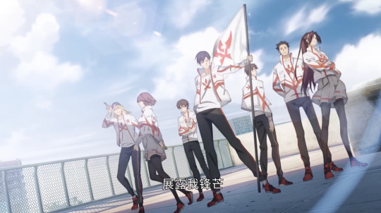
Yesterday, they released the OST for Season 2, which includes the TV cut and full versions of the OP and ED, as well as two insert songs, and the instrumental versions of all of the above. I’ve yet to find anywhere that lets me download the audio files (hoping they’ll be reuploaded to youtube or bilibili soon), but in the meantime you can listen here. They’re really good songs! https: //www. kuwo. cn/album_detail/15792659
Anyway, let’s finish up this OP analysis!
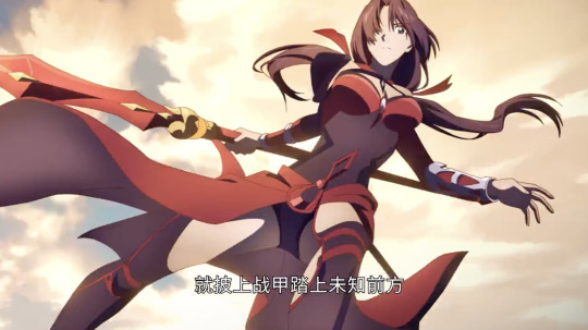
Now here, we reach the true climax as we enter the chorus section. This next segment is definitely the highest-energy part of the entire opening. It’s a montage of Happy’s characters showing off their moves, timed to the music; there’s not too much deeper meaning, but damn if it doesn’t look fantastic. The animation flows from one character and scene to the next so smoothly, so beautifully, it’s just incredibly hype to see. This is what you get when you specifically choreograph/animate sequences for the opening instead of just reusing shots from the main show! (Parts of some of these shots appeared in episode 1, but I do honestly think that it’s more likely that the show reused shots from the opening than the other way around, just because of how perfectly the OP fits together. I also don’t think it’s super noticeable in-show; I’ve just been watching this obsessively.)


In particular I love the line that kicks this all off: “just put on your battle armor and step onto the road to the unknown.” Specifically, though, the rhythm of the lyric is, “jiu pi shang zhan jia ta shang wei zhi qian fang,” with emphasizing accents on the -ang sounds. This isn’t how you would divide the phrase naturally, but because the (syncopated!!) melody accents these notes/syllables, the rhyming effect really stands out and it feels as clever and satisfying as a rap lyric. Moreover, the emphasis times juuust right with the attacks of Soft Mist, Steamed Bun Invasion, and Windward Formation, a perfect example of how music and visuals mutually reinforce each other for maximum cool effect.
It’s generally easier to rhyme in Chinese than English, because of a smaller phonetic vocabulary. From the chorus onward, the key rhyme is on the “-ang” sound (think “ahng” or “ong”, not “aang” like the Avatar), which is a good choice - powerful, reverberant. The asymmetry of the syllable’s use in this section - the song’s lines are all different lengths at this part, so you’re kept on your toes as to when the pattern will reappear - helps add to the engaging excitement of the song. This is also the syllable used for most of the rhymes in the second half of the first OP.
jiu pi shang zhan jia ta shang wei zhi qian fang
hui qi shou zhong wo jin de na shu guang
you ni men zai lu shang__
shi li liang


I really love One Inch Ash’s design. Concealed Light had a big redesign for this season, and honestly I like it as well. And notice here that he’s holding a book - exactly how we left Luo Ji when we saw him last!
“Waving the light clenched tightly in our hand” - that is to say, brandishing our light as our weapon, no matter what form it may take - a sword, a book, our hope and determination.
On a purely musical note (ha), right at this point, specifically the measure beginning with “那束光,” you can hear a three-note “ooo” harmony line in the background, and wow it’s so subtle but I love it so much! A similar three-note line actually appears earlier too (during the “crossing the frozen finish line,” right as the music is building up), also to great effect.

We follow Concealed Light’s gaze upward to the building to see Deception running along the wall, from which he does a flip and slashes downward with twin blades. I love that transition a lot, but my favorite transition of this entire sequence has to be the following one:


Yes! Deception’s cross slash resolves perfectly into the cross held by Little Cold Hands. It’s so fast and so natural you don’t even notice it, and that’s the absolute beauty of it. The first time I saw this, I was in awe - the animators really brought their A-game to this, far better than I ever would have dared hope for this series.

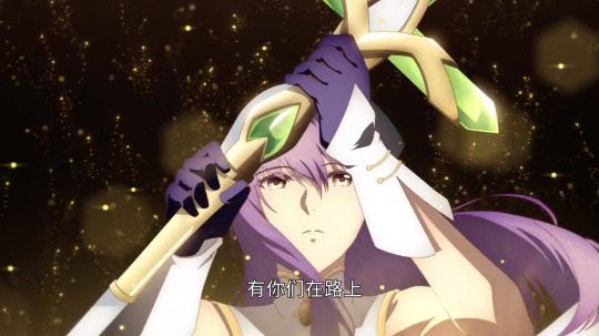

And Little Cold Hands is so pretty! When we got our first art of her official design, the comments were filled with people simping for her, and honestly, valid. I’m surprised her hair is purple instead of pink, but that’s just a minor thing.
There’s something especially powerful about how she raises her cross in time with the lyric “having you all here [with me] on this road,” and then the cross flashing brilliantly with “it’s power.” More than any other role, the healer is a team player. And this theme of team togetherness is particularly important for An Wenyi, who is deeply moved by the team’s perhaps illogical faith in him. Remember that analogy Ye Xiu tells him, of the straw tied to the deluxe mitten crab?
An aside: listening to this, I always thought the line should be 有你们在身旁 instead of 有你们在路上, because it still fits the rhyme, because my past experience has somewhat conditioned me to expect that phrase, and because the full message of “having you by my side is power” just makes me wanna tear up like what a good line! So it felt like a missed opportunity that they didn’t use that. But as it turns out, the final iteration of this chorus in the full version of the OP does, in fact, use “by my side”! And I think making this tiny tweak to the lyric the final time you here it just makes it that much stronger :’)
I’m also just a big fan of the “it’s power” melodic flourish in general, since it comes as a surprise. You kind of expect the melody to end with the previous phrase, but the extra notes here add a really nice emphatic beat to finish off the line.
So to recap the transitions: we see Soft Mist falling from the sky and get a close up of her face as she stabs her spear; this takes us to a closeup of Steamed Bun’s face facing roughly the same direction before we zoom out to his torso and he slashes from lower left of the screen to upper right; following the motion of that slash we see Windward Formation’s torso rotate in that direction as the camera zooms out farther; we follow the rays of his attack to see One Inch Ash drawing his sword; we zoom in on the flashing blade and zoom out on Concealed Light’s glowing book; we follow his gaze upward to see Deception running along the building behind him; Deception leaps and slashes and the slash becomes Little Cold Hands’ cross, which raises up and triggers an explosion. It’s just so dynamic and smooth even without taking place in one continuous setting, and it just really, really gets you hyped.
Also, starting from Happy’s team picture at the start of the chorus, which is during the day, it feels like Soft Mist and Steamed Bun’s moves are at late afternoon, Windward Formation and One Inch Ash take us to nighttime, and then you can see the first rays of morning in Concealed Light and Deception’s segments. This continuity also definitely helps with the feeling of natural flow through these scenes.
Anyway, this entire action segment is just so beautiful, I could watch it on loop. But we still have the final segment of this OP to analyze, so let’s keep going.

After the action sequences of the climax, we settle down a bit now as we approach the end. Here we see the Excellent Era team picture, in the same style as the team pics we saw earlier, but presented separately. It makes sense, as the role they play in the story is different from the roles of all the other teams.
Sun Xiang, Liu Hao, and Cui Li are at the bottom. Because we’re panning up, these three are the first we see. At first glance, the way they’re positioned is fairly consistent with the team pics we’ve seen already: Captain Sun Xiang at center-right, the largest figure; vice-captain Liu Hao, manager Cui Li in the background.
Sun Xiang’s position and expression is really the only one that fits the healthy pattern of the teams we’ve seen already - looking toward the camera, a confident (though arrogant) smile. He might be misguided, but there’s hope for him yet. Notice how Liu Hao isn’t even looking at the camera, which as we’ve seen before is somewhat of an indication of how unified and focused the team is toward its goal; instead, Liu Hao is doing his own thing, determined to prioritize his own desires over what’s best for the team. And manager Cui Li is in this image too, despite not even being a player. His sinister presence reflects the unhealthy interference of the business side in the gaming side. Excellent Era’s downfall comes about because of its prioritization of profit over victory.

As we pan up, Excellent Era’s logo comes into view. It’s larger than any of the other team logos we’ve seen so far, spanning around three-quarters of the screen whereas the others looked to span no more than half. Excellent Era’s legacy is a weighty one, to date the only team to have ever won three championships, and consecutively to boot.
It’s this immense, shining logo that seems to be casting Tao Xuan on the left into shadow. He cuts a large figure, reflecting the deep impact his actions have had upon the main plot of this story, even though he’s only now appearing for the first time in the donghua.
However, he’s also turned away from the camera, such that we can barely even see his closed eye. Because of that, it’s difficult to read his expression, but the impression given by this pose is not one of vindictive pride, but one of shame, as though he can’t quite bear to face what he’s done. On some level, no matter how he might try to rationalize it as necessary, Tao Xuan knows that his profit-driven betrayal of Ye Xiu was a pretty awful thing to do. It might be this amount of guilt that leads him to offer Ye Xiu a wish granted, a tribute to their years of friendship and partnership before their ties are severed completely.
In the end, Tao Xuan’s greed leaves him with nothing really to show for it. What had he gained? What had he lost? Those realizations are still a ways off in the story, but I like how this OP is already hinting at the depth of his character. Tao Xuan isn’t some glasses-flashing, evil-laughing, one-dimensional antagonist; he is in fact very realistic for the setting. We can condemn his actions and priorities, but at the same time we can understand how he ended up here.
As for Su Mucheng, her eyes are closed as well. She’s brightly illuminated, but pointedly turned away from all of the others in Excellent Era; she knows the direction of her future, and that it no longer lies with Excellent Era. Her loyalty was always to Ye Xiu, and as soon as he was banished, her relationship to the team was professional and nothing more.
“This light hidden in my heart is burning” - there are many ways to read this lyric and what exactly the light referenced here is, but because the line is paired with this image, I naturally think about Su Mucheng’s situation. Despite her pretty-vase, sweet-girl appearance, she holds a deep, profound anger at everything that happened regarding Excellent Era. It’s a testament to her immense strength of character that she lasted the remaining one and a half years of her contract in this hostile environment.
Yet even as she resolves to cut ties, there’s a sadness in her expression. She was here from the very beginning as well, when Excellent Era was no more than an internet cafe, and it pains her immensely that the powerhouse, championship team that they and her brother had built from the ground up would ultimately meet this tragic end.
It’s interesting to note that both of the “redeemable” characters here (namely Su Mucheng and Sun Xiang) are on the right, more brightly-lit side of the screen, so there’s a nice little dividing line you can draw there. Sun Xiang’s eyes are still looking toward the left, though, revealing how his character development still has yet to play out.

From there we cut to Ye Xiu holding Lord Grim’s account card. He’s standing back on top of the roof from the beginning of the OP, now in full daylight.
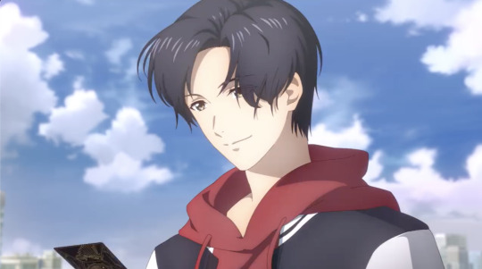


As mentioned… the animators really went ham on the bangs animation.
Ye Xiu turns away from the railing, the camera cuts to an image of Happy’s logo on a flag waving in the wind, and then we zoom out to see the current members of Team Happy gathered together in uniform, standing proud in the light of day. Left to right, Steamed Bun, Tang Rou, Luo Ji, Ye Xiu, An Wenyi, Wei Chen, Chen Guo. Presumably, this will be Happy’s lineup by the end of the season.
Up until now, we’ve only seen the real players separate from each other - they’ve all been in different places, never even in the same frame together. (This, of course, also contrasts the pro team pics that we have, which show everyone together.) Halfway through the OP, we got the group shot of them meeting in game with their characters. And now, they’ve finally met up in the real world as well.
One thing I like about this final pose is how it compares to the final pose of the OVA OP. It’s the same kind of power-pose vibe, but there we only had Ye Xiu, Chen Guo, and Tang Rou. Look at how we’ve grown since then! They’re well on their way to being a proper pro team!
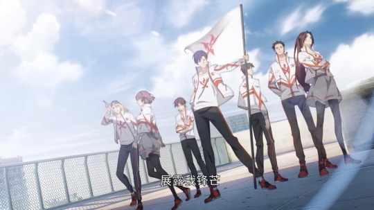
And that’s a wrap! With this final image of Team Happy gathered together, we’re ready to enter the episode proper.
So let’s talk about the OP as a whole. Generally, an OP serves a couple of main roles: a) tells you a bit about what the show is about, b) gives you an overall feeling / mood for the show, c) gets you hyped and ready to watch the upcoming episode.
How well does this opening achieve those goals? Pretty well, as we’ve seen. Past OPs did a pretty good job of setting the mood, but they honestly just put some pretty visuals on the screen, only vaguely aligned to the music, and called it a day. This OP, however, has a cohesive storyline to tell, framed around Team Happy’s coming together (following the tagline of this season). Even in such a short span of time, it manages to convey so much information about its story and characters, both overt and implicit (as I hope this series of posts has managed to convince you). Paired with the music, which has its own deeper meanings encoded in the lyrics, the OP becomes incredibly effective and memorable as it makes its statement.
I mentioned an “interest curve” earlier (interest in the sense of interesting, not the money); this is part of the standard formula for anime opening songs, in my experience. I’m a little too lazy to draw a graph myself, so take a look at this image:

(source: https: //www. researchgate. net/figure/Example-of-an-interest-curve-for-a-successful-entertainment-experience_fig1_333917625 )
Although not all of the relative heights and segment lengths are accurate in this specific case, hopefully the general shape of the interest curve is enough to demonstrate my point. You’ve got the A-B peak at the opening instrumental segment, the C-D peak/arc over verse 1, the D-E-F peak/arc over verse 2, then the sharp F-G-H peak over the chorus before dropping off for a smooth landing right into the episode. This general pattern is effective at holding the viewer’s focus and managing their excitement over the course of this one and a half minutes.
Visually, the OP is just such a treat for the eyes. I’ve already talked about many of the little details I love - lighting, character designs, animations, transitions, etc. - but all in all the new animation studio is doing a really good job here. An OP is how you hook people, and I’d definitely feel comfortable using this to try and bait people into watching this show.
One comment I want to add is about the incorporation of the credits, which we didn’t see until the episode premiere. I don’t think there’s anything too exciting to say (and I also don’t have access to any images right now since the OP was only shown in episode 2), but the fonts and styling were a nice choice - it gave a gaming vibe, but if I recall it still used a serif font, so it didn’t feel overly modern - and the text positioning generally complements instead of distracting. I also liked how they showed the lyrics! I didn’t really expect them to include them onscreen, or if they did, I thought they would just be plain subs like they were in this video. But in the actual OP that plays at the beginning of the episode, they’re as much a part of the art as the credits!
If I had to make any criticism, my biggest complaint about the OP is, I think, the singers. I think having two different singers trade off can work nicely, but in this case, the switches are jarring because their voices are so different. The first singer has a lower, gravely voice, while the second singer’s voice sounds much brighter and more nasally. Furthermore, the first switch doesn’t come until we’re fully halfway through the song, which means that by that point we’re already used to this first singer. It’s also strange that they’d switch back to the first voice at the climax of the song, when I think the second voice would suit the high-energy segment much better. Switching from second to first right at this point feels like we’re actually taking a step down in energy, which is the opposite of what should be happening here.
Still, my main problem isn’t with the voice switching but with the voices themselves, and I think the voices are something I could get used to. The third switch, going from the first voice back to the second voice during the shot of Excellent Era, is much less jarring than the others - I actually like how it feels like the solo is passing naturally from one person to the next, emphasizing the ideals of this not being a single-player game and all that. For that transition in particular, I think (because of the added “it’s power” flourish) it happens too quickly for one person to sing it comfortably, so having another person pick up the line works best. And I do like how the voices sound when they overlay together for the final lines of the song.
So, overall? Overall, this OP is really damn good. It’s everything I could have asked for and more. After such a long wait, the OP, at least, does not disappoint, and I’m extremely excited to see what the series has in store for us.
If you’ve read to this point, thank you! I like this series a lot, as you can probably see, and I’m treating it as my glory :)
18 notes
·
View notes