
Statistics
We looked inside some of the posts by framecaught and here's what we found interesting.
Average Info
Notes Per Post
172
Likes Per Post
123
Reblog Per Post
49
Reply Per Post
0
Time Between Posts
24 days
Number of Posts By Type
Text
3
Last Seen Tumblr Blogs


Fun Fact
Hackers stole 65M passwords from Tumblr in 2013.
Text
Cataloguing Homestuck’s Art Styles
Hussie deploys a number of distinct art styles throughout Homestuck, each serving different purposes in the narrative. A number of these, especially those mentioned in the published book series’ author commentary, have been catalogued in the Homestuck wiki [1]. These officially named styles are well-known enough to appear in quora answers. However, Homestuck employs a much larger variety of stylistic manipulations than explicitly mentioned in the book commentary or wiki. While scanning through the comic again for this project, I wanted to catalogue the rest of them!
This post constitutes a working list of all distinct art styles present in Homestuck. I’ve chosen not to include the distinct styles of the fanartists/outside artists who contributed to the comic; that will be a project for another day. As far as I know, this list only comprises the different styles Hussie develops throughout the comic. I have tried to bring a degree of specific formal analysis (also known as art-historical language) into my description of each style.
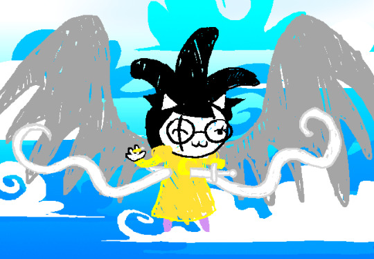
1. “Classic” Style
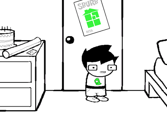
Page 1 of Homestuck

Page 1349 of Homestuck
Page 4227 of Homestuck
The “Classic” Homestuck style appears on the first page of the comic. Although not officially described by the wiki, it is widely understood as the comic’s typical graphic norm. Characters have simplified faces and clothes, and they frequently lack arms. Elements are often outlined in a black stroke, especially to differentiate them from other adjacent, similarly-colored elements. In more colorful panels, scenery may be made up of solid blocks with bright colors. Sprites (base character illustrations) and elements are repurposed from panel to panel in new combinations. Homestuck even takes up the repurposing of sprites as a gag, as in page 1349 above where the ability to flip one’s sprite allows Noir to regain his lost wrist barcode.
This style obviously shares characteristics with Hussie’s style in Problem Sleuth. General characteristics that frequently appear in Hussie’s art are present, such as circular faces and rounded edges on quadrilaterals. The Classic Style umbrella actually covers the broadest range of visuals out of any style catalogued here. The uber-simplistic sprites, such as John on page 1, have typically been lumped in with, for example, the illustration on the cover of Homestuck Book 1, or the two other examples I pulled for this post. So, in the Classic Style, characters can sometimes appear with arms, sometimes without, and in outfits of varying detail, but they retain the same facial features and simplistic quality. The circular facial shape is especially characteristic of this style, along with the lack of a neck. The neck-less quality, static poses, and simplistic detail chiefly differentiate some instances of Classic Style from Hero Mode, though there are still some grey areas.
2. Scribble Mode

Page 1931 of Homestuck

Page 1937 of Homestuck
Page 1798 of Homestuck
Page 3140 of Homestuck
This style is recognized by the Homestuck wiki, which describes it as emphasizing “a particularly silly/stupid moment in the story, particularly those to be imagined by a character.” That is to say, this style often denotes imagined scenarios which do not actually occur in the comic but instead in a character’s imagination, and especially those which form the butt of jokes. It is also employed simply to highlight silliness. This style is constructed to appear as if the author has “scribbled” rapidly between the outlines of forms to fill in color, creating gaps in those forms. Generally, strokes are made to seem more careless, and less detail is used. While the style is meant to mimic a scribbling motion, it does not always end up crude or parodic. For example, in this “charming vignette” (in Hussie’s words) depicting the Mayor’s dream, the scribble style actually illustrates a remarkably beautiful and almost impressionistic series of panels. Although the dream vignette has certain obvious scribbley elements and certainly depicts an imagined scenario, I would argue that it combines aspects of both Scribble Mode and Hussnasty Mode (#4 in this post) throughout.
I have also identified two distinct styles within the Scribble Mode umbrella. One always uses a thin, apparently single-pixel-wide black line to outline forms, while the other uses a thicker stroke for both its filling and outline. You can see the difference between these in the four examples I’ve pulled; they are sometimes even combined within one single Scribble Mode panel.
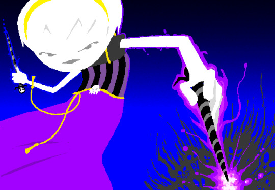
3. Hero Mode
Page 1815 of Homestuck

Page 2063 of Homestuck
Hero Mode was officially named as such by Hussie. The Homestuck wiki page describes it as cropping up to “emphasize a particularly epic moment in the story.” Hussie originally called the style “action panels” before hitting upon the current name, emphasizing the link to action scenes and dynamic poses. Along with dynamic posing, characters are drawn in greater detail and tend to have elongated limbs. Some crossover can be seen between Hero Mode and Hussnasty Mode. I would argue that characters in Hero Mode usually retain the original style’s characteristic lack of a neck, while Hussnasty Mode often adds one. Compared with the Classic style, Hero Mode always adds arms. The degree to which Hero Mode drawings include the “hatching-type effect” characteristic of Hussnasty Mode varies from panel to panel. The difference between Hero Mode and Classic Mode can be observed clearly on these two pages, where Damara shifts between the two styles at the behest of Scratch, who asks her to “render [herself] in a more symbolic manner.”
The wiki asserts that “Hero Mode dispenses with the black outline that typifies sprite-style animation and scribble mode,” but I don’t think it can actually be characterized as the only lineless style. Scribble Mode and Hussnasty Mode also sometimes feature a lineless graphic style depending on which part of a character is being depicted, or the need for a line to differentiate two features of a similar color. A willingness to move between lined and lineless blocks of color characterizes Hussie’s art as a whole.
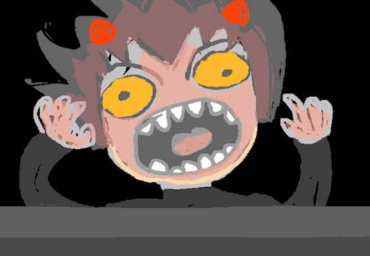
4. Hussnasty Mode
Page 2805 of Homestuck
Page 2976 of Homestuck
This art style is also named by the author. In his commentary on page 2805, he writes: “Someone asked me what I called the style, and I replied by naming it "Hussnasty Mode" myself, because well… it's a bit nasty, isn't it? Kind of raw, a little over-illustrated, and making use of a lot of jagged aliased pixel edges for a hatching-type effect. It was sort of the point to make it a little nasty, kind of aggressively incongruous with the other styles previously established.” This quote sums up the style’s characteristics pretty well. Hussie also describes how this style is more naturalistic, or less symbolic, and was meant to work in direct contrast to the extremely symbolic RPG Sprite Mode. He writes that “drawings like this are introduced in contrast with this simple RPG sprite mode, which was also established very recently as something that Homestuck was "allowed" to use as a stylistic presentation of characters and settings… Every time HS does something like this, it's widening its own umbrella in terms of what it's allowed to do stylistically, which includes dramatically simplifying and abstracting its forms. Which implicitly asks another question: Can HS "allow" itself to go in the other direction? To render characters with higher degrees of definition, regardless of congruity, and freely navigate this full artistic palette at any time, resulting in sharp stylistic contrast and a certain amount of visual thrashing? The answer to that question, almost immediately after it's asked in the form of dropping RPG-sprite Rose into a standard panel shot, is yes, HS can do that, and clearly it WILL do that.”
5. RPG Sprite Mode
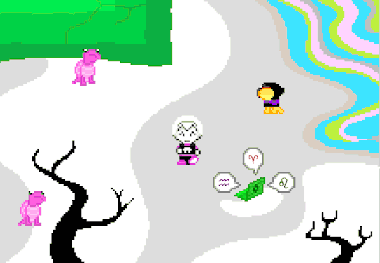
Page 2804 of Homestuck
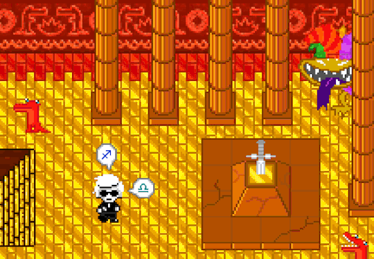
Page 2824 of Homestuck
Despite being officially described by the author, RPG Sprite Mode hasn’t gained much representation as a distinct style (it does not have a wiki page, for example). This style appears after Homestuck’s first walk-around game, now incorporated as a style for static or gif panels. After their joint introduction, this style is juxtaposed against the Hussnasty style. The quotes pulled above in the section on Hussnasty Mode nicely describe the contrast between these two styles and their greater impact on Homestuck’s graphic norms. RPG Sprite Mode always shows characters from an aerial view, mimicking the style of the first walk-around game, which in turn mimics a wealth of RPG sprite games (such as the original Pokemon games). Sprites from these sorts of early games can be characterized by their almost pointillistic use of individual pixels to carefully construct forms.
6. Terezi’s Perspective

Page 2756 of Homestuck
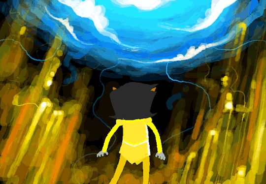
Page 2128 of Homestuck
This style hasn’t been officially described yet. It only crops up as a representation of Terezi’s perspective, conveying some of her experience tasting and smelling colors. While it only appears a few times in the comic, I think it is uniquely visually interesting, and it includes “blurring” techniques which are only rarely employed in the rest of the comic. I’d guess that the effect is created by layering low-opacity strokes over one another and then sliding the different layers’ opacity up and down.
7. SBAHJ Style

Page 8 of Sweet Bro and Hella Jeff
Page 3451 of Homestuck
The SBAHJ comic, featured both within Homestuck and as a spin-off, has its own recognizable style. In the first few pages it has a lot of commonalities with Homestuck’s two versions of Scribble Mode, but later takes on distinct characteristics. It can be characterized in part by its image clipping, an effect where an element is made to look like it has been selected within a square box (in MS Paint or Photoshop) and dragged around the page with little care for the size and accuracy of the selection box. Commenting on page 3451, Hussie describes this effect as follows: “In the SBaHJ comics, one of my cool tactics—which I'm almost positive I invented as a sequential artist—was to elaborately render someone ‘turning around’ by taking one shot of them and gradually altering the pose by crudely rectangle-selecting pieces of their face and nudging them around until they're facing the other way in a totally unconvincing and utterly hideous manner.” Different from Scribble Mode, the SBAHJ style also frequently features blocks of color that appear to be filled with the “paint bucket” tool. When the paint bucket tool is used to fill anti-aliased stokes, it creates a small transparent space between the filling and the original outline, visible in the SBAHJ graphics. Finally, SBAHJ comes to include image compression and glitching, created through “deep frying” compression techniques. Overall, the breadth of manipulative techniques made apparent to the viewer in SBAHJ is much greater than any other style. SBAHJ panels are reproduced wholesale or hyperlinked in Homestuck, but on these two pages Gamzee is also drawn in the SBAHJ style.
8. Caliborn’s Styles

Page 5075 of Homestuck (hyperlinked in pesterlog)
Page 6259 of Homestuck

Page 6929 of Homestuck
Page 6864 of Homestuck
While Calliope’s in-world art was contributed by Shelby Cragg, Hussie gives Caliborn has three styles of his own. The first is his “angular” style, which Calliope aptly characterizes on page 5109 as containing “inscrutable squiggles” and demonstrating a “penchant for arbitrary, completely baffling straight lines and right angles, almost as if trying unsuccessfully to begin constructing a grid.” The second is the style he uses in Homosuck, which retains elements of his original “baffling right angles” but generally takes on the black outlines characteristic of Homestuck’s Classic style, while employing even cruder detail. Finally, after reading a “How to Draw Manga” book, he develops his “manga” style which uses black strokes, somewhat messy coloring (usually with the paint-bucket tool), and shows an attempt at naturalistic representation despite a complete lack of understanding of human anatomy. This style is specifically meant to emulate manga styles, so it features the characteristic white dots as highlights in the eyes, among other features.
————————————————————————
As becomes apparent through Hussie’s commentary, the different art styles employed in Homestuck do more than just emphasize certain moments; they form part of the comic’s visual language and ask us to question our understanding of graphic representation. The scope of this post also illustrates the attention paid to Homestuck’s visual elements throughout the story’s production and within its readership, even if these visual distinctions have received less attention in scholarship. Despite the variety of styles, we can see Hussie’s characteristic artistic tools, techniques, and sensibilities reflected across the comic.
If you find any styles recurring in the comic that I haven’t mentioned here, feel free to shoot me a message! Again, I haven’t included styles from other contributors; only those developed and drawn by Hussie.
————————————————————————
As we approach the close of the semester, I’ll probably be putting out one more post sometime soon! If you liked this post, you can follow the blog on tumblr for updates or, if you don’t frequent tumblr, sign up for the mailing list to receive an email whenever I publish a new mini-essay!
————————————————————————
[1] These include Hussnasty Mode, Scribble Mode, and Hero Mode.
96 notes
·
View notes
Text
[S] Cascade After the Death of Flash
Most of us familiar with Homestuck are familiar with [S] Cascade. This seminal flash animation concludes Homestuck’s fifth act and is still considered by many fans the most important, climactic animation in the comic (even ahead of its successors [S] GAME OVER and [S] Collide).
Many of us may also be familiar with the extraordinary circumstances of the animation’s release. A user called Vivi on the now-defunct MSPA Forums made a commemorative comic documenting the occasion, which, to my view, really captures the essence of the release-mythos. In short: On October 25th, 2011, Homestuck updated after a year-long hiatus with a thirteen-minute flash called [S] Cascade. As fans raced to watch it, the influx of pageviews crashed Newgrounds, the site where the flash was hosted. Hussie temporarily uploaded the flash to megaupload.com. Megaupload.com crashed. The Homestuck website crashed; the Homestuck forum crashed; livestream.com crashed as fans who had “gotten in” tried to stream the video; and, finally, the Homestuck fandom crashed Twitter. [1]
Today, it is hard to imagine Homestuck fans crashing Twitter. Back in 2011, Twitter was a lot smaller, and Homestuck was a lot bigger. But it wasn’t just the long year of building anticipation and the mad scramble to watch the flash which cemented [S] Cascade as one of Homestuck’s most iconic pages. The Flash itself is aesthetically ambitious beyond any previous flash in the comic [2]. Not only does it combine detailed illustrations contributed by fan collaborators with an absolutely fire soundtrack; it manipulates the traditional Homestuck “panel” in a completely unique way.
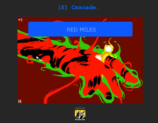
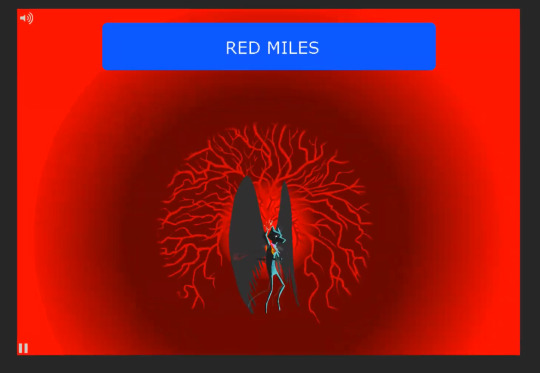
Among the various stunning moments in the flash, I find Bec Noir’s dramatic release of the red miles one of the most memorable. The YouTuber Precision F-Strike captures my same reaction when I watched [S] Cascade for the first time in this video around 1:20, exclaiming: “My screen is getting bigger! My screen is getting bigger!!” What made this “expanding panel” trick so dazzling upon my first watch? The release of the red miles marks the first instance in which [S] Cascade modifies the traditional size of the Homestuck panel. By no means does it mark the first time the comic as a whole has deviated from its own standard panel size; elongated panels, multiple panels, and links-to-panels have all been regular features of the comic up to this point. However, [S] Cascade is the first page to modify the panel size during a Flash sequence, changing in motion. This novelty, combined with the surprise of the effect, sets the reader up to expect a flash of epic proportions—and [S] Cascade delivers.
After expanding for the red miles, the panel never quite shrinks down to its original size. For the rest of the animation, the plot unfolds within an extended panel-space ripe for dramatic exploitation. At 2:53 the panel shrinks back down to show Bec Noir’s journey to post-reckoning earth, then grows again to get back into the action. At 4:22 it shrinks and breaks into multiple panels to illustrate Bec Noir wreaking destruction in the troll’s session. The proliferation of these moving rectangles mimics a film reel, reminding us that we have technically already seen these events, but underscoring their importance as a conglomeration of memories for the trolls.


Transitioning to the human sessions’ Derse at 4:38, the panel blows up again to its traditional size and adopts an exterior “wallpaper.” This “wallpaper”, as I’ll call it, shifts with the content of the Flash for the next few minutes. It shows the exterior of Derse as Rose and Dave fly through, then it takes on the red and yellow colors of the quest beds; the black and white colors of The Tumor; the red and blue colors of the “mass of two universes” device; and finally the fleur-de-lis pattern of the Felt mansion. During the sequence between Sn0wman and Slick, at 6:08 Slick’s bullet actually pushes out the corner of the traditional frame, extending it back into the full extended-panel space. Then again, during the climactic moment at 10:02, panels grow and shrink and replace others, flashing in time with the soundtrack, drawing the plotlines together and anticipating the finger-frame with which Jade creates the Fenestrated Plane. The animation finishes with John and Jade busting through the Fenestrated Plane, which cycles through the comic’s own panels, culminating the meta-referential panel distortion with this final act of “escaping” from and through the Homestuck panels themselves.
As a result of the extended panel-space established at the release of the red miles, we get to experience the majority of [S] Cascade’s action (and gorgeous artwork) on an enlarged canvas. Just as we go to the cinema to see movies on the “big screen,” Homestuck deploys its own big screen at the start of the flash. Then, all the growing and shrinking between segments contributes to the narrative flow of the flash. The “shrunk” portions leave room for the panel to blow up again once the next climax comes. I think the “wallpaper” effect employed mid-flash is especially effective, as it allows Hussie to continue utilizing the extended panel-space while keeping the frame small in advance of the Sn0wman’s death, at which point it expands again. It’s also important to note how Hussie manipulates our other preconceived expectations, aside from panel size, to enhance the animation’s drama. The website itself gets a special [S] Cascade color scheme and header. In the unfamiliar layout of this Cascade-ified website, readers prepare themselves for the best and the worst—then their expectations are thrown off balance again, for good measure, with the expansion of the panel and the big-screen execution of the flash. With all of this in mind, it’s easy to see how [S] Cascade generated such a massive response.
As you may be aware, as of January 2021 Adobe has discontinued its support for Flash Player, with all major web browsers following suit. This means it’s near impossible to run flash content on any normal computer, and it won’t be long before flash only exists in archival projects. Luckily, the new denizens of the Homestuck website have worked to keep all of the story intact despite the changing media landscape, with some interactive flash pages broken down into videos or screencaps and animations converted to embedded YouTube videos [3]. If you are interested in experiencing Homestuck’s flash content as originally released, a fantastic project called the Unofficial Homestuck Collection has worked to archive the entire comic in a custom browser which natively runs Flash (all you need is 4GB of space on your computer and some time for the assets to download). This archive has been invaluable for my art historical investigation into the comic [4].
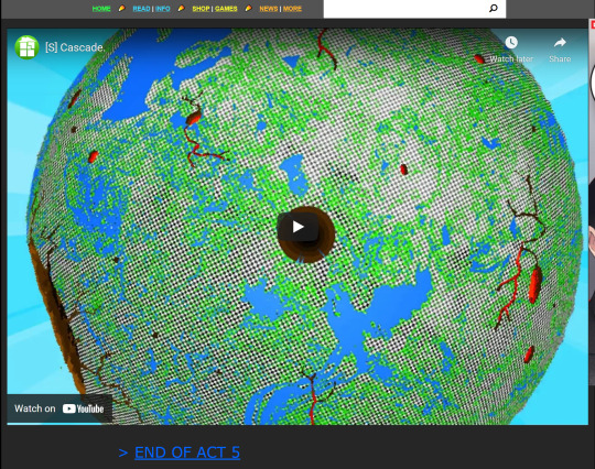
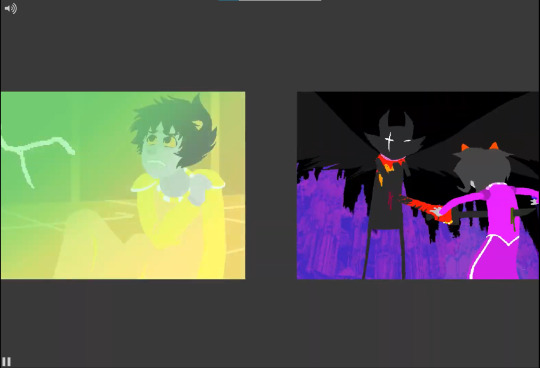
As it stands, though—unless forced by a concerned friend to download The Unofficial Homestuck Collection browser—new readers to Homestuck can’t experience the Flash games and animations in their original format. The same goes for folks rereading the comic. In the case of [S] Cascade, significant losses must be mourned. The effect set off by the red miles (the surprise and novelty of your “screen getting bigger”) is hampered by the embedded YouTube format. When you open the [S] Cascade page, now, it presents you with a mid-flash thumbnail, a YouTube play button, and YouTube framing elements such as a watermark and title (pictured above). You can’t avoid already seeing the extended panel-space of the flash page with this new format. Even though the panels within the embed begin in their “shrunk” state and grow to fill out the video frame, the expansion can never be a surprise to the same degree it was in the original Flash format. Flash animations were unornamented by watermarks, titles, and scrubber bars. They were so indistinguishable from regular static panels and gifs in terms of size, image quality, and framing that this gag (pictured below) actually worked. The indistinguishable quality of flash animations from regular gif panels created the necessary environment for [S] Cascade to surprise us by suddenly growing and filling the screen. That drama is inevitably lost in the flash’s new format.

On the other hand, the YouTube format presents some obvious benefits for readers. For one thing, you can now scrub back and forth in the animation, pause it, and even see its timestamps. This is beneficial to any reader who wants to revisit key moments and enormously helpful for someone like me analyzing the animation in detail. I would argue that the inability to pause the animation in its original format contributed to its monumental quality—readers couldn’t pause to breathe, and the comic took merciless control over the pacing—but of course the inability to pause something is also terribly inconvenient. Furthermore, the video format solves an issue that plagued Homestuck readers (including myself) throughout the comic’s lifetime: it’s inaccessibility on mobile devices. Adobe Flash famously failed to transition into the world of mobile touch-screens after Steve Jobs decided not to support it on the iPhone, writing a letter denouncing the software for its errors [5]. With Flash no longer functioning, the reformatted pages in Homestuck are all compatible with mobile devices, meaning readers can now enjoy the comic while lying sideways in bed like we always dreamed. Among other considerations, Adobe Flash was a complete pain to work with [6] for many large-scale projects, and its technical limitations cannot be ignored. On the whole, the death of Flash speaks to a greater evolution in our 21st century media sphere—the growing importance of mobile browsing, the shift from web-hosted games to apps and game launchers, and the increasing “convergence” of platforms into all-purpose devices. While much of Homestuck’s impact and charm resulted from its innovative use of Flash, like the example I’ve given in [S] Cascade, the unique bubble of history in which Flash existed should be fondly remembered and effectively preserved as we continue to navigate the comic’s legacy.
————————————————————————
Happy 4/13! If you liked this post, you can follow the blog on tumblr for updates or, if you don’t frequent tumblr, sign up for the mailing list to receive an email whenever I publish a new mini-essay!
————————————————————————
[1] I unfortunately can’t say I was around for the original [S] Cascade release (I started reading the comic about two years too late). However, even during the Gigapause, what I’ve called its “release mythos” was still widely retold. The events themselves are documented here: https://fanlore.org/wiki/Cascade_(Homestuck). Thank you to @imploder for having saved Vivi’s comic on tumblr!
[2] Hussie wrote about the making of [S] Cascade on his tumblr, now archived here: https://wheals.github.io/tumblr/tumblr.html#about-eoa5-part-1. This gives some insight into the massive undertaking. Previously, the longest animation in Homestuck was [S] Descend, an animation which Hussie calls “Cascade Lite” in his author commentary in Homestuck Book 3. [S] Descend was the first animation to significantly incorporate multiple plotlines moving along at once. Hussie describes this narrative style as an “action-collage” (also in the Book 3 commentary). [S] Descend was also (to my recollection) the first time Hussie significantly incorporated assets from contributing artists into an animation, which he explained was partially to keep the production moving faster. Ironically, during the production of [S] Cascade, organizing contributors turned out to be much more of a hassle—but ultimately Hussie deems the myriad of captivating art styles “a big plus” in his post.
[3] Although some are completely broken, now :(. RIP silly flute refrain.
[4] I seriously cannot overstate how grateful I am for this project.
[5] This article does a great job of explaining the history of Adobe Flash and its eventual demise.
[6] Hussie goes over some of the issues he had with the software in the post referenced at [2]
48 notes
·
View notes
Text
Transmedia Storytelling: A Perspective on the Homestuck Epilogues
First of all, thank you for reading my first post! I created this blog to document some of my research for a directed study project. I’ll be looking at Homestuck from an interdisciplinary lens but focusing especially on its formal artistic qualities and place in art history. The blog will contain various points of analysis which I develop over the course of the project. For my first piece of writing, I wanted to tackle (from a new perspective) what I view as a complicating factor in the controversy surrounding the Homestuck Epilogues.
Rather than critiquing the Epilogues’ content or making a judgement about their overall quality, I want to explore a specific criticism which has been echoed time and time again by fans. In an article for the online journal WWAC, Homestuck fan-writer Masha Zhdanova sums up this criticism:
“No matter how much members of the creative team insist that their extension to the Homestuck line of work is no more official than fanwork, if it’s hosted on Homestuck.com, promoted by Homestuck’s official social media accounts, and endorsed by the original creator, I think it’s a little more official than a fanfic with thirty hits on AO3.”
Between attacks on the Epilogues’ themes, treatment of characters, and even prose-quality, fans have frequently referenced the issue of endorsement and canonicity as summarized above. Although the Epilogues and Homestuck’s other successors (including Homestuck^2 and the Friendsims) attempt to tackle themes of canonicity within their narratives, critics of the Epilogues contend that this philosophical provocation falls flat. While the creators argue that the works should form a venue for productively questioning canonicity, fans point to issues of capital and call the works disingenuous. In Episode 52 of the Perfectly Generic Podcast Andrew Hussie explains that, to him, the Epilogues are “heavily implied to be a piece of bridge-media, which is clearly detached from the previous narrative, and conceptually ‘optional’ by its presentation, which allows it to also function as an off-ramp for those inclined to believe the first seven acts of Homestuck were perfectly sufficient.” As Zhdanova paraphrases, a critical view posits that this “optional” reading is impossible. The company ethos and production of capital inherent to the Epilogue’s release—their promotion, their monetization—renders their “fanfic” backdrop completely moot, if not insulting.
Why does appropriating the “aesthetic trappings” [1] of AO3 strike such a chord with critics, though? What’s wrong with the Epilogue creators profiting from their work? Other officially endorsed “post-canon” materials, including the Paradox Space comics, Hiveswap and Friendsim games, have not inspired such virulent opposition. The issue comes down to the association between the AO3 layout and the separation from canon. The Epilogues ask us to read them as “tales of dubious authenticity,” but critics assert that this reading makes no sense in the context of their distribution. It’s not exactly the endorsement or monetization that prevents a “dubious” reading, though. After all, Hiveswap is also endorsed and monetized, yet fans have no problem labeling it as “dubiously canon.” So what is it about the Epilogues’ presentation that seems so incongruous with their premise as “dubious” texts?
I’ve come to understand this issue through the lens of transmedia storytelling. First conceptualized by Henry Jenkins, “transmedia storytelling” involves the production of distinct stories, contained within the same universe, across different media platforms. [2] This allows consumers to pick and choose stories across their favorite media outlets, since each story is self-contained, but superfans can still consume All The Content for a greater experience. The Marvel franchise with its comics, movies, TV shows, and other ephemera, is a great example of the transmedia phenomenon.
How does Homestuck fit into this theory? In an excellent article [3] for the Convergence journal, Kevin Veale lays out a taxonomy for Homestuck’s role in new media frameworks. Rather than dispersing different stories across multiple media platforms, Homestuck combines the “aesthetic trappings” of many media forms into one massive outlet: the Homestuck website [4]. It’s almost like the inverse of transmedia storytelling. Veale describes this type of storytelling as “transmodal.” He further defines Homestuck’s storytelling as “metamedia,” meaning that it manipulates the reader’s expectations of certain media forms to change the reading experience. So, despite its multimedia aspects, Homestuck structures itself around one monolith distribution channel (the website), the importance of which directly feeds into what we know as “upd8 culture.” The Homestuck website itself, as a “frame” which encapsulates Homestuck and the other MS Paint Adventures, takes on a nostalgic quality; the familiar grey background and adblocks become inextricably linked with the production of the main, “canon” narrative.
Homestuck itself—the main narrative—is a transmodal venture. However, as of writing this post, the Homestuck franchise has taken a leap into transmedia waters, starting with the Paradox Space comics and continuing with Hiveswap, the Friendsims, and Homestuck^2. All four of these examples fit the definition of transmedia ventures: they contain distinct stories still set in the Homestuck universe and are distributed through fundamentally separate media channels from the main comic. Which is to say, crucially, none of them are hosted on the Homestuck website.
This is where I think the issue arises for the Epilogues. The Epilogues, from what I can tell, aimed to present themselves as a transmedia venture rather than a transmodal one. Firstly, they try to act as a “bridge-media,” or self-contained story. They can be read as a continuation of Homestuck, but can also be separated or ignored. Secondly, they take on a distinct format (prose). Hussie notes in PGP Ep. 52 that the Epilogues were originally only meant to be published in print, functioning as a “cursed tome.” In short, they were intended as a transmedia venture: a self contained story, distributed through a separate medium (prose) and separate media channel (print), to be embraced or discarded by consumers at their whim.
Instead, when the Epilogues were released through the main Homestuck website, readers couldn’t help but interpret them as part of Homestuck’s long transmodal history. Rather than interacting with a new distribution channel, readers returned to the same nostalgic old grey website. The AO3 formatting gag makes no real difference to readers, as Homestuck patently appropriates the aesthetics of other platforms all throughout its main narrative. This issue of distribution (print versus website), which in turn produces either a transmedia or transmodal reading, is the crux of the criticism I mentioned before. Despite the creators’ protests, readers failed to see any “question” of canonicity because the Epilogues fit perfectly into the comic’s preexisting transmodal framework, supported even further by the nostalgia of the website’s very layout. The Epilogues read as a transmodal contribution to Homestuck’s main channel rather than a post-canon, transmedia narrative (like Paradox Space or the Friendsims) as they were intended. This created a profound dissonance between the fans’ experiences and the creators’ intentions.
How things might have turned out differently if the Epilogues really had been released solely as “cursed tomes,” the world will never know. In PGP, Hussie cites the importance of making content freely accessible on the website as a reason for the online release, which is certainly a valid consideration. Even though the print format offers a much clearer conceptual standpoint as a transmedia “bridge-story” [5], issues of capital and accessibility may still have come to the forefront of discussion. As it stands, though, I think the mix-up between transmedia and transmodal distribution was a key factor in the harsh criticism the Epilogues sparked.
------------------------------------------------------------------------
If you liked this post, you can follow the blog on tumblr for updates or, if you don’t frequent tumblr, sign up for the mailing list to receive an email whenever I publish a new mini-essay!
------------------------------------------------------------------------
[1] I love this term, “aesthetic trappings”, which Masha Zhdanova uses, so I’ve overused it to some degree in my post.
[2] Henry Jenkins, Convergence Culture: Where Old and New Media Collide, 2007: pg. 98. You can also find a description of transmedia storytelling on his blog.
[3] Veale, Kevin. “‘Friendship Isn’t an Emotion Fucknuts’: Manipulating Affective Materiality to Shape the Experience of Homestuck’s Story.” Convergence: The International Journal of Research into New Media Technologies 25, no. 5–6 (December 2019): 1027–43. https://doi.org/10.1177/1354856517714954.
[4] Although the Homestuck website shifted branding from mspaintadventures.com to homestuck.com before the Epilogues’ release and has shifted its aesthetic somewhat (re: banners and ads), I treat the core “website” as the same location in my post
[5] Hussie points to numerous fascinating experiences which might have arisen from the print distribution. He describes a tome as “something which maddeningly beckons, due to whatever insanity it surely contains, but also something which causes feelings of trepidation” and references the sheer size of the book and “stark presentation of the black and white covers” as elements which produce this trepidation. The ability to physically experience (through touch) the length of the Epilogues and the impact of the book cover were lost in the online format. Although the Epilogues have been released in their intended book format now, the printed novel still won’t be a “first reading experience” for most fans.
28 notes
·
View notes