#but thats so much work and lineart is Fun Sometimes
Explore tagged Tumblr posts
Text
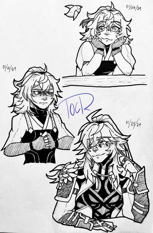
The many ages of Jing Yuan~
In honor of my man and first limited character finally getting his rerun for newbies in 2.0 (also what a trailer holy-)
Credit goes to the lovely mellon_soup on Pinterest for my pose references.
#hsr#honkai star rail#jing yuan#honkai jing yuan#honkai fanart#fanart#art#BOLD OF YOU TO ASSUME I KNOW HOW TO TAG MY OWN WORK#image quality isn't perfect? but I am... tired and sick so take#anyway have I ever mentioned that I love this man?#fantastic character#also v pretty#I'm literally the drake no/yes meme but with digital and physical art#like#i have the tools to draw digitally#but thats so much work and lineart is Fun Sometimes#Anatomy is hard and I haven't taken an art class in Years 💀#artists on tumblr#i love not drawing for Months#and then suddenly being struck by the gods to mark my existence and mind with different kinds of minerals on paper#my art#robyn's scribbles
54 notes
·
View notes
Note
How do you draw so freely? Its beautiful
Thank you very much!!
Assuming you're referring to how loose my sketches are, I think it boils down to mileage. Alongside the classic recommendation of reference + study, usually when I get really into a piece of media I'll draw characters I like a whole lot and it builds muscle memory, and the ones that end up in my posts usually have already been through that process to some extent.
Studying references + going through a couple dozens rounds of extra wonky proportions and nonsensical physics (definitely visible on my own posts lmao) will help with both your brain and muscle and once you've stacked up enough of that it'll become easier to intuit certain things and keep stuff looser.
(hey this got really long, so just scroll to the bottom to see my current sketch process if you'd prefer that)
In my personal experience as a hobbyist, I spent roughly 3 years butchering the loomis method until things looked even remotely to my liking. And by that I mean "layering bullshit guidelines so thick and heavy that by the time I'm done lightening it via eraser there was barely any paper left." Drawing has been and still is really frustrating sometimes but for most of it I have a lot of fun and honestly as long as you have that it doesn't really matter whatever else (again, hobbyist here. my stakes are low). Switching up medium every once in a while if you can helps keep things interesting, and drawing with a pen is good for building both line confidence and tolerance for your own mistakes.
Honestly for all of that this stuff is still RNG to me lol. Every once in a while things just Will Not Work Out, but the rates definitely gets better the more experience you have. I only post about, say, 20% of what I draw probably. The rest includes but is not limited to practice sketches, personal art, stuff too nonsensical for even tumblr, or sketches I just plain don't like.
Uhhhhh now for what you actually asked. I've grown really lax, if not a little lazy, regarding guidelines (when you've drawn a specific thing often enough it just kinda gets tedious) so now i just do these very thin and light lines vaguely hinting at a character's pose and position. The only thing I consistently do is probably the little circle to indicate the head. For more heavily stylised proportions I'll go into more details at the outline stage, mostly aiming for the feeling of it (usually how goofy it looks since thats what I use them for). For more complex poses/ones I'm not familiar with I'll do multiple iterations.
Unearthed some stuff that I probably wouldn't post otherwise (the proportions are a bit off from what i'd prefer and the lineart isn't that confident). Here i am redrawing this for demonstration purposes


gonna go in order of the photos. everything shown was done with a 0.5 mechanical pencil.
usually i start with these very thin, light lines, just getting a very rough ideas of where everything is - head, torso, pose (spine, arms, legs). i sketch largely with approximations and landmarks, keeping in mind some bullet points for the relative distance among certain body parts (e.g. make sure the elbow is always a little past the rib cage. i'll write more out at the end) rather than any precise guidelines. i often don't even clean these up - at the end the main lineart is harsh enough that they override these, and though they're visible they do not interfere with the image as a whole. you can look at any of my sketches prior to this and find them.
then i go in with hard, dark lines, once again noting the respective distance among facial features (i'm using the loomis proportions, thinking about the face in thirds)
this is so unhelpful when i just say it, but genuinely at this stage i rely on muscle memory and mileage. if you've drawn the same anime girl for a bajillion times you can probably intuit the proportions. remember that 3d things have volume and interact. ("yes, see, her bangs and eyes round out like this, two locks of hair (they're thick and well kept, so they should have a solid cylinder shape...) against the side plane of her face - split that plane of the skull in half, and the ear should be somewhere around there...")
ok for the parts where a lot of things happen (clothes, tie, the pose interfering with them etc) i just go ham. make a mess! draw everything out even if they overlap each other. so you can keep track of them. here i also bring in some light shading to make out the form of her torso.
i lighten the whole thing with eraser, but the previous lines are harsh enough that the residue can act as a new base of sorts. i think this is comparable to having a sketch layer with lowered opacity in a digital piece
i go over the whole thing again now that i've got a better idea of the form
rinse and repeat. go all in, adjust, blow the whole thing up if it looks off and then build on the remains
for the last photo, you can see that I've adjusted the right leg, since now im taking into account perspective. I uhhhhh still am not particularly confident in drawing her shoes (or any other shoes for that matter) in 3d space so once again I'm bullshitting the form with trying to wrap around its shape and to visualize the shadows. usually for these I pull up references and pray
a side note for the hands: against an earlier ask, I've mostly switched to using silhouettes and then sectioning the fingers after. here the slight shading approach also help in blocking out and making them readable without you having to stress over the minutiae of what joint should bend where.
...I've hit the upload limit for photos, so I'll reblog with additions, but in essence:
• very thin lines to map out the pose and mark where certain body parts may go
• i draw everything in approximation, keeping a few bullet points in mind and adjust as i go (which does keep the sketches loose and make it easier to vary proportions for different characters, but also make floating features more likely (evident in some of my more recent posts as well):
loomis for the head and neck
rib cage (+collarbone), then elbow slightly below it
pelvis, crotch halfway point of the whole body
legs, knees their halfway point
feet are about as long as the forearm usually
(Disclaimer: i must stress again that I'm not a professional, and cannot guarantee that these bullet points are entirely correct. This is just how i draw at the time of writing - stylized with little regard for the intricacies of human anatomy)
• with the exception of the first stage, my lines are dark enough that the mistakes get reused as base for correction after they've been lightened with eraser a little bit.
• I also bring in some shading while doing lineart to make sense of form if I'm having trouble. I use this most often for noses, hands, legs, and breasts.
• if you encounter a sketch that Refuses To Work Out, leave it. No, listen to me, Leave It. Revisit it sometimes later, if you want (for mine they range from a week to 5 months, but my sketchbooks disorganization is another matter entirely). just leave it for a bit.
• do a bunch of pen sketches if you wanna get comfortable with mistakes/build muscle memory
• once more, all-time classic: reference the hell out of anything you don't know. 100000 google images. look up a human anatomy 3d model to see what muscles attach to which bone. practice copying 1:1 things that look good to you (practice!! don't post/claim anything as your own if it isn't - this applies to my own stuff btw, feel free to trace for practice at your own risk). note again that the only reason i can only bullshit my way out of these is because i've drawn them dozens of times - the moment you throw me more complex perspectives i'll need to start the learning process all over again
#anon ask#asks#hey sorry this got So long. if u dont wanna send me asks again i understand#remember when i said my last ask was long... haha... good times...#this thing has been in my drafts for what... a year now? sorry. i'm just not sure how to articulate all this#DoNT make bets on how long until im done writing the reblog also...#junko enoshima#danganronpa#sketch#traditional stuff
22 notes
·
View notes
Note
Hey there!! An ask for the Big Bang - your sneak peeks have so much texture in them! How do you decide what you're gonna use, when in the layering process etc do you add them?? Tell me everything! 💌
WAGH THANK U SO MUCH!! And this is a very fun question thank U <3
SO, the brushes I use that have this texture are from here! One time a while back they had a sale with a package with a bunch of them and thats how I got them! ever since they are my go-to texture brushes + adding perlin noise in some pieces if I think it helps them.
NOW I have several different ways of working/styles both because practicality but also just working with different materials! Sometimes I do my lineart in traditional, sometimes is about putting a lot of effort in texturing and individual shadows.
With this projects I tried a middle ground, considering I didn't have time or energy to do full on digital painting but also I wanted to have full looking illustrations, so I used the technique I used in this drawing! (Sharing this one to not reveal anything related to the Big Bang yet)

I used the screentone brushes as part of the lineart, basically trying to create general shadows and textures with them!

Then I just colored! adding some shadows with color and some extra lighting effects with the screentones!
Also something I did in the Big Bang pieces that didn't do here is that I added extra layers of ambient lighting! Is just overlay/multiply/screen layers with a gradient on top of the lineart. Also I colored the lineart so everything looked better dfghjk
And then to some that story-wise were printed photos I added A Lot of perlin noice on top to give it that scrunchy texture of paper dsfghj I hope this is useful for you! When I can reveal the Big Bang pieces I can do another breakdown if you would like <3
11 notes
·
View notes
Note
What's your favorite thing about drawing? What part do you like most about it? Sketching, lining, coloring? Clothes? Backgrounds? Expressions? Like if there was one part you could just do forever, what would it be? Would it be multiple parts? What's your least favorite part? Do you avoid the parts you don't like doing, or do you work on those too?
i will just ramble my answer
transient as fuck answer short and simple is i enjoy all of it as much as i hate it at the same time.
i spend a lot of time thinking about body gestures and interaction more than anything so a lot of the reward of my art since maybe late highschool has been a so called breath of life that i work towards fulfilling more and more not out of any ambition but just because i derive joy from flow of motion and pragmatic interaction. my last comic i was really proud of artistically but felt like the dialog was too 'these are just characters' with no fleshed out multidimensionality, what was spoken in it made me feel like i did nothing because it was just some sentences you would hear on a show. that really killed my enjoyment of that piece. alternatively a comic i did like a lot was this one, theres a lot of motion, interaction, body language. things are alluded to instead of being directly called upon. so i guess yeah i really really like expressions. these ones were fun.

backgrounds are something im newer to and i enjoy getting to know them though they serve a challenge 2 me but thats fine
lately ive been playing with airbrush tool
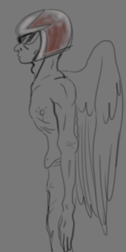
if u let me i will just draw faces for a while . sometimes clothes are fun, i like to play with shape so those are a good opportunity. i used to not like rendering but i just didnt know how i prefered 2 do it until recently and now its more fulfilling like with here x x i like rendering things when theres gon b chance for like a shiny finish which is why some of my more recent rendering looks like clip art [intentional] x x for that same reason, robots are fun because i enjoy doing metalic sheen x x using ummmm screen tone for highlights is also something i like to do a lot
i like def do avoid the shit i dont like doing but what i dont like is in constant shift and eventually i willjust do it anyways and learn how to do it my way. my lineart is completely manual for one. i use a 1.5 sized brush with no pressure sensitivity for digital and a 005 micron for traditional and thin just make the lines as thick as i want them to be cuz i dont like relying on brush dithering basically.
4 notes
·
View notes
Note
what's your process for coloring like? the look of that elendira is so textured and interesting, i can't figure out how you do it
AA THANK YOUU ^__^ !! textures & brushwork are my favorite things abt my art, so im happy you find it interesting hehe . its SOO cool to look at & so much fun to draw imo
i prefer to color by building in layers , if that makes sense 🤔!! hundreds of them !! such that i'm always drawing on Top of previous layers, working from big & messy blocks of color to, eventually, small and refined blocks of color until it feels processed enough. as a result, i rarely ever erase (!!) and i rarely ever draw lineart aside from the initial sketch
a rough, patchy textured brush is key here, as it'll give you dimension and variability w/ your colors. i recommend "Brush and various sets of fountain pen style (万年筆風ブラシと色々セット)" on Clip Studio (ID: 1679706) !! :3

im terrible with explanations though, so i'm going to show a step by step of that elendira drawing if you dont mind :3
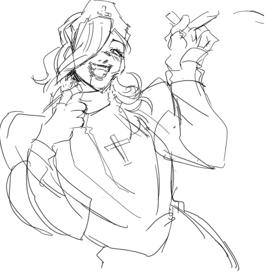
sketch layer !! because i mostly render through color alone, i try to make this as close to the finished thing as possible . ^__^ i hateee drawing the same thing over and over and like the expressivity and movement of my sketches anyways , so the more i can preserve at this step, the better. if u were to look at a side by side of my sketches and finished pieces, youd notice a lot of those og lines are present in the final drawing :3

2. flats !! pretty self explanatory, but the solid background gives me an idea of where the figure begins & ends while the colors themselves help distinguish whats what . i stick to ambient lighting @ this point because im usually not sure what i want to do with the overall palette or lighting yet . having two tones (ex, dark and light in her hair or dark and light on her skin) can also help in identifying key features early on that u wanna preserve. as you build layer by layer, sometimes these areas will remain untouched and i think it makes for a rly lovely feel at the end

3. start blocking !!! to be totally honest with you, i dont really know what i do here HAHAHA. like i just scribble the shit out of it, usually focusing on what i might want to do with lighting (ex: grey areas to accentuate folds in her costume). i think i like to start "erasing" the sketch where possible by coloring on top of it .. like if you look at her hat or her arm , you can tell i'm starting to get a sense of the shapes i like vs the ones i dont. it's at this point that the final image starts to emerge in my mind , like im gradually pulling her from a tarpit of scribbles until shes recognizable lol. chipping away at the marble until i can free her. tbh.

4. keep blockingg...when u think u are done , block some more . as you can probably see, the brushwork becomes more intentional as i add more shape, with specific focus on line weight. this is also where the patchiness of that textured brush comes in - notice how none of the colors seem totally uniform (ex: the red cross or the original sketchlines for her waist). you can see bits and pieces of the layers underneath pushing through and i really like that !! ^__^ its very fun and sketchy to me, so i try to keep them around. those areas are also great to colorpick from, because it'll give you "new" colors to work w/ that are already part of your palette.

5. GRADIENTS & GRADIENT MAPS !! TONE CURVE !! COLOR PICKER !! this is the best stage tbh. flatten your image so its all on one layer and just go crazy with all the color settings in ur program. add gradient layers and set them to darken, or overlay, or subtract, orrr. lighten or dodge glow or divide or soft/hard light.! OR!! edit the hue, saturation, luminosity and contrast.and then color pick from these edits, block even more on top of ur image, flatten, color edit again, etc. etc. until u feel satisfied.
ANYWAYSS . i hope that makes sense @__@ sry i wrote this out and deleted it like 23 times trying to make it make More sense but thats what ive got HAHA i hope its useful though :3 !
#SRY I STRUGGLED 2 EXPLAIN THIS#dude its like my brain bcomes stuffed w/ cotton anytime i try 2 write#i hope it makes sense tho..#it also probably sounds so redundant to make new layer one after the other for just a few brushstrokes#but those brushes i linked have a multiply property so if you draw on top of prev lines they'll create dark patches#and so if im working over a large area ill generally need like . 5 layers each with one brushstroke :sob: if that makes sense#this one had . 84 i think. total. layers i mean. the merylvash one had 300+ HAHAH so it rly depends#like YEAAH i could just use a normal brush but i really like the way this looks#andd sometimes the multiply function works really well or will give me the proper shadow tone im looking for#anywas.wanywaysn anyways#asktag#anonymous#long post
60 notes
·
View notes
Text
Decided to watch Hazbin Hotel…..(only because I hard that Jeremy Jordan is Lucifer va…..and also because i am a hater™️)
Watching this on Watch Anime dub, it has the pilot…so
Pilot
Pilot Charlie voice is so pretty. God the angels designs remind me of those weird The Purge neon mask…forget how red this pilot is..there is a lot of random sounds effects, it feels a tinnnyyyyyy bit to much. Pilot angels voice <3 snake guy voice so SO familiar????? I feel like he was in a video game or something. Hmm I forgot how much cursing there is…minor pet peeve, sometimes the lineart is hot pink and it’s kind of annoying since it sticks out against black lineart, also there SO many eyes, everywhere? Idk if that a fun little quirk or lore™️ that one news reporter being on fire made me laugh.. I like the mixed art style when Vaggie talks about Alastor, it’s charming. Hmmm, radio sound effects, love them <3
I think it’s cool that Charlie is a very sweet, kind of “childish” Nieves princess in a world full of murder and hate and violence. It makes me wonder how she got that way? Also hell is overpopulated so the angels kill them. Interesting!! Especially since lot of demons also fight over territory. This Katie killjoy does have a point, why would sinners want to change? Beside the killing, it seems like hell is basically Earth 2.0.. It is cool how Alastor the radio demon, decided to help out because he’s bored.
GOOSEWORX THE CEATOR OF THE AMAZING DIGITAL CIRCUS :0 👀 yooooooo. Jesus there so many people working on this pilot…
Scale of 1-5 I give this a 3.5.
Episode 1
Ok, so the intro says that the angels have an extermination because they don’t want Hell to rise up. But in the pilot it was because of overpopulation…Also Lucifer not liking hell and can no longer dream, while Lilith thrives…hmmm if this story has Lilith be evil while Lucifer is good idk how to feel about that. The voices are different, while I don’t like Charlie’s new voice (sounds to idk deep?) I definitely like Vaggies, it’s deep and a bit monotone. Also new outfits!!! Charlie’s is fine, but I don’t like how sharp her face is? So look more older and mature compared to her pilot self, which add the whole naive princess feel. It’s canonically 5days to a week between the events of the pilot and the first episode…oh ew I hate Angels voice. It’s too high, and he has an accent now??? Oh Husk voice!! While is deep, it’s also high? No longer gruff.. hmm character wise, angels seem more bitchy?? Then the pilot?
Ok…random song???? Just…no build up music or anything.. Charlie curses more too. In the pilot she curse like, 3 times. Here she does it more.
There is a giant clock tower thing that went you go in, leases to a lobby then leads to the angels???? Wouldn’t that make it like, easier to attack heaven or something? Why is an Angel, like the heaven angel, cursing?? I feel like that would be against the rules?? WAIT THATS ADAM LIKE FIRST HUMAN ADAM???? Oh no that worse… like like nifty she’s a cutiepie :)
Ok Hell is still overpopulated, and heaven keeps killing then because they think he’ll will overpower them, but Adam does it for entertainment? Hmmm they also going to kill again in 6 months. :/ Katie killjoy voice is also bad.. oh!!! Wait Adam lied, the real reason heaven is killing again because an Angel was killed? But an angel was never killed before??? I thought hell was very powerful?
Episode rating 1-5. I give it a 3. I like the singing, love Vaggies and Alastor’s dynamic. But the plot is a bit confusing? Is hell being kill because of overpowered or because of overpopulated? The hotel design is pretty. Though he’ll is still red :/
Episode 2
Why is hell citizen freaking out? In the pilot it seems like they like it, because people can fight over territory. And an angel was murder, so ??? Don’t see why they would panic.
The Vees. Vox, a tv head demon who is like a weird Amazon business guy. His design is…clutter. Dude, striped jacket with vertical stripes shirt? Tho thank god he’s blue, he sticks out nicely in hell. I like his blue neon eyeliner, that cool. Velvet is a British fashion designer….shes fine. I don’t really care for her. And Valentino, who’s is Angel’s boss/pimp. And oh my gosh whose voice, his accent keeps coming and going??? It’s bad I hate it, because it’s so noticeable. Interesting that he’s Spainish(?)
Vox can hypnotize people and he did a cool tv voice effect!! Oh god I think I have a favorite character??? Vox and nifty…
Ok ok ok, so there a radio demon, a tv demon, is there a computer/internet demon??? God I hope so. Imagine if there an internet demon and vox and alastor has to like put aside there differences and work together.
Why is there Egyptian demons???? Ancient Egyptian believed in an underworld called Duat, but it’s not a place of external punishment. The ancient Egyptian thought the worst punishment a soul could have would be denial to the afterlife, and being ceased to exist. The souls did have to make a dangerous journey to be judged by Horus and Osiris. (Wiki)
Vox asked Alastor to join his team?? Maybe Vox doesn’t like Velvet and Valitini that much? He seems more like a boss to them than a friend.
“And that’s the tea” :/ Why is Alastair using slang from after the 20’s? I mean sure he probably learn it in hell. But Alastor is like from 1920. That’s the tea/spilling tea is original from drag culture in 1994.
What IS Charlie’s plan to redeems sinners? Charlie was born in hell, and the sinner were from earth, surely the sinner like, know how to apologize and basic human decency? Maybe they just forgot? Maybe they need to like, clean themselves of their sin??? Idk.
Oh my god Charlie is having them do a say no to drugs roleplay!!!! ……that. Akers me wonder, how does Charlie’s know this stuff if she’s from hell? Does she learn this by watching the sinners? Did her mom or dad teach her this??? Ok, so I have seen the pilot and that seen post about that one comic about angel day to day life, and seen the addic music video. So it’s a surprise that Fat Nuggets, Angle’s pet pig is here. And that weird red smoke.
I don’t care for snake guy. He’s…neutral. Kind of suck that who snake guy being a spy was like, immediately uncovered. Kind of wished that angle was get like bummed out about the attention snake guy is getting, then later he would like, try to find out what is going on. Or something!!! But I guess having snake guy be an actual member of the team is fine. Tho, I do like his design. It’s nice to see characters that aren’t so red. Angel’s and Vaggie’s singing voice harmonies really well. Ok, this is like the first sign I actually enjoy.
Scale 1-5. I give it a 4. Only because of Vox, and that ending song.
Episode 3
Snake guy wanting to shoot the other residents because he thinks everyone is to nice and it’s a lie. That…that surprisingly a deep thought? Like I didn’t expect the show to have the residents not trust one another because they are waiting for the other shoe to drop. Also it seems like Vaggie and Alastair run the hotel, like doing up with the ad, making rules. Seems like Charlie is just the face/money aspect of the hotel. My guess is that in the future Charlie wants to quit, or is forced to to quit, and Vaggie take over, or gives like, an emotional speech about how the hotel and running it charge her for the better.
I remover in the pilot, or around that time, Alastor is aroace (nice) but I don’t remember what Vaggie is. But I can see people shipping them. For me, I could see then being close friends or maybe a weird ambiguous relationship.
Charlie you kind of a shitty boss. Like, I know I just said that vaggie does all the work, but girl, you have to do some work to?
Oh my god there do a Mean Girls trust fall bit.
Weird green spider guy….i love him. Wish this show has subtitles, would love to understand what this guy is saying..
There sub overloads? Neat. God that weird neon wolf??? Dinosaur??? Is SO distracting, like they really stick out against the reds and washout colors..
Once again, a another song without any music buildup or warning. “I’m the backbone of the Vees” hmmmmm are you tho? Like, Vox is doing a lot, and Val is….there. WAIT IS SHE the internet overboard??? She’s call “social media overlord” in one of the screen backgrounds.. god if she if, that lame. She not like, scary or imitating?? She’s just annoying. Man that sucksss. We could have like a cool internet overlord that was young and careless, but that a persona, and on the inside they are rude and vile. Because the internet has everything and anything, so they could instantly control people lives or spread rumors or doxxs people????
Idk why, but velvet sing reminds me of SIX the musical. But I know that her VA is Lily Cooper who did the SpongeBob musical and wicked , and not SIX.
Why is this lady’s earring hanging off her hair??? Do sinner/demons/whatever not have ears or noses?? Eghh I don’t like her singing?? It feel like she’s straining herself.
WAIT THE SNAKE EGG HAS EGGS BECAUSE SNAKE LAY EGGS BUT THEY ALSO EAT THEM. OHHHHH. why did that take me so long to figure that out??
Scale 1-4. I give this a 2. Idk man, this episode is kind of boring.
Episode 4
Oh dear, I hard LOT of bad things with this episode…let’s see how bad it is.
Charlie get gross out by the sex tape….asexual Charlie real. To me!!!! Also same, Charlie, same.
“Dollface” aw, cute.
Angel panicking about Charlie trying to talk to his boss. I’m guessing he’s afraid that if Charlie accidentally angers Val, Val will take his anger out on Angel. :(
Oh cool. Val hit angel. Wow!! (Sarcasm) Totally wish there was like, a warning or something for that!!!!
Hmm ok. So that song was…bad. Like lyrically bad. As for the scenes, I literally don’t know how to feel about them? Like knowing the backstories of this episode, it grosses me out. But the song and scenes, just didn’t feel anything? Idk.
I don’t think husk should get angel back?? Angel was sexually harassed him, and husk has repeatedly said no. Like yeah, angel did that has a bad coping mechanisms or like, persona, but hmmm. I feel like if they two need to talk to each other, it could be in a different way? Also I noticed this episode is SUPER short compared to the other ones. The other once’s are like 22 minutes, this one is 12.
Oh cool, husk stoped angel from getting roofied. I guess with him being a bartender, he’s train to watch out of these things.
Husk singing voice is so so nice <3 but WOW is this message a bad one. Angel sold his soul to Val, and Val abuses him. Angel then self destruct because he thinks if he (angel) is broken enough then Val will let him go. Meanwhile…..Husk was an overlord who gamble and lost his soul to Alastor…..these 2 problems don’t equal each other. One is horrible, and one is a bummer situation. Also the message for being at rock bottom, together, maybe he helped to some people, but I think in Angel’s case he needs different help. Like sometimes when people act worse with each other, it can make people not want to get better or encourage someone to get worse. I feel like that what husk and angel dynamic is?
For some reason I feel like Charlie was written really out of character here??? She crying and had to be carried away. It feels very weird.
Scale 1-4. I give this a 1. Would have have this a 0 but husk singing voice save it.
I heard that episode 5 and 6 are coming soon. Will I seen them, probably. Do I enjoy this show? Not really. The concept is cool! And like, only 3 characters I enjoy. But I feel like the way this is handled is bad. On Prime Video this show is 18+. Honestly, this show feels more like TV-14 - TV-MA. TV 14 is decried as intended for children ages 14 and up in company of an adult. It possibly contains suggesting dialogue, strong language, intense sexual situations, or intense violence.
TV MA is for adults. It possibly contains crude indecent language, explicit sexual activity, or graphic violence. On IMDb Hazbin Hotel has 19 sex and nudity, 14 gore and violence, 9 profanity, 10 alcohol, drugs and smoking, 9 fighting and intense scenes. On HBO MAX it’s 18+, TVMA, when video version, and 16+ on YouTube. So like, who is this show for???
23 notes
·
View notes
Note
Gonna do obscure n random hcs-
Dream has a soft spot for twins. He sees twins an gets nostalgic n sad/ most people portray ink as evil-soulless guy thats lying but i think he'd mostly be happy and having fun with life/I personally cannot see ink or classic as anything BUT aroace. I physically cannot. / when people touch error they lose their lineart and it feels soo weird. Kinda like when a hand falls asleep. / most afterdeath kids dont have the death touch, but a few like greape, anubis, or ancolie do/ nightmare isnt the nightmare dream grew up with. Hes literally a different person- a sorta parasite that took over passives body through the apples/ to go along with that last one nm and fresh resent each other. Fresh has fun with it, but nightmare hates his entire being and sees him a threat./ error is soo silly. Literally just having fun with himself until someone comes along n messes it up by having opinions or existing.
first I will say I love these headcanons/opinions these are great !!!! spinning these around in my brain. now for if they match up with my own B) all interpretations are valid interpretations Dream and twins: I've actually been thinking about something similar lately!! In my mind, its almost a trigger for him? If he sees two identical twins it Will make him think about his past, if not just make him feel..... sad. feel as if he's missing something. Ink isn't evil?: I 100% AGREE. you. you understand him. he's just a silly guy living his life. i personally like putting him in situations that reveal his morality (which, to others in the multiverse, appears grey. in short, he's a character who has the morality of a creator. there's more to it. but, hes interesting! he's interesting). I like exploring all angles of him and his views and morality and character and bwghkrgbirhwbg but really hes just a guy. just a guy having a good time yknow. or trying. AroAce Ink & Sans Classic: I pretty much fully agree with this, just with the change that I can't see them as being anything but on the aroace spectrum. I see Sans as biromantic asexual, bi aroace, or aroace. Ink is the one who I often just see as aroace, and really more often just see him as just that. Error's touch causing loss of lineart: I haven't ever thought of this before but I LOVE IT SM. will be thinking of this.... I also like the idea of physical touch not just hurting Error but affecting whoever touched them.
AfterDeath kids and Death's Touch: I actually don't know a lot about AfterDeath ship kids! So, I haven't really thought much about them. I do think that any kids of reaper and geno would have something weird around death though, maybe not death touch but something similar. Nightmare isn't Nightmare?: I actually really don't like Nightmare and passive not being the same person. Personally, I feel like there is a way you could rewrite Dreamtale to make it work better, but it would have to be a significant rewrite (which people do and I love it when they do). It just feels like... something often gets lost with Nightmare's story when he isn't the same person, at least in some way. I personally like the idea that Nightmare himself doesn't see himself as passive. He sees himself as having killed that part of him, or something like that. Or, I can see Nightmare having dissociated away from that part of himself. Or, I can see Nightmare being like "yeah I'm nightmare I'm the nightmare you knew, Dream. this is what you've done, this is what you've made". In any case, they are the same person in at least some way to me. Nightmare and Fresh resent each other: This is really cool with the idea of both Nightmare and Fresh being parasites. It's not a headcanon I have, since I don't see Nightmare that way. I think Nightmare is just kinda mildly annoyed by Fresh- Fresh thinks Nightmare is fun to mess with. Nm rarely ever destorys aus (because he needs aus to feed on) so Fresh doesn't see him as a threat. Error is silly: YES. well. ok. sometimes. Error takes his job seriously..... sometimes..... like cq has said Error is contradictory he doesn't make sense he's not supposed to make sense. I think sometimes Error's silly with it sometimes he's not. overall he is just a silly guy though !!
#ask#i love hearing other peoples hcs sm#i love hearing diff interpretations#my askbox and dms are always open for dicussions on headcanons#also i need to look up those afterdeath kids
17 notes
·
View notes
Note
Dude asking, for a friend but how the hell do you find the motivation to finish animatics/comics/interactions and stuff .!?! Your art’s so cool and very tasty i wish i could absorb the way you draw mouths specifically
helloo:3 oo thats such a good question lol bc a lot of the time i DO give up on many art pieces/ideas, most of which never even make it to a sketching phase...i have so many little blurbs from my notes app that just. stayed as little notes and blurbs. (it's also extra tricky bc i don't have as much free time as i used to as a teen lol, thems the breaks when ur a working college student...i gain better art knowledge but at the cost of money and free time...AUHG)
BUT as for motivation? hm, it's different for everyone, but some advice that helps me: break things down, set up a semi-deadline, and also be self indulgent as hell with your work.
for my post-juno incident comic- i almost gave up halfway on it! i'll share the fully process on it eventually, but long story short the second half was in a sketch/lineart phase for a longggg time (december-february...). i would just stare at it in my drafts. eventually, i came back to it one day and was like...let me at least clean up the lineart. so i did that. then i was like, okay let me at least color Mind. did that. okay let me color Soul...okay im just fixing their color palettes...okay just add that to every panel...okay let me get the background colors....slowly and surely, the comic was getting finished! i tried to tackle it one part at a time. it sounds simple, but i find it's very easy to get overwhelmed with how much you have to Get Done. breaking it down into phases and working through each one really helped keep me from burning out and staying motivated!
another thing that helps is deadlines! self imposed ones, to be exact. and those can be as soft or as serious as you choose, for any time you make art. say an anniversary is coming up, and you want to make something for it! that's massive motivation right there. and sometimes it's something you really to have to push yourself to make. i started my little spree week of posting on a specific day to end on the CCCC 2nd anniversary, and some of my drafts (like the comic and anniversary piece itself) weren't finished yet! insane motivation to finally lock in and finish. but of course, don't break yourself trying to make it either, a date is just a date, and you can meet the deadline as you please (reference). if you would be less stressed being a day or week or so late, by all means! sometimes it's just nice to have your own personal projects to work on in the background of whatever else u have going on.
finally, be self indulgent as hell in your work. find whatever you like to see/make in your art, and do it as much as you want! personally, nothing motivates me in making art more than wanting to see my own art. im pretty egotistical, pretty much all of my shared pieces are stuff i personally thought was cool and had fun making. my favorite things to work on are sketches or lineart, mainly revolving around character interactions, be it comedic or insane. i genuinely just love drawing it so much, i go crazy without it, sometimes it's not so much motivation as much as it is a compelling. which works too. and on the flipside, if you don't want to do something, you don't have to do it! for example, i dislike rendering, so i avoid it as much as possible. free will baybe!!
one final note, don't be afraid to walk away from ideas or pieces...you can always come back to them when the time comes! i make a lot of sketches, but it takes weeks or even months for them to get finished into digital works. and that's not a bad thing, in fact, it even helps you decide what ideas truly intrigue you enough to want to go back to, thus making motivation to keep working on them much more easier.
i ramble a lot, but mostly this is just some advice that helps me personally! follow it as much or as little as you wish, and good luck!! (and tysm for the compliment btw, feel free to absorb the way i draw mouths!!:3 ive studied it from other artists and implemented it in my art, and of course anyone can study from me and implement into their own works!! yippee!!!)
#long post#pondering lip curls straight lined teeth and gums...yess...i love mouths..#its so funny you mention motivation too. i actually almost fell out of my chonny jash phase in january. it was actually almost upsetting#i had no motivation to do anything cccc related and i was actually v miserable abt it#for some odd reason. going back to school seemed to fix it?? and also chaos week of course#but i got assigned hw again and was like. NOOO BUT I WANT TO MAKE CHONNY JASH FANART NOOO#so. sometimes longing to ignore all your school problems helps to motivate#but im not abt to encourage that LMFAOO. STAY IN SCHOOL!!!#jaggy posts#jaggy texts#inbox
4 notes
·
View notes
Note
hi, your art style is so cool!! i love it
as a beginner artist, i was wondering if you had any helpful tips for procreate or anything? the art world is kinda daunting lol😅
thank u so much!! ive been feeling down ab my art so seeing this in my inbox was like a sweet treat LMAOO 🎀
so back to the q…. im afraid i dont have any mind blowing tips. its normal to feel overwhelmed as a beginner, but everyone starts somewhere! i say familiarize urself with basic procreate shortcuts (loads of tutorials online) and always play around with their settings! it should be helpful for the learning process along the way.
for eg ermm i used to abuse the gradient maps settings to pretend i know shit ab colouring 😭💀 i still do tbh, except now i understand how it actually works and i can easily get the colours that i want.
some of the things i learned:
1. cool lineart (i always use this as a part of my render process)
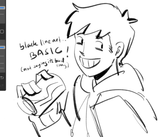
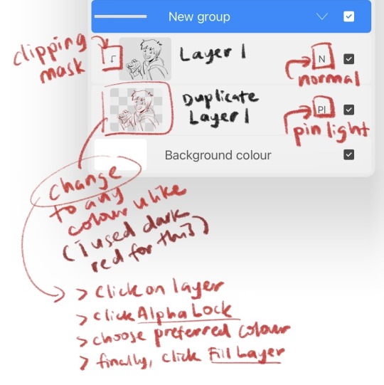
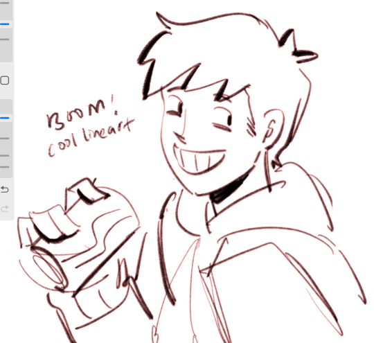
2. art is subjective, pick any that you think suits your preference/is fun to use
for brush, do you prefer it round or textured? lots of pressure sensitivity or none? i like my brushes textured and with a good amount of pressure sensitivity. for blending, do you prefer the transition colour to appear smooth or textured/messy? i sometimes mix between both to give a sense of harmony, but i like it textured more. it all comes down to what feels right to you. pick a few artyles that you like and incorporate it into ur own! pretty basic tip but thats the best way that i know. just pretend ur a mad scientist trying to find cure for like cancer or sumn
3. personal opinion: brush type matters
dont listen when someone says the type of brush u use doesnt matter. yes you can draw with any brush. yes all brushes work the same way 🤯🤯🤯. but theres gotta be that ONE brush that just hits the spot for you, as if its made specially for Your Hands….. unfortunately theres no shortcut to finding Your Brush. it took me 4 years of endless experimenting to find mine.
if ur curious on what brushes i use, i have it listed in my carrd. however i still experiment a lot and dont rly bother to update it, but those should be what i use the most/my top favs !
★ ★ ★ ★ ★ ★
i dont think this covers everything, but this is all i could think of from the top of my head. just lots of trials and errors really, and dont be afraid to make a mess!!! i hope this answers ur question :33 all the best!
9 notes
·
View notes
Text
Harrier's short guide to drawing
Hi!! My name is Harry and I've been drawing consistently for about 5-6 years. And uh- I wanna show a basic overveiw of my process!!! then here ya go https://www.tumblr.com/bloomburnweepwilt/758926600395980800/oh-look-its-ameliedoree-her-videos-slap-go?source=share
Also go watch Amelie Doree- thats who this drawing is a fanart of.
1- Getting your rough down
The first and most foundational step is getting a basic layout of your drawing, before you do anything you have to make sure you get a good idea of what exactly you're drawing. This is one of the few parts of drawing that you don't just have to ram yourself into the wall with practice to get good at. You just have to play around and have a fun time and look at the art you like to see what compositions they use.
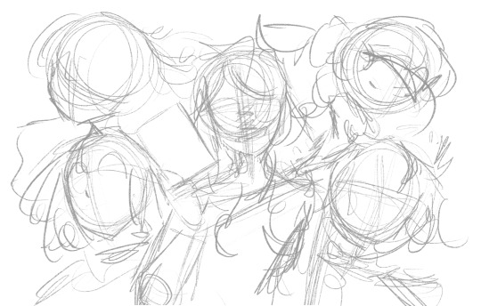
My roughs are relatively clean because I have a lot of experience with this art style I use and I don't need a lot of guidelines. If I was doing furry art, realism, a western comic book style, or even something more simple like a gravity falls or owl house inspired style I would need a lot more guidelines because I'm not used to the parameters of the style. Though if you're just starting out then no matter what you do you're gonna hafta build up a lot no matter what style you go for.
2- Sketching/Lineart
For me my process has evolved to where I carve out my lineart from the sketch directly. But this is where you have to just put in the hard work and time into building your skill. I don't have any particular advice on this end besides follow your bliss, do gesture drawings, and make sure you have measurable goals.
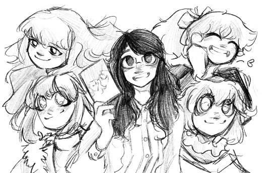
If you want to take inspiration from my artistic inclinations specifically, then keep your lines loose, try to have decently realistic proportions but don't stick too hard to them. Especially if you're drawing a fictional stylized character and not a character or person with a real flesh face where you have more room for conveying likeness. Also sketchy loose lines are pretty much always look better, it allows your art to look more lively!
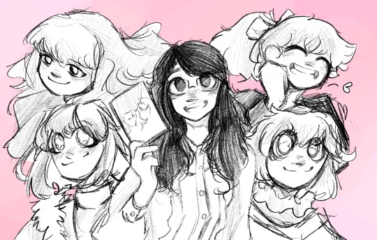
3- Get background colors down
Nothing much to say here, you just need to do this so you get an idea of what the rest of the colors will feel like. It doesn't have to stay the same color but getting the vibe down is important.
*also normally I wouldn't use bright white for a masking color, but because I want the art to be very bright and colorful so I decided to go with white.
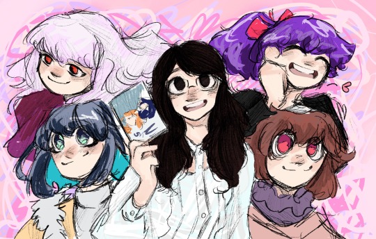
4- Flats
Another thing you kinda just have to learn and get used to. If you feel like your colors are just a bit too disonant, use your programs hue slider and move it just slightly left or right. Its a really good way to get everything feel cohesive while also not loosing the core pallete.
6- Linessssssss~~~~~~
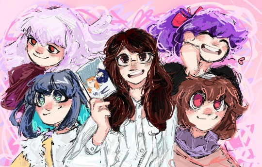
For me this is where all of the life of my art comes from, its where i get to be super loose and impressionistic with my stuff and I get to color up the thing. A lot I'll go with "unexpected colors" in places because those unexpected colors can add a lot of texture and life to your art but this is meant to be pastely and fun so i decided to go wit more conventional colors.
7- Add coloring layers on top for final adjustments
these don't have to be super obvious and noticeable, but often the right mix of overlay and multiply layers can make a piece look better.

And thats basically the whole process. Add and remove what you want, I just wanted to share since Baby artists sometimes don't have a realistic idea of how art gets made and having a step by step can be useful.
#art#harrier du art#art tutorial#amelie doree#art education#artist#digital art#youtuber fanart#this took an hour and a half but dont expect your art process to take that short a time quickness is a skill#ayayo san#gore screaming show#16 bit sensation
4 notes
·
View notes
Note
Your art is very shapey and it's really cool!! I was wondering if maybe you could share a bit of your process??
hey, thank you for the kind words. i appreciate it greatly.
i'll be honest; in terms of a "process" i dont really have one? i'm not as traditional as other artists go, but, if i really think about it, that's the magic of creating, as sappy/cheesy as that sounds lol. i'll talk about what i can tho. i'm not great with words so, bear with me.
i free draw, i don't really draw the traditional guidelines or anything, like the circle with the cross over it? even tho sometimes that bites me in the ass, but thats just how i've taught myself to draw and there's no point in changing that for the sake of being like everyone else.
i start by drawing the jawline first. obviously changes with every face shape i draw but ive drawn this specific look so many times. tbh if anything is my "guideline" its this

i'm drawing franziska since she's all i've been wanting to draw lately.
another method that pops up in my art a lot is utilizing layers like crazy, it helps me so much. i usually draw the hair on a separate layer, and the torso, and sometimes an arm. it helps when i want to change it's size or move it freely, without having to erase so much of what's underneath.

i also keep the opacity lowered because it helps me focus on which part i'm working on.
sometimes im not as sketchy and messy as this as sometimes i draw really quickly.

i tried not erasing as much to show how messy i really am even tho it's usually cleaner at this point when im actually drawing.
here it is semi-cleaned and opacity all put back to normal.
most of my stuff i make is simple doodles, i dont worry about cleaning so much all the time.

that's all i can think of. in terms of color tho, i never really color or render, not often at least.
but tricks i use are usually changing the color of the lineart (oh yeah i hardly ever line my work, i clean and color the sketch) another thing is, instead of making the color darker, i just use a different color entirely. for example, of im shading white, instead of using grey, i'll use blue or something. just makes it pop. i tend to color differently every time i do it, tho those two things are the two that stick in my head the most.
i tend to draw the same elements over and over, like short hair and sideburns. masculine traits. i am transmasc after all, and i put a lot of myself in the content i make. i'm sure that was obvious enough lol. i don't wish to be a professional when it comes to art, i do it purely for fun. i'll be blunt, i usually draw what i want, how i want. it's for my sanity.
thank you for indulging me.
3 notes
·
View notes
Note
Recently found your art after falling into Resident Evil and YOUR ART IS AMAZING!!!!
Like, just looking at the comics along: the lighting, the composition, the colors!!! kjdsfgkjfgbdf its stupendous and I'm pointing at it like "I wanna make that!" The slightly soft lines especially give it such an excellent vibe
I ended up scrolling through your RE6 + L4D2 stuff and the excellent AU~ love your designs and witchy Leon is very fun and *strikes pose*. (Also that "first" comic with "Nick startled the Witch" where we first see him as one was so cool, as was Leon's internal dialouge. Like that plus all the other comics he's still Leon but Not in a way, the Not being 'okay time to hunt these molotov bozos with my reluctant-roommate-ally-unrealized love interest')
Thank you for sharing your art!!
Thats exactly what I was feeling whenever I saw cool art in the L4D fandom. One day, soon you too will inspire someone one day, jus like how I get inspired too :]
LIKEEE RE6 is so based to have a crossover dlc w L4D2 bc it's literally just L4D with a dodge roll, both games have so much in common and there's so much ideas to play around with. And I've been having fun drawing Witch!Leon a lot, what you said at the end is exactly the vibe Im going for! He simply doesn't want to hurt anyone but sometimes he has no control over it and he isn't very happy about it.
Also love how you pointed out the soft lines, bc it's like, that one missing puzzle piece of how I want my art to look. I realized that lines don't have to be clean all the time, so doing the exact opposite just works for me and then suddenly I love lineart again *screams into pillow* Thank you for jus the lovely words <3333
10 notes
·
View notes
Note
Hi! Me again! Thanks so much for replying! I actually do have two things(elements) I'm working on at the moment. Line art and coloring are what I struggle to do the most. My sketches come out so nice until I try to do my line art. And I have issues with lighting, shading and such. Thats all I truly need help on. The positions and anatomy I'm sure I could work on my own. Oh! Thanks again for offering help! It means a lot to me(Also I'm not expecting anything professional from you! I'm just a person who likes to learn different ways a styles that might help me tis all! So don't stress, please! Thanks again!✨💖💖💖🌸💖💖💖✨)
ok that's a lot of different things haha so let's look at lineart✨!! because that's the part i like doing the most... here's a picture i drew as an example! i'll put the "tutorial" part under a cut since it's long...
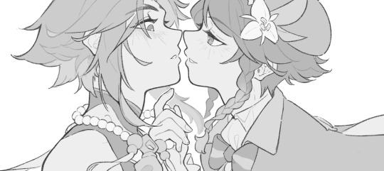
"my lineart comes out way stiffer than my sketches" is a huge mood O(--( when you're sketching you tend to be a lot looser, and drawing lots of overlapping lines creates visual ambiguity where your eyebrain kind of fills in details automatically. then when you try to draw a single line on top of a mass of vague details, it looks weird...
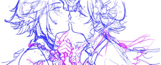
sketch for the above picture; i think there's a few things you can try to retain the looseness from your sketch page:
1) don't even do lines lmao sometimes i just clean up a sketch with eraser and call it a day
2) i like using a pencil/textured type brush to do lineart now! you won't be able to bucket fill for coloring anymore, but for me it helped deal with the too stiff/too clean feeling.
3) i don't do this myself, but i've seen some people suggest blurring the whole sketch layer so you can still see the original sketch as a guide, but don't feel constrained to redrawing exactly on top of it
i also don't bother connecting/closing all lines, it's easier on the hand to not redraw one super long unbroken line fifty times lol
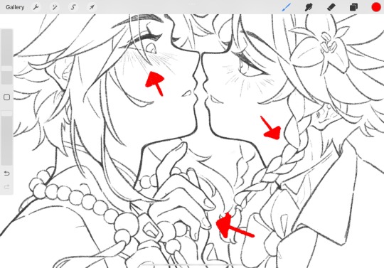
for this one, i redrew the lineart on a new layer. pay attention to areas of high detail density (where you have a lot of stuff going/lines intersecting). e.g., venti's hand, his braid, xiao's bangs... is it easy or difficult to see what's going? check for line tangents, adjust thickness, add more negative space to clarify what you're seeing. small adjustments can bring more visual clarity too; for example, even though xiao's hair falls over his face, i like drawing the eye/brow underneath so you can still see the shape of his expression... to make it easier to follow the line of his bang, i erased a little bit of the brow/eyelashes underneath so they don't intersect his bangs on both sides of the line, which helps create more depth and makes it easier to see the hair line
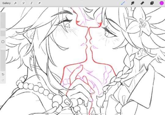
you can also vary line width to create depth! i highlighted in red where i drew with thicker lines, because these are the big important shapes that are the central focus. highlighted in purple elements that are further away from the viewer (the hair on the other side of their face, xiao's necklace) or finer details (venti's nails)
contrast makes things fun and easier to look at it...! i like using thicker lines around the main shape/contour of something and drawing the interior details with finer lines
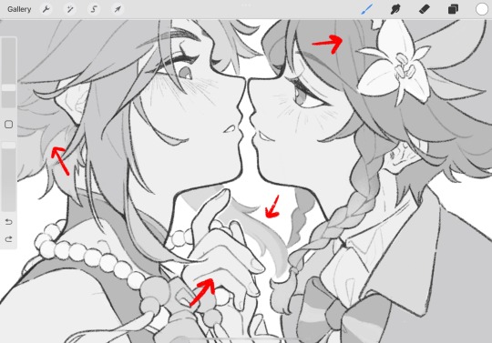
fill + lines colored: this is less of a good example because it's all grayscale, but i think coloring your lineart also helps contribute to contrast and depth o: you can retain details but make it easier for the eye to parse
those are the main things i think about for lineart; hope that helps (at least somewhat)...!
#ASK EVER#i realized belatedly i couldve just used an existing file as sample pictures... instead of drawing a whole extra picture...#whatever i got to draw xiaoven again so it's still good for me LOL
605 notes
·
View notes
Note
HELP YOUR ART IS SO BEATIFULLLL AJJWDIAGAIVKAKujui I CANT EVEN IT WAS ART BORN FROM HEAVEN I WANTED TO ASK DO YOU HAVE ANY TIPS FOR A STRUGGLING ARTIST?
AGHGH THANK YOU SO MUCH!!!! I'm sooo sorry for the time I took to respond to you. I've been busy and its also a very difficult question, i'll be honest. The thing is you're asking for tips for a struggling artist.... to a struggling artist... so. I'm gonna try my best to give you something concrete and that makes sense, but i don't know if ill be able to- and knowing me, it IS going to be messy, I'm really sorry for that!!
First thing I'm gonna say is, obviously, draw things for yourself. Draw stuff that makes you happy! When I get really into a piece of media, i've noticed that i can see my improvement over a significantly shorter amount of time than usual, simply because, well, i like this stuff, and i like drawing things in relation to this stuff, and i want to draw more because i enjoy this stuff, y'know? It's easy to say and it might sound like it's not really a tip, but from my personal experience, i can say it does make a big difference. So basically, obsess over something and draw it all the time- but then, don't only draw the same thing over and over again, rather insert it into your art and get creative? For example, since we're both Pokémon enjoyers- take characters or pokémon you like and try things out! Focus on different things; shapes, colours, lineart etc. But if you don't feel like making studies or changing anything today, that's also fine, you don't have to. The most important thing is to have fun, or else, you'll get stuck. You don't draw with your head, and that's something that I myself struggle with, so i can't really talk, but having fun when you draw and just not caring about if it works technically or if the anatomy is correct or if others are going to like it- THAT's when you're going to improve, because you're going to like what you're doing and you're going to want to do it even more!
Also, search for inspo! Open pinterest and collect artworks you like, and staaare at them for a very long time. I like doing this. Plus, it usually makes you want to draw, too. This is a very common "tip", but notice what you like about how this person draws that specific thing (hands, legs, noses maybe? or the way they do lineart, or the way they colour), and just slap it on your art. It's like a cool little upgrade and it makes drawing even more fun.
Art takes time... art is a fuck... and we all have sort of a hate-love relationship with it, i think. And you're always going to struggle to a certain extent, because it'd be too good to be true if you could do everything and anything without having to learn and try and fail before. And sometimes you're gonna feel like you don't want to draw, and sometimes artblock will hit you like a truck, and thats ok!! You'll come back to it eventually. Challenging yourself can be great and all, but don't force yourself when you really don't feel like it. Be patient, and be indulgent!! You got this!! We got this!!! We can do it!!
#ask#art tips?#thank you again for your kind comment amlzkecz#i dont really know if this is going to help at all. there are so many things i could say on this topic... too many things...#hope it was clear enough?#it means a lot to have someone ask ME this hahaha#i kinda feel like you got the wrong person.....#tysm <3 youre too sweet#also keep in mind this is all only from my point of view!! you really dont have to agree with or follow anything i say here#theres no...art law... just do whatever you want#whatever makes you happy!
7 notes
·
View notes
Note
if someone already adsked these sorry hehe 23 & 5 & 8
ZILLAYyyyyyyyyyyy thank you fo rhthe ask i smiled. Clyde beat you to 23 but ican still do the other two.
5. least favorite thing to draw
anything requiring clean geometric shapes and lines and shit ~_~ My wobbly hands and terrible eye for these things make me genuinely unfit for drawing architecture which boils my blood because architecture is like important to me. i've been working on it but i make slow process because i'm just reallllyyy bad at keeping things uniform. its not just that im bad at it though i love drawing things im bad at drawing its mostly taht i get insanely frustrated. someday i will fix this about me.
8. what's the most fun and the least fun parts about your process
MOST FUN is certainly painting and sketching. You can kind of definitely tell because this is all i really do whenever i can help it. i love fucking with color , i have so much fun just drawing casually unpolishedly. i love painting and its relaxing and satisfying for me to basically have infinite chances to just do an area over by throwing more color on top of it. thats the best part about it. LEAST FUN is Everything else. correcting mistakes and polishing shit destroys my soul i want everythingto be so messy all the time. having to do lineart destroys my soul. i have extremely little patience for it. so i simply stopped. But sometimes it cant be helped........and i hate eery second of it.
BTW do you want to hang out with us later. Thankyou for the ask i smiled : )
6 notes
·
View notes
Note
Hiya! May I ask how you plan out your color palettets? They're so vibrant and purple :3
i must start this off by saying that where ive gotten with art thus far has been mostly through bullshitting and just messing around. and i wouldnt have it any other way. like yeah its good to have a basic understanding of color theory and what not but ... heres what i do :^9
most of these apply to digital art specifically ... so keep that in mind
-one way that i sort of got an eye for picking colors was through creating a basic color palette, filtering it to my liking, and working from there.

(layer modes here were ‘lighten’ and ‘saturation’ over that, but thats not really important + the names of layer modes/blending modes/what have you differ from program to program)
i found this to be a lot more enjoyable than coloring a piece with a basic palette and putting filters over it, and like ive said it gave me an understanding of how colors work together in ways you wouldnt expect. any of the colors in the filtered palette may look odd on their own but work well all together. this is just a really good way to start with working with more interesting palettes, and i still find myself doing this from time to time. since most of my focus has been on cooler palettes, ive been thinking about doing this method to get some warmer palettes to work with and attempt to understand those.
-on the topic of filters, theres absolutely no shame in using them to your advantage. filters are cool and fun to mess around with and i dont understand why some people are so stingy with them. even though i dont do the previous trick as much these days i still like messing around with filtering an otherwise finished piece. i drew something recently which looked so much more fun and vibrant after upping the saturation, and typically i like to put ‘brightness’ or ‘luminescence‘ filtering over a drawing. like i said ... just mess around from time to time and you’ll figure out some cool things you can do.
-never underestimate the importance of the color of a background/lineart/any other element of a piece. a colored background can heavily alter the mood of a piece. and if you do lineart, think about changing the color of it (typically i do a dark purple or blue because i think it looks nice :^9) and also consider filling in a subject in a piece with one color before coloring over it with the actual palette, your ‘underpainting’ if you will. even as someone who doesnt use this for painting, i find that this still helps me.
- substitutes !!! think about using blue in place of black, cyan in place of white, and so many other possibilities. and on another note, dont be afraid to use pure blacks and whites in palettes, not everything needs to be soothingly pleasing to the eye. there are no limits to what youre “allowed” to do with art. even though i typically use a dark purple and what not, sometimes i experiment with black lineart, and i find that it looks very striking. just dont lock yourself into a certain way of always doing things
-im sure this doesnt need to be any longer ... final general notes of mine are .. dont be afraid and hold yourself back from trying out “weird” palettes, sometimes an experiment turns out and sometimes it doesnt. the biggest mistake you can make is stifling yourself in fear of making something “bad”, just go crazy. and remember that youre learning even when you arent drawing, consider collecting artwork from others with palettes that inspire you and putting it all into a folder that you look at from time to time, and take note of how others go about things. every artist has inspirations, and mine are a huge part of where ive gotten with art and the things i want to continue to experiment with.
like once said in sonic adventure 2 .... live and learn everybody
#asks#my apologies for only now getting around to this one :^9 and for somewhat going off topic#i love talking about art and always enjoy being asked about it ....#hope this helps even a little bit u.u
5 notes
·
View notes