#but just for the sake of it yk
Explore tagged Tumblr posts
Text
i was wandering life unaware and unbothered until i saw lovely @royalthorned post about regulus and rabastan and my life hasn’t been the same since. i could never before really see regulus with anybody because it just felt ooc for the way that i view him but rabastan ???…yeah, yeah actually.
rabastan is an awful little thing, all bark and no bite, arrogant, loud in a wanna-be sophisticated way and has a black-and-white superficial, liberal view of life. he does lots of things but never too seriously, he’s impulsive but seldom for good reasons but one thing that he fully is, is himself. maybe he is just too simple-minded to lie, manipulate, and cheat or maybe that’s just how he is, but he is quite probably as honest and true as one can be in his context. he is awful at what he doesn’t do but good enough about what he does, so everyone is content with him. rabastan is the epitome of a Lestrange, he is loyal to an absolute fault and though no one is close in the family, blood is all. and he stands on their motto more than he stands on anything “Corvus oculum corvi non eruit” ( a crow will not pull out the eye of another crow ). he has the charisma and tone of an heir but everyone is glad he is not. he’s chaotic and anger-driven. when his temper becomes uncontrollable he recluses himself to sculpt. ( idk why but i’m convinced all Lestranges have an affinity with art and where rabastan sculpts, rodolphus plays instruments and composes )
regulus on the other hand is hard-headed, sneaky, and far too smart for his own good. and he somehow now had the thick and unwavering attention of the second son of the Lestranges. to rabastan, regulus was the most interesting being he had laid eyes on. a pretty and scrawny man who held all the power he could ever want and chose instead to read stupidly long books about things no one knows about and write equally long manuscripts about things no one could ever think of ( regulus who plays out experiments in his books is dear to me ). he was a ghost who acted all proper and well, and roamed the halls of the black manor. he had the answer to every question, and had everyone tightly wrapped around his finger, and believed in a god everyone faked at hearing, and held grudges like an old victorian lady, and remembered everything all the time, and rabastan wanted nothing more than for that god-sent, angel looking boy to see him too. he had never really tried to get anyone’s attention, always receiving it with little effort, but with regulus he was desperate.
they first met in a family gathering, humble conversation found its way through loud speeches and ceremonial family rites. it was a quiet thing, sweet and poisonous. to regulus rabastan was the forbidden fruit, the epitome of what he couldn’t do but needed to try. some sort of sinful desire he had succumbed to. his life was tidy and plain, and rabastan was the chaos that kept him on his toes wrapped in luxurious clothes, and shiny smiles, and elicited in him a morbid interest he couldn’t shake. i think he liked to know he had with no effort on his part the complete attention of someone like that.
this one is for you Irene @katakosmos


#i haven’t reread this if it’s distasteful don’t blame me#i’m thinking about rabastan who hasn’t spoken to his brother in months despite them living under to same roof just to ask him about music t#impress regulus#like how do you compose ? and how does one acquire an absolute pitch and if it’s possible to learn violon in a day#and rodolphus just ignores him#it’s so funny that rabastan is all angry and loud and obnoxious yet he sculpts#one of the things that take up the most patience and thoroughness#regulus might secretly despise him a little#but just for the sake of it yk#regulus#rabastan#regulus/rabastan
35 notes
·
View notes
Text
In light of Iskall and Stress’s decisions to leave Hermitcraft, I ask all the fan-content creators to PLEASE NOT DELETE STUFF ASSOCIATED WITH THEM RIGHT AWAY. ESPECIALLY FICS. We don’t know the full context, and plus, it’s a part of Hermitblr History. At the very least, if you don’t want to be associated with their content, orphan the works or repost them anonymously. Heck, send them to me, just so we have an archive! Hermitblr has been so good about separating the ccs from the characters, so let’s not let interpersonal conflicts between the ccs majorly affect our enjoyment of the characters, especially with what little we know.
Edit 1: Everyone please take care.
Edit 2: Due to the way asks with Media work, if you send me fanart of Stress or Iskall, I will make it a separate post so as to not include or reveal your user. Alternatively, I can make a Google Form? Lmk.
Edit 3: WE OFFICIALLY HAVE A GOOGLE SHEETS MASTERDOC!! I’m working on formatting it so things are easier to find. Add images, links to both the original and your Wayback Machine Archives, credits, and more! I’ll get working on an anonymous google form.
#hermitblr#hermitcraft#hermitcraft fandom#fanart#fanfiction#not drama necessarily but yk#Stress#stressmonster101#stressmonster fanart#iskall85#iskall fanart#I know I’m probably being majorly selfish but cStress especially has been a major part of my fandom experience#And I don’t want to lose that just because people are afraid of being associated with anything that could be slightly conflict-based#Assume the best in people for God’s sake#hermitcraft iskall#stressmonster#iskall#stresskall#Hermitshipping#lost media#as a rb (quicksandblock) said:#we have enough lost media in the MCYT fandom#Let’s not add onto it#media preservation#fanfic preservation#art preservation#iskall situation#<- I think?#Iskall and Stress archive
589 notes
·
View notes
Text
So y'all have seen the Williams F1 Logo before, yeah?
well get ready, becaues I am about to ruin your day!
where does one even begin with this. i am sorry in advance. -just a poor learning graphic design student, who simply tried to enjoy their saturday evening
The Logo
For anyone that doesn't know, here's the Williams F1 Logo. Entirely unedited, copied straight from Wikipedia:

Now like many fans, I actually quite enjoy this logo. I like the modern, sharp edges of it and it's simple yet intriguiging design. It's memorable, while also easily recognizable as a W. I also really enjoy the colour choice (this, however, is entirely a personal preference.)
(entire rant under the cut. please keep reading this took years off my life span.)
How did we even get here?
Let's start at the beginning. How did we even get here? Well I, a poor poor learning graphic designer, was watching this lovely video from Mr. V's Garage about bad F1 Logo's over the past 35 or so seasons. Very interesting, I can only recommend it (but you don't need to watch the video to understand this post)!
Now, to cleanse the palette at the end of the video, Mr. V included a top 10 GOOD logos from this time span, it was very kind of him.
On P4 of this "Good List," Mr. V placed the current Williams F1 Logo, as pictured above. At first I vaguely agreed with this, believing that he probably simply hadn't noticed one of the things that's been bothering me about that Logo since the first time I saw it up close.
The first sign of Trouble
So, what is this mystery issue, you might ask?
It's simple really. You don't necessarily notice it at a first glance, but something about that logo seems off. Taking a second longer, you may notice it yourself.
No, I mean it, take a minute and go look at the logo. It looks wonky as hell, doesn't it?
Well I can tell you the first thing that I personally noticed. The arms of the W aren't in line with the bottom half, see:

(Graphic by @girlrussell who was so kind to let me use it, as it is way prettier than the one I made)
It's a crooked W. There is no good explanation for this. The rest of the font is perfectly fine, geometrical shapes.

Anyway, the good person that I am I went to point this out to my partner ( @leftneb ) who proceeded to inform me that he, infact, was not aware about this and was, quote, "never going to unsee that."
Now, the good FRIEND that I am, I, of course, proceeded to rush into our broader F1 friendgroup to make them suffer for eternity.
What's the logical next step to take? Of course, fix the logo in Adobe Photoshop, you know, as a joke.
(Disclaimer at this point, I am not necessarily the biggest fan of Williams Management Team. I enjoy ALL their drivers this season. I do NOT enjoy James Vowels. Be warned.)(Also I am aware that he probably did not have an influence on the logo)
Trying to fix it. Oh god, I was so innocent back then
Trying to fix the logo in Photoshop is the worst mistake I could've made. THE worst path to take. I could've just giggled about making my friends suffer (which I succeeded in, by the way) and moved on. Instead I ruined a perfectly good Saturday evening, and for what? I don't know anymore.
Anyway, how was I gonna go about fixing the logo in the simplest way possible? Simplest way I could come up with: slap the thing in Photoshop and put two, mirrored boxes at each side to make the sides line up. Small issue, how do I make the thing actually even? Fix: line them up at the intersecting point with the bottom tips of the W.
Here's the result:

Hey, anyone care to explain to me why in THE LORDS NAME the arms are different sized? I mean, surely they weren't before. Surely, certainly, I must've messed up.
I double, I tripple checked. I made sure everything was lined up and made sense. But no.
It just couldn't be. Something was uneven in this logo, something even deeper. Something I could not have predicted when first taking a closer look. It was at this point I realized I had messed up. What rabbit hole had I stumbled across? Certainly, it couldn't get much worse.
And that's when I noticed.

(pictured above; my genuine reaction)
There's MORE? (oh god, the top isn't lined up)

I couldn't believe my eyes. This is the PINNACLE of the sport, and THIS was the logo of one of the competing teams? I mean, yeah, we have a Visa Cash App RB or a Kick Sauber or even a MoneyGram Haas which are all terrible logos, but at least they're CLEAN. (this has not been checked. If anyone wishes to ruin a nice Saturday evening, feel free to check them and tell me how wrong I was in the previous statement!)
But you can see that there is no end in sight for this post. I'm sure you're as scared as I was at this point. By now we were sitting in VC, discussing the horribleness of this logo. I had long informed my irl's about this, who take said design classes with me. And it was one of them who pointed out the next thing that had been bothering me, but I had not been able to put a finger on up to this point.
thE DISTANCE, HOW DID THEY FUCK IT?

I'm afraid I have to confirm your fears.
Yes, those lines are the same length. According to Photoshop, they're on the same level as well, so no flunking with angles.
The gaps of the arms to the main W are not the same. They're differently sized gaps.
It was clear to us, this logo is inherintely flawed. They're subtle issues, but once you pay attention you start to notice things. It all looks slightly wonky and off centre. And eventually, you get paranoid, and start comparing other angles and sizes. And you will keep finding things. This has ruined my life.
HOOOOOW

Honestly, I don't even know what to say. Yes, yes sadly those lines, too, are the same length. Just copied over from one side to the other and layed over on the same height. I admit, they're not layed over perfectly. I was honestly holding back tears at this point. But the point still stands, you can clearly see a difference in width.
Honestly, the only way I can explain it is that at some point there was a mess up of distance or proportions and whoever was designing the logo couldn't pin it down and tried to restore the visual balance by making manual adjustments. And in all honesty? They kinda did a good job, if that's what's happened. I mean, you notice the crookedness of the arms, and then maybe the difference in height, but the rest you probably will not notice if you don't spend too much time staring at it. (like some of us) And even those issues clearly aren't noticeable to the vast majority, considering I had to go point it out to a group chat for my friends at least to notice.
what the fuck is THAT?
Now, the thing about doing this investigative work of prooving a team you dislike is worse in more aspects than you previously thought, is that you do a lot of zooming in. And zooming in means you might notice bits that yours eyes simply overlooked before, because they were too small.

Here you can witness the top of the middle point, that, for whatever reason, really wants to touch the top border of the Logo. I'm relatively certain that's the highest few pixel in the entire graphic, considering earlier chapter "There's MORE?" I have no idea why it looks like that or why they thought it was necessary for it to not end in a clean point.

I just actually have no idea how to even describe what is going on on the top of the left arm. That left hand side, again, touches the side and is therefore the most-left-pixel in the graphic. I, once again, have no idea the purpose of this. However the RIGHT hand side also makes no sense, as it is the most prominent corner in the whole logo. There's pointed corners, and rounded OF corners, but nothing that is trying to form it's own colony in a distant land that hopefully isn't this god awful logo. I hope that blob gets away. I really do. You go king.
i'm loosing my mind
Anyway, the only reason I could come UP with those weird "reachy-outy-bits" was to establish the dimensions of the logo? But if that was the case, I don't understand why they managed to keep all the other potentially border touching corners clean?


Like, look. Those are clean, sharp corners with some clearance off the borders. I have no clue why they managed it here but not with the others.
guys. please.
Backtrackig a little bit, going back to the positioning of the arms.

Do I need to mention that those lines are both the same length and the same (mirrored) angle? I really hope I don't, because I don't think I could be making this shit up. Like, once you roughly know what you need to look for it just kinda becomes easy to find.
As said before, I genuinely do think that most of these issues happened in a chain-reaction. For example, the distances between the main part and the W wouldn't be as noticeable (and they do get noticeable once you start looking at it) if the angle wasn't fucked. And guess what, there's more fucked angles here! Which ALSO influence this specific area of the logo!
this is just embarrasing for you.

something something same line copied over and mirrored etc etc
It's not as visible but the angles defintely don't line up here as well. As mentioned before, these issues for the most part all influence each other. It doesn't really excuse the issues, in my opinion as a designer, because a big company like this shouldn't have these sort of issues in their logo.
So let's review;
to sum it up,

i cannot even BEGIN to explain to you how big of a fucking JOKE this FUCKING logo is. because, i thought to myself, to round the post out, hey, why not show ALL the issues i pointed out in one picture? that would round it out quite nicely, wouldn't it?
Yeah well, this logo sent STRAIGHT FROM HELL just could NOT let me rest. I had only done the lines visualizing the crooked arms in PAINT up until this point, i.e. I had only pulled both up individually. To make a nice "rounding out" picture I still had to add them into PHOTOSHOP. so i did. i pulled up the line. i mirrored the line.
THE ANGLE IS FUCKING DIFFERENT
none. and i mean NONE of my friends had noticed this before. i need you to understand that we looked at this thing with FIVE pair of eyes, and NONE of us noticed that until i thought to myself "Oh I still need to add these specific lines to have ALL the issues I pointed out in my SILLY TUMBLR POST in ONE image" and i get THAT FUCKING SURPRISE
I was PLANNING to round the post out with a statement on how obviously this isn't a serious post. Here, I even had it all written out already because I accidentally started writing it in the last paragraph:
Of course, this is nitpicking, and it's not that serious. I'm aware of that. AS MENTIONED most of these would not be noticeable if we hadn't gone specifically looking for them.
yeah, well, fuck that. i just spent two hours seething about this logo. i'm ending the post on this instead.

#i am ENRAGED#i managed to actually calm down about it#yk. just typing away#and then i just try to ROUND OUT THE POST#for fucks sake#anyway i know i'm posting this at an hourrendous hour#if you read all the way. reblog? maybe#pretty please#williams f1#williams formula 1#williams racing#formula 1#f1#also apologies for any spelling mistakes i do NOT have the nerve to go back and proofread this
944 notes
·
View notes
Text
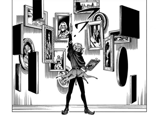
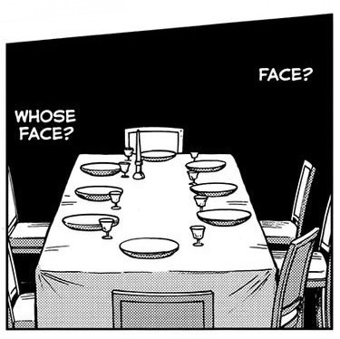
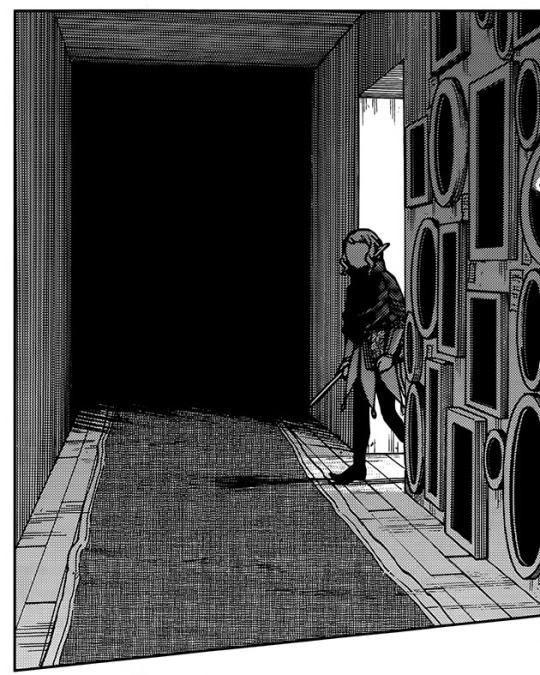
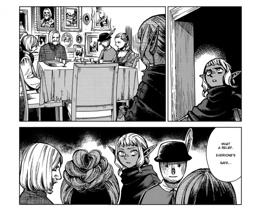
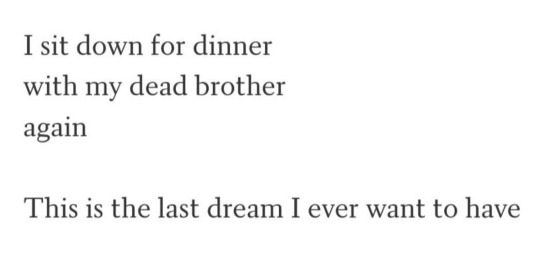
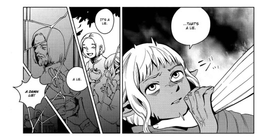
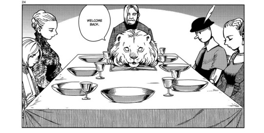

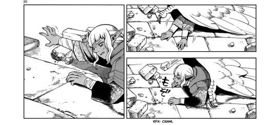
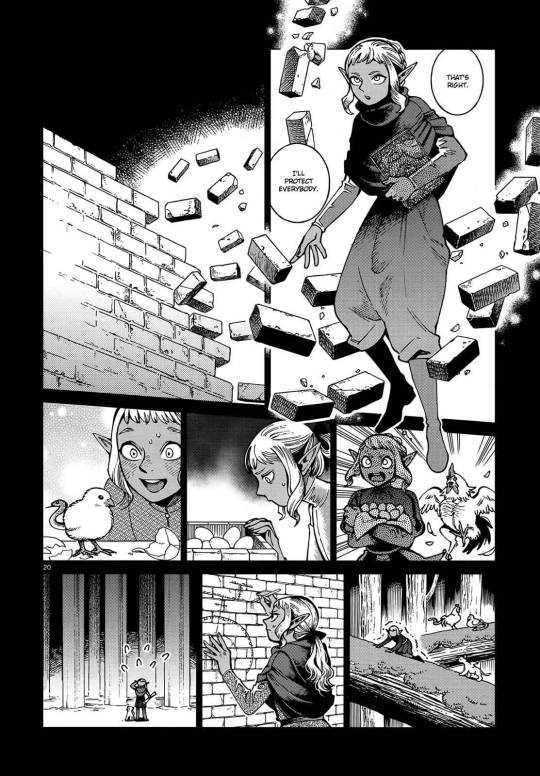
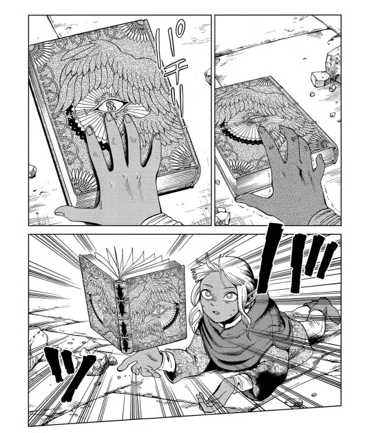
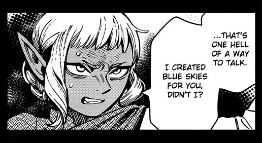
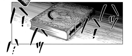

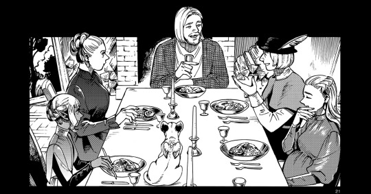
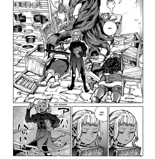
Homegrown
Thistle and Delgal - Dungeon Meshi, Ryoko Kui
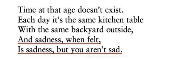
^ Fernando Pessoa / Killing Flies, Michael Dickman / A Brother Named Gethsemane, Natalie Diaz / Antigonick, Anne Carson v Oats We Sow, Gregory and the Hawk

#Dungeon meshi#spoilers#dungeon meshi manga spoilers#thistle#sissel#thistle dungeon meshi#web weaving#web weave#Just in case for sake of transparency: in the ‘what a relief everyone’s safe’ panel I erased a bit of dialogue he originally said#‘What a relief everyone’s BODY IS safe’#But yk. Delusions angst. Dinner table Thistle imagery you are famous to me#delicious in dungeon#Umm go check out my Thistle & Falin fic on ao3 called Slivers maybe idk#Sometimes it does feel like Thistle has an age regression through the manga it’s interesting. Kui what were you cooking#I am a firm believer that Thistle’s an adult and that that doesn’t take anything away from his narrative tho.#He’s the older brother here & that’s the whole point. God dunmeshi family narratives I love youuu#Thistles are a weed… Idk the garden theme for him works great imo. Make that dungeoneum manage that kingdom like an ecosystem
1K notes
·
View notes
Text
madame morrible has the worst fucking luck ever and I CAN'T because first of all after decades and decades of waiting she finally gets her most promising student yet right; she finally gets someone who actually has magic and who might actually be able to read the grimmerie and help further her and the wizard's plans and COINCIDENTALLY this student (bless her heart) is shunned and ostracized by literally EVERYONE including her own family and is desperately craving some form of parental love and affection and validation and acceptance and so madame morrible is like 'ooh this is fucking PERFECT this girl is going to be SO easy to manipulate into doing what I want what could possibly go wrong wow.'
and in comes the fucking pink lesbian.
because elphaba is shunned and hated and all of her peers avoid and detest her because she's weird and green BUT then all of a sudden?? out of nowhere??? she and her pink roommate who, mind you, had a choreographed song and dance routine which involved the entire student body in which they detailed how much they really really hate each other, got really fucking close??? now they go everywhere and do everything together??? they are attached at the hip and looking longingly into each other's eyes WHAT IS HAPPENING????
you are madame morrible and you think galinda upland is in love with your student and what is worse is that your student might be in love with galinda upland and that fucking SUCKS because how the fuck are you supposed to properly emotionally manipulate her now. and it makes absolutely zero sense to you because WHY is galinda upland, the most popular girl at shiz taking an interest in your student??? WHY IS SHE HERE, WHY IS THE FRUITY BITCH RUINING YOUR PLANS???
glinda's very EXISTENCE is a thorn in your side; her simply being herself and interacting with elphaba is probably the reason why you feel a headache coming every time you see them together and is perhaps the reason why you scream into your pillow at night because this absolute loser lesbian just being there might upend a huge fucking chunk of what you've been planning for years.
and then the fucking cherry on top of all of this your student decides to play vigilante and flies off into the sunset and then that leaves you stuck WITH her situationship who you hate more than anyone in the world and you're forced to sort of team up with her for a bit except she doesn't really know magic and she's just being sad and gay and moping about missing her girlfriend and you're sitting there FUMING thinking about how all these fucking witches are fruitier than fuck and all of them are useless to you at this point.

like this is just madame morrible at shiz after elphaba asks her to include glinda in their study sessions just realizing 'dear god I am going to be ping-ponging between these lesbians for the rest of my fucking life aren't I.'
ik she needed elphaba for the plot and for her dastardly plans but in all honesty if I was her and elphaba came up to me at 1am and was like yes please I need you to include my roommate with whom I have a homoerotic relationship in our study sessions or else I will quit right now. also, you have to go down to our party this very instant and tell her in person yourself bye and thanks, I would've just handed in my resignation letter right then and there and cut my losses.
#wicked#wicked 2024#wicked movie#this is for the movie specifically but i just love the madame morrible-glinda dynamic#like the initial one sided beef they have is SO fucking funny#because glinda's like “wow i admire and respect you!! i want to be like you!!”#and morrible's like “if you fucking touch me i will actually set you on fire”#but she HAS to tolerate glinda for elphaba's sake#like she CAN'T#she's stuck with this girl#she can't escape her#even when elphaba leaves GLINDA'S STILL HERE#AND SHE'S NOW STUCK WITH GLINDA#SHE PUT UP WITH THIS NONSENSE FOR ELPHABA#AND ELPHABA'S FUCKING GONE AND LEFT HER WITH THIS THING#AND NOW HERE SHE IS#it's so FUNNY i can't#especially because by the end glinda's also like oh you thought i made your life hell before think again ugly bitch try me#love that for her i won't lie#glinda upland#galinda upland#elphaba thropp#gelphie#gelphie: ruining lives since their shiz days#good on them yk
320 notes
·
View notes
Text
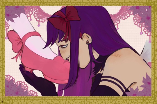
“You believe me like a god, I betray you like a man”
#have you ever gotten a random surge of creativity and lack of care in the world and just created for the sake of it?#YEAH THATS RIGHT#thaats what happened to me yesterday#this isn’t the best work I’ve done but tbh#it’s been like what..close to two years since I last drew a whole piece so yk#I love drawing#anyways had to get this pt of my head so that I could continue playing signalis (and probably draw stuff for it too)#this piece has been on my mind for months now but I never felt confident about it#maybe in the future I’ll draw it better but for now#I like it like this :) bc at least I drew it#anyways mindless rambles mindless rambles let’s all giggle#puella magi madoka magica#magica madoka#pmmm#homumado#madohomu#madoka kaname#homura akemi#YAY ^_^!#d0gart2
216 notes
·
View notes
Text
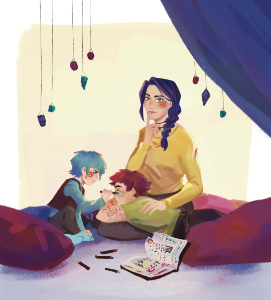
I was talking about Arcane finale with a friend and joked that Isha didn’t die, but went to past because of hexcore magic, grew up, became friends with two guys who kinda reminded her of her previous adoptive family… in this new life she became known as… Felicia……
#Arcane#Ok hear me out her eyes are blue because of hex magic influencing her during time jump#Why time jump? Idk but apparently its sorta canon now#Anyway#she finds a way to survive in the past#she still experiments with hair color and ends up loving purple#maybe later she feels more comfortable about talking to some people (just for the sake of this au ok???)#nonverbal Isha is obviously valid#Ok back to this#It’s just kinda funny to add more drama to the family by locking them in a time loop yk#Also the fact both Isha and Felicia are associated with bright yellow or light yellow#Ok time for normal tags#arcane season 2#arcane powder#arcane vi#arcane felicia#arcane isha#arcane fanart#digital art on tumblr#lynn lyrae art
86 notes
·
View notes
Text
I desperately need fics of post s2 jayvik or even an au with s2 jayce and s1 viktor where we explore the change in dynamic after jayce suffers his own leg injury in the anomaly. Im sure people have already seen all the parallels and analyses of jayce and viktor’s injuries, but it’s just a concept really special to me,,,,there’s nothing more beautiful than connecting with someone experiencing a similar struggle—it’s just so much stronger because of your ability to truly empathize with the other. And obviously that’s ignoring allll of jayvik’s history. I just think there’s so much potential there to expand on the possibilities of their relationship.
#aloonaram thots#arcane#jayvik#jayvik fanfic#jayce talis#viktor arcane#like i wish i was skilled enough as a writer to write it myself#like viktor showing jayce how to properly use a crutch so he doesnt shove it up his armpit#or jayvik fixing each others braces#and how viktor might react to jayces confidence in his disability#bc i dont think jayce would be insecure#and in turn how does that effect viktors own self image?#and what about pain management#i would looove to see them both caring for each other or even viktor teaching jayce the ideal way to care for his injury#also jumping back to the confident jayce#i truly think that if viktor saw jaycr walking confidently in a public space with his crutch and brace#viktor would feel more confident like i just know he’d be breathless at the way jayce carries himself without fear of judgment#but also conflict for conflict’s sake—what if viktor instead felt a form of jealousy? jealous that jayce was able to be more confident#how would that effect their relationship yk?#just…sm stuff i cant#im not disabled in the way jayce and viktor are but i do have disabilities so this stuff really hits home
85 notes
·
View notes
Note
Chuuvia besties clorinzai worsties
so true tumblr user evilkaeya sry for the infinitely late response i had to draw their first meeting in my head
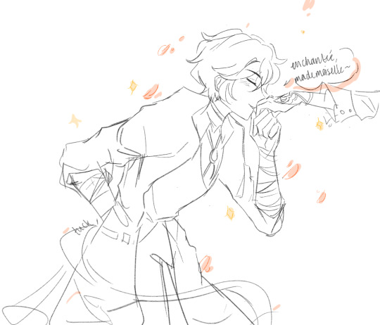

dazai would make sure to be on his best behavior around chlorinde bc she could fold his ass in a second
#edit: NO OMFG I DONT SHIP THEM THEYRE BOTH GAY FOR FUCKS SAKE.. THIS IS A JOKE (anons in the ask box need to take a joke fr)#yk actually. part 2 where she just kicks him in the ribs with her nine inch stillettos puncturing his stomach#chuuvia sipping tea in the corner completely ignoring their unhinged partners#genshin imapct#bsd#lotus’s asks#lotus draws
357 notes
·
View notes
Text
(i feel like analyzing stuff again so here we go) kaz is smart because he knows people. he loves puzzles, loves locks, loves taking things apart to figure out how they work. he says in soc that you figure people out like you figure anything else out, by taking it apart. kaz is smart because he finds enough out about people to make assumptions.
he knows what people will do, and often times it leaves the ones being duped going "how did he do that? how did he know?" kaz never truely knows something will 100% happen, he's just assuming it will and is almost always right.
in the begining of soc, when the crows are breaking matthias out of hellgate, kaz assumes wrong, though. he knows that jesper has a reputation for being late, so he assumes that jesper will take to the task of releasing the animals like he will anything else he does, and be late doing it. he has, in some sense, taken jesper apart. he knows what jesper does, and he plans around this assumption, however ends up being wrong. nothing extremely consequential happens because of his assumption, but it proves that kaz will assume things with confidence.
a huge aspect to why kaz is so successful in his planning and overall schemes is because he knows how to make a good assumption. he has inej gathering him intel, which enables him to make such confident and correct guesses about how people will act.
one instance of kaz's assumptions being correct is the whole geels and 19 burstraat situation in the beginning of soc. when kaz threatens to burn down geels' lover's home, geels could have not cared, could have shot kaz right there, but he didn't. geels doesn't, and kaz continues very boldly facing him. why? because kaz knows how geels will act.
another instance is in ck when kaz kidnaps alys and uses her to get inej back. at this point, kaz knows how van eck will act. van eck has already duped kaz once, and i imagine after this one of the things kaz does to insure it never happens again is over analyzing and taking him apart. it works in this instance, because kaz has already seen how much van eck cares about a "worthy heir," and alys is literally holding that. kaz has taken van eck apart, and had figured him out enough to make a bold and correct act based on assumption.
all this to say, kaz thinks and thinks and thinks and is always thinking and picking everything apart, and that is the key to why he can get away with everything he does. and maybe one day his assumptions that make him so smart will fail him, and maybe one day they'll be fatally wrong.
#i'm back at it again with the literary analysis#my english teacher loves me#weird statement but yk what i mean#i feel like (and know) that i'm constantly picking apart this duology and i don't think i'll stop anytime soon#i could yap forever but i'll stop for y'all's sake#UGH i just love kaz's character so much#so COMPLEX and so much to ANALYZE#kaz brekker#side note yall i've been spelling brekker like brekkar for the longest time and no one was gonna TELL ME???#kazzle dazzle#six of crows#literary analysis#yapping#yapping fr#six of crows fandom#soc
115 notes
·
View notes
Text
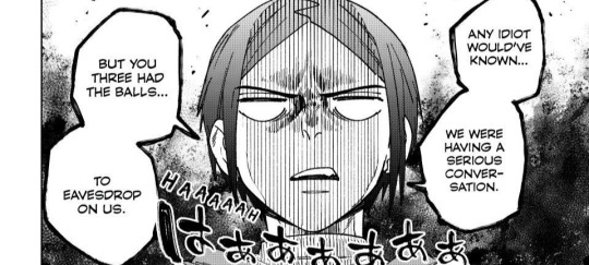
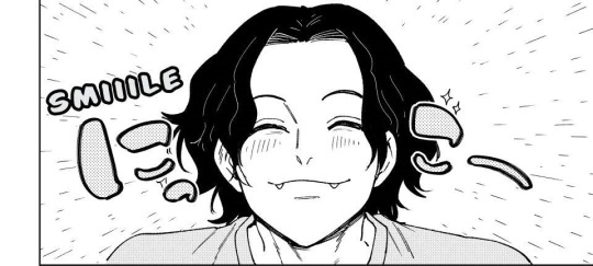
the cat, the dog, and their owner

#ngl id be sako too if i have hiragi as my owner#but in all seriousness i love their dynamic#i didnt expect inugami to be so interested in hiragi though it was a pleasant surprise#all this time i thought he just hopped on the ride not really caring who this hiragi person is#yk just to bond with sako or something#its like friend a rants to friend b about friend a's neighbour and friend b is like oh yeah omg what#but turns out friend b had heard about the neighbour all along lol#such an elaborated way to tell you i dont expect much from inugami's braincell HAHAHAHAHA#NAUR BUT I LOVE HIM OKAY HE'S PRECIOUS AF#thankfully this aint tokyo revengers else one of them would be dead by now for plot sake#im traumatised#yoru's letter#wind breaker#sako kota#inugami teruomi#hiragi toma
30 notes
·
View notes
Text

What a plot twist you were. [x]
#Like. The narrator introduces jc to us as the antagonist#Then we got to know him. Not who people think he's. But who he really is#And we saw jc giving wwx a piggyback. Giving him soup. Rescuing him. Putting himself between wwx and any danger (madam yu/wen soldiers)#And even the staged fight. It's yk. Staged#jc wanted to protect wwx at any cost. But wwx wasn't willing to compromise. But jc did#The fight was wwx's idea. Because jc is an enabler (just like jfm and jyl)#jc is ready to bend for his loved ones sake#The point is. Every action jc takes. Is in the name of his loves ones' safety. And surprise. wwx is one of the people jc really cares about#Even after wwx' return. Aside a broken cup. jc isn't doing much to stop wwx or anything. We know that jl was able to free wwx from Zidian#only because jc - Zidian's primary master- wanted it!#And jc fling himself into danger countless times to save wwx even though wwx can't sit still with him for a hot minute#What I wanted to say it's that the jc is presented to us - the mean ungrateful man- is very different from the real jc -#the indulgent uncle who rolls his eyes at his nephew antics. the brother who buries the hatchet for his sister's happiness.#the uncle who kinda wants to help wn to get up from the floor because he was an ass to jc but he helped jl and that's what matters to jc#the sect leader who let two women speak freely their mind in a patriarchy society#People better than me have already said this. shit I can't remember my point lmao#Like. jc is presented as an antagonist but what this man wanted was an apology and an explanation#This post is a mix of a rant I wrote last year (ha) after seeing a bad take. About what I don't remember lmaoo. And me wanting#to make gifs of wzc in this scene. Why does he look so good. It should be illegal. Seriously#jiang cheng#*mgifs
137 notes
·
View notes
Text
I absolutely HATE when people see their favourite character making a bad decision/messing up/having questionable morals in a fic and go
“that’s not my sweet little -name- they’re perfect and can’t do any wrong and this fic is now horrible because I don’t agree with how you wrote the characters”
like your right that’s not your sweet little -name- it’s theirs!! It’s the person who wrote the bloody fics characterisation and if you don’t like it then don’t read it omg
#also characters making bad decisions does not reflect the authors morals#and please for fucks sake stop saying that because they can write characters that believe immoral things means that they must believe that#some people just have an imagination#and are good at writing#but I don’t expect you to know what that’s like if that’s what you come to after reading something#it’s made up!! fiction!!! fake!!!!#this may or may not be because of a TikTok comment section#I have so many angry rants in my drafts because of tiktok comment sections#I could just not open them#but I do every time#it’s my fault#i guess#but not my fault people are stupid#that’s there own#marauders#marauders era#fanfiction#fanfic#characterisation#marauders fandom#the video might have been on choices just a little bit#so you can imagine the comments#i haven’t read it#but isn’t the whole point that people make good and bad and questionable CHOICES??#yk like the fucking name of the fic??#no? idk#mcd scares me#jegulus#choices#regulus black
25 notes
·
View notes
Text

#its a problem i think#i need to lock the hell IN DUDE I NEED TO LOCK IN SO BAD#tomorrow mayube i will sleep on it#what ive been telling myself for the past three days i rlly just want to get my ideas out my brain before they haunt me yk#ill take however long i wanna but i cant for MY sake LOL#goobnight
41 notes
·
View notes
Text
so how upset do you think ariana grande was when they cut the scene of glinda and elphaba bouncing on the bed.
btw in case you aren't exactly sure what the scene's about this post should work well enough in helping you understand it.

#wicked#wicked 2024#glinda upland#galinda upland#elphaba thropp#gelphie#ariana grande#i am just saying#woman is literally out here as like#the number 1 gelphie shipper#seizes every opportunity to jump up and be like GLINDA'S FUCKING GAY AND IN LOVE WITH ELPHABA#SHE'S IN THE FUCKING CLOSET#SOMEONE GET HER OUT#and yk good on her#but for argument's sake#what'd you suppose her reaction was when they cut this scene#just saying#it's a fairly funny scene.
44 notes
·
View notes
Text
manny jacinto's sculpted by the gods insane face card is singlehandedly blocking me from throwing up ripping my hair out and mourning the death of my two fave jedi in the acolyte. like what is this. no man should have this power
#“oh no he's hot” BUT FOR REAL THIS TIME#THIS is a man i can justify for murdering people!#this is a Villain TM#he's not a crybaby he's a literal Sith who just want to be a Sith in peace and that includes killing manipulating torturing#all that villain stuff yk?? and i hope he stays that way no redemption no grater good no sad backstory#just a bitch for the sake of being a bitch#and when the time comes someone will just chop his head off i guess! end of story!#i honestly love it. good ol palpatine fashion#the acolyte#the acolyte spoilers
38 notes
·
View notes