#but it's mine and i love it
Explore tagged Tumblr posts
Text
Got a bit of a different bookbinding post today. @renegadeguild got an ask from a new binder saying they were intimidated by everyone's gorgeous binds (me too, actually, some of you guys are scary good), and so they've asked people to share their first binds. And I realized I'd never even taken photos of my first one, so here it is, warts and all:
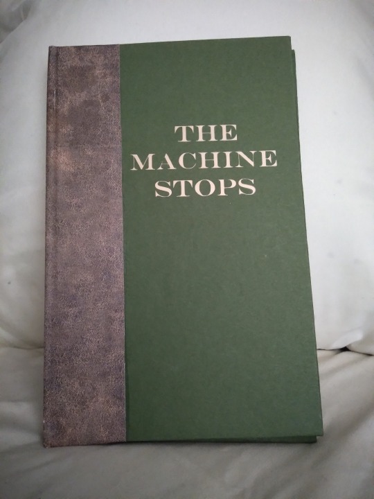
This is E.M. Forster's The Machine Stops, a public domain scifi short story that you can read for free at the link. The first reason I chose it was that it's an interesting story, and I'd bought a print-on-demand copy a few years previously that was just terrible. Baffling cover choices, basic errors in the typeset (like quotes that face the wrong way), weird size that didn't fit on my shelf; just not a good product. I couldn't do it with more indifference than the PoD people. The second reason was that I was too intimidated by the thought of asking a fic writer if I could bind their story and then producing something with a thousand sloppy beginner mistakes, and then they'd want to see photos and I'd have to show them this and it would have been mortifying, but Forster has been dead since 1970 so I could not disappoint him. It was very freeing. I bound it in 2021 as an experiment, to see if I liked this hobby enough to stick to it. The cover is green cardstock and faux leather scrapbook paper that I bought at... probably Hobby Lobby. I added the title later, as a practice project when I first got my Cricut; for the first two years of its existence it had a blank cover.
There are more photos under the cut!

In this photo we can see:
--Too much glue when attaching the leather-print paper, so it oozed out onto the cover.
--Cricut font too thin and too much heat/too long of a press, so the letters have gaps and the glue also oozed out here. It's a continuing theme with this bind.
--I tried to use a bone folder to give it a sharper hinge crease and accidentally pressed too hard and tore a hole in the paper; you can see this in the little white vertical line near the top of the hinge
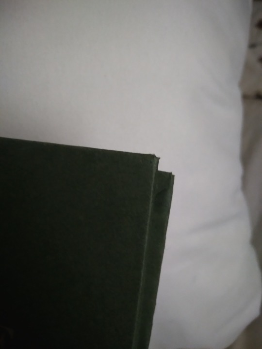
The fore edge is not square. I actually don't remember why this happened. I may have eyeballed the board position when I made the case, or the paper may have slipped while the glue was wet, or I cut it crooked and didn't notice till later. Either way it's bad enough that the book doesn't stand on its own. There was a crooked man/who walked a crooked mile/and found a crooked sixpence/against a crooked stile./He bought a crooked cat/which caught a crooked mouse/and they all loved together in a little crooked house, and I bet they read this little crooked book from their little crooked library.
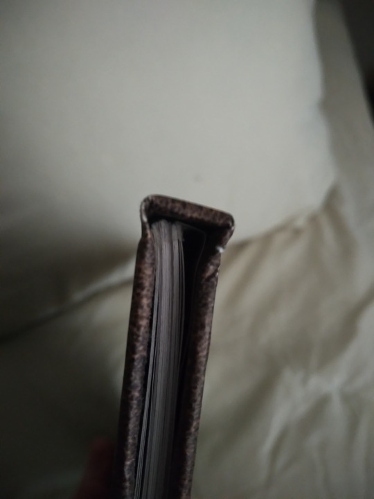

Top view, you can see that the case is too big and the text block doesn't sit straight in it. It has no endbands or bookmark, and it's hard to see in this photo but there's glue on the top of it, at the spine. This still happens to me but I know how to trim books now so this bit gets cut off. You can also see that the scrapbook paper has some cracks where its white core is visible. This is why I do cloth or actual faux leather on the spines now. Endpaper shows uneven trim (did I not use a ruler for this??), too much glue causing major seepage, and it doesn't sit evenly in the case. I'm not sure if this is because of the case itself being crooked, a badly-trimmed endpaper, or if the text block is also crooked. Or it may be a combination of all these factors. Unclear.
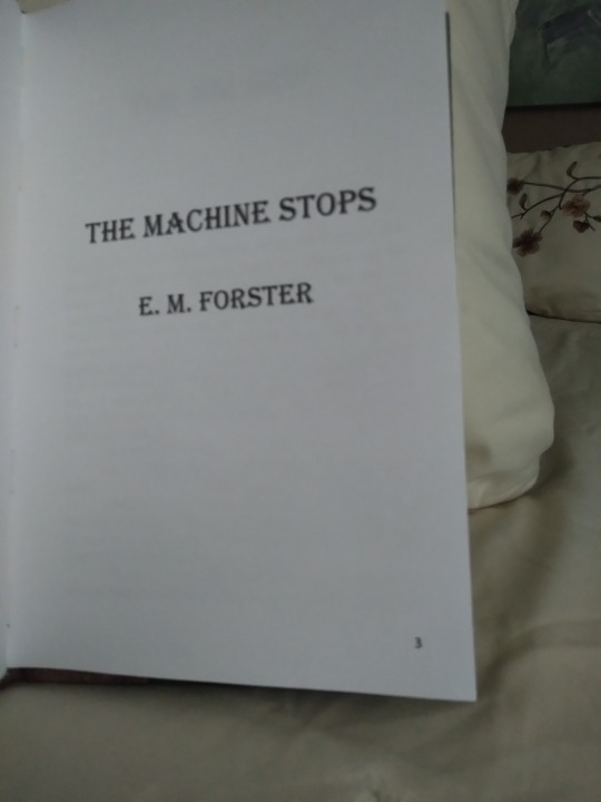
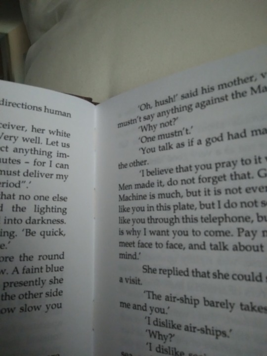
Typeset photos! Here we see:
--Title page has a page number on it. This is a pet peeve of mine and I fixed it after this book.
--There is no half title, summary, or metadata. All my later binds have these things.
--It's typeset in Times New Roman. Unlike many I don't actually hate this font but reading it reminds me of being in high school so this is the only book I used it for. Baskerville is my beloved now. The font is also much bigger than it should be. It's not huge but it's like a large print book so it feels weird for me to read it.
--Lol what are margins
--Lol what are page headers
--Actually I think I left the headers out so it wouldn't have a header on the first page of each chapter, because I knew about page breaks but not section breaks at this time.
--It's on regular-ass lightweight printer paper. There's nothing wrong with this but I switched to heavier weight paper shortly after to help with bleed-through and the light stuff feels so flimsy now.
--I didn't understand how Word's book fold worked at this time, so when I had to set the sheets per booklet and it had an option for 4, I chose that thinking it would give me 4 sheets of paper (16 numbered pages) per sig. It did not do this. It gave me 4 numbered pages per sig. So every signature is 1 sheet of paper. Every page is its own signature. I am still mad about this but it sure drove home how the setting works and also how to make kettle stitches since you make one after every sig. A book of 48 pages has 12 signatures which is just ludicrous.
--There's no photo of this but it has a piece of printer paper on the spine because I didn't have mull. I did use PVA though. Lots and lots of PVA.
--It's stitched with regular sewing thread, which means it doesn't have much swell for a book with that many sigs, but it's less sturdy and more likely to tear the paper.
And that's that! It probably sounds a bit like I was tearing it to shreds but I actually love this book quite a lot. I learned so many things that I applied to my next binds, it was an invaluable experience. It let me fall in love with the hobby so I could make the awesome things I make now. I've got those all posted on my main blog under the tag #snek makes books, or you can see them all on my side blog @papersnakepress. For a first book it's functional and readable, and still better than the PoD copy I had before. I've been thinking of doing a rebind as a sort of progress gauge, actually. Maybe next year.
#bookbinding#snek makes books#the machine stops#it's not winning any beauty contests#or technical skill contests either#but it's mine and i love it#first bind
92 notes
·
View notes
Text
I understand people that are like “the colors of the nonbinary flag are so obnoxious” and like I get it but ALSO I am obnoxious which is why I love it I want the garish color combinations I want the bright and loud and weird
It’s not even a “oh my gender is weird so I want my flag to represent that” it’s “I’m also loud and garish so this fits”
#combat skirt out#also I like purple so#I use the agender flag when I can because you hardly ever see it#but when it comes to the nb flag I'm like heck yeah it's obnoxious I love it#tho obviously I get that that isn't for everyone no disrespect#but it's mine and I love it
8 notes
·
View notes
Text
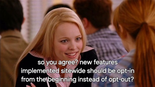
staff: our april fools joke this year is a silly feature that doesn't really do anything but give you a button to boop other users! they have to opt-in first though :)
me:
108K notes
·
View notes
Text
there is a judge in Seattle who does the weekly name change hearings, and who says it's her favorite part of the week. she says she doesn't read out previous names, or ask about the reasons why people want to change them. she says it's a beautiful moment, and a celebration; a claiming of a new identity, or a reclamation of an old identity. she encourages the room to clap for folks. then she welcomes everyone up, one by one, by last name and with warmth; she shows them the court order where nobody else can see, asks them to double check the spelling, and then they're done! do they want a picture? do they want their friends and loved ones who came with them to be in it too? do they want the court order in the photo? she helps everyone pose, shakes hands and stands with them for as long as they need to take it, recruits the clerk for help taking photos of the folks who came alone. then she tells them where to go next, congratulates them, and claps along with the rest of the room.
probably three quarters of the people there were trans, and she centered their experience quietly, with love and joy.
I think I'll be thinking about her a lot this January, and for a long time after. it's good to know she's there.
#went with a friend for their name change today#mine sucked in comparison! but different city and different judge i guess#anyway if you're in Seattle and thinking about getting your name changed... do it!#it was so lovely. genuinely.
30K notes
·
View notes
Text
i think we should remind musicians they can absolutely make up little stories for their songs btw. it doesn’t have to be about them at all. you can invent a guy and put him in situations to music. time honoured tradition in fact.
#sorry im bored of the same tags on this lmao#sometimes i think the confessional style loses impact because everything has to be excavated from the depths of the soul#and somehow. confessional writing seems to be going with the most disaffected bland sound possible. odd.#i love deeply personal songs! i love when songs sound like they mean something to the artist!#something something wider issue of mining trauma and being performatively vulnerable for quote unquote content#idk i don’t have the actual knowledge to write about this well there’s just something not landing for me recently#mine
65K notes
·
View notes
Text
God sending his silliest soldier:
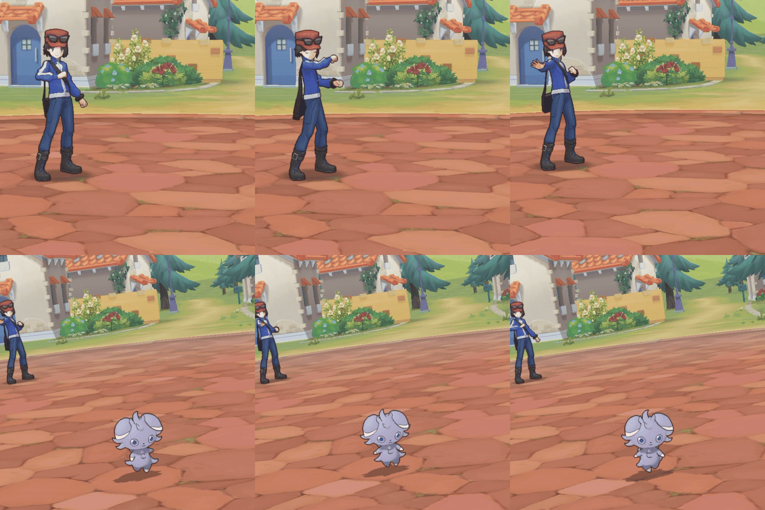
#random#good gif#espurr#I just love the walk so much#it just screams ‘step aside bitches this ass is mine’#this kitty has murder in their eyes#powerful
64K notes
·
View notes
Text


#feelings#love#lovers#i love you#couple#couples#couple cuddling#couple goals#relationship#relationship goals#romantizing life#romantic couple#romantic love#romantic#romance#cuddles#affectionate cuddling#affection#hugs#hugs and cuddles#deep feelings#aesthetic#photography#artists on tumblr#be mine#could be us#amor#passion#touch#obsessive love
29K notes
·
View notes
Text

algo keeps giving me the Wrong Kind of fat fashion content
#the worst thing is that the way tummy and thigh squishes when sitting is like my favourite part. i love the way mine does#like not only do i think its cute and sexy and looks nice in any outfit and is awesome but. uh i forgot what i was sgonna say#my art tag
15K notes
·
View notes
Text
Dick (Nightwing) and Jason (Robin) stare at Bruce. One sports pleading eyes, the other a shit eating grin. There’s a child between them with black hair and blue eyes.
Bruce, he doesn’t know what’s happening but he doesn’t like it: No.
Dick, grinning: He’s our younger brother now.
Jason, nodding seriously: You’re not gonna take him from us.
Tim, got kidnapped while taking photos of patrol, just happy to be there: Where’s the Batcave?
Bruce: what.
Dick, grinning wider: He’s ours now.
#batman#dc comics#kid!tim#I love those fics#they need to make Nightwing a little more unhinged tho#like I would expect both Jason and Dick to hate each other until they find a common enemy (Bruce)#and annoy the shit out of him#or until they find stalker Timothy Drake following them are met with a bought of brotherly concern so strong they don’t even blink an ey#they don’t even care when tim accidentally calls them by their civilian name#they just look at each other and kidnap him#Tim’s just along for the ride#he gets to swing with them through Gotham (so cool!!) and ride nightwings motorbike!!! and see the batcave!!!#little eight year old Tim’s dream come true#tim Drake#Jason Todd#dick Grayson#Robin#Nightwing#bruce wayne#batfamily#batfam#mine
14K notes
·
View notes
Text
okay i wanna play. what's the first song on your wrapped that has a color in the title?
#mine is orange juice by noah kahan:)#spotify wrapped#i love how many people are saying pink pony club and red wine supernova. slay
11K notes
·
View notes
Text
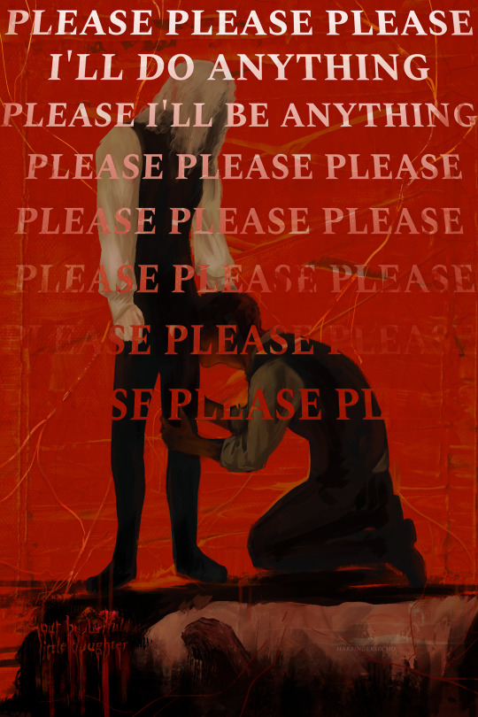
you will regret this for the rest of your life
#iwtv#interview with the vampire#vampterview#iwtv spoilers#louis de pointe du lac#lestat de lioncourt#claudia eparvier#claudia de pointe du lac#iwtv claudia#mine#art#*24#this is probably one of my favs in a while.i'd love to do more stuff like this (and do more abstract stuff) but i dont think i'm good at it#anyway. someone put a gun to my head so i'll do more refs for artfight
19K notes
·
View notes
Text

adrien in my outfit from a few days ago✨ feat. my claws out converse
bonus:

#ml#miraculous#miraculous ladybug#my art#adrien agreste#chat noir#marinette dupain cheng#YAAAAY I DREW A PICTURE OF ADRIEN AGRESTE#and i haven’t even finished my homework for tomorrow. wow it feels good to be back#my claws out converse are very real and special to me.#also while i was drawing this i was just realizing that this outfit was not THAT weird of a thing for adrien to wear#and it made me wonder if i need to assess some things about how i choose my wardrobe#adrien and marinette are going to an art festival in these outfits because that is where i went in mine#anyway peace and love<3 this was so fun to draw i need to actually draw again
9K notes
·
View notes
Text
#intimacy#intimate#love#couple#relationship#relationship goals#romantic#couple goals#cuddles#k!nk#hand k1nk#k1nk#me and who#me and him#me and you#roleplay#wattpad#fanfic#when us#us#could be us#i am yours#be mine#thinking about you#affectionate cuddling#extreme cuddling#cute couple#cuddling#couple cuddling#cuddling and touching
20K notes
·
View notes
Text
Gyroid bath time 🫧
#have i done this a million times already? yes and i still love them#babbloid#thwopoid#gyroid#acnh interior#acnh bathroom#k.k. synthwave#acnh#animal crossing new horizons#mine#animal crossing
7K notes
·
View notes
Text
seeing reddit refugees repeatedly hit their post limits and comment their thoughts on every reblog is kind of refreshing. site migration be damned these guys know how to blog
#reddit blackout#it’s great#i love the excitement!! it seems like everyone is enjoying tumblr so far#reminds me of 2010 when people reblogged everything that hit their dashs#mine
89K notes
·
View notes
Text


The continued adventures of Detective Agnes and her "K9 unit" Señor Scratchy
#I still have more ideas#I love him#agatha all along#agathario#agatha harkness#rio vidal#Señor Scratchy#mine#art#mcu art#marvel art#agatha art
7K notes
·
View notes