#but also art lessons are free on YouTube
Explore tagged Tumblr posts
Text
You shouldn’t it’s a curse.
Writers that can also draw, oh how I admire you.
#see you write for a while and think ‘ooh I should draw this scene!’#then you go to draw and realize you’ve neglected your drawing skills so bad#you can’t draw crap#and vice versa#but also art lessons are free on YouTube#I recommend JakeDontDraw
631 notes
·
View notes
Text
My Favorite Cheap Art Trick: Gradient Maps and Blending Modes
i get questions on occasion regarding my coloring process, so i thought i would do a bit of a write up on my "secret technique." i don't think it really is that much of a secret, but i hope it can be helpful to someone. to that end:

this is one of my favorite tags ive ever gotten on my art. i think of it often. the pieces in question are all monochrome - sort of.
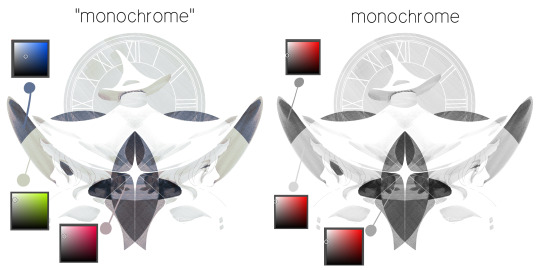
the left version is the final version, the right version is technically the original. in the final version, to me, the blues are pretty stark, while the greens and magentas are less so. there is some color theory thing going on here that i dont have a good cerebral understanding of and i wont pretend otherwise. i think i watched a youtube video on it once but it went in one ear and out the other. i just pick whatever colors look nicest based on whatever vibe im going for.

this one is more subtle, i think. can you tell the difference? there's nothing wrong with 100% greyscale art, but i like the depth that adding just a hint of color can bring.
i'll note that the examples i'll be using in this post all began as purely greyscale, but this is a process i use for just about every piece of art i make, including the full color ones. i'll use the recent mithrun art i made to demonstrate. additionally, i use clip studio paint, but the general concept should be transferable to other art programs.

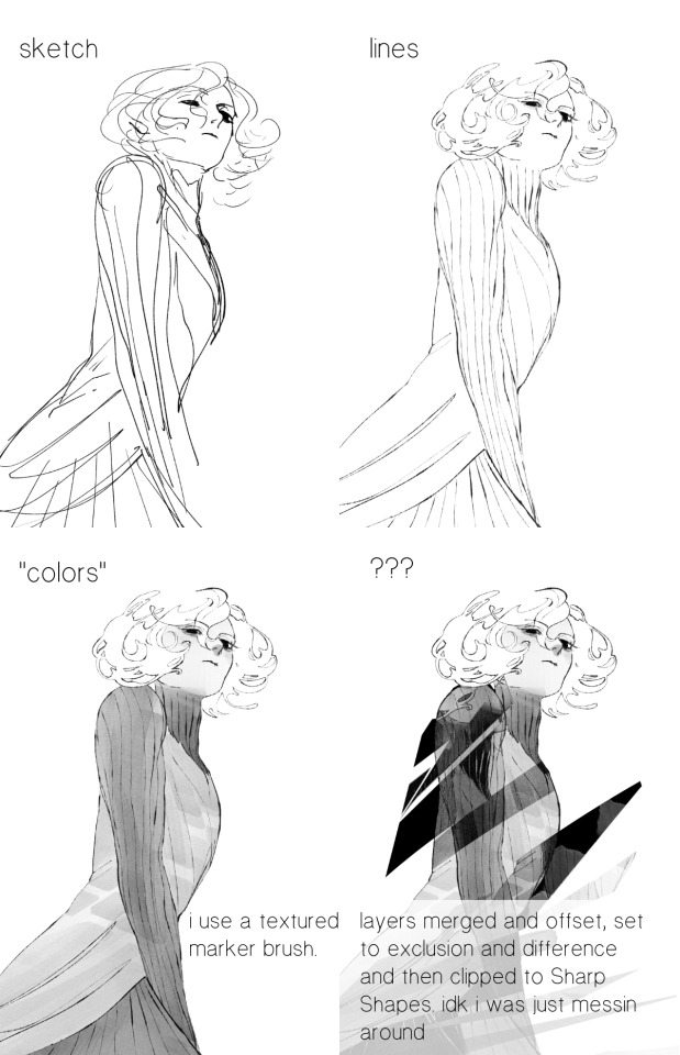
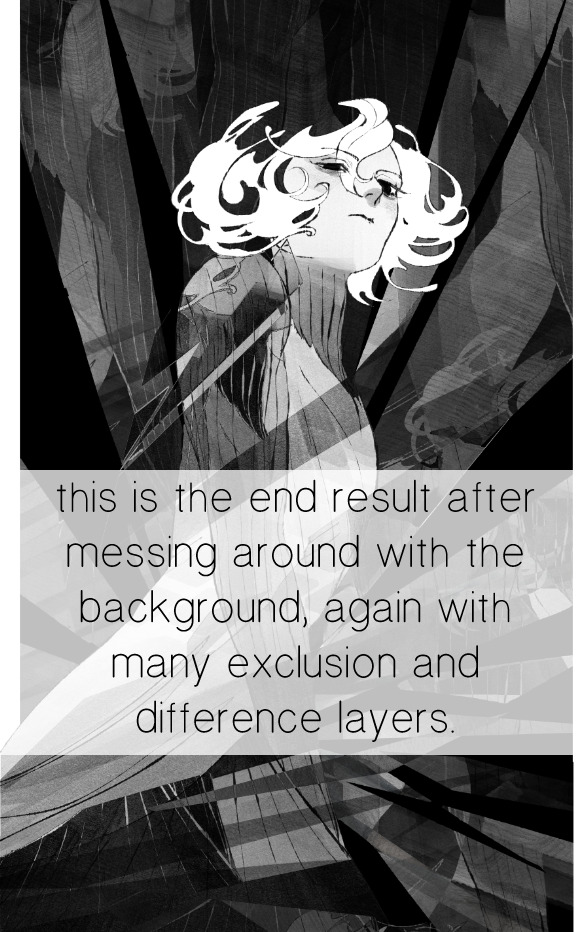
for fun let's just start with Making The Picture. i've been thinking of making this writeup for a while and had it in mind while drawing this piece. beyond that, i didn't really have much of a plan for this outside of "mithrun looks down and hair goes woosh." i also really like all of the vertical lines in the canary uniform so i wanted to include those too but like. gone a little hog wild. that is the extent of my "concept." i do not remember why i had the thought of integrating a shattered mirror type of theme. i think i wanted to distract a bit from the awkward pose and cover it up some LOL but anyway. this lack of planning or thought will come into play later.
note 1: the textured marker brush i specifically use is the "bordered light marker" from daub. it is one of my favorite brushes in the history of forever and the daub mega brush pack is one of the best purchases ive ever made. highly recommend!!!
note 2: "what do you mean by exclusion and difference?" they are layer blending modes and not important to the overall lesson of this post but for transparency i wanted to say how i got these "effects." anyway!
with the background figured out, this is the point at which i generally merge all of my layers, duplicate said merged layer, and Then i begin experimenting with gradient maps. what are gradient maps?
the basic gist is that gradient maps replace the colors of an image based on their value.

so, with this particular gradient map, black will be replaced with that orangey red tone, white will be replaced with the seafoamy green tone, etc. this particular gradient map i'm using as an example is very bright and saturated, but the colors can be literally anything.
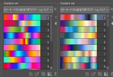
these two sets are the ones i use most. they can be downloaded for free here and here if you have csp. there are many gradient map sets out there. and you can make your own!
you can apply a gradient map directly onto a specific layer in csp by going to edit>tonal correction>gradient map. to apply one indirectly, you can use a correction layer through layer>new correction layer>gradient map. honestly, correction layers are probably the better way to go, because you can adjust your gradient map whenever you want after creating the layer, whereas if you directly apply a gradient map to a layer thats like. it. it's done. if you want to make changes to the applied gradient map, you have to undo it and then reapply it. i don't use correction layers because i am old and stuck in my ways, but it's good to know what your options are.

this is what a correction layer looks like. it sits on top and applies the gradient map to the layers underneath it, so you can also change the layers beneath however and whenever you want. you can adjust the gradient map by double clicking the layer. there are also correction layers for tone curves, brightness/contrast, etc. many such useful things in this program.
let's see how mithrun looks when we apply that first gradient map we looked at.

gadzooks. apologies for eyestrain. we have turned mithrun into a neon hellscape, which might work for some pieces, but not this one. we can fix that by changing the layer blending mode, aka this laundry list of words:

some of them are self explanatory, like darken and lighten, while some of them i genuinely don't understand how they are meant to work and couldn't explain them to you, even if i do use them. i'm sure someone out there has written out an explanation for each and every one of them, but i've learned primarily by clicking on them to see what they do.
for the topic of this post, the blending mode of interest is soft light. so let's take hotline miamithrun and change the layer blending mode to soft light.

here it is at 100% opacity. this is the point at which i'd like to explain why i like using textured brushes so much - it makes it very easy to get subtle color variation when i use this Secret Technique. look at the striation in the upper right background! so tasty. however, to me, these colors are still a bit "much." so let's lower the opacity.
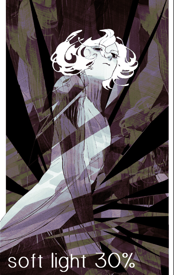
i think thats a lot nicer to look at, personally, but i dont really like these colors together. how about we try some other ones?
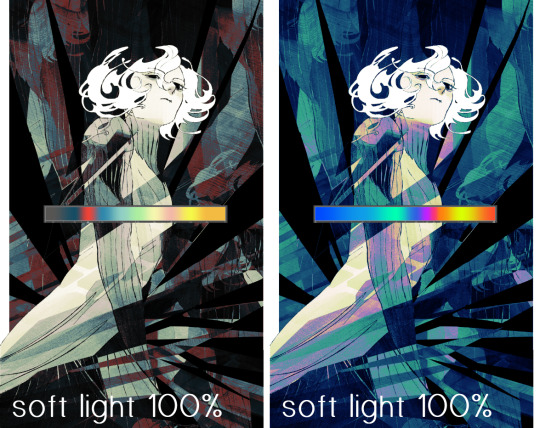
i like both of these a lot more. the palettes give the piece different vibes, at which point i have to ask myself: What Are The Vibes, Actually? well, to be honest i didn't really have a great answer because again, i didn't plan this out very much at all. however. i knew in my heart that there was too much color contrast going on and it was detracting from the two other contrasts in here: the light and dark values and the sharp and soft shapes. i wanted mithrun's head to be the main focal point. for a different illustration, colors like this might work great, but this is not that hypothetical illustration, so let's bring the opacity down again.
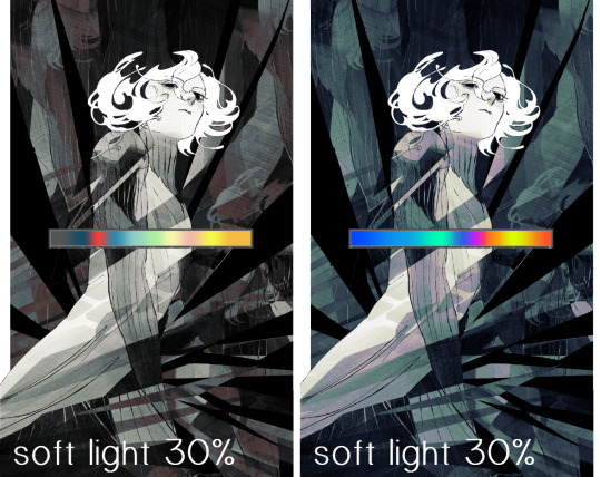
yippee!! that's getting closer to what my heart wants. for fun, let's see what this looks like if we change the blending mode to color.
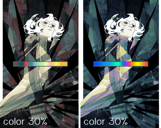
i do like how these look but in the end they do not align with my heart. oh well. fun to experiment with though! good to keep in mind for a different piece, maybe! i often change blending modes just to see what happens, and sometimes it works, sometimes it doesn't. i very much cannot stress enough that much of my artistic process is clicking buttons i only sort of understand. for fun.
i ended up choosing the gradient map on the right because i liked that it was close to the actual canary uniform colors (sorta). it's at an even lower opacity though because there was Still too much color for my dear heart.
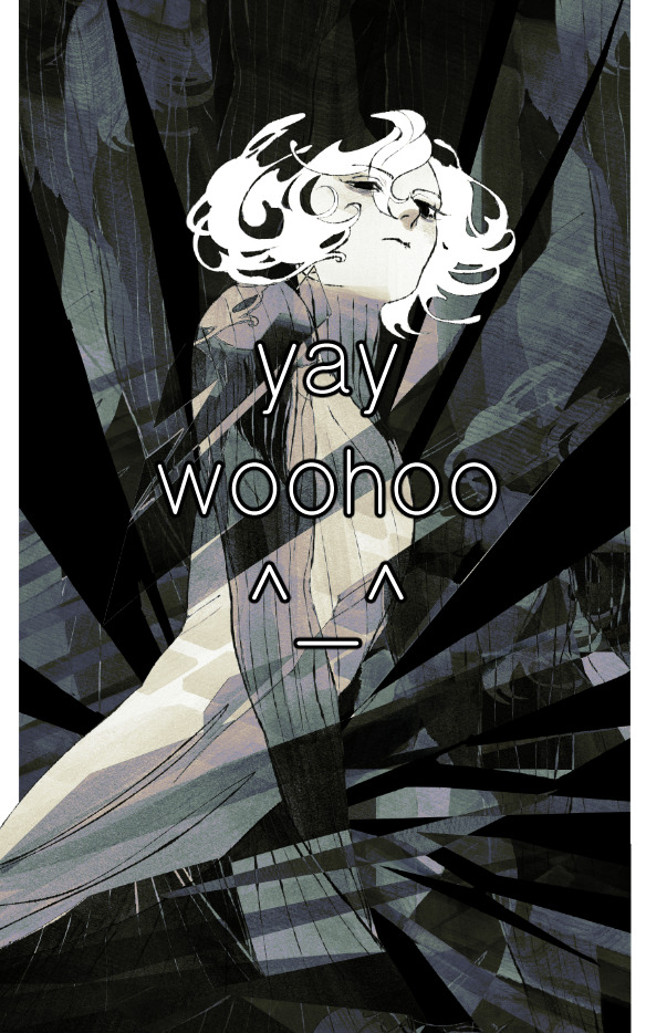
the actual process for this looks like me setting my merged layer to soft light at around 20% opacity and then clicking every single gradient map in my collection and seeing which one Works. sometimes i will do this multiple times and have multiple soft light and/or color layers combined.
typically at this point i merge everything again and do minor contrast adjustments using tone curves, which is another tool i find very fun to play around with. then for this piece in particular i did some finishing touches and decided that the white border was distracting so i cropped it. and then it's done!!! yay!!!!!
this process is a very simple and "fast" way to add more depth and visual interest to a piece without being overbearing. well, it's fast if you aren't indecisive like me, or if you are better at planning.

let's do another comparison. personally i feel that the hint of color on the left version makes mithrun look just a bit more unwell (this is a positive thing) and it makes the contrast on his arm a lot more pleasing to look at. someone who understands color theory better than i do might have more to say on the specifics, but that's honestly all i got.
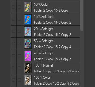
just dont look at my layers too hard. ok?
2K notes
·
View notes
Text
I AM SO SICK OF POP CULTURE BS MODERN ASTROLOGY , LORD FREE ME FROM THE SHACKLES OF HAVING TO READ THESE SELF ASSURED MODERN TAKES.
If I have to see one more comment or post relying on the ABC house system or modern rulerships I'm gonna crash out fr. What a tragically bastardised ancient art astrology has become.
If you really want to understand and appreciate astrology, you must understand it's context and the richer symbolic meanings behind its foundations (e.g. thema mundi, trad rulership and by extension reevaluating your understanding of the planets and signs, dignities, whole signs, Egyptian terms, chaldean decans, lots etc). This is especially vital for predictive work e.g electional and horary astrology.
Not everything modern is bad, i use many modern things myself. But better discernment is needed in order to separate misinformation and deep misunderstanding from something that is genuinely pertinent, and learning traditional (e.g. hellenistic astrology) can help with this. You have to let go of overly subjective interpretations from 'working backwards on a chart analysis and seeking confirmation bias , and you have to let go of default modern premises which you probably never questioned. Trust me, I learnt the hard way. There are a few things which I didn't agree with in hellenistic astro when I first started just because I couldn't relate it to myself or others...rookie error fr💀🤡🤡
Nothing is more freeing than taking the long and initially confusing plunge into the "scary complex" og astrology that is traditional astrology. Especially when you're trying to unlearn so much bs which you dont even think is bs at first. But it is so worth it. Once you properly understand the foundations of it , it becomes so much clearer to see the implications of these nonsense modern takes.
I've been super busy lately and suffering from my lack of executive function so I haven't written as many posts as I'd have liked to yet. But more will come eventually🤞. In the meantime, some extremely helpful resources to get started:
- Chris Brennan / The Astrology Podcast (his books are also good apparently)
- On The Heavenly Spheres: A Treaty on Traditional Astrology by Helena Avelar & Luis Ribeiro (pdf of this is easy to find online. Very solid primer into trad astro)
- Astrology and the Authentic Self , and Ancient Astrology in Theory and Practice , both by Demetra George
- Sevenstarsastrology.com - an absolutely fantastic blog writer who deep dives into plenty of traditional topics. E.g. 12th parts , antiscia , arabic lots, and some more basic things too. Long articles/lessons but extremely extremely informative. Genuine goldmine.
- Patrick Watson, he alao writes some brilliant articles too. His article on the ABC house system was especially useful in getting me out those trenches.
- @/illuminiah , @/0degreestaurus, @/ellieremotigue, @/saturnandhoney, @/ilanastrology, @/bloodyjupiter_ are all just a few tiktok accounts off the top of my head which have been very helpful in helping me unlearn modern shit.
- www.skyscript.co.uk
- Nightlightastrology on Youtube / Adam Elenbaas
- Lee Lehman is especially good for horary and electional according to my horary-specialised friends
- Robert Hand
- u_StellaGraphia on reddit posts some amazing explanations (in comment sections usually) , really helpful stuff
- my other posts so far
- stop reading costar, cafe astrology, astroseek, etc interpretations :)
#astroblr#astrology#tropical astrology#astro notes#astro observations#hellenistic#traditional astrology#astrology observations#modern astrology#astrology masterlist#astrology transits
176 notes
·
View notes
Note
I'm not hating it is still your art and I still enjoy it just please understand there are environmental consequences to AI as well. the equipment to host AI services still needs to take up physically space in a server to run it and training an AI model consumes tons of electricity and leaves a big carbon footprint. whatever your choices just please stay informed. I'm not an artist so I'm not going to tell you how to do your art I just want you to know this because a lot of people using these things are uninformed about it.
I use it in my own computer using my own resources. I live in the forest and I have very few physical possessions, (I’m sure everybody critizing this don’t use Google, Youtube, Instagram, Amazon, planes, cars, plastic…)🙃
I know too from first hand that most people who NEVER used Ais nor even tried or studied how they can work are also not informed, but they feel free to give lessons about things they dont know. 👀👍
In my case I NEVER speak about what I dont know:
1st: to not be an ignorant.
2nd: to not cause disinformation and to not offend those who actually know about it.
Thanks for the insights, Im aware of them much before the trend, is my work, not a hobby.🙏
To hate or to love something or somebody first we must know.
Peace!!!
217 notes
·
View notes
Note
I, a very white and somewhat privileged person, am absolutely terrified to draw colored people. Because I don’t know if I’d cross the thin line of tasteful and authentic or racist and stereotypical…
Lol for starters don't refer to us as coloured people. This ain't 1955. Secondly my best advice to you is to use references of actual people of color. I would highly recommend staying away from those white men art station youtuber type artists for tutorials because they get a majority of their techniques and style from main stream video games and comic books, which to put it nicely don't have the best reputation for representing women and poc. tangent over, so yeah references. real life photographs of brown and black people.
pinterest is a site that a lot of current, especially younger artists like to use, but in all honesty it's not a very good source for someone trying to learn the fundamentals. it'll mainly show you 20 something year old ig and twitter models which is okay if you wanna just draw pretty people; but not the best if you wanna like I said learn fundamentals + have a portfolio that's varied. also it's rife with ai shit and stolen art, so yeah would only recommend that as an initial starting point/using it to make your own personal board for your saved images.
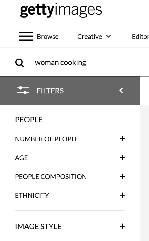
stock photo sites are my go to for refs. getty images, istock, alamy, etc. a simple right click save image or screenshot will work to get the images you want for free. of course there will be the watermarks, but they're honestly a very small issue to bypass. as long as they're not opaque and nearly covering the entire subject; you're good. a nice thing about stock photo sites is they usually give you the option to filter the image search results. say for instance you want to draw an elderly asian woman cooking or a young black man painting a picture or an indigenous child playing with dolls. you can look up certain terms you want in the search bar & specify gender, age and ethnicity to narrow down your search to what you want.
another awesome place for references i discovered during college is posespace.com

like with getty images, it gives you the option to filter your searches. they also have their models in clothed or nude shoots in the event that you want to practice some bare bones anatomy.
also also, get your info from artists of color. there's a decent amount of tutorials ive found over the years on here and youtube on coloring skintones, drawing certain hair types, how to avoid caricatures and stereotyping, different facial features, cultural hairstyles. the list goes on. don't be afraid to depict people outside of your race. literally just go about drawing us the same way you would a white person. don't be scared, as long as you remain respectful and make an honest effort to learn; you'll do fine.
resource links by and from artists of color:
'how i draw south + southeast asian people'
an example of what to avoid when stylizing east asian characters
'drawing asian people, source: i'm asian'
'lessons from drawing I: what is asian anyways?'
'how to draw indians'
'how to draw arabs'
'How I draw skin Part 2: DON”T DRAW NATIVE PEOPLE WITH RED SKIN!!!! A tutorial' (the link to the first part of this tutorial is broken sorry)
How to Draw Native People: a Tutorial/Reference Guide
How to Draw Black People by peachdeluxe
tips for drawing black people by rosheruu
drawing east asian faces by chuwenjie
how to draw black people series by Artistik Freedom (youtube)
✏️How I draw black hairstyles (simple) 🌱 by Likelihood Art (youtube)
there's also a bunch of black and brown artists on twitter and tiktok, so checking those sites for tutorials would be a good additional resource
good luck on your illustrating melanin endeavors 👍🏾
#anonymous ask hour#sorry for the late reply it took a while to compile all these links#art resources#long post
102 notes
·
View notes
Note
Okay so I’m welsh. I’ve kind of always known that but it was recently confirmed that i’m REALLY welsh and that’s been making me really interested in the culture and language. I don’t understand half the posts on this blog but i’m trying to learn because it’s really important to me to keep the language and the culture associated with it alive! I guess this ask is to ask if you know of any resources for learning welsh in the states?
I also wanted to say thank you for running this blog because it’s made me feel really connected with the culture i’d been cut off from when my great grandparents moved to the USA
Diolch yn fawr iawn! That really means a lot, and I'm happy you're finding your place with Welsh and enjoying learning about the culture.
Here's a list of resources that might be useful for the Americans out there, but most of online resources I've shared before should be useful too.
List of resources from Cymdeithas Madog, an American-based Welsh learning organisation.
Articles and resources from Wales.com about Welsh culture, history, politics, arts and tourism.
Learn Welsh YouTube page, good for grammar and vocab.
The holy grail, Dysgu Cymraeg. Lots of resources, free textbooks and audio resources, option to learn with classes in person, virtually or by self-studying.
Can't vouch for how good it is, but Listen and Learn USA offer in person and online Welsh lessons and resources, so could be worth checking out.
Doctor Cymraeg. Just trust me.
Hope this is useful! Dysgu hapus!
16 notes
·
View notes
Note
Out of curiosity, when/where did you first learn to animate? What inspires you to make your animations?
(I'm partly asking this because the urge to animate hit me like a truck once I really got into PMATGA, lmao. I've only ever made around 3-4 small ones over the span of several months)
Good question! Long answer! :'D
I've been dreaming of being an animator since I was young, because my elder sister studied animation and that's where I learned more about it. She gave me her copy of The Animator's Survival Kit from Richard Williams after she finished studying, and I've kept it with me ever since. Mind you, I never finished it, because distractions happened XD But I've read the first bunch of pages and started getting a fletchling idea of how animation worked. This was when I was around 10-14 years old. My favourite movies were almost exclusively Disney or Dreamworks classics, and my love for them grew as I grew older. I keenly observed their animations and analyzed what it was that them so appealing, long before I actually learned how to animate properly. Through observing what made those animations so appealing and life-like, I've built up references in my mind as a benchmark as to how animation is supposed to look. So when the time came to learn animation properly, I've already had a headstart thanks to observation, which sped up my learning quite a bit.
Now, let me tell you about a man named Aaron Blaise.
youtube
To say that Aaron Blaise is an animation legend would be an understatement.
He was the co-director of Brother Bear. He worked on various Disney movies that shaped our childhoods. He animated young Nala from The Lion King, Raja from Aladdin, and he also worked on Beauty and the Beast, Mulan, Pocahontas, and the Rescuers Down Under. He left Disney in 2007, but in 2012 he teamed up with a friend and decided to start CreatureArtTeacher, a website where he shares everything that he's learned, whether that be animation from his time at Disney or just art in general. He brings aboard many other professionals in the same field and beyond, where courses are offered at the most affordable prices. Often, he'll also offer lessons on various art subjects on his YouTube for free, and he livestreams frequently!
It's thanks to these lessons that I've learned more about animation. While I didn't practice often, I did start taking my first steps into doing animation, spurred on by inspiration from Aaron's videos. This was around age 16-18. Unfortunately, I can't track down my first ever animation I've made. But I did make this sometime before turning 20;
Yes, that's a BG shot from pmatga XD
So going into my twenties, I knew enough about animation to make small little snippets such as the one above, but I wasn't yet at the point where I'd consider myself an educated animator. And here's the thing; when I went to university, I studied Visual Communication & Design, which mostly focused on graphic design. In that course, we did do a little bit of animation, but it was nothing I've already known, and it was mostly cut-out animation where you control it like a puppet in After Effects. What I really wanted to do was dive deeper into traditional 2D cell animation, but we had to preferably work in 2D cut-out animation to save time. It was a cool learning experience, but also a bit frustrating because I prefer the traditional frame-by-frame method. Alas, that would take too long, and my uni projects ran on a 2-week basis (a new project every two weeks), so I couldn't push to improve my animation skills in the direction that I wanted to. I still learned quite a bit tho, and got valuable experience with different programs, so I guess the time I got a taste of animation education was around the age of 22.
But then came 2024, age 24, when I got hired as a storyboard artist at my current job. Thanks to the company's help in giving their workers the space to learn new things, I finally tackled animation in earnest. I brought out the good ol' The Animator's Survival Kit and Aaron Blaise's courses and taught myself as much as I could, along with the support and guidance of the studio. Needless to say, sometime afterwards I could make the Rubber Pac animation I did here.
So yeah! It was a combination of things. Both my sister's influence and the influence of animated movies from a young age, Aaron Blaise's courses, university, and real-time work experience are what taught me animation <3
As for what inspires my animations, it mostly comes down to music tbh. I can always conjure a scene in my head along with whatever music is playing. Other than that, it's the desire to give life to something in an intrinsically human way, especially as art. I've always felt closest to God as an artist 💙
Told ya it was a long answer xD But hey, twas a fun answer! >:D
21 notes
·
View notes
Text
Reading a Birth Chart 101: The Complete Guide
(Part I): Intro to Intrigue
Glossary: Astrology websites, explanation of sun in all zodiac signs, moon in all zodiac signs, rising in all zodiac signs and also takeaways section. (LONG POST)
hey, this post is for any beginner who has gotten into astrology and reading their natal/birth chart. if you are reading this, you probably discovered astrology through tumblr, instagram, tiktok, youtube or any other platform (or maybe your friend told you about it) and have no idea where to begin. you go onto an astrology website, type in your birth info and you are met with something that looks like this:

(Natalie Portman’s Birth Chart)
as a beginner, you don’t know how to make sense of this. there’s lines everywhere and a bunch of symbols that you don’t understand. don’t worry, you don’t have to deal with this right now. right now, we will be focusing on the basics.
Astrology websites and their descriptions:
what we are going to do is go on every single astrology website that gives you a birth chart. i will link a few below. you will make a birth chart on every single one of these websites and throughly read the descriptions. some things will make sense, some won’t. i advice you to take everything these websites say with a grain of salt since these are auto-generated descriptions for one placement and don’t consider inter-planet relationships.
some websites i used to go to during my beginner stages:
cafeastrology (astro.cafeastrology.com)
astroseek (horoscopes.astro-seek.com)
astrodienst (astro.com)
……
you may wonder, why are we doing this?
one simple reason: intrigue. you won’t be able to master astrology if it doesn’t intrigue you. when you go through these descriptions, the aim is to achieve “oh my god, this is so me!” moments. by doing so you solidify your belief in the stars and acquire a hunger for knowing how to read people.
you go through these descriptions and feel very heard and understood, then we start building the foundations of a birth chart: the big 3.
The Sun, Moon and Rising:
also known as the big 3, the sun, moon and the rising. these are the most basic placements to learn during your reader journey.
1) the sun: the sun is probably the only sign you are familiar with. it is what you say when someone asks you: “what’s your zodiac sign?”
“oh, i was born on jan 1st. i’m a capricorn.”
it signifies your ego, self, identity and is solely just, you. the reason why mainstream astrology gets this wrong is because it stereotypes the sun and disregards any aspects* to it or the house* which it’s in.
(these will be explained in later lessons*)
the sun will be in either of the 12 zodiac signs. the zodiac signs go from aries-pisces. i urge you to remember the order of them whenever you can. it will prove to be helpful later on.
aries sun: your identity can be affiliated with your physical appearance and you place your ego around how you come across to other people. putting yourself first will be a theme in your life when you decide to go through self discovery, since you are a fire sign passion, aggression and drive will be key.
tarus sun: your identity is around your possessions, wealth, etc. self esteem will be a theme when it comes to self discovery, all things beautiful like art, music, any sort of leisure activity helps you feel more connected to you. you are an earth sign, so staying grounded, consistent and stable are key.
gemini sun: your identity is accordance to your wit, communication. siblings (or lack of) can play a role in why you are the way you are. thinking on your feet and quickly strengthens your relationship w/ your individuality. you are an air sign, so intellect and duality are key.
cancer sun: your identity is centered around your home, mother (or any other maternal figure in your life), connecting deeply with your inner psyche and emotions will help you realize your true self. you are a water sign, so familiarity and deep connection are key.
leo sun: your identity is centered around you, literally! being creative, working with kids or regaining your childlike self, understanding paternal figures, etc. help you connect with yourself. you are a fire sign, so confidence and feeling acknowledged/ appreciated are key.
virgo sun: your identity is centered around routine and details. some natives may find that staying chaste/ losing it changed their self identity. performance in work and quality of it changes relationship with self as well. you are an earth sign, so friendships and formalities are key.
libra sun: your identity is centered around fairness and beauty. relationships with others serve crucial ways to discover yourself. you are an air sign, so art and equality are key.
scorpio sun: your identity may be ever-transforming through lessons. having an overly-comical or strategically closed-off persona to hide your complexity is common. you are a water sign, revealing secrets and interest in the occult are key.
sagittarius sun: your identity may feel like it’s something that is distant, natives feel like they need to “know” (philosophies, religion, etc.) to feel closer to themselves. you are a fire sign, so desire and passion are key.
capricorn sun: natives will attain self-realization at a later age. curating / having control over their public image, or their work is a consistent theme. you are an earth sign, so taking initiative and loyalty are key.
aquarius sun: going through some sort of intellectual debacle to understand oneself, friends are a common theme. wanting change and community. you are an air sign, so revolutionary ideas and technology are key.
pisces sun: feeling like your basing your self around how other people perceive you/ feeding to their ideals. going through a period of disillusionment will help you understand your ego. you are a water sign, so spirituality and empathy are key.
2) the moon: the moon signifies your emotions and how you deal with them. it can also show how your childhood was + represents your mother/ any other maternal figure growing up.
aries moon: emotional changes can be seen at face value, they are also a source of motivation and drive. mother/home life is passionate and challenging.
taurus moon: beauty and food are used to regulate oneself from negative emotions. mother/home life is stubborn, affects your self-esteem and relationship with money.
gemini moon: emotions are seen from dual perspective, thereby being prone to intellectualizing. siblings can be a significant part of home life. short-distance travel, changing homes is common.
cancer moon: emotions are bottled up and kept deep within the crevices of the native. the emotional intensity of mother/home causes native to keep their own feelings to theirselves.
leo moon: creativity and humor is a common way to express emotions. the child was the star of the home. mother is popular amongst family.
virgo moon: emotions are better expressed written. mother was involved in her work. routine keeps emotions regulated.
libra moon: when close relationships are in turmoil, native’s mood is affected. needing fairness and balance.
scorpio moon: relationship with mother transformed which caused secrecy in the native regarding emotions. intense home life.
sagittarius moon: weird relationship with emotions, as if they are foreign or in a distant land. expressing emotions through “bigger” ideas like philosophy or theology, but failing to express them through simple writing.
capricorn moon: mother/home life made the native disciplined. emotions are strained, vulnerability comes with a later age.
aquarius moon: native feels safer expressing emotions on the internet or through any forms of technology. sudden changes in emotions, political ideas or change fuel emotions.
pisces moon: native is able to understand everyone’s emotions except it’s own. prone to running after any sort of esoteric, escapist experience.
the rising: also known as the ascendant or the first house, it shows how we like to present ourselves, the course/ journey of your life. some astrologers like to discuss superficial self vs shadow self with the ascendant (1st house) and descendant (7th house). we will get into that in later chapters.
aries rising: people are surprised by their understanding and willingness to compromise. have a taste for aesthetics and things that look good.
taurus rising: these people have a certain knack of art and pleasantries. the neck is always highlighted. very troubled once you get to know them, relationships transform their sense of self.
gemini rising: small-looking individuals with bright eyes. interested in meeting new people to discuss new ideas. interested in travel, siblings can be discussed a lot when they first meet u.
cancer rising: moon-like faces that are on the bigger side. looks more like the mother. people are surprised by their discipline.
leo rising: these people always have distinct hair! can look more like the father, or have that same loud laughter. creative individuals.
virgo rising: intelligent energy but in a careful manner rather than a chaotic one. secret need for the spotlight/ being admired for their hard work.
libra rising: pleasant smiles, cordial faces. perfectionists when it comes to appearances.
scorpio rising: intense when it comes to first impressions, longing for balance and cooperation but being a little awkward, prone to self-rejection.
sagittarius rising: witty jokes and philosophical questions, powered by the darkness of their psyche and revolutions of their mind.
capricorn rising: they have a weird relationship with their self esteem, feeling detached. prone to getting moody and emotional once you get to know them. may look more like the father.
aquarius rising: friendly energy with eccentric ideas. need to be admired in their relationships, they have this creative and generous side to them that isn’t seen at first.
pisces rising: ever-changing personality when meeting new people, but don’t think of it like a transformation- it’s more like waves of water that fit into any vessel. passion for understanding human psyche, prone to anger or getting defensive when it comes to being fully intimate / authentic.
Takeaways + To-do’s:
okay, we have gone over websites and chart-making, we went over the 12 zodiac signs and the big 3- the sun, moon and rising in all the signs.
while you were reading your chart, you must have seen way more things- houses, aspects, etc. these things help you have a clearer understanding of the birth chart.
when the explanation of a planet doesn’t apply, don’t worry. today we only described the energies of the sun, moon and rising. the house it is in, the degree and also aspects to the placement channel the energy of your big 3 or cancel it out.
nevertheless, you now have an understanding of some basic principles of birth charts, so congrats!
—> using intrigue to further your understanding:
reader, it’s not feasible to memorize the meanings behind all these placements. instead, try to involve them in your daily life. ask a friend their birth time, look up their chart, then tell them the explanations of their big 3. you can even look up celebrity charts to see how their big 3 plays a role in their lives. this will help you gain an understanding of the signs (and memorize them) without feeling like you’re forced to “study.”
i will meet you again soon, where you will be able to understand elements, inner and outer planets, how each zodiac sign’s energy affects a planet and you will be introduced to the 12 houses!
good luck on your astrologer journey, i hope this makes things a little less complicated. 🤍
#astro observations#astro notes#astro#astro community#astrology#zodiac#zodiac signs#birth chart#natal chart#aries moon#taurus moon#gemini moon#cancer moon#leo moon#virgo moon#libra moon#scorpio moon#sagittarius moon#capricorn moon#aquarius moon#pisces moon#aries#taurus#gemini#cancer#virgo#libra#scorpio#sagittarius#rising sign
274 notes
·
View notes
Note
hi omg i love your art so much can i ask do you have any resources(free or not) for self taught artists who dont wamt to pay for art school to get better?
and also do u do critiques?
yes! i have a few resources ive made myself in the #art tips and #tutorial tags on my blog (of varying quality, i dont stand by some of my rly old advice) and $7 patrons/kofi members get access to new tutorials every 2nd month+ backlog of past tuts:
https://www.patreon.com/filibusterfrog
https://ko-fi.com/A422B7K/posts
critiques are free in my groupchat and i do feedback/lessons with 40 dollar patrons
in terms of resources ive not made myself you should trawl the artbooks available on archive.org, theres a lot of good ones! sinix on youtube is also does great vids imo. good luck!!
#croaks#basically any tutorial that encourages u to try something new is worthwhile#anyway if you do decide to hop into the discord to ask art questions ill do my best to answer the bc i do like to chat abt art#and i love well worded art questions
187 notes
·
View notes
Text

My online art school is nearing its first official phase of starting up. After spending the year thinking on different approaches to subjects i myself may not be familar with I’ve settled on running the school more improvisationaly and answering art questions specifically requested by the community. In the future (as i want to make this project long term, something i spend my future on perfecting) i want to have a proper syllabus crafted with rotating subjects I could teach and adjust with time.
Teaching art is a big undertaking, I guess! But one I’m determined to dedicate myself to and follow through on with a realistic and achieveable structure for myself while also creating a consistent flow of lessons and advice and streams. At the moment I plan to stream at least *once a week* with prepared art questions on the art school discord. Youtube video archives are in the stars but not achieveable until I find myself affordable and functional video editing software.
All this said, Ive found myself at a roadblock and in financial need. I’ve spent the past year working part time for minimum wage and have still been unable to get on top of the debts that built up during my years spent unemployed and working on my mental health. My headphones broke last night after years of daily use. The recording setup I have been working on for this is near-perfection, just in need of some considerable technical work. (i have to HACK a camera! woo!) and I REALLY want to get things going before the end of the year when this is an idea I have been working on since this spring.
If you find yourself able to support me and my future aspirations to teach art in a free, accessible and encouraging environment, please consider doing so here:
If you’re interested in the art school, check it out on Discord! I hope to see it flourishing over the course of 2025!
#god i hope that discord link doesnt expire#crowd funding#art school#donation post#i wish i didnt need to do this. man.#i already feel indebted from the support for my situation last summer#i want to do this.#thank you for reading#i hope i can return the charity ten fold if i ever find myself financially stable
11 notes
·
View notes
Text
Rewind the Tape —Episode 4
Art of the episode
Just like we did for the pilot and for episodes two and three, we took note of the art shown and mentioned in the fourth episode while we rewatched it. Did we miss any? Can you help us put a name to the unidentified ones? Do you have any thoughts about how these references could be interpreted?


Bust of a Woman with Her Left Hand on Her Chin
Edgar Degas, 1898 [Identified by @terrifique.]
Degas, whose work already appeared in the second episode, was a French painter of the 19th to early 20th century. His impressionist paintings often depicted ballet dancers, racehorses, and human portraits of isolation.
Krumau on the Molde, Kneeling Girl with Spanish Skirt and Self portrait in a jerkin with right elbow raised
Egon Schiele, 1912, 1911 and 1914
Schiele, whose work we have also been seeing around Rue Royale since the pilot, was an Austrian Expressionist painter, very prolific despite passing before turning 30. His work is recognizable for its transgressive portrayal of the nude body, including his nude self-portraits; but his later oeuvre features many landscapes.

The Kitten's Art Lesson
Henriette Ronner Knip, 1821-1909 [Identified by @terrifique.]
Knip was a Dutch-Belgian romantic style artist best known for paintings of animals, particularly cats and dogs of a playful nature. See more of her work here.

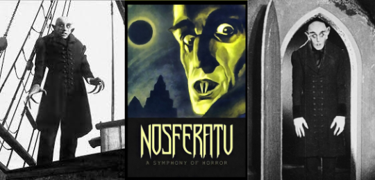
Nosferatu
F.W. Murnau, 1922
Nosferatu is a silent expressionist horror film from the legendary German director F.W. Murnau. It is an unauthorized adaptation of Bram Stoker's Dracula. While not a commercial success upon release in 1922, film historians now consider it an influential and revolutionary film in the horror genre. Since it has been in the public domain since 2019 in the U.S., it is now free to stream on YouTube.
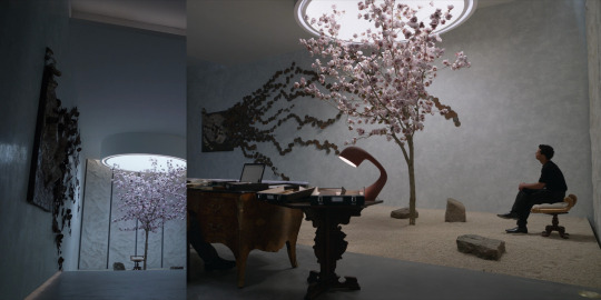
Untitled piece
Sadie Sheldon, undated [Identified by @lanepryce.]

The incredible metalwork piece on the wall of the reading room was made by a New Orleans-based artist, for New Orleans... pizzeria! It was made for Pizza Delicious, using dozens of tin cans. Sheldon describes her work as "site and time-specific projects from found materials (...) related to adaptability, renewal, and appreciating the objects of our everyday life".
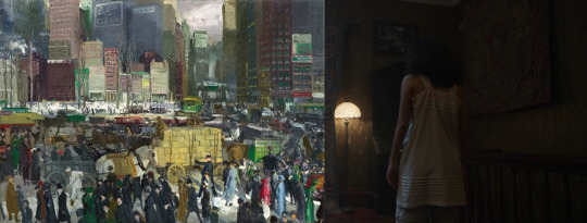
New York
George Bellows, 1911 [Identified by @nicodelenfent, here.]
Several of Bellows' pieces have been featured in previous episodes. He was an American realist painter, known for his bold depictions of urban life in NYC. His work "revolutionized the conventions of the traditional American urban vista and surpassed the efforts of other contemporary urban realists" [x].
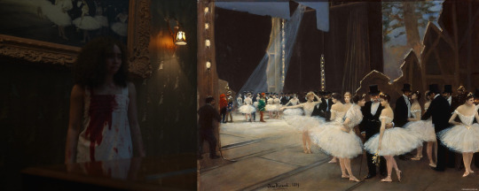
Backstage at the Opera
Jean Beraurd, 1889
Beraurd was a Russian born French painter known for his depictions of Parisian life and society during the Belle Epoque. [Identified by @nicodelenfent.]
Unidentified works
In Claudia's room: above the Knip we can see a painting of what looks like four people, maybe women sitting at a balcony. To the left of the door we can see, on top, a floral bouquet over a dark background, and below that, an illustration or painting of a woman with flowers over a bright pink background.
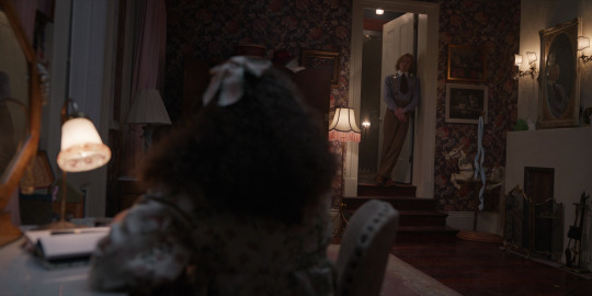
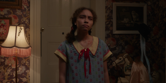
You can see all unidentified works from the first season in this post. If you spot or put a name to any other references, let us know if you'd like us to add them with credit to the post!
Starting tomorrow, we will be rewatching and discussing Episode 5, A Vile Hunger for your Hammering Heart. We can't wait to hear your thoughts!
And, if you're just getting caught up, learn all about our group rewatch here ►
#the vampire claudia#claudia iwtv#louis de pointe du lac#daniel molloy#lestat de lioncourt#vampterview#interview with the vampire#iwtv#amc interview with the vampire#interview with the vampire amc#amc iwtv#iwtv amc#IWTVfanevents#rewind the tape#analysis and meta#art of the episode#the ruthless pursuit of blood with all a child's demanding
34 notes
·
View notes
Text
I say this a lot but SERIOUSLY, you can become an AMAZING artist if you dont have a lot of money!
You can seriously make some great stuff with a dollar store sketch book and an hb pencil
Expensive art supplies only improves the quality (and not even by that much sometimes) NOT the skill
Theres also SOOOOOOO many free lessons on Youtube, and thats how many artists started, most of us didnt go to classes/school
So yeah pick up that pencil and make something great!
9 notes
·
View notes
Note
How does one become good at drawing planets
Hey, thank you so much for the kind words & the question!
I'm still definitely a beginner, and have a long way to go, but it really warms my heart to hear you say that. For starters, getting over any perfectionism you may have is a big must!
I know a lot of people always say this, but practice, time, patience, doing studies, and having fun are the most important ways to get better!
I'll walk you through my progress, and what I've done to get where I am today with things! I will warn you, it did turn out to be a long winded post. If you want the jist of it, you can scroll to the bottom!
So, I've been doing digital art since say, mid 2015 or so. I didn't have much of a grasp on art, and while I grew up loving space and space exploration, I didn't quite understand how things worked.
On August 2nd, 2015 (when I was just 15), I posted my first piece on DeviantArt.
This was my first foray into space art. It may not be the best, but I remember being very excited about it, and actually making a piece like that.
This first piece is a big sign of what issues I would face with space art until very recently; a lack of detailing, leading to a soft appearance.
This would plague me for quite some time; I would put very little effort into detailing, and wouldn't even zoom in on the canvas for quite some time. I would do things from afar, not wanting to zoom in for some weird reason. This can be seen in the following paintings, as well.
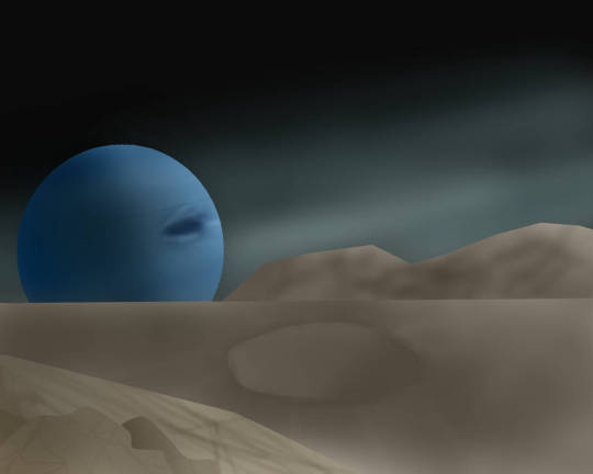
This one, also of Neptune, was posted two years after the first one. The framework is kind of there, but only barely. The perspective is off, and once again, the detailing is too minimal and too soft. On top of that, the shading isn't nearly as harsh enough. Compositionally though, I was starting to get a grasp of some basics.
There would be a brief artless period in my life from 2017 to 2020; every once in awhile, I wouldn't do art for a few years. Then, suddenly, I would get back into it and put out several pieces, all before growing quiet once more.
2020, once Covid-19 started happening, would see the return of me to the world of art now that I was suddenly without a job.
Once again, Neptune will be a demonstrator of how my skills changed.
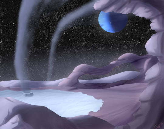
I was starting to get there; in terms of composition, much better than my older works. Coloring is a bit off, but overall, I was starting to actually understand how art works, and why things like detailing were important. One big thing here though; I was still painting with color. That would be one of the last big things for me to get over, although I didn't even know it then.
From the period of 2020-2021, I made a lot of paintings and mission patches for my one friend's KSP youtube series (seen here).
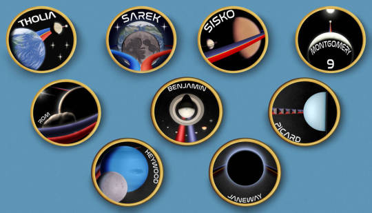
Doing what were essentially mini paintings, I learned a *lot* about composition and detailing. I think the one I spent the longest on was Heywood, in which I did my best to follow imagery from Voyager. Looking back now, however, it isn't quite accurate; that's the south pole! I still had a lot to learn in regards to doing accurate portrayals of celestial bodies, down to inclinations and the like.
Anyways, doing all that really burnt me out, on top of doing free art for people I didn't even know. That's another big lesson; only do gift art if you feel up to it, and for a friend. Do not do it for strangers.
It wasn't until late 2022, in September, that I actually finished a piece again. My illness had been pretty bad, leaving me bedbound for quite some time. However, during that time, I hadn't lost my skills thankfully.
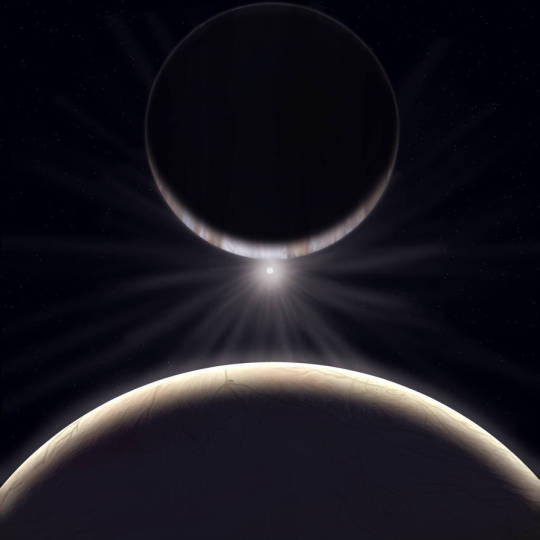
This would be one of my first somewhat decent portrayals of Jupiter and one of his moons, using SpaceEngine for getting reference images and making sure all the parts were in the right place. This would set the groundwork for later paintings, as I always use SpaceEngine now to make sure I have the orientations and sizes of things in the sky right! It's been an invaluable tool, I quite literally don't know where I'd be without it.
Anyways; after that, it was very sparse once more, up until quite literally this year. Sickness sprung up again, and I had a rough winter due to the loss of my grandfather to Covid-19, among other things.
2024 saw, in my personal opinion, the biggest and best change to my art yet.
PAINTING IN VALUES!!!!!!!!!
I cannot stress this enough; understanding what values are, and how to see them in every day life literally changed my entire perspective on things. On life! I cannot go outside anymore without comparing and contrasting values of objects and natural phenomena.

This was before values. Not bad, but still not great. Detailing was getting there. This is from March 27th, 2024, and was part of an art trade with @dan-asd of their worldbuilding project.

And this, this is 3 months later, from July 16th, 2024. Commission for @corvidist, my very first. This was a massive leap in the way I understood and processed the world around me, and in turn, what my art looked like.
Everything is in values. Your phone, with the seemingly pure black LCD touchscreen to the blue and purple phone case. The clouds, with their bright white tops and dark bottoms. The river, with the murky green waters contrasting with the bright orange stones. All values, just differing shades of gray with color added! Everything is light! Everything is the absence of light! Light is the entirety of your piece; you just have to understand where light falls, and where it doesn't.
Apart from that, everything is just rudimentary shapes and lines. The universe is made up of different kinds of lines and shapes. Entire worlds can be reduced to light and lines, people can be too. You just need to know what to look for, and how to process that into artwork.
I cannot stress how much understanding that, and doing tiny little paintings really helped me get a much better grasp on things.
Take some time, get a small canvas out, and paint your favorite celestial body. Take as much or as little time as you need, and just have fun with it. Play with color, play with values, whatever your heart desires!
Once you're done, take a step back, and compare it to the picture. Analyze what areas you didn't enjoy, and what areas you did. Look for what doesn't line up with the picture, and think of how you could better approach it. Think of how you can change the lighting to make it seem more real, what effects are needed to bring it to life.
Art is the process of taking what you love, and putting it to paper (digital or not!). Focus on what you enjoy doing; it will all come naturally with time. You'll start to pick up on things, big and small, that will bring your pieces closer and closer to what you want it to be.
And please, for the love of everything that is holy, have fun with it and don't overthink it! You will be so disappointed in yourself if you hype yourself up for a piece, only for it to come out not the way you expected. That's ok! That's part of learning! It can be disheartening, but if you take the time to look at how and why you don't like the piece, it'll come out so much better next time around!
Talk to people, too! Talking with my dear email-pal Eduardo was my first step into understanding astronomical art, and thinking on how to improve my work. He really helped me step into the right direction when I was just starting out, which I am still eternally grateful for to this day. I think of him and his work often; he really was a massive help.
In more recent times, talking to @whirligig-girl helped me to get a better grip on realism, and how better to portray celestial bodies. She was a huge help in giving me pointers for fixing up my View From Amalthea piece, as well as the ones that followed after. Talking to artists more experienced than you and getting critiques is always a huge help; it can really show you things in a new light!
Speaking of, don't be afraid to let a piece rest and marinate for a bit. A day, a week, or even a year. It doesn't matter. You will come back to it, and you will see new things you never saw before, and think of new ways to improve upon it. I have a piece that's been in limbo for YEARS, and I still have yet to actually get to paint it (the top one, the alien one (i will never finish that Uranus piece though lol)). I have it perfectly envisioned now, so waiting really did pay off in the end.
Essentially, it all boils down to this:
Everything is light, or lack thereof.
Don't overthink it, and have fun.
Do not do free art for strangers.
Everything is shapes and lines.
Step back and look at your pieces, deconstructing them in your mind or on paper.
Examine your everyday life, and see how everything interacts in terms of values and color.
Do studies, please god, do studies they're so fun and eyeopening
Warmup! Warm! Up! WARMUP!!!!! They are critical to getting your mind in the art headspace! You will feel less interested and less focused otherwise!
Don't worry about your medium, just do what you enjoy and works best for you! There is no such thing as a perfect brush!
Talk to other artists in fields you enjoy!
I love talking about art, I really could go on for hours, but I will stop myself here.
You decide what you get out of art; it's your skill, your time, so do what you desire! These are only anecdotes about my experiences with art; they aren't universal, but I do hope they've helped. If you have any questions, any questions at all, don't hesitate to reach out!
Lastly, here are two resources for you for any future artworks you may do:
I got this book many years ago, but the lessons it gave me were invaluable. I mean it; they helped me to understand the importance of doing studies, and for detailing!
Paid membership, but an organization dedicated to doing astronomical art. I have yet to join, but I've heard lovely things about it! Hoping to join later this year, funds allowing.
I will finally end this here. Thank you so much for the ask, and I hope you have a lovely rest of your day!
18 notes
·
View notes
Text
A love letter to Murder Drones
Btw this is just a rambling about how I got into Murder Drones and how it has changed my view of the world, so if you don’t care then don’t read :3
(Also it’s gonna be lengthy and maybe a bit of trauma dump)
I also don’t expect @liamvickersanimation or @glitchproductions to use tumblr, and if they see this I will jump off a cliff lol
So, it started one day when I got the Murder Drones pilot in my recommended on YouTube. Buut I scrolled right passed it cause I didn’t really care about it then. A few nights later, round midnight, I saw the pilot again and caved. I then went to the playlist and watched the first 6 episodes. (This was a month after ep 6 came out)
I did fall in love w/ the style of the show, but I did not understand the plot.
so I watched the show again and again, and even watched theory vids on it. And when I tell you I bawled by eyes out when I watched the show again, got connected to the characters, I bawled by fuckin eyes out when V sacrificed herself.
While watching theories of MD, something clicked in my head and I decided that I wanted to do my own show as well.
but, I suck at creativity and can’t make up new things, just edit already made things. So I decided, if I can’t make my own stories, I would help other people make their stories.
in other words, I wanted to be an animator
after I got my mind in on the fact I wanted to be an animator, I had downloaded many, and I mean many animation apps on my drawing iPad, and tried to 2D animate.
now, I would call myself a shitty artist. I don’t know anatomy and I barely use references too.
so when 2D animation did not work for me, I almost gave up my dream to become an animator, and plus.. I didn’t even know where I wanted to work.
I didn’t want to work for Disney cause I don’t really like their stuff anymore, and dream works kinda fell off too (no offense to any fans of those people, I will respect your opinions)
So I gave up on my dream, and I checked glitch prod. for any new info for MD ep. 7. But, instead of anything Murder Drones a new show was on called The Amazing Digital Circus.
now, I absolutely did not care about some new show, I only wanted Murder drones. Then I caved again and watched TDAC. and I fell in love w/ it as well.
and TDAC brought by dream back up to become an animator. I decided that I wouldn’t work for DreamWorks or Disney,
I would work for Glitch Productions.
now, I have no idea if I’ll ever be able to work for them, but it would be an honor.
then ep. 7 dropped for MD, and I fell in love again with this episode. Especially Flesha. Her movements, her emotions, her flicker design! It was all just perfect!
So I started to look online for ways to become an animator, but not a 2D one.
My mom helped me find a program called Blender.
and yes, I still use Blender to this day
I then started to take lessons from YouTube vids online and once I got the hang of it, I started to look for models that I could pose.
now, I can’t animate good rn cause I have a very shitty laptop that can barely run one model at a time, but I’m still learning.
and then the finale for Murder drones finally comes out. And omfg I have no words
it’s peak perfection
again the characters felt so ALIVE! And FREE!
and it’s what I wanted to do! It’s still is! I want to animate characters that people love and make art or fanfics about.
so.. that’s the point of this “Love letter”
I just wanted to say.. Thank you Liam and Glitch for this amazing show that I and millions of people could be apart of. And I hope I’m able to meet you in person and maybe even work under you one day.
Again.. thank you @liamvickersanimation and @glitchproductions.
you brought be out of my shell and made me into a better person, I owe you a lot.
and with that.. goodnight
-love @deedah
9 notes
·
View notes
Text
Art of Robin Fae

Hello and welcome! Feel free to call me Robin or Fae (they/she). I'm a freelance comic artist and illustrator. A lot of my work is based on my own original work, though you may find a surprise bit of fan art here!
Below the cut will detail the different comics I'm currently working on along with how you can support me and my work. This will be updated as time goes on!
~COMICS~

SAY SOMETHING
This story follows Buddy, a teen burdened by a Demon. This Demon bursts from their mouth and eats whoever Buddy happens to talk to. Buddy tries to live an average life, but it’s difficult when such a dangerous presence threatens those you love.
Originally created as an 8-page mini-comic back in 2014, SAY SOMETHING evolved into something far greater and debuted as a long-form webcomic on May 7, 2016.
Content Warnings: Blood, death, language, transphobia, self-harm
Current status: ONGOING - Updates bimonthly on Saturdays
Website: SAY SOMETHING
Mirrored on: Comic Fury ; Global Comix

Fox's Wedding
Lily is a human that is secretly taking magic lessons from Refure, a fox fae who mingles with humans, as reckless as that may be. Learning magic has proven difficult, causing Lily to lash out in frustration. With these two’s relationship strained, can they repair what is now lost?
A graphic novel inspired by the weather phenomena: the sunshower. There are many sayings throughout the world that say, "when rain falls while the sun is shining, the foxes are getting married." My goal is to have this finished by the end of 2025.
Content Warnings: Slight nudity, alcohol consumption
Current Status: NOT YET PUBLISHED - Finishing the pages (13/54)

Gale Force
Life as a mage is fraught with peril. As such, Ray decided long ago that hiding her magic power was a far safer option. Her plans to stay in hiding change, however, when a magical creature forces its way into her life.
A multi-chapter comic with concept work dating back to 2011. This adventure fantasy story takes inspiration from real world magic along with the series' "The Ancient Magus' Bride," by Kore Yamazaki and "Witch Hat Atelier," by Kamome Shirahama.
While a few pages have been finished, I'm focusing on finishing the script before continuing page work.
Content Warnings: TBA
Current Status: NOT YET PUBLISHED - Scripting (Currently on Chapter 5)
How to support me
You can support me directly by tipping me on my Ko-fi or by becoming a Ko-fi member! Memberships start as low as $3 a month and with that you can see early high resolution pages of SAY SOMETHING.
Should my current Ko-fi goal be met, members can see in-progress work of whatever I happen to be working on. That could be anything from scripting to comic pages or illustrations!
To my Ko-fi: (x)
~Commissions~
There's a very good chance that I'm taking commissions! If you'd like your OC, pet, favorite character, or anything (within reason) drawn by me, check out my commission page.
Please sure to read the ToS, too: (x)
~Twitch~
On occasion I will stream on Twitch! Right now my set-up can only handle games, but I'm hoping to be able to stream art in the future.
To my Twitch: (x)
~Youtube~
I'm uploading sped up recordings of my art, which include illustrations and sometimes comic pages. My Twitch VODs will also be uploaded there, so if you miss a stream there's no need to worry! It'll be here.
To my Youtube: (x)
~Other Socials~
Tumblr isn't the only place you can find me! I have a central hub where you can see a handful of my most recent work that also includes links to my various socials.
To the hub: (x)
Thank you for reading this far! Have a good one!
4 notes
·
View notes
Note
omg pls spill ur secrets, where did you learn to draw so good, especially realism, like what books or channels or lessons did you use/learn to become so good at what you do
what did you study in the fields of art I guess I can word it better, idk how to really put it😅
Hello anonnn💕
I'm not very good at explaining but i will try xD I honestly just randomly watch some digital art tutorials online especially on YouTube on my free time( i highly recommend sinix design https://youtube.com/@sinixdesign?si=vIHAtAj3MZnIU21o). I tend to often find myself analysing how other artists draw on those like speedpaint videos and apply it once i draw too.
My art style varies 😭 but when it comes to realism, what contributed to me getting good at that would probably be because I was a traditional artist before i transitioned to digital, i do those oil and acrylic painting portaits as well as charcoal portaits before so i just applied the stuff i used to do there into the digital format.
Additionally i am currently an art student and studying at an art school which helped me be more efficient with it.
I really advise it to study the basic fundamentals like anatomy and perspective and utilize it. When it comes to color theory I did learned the basic of it tho i just mostly go with the vibes depending on the art i create 😭 the placing of the lightning and shadows are also something i would keep in mind.
I hope this helps🥹 <333
12 notes
·
View notes