#but I changed the colors a LOT & also a bit more when I sketched it up
Explore tagged Tumblr posts
Visit Tumblr Blog
Explore Tumblr blogs with no restrictions, modern design and the best experience.
Last Seen Tumblr Blogs


Fun Fact
Tumblr was acquired by Yahoo for $1.1B in 2013.
Text

brush test slash rendering practice with ayem
#morrowind#almalexia#the elder scrolls#tes#tes fanart#art#id in alt#ok that's all the tags this needs ANYWAY#i started this 1. for experimenting with coloring from dark to light#2. because i wanted to draw someone kind of back turned to the camera#3. rendering practice for hair particularly#4. to go from sketch to rendering rather than doing lines to see if that doesn't smooth out my workflow a bit#5. because i've never actually used this brush past flat coloring#and out of those 1. i don't think i had enough of an idea of the palette or process to jump into dark to light painting so i did scrap that#and go with my usual “flat color with one of the mid shadow tones add shadows add light”#i do think that painting from shadows out is a thing people do digitally i just think this wasn't the drawing to test it on for me#i think i'd need to look at some other peoples processes and start with a more fleshed out idea of where to go#2 and 3 i think worked out. i'm gradually figuring hair out which i think is sick#4 i also think worked out for me which is also sick because i do get caught on lines a lot. they're fun sometimes but i think some drawings#benefit better from not having them and that it might be a bit faster#and of course everything i do is so that i can draw slightly faster and better for next artfight#as for 5. i have mixed feelings on this brush but that might be because i hate change. and also because i started this drawing on the 15th#of november and finished it yesterday. so im kind of just sick of working on and looking at it#it was a valuable learning experience and i think it came out well! i am also going to drop to my knees and rejoice when i can finally#close this file out and free medibang paint from under it so i can work on Literally Anything Else#thank you almalexia for being my test subject i should've used a reference for your armor when i did the sketch but i didn't#maybe the crown looks weird because of it maybe it doesn't. not my problem anymore i can draw other elves again#my art#iiii think i forgot a my art tag last time
118 notes
·
View notes
Text
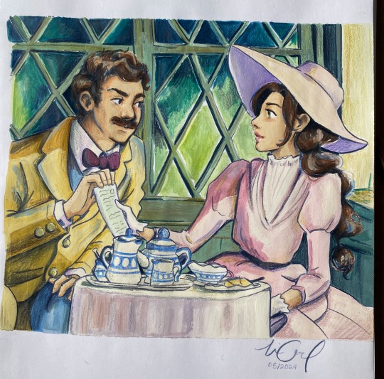
Sebastian had a few days leave from duty so he visited Eloise😇😇
#im literally OBSESSED with Eloise😩#and this AU😇🙏#they are maybe late 20s/early 30s here I wanted to experiment a bit#anyways I was reading A Little Life at the beach today#and ngl I was tearing up literally ALL the time!!! 😤😤😤#it’s just so beautifully written & I find myself relating so heavily and I get gut punches every few pages where I need to stop reading#and just process it#idk maybe I am sentimental today LOL#It’s just…it’s making me think about the fact that I’ve never really Belonged in any one place and neither have the characters#my mom is the product of Bulgarian/swedish immigrants to the US and my dad is a Spanish pueblo man 😂#and their experiences/culture/languages etc etc have shaped my life soooooooo much🙏#but like at the same time. too reserved to truly fit in with the Spanish but too open/blunt for the midwest#idk it is weird to explain#anyways I just keep moving forward & make my own way🙏🙏🙏#thank you for coming to my free Therapy Session in the hashtags (bc nobody reads these😂😂😂😂)#also if you did & you also read a little life please🙏 or if you want to talk about books in general🙏🙏#hogwarts legacy#hogwarts legacy fanart#hphl#sebastian sallow#hogwarts legacy mc#hogwarts legacy oc#eloise#oh also this is a recreation of a Porco Rosso scene😇😇🙏🙏#but I changed the colors a LOT & also a bit more when I sketched it up
71 notes
·
View notes
Text


[ EctoberHaunt 2024 Banner ]
Hi hiii~ I get to draw the banner again for @ectoberhaunt this year~ It was a lot of fun :DD
I wasn't sure how to incorporate the gold and silver at first but I think it turn out pretty good
Also thank you to Enn for helping me with the flats I would've pewished ksjadnaksj Sketches and some ramblings under cut
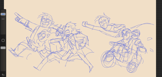
Here's the initial sketch for the banner. I tried my best to keep it close to the sketch or at least have the same energy (hopefully qwq)
As you can see, I drew Sam and Tucker riding a scooter bike originally. But the banner, I try to get as close to canon design as possible. I could not for the live of me remember what episode has the scooter bike. And.. turns out I might've just misremembered the scooter as a motor bike? so I just draw the scooter lol

(This is from the Killer Garage Sale episode btw. I couldn't find the scooter's pict on the wiki so I gotta screenshot it from the episode)
Also speaking of couldn't find reference pictures in the fandom wiki,


I couldn't find pictures of the college trio full body screenshots there. Only the Vlad leaning into the portal while Maddie and Jack looked away. Very useful references, yes.
I used to think that Jack was the worst one here about lab safety (considering he was the main reason the portal exploded on Vlad's face), but Maddie is no better after watching the episode again. Girlie wear big round earrings and leg warmers in the lab. Pretty sure that's... not very safety. Vlad is not better since he does lean very close into the radiation portal so... lol
Anyway, I tried to incorporate their dynamics in the banner. Jack the very excited one and leading the ghost hunt, Maddie following along with more ghost gears, and Vlad... well, I was thinking Vlad could be the 'rational' of the trio and like brings stuffs the other two wouldn't have thought to bring out of excitement (i.e. flashlights in case they need to go through pitch black tunnel so they don't fall off etc etc)
But... you know, that's giving Vlad too many points than he deserves lol. So, I draw Vlad still bringing the bag of extra stuffs, but it's not fully closed so some stuffs fell off on their trails. They all should share braincells and Vlad does not get a turn lol
Also changed Maddie's clothes and give her the teal suit to match Jack and also looks better when she's running

There's not much I can say about the main trio process? I mostly just want Sam to be the one driving the scooter while Tucker handles the navigations or sth. They get to ride scooters to catch up with Danny~
Danny and Tucker's colors a bit ashy bc I color picked them from low res screenshots askjdnaksj I fixed em on the final tho so yea

O yeah, I don't know if it's visible on the final art, but I initially try to give the kids warm shadings and cold lighting (Silver), and the college trio cold shadows and warm lighting (Gold) to fit the themes.
Also the light source.. sorta? The adults has the light source from behind them bc they are in past/past the age in the drawings? And the kids has their light source from in front of them, going into the future and the many things ahead of them kajsdnaksd
#13thcat art#13thdoodle#danny phantom#sam manson#tucker foley#jack fenton#maddie fenton#vlad plasmius
405 notes
·
View notes
Text
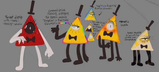
I've been thinking a lot about Euclydian biology lately, specifically in regards to pigmentation thanks to this awesome ask I got on a side blog, and wanted to illustrate some of the ideas I had. Super quick lazy sketches but hey, maybe some of you will dig this! Nerdy stuff under the cut, will make a bit more sense if you read the aforementioned post
Euclydians have a genetic predisposition towards a "resting" color (in Bill's case, yellow). The opposite of this state (full "flexing" of chromatophore-controlling muscles) is also predispositioned, which is what's seen in the threat display. This rapidly stimulates the individual's metabolism and gets their blood really pumping in preparation for conflict, but is also somewhat costly in terms of energy, so is typically only flashed rather than maintained as Bill does it
"Teeth-peeking" is the cute zoology term I came up with for when a Euclydian displays a couple teeth overtop their eye without fully switching into mouth-function, usually as a threat but sometimes a sort of stim when they're hungry
Communicative flashing ("Chromatic") has a few languages. The most primitive is Simplified Emotive which is a quick display of mood, while the most modern is Traditional Chromatic, wherein patterns of color serve as words. Words in Traditional Chromatic are not ciphers like they are in TBoB and there aren't always direct translations into English
There are a couple accepted ways for a naturally colorful Euclydian to signal an emotion or "syllable" that matches their color, typically either by a subtler change in value along the edges or by changing everything BUT the edges
It's probably worth noting that Chromatic of any variant is considered a secondary, uncommon language in modern Euclydian society. It's simply more efficient and easier for most to speak, though I think Simplified Emotive probably stems from the natural threat display and so it's more intuitive. It's not unheard of for someone's edges to flash "angry/surprised" (◼) for a second if you bump into them on the sidewalk
A memetic blush is a learned behaviour in which individuals appear to fluster by a reddish shift in color along the face, edges and vertices. This might just be something Bill (or hypothetically other Euclydians who come into contact with humans) does I'm not sure yet but it's cute so
Given the body needs to conserve more energy when fighting illness, it's not uncommon for chromatophore muscles to weaken or spasm in order to lessen metabolic strain, giving the individual a patchy look that often reveals the naturally white skin below the chromatophore layer
When rigor mortis occurs in a dead Euclydian, all the minute muscles in control of chromatophore dilation contract all at once, rendering the entire body white. Because of this, white is considered a bit of a grim color in Euclydian culture; you know emos are wearing all-white instead of all-black
Conversely, a perfect, non-tinted grey is a regal shade because it's seen as a sign of fitness and strength. Maintaining a neutral grey requires very precise control over one's chromatophores to get the balance right and hold it there
Euclydians are capable of training the muscles that control their chromatophores like any other, and as a result can change their resting color with enough discipline! They can also use this technique to give themselves markings. Haven't decided the cultural implications of this entirely, but I think the idea of someone training themselves to match their threat display so nobody can tell when they're angry, for example, is a cool idea. Possibilities!
181 notes
·
View notes
Text
Aeolus character design process!
(disclaimer: my writing sucks and I'm not good at explaining things so if it gets a bit weird just know I'm trying my best)
a lot of people have been saying very nice things about my character design for Aeolus in EPIC, and that makes me really happy! So I decided to break it down to show you guys my full process in designing them! :D
When I first listened to the snippet of Keep Your Friends Close I was very excited that this old bearded god man was going to be interpreted by a girl, so the first concept I had was to maximize this contrast by also making my Aeolus appear as a child. Aside from the contrast thing, it would also tie in with their playful personality. Here are some of the sketches I did at the time (around 2022):
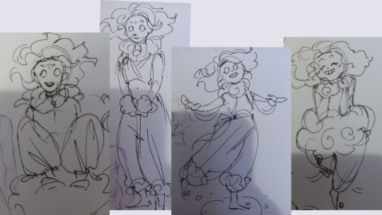
Since the beginning I always had the clown aesthetic in mind. Not sure why, just thought it matched the cute playfulness of the character. It was fun combining wind/cloud stuff with the clown aesthetic, like the cloud around the neck and wrists, which was supposed to resemble those ruff thingies that clowns usually wear.
I experimented with a lot of elements, like the headband and the cropped shirt, but I decided to remove and recicle them in other EPIC characters (Odysseus and Circe). Their design was also more feminine, and since I was aiming for a more androgynous look this would be changed later.
I remember around this time I saw a video of Jay where he said he envisioned Aeolus having a more calm nature aesthetic, so I decided to change my design to better match what he had in mind. I made the hair wavier, with clean and smooth lines, made sure that Aeolus would act less clown-like, rarely stand up and never abandon the cloud. These doodles better resemble the current design:

it was also around this time that I designed the island in the sky. My biggest inspiration was New Super Mario Bros. WII world 7, mainly because of the chill vibes and cute fluffy clouds. So I took that and threw the combined aesthetic of a child's playroom and ancient Greece temple on top of it and it was done.
Right now here's the full body reference of them:
I'm very proud of it, I think it matches the themes and feelings I had in mind while also translating their personality quite well. The color palette is a simple blue/yellow/red, but the simplicity helps to complement the childish appearance. Their outfit is comfy, cute, and something you'd like to sleep in. The round shapes makes them adorable. Overall a cute little gremlin that is also a very powerful god.
#digital art#art#epic the musical#greek myths#epic: the musical#character design#epic the ocean saga#epic the musical fanart#the oddyssey#the ocean saga#keep your friends close
1K notes
·
View notes
Text
✨ShadowPeach Bio Parents Bio AU Q&A! 23/10✨
I'm LIVE on my TWITCH page drawing Spicynoodle! Come and say hi!
Welcome to the Q&A! A space where I can answer related or similar question about the Shadowpeach Bio Parents AU! If you submitted your ask anonimously, then you’ll have to check the whole post if it’s answered here, if it’s not, worry not! Your asks might have been used for a future comic or just in the queue~
Anonimo ha chiesto: Ok so your Bio parent AU (loving it so much by the way) takes place after season 5 right? I thought it would be cool if you touched on Monkey Kings issues with Mk using the circuit on him. I eat that stuff up. if its already going in a different direction then that's ok, just a suggestion.
Aww in the end I don't think I can fit this in the story. It's absolutely an amazing idea, and I had thought of adding it for so long, but in the end the final part of the story will go differently.
Anonimo ha chiesto: How do Wukong and Macaque react that they have two grandchildren?? (Kai and Nya)
Will probably die of emotions. The fact that that's both their son's son/daughter, and that's their nephew/niece. It would blow them away. I'll never have children, but they completely change your prespective.
@shadowpeachera ha chiesto: AGHHHHHH XIAOTIANS WEAPON IS SOOO COOOOLLL AND THE WAY YOUR SHOWED HIM MAKING IT AGHHHHHH SO GOOD HOW LONG DID IT TAKE YOU TO COME UP WITH THE DESIGN? THE COLOURS? THE EVERYTHING UGHH I LOVE EVERYTHING ABOUT THIS COMIC AGHHH
I think I did a couple of sketches before the final design, but I went on pinterest quite a lot before to see some variations of magical staff
@beanspassin ha chiesto: Do you think Macaque and Wukong will ever find out about each other secretly checking the other out? Cause let’s face it, Wukong will get a MASSIVE ego boost when he finds out Macaque was staring at him. 🤭
I think Macaque can HEAR when Wukong is checking him out. Wukong probably would negate the fact that he's checking him out, bc my boy is just a mess of emotion
@tessthe-cheesecake ha chiesto: Hello! I just wanted to say I really love your Shadowpeach Bio Parent AU I just have two questions, one: how is MK handling four ears? I assume he doesn't like crowded places (if yes then me too bud me too) ok second question would MK ever go back to being Wukong's successor but in his own way instead? :)
I think MK doesn't want to be a successor bc he doesn't want to be the next Monkey King, but he still wants to be the Monkie Kid. Also, I think he might be starting to feel himself a little more like an heir then a successor
@minli-daughter-of-wukong ha chiesto: So, would you have changed MK’s weapon if you thought a staff wasn’t really his style anymore? Also how did you come up with the idea for the sunset staff and can you give tips on how to find the right kind of weapon you’d choose for a character? So this is so long lol
I aint real good with weapon/characters. This was my first time matching a weapon to a character to be honest. I wanted to create something that was similar to both Wukong's and Macaque's staff, but at the same time being something new. With a new color palette that could represent the kind of hero MK wants to be
@cavern-of-shenanigans ha chiesto: Ok ok ok this is kind of silly but MKs new staff kind of reminds me of a twirling baton So combined with Macaques showmanship and the scarf bit MK tied on, they could play around with it and do a joint shadow play/ribbon dance performance! Maybe add him into the hero warrior story? Nice mother son bonding activity because its cute
HA! true! they are performance duo!
@ashmeertheimp ha chiesto: Hi love your fan art, story,and art style! What if piggsy and Tang went on a long trip and lives in flower fruit Mountain
I don't think freenoodle could survive living so close to shadowpeach
@italian-wizarding-world ha chiesto: Duuude i love, Love, LOVE!!! your art, and your Mk, Wu and Mama it's just too sweet, just two question: 1 Why sunset and not dawn? is it because usually sunset are more impresive? or maybe the staff has two "forms" depending on him using more his shadow powers and if so can he change between them? 2 We need red son reaction to Mk essentially magical girl transformation even if it's just a sparkling staff, because i think it would be epic/hilarious. We need more moment about them and Mei lookin at how dumb both are
I liked sunset because in a way MK started more with Sun powers and he is now discovering more his Macaque side of powers, so he's approaching a little bit the shadows (so his journey was from day to slowly twilight)
Anonimo ha chiesto: Have you ever thought about drawing an adult MK? I love your drawing style, and I wanted to see what an adult MK would look like, as well as Mei and Red Son. Você já pensou em desenhar um MK adulto? Eu amo seu estilo de desenho, e eu queria ver como seria um MK adulto, assim como Mei e Red Son.(I'm Brazilian by the way and I love reading your Au)
Maybe in the future....?
Anonimo ha chiesto: I REALLY REALLY REALLY LOVE NO ..I ADORE YOUR DRAWINGS MAN!!!❤️❤️❤️❤️❤️ EVERY DAY I REREAD THE WHOLE LMK COMICS OF YOURS..!!!!!!❤️❤️ And hey l have a quition!!! What if mk interrupted wukong while his meditation and like wukong thinks he's in the past what is he gonna do when he see mac!?🌝❤️ Probably we will see a lot of hugs and kisses?🥹
Can you imagine since they are so cuddly even if they aren't together yet again in the AU, that because of this Macaque for a good moment DOESN'T notice the difference?
Anonimo ha chiesto: Can we get a character sheet for chiyou?
nope sorry, but he will come back no worry
Anonimo ha chiesto: Who else wants to see Pigsy and Tang show Monkey King and Macaque pictures of MK growing up?
Aww I think Wukong and Macaque would die from cuteness but at the same time feel a great remorse that they weren't there for their child when he was little. They are glad freenoodle was with them, but still, It's a big chunk of his life that they missed.
@itz-izzyart ha chiesto: So with the noise canceling headphones, does mk wear them so he (hopefully) doesn’t start hearing the past again or is it just something he wears to help him sleep at night?
Both. It helps him muffle the noise.
Anonimo ha chiesto: Would Wukong get ptsd if MK somehow got a circlet himself ?
He would probably loose all his immortalities rather than let MK have a circlet.
@loseranddummy ha chiesto: I have a ≈question≈ is Peng gonna be in your lmk bio parent comic by chance?
mmmm nope, sorry
@oddogoblino ha chiesto: Beeeeeg monke armmssss...meant for hug jail...
yessss..... and cudlleeeeeee...
Anonimo ha chiesto: :D was macaque grooming mk while they were waiting for the weapon to be forged
yup!
Anonimo ha chiesto: HI! Hope you're well and staying hydrated. Would we/could we see more Lilo and Stitch refs for your ShadowPeach bio parents au? I saw the last one and couldn't stop laughing. 😆 Maybe a beach scene or something?
I'll have to see the movie again and I'll see if new idea come in my mind
Anonimo ha chiesto: Have you ever thought about that because Macaque was gone from the living world for so long he doesn't know how use modern technology. Like Wukong's phone will go off when he isn't there and Macaque can't figure out how to get the stupid thing to be quiet
They are both gay boomers, your honor
Anonimo ha chiesto: In your shadowpeach au who is a morning person and who is a night owl Macaque or Wukong?
none of them. Wukong sleeps like 12 hours and Macaque like 5. (but now he's sleeping more thanks to Wukong but still wakes up earlier than Wukong)
260 notes
·
View notes
Text
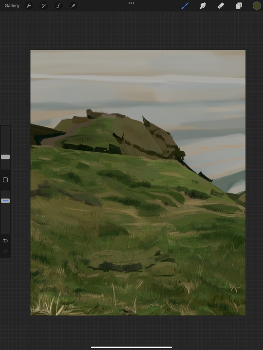
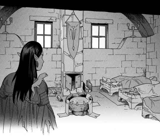
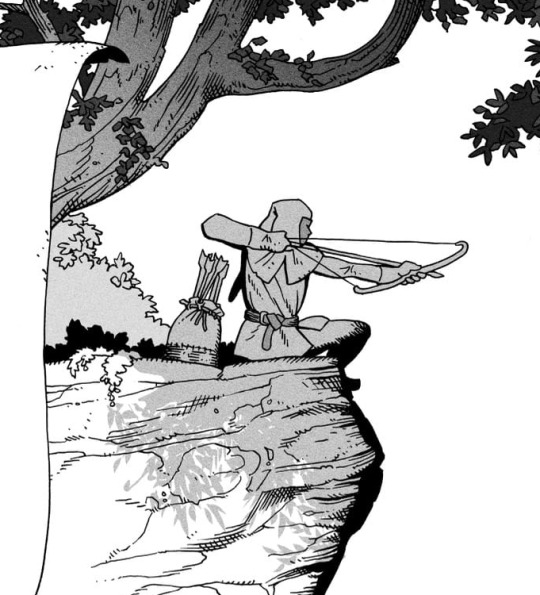
i got a few asks about my process :0 so yea i took some screenshots mid-process of my recent cliff-skk thing just for that
m gonna preface everything by saying that i did have a ref for the environment!! i avoid color dropping from the image and tracing cuz i do want to hone some digital skills. also saying i'm doing an "environment study" when i'm really just drawing skk makes me feel better abt myself
when i don't have a reference, i tend to do some thumbnail sketches in my sketchbook. here's some random stuff of past work, where i rawdogged everything:
but whatever, back to the cliff-skk. i'll also post a timelapse of it for easy ref, but detailed stuff is under the cut :)
first i did some rough sketches on an orangeish background (underpainting etiquette, i find it helps things feel brighter and keep a stable tone when choosing colors to lay on top), and I quickly lined skk :)


then I laid down some flats for the background, again really eyeballing the reference for hues. afterwards i thought it was a bit bright, and i wanted a more sepia/nostalgia feel to it, so i hue adjusted everything to something more uniform


then i lay down flats for skk + the ocean, which i both had to color adjust a lot (you might see that in the timelapse), and then i jump straight into rendering the background. when i render, i always prefer to do it over something lineless, so i turn the sketch layer off. i rarely do lineart for backgrounds.
i also used to render the characters first, but i've found that it's just not a great approach—especially for art where characters and background are interacting, knowing the hues and shades of the environment is crucial to effective rendering on the character that doesn't make them look out of place.
when i'm rendering, i really try to keep in mind tenants of contrast, perspective, form, and light/shadow. ex, stuff "closer" to us has more detail; the hill in the back is minimalist (in comparison); the shadows lean cool-green while the light leans gray-yellow. rake brushes really carried me here idk... my fav brushstyle forever


eventually i reach a point where i'm satisfied (or bored) with the background. for the last stages i usually have the subjects hidden so i can really perfect the details—but then for super duper final details, like the little leaf specks and grass strands, i unhid skk so the poppy details could work around skk. then i get to rendering the characters :)
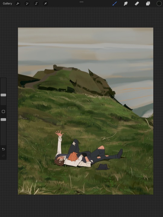
i forgot to take ss of all the stages when i rendered skk, but here's something from... about the middle of the process? i tend to render characters with the lineart hidden as well, sometimes bringing it back just to clarify things, but ultimately i prefer to define things by form than by line. that's just me tho idk, idt it makes or breaks anything, just a preference
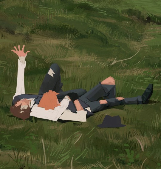
again rlly just thinking about cool/warm, reflective tones (the greenish shadow on chuuya's left inner leg, sky-gray blue on dazai's vest), really just slotting the subject into the environment. after i finish rendering the characters, i usually return to the background and add some stuff—in this one i defined the waves a bit and put some grass around skk
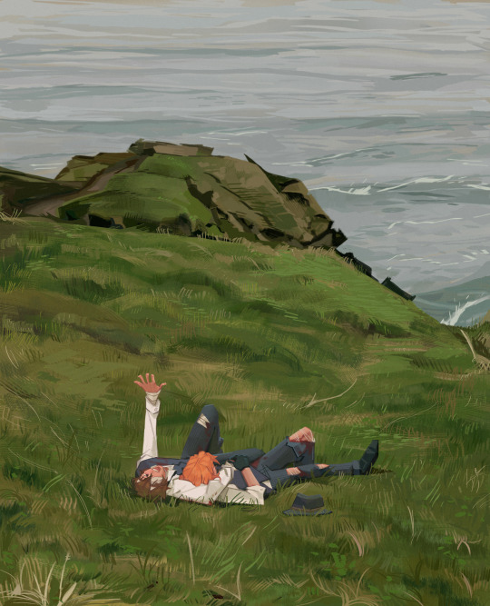
and yeah then we're done idk LOL. sometimes i run the file through camera raw (photoshop) to do some color adjustments—i find that my iPad displays colors super differently, usually making things a lot lighter than they are (u can see how dark the timelapse is...), so i find myself lightening my work a lot. i also sharpen and add noise as needed :)
i think my process has changed a lotttt even in this past year. it's kinda crazy!! it's always fun to do these and just reflect a bit on how i work. mostly just mindless insanity until it kinda works.
thanks for sending in an ask. and if u read all that, thanks to u too lolol
178 notes
·
View notes
Text
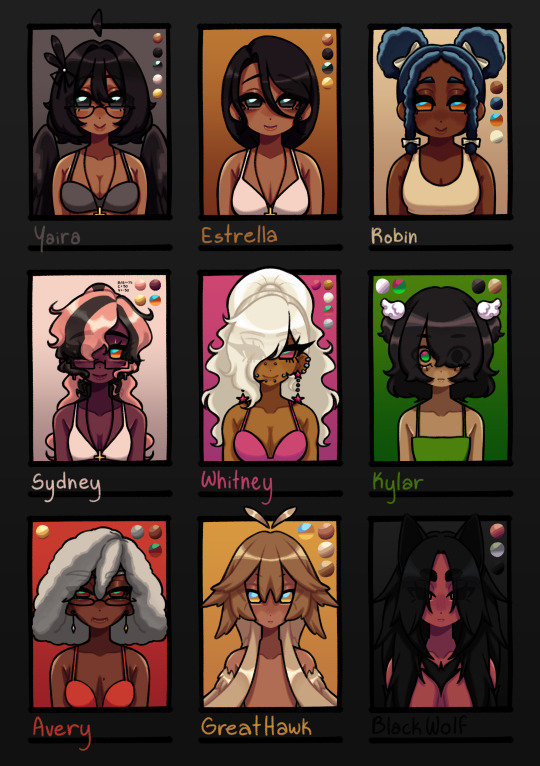
I FINISHED THEM. I DID IT. WOOHOO (crying)
edit: putting myself back in the trenches, more extreme though since i'm making character sheets LMAOAOA
design notes:
Yaira: nothing changed
Estrella: dead mom ponytail gone </3 i only did it in the og drawing of her bc its funny
Robin: ROBINNNN. IM SO SORRY I FORGOT THE PUFF BUNS UUEHEHHHHH- anyway, when i was planning out the designs for the other named npcs, i was like "why the hell are there so many gingers" so i made her have blue hair :3 to match with her confidence stat :3 also gave her yellow/orange eyes instead of green bc there were also a lot of green eyed npcs
Sydney: SKUNK HAIR. I DUNNO HOW I FORGOT ABOUT THAT YUMMY DYE STYLE. SYDNEY IM SORRY. i completely forgot i wanted to still have her natural hair (also just made pink bc teehee i like whimsy) to show
Whitney: not much changed besides the hair style. completely forgot i wanted her to be super gyaru OTL. gave her cheek piercings bc they're cute :3
Kylar: i lowkey started to not like how i did her hair originally and then came across all the sketches i made for the LIs and was like FLUFFY KY :3 ofc had to keep the emo bangs :3
Avery: nothing changed LMAOAOA
Great Hawk: FEATHER HAIR. I FORGOT I MADE A SKETCH FOR FEATHER-LIKE HAIR FOR HER. IM MAD AT MYSELF.
Black Wolf: not much changed, just made her hair longer bc why not
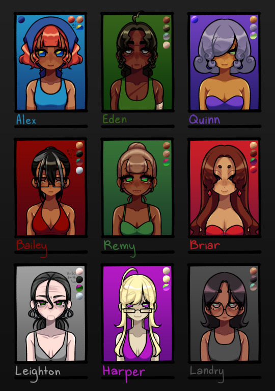
Alex: not much changed, just made he hair more of a red red, darkened her skin, altered her bangs, and changed the color of her bandana. still wanted to keep her looking like a cutie patootie
Eden: I ACCIDENTALLY GAVE HER A GIANT FOREHEAD THE FIRST TIME AND I DIDN'T MEAN TO SOBBING. not much changed though, just made her hair darker and have a green tint to it. look im trying to make my designs have lots of whimsy
Quinn: you can tell with Quinn LMAO. i just felt like she needed to have a distinct look since she's a special npc n all :3 classic purple and green color scheme for a shady character
Bailey: i'm gonna be honest, i was originally gonna go with a mean asian mom look for Bailey but then i was like "....what if muscle mommy"
Remy: i wanted her to look like a little shit. that's all
Briar: tried to go for a bit of a Jessica Rabbit and Rarity type aura. i really like her design and she could put me in the underground brothel any day :3 /j
Leighton: just an old hag, nothing special
Harper: wanted to make her look a little inhuman??? i think i got it with how dead her skin looks idk. also wanted her to look like a little shit
Landry: here's where the asian mom look went. i like her and Mickey's dynamic and they both just look like regular people (better for crime)
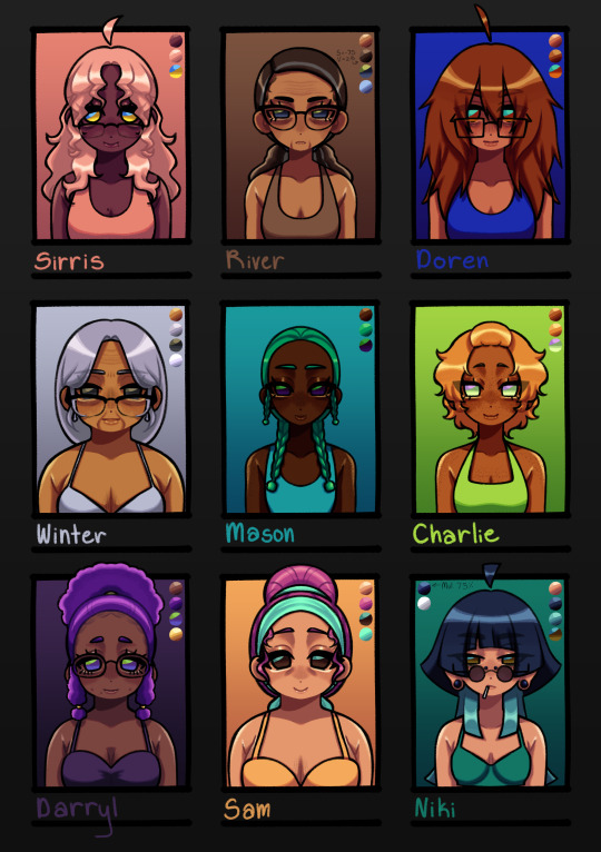
Sirris: Sydney if she was older. idk what else i should've done lol
River: old lady :3 hot old lady :3c (pt 1)
Doren: i wanted her hair to look fluffy as hell
Winter: old lady :3 hot old lady :3c (pt 2)
Mason: SEAWEED HAIR. that's all
Charlie: wanted to embody :3c
Darryl: she's very cutie patootie to me so i made her a cute patootie
Sam: wanted her to look like candy kinda. idk :3
Niki: i only made her hair a little longer and no weird two layer thing for the short portion
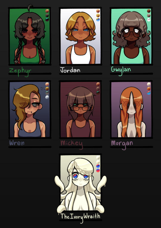
Zephyr: wanted her to look smug and also kinda cute???? idk, i didn't really have a vision for her
Jordan: also didn't really have a vision for her, but it did want her to gave similar eyes to Quinn
Gwylan: her i did have a vision for :3c she's a cutie patootie, that's all :3
Wren: thought a side shave would make her look cooler
Mickey: hairstyle changed a little. other than that, not much changed
Morgan: still a wet rat
Ivory Wraith: nothing changed (they have special eyes tho)
#dolgl#dol#degrees of lewdity#silly billy kitty draws#yaira the beloved#estrella the dead mom#robin the orphan#sydney the fallen#whitney the bully#kylar the loner#avery the businessperson#great hawk the terror#black wolf the alpha#alex the farmhand#eden the huntress#the ivory wraith#jordan the priestess#bailey the caretaker#harper the doctor#briar the brothel owner#remy the farmer#leighton the headteacher#landry the criminal#quinn the mayor#wren the smuggler#mickey the hacker#morgan the sewer dweller#niki the photographer#sirris the science teacher#river the maths teacher
349 notes
·
View notes
Note
hi quip! i really like your one piece comics and i am curious how you do them! i'm not good at comics and want to be better at drawing them! how do you learn how to make comics?
thank you!
uh oh... im afraid u have caught me at the perfect crossroad of "bored at work" and "unrelated task ive been meaning to do but keep putting off."
this is long. i hope you like reading (and grayscale progress pics). and of course!!! disclaimer before we begin that this is just how I, personally draw comics. there is no "right way."
quip's comic-making process!
Switching my typing to make this more legible...
My process can kinda be broken down into 6 steps:
Brainstorming
Thumbnailing
Sketching
Panels & Text
Lines
Tones/Colors
1. Brainstorming
My brain is a leaky sieve on a good day, so I sloppily jot down ideas in my phone notes the moment I have them. This helps me when it's time to draw too, because if I feel art blocked, I can look through old concepts and see what catches my interest.
Otherwise, I love drawing for other people's writing. :) And if worst comes to worst, doing manga/comic page redraws in my style teaches me new things every time.
Once I have my idea, I'll usually make a bulletpoint list of "plot points" or "story beats" I want. Then I plan the comic with this format that I've adapted from a tutorial I read once. I'm going to use my most recent comic (original comic post) as an example.

I start in the third column, writing notes of what I'd want to see in each panel. I also include the dialogue (in this case, I didn't have to write the dialogue! it's from the fanfic linked in the original comic post!). I usually write the whole name like [Luffy:], but at this point I've drawn so much of these guys, just the first letter works.
I like to handwrite these notes to get an idea for how much text I'm putting in a single panel.
After I describe all the panels, I go back and separate them into pages. I can't tell you how to know how many panels to a page. It's whatever works for you. I just kinda know about how big each panel will be, and so I can feel when I'm probably running out of space. (Also. You can change things later. I don't in this example, but I add/drop pages/panels all the time.)
2. Thumbnailing
Thumbnailing—as the name suggests—should be done tiny. Too tiny to accidentally get sucked into details.
This is about marking down blobs where items/characters go, and figuring out the paneling. I'll draw and redraw these a bunch of times too.
This is also the most time-consuming/brain-working part for me. If I were in a zine that did progress percentage, I'd try to finish thumbnailing around the 50% mark (but I'm also a moderately fast artist, so your mileage may vary).

I think the terrible quality makes them charming, actually. I really like how silly they look. :')))
I will add, when you draw your "page" rectangle, make sure it's the same proportions as your actual canvas for the final image. You want an accurate idea of how much space each panel will take up, especially if you have a lot of text.
3. Sketching
This is my most recent change to my usual workflow, and it's saving me a lot of time. I make my thumbnails a bit bigger (each one about half the size of the final canvas), and I sketch these basic body forms right over them.

It just helps give me placement for my actual lines!
I usually draw these in a paleish color so I can lower the opacity and not get distracted by them while lining. The random darker parts are to either help keep two forms separate (like when two characters have their limbs all over) or to better define sections that were too sloppy/poorly proportioned.
I also think this helps my poses stay looser, because I have more dramatic/wriggly shapes that aren't too bogged down by proportions yet.
Sidenote: I CANNOT show this here, but sometimes this is when I take videos. Of myself. I prop my phone camera up and shoot a video of me acting each panel. :/// It looks really dumb, but it also shows me fun body language ideas like hand gestures, expressions, weight distribution, etc. Just pretend you're an overdramatic cartoon character, and try not to worry about your roommates or mother walking in on you doing odd things. (You can also use the video for anatomy reference later, but I usually just capture the vibe and don't try to copy the actual video frame.)
4. Panels & Text
Oh, boy. So, the panels are usually just straight lines (though it's fun to make creative exceptions, like a round panel to mimic looking through a spyglass), but there are some fancy rules that I don't strictly adhere to.

I believe (I have no technical training in this. Take everything I say with a grain of salt) the vertical gaps (between two side-by-side panels) should all be a consistent width and the horizontal gaps (between two panels on top of each other) should be another. The vertical ones? Should be thinner? Because you want the eye to easily glide between them, whereas the horizontal gaps should be a visual barrier to keep you from jumping ahead. Just something I've vaguely noticed.
There are lots of fun "default layouts" you can look up. Or keep it a consistent grid. I think it's fun to sometimes have characters/objects sticking out of panels and overlapping others. This is just a matter of taste, creativity, and inspiration. (Read Witch Hat Atelier... It has some of my favorite paneling...)
You may also notice I have already done the speech bubbles. This is, to me, a crucial step. This helps me catch early if I don't have enough room for all the words. It also lets me plan the art in each panel with the speech bubbles in mind. There's nothing worse than working really hard on a panel, and then you realize there's no room for the bubbles.
I also try to lay them out in a way that guides the eye! Even without art, can people tell where to go next? Better yet, if I want people to look at panels out of order (aka not left to right, in my case), can I use the speech bubble path to make them? Here's just a vague example of what I mean.

As an added bonus, doing speech bubbles early also allows me to be lazy! :) Ignore the comic; I'm not supposed to post it yet oops,, There's a whole lot of drawing to do on each comic page, and I am not wasting my time on stuff that will be covered up. So yes, if I hide my bubbles, there are a lot of unfinished lines trailing off into nothing. (As a bonus, if there's a part of a character you're struggling with—and it won't look weird to do so—you can move speech bubbles to just hide the problem area yayyy)

Making the actual bubbles could be their own whole tutorial, tbh, but there are some general guidelines I use.
Zoom out when you choose your font size. You want to know how it will look to the average reader, so it isn't super teeny tiny or way too big. You generally want to keep the same text size for all your pages/bubbles.
When I draw bubbles, I try to size them about one vertical letter height (and some change) around the words [left side]. This isn't always the case though, because humorously large or funny shaped text bubbles can convey different feelings [right side].

On Procreate, I set my bubble lines to Reference and just drag-and-drop the white fill on a separate layer below the lines. (Remember to turn Reference back off again when you're done, or your fill bucket won't work right when you're drawing.)
To get the white outlines I use to keep the bubbles from cluttering up the art, I literally just Gaussian blur an all-white copy of the lines + fills... and then I copy and merge it 5 times until it's opaque enough. This is a terrible way to do it, but it works for me. :')

5. Lines
This is the part that I can't tell you how to do. I literally just. Draw right over my wacky sketched body forms. Boom. Comic drawn.

I'll make three suggestions:
Don't focus on making every panel perfect. Give a little extra love to big ones or ones you want people to linger on. Otherwise, know that people are typically speeding through the art. It's way more important to focus on storytelling than art technique. In my opinion, a good story that's told well will always be better than a beautiful one told poorly. (Some comics are beautiful AND well-written... Alas, I am just a hobbyist who needs to get the ideas out of my head at top speed.)
Put your background lines on a different layer. Put your foreground lines on a different layer too, if you have those. Basically, I try to keep the main part of each panel (usually a character or object) on my lines layer so I can erase background/foreground/etc lines to ensure clarity/focus.
You can make background lines lighter colors too. I have too many numbers sorry. (1) Background. The stuff that's farthest away. Lightest lines. Few details; more focused on shapes and the suggestion of a background (I'm not good at backgrounds). (2) Midground. Same distance away as the characters are. Lines can be black. (3) Also midground, and also the same distance away. But they're very detailed, so I lighten them so they aren't so distracting. (4) The characters. Black lines for focus. For people who haven't seen the comic, I swear they are just hugging. This is SFW. D:

6. Tones/Colors
Do not. Do NOT ask me. I don't understand colors. I hate working with them, but I try because I want to improve. I hate doing anything beyond the simplest grayscale shading. Please go elsewhere for your coloring/tone advice. This is how my color picker looks 95% of the time. I have pre-set "percentages" of black that I got by lowering the opacity of a black layer and just color picking it. I don't even know the exact percentages I used. Good luck out there. Be better than me.

7. Sharing
This is a bonus step that I didn't mention earlier, but it's actually the most important of all of them.
You need a friend. Or maybe a groupchat or discord. A family member or coworker if you're really close like that. I don't know.
Find SOMEWHERE you can spam wips and be cheered on. Drawing comics takes a while, especially if you're trying to tell longer stories than I'd dare to attempt. If I don't force someone to praise me for every line I draw, I shrivel up and die.
Also if and when you post online, add alt text. I'll admit I'm the first person to complain and drag my feet on this, and I literally use a screenreader myself when my eyes hurt (strong prescription glasses wearer). Comics should be accessible, because stories are fun and everyone should be able to enjoy them.
***
Learning???
And I guess lastly, how do you learn to make comics? Two steps: 1) read them and 2) make them. This is the tragedy of creating things.
1) Reading them: I grew up reading comic strips, western serialized comics, and webcomics. I've always loved graphic novels too. Then in late middle school, I started reading manga (Death Note and Haikyuu were my first two), and now I'm trying to read more webtoons (sorry im so slow bree)!
I also... mass-consume doujinshi, thanks to proxy mailing services and bilingual friends/Google Translate/knowing some Korean. (I have an entire bookshelf of doujin, actually,,)
The thing is, it's not usually enough to just read comics. You also need to be thinking. :/ I notice paneling, comic devices, clever comedic timing, etc. as I go. It's just a lot of studying/learning while also enjoying the story.
2) Making them: You just have to start. :( Even if you think they're "bad." My first comics were actually just drawings placed randomly all over the page, connected by speech bubbles (yay... I was already practicing how to place bubbles to lead the eye around the page...). I was going to post a pic here, but I'm a coward. Backscroll my account and you can find some older ones though.
I also know my art in general improved dramatically when I did ten comics in ten weeks for my friend's fic. Don't do this. It hurt my hands/wrists. But do practice in moderation.
***
If you actually read all that... I hope it made even a modicum of sense. And maybe it was even helpful? Just know at the end of the day, there is literally no right way to draw a comic.
And if you aren't ready to go for it yet, you can start by just adding a couple speech bubbles to your illustrations or doodles! It's a way to add storytelling and dialogue writing to things you may already be making.
Yay. I love comics. :))))
#art tips#ask#THANK YOU FOR ASKING THIS#PLEASE TALK TO ME ABOUT STORYTELLING AND ART AND COMICS#i have so much more i can say but i will not because this post is already way too dense#ive been meaning to finish/post this for so long im sorry#making comics is this fun blend of THINKING REALLY HARD AND WITH PURPOSE and doing things innately and you rly dont know why#reference#art reference#i dont remember my tutorial tag#oh. was it#tutorial#I DONT REMEMBER
93 notes
·
View notes
Note
Got any tips in shading stuff in black and white digitally?
Hi Anon!
You're in luck! I'm currently wrapping up a book which is shaded digitally, so I've been thinking a lot about this recently.
How I do this is by no means the only way, so take from these tips as much or little as you want! When I add grays and shadows to a line art drawing, I try to think about these things:
Preparing the image
I like to work with a file that has a white background and a layer with only line art on top of it. Between these two layers I add new layers where I use the pen tool and bucket to fill areas with black, then I lower the opacity for that layer to get a value that I want.


This method works well for me, and for simpler pieces I don't need more than 3 layers with different values - light, medium and dark grays.
I work in Clip Studio. Here's a picture of the layers of a recent drawing. Each layer is actually completely black but you can see the opacity percentages by each layer. Lower percentage -> brighter value. This makes it super duper easy to change the value of a layer, no need to repaint it, just change the opacity!

Value composition
For the best result, do a couple of value sketches with a limited set of values and find something that works well for the image. Getting the values right is what will improve the image the most! Here's a quick tutorial on muddycolors. Muddy Colors is a very nice art blog to check out. Looking at grayscale storyboard drawings or value sketches are great ways to pick up on this too.
I try to group values when working with grays. Take this image for example:
The character in the foreground has mainly dark grays, which separates her from the background, which has mostly light grays. Then the windows are white and the roof black.
Value composition is a huge and complex area and I recommend anyone wanting to learn to be more conscious about their values and to do value sketches. Analysing art you think has good values is great too.
Shadows
Not every piece needs shadows, but they can add a lot to an image! I use three kinds of shadows when I work in grayscale.
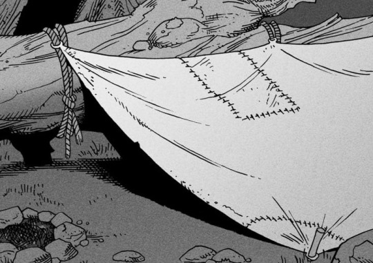
Inked shadows - these shadows are added during the inking stage and usually show areas where light would have almost no way of getting there, such as under this tent.
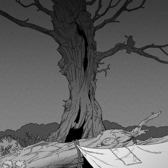
Gradient shadows - these shadows usually represent something getting further and further away from a light source or an area that would bounce light. This tree receives a tiny bit of light from a campfire on the ground and moonlight that bounces on the ground and up, fading as we get higher up in the tree. But mainly I add these gradients in ways that look cool and will help the overall composition.
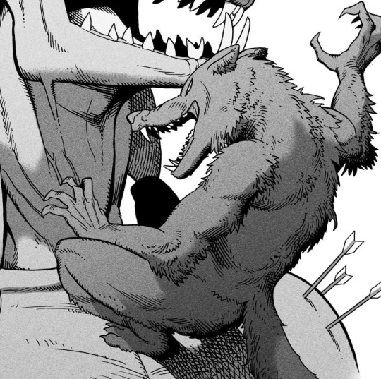
Hard shadows - these shadows appear when a strong light casts shadows and can be used on a shape or to cover something. Here's a werewolf with shadows on its back, which gives it a better sense of mass and is interesting visually!
You can also cover an area in shadow like this, where the tree casts a shadow down on the archer and the cliff.
Texture
I like to add a layer of noise as a finishing touch. In Clip Studio you can create a noise layer with Filter->Render->Perlin noise... Find a balance of scale and amplitude that works for the image, then change the layer mode to "Vivid Light" and lower the opacity of the layer to around 30%. I like how this looks, it's not super visible usually but helps make the drawing feel less artificial and digital.

I hope that helps! Here are some nice links too:
Muddy Colors
Android Arts
Gurney Journey - Read his books!
Happy drawing!
351 notes
·
View notes
Text
Some infos from the live interview with the creators of Belfort and Lupin
The chara design for Belfort and Lupin changed a lot and came from many different inspirations. Belfort was supposed to be more brown with a blue collar but it looked a bit too much like Lady from the Lady & the Tramp (which inspired his curly design) so they changed the color tone of his fur and collar. Lupin was supposed to be a dog raised by the servants at first but once again, it was too close to Tramp from Disney xD (B&L being Lady & the Tramp literally lol) so they went for a wolf and for his design there are many inspiration like the movie Balto or even Beastars with Legoshi.
Disney inspired them a lot actually. They took the idea of the relationship with B&L with The Aristocats mostly, but also Kuzco for the humor & of course, Lady and the Tramp for some designs. Also Tanne & Ponne, the sisters, are also inspired by Cinderella's stepsisters ;) there is even a scene in one episode (La Glacière) that was inspired by The Lion King (wildebeests scene)
The idea to put some historical anecdotes at the end of the episode comes from the fact that the writer of the show grew up with show like The Mysterious Cities of Gold that did something similar. And they wanted a show that could be both cute, fun and educational :)
Belfort and Lupin are both teenagers in the show <3
It took them 7 years to create B&L! they wanted the animation to be perfect and put so many details, from the settings (by sketching every little things in Versailles when they visited) to the characters movements. They said at first they hesitated B&L to even touch ("penetrate" if I use the real technical term for 3d animation lol that was funny xD) bcs that would be super complicated but at the end, one of the animator insisted bcs they wanted their relationship to be more sincere and lovely <3
About their relationship, they said there won't be romance between Belfort and Lupin (for the moment) and that was totally open to interpretation ;))) (one of the designer ships them anyway lol). And IF something would happen between them, the creator said he would prefer it to take time and develop slowly bcs they are still young (so we can totally imagine them being bf in the future hehehehe)
Belfort's name is the name of a city in France. Also in his full name, Augustin Proper de Belfort, Prosper is the name of his late father. They said we'll discover Tanne & Ponne full names in the future too ;D
They are optimistic for a season 2 and have already many ideas for it :D they said it would take place around the same time than s1. They would like to show much more sides of Versailles bcs there are so many things they haven't put in the show yet.
They talked about a special episode about Belfort and Lupin first meeting ; it happened in the forest (*v*)
In the upcoming episode "The Big Bad Wolf", there is a wolf named Remus that will appear (and you might have already seen his design here). He will be an adult wolf and it's gonna be the most emotional episode of the season apparently ;v;
They also want to make us cry more with a future episode where Belfort's dad would be mentioned :'o
There is a fox character that they wish to introduce in the future.
The comics of B&L takes place a bit before of the show apparently bcs the sisters don't know about Lupin yet. Few tomes are already in preparation and for those who don't read french, you can buy it with a files that will contain the english translation :D <33
The OST might be available someday on music platform (I WISH)
There will be an event in Versailles in June 7th, 8th and 9th with the broadcast of an episode and some Q&A with the creators and autograph too :))
(s'il y a des français, allez on forme un groupe de fan et on se donne rdv là bas XD)
#belfort and lupin#versailles unleashed#(tbh it was very clear for them that B&L are gay but they couldn't put it in the show xDDD they even have a gay wall in their studio lol)#HERE YOU GO that was so much fun!!!!#night night now#personal#my posts
57 notes
·
View notes
Text

THE ONE WHERE . . . I INTRODUCE Y'ALL TO LEO!
SOOOO…i have mentioned leo in like, 90 different posts atp and never actually made a "leo intro" (mainly bc i have weird feelings ab sharing him heavily to the rest of the world lol) but! i figured now would be the best time to get into explaining him to y'all.

LEO , commonly given the last name SCOTT (depends on the dr!) is actually originally the main character's love interest in a hockey romance book i've been in the process of writing. after getting #sickandtired of annoying ass book men i gave up and began drafting one of my own. the main character is literally me (i mean, for christ's sake her name is sloane mackintosh,) and eventually, i began thinking of him in other "au"s (i used to do this a lot on wattpad - i mean DRs but the term AU is usually more digestible to ppl that may not be aware of reality shifting. Anyways.) and began kind of placing him in everything. a list of the drs he is my love interest in is follows;
BETTER CR : (fc silasj2004*) the hockey romance book pretty much as a dr. small changes occur but basically he's the exact same as leo in the book lol
PARENT DR : (fc jack schlossberg. yes. i am one of those girlies. i am not ashamed! at least he has morals + a backbone y'all this could be much worse) the "backstory" is my better cr dr. i'm now a mother of 3 (amelia or mimi, aged 5, giselle or gigi, aged 4 and i'm pregnant with vincenzo, our final kid,) and it follows our life after what would be the events of the book. i sort-of made it also as like a WAG dr in a sense bc leo is a professional hockey player! (but he retires 2 years before this point in time so idk where my thought process is w this lol)
FORMULA 1 DRIVER DR : (fc pato o'ward MY!!!! mclaren man ln4 U ARE NOTHINGGGGGGG) leonardo dempsey, son of actor patrick dempsey (my forever celebrity crush ugh he's so fine) and driver for aston martin aramco f1 team under #99. i essentially took l*nce str*ll's daddy's boy backstory and gave it to leo bc he is indeed a daddy's boy. the only dr leo and i are enemies to lovers bc i'm too obsessed w him otherwise LMFAO
MARVEL DR : (fc marcello hernandez (MY MAAANNNN)) leo scott, secretly the speedster superhero 'comet'. hired by my dad as essentially a bodyguard (leo's not intimidating AT ALL idek how the hell this is supposed to work LMFAO) as comet and knows me out of costume as his sister's roommate (mj is also in every dr ever and actually is here in this cr. i can never leave her out i love her DOWN) basically marichat vibes (god i miss marichat)
POP STAR DR : (fc marcello hernandez, again) leo sinatra, nepo baby great-grandson of frank sinatra (there's a whole, incredibly large bit of lore ab this LMFAO + he's also a great-grandson in my better cr dr too bc i need my man RICH!) and Saturday Night Live cast member. basically i go on snl and immediately fall in love. i've stolen the 'unlikely couple' weekend update sketch for us & he does domingo, which is my song lol we're funny for it idk
THE FCS, in color photos:


i'm missing like, 18 other drs that i can think of but some important info about him;
he's half oaxacan mexican. i've tried my damnedness to find a way to make it obvious but when i was 'designing' him (aka drawing him out) i used jack, silas (*NOTE: he is leo's typical fc if i don't have an designated one for him) and marcello as references to make him look the most like him as i can. the fcs are kind of loose for him but i need a way to like fully visualize him. so. yeah. his 'color palette' (weird way to put it but idk how else) makes him tanner than all three of them i fear. all of the fcs i use (other than jack schlossberg but like. idk his main celebrity lookalike in the better cr is him so i kind of had to) are latino, but i feel like it never ever properly translates when i talk about him bc his name is fucking leopold scott. like. huh.
he's also tall AS FUCK lol and built like a tank lowkey (think tom welling clark kent GOOD GOOGLY MOOGLY) but it's mainly bc he's a hockey player. in every vers he's like. 6'3. shortest he is is w marcello as his fc and even then he's 5'11. (note in pop star dr he gets a lot of comparisons to jacob elordi for some reason??? idk my fans are weird)
he's got big brown baby cow eyes. every. single. time. like that is this man's defining trait and you know what? i would not change that for the world lol
his position in hockey is a goalie! he uses the number #29 and plays for our college and later for the new jersey devils before being traded to the anaheim ducks. after he retires he becomes a firefighter!!!! (which is sooo hot btw)
#mack yaps#(about shifting)#mackleo#reality shifting#shiftblr#shifting diary#shifting motivation#shifting things#shifting antis dni#mack's better cr#mack's parent dr#mack's f1 dr#mack's pop star dr#writeblr#writers on tumblr#leo is of course the mmc of the book i'm writing so#writeblr it is LMFAO
77 notes
·
View notes
Text
Head cannons for Todd Anderson- SFW and NSFW

Starting off soft with SFW
Definitely MELTS when he catches you sneaking glances at him during class. Like if the teacher is drilling on about some boring homework assignment, and you happen to look at him, he will literally crumble (in a good way). It brightens his mood because here he was listening to the teacher babble on and on, and then all of a sudden, his stomach flocks with butterflies all because of you.
Loves writing you little love notes and sticking them in your locker between classes. Like he’ll write them in his classes when he’s bored and thinking about you, and then drop them off at your locker and wait for you behind a corner to see your reaction
ABSOLUTELY LOVES HAVING HIS HAIR PLAYED WITH in an innocent way but also sometimes…😏 giving it a little tug does something to him but that’s something that belongs down below. Anyway, it’s one of his favorite ways of spending time with you. He loves to lay in your lap and feel your fingers softly combing through his hair talking to him about your day. Sometimes, most of the time, he ends up falling asleep because he’s so relaxed and comfortable with you
He’s more out going around you than he is with the other boys because he knows you wouldn’t do anything to make him feel different
He gives you book and poem recommendations 😇 this man loves some Whitman
If he’s having trouble sleeping, he calls you up and asks you to sneak into his dorm because again, you just calm him down. He feels tired around you a lot because he’s relaxed around you.
Low-key hates scary movies, so if you guys are watching one, he’s always cuddled up to you, and clinging onto you during every jumps-care or slight change in music.
Will let you do his makeup if you ask really nicely
Likes being called pet names or names of affection like “baby” and “sweetheart” sometimes you let a “honey” slip by too once or twice
Like’s having his face held when you kiss him. Whether you’re kissing him on the head, lips, or cheek, he loves when you softly grab his face.
Has a secret sketching talent, and draws you when you guys hangout. If the conversation has died out, instead of awkwardly sitting there, he pulls out his sketchbook and draws you. Sometimes he adds color to these sketches and gives it to you. He absolutely melts when he walks into your dorm and sees that you have hung up his most recent sketch, or even framed it.
Definitely a cuddle bug. So please hold THE FUCK out that bitch😍. He low-key loves to be the little spoon and feels safe when you have him wrapped around your arms. In fact when you guys get up in the morning after spending the night he’ll protest “five more minutes…” He’s just that comfortable around you and feels safe in your embrace.
Reads to you. Yes, just yes
NSFW
I foreshadowed a bit in the SFW up there with the hair pulling…yeah…Need I explain more?
I guess I will ^ if you guys are heavily making out and you happen to run your hands through his hair, his mind immediately goes blank and anticipates the eventual hair tug from you. When he receives said hair tug, he becomes a mess. He’ll moan into the kiss and his legs will turn into putty so if you’re standing up, his balance will fly out of the window
Was very shy the first time you guys…you know…But once he realized that it was a safe environment with you and that you wanted it to be a memorable experience, he came out of his shell and it was magical
Very inexperienced and was only with one other person before you (Neil) (I’m kidding, or am I?😉) So he has done it, but not as good as it was with you. You kind of had to show him how to touch you and what felt good where, but he got the hang of it eventually because he’s a fast learner
Speaking of fast learning, he wanted to learn how to eat you out so he could reciprocate the pleasure you brought to him. He had never done it before, so when he was in between your legs he was so nervous that he was going to do something that hurt you instead of make you feel good. You reassured him that he was doing a good job, and to just not focus on it too much. So he took your advice and when he did…Oh Lord the things he did with his tongue. For someone who had never done that before, it was like he knew the ins and outs of you and his mouth perfectly fit on you. He kissed and sucked on your clit passionately and would look up at you occasionally for validation with those big blue puppy dog eyes of his and you would give it to him alright 😉 you ran your fingers through his hair and he moaned into your pussy as he ate you out and was simultaneously grinding his hips into the bed—he was really enjoying himself.😛
Loves when you’re on top and taking the lead
Still gets very flustered when you straddle his lap as if you guys haven’t done that a million times before, it’s adorable
I’m pleased to inform you that this angel WHIMPERS. Like I’m talking full on high pitched, almost pornographic whines. His breathing gets all heavy and he tries to bite his lip to stifle the noises but that fails every-time
Was kind of embarrassed the first time he let out a noise like that because he thought you would view him as less “manly” That was not the case however, and you wasted no time explaining to him that you found it extremely attractive and encouraged him to not be shy😏
Kissing him on his neck immediately turns him on
Has a sweet spot right about the crook of his neck and when you kiss on it he lets out the loudest whines ever
Loves getting AND giving hickeys
#todd anderson#todd anderson x reader#todd anderson x neil perry#todd anderson x reader smut#todd anderson smut
131 notes
·
View notes
Note
I dmand EVERY picture of CJ you had drew!! Pretty please
Considering I'm super disorganized about my art and don't post everything I draw (sometimes it stays just in my server or among friends, or I just don't show anyone because it's unfinished/I'm unsatisfied), I'll have to find a lot of stuff that I've forgotten about.
Actually, I can just show some stuff that I *haven't* posted! (Everything else I ever have should be here.) Some of this stuff is Krow before I added the white hair because I didn't have that idea until around April.

^ Appropriately titled "Krow Smug Bitch". Everyone has fun with the cowboy AUs so why can't I?

^ He got nervous about seeing Usagi/Yukito I suppose

^ This one is interesting. Originally it was supposed to be just Krow as a magical boy, but then it turned into a bit of a mythology AU. He's the son of Yatagarasu the Three-Legged Crow from Shinto myth. Wasn't quite sure about everything... this was probably the result of watching too much Kamichama Karin as a kid lol

^ For fans of Transformers - TFP Optimus Prime with good ol' canon CJ! I feel like they would get along. Something about that red-and-blue leader drew him in I guess.
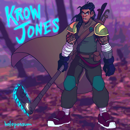
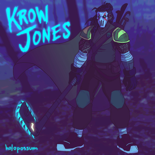
^ This was actually my first pass at an older version design of Krow. This was a complete piece too, but I was unsatisfied within a week or two. You can still see that I kept some things, notably the piercings, beard, and the idea of tattoos, as well as the Leo-inspired shoulder pads. The tattoo designs changed and so did the armor color, but it was an interesting first try at the older design.

^ A second attempt and older Krow, I was getting closer. (Still love the fashion on this though.)

^ The point I realized that I can't draw this man thin and have to start drawing him beefier and more filled out more consistently because it would be a crime against god or something. Was still finalizing his tattoos at this point and playing around with the idea of white hair. Considered the idea of the Hamato crest tattoo near his heart before nixing it because it's too cheesy and the Hamato tattoo is something a lot of people do for older/future character designs.

^ Ninpo weapon design for Older Krow! Yes he has a cyan scythe (really more of a kusarigama since it has a chain and weight at the end). Yes it's cool as fuck. No you can't touch it.
He's basically a reaper and it plays into his whole aesthetic as a crow, which symbolizes an omen of death. Crows are also often seen with scythe and scarecrow imagery because they're related to harvests.
I don't know why I never posted this, it *looks* finished... I think there was something off about the anatomy and I intended to fix it and then forgot and ugh. But anyway! There you go.

^ A height chart for younger Krow and Yukito that I never quite finished. But it's interesting to see them to the actual scale that I imagine them to be - Krow is 5'6", and Yukito's height is reversed since he's 6'5". Since both are around 19 when they meet, they're at their full adult heights here. Long live your short king!

^ Older Krow with lightning gloves. Which doesn't make sense actually because his gloves are electrical insulators to keep himself from getting zapped from one of his attacks. But who cares about that! It's cool!

^ Scythe sketch. Just trying to get a feel for the vibe of how he wields one. His cape/cloak plus the scythe probably gives opportunity for some really cool directional flow to occur.

^ Something I doodled just the other day. Old Krow but more cartoony and goofy. Love this silly guy!
I'm sure there's many more that I've missed, probably lots of half-finished sketches and doodles, but this is a lot of what I've found.
#this is a lot more than i thought it was!#snipersiniora#rottmnt#rise of the teenage mutant ninja turtles#rottmnt casey jr#rise casey jr#casey jones jr#casey jr#krow jones#holopossums#holopossum answers#long post forgib#super secret 2024 cj/krow art stash
67 notes
·
View notes
Text
-FAQ-
Hello! I've gained a whole bunch of followers lately and I've been getting a lot of questions about commissions, what my setup is, what brushes I use, etc, so I thought I'd make a post about it to answer everyone's questions at once !
Putting them under the cut <3
Commissions:
Commission prices are listed in my pinned post. You can send me a private message about your commission idea and we can get to talking :) It is helpful to have enough references handy (character, outfit, descriptions etc)
I am generally a fast drawer but I also have a job and a physical disability so there might be moments I can't work on your commission. But that is never longer than a few days at most.
Payment is upfront, the full amount and via paypal only. I know this might seem a bit scary but unfortunately there are a lot of people who end up not paying for commissions and I want to avoid that.
During the process I will send you frequent updates and will ask for input, to see if it is going in the direction you want. You can ask for changes during the sketching progress but once I've started on line-art and coloring, no big changes will happen. (You can for example ask for a different color for a shirt etc, but not for a different prop or pose or expression)
When it is completed, I will send the drawing to you via email. The drawing will remain mine and it is not to be sold or profited of by the person who commissioned me. If the commission is for something commercial/for selling, that needs to be discussed. I prefer to do drawings only for personal use!
For more questions, my dms/asks are open :)
How long have I been doing digital art:
I've been drawing digitally for about 5 years now i think? But before that I've been drawing and painting traditionally literally since the moment I could pick up a pencil.
Set-up:
It's just me and my ipad and apple pencil laying on my bed. I wouldn't even know where to begin for those whole multi-monitor/screen setups ;-; I draw only with Procreate
Brushes:
I tend to play with different brushes from time to time to get different textures, but generally i use the same few for most of my drawings/styles. My favorite one is the Peppermint Brush, for sketching. I use it in every drawing i make! I always sketch with it, and often do the line-art with it as well! And it makes for a nice textured brush for rendering as well! (i used it for a lot of rendering of the armor in this drawing)
The (procreate) brushes i use a lot are
for medieval style: inking - Ink Bleed (for line-art) artistic - Quoll (for coloring)
for general style: calligraphy - Chalk (coloring/rendering) sketching - Peppermint (line-art/sketching)
for realism: calligraphy - Shale Brush (full rendering) Also using the shale brush for smudging and erasing when drawing realistic
for lineart: smooth pencil from this pack by Heygiudi
How/why do you choose a base color:
I tend to look at a few different things when deciding on a base color/color palette.
the overall color of the reference pic
the color i associate with who or what i am drawing
the feeling/vibe i want to give off with that drawing
color has a BIG impact on the vibe of a drawing, so it is something i keep in mind when im drawing.
Using a color as a base to start, helps a lot with my drawing process. It helps me pick out other colors so they match better. It helps me get light/dark values right. And the chalk brush i use, has gaps between the strokes, so the base color will always come through a little. Having the same color come through in the entire drawing, helps pull all the colors together if that makes sense? I always start with a solid base color when i am painting traditionally as well!
Advice:
PRACTICE!!! just keep drawing and practice. I know this is such generic advice but truly practice is The Way. Learn from other artists but don't compare yourself to them. Everyone's artistic journey is different and there's no "good" or "bad". And most importantly make sure that you have fun when you're making stuff :3
I also learn a lot by studying art I admire and love. Figuring out what it is I like about it. (for example, the line thickness or the shapes or texture etc), and try to incorporate that in my own style in a way that is not directly copying or stealing.
#my art#FAQ#frequently asked questions#art process#art tips#drawing process#procreate#brushes#commission info
784 notes
·
View notes
Text
“Oh? *I* get to be in charge of our lovely Princes? Hehe. I graciously accept the challenge.”

[SR] Yuusha Tala -> GROOOOVY!! Glimmering Soirée (fan event by @starry-night-rose)

Groooovy!!: Hehe. If you want to dance with me, you’re gonna have to keep up with me first.
Set Home: Yeah, yeah… I know I’m just a glorified attendant and I don’t really have any say over the Princes... Look, just let me have this.
Home Idle 1: Helping Deuce act like a Prince has been really hilarious. But credit where credit is due, seeing him try his best is really charming.
Home Idle 2: Wow. Somehow Azul became less insufferable after being trained as a Prince. ….Wait. Nevermind. He’s still the same.
Home Idle 3: Kalim and Hornton seem to be a natural at this. I guess I should have expected that. It’s really nice to see them shine.
Home Idle - Login: Has anyone seen Grim? I swear I saw him lurking around here somewhere…
Home Idle - Groovy: I could go for "Belle of the Ball" if I really wanted to, especially since I'm the one who helped take care of everything after all. But alas, why would you vote for the magicless prefect..? Wait, unless.….
Home Tap 1: Where did I put that ghost camera? I was just holding it just a while ago… Huh? It’s around my neck? Well, that’s embarrassing. Oh stop laughing at me, will ya?
Home Tap 2: The others say I’m like a different person when I go into "manager" mode. …And they say it either like a compliment or an insult so I’m getting mixed messages.
Home Tap 3: Ugh. This cape is cool and all but people keep getting caught by it. So annoying.
Home Tap 4: Would I compete in being the Belle of the Ball if I wasn't taking care of the Princes? Depends. Would you vote for me? ~ ♡ …What do you mean you’ll give me a "pity" vote.
Home Tap 5: No, I’m not staring "longingly" at that band! …But hypothetically, do you think they’d let me play an instrument with them?
Home Tap - Groovy: Oh, wow. Crazy that they totally just left this violin here. Hmmm…..
notes:
i had fun with the voice lines aaah but it might have some changes when i’m done with the groovy (and i’ll properly put her in an actual card template)
also slight lore drop from one of the voice lines: yuusha has experience hosting formal parties pre-twst. basically she just locks in (a bit too heavily) when she has hosting duties.
(some of the voice lines also foreshadow the groovy 👀)
anyways i was just messing around a lot with the outfit design and the colors hgsdfjds
i tried my best making her purple color scheme agree with the limited color palette and i think it worked out??? idk idk--
also the cape was supposed to have patterns similar to the ceremonial robes so as to label her as someone from nrc.
i wanted to include a LOT more ruffles too but i had no patience for lining all of that 🤧
(bonus sketches/concepts below)


at first i based off her suit on hans frozen but then (because of pinterest giving me ideas) i realized i wanted a more fun outfit and so here i am-
(also help me i meant to have the voice lines to be just talking to anyone but it just hit me that it sounds like she’s talking to jamil 💀 girl they just can’t leave me alone they live in my head 24/7 rent-free)
#(edit: updated with the groovy!!!)#this was so fun!!!#thank you for hosting this event#i love designing outfits for my ocs#and this is my first time making a twst fan card with voice lines#ALSO I HAVE A REALLY FUN GROOVY FOR HER IM SO EXCITED TO FINISH IT#[—✦-#-✧ my art#twst art#twst#twisted wonderland#twst fan event#glimmering soirée#twst yuu#twst yuusona#(💜) yuusha tala#-✦—]#yknow i was just going to be a spectator for this event#but seeing how fun everyone else's posts were my hand just started moving on its own#and i found this materialized before me
147 notes
·
View notes