#brustalist
Explore tagged Tumblr posts
Text
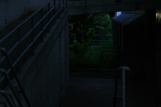
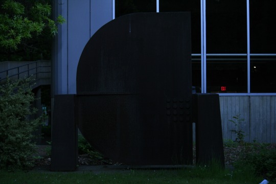
Brutalist Sears
Ink on paper 21x9cm
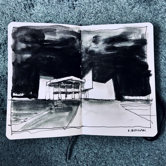
View On WordPress
#acquerello#architecture#art#brustalist#daniele barillari#danielebarillari#disegno#drawing#illustration#ink sketch#LiveSketching#sketch#urbansketcher#urbansketchers#watercolors
4 notes
·
View notes
Note
Do you think Adora would go for full on skulls or would have more a Hordak pure rusty metal look?
Or maybe a bit more a refined metal
She would obviously pick the most tacky solution she can think of :-) None of the brustalist straight-forwardness of the Fright Zone under Hordak. She'll have skulls on skulls and those skulls will also have skulls on them. All the skulls breathes fire.
7 notes
·
View notes
Note
Did you see that Paul went to see The Brustalist? Apparently this person brought up Joe while talking to him but he said everyone was brilliant
https://x.com/justmiaslife/status/1855717768613802370?s=46&t=9xBQwqpqPM-JYVifwXzewg
idk dude this has been sitting here for over a day and I don’t want to be mean to you, anon, but both your message and the tweets kinda lowkey weird me out a bit? Not spectacularly because I’ve been hyper online since I was like 11 so I’ve seen a lot right but in a very lowkey way, I find this weird. To answer your question, no I didn’t see that Paul went to see The Brutalist. Good for him, I suppose. That part is not that weird and on reflection I don’t think I’d have found your message weird if not for the contents of the tweets. Wish we’d had a pic of him there because that would’ve been fun. What I do find weird is asking him about his opinion on Joe in the movie lol and then the other X user asking follow up questions even when OP said Paul spoke about Adrien (makes sense since he’s the lead ykwim)? Like what was Paul meant to say lmao??? “Joe’s supporting turn as the very annoying son in this fuck long movie completely reshaped my life and my perception of our craft”? Or was he meant to say like “this movie was fantastic but my buddy Joe let the team down”? I don’t really understand.
again, I don’t know if I’m weirded out by YOU anon because like you haven’t said anything that weird but I’m kinda lowkey weirded out by the Twitter convo. I wish people wouldn’t be so damn weird all the motherfucking time. I find it a little weird to ask Paul what he thought of Joe’s performance in a movie where he is not the lead and I find it even weirder to ask follow up questions about what Paul may or may not have said about this.
0 notes
Photo
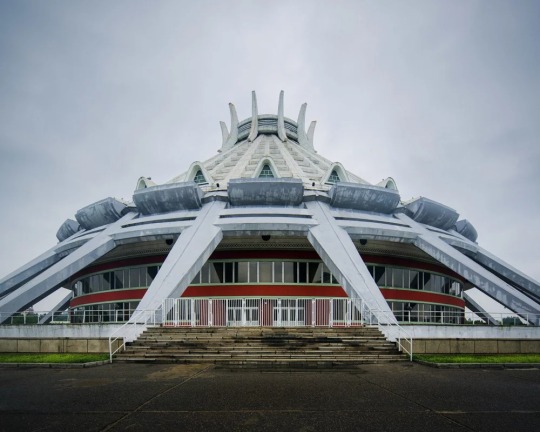
by Raphael Olivier — Posted by dolphindance https://bazaar.co/dolphindance/urban/posts/14641
#architecture#brutalism#brustalist#brutalist architecture#soviet union#north korea#pyongyang#korea#ice rink#concrete#Concrete Architecture#soviet#ussr#eastern bloc
52 notes
·
View notes
Text
Rick Owens’ home in Paris
#interior#interior design#avant garde#design#rick owens#brustalist#brutalism#contemporary artist#contmeporary art#contemporary design#michele lamy
693 notes
·
View notes
Photo
#35mm#barbican#barbican centre#indoor garden#interiors#architecture#burtalism#brustalist#london#plants
1 note
·
View note
Note
https://twitter.com/filmupdates/status/1416176064821440516?s=21
Sebastian: A break from work? I don’t know her.
14 notes
·
View notes
Photo
brustalist bus stop estonia 2018 #betontulpen #artgram #_di_ma #banalmag #architecture #documentingspace #banalography #BeautifulBuildings #beton #brutalism #brutgroup #flakphotoland #gayart #germanphotography #lekkerzine #lostplaces #lucecurated #streets_unseen #newtopographics #nofilter #photozine #ThroughTheLens #urban #urbanandstreet #awfulmagazine #urbanphotography #urbanshots #estonia #restu #busstop (hier: Restu, Valgamaa, Estonia) https://www.instagram.com/p/CMcOYzZH-04/?igshid=1haimn3evf687
#betontulpen#artgram#_di_ma#banalmag#architecture#documentingspace#banalography#beautifulbuildings#beton#brutalism#brutgroup#flakphotoland#gayart#germanphotography#lekkerzine#lostplaces#lucecurated#streets_unseen#newtopographics#nofilter#photozine#throughthelens#urban#urbanandstreet#awfulmagazine#urbanphotography#urbanshots#estonia#restu#busstop
92 notes
·
View notes
Photo
FS20, Arena, VeloWerk, Group 8
Our Arena should develop in a way in which it embodies and plays with the paradoxical elements of our collected design instruments.
Brutal, strong, volumetric, tough - filigran, light-weight, modest, gentle
Elements of roman architecture - local structures that are unroman, almost self-built
Plant diversity, rich and complex ecology that is inspired by local landscape - cyclocross that is chewing up the ground, damaging ecologies
Protecting landscape - using landscape
Roman Structure
In the upcoming weeks we want to design an Arena that is roman in how it performs and travels through the landscape. These roman ideas are embedded in formal and social elements of our design.
Formal roman aspects that we like to encounter are man made geometries, beauty in rhythm as well as the elements of the aquaduct that is formed out of a horizonal line that adapts below. Another interesting aspect, as Vituvius states it, is that „all Roman buildings must be executed in such a way as to take account of durability, utility and beauty“ - especially the themes of usage and beauty caught our interest. Moreover roman architecture in a sense is always epic, bold, topographic, framing and uncomprimisingly staging and structuring landscape.
Social elements consider the roman arena to be an interactive and public space for people to gather and watch sports, discuss and enjoy the surrounding coulisse.
Doppelgänger
We want to celebrate and communicate between the exisiting and the new structure - in keeping the same straightness, clarity and proportions of the concrete corridor. Moreover adding a lightweight, modest wooden structure to contradict this brustalist, massive existing shotting wall. Furthermore we take elements, such as the flying corridors, the gradation and the circulation towers and continue these concepts in the further landscape. Another step in maintaining the same spacial proportions, resulting out of the existing structure, is the use of a grid that is projected on our landscape.
Spacial Idea
Our bigger spacial idea is to create an interesting circulation and structure the landscape by land retention and the light-weight structure. We want to find a way to flip the orientation and movement that was before towards the empty field, upwards towards our Cyclocross route. This includes finding a specific and fascinating relation between spectator and the sport. The gradation of the existing, epic and bold structure of the shooting wall is translated and extended in the wider landscape, using the topography as basis. This strucural movement upwards the Uetliberg, side-by-side with the cultivated fir-trees and the Cyclocross route leads to characteristic framing of situations. Also taking advantage of modest, local structures that formulate ‚elements meeting the ground‘ which change and adapt to its surrounding.
Water
Refering to Vitruvius‘ ‚utility of architecture‘, our new structure has a secondary use integrated - with the particular gradations resulting from topography and by redirecting existing rivers and streams it can be used to water new vegetation. This can be fulfilled because of our graduating wooden structure that at this point has a strong similarity to ancient aquaducts. As well as existing and newly formed small lakes that collect and store water from rivers and rain, densification of soil is needed at particular spaces to avoid infiltration.
Balancing earth destruction
The question arises of how this landscape that is hosting Cyclocross (a sport that is destrucive and damaging ecologies) manages to survive constant demolition. The Cyclocross route at the Albis Arena is outlayed on exisiting paths that are mostly on gravel ground that can be reformed and exchanged. Other paths, especially those going through the cultivated fir tree nursery perform on already driven-on grassy pathways, that do not have immensive vegetation growing. Our structure is overgrown with climbing plants to balance out the extensive use of these paths.
0 notes
Text
Contextual Studies 19/02/19
Cyber
Cyeberspace- notional environment in which communication over computer networks occurs.
William Gibson was the first to use the word, and he described the term in a dystopian way. In his writing of Neuromancer, he describes it as “a consensual hallucination experienced daily by billions of legitimate operators”.
The way cyberspace looks is subjective and has been interpreted by many:
-The Matrix by The Wachowskis, with codes and numbers
-Ruslan Enikeev, with his interpretation of the Internet Map, using many dots and circles
Techno Utopianism in Silicon Valley
John Perry Barlow, in 1996, wrote a manifesto called the Declaration of Independence of Cyber Space. Overall, it asks/tells governments to stay out of the internet- “On behalf of the future, I ask you of the past to leave us alone”.
Art
• Brutalistwebsites.com, (brustalist being angular architecture of the 70s)
- Takes designs from the 90s, which seems to be becoming a trend, possibly due to the nostalgia associated with it, or as statement against neat, pre made web templates.
• Michael Manning- Mirrroring, a series of cyber animations
Cyber Culture and Cybr Topics
Social conditions brought about by wide use of computer networks for communication, entertainment and business.
A Cyborg- a fictional or hypothetical person/animal whose physical abilities are extended beyond normal human limitations.
Examples:
- Neil Harbisson, the first to be considered a cyborg by the government. He was an artist who was very colourblind, and drilled an antenna into his brain to be able to hear yellow and can take even phone calls.
- Humans, a programme on Channel 4 about cyborgs and humans living together.
Virtual Reality
Mostly used for entertainment, but can be used for surgeon training, or for the military
Augmented Reality
Technology that superimposes a computer generated image on a user’s view on the real world, such as Pokemon Go
- Keiichi Matsuda, Hyper Reality
- EA, The Sims
- Jesse Armstrong and Channel 4, Black Mirror, The Entire History of You (final scene)
Cyber Space and Dystopia
Dystopia- an imagined place in which everything is bad, typically a degraded environment
- Ridley Scott, Blade Runner
- Brett Leonard, The Lawnmower Man
Glitch
A sudden, usually temporary malfunction or fault of equipment
- Failed Memories, David Szauder (brains store images to retrieve, like files, but may be distorted along the way)
- Dismaland, Banksy (Little Mermaid)
- Black Mirror, Channel 4
- Uncanny Valley, Federico Heller (2015) - shows VR as a drug that needs rehabilitation
0 notes
Photo
Final words from 2018...
2018's Hat Fair was fundamentally one of change - with Sunday's events being based in North Walls recreation ground for the first time, it was always going to be a different experience than years before. The new, larger site allowed for a shift in schedule for the majority of major performances to take place on the festival's final day, rather than a heavier Friday night as it had been previously. On Friday, I was lucky enough to have a relatively leisurely beginning to my weekend of reporting, due to the aforementioned timetable shuffling. We attended the performance of the night's headliner, Block, the company’s brilliance signifying the excitement of the events to come. Their integrated use of huge foam bricks in the performance, coloured grey to evoke a brustalist aesthetic, both fitting and in contrast to the dancers - sometimes alien, sometimes beautiful. A video response was produced immediately after this performance by the Young Critics team, utterly in public; we were thrown headfirst into the skills which would be required of us in the days to come, of thinking on our feet, evaluating performances across multiple levels, and being willing to question forms we may have previously been unfamiliar with. This introduction boded well for a weekend of hard work and excellent fun. The following day’s events were based around the city, in which many of Winchester's already iconic sites and landmarks gained a bohemian edge, with artists and performers intertwined into the spaces. Among all attendees there was the hum of anticipation, as the next exciting venture was to be found round the corner - who knew which space would be transformed next? I adored my time spent on Saturday, as I was able to experience pleasures brought both by the Hat Fair and the wonderful local businesses already sported by the city. As I wandered, often without any particular aim, iced coffee in hand - truly living the life - I was able to constantly stumble into any kind of surprising environment. From the charm and magic of Able Mable to the incredible ability of Company Chameleon, in each nook and cranny was to be found a unique experience. The final day began early, as I wanted to have a poke around the reinvented festival field, and what a difference the changed setting made! North Walls is a much larger site than Oram’s Arbour, used prior, as well as being more out of the way; as a result the day was reminiscent of a music festival. Stalls were positioned on all sides, with two stages for dance and local musicians, allowing for a wide variety of acts in a fully immersive experience. Under the sun's vaguely oppressive heat, there was nothing I desired more on Sunday than a place to escape, to get some shade. North Walls’ only option for this lies along the shaded sides of river, which were fully packed by midday - in future hopefully some more allowances can exist to avoid the risk of sun damage. Overall however, the flatter ground allowed for large scale performances - including such spectacles as The Forgotten Crafts of Paris - alongside providing sufficient tumbling room for George Orange and his slackline moon. All in all, I had a wonderful weekend, both as a guest of the Hat Fair and as a young person with the opportunity to report on such an event, surrounded by excellent people. Thanks, all.
by Flora Pick
Image: Hat Fair, depicts George Orange
0 notes
Text
Primary Research (Harrow Civic Centre)
SUMMARY: The Harrow Civic Center: Visualizing this view of architecture gives me the impression of Brutal-ism architectural movement associated with the likes of modernism. Rough and brutal giving an intense, solid forms of architecture. Looking into facts of Brutal-ism. Brutal-ism architecture is a movement in architecture that flourished from the 1950s to the mid-1970s, descending from the modernist architectural movement of the early 20th century.
Architects such as the Swiss architect Le Corbusier who was associated with the movement. Brutal-ism gained considerable momentum in the United Kingdom during the mid-twentieth century, as economically depressed (and World War II-ravaged) communities sought inexpensive construction and design methods for low-cost housing, shopping centres, and government buildings. I believe Brustalist buildings were very popular over the years. Specifically buildings that were reliable and intact. The use of brick and concrete are undoubtedly the most reliable building materials.
Although the Brutalist movement was largely dead by the mid 1980s, having largely given way to Structural Expressionism and Deconstructionism, it has experienced an updating of sorts in recent years. Many of the rougher aspects of the style have been softened in newer buildings, with concrete facades often being sandblasted to create a stone-like surface. From these facts I believe Brutal-ism has developed in today's architecture. Buildings have become more delicate and decreased roughness.
CHARACTERISTICS:
Predominant exposed concrete - A consistent use of concrete in combination of bricked material
Massive in character - The building doesn't have to necessarily big in size but the whole characteristic of the it displays a massive character, could be the material or the function of the building.
Repeated modular elements - In the style of Brutalism I have noticed pattern formations from the use of concrete and bricks. How the elementation of the materials repeat themselves making it look less complicated.
INFLUENCES:
Modernism - The building has a modernism look to it. Non decorative and complex.
International style - The Harrow Civic Centre shows Rectilinear forms, Light Taut plane surfaces and open interior spaces, .
Constructivism - The building incorporated straight lines, cubes and rectangles; and merged elements of the modern age such as radio antennae, tension cables, concrete frames and steel girders.
0 notes
Photo
Brass Brustalist Ring Vintage Jewelry Size 9.5 Statement Ring Modernist Style
0 notes
Photo
🍂🌈🍃 (at Park Hill, Sheffield)
#brutalism#brustalist#architechture#archi#building#concrete#color#sheffield#summer#flowers#foral#instagram#instagood#instadaily
2 notes
·
View notes
Photo
follow : www.instagram.com/carolinedailyparis
#architecture#brustalist#brutalism#design#minimalist#minimalistic#modern#modern architecture#brutali
4 notes
·
View notes