#bespoke font
Explore tagged Tumblr posts
Visit Tumblr Blog
Explore Tumblr blogs with no restrictions, modern design and the best experience.
Last Seen Tumblr Blogs


Fun Fact
Hackers stole 65M passwords from Tumblr in 2013.
Text
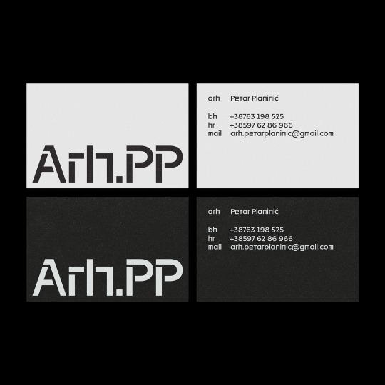
#graphic design#typography#editorial#typography inspiration#brutalist typeface#brutalism#typeface#bespoke font#custom fonts#identity design#branding#geometric#graphic art#design#visual identity#visual communication
4 notes
·
View notes
Text
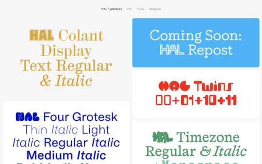
HAL Typefaces
#HAL Typefaces#independent#vendor#digital fonts#bespoke typographic solutions#platform#Studio Hanli#Berlin#shop#foundry#colors#typography#type#typeface#font#Edition International#2024#Week 08#website#web design#inspire#inspiration#happywebdesign
6 notes
·
View notes
Text
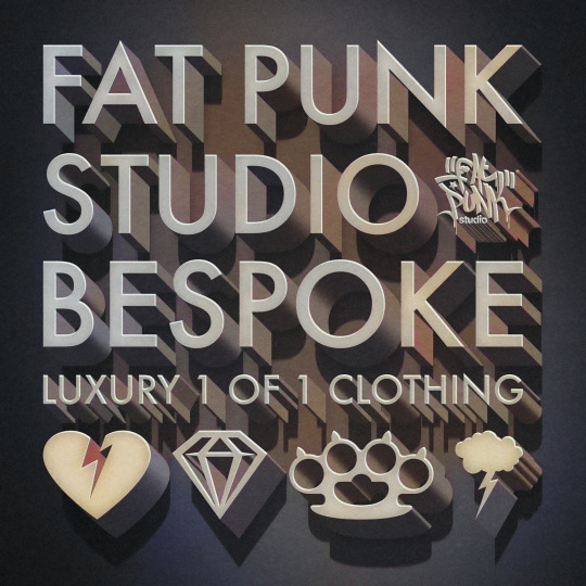
Fat Punk Studio Bespoke - Luxury 1 of 1 clothing made exclusively for you. How would you spec your own custom garment? DM to discuss your requirements.
#FatPunkStudioBespoke#FatPunkStudioClothing#Bespoke#BespokeClothing#Exclusive#FPSBespoke#Text#Font#art#design#vintage#beautiful#luxury
0 notes
Text
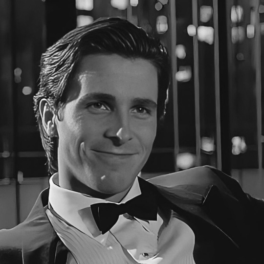
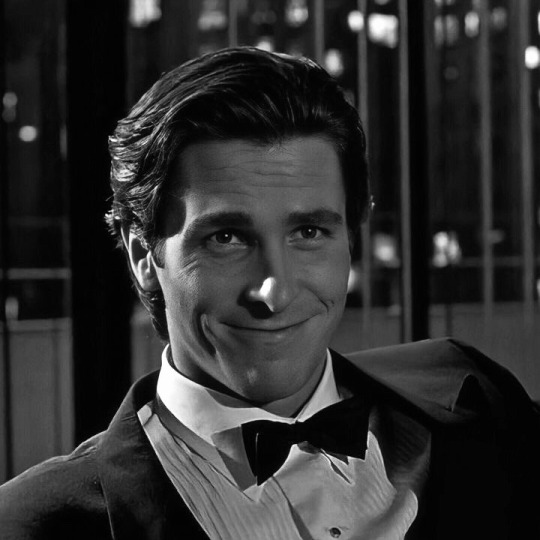
𝜗ϱ fiancé! + husband! 𝓟𝐀𝐓𝐑𝐈𝐂𝐊 𝓑𝐀𝐓𝐄𝐌𝐀𝐍 hc

tags — fem!reader﹒sfw + nsfw headcanons﹒violent fantasies﹒infidelity
a/n: i would like to thank anon for requesting this and credit to dear bow anon for helping out !!

one night, as you both rode in a cab on the way to dinner, patrick takes off his walkman and suddenly asked, “have you ever thought about getting married?” his tone was casual, but his body language betrayed his tension—the tightening of his grip on his leather gloves, the unnecessary way he adjusted his tie. when you turned to him, surprised, he waved it off almost immediately. for the rest of the ride, he ignored you, listening to his walkman.
full fic : the perfect girl
weeks later, the topic re-emerged. it was a quiet morning after sex—patrick lay beside you in his perfectly starched egyptian sheets, sunlight streaming in through the windows. “would you ever consider marrying me?” he asked abruptly. the question startled you—again. you blinked at him, unsure if you’d heard correctly. “marry you?” patrick shifted slightly, propping himself up on an elbow. his face was unreadable, though his jaw tightened slightly. “yes. i’d assume it’s a reasonable consideration,” he said, as though the idea had been entirely logical. your heart fluttered despite the lack of romance in his delivery. “yes, patrick,” you said after a moment, a small smile tugging at your lips. “i would.”
full fic : patrick’s proposal
patrick wasted no time. the next day, he presented you with a ring: an 18k rose gold cartier panthère ring, encrusted with diamond accents.
smutty drabble: jerking him off
pre-nuptial agreements (obviously)
meticulously plans every detail of your engagement and future wedding. the venue must be the right blend of modern elegance and exclusivity, the guest list is capped at “only the most important people,” and the floral arrangements must feature imported orchids flown in from singapore. no compromises.
scrutinized every decision down to the smallest detail: the font on the invitations (garamond, elegant but understated), the centerpiece arrangements (white roses only, no filler flowers), and champagne (dom pérignon, chilled to exactly 45 degrees).
patrick donned a pair of ray-ban wayfarers as the two of you arrived at the reception venue (the pierre hotel), stepping out of the rolls-royce.
your wedding dress was custom-designed at dior’s paris atelier. it was a minimalist masterpiece: a structured bodice with a square neckline, flowing into a clean, floor-length skirt with a cathedral-length train. the fabric was italian silk-mikado with a soft sheen, the epitome of elegance. no lace, no unnecessary frills—patrick deemed them “garish.” the veil was long and simple, edged with the thinnest line of swarovski crystals for just a hint of sparkle.
patrick wore a bespoke zegna tuxedo, black with peak lapels, tailored to absolute perfection. the cuffs of his shirt bore subtle platinum cufflinks engraved with your initials and the wedding date. he spent an obscene amount of time choosing the exact shade of black for the tie.
patrick stole quick glances at you, a flicker of irritation shadowing his eyes at the slight asymmetry of your smile. he stewed in his own perfectionist hell, a seething internal monologue growing increasingly deranged.
the bridal portraits was complete nightmare. after making the photographer redo them six damn times—he still found fault. he had scrutinised the angle of your neck, the curve of your jaw, the flicker of light in your eyes. in his eyes, the photos should’ve been magazine-perfect. anything less was sacrilege!
his vows were an unsettling, almost surreal monologue. a strange, disjointed stream of poetic nihilism, peppered with bizarrely intellectual references. sprinkled in lines from fromm’s the art of loving, twisting them into cryptic confessions that left everyone unsure whether he was being sincere or just… pretentious patrick.
the reception unfolded in an impossibly sleek manhattan venue. a cavernous, glass-walled space filled with patrick’s circle of high-powered cronies, along with stick-thin models who seemed more at ease snorting cocaine in dark corners than nibbling on the overpriced amuse-bouches.
the waitstaff darted around the room, terrified to stumble into discussions about stock portfolios, yacht repairs, or debates over which luxury rehab center had the best cold-press juice cleanse. conversations were a mix of shallow ambition and transactional networking.
the dining experience was an exercise in culinary pretension. dry-aged wagyu steaks with precise marbling, delicate beluga caviar that was more a statement of wealth than taste, and desserts that were too decadent (and high in calories) to exist. everything was paired with wine that cost more than most people’s annual mortgage.
the cake was a towering six-tier masterpiece from sylvia weinstock, adorned with sugar flowers so intricate they looked real. each layer featured a different flavour, from vanilla-bean sponge to passionfruit mousse.
only dom pérignon vintage 1985 was served—patrick had insisted on it. the bottles were presented on silver trays by impeccably dressed waitstaff, with glasses refilled before guests could even think about asking. patrick spent weeks debating between this and krug clos du mesnil but ultimately decided the former “sent the right message.”
during the ceremony, patrick’s bored mind slipped into violent fantasies. he imagined choking out the priest with his necktie and chopping up his groomsmen like sashimi.
despite being invited out of obligation, evelyn didn’t show. patrick hadn’t mentioned her absence until much later, casually remarking, “it was better this way.” he didn’t dwell on her, but jane—his secretary and a guest at the wedding—looked quietly heartbroken for some reason.
dancing was beneath patrick. instead, he lingered by the bar, a martini glass filled with a pristine, artful concoction he hadn’t ordered but took anyway because it fit perfectly in his hand. he’d observed the guests, mentally doing fit checks.
after the night wound down, patrick would lie naked in your hotel suite, staring at the ceiling with an unsettling stillness. his jaw clenched as his thoughts spiraled. not about the wedding itself—that was a calculated performance he’d mastered. no, he was questioning the tie. the damn zegna tie. why hadn’t he gone with the brioni?

insists you accompany him to every social gathering, but not because he wants your company. you’re his accessory, his proof of a successful relationship. he spends the evening flaunting you on his arm, introducing you to people who matter to him (read: people whose opinions validate him), and correcting your behavior if he deems it less than perfect.
his morning routine is sacred, and by extension, you’re expected to have one too. patrick buys you a shelf’s worth of high-end skincare products and insists you use them exactly as prescribed.
takes immense interest in your wardrobe. if something looks even remotely outdated or “cheap,” he’ll whisk you through fifth avenue, steering you toward hermès or dior
has a habit of buying you extravagant gifts after every argument—designer bags, clothes and jewelry. “i thought this might cheer you up,” he says, like he didn’t just shatter your nerves an hour earlier.
morning sex is first thing when you both wake up, right before his meticulously scheduled workout—his body at its peak energy. once finished, he’d kiss your forehead and disappear into the bathroom for his grooming routine.
insists on watching the patty winters show and sit you both in front of the television. you often have no choice but to endure his running commentary.
patrick has a love-hate relationship with grocery shopping. he claims it’s beneath him, but when he goes, he micromanages the process to an extreme degree—reading labels, debating brands, and spending 20 minutes in the imported cheese aisle.
your wedding photos are framed in the living room, carefully arranged in a symmetrical layout. patrick often stares at them as he works out.
his idea of romance sometimes verged on the grotesque. one evening, he decided the two of you should watch the texas chainsaw massacre together. he ends up fucking you into the couch as he enjoys the music.
not the type to be overly vulnerable, but in the privacy of your bedroom, he’d occasionally let down his guard. pillow talk with patrick is a mix of unnervingly sharp observations and random musings. he’ll ramble about the fisher account, dissect music lyrics in great detail, or comment on global events with an eerie detachment.
occasionally, he’d break the stream of words with a sudden, “you’re listening, aren’t you?”
patrick hates surprises—unless they’re from him. when your coworkers once threw you a small birthday party, he was visibly irritated the entire evening. “it was tacky,” he said flatly on the drive home. “you deserve better.”
he got you reservations at dorsia, a perfectly chosen gift (think chanel jewelry or a bvlgari clutch), and a bouquet of flowers with handwritten note that’s short, formal, and oddly impersonal: “to another year of excellence—patrick.”
patrick rarely laughs, but when he does, it’s usually at something dark or absurd. once, you tripped over a stack of magazines he left by the couch and groaned in pain. his response? a sharp, startled laugh, followed by an unconvincing, “…are you okay?”
he adores the opera—not so much for the art but for the prestige it carries. he’ll plan elaborate evenings at the metropolitan opera house, ensuring both of you were impeccably dressed. he wore a brioni tuxedo, while he’d insist on you wearing a custom-made gown from carolina herrera or oscar de la renta.
despite his outward sophistication, his attention drifted from the stage to you. hand resting lightly on your thigh, fingers tracing small circles through the fabric of your dress.
he’s absolutely neurotic about cleanliness. he’ll never leave a glass on the counter without a coaster and can’t stand an unmade bed.
hates clutter and will occasionally “edit” your belongings—quietly throwing out things he deems unnecessary, like old magazines or sentimental knickknacks, without consulting you.
micromanages household tasks. he critiques the way you load the dishwasher, fold laundry, or even stack the fridge. “this is inefficient,” he’ll say, rearranging items while you stand there, biting your tongue.
patrick has an affinity for the ritual of lighting cigars. he’ll let you hold the match for him occasionally, but only if you did it exactly right.
would only agree to a pet under duress, and even then, it would have to be something sleek and purebred. when you suggest something more practical, like a rescue, he’s visibly horrified.
when you finally get the pet, patrick is immediately jealous of the attention you give it. if the cat / dog sits on your lap during movie night, he’ll stare at it with naked dislike. “i don’t understand why you let it do that,”
patrick has an odd relationship with your pet. he’ll complain about it incessantly—“it sheds everywhere,” “it’s always underfoot”—but despite his constant bitching, you’ve caught him talking to the pet on more than one occasion. “she likes you more than me,” he mumbles bitterly. the pet tilts its head, oblivious, which irritates him further. after taking another sip of scotch, he nudges it away with his foot—not enough to hurt it in your presence.
but the true ugliness of patrick’s jealousy comes out when you’re not looking. he’ll straight up kick the poor thing or lock it out from your bedroom.
doesn’t officially cheat, but he indulges in frequent encounters with sex workers—usually in secluded, high-end hotels. these encounters, hidden from you, are his way of dealing with his violent fantasies.
afterwards, he comes back to you, his demeanor completely unaffected. he doesn’t apologize, doesn’t act like anything has changed—because, in his mind, it hasn’t. you’re still his. you always will be.
when he’s bored, he’ll ask you to try on outfits—sometimes just a simple dress, but mostly it’s something risqué. he watches you from the other side of the room with that detached gaze, silently critiquing your appearance. “it’s not quite right,” he’ll say, before giving you another outfit to try on like you’re his personal doll.
full fic : leather & lace
while patrick doesn’t outright admit his dependence on you, it’s clear in the small moments. if you’re gone for too long, he’ll call, his tone petulant as he demands your whereabouts, as though your absence disrupts his routine.
at age 27, patrick doesn’t yet feel the need to rush into parenthood, but there are times, especially while having sex, that he considers the possibility. it’s an idea that briefly excites him, but he quickly dismisses it with a wry smile, preferring the idea of you and him maintaining an image of “perfection” without the messiness of raising a child.
though you’ve never spoken about the future in concrete terms, patrick assumes you’ll always be by his side, forever wrapped in his controlling, perfectionist bubble. he doesn’t see any reason why you’d want to leave; after all, why would you when you have everything?
fear-is-truth 2024 — all rights reserved. do not modify, repost, translate, or plagiarise my content.
#patrick bateman x reader#patrick bateman#patrick bateman smut#patrick bateman fanfic#patrick bateman imagine#patrick bateman x female reader#patrick bateman x y/n#patrick bateman x you#american psycho#slasher smut#slasher x reader#slashers x reader#slasher headcanons#slasher fanfic#christian bale#christian bale x reader#slasher fic#slasher fanfiction
380 notes
·
View notes
Text
did u know the affinity suite has a six month free trial, no card needed? stumbled* into it and have been slowly teaching myself how to vector in designer
(*this is not hashtag sponsored, i legit did stumble into it and have been having fun, a+ marketing affinity)
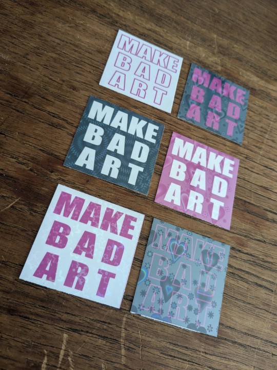
these bad boys are STICKERS and involved a lot of trial and error
> MAKE BAD ART stickers measure apx 2"x2" and are home printed, laminated with holo film, and hand cut
the og black with white text was perhaps not ideal to start with, i definitely chewed through a lot of ink troubleshooting, but the end result makes me very happy. they're a lil janky but full of love, and truly fit the goal of making bad art
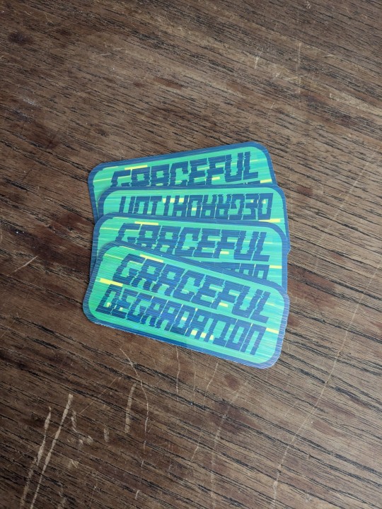
> GRACEFUL DEGRADATION stickers measure 3"x2" and are a love letter (love sticker?) to several of my favorite people, because i have a type and that is type includes chronically ill techno wizards
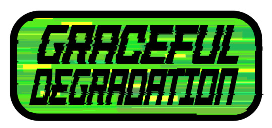
@craftsbyrom helped me a ton with some explanation on how to create the glitch effects i desired via a bespoke text based tutorial (why do those not exist anymore), which i then layered with this streaky holo film following the direction of the glitches. the end result is super cool!!
font was made by the typography artist yutaONE (insta: @/yuta_ptv_jp )
you can find these guys listed on my ko-fi shop for a couple bucks each, along with a bunch of other fun goodies
#cybercore#punk art#queer artist#graceful degradation#handmade stickers#diy#mochi rambles#mochi crafts#mochi makes stickers#mochi makes graphics#graphic design
43 notes
·
View notes
Text
why am i like this
why am i the type of person who'll sit down to finally answer a very sweet ask about My Guys, and instead of doing that, or anything that's of any interest to anyone else, spend an hour just picking through fonts to see what could be fitting for each of their handwritings.
i'm still wearing my streetclothes, and i've bespoke fonts chosen for 11 of my characters now
......... at least now i could write fake notes and stuff in their name if i wanted, that's something
#squirrel speaks#some are appropriately pompous#some are far less so#it's difficult to find a font that shows that a character only learned to read and write like. a year ago#the only ones who don't have fonts in my mind are tanner coris and mara#literally just because i've not played them enough in their respective games yet#whoo i'm down the deep end aren't i#recently found a google docs template that's styled like a wiki article; am i ranged enough to try and make little profiles for everyone
19 notes
·
View notes
Note
wait im confused abt your retro game music post. maybe i just dont understand what a sound font is
soundfont is a bespoke file forma- hang on i'm too lazy let me just get wikipedia up

"SoundFont is a brand name that collectively refers to a file format and associated technology that uses sample-based synthesis to play MIDI files. It was first used on the Sound Blaster AWE32 sound card for its General MIDI support."
^ while pretty much every computer and game console from the 70s - mid 90s made use of sequenced music, not all sequenced music is midi! midi is (remembers i'm lazy) go read the wikipedia page for midi and notice how the NES, SNES, Gameboy, and Sega Megadrive, and all those other things don't use it (atleast not natively i'm sure somewhere at some point midi was used in the composition of SOME pieces but fgdjghdfghf anyway hopefully you can see the difference between taking some samples of NES sounds and slapping those onto any old midi file, and actually writing music for the hardware)
5 notes
·
View notes
Text
did you know that tumblr has its own bespoke typeface?
it's a variant of ABC Favorit by Dinamo! it's been around since 2017, and it's got some really unique features. i like the rounded corners a lot. very interesting also how www becomes basically a sharp wiggly line.
another cool thing about this font is that it has a lining variant with a toggleable "connected mode", which does this:
i don't recall ever seeing this around, but it's pretty unique!
#font#typeface#typography#type#yeah i realized not a lot of posts have identifiable fonts#or if they do they're like. serious posts that are not appropriate for a gimmick blog#so im just gonna talk about fonts. and identify em on demand.
2 notes
·
View notes
Text
The HORROR DIE leggings are a great example of a confusing trend in consumer product, where art that speaks for itself has a random dictionary word added to it like some sort of flash card. As if put there by a non-english speaker, or someone who desperately wants to flex their new commercial font license.
Ir looks ridiculous, and yet people still seem to buy these things. This is how I’ve come to believe that non-designers cannot be trusted with the right to self-determination. Print-on-demand was a mistake. Clothes should be made by bespoke specialists or in the thousands-count by committee. If a design is too complex to be knit or screenprinted, it should be wholly disqualified from the textile industry, not used to subject us to more fucking polyester
5 notes
·
View notes
Text
Looking at given refrences
https://informationdesign.org/
Looking at the reference list for the unit to make sure that my work is following current trends and so that I know what is happening around the design world, this will enable my work to stay relevant and current and fit into the environment.
2 notes
·
View notes
Note
I'm not really gonna ask anything, just complain.
I'm tired of seeing puppet Amity and emperor Luz everywhere, what's even so special about it? What's the appeal???
People see 2 seconds scenes without context and make it that episode's entire content 🤦
I don't know if ep 3 came out already but I'm not looking forward anyways.
…Angst. Angst and new designs which are probably the two most powerful motivators for The Owl House fandom. Why do you think S2A felt like it damn near cut the fandom down to its size?
This actually has to do with kind of fandom culture in general. The most visible part of a fandom is its artists. Their work is quick to consume, easily posted and reposted (with credit you'd hope but… sigh) and the easiest to take inspiration directly from the show for. Every week there'd be at least one screencap redraw that the fandom would do whenever a new episode came out. Honestly, the finale's big Lumity screencap redraw is really awkward looking to me out of context. It's not hard to see why these are so popular though. The reference is directly in front of you, it's a moment people are already talking about and you yourself probably liked the posing too so why not redraw it? It's a hell of a lot easier to do than come up with a bespoke story concept based off of each episode in a series.
That isn't to call art easy or the like, just that fanart is the backbone to a fandom for a reason, at least in my opinion. Twitter has a character count limit. Reading Fanfiction on Instagram blows. Tumblr is the closest to a place where longer form videos and stories can be posted and they still take MUCH longer to consume and share and without as much guaranteed return on effort spent. There's a reason the internet as a whole LOVES art from a commercial and consumer standpoint, even if they also keep trying to screw over artists because yaaaaay capitalism.
But screencap redraws aren't going to be everything. The more potential in the story, the more people will be able to come up with evocative concepts and stories and even make comics about the show. This was a BIG part of the fandom's peak between S1 and 2. Everyone had their own take on how Lumity would get together. Everyone had their own idea for how Amity might confront her parents. Amity in general was just a font of inspiration and the concepts with Luz weren't played out or felt contradictory to the more cynical character we got in S2 so angst with her about her mom, her world, etc. like that was still something everyone was tapping into, especially since it felt like the portal being destroyed was such a big deal.
I made a large Twitter thread the other day btw about how just shit the Portal Door is from a narrative perspective, first as a nitpick in S1 and then just a genuine problem in S2, because of it being gone, but that's a different blog.
But post S2A… What did you have? Camila's promise was never going to end satisfactorily, to the point where it goes from a moment of Luz being a good daughter to an almost inhuman monster towards her friends because it is handled so poorly. Amity is pretty much resolved outside of being happy to be Luz's girlfriend because she's already stood up to her parents, integrated into the rest of the cast and even already addressed the only piece of angst the show ever allows for her with her relationship and that's being an obsessive enough girlfriend. Sorry, I mean a good enough girlfriend. sigh Gus has had an episode but was overshadowed, Willow has had like a half dozen lines this half a season, King has been pretty much absent since his episode, Raeda was still mostly an Eda episode with literally every element of that episode just to shove Momma Eda down your throat…
It's not surprising that post S2A, the fandom has felt in general much quieter. Minus A: Huntlow and B: whenever they get a new design they can turn into Luz/Lumity angst. Everyone remember the teaser for the Collector's design that was done during a livestream and how that consumed the fandom for a little while because of possessed Luz ideas?
The puppet Amity and Belos Luz hype was effectively that. It brought even the casual artists back because they had a new, easily evocative design available to them that also had very obvious potential for angst. How many "I'M NOT LIKE HIM" pictures came out regardless of how weak any parallel between Luz and Belos is? Luz crying over a temporarily dead Amity is saddening, even if she's been little more than a puppet for the writers for a while now.
It's just how fandoms work. It's not even necessarily a bad thing. Dana has been VERY good at keeping the fandom alive during things like hiatuses. S1's hiatus is when the Betas were most popular because they dropped at a time when people were starting to wane from the show and now they had an entirely different angle to work from for anything Lumity they wanted to do alongside just good designs to draw. Most Lumity and Huntlow artists redo any piece that Dana does for the two ships. It's very effective for keeping a social media presence for your show honestly.
I won't even act like I'm above it. While I commissioned reference sheets for Rich Witch to make it easier to commission more artists for these characters, that wasn't the only reason. Rich Witch had a Reddit page (that I should clean up honestly) and its pinned thread includes the reference sheets and physical descriptions for the characters who don't have reference sheets. This is because I recognize that that makes fanart easier and that fanart is a lot easier to share than text blurbs. It is one of the ways to try and cultivate a following online nowadays or to help your fandom grow, at least in my opinion.
Can it be frustrating? Absolutely. I mean, Huntlow fanart has probably done way more damage to my interest in Hunter than anything else because it always emphasizes Hunter as nothing but a failure. Hell, it also emphasizes Willow's strength commonly and very little else about her character. Lumity has bored me for a long time in art because 90% of it is just cute fluff which isn't bad but it's not compelling. And I mocked both Belos Luz and Puppet Amity, despite the designs for them being good and the art being good, as shallow because narratively it means very little.
And the larger that disconnect becomes, the more frustrating a trend in the fandom is going to be. Plenty of people hate the Betas because they hate the edginess or the fact that a lot of people used them to start creating spicier material. There's not much anyone can do about that though. While a creator can try to promote a kinder fandom, fandoms are inherently too emotional and too large to really control outside of helping the show grow or find a new audience. It's just a part of that culture.
And frankly, I'm going to be bothered by the toxicity and inhumanity (guess what fandom will dox you for liking a ship between a bi girl and a straight guy?) of fandoms long before their art trends.
17 notes
·
View notes
Text

#graphic design#visual communication#design inspiration#bespoke font#logo#logotype#typography#type design#techno design#brutalist design#brutalism#aesthetic#identity
0 notes
Text
Clue Perfumery
#Clue Perfumery#perfume#Bespoke Fragrances#independent#Chicago#shop#type#typeface#font#ABC Diatype#Signifier#2023#Week 47#website#web deisgn#inspire#inspiration#happywebdesign
4 notes
·
View notes
Text
Remixable Review: Navigating Internet Marketing with AI-Driven Insights
In the fast-paced world of internet marketing, staying updated with the latest strategies is key. Remixable emerges as a revolutionary tool, offering comprehensive insights into internet marketing realms such as product creation, website development, traffic generation, and monetization. With the power of AI, Remixable simplifies and streamlines marketing strategies, making it an invaluable asset for both beginners and seasoned marketers.
Unlocking Marketing Potential with Remixable
Remixable is not just a tool; it's a complete guide for internet marketers. Whether you're starting out or looking to enhance your existing strategies, Remixable provides expert guidance and bespoke information to meet your specific needs. This platform empowers you to make informed decisions, crafting effective digital marketing strategies.
Embracing Remixable for Digital Marketing Success
Leveraging AI, Remixable is your ultimate source for adapting to the dynamic digital marketing landscape. Utilizing this cutting-edge platform lays a solid foundation for your business, boosting your chances of success in today's competitive online market. Remixable is not just a tool; it's your gateway to unlocking opportunities in internet marketing.
Website Building and Design: A Key Aspect of Internet Marketing
A successful website is a blend of user-friendly design and aesthetic appeal. It should offer a seamless user experience (UX) while being visually attractive. This balance ensures that your site is both accessible and engaging for visitors.
Responsive Design and UX Principles in Web Development
Responsive web design is crucial in today's mobile-dominated world. A website that adapts to various devices and screen sizes provides a consistent experience for all users. Additionally, applying UX principles like intuitive navigation, structured content presentation, and clear labeling enhances usability.
Tips for Enhancing User Experience on Your Website
Utilize headers and subheaders to organize content.
Implement a clear menu and site structure.
Choose readable typography and font sizes.
Ensure fast loading times to prevent user frustration.
Optimizing eCommerce Websites
For eCommerce sites, the focus should be on optimizing the purchasing journey:
Use high-quality product images with detailed descriptions.
Streamline the checkout process.
Offer multiple payment options and display trust signals like SSL certificates and customer testimonials.
Conclusion
By incorporating these design principles, you're on your way to establishing a strong online presence. Remixable AI stands as a resourceful guide in exploring internet marketing aspects and monetization strategies. With this tool, you're equipped to create a functional, appealing, and user-friendly website tailored to your audience's needs.
This article provides a fresh, SEO-friendly perspective on Remixable, emphasizing its significance in internet marketing and website development.
Click for more details
3 notes
·
View notes
Text
App Showcase: Navigator
The Asspull IIIx Navigator is built into the system BIOS and provides disk management features.
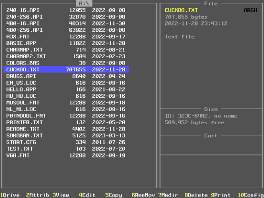
(Seen above: the main Navigator screen in the middle of a redesign. To the left is a list of files, which is supposed to be several columns of only names. To the right is information about the currently selected file and the disk it's on, and blank panels for information on any cartridge that may be inserted and the system itself.)
All actions except for entering a directory or running an application may be executed via the function key bar along the bottom, though several aren't available just yet.
Change which drive to show.
Change the selected file's attributes (the black letters in the top right corner).
View the file — the Enter key also works so I might remove this to make room for another feature.
Edit the file — only plain text files can be edited though.
Copy the selected file to another path.
Rename or move the selected file.
Make a new directory.
Delete the selected file.
Print the selected file. This only works on plain text files (though there are some escape codes) because of the A3X's companion printer's limitations.
Change the system configuration
Holding the Alt key, this changes:
Copy the diskette.
Format it.
Change its volume label.
?
?
?
?
?
Change the system time.
See detailed system information.
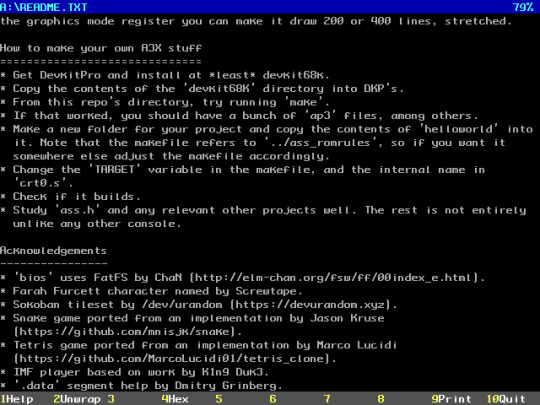

(Seen above: the text file viewer in plain and hex modes.)
API files are AssPull Images, a bespoke format. The Navigator can view them, with full support for all the format's features, because this is a BIOS function.
FNT files are... exactly that. Fonts. There is no real viewer per se, but trying to do so will load that font into VRAM, replacing the default until a restart.
LOC files are Locale information. Again, there's no real viewer, but like fonts you can just press Enter to activate them. This changes the names of months and days, currency, time and date formats, and keyboard mapping.

(Seen above: the work-in-progress editor based on kilo. A custom font, mOsOul, has been loaded beforehand.)
START.CFG specifically lets you preload a font and/or locale on boot, before the Navigator even gets a turn.
There's also a screensaver. It's Starfield, from Windows.
2 notes
·
View notes
Text
you too can make this logo if you have a minute and basically any program. Illustrator, Word, Slides, Canva, Paint, all super doable if you're familiar enough with the software to be able to make a square, change the color and have the font Futura Bold on your computer (if not you can download it in another minute easily from google search) and can kern it in on top of the square. Here's a gif of me making it in 53 seconds from start to finish:

Why did they do this?
Because they're launching a debit card. They wanted a new look for their brand because they're "ushering a new customer experience" (according to the verge). Which is fine, a company's rebrands should have a reason; they shouldn't update just to update. Paypal felt this was a significant enough change for them to want to change their identity with it. And maybe it will be; they're moving into the physical wallets alongside our digital wallets.
Is this a good logo?
I don't think that being my being able to recreate it in 1 minute makes it a bad logo. I don't think that it being simple or flat makes it a bad logo. But. I do think it's a bad logo.
It is not interesting to look at, being just a fairly common font on a blue background (apparently it is a font based off of futura, according to the designers, but it looks pretty damn the same to me, like just horizontal scale it to 90 and kern it in to -50 and there you go).
It also strips the double P logo from the identity, which Paypal has built up as a well known icon since that logo's launch in 2014, ten years ago. The double P logo was clever, as it was two P's for the name as well as being symbolically representational of Paypal's function: two people (the two P's) sending money (the overlap of the letters) to each other. The wordmark also had motion to it with the letters sheered to the left, showing the idea of Sending the money.
This new logo was designed by Pentagram, a hugely popular and successful design firm responsible for countless logos and logo redesigns for huge companies (citi bank, DC comics, to name a few). Their work is usually good, but this smacks of laziness and justification to me.
Like, lets be honest, that is futura, that is not a “new bespoke brand typeface, PayPal Pro.” And if it is, they should have focused more on making the letters used in the logo be more easily differentiated from its parent font. And I've got no issues with wordmarks as standalones - not all of them need symbols with them! But the wordmark should still be interesting to look at! Hell, look at venmo:

Venmo is a great example of a competitor having everything the paypal rebrand was going for but successfully. It's a simple flat wordmark, but that is a custom type treatment, not a boxed font, and it has motion and interest.
This brings up a good point about application. Venmo uses the V from their wordmark as their app symbol; what will the new Paypal logo use for theirs? Their new logo has no symbol and is a horizontal layout, which is not suited to being crammed into a square. What do you want to bet they'll keep using the old overlapped P's? This is another reason why the rebrand is crap: If you're going to do it, do it right. Clear everything out, and make sure your new logo fits into as many uses as possible, ESPECIALLY the one that most people use, i.e., THEIR APP.
So I do think that some designer at Pentagram crapped this out in a few minutes, probably tired after coming up with 12 other logos that were more interesting, retconned some reasoning behind it, and pitched it and it got in (for every logo you see there are tens of better and more interesting logos that the client put into the trash).
This happens because the people who run companies aren't designers and have been swept away in the current of companies updating their logos to flat and simple logos (I can go into that somewhere else, thats a whole other rant but I'll TLDR it and say that its not always bad and its done for a reason) and the unfortunate need to be constantly on the cutting edge of trends, and not necessarily because designers are bad at their jobs. However I won't discount that, as I think the Pentagram team should have stopped this logo from going far enough in the design process to even get pitched. Never pitch something you don't like to the client! Because they'll always pick that one. Like I pity the fool who had to try to develop this into a full identity after it got picked (here's the full project, it's motion design focused, which is cool, but it's nothing we haven't all seen before).
TLDR
I'm a graphic designer and I agree that this logo is bad because it lacks visual interest, strips the brand of any real identity, and feels poorly developed. (though I don't think the "stripping down" of logos going on for the past 10 years is necessarily bad)

#info post#maybe i'll have to do a post about logo stripping sometime#i have a lot of thoughts about that#how people percieve that vs how companies use it and such
35K notes
·
View notes