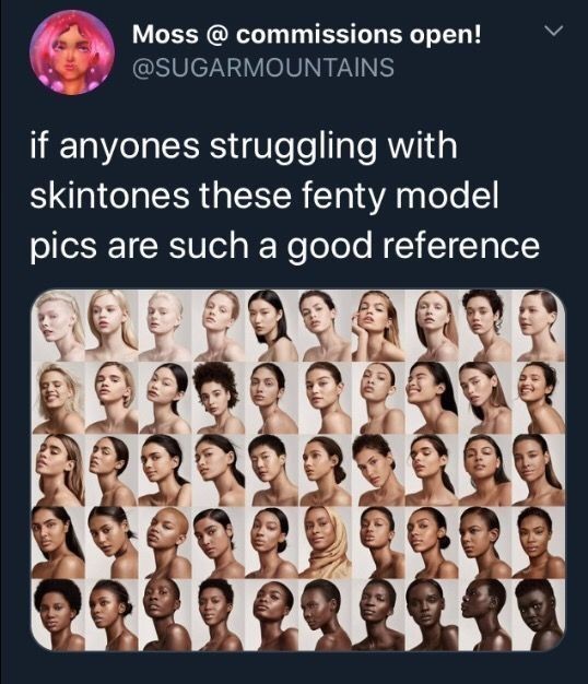
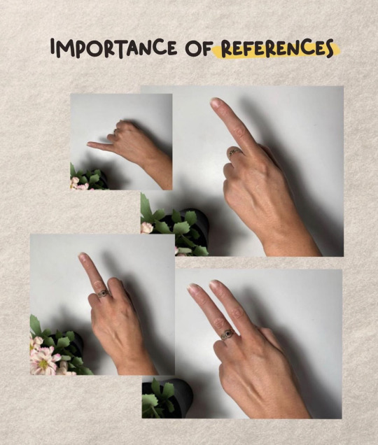
#art tutorials and refs
Explore tagged Tumblr posts
Visit Tumblr Blog
Explore Tumblr blogs with no restrictions, modern design and the best experience.
Last Seen Tumblr Blogs


Fun Fact
Tumblr has 16.74 million mobile monthly users in the US.
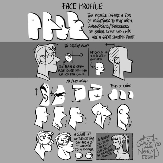
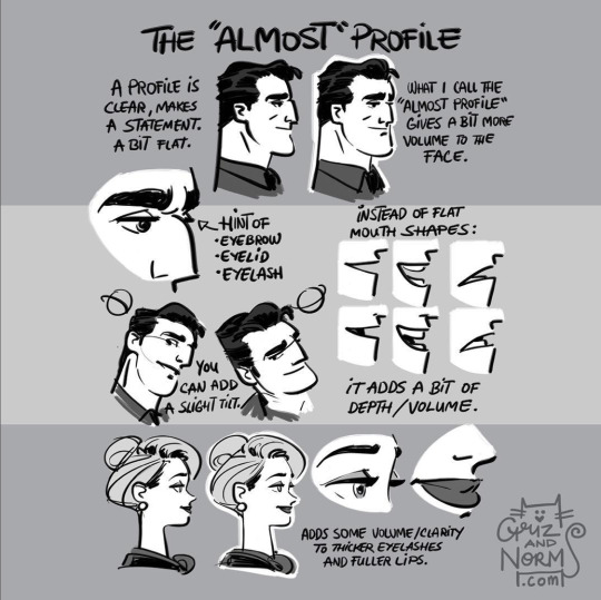
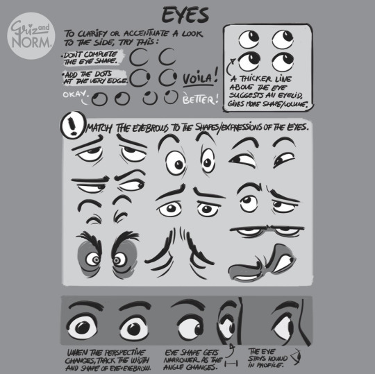
Photo
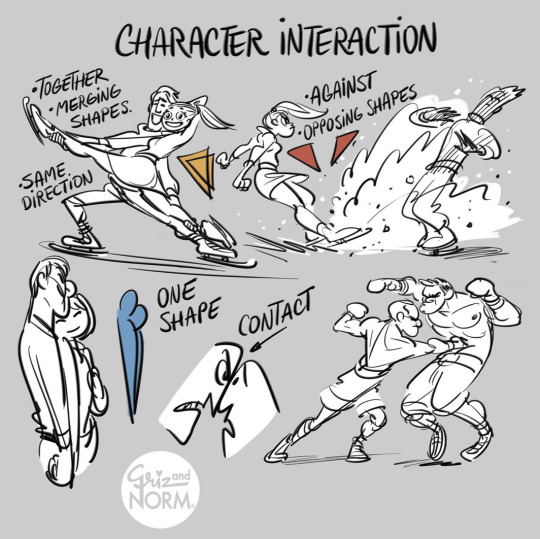
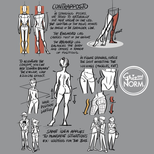
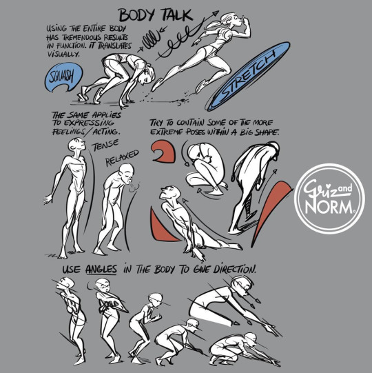
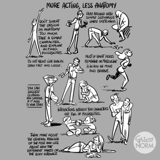
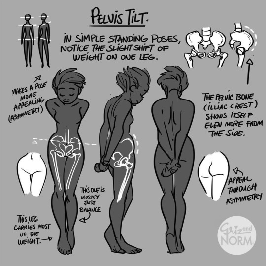
More art tutorials by Disney artists Griz and Norm Lemay
#disney#art tutorial#drawing tips#art reference#art ref#Griselda Sastrawinata#normand lemay#art#not concept art
48K notes
·
View notes
Text
Highly suggest using it.^^
Follow me for more 🌿
#art blog#artistsupport#art help#beginner artist#artists on tumblr#art tutorial#artist spotlight#art tips#art tumblr#art ref
13K notes
·
View notes
Text


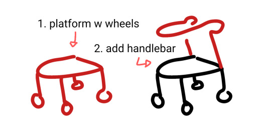
wheelchair, cane + forearm crutches, walker 90% chance if you're hesitant to draw mobility aids you're overthinking it. start somewhere. obviously these are not detailed references.
wheelchairs and walkers should be proportioned like chairs. in most cases canes are held on the opposite side of the painful leg because you want to put weight on the cane instead of the leg (dr house lied to you) but depending on the reason for the cane this can change!
[ image id: a title image that reads "learn how to draw mobility aids very fast" followed by three simplified drawings of different mobility aids broken down into two steps each. the changes made in each step are colored red.
the second image shows a wheelchair, with the steps "1. seat with footrest", showing a simple chair shape, and "2. wheels", which adds two large wheels to the back and two small wheels to the front.
the third image shows both a cane and forearm crutches, with the steps "1. stick", showing a single line of color, and "2. add handle", which shows a hand grip and a forearm rest on two different sticks. and additional label below this step reads "handheld stick height is where the hand rests at the hip" and "forearm stick height is the forearm".
the fourth image shows a walker, with the steps "1. platform with wheels", showing a backless chair shape with a wheel on each leg, and "2. add handlebar", which shows a handle raised above the seat. end id ]
✨ edited to remove italics for screen readers + also pointing out that I missed the handle on the forearm crutches! always use real reference photos when you can, this is just a starting point to help you understand the basics if you're not familiar :3
#are they perfect renditions? no. but first attempts at drawing anything rarely are#and tbf id rather people start drawing them and draw them badly than never draw them at all#art ref#tutorials#mobility aids#wheelchairs#canes#forearm crutches#walkers#sorry if there are typos blame the blindness#patch me through to palaven command
7K notes
·
View notes
Text

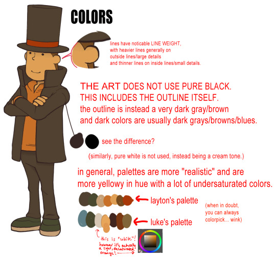
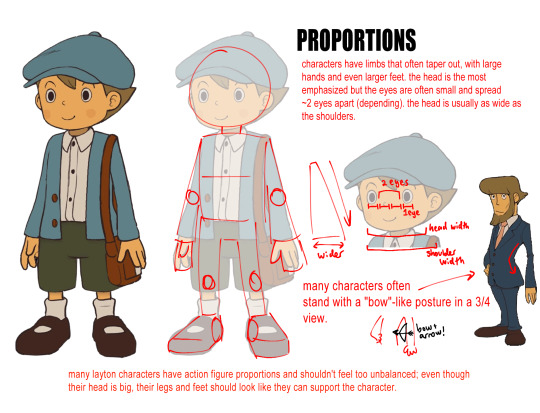

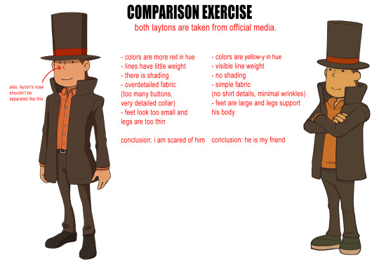


now that i finally finished my own fanart, here it is for the 0 people who requested it! mostly just a conglomeration of my own observations while attempting the style. hope this helps people!
#my posts//#professor layton#hershel layton#layton#luke triton#i havent played this game btw HAHAHAHA#its on my to play list tho!!! i do have it!#tutorial#art tutorial#art ref
558 notes
·
View notes
Note
I saw the ghost bride hey arnold fanart timelapse and how were you able to know that the "blueish" colors felt right? (its right when you put the base flat colors then added like a "blue filter" to the colors, around 1:42). I color picked the colors and its crazy, helgas "skincolor" is actually a blueish gray but beside all the other colors it looks like her skincolor.
I've seen it in many cases when they put a character in a different backgrounds so they gotta match the characters colors to not feel out of place, but I have no idea how to do that.
(the timelapse in question)


honestly i just eyeballed it, it doesn't have to be the right color at first because you can always adjust as you go along. note that this grayish blue layer i put on top of the base colors ended up looking warmer once i added the rim lighting, which was a more saturated blue.
as i added more warm elements to the background (aka purple and magenta) that initial blue shading layer had to be adjusted to match. you may notice the shadows on helga ended up being more greenish than blue. that's because it's the complementary color to magenta, meaning they're on opposite ends of the color wheel. between those two sits blue-teal, which i used for the lighting. i think those are three of four colors making up a tetradic palette? the remaining one would be orange, which i didn't use.
that's the walkthrough for that specific piece but let's talk a bit more about how to pick colors for shading, lighting and backgrounds:


i didn't touch on values because that's a bit trickier, it depends on not just the color but also the material you're coloring (a soft wool sweater isn't gonna have the same contrasting values between lights and shadows as, say, a shiny leather jacket.)
i hope this made sense? these aren't hard rules, obviously you can go crazy with colors in art if you so choose. sometimes you have to bend the rules to get the desired effect.
380 notes
·
View notes
Note
Can we have a tut on how u draw Lego’s?? 🙏


Indeed you can!! I mightve gotten a little carried away here but I hope its helpful HEHE
#ninjago#lego ninjago#lego#tutorial#drawing tutorial#art tutorial#art tips#fanart#art advice#ninjago fanart#lego fanart#ninjago oc#ninjago garmadon#garmadon#lloyd garmadon#ask box#art#drawing#digital art#art ref#art reference
186 notes
·
View notes
Note
Hi!! Do you have any advice on drawing ears and how they are positioned on the face? I noticed that the way you draw ears is quite varied compared to other artists, even with different types of pointy ears like on your OCs or on Falin! I really love looking at your artwork and it was a detail that caught my attention!

Really quickly roughed this out for you but i have to say i actually consider ears to be a serious weakpoint of mine so this isnt really a reference so much as things i keep in mind — i basically have to adjust them every time i draw anything to get a feel for them! Ears are a part of a character’s design so i adjust pointiness and shape to match the character’s vibe.
I feel like the biggest pet peeve i have is that people forget perspective is a thing! Ears are aligned to the brow ridge and where the nose connects to the upper lip, yes, but a character facing any direction other than profile’s ears will recede in perspective and appear to align more with like, the cheekbone or the eye, depending.
Last note is when i say “suggest don’t tell” that’s really advice for anything — sometimes suggesting a structure is more important than getting it exactly right. It’s also jarring for a viewer to see one hyper detailed area of focus when the rest of the image doesnt have that and it’s not on purpose — is the ear more detailed because the artist wants you to notice it, the character is listening hard, etc? Or is it detailed because the artist was unconfident about which details to include and unintentionally gave a tell as to a weak area of their work? I feel like i can always tell when an artist used an Abnormal Amount of Reference for a spot of a drawing because they lacked confidence, correctly went to get reference, but then failed to pare down the detail to match the image. Ears can be a tell for me in my work anyway. And people facing away from the camera.
Hopefully this helps but i really dont know how to draw ears well i feel really unconfident about them lmfao.
Anyway thanks for the message!! This is very unstructured but hopefully its some decent insight into how i think when drawing ykwim
266 notes
·
View notes
Note
How did you go about redesigning the clothes in you remaster?
Ooh great question! I'll go into more detail below, but the gist is that I broke down each character into their vibes and general aesthetic and tried fitting it to my design biases.


I tend towards more grounded designs than the original JRPG-inspired armour and clothes, so I referenced a lot of medieval fashion for the setting. You'll usually see me covering bared skin in battle outfits or toning down extra details I struggle to draw

Then, using those references, I'd try to thumbnail basic shapes and colours to figure out which works best


(More specific character notes below)

For some characters like Iseul, I didn't feel much need to change his outfit so I mostly toned down the detail to suit my style. I shifted the colour scheme to something warmer and removed the fur and extra armour to serve his image as animal-loving and battle-avoidant. This serves as great contrast to his timeskip outfit where he then commits to being both a warrior and a prince, with more ornamentation and practical armour


I designed Helena and Alain as contrasts. They have very similar themes and designs, so I decided to smooth Alain down into the picture-perfect metal knight while Helena's wilder and asymmetric. I referenced more realistic armour for Alain but overall I wanted to keep his clothes similar.
For Helena, my design style is more practical and thematically I want to avoid Helena baring skin and vulnerability so I extended her corset into more of a chest armour and covered her other thigh. To add to her duality of magic and metal, I gave one arm armour and bared the other to show off magical scars.


August and Altea's designs are where I start to venture off into more vibes-based outfits. August is humble and traditional, a knight with proud loyalty to his Lord and family, so I gave him medieval colours to represent both on his tabard. The armour is still there, but it's less focus on metal and more on "cheaper" materials to serve as a contrast to his timeskip where he becomes a proper knight in shining armour. For that reason, I took away the cape and other unnecessary decoration.
Then Altea is flashy, wealthy, and bright. I kept the focus on light armour, with scalemail as the only obvious protection. I've mentioned before but I took inspiration from south east asian fashion (mostly cambodia and malaysia) as a grounded but ornate basis for her magical girl theme. Here the colour scheme and fabrics are what mostly connects it to the original

Similarly, Lennox is where vibes rule and the overal aesthetic changes quite a bit. He's often described with "choir boy" hair, so I wanted to combine choir robes with ornate priestly outfits to sell him as a vain cult-leader. I kept the symmetry, long coat, and lack of obvious armour, but I wanted him to look less modern and stick with less structured outfits.

One thing specific to the generals, is that I wanted to give them more of a variety to colour palettes to sell that while they're working together, they're not exactly happy about it. While they all have a focus of blue and silver to keep them cohesive, they each have a motif: Alain - silver, Helena - pale blue, Jinhai - brown, Lennox - dark blue, Magnus - turquoise
#love and legends#character design#costume design#whyyy did the image orientation all fuck up??#art#art ref#tutorial#ish#i love doing redesigns#or well converting designs to fit my biases :P
228 notes
·
View notes
Text
Drawing ruffles


-all from Pinterest
#art reference#art#reference#how to draw ruffles#drawing#how to draw#drawing tut#art tut#draw tut#drawing tutorial#art tutorial#art ref#drawing reference#drawing ref#drawing tips#art tips#draw tips
172 notes
·
View notes
Text


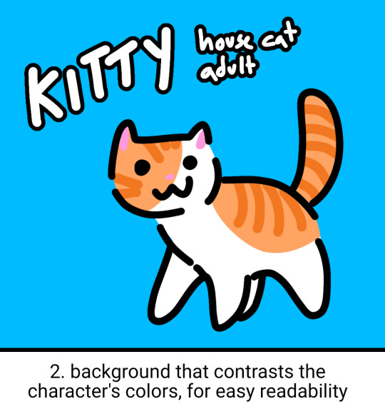


simple little ref sheet guide with some tips relevant for any amount of detail! With Art Fight season around the corner they're some good things to keep in mind :)
other miscellaneous tips
if your character has detailed markings that need to be accurate (like tattoos), place the reference for it on a rectangular transparent section so it can be selected easily for copy/paste!
if your reference is for art purposes, try to keep it relevant to art! lore can help, but a lot of backstory text can make it difficult to tell what's important when drawing them
important things to include as written details are heights, weights / body types, pointing out any intentionally unusual proportions, and other things that may be interpreted as an art style (or that your reference may not accurately convey)!
if you can't draw something the way you want others to draw it, you can just insert other photos / screencaps for others to reference!
always have a SFW version. not one with censor blocks over the bits, I mean one that doesn't have the bits out at all. put some underwear on that beast. it's common courtesy.
ADD ALT TEXT. write a description of your character! bullet point lists of succinct traits are clearest for artists to work with when commissioned. having both a written and visual reference makes it possible to verify things
2K notes
·
View notes
Note
Fav art tips?
These're some of my general art / drawing tips!
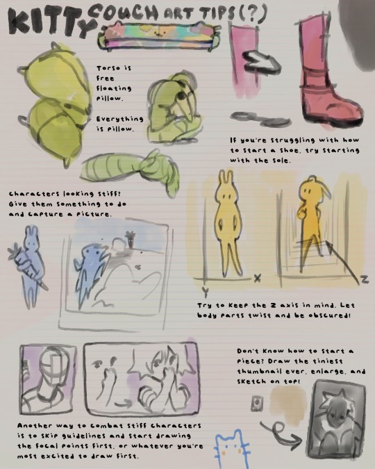
✎⁾⁾ ◞
Just incase text is hard to read:
1) torso is free-floating pillow. Everything is pillow. (soft, flexible anatomy)
2) if you're struggling with how to start a shoe, try outlining the sole first.
3) characters looking stiff? Give them something to do and take a snapshot mid-action.
4) try to keep z-axis in mind! Let body parts twist and be obscured.
5) another way to combat stiff characters is to skip the guidelines and start drawing the focal points first... or whatever you're most excited to draw first.
6) don't know how to start a piece? Draw the tiniest thumbnail ever, enlarge, and sketch on top!
#hi sorry this ask has definitely been collecting dust#art help#art tutorial#art ref#art tips#how to draw#how to art#tut#ref
183 notes
·
View notes
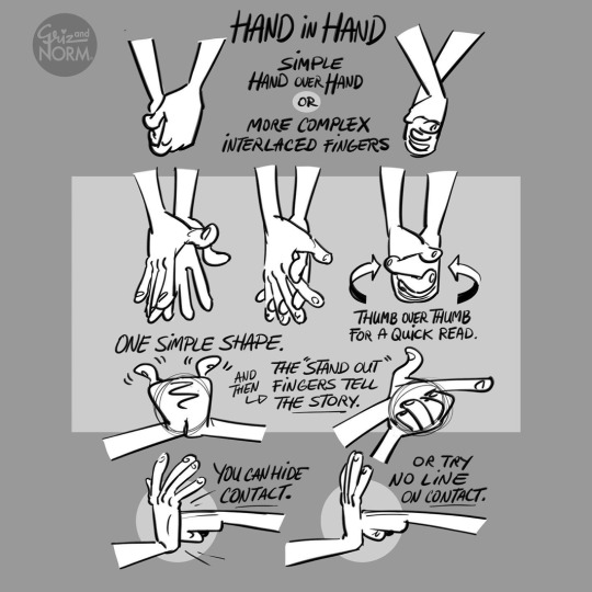
Photo
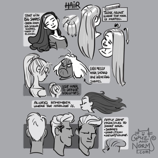

More drawing tips by Disney artists Griz and Norm Lemay
#art tutorial#drawing tips#Griselda Sastrawinata#normand lemay#not concept art#art ref#art reference#art references
6K notes
·
View notes
Text
How to draw: The position of the Fingers in Hand Poses Correctly (FINGERS WORK TOGETHER)
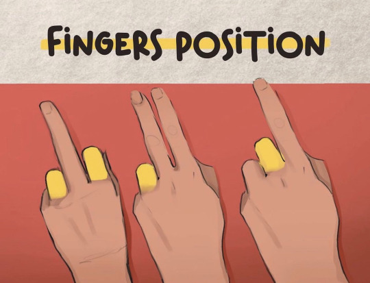
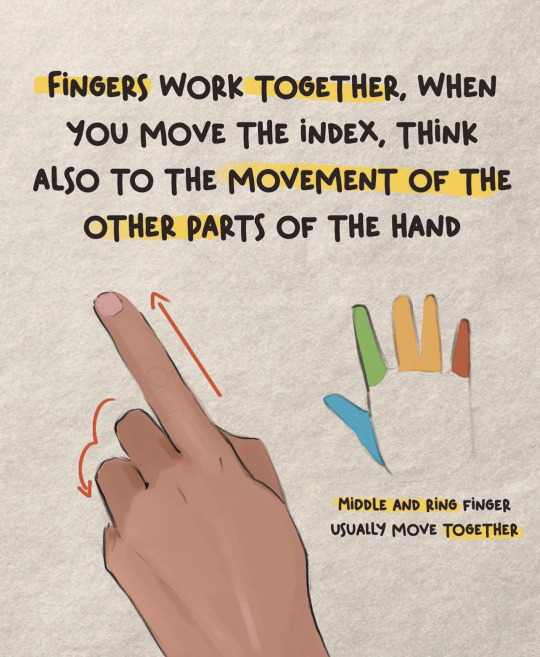
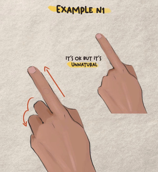
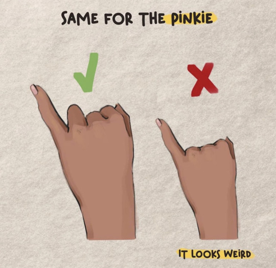
Credit: Valentart_
#random tip#random tips#hand#hands#finger#fingers#anatomy#human anatomy#pose#pose ref#pose reference#pose references#proportions#proportion#art tutorial#drawing tip#art tip#art tips#art tutorials#drawing#drawing tips#drawing tutorial#drawing tutorials#art#posing
2K notes
·
View notes
Note
do you plan to do a beard/mustache chewtorial some day?
Your wish is my command dear annon!


Transcript below cut
Positioning
> usually grows below cheek bone
> connects to the sideburns
> usually grows sparser on either side of the soul patch
> sometimes sparser on the cupid's bow
-> moustache doesn’t always connect with the beard
-> grows down the neck
Stubble
Don’t
• Place hairs chaotically on the face
• Draw each hair the same lenght
Do
• Place hairs in areas of thicker growth
- the stache
- the soul patch
- along the jawline
- on the chin
• Slighty alternate hair lenghts
• Bunch hairs together
Trimmed Beard
-> hair should follow the shape of the face
-> moustache is among the first to grow
-> as the beard grows, hair will be thicker at the bottom and sparser at the top
Tip: to turn stubble into a moustache just add some loose horizontal lines on the ends
Beard
-> Eases into the cheek, less is more
-> Think in shapes! Hair segments will overlap. Show this to add dimension.
-> Moustache starts hiding the upper lip
Different textures
The texture of a black person’s beard is pretty difficult to replicate with a sketching brush!
Try using one that has a coarse texture and is buildable, like a marker or a watercolour one.
145 notes
·
View notes
Text
Na'vi Stripes Tutorial!
Tagging @eywaschild891, in case you were still interested in this! (note: this tutorial is about the digital process of adding the stripes, not actually designing the patterns)
I'm using MediBang Paint Pro, but this technique should work in any program that supports layers.

So you've drawn your Na'vi and now you want to add some stripes! First we'll have to start with a base color. Underneath your lineart layer, add two new layers: one as the main base color layer (for coloring hair, eyes, clothes, etc), and on top of that, a separate layer for the skin. Putting the skin on a separate layer is important because that way you'll be able to do the stripes as a clipping mask.
Your layer box should look something like this (you can ignore the gray background and extra folder, they're not important for this tutorial):

Now we can start on the base stripe layer. Create a new layer and set it as a clipping mask on your skin layer. This makes it so that you can't "color outside the lines", so to speak, while drawing the stripes. Then take a hard-edged brush and start drawing the patterns you want. I like to use MediBang's "mapping pen", which has a subtly textured edge, but the regular default Pen tool will work perfectly fine as well.


If you'd like, you can stop here and call this done: solid stripes are perfectly acceptable in a cartoonified stylization. However, if you look closely at Na'vi stripes on canon characters, you'll note that they're not completely solid: they have a subtle fading effect, where they're darker along the edges and a bit lighter in the middle, and in some places they fade out into the body. Sometimes it almost looks watercolor-ish.
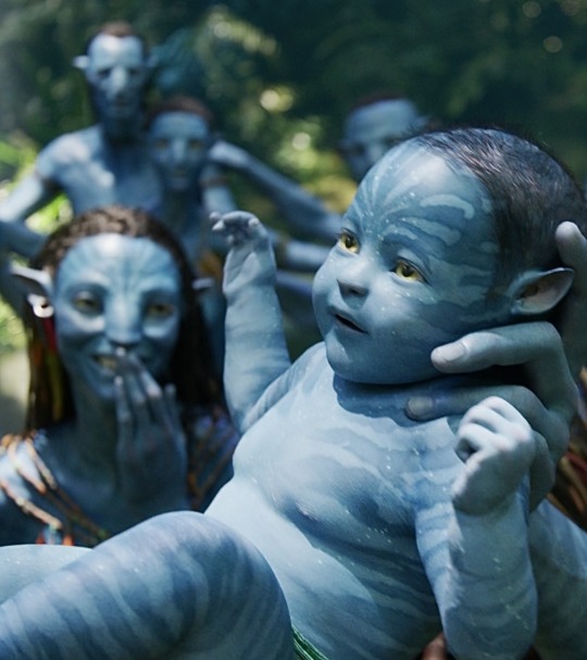
(I'm sure there are better examples out there than these but I'm not up to digging for them rn 😅)
So, let's continue! To fade our stripes, create another clipping mask layer above the main stripe layer. Use a brush with pressure-based opacity such as MediBang's "pencil" to loosely fill the insides of the stripes with the base skin color.


Once you have filled in all the stripes, use the gaussian blur filter to smooth out the fade. The filter doesn't need to be super strong—in fact, if you make it too strong you will loose the detail and the stripes will look solid again. With MediBang's version of the tool, I had it set to 7 (out of a max of 64) for this image, though of course the way it works may be different in other programs; mess around with different settings until you get something you like.
(sadly I do not have a screenshot of the blurred version because apparently the way my cintiq takes screenshots is dumb; it only captured the "gaussian blur" popup window instead of the whole screen. oh well. :P)
Now that we have the fade within the stripes, let's also make them fade into the rest of the body. The areas you'll want to do this with are the torso, inner arms, and inner/back of legs.
Create another clipping mask. Using the same pressure-opacity brush and base skin color as before, loosely block in where you want the stripes to fade into the body.

Once you've finished, gaussian blur the layer just like before. This one can be a little stronger than the inside-stripe one. For this image I had it set to 14.
Sometimes, the areas you block out will overlap with areas that shouldn't be faded—for example, here the fading from the back of the character's thigh is overlapping with her tail. To fix this, just erase it to remove the fade from where it shouldn't be (this is why we do this step on separate layers). Make sure you do this erasing after you've applied the gaussian blur.

Depending on the pose of your character, there may be places where one faded area overlaps with another. For example, in this drawing, the blocking for the arm fading overlaps with the blocking for the torso fading. Here it is with the torso fading turned off so you can see the overlap:

This makes it difficult to do both the arm and the torso on the same layer, because I won't be able to remove where the arm fading overlaps the torso fading without also removing the actual torso fading.
Luckily, there's a simple fix: just do the arm fading on a separate layer. Do this as many times with as many layers as you need to for your particular pose. Sometimes you'll only need one or two, like here; other times you'll need several.
BUT, fading the stripes is the last step! Regardless of how many layers you end up needing, once you're done, you're done! Now you have a Na'vi with nice natural-looking striping 😸

At this point you can go ahead and merge all the clipping masks into the main skin layer and even merge the skin layer with the other-base-colors layer if you're ready!
Hopefully that wasn't too hard to follow; feel free to ask if anything is confusing or unclear. Happy drawing! 😸
#avatar#avatar 2009#way of water#na'vi#na'vi oc#my art#tutorial#yes i draw every stripe individually yes it takes a long time 😭#anyways...#wanted to make this over the holidays but then i was sick the whole time and not up to it ;w; oh well#i suppose this is also technically a preview for a new ref sheet though 👀#i have made some changes to my sona's design since making her current ref so it was in need of an update#they're not *major* changes or anything; just some minor adjustments to outfits and stripe+sanhì patterns#but enough to want a new ref#so 👀
114 notes
·
View notes
Note
Quick question where did you learn your coloring and rendering techniques?? Could you link to them if you have some??
the school of hard knocks babeyyy
nah but seriously i've just been drawing for a long time. i'm self-taught and there's no specific material i learned from, so i don't know what to link you to.
but if it helps, here's a quick breakdown of this particular style since it's the one people ask me about the most. it's basically coloring a sketch and then painting over it. i don't usually render shading before the base colors, but i wasn't following any particular plan or process. this was just a sketch i was mindlessly working on to keep my hands busy while i did something else.


i have another step by step breakdown and some very brief stuff about color theory here if you're interested. it's a different style and process than this one though. i also have some timelapses on my youtube channel!
i hope this helps a little! i realize i didn't really go over actual fundamentals but i feel like you should learn that from someone more capable than i am lol. this was really just about my techniques specifically.
140 notes
·
View notes