#art so good i posted a rendered version
Explore tagged Tumblr posts
Text

Digital colored and rendered version
Time taken: 6 hours, 24 minutes
File corruptions/crashes: 1 full corruption (3 hours of work on the face) and 3 crashes
#captain 3#splatoon 3#my bbg <3#do people even read these#howdy yall#ratkingart#art#digital art#im stuck using the ratking tag cuz its my brand#art so good i posted a rendered version
44 notes
·
View notes
Text

Sooo… do you know that story about Athena being arranged to marry Hephaestus?
This was partly inspired by @mer-acle's drawing of the same myth. I wanted to draw something for it to but wasn't sure what and then... inspiration stuck "Ah Ha! I'll redraw the reluctant bride by Auguste Toulmouche, but like, with Athena!" Which makes this probably the nerdiest drawing I've ever done. But I mean how could I not that death glare is iconic!

This is such a fascinating myth, it has such interesting implications for Athena's family relationships, and Athena as a person. Like not only was she married off despite her clearly wanting it, but nobody did anything about it, she had to get out of it herself. Like that hurts but the way she responds is so wonderfully in character for a much younger Athena.
In the original myth Hephaestus asked to marry Athena (by which I of course mean he asked Zeus what kind of hooligan would ask a woman if she wanted to marry him). But i kind of like the idea I've been playing with of Hephaestus not wanting it either, just because this story really highlights the fact that they have so much in common. They were both born in unusual ways, got abandoned at birth because of it, and when they got back to Olympus LIFE STILL FUCKING SUCKED. I also originally started exploring this myth as a way to have the Erichthonius myth because I love him, and keep Athena and Hephaestus's friendship.
bonus original sketch:

#yeah it had minor flaws when i coloured it so i made some edits in procreate. I love living in the future!#i may do a fully rendered version of this but I might not post it depends if it's any good#characters from right to left are Hera Athena Demeter and Persephone in the back#quite proud of my inclusion of Persephone here because of what the girl in the painting represents#even if she didn't reeeealy turn out that well here#athena#tagamemnon#athena greek mythology#auguste toulmouche#greek gods#my art#greek mythology#by golly it's been a long time since I've posted my art on here!
46 notes
·
View notes
Text
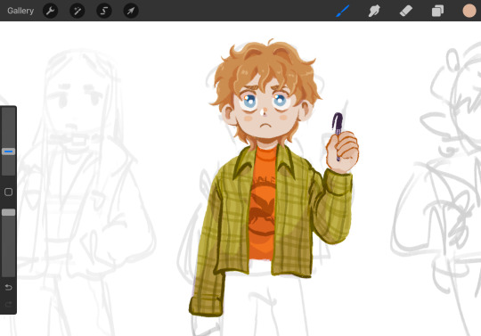
Working on a pjo drawing and I keep having to stop to be like 🥺 he’s just a little guy,,,,
#my art#strawberridraws#fanart#art wip#pjo fanart#percy jackson fanart#Percy jackson#might redo his hand lmao#looking kinda goofy#I love his expression tho#also my current fave art method is to roughly sketch and then just. go for it#just slap down color and then slowly refine lmao#lineless art my beloved…#I love how it looks but it takes forever lol#and yet also allieves me of the pressure ? somehow of like. drawing good tm#sometimes I get too caught up in a good sketch/lines that I don’t get to my fave part (color/render)#so I just. skip to that#idk im rambling#I’ll post the finished version uhhh#sometime#when I finish ig lmao
121 notes
·
View notes
Text
Pinup!!!!! the baby!!!! the guy!!!!
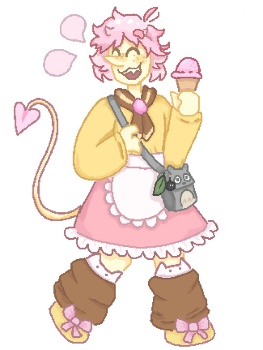
sorry if this looks kinda iffy the majority of this was drawn between 11pm and 2:30am so i was very tired loll
also yes that is a totoro bag i dont care if totoro doesnt exist in cyber city he has a totoro bag come at me
Pinup belongs to @turntableart
#read all the tags before you reblog otherwise you will be confused#i feel like i got the body type wrong uaughhh#i feel like the proportions are inaccurate#im blaming it on the clothes i promise the sketch looked good then the clothes went and ruined it#i feel really bad admitting this but now that i think about it i literally never draw chubby characters#all my addisons are pretty long and gangly for the most part and then spamton is just very small in my style hes not really pudgy#and tbh i didnt really draw full bodies very often before addisons and spamton but my one (1) oc was also pretty long and lanky#probably because i myself am pretty long and lanky#ueuugough hauguh#i need to practice more#also i feel like the shoes look weird#im generally not too happy with it but its ok ig#i was terrified of making the features too exaggerated and being offensive and i think i went to much the other way and just made him skinn#ffs#ill draw him again i promise#and it will look better pinky promise#🤙🤙🤙 theres no proper pinky emoji#i love him tho hes cute#i really like his original design#uururuguggg#ugh debating whether i should even post this or if i should keep tinkering with it#im gonna tinker with it a bit more i will continue writing tags when im done#ok tinkering over im much happier with it now#i made him a bit shorter and that solved all my problems#i think i have a habit of drawing characters too tall ngl lmao#also not too happy with the rendering but its good enough#uh im only posting the tinkered version that im happy with so if you want the untinkered version then just ask lol#pixel art#art#turn off the lights arg
20 notes
·
View notes
Text

this is before i rendered it btw

i tried rendering and turns out i fucking hate it !
#mush art#only posting because i wanna keep it but i rendered the drawign so i dont have thsi version#took a screenshot first#this is without shading and stuff#just flat colors and lineart#the difference💀#wait now i kinda love the finished version#been a while since i looked cuz i was full of rage#but YIPPIE ITS SO GOOD WTF
62 notes
·
View notes
Text
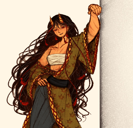
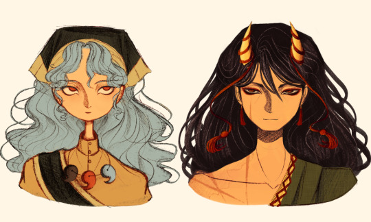
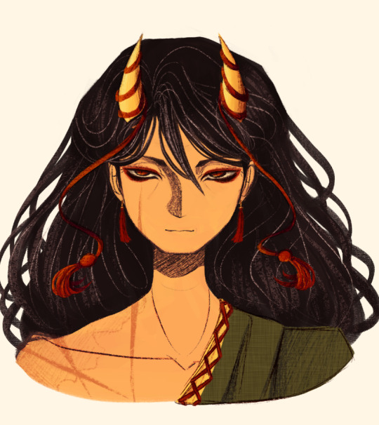
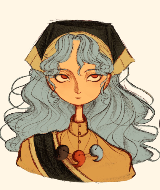
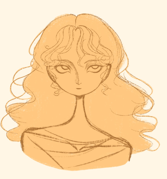
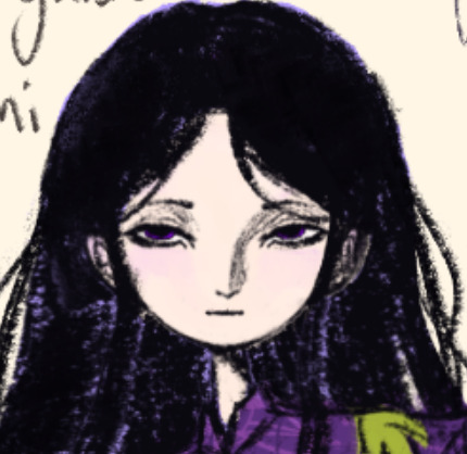
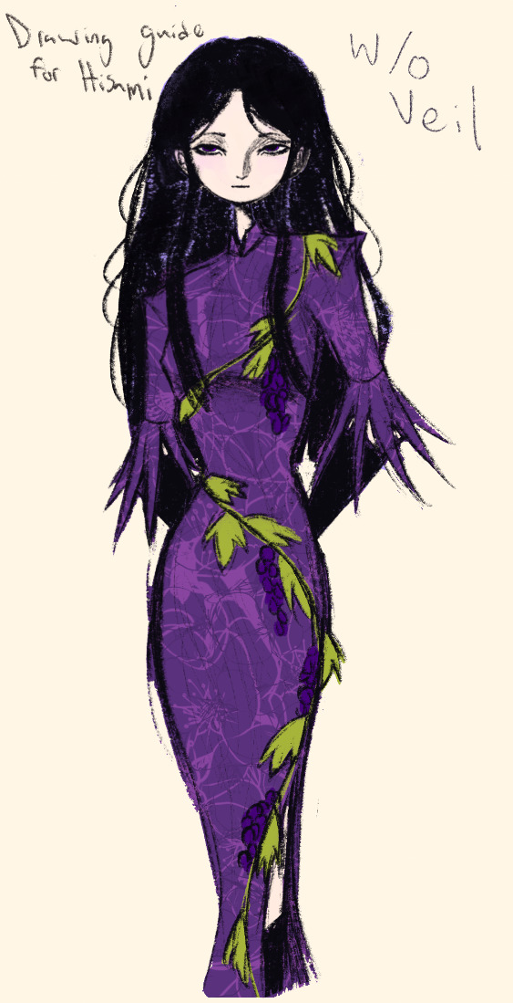
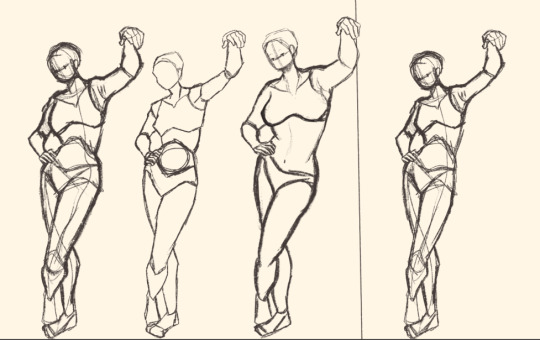
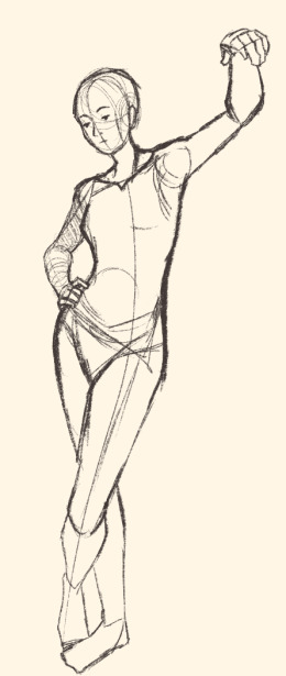
Here's a digital sketch dump of some pose/anatomy practices and some 2hu doodles, I think from now on if I don't have any big final piece to post, I'll just post sketches I liked that I did digitally (might also reblog some drawings of mine that I want more people to see, maybe idk).
Artist's Notes:
Ok so after the recent Hifuu fanart I did, I've been hoping to experiment more with how I draw faces, how I render, as well as how I stylize things. In some of the earlier sketches I did, I had an idea for a pose that I wanted to try drawing, so I took a ref pic of myself doing said pose (the leaning one btw) and then did a sketch over top of it just to get an idea for the shapes, negative space, and silhouette. After that, I wanted to do some simpler breakdowns of the shapes so I can get better at simplifying the body (these ended up being the bottom right sketches in the post). I also did some experimenting with how to push certain parts of said sketches to create a different body type (via liquify and then a more refined version based on that sketch), as well as figuring out what makes a pose feel natural and not stiff. This was also a bit of a foreshortening practice just so I can get more confident with it, and I ended up using the arms from the liquified version for the coloured Zanmu sketch I did since I liked them so much (dw I'll get to that).
The next thing I wanted to try and draw was Hisami, mainly because.... I am very bad at drawing her in my style. Last time I drew her I made her look really creepy and spindly, and it is my headcanon now that she can switch between a more human, and more creepy look whenever she wants. I'm liking where the face is going a lot, might have to refine a few things about it in the future, but it's cute (I also made the blush purple which I think is what I'm gonna do with her face from now on). I also like how her hair in the sketch turned out a lot, but the outfit..... not as much... Ever since I started changing my style to something less cartoony, I've had a hard time drawing her outfit in my style. Especially the flower veil thing she has on, which, I did try to find a way to draw, but I ended up deleting that sketch because I didn't like it. I'm also not a fan of using the colour purple, like, pure purple, magentas are fine, indigos are fine, but not strict purple. I also have a hard time with drawing all the little pattern details on her dress. I also need to find a way to draw the flower veil in a way that looks good because everytime I try it ends up just looking off (very similar to whenever I try to draw Zanmu's blue spears). I think the only solution to this problem is to do what I normally do and make my own version of the outfit, but with adjustments to suit my style while still trying to keep core elements from the original design intact (like I do with Zanmu and Keiki, and yes I am going to get to that Zanmu drawing just gimme a minute).
Ok next up is Keiki, my favourite Touhou character who I haven't drawn since the beginning of the year. Since my style has changed a lot, I wanted to just do a face sketch of her to get a hang of drawing her again, and I..... really really like how it turned out! When I drew her eyes, I realized that a good way of keeping faces too same facey can be via varying the sizes of their pupils, so that's an idea I'm gonna keep in mind from now on. I had a lot of fun with her hair, I initially was gonna do it like how it is in the official art, but I ended up not liking it, so now I'm gonna draw Keiki with wavy heir like this because it's fun and it looks nice. I also included my base sketch for Keiki's face since I was initially struggling with drawing her bandanna, and in the coloured sketch I added some more detail into her hair.
Now to finally talk about the sketches for Zanmu. Good lord was I having a tough time with her face. I also did this sketch before I figured out how I wanted to draw hair, so that's why the rendering on her hair is different (I did this soon after the Hisami sketch actually). Since I changed my art style a lot, I had to find a way to translate her face from my more cartoony style to my more detailed style, so while the face shape, nose shape and mouth was fine, I was really struggling with the eyes. I did get somewhere eventually though, and I am super happy with how it turned out. I wanted to lean more towards the androgynous side of the gender presentation spectrum, mainly because I think that makes sense for her character. Also made sure to include the silver hairs and some wrinkles just to bring some signs of her aging into her face because those are just staple features of how I draw Zanmu at this point lol. You will also notice that I gave her some scars on the right side of her face, and that's because I am a Zanmu-with-scars truther, I fucking love it whenever I see someone give Zanmu visible scars like that it just adds so much omg (I also tried to put a wolf bite mark on her arm in the full body drawing but idk if it reads well). While you can argue that her not having scars sells the idea of her being this "powerful, untouchable mastermind who is impossible to defeat," I'd say that instead of those scars representing times she got injured, they represent everyone who has failed to defeat her.
As I was drawing Zanmu's face, I referenced my sketch of to help with contrasting their features since I made Keiki's face more traditionally feminine. I also didn't mention this in my commentary on Keiki's face because I wanted to save it for here, but giving Zanmu scars also plays into the fact that she used to be human, wheras Keiki doesn't have any scars because she's a god who doesn't follow the rules of normal human biology. Plus I'm thinking about the two of them interacting again (return of Zan/Keik??? (I'm a multishipper btw) maybe???) so drawing their faces together will definitely help me in the future if I wanna draw them together (again, maybe as a ship? I've kinda been ironing out the kinks in their potential interactions (romantic and non-romantic) for a while now so idk maybe expect that in the future lol).
And now for the full body drawing, when I was doing the face sketch I did this little snippet of an outfit, had a vision, and the made it into a reality. I'll admit, part of me was worried that it would end up looking too much like Yuugi's outfits in the spinoffs and mangas, but I feel like I made enough changes to differentiate them. I tried to keep a few of the major details in Zanmu's design (i.e. the red tassles and yellow lining on her shirt) while putting a new spin on it. I also dialed up the scars to 11 since without them the whole thing kinda looked incomplete. Also, while I could say that the leaves on her kimono are "a nod to the fact that technically she should be a tengu because back then people belived that corrupt monks would turn into tengu but no Zanmu is an oni and they're maple leaves because...tengu...ahahahaha" what really ended up happening was that I looked up clothing patterns from Sengoku era Japan, liked the leaves the most because the red picked up on the red from the rest of her design and just ran with it. I also always had the idea to put Zanmu in men's clothing from Sengoku era Japan and while the accurate thing to do would be to put her in a Buddhist's clothes from that era.... from a character standpoint, I don't think Zanmu is pious enough to strictly wear the proper monk uniform, and also since she's basically the king of Hell, she would probably dress herself like royalty from that era. TBH, I probably could've been a bit more historically accurate, but again, this was mainly for conceptual purposes because I had a vision and I needed to see it through.
If I were to draw her in this sort of outfit again, I should probably try and use more references, although now that I look at it, if she were to wear it properly this would maybe, probably look a bit closer to a Kyūtai sugata (a very huge stretch, but it just kinda reminds me of that) just without the layers under and over the main piece of clothing (In the website that I searched up to try and compare the outfit in my sketch to, they name the outfit pieces but don't label them on the image, so I don't know 100% what everything is called) so I will definitely have to use that style of clothing as a reference going forward.
Also, I was kind of inspired by the ToTK design for Ganondorf since I have finished the game a while ago and I absolutely love what they did with his design (it's just so fucking cool omg) and I thought that sort of look would look good on Zanmu, so yeah got some inspo from that.
And those were all the notes for each of the sketches, I'm motivated to draw rn but kinda art blocked, so doing these little coloured sketches helps a lot.
#touhou project#art#fanart#sketches#sketch dump#zanmu nippaku#keiki haniyasushin#hisami yomotsu#touhou 19#touhou 17#unfinished dream of all living ghost#wily beast and weakest creature
343 notes
·
View notes
Text
Process :]

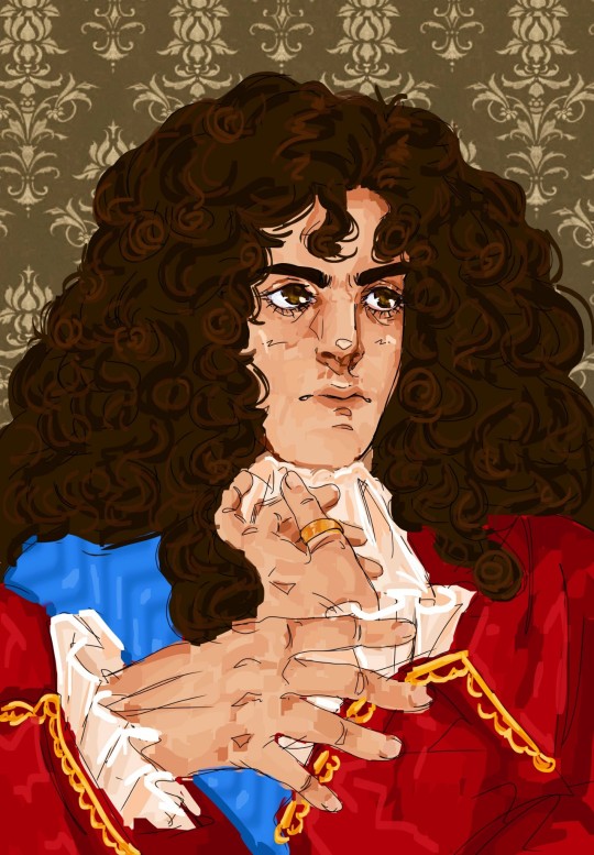
“Amore et Timore” - King Fernando I “El Animoso”
#i really like the emotion of the first sketch but i dont think it looks enough like him#i think my favorite part is always when i start painting stuff on top of the line art#bcs i dont like doing ultra clean lineart anymore if im just gonna paint over it#and painting over it means i can fix things i couldnt really get right in the lineart#its always atill crazy for me to see the steps like this#and i like this one bcs i saved a pic in the middle of painting which is really interesting to get to see#i should really do timelapses but i always forget to set them so#i really struggled w a lot of this so im glad it turned out well#i think once i get to the rendering stage its smooth sailing#lineart is probably the worst part bcs the sketch can be iffy but then i actually have to try and fix things#but as i said its good when i get to the painting stage bcs i can just paint over anything i didn like#for example: his nose and eyes. i struggled w so badly but painting them? so good!!!#i didnt care about the fabric in this unfortunately#i wanna learn more about it so i can give him super intricate detailed clothing bcs i think hed eear that#but i always paint the face first and then remember oh yeah theres clothes too oops#hehehehe anyways thank you for all yeh compliments on the hands. it pleases me bcs theyre in fact MY hands#idk i find it funny whenever people compliment me on poses and stuff#especially hands. bcs the first process of a drawinf for me is taking pose reference of myself#and i really wanted to do a portrsit with hands so i took a lot of hand centered pics so im glad it worked out#okay now hopefully i can mske a seb version of this 🥺🥺#so i can drop his name and motto lote on you guys too#my issue is i put more work into my posts and art than i do school 💀#like no no i cant just make a little lore post for their mottos and nicknames#I MUST PAINT SOMETHING! okay catie....#catie.rambling.txt
52 notes
·
View notes
Note
Thank you for getting me to finally try pixel art! I‘ve always wanted to get into pixel art but I never knew what to start with and always ended up procrastinating. Your blog and the post you made on learning pixel art were what finally pushed me to give it a go. It was really helpful and I managed this little animation in Libresprite.

I definitely want to improve and your art is like the ultimate goal lol. Do you have any tips or instructions for how to get better or on what to focus on in the future? I‘d appreciate any kind of criticism/input you are willing to give! How do you manage to make such gigantic and beautiful landscapes?
thank you!! and i'm so happy you decided to give it a real go, you're doing great already!! the rendering on the body and the pink shading is really nice.
i can help a little with animation stuff but i'm not an expert, ill write something out about backgrounds at the end
i hope you don't mind but i edited the sprite a little, just to illustrate some stuff
🤺Animation stuff

i added an extra frame near the top of the arc so it slows down. this is called ease or slow in/out and usually happens at the beginning and end of movements. u can do even more slow but this is just a quick version
i also removed the middle frame (where the tail is straight down) to make the swing appear a bit more powerful. this could be the principle of timing in the same video. you can exaggerate smears if you do this, its up to you!! lately i tend to exaggerate stuff a lot, things arent super noticable in motion
i also got a good bit of advice from nickwoz that helped me, basically when you begin to animate, it really puts the rest of the sprite being still into focus. try to think of how you could animate other parts of the body, even subtly. and sometimes if individual pixels stay still they can catch the eye in an unintended way as well, just keep it in mind!!
if you want to learn animation more, you could take a look at duelyst sprites, they have incredible idle and ability animations, i study them a lot

heres one i downloaded a long time ago. i recommend just downloading stuff you like and looking at it!! i have a huge collection of pixel inspo. slowing animations down can really help you understand whats going on. its just a bunch of simple elements put together that makes it look so good.
IF U WANT MORE RESOURCES/ARTISTS I REOCMMEND TO GO AND STUDY LMK!!! IM LIKE A WIKIPEDIA, I AM A BIG FAN of pixel art and love to share
🌿 OK lets talk about landscape stuff
it looks like you have art experience already, but im gonna talk as if youre a complete noob cos it might help some other people who read this!! ur doing great 👍
❓ how to learn: study (and practise a lot)
what i mean by study: draw it, copy it, try to understand it. you can try to change characteristics about it. changing the angle or lighting can help u understand how something works in 3 dimensions.
sometimes it takes time, dont worry, you will figure out your own style through doing studies, its all a process
❓ how to draw landscape details?
study pixel artists and how they do it recommendations: fool, slym, jubilee, deceiver
also please look at real world references!! you got to build that visual library
❓ how to learn composition?
study traditional artists or animation. i did a ton of studies of ghibli backgrounds which i think helped my growth a lot recommendations: arcane, studio ghibli, traditional painters
im gonna break down a piece as well and maybe that will help. this is one from 2022 but its still one of my most popular and its pretty simple too!!


if we remove all the fancy stuff what we have is actually really simple. just a few large, overlapping shapes that all point towards our focal point. it's the brightest area with the most contrast and many edges point into it.
go to pinterest or google and just search "pretty landscape" or "mountains" or something and you can see what i'm doing is nothing special or unique!! break it down into bigger shapes to begin with, its just different areas of material mostly.

and heres how you can make any landscape from any colours. purple sky or mountain? orange grass? ok !! it all works, it doesnt matter. i just blend the colours.
when parts of the landscape are in the distance they become closer to the sky colour as there is more "sky" in between you and it. its called atmospheric perspective. so if the sky was red, the clouds would fade towards red.
OKKK i dont know what else to say so i hope that helps!! honestly 90% of what i do is intuitive and hard for me to really explain, so you dont have to know The Rules, you just kind of pick up stuff as you go.
GL and thanks so much for showing me your art!! please keep going!! 💕💕💕💕
184 notes
·
View notes
Text
FNaF World: The Funtimes are completed!
After a lot of blood, sweat, and gears, I have finally completed my Adventure versions of the Funtime animatronics!
I completed the first two in my previous posts... Circus Baby (And Bonus Stuff) Funtime Freddy
So I'll only be posting the two I've just completed, starting with Funtime Foxy!


Originally I didn't want to make a new Funtime Foxy, I felt like the original FNaF World's Funtime Foxy stood on its own. However, after some careful consideration, I realized that the one from the original game didn't have hurt animations, as that's a liberty I alone have taken. In order to give Funtime Foxy a hurt animation, I was already going to have to recreate them anyway, so I figured I might as well overhaul them to better fit their actual design. I now consider FNaF World's Funtime Foxy to be specifically a "fixed mangle" incarnation, and not representative of the Sister Location character.
And now - last, but not least - Ballora!


Now, normally I don't particularly care for Ballora's design. She's kind of a misfit when compared to the other animatronics. But working on this model has given me a new appreciation for her design's unique brand of creepiness. Her hurt animation is inspired by Scott Cawthon's Steam post, within which he explains that when Ballora is off her "track", she crawls around like a spider. I figured that her switching to "off-track" mode served as a good visual metaphor for her being caught off guard by an attack.
Modeling Ballora was a challenge, as she's probably the most humanoid character in all of Five Nights at Freddy's, and I had to figure out how to cartoonify her. Despite that, she turned out pretty great in the end. She has a reasonably canny face, and she emotes well with just her eyes.
Now that these two are done, the Funtime animatronics are complete, and so is my third row of characters. Here's a fun render with all of them as a celebration!

Thanks for checking out my art! Stay tuned for more down the road. Catch you on the flipside!
#mellowtrashtrash#art#digital art#3d artwork#blender#3d animation#fanart#fnaf world#five nights at freddy's#funtime animatronics#fnaf sister location#fnaf sl#circus baby#ballora#funtime foxy#funtime freddy#sister location
143 notes
·
View notes
Note
Can you draw everlark cuddling?
Omg yes I can. Here they are cuddling in the meadow :3

Timelapse, alternate version, & extra notes below :)
[For the peeps lookin for a link to Swan Upon Leda in my pinned, there you go]
- - - - - - - - - -

I’ve sat on this anon for a while bc I wasn’t in a drawing mood for a while, but I will have you know that when this ask came in I was not having a good day & seeing this made me LIGHT UP bc I haven’t posted my art in a long time (or made any for that matter) & didn’t expect to get any requests like this and it was just so sweet & innocent- I’m rambling, ANYWAYS.
I wasn’t planning on this being a fully colored or fairly-rendered piece; thought it was just gonna be a simple sketch. And then things got out of hand & I really liked how it was turning out so I just kept going 😁 I like the result. Picasso.
#the hunger games#katniss everdeen#peeta mellark#everlark#everlark fanart#meadow song#cuddles#THEY ARE IN THE MEADOW ISNT THAT GREAT#I LOVE THEM#this turned out better than I expected it to#I swear to god if tumblr crunches the quality I will commit crimes#can we all collectively agree to pretend that I didn’t show a picture of my ass and feet in the timelapse? thanks#we aren’t going to talk about me forgetting Peeta’s prosthetic leg. I totally didn’t forget.
110 notes
·
View notes
Note
you have probably been asked this a billion times and maybe even have answered it but would you mind sharing what brushes you use on procreate?
Hi! No worries at all, I don't mind answering 🎨
Here's a link leading to two posts I made about brushes and stuff but I feel like making a new one with a bunch of image examples, just because.
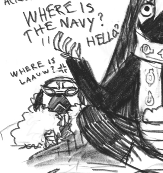
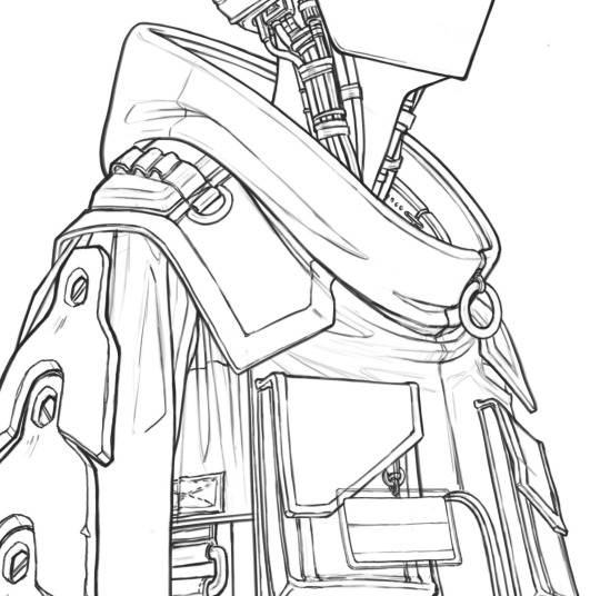
I use HB Pencil for lines and sometimes for shading too. I've saved several versions of it where I've adjusted the texture and size, so I can pick if I want a rough or smooth look. I get smooth shading with the pencil by tilting the pen, just like you'd shade with a real pencil. It took some practice but I love how versatile that brush is depending on pen tilt and how precise you are. These are all 100% Procreate HB Pencil:

For backgrounds, rough shading and finishing touches I often use a bought oil paint brush pack you can find in the links. It was $10. I've gotten lots of neat textured art out of that money. For smoother shading and coloring under the lines I use a mix of round brushes of varying softness that feel good, it's usually nothing complicated and I wing it depending on what style I'm aiming for.
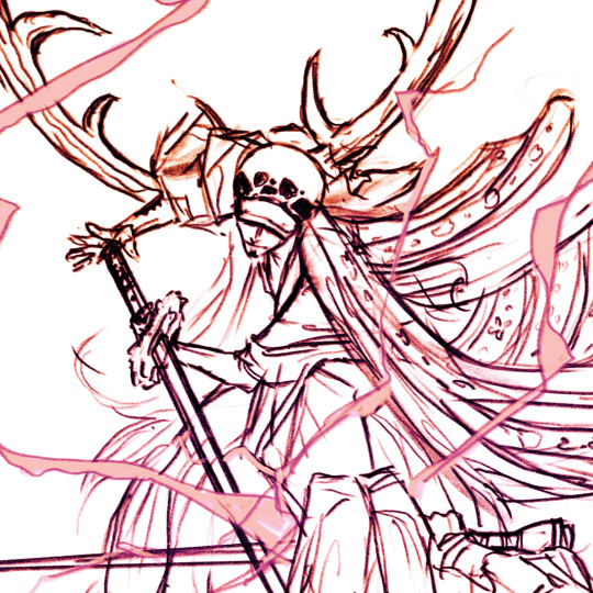
This one was made using HB Pencil with slightly reduced texture + the oil paint brushes and a shit ton of effects at the end.
I rarely paint the very smoothly rendered or realistically shaded things in procreate though, I use photoshop for those because I have more control of the pen pressure after many years using the devils software and I need that control to do the real fine blending. I use one single brush that I've used since 2008. I don't know where that brush can be downloaded anymore but it's a slightly textured round thing. The brush is nothing magical, it just happens to be the one I'm used to so I've learned exactly how to control it. It's my old trusted friend.

The one below I made by using my trusted photoshop brush in procreate + a bunch of effects. Old trusty brush behaves weirdly in Procreate so I get weird results.

I can try to figure out a good way to upload my trusty photoshop brush and post a link so others can get it. Just need to find something reliable and safe.
33 notes
·
View notes
Text
doodle dumps for september
ive been so busy recently but ive got some doodles i havent shared outside of discord servers so here ya go (plus my words on some doodles from left to right per row)
also i cant remember if i posted any of these but if i did, whoops aksjhd


this one was my first attempt at colouring with my new prisma coloured pencils askjhd, i aint good at it in the slightest tho
narry and ford glass exchange, narry has the stronger perscriptions tho ;-;
taken during a lecture


:]
:P
:) >:D


i like going into fantasia and playing dress up with narry it gives me outfit ideas aksjhd
this is one variant bc originally i was gonna make it a full piece, but i got stuck on the accent colour, this is just one version
i had gravity falls drawing ideas n wanted to put some to narry, see his reaction here


little stanley n his bucket :3
i got a hair cut rip the rat ponytail call me gordon freeman sdlkjh /ref
i dont like not drawing narry in a while, i missed my bestie, made this as reassurance


WIP divine art design doodle back when it was just all white outfit narry with wings
WHOOPS ITS GRAVITY FALLS STAN AND FORD INSTEAD OF STANLEY PARABLE STAN. PINES PINES PINES!
another doodle done in a lecture, i really do need to pay attention


"im gonna show my best friend squidward narry to EVERYONE in town, wearing a salmon suit!" /ref
doodles of me trying to make divine arts face look different from narry's
sort of a final iteration in terms of hair and face, he looks similar to narry still, but with some small changes so hes his own person, might render this fully later tho


doodle of edgar (edgars from @/bucketfullofstrawberries (i already shared this with him on discord so im not gonna tag skdjfh))
done in mspaint aksjdhkjh
#artswin#tsp narrator#tsp stanley#essence of divine art#doodles#tsp#tspud#the stanley parable#the stanley parable ultra deluxe#stanley parable#tspud narrator#self insert oc#self insert art#self ship#qpr selfship#digitalmuse#ozrator#naroz#so sorry for the long post#art schools killin me#but i didnt want to share these doodles as they were being made bc of time#plus tagging#i hope yall enjoy these tho askjdh
49 notes
·
View notes
Text

Just a sketch i liked, i did begin rendering it but it was before i fully figured out how i wanted to render... im not going to post that version i might redo it but the flat colored sketch was pretty good i hardly see any pony art that is sitting or laying!!! I think such poses are so inderrated
#mlp friendship is magic#mlp g4#mlp fim#mlp oc#mlp art#mlp fanart#my little pony#my little pony fanart#mlp oc pony#mlp oc art#oc adopt#mlp original character#mlp ocs#oc art#oc#ocs#art#my art#nezzypezzy
29 notes
·
View notes
Text

Note that these commissions are creative freedom, meaning that I will complete your piece and send it to you once it is complete. These commissions are fullbody only. If you want simpler commissions, keep an eye open for my streams, which will happen regularly. Stream commissions will never involve backgrounds, or more than simple shading so if you want a background or my more complicated illustrations, my regular commission slots are the way to go. You can see my queue here on my Trello! https://trello.com/b/fr34HOv5 Read my TOS and Will/Won’t do here: https://artha-cryptid-commissions.weebly.com/ Max of 2 Characters. +50% of total of the entire commission minus the background for a second character. Form to Fill Out https://forms.gle/mn1VU3eaSEGKL7yp8 Base Price: $65 1 character, flat colored Example: https://www.furaffinity.net/view/57295174/ Character Design: $85 If you want me to design you a custom character. This comes with a front view and a back view. Comes with optional NSFW details. Reference Sheet $150 This comes with a front view, back view, optional NSFW details, color palettes and 5 different details (Headshots, closeups, weapons, or optionally the front and back view with an outfit shown instead of the additions. If NSFW details are added, you get a NSFW and SFW version of the ref sheet. Additions Edits +$15 per edit UNLESS it’s something I missed. Nitpicking or requesting major changes will cost you extra. Having to go back and change things and waiting for feedback instead of sitting and completing the piece while I am in the zone is what caused my massive burnout issue, so you will get your completed piece when I finish it. I will keep you updated on progress, however. Complexity Fee +$25-$75+ This is a sliding scale based on the character. The more complex the character, the more expensive this will be. Intricate markings, detailed scales, intricate wings, extra limbs, extra heads, things like that. Willing to discuss things. Shading +$25 This would be shading using 2-4 layers, with shadows and highlights and detailing. Fur and hair will have some detail to it. Example: https://www.furaffinity.net/view/56770996/ Rendering +$55 Fully rendered shading, several layers of lighting and shadow, detailed fur/hair. Example: https://www.furaffinity.net/view/54288996/ Background (Simple) +$35 This will be a background that is fairly simple. Basic outdoors, basic interior. The simple background can not be applied to rendering tier shading. Example: https://www.furaffinity.net/view/53339172/ Background (Rendered/Detailed) +$85 A full background, fully rendered and detailed. More detailed outdoors, more detailed interior. Can only be applied with shading or rendering. https://www.furaffinity.net/view/50552592/ NSFW/Fetish +$20 NSFW art is a lot harder for me and takes a lot more time to pose and make look good, so I charge extra for it. This isn’t for nudity (IE, a character standing with a boner does not charge extra, but a character in a pinup type of pose or two characters actively engaging in explicit activity does) This also counts if the image itself is not sexual, but the subject is fetish Heavy Fetish +$35 Heavy fetish content will not be posted onto my main account and I won’t do anything featuring underage characters or straight up animals in NSFW situations.
#Art#Commissions#Comm#Artwork#Selling#Sale#Slots#Anthro#Furry#Creature#Monster#custom#character design#oc#creature
40 notes
·
View notes
Text


Sooo another update I decided to redo Lotta’s and Roxanne’s exorcist mask cause I hated how they look and decided to base them on helmets instead so up top are the old versions.


And here are there new exorcist helmets am fucking cooking here y’all and I love it. And if I should make any change to them let me know, and working on line art as this is posted and ohhhh myyyy.

And I finished the rendering, shading and lighting on exorcist Adam and OH MY GOD I DIDN’T EXPECT IT TO TURN OUT THIS GOOD. I CAN LICK THST MANS FORHEAD MASK HHGTRG.
This is fanfic art being crated for “Hunt You Down” created by @megaunhappybunny on ao3 ps it’s Adamsapple and Guitarspear and end game is Guitarspearapple.
23 notes
·
View notes
Text
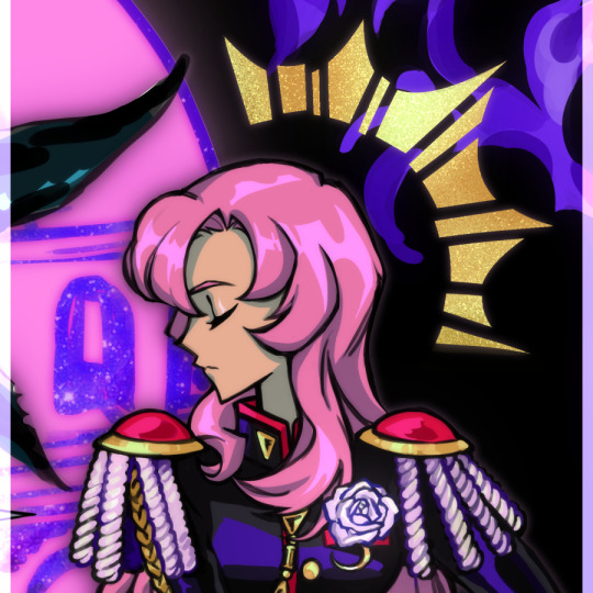
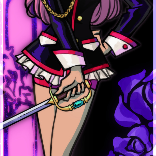
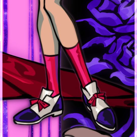
🗒️ 24.04.2024 ⋅⋅⋅ 🥀
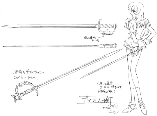
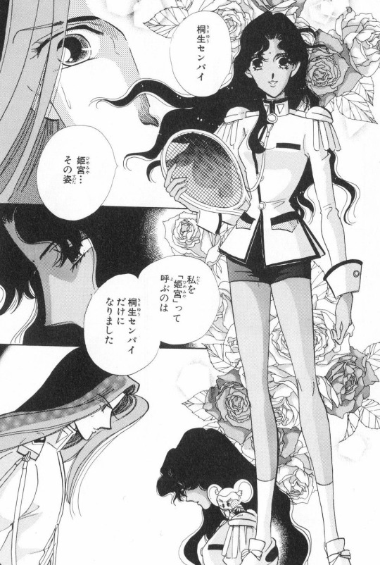
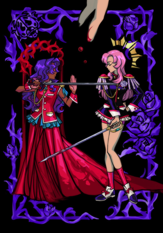
some notes for 20.09.2023 post and a separate cut out for utena because i spent a very long time rendering her ... the original concept i had in my head for this art was very different. it was just supposed to be a style study of this an official anime prop design art, and i'd thought to draw anthy in a similar pose across from her like in the shown version, but with her wearing her prince outfit from the manga. something something another form of female competition under the patriarchyyy stop pitting 2 girlprinces against each other omg etc (side note, how sick would it have been in an AU where akio made anthy fight against utena in the ring? like i dont think it would hav added more to the story or made it better really ... probably would've diluted the message to be honest ... but everytime i see that manga art of prince anthy i imagine some convoluted black rose arc AU where utenas dodging anthy getting her hair hacked off left and right like himemiyaaa nooo snap out of it this isnt uuu while anthys silent and dead eyed hahaha) but then after i drew prince anthy, the picture looked rather empty ... so i thought to add a few decals or borders in the style of the show & official arts but aaahh ... there was still too much negative space. i had to scrap anthy's prince outfit and put her back in her rose bride dress 😭 man !!! he cant keep getting away this !!! [blames akio the figurehead of patriarchy instead of taking responsibility of my own actions] which made me sad because i was pretty satisfied with the way i drew her pose and legs ! but i had to cover it up 🥲 ... the composition overall looked better though. and then after that it kept spiraling. i just kept adding more and more things until i lost control of this drawing and it plagued my WIP folder for months ... i dont want to try and connect all of it in words so ill just lay out all the pieces for you so you can connect them yourself. and you can experience my art thought process in fraction of erraticity and frustration as i experience it myself. this is a lot neater than what happened in my head though because i bothered to put it in order. honestly if i can make you feel a little bit insane trying to scroll through and read all this than i can make you understand how annoying my brain is when all i wanted to draw was utenanthy girlprinces fighting starting references & inspiration: utena prop reference sheet & manga prince!anthy
the tower & the lovers tarot
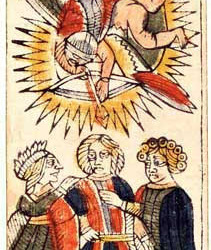
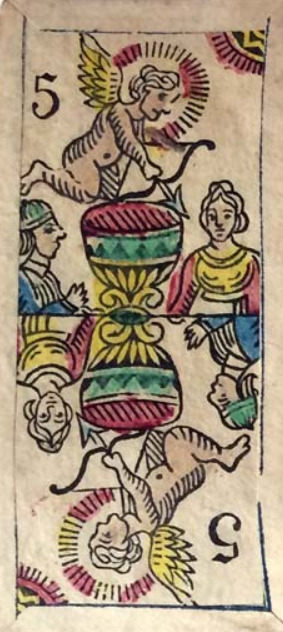
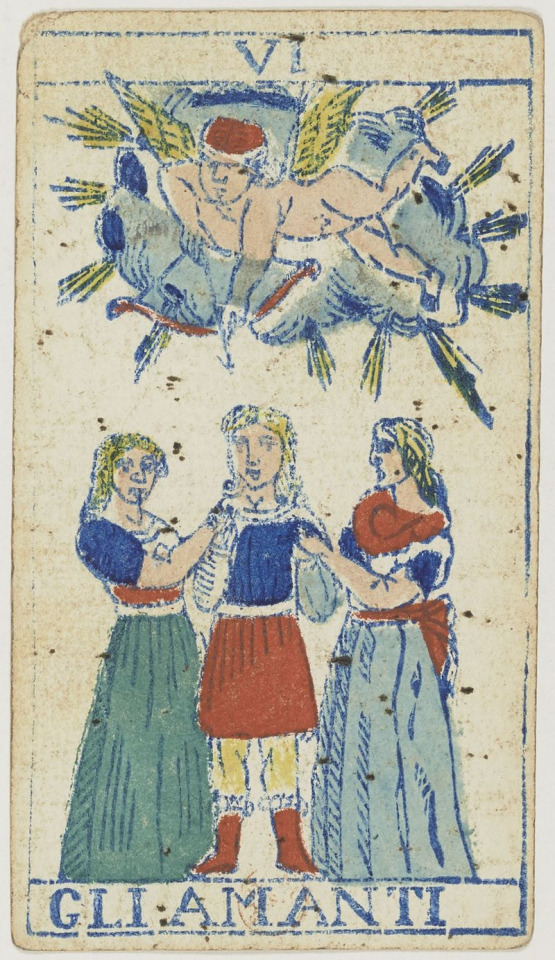
above: the lovers as depicted in the tarot of marseilles deck, tarocco bolognese deck, & tarocco piemontese deck the lovers (tarot card) wikipedia: The Lovers is associated with the star sign Gemini, and indeed is also known as The Twins in some decks. Other associations are with Air, Mercury, and the Hebrew letter ז (Zayin). In the Rider Waite deck, the imagery for this card is changed significantly from the traditional depiction. Instead of a couple receiving a blessing from a noble or cleric, the Rider–Waite deck depicts Adam and Eve in the Garden of Eden.
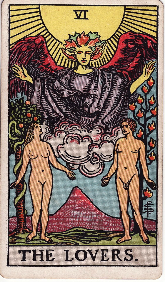
a.e. waite, the pictorial key to the tarot, part III, section 3, no.6: UPRIGHT: Attraction, love, beauty, trials overcome REVERSED: Failure, foolish designs. Another account speaks of marriage frustrated and contrarieties of all kinds a.e. waite, the pictorial key to tarot, part II, VI. the lovers: In the foreground are two human figures, male and female, unveiled before each other, as if Adam and Eve when they first occupied the paradise of the earthly body. Behind the man is the Tree of Life, bearing twelve fruits, and the Tree of the Knowledge of Good and Evil is behind the woman; the serpent is twining round it. The figures suggest youth, virginity, innocence and love before it is contaminated by gross material desire. This is in all simplicity the card of human love, here exhibited as part of the way, the truth and the life. It replaces, by recourse to first principles, the old card of marriage, which I have described previously, and the later follies which depicted man between vice and virtue. In a very high sense, the card is a mystery of the Covenant and Sabbath. The suggestion in respect of the woman is that she signifies that attraction towards the sensitive life which carries within it the idea of the Fall of Man, but she is rather the working of a Secret Law of Providence than a willing and conscious temptress. It is through her imputed lapse that man shall arise ultimately, and only by her can he complete himself. The card is therefore in its way another intimation concerning the great mystery of womanhood. going off of the rider-waite tarot deck: the pictorial key to the tarot—biddytarot's interpretation of the lovers: UPRIGHT: Love, harmony, relationships, values alignment, choices REVERSED: Self-love, disharmony, imbalance, misalignment of values In its purest form, The Lovers card represents conscious connections and meaningful relationships. The arrival of this card in a Tarot reading shows that you have a beautiful, soul-honoring connection with a loved one. [...] The Lovers is a card of open communication and raw honesty. Given that the man and woman are naked, they are both willing to be in their most vulnerable states and have learned to open their hearts to one another and share their truest feelings. [...] On a more personal level, The Lovers card represents getting clear about your values and beliefs. You are figuring out what you stand for and your philosophy. Having gone through the indoctrination of The Hierophant, you are now ready to establish your belief system and decide what is and what is not essential to you. It’s time to go into the big wide world and make choices for yourself, staying true to who you are and being authentic and genuine in all your endeavors. At its heart, The Lovers is about choice. The choice about who you want to be in this lifetime, how you connect with others and on what level, and about what you will and won’t stand for. To make good choices, you need to be clear about your personal beliefs and values – and stay true to them. Not all decisions will be easy either. The Lovers card is often a sign that you are facing a moral dilemma and must consider all consequences before acting. Your values system is being challenged, and you are being called to take the higher path, even if it is difficult. Do not carry out a decision based on fear or worry or guilt or shame. Now, more than ever, you must choose love – love for yourself, love for others and love for the Universe. Choose the best version of yourself. Finally, The Lovers card encourages you to unify dual forces. You can bring together two parts that are seemingly in opposition to one another and create something that is ‘whole’, unified and harmonious. In every choice, there is an equal amount of advantage and disadvantage, opportunity and challenge, positive and negative. When you accept these dualities, you build the unity from which love flows.
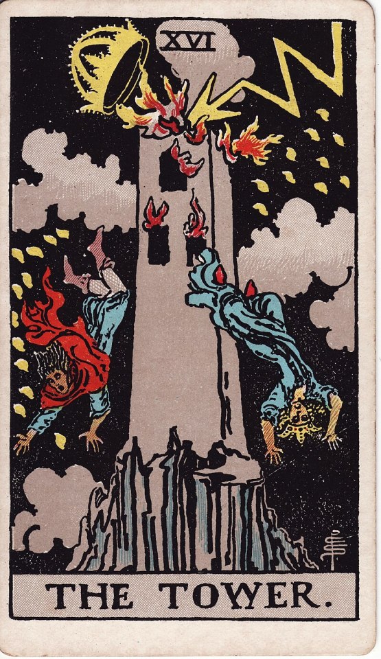
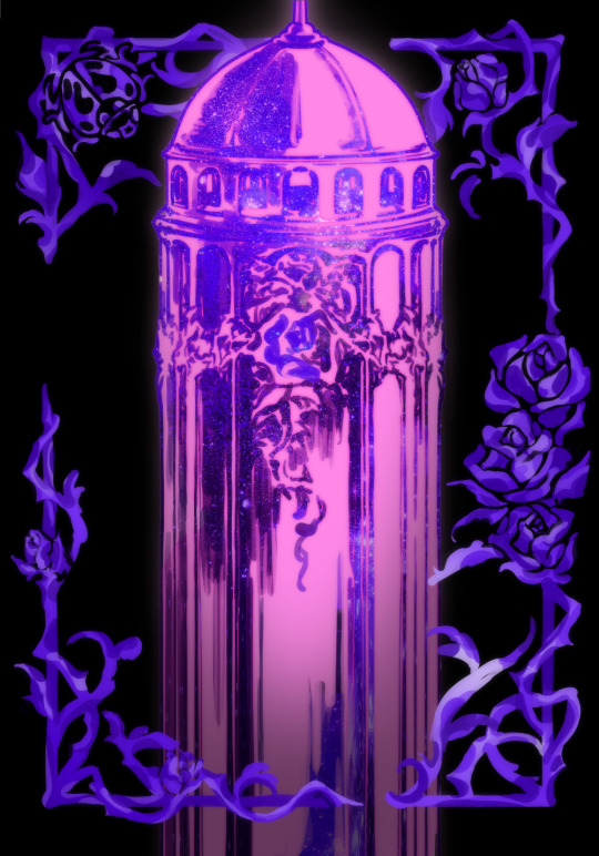
the tower (tarot card) wikipedia: The Tower is widely associated to danger, crisis, sudden change, destruction, higher learning, and liberation. In the Rider–Waite deck, the top of The Tower is a crown, which symbolizes materialistic thought being bought cheap, downcast. a.e. waite, the pictorial key to the tarot, part III, section 3, no.16: UPRIGHT: Misery, distress, indigence, adversity, calamity, disgrace, deception, ruin. It is a card in particular of unforeseen catastrophe REVERSED: According to one account, the same in a lesser degree also oppression, imprisonment, tyranny (the wikipedia included a.e. waite's upright meanings, but i have no idea where they got the reversed meanings) going off of the rider-waite tarot deck: the pictorial key to the tarot—biddytarot's interpretation of the tower: UPRIGHT: Sudden change, upheaval, chaos, revelation, awakening REVERSED: Personal transformation, fear of change, averting disaster The Tower shows a tall tower perched on the top of a rocky mountain. Lightning strikes set the building alight, and two people leap from the windows, head first and arms outstretched. It is a scene of chaos and destruction. The Tower itself is a solid structure, but because it has been built on shaky foundations, it only takes one bolt of lightning to bring it down. It represents ambitions and goals made on false premises. The lightning represents a sudden surge of energy and insight that leads to a break-through or revelation. It enters via the top of the building and knocks off the crown, symbolizing energy flowing down from the Universe, through the crown chakra. The people are desperate to escape from the burning building, not knowing what awaits them as they fall. [...] The best way forward is to let this structure self-destruct so you can re-build and re-focus. [...] with a card like The Tower, you have no choice but to surrender to the destruction and chaos, no matter how unwanted or painful [...] After a Tower experience, you will grow stronger, wiser and more resilient as you develop a new perspective on life you did not even know existed.
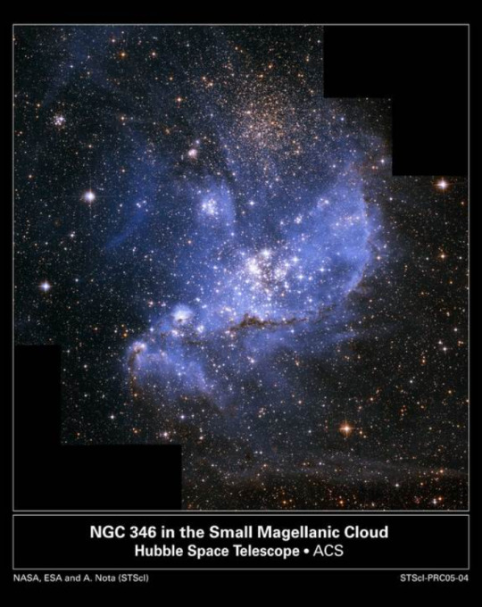
infant stars taken by NASA hubble used in the background overlay of akio's tower star birth | cool cosmos: Stars form from the simplest of building blocks - huge clouds of gas and dust that permeate the Galaxy. [...] While these big clouds of dust and gas lay dormant for many millions and perhaps billions of years, eventually some of them are disturbed. This can happen gradually, maybe caused by the approach of one of the Milky Way's spiral arms as it slowly sweeps around the center of the galaxy, or it can be a sudden event, like a nearby supernova explosion that blasts a shockwave through the cloud. Either way, a small increase in the pressure and density of the cloud forms knots in the gas and dust that eventually collapse under their own gravity, pulling more and more of the surrounding material in, and forming the stellar "seeds" known as protostars. From Protostar to Star: As the clouds collapse, they start to rotate, and, like a spinning skater pulling in her arms, each of these seed protostars begins to spin faster the more it collapses. The material falling towards the protostar flattens out into a rotating disk of dust and gas encircling the central core. The protostar warms up, as the potential energy of the material falling in is converted into kinetic energy, but it has not yet ignited to form a fully-fledged star. For the next few million years, the protostar's gravity pulls in more material from the surrounding cloud into its disk. That disk transports the gas and dust onto the protostar, causing the protostar to grow. The increase in mass causes the gravitational field of the protostar to increase and so even more material is pulled into the disk. The addition of more material, in turn, increases the gravitational field even further, pulling in more material, and so on, creating a feedback loop that keeps the whole process going. [...] The density and temperature of the protostar keep climbing higher and higher, until eventually the core grows to about one tenth the size of our Sun, and becomes hot and dense enough for hydrogen nuclei to spontaneously stick together to form helium, in a process called nuclear fusion. At that instant, the core ignites, and the new star is born. Meanwhile, in the disk, clumps of material have been forming, which are the seeds of new planets. These seeds sweep up material in the disk in a process called accretion, forming the planets of a new solar system. Once the star has started nuclear fusion, the heat and wind from the infant star begin to blast the gas and dust away, creating a cavity in the cloud. As more and more matter gets funneled onto the star from the disk, the star gets larger and larger, causing it to push harder and harder against the cloud and the disk, enlarging the cavity, vaporizing the disk, and halting the growth of planets.
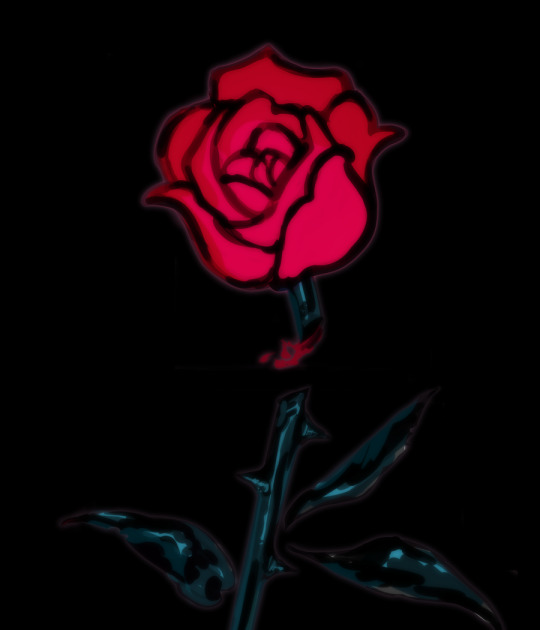
deadheading (flowers) wikipedia: Deadheading is the horticultural practice of removing spent flowers from ornamental plants. Deadheading is a widespread form of pruning, since fading flowers are not as appealing and direct a lot of energy into seed development if pollinated. The goal of deadheading is thus to preserve the attractiveness of the plants in beds, borders, containers and hanging baskets, as well as to encourage further blooming. Deadheading flowers with many petals, such as roses, peonies, and camellias prevents them from littering.
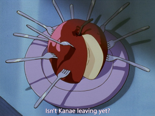
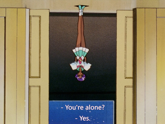
[...] Ornamental plants that do not require deadheading are those that do not produce a lot of seed or tend to deadhead themselves [...] if the plant bears attractive seeds or fruits, deadheading is normally avoided
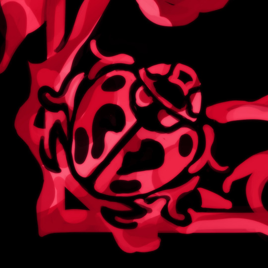
ladybird, ladybug, lady beetle: scientific name "coccinellidae" wikipedia: Etymology: [...] The common English name ladybird originated in Britain where the insects became known as "Our Lady's birds". Mary ("Our Lady") was often depicted wearing a red cloak in early art, and the seven spots of the species Coccinella septempunctata (the most common in Europe) were said to represent her seven joys and seven sorrows. Trophic Roles: Coccinellids act both as predators, prey and parasitic hosts in food webs. The majority of coccinellids are carnivorous and predatory. [...] Cannibalism has been recorded in several species; which includes larvae eating eggs or other larvae, and adults feeding on individuals of any life stage.
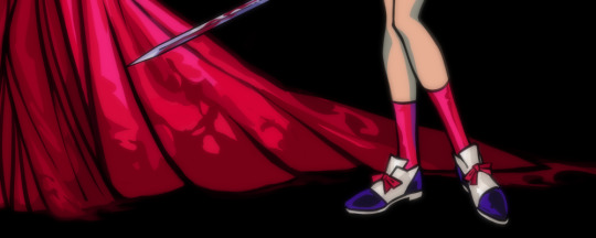
Defense: The bright warning colouration of many coccinellids discourage potential predators, warning of their toxicity [...] Species with more contrast with the background environment tended to be more toxic. Coccinellid haemolymph (blood) contains toxic alkaloids, azamacrolides and polyamines, as well as foul-smelling pyrazines. Coccinellids can produce at least 50 types of alkaloids. When disturbed, ladybirds further defend themselves with reflex bleeding, exuding drops from their tibio-femoral (knee) joints, effectively presenting predators with a sample of their toxic and bitter body fluid.
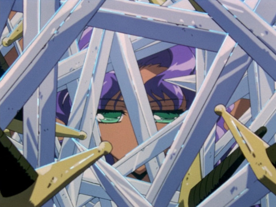
despite said being named after the lady virgin mary they are known to be promiscuous breeders, who's habits have been documented to result in epidemics of sexually transmitted infection in large populations, subject to various academic studies

lyric from lady oscar's theme song "the rose perishes beautifully"
youtube
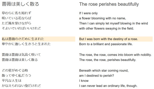
ok there was more but its been like 8 hours it turns out trying to put my thoughts into words even if its just a bunch of copy pasting is even more annoying than just thinking them im ending this post 😭
89 notes
·
View notes