#i should really do timelapses but i always forget to set them so
Explore tagged Tumblr posts
Text
Process :]

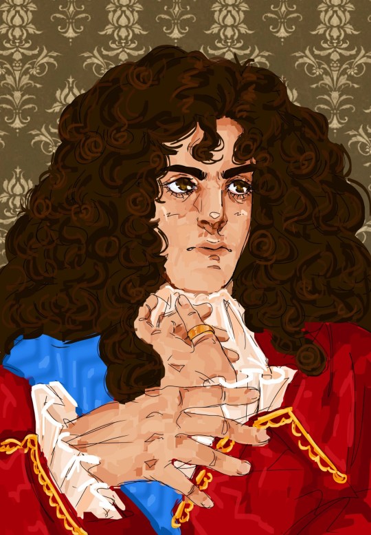
“Amore et Timore” - King Fernando I “El Animoso”
#i really like the emotion of the first sketch but i dont think it looks enough like him#i think my favorite part is always when i start painting stuff on top of the line art#bcs i dont like doing ultra clean lineart anymore if im just gonna paint over it#and painting over it means i can fix things i couldnt really get right in the lineart#its always atill crazy for me to see the steps like this#and i like this one bcs i saved a pic in the middle of painting which is really interesting to get to see#i should really do timelapses but i always forget to set them so#i really struggled w a lot of this so im glad it turned out well#i think once i get to the rendering stage its smooth sailing#lineart is probably the worst part bcs the sketch can be iffy but then i actually have to try and fix things#but as i said its good when i get to the painting stage bcs i can just paint over anything i didn like#for example: his nose and eyes. i struggled w so badly but painting them? so good!!!#i didnt care about the fabric in this unfortunately#i wanna learn more about it so i can give him super intricate detailed clothing bcs i think hed eear that#but i always paint the face first and then remember oh yeah theres clothes too oops#hehehehe anyways thank you for all yeh compliments on the hands. it pleases me bcs theyre in fact MY hands#idk i find it funny whenever people compliment me on poses and stuff#especially hands. bcs the first process of a drawinf for me is taking pose reference of myself#and i really wanted to do a portrsit with hands so i took a lot of hand centered pics so im glad it worked out#okay now hopefully i can mske a seb version of this 🥺🥺#so i can drop his name and motto lote on you guys too#my issue is i put more work into my posts and art than i do school 💀#like no no i cant just make a little lore post for their mottos and nicknames#I MUST PAINT SOMETHING! okay catie....#catie.rambling.txt
51 notes
·
View notes
Text
youtube
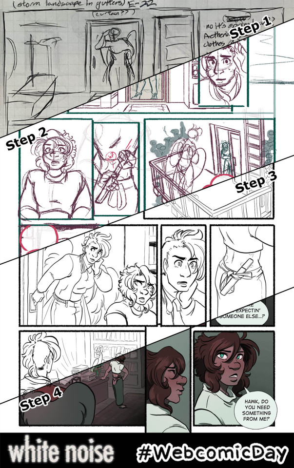
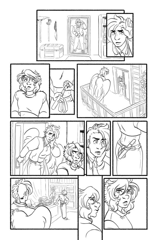
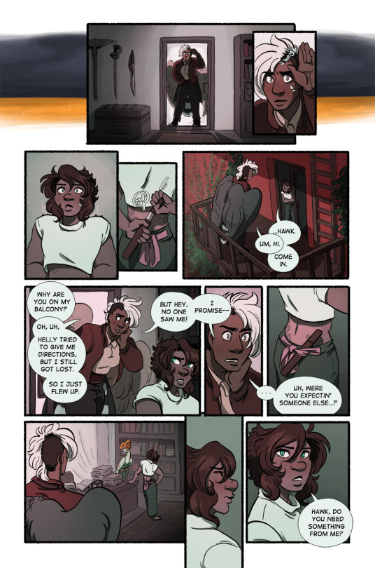
Happy Webcomic Day! My webcomic White Noise is a labor of love--according to Procreate, this page took me 15.5 hours to complete.* Here's a look into that process!
Some other notes:
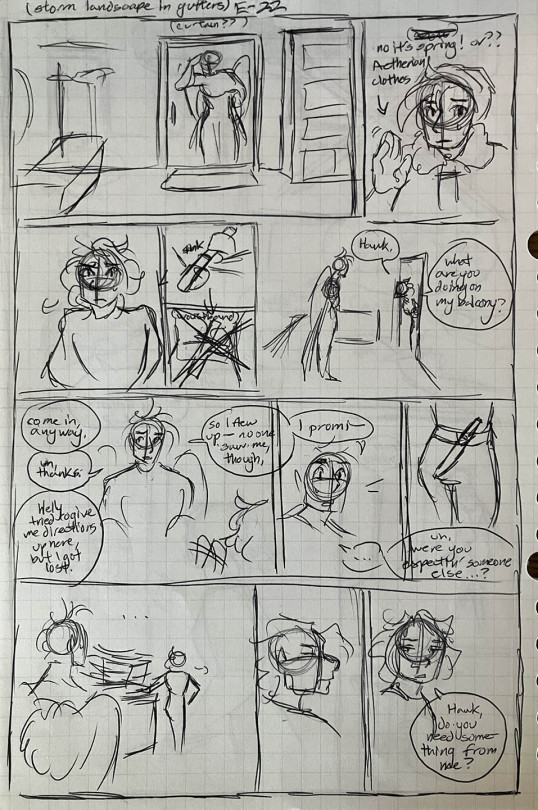
The thumbnails are done on graph paper and I script while I do them--there is no separate written script for White Noise. I usually spent a couple hours on weekends as needed thumbnailing, sometimes at a coffee shop or at home listening to records.
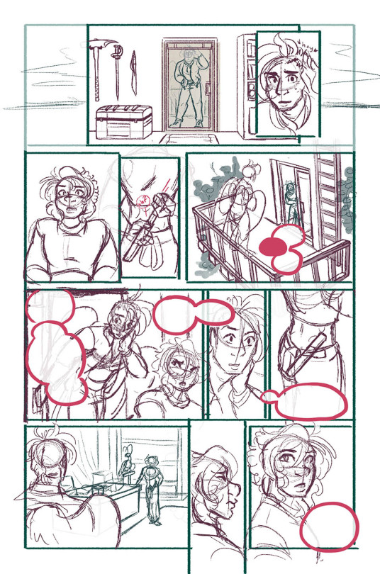
I then set up the file in Photoshop, so I can lay in the text and use the template I have with bleeds already set up. The text is rasterized and I shuttle the file over to my iPad via Airdrop.
The bulk of the actual work is done in Procreate, which records timelapses that I sometimes share to my Patreon. I usually spend a couple hours most nights after my day job or on the bus commuting doing this.
Once everything art-wise is done, I shuttle the file back over to my desktop to re-set in the text, add a stroke around the speech bubbles (Procreate doesn't have that took fsr) and do the resizing/exporting for web.
On Sunday mornings I get up, queue the page and write the page descriptions. I don't spend any time on the page descriptions outside of that.
Also, this process goes for the whole first arc of White Noise. I'm done with that arc (which means you can binge the whole thing I'm js!!) and am experimenting with some different methods these days, but my workflow is still generally the same.
*Some more talk about the labor (and burnout) involved below the cut:
This particular page (and most of the pages I did in 2023) took a lot longer than normal because I was heading into a burnout period that I'm still lowkey in/recovering from. It's obvious to me now in retrospect watching the timelapse here and seeing how much noodling I'm doing and how much I'm struggling with the process, but at the time I was just very frustrated generally. When I'm not burned tf out pages take maybe 10 hours max.
2023 was a pretty stressful year--lots of big life changes, uncertainty, pet death, health issues--so it's no wonder it propelled me into burnout, but it just goes to show that even the slowest and steadiest pace is not sustainable forever. I've been doing one page a week following this general process for over a decade! And I stuck to that pace because I knew it was one I could maintain. But even so, by the end of this arc I found myself working more and more slowly, not really looking forward to the work, feeling anxious about being behind, unhappy with the finished work, and extremely annoyed with myself for not being able to give it my all right there at the finish line.
I did stop for a while after the epilogue and took a more or less complete break from drawing for about a month--the longest I have EVER gone without drawing, much less working on White Noise--which did help, but these days my ability to work is...inconsistent. I should probably take another total break, but I'm reluctant. What if my passion never comes back? What if people forget about WN? It's already pretty obscure, and with the general social media collapse, it's harder than ever to get people to read my work. Now that I've left Hiveworks, WN doesn't even get the benefit of being linked to other comics (although objectively very, very few readers actually got referred to my comic that way.) And frankly, I'm also just too proud to go too long without comic updates. I've always told myself, I might not be the best artist or the fastest worker or make a popular comic, but I'm consistent. Difficult to let that go.
This is all to say that webcomics are hard. We do them because we love them, we have stories to tell, we are seized with the human compulsion to create. We spend hours of our time, almost always on top of the paying work that allows us to eat, to make something that we then give away for free. It has consequences on us that the reader doesn't often see, no matter how careful we are about it. If you ask me, webcomics deserve to be valued more.
Happy Webcomic Day! Read webcomics!
#webcomics#comics#webcomicday#webcomic day#web comix#indie comics#wn comic#white noise#behind the scenes#art process#comic making#sorry about the vertical video Tumblr would not just let me upload the video file into the post#Youtube
57 notes
·
View notes
Text
basic manga cap tutorial || ibis paint x

I got a request on how I color my manga caps (you can check them out in #morgan-colors-bnha and #morgan-colors-hq), so I thought I’d do this step by step tutorial that walks you through my process!
I color and draw on my phone (Samsung Galaxy Note10+) using the stylus provided with the phone, however you can use your finger. For manga cap coloring, I use Ibis Paint X, which you can find HERE for the Google Play Store, and HERE for the Apple App Store! It is a FREE app, and actually really helpful for a number of reasons, which I’ll show you down below! It does go without saying - there are a limited number of brushes that you get with the free section, but I haven’t found them to be too limiting, however I’ve only done basic manga cap coloring. You can watch short ads (I haven’t watched any, so I can’t vouch for the obscenity of them) to use the non-free brushes for a short period of time, though.
The first part of this tutorial is going to be showing you how I took THIS SUGAWARA manga cap and turned it into the one you see HERE (both as pictured on the header image). The second part of this tutorial, attached at the bottom, is a timelapse video where I show you how to turn THIS BOKUTO manga cap into the one you can find HERE.
Alright - without further ado, let’s get into the tutorial! As always, if you have any questions, please feel free to drop by my ASK BOX! Hopefully this is in depth enough without being too confusing. ❤
I’m doing this in steps so it can be in depth and informative enough, but I know that can become a little confusing, so I’m going to do my best to explain each step. I’ve also highlighted using little yellow boxes where I’m referencing, as pictured below.
To start, here are the ways I usually find manga caps:
1. Google searches, Pinterest searches, etc. Sometimes they’re already transparent, other times they’re not. I’ve found that I’m able to use the non-transparent ones because of the tools that are within Ibis Paint X.
2. Tumblr blogs - there are some blogs that are meant purely for transparent manga caps.
3. Manga scans. I, personally, haven’t used manga scans, but I know others that use them! They usually require some extra clean up, which can take extra expertise. Removing speech bubbles, backgrounds, etc.
Please remember to provide credit if it’s requested from the original poster!

Step #1: Open IP (Ibis Paint - I’m not going to say it every time because WOW that would get repetitive) and click on “My Gallery”.
Step #2: This is your gallery - as you can see, all of my prior caps are here, and this is where you will either open an old cap and keep coloring, or start a new one. In the bottom lefthand side, you see I’ve highlighted the “+” sign. This will bring you to the next screenshot.
Step #3: This is where you can choose if you want to create your own canvas, or create a canvas based off of the imported photo. Since I don’t do many “official” manga cap posts where I create a full image set from them, I usually just click on “Import Picture”, and go from there! However, if you want to create an image canvas, and import the picture once you’ve gotten the canvas open, please see Step #6 for how to import the image once you’ve already created a canvas!

Step #4: This is the screen that should pop up every time you import an image. When you’re doing manga caps especially, you’ll want to hit “Ok”.
Step #5: I believe these are the automatic settings, however if they’re not on your app, these are the settings I use when selecting how to extract the line drawing. Black at 0%, White at 100%, and Middle at 50%. This will remove the background from the manga cap, and only leave the dark line art remaining.
Step #6: This is what the layer should look like once you’ve extracted the line drawing. See highlighted the “+” button - this is how you will add new layers. I chose to add a new layer, which you can see in Step #7. However, if this is where you want to add an image, see the highlighted camera button. This will let you choose an image from your camera roll and import. The “Extract Line Drawing” option will appear each time that you import an image, so don’t worry about triggering it! It will trigger itself!
Step #7: Here is the new layer! I cut out the screenshot from before, but each new layer shows up on top, so I had to use the three little lines on the righthand side to drag it beneath the layer of the Sugawara manga cap layer.
Step #8: I used this new layer to import a photo of Sugawara in his uniform from a quick google search. I actually end up grabbing another one just to make sure I know what the bottom half of his uniform looks like, but I don’t show it just yet. Because the layer is behind, it shows up underneath Suga’s face. I end up erasing the parts that interfere with the cap here in a bit.
Step #9: When you click the brush button down at the bottom, this selection screen comes up. There are a ton of brushes to choose from, but for the base colors, I use “Dip Pen (Hard)” at 100% opacity. I’ve shown it highlighted here!

Step #10: Now we’re going to create our color palette. Sometimes I will find color palettes online And import them, but for the sake of simplicity, I’m going to use this photo of Suga along with another one that I nab later to create the palette. The way you use the “dropper” tool (if you’re familiar with Photoshop) to select the colors from another portion of the image is to press down rather hard, and then this circular selection tool will pop up. You can keep the pressure and drag it to the specific spot you want to pick up a certain color for. I’ve found that it’s best to do this with my finger instead of my stylus. I’m not sure if it’s because the heat of my finger and the change in pressure is easier to pick up, but that’s what works for me!
NOTE: It is important to note that if you have the eraser tool selected instead of the brush tool, you won’t be able to use the color selector. This might come as second nature to some of you, but it STILL makes me screw up from time to time, haha.
Step #11: Using the dropper/color selection tool from Step #10, I create a small color palette, as you can see in the upper lefthand corner of the image in this step. I grab both the lightest and darkest shades from the different things I’ll need to color in for the cap. I picked up the highlights and shadows of Sugawara’s skintone, eyes, hair, and jersey. I just draw in little overlapping circles so I can switch back and forth between the colors
Step #12: I added an additional layer in the very back of this image, and colored it in completely using a blue shade. This will allow me to make sure that I’ve filled in all of the space behind the manga cap. It’s important to note that in order to color the line art in later, you’ll actually need to “overdraw”. We’ll touch on that more later.
Step #13: As I show here, I have a layer where I use the singular skin tone shade and color in behind the manga cap, filling in all the spaces where Sugawara’s skin is showing. I usually use a different layer for each different shade/color just in the event I need to do a bunch of erasing, or if I need to change the layer style later.
Step #14: Here is where I show how I “overdraw”. I’m not sure if you can see it very well here in these screenshots, but the way that these manga caps are drawn, sometimes the line art isn’t “clean”, it looks more shaded/scratchy. So, in order to combat white space, I usually overdraw and then go back in with an eraser. You can see in Step #15 the size brush I usually use - somewhere between 2.0-4.0, but most of the time I use a 3.0 size brush. I’ll go back in with the eraser with a similar size on the easy parts, and then all the way down to the smallest size - 0.3 for really close quarter erasing.
NOTE: It’s important to realize that the smaller the eraser, sometimes the circumference of the eraser can be really light in opacity as well. You can help this with the intensity of the pressure that you use with your stylus/finger, but I’ve found that sometimes using a really small eraser can be counterproductive. There are times where I’d rather “over” erase in which I actually erase into the cap and then redraw using a small brush size. You’ll have to play around with eraser/brush size and such to see what works best for you!
Step #15: Here is the skin all colored in! You’ll notice I colored in his eyes and mouth, which are going to end up being white in the end. I do this because usually it’s easy to forget that you need to color things in white if you’re doing it against a white background. I oscillate between the colored background and the white/transparent one because sometimes it can be tough to look at that bright color all the time. I’ve found that this is more of a tip/trick for me to be able to remember to color in his teeth and eyes and even sometimes the brow or other features! In the end, this just works for me. You don’t have to do this step!
NOTE: As I stated in Step #14, using pressure can change things. The same goes for this specific pen type - the dip pen. I use about size 3.0 most of the time, but I can actually do really detailed work with this size pen (see Suga’s ears, the spaces between his hair, etc.) by using lighter pressure. I do have a stylus, so this is a lot easier for me. The pressure was a little tricky for me to get down in the beginning, but once you realize how soft/hard you need to press down, you can use bigger brushes for even smaller areas. I find that makes it a lot easier for me, since I don’t have to keep changing the brush tool - which you can do using the sliding bar at the bottom of the screen labeled “Thickness”. The thickness of a brush is the circumference it has when you are using the hardest version of pressure you can muster, so keep that in mind!

Step #16: Here is where I do the basic coloring for the skin, hair, and eyes. These colors will be relatively the same as the colors from the palette, because there is not a “gray cast” caused by the line art sketch from the manga cap. This means that the skin color that is showing in the manga cap that I’ve colored is pretty close to the original color from the screencap from the anime/the palette that I’ve got in the upper lefthand corner. I do FLAT coloring for this - aka NO SHADING YET. So I only use the LIGHTEST shade for the hair and skin - the ones farthest to the left on the palettes for each section. I do use the DARKEST shade for the eyes, but that’s because usually the lighter shade is the one you use most sparingly, where as with skin, the darker shades are used for shadows only and aren’t used in excess.
NOTE: As previously stated, I do a separate layer for each different color. At this point there should be six layers, as follows (from the bottom up): Layer 1: Background Layer (Mine is blue, but for the sake of easy viewing, I made it white.) Layer 2: “Notes” Layer - this is where I keep my notes, as in the reference photos, color palette, and any other things here and there. Layers 3-5: These are the colored layers - skin, hair, and eyes. Layer 6: Manga Cap Line Art
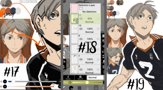
Step #17: Here’s where I’m showing the two different orange tones. This is what I meant in Step #16 - The original orange shade is the lower part of Suga’s collar - as you can see, the line art shading makes the color a lot more muted. I used the color wheel to find something brighter, just for a comparison shot. I still choose to use the traditional palette that I pulled from the anime screencap.
Step #18: Now that I’m ready to color the manga cap pieces that are skewed by shading (i.e. his jersey here), I usually turn the manga cap down in opacity, so I’m able to recognize where I need to fill in! This is where I fill in the blue of the jersey, the orange of the collar and other accents, as well as the off-white shade for the number and the line accents.
Step #19: Using the eraser and smaller brush sizes, I fill in all of the flat colors. No shading yet!
Here comes the time consuming, nuances...
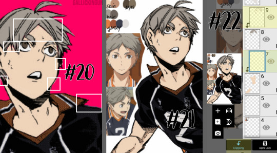
Step #20: I’ve turned back on the colored background layer - sometime between when I started and now, I changed it from blue to pink. If you can zoom in on the image, you’ll see the boxes in white contain “errors”. This is areas where there are “holes” in the coloring, or where I’ve gone outside the lines. I’m going to go back in and clean this all up with the eraser and some more brush work.
NOTE: This is very important, especially if you’re trying to make this a transparent image, or if you’re going to do the extra steps and color in the line work. Any holes, overdrawn, or underdrawn areas will make the final drawing look a little funky.
Step #21: Here is the shading! Honestly, this cap kind of shaded itself, haha. Some manga caps have “built in” shading, as you can see on Sugawara’s arms and neck. I added some shading to his hair and face, trying to use the anime caps as a reference. I’m not very good at shading yet, but I wanted to show it here so you guys could see!
I used the darker shades from the palettes on the eyes, hair, and skin. I didn’t do any shading to the jersey because the manga cap lines already skew it so much, that it didn’t really seem necessary. This can be a really hit-or-miss time, both with areas that you choose to shade, as well as the colors that you use. I would really suggest searching for skin tone palettes if you’re not using the anime screencaps for reference!
Step #22: For my shading, I actually use “clipping” effects. As you can see, the two layers that are highlighted are clipped to the layers beneath. This means that the coloring on the clipped layer will “attach” aka clip itself to the layer beneath and that layer only. So, for the shading of the skin, hair, and eyes, I chose to clip the shaded parts to the base coloring, that way even if I over drew, the colors wouldn’t bleed together.
I did more of what’s called “cell shading” for this manga cap, as well as the Bokuto one that I do in the timelapse video below. What is cell shading? This wiki page explains it pretty well, but basically it’s more “harsh” shading where there’s not necessarily an airbrushed quality to it, it’s more blocky. You can see I only chose to use one color of shading, which makes the contrast much more stark. IP does have several airbrush tools, I’ve used them in my Bakugou manga caps for his gauntlets, and they work really well!
I brought up earlier that it’s important to color your base colors all the way to the edges of the manga cap line art. This clipping effect is why. On Suga’s neck and ears, the darker shade that I used for his skintone goes to the edge and actually underneath the line art of the cap, because it is clipped to the base skintone layer beneath. Had I not made sure to go all the way to the edge of the line art, this would be much more choppy, and there would be white space between Suga’s ear and his hair!
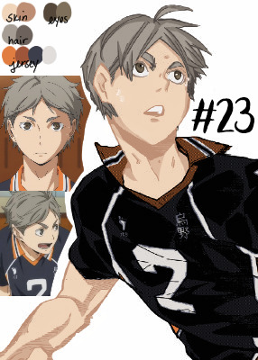
Step #23: Here is the extra step - line art shading! This can be tricky, depending on the complexity of the line art, the shading, etc. Usually, in choosing a shade to color in the line art, I grab the darkest shade for that section, and then grab something even darker. As seen in Step #18, there is that drop down box that is currently listed to “Normal” - this will need to be set to “Screen” for the current line art coloring layer. You’ll also need to “clip” the layer you’re using for the line art color to the manga cap, meaning it will need to be on top of the manga cap layer - and therefore, should be the highest layer in the image.
For this image, I only did line art coloring on Suga’s face, hair, arms, and neck. I was really satisfied with leaving the jersey alone so far as coloring. I did this mostly because of the sketchy quality of the cap, the line art would be really involved and complicated, and it just wasn’t worth it to me (so sorry lol), and I liked how it looked with the darker color outlining it anyway.
Also, I added little details like making the sweat on Suga’s face outlined in white! And yes, I do know that missed Suga’s beauty mark, but we’re going to pretend I didn’t just do that. I love you, Koushi, please forgive me.
And that’s it! I’m sure there are easier ways to do things, or better ways, haha. But this is my beginner tutorial (as in I’m the beginner, lol). I hope that this helped anyone whose doing it for the first time! I stated this before, but if you have any questions, please feel free to hop into my ASK BOX and ask me! I’d love to help anyone out! And I’ll do my best!
See below an additional manga cap coloring - Bokuto Koutarou this time! I thought doing a timelapse video of me actually coloring in the cap would help you guys out!
PLEASE BE AWARE: This video is in 2x speed so it could not be forever long and really boring lol. With that being said, I do spin the screen around several times while coloring in the cap - this could make you nauseous, so please beware of that before you watch!
Here is a link to the time lapse video on YouTube!
A special thanks to @cutesuki--bakugou who helped me a lot while I was coloring my original caps, and also to @writeiolite who nudged me in the direction of finally starting to color manga caps! And a little thanks to @rouge-heichou since I bugged her about a couple of things as well. And then as always, a huge thanks to @candychronicles because she keeps me sane. Also a special mention to @pixxiesdust because she does really cool gifs and has done a wonderful job in the bookclub of trying to share her knowledge with everyone else.
Disclaimer: I’m no artist, this is just for fun! I’m sure my shading and line art can use some work.. but I’m not focusing on that! Instead I’m just going to keep playing around and having a good time ❤
#haikyuu!!#haikyuu manga#haikyuu manga cap#sugawara koushi#bokuto koutarou#manga cap color#manga cap coloring#manga cap tutorial#coloring tutorial#manga cap coloring tutorial#morgan colors hq#morgan colors bnha#morgan does tutorials
159 notes
·
View notes
Text
Colouring/ Shading/ Lighting for Digital art
HI! Hello~ I’m here and I have a teeny tiny tutorial for you today (courtesy of dear Melito who actually wants my help??? I’m??? Blessed??? I realise that there’s a lot of you who have no clue who the fuck this person I’m referring to is, oh well, not my problem — ur missing out on hella great cake.)
So I have a timelapse of everything (below, duh, in case you can’t scroll) and I’m also gonna make comments on it cus ya know, these vids are only a minute long and thirty fucking megabytes like Jesus Christ.
So without further ado-do!
Should I have added music? Probably??? Ehhh the deathly silence can comfort you. (Wow what a mood.)
The Run Down:
Is rundown one word or two??
When colouring, I break it up into three main steps: base, line and “Hiding All My Fuck Ups”
(First) Base
I’ve never made it to first base... or any base
When colouring, use a non translucent brush to colour in everything. As in, so it’s completely solid??? Where’s my English today?
For every different colour, put it on another layer! I tend to do the skin colour first. You can go over lines that will be covered with another colour... did that make sense?
That’s it, I just felt the need to have three steps at least.
Line
As in... line art.
What I do is I lock my layer — that means when I try to add colour, colour will only be applied to the area that’s been drawn on.
I usually colour pick the colour I used for the base, and the line looks very pale when done (I do this with a non translucent brush too)
I then adjust the layer with lineart so the colour looks darker and more saturated. For my program (Medibang) I go Filter > Hue > Max out the saturation and lower the brightness > save. Sometimes I may do it again if it’s not dark enough.
If you can’t edit the colour then there’s another way! Duplicate your lineart > select the layer on top > change blending/ layer type to “Multiply” (it multiples the colour... duh)
If THAT doesn’t work I have one last suggestion before I sadly admit idk — duplicate line art > select top layer > colour the entire think a dark colour or black > lower the opacity
Line art done! (This time I wanted six steps — 6 is my fav number)
“Hiding All My Fuck Ups”
I rely on this too much okay?
I can actually further split this into two; shading and “I’m Kidding Myself” — let’s begin!
Shading
To shade, I work from bottom layer up!
What you’re gonna do, is select your bottom colour, (or any really but ORDER HELPS) and lock the layer.
Why? That way it’s easier to colour without going over the lines! (Your building on the foundation you set essentially)
With a semi translucent brush (FYI, translucent brushes are thinks like “blur” or “smudge” that purely affect what’s there and do not add anything) I use the watercolour brush set at 15-20% opacity.
I’ll eyedrop the base colour that I’m shading, and with the colour wheel, tru and find a darker version of that. NOTE: when looking for a darker colour, I don’t go to the black, I try and find a more saturated colour OR a darker HUE — black is a curse, I don’t ever use pure black or pure white — give your work the colour it deserves UwU
With the watercolour brush, I literally run the darker colour over all lines that indicate a shade (imagine a light somewhere and what that light touches is what you mainly focus on)
For clothes, I follow the creases I’ve drawn
For hair, I tru to imagine the hair in three main shapes and run the colour over the perimeters of those
Then it’s time to blend! I usually just eye drop the base colour again for this, and trace (lightly, our tablets have pressure sensitivity — same going for steps 1-8) the line that divides the light from the dark, adding a middle ground since the watercolour brush is only semi transparent.
For adding blush to skin: create new layer above skin layer > set to multiply, again, if you can’t do this then you follow same steps as before with line art) > using an Airbrush like brush (soft, no sharp edges, kind blurred), colour the skin areas that need blush.
Skin areas that need blush; areas with LOTS of blood vessels (head... the OTHER head...) areas with thinner skin (elbows, knuckles, knees)
If your skin layer was on the bottom, your blush will only appear on top of the skin and not the other layers!
Just be careful about the areas outside the drawing — you may need to do some tiny erasing
Finally, merge all the colours together. Sometimes different layer types don’t like to merge together without screwing up your other layers, to avoid simply merge them one at a time from bottom up.
As in, second last one and last one merged together, then the one above that merged with the last one — merge everything with the last one... AM I MAKING SENSE?!
I’ll usually merge the lineart with the colour too — I just didn’t here for some reason
“I’m Kidding Myself”
Here we add stuff that hides flaws and merges the character with a background if you have one!
I use three types of layers for this, if your program doesn’t use these then see if they have similar functioning ones (I’m always experimenting so this isn’t set in stone) if your program has nothing then... this will be a little harder, you’re gonna have to do this by hand somehow.
I use these kinds of blending layers; Multiply, Overlay and Add
First I prevent getting the colour on anything BUT the character; magic wand tool > select the empty space > hold ctrl/shift and keep tapping to add or remove areas > invert if you need in order for the art piece to be selected
You can see this when my background when blue, I’m basically highlighting my art of Yuri
Colour this entire space on a new layer. The colour I use doesn’t change here on out (except in the video I do cus I lose the colour but that’s aside the point). When choosing a colour, consider the colour of light — I use human colours??? Colours you find on a person essentially.
As a general rule of thumb; for every new thing, new layer, it gets a little harder here. I also use a semi translucent (watercolour) brush again for everything!
Now we have a silhouette of Yuri — I set this to multiply, it’s essentially like a highlighter marker pen but darker?? This is so that I may adjust the entire colour to fit the lighting colour
New layer (NL), I set to Overlay. Overlay is like multiply except bright! Remember what I did when shading? Yep, rinse and repeat! Afterwards, adjust the layer’s opacity setting so that it fits better with the image.
I’ll also make the brush really tiny and go over hey areas to highlight such as the edge of the nose, chin and jaw — I’ll also add shine to the eyes.
NL, set to Add. I only ever use this layer if I want to achieve “blinding lights” sort of looks. So when the lighting is immense, I have a white background, or the background is incredibly bright.
I use add layer scarcely, to blemish any lines and make it look more refined. I’ll also adjust opacity if need be.
NL, I’ll use the airbrush set too REALLY BIG (1000 usually) and if I have a background, will try and add light to it by making this layer multiply too. I’ll add darkness in the side or corner of the background etc.
NL do the same thing with Add except also make a point for where the light is coming from.
NL, I’ll use a mix of Add and Overlay to add sparkles, fragments, light spots etc depending on image type of need be
Using a Fluffy pastel brush (it’s textured) I also use pure white. This is the only time I ever do.
I’ll add reflection to eyes, jaw and nose. For hair, I’ll pick out a few strands of hair where it’s darker and throw in some loose lines. Clothes are rarely outlined and only where light touch. I use this limitedly.
Ctrl + D ;) to deselect the lasso tool — I don’t usually merge the layers after this because it’s usually too messy and I’m done anyway so I save it, however you CAN put them all in a FOLDER if need be. (I have a few in my vid, the entire thing is in a folder tbh)
Voila! That’s it!
I hope this has been of some help or use! And that this makes SOME sense... I’m absolute shit at explaining everything...
This was incredibly fun to do tho and I spent two hours typing this all! Wow!
Okay thanks for reading! (Hope this helped Melitooooooo, don’t forget the wedding cake ~ v/ important part of marriage you know)
#art#digital art#yoi#yuri plisetsky#art tutorial#tutorial#colouring tutorial#how to colour#colour and shading#how to draw
47 notes
·
View notes
Text
The Waste of Westworld
So now we have come to the end of Westworld season 3. I never know what to make of this show. Because I like it. But yet, its kinda,, bad. Plus, no one that I know watches it. And that one person who does, cannot grasp what is going on,, or is a month or three behind, so trying to talk about it is useless.
But like I said, I do like it. The overall story and general theme is great.
For those who might not know what Westworld is..The HBO series and original movie plots revolves around a future-ish vacation park, where the guests interact with lifelike robots/androids.. To play out storied scenarios. But because everything is robots and computer driven, the guests can literally do anything to the lifelike “hosts”. Murder, rape, bank robberies... it’s all very possible in Westworld. But of course something goes wrong with the system and the Hosts start fighting back.
Anyhow. The first season of the series was pretty gripping. We get a better look at the beginnings of the park and its founders, while following the subtle changes in the Hosts that lead to the mentioned security failure.
What the series added that the original movies only slightly eluded to was much more of the behind the scenes, dark corporate side of things. And that bit made the darker twist possible.
Throw in a sizable bit of sleight of hand moving timelines and you got a couple of story points that are quietly coming at you from different ends of that timeline that are all moving towards a finale that neatly ties up those ends and sets up the whole series to move forward perfectly. At this point, the show was really in its groove.
Then season two came along.
The set up of the first season really had season two pointed in a great direction. But instead of running with the fantastic plot, the show decided to run with the other thing it was known for,, the jumping around on the timeline thing.
That alone wouldn't be so bad, but doing it just to confuse people, did just that. It was so all over the place, with little explanation. It became too confusing to half of the people trying to follow along.
And for those who did manage to keep things mostly sorted, it became quite clear that the confusion was done on purpose, with no reason other than to mess with them.
To be fair, the second season story was actually pretty good.. if you laid it out in direct order, without all the fluff and misdirection. But by itself,, very short.
So by keeping the audience turned this way and that way by uselessly bouncing forward and backward, not knowing what the hell was happening, it allowed the short plot to be spread out for the length of the season, but then never really tying things up as good as season one.
But it did more or less open the door for season three. I say more or less because it really felt like they were also leaving the door open to fade away and not return.
But season three did return.
I haven't mentioned the acting in the two previous seasons. We all know Westworld has won many awards in its first two seasons for both acting and support actors.
So just to say it… I don't see why.
The weakest link of Westworld for me has always been its poor acting. Some of its great don't get me wrong. Ed Harris, Hopkins, Wright, Tessa Thompson.. Great! Even Evan Rachel Wood has moments, but she mostly provides nothing. But probably the worst of the bunch is Maeve, Thandie Newton. She ruins any immersion happening. And every season the acting seems to get worse and worse. To the point that I'm starting to think that its part of their gimmick.
Ok before getting to season three lets pull a few things together here.
Season two took a pretty hard nose dive with the confusion of the time jumping. May have lost a few people along the way.
They took one of the poorest actors, made her mostly the focus, plus very unrealistically and comically immortal. (Maeve)
Ok ok,, season three. Some where before work started on season 3, someone in the board room must have said,, “you what we need to do,, I think we need to stop this time jumping thing. I think we are confusing people a little too much”
GREAT! Good idea. I couldn't agree more. Just tell the story, let it happen in real time and stop using that gimmick. I 100% agree..
But then he continues…. “And also, we should look at getting a new, more horrific actor to take a new up front role so the audience can forget at how badly acted Maeve is. Lets call Aaron Paul!”
Are you kidding? Who the hell though this was a good idea? If the idea was to make me cringe and mostly ignore a main character, then casting Aaron was the best choice. Im gonna say this casting choice is one of the worst moves of this series.
As far as the meat of season three goes.. What happened to the plot writing? Was the writing all along that bad that only the forced misdirections made it bearable? Seems that way. Now that we have a straight foreword moving plot where one can focus on it.. there is nothing. Just... nothing.
Sure there are a few groovy action scenes and a few, oddly out of place plot point tie ups that only felt like time fillers rather than development. But for the most part, season three was a rushed mess that felt like it was being made up as they went.
Every episode left me thinking it was just one of those filler episodes to try to explain something, and next weeks episode would be back to being great!
Except none of that happened. Ever.
When I saw that the next weeks episode was the season finale, I literally said to my self.. “How can it be the finale? Nothing happened yet!”
The finale came around. It happened. I watched it. And I immediately thought. This entire season could have been just this one episode. Nearly nothing that happened in the previous nine episodes made any difference.
We all kinda thought we knew how it would turn out,, and thats exactly how it did. We didn't need nine hours of filler to get there.
Anyone who had watched both of previous seasons, only needs to watch season three finale and they would be perfectly caught up.
No other way to say it. Season three was a complete and utter waste of time.
The one good thing is that there is going to be at least a season 4. And the only direction that it can go is up.
This franchise had so much potential at one time, its just too bad that they went for gimmicky tactics, and that started its downfall. The story they had, that they used could have carried it, but sadly everything else around it crumbled and took it all down.
Timelapsed Scifi
0 notes
Photo
New Post has been published on https://www.updatedc.com/2019/01/11/freewell-nd-pl-filters-for-dji-osmo-pocket-review/
Freewell ND/PL Filters for DJI OSMO Pocket Review
The Freewell ND/PL filters for the DJI OSMO Pocket are some of the first ND/PL filter solutions available for DJI’s latest creation. I reviewed the DJI OSMO Pocket late last year and unfortunately, at the time, there were no ND filter solutions available. For professional shooters to get the most out of the OSMO Pocket they really do need to use ND filters, otherwise, you have to run excessively high shutter speeds.
On low bitrate, inter-frame codecs running high shutter speeds can strain the codec. Less motion blur means more fine details per frame, therefore, harder decisions for the codec on what to keep and what to crunch. By sticking to the 180-degree shutter rule you will be helping the codec out.
The problem with the OSMO Pocket is you can’t adjust the f-stop, so even if you use ND filters you aren’t always going to be able to achieve correct exposure by following the 180-degree shutter rule.
What do you get?
Included in the Freewell 4K Series Bright Day Filter 4 Pack for the DJI OSMO Pocket set are the following:
ND8/PL ND16/PL ND32/PL ND64/PL
The filters come in a small protected case and you get a cleaning cloth. The filters give you between 3 to 6 stops of ND depending on which one you use. As the DJI OSMO Pocket performs better at lower ISO levels such as 100 and 200 you are probably going to find that you will primarily be using ND/PL 8 and ND/PL 16.
What are the filters made out of?
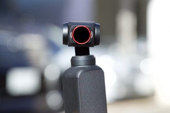
Freewell claims that the filters are made out of 16 layers of multicoated optical glass. The glass is manufactured in-house by Freewell. These are hybrid filters that combine both ND and PL properties. This is a good combination as the OSMO Pocket doesn’t have particularly good dynamic range, and it doesn’t deal well with bright reflective surfaces. You can rotate the red ring to change the polarizing effect.
The filter frame is quite thin and despite the filters being round, they have little tabs on the side so they are a little easier to handle. The filters come with a lifetime warranty.
Weight
As the DJI Osmo Pocket utilizes a very small gimbal, you don’t want to add any excess weight to it. FREEWELL doesn’t quote any figures for how much their filters weigh. I put them on a kitchen scale and they barely moved the needle. I estimate that their weight is around 1 g (0.03 oz). This lack of weight means that using the filters shouldn’t affect the gimbals performance.
Build Quality
With the filters being tiny and weighing in at 1 g (0.03 oz) it’s quite hard to determine build quality. The filter frame feels nice and sturdy and the glass is well protected. My only gripe is that the writing on the filters is so tiny that you almost need a magnifying glass to see what ND strength you are using.
The filters also have a small red ring around them so they are easier to see. As they are so small, if they were black and you dropped one you probably wouldn’t be able to find it. I think what they should have done is color code the filters so a color represents the strength of the filter. Then all you would need to do is put labels in the box that showed the color and an ND strength. That way you would know exactly what filter you were using.
Do they attach firmly to the OSMO Pocket?
The filters magnetically attach to the front of the OSMO Pocket. Now, there is a little groove for where they attach, you just have to line the filter up and place it down. The filters do stay on fairly securely and even if you knock the filter it doesn’t move. The problem I found is that because the filters are so thin they are hard to hold onto and I constantly found myself touching the glass with my fingers. You can also turn the red ring to adjust the polarizing effect, but because the ring is so thin you need to be careful that you don’t end up putting your fingers on the glass.
As they use magnets you can actually stack the filters to create stronger strengths of ND. While I wouldn’t actually recommend putting that much glass in front of the OSMO Pocket’s camera, you could do this for capturing long exposure timelapses or photos.
How do they perform?
Having ND filters is one thing, but if they aren’t well made from quality glass then they can introduce fairly extreme color shifts, particularly when high strength ND is used. This is especially true when you combine both ND and PL properties into a single filter. I decided to do some tests to see how well the Freewell filters performed. To do this I shot a color chart, first with no ND/PL filters being used, and then with the various strengths of ND/PL. What I wanted to see is if there were any color shifts or loss of sharpness when using the filters.
vimeo
The filters performed fairly well, even at high ND strengths, but they do have a slight push towards green. In saying that it’s fairly easy to correct the small green tint in post. The strengths seemed to also produce inconsistent results. In somewhat of a surprise the ND/PL 8 had the most noticeable green cast, while ND/PL 64 seemed to look the best out of all the filters.
When I compared the Freewell filters head-to-head against the PGYTECH OSMO Pocket PRO ND/PL filters I found that they weren’t as good. That’s not to say these filters are bad, but in my opinion, they aren’t as good as the PGYTECH filters which retail for the same price. Maybe this is because PGYTECH is using German SCHOTT optical glass, which can be found in more expensive ND filters that get used on digital cinema cameras.
The filters do suffer from a slight loss of sharpness, but this is only really noticeable at higher ND strengths. If you use the ND/PL 8 and ND/PL 16, you probably won’t be able to perceive any real-world difference.
I also tested the filters in real-world conditions and they certainly make a difference to the results you can obtain when using the DJI OSMO Pocket. Not only do they allow you to keep the shutter speed down, but they also do a very good job of minimizing and creating more pleasant flare. The ND/PL filters also help the OSMO Pocket with bright reflections and glare, and it’s nice that Freewell has made the filter rotatable so you can adjust the polarizing effect. The only problem with having a rotatable PL filter on a small gimbal such as the OSMO Pocket is that you need to rotate it everytime you put it on the camera lens to place it in the correct position. You can only really do this with the gimbal turned on and this means that you will probably have to end up resetting the gimbal once you have finished making the adjustment. It’s very easy to forget that the filters need to be rotated to adjust the polarizing effect and if you are in a hurry you may well end up shooting with it in the wrong position.
Above you can see the difference they make. At the top, the OSMO Pocket is set at 100 ISO 1/5oth shutter and you can see that the picture is massively overexposed. At the bottom, the same settings are being used but this time I added the Freewell ND/PL 16.
I also found the filters were great for doing long exposure timelapses and taking long exposure photos.
I was surprised that a set of ND/PL filters that retail for under $70 USD was able to produce fairly decent results. I’ve tested expensive filters from well-known manufacturers before that weren’t very color accurate.
Not all filters are created equal, and this is why it’s important to do tests like this. It’s important to know exactly what you are getting.
Competition
The PGYTECH OSMO Pocket PRO ND/PL filters
Direct competition comes from the PGYTECH OSMO Pocket PRO ND/PL filters, Honbobo DJI OSMO Pocket ND8+ND16+ND32+ND64 kit, and DJI’s own ND filters (which still aren’t available).
Price
The Freewell 4K Series Bright Day Filter 4 Pack retails for $69 USD. Coincidentally this is the exact same price that the competing PGYTECH OSMO Pocket PRO ND/PL set costs. The Honbobo filters retail for ¥8,399 ($76.70 USD).
Conclusion
The Freewell 4K Series Bright Day Filter 4 Pack is a fairly good solution for the Osmo Pocket if you are looking for ND/PL filters and I like how you can adjust the amount of polarization. I still prefer the PGYTECH OSMO Pocket PRO ND/PL set as it’s got almost zero color shift, it’s a little easier to attach, you can read the ND strengths, and the magnetic carry case is a clever addition. With the Freewell filters, it’s almost impossible to read what the ND strengths are unless you pull out a magnifying glass.
0 notes