#art related rambling
Explore tagged Tumblr posts
Text
hey artists I just wanna say something that I kinda wish someone had told me when I was struggling to find a job related to art.
It's okay to get a non-art related job.
Like seriously, you aren't a failure if you do. I remember thinking I would be but it is such a fucking tumultuous time right now (especially with game dev) that honest to God I wish I'd also taken a trade skill alongside my art. People will always need electricians, HVAC, welders, mechanics.
obviously you can still do your art on the side - take commissions, contracts, etc. I want to emphasize that often with art related jobs you will LOSE THE DESIRE TO DRAW AFTER WORK IS DONE FOR THE DAY. it's exhausting. Fulfilling? Most times, but there will be a lot of bureaucratic nonsense that leaves you feeling dead tired and just wanting to space out after work.
I didn't realize this when I first became a fulltime concept artist. I genuinely thought I'd have the energy after drawing all day to....draw all day after work. I hardly do. I usually want to mellow out with a videogame or do something mundane like the dishes or cleaning. It's exhausting.
Anyways this ramble was prompted (specifically) because I know how hard it is to get art jobs right now. Especially with game dev, I will say very plainly that it is a very rocky time within the industry with layoffs happening left and right. I've known people who get hired and laid off within the same month.
So don't feel bad for not doing it fulltime. It can stay your passion hobby and still be worthwhile.
508 notes
·
View notes
Text
*falls through the ceiling and comes crashing to the ground*
SECRET LIFER DESIGNS BUT THEY ALL HAVE PERSONALIZED LIKE, BOOK HOLSTERS FOR THEIR TASKS THAT THEY GET EACH SESSION

#sorry i just got excited#i find it fun to think of how to include gimmicks in the designs *sometimes* and this is what i thought about for sl#character designs#related#secret life smp#secret life spoilers#kinda#my art#struda rambles
7K notes
·
View notes
Text
WOE, NEXT SUMMER DESIGNS FOR SOME OF THE GRAVITY FALLS KIDS, GO!


Click for Quality!
Pt 1/2/?
#I’ll post the next batch when I finish the grunkles#I don’t like my first attempt so I need to redo them#aria draws#digital art#digital drawing#fanart#these designs may or may not be used in an AU I might post about… and whenever I post about curly I’ll use these designs too#the AU and curly aren’t related but they take place at the same time#just in separate universes#why am I rambling half of y’all don’t give a shit bout curly 💀#gravity falls#gf#gravity falls fanart#gf fanart#dipper and mabel#mabel and dipper#dipper pines#mabel pines#gideon gleeful#pacifica northwest#robbie valentino#wendy corduroy#also yes I know Robbie isn’t canonically ginger he’s canonically brunette but someone in a discord server I’m in suggested it and I love it#sue me!
784 notes
·
View notes
Text

!! Lil guys !!
#bumfuzzled art#bumfuzzled animations#mha#tokoyami fumikage#dark shadow#I deleted like half the frames because I ran out of time mb guys. terrible planning.#and now for my regularly scheduled rambling#lil babies#they’re so eepy and so smoll#it’s their birbday#hc time: darkshadow does not need to breath but sometimes he’ll mimic the movements#1 because it makes him appear less scary and 2 because it’s calming for Tokoyami#kinda like the baby toys now that I think about it#on an animation related note:#I spend too much time animating darkshadow.#I just really like the effect but it’s very time inefficient#and I had to redo it when I took out frames so I basically did it twice…#for the record it’s in 8 fps but was intended to be 12 fps so it’s choppy#and not bouncy :/#I like my animations bouncy#edit: nvm I’m a dumdum and forgot to change the timing. it’s still in 12fps so it’s super fast.
662 notes
·
View notes
Text


in which hunter’s possession goes a whole lot worse
#my art#toh#the owl house#hunter toh#luz noceda#toh fanart#the owl house fanart#cw body horror#i realized i never posted this to tumblr? it’s from december 2023 LOL#i always forget to post art here!!!#au my friends and i were playing around with#rot au#or carcass hunter..lol#but its october so. it is on my mind again heavily#i love small town / forest horror#back in 2022 before TTT i had been writing some stuff w/ a more horror-mystery aspect based on the teasers and fan spec at the time#so i was having fun with this#at some point i wanna more fully write/draw out some stuff in relation to this au#one thing about me i LOVEEE designs with multiple faces. i have done a number of them i have yet to post but Youll See#okay rambling over ill write an actual text post later fjshdkdhxk
828 notes
·
View notes
Text
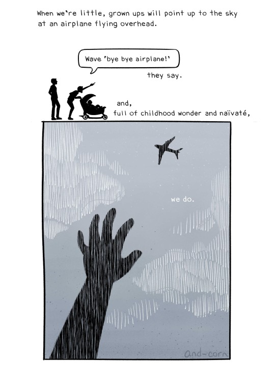
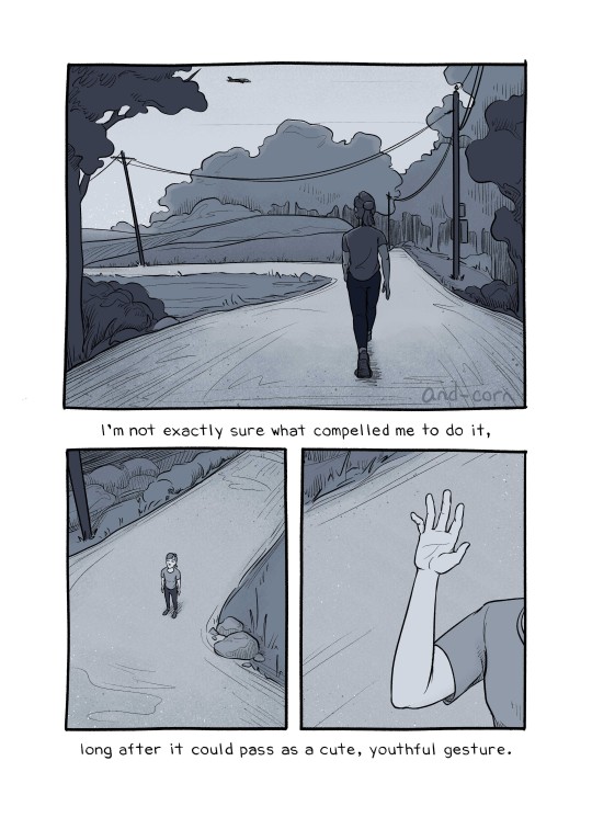
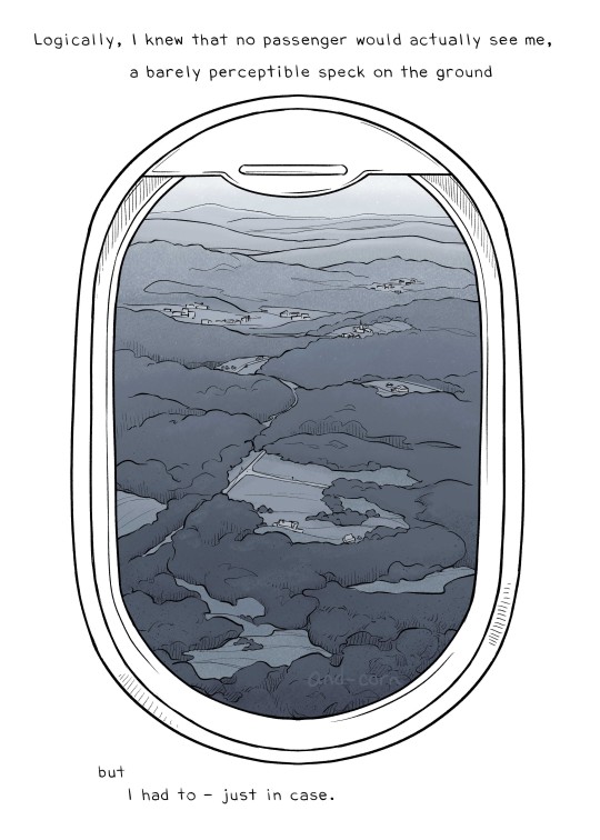
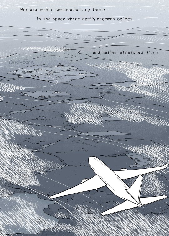
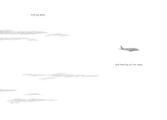
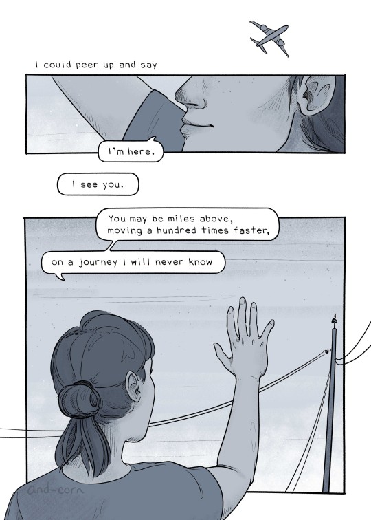
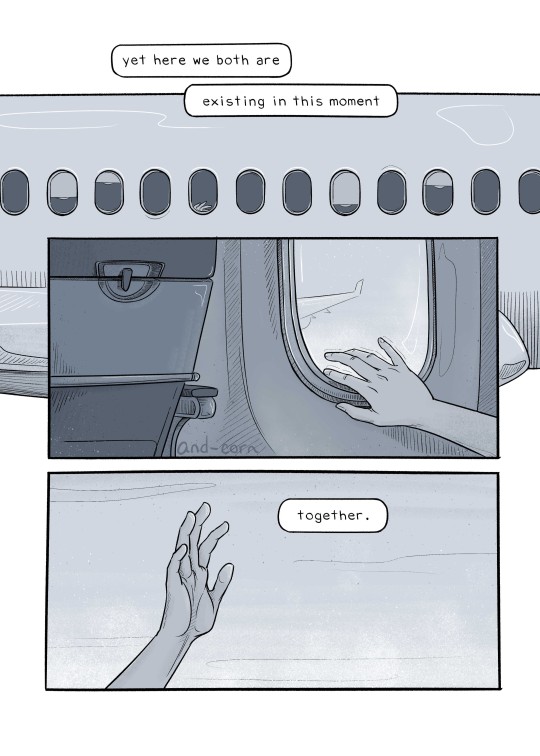
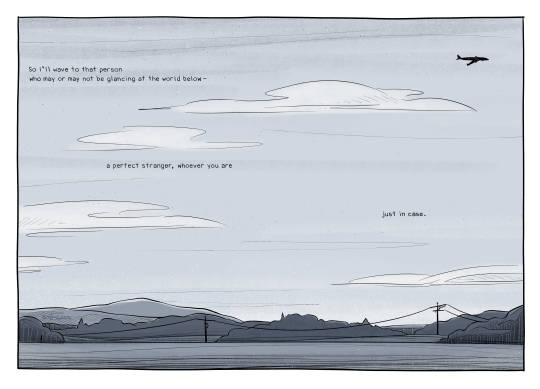
B I G N E W S !
I've made an art book and the Kickstarter is about to launch! It has writing, illustrations, and comics similar to this one! It's called Waving at Airplanes and it's probably the largest project I've ever done (I'm quite proud of it).
The book will also include this comic, this one, plus this, and this - AND 6 additional, never-before-seen comics/illustrations! So if you happen to like those comics, it would mean a lot if you considered getting the book! You can check out the Kickstarter page here!
Since the artwork is already done, the Kickstarter is really just a pre-order (to cover the cost of having the books printed and shipped). It launches on 9/9/2024 and will last 4 weeks!
Thank you! These comics may not be my most popular, but they are the most personal to me, and the support for them is really special.
#comic#comic art#original comic#web comic#webcomic#illustration#illustrated story#relatable#thoughtful#thoughtful comic#thoughtful writing#writing#original story#original poetry#prose poetry#short poem#illustrated prose#original art#illustrative art#storytelling#relatable story#relatable writing#ramblings#random thoughts#comic artist#illustration artist#amateur poet#poetry art#artists of tumblr#artists on tumblr
921 notes
·
View notes
Text
I so miss being a jhonen vasquez imposter)
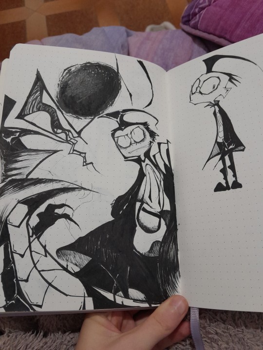
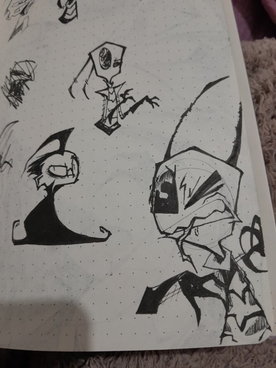
Got that jhonen style brainrot
#dib coat blob because i loved how i drew him like that in my old art#jhonens style is engrained in my very essence#its always been therapeutic when i was in middle/high school#so now its just cathartic#invader zim#my art#art related / rambles
738 notes
·
View notes
Text
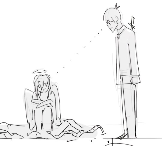
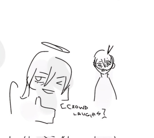
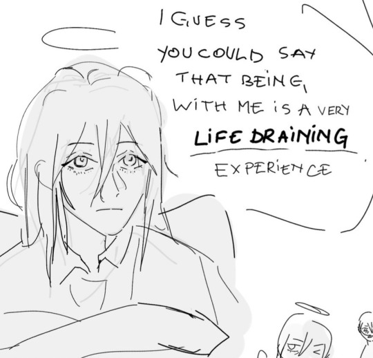
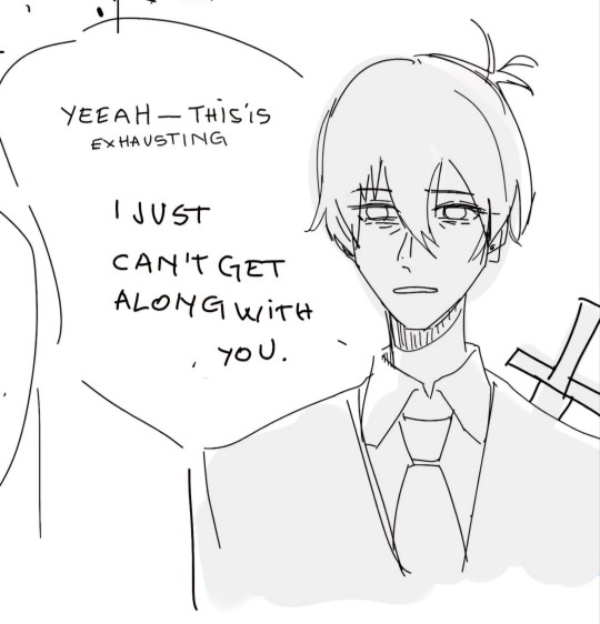
akiangel if they were in a sitcom
#this is so goofy and ooc but#it's also very old#i have no new art as you can probably tell#BUT IVE TAKEN MY LAST ACADEMIC RELATED THING SO NOW I AM FREE#which means ill draw more#probably...#anyways tagsss#csm#funny#meme#super funny#aki#aki fanart#iztea draws#chainsaw man#csm fanart#angel#angel csm#angel devil#comic#akiangel#the ramble man#art#fanart#aki hayakawa#csm manga
639 notes
·
View notes
Text
YALL
I JUST HAPPENED TO LOOK UP AT THE NEWS ON TV
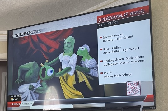
#IS THAT KERMIT THE FROG WATCHING MIKE WAZOWSKI GETTING BEHEADED BY SHREK OR AM I LOSIG IT#WHAT THE FUJG#FUCK#I heard something about school art winners and just happened to look up#Fucking cackling#its beautiful#true art chat#rey rambles#lmao#lol#meme#memes#dumb shit#funny#i love this#relatable memes#funny memes#tumblr memes#best memes#dank memes#humor#joke#haha#funny post#Art#art memes#meme template#meme art#artwork#not my art
887 notes
·
View notes
Note
Hello! Many people have said this but ill say it too, I LOVE YOUR COMIC SO MUCH ( ´ ▽ ` ).。o♡
I really wanted to ask you about how you do the backgrounds? (Something i struggle with) whats the process? Like from start to finish, also, to do the rise backgrounds do you use reference from the show and generally real photo of ny? Or do you come up with them? And last question- The shadow and light on the background- Like HOW
i know it’s a lot of questions but i’m just so curious qwq and wanna learn to be better, thank you again in case you read this and respond, in case you don’t, i hope you have a nice day and a wonderful life uwu keep up the great work! (≧◡≦) ♡
Backgrounds are a really broad subject and I'm always a little overwhelmed when asked this question. Just like drawing the human body, backgrounds take time, repetition, and practice!
My answer got a bit long, so it's going under a read more :) but if you digest info better in video format I found this on youtube
youtube
It pretty much goes over everything I wanted to say, but in a much better way. I wish I had found it before writing all this out lol
ok, first of all, I'm not a teacher nor was I built to be one of those cool helpful art tutorial people who do a full coloured tutorial filled with illustrations. This is just going to be a messy "how I do backgrounds / environment layouts from start to finish." kinda thing.
... lets start with a sight tangent.
Sketch from Life!!!
If you want to get better at backgrounds I recommend doing some sketching out in the real world!
When I was first getting into doing backgrounds I went to cafes and parks to just sketch the buildings and objects. Sketch rocks, flowers, clumps of grass, garbage cans, bottles, tables, street signs, etc. If you are drawing a tree observe how the trunks twist, how the bark flows, or how the leaves are bunched.
If you can't leave the house the same still applies! Sketch the interiors of your house, the walls, or common objects like chairs and bookshelves. How are objects stacked? items on the floor?
If you aren't comfortable with drawing outside or in public you can take some photos to draw from! They are good for practice and you can use them again as references later. Alternatively you can find pictures online of buildings and objects to sketch as practice.
All spaces have objects in them, it becomes easier to draw those kinds of spaces when you already have spent time observing and sketching them.
ALSO! They don't have to be good sketches! It's just to build out your mental catalogue and strengthen your perception of perspective.
now the actual thing...
BACKGROUNDS
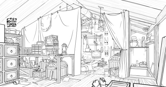
(the pictures used for this are my own. I dug them out of my 2022 folder)
Backgrounds have slightly different rules based on what you are making them for. Videogame Environment Concept Art vs Animation Layouts vs Comic Backgrounds vs Illustration backgrounds.
They all follow the same basics, which I will go over here, but the intention and function of those designs are going to be different. It's all about how you set up the scene and what it's purpose is!
Brainstorming and Thumbnailing
I like to think about a location as though it is a character. An abandoned old house with creaky sagging floorboards is very different from a futuristic space ship with sharp metal floor panels. A gas station has a very different feeling from a library.
I usually start by asking what is this location's story? Why was it built and for what purpose? What kinds of things does this room need to fulfill that purpose? You don’t need solid answers, but its good to be thinking about it while you are working.
Next, sketch some ideas for how this place is going to look. For me, this usually involves drawing the idea from multiple angles and then making lists & small sketches of the objects I think should be filling the space.
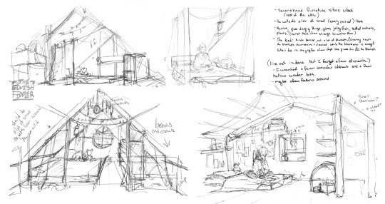
Example: The main character of my original work is a Wanderer. They collect a lot of things on their travels, but those items have to be small enough to be easily carried in a backpack. I wanted his room to be in the corner of an attic, walled off by curtains, and filled with trinkets. You can see some of my brainstorming above.
References
I only look for references after I've done some sketching and planning; this is to solidify my idea first so that I don't accidentally copy anyone else's work. I will make a moodboard with pictures of lighting, colours, items, rooms with specific ceiling beams, old chairs, etc. basically whatever I feel fits the vibe.
Honestly, I don't use references as much as I should. For ROTTMNT fanart I look at backgrounds and screenshots from the series to study the style. I also reference actual photos of NYC to get a feel for how Rise condenses the visual information.
In general, it's good to have references of real life objects/locations, because there are so many details like cracks in pavement, stickers on polls, crowning on buildings, fancy fencing, weird chair legs, etc. that you might not think of. It's the imperfect details that can make a location feel more alive.
Perspective
Once you have your chosen sketch we move to.... the infamous perspective boxes. Doing backgrounds is just learning to be comfortable drawing So Many boxes and carving items out of them.
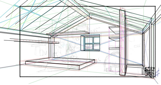
Many better artists than myself have made videos on perspective, vanishing points, and all the technical bits. Videos like THIS ONE and THIS ONE are helpful (this post is great too!!). There are probably a lot of classes to be found on Skillshare or Schoolism. I learned a lot of this in my college art course, so I can't give you a specific video which helped me.
You can get by and be a good artist without learning this stuff. There are quite a few successful artists who have admitted they never bothered to learn perspective (one of these people even made a whole graphic novel series).
I personally avoided properly learning this stuff until I was in my 20s because I thought it would be boring and difficult to do. tbh I really wish I had learned it earlier because it's so much fun to make those silly little boxes imo. It looks scary and complicated but, just like drawing humans, it just takes time, repetition, and practice to develop the knowledge and skills.
Cleanup
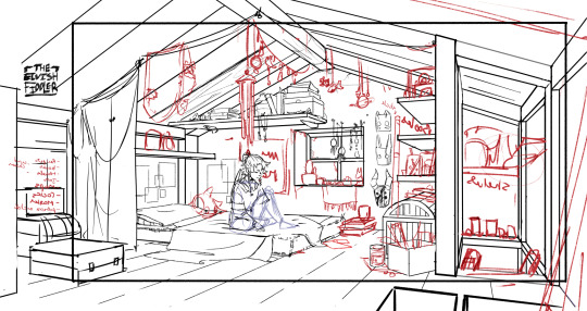
You have your boxes and lines! Cool! Now to make a scene out of it. Fill in the details, get everything placed were you want it! Generally, the lines of each item will point back towards the horizon line, but they can have different perspective points.
Generally you would want to clean it up and get your room completely sketched before doing the lineart. I tend to combine the steps (not recommended)
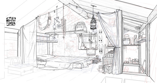
Lineart
I've mentioned how I do this before. Closer objects have thicker lines and more detailed inside. Further objects have thinner lines and less detail. I didn't quite achieve that balance with the image below, but it's close enough.
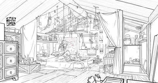
Colours and Shading will have to be a separate post. In the meantime, I highly recommend the book "Color and Light" by James Gurney. I used to borrow it from my local library and a good chunk of my knowledge was learned from it :)
#Artist's Comic Rambles#asks#art related asks#thank you for the ask!! I'm glad to hear you enjoy the comc :D#i hope this was somewhat helpful...#i get overwhelmed by broad questions very easily haha#if you would me to elaborate on something specific I mentioned feel free to ask#i wrote this all out weeks ago and then forgot about it... I just added a link or two but yeah here it is
307 notes
·
View notes
Text

my shining star, when will he come home :(
#gillion tidestrider#jrwi riptide fanart#jrwiblr#just roll with it show#art taggg#jrwiposting#btw lemme go crazy over gillion and edyn in the tags rq#i try to make them look somewhat similar but with key differences bc i hc them as half siblings (not that gil knows oop)#easy one is the way their nose is shaped like edyn has a soft slope and gillion is sharp with lots of points#same with their ear fins. gillion's ends in a point upwards and edyn's continues a gradual curve#i think not only is gillion outwardly made with sharper points becuause yknow. Chosen One but also hnnnng leviathan heritage perchance?#i just want them to come off as Related but not necessarily bio siblings#since finn did like. tell gillion that him and edyn do Not look alike and i think he doesnt even look like finn either?#idk ramble over i just love half sibling tidestriders lol
277 notes
·
View notes
Text

@yeehawgust: Week 5: Lone(some) Ranger
I'll be the moon / You'll be the sun / We'll make the day glow / You'll slowly rise / And I will fall (x)
#red dead redemption 2#rdr2 fanart#arthur morgan#charles smith#charthur#rdr2#rdr#yeehawgust#yeehawgust 2024#jaderaven art#/ if I think too much about charles's journey to finding a place where he belongs#/ in relation to how deeply he and arthur connect with each other#/ I may just cry#/[insert another of my ramblings about how these two are soulmates whether you interpret them as platonic or romantic]
331 notes
·
View notes
Text


Painting is so hard sometimes man it's an unpredictable beast (yes I'm learning an old painting technique shush)
#Ziku's insane rambles#yes this is related to the AU#don't question it (for now)#tadc#tadc au#harlequin au#tadc harlequin au#the amazing digital circus#art wip#tadc harlequin au the man in the red coat#harlequin red coat
289 notes
·
View notes
Text

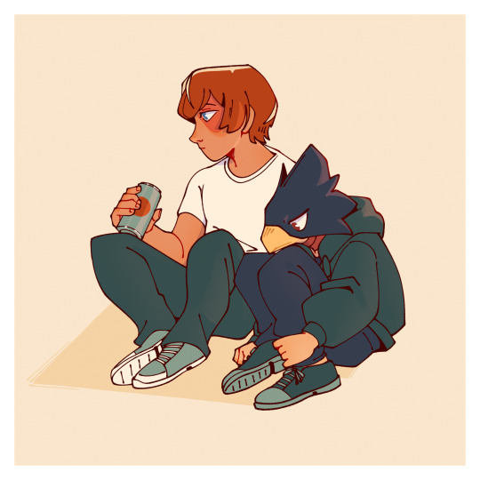
Frens !!
#mha#my hero academia#tokoyami fumikage#izuku midoriya#shoto todoroki#bumfuzzled art#too lazy for proper rendering unfortunately#and now for my regularly scheduled rambling#shoutout to the friends that talk your ears off#and shoutout to the friends who are just there#also rereading mha made me notice Midoriya actually doesn’t talk much#man’s is monologuing in his brain the majority of the time#still a yapper in my heart#also also tokoyami is holding his scarred leg on purpose. just wanted to point that out.#and now not drawing related#all asks got deleted and all my notifs keep disappearing#if you send anything please resend#update:#I FORGOT MIDORIYAS SCARS? :( nooooo
541 notes
·
View notes
Text
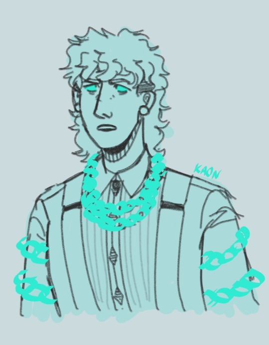
feverishly doodled jacob marley in my phone's notes app immediately following my first watch of vhscc. I'm going to be looping this for several hours
#it was immensely good#to say the least#not going to ramble in the tags too much#I'd definitely like to create a higher-effort art piece relating to vhscc but this is all I have time for at the moment#also meredith jacob marley just. does this to me I guess#so fun to draw#starkid#vhscc#vhs christmas carols#vhs christmas carol#jacob marley#my art
208 notes
·
View notes
Text
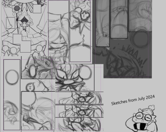
Okay... Was cleaning up my files and found these veeeery unfinished comic pages of mine, I took some and made 'em into a small collage. It's shadvani because of course. Note, the pages are not in order and uncompleted, the comic was supposed to be around 12-pages. I just chose the cleanest sketches to put in aaaa.
This one's a bit embarrassing to post, but these will just rot in my files otherwise so... I got so many unfinished stuff... May they see the light of day eventually.
#the comic's premise is related to that one crying/sleeping comic and includes more headcanons of mine#but that's a story for another day#wip (work in purgatory)#sketches#1m4 rambles#shadowvanilla#art#text#stuff i draw
248 notes
·
View notes