#art consistency doesn't exist
Explore tagged Tumblr posts
Text

The child queen of a world born anew!! What will she do!
#what a way to celebrate my graduation#the fragile threads of power#shades of magic#adsom#the threads of power#it's book fanart y'all!! I think this is the first time ever that I'm doing art for books#since it's not visual medium it was super fun to draw a character entirely the way my imagination gave shape to them#you'd think it's the same with podcasts but most have such consistent fanon designs that it's hard to deviate from it#so I'm reading the new book in the world of the shades of magic trilogy by v. e. schwab and it's so fucking good#I've missed the old characters so badly and I love the new ones just as much aaaaaaa#kosika of white london#that doesn't seem to exist as a tag so I'm hereby creating it#I'll also be back on my usual stuff so be ready for a lot of that!!! I wanna draw so much now that I can#I've missed the handful of ppl I know on here#shrews art#cw blood#victoria schwab#illustration#art
142 notes
·
View notes
Text
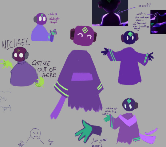
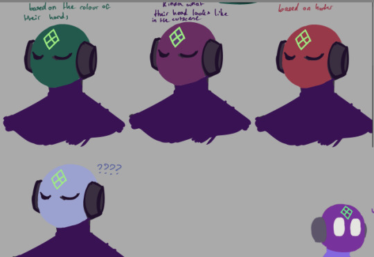
compilation of this guys colours haunting me
#every iterator we have seen in game has a different puppet colour than their associated colour#Moon is blue and yellow. Pebbles pink and cyan. Suns yellow and red#the colours arent exactly opposite of eachother. more like a third across the colour wheel maybe?#though suns colours are pretty close together so idk#and nsh being green on green doesn't really fit that but iterator colours aren't really consistent anyways. But just following that logic#what if purple. But then its purple puppet with purple cloak#im not even gonna start about the scarf in the tags that things maybe existence haunts me just as much#I don't think ourple nsh is more canon im just losing my mind a bit thumbs up I love green NSH my favourite pea head ever#probably gonna draw him both ways#also tag ramble jumpscare get scared get scared#my art
173 notes
·
View notes
Text
It's "feeling anguished and apoplectic about the corporate treatment of motorcity and rise of the tmnt" hours

#STOP SCREWING OVER GOOD ANIMATION AND BEING SURPRISED WHEN IT DOESN'T 'PERFORM WELL'#ART DOESN'T EXIST JUST TO MAKE MONEY#BUT MAYBE IT WOULD MAKE MORE MONEY IF YOU ACTUALLY AIRED EPISODES IN ORDER#OR AT A REASONABLE HOUR#OR WITH A CONSISTENT AIRING SCHEDULE#WITH ACTUAL MERCH#I Am Filled With Hatred#rottmnt#motorcity
18 notes
·
View notes
Text
Started reading dungeon meshi and I genuinely have not been this invested in a manga in so long (or piece of media in general that wasn't related to Sonic in some way) I'm having the time of my life here
#ramblings#it's so good#the art is consistently good#the pace of the story feels just right so far#and all of the food looks so good it makes me wish fantasy monsters were real just so we could cook them#it's got me craving food made of stuff that doesn't even exist. how is that possible#also i haven't noticed anything fanservice-y so far which is SO refreshing like you don't even know#like i swear if i see anything with an anime style i can say with 99.99% certainty that either women or kids are sexualized#sometimes both. actually a lot of the time#i can just follow these characters and focus on their quest to save falin without being taken out of it by fanservice it's great#.. hope i'm not jinxing myself by saying all that lmao#idk i'm a good ways in and it still seems fine so i probably don't have anything to worry abt#anyways i wanna eat the treasure bugs
4 notes
·
View notes
Text
wrapped in a shock blanket, shivering, sweating, staring vacantly into the distance <- (saw two posts about gotham war)
#batman#batfam#dc#conpost#it can't hurt me if i don't see it!!!!! goodbye i am going to continue pretending rebirth (derogatory) doesn't exist#in GOOD news i got batman: the long halloween for 50% off and it came in today!!#one of my fav comics. the art is so fun and there is.....how do u say.....Consistent Characterisation?? baffling#the way tim sale draws bruce's nose just sparks a Lot of joy
2 notes
·
View notes
Text

E S S E N I A N T W I N S
Essenia is no stranger to religion, despite being so disconnected from the rest of the world. The inhabitants, few as they may be, place their faith in the Twins: Aonoz and Zonoa.
They are considered the heart and soul of Essenia, respectively. Should either of them fall- an unlikely event, but not impossible- it is said that unrelenting chaos will consume the island, leaving naught but destruction in its wake.
The first people to live on Essenia did not know what the Twins looked like, and thus, speculated their purpose. The general consensus reached a sun and moon motif, representing the eternal balance of day and night that they keep.
Only three lucky souls have witnessed the Twins' true forms.
No one believes them.
#gods#my art#oc: aonoz the heart#oc: zonoa the soul#they're always referred to by they/them in whatever “holy texts” they end up in#but outside of that aonoz is considered the brother#and zonoa is considered the sister#reuploaded because tumblr kept deciding to move text when i was trying to highlight it#creating big gaps#it fucking sucks#because apparently consistency Doesn't Exist when i try to tap+hold#and also why can't i get rid of the gaps??????#literally why do they stay there?????
1 note
·
View note
Text

@dimiclaudeblaigan asked for a tutorial on how to begin drawing. Good news! If you can draw a funky looking stick man, you have already started!
I think that stick people are a great starting point for artists because of the things you can learn from them that will be important later on.
If you are able to draw a circle and a couple of lines, you can easily put together a stick person.

Congratulations! You have started to draw. :)
A stick person is a very minimal artistic representation of a real life person. It is simple yet recognizable, and is widely used in art, media, and signage.
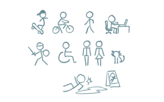
But what can a stick person teach us about drawing people that look more like… well, people? Lets have a look!
By simply adding a few more lines, we can add a pair of eyes and a mouth. Maybe even a little triangle nose! Or half circles for ears. We can now draw a face, which provides a basis for all sorts of expressions.
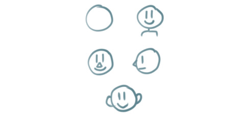
These simple additions can allow us to explore the wide range of human emotion and individuality.

This may seem like the basics of the basics. But that is what we want! In order to get to the point where we are able to draw complex, elaborate representations of humans and objects, we will need to start with simple shapes like lines and circles and build our understanding from there.
For instance, lets give our stick person some cool new features, such as hands and feet. I chose little squiggly circles to represent hands, and triangles to represent feet.
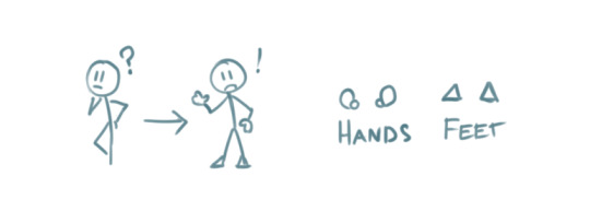
We can go a step further and modify the body of the stick person to include shoulders, hips, elbows and knees. These parts of the human body are quite complex in real life But here, all we need to do is add a few simple lines and dots to our stick person.

The lines provide some additional structural elements to our stick person's body, which are the shoulders and the hips. The dots indicate the points of articulation - elbows and knees, the places where the arms and legs bend!
Now we can use our stick person to show us an even wider range of human movement, action, and expression.
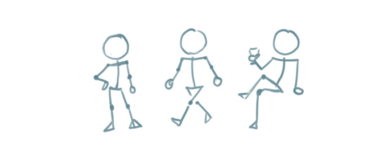
Our little drawing of a human being is evolving! All it took was adding a few more lines and shapes here and there.
By elongating some of the existing lines and making the head an oval instead of a circle, we can give our stick person proportions that resemble that of a real life human.
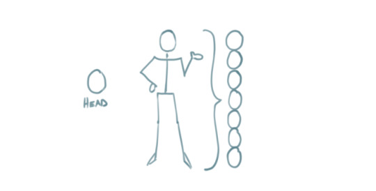
By this point, we have managed to add more complexity to our stick person simply by using our ability to draw lines, circles, and other basic shapes!
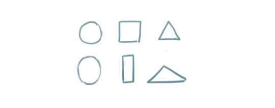
These basic ideas are the building blocks that will enable us to create more complex shapes.
The next part may be a considerable step up if you are absolutely new to drawing, but I have decided to include it in order to show you how complex objects like the human body can be built from shapes that are a bit more complex than circles and lines.
For example. Two ovals and a rectangle can be combined to create a cylinder.

Six squares can be combined to create a cube, or a box. Here, each square is distorted slightly depending on which way the cube is facing.

Note that the back faces of the cube and the bottom of the cylinder are hidden. These shapes allow us to visualize that which should not normally visible.
A sphere from all perspectives can be represented by a circle. But we can make it more like a sphere by adding lighting and shadow if we so desire.

Cubes, cylinders, and spheres are examples of 'solid shapes' because they consist of 3 dimensions.
Lets see how these solid shapes can be used to compose the human body.
By stacking three cylindrical objects, we can create a torso. Two spheres have been added to form shoulders, while a smaller cylinder forms the neck.

An arm is an alternating sequence of spheres and cylinders connected together. Note that the hand has been simplified for this example.
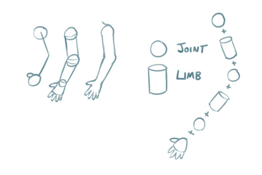
We can apply these solid shapes to the rest of the body to give us a more recognizable representation of the human form. It doesn't even have to be perfect. And just like that, our stick figure now has a silhouette that is unmistakably a person!
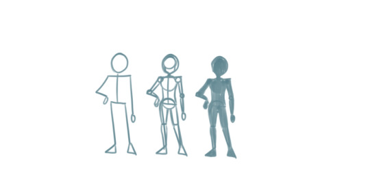
In the above examples, notice that we kept the stick person at the beginning while building up the shapes and solids around it. This is because the stick person serves as a guide for positioning the body and its various parts -> also known as posing.
You can do the same thing to everyday objects! Here, I drew a wine glass by stacking these three dimensional solid shapes.
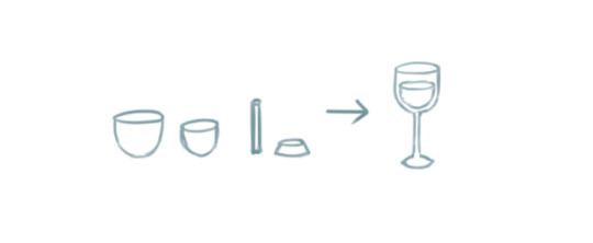
The cup and its contents are two ovoid shapes that were cut in half. The stem is a very thin cylinder shape. The base is a cylinder with a slightly wider bottom.
Solid shapes help inform us how objects and parts of the human body may appear from different perspectives.
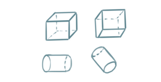
For example, a sphere can be used to demonstrate how the human head appears when looking up or down, turned to the side, or tilted at an angle.

With these examples, I hope I have managed to convinced you that if you can draw a circle and a couple of lines, you can draw a person! You just have to train your eye to recognize the simple shapes within complex objects. Try it with everyday objects as well! Or even your favourite media! A drawing subject can be as simple or as complex as you envision it to be.
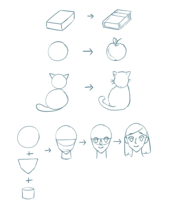
Once you have mastered that, there are many aspects of drawing you can explore from here that may require you to seek additional resources or a fellow artist's advice.

Last of all, remember that drawing is an iterative process. Even if you draw something correct the first time, you will need to draw it again and again to get it right all times! And by making small changes like the ones we explored in this tutorial, your drawings will gradually transform!
I hope what I've demonstrated here are enough to provide the basics of how to get started with drawing objects and people, and also to help refresh more experienced artists. :) Hopefully I didn't go too off topic with what was requested, and let me know if there are any more questions I can answer.
Cheers :3
27K notes
·
View notes
Text
Broke: Chilchuck Tims is child coded.
Woke: Chilchuck Tims isn't child coded, he's a middle-aged, divorced man with grown up children.
Bespoke: Chilchuck Tims cannot be accurately described as either "child coded" or "not child coded" because he is a deliberate commentary on the idea of "child coding" itself.
Chilchuck, and half-foots in Dungeon Meshi in general, are given significantly more neotenous proportions and appearances (e.g. larger heads and eyes, rounder faces) than the other races. This is not universal for depictions of hobbits / halflings in Tolkien / D&D inspired fantasy fiction. Compare Chilchuck relative to the "tallmen" (humans) in Dunmeshi to how small races are drawn in something like Legend of Vox Machina (many of those characters are gnomes but whatever) or in basically any official D&D art. It was an intentional artistic decision to make him look like that. This is reinforced when he's temporarily transformed into a tallman (human) and in addition to becoming much taller he gains features that make him look more visibly middle-aged (stubble, eye bags / wrinkles, a more oval face) that he doesn't have as a half-foot. See also Marcille's transformed form and supplemental drawings of what all of the main party would look like as other races. However they do NOT look indistinguishable from actual children as portrayed by Dunmeshi's artstyle and have distinguishing features e.g. larger ears.
Chilchuck is frequently mistaken for a child in-universe, or treated / perceived as one even by members of other races who know he's a half-foot, and he hates this. His infantilization and that of half-foots in general isn't just a running gag, it's a significant plot point and source of discrimination. Like when the party gets impersonated by shapeshifters copying everyone based on the others' memories of them, and most of the Chilchuck clones look and behave more childish than the real one, and they almost get away with it, even though his party should know better than to think of him as a kid.
The narrative consistently takes the position that the people infantilizing Chilchuck are wrong, and are being ignorant/racist.
Conclusion: Chilchuck is definitely not "child-coded" in the way that a 700 year old shapeshifter that looks and behaves indistinguishably from a little kid for contrived reasons. However, he is intentionally designed to make it seem plausible for people who know he's an adult to still not fully believe it and this can make the viewers fall for it too. Which I guess is "child-coding" in a sense. But the message the work is trying to send is very clearly "Don't decide that grown-ass adults are equivalent to children and treat them like children because they have physical characteristics that remind you of a child you dipshit."
While hobbits aren't real and Chilchuck's traits that get him mistaken for a child are exaggerated compared to the vast, vast majority of real people, infantilization of grown-ass adults due to ableism, racism, or just people being dumbasses who forget short people exist is a real issue, and if you start shit with people for shipping Divorced Dad Chilchuck Tims with other characters or whatever you are displaying the exact attitude that's being criticized.
5K notes
·
View notes
Note
I ADORE your art and how well you match the ISAT artstyle. I've been being alot of studies to try replicate the style and draw characters 3d but stylised. Are there any tutorials that have helped you, studies you do, or things you keep in mind whilst drawing to make the characters look so 3d?
Oooaaahh thank you!!! This is a really good question. I say that because I feel like I "2D cheat" ISAT art a lot. It's very comfy to draw bc my normal art is like that too, with angles that shouldn't be able to exist but look right bc it's 2D so your brain forgives it. Design of the art > accuracy of the anatomy, y'kno?
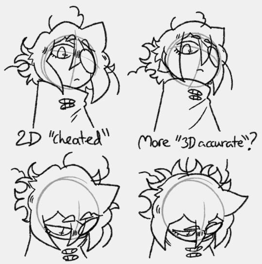
The hair kind of gives it away in most cases. It's meant to be such a specific shape, it kind of stops looking like the character if it gets too 3D? But drawing it more 3D has huge utility too, especially for animation n stuff. It's just something I've noticed about the style! It's very designed for 2D. It's very "the shape of the lines" > "the shape of the 3D object"
It's helpful to remember that ISAT characters are all made up of really simple shapes. Like Siffrin's head is just a ball from nearly any angle but the side. Their body is a cylinder but one end is wider than the other. Odile's face is a ball but the bottom is long, like an oval. Isa's is a ball but his chin is square, it has soft corners. Even Bonnie's face is a ball you just add a cheek bump. Etc etc.
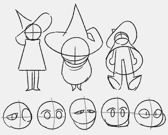
^Notice how i can't simplify the hat down into a consistent 3D shape bc otherwise it just. kind of. doesn't look like Siffrin's hat LOL
If you have the simple 3D shapes down then the rest of it is all 2D cheating and focussing on details! Having character refs nearby at all times especially when ur tryna figure out how to draw the character is KEY so you can keep looking at it and comparing. Try to pay attention to the little quirks of the art style that differ from yours and try to mimic them. But don't be afraid to let your style infect it a bit if it helps you to create something more dynamic looking.
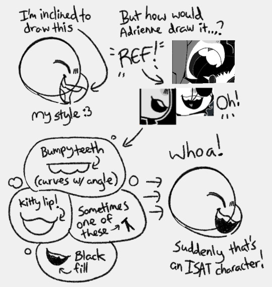
It helps that i've been drawing for ages. I know 'practice' is the age old advice but here's my spin on it: just draw, keep drawing what u want no matter if it looks bad or if some professional artist tells you you're doing it wrong. So long as you keep drawing you are learning. Indulge and draw what you want so you get to keep all the motivation and keep going.
oh and PUSH YOUR POSES/EXPRESSIONS!!! By this I mean, draw it once, and then lower the opacity and draw it again on top but pushing everything a little bit further. If a pose feels stiff this tends to fix it.
uhmmm i rambled on for ages but i hoped it helped u Tea (or anyone else reading)! thank u for the excuse to draw a bunch of funny isat doodlies :D keep going you have GOT THIS!!! THERE IS NO WRONG WAY TO MAKE OR ENJOY ART! YAY
1K notes
·
View notes
Text
i think the adage of "machine learning is just a tool" is speaking past most of the issue. like, of course it is, it's been a tool for like 15 years, but we all know that it's not being marketed as a tool. if it were marketed like any other tool, it would be obvious that it requires existing artistic ability to be fully utilized.
and yeah, when you get down to it, making legible and consistent AI art in line with what you're imagining is basically just as hard as drawing it yourself, but reality doesn't bring in cash. we know it's a tool, the problem is that it can never just be a tool, it must be the product. it must be a magic machine that translates imagination into pixels, but this cannot be. not because art is uniquely human, but because letting a noise generator fill in such massive gaps is necessarily ceding control, ceding authorship.
637 notes
·
View notes
Text
the rise of AI art isn't surprising to us. for our entire lives, the attitude towards our skills has always been - that's not a real thing. it has been consistently, repeatedly devalued.
people treat art - all forms of it - as if it could exist by accident, by rote. they don't understand how much art is in the world. someone designed your home. someone designed the sign inside of your local grocery store. when you quote a character or line from something in media, that's a line a real person wrote.
"i could do that." sure, but you didn't. there's this joke where a plumber comes over to a house and twists a single knob. charges the guy 10k. the guy, furious, asks how the hell the bill is so high. the plumber says - "turning the knob was a dollar. the knowledge is the rest of the money."
the trouble is that nobody believes artists have knowledge. that we actively study. that we work hard, beyond doing our scales and occasionally writing a poem. the trouble is that unless you are already framed in a museum or have a book on a shelf or some kind of product, you aren't really an artist. hell, because of where i post my work, i'll never be considered a poet.
the thing that makes you an artist is choice. the thing that makes all art is choice. AI art is the fetid belief that art is instead an equation. that it must answer a specific question. Even with machine learning, AI cannot make a choice the way we can - because the choices we make have always been personal, complicated. our skills cannot be confined to "prompt and execution." what we are "solving" isn't just a system of numbers - it is how we process our entire existence. it isn't just "2 and 2 is 4", it's staring hard at the numbers and making the four into an alligator. it's rearranging the letters to say ow and it is the ugly drawing we make in the margin.
at some point, you will be able to write something by feeding my work into a machine. it will be perfectly legible and even might sound like me. but a machine doesn't understand why i do these things. it can be taught preferences, habits, statistical probability. it doesn't know why certain vowels sound good to me. it doesn't know the private rules i keep. it doesn't know how to keep evolving.
"but i want something to exist that doesn't exist yet." great. i'm glad you feel creative. go ahead and pay a fucking artist for it.
this is all saying something we all already knew. the sad fucking truth: we have to die to remind you. only when we're gone do we suddenly finally fucking mean something to you. artists are not replicable. we each genuinely have a skill, talent, and process that makes us unique. and there's actual quiet power in everything we do.
#also pay plumbers more. and electricians. and other devalued occupations#idk that this makes sense#but im like#people being so fucking pleased with themselves about the fact they can ''fake'' art#n im like#sure#but what if we stop making things for you huh#what if we stop giving u this stuff anymore#what happens to ur ai art? does it keep growing? does it keep making choices?#why do u need to see us as machines?#''i want X to exist but i don't have the skill to do it''#okay spend literally years of your life studying#''i don't want to do that''#okay pay someone who DID do that#''no i don't think it's a real skill''#okay so. YOU can't do it. and a LOT of people can't do it. but you think WE should be able to?#FOR FREE?#either it has value or it dont baby make up ur OWN mind#btw studying here is not used academically. i think if ur like. constantly knitting.#thats studying#do u spend hours reading and find urself taking notes and learning about writing#ur studying#do you follow other artists and spend a lot of your time trying new things (even unsuccessfully)#that's also studying#etc#was weird to write this thing about choices and then be like. wait why DO i like that
7K notes
·
View notes
Text
One interesting thing that can happen in long running media is that the general cultural background can shift under the work, recontextualizing it as it is being written. I'm specifically thinking of the Order of the Stick, a Dungeons and Dragons themed webcomic that started in 2003 with the titular party of adventurers going through a dungeon.
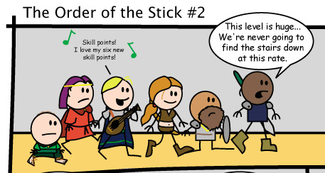
From left to right, we have Belkar Bitterleaf the halfling ranger, Vaarsuvius the Elf Wizard, Elan the Human Bard, Haley Starshine the Human Rogue, Durkon Thundershield the Dwarf Cleric, and Roy Greenhilt the Human Fighter. The comic takes place in a fantasy setting that knowingly runs off the rules of Dungeons and Dragons third edition. Characters talk about rolls and bonuses and intentionally take levels in various classes. At the start, the comic was a pretty basic gag comic about the D&D rules, basic fantasy/adventure tropes, ect.
In the 20 years the comic has been running, it has updated about 1300 times, not counting bonus strips exclusively made for the printed version, and several print (or PDF) only side and prequel stories. It has also dramatically grown from it's roots, the art has improved while keeping the same general aesthetic, and the gag-a-day comic has become a sweeping fantasy epic. The characters have grown beyond their initial bits (Belkar is a Murderhobo, Elan is stupid, Haley is greedy, ect), and it's genuinely up there as one of my favorite stories. But anyway, let's talk about Vaarsuvius. If you look at the above art, You'll notice that the characters tend to have three types of body shapes: Rectangles for Roy, Belkar, and Elan, feminine curves for Haley, and Robes for Vaarsuvius. This presentation is a pretty consistent signifier of gender and/or somebody wearing robes. Early on, part of Vaarsuvius's running gag became their ambiguous gender. At the time, it was a fairly common joke in fantasy to talk about how Elven men had androgynous or "Girly" appearances, so V was part of that. Instead of a singular pronoun, characters would generally just abbreviate Vaarsuvius's name as "V", and whenever the narrative would have naturally provided some indication of gender one way or another, V would resolve the situation without providing any such indication. For example, an early gag has the characters seeking out a set of modern style bathrooms in the dungeon. When they find them, V says that their "More Efficient elven biology" means they don't have to go yet, so they wait outside while the boys go into the Men's room and Haley waits in the inevitable long line at the women's. When Vaarsuvius reveals that they are married, they use the term "Spouse" to refer to their partner, when we see their children, the children are clearly adopted (V and their partner both have pale skin, their children have darker skin) and refer to Vaarsuvius as "Parent". Vaarsuvius themselves seems to have trouble identifying other people by gender. Characters outside the central cast might refer to Vaarsuvius as "He" or "She", but doing so was always shedding light on that character's perspective, rather than saying anything about Vaarsuvius. The assumption behind the gag is that Vaarsuvius must be either male or female, and the joke is that the narrative/Vaarsuvius themselves keeps finding ways to avoid "Revealing" their gender. Fan wikis and official books list Vaarsuvius's gender as "Ambigious" and on the forum there used to be a regular, multi-part thread dedicated to debatings Vaarsuvius's gender, even after the author declared that it would "never be revealed".
Anyway, going back to the start, it's 2023, and something shifted at some point, both in the comic and in the general cultural background. The jokes about V's gender kind of fell off, not just because the gag got played out, but because the basic assumption behind it simply doesn't work anymore. Everybody knows that Nonbinary people exist. There's no point in the comic where Vaarsuvius switches from being "Ambigiously Gendered" to Nonbinary, in fact, the entire comic reads just fine if you read Vaarsuvius as male or female and just not caring enough to clarify their gender to anybody and at some point other characters just stop thinking about it. But it's interesting to see how a character trait that was once included in even the most basic character descriptions (Varsuvius: Elven Wizard. Arrogant, Intelligent. Ambigiously gendered) just kind of got washed away by a rising tide of cultural nuance towards gender. Also go read OOTS, it's pretty great.
#order of the stick#oots#webcomics#long running media#posts that have been swimming in my head until I let them out
627 notes
·
View notes
Text
I really like crossover fanfics and fan art, I really do. However I sometimes feel like some of the most popular fandom crossovers are also ones that perpetually fall into boring and predictable patterns while simultaneously and consistently ignoring/forgetting the most obvious and easy ways two or more fictional properties could be combined or crossed over.
And I think this is nowhere more apparent than the absolute proliferation of Danny Phantom and DC comics content here on this site.
Because you know what, I think there are some really cool and interesting things you could do with placing Danny and company in the world of DC or vice versa. The problem is that overwhelmingly I don't see any of those interesting ideas being done.
It's all the same variation of like three different plot points, all of which are exacerbated in their boring unoriginality and fandom cringiness by the fact that they also almost entirely revolve around the same flanderizations of DC characters that originate from people whose understanding of these comic book characters is entirely based off of watching the Teen Titans and Young Justice cartoons.
I am so so so so tired of seeing the same premise of Danny getting involved with Batman because he's a dark-haired light colored eyed superhero "twink" just like the rest of the male Robins. I'm tired of him getting adopted by Bruce, I'm tired of him being secretly Dick Grayson's long lost relative.
What's even worse is this crossovers frequent demonstration of what I think is the inexcusable sin of unoriginally using John Constantine, a character that I by and large think the vast majority of this website and it's user base just doesn't understand and probably never will. (this is a whole separate rant but the website that at one point had the majority of its user-base obsessed with an imaginary queer interpretation of one of the most aggressively mediocre and dude bro heterosexual paranormal TV shows to have ever existed is one that I think is fundamentally incapable of actually understanding or appreciating a legitimately compelling queer paranormal/urban fantasy character. The website that thinks Cas and & Dean were anything, whether that be a compelling romance, compelling characters or even in a good or enjoyable show, I think are forever incapable of actually understanding John.)
Do I think you could write an interesting story with John Constantine interacting with Danny? Yeah sure but I think that that would be entirely predicated on one's ability to actually write John compellingly, which is a dubious ask in the first place AND regardless it's still the most uninspired and boring interpretation of what you could do with "Danny interacting with one of the supernatural characters of DC"
Here are some actual recommendations for interesting crossovers and universe fusions :
*The fact that people want to have Danny Fenton interact with DC characters and Deadman and Secret are not the characters that immediately come to mind for fic ideas shows I think either the fundamental lack of creativity on the part of people who like this crossover, or just that they really don't know shit about DC comics....... Danny and Boston Brand would play off each other so well both comedically and as potential mentor and mentee. Greta and Danny would be ADORABLE together whether it is just friends or in a shippy dynamic.
* We need stories where Danny is interacting with The Spector, and the lack of them is just plain criminal in my opinion. I really could see a bunch of really cool stories where GhostKing Danny is put into conflict with the Vengeance of God. Or make him team up with The Specter have and have him fight Eclipso.
*we know the DC afterlife is incredibly complicated and interconnected with other mystical realms such as The Dreaming and Hell, maybe explore how that would relate to DP's conception of the Ghost Zone. Danny, Zachary Zatara and Kid Devil's bizarre interdimensional odyssey would be a great fic!
* if one has to put Danny in Gotham for some reason or another have him fight against the Gentleman Ghost, play around with the relationship with the glowing green ectoplasm and the green glowing liquid of the Lazarus Pits, and if you do that you have an excuse to make him interact with Jason Todd if you absolutely can't resist bringing in a member of the Bat family. Remember, Jason has the ability to summon forth magical blades under certain circumstances and as a character who has repeatedly died and come back to life he's the only bat that I think would actually have interesting interactions with Danny.
* but above all if you have to have Danny Phantom and company goes to Gotham as your story premise, I cannot emphasize this enough, HAVE HIM TEAM UP WITH RAGMAN!!!!!! I swear to God, have the snarky Ghost Boy interact with the character whose costume is literally filled with ghosts!!!!!!
*going back to the ectoplasm and Lazarus Pit idea, make Danny an avatar of The Black/ Rot. I would absolutely love to see him have to contend with the likes of Anton Arcane or come into conflict with Swamp Thing and Animal Man. Also having Swamp Thing present in the story would give a far more organic reason as to why John Constantine would be interested in this teenager with ghost powers.
So yeah I would kindly ask the people who are so insistent on producing crossover content of these two fandoms to actually do some interesting ideas.
And incidentally while we're on the subject matter, the fact that so much of Danny Phantom is directly inspired by Spider-Man and yet there's not really a lot of crossover between DP and Marvel properties is really really bizarre to me, especially because this website's user base purports to be such huge appreciators of the Spider-Verse films........
#danny phantom#dc#dp x dc#anti dp x dc#crossovers#fandom fusion#deadman#john constantine#swamp thing#dc ragman#kid devil
133 notes
·
View notes
Text
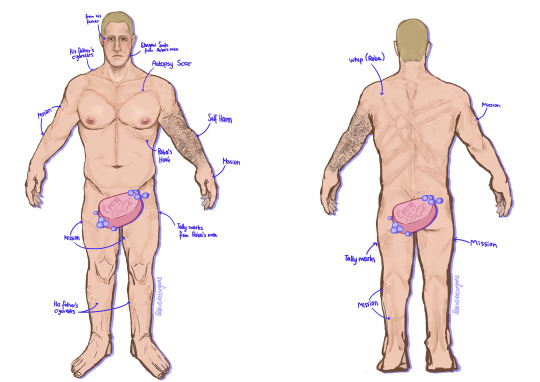
ghost scar headcanons (CW for his backstory)
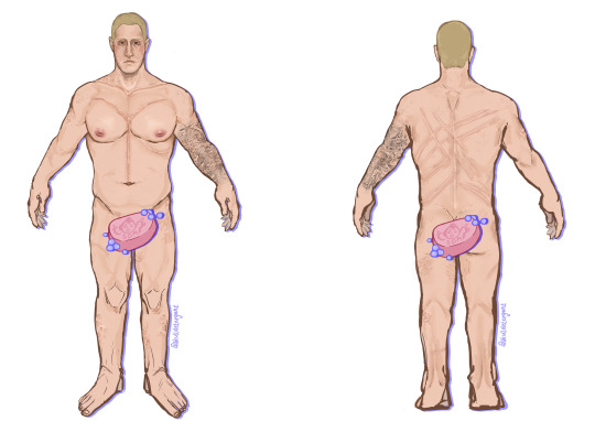
no tattoo/no text version & explanation under the cut
CW⚠️ discussion of child abuse, torture, self harm & sa
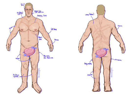
since i headcanon ghost to have quite a few scars, i decided to make a "character sheet" or "scar map" to keep my art more consistent.
in the drawing, the scars are already labeled and i think pretty self-explanatory, but i will go into some more detail and elaborate on my headcanons. again, please read the content warning. i did my best at trying to discuss the following in a sensitive way, but it may be upsetting to read nonetheless.
let's begin with the ones that say "mission". i imagined they are just random scars he sustained during his service over the years, like gunshot scars or knife slashes from close combat.
but others like "roba's hook", the autopsy scar, tally marks, the whip scars and his glasgow smile are from during the time where he was captured and tortured. i headcanon reboot ghost to have pretty much the same backstory as OG ghost, with some slight differences and additions of my own.
things like the glasgow smile or tally marks are made up by me, and others like the being hanged from his ribs actually happened (comics). ghost was also canonically sexually assaulted multiple times, which gave me the idea of said tally marks to emphasise how cruel his captors were.
correct me if i'm wrong, but in the comics ghost doesn't have any scars after being tortured, any cuts shown on his body just cease to exist a few panels later. but considering what he was put through, i do think that there would be permanent scarring.
now, it's also canon that ghost was abused by his father in ways like him bringing large animals such as snakes in his room to scare him, or having him watch a woman die from OD, which made me consider what the full extent of his terrible father's "parenting" must've looked like.
ghost has a small, almost faded scar under his eye, he was too young to remember how he got it, only finding out when his mother told him. his father was being neglectful when he was supposed to watch him, and simon injured himself while wandering around.
now, it is unclear in the comics if mr. riley's abuse was purely psychological, or if it extended to physical as well (again, correct me if i'm wrong). but i didn't find it unrealistic to have the latter be the case, which is why simon has cigarette burn scars on his neck and legs. his father found it amusing under the guise of "making him a man" and seeing how long little simon could take it before he would start crying. nowadays the burns are barely visible.
and lastly, the self harm scars covered up by the tattoo sleeve on his left arm. considering what simon had to go through at an early age, it is not unlikely that he might have resorted to SH as a teenager. and later, he got the tattoo as a reminder to himself that those days are his past and not his present.
i really read the comics and said:
#reupload because i noticed a mistake in the last one#call of duty#cod#ghost#mwiii#mw3#mwii#ghoap#my art#simon ghost riley#simon riley#cod ghost#mw2 ghost#modern warfare#modern warfare 3#modern warfare 2#modern warfare iii#modern warfare ii#cod fanart#ghost fanart#simon ghost riley fanart#call of duty modern warfare#skulldetergent_art🎨
254 notes
·
View notes
Text
"why not just make your own website?"
with the announcement of cohost's death and amidst all the other tumultuous shit currently going on with social media as a concept (i am AMAZED twitter has survived this long given the circumstances), one suggestion that i've been hearing a lot is "we should just go back to the good old days of personal websites. let's all just make neocities pages!!"
(this is gonna be a long one sorry)
and like. idk! it's certainly something i've considered, i think it would be a fun thing to have, but it also feels like the equivalent of "capitalism sucks so let's all just run off into the woods and live in a cabin outside of society" to me. like it would be nice, it would be fun, but it doesn't ultimately solve the actual problems that are present with the modern internet, it just evades them. more importantly in my case and many others, it does not really help people who rely on the modern internet and the connections they're able to make there for their income. sure i can make a website and host my art and blog posts there, but who's going to see it? i can't build a consistent audience and make a living off of random passersby who peek at my website once, say "huh, neat!" and MAYBE add it to an RSS feed or whatever if they really like it. there's minimal potential for meeting and impressing new people outside my existing circles if i don't ALSO still have some manner of social media platform to promote the website on.
a lot of the "solutions" i see people proposing for the slow, painful decline of social media as a user experience keep coming back to old-fashioned, more isolated/insular systems. we miss forums, we miss personal webpages, we miss newsletters, etc etc. but like... those things were ideal in the "old web" because the old web was more about sharing hobbies and interests with whoever happened to pass by and check them out, and even just USING the internet was a niche hobby in and of itself for a lot of people. if you wanna be kinda cynical about it (and not unjustifiably so), web 2.0 is much more blatantly business-oriented, and its algorithms and carefully crafted UX's are primarily meant to funnel you towards viewing ads and spending money on products. looking at it that way, it sure does suck and Everything Was Better Before! but the modern web is ALSO more powerful than anything before it for just like. connecting people. spreading information and news. showing your art/music/writing/thoughts/etc to strangers who never knew you existed an hour ago. putting the tools to reach out to someone and tell them you think they're cool right there on the same website where their art is hosted, just a comment or a message away.
if you're able to avoid patterns of engagement-bait and obsessing over follower counts as a measure of self-worth (a big "if", i realize, but i view it like installing an adblocker - it's just kind of a basic prerequisite for modern internet safety and survival), a lot of these systems can genuinely be really positive and life-changing in ways that were simply not possible 20 years ago! almost all of my current closest friends are people I met through sharing our art on platforms like Twitter who were complete strangers at the time. all of the art clients that regularly pay my bills and support my work came from places like that too! the "social" part of "social media" is really what makes it ultimately worth keeping around in any form, and makes the pursuit of a Good social media platform still valuable.
there's a lot to love about the old web - its aesthetics, simplicity and freedom for personal expression - but every time someone says "just delete your socials and make a personal website" i am forced to confront the fact that i could never do what i currently do or be the person i am on the old web. if i was stuck hanging out in my own little space and only ever interacting with people who openly and loudly share my interests, i couldn't support myself with art full-time, i probably would never have met the kind and quiet strangers who are now my best friends and have made me who i am, and i'd just generally get a lot less insight into the vast range of experiences and perspectives that exist outside of my own. my life would be on a fundamentally different trajectory in countless ways without the advent of web 2.0.
and that's not to say "well twitter and facebook and tumblr all suck but you kinda still have to hand it to them" cuz you don't, obviously. they're corporations, and their job is to take the personalities and thoughts and art of the people who use their products and try to scrunch it all into something uninform and marketable that generates profit and pleases their shareholders. but like, you CAN still make a good thing out of them! these websites are tools just as much as geocities or myspace or IRC used to be. and the one thing these newer tools are pretty much all REALLY good at is discoverability. if you're just a hobbyist at the things you wanna share on the internet, then you likely don't have a lot of use for those tools, and perhaps you WOULD genuinely be happier just keeping a personal blog site or hanging out in private groupchats or sticking to specialized federated Mastodon instances or whatever. it just isn't feasible for me, and there are a LOT of people in my same situation. my entire industry of online freelance artists barely existed 20 years ago, and the web culture of that era is largely incompatible with my continued survival in the mid-2020s. i would LOVE to run off and live in the woods in concept, but all my survival skills are adapted for city living and i would just eat the wrong berry and die out there. i want- i NEED people to try and improve the spaces we're in, and support better forms of social media (like what cohost was trying and largely succeeding to do!) instead of just complaining that it all sucks, everything was better when we were kids, and digging ourselves little holes to hide in. much like all the other problems and frustrations and systemic issues of the world we live in, the modern web isn't going to go away if you just ignore it, so we may as well try to make it better for everyone.
anyways tl;dr i probably WILL make a neocities at some point. it could be fun, even if it doesn't help my career stability or whatever. but i do also need ALL THE SOCIAL PLATFORMS I USE FOR MY JOB TO STOP EXPLODING PRETTY PLEASE, and failing that, some actual half-decent alternatives that aren't going to fizzle out in a month would also be great thanks ✌
#buny text#webbed site#long post#sorry this one got embarrassingly long and i probably repeated myself a lot#i've just essentially had this same conversation like 8 times in the past 24 hours and wanted to actually put my thoughts somewhere public#i hope it doesn't come off like i'm snapping at anyone either. i know this suggestion is always made out of a desire to be helpful#and i do appreciate it and have given it no shortage of thought#i just needed to explain why it isn't a viable solution for everyone and why actual good usable social platforms are still important
186 notes
·
View notes
Text
You know with how safe edgy Viv's shows I don't see why the setting is in Hell. I feel like Viv shot herself in the foot by doing this because it seems like Viv wants the praise of being considered edgy but she's too cowardly to follow through so we're trapped in this weird limbo where Viv wants to be edgy but is obviously putting on the brakes.
I think part of the problem Viv is quite immature.
Despite Viv being an adult, it is very evident in her writing style that she hasn't quite matured past the edgy teen phase and whilst her animation and drawing skills are good despite the questionable character designs, her writing is by far the weakest part of her skill set. It doesn't help Viv seems very impulsive and changes her mind on a whim and is willing to turn the story upside down at all costs as it's why Helluva Boss went from a dark comedy to Stolitz melodrama soap opera.
Not to mention Viv has amassed the wrong kind of audience for this show. Let's be honest with ourselves, despite Viv's show being rated adults, I am like 99% certain that at least a fairly large chunk of Viv's audience are teenagers and young adults at best who have been watching her since her channel got popular and most of these people primarily care about shipping and tend to be...immature and more volatile. I think that's partially why the writing is so juvenile because Viv is scared of alienating her audience. I think that's why she made Ozzie care for consent and Bee being concerned over people overindulging because Viv didn't want to make them unlikable at the cost of consistency. It's also probably why Lucifer's more evil pilot incarnation got changed into some wacky silly uwu depressed boy.
Viv seems to play favorites and she doesn't hide it. It's very obvious that when Viv favors a character, they become more likable almost instantly or at least she tries to make come off that way, though it's more noticeable with people like Stolas, Fizz and Lucifer. Compare their initial impressions in their debut episodes and you'll see a stark difference. I also think Viv is overall way too close to her fanbase because she takes ideas from them and she ain't subtle. Vaggie being a fallen angel was a fan theory that slipped into canon, Stolas and Blitzo meeting as kids was based off fan art and Hell, Chaggie wasn't even her idea(which probably explains how dull and unnecessary their relationship is) because a crew member made it and Viv being impulsive put it into canon despite Vaggie and Charlie acting more akin to best friends and honestly given how Vaggie's fallen angel backstory makes things so weird, I genuinely think she'd be better not existing in this series.
Honestly I'd at least respect Viv if she at least stuck with her guns here. Instead she's pretty much playing ping pong in terms of consistency because Viv's version of Hell is more or less Detroit but painted red.
#hazbin critical#helluva boss critical#helluva criticism#hazbin critic#spindlehorse criticism#vivziepop critic#rant#anti vivziepop#vivziepop critical#anti hazbin hotel
254 notes
·
View notes