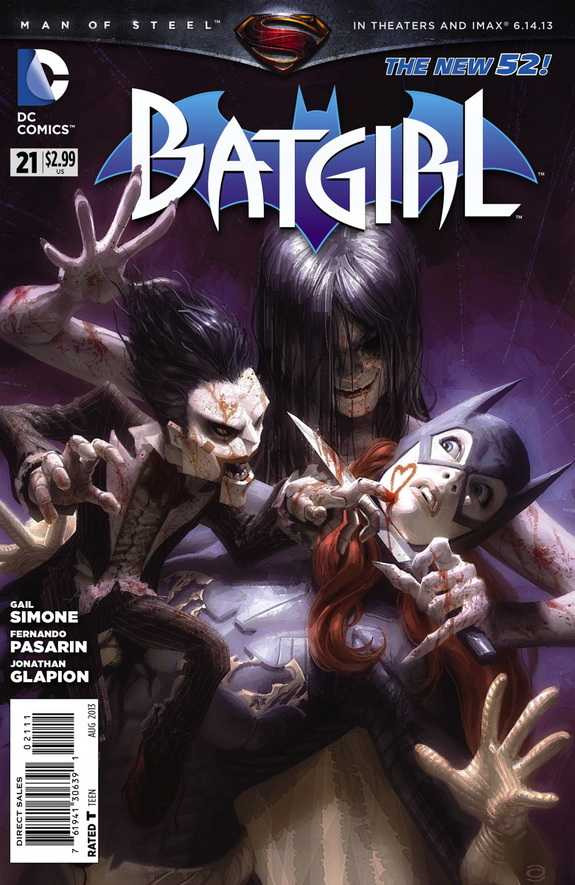
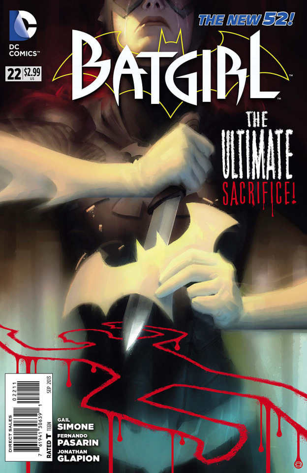
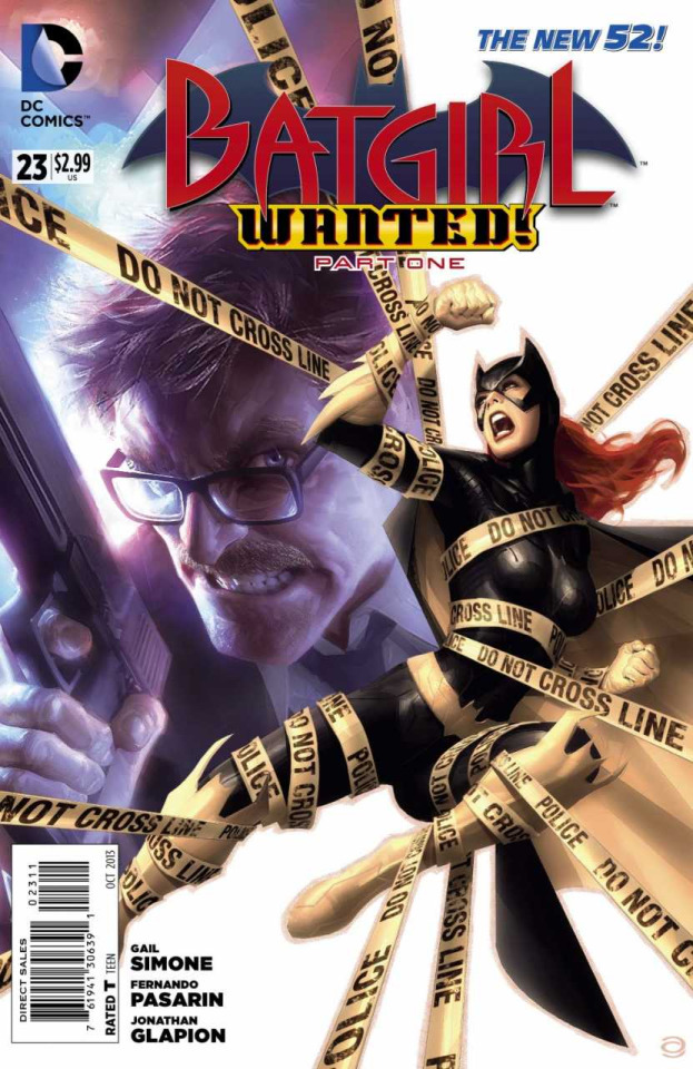
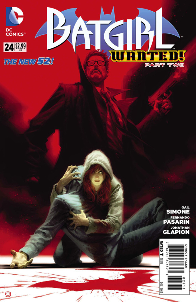
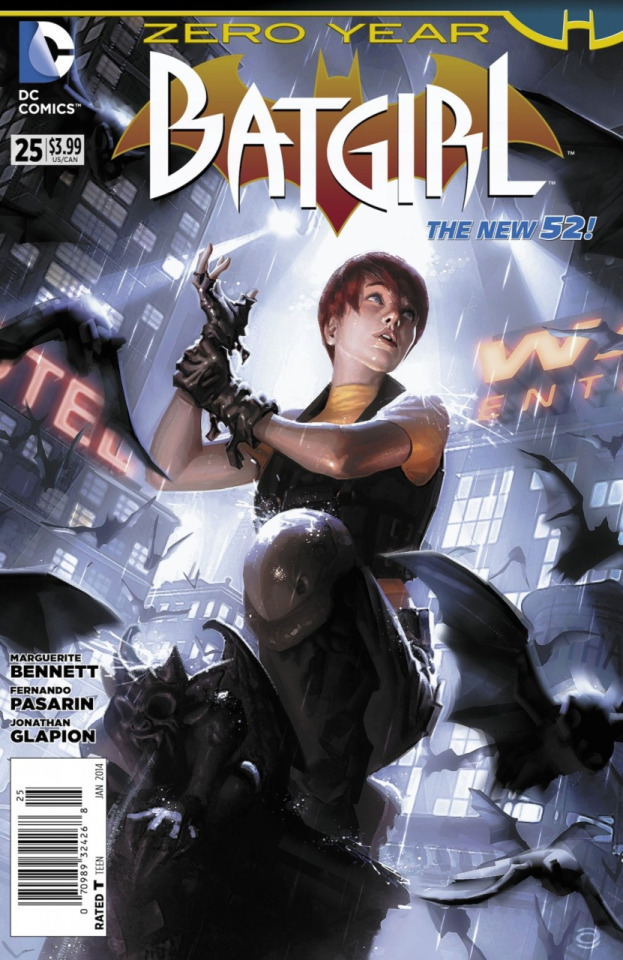
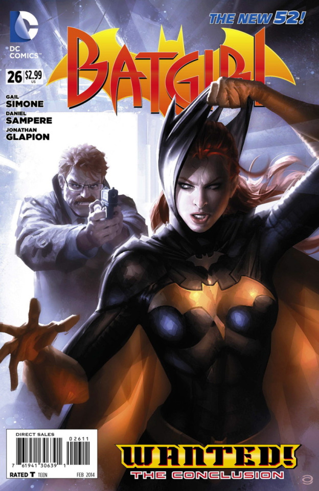
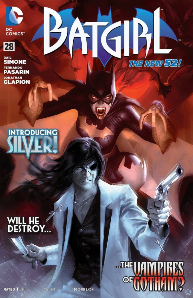
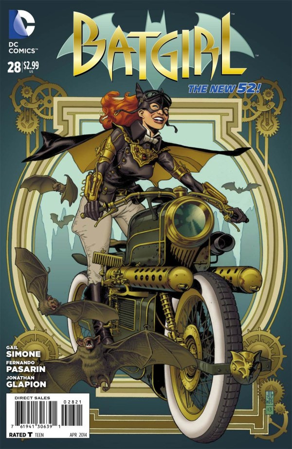
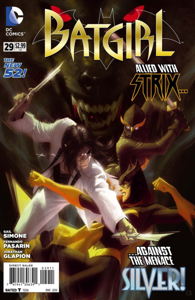
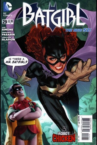
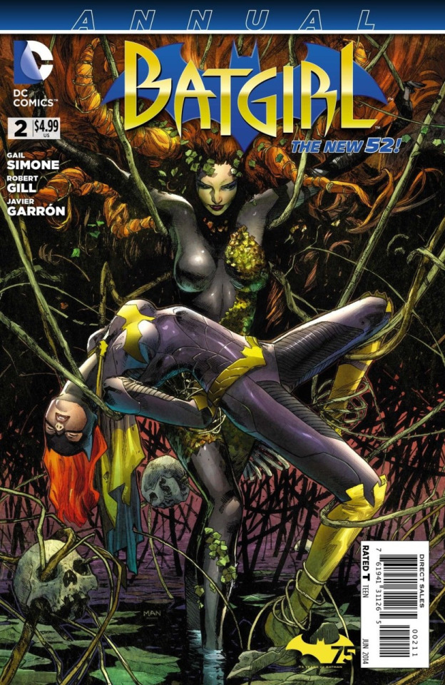
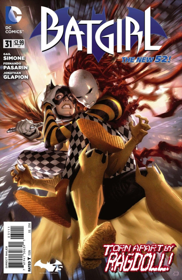
#art by: marcelo maiolo
Explore tagged Tumblr posts
call-me-oracle · 7 months ago
Text
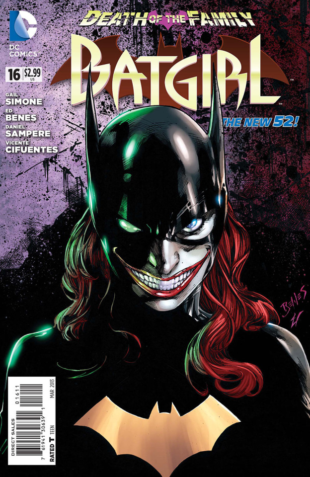
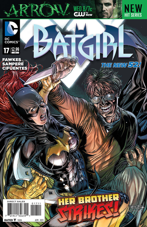
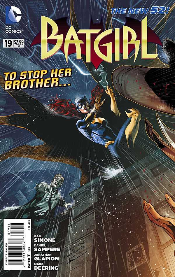
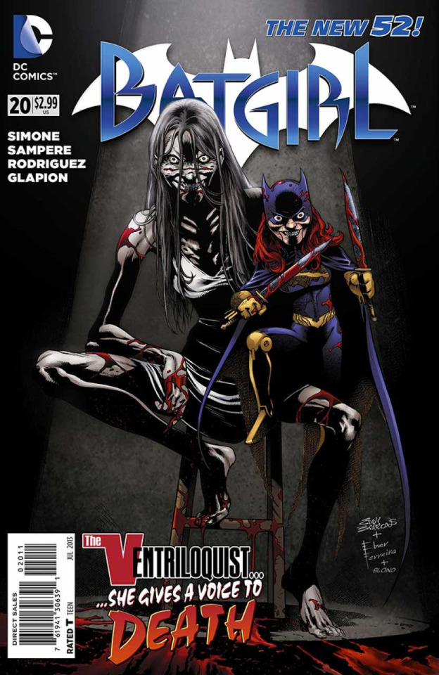
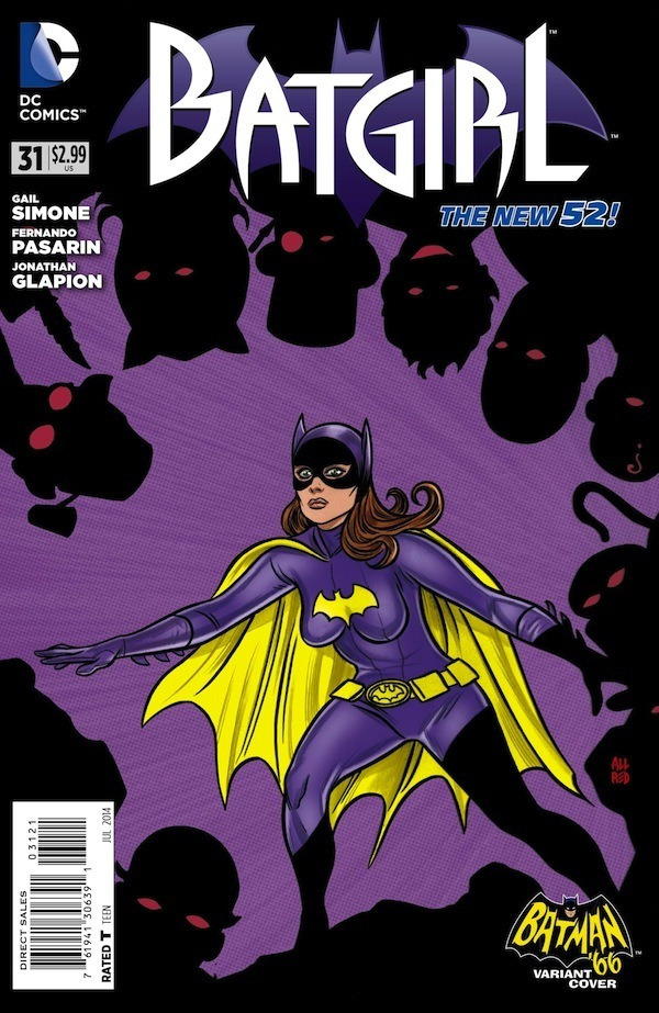
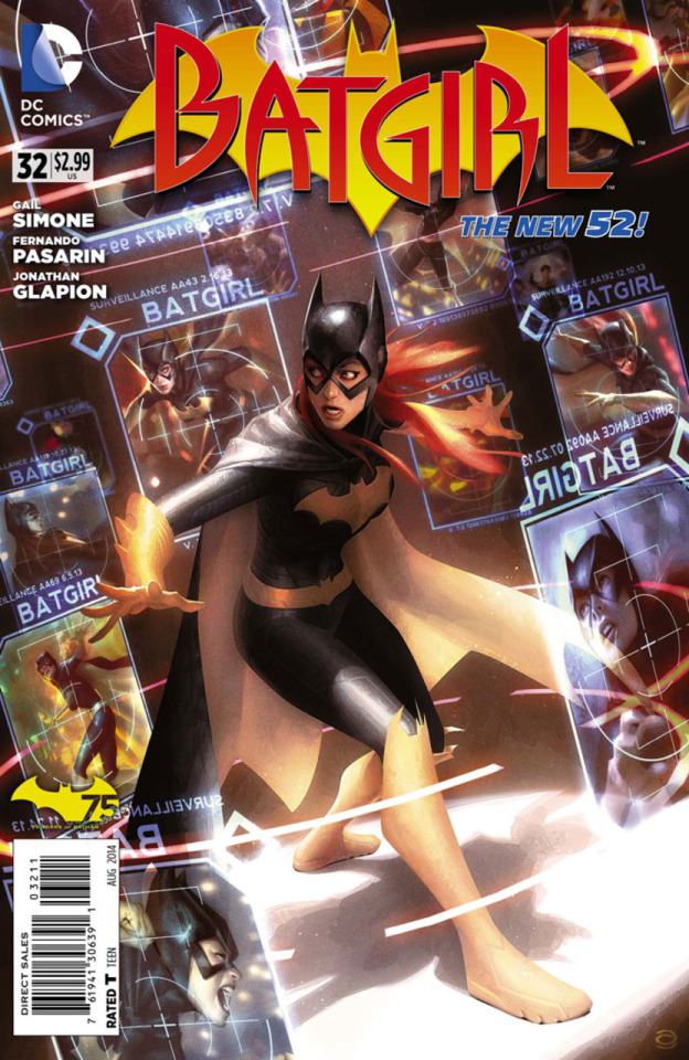
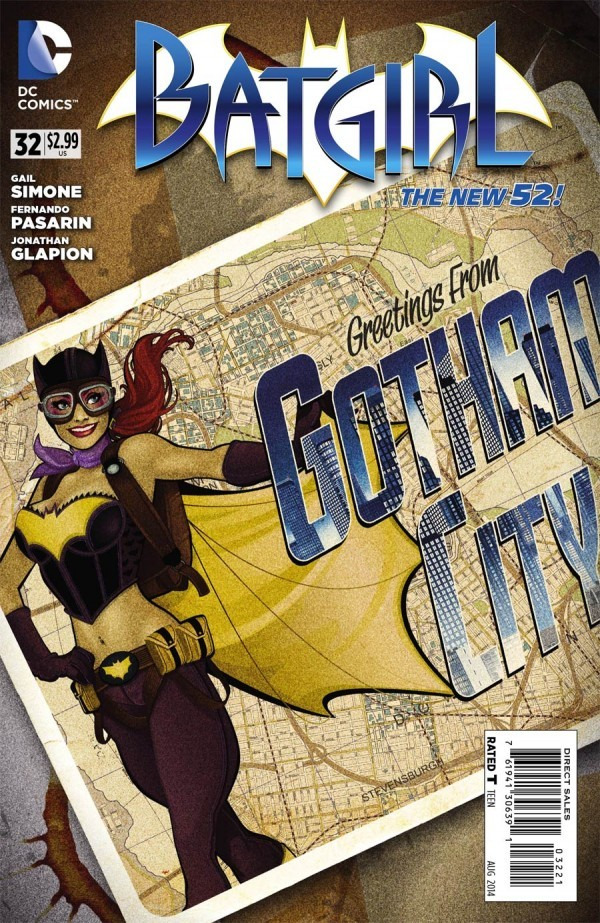
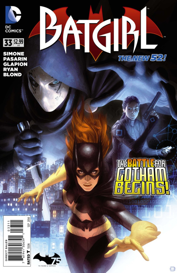
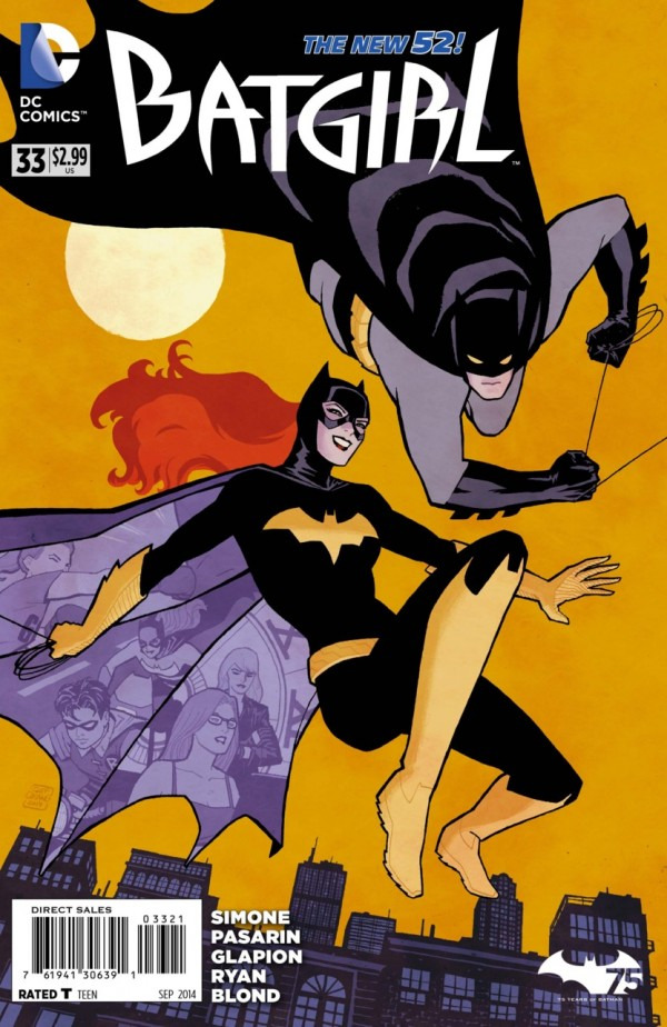
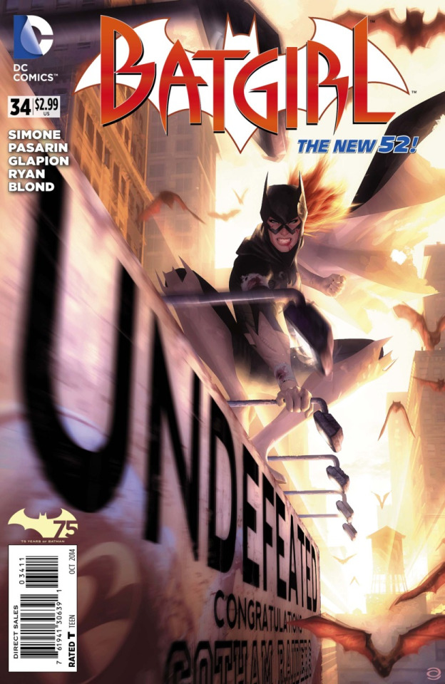
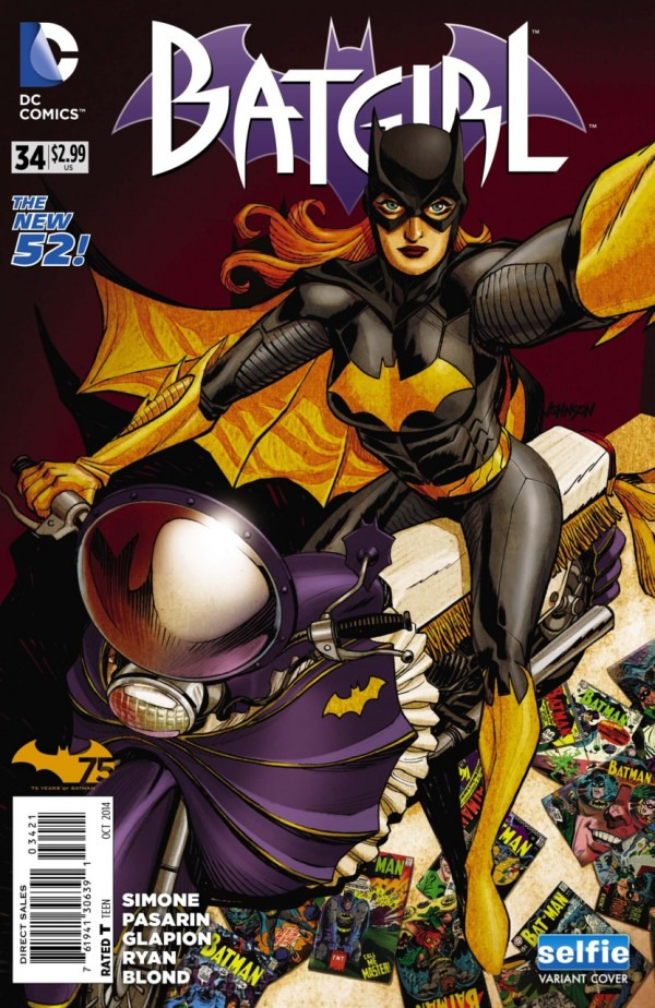
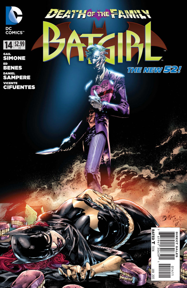
barbara gordon in batgirl (2011) by gail simone covers pt. 2
Tumblr media Tumblr media Tumblr media Tumblr media Tumblr media Tumblr media Tumblr media Tumblr media Tumblr media Tumblr media Tumblr media Tumblr media Tumblr media Tumblr media Tumblr media Tumblr media Tumblr media Tumblr media Tumblr media Tumblr media Tumblr media Tumblr media Tumblr media Tumblr media Tumblr media Tumblr media Tumblr media Tumblr media Tumblr media
15 notes · View notes
smashpages · 3 months ago
Text
Tumblr media
Santa’s coming back to the DCU this December
Jeff Parker, Lukas Ketner, Marcelo Maiolo, Pat Brosseau and Michele Bandini make the nice list for bringing us a sequel to ‘Batman – Santa Claus: Silent Knight.’
59 notes · View notes
gotthardcollection · 1 year ago
Text
Tumblr media
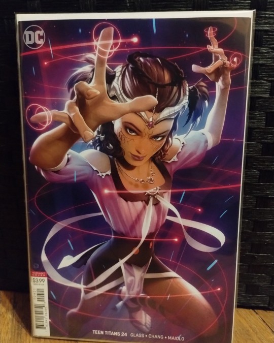
DC Comics: Teen Titans
Issue 24
(Featured On Cover)
Djinn
(Artists)
Adam Glass
Bernard Chang
Marcelo Maiolo
8 notes · View notes
why-i-love-comics · 6 months ago
Text
Tumblr media
The Penguin #8 - "The Apartment" (2024)
written by Tom King art by Rafael De Latorre & Marcelo Maiolo
875 notes · View notes
wwprice1 · 15 days ago
Text
Tumblr media Tumblr media Tumblr media
Awesome Batman and Robin preview art by Javier Fernandez and Marcelo Maiolo.
71 notes · View notes
comicwaren · 1 year ago
Text
Tumblr media Tumblr media Tumblr media Tumblr media Tumblr media Tumblr media Tumblr media Tumblr media Tumblr media Tumblr media Tumblr media
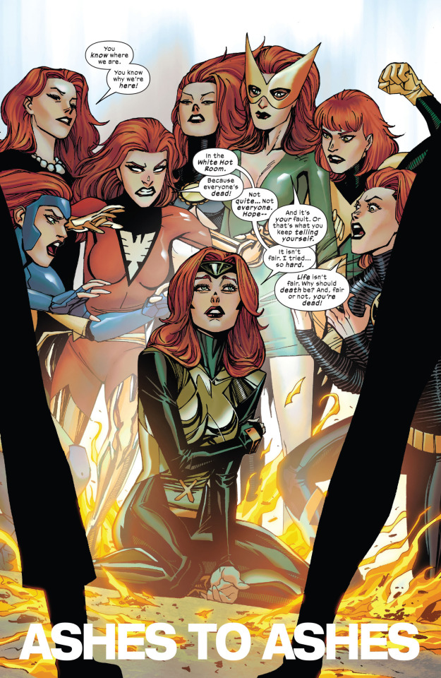
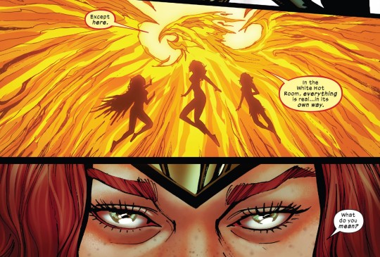
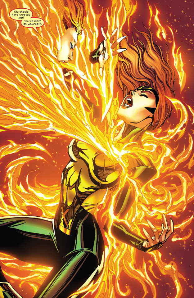
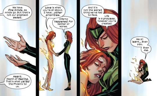
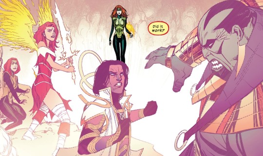
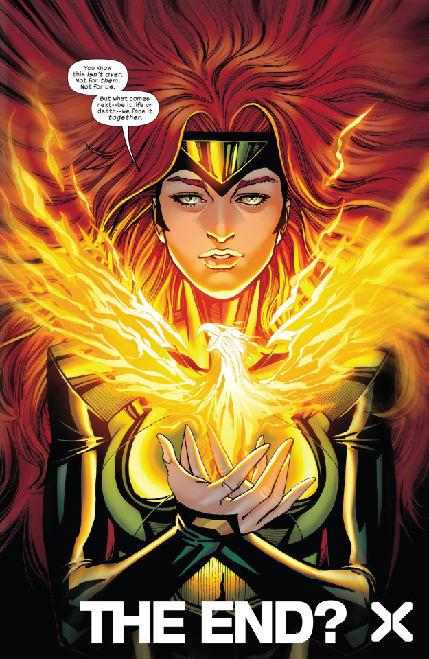
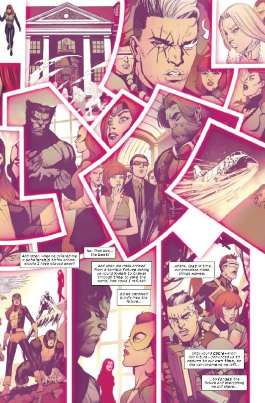
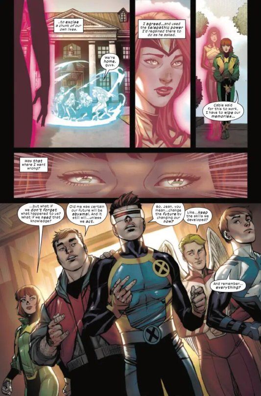
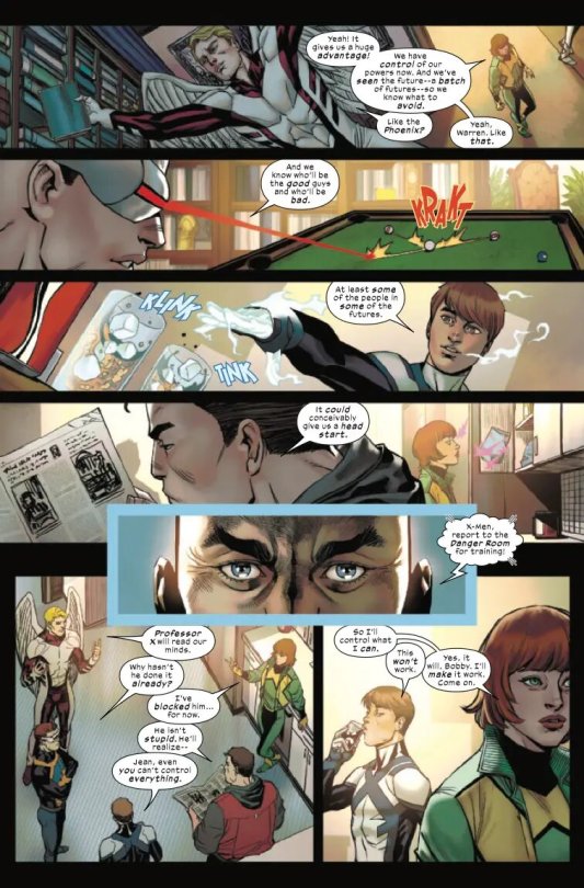
From Jean Grey Vol. 2 #004, “Ashes to Ashes”
Art by Bernard Chang and Marcelo Maiolo
Written by Louise Simonson
77 notes · View notes
because-batcat · 10 months ago
Text
Tumblr media
Batgirl and the Birds of Prey Vol 1 #16 (January, 2018)
Written by Julie Benson and Shawna Benson with art by Roge Antonio and Marcelo Maiolo
41 notes · View notes
dailyjsa · 7 months ago
Text
Tumblr media Tumblr media
The Terrifics #3
Writer: Jeff Lemire
Artist: Joe Bennett
Inker: Sandra Hope, Jaime Mendoza, and Art Thibert
Colors: Marcelo Maiolo
23 notes · View notes
heckcareoxytwit · 1 year ago
Text
Tumblr media Tumblr media Tumblr media Tumblr media Tumblr media Tumblr media
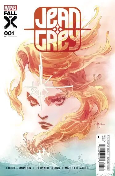
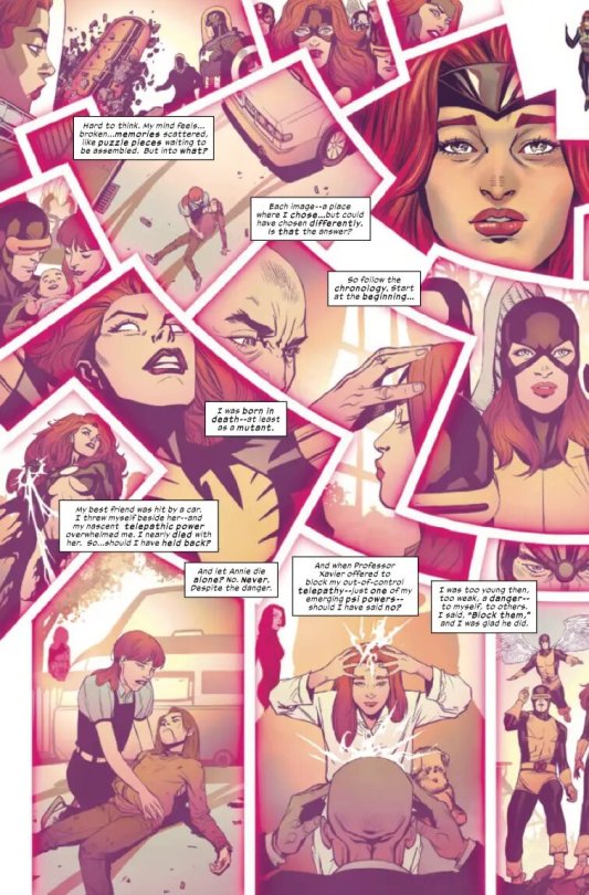
A preview of Jean Grey #1
JEAN GREY #1
SUPERSTAR CREATORS TAKE JEAN GREY’S LEGACY TO FIERY NEW HEIGHTS! After the events of the Hellfire Gala, Jean’s life is in shambles. Mutantkind is in dire straits—and there’s nothing this founding X-Man can do. She’ll have to save herself first. And that means looking into her past—for the moment when it all went wrong—in a desperate attempt to save her and all Krakoa’s future. Legendary writer Louise Simonson returns to the X-Men with a story full of fan-favorite moments, heartrending revelations and pulse-pounding devastation!
Written by: Louise Jones Simonson Art by: Bernard Chang, Marcelo Maiolo Cover by: Amy Reeder Page Count: 36 Pages Release Date: August 23, 2023
83 notes · View notes
kilowogcore · 6 months ago
Text
Tumblr media
As George Carlin once said, "It's a big club, an' you ain't in it."
An' as I'm gonna add, if we organize we can still flip the table!
(Art sampled from "The Penguin" Vol. 1 #10 by Tom King, Rafael de Latorre, Marcelo Maiolo, Clayton Cowles, Ben Meares, and Katie Kubert)
13 notes · View notes
dispatchdcu · 1 year ago
Text
Amazing Spider-Man #35 Review
Amazing Spider-Man #35 Review #MARVEL #marvelcomics #comics #comicbooks #news #mcu #art #info #NCBD #comicbooknews #previews #reviews #spiderman #Amazon #peterparker #asm #amazingspiderman
Writer: Zeb Wells Artist: Patrick Gleason Colorist: Marcio Menyz & Erick Arciniega Letterer: Joe Caramagna Cover Artists: John Romita Jr, Scott Hanna & Marcio Menyz; Elena Casagrande & Marte Gracia; Tony Daniel & Marcelo Maiolo; Patrick Gleason & Marcio Menyz; Claudio Sciarrone Publisher: Marvel Price: $4.99 Release Date: October 11, 2023 Norman Osborn reforges Kraven The Hunter’s spear to…
Tumblr media
View On WordPress
21 notes · View notes
smashpages · 5 months ago
Text
Tumblr media Tumblr media Tumblr media Tumblr media Tumblr media Tumblr media Tumblr media
Plastic Man No More #1 (DC Black Label, September 2024) preview art by Christopher Cantwell, Alex Lins, Jacob Edgar, Marcelo Maiolo and Becca Carey
50 notes · View notes
small-screen-superman · 3 months ago
Text
Plastic Man No More! #1 Review (Plus Some Thoughts on Fan Reactions)
For an enhanced experience, read this post on my personal blog! https://www.sssuperman.com/blog/plastic-man-no-more-1-review/
Tumblr media
Plastic Man No More! is a new DC Black Label comic series written by Christopher Cantwell about Plastic Man potentially dying as his body melts. It’s a surreal premise with a lot of potential for both introspection and body horror, and though it’s only one issue in, it’s delivering so far. DC Black Label is usually intended for more mature, out-of-continuity stories, so it seems to be a perfect fit.
This issue basically does two things: establish who Plastic Man is (including his backstory and current life) and begin the current story. As a result, the amount of stuff that happens in the present story isn’t a lot, but that feels perfectly fine. The comic still feels content-rich since it efficiently conveys quite a lot about the title character, including various different eras of his history, his relationship with his family, his relationship with the Justice League, and his insecurities and regrets. To me, it’s a mark of a great comic to be able to say a lot with relatively few pages or panels, especially if you do so using the conventions of the medium to their fullest.
Some comics lean heavily on just one or two tools, such as relying heavily on just narration boxes to tell their story, but this one takes advantage of a breadth of storytelling tools comics have to offer. For example, there are a couple instances of panel montages to convey a lot about Plastic Man’s life in just a page or two.
Tumblr media Tumblr media
Another excellent utilization of the comic book medium is its usage of two different art styles drawn by two different artists, Alex Lins and Jacob Edgar (and a colorist, Marcelo Maiolo, using two distinct coloring styles). The main style, Lins’, has a certain roughness and dinginess with colors tending towards the dark and desaturated, while Edgar’s is clean, bright, and classic. The latter style is used for scenes with the Justice League and a couple of “happy” panels. Both styles are realistically-proportioned but a bit cartoony, especially the latter. (Cartooniness seems like a good fit for Plas in general.)
This art style contrast extends to the fact that the Justice League scenes have bright lighting (taking place outside during the day or in the well-lit Hall of Justice), while the other style is used for night scenes. It was written to ensure this wonderful visual contrast makes sense in-universe too.
Tumblr media
So much depth and interest is generated in a scene like this. Though the League seems oblivious and even uncaring, it’s clear that some of their reaction is also due to Plastic Man’s self-presentation. Joking almost seems like a compulsion for him, a coping mechanism built up so strongly over the years that it’s hard to stop. It makes me excited to dive deeper into Plas psychologically.
I also liked the body horror; it’s gross and disturbing but also appropriately goofy and strange. The color and texture added by the colorist certainly helps with the gross factor. The art in general is great; I particularly loved Jacob Edgar’s bright and classic art, while Alex Lins’ (the main artist) wasn’t as beautiful to look at, but was extremely effective in setting the tone and conveying emotion. All in all, this issue delivered what it promised and was enjoyable, intriguing, and dramatic, and I think this series has huge potential.
Before I end this review, I’d like to share my opinion on some negative reactions to this book.
Some Negative Reactions & My Response
To be clear, this book is receiving a great reception from many corners. I’m not claiming it’s not, nor am I trying to claim that anyone’s opinion about this book or its premise is illegitimate. I just want to mention a couple arguments against this book and why I understand where they’re coming from, but don’t fully agree.
First of all, there are some people who dislike this book’s premise because Plastic Man stories are generally more light-hearted. This isn’t “wrong”, of course; we all have our own preferences. But I guess it seems a little limiting. I actually think it’s pretty cool to find potential for a character to be used in new ways that, despite going against what that character is usually used for, still make use of their unique traits. This story is clearly leveraging the established facts about Plas despite using him in a tonally different story. It’s not a direction everyone will like, and that’s fine. But considering it’s not even an in-continuity story, I think it should be given a chance.
Even for characters who I’m more attached to than Plastic Man (I confess this is actually the first comic of his I’ve read!), I don’t like the idea of limiting superheroes too much, when many of them are actually quite versatile. For example, I don’t think the idea of Superman stories being dark or having a dour tone is inherently bad (though it needs to be done with care, of course).
I somewhat understand the fact that, since Plastic Man doesn’t have another title right now (or even a series where he appears regularly), it’s annoying to some that he finally gets his own title, and it’s not what anyone would expect a series starring him to be. But on the other hand, I don’t think there’s any reason to believe that, if this title didn’t exist, a more conventional Plastic Man series would be released.
Tumblr media
For me, the big thing is that this is it out-of-continuity. Things don’t have to be the same as the mainstream comics.
Especially with the above point being the case, it’s generally more important that characterization serves the story than that it conforms to canon or expectations.
The characterization of the Justice League isn’t that bad. It’s somewhat believable that they would be too preoccupied to understand the seriousness of the situation.
All this to say, I don’t exactly disagree with the notion that the Justice League’s characterization is bad. It just doesn’t really matter in this particular context. It still annoys me a little bit, but I can accept it for the sake of the story.
To conclude, the negative reactions to this book are the kind of reactions you see a lot in fandom, especially superhero fandoms. It’s justified in many cases, but sometimes it annoys me if I feel like people aren’t being open-minded to new ideas, or aren’t thinking about the context or goals of the specific story.
2 notes · View notes
why-i-love-comics · 2 months ago
Text
Tumblr media
Batman & Robin #14 - "Memento" (2024)
written by Phillip Kennedy Johnson art by Javi Fernandez & Marcelo Maiolo
194 notes · View notes
scarlet--wiccan · 2 years ago
Note
Do you know of any good examples of Pietro being coloured with darker skin? There’s the new SW solo and No Surrender but is there any other that you know of?
I hope the positive change we’ve seen with colouring Wanda correctly will extend to him as well
Depends on your definition of "darker." A lot of what passes for brown or tan in comic books is shockingly light to me.
There are plenty of comics, particularly in the 90s, where Pietro and Wanda are somewhat tan, but that's usually just because the artists were working in a warmer color palette. It's not an intentional choice-- they're usually in the same shade range as other white characters.
Things really started to change with Quicksilver: No Surrender. The color artist, Rico Renzi, intentionally gave the twins deeper skin tones, and I've heard that this is something the writer, Saladin Ahmed, specifically requested from him. Unfortunately, you can't really tell in most issues, since Pietro is mostly alone in a grayscale setting, and the flashback sequences were colored by a different artist. Still, it really stands out in the final issue, and it was the start of a slow but steady change for the entire Maximoff family.
Over the past four years, many artists have begun changing the way they draw Wanda, Pietro, Billy and Tommy. Here's a quick timeline:
Rico Renzi went on to color Wanda and Pietro with brown skin an issue of Squirrel Girl Beats Up The Marvel Universe
Marcelo Maiolo gave Billy a deep tan on the cover of Empyre: Aftermath Avengers and in a splash page of Marvel's Voices: Pride.
Jesus Aburtov gave Wanda noticeably tan skin tone in Darkhold.
Rye Hickman and Brittany Peer drew both Wanda and Pietro with defined noses, curly hair, and brown skin in Who Is the Scarlet Witch?
Russel Dauterman debuted his new design for Wanda ahead of the 2022 Hellfire Gala-- in all of his illustrations and design sheets, she has light brown skin, dark curly hair, and a defined nose.
Peach Momoko began drawing Wanda with brown skin in official cover art and personal pieces during the Judgement Day event, which has been mimicked to varying degrees by several other artists.
Scarlet Witch (2023) is announced, featuring Dauterman's Gala design as Wanda's new definitive look. Dauterman is on covers, with Pichelli and Wilson on interiors. In the most recent previews, Wanda and Pietro both have rich, warm brown skin.
The Maximoff family appears together in Love Unlimited: Hulkling & Wiccan. They are initially shown with fair skin, but by the end of the series, color artist Matt Milla has noticeably adjusted Billy's skin to a light brown.
I had a brief conversation with Dauterman on Instagram last month and he acknowledged that Wanda's new look was an intentional choice and was glad to hear that it's making people happy. I'm delighted that so many artists are starting to take cues from his choice, and Renzi's, to show Wanda and Pietro this way.
Here's Pietro in Squirrel Girl:
Tumblr media
And here's the twins in Scarlet Witch again BECAUSE LOOK AT THEM!
Tumblr media
61 notes · View notes
comicwaren · 5 months ago
Text
Tumblr media
“We’re going to heal... everyone.” -- Venom
Cover art for Venomverse Reborn #001
Art by Tony Daniel and Marcelo Maiolo
33 notes · View notes