#and you pick apart these choices and there’s just layers and layers of overlapping reasons underneath
Explore tagged Tumblr posts
Visit Tumblr Blog
Explore Tumblr blogs with no restrictions, modern design and the best experience.
Last Seen Tumblr Blogs


Fun Fact
In 2020, Tumblr had 29.4 million users in the US.
Text
i think what’s so interesting wrt the cassandra-rapunzel communication problem—& part of what’s frustrating about the wider fandom acting like it’s in any way cassandra’s fault that rapunzel deliberately ignores the things she says and the very clear boundaries she consistently tries to lay down—is that like
it’s not rapunzel’s fault
but i do think it’s something she does deliberately, not out of malice but because that behavior is something gothel trained her to do, by playing nasty little mind games and gaslighting the fuck out of rapunzel for eighteen years and cultivating the relationship we see in tangled wherein rapunzel is made responsible for managing gothel’s feelings and divining the true meaning behind everything she said and being punished with sly verbal abuse whenever she failed. and like, that’s the only communication model rapunzel has.
(even the situation with eugene kind of reinforced that, i think; not because eugene is in any way like gothel but because the person he initially presented himself as, flynn rider, turned out to be a façade rapunzel needed to see through in order to get to know the real eugene, which…is not that different from the interpersonal model rapunzel learned from gothel, really. people have a mask that they show you and it’s your job to ignore it and look past it and see the real face underneath, or else…bad things)
(also rapunzel gets tossed into serious princessing within WEEKS of leaving the tower so i am sure like the majority of people she interacted with at this point being POLITICIANS didn’t help, lmao)
and then she meets cassandra and. beginnings establishes that the first thing rapunzel is drawn to about cass is that cass doesn’t have a façade; cass is blunt and honest and real—(which is a perception that, tangentially, i think also contributes to rapunzel’s ongoing blindness to the social and class disparities between herself and cass, bc despite cass saying so Out Loud, Many Times, until the very end of the show raps never does quite grasp that cass has a job to do and does in fact maintain and desire a level of professionalism and separation btwn her job and her personal life in spite of her straightforward demeanor)—anyway, the point being, i think rapunzel DOES have a genuine social knack buried under all the layers of trauma and awful conditioning she got from gothel, because she’s able to identify instinctively right from the start that cassandra Isn’t Like the two-faced people rapunzel is surrounded by. which like, i’m not using two-faced as a value judgment here, just—rapunzel is surrounded by politicians and diplomats and servants and courtiers and one freshly-reformed charismatic thief and all of these people very fluently speak a social language that rapunzel doesn’t, one which requires them to play certain roles that might be wildly disconnected from their true selves, and rapunzel herself isn’t equipped to parse the distinction between that and what gothel was. so: she sees cass, who plays the game just enough to stay out of trouble but also openly chafes against it, and immediately is drawn to her because cass barely plays and openly resents the game.
so like, rapunzel knows that cass is Different From Other People and yet—even knowing that she doesn’t and honestly probably can’t just take things cass says at face value, because taking anything anyone says at face value goes against everything she’s ever been taught about how people work, and she likely legitimately cannot fathom that when cass Very Clearly says things like “we are not friends” she just… means them. & then ofc beginnings involves cass pursuing a career opportunity that would take her out of corona and rapunzel finding out and feeling personally betrayed and doubting her own instinct, which…again i think probably just reinforced this conditioning
and the end result is rapunzel through no fault of her own ends up in this WEIRD zone where she recognizes that cass is a basically honest person who doesn’t hold back much on her opinions but also rapunzel doesn’t trust that and maybe doesn’t trust her own perceptions enough to fully accept that when cass says no to something it’s okay to take her at her word—all exacerbated by the fact that cassandra at the end of the day can’t enforce boundaries with rapunzel except by expressing frustration when they’re violated, bc she’s rapunzel’s servant. so like, genuine consequences of transgressing cass’s stated boundaries aren’t even possible—it’s not like cass can remove herself from the situation! so how is raps supposed to learn better? she can’t.
but there is that deliberateness to it, because a) rapunzel has this instinctive perception of cassandra’s straightforward nature and b) cassandra herself nine times out of ten says in plain terms exactly what she wants and often why, and while it isn’t rapunzels fault that she has this fuckton of baggage ignoring what cass says in favor of trying to divine her ‘true’ feelings IS a choice that she makes, out of anxiety and self-doubt and just flat out not having ever learned any other way to treat people
& i mean i talk to death the subject of cassunzel fanon stripping cass of agency and making the uwu poor friendless repressed sad useless idiot lesbian rapunzel needs to rEsCuE and bRiNg OuT oF hEr ShELL but it’s like. not quite as but almost as frustrating how framing rapunzel as like, basically cassandras emotional support animal and also someone totally blameless and totally ignorant in her treatment of cass takes away rapunzels agency and intelligence too. (this girl grew up isolated in a tower with no one to talk to but her abuser and a chameleon and she fucking taught herself physics and astronomy and how to cook and bake and make music and paint, and you expect me to believe that in two years she never once even thought “hmm cass told me not to do this, but…”? like first all that’s not the defense of rapunzel you think it is because that level of ignorance legitimately makes people dangerous, and second of all it’s just literally not true like, in BEA/WTH rapunzel understands perfectly well that cass doesn’t want her to share cassandra’s secret with eugene and after multiple conversations on the subject decides to do it anyway! in UR she literally says out loud on two separate occasions that she knows cass doesn’t want her to pry and proceeds to do it anyway! These Are Choices She Is Making)—& i just
like the girl is anywhere from six months to three years out of a horrible isolated abusive lifelong situation depending on what part of the show you’re looking at and yeah of course her choices are shaped by her trauma but—god, they’re still HER CHOICES. and i guess i just don’t understand the appeal in watering down the agency rapunzel has in making those choices and the complexity of why, because rapunzel isn’t an idiot and she does know that cass really doesn’t want her to do things sometimes and there are times when she very openly displays discomfort or hesitation about transgressing those boundaries but does it anyway because doing what she feels like doing—to soothe her own anxiety or guilt or curiosity or whatever!—just… feels better in the moment than trying to be respectful of cassandra’s personal space. like, it’s not her fault she’s like this but if she wanted to change she absolutely could? cassandra in a lot of ways is the ideal person to learn about boundaries from because she’s the kind of person who says exactly what she means 95% of the time and if raps were to like, make a genuine effort to tackle things im positive cass would’ve been more than willing to help raps figure out some strategies for managing that anxiety—even as it is cass despite her frustration with constantly being trampled over showed rapunzel a lot of patience and understanding!! this could so easily have been something they collaborated on together and became even closer through, but… it would have been uncomfortable and rapunzel isn’t good at discomfort! she deals with it by shoving it down and pretending everything is fine even when she knows it isn’t!
& like
that’s good that’s a good thing characters having agency in their fuckups and making choices that they know aren’t right bc it happens to feel better is good—all of this is why rapunzel is such a neat character and a huge part of why tts was so great, bc it took the very rosy fantasy of rapunzel as this sweet ball of sunshine virtually untouched by the horrors of her upbringing besides her endearing naïveté and threw that out the fucking window to treat her like an actual goddamn person instead, one who does try her best but still makes mistakes and also sometimes just flat out makes shitty selfish decisions, bc trauma is messy and recovering from abuse is hard and people can be complicated and contradictory and more than just one thing, and—just, god, why would you want to take that away from her by treating every bad choice she makes as something fundamentally outside of her control?
#i am just thinking tonight abt how much i love that tts rapunzel was allowed to be FUCKED UP#like? even within the restrictions of disney princess#she feels so complex and REAL#how profoundly amazing is it that we’ve got a disney princess#who deliberately makes choices she knows to be wrong over and over bc it’s too hard to grapple with her monumentous pile of baggage#and then has that blow up spectacularly in her face when the friend(s) she harms lash out at her#and you pick apart these choices and there’s just layers and layers of overlapping reasons underneath#all of them understandable and logical based on her past and present circumstances?#s3 executive meddling nonsense aside. the emotional realism! is good!
77 notes
·
View notes
Text
Not to keep on with this but right so I made a post about Vergil and Bernini and in that post I mentioned what art works and pieces I think represent the other parts of the DmC trio, Kat and Dante. And I just wanted to follow up on that with more focused posts because yall have no idea, I’m very into this whole thing.
First up: Dante
So Dante I go into a good deal in the Baroque essay already so some of this is a rehashing but I just wanted to go more in depth about Dante and Caravaggio’s Davids.

(David and Goliath, 1599)

(David with the Head of Goliath, 1607)

(David with the Head of Goliath, 1610)
More about Dante, Caravaggio, and especially that last David under the cut! This one got a little long.
Ok so first things first, like discussed in the Baroque essay, Dante is Baroque and the game is based around Caravaggio’s Baroque to a point where many of his paintings are directly referenced. That last David in particular is referenced directly in the game. See below:
so I’m not really saying anything the game hasn’t really done itself here. Dante is the main character, he is represented by Baroque and Caravaggio. That’s his vibe, that’s the parallel. And it’s a very intentional one I mean in Talexi’s art book he discusses picking Caravaggio as an influence and the overlap between Dante’s whole deal and Caravaggio’s own. But I’m like really into Caravaggio’s David’s and want to talk about that and the neat way this plays with Dante’s whole deal so, let’s do it.
To quickly summarize Caravaggio and the background of his last David: Caravaggio was an angry guy who worked in Rome during the Baroque period until he killed a guy for Reasons (probably a bet, possibly a woman, possibly a tennis match or something, probably the bet). He gets kicked out of Rome, does some stuff (joins a knighthood? at some point then leaves the knighthood?), gets word that the pope wants to pardon him. He goes back to Rome with some art but dies on the way at the ripe age of 38. One of the paintings with him that makes it on this trip is the last David.
What I like about Caravaggio’s David’s is how different they are then other David’s that come up in the art history canon. Just for comparison I’ll share the famous David but also Bernini’s David from the same time period.

(The David, Michelangelo)

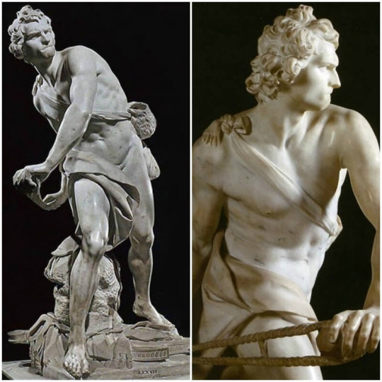
(David, Benini. Pain to get a photo of s2g)
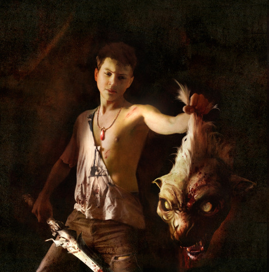
The first key difference is I mean, all three of Caravaggio’s David’s are wearing clothes which I think is neat in that I imagine he would be wearing those given the situation. But beyond that, what strikes me about Caravaggio’s David’s is their youth. In the biblical story, David is more the age Caravaggio consistently depicts him at. Which is about approximately preteen or teenage. The second thing that strikes me is the confidence and power displayed in Bernini and Michelangelo’s David’s evoke. But Caravaggio’s are not confident, not the way these one’s are. And especially that last one.
Caravaggio’s David is unsure. He’s just done this thing, killed this man, but he doesn’t seem to have quite processed it in the first two. But in the third, he is processing it. And he’s not processing it well. This is a David who is unsure. This is a David who seems to pity the man who’s head he now holds by the hair. This is a David who is not strong and unwavering and confident and elegant, this is a child who just killed a man. This echo’s in the games interpretation of the scene, that same worry echoing in Dante’s brow that’s in Caravaggio’s. It’s a sympathetic David in that he seems to be unsure if this choice was worth the personal toll but also in the sense that the viewer is sympathetic to him, they feel bad for this child who has just been forced to make this choice.
Reboot Dante’s life is not one about choice, it’s not really something he seems to be able to do often. Sparda put him into the orphanage and the orphanage put Dante into the foster care system. And ever since then Dante has had to fight. Not by choice, but by necessity. It show’s in his combat style, in his clearly untrained movements focused on power and strength rather then tactics. Vergil, if you watch him fight, he’s much more elegant, his style reflecting practice and technique. Dante, though, throws everything into his movements to kill as fast as possible. That if he just swings hard enough, this’ll all be over faster. He even stumbles in his combat because he’s put so much power into his swings, it’s my favorite little detail.
In the game, it’s mentioned that Dante’s first recorded demon kill was when he was eight years old. It was one of the ‘caretakers’ at the facility he was in. I often wonder if that’s the moment that they were trying to depict in this image, the moment after that. I'm not really sold that he looks eight here but I mean you be the judge of that but bare with me. It’s the mood, that moment right after he’s been forced to enter his new reality for the first time. That he is going to have to fight like this the rest of his life. That bewilderment and regret and just general disbelief that he’s done this, that he’s just killed something. That sorrow for the Dante he was before, like that sorrow that David must be feeling for who he was before as well.
But there’s a second layer here I haven’t gotten to yet. And that’s how Caravaggio’s David is also thought to be a self portrait. No, he’s not David. Caravaggio has painted himself as Goliath. A portrait of Caravaggio for reference:

(Caravaggio as depicted by Ottavio Leoni in 1621)
Usually this is read as a tongue and cheek thing to the pope, like Caravaggio is offering himself in the ultimate repentance for his crimes. He’s sorry, here’s his head on a platter. But there’s something about it being a self portrait coupled with David’s pity for this Goliath that feels kinda...sad in a way.
Further context to this is Caravaggio, on the run or not, did not have a studio. He was a solo artist, which is a bit odd for the period at his level. He did not take students, so his techniques died with him. No one else worked on his paintings, they’re all by his hand. This in particular David was not commissioned either, it was done as a gift. So this was a deliberate thing entirely thought through by him, painting himself as Golith, painting David so full of pity and grief.
It’s sort of this idea of pity for the monster when you yourself are the monster as well as a sort of self hatred. Which reboot Dante is familiar with. Either Dante, preboot or reboot, kind of has this arc about trying to cope with being half demon while hating being half demon. It’s not a part of himself that he likes. The reboot goes further with this though because he doesn’t even have the solace of being half human, he’s also half angel. Reboot Dante goes from seeing himself as a human being to being told no, your not, your the things that you hate and it’s your job to protect people anyway. You are both the out of control monster and a threat, but also their protector.
In either reboot or preboot this isn’t like the most explicit character beat, though it does come up. In the reboot we see it peak through in moments like Dante’s interactions with Phineas. The ‘my father was a demon and I’m nothing like him’ mentality. The reboot makes this more pressing to in that like, the reboot makes it clear that demons are not a hive mind. While they seem to vary in intelligence and free will and all that, the game does not imply that Phineas and Sparda are alone in their grievances where as the preboot paints demons like Sparda and Trish as complete oddities. But part of either Dante’s rejection of Sparda is always rooted in ‘Sparda is a demon, and I’m nothing like the demons.’
This is interesting in the reboot because, unlike Vergil, reboot Dante is always visually contrasted with demon imagery. His world is very red. His color is red. The colors on him, even the blacks and grays, are warm tones. His devil trigger is designed in such a way that the abundance of reds in it are even more prominent then his initial design. The only time he’s not is the scene with the graffiti where he’s positioned on the side with the angels. But visually it’s still made clear. Dante is the demonic twin, Vergil more angelic. On top of that, characters in the reboot love to point out how Dante reminds them of Sparda. Phineas does it and Mundus really does it (the ‘just like your father, too big for your fucking boots’ line). Which further puts Dante at odds with his identity. As much as he thinks he is nothing like Sparda, he’s his fathers son. He’s the demon half of this twin relationship.
I think to like Caravaggio’s David’s just...they don’t want to do this. They’re just kids. They don’t want to kill their Goliaths. But they have to. Which is the spot we see reboot Dante in. He doesn’t want to save the world. He doesn’t want to fight for his life as often as he does. He doesn’t want this. But he has to do it. He might say he doesn’t give a shit, but what’s his choice? When has he ever had a choice? He’s the unwilling savior.
This runs through the game to. Dante doesn’t really want to be here. He makes that clear a lot. And his bravado is constantly a cover to keep him from being too vulnerable, too exposed. But it’s that last fight with Vergil where it all falls apart. He did this because Vergil asked him to, and Vergil didn’t even tell him the truth. And just like everything else, Dante doesn’t want to kill Vergil. He doesn’t want to fight him. But he’s provoked him anyway and got himself in this fight and he can’t let Vergil take the throne. David can’t just let Goliath go.
It’s the end of the game where we finally have Dante completely free of his walls and completely bare and entirely unaware of who he is and what he’s supposed to do next. It’s the same sort of vulnerability that I feel is abundant in that last David. Who is he now after all of this? Does he like this person? What’s he to do now that he knows what he’s capable of, knows what he’s done?
What makes him any different then this head in his hands?
#dmc devil may cry#dmc reboot#devil may cry reboot#dmc reboot dante#devil may cry reboot dante#reboot dante#fab talks meta
104 notes
·
View notes
Text
HALO FOR BEGINNERS PART 1: A NOT SO BRIEF INTRO TO HALO
So Microsoft has recently announced that The Master Chief Collection for Halo, is coming to Steam, opening up the Halo universe to many new players who haven’t been able to play before thanks to not owning an Xbox.
So in celebration of this, I’ve decided to put together a little series thats basically a Beginner’s Guide to Halo, for people who only know it for its stereotypes involving its multiplayer play.
This series is mostly aimed at popular video game fandoms on Tumblr, so you might catch me making some comparisons (especially to series like Mass Effect that actually have some tropes in common with Halo)
However a couple of things before I get started for real
1.This guide will only be talking about the original trilogy of games, Halo: Combat Evolved, Halo 2, and Halo 3. There are three other games in this game bundle, Halo 3: ODST, Halo Reach and Halo 4. However I haven’t actually finished ODST, and I haven’t played the latter two in over half a decade, so I really don’t feel equipped to talk about them in length.
2. Halo deals with a lot of heavy content. Along with the obvious blood and gore, there’s a lot of body horror involving the Flood (though if you can stomach say… Telltale’s TWD, its probably about at that level of squick). Heavy themes that are core themes of Halo include genocide, religious based trauma and abuse, child soldiers and medical experimentation on humans. I don’t believe Halo CE has much in the way of individual triggers to look out for, but Halo 2 has an extended torture scene that includes stripping someone naked to humiliate them and Halo 3 has several sequences involving a female character being violated mentally. So if anything these things are extreme triggers you can’t engage with, then I say you should listen to your gut.
3.I will not talk about the multiplayer aspects of Halo much (except to discuss stuff involving co-op maybe) as this series is meant to kind of explain more outside of multiplayer stereotypes.
4. Halo 2 and 3 are pretty hard to talk about without mentioning spoilers for the games that come before it. If you’d like a totally spoiler free experience, I’d recommend skipping anything where I mention these games. Also for the sake of my own sanity, I am not treating the Flood as a spoiler, because ...well it hasn’t been for almost 20 years, and Halo has since reached a point where you can’t really talk about it without mentioning them.
----
So I guess I should start at the very beginning?
WHAT EXACTLY IS THE HALO MASTER CHIEF COLLECTION?
The Halo Master Chief Collection is a collection of the first four Halo games, and ODST, and soon Reach will be added too! Its sold at the equivalent price of one retail game, so you’re basically getting six games for the price of one.
It was released for Xbox One in 2014, to coincide with Halo 2’s tenth anniversary. It was infamously buggy at the time, (probably because it was rushed for the aforementioned anniversary) but most of these bugs have been fixed, and they even added in ODST as an apology gift! The PC version should not contain these bugs. (though there’s a decent chance it might contain bugs related to PC porting, especially for Halo 3 and beyond which have never been ported before, but that’s just speculation).
If the PC version is identical to the Xbox version, the Master Chief Collection is essentially a download pass for these games. You download and pick and choose which ones you want! For example on my Xbox I don’t have the ODST from MCC loaded on because I already have the vanilla Xbox 360 version loaded to emulate (which I still haven’t finished but YOU KNOW). This allows you to play the games you want and not waste space and download time on the ones you don’t.
Halo Combat Evolved is ported based on the 2011 10th anniversary version that updated the graphics. Halo 2 received a brand new (and absolutely STUNNING) graphics update specifically for this release. Halo 3 and beyond are straight up ports with the original graphics, though with a much better frame rate.
SO WHAT EXACTLY IS HALO?
OH…. umm I guess maybe I should talk about that too.
Halo is as most people know, a sci-fi first person shooter. From 2001-2010 the games were released by Bungie. When Bungie left Microsoft to make the Destiny series, Microsoft kept some employees behind and hired some new ones to create 343 Industries which is their in house team to make Halo. The first game released by 343 Industries is Halo CE: Anniversary in 2011, and the first game released based on original content is Halo 4 in 2012. This post series though will mostly focus on Bungie content.
So Halo: Combat Evolved came out in 2001 and its...basically the reason the Xbox is a THING. If it weren’t for Halo, or even if Halo had been a multiplatform release, the Xbox probably would have gone the way of the Sega Dreamcast. Halo: CE had many innovations for the first person shooter genre at the time, including a two gun limit where you have to strategize your choice in weapons, a very complex AI system for the time, and basically revolutionized multiplayer for FPS games as we know it.
Halo would have been the best selling game for the original Xbox if it weren’t for Halo 2’s release in 2004, and Halo 3 basically was THE title for the Xbox 360, when it came out in 2007. The later games haven’t been AS successful, but still have a very loyal fanbase.
ENOUGH WITH THIS HISTORY LESSON, WHY IS HALO ANY DIFFERENT FROM CALL OF DUTY?
First things first.. I know there’s a lot of posts going around rn, talking about how well….overly militaristic many FPS games are. I will say I DON’T believe Halo is on the same level of some of these games. I’ve never heard of it having any military involvement in production, and I’d say its about as militaristic as Mass Effect is, as in the protagonists are in the space military, and the plot revolves around that.. The backstory of Halo if anything, paints the military in a very gray morality light AT BEST. So if you’re worried about this being a game that over-glorifies military stuff, if you’re okay with Mass Effect’s portrayal of a human space military, you’ll probably be fine with Halo.
SO I have not actually played Call of Duty or games like that as surprisingly I actually really don’t like the FPS genre, and Halo is the only FPS game I like. I will say though, Halo is definitely not a totally generic shooter, the way Call of Duty is stereotyped as. It has a very interesting plot with a lot of layers, and very unique lore, that still plays on familiar tropes. (and I’ll get into some of that later.)
At least one selling point I’ll say, is that unlike many modern shooters, Halo is STUNNING. It uses color very well, and has many beautiful maps, and especially in the remastered games you could just look at the environment for days. So the fact it has a color palette outside of gray and brown is definitely enough to set it apart.
I will say if you like Mass Effect for its alien lore and world building, there’s a very good chance you’ll like Halo too. The fandoms have a lot of overlap, and actually have a decent amount in common despite the fact one’s a shooter where you kill aliens and the other is an RPG where you…. you know with the aliens.
SO WHAT IS THIS PLOT YOU SPEAK OF?
I plan to go more in depth into this in my next post, but I figured for this intro post I might as well tell the basic gist of it. There will be some loose spoilers for the sake of the summaries making sense.
Halo Combat Evolved, is about a lone human ship that has escaped the destruction of the planet Reach, which was the last thing between Earth and the Covenant, a race of aliens hell bent on wiping out humanity for religious reasons. The ship makes a “random” jump to what they think would be the middle of nowhere, but in fact brings them to a ringworld that is worshipped as the foundation of the Covenant religion. Both human and Covenant land on this ring and a fierce battle assumes as they try to take control of it. Halfway through you learn that there’s...surprise! Zombies! Called the Flood, a spore like species that turns people into zombies and their only drive is to consume everything in their path. It turns out Halo, is a weapon to destroy them but…. It also destroys every living thing in the galaxy, so it turns into a mad dash to make sure that a) no one activates it and b) the Flood are able to be stopped without it before they leave the ringworld.
Halo 2 takes place about a month later, and is a split campaign between the Master Chief and the Arbiter, who is the disgraced commander of that fleet you were fighting in the first game. The Master Chief side of the story involves the Covenant finally making it to Earth, and the discovery of a second Halo ring, and the fallout of both of those things. The Arbiter side of the story involves him trying to restore his honor within the Covenant, by becoming a suicide soldier fighting for their faith, but as he does missions for his prophets, he learns the amount of lies and hatred his religion and society are built on.
And Halo 3 is basically...the convergence of all these stories. Its very hard to talk about without mentioning spoilers, and without going in depth about world building related stuff, which is the focus of my next post.
The final thing for this intro is….
WHAT IS HALO’S GAMEPLAY LIKE?
Okay so… I’m not going to talk about the controls, because I imagine they’ll be very different from mine, as an Xbox player. And I’m very biased because Halo is the first game I ever played on a controller as a kid, so I don’t really have an objective way of describing them. But the fact the controls were easy for me as a seven year old, probably makes them pretty easy to learn in general.
Because Halo is a linear story, the game is split up into levels. In the vanilla releases of the game, you need to play them in order to unlock them all, but in MCC that is NOT the case, and you can skip levels. I really do not recommend doing this though the first time around for obvious reasons, but once you’ve completed the game, you can just play the segments you like! And trust me there are certain levels you’ll hate (like the Library… I will tell you right now you will hate that level.)
There’s four difficulty levels, Easy, Normal, Heroic and Legendary. Easy is well..super easy. This is the mode I used as a little kid. However I don’t think there’s any shame in playing at this level, in fact I usually use this difficulty for my first playthrough so I can get through the story with no difficulty. Normal is well...normal. This is the difficulty I usually play at, its probably the most realistic in terms of enemy strength vs player strength. Heroic is basically pretty hard but not like...obscenely hard, but enough to be a big frustrating unless you know the game really well. And Legendary is… well super extra hard. Play Legendary if you enjoy having everything murder you, with no mercy. Also Halo 2 has a significantly harder campaign then Halo CE and Halo 3.
In the vanilla releases of the games, starting with Halo 2, there are items called Skulls you can collect that add difficulty or some extra fun to the game, but you have to collect them in the Legendary difficulties of the levels. This is NOT the case for MCC, and they’re all available for you from the getgo. I really don’t recommend using them for your first playthrough unless you really want a challenge, with the exception of the silly ones like Grunt Birthday Party (which spits confetti for headshots to Grunts) that don’t actually affect gameplay.
A lot of other gameplay stuff is really hard to generalize since Halo is a series where the gameplay tends to be pretty different between games, such as with HUD features and such. But those are some general miscellaneous game things they all have in common.
So yeah, thats it for my intro to my...intro to Halo. I’ll get started on the next one talking more indepth about the factions and what not, when I recover from...writing this.
#halo shitpost hour#halo#i have been working on this all day until i was happy enough with it so ahhhh#i have nothing resembling an idea when the next part will come out right now i just need a nap
96 notes
·
View notes
Text
some loose thoughts about the blackrock
working through the epilogue, one scene at a time! have some thoughts about the blackrock since the ship is very much the heart and soul of rythian’s motley crew of vault hunters.
nanosounds hired a professional, industrial grade cleaning crew to go through the entire frigate before launch day and had to ship them out to pandora, which was no minor expense but sipsco. paid for it, and the decision earned both ire and gratitude from daltos’ bandit gang; daltos’ feelings on the issue are firmly ‘f*cking finally.’
the frigate is over fifty years old, and bebopvox is still very fond it since it served as home, prison and body, which is something they’ll never be able to explain to a human. when vox was born, bebopvox gave vox the ability to choose when to retire if they get tired of being attached to the frigate. what happens after depends on what bebopvox’s backup plan is.
dahl ships are built to last; some wreckages of dahl ships serve as landmarks, monuments or historical attractions (a few being run inside of one). on pandora and its moon, ship wreckages are prime stronghold territory. all end up being eventually torn apart for parts and scrap, which is what would have happened eventually to the blackrock if its stranded crew had abandoned it.
the blackrock is not the biggest military frigate; there are both larger and smaller ships that dahl manufactured, and the blackrock is a middle tier ship.
it’s equipped with turrets, missiles and front mounted lasers. missiles are launched from top and sides. what type that are digistructed and supplied is up to the captains and the a.i. the blackrock’s firepower isn’t a joke in spite of its age; it’s been used for dogfights, evacuations, bombing, orbital strikes, hit and runs and ambushes before.
cargo bays serve as a giant airlock, emergency accomodation, vehicle storage and troop bay. the blackrock has at least six, all on ground level. each cargo bay is equipped with an atmospheric shield (the thin, transparent layers holding all the air in) that can be easily breached by any party; opening the deployment cargo bay doors is generally a big risk during battles since anything can breach the shield. hence, cargo bay requires heavy defence or patrols at all times.
airlocks exist on both ends of the frigate, on every floor. the most airlocks are located on ground level (thanks to the cargo bays) and beneath the frigate roof. repair crews can leave any airlock; vox can provide guidance, and there’s no shortage of crevices and corners to serve as handholds.
there’s a lot of hidden spaces, some only accessible via vents, panels, secret walls or doors. daltos and arsenal possess the only maps about said spaces ever since they decided to empty out the frigate for cleaning day. daltos was not happy when he found out how much of the frigate’s insides were vandalized so that bandits could hide their stuff from him/other bandits/arsenal/kraggons. he ending up keeping said spaces anyway.
there’s a big absence of windows on the frigate. there are some, but the majority is based on the bridge. a couple exist in certain captain’s rooms with another few in the cargo bays.
to stop people from going nuts from lack of windows and the long hours spent in space, there’s a dedicated ‘grass room’, a room which has holographic capabilities, supplemented by a floor with real grass grown on top of it. it can be used to travel to faraway places, tours, shopping or just to chat. the room’s multipurpose functions were exceedingly popular back in the day, and requires bookings in advance; vox now monitors usage and bookings. honeydew lovingly tends to the grass in his spare time, and seeks to add more garden features.
the exterior hull plating is supposed to be a dark olive green but the colour was burnt away by pandora’s sunrays, bullets, missiles, weather and time. the blackrock is overdue for a hull overhaul, and arsenal has a neat collection of sample paint cards he handily acquired thanks to arden and dick’s bottomless stomaches. he’s has three albums worth, and keeps trying to invite his fellow captains to pick a colour. he has his heart set on a nice, relaxing shade of eyesearing, fire engine red.
there also used to be vending machines for weapons, medicines and ammunition but they’ve since been damaged, exploded, vandalized or stolen. they’ve been replaced prior to launch day.
the quick change station is glitchy and hasn’t been the same since the big crash on pandora; it makes hair sprout in the blink of an eye, often in the incorrect length and shade, or painting unwanted tattoos or marks on bodies, that sort of thing. it’s been fixed, and has moved to the medical bay for obvious reasons.
troop quarters are based primarily on the lower and ground floors. troop quarters come in single and shared rooms. the rooms closest to the bathrooms or amenities used to spark scuffles beween bandits.
rooms dedicated to amenities include: laundry, gym, refectory/cafeteria, recreation (for briefings or movies, bar (opens to previous room), pool, library, prayer, shooting gallery, weapons storage.
engines are twin engines, located at the back and base of the ship; engine room is a double airlocked space on ground floor with ramps going upward within it. the positioning of it is a little weird to accomodate ladders that allow crew to directlhy climb into the engines and explore its insides. this makes repairs a cinch but if anything happens, it’s harder to contain, hence the double airlock.
power is located in a separate area, in case of engine failure. if engines fail, then power can still be used for communications or whatever. also includes backup generators.
cargo bays also capable of storing blueprints for digistructing vehicles and other objects. digistruct pads and bays are located in every cargo bay and has since been fixed by vox; it was disabled after the crash to discourage thieves, tomfoolery, backstabbing and sabotaging.
vox is kept in the a.i. core room, which is located on the bridge past the war room. nobody is allowed inside except for certain crew members. whoever vox lets in is up to them, and visits are logged. hidden turrets keep watch for threats. a secret surveyor and miniature loader are maintained to serve as ‘bodies’ for vox, if vox ever has to eject or feels like stretching their legs.
vacuum doors can be deployed on every floor at certain lengths in the case of hull breach. vox is in charge of them, but manually deploying the doors (closing and opening) is also possible but take some effort due to the secure mechanisms and weight of the doors.
contrary to appearance, the frigate can move in any direction; the engines are linked to smaller engines that run along the length, top and underside of frigate for omnidirectional flight. they’re just very discrete.
the bridge has two floors. ramps, stairs, hidden ladders, jump pads and grav lifts serve as methods to navigate between the two.
the bridge is the central hub of the frigate, and crucial for all operations, and there’s only so much vox can do once the bridge is lost, so it’s staffed and patrolled at all times, even when it’s technically the dead of the night. a skeleton bridge crew keeps tabs, who changes shifts and numbers accordingly.
the blackrock’s captains share all the workload, and all are only summoned to the bridge in emergencies. otherwise, they work in rotating and overlapping shifts mutually agreed upon in advance. it’s rare for two captains to share a double shift (the joke being that it’s a dating thing, in dahl military since most captains can’t stand each other let alone share or work the same shift).
vox does all the steering and since they don’t suffer from the command restraints of a military a.i., they can provide feedback for the captains (such as best route, speed, flight path, obstacles). daltos, zylus and arsenal trust vox’s judgement; most of the time, the four collectively plan each stop and journey.
manual steering is possible but only in exceptional circumstances (as some people would know).
vox gently reminds people to carry oz kits around at all times, in case of hull breaches. there are oz kit dispensers on every floor, next to the airlocks. vox will not stop pushing reminders until an oz kit is obtained due to safety concerns. bebopvox was the same.
long ago, someone started an actual farm in the grass room so there’s thriving plots of herbs, fruits and vegetables available in tiny terrariums and greenhouses. daltos kept it running. bandits fight amongst each other for the right to maintain and harvest it. at the moment, honeydew is the current curator but has his pick of gardeners. he holds some authority over bandits because of it.
there’s also a virtual reality function available, in the recreation room and the grass room, for some bizarre reason. the headsets and gloves supports games (like digart *coughminecraftcough*), school, courses, entertainment (anything especially graphic and high risk has to pass hr and vox’s approval), you name it, it can probably do or run it.
ameneties like laundry, bathrooms and kitchens, mess hall are in different locations to avoid bottlenecking during bouts of high traffic and activity. it also stops people from forming rackets and cutting off others who need to use it. it also makes who gets what chores easier.
it’s a ‘refectory’ because that’s what it says in the manual but everyone calls it ‘food place’, ‘cafeteria’, ‘mess hall’, ‘STOMACH STUFFER’, ‘*groans*’, to name a few choice synonyms. the food served there depends on the crew assigned to cook. these days, it’s ravs, nilesy, honeydew, heinkel (ravs’ former lieutenant), minty, or whoever wants to test their recipes. everyone is usually game enough to try something new on the menu. food is free, and there’s always a chef on duty to accomodate the multiple shifts, even in the middle of the night.
bridge crew consists of ex bandits from daltos’ old gang. the majority are from the buzzard boys and are already familiar with how daltos and arsenal operate; they’re a bit intimidated of zylus, given his previous history.
frigate crew are separate to that of the bridge crew since they’re responsible for day to day operations, from basic repairs, cargo movement, patrols, cleaning, housekeeping, and kitchen duties. the majority is parvis’ gang with a few members from daltos’ old gang.
the rivalry between the bridge and frigate crew is a natural occurrence, given that both crews are from once warring gangs but it’s more of a friendly competition than anything, since bandits need a source of friction that won’t turn destructive due to boredom. arsenal and sparkles head each respective crew, and egg the rivalry on as much as possible.
6 notes
·
View notes
Text
Print #1
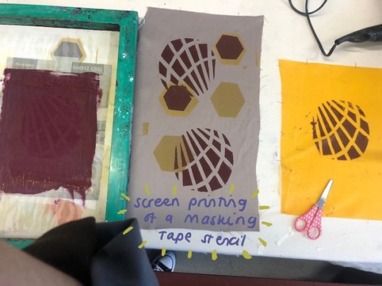
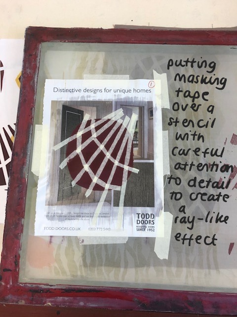
Friday 7th October 2022
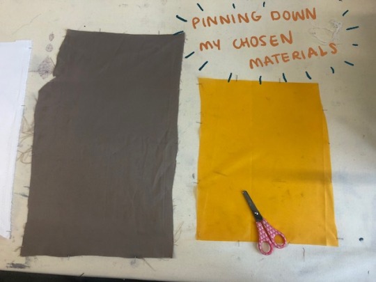
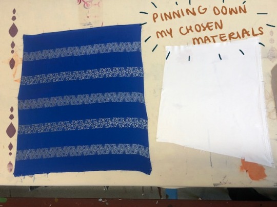
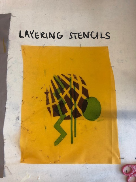
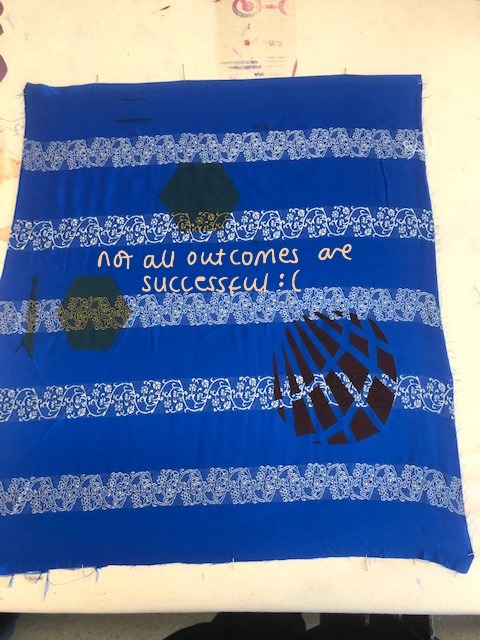
Practising print patterns. This was the most stressful I will admit. I think it was because the screens were so big it was scaring me. Mixing the dyes for the print was also a nerve wracking experience, I was sacred of the potential of making too much mess with the pigments, but if I omit that great fear out, it was quite fun to mix pigments and make a like bespoke colour for my own pieces. With the photos I've uploaded for this workshop I tried to label them like steps and put them in order but it didn't work too well (crying face). I picked a range of fabrics, the yellow one was more plastic-y so when I printed on it, it either didn't take well, or once dried it was starting to peel, rather than becoming one with the fabric. I really liked the blue fabric, it was perfect for my theme, it is a pattern you commonly see in traditional South Asian sarees, so I was disappointed when my stencils didn't suit it well and rather stood out for the wrong reasons: ugly. I think the piece that turned out pretty well is brown-ish fabric. The colours took to the fabric well and the layering is shown pretty clearly.
The focal point of these pieces is the layering of odd and random shapes. Why? Of course it's a perfect representation of this mix up of traditions and lifestyles that I live and breathe amongst. The shapes I used do not connect at all, they carry no correlation. I also tried to use colours that don't really go that well together, hence the choice of that deep gold-yellow and dark burgundy colour, near opposites almost. It's quite nice to see that idea in my head being translated in such a way. And then the overlapping of the shapes, another layer of how some things just don't mix well, but can look quite pleasing from far, like they weren't meant to be mixed, they were just meant to live side by side, existing without conflict.
As I grow older, I find myself being more and more open with my thoughts towards my ethnic culture and a yearning to learn more, even about other people's cultures too. It's so interesting to me when similarities are found and the country's are like on opposites end of the globe, it's so nice to think that we are different but there are things we can find solace in together. Let me try and think of a good example, maybe something like where a hierarchy is formed on the basis of age, determining who is respected the most. For example maybe South Korea (from what I have read and seen) and Bangladesh (well the culture and tradition that I have been brought up on). Respect is a huge thing in these cultures and it is shown through actions and the language. In Bangla (the language of Bangladesh) there are different word endings to use for those who deserve more respect, there are different words to address those who are older than you, calling them by their name would be a sign of disrespect, they have a title. I think in Korean it is very similar, I think maybe apart from the name thing, I may be wrong. But South Korea do not really gave much in common, despite both being in the continent of Asia, one is from the South the other the East, out cuisines are different, our languages don't have any similar sounding words, in fact the two countries seem completely different. But there is that one connection: the respect towards elders hierarchy thing. Now, compare this to England. It was a culture shock to me. I was amazed that my white friends could call their elder siblings by their name, my siblings were always told to call me big sister, they were confused on my outlook towards the subject. Even in Year 11. It was an odd concept for the both of us to understand. To them (well the one I spoke to) an elder sibling is just another human to them, but to me an older sibling or cousin is someone who is older they have been around longer, they deserve that bit of respect. But then again it makes sense that we don't understand each other, we grew up with these ideals, it would be hard to change it just like that. But yes, it's just one of them things I'm extremely fascinated and intrigued by. I hope this was translated well into my work. What do you see when you look at these pieces?
0 notes
Text
MIDTERM ASSIGNMENT(s) INSTRUCTIONS: THE ULTIMATE REVIEW OF ALL PREVIOUS LESSONS UNTIL THIS POINT. ALL INSTRUCTIONS ARE IN THIS ONE POST.
Intro
Chances are, you're renting a place to live somewhere in Murfreesboro while you attend MTSU. But are you getting a good deal on your apartment? How would your rent change if you got a smaller place? What about a bigger place? Which is more economical: a two-bedroom apartment that you pay for by yourself or perhaps split with one roommate, or a larger apartment, with multiple roommates sharing the rent? Which areas of the city offer the lowest - or higher - rents? How to rents near campus compare with rents elsewhere in the city? How did rents change between 2018 and 2019?
The data
This dataset, which I've distilled for you from the 2019 and 2018 American Community Survey Five-Year Estimates, can answer all of these questions - and perhaps more, if you get a little creative. See this view-only Google Sheet:
J3520 Midterm Project Data
... which contains 2019 and 2018 median rent data for every U.S. Census Bureau tract that lies wholly or partly within the Murfreesboro City limits. The 2019 data are the latest available; data for 2020 and 2021 are probably still being compiled. You'll find the data in one tab and a codebook in the other tab. The codebook describes what the data in each column of the Google Sheet measure. You may copy and paste the data into Excel or Google Sheets, or you may download the data and import it into Excel or Google Sheets.
You also will need to download and unzip this .kml file of all Census tracts:
Murfreesboro Census Tracts (sorted by Census Tract ID)
Remember: You will have to decompress this .zip file and store the resulting .kml file on your computer, using whatever procedure your computer and browser rely on for doing so.
Your task for this project
Your job, in sum, is to produce and publish a report, based on the data I've provided, that offers MTSU students and/or Rutherford County residents in general some newsworthy insight or insights about median rents in Rutherford County. You will receive full credit on the assignment if your published report meets each of the following criteria:
1. The report contains at least one embedded, online, interactive map, correctly sized, centered and zoomed, and appropriately edited with a suitable title, subtitle (if needed), labels, legend, etc. You may make this map with QGIS, if you like. Or you may make the map using the "shortcut" method described in the Alternative mapping lesson and assignment from last week - the one I added after we lost a week due to the Feb. 15 ice and snow storm. If you want to use QGIS, you can import the .kml file just like you would import a shape file.
2. The report contains at least one embedded, interactive data visualization, such as a column or bar chart. Again, this feature should be appropriately edited with a suitable title, subtitle (if needed), labels, legend, etc.
3. The report contains clearly written, error-free text that presents the insights in an engaging, easy-to-understand manner. I expect at least three paragraphs, with each paragraph consisting of at least one or two sentences.
4. The report is labeled with a suitable headline.
5. The report is published on your WordPress or Wix site under a navigation menu link that I can easily find when I visit your site to grade your project.
6. Your data analysis, graph and map are accurate. Better double check your numbers in all instances.
7. Your work is original to you. You may seek help from classmates and/or from me. But the published content of your project must be uniquely yours. In particular, avoid duplicating, or nearly duplicating, someone else's phrasing of the report's text. Maps and graphics, of course, probably will overlap considerably from project to project, having been produced from the same dataset. There are, after all, only so many angles that can be pursued in the data. I understand that.
8. Your insights would be reasonably useful and interesting to an MTSU student and/or resident of Rutherford County. You do not have to cover every possible insight or pattern that could be drawn from the data. Nor does the particular insight, or set of insights, your report focuses on have to be unique. Just tell me a good story, based on something, or a couple of things, you found in the data. If you're unsure of what to look at, or unsure about the the validity of your choice, ask me. I'll help.
9. Your project is published on your WordPress or Wix site no later than the specified deadline.
The ground rules
As already indicated, it's kind of hard to cheat on this assignment. You have a full week to complete your project, including every class session between now and the deadline. It is open-book, open-notes, open-YouTube videos, open-D2L, open-classmate, and open-me. Provided you don't overtly copy someone else's work, or get someone else to do your work for you, you will be just fine.
An example
See this post:
https://thedatareporter.com/nashville-growing-but-only-in-patches-analysis-of-new-census-data-shows/
... for an example of the type of report I'm looking for. The example is probably more elaborate than what you will produce. It has a multi-county, multi-layered map, for example, something you do not have sufficient data to produce. It also draws upon a richer dataset than the one I have given you. The main purpose of the example is to give you an idea of the tone and organization of the sort of data report I have in mind. Notice that your report does not have to include quotes or paraphrases from individuals or experts the way a standard news story would. Just write in third-person, conveying what you have found to be true and interesting/useful about the data. You will find this style of writing at data-driven journalism sites like FiveThirtyEight.com and The Upshot.
Have fun with this, OK?
I could have picked data about any of a range of relatively boring or obscure American Community Survey topics. But I picked rent because I figured that, well, you'd be interested in using the data to find out something useful that others - or at least most others - don't know. That's the thrill of doing this kind of investigation. You're using high-value skills to come up with valuable insights that few others could figure out. Enjoy that feeling, and feel free to pitch what you find to the local media outlet of your choice. I'll even help you do it, if you like. At the very least, put this project on your WordPress or Wix site in a way that will give you something you can be proud to show potential internship hosts or post-graduation employers.
NOTE: The material below is the original version of the midterm - the one I had planned for you before the snow storm hit. You may use it if you like, but the revised version, above, is a bit easier to deal with and offers more current data. If you use the revised version above, you may ignore this version. And if you use this version, you may ignore the revised version above.Intro
Chances are, you're renting a place to live somewhere in Rutherford County while you attend MTSU. But are you getting a good deal on your apartment? How would your rent change if you got a smaller place? What about a bigger place? Which is more economical: a studio or one-bedroom apartment that you pay for by yourself or perhaps split with one roommate, or a larger apartment with multiple roommates sharing the rent? Which areas of the county offer significantly lower - or higher - rents compared to the countywide median?
The data
This dataset, which I've distilled for you from the 2018 American Community Survey Five-Year Estimate, can answer all of these questions - and perhaps more, if you get a little creative. See this view-only Google Sheet:
J3520 Midterm Project Data LOCATED AT: https://docs.google.com/spreadsheets/d/1HArDzRcwcxQcixnlbGefNkbZzXGQftJnXSG5UrSDfWk/edit#gid=2105471313
... which contains the data in one tab and a codebook in the other. The codebook describes what the data in each column of the Google Sheet measure. The codebook also offers information about the original data source and about things like the "margin of error" data included in the sheet. If you need to edit or analyze the data in some way, you may copy and paste the data into Excel or Google Sheets, or you may download the data and import it into Excel or Google Sheets. Remember, though, that QGIS will be happiest if you import the data as a comma-separated value (.csv) file.
You probably also will need to download a shape file of every tract in Tennessee. You can find one here:
https://www.census.gov/geographies/mapping-files/time-series/geo/carto-boundary-file.html
... by scrolling down to the "State-based Files" area, finding the "Census Tracts" drop-down menu, and choosing "Tennessee" from the menu. The shape file will download in a .zip file that you will have to decompress and store on your computer using whatever procedure your computer and browser rely on for doing so.
Your task for this project (you will get full credit if):
Your job, in sum, is to produce and publish a report, based on the data I've provided, that offers MTSU students and/or Rutherford County residents in general some newsworthy insight or insights about median rents in Rutherford County. You will receive full credit on the assignment if your published report meets each of the following criteria:
1. The report contains at least one embedded, online, interactive map, correctly sized, centered and zoomed, and appropriately edited with a suitable title, subtitle (if needed), labels, legend, etc.
2. The report contains at least one embedded, interactive data visualization, such as a column or bar chart. Again, this feature should be appropriately edited with a suitable title, subtitle (if needed), labels, legend, etc.
3. The report contains clearly written, error-free text that presents the insights in an engaging, easy-to-understand manner. I expect at least three paragraphs, with each paragraph consisting of at least one or two sentences.
4. The report is labeled with a suitable headline.
5. The report is published on your WordPress or Wix site under a navigation menu link that I can easily find when I visit your site to grade your project.
6. Your data analysis, graph and map are accurate. Better double check your numbers in all instances.
7. Your work is original to you. You may seek help from classmates and/or from me. But the published content of your project must be uniquely yours. In particular, avoid duplicating, or nearly duplicating, someone else's phrasing of the report's text. Maps and graphics, of course, probably will overlap considerably from project to project, having been produced from the same dataset. There are, after all, only so many angles that can be pursued in the data. I understand that.
8. Your insights would be reasonably useful and interesting to an MTSU student and/or resident of Rutherford County. You do not have to cover every possible insight or pattern that could be drawn from the data. Nor does the particular insight, or set of insights, your report focuses on have to be unique. Just tell me a good story, based on something, or a couple of things, you found in the data. If you're unsure of what to look at, or unsure about the the validity of your choice, ask me. I'll help.
9. Your project is published on your WordPress or Wix site no later than the specified deadline.
The ground rules
As already indicated, it's kind of hard to cheat on this assignment. You have a full week to complete your project, including every class session between now and the deadline. It is open-book, open-notes, open-YouTube videos, open-D2L, open-classmate, and open-me. Provided you don't overtly copy someone else's work, or get someone else to do your work for you, you will be just fine.
An example
See this post:
https://thedatareporter.com/nashville-growing-but-only-in-patches-analysis-of-new-census-data-shows/
... for an example of the type of report I'm looking for. The example is probably more elaborate than what you will produce. It has a multi-county, multi-layered map, for example, something you do not have sufficient data to produce. It also draws upon a richer dataset than the one I have given you. The main purpose of the example is to give you an idea of the tone and organization of the sort of data report I have in mind. Notice that your report does not have to include quotes or paraphrases from individuals or experts the way a standard news story would. Just write in third-person, conveying what you have found to be true and interesting/useful about the data. You will find this style of writing at data-driven journalism sites like FiveThirtyEight.com and The Upshot.
Have fun with this, OK?
I could have picked data about any of a range of relatively boring or obscure American Community Survey topics. But I picked rent because I figured that, well, you'd be interested in using the data to find out something useful that others - or at least most others - don't know. That's the thrill of doing this kind of investigation. You're using high-value skills to come up with valuable insights that few others could figure out. Enjoy that feeling, and feel free to pitch what you find to the local media outlet of your choice. I'll even help you do it, if you like. At the very least, put this project on your WordPress or Wix site in a way that will give you something you can be proud to show potential internship hosts or post-graduation employers.
0 notes
Text
METEOROLOGY- Snow
Original title: Meteorology.
Prompt: climatic metaphors, phases of love.
Warning: none.
Genre: drama, romantic, comedy, angst, family, friendship.
Characters: Luke Alvez, Penelope Garcia, BAU team, Phil (Luke’s partner), Phil’s wife, Roxy, Derek Morgan.
Pairing: Garvez, Phil x Lucille.
Note: Multichapter.
Legend: 💏😘😈👓🔦🐶❗👨👩👧👦💍🎈.
Song mentioned: Via con me, Paolo Conte.
Meteorology- Masterlist

MY OTHER GARVEZ STORIES
This story is over! 😊 I hope that you liked it!

SNOW
The snow has five main features. It's white. So, it's a poem. A poetry of great purity. It freezes the nature and protects it. So, it's a paint. The most delicate paint of winter. It constantly transforms. So, it's a calligraphy. [...] It's slippery. So, it's a dance. [...] It mutates into water. So, it's music. In spring it turns rivers and streams in the symphonies of white notes. (Maxence Fermine)
When he saw you, asleep in an uncomfortable position on the couch, he believed that you were a hallucination. He had to approach and touch you, to convince himself that it was not his mind played tricks on him. But at the exact moment when he touched you, you immediately awakened. What were you doing here? Oh, yes, you had decided to wait for him to return from the case in Nebraska. One of the first things you did was come in with his account to find out where he was. All data received were in fact stored on the tablet automatically in the computer of the oracle of the BAU (aka you) and you didn't take long to figure out that your entire system, your babies were back in the hands of Kevin.
Hack it was a breeze. But this time you had left no trace, so he hadn't noticed that the legal owner had returned. You had followed all developments until they given at your ex the information that the unsub had been taken. Probably it was the awareness of knowing him was safe, already on the jet, to give yourself permission to close your eyes for a few minutes ... and collapse into nothing.
-Penelope!- he exclaimed when was sure that you were really here. He didn't ask you what the hell you were doing there, without even warn him. He doesn't seem angry, just happy because you were back. He doesn’t given to you the time to talk, to begin to justify yourself, trying to explain the reasons behind your behavior. He was immediately knelt at your feet, taking your hands with his. -It's not true that I want children only for my mother. I want them from you, only you. I love you, baby, I love you so much and I'm astonished not to be dead without you. Although it's only been a few months. I don't want play tough guy, make you believe that I don't missed you a single moment, or however I don’t want to deny having felt a strange pleasure, I don't know whether it's the correct term, perhaps a relief whenever that I could not think about you, ‘cause I felt better ... but at once I felt guilty. If love is to suffer so, then I don't care, I'll feel pain until I up dead.- Did he have done such a long speech before, apart from the day that he had proposed you? Maybe for your wedding. It's more that's kind of your thing, to shoot in rapid fire sentences without it having necessarily a logical sense.
-Luke ... - you had try, but he hasn't given you even one second to speak.
-Please, let me finish. If you're reached the point of having to run away from your husband, it was partly my fault. I want to carry my own share of responsibility. I'm serious. I want to believe that if you have come back here, it's because you decided to give me another chance... - at this point you had to interrupt him necessarily, although sharply.
You've standing up. -Please Luke, stop! Stop being so sweet and understanding. It makes me feel even more guilty. But the worst is that I know it's not a tactic, you're really such. And I don't know if I deserve you, but you love me and until you love me I'll continue to use this privilege.- now it was he who attempted to overlap your thoughts with his own, but you have continued wholeheartedly. -I left because I realized that I desperately needed to find someone to vent the frustration of not being able to have a child, when I felt it was my right. And you were there, available. innocent and ready for sacrifice like a little lamb.- you shook your head. -But I couldn't allow it. I couldn't allow myself to dumping on you everything, besides knowing that you were hurting too, that it's impossible to have a baby alone, it takes two people... and since I saw your baby picture, yes, we were together only a few months, I did nothing but wait the moment when I would have given birth to something equally gorgeous.- he has smiled, but his eyes were even more watery of yours. -And when I realized I couldn't do it, I don't know, everything has lost interest in me. Even your love.- you have confessed, having decided to be totally, even brutally honest with him, because he could understands who was the woman he married, both in colorful shades and black streaks. -And I'll never forgive myself. Never. But I can't deny the past. I wouldn't even if I could. I can only say ... - you have hesitated. -I... I knew, even before escaping, there was a chance to think about adoption. But I was too selfish to take it in consideration.- you have pointed the finger at his chest. -Your altruism, the fact that you let me choose for themselves whether to continue in my error, or come to my senses, saved me. And if you want it too, I ... - this time he's brilliantly managed to stop you, placing his lips on yours. In that moment you realized it's been more than sixty days from the last time he did it.
And abstinence is being felt. The hands of both roam, explore, monitor and record the changes. Luke has lost weight. You can feel his ribs. It's you that have reduce him such this, but knowing it doesn't stopped you; what you've destroyed in him, you'll have to rebuilding it, indeed, you'll both it.
Clothes and various clothing was flying around the room, but before he could slip inside you, you have notice something. Another absence. -Roxy - you have whispered with a groan. And he has stopped.
-What?- but only with the brain. Hormones continue to push his body against yours.
-Where is she?- panic in your voice. -Please, tell me that nothing happened for my fault. I couldn't bear it, seriously. No, no, no! - and then you were already crying, stark naked, into chest of your husband, naked as you.
-In the first week and for few days she didn't eat.- he starts telling at you, confirming your suspicions. -But then she recovered, although she never ceased to wait you. Now it's with Jessica. I couldn't leave her alone, while I was away for a case. She can no longer bear to be alone, without someone to stay whit her.- relief rapidly replacing anguish. Your lungs hurt, when you have begun again to breathe. -Want us to go and pick her up? If you want, I call her and I could tell ...- you have shaken your head.
-No, I can wait until tomorrow morning. Where were we?- his precise thrusts wipe out every tear and every sign of cried that you no longer couldn't consume. For all time your fingers have been intertwined, almost you would fear that without this contact your act may seem like just a tangle of animal instincts too long repressed.
The only thing that have comes out from your lips is his name. -Luke.- for all occasions you declined to pronounce it, for every time you decided to deny him this small joy.
And this night you conceived your child.
It wasn’t snowing that night when you have arrived late at work, because you have making love with her until you both collapse exhausted on the sheet, and then you get ready in a hurry. But when your colleagues have seen Penelope, everything was forgotten. More or less. And everything is back to normal, or nearly so.
Because your wife is not immediately returned to work, actually, you've taking few days too. And you have made a very important decision. Prentiss was the first to know. You've announced it when you went to her office to ask her permission to skip the next case. With your work you never know when you'll have time to think about it seriously and you both were certain that postponing, you would end up archive it forever. -Penelope and I decided to adopt child.- you can't describe even today the face of your boss while she has hearing you say such a thing.
But shock has quickly turned in joy. -I'm so happy for you! Have you said anything to the others?- you shook your head and you have go outside, so instantly you been proven wrong. JJ and Tara are embracing your woman and even Spencer seemed to have eyes a bit watery.
-I'm sorry.- she told you when was able to break free. You have put your arm around her shoulder while you were dating from the building.
-You haven't to be apologize for sharing our joy with the people that we truly love.- she has nodded and you remained silent all the way, clearly feeling the weight of what you'll were making.
Even during that week, you spent visiting websites and then real centers, talking to three thousand experts to get an impression of what you have to expect, even in those days it's never snowed, not even an inch. After all it was late spring, and a snowfall would have seemed really bizarre.
But you had thought about snow several times. Because when she left you, your heart was covered with a thick layer of ice, but as soon as she returned everything was melted. Because her skin was milky as that particular state of the water, and in the country from which her great-grandparents had emigrated centuries before, snowfall is routine. Then, because she was, in all aspects, fluffy and soft as snow.
From the first step, you both have felt the anxiety of not being up to the task. Hundreds of other couples like you aspire to your own desire, plus you have no power of choice. It was social workers to process your data and combine them with those of the many children who needed a house and especially love. Of course, the fact that you worked for the FBI could be an incentive, but also play against you. You were forced often to stay away even weeks and she couldn't bring an innocent soul in her bunker, surrounded by gruesome images, video by the killers to preserve a memory and 911 calls by next victims. It was not an ideal climate to raise a child.
But you always knew that Penelope would be a fantastic mother. With her innate ability to put always others in first place, let alone with a fragile and vulnerable creature.
At best, the one on which you could have doubts were you. You didn't even know how you have to hold a baby! -But we don't adopt a newborn! - your wife complained once, rational any more than you are totally terrified.
But in the end who was right, was you. You did well to get scared and wonder if you'll ever been able to change a diaper or take a bath without boil the poor creature in your arms. Then month after the return of Penelope, exactly on the day when you were informed that you were considered eligible and therefore you could take the next step, she fainted right in the social worker's office, who took care of your request, and it took a while to bring her back to consciousness. The next morning, she vomited. -Maybe it was something that I ate... - it was her consideration, but you were not yet convinced. Sure, you didn't dared to hope ...
When she fainted a second time you took her to hospital immediately. And there they have said. -Congratulations, you're having a baby.- not even at that moment it was snowing.
One of the first things you did was go visit the grandparents that your child would never have known. -Mom, are you happy? I know you'll watch over them- Penelope certainly notice that you have spoken in the plural and she has shaken your hands stronger. -like you would have done if you was still here.- just after you have announced the great news to the team. And then, another roundup of hugs and pats on the back for you, so that in the evening your shoulder blades hurt. But was such a pleasurable pain!
Then you were forced to come to terms with reality and also to say it to Debra, the woman of the custodial system. There was no need to talk about it among yourselves. Even before you declared a willingness to continue to provide a family even to someone less fortunate, you know that she felt the same way. But Debra couldn't imagine it. -Oh, congratulations, Penelope. I'm happy for you guys. I haven't known you for so long, but it was enough to understand that you'll both be wonderful parents.- her tone, however, was not exactly cheerful, indeed, sad. An expression that you know very well. -What a pity. I was sure that Melody would be happy with you. Patience.- but you have no left her to believe that last month had been just a waste of her time.
-No, you have not understood. We haven't changed idea.- you shook Penelope's hand. -We want to still adopt child; the only difference is that he or she will have a little brother to play with. It's a problem?- it took a lot more than some nice phrase, to convince her that this was your final decision.
It was definitely worth it, you think, looking at the sleeping bodies on the couch in various positions.
A blond head, whose hair make you a little 'tickle, is lean on your chest; you don't move your arm since an hour, for fear of waking her. Although you should, because tomorrow is a day like any other (so fabulous for you) and they will have to go to school and you at work. Not far from your wife, and completely lying on her stomach, his face buried in her breasts, a small creature with dark hair as yours, just a little 'more curls, who has already turned one year old.
Curled up on the armchair there is your dog, not so young, and between its paws a wad of completely white fur, homage and further gift from heaven, which was found the day that Melody has entered officially part of your life.
White ... white as the snow that now yes, falls relentless and closed off the city for a while. But now the circulation is restored, so yes, tomorrow they will go to school and you both at work ...
But now ... now you don't necessarily think about it, you can still soak up a few minutes in the heat from the crackling wood stove and your family. In a moment you will start to bring the little monsters each in their beds, give a pat to the old lady and her playmate, and finally you'll lay your lips on Penelope's, lingering a bit too much, until she opens her eyes and she'll smiles, like a gift.
You don't know if perfection exists, but in this little picture away from all evil, you feel pretty close on this.
There is a happy climate, at atmosphere despair, positive and negative, one serene and one stormy, a fertile climate and an unproductive, a peaceful and a polemic climate, a climate of confidence and one of certainty. (Luca Mercalli)
#garvez#penelope garcia#luke alvez#luke x penelope#penelope x luke#garcia x alvez#alvez x garcia#criminal minds#cm#meteorology#snow
9 notes
·
View notes
Text

for the first in a while, I'm gonna ... try to take it easy, today.
I actually have a lot to do but I really need to chill the fuck out for a second and take a breather. my OCD's made my life remarkably difficult lately and I've begun to disassociate in order to cope. I know disassociation plays a key role in obsessive-compulsive disorders; I know my OCD's fairly severe and it's been getting worse as I get older, but I'm not...usually this bad. Even when under stress.
for example, a batch of 200 commissioned banner icons suddenly turns into 400+, and I'm still not done because I can't stop keep remaking them.
oh, this one's coloring is off. but these frames are split second to each other ... can't have that, gotta redo 'em.
wait, the pixels are...'weird' looking in the corner, here. rejected.
this one could've been cropped way better. how could I expect them to use this?
why is this one in the 'final version' folder when the border around it overlapped a part of the icon?
I need to redo these 73 because the shadow is too dark and blocky beneath the icon. it’s supposed to be a fade. it’s what they ordered and you’re not giving them what they asked for.
someone's paying you for this shit get it TOGETHER
yesterday, my OCD got triggered about 3 times? I have a couple of forms. I had a breakdown in front of my mother after she came home and asked me if I ate and I know I must've made some kinda stupid face that gave it away because seconds after she'd asked, I realized I didn't know what the hell ate other than the toast she'd watched me eat before she left for work at 9am. It was 11pm when she asked.
I also had mini-breakdown while talking to my customer and it was terribly embarrassing. I got a nosebleed to top it all off too lmao ( i'm so sorry if you're reading this, john omfg you've been the best to me and I'm sorry because I'm sure all you'd wanted was icons to rp sdfkjsd )
but I just.
All of my friends think OCD is just me having high ass standards or just being 'know-it-all'. I've been called that all my life. In fact, I've been called that by friends I thought would never say anything like that about me because I thought we were friends
We live in this new age of 'awkward is cute'. It's hip to be square, cool to be uncool, and sexy to be nerdy and quirky. and there isn’t any better way to declare your individuality and weirdness than branding yourself 'so OCD' about something.
Ahaha.
I fucking loathe people who do this.
OCD isn't a quirk or a set of tendencies. It's not fucking buzzf.eed list, not a little buzzf.eed quiz you can take and readily relate to the results; it's an incapacitating, isolating disease that makes you afraid of your own mind.
If my friends could see, just once, what it's like for me, when I'm caught in an obsessive-compulsive loop, maybe then they'd finally understand me when I say ''''it's bad''''.
Even Something as simple as drawing a line-art from a sketch turns into a complete and total nightmare. 8/10 times, I'll redraw the line-art like — hm, I don' dunno — about 7 fuckin' times in a row, then, delete all of it because IDK, it wasn't 'right'? ( Who am i kidding; I do the same with sketches ヽ(・ω・)ノ )
Oh, yeah, for sure. Me and my ‘high fucking standards' did this.
NO. No one in their right mind would do this. They wouldn’t re-draw the same fucking drawing 7 times in a row and the same layer style over and over, not even changing things up to maybe get some progress. Nobody. Jfc.
And oh, god, that moment when you realize, it's been more than 8/9 hrs since you began and you haven't eaten or drank anything; you don't remember the last time you looked at your phone or what the hell happened to the time because last time you looked, it was 11am and now it’s 9:48pm.
Moreover, you made exactly zero progress on your project — because IDK — there’s no valid reason? JUST COULDN'T STOP HA
I never thought I would talk about this, but uh, Y'all know how much I love han. I want Han to be seen in the best light possible. while SW has been one of the few things that have held a light in my life, he's helped me become a better person in more ways than I can articulate. and no, I don't mean I suddenly started picking trash up off the highways.
I mean, by writing him in this amazing place filled with people I don’t have IRL who share my interests, I’ve met so many new people, friends, learned so many lessons, about characters and life and writing.
When I began writing Han, here, I had just learned what present and past tense was in English. I was winging my writing, trying really hard to understand. English isn't my first language. In Cantonese, my native language, there's no such thing as a past tense.
By writing Han with you guys, I've taken huge steps in life, without even realizing it.
So, everything I do for han, I want for it to be good.
Not outstanding, and definitely not exemplary or nonpareil — just ... good.
And icons — haha. I love icons. I love and hate making them. similar to my writing, I work very hard on his icons. ... but I need to learn where to draw the line.
I once remade an icon 23 times before I was happy with it. ( i had 23 versions left in my folder lmao ). like these here? 10 versions of each, in the least.

( the last one is kinda an exception... I think. I made that one well over 25 times, for sure. but I think it's because I'm not accustomed to Blaine's coloring yet. )
Wow, this really turned into a long post. I don't really care, though. My OCD is something that has always been completely ignored IRL. Shit, it's ignored by even my online friends. I can't even game online without one of them thinking I must get off on establishing my superiority and overall knowledge of '???’ game. Haha.
'Show me your build?' :D 'Er...nah. I think I'll pass.' 'Why? What's the matter?' 'You'll pick it apart.'
It's never considered 'advice' when it's from me. It's me as a know-it-all, as someone who looks down on others for not having up-to-par stats.
I'm sorry I did the math for you so you wouldn't have to. This is simply advice you're free to toss aside, but it's not like it matters. Even if I reassured that—you're already too annoyed to listen for any longer.
So, I’ll also apologize for how I can recall faction modifiers, body part modifiers, critical hit and stealth modifiers, as well as debuffs; how a certain amount of damage of one type turns into inflicted damage to a target while considering type modifiers and armor, and knowing the damage formulas needed to calculate the number of hit points required to kill an armored or unarmored target, with or without a finisher multiplier figured in — because I want you to do the very best with your weapon of choice, even though I can name 5 different weapons that utterly outclass it by tenfold.
In reality, I never had much of choice. Information like that doesn't stop looping in my mind, even at night, when all I want is to sleep.
Sometimes ... I wish I could be that one character on a comedy show who has a quirky disorder or ''OCD'' and everyone seems to love him for it because he's funny when he does it or he's generally helpful
More often than not, my OCD just ruins everything. I don't feel like I belong anywhere.
I need to take a breather.
#˒・*。◞ ( ooc ) *・゚✧ ⎸ ᴏᴜᴛ ᴏғ ᴄᴀʀʙᴏɴɪᴛᴇ.#;; — rp woes#;; — general venting#;; — ocd cw#( . trying to be positive but it might've come off negative? okay tldr; i wanna take it easy. i even slept in (kinda) today.#( . im sorry for all the new people seeing me complain lmao i promise i'm usually an active han#( . i just need to finish my commissions first
7 notes
·
View notes
Text
The Noise In-Between: An Interview With Ivan Seal
Declan Tan talks memory, meaning, and material with Berlin-based artist and Caretaker collaborator, Ivan Seal

Ivan Seal, adultery bi prenontspliver, 2015
Memory. It’s a funny old thing. And for Berlin-based artist Ivan Seal, memory isn’t only funny – you can throw in beguiling, banal, totally enthralling and infinitely alluring while you’re at it. That’s because it’s this central subject of memory that underlines Seal’s ‘endless alphabet’, a series of paintings – imagined scenes and remembered objects made using no reference materials except for his own grey matter, and the canvases themselves – in a project spanning over six years, with no signs of fading like the neurons that imagined them.
With this style and method, Seal has struck deep into a vein of psychological, nigh on neuro-exploratory art, an intersection where figurative and abstract combine and bloom out like a billowing mushroom cloud of possibility and meaning. But to attempt to explain or classify his work would kind of miss the point.
I first came to Seal through his collaboration with fellow Stockport export, the experimental electronic producer and underground darts maestro Leyland James Kirby (a.k.a. V/Vm), creating the artwork for the latter’s Caretaker project – itself a study of memory and the effects of dementia.
The mysterious hunk of clay, with its single baffling matchstick, sat on the sleeve of An Empty Bliss Beyond This World compelled me to seek him out. And discovering that he’s down the road from me on this now foreign continent (a long-ish road, given), we ducked into a café to discuss where this all grew from.
Over a cortado he settles into the weighty Chesterfield, a kind of fizzing energy coming off him – not just from the coffee. We’re only 1pm and he says he’s already completed a painting today, and worked on several others.
The conversation soon branches out, like one of his paintings, taking in everything from D&D to teaching at the Royal College of Art – in fact, I feel like I get so much material that I completely forget my laptop on the café table, only realising what I’ve done three U-Bahn stops away in a total panic. By the time I’ve switched platforms and sprinted back, cursing (almost crying, if I’m honest) into my elbow bends that it’s happened again, £1,000 dropped, I find the table occupied only by a young German family sharing creamy cakes. The staff haven’t seen it either. It’s gone. Very quickly one of my dream interviews becomes a nightmare.
I think back through the interview. I remember pointing out early that, in terms of subject matter, we’ve had some overlapping interests. I mention that I caught one of his online video interviews, in which he begins proceedings by discussing LSD and ecstasy, apropos of very little. It seems a good a place as any to kick us off. It occurs to me that the mystifying aspect of Seal’s work might stem from that percolation of substances into his often-surreal painted dramas. I dig right in with a favourite Kubrick quote to see where he stands: “Drugs are basically of more use to the audience than to the artist.”
“When you get into your own thing,” he says “then you realise that that can give you a deeper, longer and more frustrating hit. Imagine taking something which has a highly addictive property in it – which for me is making art. It’s something which is not maybe the wisest of life choices – but you keep coming back to it. I didn’t paint for years and then I started painting again when I was 31 or something, and in that found the addiction again. I had that before but gave up painting – for the wrong reasons, I think.”
It was his Sheffield art college tutor Steve Dutton who suggested artists can tackle the problems within painting with any medium. “It doesn’t actually have to be paint. And I still believe in that.” Venturing into installation and then sound, it took Seal ten years to return to the canvas. “I see it as a journey to get back to a moment where you ask yourself, what do you actually want to do? But I think that moment needs working towards and it took a long time, to ask what action has the promise of satisfaction somewhere in it? And I thought the last time that happened was when I used to paint. So I started painting again.”
But he found that painting re-uptake somewhat inhibited. For about four years, he found himself painting over paintings, again and again. “I had about ten paintings, and they’d all be ten not-so-great paintings. But it was more about opening that doorway and slowly getting in – because I didn’t know what to paint.
“Over-painting and over-painting and over-painting – it all felt very academic in a way. Then I was advised to just get a lot of canvases or paper, and just do a lot, rather than try to make some bloody masterpiece. That’s advice you give students when you notice they’re constantly polishing a turd, and it happened to me.” Arriving at this moment himself, Seal had an epiphany. “That’s when I first kind of came to this idea of the disaster, the catastrophe which is inherent in a blank canvas, blank page, or a blank file in front of you. You’re only going to ruin it, but for some reason you have this urge to ruin and you start with that.”

Ivan Seal, allchav tart, 2016
For Seal, the whole activity of painting is entangled with a notion of failure – “a notion of struggle. And struggling with your own failings until something works. I don’t paint from photographs or objects. I constantly return to that moment of blank canvas and ruining it, and coping with it.”
For the first piece of this series, he wanted to paint something: not somewhere, not someone, “because I wanted the somewhere and the someone to be in something. Then I thought, then I’ll paint something that’s kind of nothing, in a way.”
He had been reading a story called The Golem. “It’s this idea that comes from Jewish fables. You have this lump and you form it into a little person and it does things for you. But if it doesn’t have this sticker on its forehead – which I think translated is ‘truth’ – then it just does its own will. And for me, this notion you have something, you create something, but it’ll in turn to attack you and destroy you, seemed very apt to painting.”
It must have been hard to predict how that base material, painted on canvas, would transform into an unending project. “Clay is where a lot of art comes from, a very basic form. I knew I wanted to paint a lump of black clay, but I didn’t want it to be somewhere that was ‘located’. In art, you put things on plinths, like a stage – so I put literally a lump of clay on a plinth in paint. Then I painted a match in it. Suddenly I had drama. And I’ve been working on that series since. In some senses, the action is utterly banal, and the intent is absolutely banal, but there’s the same point which holds, I feel, countless opportunities for somebody to look at it, and for somebody to interpret.”
Now Seal produces this work at an astonishing rate. “Some of them are very small,” he says, now upstairs in the studio, “then other ones I could be working on for like a year. Constantly going back to them.”
This approach means he has twenty or more canvases on the go at any one time, spread across two rooms in what used to be his apartment. They’re stacked up by the dozen in a storage room. The only noticeable piece not by his own hand is a painting of a bridge and town by his grandfather, a source of inspiration for many of his colours, Seal says.
“Rather than having one singular moment, painting like this works more like a brain,” he says as we stroll across the bare floorboards. “It works more like how you think. The studio somehow becomes an active way of thinking, a big head which I’m stepping into every day and basically poking around, like your own head works when you’re thinking about stuff.” He pauses.
“You can’t trust any memories at all, can you? Because it’s all glitched. It’s all nonsense in a way.”

Ivan Seal, the pot complains, 2016
Painting in this way is a meandering thought process, “but whilst moving your hand – and it’s somehow about making this distance between your hand and the head as short as possible.
“That’s what I’ve always loved about improvised music, the immediacy. It’s not people dicking about, it’s just thinking on a really hyper-fast level. Each move is very quick, it’s not like I’m executing tiny bits, and it’s very laboured.” He crouches down and picks roughly at the paint as if to illustrate his point.
“But I’m shifting paint around as well, taking paint off, putting it on, taking it off again. Then you often look at the paintings – and you don’t get this if you look at them online – if you see them physically, the paintings have a lot of scars on them, all over. You can see bits where something else was there, and I’ve just worked through. Instead of trying to illustrate something, I wanted the actual action of painting to be ‘it’.”
“It’s like you concentrate on one thing and you’ve got all this other information coming in,” he continues, “and that stains it. That alters the taste of it, recreates it – like that notion of glitch. They create errors in it. These painted objects are like a sum of these errors and glitches and that’s why there’s a hell of a lot of thick overpainting of things. A lot of the time I’ll start with something and then start layering paint on to cover up my tracks, or to cover up something too personal. Because that’s what we do.”

Ivan Seal, auxch noise reduced, 2016
For the last half a decade or more, he’s been evolving this idea that the action of painting becomes very close to the errors of how we think, or how you remember something – a kind of psychology of painting. “I always have to be careful,” he says. “When you talk about memory, people always think of the romantic idea. But memory is also the memory of meeting you now, or the memory of the Apotheke front window I saw this morning, with these horrible straw faces in. But each time the memory is glitched.”
“If you put the original event next to the memory, they’d be totally different. And I love this noise in-between, what you’ve gone through, your life. And trying to put it down somehow, or trick time somehow by activating it, and I find this noise, this glitch, has countless potentials and paintings in it.”
“Art is always working from memory,” he says. “It’s all questions of – even if you’re painting from something directly in front of you – it’s about that distance to inside you and then out. Like a loop. It’s about what you can do with that and how you pervert it.”
The son of a butcher and a ballroom dancer, Seal finds there are subjects and figures he naturally returns to, as a way of understanding them. His dramas are now more likely to be populated with gesturing porcelain figurines and mysterious, metamorphosing clays transforming like waking dreams from one form into another, as if consuming themselves.
“I don’t want to paint them but I do,” he says of the porcelain pieces – like dusty abandoned objects on some wooden-veneered, fat-back cathode ray TV from the 80s. “And they’re personal things. I can understand them, but they’re more like starting points. The dancers in my paintings are often like that, something I’m familiar with and just somehow know or have a warming to – and that’s the vehicle to get to other things.”

Ivan Seal, syntaksipolontian klapis, 2015
At several points in the conversation, like this, Seal drops a register and explains candidly his suspicion of painting, and of painters. It’s clear he takes his work seriously, but not this romantic ideal of ‘the artist’.
“Images are constantly telling us how to think. If you create, you’re involved in something which rather than saying ‘think this’, you can say ‘think with’. Then the process of looking at the work, I hope, is close to the process of making it. Because it’s just something to use and then to make your own sense of, in the context of your own life and your own memories, and everything which went from being born to being stood right in front of it. All that comes into it, so why not use it.
“As soon as you look at a painting, you’re decoding. But the actual decoding becomes something which becomes immersive. But I don’t want it to be ambient. I have a problem with that ‘drugginess’ of ambience and this ‘letting go’. I want the paintings still to be active. Like this thing that this collaborative outfit Farmers Manual said once: you’re building something to a certain point until you cease to be the makers and you become the audience. That’s how I see the painting, as soon as I get to that point when I’m pushed out as the artist, the maker, that romantic idea, and suddenly I’m just back into being, looking, thinking: ‘Who the hell are you?’ That’s when I know it’s hit on something that it shouldn’t have, and it’s good to go out the door.”
I ask him about his rough handling of the canvas as he crouches down and peels something off a corner. “I don’t think you can ruin a painting,” he laughs, looking up. “There’s always opportunity for them. Even if you’ve terrorised it, or you think you’ve destroyed it, it’s just another opportunity. It’s just another thing to improvise with.”
You’ve never destroyed a canvas? “No, I don’t destroy canvases. I often get to a point where it’s terrible, and then something very quick can happen and you finish it within a couple of hours.” He stands: “Someone asked Philip Gusten, how do you know when a painting’s finished? He said, ‘It stops staring at me.’ And there’s something in that. Work is something you just know.
“Often one talks about truth of material in arts. They say if you make a sculpture out of clay then you have a truth to material, it has all these thumb prints and how the material actually works. But with painting, the truth of the material is its lies. It’s a lying thing. It says ‘I’m this’, but it isn’t.”
He segues quickly into ‘making art’ versus ‘showing art’. “Those are two very different things,” according to Seal. “You can have your reasons to make art, but you’ve got to have your reasons to show art. For me, that was about creating an opportunity where people can all leap, with just this thing on the wall. I like its economy of means. I like that it’s minimal in a way.”
Economy of means. The words ring in my ears. Back to that laptop, now three stops from the café and counting. I think to call up Ivan and ask if he saw the Macbook. I think no, actually, that’s not a good way to end an interview. Now I see my wife’s face in my mind’s eye. She will fully murder me, I’m convinced (I left another one on a bus in Leipzig only six months ago).
It takes a further thirty minutes of cursing into my elbows and at my shoes stood on the now-rush hour U-Bahn to get back to the flat, as the hope of the silver flaps still charging somewhere at home quickens my crepe soles across the dusk snow-slush. I try to grasp firmly onto the memory of it in the café but each time the laptop slips away, the train carriage glitches. Was it ever there? How did I just walk off, leaving it behind? How did I get so swept up in the discussion. Easily, I think. It’s a price to pay for the interview. It’s fine.
I charge into the living room, and there it is. Full battery.
Memory. It’s a fucked, banal, funny old thing.
0 notes
Text
9 amazing logo design trends for 2019
What makes a logo special? Do we judge its effectiveness based on utility? Is its value determined by how well-received it is? If you want your logo to feel remarkable and relevant, you need to keep an eye on how logo design trends are evolving.
Predicting which logo design trends will dominate the terrain ahead means appreciating what’s come before them. Now more than ever designers are willing to look at past trends while pushing the boundaries with new styles. In 2019, we’re seeing a fierce appreciation for color, storytelling and design-defying experimentation. The interesting new ways designers are elevating logo design by playing with familiar styles and clever use of color are going to make 2019 an electrifying year in logo design.
9 logo design trends that will be huge in 2019
—
1. Variable logo design 2. New Age geometry 3. Logos that trick the eye 4. Purposeful color 5. Elevated negative space 6. Shift in minimalism 7. Logos with pedigree 8. Overlapping elements 9. Maximizing details
1. Variable logo design
Designers are working in an era where brands are hyper-aware of the fact that their logo will be viewed on a multiplicity of platforms. We covered a similar trend last year, but brands are no longer just concerned with how well a logo translates across platforms, they’re also asking how it can help them build a stronger personal connection with different groups of customers. How can my logo speak equally well to millennials and families? Enter, variable logos that adjust depending on which group you’re talking to.
In 2019, this trend admonishes any one-size-fits-all approach to logo design. Variable design individualizes the relationship between customer and client because these logos embrace the challenge of adaptability. Specialized iconography, dynamic typography and thoughtful customization help frame genuine connections to an audience’s specific needs.
Sulliwan Studio’s logo for Public Space was designed with major brand flexibility in mind. A series of interchangeable pictograms accompany the logo’s standard typography and can be amended to form new logotypes depending on the customer.
No matter which production is on and who the audience is, this logo fits perfectly. Via Elena Kitayeva
Russia’s Perm Opera Ballet Theatre can update their mark, designed by Elena Kitayeva, for different stage productions and alternate between a variety of images, patterns and color gradients, depending on who they’re speaking to and who they want to attract.
The pliancy of variable logo design is what makes it so desirable. Companies looking to personalize their relationship with consumers are gravitating toward this trend because it provides prime targeted delivery, while at the same time keeping their logo recognizable. In 2019, expect to see logos adapt to their audiences in flexible, creative ways.
This logo for artist Brea Weinreb can be stretched, changed, condensed or combined with artwork, depending on where it appears and who it’s intended for. Logo design by goopanic
Full name, short name or abbreviation? Pick the right variation of your logo according to who you’re talking to. Via Julien Lelievre
2. New Age geometry
Once certain trends become recognizable, we subconsciously limit their potential. Case in point: geometric design styles, which have fallen prey to a distinction for being overtly mathematical, cold and even authoritarian. Although it’s easy to define geometric logos as such, in 2019 there is an upward trend where designers are pushing that ceiling by deliberately pairing their creations with vibrant colors and friendlier compositions to offset its reputation.
Via Cecilia Castelli
The New Age geometry trend is all about giving geometric logos a warmer look. “Mix bold geometric shapes with colorful palettes. Clean and minimal but strong,” suggests 99designer Claudia C., on crafting trendy geometric logos.
The Two Kings House pulls circles, triangles and rectangles together with a regal color palette to form a large, reflected portrait of a King holding a rose. Here 99designer ethereal’s impressive logo redefines our experience with geometric design by taking those commonplace objects then layering them with color and playing with line thickness. An artistic take on geometry like this reconciles the frigidity of modern brands with the yearning for a more personal feel.
Logo design by C A P S
3. Logos that trick the eye
The French term “trompe l’oeil” translates to “deceive the eye” and that’s exactly what this logo trend is all about. When you’re accustomed to cycling through ideas day in and day out, playing with visual tricks keeps your enthusiasm for logo design alive. This innovative practice that designers are turning to in order to reenergize their creative juices is also a trend that will dominate logo design in 2019: logo designs that play off tricking the eye—more explicitly, the art of perspective and distortion. Fragmented, warped or visually broken… it’s all good here.
Via Albert Romagosa
Playing with perspective is a cool way to disrupt what is considered acceptable in logo design. Notice how the examples above create the illusion of three-dimensional objects and play with depth. Specifically, Hampus Jageland’s creation for EdgeBoard, an Australian company specializing in chopping boards. Jageland melts together the E and B in the company name and tricks the eye by angling the letter B to look like it’s on the other side of a 90degree wall. The logo works perfectly because we see perspective in action and it accurately reflects the name of the business by literally showing us an “edge.”
Via Avanti-Avanti Studio
99designer Reza Ernada’s Healerr logo perfectly demonstrates how distortion tricks the eye, where doing something as simple as altering kerning or overemphasizing elements is key. He warps the thickness of each letter to create a phased effect with his typography and pairs that with an illustration of a healer drawn with irregular lines.
Avanti-Avanti Studio crafted a brand identity for the Ciutat Flamenco Festival using a similar technique. By warping certain letters in the logo, they’ve set this festival apart from countless others thanks to its unique frequency effect. Clever applications of perspective and distortion like these will make 2019 a refreshingly surprising year in logo design.
4. Purposeful color
Storytelling through color is an inventive method for designers to help brands shape authentic relationships. It doesn’t take an expert in color theory to understand that a color like red evokes passion, vigor and desire. Where this trend can get complicated, however, is when a brand’s message relies heavily on color selection to express its identity. That make or break moment depends on whether the right palette is in play.
Picking the right colors helps brands communicate more effectively. Rather than using random colors simply to attract attention, in 2019 the meaning of logo color is paramount. We’re seeing logo designers focus more strongly on using color in a purposeful way, placing color more intentionally than ever and conveying meaning with each careful decision.
Logo design by Spoon Lancer
99designer Bruno Vasconcelos’s lively logo for greeting card aficionado House of Gumdrops weaponizes color to not only communicate the company name but also to appeal to it’s mostly-female demographic. “To create these designs, I was inspired by the shapes and colors of gumdrops,” he explains. “I used their convex shape to redesign the font, making it more original. I complemented that by using primary colors with a modern twist.”
Via Gilian Gomes
Franklin Fella is an exceptional study in color delegating a brand’s ethos. “The colors were chosen boldly to make the brand stand out with its own unique and happy palette. I wanted it to represent the joy of the relationship between parent and child,” says 99designer Rossie Moss. His choice to use bright orange dots on the boy’s cheeks tells us the child is smiling and happy. Would blue have been as effective here? No way.
5. Elevated negative space
Lindon Leader’s design for FedEx is arguably the world’s most celebrated negative space logo. The ingenious arrow hidden between the E and X is not only clever, it’s a logical representation of what the delivery service is known for—delivering packages!
But even without a history that includes FedEx, negative space is an engrossing design trend that designers are pushing to its limits in 2019. When you take something away from a design, you are, as a result, pushing that area into a more assertive role in your presentation. These designs are created best by those who are believers in dispensing with everything until the point is reached beyond which the design breaks down entirely. Logos created in those moments leverage negative space in voraciously dexterous ways and are elevating the category.
The illustration for Kabooter cleverly mixes a delivery driver on his scooter with the silhouette of a dove. 99designer Mich explains how to take negative space to the next level to achieve this trend: “The key is focusing on the slightest details of any object, that is where you make something unique.”
Logo design by Ocelittle
Consider how the fish is presented in the negative space of the letter S in SeafoodSouq. The proportions of the animal are distinct from the shape of the S but wrap comfortably around the spine of the letter to create a strong, unconventional design. Designers who follow this trend successfully are using negative space in unexpected ways.
Via rahul chandh
6. Shift in minimalism
Amongst the most familiar design trends is perhaps the most salient: minimalism. At this point, it’s reasonable to question whether minimalism is a trend or a necessity. We are several decades removed from when the minimalist movement first impacted the design scape in the early 1970s, but the interest in it remains unsatiated. As designers continue to master the art of stripping design to its core compulsions, they’re evolving the trend by narrowing in on more abstract concepts.
This shift to abstract concepts enhances the effect of minimalist logo designs and makes them more effective. “Minimalism is less a style than a weapon; clearing away noise so a message shines through, clean and naked,” says 99designer Ian Douglas. “It gives just enough to create an anchor, without weighing down the imagination.”
Logo design by Marija…
99designer robbyprada’s piece for Paper Mill Trading shows us how to effectively cut through the noise. Each component of the logo focuses on very basic principles: a simple circle and monochromatic color scheme pairs logically with a trio of bare branch trees.
Logo design by Iva Ron
Another stellar example for this shift in minimalism is 99designer Iva Ron’s logo for Pulpo Gallery, a dramatic avant-garde take on an octopus. “This piece is broken into two main pieces, black ink and tentacles, simplified to exaggerate their complimentary characteristics,” Iva says. “This contrast is meant to be questioned by the perceiver. Why did I recognize an animal here? Could it be something else?”
This is a designer aggrandizing a minimalist concept through his own abstract interpretation, raising our expectations for minimalist design in the process.
7. Logos with pedigree
Did you know Stella Artois has been using the same logo with very minimal changes since the early 14th century? The practice of creating a logo that will serve as a timeless element of a brand’s story is nothing new to designers. In fact, it’s a request they frequently hear in conversations with their clients—and it will only grow in popularity this year.
In 2019 we’ll see brands making decisions that favor authenticity over notoriety and hoping their identity withstands the test of time as well as Stella Artois. This pursuit of trustworthiness means brands are pushing for classic designs that appear to carry an impressive lineage despite being newly created. Logos that include vintage textures, artisanal touches, precise line work and even a specialized crest are the focus.
Logo design by austinminded
“I aimed for an authentic, vintage look and wanted the logo to be simple, to correspond with trends like stick and poke tattoos and nature illustrations,” says 99designer extrafin, on his logo designed for Cobra Lily. “I used a selection of digital brushes for an added organic feel.” The result is a logo that clearly communicates a connection to history and conveys trust and experience.
Via Castlefield Design by Sophie Taylor
8. Overlapping elements
This year we will see more creatives embrace the overlapping elements trend, where designers utilize opacity and stimulating shapes to construct eye-catching pictorial marks, wordmarks and more. This trend will also pull from other trends on this year’s list; expect to see overlapping designs making use of geometry, meaningful color, and negative space.
Via PayPal
Via Allan Peters
Major brands have already started using this trend in their branding and now designers are finally starting to make full use of its possibilities. PayPal famously introduced the trend in 2014, revealing their redesigned logo featuring two overlapping P’s that perfectly signifies the company’s devotion to its 250M+ users.
It’s taken a bit of time since PayPal’s reveal for others to fully embrace this trend but we’re seeing a huge uptick in enthusiasm for it in 2019, featuring bright colors and bold shapes.
160over90’s overlapping logo for Woodmere Art Museum pulls double duty as a modern lettermark representing the letters WAM and as an abstract architectural design depicting the peaks and valleys of a building. Rosie Manning’s Truman logo is another phenomenal take on this trend that fascinates us. Experimenting with opacity and cautious kerning was significant to the success of her creation.
9. Maximizing details
Logos are traditionally small canvases where designers must stretch their imagination to paint an impressive picture of who a brand is and what they stand for. When you factor in the need to be responsive across multiple applications, it could appear to be a near impossible task to create a logo with meaningful attention to detail.
What we will find in 2019, however, are designers doing just that. So many upcoming trends highlight minimalism as its brainchild so we’re captivated to see its rival at work here. More is more and the magic happens in all those attentive details.
Via Steelyworks
Steelyworks’s logo for Mumford and Sons revolutionizes the silhouette of a Pegasus into a thought-provoking, highly-detailed art piece with a continuous monoline that runs from its crest and down to its heels. Fans who see this on social media and printed on merchandise will ascribe the magical presence of the mythical stallion with the songs they love from the band.
Via Jared Tuttle
99designer Deb explains how she makes this hyper-detailed, complex trend work for her: “I have an architecture degree that helps with balance and illustration concepts, especially regarding monuments, scales and synthesis.” This trend requires skill and lots of attention to detail, but the result is worth the effort.
99designer Greeninblue‘s illustration for Red Shoe Stories embellishes the traditional characteristics of a rooster, such as its large feathers and perky comb, with clusters of hand-drawn dashes and an exaggerated silhouette. The design is made memorable because of her artistic touches—right down to the iconic red boots—and it’s the incredible detail of the logo that successfully establishes an identity that’s easily recognizable and uniquely eye-catching.
Ready for logo design in 2019?
—
What we can expect this coming year will be one of the most exciting periods yet in terms of logo design. Trends are not only co-existing, they’re forming symbiotic relationships. Don’t be surprised to find abstract minimalism blending into variable design or negative space plunging into overlapping elements. Designers are finding more and more intriguing ways to experiment with logos and we’re excited to see what makes a lasting impact in 2019!
Looking to get an awesome logo designed?
Our designers can create the perfect one for you.
Let’s go!
The post 9 amazing logo design trends for 2019 appeared first on 99designs.
via https://99designs.co.uk/blog/
0 notes
Text
10 Best Winter Jackets For Women – 2018
New Post has been published on https://www.claritymakeupartistry.com/10-best-winter-jackets-for-women-2018/
10 Best Winter Jackets For Women – 2018
Pratima Ati September 21, 2018
There are two kinds of people in the world – the ones who love winters, and the ones that quake with fear when told ‘Winter is coming.’ But if you in a place where winters run strong for 4-6 months a year, there’s no choice but to give in and embrace it. Some places give you a chance to doll up while others, sadly, freeze your anatomy if you are not well prepared. If you haven’t already realized where this is going, it all starts with a winter jacket. The idea is to invest in a good one that is functional and lasts for a long time. Are you looking for a winter jacket? Do you want to know what your options are? We’ve got this! Here’s a list of the best winter jackets in the market right now.
Warmest Winter Jackets And Coats For Women
1. Columbia Sportswear Long Down Winter Jacket
When winters start to get serious, you need to stop goofing around with hoodies and flimsy pullovers and look for jackets that can protect you from the cold. If you don’t like the idea of heavy jackets that weigh you down, choose a lightweight down jacket that protects you from harsh conditions like the Arctic air. Here’s a jacket from Columbia Sportswear with 600-fill-power-goose-down that is soft, portable, and comes with patented thermal-reflective technology that reflects your body heat to keep you warm. It is light, breathable, and water-resistant. All of this without compromising on the aesthetics of it. The quilted pattern has a sheen and cinches slightly to define your waistline.
Buy it here!
2. Orolay Thickened Down Jacket
The idea of winter jackets is cringeworthy because they add a few kilos and make it look like you’re carrying it all on your shoulders. However, the Orolay Thickened Down Jacket avoids doing just that by being fluffy and light and keeping you thoroughly covered and warm. It is made from adopted polyester material that is about 60% denser than most materials used for winter jackets but without being heavy. Everything about this jacket is unique, from the crumpled hem to its perfect stitches. This is a coat that is equal parts functional and fun.
Buy it here!
3. The North Face Women’s Arctic Parka
Love the idea of trench coats, but the city you stay doesn’t give you the opportunity to look even remotely chic? We have some good news! The North Face Women’s Arctic Parka is a long trench style winter jacket that protects you when winters in your area start to feel like strong Arctic winds. This jacket is breathable and comes with 550 fill down insulation. It is waterproof and deflects rain, sleet, and snow. It cinches at the waist and is figure-flattering too.
Buy it here!
4. Arc’teryx Patera Parka Long
Arc’teryx Patera Parla Long takes you from town to city without compromising on style or functionality. It fully covers you up from head to ankles and regulates the temperature inside by letting moisture vapor escape. It is breathable and does not feel heavy because of the lightweight materials used.
Buy it here!
5. Mountain Khakis Women’s Ooh LA LA Down Vest
Apart from all the heavy loaded jackets, you need other knick-knack layers like vests, shrugs, and pullovers that you can add, especially during fluctuating weathers. The Mountain Khaki Women’s Vest comes with 650 fill down insulation that is featherlight but gives you excellent warmth. The gathered waistline, oversized collar, and sheen are all charming additions.
Buy it here!
6. Orolay Women’s Thickened Jacket With Hood
This long trench style jacket is meant for harsh winters. It is made with high quality down filling and doesn’t look puffed up like the bomber jackets made with this material. Its neckline is unique, stylish, and continues down till the knees, adding to the aesthetic.
Buy it here!
7. BGSD Women’s Tabby Water Resistant Hooded Maxi
If you want to go all out with coverage and are looking for that one jacket that covers you entirely, you need to try out this hooded maxi by BGSD. The BGSD Women’s Tabby Water Resistant Hooded Maxi is a bestseller for the same reason. It is made from 100% lightweight polyester with 20% feathers, which makes it airy and breathable. It comes with two pockets on the inside and outside, so you can store your belongings and tuck your hands in comfortably. You can wash it at home, and it barely needs any maintenance.
Buy it here!
8. Montane Phoenix Jacket
The Montane Ladies Phoenix Jacket is lightweight and perfect for outdoors. It is designed in a way that gives you full insulation. Though it is water-resistant and windproof, it is extremely breathable. Its fabric locks air inside the jacket while letting the insulation fully loft, retain warmth, and prevent cold air from getting in. Since its yarns are recycled, it is eco-friendly too.
Buy it here!
9. Adidas Outdoor Nuvic
Adidas is the master of the game when it comes to outdoor clothing, and it is no different with winter clothing. Their HyperDRY Nuvic Jacket can be worn on a trek as well as in the city. This lightweight jacket is made from finely woven fabrics that are water-resistant and also come with heat-seal technology with an overlapping design that prevents water and cold air from seeping through. Its goose down blend material retains warmth while the insulation ensures warmth retention. The patented HyperDry DWR finish keeps the jacket dry, and the fluorocarbon-free wax-based finish makes it 80% more long-lasting than your standard DWR finishes. Another interesting fact about this jacket is that the insulation feathers are taken from birds that are not live-plucked or force-fed, and their protection is taken into consideration.
Buy it here!
10. Kate’s Fur Collection Women’s Parka
Kate’s Fur Collection Women’s Parka is made for the toughest of winters. However, its fun colors make it cool. You know what else makes it attractive? You can customize it according to your taste! You can customize the fur and colors of your jacket. The order will take about a week to be made and shipped to your address. These parka jackets are lined with luscious fox fur and a custom coat that protects it. The snug two-way zip closure keeps you warm and cozy, the hood protects your ears and head from the cold breeze, and the functional pockets are a perfect addition.
Buy it here!
So, are you ready for the winter? Which of these jackets would you pick to keep yourself warm during those cold winter months? Comment below to let us know.
Feedback
×
How can we improve it?
This article contains incorrect information.
This article doesn’t have the information I’m looking for.
×
How helpful was it?
This article changed my life!
This article was informative.
The following two tabs change content below.
Latest posts by Pratima Ati (see all)
Pratima Ati
RELATED ARTICLES
Source: https://www.stylecraze.com/articles/best-winter-jackets-for-women/
0 notes
Link
Every week, we pick a new episode of the week. It could be good. It could be bad. It will always be interesting. You can read the archives here. The episode of the week for July 15 through 21 is “Austerlitz,” the seventh episode of HBO’s Succession.
Have you opened your heart to the gospel of Succession? Since the show premiered on HBO in June, it’s the only thing I’ve been able to think about. In terms of the network’s programming, it feels like a more dramatic counterpart to Danny McBride and Jody Hill’s brilliant odes to contemporary Americana, Eastbound & Down and Vice Principals, the latter of which my Vox colleague Todd VanDerWerff described as “so dedicated to its own vision that it might make you laugh, and then make you want to throw up about five seconds later.”
All three shows are working with a similar set of tools. The characters are inherently unlikeable to the point that it’s startling to realize you’ve come to care about what happens to them, largely because the line between laughing with and laughing at them becomes so tenuous. They’re painfully funny, with the operative word being “painful.”
It’s just that Succession (created by The Thick of It’s Jesse Armstrong, if you needed any indication of the show’s pedigree) happens to be wrapped up in a more prestige-y looking package, and is working toward its central tragedy from the dramatic end of the scale rather than the comedic.
It’s that sense of cognitive dissonance that has largely allowed for Succession to fly under the radar. The show tells the story of a family-run media conglomerate wrestling with the question of who will take over if or when the patriarch chooses to step down. It looks too serious for how funny it initially is, but that humor is ultimately just as much of a defense mechanism as the brittle fronts put up by its characters, breaking apart and revealing deeper layers as the show tilts into disaster.
The show is a lot more fun than it might look. And it’s much more complex than the thinly veiled Murdoch family analog its advertising might lead you to expect.
As the first season has progressed, the series has grown into one of the most deftly executed dramas currently on TV. The show’s sixth episode, “Which Side Are You On?” ended in heart-pounding fashion with Kendall Roy’s (Jeremy Strong) failed attempt at staging a coup against his tyrannical father Logan (Brian Cox).
The sequence might as well have been a nightmare: Kendall was forced to dial into the meeting instead of attending in person, running through stalled traffic while on his phone (leaving his supporters to wilt under Logan’s gaze) and trying to interpret the stony silences on the other end of the line. The result — Logan remaining in power while Kendall was fired from the family business and left listlessly roaming the streets of New York — was blood-curdling.
That episode’s follow-up, “Austerlitz,” is a little less immediately showy, but it’s a neat microcosm of what Succession is, as well as perhaps the clearest example of how the show expertly strikes a balance between humor and heartbreak. If you’re not a Succession believer just yet, here are three reasons you should be, as explained by the episode.
“I want to have your back, and, uh … there’s also my back.” HBO
Arguably, none of the Roys are people you want to root for — despite being family, they can’t even root for each other. When Logan calls his kids together for family therapy (which turns out to be for positive PR rather than any actual inclination toward healing), one doesn’t show up, and the others can barely stifle their laughter when he says that everything he’s done has been for them.
This dynamic could easily become tiresome to watch, but the personas that Succession’s characters flaunt, whether it’s Kendall’s “business bro” posing or his younger brother Roman’s (Kieran Culkin) unrelenting penis-centric humor, have gradually been peeled back, transforming my desire to see these idiots get their comeuppance into genuine emotional investment. It’s a turn that would fall flat if the cast wasn’t so uniformly great. Their bad behavior, while not justifiable, comes from a place that any viewer should find at least a little familiar.
Granted, some characters are easier to care about than others. Siobhan Roy (Sarah Snook), tellingly nicknamed “Shiv,” is the most appealing (or least odious?) of the bunch, largely because she’s the only Roy child who seems to have secured any significant measure of independence from Logan.
Instead of going into the family business, she’s gone into politics, and when the two begin to overlap, her frustration is tangible. She doesn’t want to be defined by her family’s name, but it’s not her choice to make. And Snook is a master at playing tough to the point that when Logan finally reduces Shiv to tears in “Austerlitz,” it comes as a shock.
To that end, “Austerlitz” serves as a showcase for each character’s human flaws and insecurities, as the pretext of a family sit-down brings every character together under a single roof and holds a magnifying glass to the bonds between them. Even Shiv’s less self-possessed siblings — Kendall, Roman, and Connor (Alan Ruck), the eldest and least effective son — slowly start to feel more like human beings as the show makes clear just how badly Logan has broken all of his children. Watching him try to “win at therapy,” in Shiv’s words, is uniquely frustrating, and when the proceedings fall apart, there’s a sense of loss in the air rather than satisfaction.
Sweet, simple cousin Greg. HBO
Part of Succession’s emotional turn also comes from the way it deploys laughs. Armstrong uses cringe humor in abundance, first inviting us to draw a morbid kind of enjoyment from the antics of the Roy children before slowly pivoting to have us feel guilty for being complicit in their misery. But that’s not to say that the show isn’t also just plain funny.
In “Austerlitz,” for example, when therapy begins to break down, the therapist suggests everyone unwind by getting in the pool. The kids immediately tell him that doing so is out of the question because Logan can’t swim. “He doesn’t even trust water. It’s too wishy-washy.”
Moments like these are regularly punctuated by the way the show is shot, with little zooms in and out on the characters’ faces that are commonly used on shows like The Office or Brooklyn Nine-Nine, but rarely on “prestige dramas.”
Then there’s the way Tom (Matthew Macfadyen), Shiv’s fiancé, follows her around like an overeager puppy, pressing her for details on how therapy is going. His interest is both personal and practical: He works for her father. Though he knows it’s not a good time to try to angle for a better position in the company, he can’t help it — not that that should come as much of a surprise, given that his attempt to cheer Shiv up during the second episode of the series, which saw Logan hospitalized, was to propose to her in the hospital hallway.
Though Tom otherwise takes a back seat in “Austerlitz,” I’d be remiss not to mention that his rapport with cousin Greg (Nicholas Braun) is the most consistently funny part of the show. Their status as the two outsiders to the Roy family — Greg is the black sheep cousin from Logan’s (practically estranged) brother’s side — immediately puts pressure on them in an environment that’s already close to its boiling point.
Unlike the people they orbit, they don’t come from money, making their vying for some kind of status all the more obvious. Greg phones his mom for advice, and Tom can’t stop trying to needle Shiv about how to best impress her family.
Tom loves Shiv, but he loves the power that the Roy name bears, too. As such, though he ought to be able to find common ground with Greg as another (relative) beggar at the feast, Greg also constitutes a threat to his position.
Tom is, to put it mildly, absolutely horrendous to Greg, subjecting him to near-constant verbal abuse (which he plays off as a joke, a tactic Greg is finally getting wise to) and using Greg as a pawn in his attempt to climb the Royco ladder.
It’s a demented relationship, but Macfadyen is so good at playing a sociopath, and Braun is such a delight, that it’s impossible not to laugh while watching as they navigate everything from a corporate “death pit” to eating ortolan, a delicacy that was also notably featured on Billions as a marker of wealth, as it involves consuming a protected species of songbird whole (and which Tom gleefully tells Greg is “kinda illegal”).
[embedded content]
Of course, Succession’s humor has become all the more precious as the series progresses. “Austerlitz” is particularly grim, as Kendall’s journey to family therapy takes him on a detour into a drug den, first. Early on in the season, it was established that Kendall is a recovering drug addict, and that his marriage fell apart as a result of his drug abuse and his commitment to his work — or perhaps more accurately, to his father.
His relapse is crushing, as is the knowledge that it is in equal parts due to just how low he’s been laid by getting fired from the company (and then being sued by his father for his insubordination), and to his father planting stories about a relapse in the tabloids.
When Kendall finally arrives at the New Mexico ranch where his family is gathered, he’s high out of his mind. He’s smiling throughout the ensuing confrontation with his father, but there’s no semblance of happiness in his attitude — there hasn’t been through the entirety of the show thus far.
“I was born lucky,” he says, but he knows the Roy silver spoon is a blessing and a curse. Like Shiv, he’s inextricably tied to his family despite how ill-suited he is for the shark tank it is, and he’s finally realized that the reason (or one of the reasons) that Logan seems to hate all of his children is that they were born with luxuries that he had to earn.
Strong is giving perhaps the most impressive performance on the show — every scene of his brings to mind the devastating finale of The Thick of It, in which spin doctor Malcolm Tucker (Peter Capaldi) finally decides he has nothing left to say — and is most clearly shepherding Succession toward the Greek tragedy it now seems it’s always been.
Tension is brewing between the Roys, and it’s clear that something horrible lies ahead, especially now that they all know they’re capable of stabbing each other in the back. Thanks to his father, Kendall has become a man with nothing to lose, which, for once, actually makes him dangerous. That is, if he’s able to keep from falling prey to his own monsters.
We’ve known from the start that the Roys are horrible people; what makes Succession so impressive is that it has managed to make their turning against each other so difficult to watch. It’s hard to imagine what would constitute a “happy” ending to the season — if one is even in the realm of possibility.
Despite how much we’ve learned about the Roys already, there’s still a lot left to unravel. To wit, in contrast to what the Roy children said about their father earlier in the episode, “Austerlitz” ends with a shot of Logan slowly swimming in the pool as his children depart one by one.
Succession airs Sundays at 10 pm on HBO.
Original Source -> HBO’s Succession has quietly become my favorite show of the summer
via The Conservative Brief
0 notes
Text
10 Reasons to Love (and Use) Gradients in 2018
After years of flat, material and completely minimal styles, the gradient has made a comeback. Everywhere you look, designers are using color fades to add visual interest, create user engagement and just design something that’s worth looking at.
If you aren’t a fan of gradients, maybe it’s time to rethink your stance on the issue. To help convince you, we’ve got 10 reasons to love and use gradients in your website design projects this year.
1. Backgrounds Create Interest
A gradient creates visual interest and helps move users through a design. The eye will land on one area of color and the change between hues and light and dark areas helps shift focus across the screen.
Gradients can be a highly useful and engaging design tool and add spark and intrigue to a multitude of projects. While there are plenty of ways to use gradients, one of the most popular options is as a background element with images, text and other elements layered on top of it.
The example below uses this exact technique. The gradient provides a resting place for the eye with soft colors that help more focus from the top of the screen to the bottom corner, where a “Discover More” direction is located.
The gradient carries through the rest of the page, below the scroll, so that the user always remembers where they are. It also provides a halo type area that highlights the main navigation.
2. Lettering Can Provide a Focal Point
Just as a gradient can be used in the background, it can be a foreground element as well. Color gradients are a rather versatile technique, which might contribute to their overall popularity.
Flip the usage and a foreground gradient can be used as the fill for lettering on a more plain background to highlight and bring attention to the words.
Color choice has to be intentional so that there’s always plenty of contrast and readability is maintained.
3. Overlays Can Spice Up a Bland Image
A color overlay can add extra interest to an image that is a little bland. A gradient overlay is not a fix for a low resolution or poorly composed image, but it can give a simple scene more pop.
Gradient overlays can help establish brand, as well as the voice, tone and personality of the website. Bright colors say something quite different from more muted options.
While this technique can look pretty neat, such as the portfolio example below, it is starting to get a little overused. Make sure to do something a little different with a full image, gradient overlay to set your design apart. The example below does this by completely fading the image away so that the bottom of the gradient creates a solid color bar across the bottom of the screen.
4. Help Move the Eye
A great gradient can help move the eye through a design in a way that helps create intent for users. Most users read in somewhat of an F-shaped pattern, starting at the top left and moving down and across the screen.
Use lighter and darker areas of a gradient color scheme to move the eye from a starting point, such as a logo or primary messaging, to the main call to action. The eye will go to the lightest areas of color first then move to darker spaces. Design and place the gradient color to reinforce this eye movement.
5. Create Something Memorable
While gradients are becoming more popular, the fact that every color combination is somewhat different makes them memorable to users. A killer color combination can stick out—and stick with—a user to help them remember your brand or messaging.
Design gradients with the purpose of helping create that connection. What’s cool about a good gradient is that it almost becomes a color onto itself. If you have a great gradient to work with, use it like you would any other color in your brand palette to establish a visual connection. (Or use multiple gradients as the color palette.)
6. Emphasize Brand Colors
Use a gradient if you have brand colors that lend themselves to being paired. For new brands or websites trying to establish themselves, this can be a solid way to build branding and connection with users.
Think about how to incorporate the same style of gradient into multiple uses – on the website, for social media messaging in print or ad campaigns. Seeing the same use of the same colors in the same gradient will start to stick with users, who will in turn associate those colors with you.
The example below, Community Sector Banking, does exactly this. The color choices are interesting and the gradient – on the photo and in the bottom navigation bar – reinforce the color palette and its relationship to the brand.
7. They Are Easy to Create (Or Generate)
Adding a gradient to an image or creating one from scratch can be as simple as picking two or three colors and then selecting a shape for the gradient and where colors should start, stop and overlap.
Gradients, in terms of shape are directional, from left to right or up or down; or radial, where color variations emanate from a single point in a circular fashion. A design can contain one or multiple styles of gradients.
Picking colors for the gradient might be the most difficult step. Using colors that are nearby on the color wheel will result in the most complementary and natural gradients. But that’s not always what you have to work with. In that case, you’ll want to play with colors so that you don’t end up with a nasty hue in the space where your primary color choices meet.
Need to make a gradient and don’t trust your skills? Try one of these tools:
WebGradients: Free collection of 180+ premade gradient swatches in CSS, PNG, Sketch and Photoshop.
Gradient Buttons: CSS for gradient buttons with animated hover states
Gradient Wave Generator: Pen to make a cool gradient wave using your own colors and starts and stops.
8. Color Fades Feel Natural
Even though it might not be your first thought, gradients often have colors and combinations that feel natural. Think about it, not everything in nature is a solid, single shade of green.
Gradients are a natural choice for this reason, particularly when you combine colors that would actually fade into each other in the natural world.
The illustration below is an overly obvious example with a sky that fades from day (orange) to night (blue).
9. Create Art When You Don’t Have a Dominant Visual
A good gradient can create visual interest and a visual display when you don’t have a whole lot to work with. Using a bright color, such as the example below, or brand colors can help establish your website’s presence.
Color changes are interesting enough that they can often stand alone as a design element. Think about how you use, and select colors so that they create the right emotional pull for users and help them find the right feelings to associate with the content.
Even a subtle gradient can go a long way to setting the tone for a design.
10. Gradients Are On-Trend
Gradients are an easy—and highly usable—element to add for a touch of something trendy without feeling overwhelming. With so many ways to use a gradient, it makes a lot of sense that this could be your go-to solution.
And while gradients have fallen out of favor from time to time, they tend to come back rather quickly because of an almost universal appeal.
Add Realistic Chalk and Sketch Lettering Effects with Sketch’it – only $5!
Source from Webdesigner Depot https://ift.tt/2GR0Ugw from Blogger https://ift.tt/2EDApoT
0 notes
Text
10 Reasons to Love (and Use) Gradients in 2018
After years of flat, material and completely minimal styles, the gradient has made a comeback. Everywhere you look, designers are using color fades to add visual interest, create user engagement and just design something that’s worth looking at.
If you aren’t a fan of gradients, maybe it’s time to rethink your stance on the issue. To help convince you, we’ve got 10 reasons to love and use gradients in your website design projects this year.
1. Backgrounds Create Interest
A gradient creates visual interest and helps move users through a design. The eye will land on one area of color and the change between hues and light and dark areas helps shift focus across the screen.
Gradients can be a highly useful and engaging design tool and add spark and intrigue to a multitude of projects. While there are plenty of ways to use gradients, one of the most popular options is as a background element with images, text and other elements layered on top of it.
The example below uses this exact technique. The gradient provides a resting place for the eye with soft colors that help more focus from the top of the screen to the bottom corner, where a “Discover More” direction is located.
The gradient carries through the rest of the page, below the scroll, so that the user always remembers where they are. It also provides a halo type area that highlights the main navigation.
2. Lettering Can Provide a Focal Point
Just as a gradient can be used in the background, it can be a foreground element as well. Color gradients are a rather versatile technique, which might contribute to their overall popularity.
Flip the usage and a foreground gradient can be used as the fill for lettering on a more plain background to highlight and bring attention to the words.
Color choice has to be intentional so that there’s always plenty of contrast and readability is maintained.
3. Overlays Can Spice Up a Bland Image
A color overlay can add extra interest to an image that is a little bland. A gradient overlay is not a fix for a low resolution or poorly composed image, but it can give a simple scene more pop.
Gradient overlays can help establish brand, as well as the voice, tone and personality of the website. Bright colors say something quite different from more muted options.
While this technique can look pretty neat, such as the portfolio example below, it is starting to get a little overused. Make sure to do something a little different with a full image, gradient overlay to set your design apart. The example below does this by completely fading the image away so that the bottom of the gradient creates a solid color bar across the bottom of the screen.
4. Help Move the Eye
A great gradient can help move the eye through a design in a way that helps create intent for users. Most users read in somewhat of an F-shaped pattern, starting at the top left and moving down and across the screen.
Use lighter and darker areas of a gradient color scheme to move the eye from a starting point, such as a logo or primary messaging, to the main call to action. The eye will go to the lightest areas of color first then move to darker spaces. Design and place the gradient color to reinforce this eye movement.
5. Create Something Memorable
While gradients are becoming more popular, the fact that every color combination is somewhat different makes them memorable to users. A killer color combination can stick out—and stick with—a user to help them remember your brand or messaging.
Design gradients with the purpose of helping create that connection. What’s cool about a good gradient is that it almost becomes a color onto itself. If you have a great gradient to work with, use it like you would any other color in your brand palette to establish a visual connection. (Or use multiple gradients as the color palette.)
6. Emphasize Brand Colors
Use a gradient if you have brand colors that lend themselves to being paired. For new brands or websites trying to establish themselves, this can be a solid way to build branding and connection with users.
Think about how to incorporate the same style of gradient into multiple uses – on the website, for social media messaging in print or ad campaigns. Seeing the same use of the same colors in the same gradient will start to stick with users, who will in turn associate those colors with you.
The example below, Community Sector Banking, does exactly this. The color choices are interesting and the gradient – on the photo and in the bottom navigation bar – reinforce the color palette and its relationship to the brand.
7. They Are Easy to Create (Or Generate)
Adding a gradient to an image or creating one from scratch can be as simple as picking two or three colors and then selecting a shape for the gradient and where colors should start, stop and overlap.
Gradients, in terms of shape are directional, from left to right or up or down; or radial, where color variations emanate from a single point in a circular fashion. A design can contain one or multiple styles of gradients.
Picking colors for the gradient might be the most difficult step. Using colors that are nearby on the color wheel will result in the most complementary and natural gradients. But that’s not always what you have to work with. In that case, you’ll want to play with colors so that you don’t end up with a nasty hue in the space where your primary color choices meet.
Need to make a gradient and don’t trust your skills? Try one of these tools:
WebGradients: Free collection of 180+ premade gradient swatches in CSS, PNG, Sketch and Photoshop.
Gradient Buttons: CSS for gradient buttons with animated hover states
Gradient Wave Generator: Pen to make a cool gradient wave using your own colors and starts and stops.
8. Color Fades Feel Natural
Even though it might not be your first thought, gradients often have colors and combinations that feel natural. Think about it, not everything in nature is a solid, single shade of green.
Gradients are a natural choice for this reason, particularly when you combine colors that would actually fade into each other in the natural world.
The illustration below is an overly obvious example with a sky that fades from day (orange) to night (blue).
9. Create Art When You Don’t Have a Dominant Visual
A good gradient can create visual interest and a visual display when you don’t have a whole lot to work with. Using a bright color, such as the example below, or brand colors can help establish your website’s presence.
Color changes are interesting enough that they can often stand alone as a design element. Think about how you use, and select colors so that they create the right emotional pull for users and help them find the right feelings to associate with the content.
Even a subtle gradient can go a long way to setting the tone for a design.
10. Gradients Are On-Trend
Gradients are an easy—and highly usable—element to add for a touch of something trendy without feeling overwhelming. With so many ways to use a gradient, it makes a lot of sense that this could be your go-to solution.
And while gradients have fallen out of favor from time to time, they tend to come back rather quickly because of an almost universal appeal.
Add Realistic Chalk and Sketch Lettering Effects with Sketch’it – only $5!
Source p img {display:inline-block; margin-right:10px;} .alignleft {float:left;} p.showcase {clear:both;} body#browserfriendly p, body#podcast p, div#emailbody p{margin:0;} 10 Reasons to Love (and Use) Gradients in 2018 published first on https://medium.com/@koresol
0 notes
Text
10 Reasons to Love (and Use) Gradients in 2018
After years of flat, material and completely minimal styles, the gradient has made a comeback. Everywhere you look, designers are using color fades to add visual interest, create user engagement and just design something that’s worth looking at.
If you aren’t a fan of gradients, maybe it’s time to rethink your stance on the issue. To help convince you, we’ve got 10 reasons to love and use gradients in your website design projects this year.
1. Backgrounds Create Interest
A gradient creates visual interest and helps move users through a design. The eye will land on one area of color and the change between hues and light and dark areas helps shift focus across the screen.
Gradients can be a highly useful and engaging design tool and add spark and intrigue to a multitude of projects. While there are plenty of ways to use gradients, one of the most popular options is as a background element with images, text and other elements layered on top of it.
The example below uses this exact technique. The gradient provides a resting place for the eye with soft colors that help more focus from the top of the screen to the bottom corner, where a “Discover More” direction is located.
The gradient carries through the rest of the page, below the scroll, so that the user always remembers where they are. It also provides a halo type area that highlights the main navigation.
2. Lettering Can Provide a Focal Point
Just as a gradient can be used in the background, it can be a foreground element as well. Color gradients are a rather versatile technique, which might contribute to their overall popularity.
Flip the usage and a foreground gradient can be used as the fill for lettering on a more plain background to highlight and bring attention to the words.
Color choice has to be intentional so that there’s always plenty of contrast and readability is maintained.
3. Overlays Can Spice Up a Bland Image
A color overlay can add extra interest to an image that is a little bland. A gradient overlay is not a fix for a low resolution or poorly composed image, but it can give a simple scene more pop.
Gradient overlays can help establish brand, as well as the voice, tone and personality of the website. Bright colors say something quite different from more muted options.
While this technique can look pretty neat, such as the portfolio example below, it is starting to get a little overused. Make sure to do something a little different with a full image, gradient overlay to set your design apart. The example below does this by completely fading the image away so that the bottom of the gradient creates a solid color bar across the bottom of the screen.
4. Help Move the Eye
A great gradient can help move the eye through a design in a way that helps create intent for users. Most users read in somewhat of an F-shaped pattern, starting at the top left and moving down and across the screen.
Use lighter and darker areas of a gradient color scheme to move the eye from a starting point, such as a logo or primary messaging, to the main call to action. The eye will go to the lightest areas of color first then move to darker spaces. Design and place the gradient color to reinforce this eye movement.
5. Create Something Memorable
While gradients are becoming more popular, the fact that every color combination is somewhat different makes them memorable to users. A killer color combination can stick out—and stick with—a user to help them remember your brand or messaging.
Design gradients with the purpose of helping create that connection. What’s cool about a good gradient is that it almost becomes a color onto itself. If you have a great gradient to work with, use it like you would any other color in your brand palette to establish a visual connection. (Or use multiple gradients as the color palette.)
6. Emphasize Brand Colors
Use a gradient if you have brand colors that lend themselves to being paired. For new brands or websites trying to establish themselves, this can be a solid way to build branding and connection with users.
Think about how to incorporate the same style of gradient into multiple uses – on the website, for social media messaging in print or ad campaigns. Seeing the same use of the same colors in the same gradient will start to stick with users, who will in turn associate those colors with you.
The example below, Community Sector Banking, does exactly this. The color choices are interesting and the gradient – on the photo and in the bottom navigation bar – reinforce the color palette and its relationship to the brand.
7. They Are Easy to Create (Or Generate)
Adding a gradient to an image or creating one from scratch can be as simple as picking two or three colors and then selecting a shape for the gradient and where colors should start, stop and overlap.
Gradients, in terms of shape are directional, from left to right or up or down; or radial, where color variations emanate from a single point in a circular fashion. A design can contain one or multiple styles of gradients.
Picking colors for the gradient might be the most difficult step. Using colors that are nearby on the color wheel will result in the most complementary and natural gradients. But that’s not always what you have to work with. In that case, you’ll want to play with colors so that you don’t end up with a nasty hue in the space where your primary color choices meet.
Need to make a gradient and don’t trust your skills? Try one of these tools:
WebGradients: Free collection of 180+ premade gradient swatches in CSS, PNG, Sketch and Photoshop.
Gradient Buttons: CSS for gradient buttons with animated hover states
Gradient Wave Generator: Pen to make a cool gradient wave using your own colors and starts and stops.
8. Color Fades Feel Natural
Even though it might not be your first thought, gradients often have colors and combinations that feel natural. Think about it, not everything in nature is a solid, single shade of green.
Gradients are a natural choice for this reason, particularly when you combine colors that would actually fade into each other in the natural world.
The illustration below is an overly obvious example with a sky that fades from day (orange) to night (blue).
9. Create Art When You Don’t Have a Dominant Visual
A good gradient can create visual interest and a visual display when you don’t have a whole lot to work with. Using a bright color, such as the example below, or brand colors can help establish your website’s presence.
Color changes are interesting enough that they can often stand alone as a design element. Think about how you use, and select colors so that they create the right emotional pull for users and help them find the right feelings to associate with the content.
Even a subtle gradient can go a long way to setting the tone for a design.
10. Gradients Are On-Trend
Gradients are an easy—and highly usable—element to add for a touch of something trendy without feeling overwhelming. With so many ways to use a gradient, it makes a lot of sense that this could be your go-to solution.
And while gradients have fallen out of favor from time to time, they tend to come back rather quickly because of an almost universal appeal.
Add Realistic Chalk and Sketch Lettering Effects with Sketch’it – only $5!
Source p img {display:inline-block; margin-right:10px;} .alignleft {float:left;} p.showcase {clear:both;} body#browserfriendly p, body#podcast p, div#emailbody p{margin:0;}
https://www.webdesignerdepot.com
The post 10 Reasons to Love (and Use) Gradients in 2018 appeared first on Unix Commerce.
from WordPress https://ift.tt/2IIoA3a via IFTTT
0 notes
Text
Hardwood Flooring in New York
Hardwood floor refinishing and sanding is unforgiving paintings. Make a mistake and it will show. however, a refinished ground can deliver splendor to a room like no different project. To hire a pro to sand, seal, stain, and practice numerous end coats of an oil-based totally poly will price $4according to rectangular foot, or greater. Doing it your self can store as a minimum half of of that. suppose you’re up for it? here are some helpful pointers approximately a way to refinish hardwood flooring in new york.
1. select DIY-friendly sanding device until you propose to sand many floors on your lifetime, random orbital sanders are the fine choicefor do-it-your self hardwood ground refinishing. They take longer to get rid of vintage finishes than drum sanders, but they do not require lots of revel in to apply and are less likely to damage your ground. With a random orbital sander, you could move with or against the wood grain. just make certain to maintain the sander stage always. Even an orbital sander can “run away” from you and reason sander markings which are tough to cast off. To study more about random orbital sanders, click right here. associated: Kitchen flooring: eight famous picks 2. Watch your lower back avoid back harm while transporting sanders from the condo store to your home (or up stairs) by using constantly having a helper. Use ramps to move the system whenever feasible. in addition, get help shifting heavy fixtures out of the room. (It needs to be completely emptied before you start.) three. Take precautions hardwood flooring Hardwood ground refinishing and sanding generates a massive amount of dust and fumes. inventory up on dirt masks and earplugs and, when making use of sealers and oil-based totallypolyurethane, put on NIOSH-permitted natural vapor respirators, neoprene or vinyl gloves, and eye protection with splashguards. four. Don’t get too aggressive start with coarse-grit abrasives enough to dispose of the old finish and most floor scratches. avoidthe use of grits coarser than 60; this will help hold you from adverse the flooring. proceed with abrasives which might be step by step finer till you reach the preferred degree of smoothness. (My desired development for a hardwood ground consisting of alrightstarts with 60-grit abrasive, goes to 80-grit, and finishes with one hundred- or one hundred twenty-grit.) Sand as though you are mowing the lawn. continue row via row, overlapping runs via 1/2 the sander’s width. you willneed to make numerous floors & Stairs > useful suggestions for Refinishing Hardwood floors helpful guidelines for Refinishing Hardwood flooring through Joe Provey floors wooden FINISHES how to upkeep stocks SEE extra See greater article icon useful guidelines for Refinishing Hardwood flooring See greater article icon Solved! The satisfactory floors for dogs See extra gallery icon simply Floored! 15 absolutely unexpected DIY floors Alternat... the way to Refinish Hardwood floors - After photograph: JProvey Hardwood ground refinishing and sanding is unforgiving work. Make a mistake and it'll show. however, a refinished floor can convey splendor to a room like no other undertaking. To lease a seasoned to sand, seal, stain, and practice several finish coats of an oil-based totally poly will fee$four in line with rectangular foot, or extra. Doing it yourself can keep at least half of of that. think you’re up for it? here are some useful guidelines about how to refinish hardwood flooring. 1. pick out DIY-pleasant sanding system unless you plan to sand many flooring for your lifetime, random orbital sanders are the greatpreference for do-it-yourself hardwood ground refinishing. They take longer to eliminate oldfinishes than drum sanders, but they do not require lots of revel in to apply and are much lesslikely to harm your floor. With a random orbital sander, you could circulate with or against the timber grain. simply make sure to hold the sander level always. Even an orbital sander can “run away” from you and motive sander markings which can be hard to cast off. To research greaterabout random orbital sanders, click on here. associated: Kitchen flooring: eight popular picks 2. Watch your again avoid returned injury whilst transporting sanders from the apartment store to your private home(or up stairs) via usually having a helper. Use ramps to move the machine on every occasionpossible. similarly, get help moving heavy furnishings out of the room. (It must be completelyemptied earlier than you begin.) how to Refinish Hardwood flooring - Sander picture: shutterstock.com 3. Take precautions Hardwood ground refinishing and sanding generates a massive amount of dust and fumes. stockup on dust masks and earplugs and, whilst making use of sealers and oil-based totallypolyurethane, wear NIOSH-approved organic vapor respirators, neoprene or vinyl gloves, and eye safety with splashguards. four. Don’t get too aggressive begin with coarse-grit abrasives enough to take away the old finish and maximum surfacescratches. keep away from using grits coarser than 60; this could assist maintain you from detrimental the flooring. proceed with abrasives which can be regularly finer until you attain the favored diploma of smoothness. (My desired progression for a hardwood ground along with very wellstarts with 60-grit abrasive, is going to 80-grit, and finishes with a hundred- or a hundred and twenty-grit.) Sand as even though you are mowing the lawn. proceed row with the aid of row, overlapping runs by using 1/2 the sander’s width. you'll should make numerous passes with eachgrit. associated undertaking manual: Refinishing Hardwood flooring pinnacle guidelines for the use of a ground Sander Stenciled flooring: The first-class of modern day Designs 15 completely unexpected DIY flooring alternatives five. consider the corners A palm sander may be used to sand close to baseboard moldings, but use a pointy scraper to eliminate any regions of old finish the sander might also leave out. Scrapers permit you to get into recesses (alongside board edges, at butt joints) without having to dispose of loads of clothwith the sander. 6. protect against dust and hair whilst you’ve completed sanding, get rid of all dust with the aid of vacuuming and wiping the sanded regions with tack cloth. in case you find a stray hair embedded in dried polyurethane and you continue to have at least one coat to go, lightly sand over the hair with a totally fine (320) abrasive. cautiously dig out the hair with a pin or fingernail, if feasible. Then resand with the identical very exceptional abrasive, taking care not to breach the stain layer. Upon recoating with poly, the hair mark will all but disappear. 7. Sealing the deal A sealer coat isn't always typically wanted, but in case your ground takes stain inconsistently, it's going to help ensure even stain coverage. check for this via applying stain to a place with a purpose to now not be visible once fixtures is moved returned into place. it is essential to applythe sealer frivolously. in any other case, ‘holidays’ (skipped regions), forestall marks, and lap marks may also show thru after staining hardwood floors. practice the topcoat. cautiously observe the instructions on the box of polyurethane endconcerning how to put together and apply it to your ground. normally speaking, you'll follow the end to the bare wooden the use of a roller applicator or an extension pole. helpful Tip exclusive brands and exclusive varieties of end can provide the timber a one-of-a-kind tone. So before doing the complete ground, test the end you'll be the use of in a nook or otherinconspicuous vicinity of the room. This easy check will assist to ensure that the finish will appearance the manner you need. do not paint your self into a corner. begin on the farthest corner from the door and observe the end easily and frivolously with the grain. paintings your way lower back closer to the door untilyou've got covered every inch of floor area. keep a small, angular-bristle paintbrush on hand for any spots that you can not get to with the curler. permit the primary coat dry absolutely. Dry time varies for every brand and each type of finish—it's going to typically take anywhere from 3 to 8 hours, however read the product label and observe the specified instructions for best results. in a while, use a pole sander and a palm sander with an ultra first-class-grit sandpaper to gently sand the floor again. this will roughen the surfacea piece and assist the next coat adhere extra efficiently. easy up the dust from sanding with the store vacuum and a tack cloth. observe the following coat like you did the primary. In some cases, you could find you need extra than coats. in that case, honestly observe the approach you used for the primary and second coats for the subsequent. when you’ve finished all of your coats, let the ground dry overnight, or for 24 hours. At that point, your new refinished floors should be geared up to walk on. but, wait a couple of days beforemoving again furniture or rugs, and many others. You want to be sure that the end has absolutelydried and won't be marked up by way of shoes and furniture legs whilst you flow everythingreturned into the room.
Finish
I breastfed my baby girl for 3 months when I decided to give her formula I couldn’t have made a better choice than Holle organic formula. The product is great, its gentle easy for my baby to digest, it doesn’t have the weird smell of regular formula, it tastes good and you can even see the difference in the baby’s stools. I’m so glad to have found
Hollie changed our daughter’s life literally. I highly recommend this for your child. It is simply the best. We buy from https://myorganicformula.com/. A million times better than anything you can compare with any other organic formula for your baby.
�iii�iii�iii����3 @
0 notes