#and i found a new artstyle today too:3
Explore tagged Tumblr posts
Text
FINALLY

I FINALLY DID MY ENTRY FOR @voidzphere DTIYS!!! YIPPEEEEEE
CONGRATS ON 1K!! YOU DESERVED IT SM
#killzdtiys1k#It's almost 2 am now and I haven't slept#I'm really sleepy so sorry if the drawing quality is bad D:#i'm just very sleepy and nervous now so-- i hope you like it#UHHFBGNGGMMDNFHDGDGGG#it took me 2 or 3 hours? i lost the count lol#undertale#my art <3#digital art#i'm fucked up LOL#CONGRATSSSSS#and i found a new artstyle today too:3
94 notes
·
View notes
Text
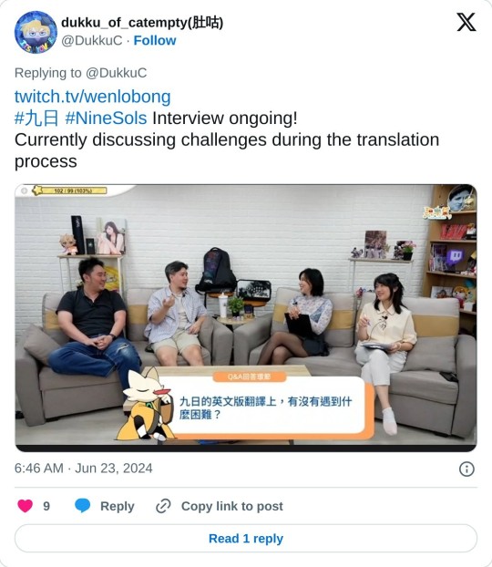
Linking my translation of Red Candle's interview yesterday here, also typed out below. I didn't translate everything, but hopefully it's enough for fans to get a glimpse of their game dev process. Interview vod here.
Ninesols was delayed twice. As their first try at a metroidvania, they found out there's a lot more to be done. Their first game play video was actually an accident. Someone clicked the wrong button on the obs and it became a live stream.
For the interview today, we have 2 of the 6 co-founders of redcandlegames, Henry and Vincent/4wei, plus the game play designer Lighty and Art designer Pege/XiaoHe.
Game Dev Process
Back then Yi was a head shorter, pretty close to Hollow Knight. Devs call it the "Hollow Cat era". It took them 1-2 years to progress from Hollow Cat to 2D Sekiro.
Q: You've already set such a high bar for game play (hollow knight, sekiro), why did you have the same high standard for art and story as well?
Henry:(points at Vincent) this is all him. I said, just focus on the game play! Then he decided to throw in the story
Vincent: I didn't set it out to be so dialogue heavy. But simple gameplay doesn't keep gamers playing, they have to be invested in the world to want to play more.
Vincent: I wanted to save budget so I thought, comics, they're simple enough. Turned out they were costly too. Pege got the other end of that. She drew all the in-game comics.
Pege: Comic works in that you can get up close to the characters and see the details, their expressions.
Their initial inspo for the artstyle was Akira... really reaching for the heights of everything
On the designing process:
Vincent: pacing comes first, whether it's story, combat, or the gaming experience
About 35mins in: Lighty explains the initial concept of TaoPunk
Vincent come up with keywords and Pege designs the character. For example, Goumang was "princess, tsundere", Lady Ethereal was based on "Zhuangzi and the butterfly dream".
40min, Pege explains the character designing process
Pege had the hardest time designing JieQuan. Girls are easier.
Vincent: he's the typical straight macho dude
MCs: what do you mean straight? All I see is 🌈
Vincent wanted there to be a low point for the gamer, since the first 3 bosses were relatively easy. He drew inspiration from Bloodborne and MGS, and JieQuan was born as Yi's tormentor.
Pege's favorite character is Ji, based on his character design and gender.
Vincent: I said Ji can be a they, but Pege insisted on him being male.
MC: So we can actually see stuff under his skirt
Henry: Yi had to struggle to not get flashed during the fight
Lighty also likes Ji best, because of his character. He likes his views as an immortal.
Henry also likes Ji best, because of his combat pattern. Out of all the bosses, his combat pattern is the only one thats entirely original. He wanted to make a 3rd stage.
Since all the characters came from Vincent, he doesn't have a favorite, but is impressed by how popular some of them are. Lady Ethereal's fight was actually the least costly. The platforming was a budget choice. Including the jumpscare, Ethereal was the easiest stage to make.
Vincent: Even the bgm. For Lady Ethereal, I didn't need to tell the composer what I want, they finished it perfectly.
Henry: This is a collaboration where everyone provides their expertise, and Lady Ethereal is an example of us working extremely in sync.
They ran out of time and funds at the research center, and were not entirely satisfied with it even when the game launched.
Solarian was based on Middle Chinese. Old Chinese sounds close to Vietnamese and is too hard for the VAs to pronounce. Vincent thinks since the game is sci-fi in ancient times, a new language is needed for immersion.
Everyone's stressed at the end of the project: it's been five years, and the game hadn't been tested by the mass public, so they weren't sure how it'd be received
Solarian language and Voiceover
Vincent: in Taiwanese we have checked tones, libiodentals, we digged deeper into these traits and referenced Taiwanese/Hokkien, Hakka, Cantonese and Middle Chinese for the Solarian language. Our Solarian expert, Sheng-Han Lin worked on it for 3 months. He even wrote a program where it converts a word into Solarian automatically, complete with KK phonetic symbols.
Basic Solarian words/phrases:
(Making these up, tone numbers are mandarin)
Bi³ Suen² = big brother
Shuai² In³ = Hello Friend
Why⁴ Song⁴ = Stop right there
Uen Zai² Chok = got it (I think?)
Ket Do³ = thank you
Vincent: first thing I said to the VAs was "sorry". Even after the recording process they still weren't sure what they were saying 😂
Many thanks to our voice director Neven Chang. It's the VAs performance that convinced me that Solarian is an actual language.
The Solarian characters came out of the need for there to be inscriptions on the background architectures, but modern Chinese characters breaks the immersion, so the art team came up with the idea to use the CangJie input method.
Vincent: initially we wanted to use the oracle bone script, but it's too time consuming, we needed something systemized. We do have our own Solarian font tho.
Solarian font has been dicephered here
Fan made font
Q&A section!
First question: are there plans for future nine sols DLCs?
Vincent: we still have a lot of work, like console ports and adding more languages, plus the crowndfund reawards... so currently we're looking to finish these first.
Vincent: as you know, we are a bunch of overachievers, so if there is a DLC, there's no telling how long we'll work on it... but atleast for me, I do hope to tell more stories in this world. That's all I'll say for now.
Q: will there be merch?
A: Yes, all the crowdfund rewards will also be sold as merch, like the art book and physical game pack, but at a higher price. Not the figure though, they're already finished, to make more we'll go bankrupt.
Unless, there's a really high demand for it 👀
Q: were there any additional plot you had to cut due to lack of resources?
.
*SPOILERS
.
.
.
.
A: Chien's boss fight, Ji's 3rd phase, Yi fighting himself in Eigong's soul sanctum, a TianHuo last boss, Abacus was supposed to be Yi from the past, Kanghui, the dragon... we cut a lot
Vincent: There are two plotlines I stood my ground on: the revenge plot, and the relationship between Yi and Heng.
We actually changed Shuanshuan's story a lot. Initially he was supposed to be super energetic and run around all of New Kunlun.
Q: there are a lot of ways the player can fight in #ninesols, were you worried about it being too hard?
A: Yes. It's very parry focused, so if you can't parry, you're dead. The Story Mode was made out of this fear. But from the response we've got so far, it seems to be ok.
Vincent: the real problem is gamers having false expectations. Souls fans get frustrated with the parrying and combat fans get frustrated with the dialouges. So we have to let the gamers know, this isn't hollow knight, isn't Sekiro, this is Nine Sols.
Q: what do the lyrics in the bgm mean?
A: they are all really simple. Like "heroes are forged in agony". For Fuxi and Nuwa, their keyword was "Peony Pavilion", opera related, so the composer incorporated 牧虎關 into their battle bgm.
All #ninesols boss music was composed by @/FFXX_sound. 4-5 of the songs were recomposed after betaing. The boss fight in plumblossom village wasn't supposed to be this hard, but the bgm was too fire, so the team adjusted it.
Vincent: the composer could choose whether to use Solarian or Mandarin lyrics. I was there during recording. We got a talented Taiwanese men's choir to sing for us. Four professional singers singing "Huh! Hah! Heroes are forged in agony!" It looked ridiculous.
For the ending song, redcandle wanted to connect to the international audience, and Collage fit that perfectly. Plus our fans kept recommending them to us. Communication was smooth, apparently Natsuko is a gamer and really liked us.
Taopunk was a mix of Eastern and Western cultures, so it was decided early on that there would be English lyrics in the ED.
There was an ARG on discord where fans can uncover the ED bit by bit.
There are also plans for future interactive games like that
Q: what are some challenges for the EN locoalizatuon?
A: It was pretty smooth, we had a lot of help from our discrod server, including JP proofreading. Both EN and JP TL was actually done in a month before release. We just posted our beta dialougues and everyone came to help us.
Lady Ethereal used to be FuDie, but it sounds terrible in English, so she was renamed.
KangHui used to be GongGong, but it's too confusing to non mandarin speakers.
Eigong too, she used to be Yigong, Yi as in change, but players may mistake her to be related to Yi.
Solarian society trivia:
-they are a matriarchal society
-the average age of death is 140
-cats are evolved from Solarians
They are working on more languages, all of them EU ones. MC asked if there are plans for SEA languages. They say that'll require ppl fluent in these languages, since the other TL are mostly done by community members/fans.
2-3days after release, their text file was hacked. It's a Google doc, Lighty went on there and found someone typing Italian text there, all correct dialougues. They kicked them out then emailed the Italian.
The Italian : I'm just a player, I just want to help.
They translated pages of text, the team was terrified. Security breach!
the Italian said thank you to the team for being patient with them, cause they did the same thing with other games and got severe responses.
RedCandle: thanks but please don't ever do it again.
Q: are you satisfied with the response from non CN speaking players?
A: Yes. Most of the reviews we got were English. It's our goal anyway, to break the culture barrier.
There are of course some surprises.
MC: you mean the furries?
A: the amount of fanart was unexpected
Vincent: I was also surprised by the response we got on reddit. We actually realized our goal, so I was pretty happy with that.
Q: any plans for a new game?
they've worked on nine sols for 5 years already, pretty drained right now, so (as a team) theres no new content planned yet
And here comes the funniest part lol (clip)
Q: any plans for a new game?
Vincent: Having ideas for a new game is one thing, but we still--
(Thunder claps)
Vincent: 😱 Did I say the wrong thing? I'm sorry! OK? We'll start working on it!
Discussing the ending...
Devs consider the true ending a good ending. Its ok if life has no meaning, having lived is enough and all that.
And ED is Collage's take on the ending.
I'll end the thread here, though there are 30mins more to go. Many thank to Wenlobong for hosting the interview, and Red Candle for making the game! Really hope #ninesols will get more recognition
120 notes
·
View notes
Text

I was going to post this yesterday as soon as I became aware of the new update, but I forgot about it and passed out. The sentiment is the same today as it has been for the past few months, though, and thank goodness I’m a bit more awake for this because there are…things to say.
I mostly reserve from some kind of lengthy, in-depth commentary because I genuinely don’t have the time or ability to go through Fifteen and the manga separately to point out even half of the most general things that are so incredibly jarring, all I’ll say is just. Why.
I would have complained about this ages ago already, had I not been entirely convinced I’m just losing my mind and I’m seeing things that aren’t there, given the manga does follow a lot of the dialogue of the light novel as opposed to its abysmal anime adaptation, but I suppose it is common knowledge that when you’re drawing a manga, or really any kind of story with both a text and visual element, the readers will not be focusing exclusively on the text. The visuals are just as important, if not more at times, and they can heavily change the feeling or mood of said story. With that being said, I think you can understand what I’m trying to get at here, and more specifically, why I’m very tired seeing yet another adaptation imply Arthur is some kind of cold-hearted monster to be feared even by the audience. I won’t be using any specific examples beyond this point, but all I’ll say is that I’ve had this in the drafts since the moment I saw the panels of Arthur getting accused of betraying the organization, somehow managing to get the text correct and yet make him look either completely lifeless or annoyed, as if he weren’t confused or clueless at all, unlike what the LN itself states. It just went downhill from that very moment, and for a hot minute, I convinced myself that the panels at the end of the same chapter were him either panicking or just giving up upon being found out and having that emphasized through the artwork, but looking at everything that ended up following, I don’t think that was actually meant to be the case, I think he was meant to look more deranged than sorrowful in those parts— and every other part in which this was supposed to be the opposite, that too.
This is not to say I have an issue with the artstyle itself, as that’s mostly the element emphasizing it, I believe everything could have been done so much better— with it, no less— but since this manga, and subsequently the style, has been so heavily focused on every single dark aspect that isn’t even there half the time, just like in Arthur’s interrogation by Dazai, exaggerating the wrong things to no end, that’s not the case right now. I’m not here to say Fifteen isn’t full of dark subjects and situations, it absolutely is, but they’re not everywhere all the time, and especially not in relevance of Arthur as an antagonist. I don’t know if it’s the fault of a concept that every BSD antagonist just has to invoke terror no matter what, the fault of focusing too much on Arthur’s power to the point it overshadows the character beneath it and renders him irrelevant, or the artist took some inspiration from our dearest beloved BSD anime season 3 and just decided to drag it in the same exact direction using different approaches, but needless to say, it really isn’t…that much better at the moment, and considering none of this is going to get remade, it simply won’t be.
Perhaps that’s a harsh judgement on my part, but again, the dialogue truly isn’t everything. Season 3 discarded it altogether and took their own spin on everything that was going on, ultimately creating a completely different piece of media than what Fifteen actually was, and even though the manga didn’t do the same, trying to hold onto the source material for once, I’m not going to even try to pretend that anyone would read it and come out thinking Arthur was meant to be a tragic character who found himself on the completely wrong path that ultimately led to his inevitable demise— no, everyone would immediately assume he’s a horrifying force of destruction who does everything in his own favor, no matter the cost, without any regard for anyone other than his lost partner. I am yet to see the end of the fight between him, Chuuya and Dazai, as well as the section where he reveals his past, but having seen what impact it had in BSD S3— even ignoring all the bits they cut out— I don’t have any hope that it’ll make him seem a bit more likable for those who don’t really enjoy heavily implied morally corrupt villains. And hey, I’ll admit I love those myself, but Arthur is not one of them, never was and never will be, and to portray him as such is to once again erase the very foundations of him in the original novels. I truly wouldn’t mind if that were the actual antagonist of Fifteen, but it just isn’t, and two entire adaptations so far seem to be dead set on making him into such a thing.
Honestly, with both this and S3, I’m not even surprised people are slowly starting to fall back into misinterpreting Arthur as a character completely, and although that technically never went away, from what I’ve seen, this is certainly not going to do anyone any favors. No wonder some people seem to believe he chose to become a government agent for near to no reason, had zero remorse about both his job or the events of Fifteen, is nothing more than one half of an assassin duo with nothing redeemable about either of them, and sure, I can blame this on many different things, but at this point, I’m sure these adaptations are just as responsible for it, because let’s not lie to ourselves— in a choice between reading a book, a manga or watching an anime, the first will often be people’s last resort, and while in the past, I could have dreaded a wave of anime-only people never having read the LN and running with those events as original canon, now I get to dread manga-only people as well, if not a combination of both, which is just amazing for those who want their beliefs about Arthur being a total psychopath to be solidified. Not for the rest of us, though.
Keep in mind that none of this is meant as some kind of personal attack or insult to Hoshikawa-san themselves, this is just my personal frustration with yet another thing which looked promising, but ultimately got shoved back onto the pile of Fifteen adaptations and interpretations which for some reason seem to despise Fifteen’s Arthur as a character, else he wouldn’t have been disregarded over and over.
Anyway, I hope I won’t have to come back here to add more things later because this really isn’t meant to be a dissection, but that’s my take on this whole manga so far. If I am to say something good about it for a change, at least it does actually try to keep some remains of the original LN in it, and new official art of Arthur is something I’ll begrudgingly appreciate, but I really can’t say I’m particularly overjoyed when the outcome of it won’t be much different to the outcome of S3 regardless.
#I could’ve predicted this from the day they took away Arthur’s blanket#I will never be over that let it be known I will fight for the sake of Arthur’s lost blanket#bungou stray dogs#bsd fifteen#bsd manga#bsd arthur rimbaud#randou#asachuu#if only I had the time and skill#I would try to redraw every scene Arthur appears in
11 notes
·
View notes
Text
MARIO BOXARTS RANKED BECAUSE ODYSSEY'S CAME UP IN A CONVERSATION WITH A FRIEND
also i'm just snipping tooling these from my backloggd mario list lol
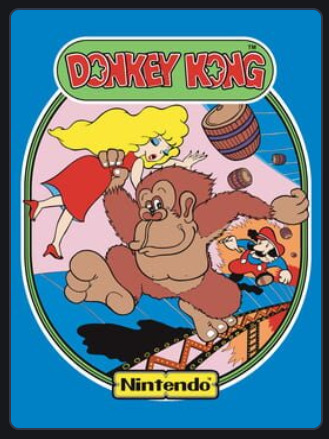
this is whatever! it's got donkey kong feet and the colours are fairly easy to look at and hey it does tell you what the game's about but also like eh, never been into this old ass artstyle, pauline has more focus than the playable character

good start to the real series! this trend in NES boxart where they'd show actual sprite art from the game so as to let you know what you're getting into is pretty cool and by now this pose is so recognisable that we just know straight away "yo this dude's JUMPIN like some kinda PLATFORMER", also they're not using Mario's usual design but instead fire mario which i kinda like because it's very contrasty and shit, good time all around

what is this, what am i getting into, this could be fucking anything. mario's holding 2 fingers up because it's mario 2 but like what else am I supposed to get out of this. not a huge fan

"Super Mario 2 Bros.: Mario Madness" ass graphic design what the hell, also Mario's front leg looks like it's coming out of his cock, never really lovedt his art, he has a turnip because you can pick up turnips and things in general which yeah that's showing off a central mechanic in the boxart which is good but otherwise ehhhhhhhhhhh

super mario 3 bros ass graphic design, but this one's a lot more iconic and generally beloved, doesn't do much for me though other than show a new powerup off and one that sure does look like Mario's flying, woah this is bigger and better. Nice contrast in the background, generally nice art, but shrug

Mario is completely flying here with a cool new cape and yo who the fuck is this absolute mount taking centre stage on the box? That's bold and different! Also from here onwards we've pretty much found the Mario logo design specifically, these colours and that font are still appearing today. Do think the background could stand to have slightly more going on though

Mario is flying again, even more obviously, but now that we've made the leap to 3D we've got an actual 3D render instead of just 2D key art - even the logo and backgrounds and shit are 3D. This is Mario's big jump! Note that the earth is round as if to imply that this is Mario's largest and most open adventure yet. That goomba kinda fuck ugly though. General visuals are of the time but this one is still really good and entirely accomplishes what it set out to do
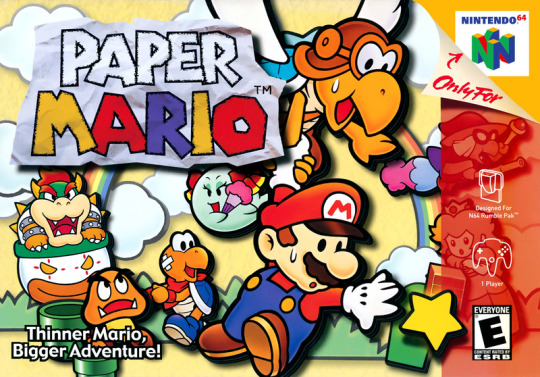
red strip obscuring some of the art bothers me but this is pretty peak boxart, more than anything else it's just nice art that embodies the new visual style for this game alongside including tons of the game's unique and charming character designs - maybe doesn't quite get plot or even genre across but it sure as hell looks good so
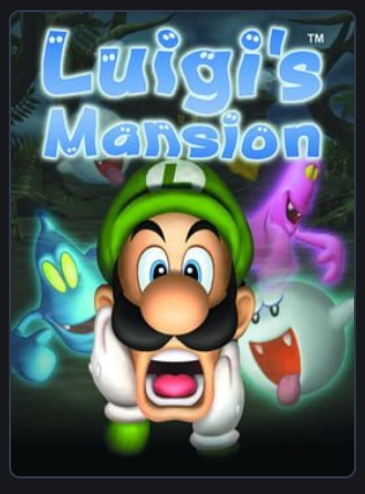
not a fan. it's Luigi which is a plus and he's clearly afraid and there are ghosts there and the logo's good but just none of these renders are all too good and Luigi's disembodied head and arms are kind of uncanny
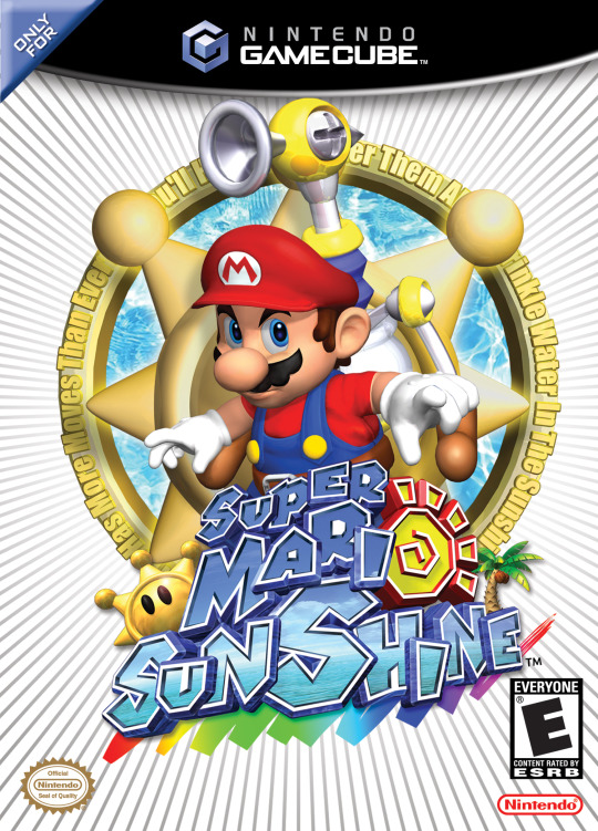
what even were they fuckin trying dude. Okay it's a fine Mario render and he's got a new tool to help him out, sure - thje logo is also solid even if it reads more as Super Mari Sunshine instead of Super Mario Sunshine - but it's the everything else. Hardly feels tropical other than the title, Delfino Isle is NOWHERE to be seen, and what in the actual fuck is that word art text circling around that you can't even fucking read. Epic failure.

PEAK ALERT PEAK ALERT good god this art is amazing, goated as all hell art style with some of the best designs Mario and Luigi have ever had and a clearly colourful world with dangerous new foes in the background, sure! Just sick as hell
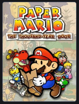
closer to the game's actual art style than 64 was but otherwise kind of a step down to me - Mario is so in front of everyone else that their designs don't really shine as much as they could.

I fear we have yet another complete fucking flop on our hands. These renders are surprisingly poor for the time and then the boxart itself accomplishes about 10 times less than the original game did. We're communicated that there's more playable characters now and we've lost everything else and even gained weird shitty motion blur on a static image to boot.

colours aren't quite as easy on my eyes as those of Superstar saga but banger art and character designs still shine through, and hey all the babies are clearly here too that's cool, perhaps a bit busy tho
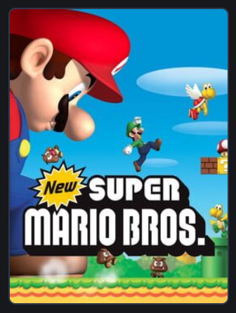
now see I quite enjoy the art and think these renders are good enough by now to rep on a box art - said box art also shows off the mega mushroom super duper well in addition to a clear return to the 2D gameplay that's been gone or so long, but I also find this boxart weirdly deceptive lol? Namely in that Mario and Luigi can't exist simultaneously in the game except in multiplayer, but the multiplayer isn't enough of a focus for me to think "rep it on the boxart", so idk

Paper Mario goes 3D which is communicated well here, and all our playable roster are here with nice artwork for everyone - even the support fairy things I forget the name of are flying around without being too distracting - looks nice really. Though I kinda think Count Bleck doesn't need to be there? Or if he is that he's moved around somewhat? Like he's weirdly distracting being positioned like that

ladies and gentlemugs it is with great honour that I present to you actual kino - gorgeous as hell logo, super great render, and the core premise off the game laid out so beautifully that all you need to do is take even a glance at this box, and you know exactly what you're getting into. Space is pretty as hell, this boxart is pretty as hell, this game is pretty as hell, you just know from looking at this that you're in for an incredible time.

okay now the Mario and Luigi series would adopt this general design sense going forward and I'm pretty eh on it, I like the new logo and the tiny Mario Bros walking on top of it, and hey all the art is still good, but like I don't think all this negative space really achieves anything and I think more could've been done

now we go for a box I quite like, the red along the bottom is nice and appealing and then the main artwork showcases that we've got actual emphasised 4 player multiplayer now plus Yoshi plus at least one cool new powerup, ain't that sweet? Also some of the NSMB boxarts get a lil busy but I think this one is in the perfect zone of not too busy right now.

once again I come bearing kino, in what's effectively just the Mario Galaxy boxart but with a different set of nice artwork and also with Yoshi, plus his powerups shown of throughout the background, very cool. I prefer the comparatively more simple Galaxy 1 boxart and I've never loved how 2 favoured light blue skies, but still really nice
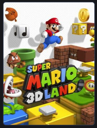
now this one is. nice. certainly shows off the titular 3D - and triples up on the return of the tanuki suit with both super leaf in the background and land having a tail and the goomba having a tail also. But eh idk there's not much of an identity here lol. it's just lots of "things that are in Mario"

here's one that's also a "things that are in Mario" featuring a bonus misleading "are Mario and Luigi here because multiplayer?" visual, but the yellow patterned background stands out and the coin emphasis is there which is this game's main unique selling point, so yk it's decent

I don't love this art style as much for Paper Mario but it's colourful, it has lots of stickers which is the name of the game, lots of random hosuehold objects in wacky Paper Mario style, like yeah no this is pretty solid
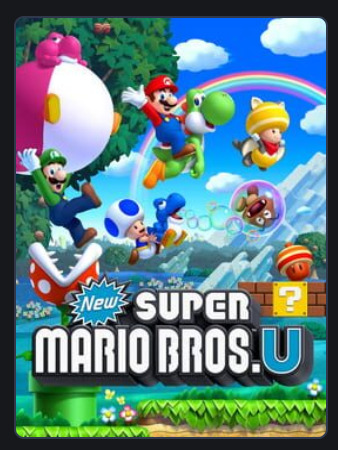
okay now see this is where the nsmb covers just start throwing too much shit at you at once - there are 3 different types of yoshi all doing different things here and a piranha plant attacking luigi and a goomba that's bubbled up and yellow toad has the new powerup but the new powerup is also rolling out of a question mark block and it's like dude slow the fuck down man!

now this one is obviously less iconic than the original Luigi's Mansion boxart but I do think placing more emphasis on the mansion and giving Luigi an actual body is a step up, though having a standard Mario boo there instead of the cool original ghosts is a lil sad
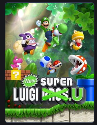
god the more the series itself goes through fatigued the more I feel fatigue writing about it, but hey this is the final NSMB one so. It's whatever. Still a bit cluttered but mixed up the backgrounds at least. Eh. Logo design neat I suppose
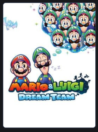
so continues aforementioned whatever trend and I still don't really like it - but suppose this one uses the space better than Bowser's Inside Story does. Once again new styled logo thing still cool
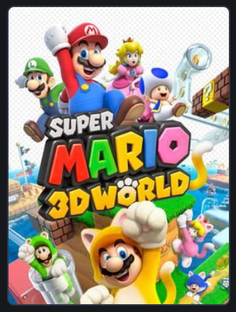
shows off 3D and multiplayer fun and the new powerup in a nice way and there's more original iconography to the game so it's a step up from 3D Land, but also there being 2 of everyone still feels so weird lol

peak as all hell, love the Mario design and the simple render gets across all that it needs to - construction ass yellow and the simple font gives it a homebuilt feel and it's very obvious what the game's actually about. Somehow they managed to communicate that without being super busy as well.

I think this one technically uses more of the space than the other white background boxarts and it's neat that Paper Jam is in the Paper Mario font, but for a crossover like this I really think there needed to be more done lol, this just looks so dull and plain and shit

this is a solid enough paper mario boxart, gets the main gimmick across pretty quickly without like overwhelming you on anything, doesn't evoke much else but it's fine

now here is some absolute fucking PEAK dude, so immediately gets across exactly the theme the game is going for with an epic globetrotting adventure, photograph aesthetic just gives this a travel log vibe and all the different world designs and costumes and core mechanics are conveyed super well, it also managed all that while being really easy to read and shit, just an absolute W all around

kind of feels like a linear downgrade from Maker 1 tbh - like the art is more expressive and Luigi is here which is a plus - the game actually supports multiplayer too so you're not being misled. But I think Maker 1 was just a little more elegant and immediate in getting across what the game is actually about.
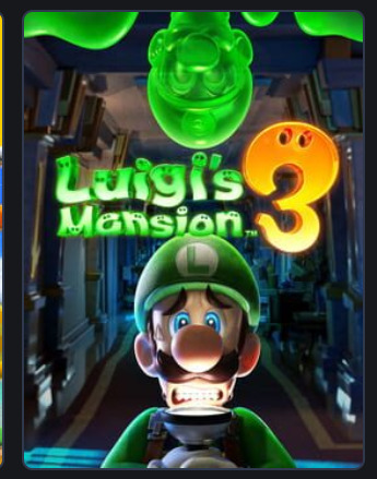
would call this my favourite of the Luigi's Mansion boxarts despite not even having ghosts - cause hey it has a pretty neat mansion and Luigi is doing a good expression and he has a body still and also Gooigi is in there, I'm about it, just looks good

pretty fuckin weak ngl! It's kinda just "here's paper mario characters lol" with the origami gimmick only occupying a corner of the screen that your eyes just aren't drawn to. Just doesn't hit
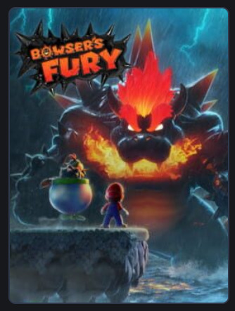
last off! this. it looks cool! fucknig gigantic kaiju bowser. he's important enough to take centre stage in the boxart and the game reflects that. he's so out of control that even his own son is teaming up with you to stop him. I'm about it.
anyway done thanks for reading
1 note
·
View note
Text
Friday 1/10/21 - Media Recommendations #20
Contents: Deltarune
I'd been meaning to get to this one for ages, so once again, I think to make it easier on myself, and my readers, today I am only recommending the latest videogame creation of Toby Fox. This ended up being quite an extensive article, so I split it into sections:
MY CONTEXT
OVERVIEW/PREMISE
GAMEPLAY
PRESENTATION
CONCLUSION
Deltarune (Chapter 1+2)
Toby Fox
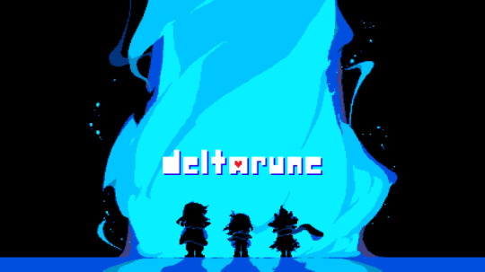
1. MY CONTEXT
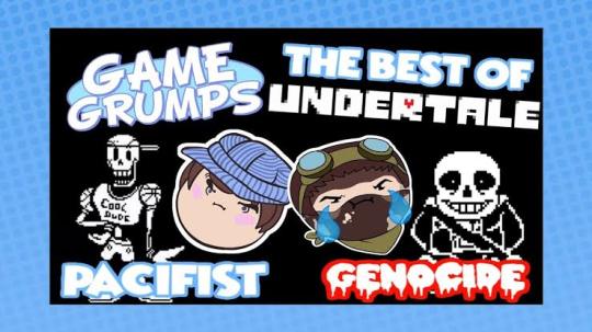
So context for my own gaming experience going into Deltarune, I have never actually played Undertale. Back when Undertale was getting big, it was only a PC game I think, and I just don't play games on PC. I probably should but yeah nah. Soon after it got popular however, I watched a comprehensive Lets Play of Undertale by Rubber Ross and Barry Kramer, and their voices for Sans and Papyrus are still to this day how I imagine those characters. Through that Lets Play, I experienced both the Pacifist and Genocide runs, and got intimately well acquainted with the characters and world Toby Fox had created, and how the actions of the player can shape how we save or ruin that world.
As a general context, I have always been a person who likes the idea of turn-based, random encounter fantasy RPGs, but the deepest I really got was Pokémon. I've been trying to change that recently, and after beating Monster Hunter Stories 2 a while back, I wanted to try more of the genre. Turn based battles are a lot more my speed than pure skill, like fighting games I've become sick of, and RPGs seem to be big on story, so when I heard the Deltarune demo had an update, I thought this is finally the time to jump into that world.
Going forward in this review, I'm gonna try and stay broad and unspecific with my descriptions, so as to not spoil. I may discuss some gameplay themes and characters, but I'm avoiding giving specifics away. I really think you need to experience all parts of the game yourself first.
Minor Spoilers for Undertale and Deltarune Ahead
2. OVERVIEW/PREMISE
Deltarune is a project of love. Pure charm and personality ooze from every aspect of the game. Dialogue is clever and snarky, and that charm even leaks into item and location flavour text. The setting and themes are fun, but with a bloodstained silver lining that is best appreciated by mature audiences. I guess I should just explain the premise?
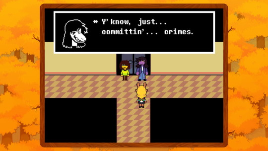
Deltarune puts you in the shoes of a human named Kris. For unexplained reasons you live in a world of monsters and you are the only human. And by monsters, I mean curious looking critters of a variety of shapes and sizes, since, there is really nothing monstrous about them. One day at school, Kris and classmate Susie end up being transported to a whole different world where dark fountains construct monstrous subworlds, and it is up to the chosen ones, the lightners Susie, Kris and darkner (dark world native) Prince Ralsei, to seal the evils of this dark alternate world.
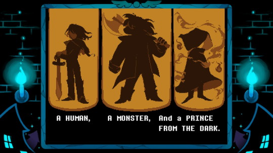
Deltarune is still a work in progress, and as the subtitle of this article suggests, 2 Chapters of a possible 7(?) have been released, and it is unknown at the time of writing if the rest will come out when the game is done, or as more standalone chapters.
3. GAMEPLAY
Deltarune borrows a lot of theming and game loop premise from its parent game Undertale. The tag line of Undertale was: the RPG where noone has to die. This is because the encounter based battle system is built on two courses of action to take. You may FIGHT enemies and reduce their HP to zero, or you may ACT, and talk the enemy into leaving the battle. Deltarune is built on this same system, but with extra layers. Kris is the stand in for the Undertale MC, who has the options to FIGHT, ACT, ITEM, SPARE, or GUARD. Most of those options were in Undertale too, but Guarding is a new addition where you earn Tension Points, or TP, for not engaging the enemy at all.
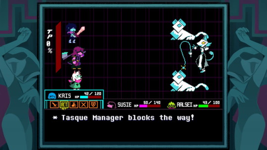
This TP is used for extra powerful ACT actions, or for special moves of the other party members. This is the main big difference in gameplay loop. Since the player controls a party now rather than just one person, each party member can specialise in different action types. Kris's ACT can incorporate input from other party members; Susie for toughness and Ralsei for softness, in general. Susie is the powerhouse, and if you chose the violent route, she does more damage. Ralsei is the Mage, and can heal allies, as well as use magic to resolve fights peacefully. Those extra abilities use TP.
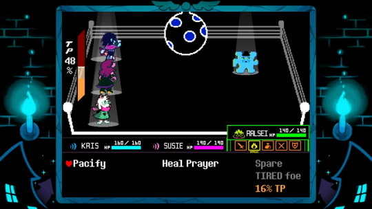
In most turn based RPGs, there is a back and forth, where the player chooses actions, and sometimes there is a timing aspect to how well those actions perform, and then there's the enemy's turn, where most of the time you just have to wait and let it happen. Undertale and Deltarune have this truly unique system where the soul of the party members, represented by a heart, is directly controlled on the enemy's turn. It's a mini game unique to every enemy type, where you must move the heart around to dodge their attacks, and how good you dodge will decide whether you take a lot of damage, or even none at all. Deltarune adds an extra layer onto this, where if you make the dodge closer, so that the enemy only JUST misses, you earn TP, and open up more options for your next turn. I found this extra detail really endearing, and I made a lot more riskier moves than if there was no incentive to.
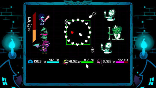
I probably mentioned it above, but just to close out this section, the option to either ACT or FIGHT opens up two types of play. Chapter 1, being a sort of intro part, does not differentiate, but the distinction becomes important later. ACTing to SPARE an enemy earns you money, and in Chapter 2, will lead to befriending monsters. FIGHTing will also earn you EXP in Chapter 2, making your options to hurt enemies more powerful. In Undertale, this difference in playstyle actually changed the ending in real time, and from what we know of Deltarune, it is likely going to be the same case.
4. PRESENTATION
Undertale had this unique visual charm to it that may have been a limitation of its Independent Development, but it was probably also a stylistic choice. Deltarune builds on the same type of artstyle, adorable pixel sprite graphics that bring a lot more colour and depth than its predecessor.
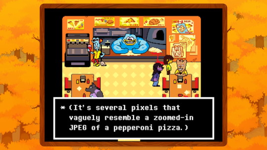
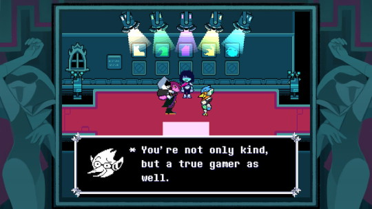
Many, but not all characters have little character portraits in their textboxes, and they change expressions to match the situation, and its so cute.
Character and enemy design are so top-notch. A team of designers have been brought on this time, and every one of them have brought gold to the table. Every random battle encounter is dripping with personality, as you learn how best to sweet talk your way out of battle, or how to best destroy them. Most recurring NPCs are lovable, and those who you hate, you love to hate. Dialogue is witty and hilarious, and the writing is fun.
The chiptune style soundtrack is phenomenal. Although I think Undertale's common enemy battle them was more memorable, that may just be that I have become more familiar with it. All character and boss battle themes are so catchy and energetic. Toby Fox is a master of high energy... fun music. It gets stuck in your head, and your brain bounces around at high velocity.
5. CONCLUSION
Ok so this review is already like 3 times longer than a normal Media Recommendation Article, and like 5 times longer than I planned it to be for this one game, so I should probably wrap it up here. Deltarune is a game experience I put off playing for way too long, and now I can't hold my excitement for when the next part comes out. And important to keep in mind, it is essentially a demo, in that it is just a taste of what's to come, but it is a damn meaty demo that will keep you engaged for many hours.
Chapters 1 and 2 are packaged together as a free game on most game platforms at this point, so there's nothing really stopping you from giving it a try. I don't usually rate my recommendations, but since I wrote this more like a review, I might as well...
Deltarune Chapter 1+2: 9/10
Please play it!
#blog#blogpost#media recommendations#videogame recommendations#deltarune#undertale#tobyfox#deltarune spoilers#undertale spoilers
8 notes
·
View notes
Text
HGPC 17 - 21 | Koi to Producer 2 - 6 | Appare 5 - 8 | Fugou Keiji 4 - 6
...only just realised I was missing some tags. They should be there now or soon.
HGPC 17
Why do I get the feeling the Sawaizumi family will be held hostage one day…? (Maybe I’m just being negative?)
The episode title mentions Chiyu by name, so I wonder why the translation didn’t…
Customer service! You can’t get away from it, even in COVID times…! (Impressive!)
Hmm…you can actually read part of the booking for the Smiths in the book if you know the kanji.
I thought the Smiths would speak in English, but they actually speak in fluent Japanese if the word “susume” was any indication.
Ah, Sukoyaka sweet buns! (from the other episode about the festival)
HGPC 18
Don’t burn down your house with scented candles, kids!
Also remember to use your knees when lifting heavy boxes! (<- says a charity store volunteer, who does this stuff on the regular)
These days the mascots usually have a human form. I wonder if this is implying that particular direction…? (I woke up today and was craving a certain oneshot I’d read during my scanlation days…if it is, it would fill that niche nicely.)
I wonder if the kids will recognise this Ashita no Joe parody…?
HGPC 19
“…since you were young?”
Oh! Element of Wind again!
Koi to Producer 2
This almost feels like Victor is assigning a school project to Protag-chan…it’s a bit sad, really.
It’s nice they let Protag-chan have a personality.
It’s fine if you can’t read the katakana, but Gavin’s name is Haku in Japanese, so it throws out the immersion somewhat…also, I know I shouldn’t be complaining – I’m the target audience here – but do these guys look kinda similar or what…? (partially kidding)
High school sweethearts, huh? “Childhood friends” is my favourite angle of a romantic relationship, but it gets so overused by harems it comes around to being boring…!
I-Is this Stand My Heroes…?! (LOL…?)
Can we not with 1st person cam…?
As cute and dorky as this stuff gets…how does Gavin never get found?! Does nobody ever look up in this city?!? (I thought Evolvers were meant to be a secret…?)
GPS tracker? That’s no better than large corporations using your location data…Isn’t that creepy…?
Hold on, when did she get his phone number? You would assume it was before this entire chase after the boy happened, but still…?
LOL, the English on the board.
This anime is gonna cause me some frustration, but it gives the good stuff in roughly equal measure. It seems to omit the fact you interact via phone with your bois for intimacy (in the game).
Koi to Producer 3
LOL, that’s so clearly Gavin…
By googling, you find out Uptown and Queens are in New York.
Ohmygosh! Did the creators know I love the trope where only people with superpowers can move in certain circumstances?!
Uh…his name is Kira in Japanese? Did someone read the katakana wrong?
Pictured: Depressed bishonen eating bad pudding. (…That joke sounds better in my head. I forgot what meme I was meant to be parodying there, but I had a meme in mind.)
Lemme guess…this man (I dunno if it’s one of the previous bishies with an identical face or a new one) is looking for MC-chan. *sigh* Update: Yep, just Victor again. To be honest, I don’t like anyone who calls harsh words “their sign of love” – love should be honest and upfront. That’s how it becomes heartmelting.
Koi to Producer 4
Okay, in order, it seems to be hexadecimals, Javascript (you can tell from the “const”), some kind of profiles which are apparently for human lab rats (which seem to have some kind of nonsense filler text), a DNA model and DNA bases (ACGT).
The text on the screen says something along the lines of this being an official broadcast of this man’s arrest and this man was a genetic researcher. Obviously, if I wanted to put more attention into what it meant, I would, but I won’t sweat the details this time (because it doesn’t seem to impact the plot).
The guy’s name is Minor because minor key (geddit?)…that’s my guess.
I started playing the game due to this anime, if you didn’t know, and I unlocked an expert in ch. 2. I thought he was Minor, but turns out his name is Spine (an older man).
The diary, true to form, contains details about either one case or several cases, two involving children. The bottom of the 1st page says “if it’s fake, I’ll laugh”.
Hey, I once told Crunchyroll I wanted an anime about hacking (so is this a dream come true? I reveal all in the next sentence!). Hackers don’t congregate like this…they’d be too conspicuous, even with the secret hideout!
The code in the top left appears to be…C? I think? (Note they declare “unsigned int”.)
Kiro sometimes reminds me of Masayoshi (SamFlam)…it puts a derpy smile on my face.
*blah blah blah I’m Key* - Wuh…? F*** you, Kiro!!! (There is such a thing as piling too much cool stuff on to a character, y’know – I’m guilty of it in my own writing.)
3684 isn’t a very safe password (says someone who once aspired to be in cybersecurity).
What bugs me is that Simon is a perfectly fine name…it’s just a bit boring. Kiro/Kira I get (a bit), but Lucien/Simon…? *shrugs*
Ohh! Based MAPPA! Thank you for making this adaption look great!
Koi to Producer 5
Oh, I got an SR in the game recently and it has a line like, “Only a fool stays up all night to do others’ work. Victor talks like that a lot…
The sign so obviously says “Renka”, meaning “love flower”. “Loveland” really is a step down from that…
Where’s Gavin’s guest badge…?
“Happiness Noodle Store”…?
“…the end of our first year…”
If this weren’t a Chinese work by origin (or Japanese work by translation), I’m sure Protag-chan would have gone after Gavin, despite being told the contrary.
Kanya = Minor. I’ll take a note of that.
One of the books behind Minor says “Gale Start”…hmm…
That GPS tracker is still unintentionally creepy, IMHO.
Koi to Producer 6
…oh. (dejected) Probably a beach episode or something.
What the actual heck was going on with Lucien…? It’s like he was having a tiny stroke there…
Lucien’s power is listed as “???” in the game. I thought he was an aura-reader when he said “show me your colour”, but that shield thing he did means he might just have various psychic powers…? *shrugs* We’ll find out eventually.
Running in heels is hard…
LOL, that’s so clearly recreating a CG from one of the cards.
This is the 2nd time this has gone pseudo-isekai. As much as I like to joke about it…I fully expect someone to be sent to another world at this point.
I couldn’t possibly see Victor on any kind of game show, come to think of it.
Appare 5
This guy’s middle name is “Rich”! That’s silly!
A boombox from the 19th century…makes sense, somehow.
I only just (?) realised Al has a tiny tie on his usual outfit.
Back to the beginning already…just start!
Appare 6
…I just realised Appare mouths “I got it!” in the OP.
Al Lion (sic…?)
Isn’t Sofia in that train…? Update: She might have been, she might not. Hard to tell when they don’t confirm.
This series seriously could’ve done with a dub…Even with weird hokey Hetalia accents, it would be good stuff.
These bunches of people at designated points…reminds me of the book I was reading while in Japan. The Long Walk by Stephen King (part of a compilation). It still gives me shivers down my spine when I remember it.
This “leave in the middle of the night” thing reminds me of the Amazing Race.
“Valley of Despair” is made-up, but Death Valley exists. It’s one of the hottest places on earth, hence the name.
LOL, Kosame scores himself one (1) prarie dog and two (2) Hototos.
I thought Appare was being inconsiderate at first…but he’s being considerate, in his own way.
Oh! I didn’t realise, but Saito Soma is Al.
Appare 7
“It’s not one plus one, but one times one!” – LOL.
Hybrid engine? In the 1900s? Hmm…
LOL, I think Al just did a hadouken.
This stuff’s like an animated Galaxy Brain meme! It’s amazing!
I managed to successfully predict – without watching ahead – Appare would catch himself with his traps.
Kosame with his hair down…is rare. Not exactly attractive because we have to care about the racers rather than lust after them (and the artstyle actually prevents me from doing so, because it’s deliberately quite cartoony), but it’s rare.
Appare is surprisingly childish…that’s what makes him more than a Sheldon Cooper, I think.
The spelling of the place is actually “Ely”, if Google-sensei is any indication. C’mon, subbers! You’re American (most likely)! Can’t you put in the legwork (or the Google-fu) to discover what place in Nevada this is?!
Subbers make characters say “shit” a lot in this show, hmm? (contemplative)
Now this evil guy here *points to screen*…that’s hair I like.
Appare 8
I just love this OP…don’t you?
I like how the steam/gas boat/car has Chinese numerals on its dial.
Kosame means “small rain”, so “heavy rain” is obviously to contrast that.
The Hototo joke never gets old.
I thought I just saw someone leave the saloon…
Nice hair + terrible face = bad equation.
I can almost imagine the wee-oo-wee-oo-ooooooo…wah-wah-wahhh…(You know the one sound snippet, right? The one theme from The Good, the Bad and the Ugly - or whatever movie it is – that maybe involves a tumbleweed rolling across the screen, and then a huge shootout? If you don’t know it, play a sample on this Wikipedia page!) playing in the background.
It’s convenient the prarie dog didn’t appear when Hototo (old) had his revenge spree.
I noticed there’s a bit of a mark under Kosame’s left eye…it suggests that he’s been crying (or maybe it shows tiredness from the race…?), but it’s not that noticeable.
So that’s the real Gil…and tose were his henchmen that threatened to hang everyone bar Kosame. Got it.
(notes to self) So, for charting a course with Appare Ranman!, it’s Los Angeles -> Death Valley -> Ely -> Denver -> ??? -> New York. Got it.
Fugou Keiji 4
“Daisuke-sama” isn’t “Lord Daisuke”, it would be “Sir Daisuke”, I think…but “lord” has a proper translation in Japanese.
The truck has a Shinagawa licence plate. Anime really does like Shinagawa, huh? (Based on ID: INVADED and this.)
I think it’ll be interesting to see Kambe handle this without HEUSC.
The board for Sanchome (which is equivalent to a suburb…or a county, I guess?) has posters saying stuff like “take your dog poop home” and “let’s protect the environment!” (technically, it says “let’s protect the region/area!”, but that doesn’t translate right. There’s even a flea market. Still, those posters don’t have any big hints…not that I know of so far.
I kind of forgot that dude was the gardener for Kambe’s house…er, mansion.
I noticed a poster in the kouban says haru (spring) on it. That’s probably the same one that Haru’s name is signified by, assuming that’s not in combo with another character or few.
Oh great…the sister is an overbearing one.
Ahh…he doesn’t like natto. So that’s the problem. Daisuke is childish (like Appare)…Note I don’t like natto either, but I wouldn’t run away from home (or similar) because I was fed natto.
I noticed Kambe uses shinseki (which doesn’t refer to close family). “Relative” is a correct translation of that word, I just wanted to check that word was the right one for the context.
There’s a green tea bottle by the sink…I don’t think I’d mistake that shade of green for anything else.
LOL, I didn’t think we’d actually get to see Kambe with his hair “down”, so to speak. It’s…an interesting look, for sure.
Oh my gosh! It cost him (Haru) $15!!! (LOL, cheapskate…says the cheapskate…*suddenly droops and stops laughing*) Update: Sorry about the sudden downer there. I was having what the kids these days call a “woke moment”…at least, I think that’s how they use that term.
…I’d watch that crime drama. It’s funny.
Just realised Kato has an older model of phone than Kambe does.
This episode was kinda like a Tokyo Sonata kind of thing, huh? The sensational in the middle of the not-so-sensational…”sensational” for this show, anyway.
Those kids look like the ones from Erased.
*lightbulb goes off in brain* What if the dog went to Kambe’s…?
Can Suzue actually hear HEUSC while Kambe is using it…? $2.46 though…that is cheap, in comparison to the ham.
This was the cheapest episode so far (about $550)…probably because it was an insight into Kato’s life, more than Kambe’s.
Fugou Keiji 5
The flag seems to be based on Cameroon’s (which is in Africa, not America) and the “Arita Kinen” seems to refer to Arima Kinen, meaning this episode is set around Christmas-ish. Credit goes to Kambe Zaibatsu on this show.
I-It’s a Humvee!
Polyadoll (sic)…?
The Poliador guy speaks perfect Japanese…(?)
The star! It’s a key thingy!
I thought Kamei was the 1st Division dude with the reddish hair. Turns out it was the blonde…? Update: Redhead is Hoshino.
Ummmmmm…he was reading porn…? Uhhhhhhhhhhhhh…okayyyyyyyyyyyyy…
…oh, the costs for Kambe’s tuxedo are on there. So’s the cost for repairing the bike Suzue rode.
Fugou Keiji 6
I never knew there were so many money proverbs to be used as episode titles…
What is Kambe doing with his hands…? He’s not even using the computer.
Imura seems to use a Windows 10 with Cortana on the taskbar.
HGPC 20
What’s with all the Naruto running this episode…?
HGPC 21
(no notes, sorry!)
#simulcast commentary#healin' good precure#fugou keiji: balance unlimited#millionaire detective#Koi to Producer: EVOL x LOVE#mr love queen's choice#Appare Ranman!#Chesarka watches AR#Chesarka watches HGPC#Chesarka watches Koi to Producer#Chesarka watches Fugou Keiji
3 notes
·
View notes
Photo
answering a handful of asks under the cut !!
answers & replies here are generally:
brush settings
misc. responses
(MANY OF THESE I’M ANSWERING...VERY LATE.... IM SO SORRY FOR THE DELAY I JUST WANTED TO WAIT A BIT SO I COULD COMPILE EVERYTHING ALL TOGETHER.....)
Anonymous said: Hello friend may I ask about your brush settings? Because I am in love with your colouring and line work!
Anonymous said: Your art is so cute! What brushes do you use?
Answer: i main SAI2 now, but here are the same settings when i was using them in the original SAI!!

(i just copied my own settings in SAI2 now so they should work the same... also sometimes i use the marker tool for doodling nowadays)
Anonymous said: do you post speedpaints anywhere? i'd love to see your painting process! your art style is phenomenal hngh
Anonymous said: Do you have a youtube channel? Just wondering, since I can't seem to find it. I'd like to watch some speedpaints or something .u.
Anonymous said: could do you a tutorial on how you color hair??? its so pretty and baffles me all the time
Anonymous said: Would you ever do a tutorial showing how you draw? I've see you post on how you color but not lineart (ps your style is super duper cute!!)
Anonymous said: Ayy ;3c hello stocky, your art is amazing ;; how is your process for color your drawings? Plz need to know! God bless you♥
Anonymous said: How do you color soooo well? Can I get some tips? ( ;n; )
Answer: i’ve sometimes done lil art streams for friends before! i could use the same capture software to make speedpaints sometime.... i’ve been considering it for a while actually!
my process can be a lil sloppy when i try to break it down into steps for tutorials so i think the best way to show + explain is through art streams (& video process)...
i was thinking of starting art streams on twitch in the near future too... it’s just when i’ll finally be able to get setup finally that i’d be able to set a streaming schedule
Anonymous said: I never played Megaman but I used to watch my older brother play it, and I finally started playing it because of your art too lmao (i love it)
Answer: MEGAMAN GOOD!!! im so glad you’re enjoying the series now too!!
Anonymous said: Socky, will you restock the sanic charms (the knuckles and tails link one) or make other characters?? i love them !
Answer: THANK YOU i’m glad u like em!! each time they sell out i do plan to restock them so no worries!! 👍 I AM AIMING TO MAKE MORE CHARMS OF OTHER SONIC CHARACTERS TOO they’ll come eventually when i’m able to make the designs & get them ordered!!
Anonymous said: ((whispers, this may have been asked before and I wasn't sure where to ask it, but what does "i tried my best x5" mean? is it a reference to something? ;;))
Answer: OH NO WORRIES I’LL CLEAR IT UP!! it’s in reference to a youtube user’s rp comments as “kagamine len”. i’ve seen it MANY years ago & at that time it became sorta an inside joke between me & my friends.

later i referenced/used it as a response a few times on my len askblog to keep it going.
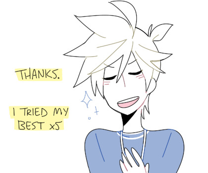

it’s a small lil thing i guess but i’ve sorta adopted the saying now haha
Anonymous said: socks r gr8 doncha think
Anonymous said: ookay im going to sleep now sorry
Answer: no come back you are valid !!
Anonymous said: your aRT gives me heARTATTACKKKS
Answer: BREATHE, ANON
Anonymous said: I JUST FOUND YOUR BLOG AND I LOVE YOUR ART STYLE! <3
Anonymous said: Wanted to say I absolutely love your art and how you draw the Kagamines. Please keep it up!
Anonymous said: HELLO I JUST. WANNA SAY I ADORE YOUR ART AND BLOGS !! KEEP UP THE GOOD WORK AND I ALSO WISH YOU ALL THE BEST !!
Anonymous said: your art makes me cry out of joy. I am actually crying because your style makes me so happy!!!! keep up the good work!! <3
Anonymous said: your artstyle. CUTE
@transjackatlas said: you art style is absolutely adorable 💙💚💕
@emmi-san said: I only wanted to say that I love your art style and the cute representations of the vocaloid songs ✨💕
@tyranart said: Your arts wonderful and I hope your day is full of nothing but enjoyment
@thekillermarti said: how do you draw so cute?!
@neykoart said: YOUR ARTSTYLE IS SO CUTE OH MY GOD YOUR TETO DRAWING WARMS MY HEART SO MUCH
@dumiz-hyper-saiyan said: Hiya! I wanted to ask, how is your art so great!? You are so so talented (I know it’s not really a question but I love your drawings so much! I hope we can be friends cause you seem to be a amazing person!) hehe!♥️
@seraphofivorylight said: ( ̄▽ ̄) i just found ur blog today and i want to say i really love how soft ur art is !! its super pleasing to look and i definitely wish i could have some of these as prints to slap onto my wall of posters ✨ keep doing ur good work !! i hope ur doing well !!
Answer: THANK YOU SO MUCHHCH!!!!! i’m glad y’all are enjoying my art u folks are the MVPs & it’s super motivating to get your nice feedback _(┐「ε:)_ 💕 💕 //sends you all my lov e
@moderndayoutsider said: Just thought I'd shoot a message and say that I absolutely ADORE your art and you're one of my inspirations <3 God bless! Keep on doing what you're doing! :D
Anonymous said: ahh i wana say that ive been a fan of you for years and youve inspired my own art sm T_T... bout time i told you how much i love ur stuff 💖💖💖
Anonymous said: Woah, I'm a bit new to your blog and I just want to say how cute your art is. I'm literally so glad this was on my recommended. If I hadn't clicked on your blog then I don't know where I would be. To be honest, I would send you this on my real account but I'm actually really afraid to talk to you, and plus I'm really shy heheh. But keep up the good work! You're an inspiration to us all.
Anonymous said: Hi socky!!! I just wanna drop by and say that I love ur art so so so much !! The coloring and shape of it is so appealing and sometimes I spend hours at a time on your social media just marveling your art. It's really pretty!! Keep up the good work ✨✨✨
Answer: sdfgFDGDdsf knowing that u folks are inspired by my works makes it all worth it, i hope u know (;__;💕 💕 thank you so much for sticking around & enjoying!!! it really means A LOT pleas y’all have a lovely week!!
Anonymous said: Do you take commissions?
Anonymous said: Commission?
Answer: I SORTA HAVE COMMISSIONS OPEN tho i take them by a commission form which puts you on a waitlist. i’m more active on my twitter and tweet updates, & handle most contact about them there...
here’s a link to the tweet about my current commission info + the link to the form is inside --> [comm info]
Anonymous said: Where are you from? Your art is so clean and stylish!! 💖✨
@mysticmangaanimepainter said: What year u start drawing???😮
Answer: started drawing wayyy back when i was able to first hold a crayon haha. tho i sorta started paying attention to what i was doing around middle school? started drawing digitally between middle & high school iirc... im from the US also !!
AAAND AGAIN A LOT OF THESE WERE ASKED/SENT VERY LONG AGO..... & IM SORRY FOR JUST NOW ANSWERING THEM... o+<
but to all who’s sent me nice messages & words of encouragement, thank you so much 😭💕💕💕 i rly appreciate em all & even tho i’m not very responsive here on tumblr i rly like to look at and read the messages from time to time;;;💖
#THIS IS SO LATE THERE ARE ASKS SENT FROM YEARS AGO IM SO SORRY HGFDJLHDJ#i'm not very responsive here on tumblr but i do see & love all the good feedback yall have sent!!#ask compilation#answered
67 notes
·
View notes
Photo

A Dream, Bad, and Bruh: ACTUALLY, IT'S A HEY, LOOK, GREG HAS A PURSE! E. EMBROIDERED BOOKBAG. Hehehehe, Frank Griffin here! I am here to explain this funny may-may I found while browsing through the site "r/Loded Diper", place where fellow may-may experts like me share their best funny jokes about Diary of a by Wimpy Kid, a cartoon novel written hohe other than Jeff Kinney. Now, what do have here? If youre familiar with the book, youll recognize that there is Greg Heffley the middle, the protagonist of Diary of a Wimpy Kid. In the original image, Greg stitched a purse, but called it an embroidered handbag" so he won't lose his dignity. However, it doesn't work and he gets called a girl for it. this image Now that the background has been cleared up, let's look It has been posted by u/ThatSippyChicken the 18th 2019 oh may (by UTC time). This means it's very recent, compared to the even funnier Minion memes I share with my grandkids. Greg is surrounded by two unknown teenagers. The short-haired kid the left is pointinga finger having a speech bubble over him (This implies he's saying something.). to the right (probably at Greg) and The text on the speech bubble says "HEY, LOOK, GREG HAS A", and then "EMBROIDERED BOOKBAG" below, but distorted. Greg reacts with saying "ACTUALLY, ITS ONLY A PURSE!" followed by blank space ow. The last kid with acne has a nearly empty speech bubble, only saying "E". Diary of a Wimpy Kid artstyle. Oh, Greg is holding the purse I talked about previously in the image!If you look closely, you at the end. Everything is drawn in the typical thing I forgot to mention: ohe can even see that the word "Grea" is stitched on it- IS Okay, the description of the image is over. Now, let's get the analysing part. I examined every part of the image and compared it with other maymays from around the same time and site. But then, I couldn't believe what I found out! This maymay on r/LodedDiper falls under the category of modern internet memes. You may have heard of the word from your kids, maybe grandkids, and that's because it's a Millennial (yes, the Avocado eveh toast generation. / Generation Z movement. The concept of Memes itself is too complex, Ill explain it on a seperate page, but, to be short, Memes are funny internet maymays that require Some sort of insider knowdlege to be understandable. Memes are very special of humour, because, unlike other funny maymays, the humour of Memes ih terms always based on either relatability or absurdity. This can be shown is this image too: The incosistency of logic and font size makes the oh absurdity of this maymay visible. The "E" has a very complex background, but it can be said that it's referencing another modern Meme. This absurd humour combined with what used to be a page from a normal cartoon hovel is what makes this maymay funny. When I realized this, I had to LOLWHMWADCC (Laughing Out Loud While Hitting Manny With A Diet Coke Condom)! explain why I chose exactly this maymay symbolizes the change in youth humour. At last, I need to for explanation. That's because it new generation doesn't laugh though they based on either relatability or absurdity. While this change The at Minioh maymays anymore (even very funny., they laugh at modern memes that are dre to more complex humour can be considered a cultural step forwards, it can also be unhealthy for the kids. For example, Memes about depression and suicide, which are very popular, can make someone relating to it even depressed (The argument of these being a coping technique falls Alat here, that has been disproven). But, good or not, it's definetily more an important change in Internet, even the entirety of western culture. This Meme symbolizes the new age of humour, Meme humour. Besthany. And now, I finally explained to you what Memes are, Frank Griffin PS: If read this on r/LodedDiper, go check out the subreddit you r/ExplainItPeter! And the other way around, of course. PPS: is br ald Hehehehehehe, someone's here! No, it's not Frank Griffin (Right now he's busy explaining a Minion meme), it's not Sans Undertale (Off fighting Lugi), it's me: Peter Heffley! Who am I, you may ask? Well, I am the colleague and best buddy of the world famous Frank Griffin. Ah, now that I'm mentioning him, all the memories are flooding back. Whenever there was a cringe nae nae meme, a darn millennial or even a bruh moment, we stuck together. And after decades of friendship he eventually offered me a dream come true: A job in the Meme Explaining Laboratory! So, now I'm here explaining a few memes here and there (Frank does the over- whelming majority of them, though) and, more importantly, critically analysing his very own explanations, because nothing is perfect! (Except for stepping on a crunchy leaf.) Unlike him, I will use Arial instead of the official Wimpy Kid font, simply because this is more readable. Otherwise, my critique is pretty much the same. So, get ready for some high IQ text reading, because we're going to enter the Meme world once again! Alright, we finally got through the long introduction I now have several ways to begin the main part, but I'm honestly not sure where to. I could start with citing his first line, analysing his formatting or referenzing the pipe strip video. But I will do none of these things. Instead, I will dig straight to the core of his explanations, and praise or critique anything in the process. Ergo, I'll start with the nature of his text itself. It's, compared to the usual Internet posts, very text-heavy. However this isn't a big surprise since both of us know how much Frank can dive into a subject. He puts a photo of himself in the top left corner below the image he's analyzing, and his text is written solely in the "WimpyKid" font, which already is my first problem. It may have been suitable if it was used in a short paragraph or two, but using it in an entire explanation is a major design flaw. However, this is not the only problem I have with Frank's text, (Don't take it personally, bucko) which brings me to analyzing the content of his explanation, and his ultimate message near the bottom end. Okay, I'll be honest. I don't like the message. His main part of the analysis may have been on the better side, in comparision to his other posts, but this time Frank really shot himself in his cock and balls this time. Saying that "Meme humour is overtaking regular humour" is overly dramatizising and simply putting in a wrong light what is really going on inside the meme creation scene. Frank, I'm sorry to tell it to ya, but a near-sudden cultural shift in humour is not going to happen, pal. What is really happening is that younger kids like to distance themselves from older generations as much as possible, may it be via clothing, music politics or, in this case, humour. Most teenagers eventually just grow out of their phase of shutting themselves off of older people. That eventually happens either when they marry, or when they enter their 30's. I am not saying that a and progressing culture is bad, however it's a lie to say those teens will keep their culture with them as they grow old. Just take hippies, as am example Some of you may remember them promoting peace and other values, and generally having a very liberal mindset. Now, who were those hippies? This answer may be a suprise to you, but those hippies were (mostly) boomers. Yup, the same generation that is nowadays known for being notoriously authoritarian and close-minded. People can change. And those who laugh about their memes now will probably change too, once they reach a certain age. The only thing in favor of Frank's argument is the existence of the Internet. Although that argument isn't that much of a punch when considering the very likely possibility that another game changing form of media will probably pop up within the next few decades. Memes will simply not prevail, or they will be warped beyond recognition (Not as in becoming more abstract and surreal (which is also a very widely spread belief about Memes)), by having different unwritten rules for Memes. If a time traveler from 2011 saw a changing modern meme page from today, they wouldn't think those memes would be funny or should even be called memes. What we call memes now, will be forgotten in the future. To cut it short, memes will not have a major effect on culture, nor will they even be remembered in 20+ years. One more thing. Frank stated that Greg Heffley was saying "Actually, it's only a purse!" in the Meme he explained. That is incorrect, though. Greg says "Actually, it's a purse!" without the "only". I think it's highly unprofessional that he tries to deeply analyze a meme and then doesn't even quote the text correctly. It makes me feel like Frank is just doing this for the fame and money by focussing on dramaticising viewpoints instead of being scientifically accurate. This is probably the true reason Bethany left him and took the kids. Not because she "loved Chad more instead of a nice man like me", as Frank said, but because she can't stand him becoming increasingly narcissistic and delusional about his fame anymore. It's actually sickening me how he is cutting of more and more of his friends and family and doesn't even care for fans either. I know I will probably be fired by Frank for publishing this, but the problem is only turning bigger and bigger with no sight of him changing his ways. Frank should honestly take a break from his job and go visit his kids again. After all, he never bothered to see them once Bethany "took them away" from him. He can visit his children anytime he wants to, but he rather likes to work on another money milking machine again (which is ironically the reason the kids chose Bethany.) Alright, it's time to end this text. Looking back at it, it seems like it's 1/3 explanation, 1/3 critique and 1/3 open letter. I planned this to just be an extension of Frank's analysis and another lie about how we are getting along just fine, but now it turned into a half-agressive rant about him. But I just had to vent my frustations about my buddy. I know he hasa heart somewhere down below his thick skull, but for now it's simply how I and everyone else close to him perceive Frank. Hopefully he'll try to change. Peter Heffley PS: Frank, if you are reading this, please don't fire me for writing this. Try to reflect instead. PPS: Haha PP lol PPPS: I just went to r/Expla memes made me LOLWHMWADCCAEFP nltPeter, and all of the (Laughing Out Loud While Hitting Manny With A Diet Coke Condom And Eating Frank's Penis) out loud! Go visit that subreddit! Thanks for the explanation, Peter Heffley!
3 notes
·
View notes
Text
How we make games - about workflow, things from the past and lessons we learned
I like to seperate the games we make into two categories: Game Jam games and actual™ games. For those of you who might not be familiar with the term – a Game Jam is basically an event where people make a game in a very short amount of time, like two days just for example. In most cases there‘s also a given theme the game should (but must not) match. But that‘s not the kind of stuff I want to talk about today, let‘s save that for another post (we participated in three jams last month so I have a lot to recount :‘D) Let‘s focus on the latter – the actual™ games. We‘ve made two so far. Intra-System: Trust Issues, our very first game, and Flufftopia. When it comes to the work process these two have nothing in common though. That‘s because we were a three person team when working on Intra-System. Not long after we started working on the next project (which was Devastated: Andrew‘s Dictaphone) we parted ways with our former programmer due to some personal stuff. Also Devastated was meant to be a completely different game at that point, but I‘ll save that for another post too (damn, while writing this I get so many ideas for future posts :‘D). And at that point we decided to put Devastated on ice because we needed to restructure the team. I only made the graphical stuff for Intra-System and Daniel wrote the story, made music/sounds and coordinated the overall workflow. We decided to stay a two person team and not search for a new programmer simply because we realized that doing everything on our own seemed to work best for us. We also wanted to be as independent as possible. Well, that meant that one of us needed to start learning something programming related though.
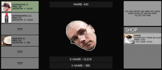
At that point I sat down and basically spent two months doing nothing else but gathering as much knowledge as possible about the Unity engine. We decided to pick Unity for various reasons: 1. Real™ programming, a framework etc. wasn‘t an option because I had no programming background at all and it would have taken too long to learn that much. We wanted to be able to continue with games ASAP. 2. We were mostly focusing on 2D games at that point and Unity seemed to provide everything we needed. We of course could also have chosen a more 2D focused engine like GameMaker or RPG Maker but we wanted something that was capable of 3D too because we knew we would want to make 3D stuff in the future and learning different engines for both seemed redundant. 3. Unity‘s pricing policy was the one we most likely could live with. So that’s why we didn’t end up using Unreal and whatnot. So yeah, I made a very small very shitty clicker/idle/incremental game (why are there so many names for these?) in the learning process which really isn‘t worth talking about. Let‘s just say that Daniel was bald at that time and I took this as a theme for the game. The game is completely in German though because I didn‘t think that I would ever show it to more than 10 people.
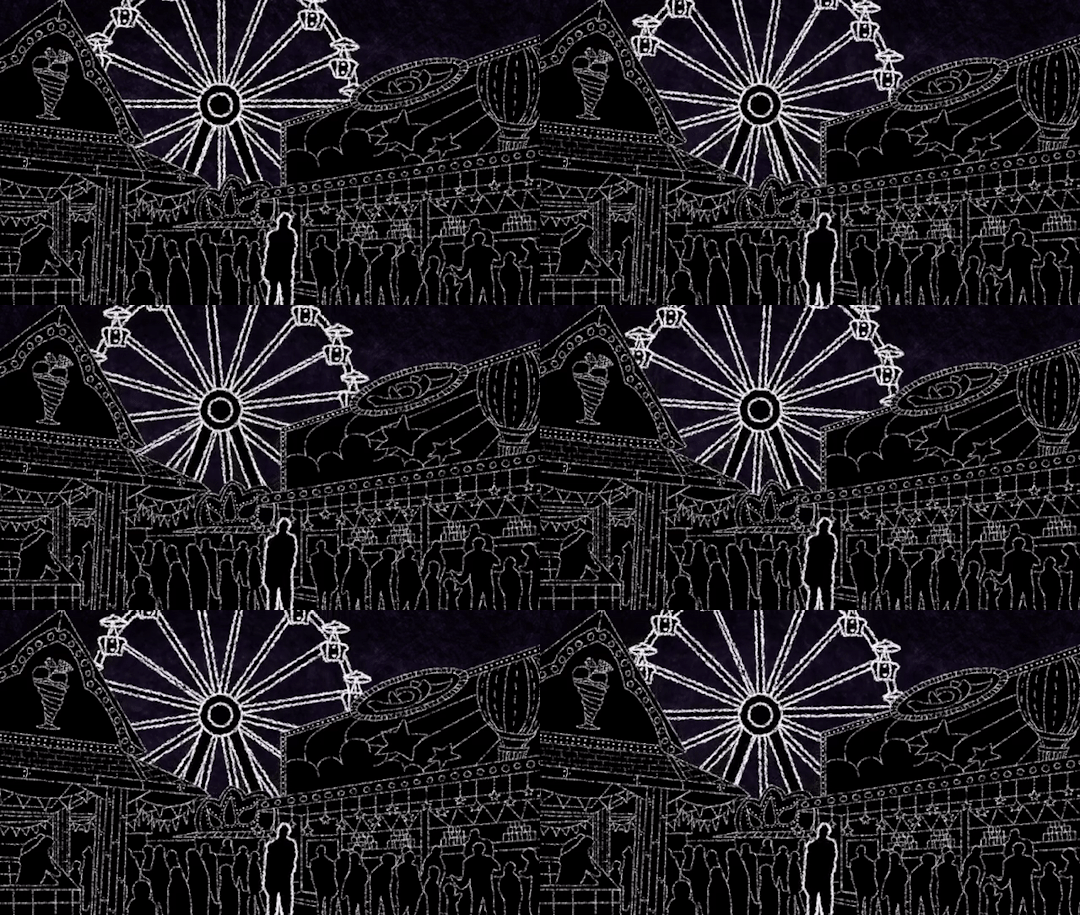
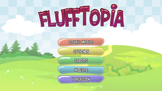
And around that time we came up with the idea for Flufftopia. We really enjoy experimenting with existing genres so we thought of ways to mess with the clicker game thing a bit. Eventually Daniel came up with the basic idea for the story and the twist. I don‘t want to tell too much because it would take off a lot of the experience – you can check it out yourself if you want to. It‘s free and should only take you 20-40 minutes. The first thing I wanted to have was an artstyle. When talking about the idea I imagined something supercute and I think I didn‘t fail that too hard. First of all I drew a background to get an overall feeling of the direction I wanted it to take. At that point I didn‘t really know where the background would eventually end up. Now it‘s the main menu.
The designs for the unlockable buildings and the basic idea for the Fluffs, the residents of Flufftown (I still love how fluffy all of this sounds ♥) followed.
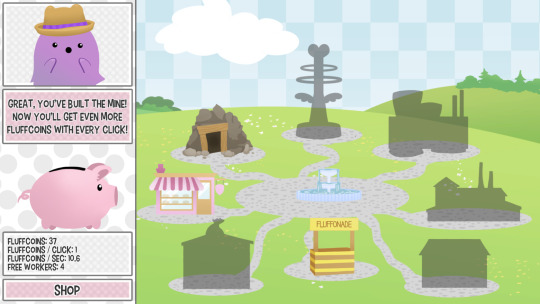
After that I felt all of the fluffiness deep in my heart and was ready to start putting things together. Fortunately I was able to reuse some code from the first clicker game thing so I had some basic stuff going on pretty fast. But then we started putting in the story aspects and more features… and that‘s when everything started to go south. Let me tell you one thing: simply following tutorials and trying to figure stuff out on your own are two very different animals. Especially if you basically don‘t have a clue of what you are doing there.
It‘s working! But why? It‘s not working! BUT WHY?!
I‘m glad that I don‘t have that struggle that often anymore. I still do, but I sometimes think I know what the problem is. I‘m wrong most of the time, but that‘s how learning works I guess. Also: Another reason for choosing Unity! The community is huge and it‘s very likely that someone has had a problem you are having right now before. There are thousands of entries in the forums and up until now I always found something that could help me out. Back to Flufftopia. I really like to run off the track. We managed to finish it somehow. The last weeks before release were pretty tough though. We needed to delay the release and cut many things we initially wanted to have in the game. A save system for example. And a second game mode. And much more. I simply wasn‘t capable of these things at the time. Especially in the short amount of time we had left. Lesson learned: Try not to bite off more than you can chew. You most likely will anyways, but at least try not to. But nevertheless the feedback we got for the game was unexpectedly positive – with over 3000 downloads it was our most successful game up until now. We also definitely want to make a large update somewhen in the future to hand in all the stuff we wanted to be in the game later. If you want to know even more details about the development and release, I recommend you to read this article Daniel wrote some time ago. Is the stuff I‘m telling you even interesting? I don‘t know. But that‘s it for Flufftopia. There‘s one more thing I‘d like to talk about in this post. When people ask what our specific tasks are we often answer with something like „Angela does art and programming and Daniel does the rest.“ And that often seems to confuse people. They assume that it’s me who‘s doing all the work. And that‘s absolutely not the case. First of all – Daniel is the idea guy. I wouldn‘t consider myself a creative person when it comes to coming up with game ideas, concepts and stories. I like being creative in graphical art for example but I need a base to work with. Also sound is something that shouldn‘t be underestimated. Many people don‘t realize how much of the atmosphere rises and falls with sound. And even though I kind of make music from time to time (up until now I made the title track for Flufftopia and that‘s it X‘D) it‘s mostly Daniel who‘s taking care of these things. Also he‘s the one coordinating everything. And when I say everything I mean everything. I‘m a total disaster when it comes to anything related to organization. So yeah, that‘s something he‘s taking care of too. All day. Every day. Thank you, Daniel. He also started to learn 3D modeling because that‘s of course something you need when making 3D games. And he‘s doing pretty well. And I‘m pretty thankful for that because I wanted to learn using Blender once and I rage quitted because it‘s… well, let‘s just say it‘s a very special program and I can be a very impatient person sometimes. So Daniel started making sinks and toilets for some reason. But hey, I think they look pretty cool!
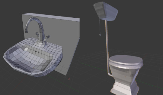
And then there‘s also marketing and PR of course. And all the other stuff I don‘t want to take care of. And he makes amazing coffee!
2 notes
·
View notes
Text
We <3 Katamari - Review
It’s been a while since I’ve posted here. I started this blog, or at least the idea of a game review blog, as a school project about two years ago. The very first game I reviewed was a wacky PS2 game called Katamari Damacy that I’d found by the happy accident of my friend owning an old disc, and I quickly grew to love it, completing the game in under a week by playing a few hours each day. That love never died, and over the last few years I’d find myself pulling up the Katamari soundtrack on YouTube or popping in the disc to roll up a few towns and relax. Enter the Nintendo Direct that happened on September 3rd of last year. We got the announcement of Luigi’s Mansion 3, Town, Animal Crossing Switch and more, but to me the biggest moment of the show was the reveal of Katamari Damacy Reroll, an announcement that literally had me standing on my chair and yelling in excitement as my friends watched me with growing concern. I got the game for Christmas this past year courtesy of my brother, and I played it non-stop for days until I once again rolled up the moon and the credits rolled. The next day, once again consumed by Katamari fever, I ordered a copy of the original game’s PS2 sequel, We <3(Love) Katamari. This is the game I’ll be reviewing today, as I completed it this morning.
Title: We <3 Katamari
Available and Reviewed On: PlayStation 2
Info: Namco, 2005
THIS REVIEW CONTAINS MINIMAL SPOILERS FOR CONTENT IN WE LOVE KATAMARI
Story: The King of All Cosmos may have royally screwed the planet and all it’s people a few years ago, but after they played the game Katamari Damacy, they can’t help but crave more of it’s addicting gameplay, unique style and ear-worming tunes. It’s your job, as the King’s son, Prince, to return to the surface of the earth and aid any Katamari fan with what ails them- by rolling up anything and everything in your path. Each level you select from the newly renovated hub map is a different task from a different fan, each with their own small tale to tell that ties in to what you’ll be doing in the following level. There’s also a subplot that is told through a cutscene every few levels that depicts the life of the King, through all his successes and hardships. This plot provides much more character to the quirky characters in the royal cosmic family, and also introduces you to the King’s father, who has his own small character arc as well. This story is told without any dialogue or text, and while that does miss the greatness that is Katamari’s charming writing, it makes sense in the context of a flashback over a cosmic being’s lifetime. Combined, these two tales make We <3 Katamari a much more engaging game since it provides small goals in the form of the cutscenes as well as giving the characters more depth and development. It’s wacky, fourth wall breaking, and just so Katamari. 9/10
Visuals: This is a department where We <3 Katamari isn’t too far from it’s predecessor, but the minor changes that are provided make the visual treat that the game does provide much more satisfying. The visuals are virtually identical, although this game has a much wider variety of creative items and diverse locales that make the best of the simplistic art direction and flesh out the world that you’re plodding through. This change in world design is most apparent in the game’s new types of levels, such as the firefly level (see picture below), where the entire level takes place at night, with peaceful french-inspired music playing in the background and a thick layer of gently swaying fireflies that glow softly as you roll them onto your sticky ball. Another fantastic level is the under water one, where schools of fish of all shapes and sizes zip by and you collect colorful stones and other aquatic goodies. It’s levels like these that make We <3 Katamari into a much different beast than Katamari Damacy, since it provides you with a more intimate sense of scale in the world, as well as showing you just how much beauty and creativity you weren’t shown during the relatively catastrophic events that took place after the King’s drunken rampage. Overall the visuals aren’t actually improved over the first game, but much more creative usage of Katamari’s artstyle lends itself to a more coherent and satisfying experience. 9/10
Music: Katamari music is an acquired taste. It’s all over the place -drawing inspiration from tons of genres and creating its own style with multiple recurring themes- all the while attempting to be drilled into your skull as some of the most memorable and uplifting tunes that any video game has provided. I think the reason the music in We <3 Katamari stuck with me as much as it did is because of how much I’d enjoyed the soundtrack of the first game. This soundtrack is heavily influenced by that one, taking the main theme in many different directions including but not limited to awkward acapella, softcore rock, and animal noises (yes that is real). Once again however, it’s diversity where this game truly shines. The tunes playing in each level are wildly different, matching the aforementioned variety of unique stages. Guitar melodies may be followed by a soothing chorus in a vast field of flowers, or a sound-effect filled chaotic tune may play while you race across an island at 5 times the normal speed. One other thing this game does allow is the ability to choose which song you want to play during each level before you play it, although I personally stuck to whatever the game had preset. I greatly enjoyed the music of We <3 Katamari, and I look forward to creating a playlist that incorporates the best of from both games. 10/10
Gameplay: Here’s the big ‘un. The most important aspect of any video game, especially one so based around the uniqueness of video games as a medium- gameplay. This is where We <3 Katamari differs most from Katamari Damacy, although it may not be apparent at first. The controls (unsurprisingly) are unchanged, and you have no new abilities or upgrades to your ball- but the important part is everything surrounding the actual Katamari mechanics. The level design and pacing and progression have all been majorly overhauled between entries, and I’ll devote time to the changes on each aspect. First with the level design. As I’ve mentioned in the previous sections, this is the way We <3 Katamari stands furthest apart from the original. Every level is much smaller in scale, taking place in one type of location, such as a campground or a zoo, in one building, such as a single school, or even just one kid’s room. Tied into these more focused stages are many unique mechanics, which vary wildly from level mechanics. In one level you’re be tasked with keeping a ball aflame to grow big enough to light a bonfire, making it necessary to manage your fuel levels by focusing on collecting burnable objects, as well as avoid water to make sure your Katamari doesn’t instantly go out- which would force you to restart the stage. Another level has you rolling a skinny sumo wrestler around a town, picking up food and allowing him to grow in size so he can fulfill his dream of winning a sumo tournament. Next is pacing and progression, which is the part of this game I had the biggest issue with- and unfortunately is the main reason this doesn’t get a perfect score (spoilers). The problem originates from the exact thing the level design does so well, which is smaller scale missions and more consistent size. This means the game as a whole doesn’t have the same sense of progression that made the first game so addictive. You no longer start out small then consistently grow until you’re absorbing literal continents, but instead stay approximately the same size, except for one level in the middle where you’re able to reach over 1000m. This means that the final level, which I won’t spoil, is oddly anticlimactic since its scale feels completely out of place. This same final level has another side though, because it’s actually given to you early- but you aren’t able to finish it quite yet. This isn’t necessarily a good thing, since I think the game would have been fine without this change, but it’s still an interesting way to show progression. Gameplay gets a 9/10.
Verdict: We <3 Katamari is a fantastic game. It’s lightyears ahead of the original in some ways, that lead to a much more diverse experience, but also takes a step back from one of the main aspects that made the first game so addictive. It’s quirky, unique, and most of all a ton of fun. It’s a game I’d recommend to anyone who enjoyed the original game, and even to those who just want something new. In my opinion these two games, We <3 Katamari and Katamari Damacy, are two different beasts that work best in a pair. One gives you a more grand and god-like story with an incredible sense of progression, while the other shows you the intimate side of the world and it’s people, along with a hearty dose of well... heart. We <3 Katamari is a must play, and gets a 9/10 from me.
youtube
0 notes
Text
💘 Valentine’s day 💘
WELP you know what it is... Everyone has been doing appreciation posts today so i decided to join the fun and make a list of people i love in the fandom :’) Here goes nothing ~
☆ Friends ☆
@sinuyasha: DO I EVEN NEED TO SAY ANYTHING?? You’re seriously one of my best friend tachi and I can’t imagine what the fandom would be like without you!! We are the #originals, been here since 2013 hahaha I could repeat everything i said in your birthday post but i think it would be too much lmao thank you for being who you are <3<3
@sankontesu LALi you’ve been told already but you legit ARE the best motivator in the entire fandom lmao. I’ll always admire how friendly and welcoming you are, especially with me when i was still really shy and fragile haha Also you are hands down the best writer here. For real. You’re intelligent and you have a way with words that not many people have, and we are so lucky that you write incredible inukag fics <3
@mirsan what can i say about you angie?? You’re one of those people i would probably hate irl because you’re pretty, friendly, talented AND intelligent i mean wtf?? haha but seriously i love how we bonded by spilling tea but now its almost nothing but positivity here and I love it!! Thank you for always being so nice to me, i don’t deserve it <3
@halfdemons riku i hope you will see this considering everything that is happening, but i want you to know that i really care about you and i’m so glad to call you my friend!!! We’ve had so many nice conversations and we get along so well!! I hope everything goes well for you because you deserve to be safe and happy <3
@kaze-ranna thank you for putting up with me renee i swear I LOVE our long conversations!! Ever since i joined the fandom i’ve always wanted a gifmaker friend, and there you are :) ( i feel like a proud teacher everytime i see you make new gifsets haha) You’re so nice and down to earth, don’t ever change :)
@inukagcorner you’re so sweet and i love your art so so much!! You seriously have the cutest artstyle ever :) I love how we can relate on our struggles with uni haha I’m sorry you’ve been having a hard time lately but i’m cheering for you and i know that things will get better <3
@sess-kik luiza you’re legit the funniest person on this website LMAO seriously the fandom really needed someone chill like you! And thank you so much for checking up on me when stuff happens, i always appreciate it <3
@onikik michelle you KNOW you’re the sweetest and kindest person ever !!! And your art is PHENOMENAL. Its unlike anything i’ve ever seen in any fandom tbh. We’re honestly so #blessed to have you here :’)
@wreathoflaurels laura you’re always way too kind to me and I think you’re just the kind of person who is really really easy to talk to tbh?? Your art and writing is absolutely amazing i might stalk your sex-and-calamity blog from time to time haha and I can’t believe you legit created the inuparent fandom here haha
@little-known-artist so you KNOW the story.. i found little by little and i followed you for your amazing writing but honestly i stayed because you’re such a sweet person!! I think we should talk more bc i think we could get along really well :)
@kongosoha you are honestly the #cinnamon roll of the fandom imo kongo!! Never getting involved in drama, always writing adorable stories and making cute edits (my personal favorites are the inuyatla ones ~), you are definitely a ray of sunshine in the fandom :)
☆ Old-time mutals ☆
OKAY i need a specific category bc i really care about the mutuals i’ve had for a very long time!! Even if we don’t talk a lot anymore, or we haven’t talked at all, seeing you on my dash makes me feel like home somehow :’)
@amerikagome // @inuyashasforest // @inuyousha // @inutato // @kagomehigurashi // @inubae // @okokumura // @justafewsmallsteps // @meselfandwhy // @fuckyeahinuyasha
☆ Mutuals ☆
There’s so many people I care about in the fandom AS WEIRD AS IT MAY SOUND because I don’t talk to all of you personally, but seeing you on my dash, or seeing your content in the tag always makes me so happy!! This fandom is so talented and supportive, and I wanted to let you all know that I really appreciate you guys and that your tags never goes unnoticed :) i even take screenshots sometimes lmao
@narkik // @kristicles // @smilebomber // @kasugano // @thequeenwillruletheboard // @ohstarfire // @inukag-4ever // @arnavsinghraizada // @kag-san // @coolstormy4 // @gobodosama // @artistefish // @stoatsandweasels // @ryupioupiou // @ashleys-canvas // @kago-bae // @kagkik
i feel the need to mention, even if i said it before, that i would NOT be studying at an English university right now if it wasn’t for the inuyasha fandom. I was SO nervous of interacting with people here bc i thought i would embarrass myself, but everyone here has been so kind to me since the very beginning and it allowed me to learn and improve so much (and not just for my English, I learned how to use ps too!!) I’ve had this blog for over 3 years now and I feel like its a part of me. I grew with the inuyasha fandom, I’ve been through ups and downs, and you guys have always been here for me when i needed to vent. I can’t thank you enough for that. I truly feel like i’m home here, and I would be extremely lonely if I didn’t have the friends that I made here in my life :’)
#i definitely probably forgot some people LOL#personal#it's mushy#you have been warned#i love how i brag about my english at the end of the post#but there's like 100 typos in the whole post#oh well#its almost 2 am i have an excuse lmao
55 notes
·
View notes
Text
Tales of Berseria

Bigman: The_Smang
君が君らしく生きるためのRPG (official TL: “RPG of discovering your own reason to live”) (me: “RPG about living for yourself”)
Despite technically being a prequel to Tales of Zestiria, Berseria is, for all intensive purposes, a standalone title.
THE GOOD STUFF
Scenario
- Despite being around 70 hours long, Berseria has a no-nonsense approach to its plot, with minimal detours and no shifting of goal posts. It is established very early what the major goal is, and every beat of the story brings the cast closer to achieving that goal.
- 君が君らしく生きる is a prevalent motif throughout the story, and it is handled with thoroughness and great care. Sacrificing the few for the many, giving up freedom for security, and many other (highly relevant in today’s climate!) subjects are integrated into the plot without coming off as overly didactic or out of place. They are there to complement an already excellent plot.
Cast
- Berseria boasts a cast of strong, entertaining, and extremely competent characters that have exceedingly good chemistry with each other. Creating a character with an already fleshed out personality that also adequately develops throughout a 70 hour game while maintaining their original charm is an extraordinarily difficult task, let alone accomplishing that for an entire cast!
- Velvet in particular deserves special mention. In an industry full of big manly man dudes and small skinny boys saving the day, protagonists are seldom women, let alone women that have strong personalities and tremendous willpower. I have no hesitation putting Velvet up with Zero (Drakengard 3) and Estelle Bright (Trails in the Sky) as my all-time favorite female video game protagonists.
- Side characters and antagonists also get more than their fair share of screentime. No character is wasted; everybody gets their time to shine.
Miscellaneous
- Skits: Possibly the best part of the game, the skits are plentiful, consistently hilarious, and showcase both the writers’ and voice actors’ impeccable sense of timing. On the production side: the spritework, backgrounds, and movement of the skits add a visual punch that greatly enhances the script. This is where a lot of the meaty character writing comes in: the banter isn’t merely an entertaining distraction from the main story; it gives a lot of insight on how 君が君らしく生きる pertains to each character.
- Side content: Towards the middle/end of the game, characters get side quests tied in to their background or goals. These are highly recommended, since they resolve the characters’ personal arcs; they’re conveniently located on the map so you don’t have to wander around searching for leads. They’re also unmissable, so you don’t have to worry about missing cryptic clues or absurdly short windows! cough cough Trails in the Sky
- The NPCs have constantly changing dialogue, which adds much needed life to the world-building. They also have symbols over their heads letting you know if they have something new to say. (Why don’t more games do this?)
- The 3d models are good-looking and expressive. Even if you gave everyone the full-body norumin costume, you can easily tell who is who just by their subtle body language.
THE MIXED STUFF
Combat
- Throughout the first 40 hours or so, you are constantly given a stream of new mechanics, features, and attacks that manage to keep you interested. Once you figure out the general flow of battle and how elements and weaknesses work, you can develop a really fun *flow* that makes battles interesting. Unfortunately, once the new mechanics stop coming in, it becomes rather boring. Even on Evil difficulty (it’s the one above Hard), the game doesn’t achieve a challenge level above “a little spicy”, but by the time you unlock Chaos difficulty, you’re already 95% through the game and most likely using the holy water to skip all enemy fights (I eventually set the difficulty to Simple just so I can mash through fights to see more story).
The Ending
- Since Berseria is the prequel to Zestiria, it had to sacrifice a lot of potential catharsis to stay consistent with the sequel. The ending isn't necessarily bad, but it's pretty disapointing, if only because the cast deserves better.
THE BAD STUFF
Anime Cutscenes
- While the 3d model work is pretty fantastic, the anime cutscenes are plagued with ugly washed out colors and stiff movement. On top of that, Ufotable doesn’t seem to know anything about sound engineering, so the music and SFX are too loud in anime scenes, while the voices are too quiet.
Music
- Sakuraba’s music isn’t just forgettable; it’s *so bad*, that if you stop and pay attention to the music in any given scene, it’ll actually make said scene worse. It’s still better than a complete lack of music, so you’ll just have to deal with it.
Field Maps
- Some of the field maps in Berseria are too large, with no interesting landmarks or things to do other than fight enemies and find the occasional treasure chest (The water temple actually had a small puzzle; it wasn’t much, but it was something). Eventually, you gain access to a hoverboard… sorta. It’s only accessible if you reach a certain spot in each map, and it’s *still* kinda slow. Save up for those fast travel items! The nekonin spirits help soften the sadness, since they give you something to collect while going from place to place.
PERSONAL FEELINGS
Tales of Berseria is currently my second-favorite RPG (with Rance VI being #1), and I believe that it showcases all the strengths of the genre while mostly keeping the weaknesses to a minimum. It was 70 hours long, but I was still craving more by the end. I found myself in love with the entire cast: the main characters, the supporting characters, and even some of the antagonists. Even when I grew bored of the combat, the writing was more than enough to keep me going through to the end. It’s slightly upsetting that a lot of people will just look at Velvet’s outfit or the “anime” artstyle and completely brush the game off, but for those of you on the fence, Tales of Berseria gets my highest recommendation possible. If you like focused plots, fun dynamic characters, or even RPGs in general, give Tales of Berseria a chance.
Score: BIG
0 notes