#and aspect ratios etc
Explore tagged Tumblr posts
Visit Tumblr Blog
Explore Tumblr blogs with no restrictions, modern design and the best experience.
Last Seen Tumblr Blogs


Fun Fact
If you dial 1-866-584-6757, you can leave an audio post for your followers.
Text
I actually finished everything, it's all sent off to Steam to review and all I need is their thumbs up and the demo goes live THIS FRIDAY.....
#i cant even begin to cover how much more work it was to release on steam than itch#holy fucking shit#but i also think that is like. a really good experience for me#even if nobody actually plays it through steam because itch is more accessible it's just good to have done the steam thing#it forced me to do things further in advance than i normally do and it forced me to make marketing building blocks to use in diff formats#and aspect ratios etc#anyway i feel like i have earned a thousand years rest now but now that it's done i don't even know how to rest#i guess i should start by going to bed not extremely late tonight#and then this week doing basically nothing except watch twitch streams#that sounds nice
4 notes
·
View notes
Text
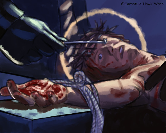
Whatever, *crucifies your superstar*
screenshot redraws from jcs 2000
#i feel like i dont need to explain these at this point#jesus christ superstar#jcs#jcs 2000#jesus christ superstar 2000#jesus christ#judas iscariot#mary magdalene#my art#either you follow me and you know i have watched this movie 50 times in the past 2 months and have 350+ screenshots on my phone or#anyways here are my screenshot redraws#bc i think this movie has some very pretty and compelling lighting and composition etc#these are not supposed to be a comprehensive narrative of it this is what i ended up drawing of the 40 screenshots i wanted to#i would have done more but im about to leave my tablet for 8 weeks#and i wanted to post this before I left#my personal favorites are the first and last#you can probably tell i drew these over the course of almost 2 months#also idk why i decided to change the aspect ratio from the actual movie but i commited so they're narrower and taller than the screencaps
203 notes
·
View notes
Text
stede pink suit tribute
#ofmd#yes even my joke fancams loop.#fun fact: this video is longer than the time this suit actually appears on screen for#i think the funniest bit of this is how fucking high res the shots of his face are compared to the actual shots of the suit bc of how much#i had to zoom in on the footage#i'm learning new sharpening methods in AE#ilu double cineon converter double unsharp mask sandwich <3#thats why stede's face looks so good#the suit not so much sggdshhgdsh#got the tumblr aspect ratio wrong as well. this is why i usually stick to the native resolution of the show#don't ask me why i tried to manually stabilize the footage instead of warp stabilizing. i'm not a pirate i'm an idiot etc.#song is ''ain't no thing'' by oliver nelson and kaleem taylor#jay.mp4
220 notes
·
View notes
Text

i wanted more dream machine content so i gotta learn to make it myself i guess (practicing drawing the machine, + felix and victor are there)
#google is saying a doohickey is a small object. whoops. was just looking for alternative words to machine#want to get better at drawing environments and perspective and machinery and differing facial features and etc etc etc...#the dream machine#my art#kcat talks#i was like i wish there was more fan content for this game!!! and then im like. i gotta be the change i wanna see in the world...#once i get them to start looking good in my artstyle i can start doing more inch resting scenes and digital perhaps...#i also sketched alicia and victor having cardboard box meal too in a more familiar artstyle but it came out weird :/#anyway! *throws a sketch to the void*#i did find out that my tablet aspect ratio settings were off the other day so i hope to make more digital art soon too#OH ALSO while im tags rambling... it does kinda suck that my favorite character is the machine bc why is it so annoying to draw#its either 1) stationary overly-detailed object or 2) tentacle or 3) possessing a different character#wait i forgot about 4) fucked up frankenstein'd organs i should draw that one sometime
4 notes
·
View notes
Text

finished up an art trade!!
#id in alt text#tried lineart again!! yippee#digital art#clip studio paint#fake anime screenshot#i didnt plan for this to be a screenshot so it's not 100% accurate (aspect ratio line weight cell shading general style etc etc)
6 notes
·
View notes
Text
It IS, but because of the much more RP-focused (and less fandom- or life-focused) nature of Dreamwidth, it's noticeable that the icons are much more often "an image of a character, without text or additions, made to look nice and convey An Specific Emotion".
Whereas even fandom icons on Livejournal were dominated by "a funny quip or quote", "artistic filter", "pretty frame", or "I have drawn on this to convey A Thing".
and making icons now is largely a much more bulk operation. Idk if people remember this but on LJ, an icon batch was usually like, 15-25 icons with unique editing, sometimes multiple ones from the same screenshot. These days (and tbh for the last decade and change), a publicly posted icon set is likely to be HUNDREDS of icons made from as many different screenshots as possible, with the main edits being to make them clean and readable.
(to be clear, this is still a skilled endeavour! Honestly, I think it takes more skill, because it means you can't skim past scenes in bad light or low res, you have to git gud at image correction. I'm biased, because I do occasionally make icons on commission, but still.)
Anyway I just think it's fascinating how even where the surrounding tech and system is very similar, icon culture has changed SO MUCH IN the "Livejournal clones" space.
there's a post going around asking for your most millennial take and mine is that the livejournal icon ecosystem was essential for a certain type of fan and this loss of critical habitat is why the bios of so many people under 25 are Like That
#and like even compared to insanejournal#when i was on there the norm was for icons to have borders and not all of them were fully square?#(this is in like 2014 though don't quote me)#and there are changes in fashion for what we want them to look like#saturation level. clarity. framing of faces. etc.#and nobody like DECIDES these things they just enter the zeitgeist#and suddenly it's cringe to have text on your icons#it's weird to have a border#etc#the only consistent thing is that if your icons are wildly out of aspect ratio i am going to judge you a little bit
2K notes
·
View notes
Text


When The Pink Opaque is on tv, it’s a different ratio aspect then the rest of the movie (i.e. the “real world” portions of the movie) and as you can see there is that black border on the sides indicating that it’s what’s being seen on tv. But when Isabel is being buried alive, it’s in the same ratio aspect as the “real world,” filling the whole screen, indicating that it’s not just what’s happening on tv but also in reality. Anyway I thought this was an interesting editing choice it kind of supports the idea that her death is real etc
8K notes
·
View notes
Text
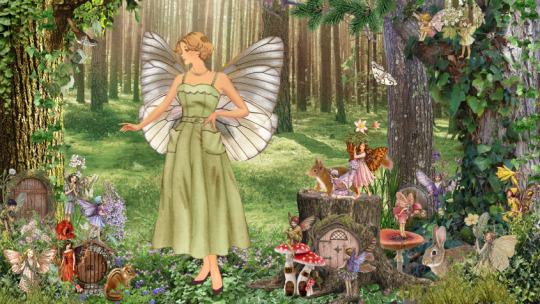
Low res preview of the dress up game I'm working on! It will be fairy themed, only one skin tone for now until I can figure out the code and get it working, but then I plan to add more as well as additional dresses and wings. I also still need to design the menu/controls.
#it's mostly collaged together from images from vintage sewing patterns paper dolls magazines etc as well as photos for some of the dresses#i got a little ahead of myself doing so much work on the graphics before i can even make it functional with the code and everything#but now i will have images to work with when testing it out#and i also have a clearer idea of what i want it to end up being which should help too#wip#also not 100% sure of what size/resolution is generally good for websites esp if you want it to be responsive 🤷♀️#but this is a 16:9 aspect ratio so hopefully that's ok??
0 notes
Text
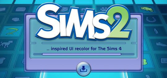
The Sims 2 Inspired UI for The Sims 4
After making my own UI override, I've been itching to look back in time and try to recreate The Sims 2 UI in TS4, and here it is!
I tried to capture the look & feel as best as possible, so I hope you can enjoy this mod and reminisce a bit c:


General Info
Changelogs Current version: updated for Businesses & Hobbies patch ✅ Latest mod update: 2 March 2025 PC/Mac: 1.113.277.xxxx Older game versions than the ones listed will not work with this mod.
UI overhaul in the style of The Sims 2's UI.
Over 500+ additional icons recolored for CAS & BuildBuy!
Sims 2 style cursor recolors.
Most text are kept in their original color, though they might get changed/updated down the line.

To install:
// Main mod
Before installing/updating, remove any old versions of Sims 2 UI whenever there's a new mod update and clear your caches.
Download & extract the zip file within your Mods folder.
Install the latest UI Cheats Extension mod and make sure it loads after the Sims 2 UI mod. Current version needed: v1.47
// Extras
Main Menu Override - now separated from the main mod.
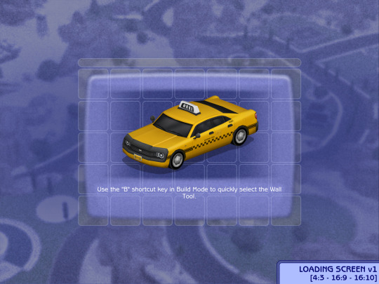
Loading screen: download only one loading screen file. Available in: 4:3 - 16:9 - 16:10 aspect ratio.
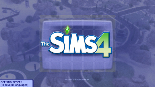
Opening screen: file to replace the intro TS4 screen. Choose the file that pertains to your game language.
Phone icon addons: pick & choose depending on which mod you use.
TS2 Cursor: recolored TS4 cursor to match with TS2's cursor. Unfortunately, some cursors are missing their recolors (rotate cam & grab+arrows in CAS).
EA Notif: optional file if you prefer to keep the notification in its original color scheme.

Mod-related Info
// Recommended mods for more immersion:
CAS overrides: bodyshop room & icon + CAS organizers, TS2 room by simsi45
buildbuy gizmo override (outline mesh + ts2 swatch)
TS2 buildbuy boundary box texture override
TS2 font & want sound replacement by thepancake1
TS2 music for TS4 by buurz
Map replacement by 20thcenturyplumbob
Taxi mod & sound override (same object as the loading screen taxi)
// Compatible Mods ✅
UI Cheats Extension by weerbesu - original mod required
Fully compatible w/ UI Cheats Extension v1.47. To avoid any issues, keep the original mod in your mods folder (both .package and .ts4script) and have it load after the Sims 2 UI mod.
Other major mods are also compatible (BetterBuildBuy, TOOL, More Traits in CAS, etc.)
// Known Conflicts ❌
UI overhaul mods (Chalk'd UI, Dskecht's UI mods)
Main menu mods (Minimalist Main Menu, Skip Main Menu, TMEX's Clean UI, and other similar mods)
Custom wrench icons
Searchable menu mods by TMEX (Better Inventory, Searchable Pose Player, Searchable Restaurant Menu, and Smarter Save Menu)
Smarter Pie Menu by TMEX (choose between standalone or compatible version)
Phone icon override

Credits/Resources
S4Studio, UI Texture Squasher (CmarNYC), Image Viewer (luniversims), JPEXS Flash Decompiler
Loading screen tut, splash/opening screen, UI/world map override tut, UI setup, phone icon resources by xosdr
Base files from the UI Cheats Extension mod (weerbesu)
📂 DOWNLOAD .zip
SimFileshare / Patreon
#ts4 mods#ts4 ui override#ts4#the sims 4#my dl#sims 2 ui#aahhh enjoy!#gonna sleep it off#let me know if there are any issues!
4K notes
·
View notes
Text
I should post some of my things about pax & sheogorath sometime. they are the duo of all time
#when your best friend becomes a god and dies#what is there to do but get a new bestie#(a worse god who really wants you to kill it. metaphorically speaking)#(and also become it. one-up that loser)#(L+ratio+you are a mere aspect while I encompass all of the primordial entity I mantled's sphere. etc)
1 note
·
View note
Note
Hello - I was impressed and extremely relieved by what you wrote in the post about the cult mentality of the Left RE Israel and accusations of genocide. You mentioned that you bought into the mindset until recently. If it's all right for me to ask, what was it that helped you break out of it? (Please feel free to delete/ignore if you'd rather not answer!)
thank you!! and no worries about asking— i think i put something in my pinned post about how people are welcome to send asks about this stuff, although my story isn’t super interesting. i fell down the typical online rabbithole, a couple weeks after october 7; i knew what had happened, at least vaguely, but the posts trickling onto my dash were all about the (undeniably tragic) loss of life in gaza, with little to no acknowledgment of the hamas atrocities that had started the war, so my narrative was pretty one-sided from the beginning. it just continued to snowball as the months went on and people became more radicalized, calling into question the reality of the 10/7 attacks and the humanity of all israelis. i never went all the way down the pipeline to full-on endorsing hamas or justifying their attacks, at least on a personal level, thank god, but i would reblog other people’s posts referring to hamas as a “resistance movement” and calls to boycott starbucks and mcdonald’s and condemnation of the “zionist media” etc etc etc. what pulled me out of it wasn’t any one thing— if someone had directly called me on my flawed logic and antisemitic biases while i was in this mindset, i doubt it would have done much, just reinforced my belief that i was on the “right side of history” and zionists were aggressors who couldn’t be reasoned with. it was mostly just passive observance and a slow exposure to other perspectives. i’m pretty sure the first post that led me to question my thinking was an ask on jewish-vents, which popped up on my dash in like, late july. this led me down another rabbithole, first scouring every single post on jewish-vents, then moving on to more popular jewish blogs that i had seen on “zionist blocklists” (applesauce42069, xclowniex, and spacelazarwolf were probably some of the blogs that influenced me the most, though i told myself i was just hate-scrolling at first, lol). i felt incredibly guilty seeing all the harm the movement i was a part of had caused to random jews and israelis just trying to live their lives and i realized how it went against everything i believed about how minority groups should be treated. from there, the aspect of actually undoing my thinking and changing my behavior for the better still took several weeks. denial of jewish indigenity to the levant in the face of tantamount archeological and cultural evidence was the first to go, as well as any ambiguity in my feelings about hamas. after that, it’s mostly been a slow process of redefining the idf’s actions from a “genocide” to a “war.” i still believe that what’s happening in gaza is unconscionable and horrific, and that too many innocent civilians have died, but i also understand how difficult it is to fight against a terrorist group that systematically embeds itself in civilian populations, and that the ratio of militant to civilian deaths is incredibly low compared to most urban warfare. i quietly deleted my old blog in early august— if i had directly engaged in harassment against jews, i likely would have kept it to make amends to the harmed parties and put a face to my actions, but as was, i had just contributed to the larger atmosphere of antisemitism on this site, and i felt uncomfortable knowing that i had a blog full of sentiments that no longer matched my values and beliefs. i decided i would be better if i took my endorsement out of the equation entirely, because when you’re looking through the notes of a post, it obviously doesn’t matter if someone who’s reblogged it no longer agrees with what was said— their notes still count as tacit approval, and i did not want approval of this “activism” attached to my online presence. i still have unwanted kneejerk reactions that crop up sometimes, particularly around the fundraiser posts from people “in gaza”; even though i know logically that they have all the markers of scams, there is still a part of me that really wants to believe i could help.
#thank you so much for asking i really do enjoy explaining how i got here and i hope these discussions#can help someone like me someday. choosing to unlearn everything i had swallowed is one of the best decisions i ever made#also sorry this took so long i took like an hour typing it out and hit text block limit for the first time ever#and then tumblr decided there was an ~error~ processing my post#so i pasted it into the notes app and then back into a draft. i hope my response makes sense and isn’t too rambly#leftist antisemitism#deradicalization#i/p#hlmoorewrites#ask
432 notes
·
View notes
Text

i told my friend i would find him some beginner’s giffing tutorials, but all the one’s i could find were either years out of date, used a method that made me go “huh”, or incorporated ready-made actions. all perfectly fine, but if i’m sending someone a tutorial i’d rather it be one for a method i understand enough to help with.
so, here is a beginner’s guide to giffing, as told by cleo, a neurotic, detailed, and organization happy individual. there will be many pictures.
this tutorial will strictly cover the gif making portion of the process, from getting your screencaps to importing in photoshop, resizing/cropping, and sharpening. i was going to briefly go over colouring, but tumblr only allows 30 images and i ran out of space, so i'll have to do a separate colouring tutorial (which also means i can go into more detail, yay).
downloading the videos, whether direct downloads or t*rrents, is also another tutorial. but make sure you’re using at least 1080p, and the bigger the file the better. a single episode of a ~45 minute show should ideally be 2gb at minimum. a full length movie should ideally be at least 5gb. imo 2160p/4k files are not really necessary; the quality increase is negligible, and it takes a lot longer to screencap them. if you do use 2160p/4k files, try and make sure it is not HDR, as those videos are often washed out and require a different screencapping program to fix.
Programs
I am using a cracked version photoshop 2022, but whichever version you use should be pretty much the same
Actions. not a program but a function inside photoshop, where you essentially record a series of steps, and then you can simple play that action when needed and those steps will repeat, which saves considerable time when giffing. I will note which parts of the tutorial are best saved as actions, and explain how to create actions at the end.
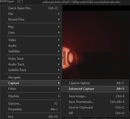
For screencapping i use kmplayer it’s free and very simple to use
not at all a necessary program, but i use freecommander instead of the regular windows file explorer as i find the dual panels very helpful when moving the frames around
Screencapping
there are many programs you can use to get the screencaps from a video, a lot are basically the same, some are better suited for particular video file types. kmplayer is a very simple program to use, but afaik the capture function only works on mkv. files (the only other file type i’ve tried is mp4, which plays but does not capture)
once you open your video file in kmplayer, we’re going to open the advanced capture window, found under capture→advanced capture, or alt+v
the window should look like this
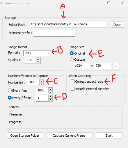
A-this is where all your screencaps will save to. i recommend making a specific folder for all your screencaps
B-make sure this is set to png for best quality
C-this is the number of screencaps you want to take, guesstimate how many you will need, keeping in mind that most videos are approx. 25 frames per second, and you should always cap a bit more than you think just in case
D-make sure “every/frame” is selected and set to 1
E-make sure “original” is selected, resizing will be done in photoshop
F-make sure “correct aspect ratio” is unselected
go to the part of the video you want to gif, and pause it just slightly before that part starts, then select ‘start’. the screencaps will start to save to the file, no need to play the video, and will automatically stop once it has capped the number of frames you have chosen
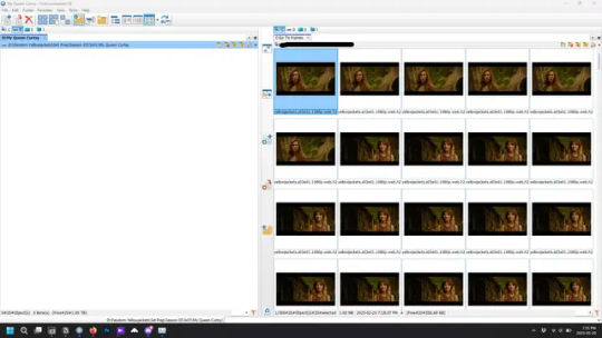
and here is how they look inside freecommander. i have already made a folder for this gifset, which is on the left. now you’re going to make a folder for each individual gif. i’ve decided this one will have four gifs, so create four folders (i just label them gif 01, gif 02, etc) and then move the frames for each gif into their respective folder
while you can always delete frames once the gif is made if it’s too big, i prefer to make sure i have the correct number of frames before i start. the gif limit on tumblr is 10mb, so it’s good to look at the scene/shots you’re giffing and decide approx. what dimensions your gif will be. full size gifs have a width of 540px and your choice of height. if you go for a square gif (540x540) you can usually fit 40-50 frames. if you’re planning for a smaller height (such as 540x400) you can usually fit more around 50-60 frames.
and here are the caps inside the folders. another reason i like freecommander is it’s ability to “multi-rename” files. the default file explorer can do so as well, but you have to do each folder individually and you can’t customize the new names as much. either way, i prefer to rename the files to each gif just to scratch my organization itch.
Introduction to Photoshop
NOTE: i have changed many of my keyboard shortcuts in photoshop to ones i prefer, so any you see listed in the menus of these screenshots are likely not the original shortcuts. you can see and change them yourself under edit→keyboard shortcuts

quick run-down of the photoshop interface. i have adjusted placement of some things from the default so this isn’t exactly how your photoshop will look when you open it, but everything is labelled, either on top or by hovering over the element. once you’re more familiar and have your process down i would recommend adjusting the workspace to suit your process.
A-your main tools and colour selector. almost all the tools have either several tools in one, or have alternate options which can be accessed by right-clicking the tool. you can also hover over each tool to get a pop-up with a quick explanation of the tool
B-additional “windows” such as history, properties, actions etc. can be opened from the window menu at the top and moved around with click-and-drag. history and properties should already be there by default, but probably on the right hand side instead. each window opens and closes with a click
C-the timeline window where the gif is made. the white square is a single frame of a gif, and on the row below is the play controls. this will not be there by default and will need to be opened from the window menu
D-adjustment layers for colouring
E-layers box. this is where the screencaps will show, along with adjustment layers, text layers, etc.
Opening Screencaps in Photoshop
go to file → open navigate to the folder for your first gif, select the first screencap, and check the image sequencing, and click open

a window will open labelled frame rate. set it to 23.976 and select ok
the screencaps will open in the timeline view, seen as the blue panel line at the bottom, and the screencaps are combined into video layer in the layer panel on the right.
Creating Frames
technically, you could go right into your cropping/resizing and sharpening from here, however if you do that directly then you have to keep the screencaps in the folders you have, otherwise if you save and re-open the gif it won’t move.
this next part should be made into an action.
at the top right of the timeline window, click four vertical lines to open the menu and select convert frames → flatten frames into clips. depending on how long the gif is, this can take a minute.
the layers panel should now look like this, each frame of the gif is now its own layer.
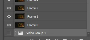
the very bottom layer will be the video group. this can be deleted as we’ve made the frames from it
in same timeline menu as before, right under “flatten frames into clips”, select “convert to frame animation” and the screen should now look like this. this will be the end of this action.
Cropping and Resizing
with widescreen footage, sometimes it’s just shorter than 1080p, but most of the time it will have the black bars on the top and bottom, and frustratingly, they’re not always the same size. it’s good to save the most common sizes as actions.
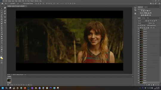
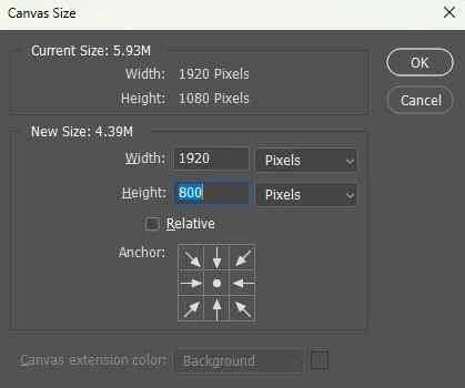
to find the size of the actual screen you turn on the rulers under view→rulers and check the height. then open your canvas size dialogue box under image→canvas size and change the height, making sure pixels are selected in the dropdown. yellowjackets is what i call “xtra wide” which is 800px. “normal” widescreen is 960px.
next we’re going to resize the caps. i also make actions for this, one for each potential gif size. open the image size dialogue box under image→image size and change the height of the image to your desired height plus 4 pixels. these extra pixels are to prevent a line at the top and/or bottom of your completed gif. now re-open the canvas size box, change the width to 540px, and the height to the desired, removing those 4 extra pixels. i have set this one to 540x540. this is where you would end the resizing action.
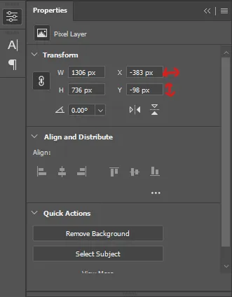
and as you can see she is off-screen. select the top layer, hold down shift and select the bottom layer to select them all, and with the move tool (the very top one) activated, click and drag to move it left to right as needed to centre the figure/s. as you move it a box will appear telling you how far you are moving it in any direction. make sure you are only moving it left or right, not up or down. to be certain of that, open the properties tab.
the y axis is your up/down, x is left/right. for this gif the y needs to stay at -98. you can also manually change the x axis number instead of dragging the image. also helpful for making sure multiple gifs of the same shot are all positioned the same.
the layer are currently ordered with the 1st at the top and the last at the bottom. with all layers still selected, go to layers→arrange→reverse. the last layer will be on top now. if there is movement in your gif, check if you need to alter the position again to make sure the movement properly centred. but once you are satisfied with the position, the layers should be in “reverse” position, of last layer on top. this is to ensure that the gif plays forwards.
Converting Gif
this should also be made into an action, going through sharpening process
in the timeline menu, select “make frames from layers”
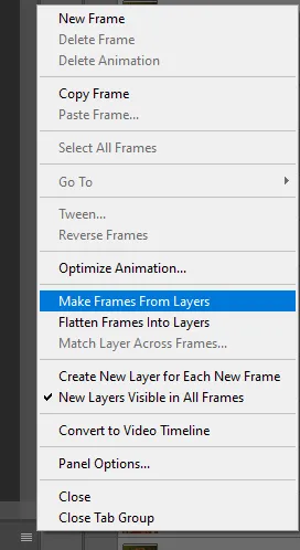
the frames are now populated in animation window. in timeline, click select all frames. go to any of the frames on the bottom and click the little arrow beneath it, select other, and enter 0.07 seconds. this is not a necessary step, as we will have to adjust the frame rate at the end, most likely to 0.05, but if we don’t change the frame rate here, then when we play the gif while working on it to check how it looks, it will play very fast.
in the same menu at the right of the timeline box, select “convert to video timeline”
then, making sure all layers in the panel on the right are selected, go to filter→convert for smart filters. this turns all the layers into a single smart object.
but if you look where i’ve circled, it says the gif is 99 frames long*, when in fact there are only 47. if you are making regular “scene” gifs, basic colouring and maybe a caption, this is fine and does not need to be fixed, it will play at the same speed. if you want to change it to display (approx.**) the correct number of frames, go to the timeline menu on the right, select “set timeline frame rate” and change it from 30 to 15
*if it does not list a frame number by 4 digits but instead says 5f, 10f, 15f, etc. go to the timeline menu on the right, select panel options, and change timeline units to “frame number”
**the reason why this is only approximate is because the actual frame rate is not a a whole number, so when changing the frame rate it isn’t a 1:1, and 47 frames becomes 50 frames. the extra frames are removed at the very end, but if you are not doing any edits that require working frame by frame, there’s no need to change the frame rate here at all
Sharpening
this is, as it sounds, making the gif look sharper. to start go to filter→sharpen→smart sharpen and this window opens. play around with the dials to see what each ones does. the below settings are good for most high quality footage.
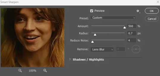
Amount-basically, how sharp do you want it
Radius-hard to explain, but this essentially sets how deep the lines of the sharpness are
Reduce Noise-smooths the pixels
once you click okay your single layer should look like this.
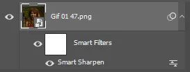
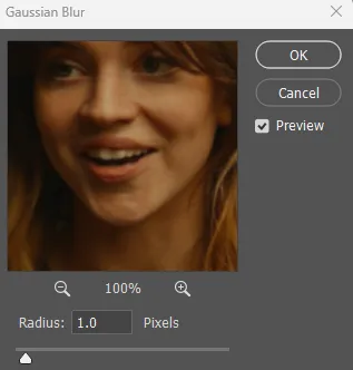
you’re going to then right click the layer and select duplicate layer. with the top layer selected, go to filters→blur→gaussian blur and set the radius to 1.0 pixels.
then change the opacity of the top layer to 10%. this is to essentially soften the sharpening a bit, as if it’s too sharp it can make the colouring wonky. this opacity level can also be changed depending on need.
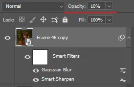
finally, select both layers, right click, and click “group from layers”. your gif is now fully made and sharpened.
Colouring
yeah. ran out of image space. but this is where you would do your colouring and add a caption or any other text.
Converting & Exporting
when all your colouring is done, you’re ready to start saving your gif. you can do it directly from your current file, but that means essentially losing your colouring, as all those layers will be merged together. i am someone who likes to save my psd’s (photoshop files), at least until i’ve posted the gifs, in case i need to fix something in the colouring. if you’d like to keep yours as well, open the history tab and select the first icon at the bottom “create new document from current state”. this will open a copy of the file in a new tab. save the original file and you can close it, continuing all work on the copy file.

select your all your layers, convert them into a smart object from filter->convert for smart filters, then follow the same steps from Creating Frames above. once you're back in frame animation, select Create Frames From Layers, and once again set the frame animation speed.
most people set the speed to 0.05. i personally set it to 0.05 or 0.06 depending on the length of the gif. check how it looks at 0.05, if it seems too fast, try 0.06.
now to save. go to file->export->save for web (legacy). the number is the lower left corner is your gif size, it needs to be under 10mb or else you'll have to delete some frames.

the right panel is your save options. the preset dropdown has some built-in settings, but you won't use them because (at least on my version) the presets only go up to 128 colours, instead of the full 256. the 3 i've highlighted in green are the only one's you'll adjust as needed. the settings below i use for i'd say 90% of my gifs. i'll sometimes change the adaptive dropdown to one of the other options, ocaissionaly the diffusion, and rarely the no transparency dither, but play around with them and see how they change the look of the gif.

when you're satisfied with the look of your gif, click save at the bottom right of the window.
voilà! you now have a gif.
Actions
this is your actions panel. the triangle on the left side is the button to open it. remember, if it's not already there, go to windows->actions to open it.
the buttons on the bottom, left to right, are stop recording, record action, play action, new folder, new action, and delete.

as you can see, i have different folders for my resizing, sharpening, captions, saving, and my 1 step (temporary) actions. to run an action is very simple; click the action, and click play.
to create an action, click the new action button, a box will pop up, give the action a name, and click record. the record button at the bottom of the action window will turn red. now perform all the steps you want it to record, and click stop recording. keep in mind it will record every single thing you do, including in other open files, so if the action you plan to record will have a lot of steps, it might help to write them down first.
to modify an action, select the step in the action above where you'd like the new step to be, hit record, perform the step, stop recording. select the step you'd like to delete, and click the delete button.
steps within the actions can be clicked and dragged, both within that action and moved to other actions. actions can also be moved between folders.
161 notes
·
View notes
Text
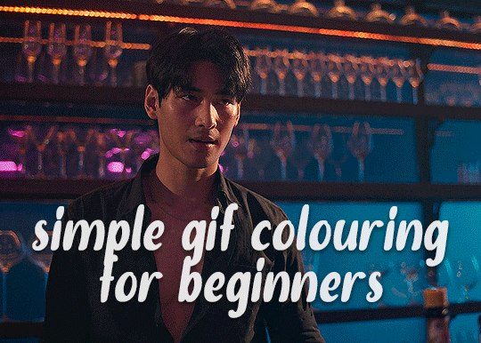
✨ Simple Gif Colouring for Beginners ✨
I wrote up my basic gif colouring process for a friend recently, but a couple of people here mentioned they'd also find it helpful! so, as requested, this is a beginner-friendly walkthrough of the way I colour my gifs :) it's aimed at brand new gif makers with no prior experience with photoshop or photo editing.
when I first started gif making I found colouring and photoshop in general suuuper daunting, so I've tried to simplify everything here as much as possible. hopefully this will be relatively easy to follow and not too intimidating!
a couple of things to begin with:
I'm only talking about colouring here - this is not a full gif making tutorial. I've linked to some of my favourites of those here!
I personally like to make bright, 'clean' looking gifs with vibrant but natural colours, so that is the style of colouring this tutorial is geared towards. most of gif colouring is subjective and about personal taste - the only thing that I'd say is possible to get wrong is skin tones, which I talk about a lot in this guide.
as I mostly gif Thai dramas, most of the advice is geared towards colouring for East Asian/South East Asian skin tones - but the techniques should be fairly universally applicable (and here are some tutorials that talk about gif colouring for other skin tones).
I'm not an expert! I'm not claiming this is the best or the only way to colour gifs - it's just how I do it.
this post is very image-heavy. if the images aren't loading (or the gifs are running slowly or cutting/looping weirdly), then try viewing the post in its own tab (rather than on the your dash or someone's blog) and refreshing the page.
okay, full walkthrough beneath the cut!
contents:
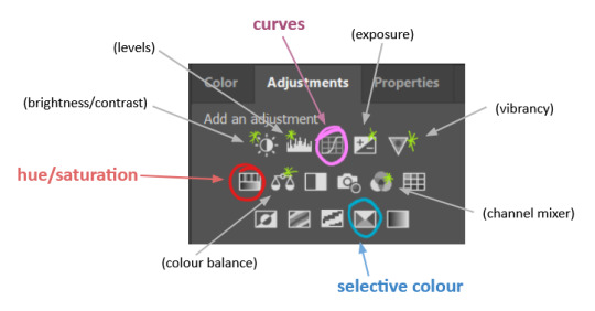
1. intro a. natural gif colouring goals b. very very basic colour theory 2. super simple colouring (the essentials) a. curves b. selective colour (and skin tone correction) c. hue/saturation d. saving and reusing colouring e. another simple colouring example 3. other adjustment layers a. brightness/contrast b. levels c. vibrance d. colour balance e. channel mixer 4. troubleshooting a. curves b. saturation 5. fin!
1. intro
the colouring part of gif making can be super overwhelming, especially if (like me when I first started!) you're completely new to photoshop and/or have no experience with colour theory or photo/video editing.
if you're opening photoshop and making gifs for the first time, I highly recommend getting used to making a few basic, uncoloured gifs to begin with. just to practice, rather than post anywhere (though you can always come back and colour them later if you want) - but it'll make the rest of the process much easier if you're already beginning to get used to working in timeline mode of photoshop. give yourself a bit of time to practice and get a feel for things like how many frames you tend to like in a gif, where you like to crop them for the best loop, what kind of aspect ratio you like etc* - so that you're not trying to navigate all of that for the first time on top of everything else!
* frames: for me between 60-90 frames is ideal, but 40-120 frames is the absolute min-max I'd personally use in a normal gifset loops: for the smoothest loops, try to avoid cutting someone off mid-movement or mid-word if possible. aspect ratio: for full-size (540px) gifs, I tend to go for either 8:5 (slightly 'skinnier' gifs), 7:5, or 5:4 (particularly big, thick gifs lmao)
✨ natural gif colouring goals
part of what can be so daunting about starting gif making is not knowing where to start or what you want to achieve. this is definitely something that gets easier with practice - the more gifs you make, the more you'll get a feel for what kind of look you like and the more instinctively you'll know how to get there. it also helps to see if any gif makers you like have made "before and after colouring" posts - these can help with getting a sense of the kinds of changes made through gif colouring. here's one I made!
in general, I like to make my gifs bright and 'clean' looking, with vibrant but natural colours. these are the things I'm usually hoping to achieve with colouring:
brighten dark scenes
remove muddy, yellowish lighting or filters
saturate colours
correct any skin lightening filters or overexposure
make lighting and colours as consistent as possible between gifs within a single gifset, especially gifsets featuring gifs from multiple scenes/episodes/videos
this guide is focusing on natural colouring, but of course there are many cool ways to make stylised/unnaturally coloured gifs. imo you'll need to master these basics first, but if you want to learn how to do things like change the background colour of gifs or use gradients or other cool effects, then @usergif's resource directory has loads of super helpful tutorials!
✨ very very basic colour theory
[disclaimer! I don't know shit about fuck. I do not study light or art. this is just an explanation that makes sense to me exclusively for the purposes of gif making.]
the primary colours for light/digital screens are red, blue, and green. having all three colours in equal measures neutralises them (represented by the white section in the middle of the diagram).
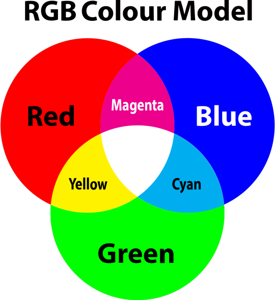
so to neutralise a colour within a gif, you need to add more of the colour(s) that are lacking.
in practice this usually means: the scene you want to gif is very yellow! yellow is made of red and green light, so to neutralise it you need to add more blue into your gif.
it can also mean the reverse: if you desaturate the yellow tones in a gif, it will look much more blue.
looking at the colour balance sliders on photoshop can make it easier to visualise:
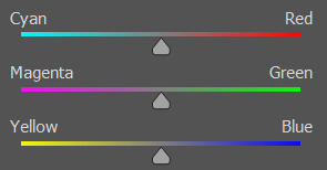
so making a gif more red also means making it less cyan.
removing green from a gif means adding magenta.
taking yellow out of a gif will make it more blue.
tl;dr:
neutralise yellows by adding blue (and vice versa)
neutralise reds by adding cyan (and vice versa)
neutralise green by adding magenta (and vice versa)
2. super simple colouring (the essentials)
starting with a nice sharpened gif in photoshop in timeline mode. (these are the sharpening settings I use!)
some scenes are much harder to colour than others - it helps to start out practising with scenes that are bright/well-lit and that don't have harsh unnaturally coloured lights/filters on. scenes with a lot of brown/orange also tend to be harder.
I usually save a base copy of my gif before I start colouring just in case I end up hating it, or find out later that it doesn't quite fit right into a set and need to redo it etc.
so here is my base gif!

it's an okay gif, but it has a bit of a yellow tint to it that I want to reduce.
colouring is easiest to do in adjustment layers, which can be found under layer -> new adjustment layer - or for me they are here:
there are lots of different types of adjustment layers that do lots of different things - but for me the absolute essentials for colouring are curves, selective colour, and hue/saturation.
I also use brightness/contrast, levels, exposure, vibrance, colour balance, and channel mixer sometimes, depending on the gif - but I use curves, selective colour, and hue/saturation on every single gif.
✨ curves layer
the first thing I always do is a curves layer. when you first open one it will look like this:
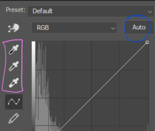
first I usually click the ‘auto’ button, just to see what happens. sometimes it makes a big difference (it usually brightens the gif a lot) - but on this gif it didn’t do much.
if it had made the gif look nicer then I would have kept it and added a second curves layer on top to do the rest of these steps.
the next step is selecting the white and black points with the little eyedropper tools.
the bottom eyedropper lets you pick a white point for the gif. click somewhere super light on the gif to see what happens - for this gif, I clicked on the lampshade on the left. if it looks weird, I just undo it and try somewhere else - it usually takes a few goes to find something that looks good.
here's what that did to the gif:

then I pick the top eyedropper and use it to pick a black point by clicking somewhere really dark, again playing around until I find a black point that looks good.
here's what the gif looks like after picking the white and black points:

this can take some experimenting, but you can make super easy drastic changes to your gif just with this. in this case, the curves layer took out a lot of that yellowy tint.
and this is what the curves graph looks like now:
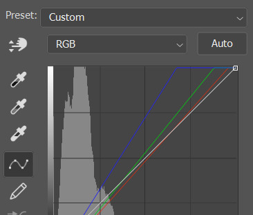
you can click and drag those lines to make further changes if you want - I usually leave them alone though. the colours of the lines indicate which colours have been changed in the gif - for example, you can see from that steep blue line on the graph that blue has been added to neutralise those yellows.
next I usually do another curves layer and just press the ‘auto’ button again to see what happens. usually it brightens the gif a bit more, which I like.
‼️if nothing is working: usually with a bit of fucking about a curves layer works well - but sometimes you can’t find a good white and black point anywhere, and instead your gif turns wacky colours and nothing looks good. this happens more often with very heavily colour tinted scenes :( the troubleshooting section at the end goes over some options, including starting with a levels layer instead.
✨ selective colour (and skin tone correction)
skin tones are made up of a mixture of yellow and red.
removing yellow (or adding blue or red) to a gif will make the skin-tones too red - and removing red (or adding cyan or yellow) to a gif will make the skin-tones too yellow.
adding blue to this gif with the curves layer took out the yellowy tint, which I wanted - but it also took the yellows out of Kim's skin tone, which I don’t want. so I need to put yellow back into the skin tones specifically - without putting it back into the rest of the gif.
selective colour layers let you select an individual colour and adjust the levels of other colours within that colour. you can change how yellow the green shades are, or how much cyan is in the blues, for example.
I need to add yellow back into the red tones to correct the skin tones on this gif. this is the case for most gifs in my experience - the vast majority of the time, unless a scene is very heavily tinted in another colour, a curves layer will add blue/remove yellow.
in the 'colors' dropdown, select the 'reds' section and drag the 'yellow' slider higher - this will add more yellow into just the red shades within the gif.

the amount of yellow you need to add back into the reds depends on how much yellow was taken out of the gif initially - I just play around with the slider until it looks right. if you're not sure, it helps to have some neutrally-coloured (not white-washed!) reference photos of the people in your gif to compare to.
here's the result. Kim's skin is a lot less pink toned and much more natural looking:
✨ hue/saturation
this adjustment layer lets you adjust the hue and saturation of the gif as a whole, and also of each colour individually.
I don't use the hue or lightness sliders unless I'm trying to do something more complicated with the colouring.
clicking the dropdown menu that says 'master' lets you edit the saturation of each colour individually. this is useful if your gif is still super tinted in one colour.
I thought the yellows on this gif were still slightly too bright, so I switched to the yellow channel and desaturated them slightly. (remember if you do this then you need to go back to selective colour and add more yellow into the red skin tones to balance out the desaturation!)
then I increased the 'master' saturation of all the colours to +5:
I usually find the right amount of saturation is somewhere between +5 and +12, but it depends on the gif.
‼️if the gif feels undersaturated, but the saturation slider isn't helping/is making the colours worse, try a vibrance layer instead.
done!
✨ saving and reusing colouring
you can copy and paste adjustment layers between gifs to make your colouring even across each of your gifs for one scene - so if you're making a set of multiple gifs of the same scene, or you think you might want to gif the same scene again in the future, you can save it as a psd so you can reuse the colouring again later.
each gif's colouring will then still need tweaking - different cameras/angles/shots of the same scene can still start out with slightly different colouring.
I recommend uploading the gifs as a draft post on tumblr so you can see what they all look like next to each other and catch any inconsistencies.
✨ another one! (speedrun!)
HI KEN!
the white point for the curves layer was in the window behind them.
the curves layer removes the muddy yellow tint, but again it makes their skin tones (especially Ken's) very red toned, which is adjusted by the selective colour layer.
3. other adjustment layers
imo many many gifs can be coloured really nicely with just those three adjustment layers, but some need different adjustments.
✨ brightness/contrast
pretty self explanatory!
I personally usually avoid using the 'brightness' slider because I rarely like the effect - I only tend to use the 'contrast' one.
the 'auto' button is sometimes useful though, especially if you’re struggling with the curves layer.
✨ levels

levels alters the white and black points of the gif, like curves - but unlike curves it doesn't also alter other colours.
use the sliders beneath the graph to alter how dark/light the gif is. you can slide the black slider further to the right to make the blacks darker, and the white slider to the left to make the whites lighter.
levels is a good place to start if your curves layer isn't working.
(I'm going to hit the image limit for this post lol so here are some screenshots of a table I made to demonstrate this rather than actual gifs. sorry!)

on both sides, I dragged the sliders up to where the big jumps are on the graph - this is usually a good place to start!
✨ vibrance
vibrance... makes the colours more vibrant. it's more subtle than saturation.
it's really helpful for gifs that feel grey. sometimes adjusting saturation just makes the greys kind of weirdly tinted, but a vibrance layer can fix that.
vibrance is much more subtle!
✨ colour balance
colour balance affects the overall balance of colours within a gif.
it's good for scenes with heavy tints.
I tend to stick to the 'midtones' dropdown, but you can also alter the colour balance within the shadows and highlights if you want.

✨ channel mixer
I avoided channel mixer for such a long time because it scared me. but it's great for scenes that are very heavily tinted in one colour.
basically, it works with the levels of red, green, and blue within a gif. you select an output colour and then play around with the levels of the colour you selected within each other colour.
kind of the reverse of selective colour?
so in the 'blue' channel, the levels of blue are at 100%, and the levels of red and green are at 0% - but you can impact how much blue is in the reds and greens and blues.
this tutorial explains it well - but imo the best way to get to grips with channel mixer is just to play around with it a bit (sorry)
(when I made this guide for my friend, I also made a slightly more complicated gif colouring walk-through that included using channel mixer. there isn't space to include it within this post, but if anyone is interested I could always upload it as an 'intermediate' gif colouring tutorial - lmk!)
4. troubleshooting
‼️curves
usually with a bit of fucking about a curves layer works well - but sometimes you can’t find a good white and black point anywhere, and instead your gif turns wacky colours and nothing looks good. this happens more often with very heavily colour tinted scenes :(
for example, with this base gif:
using many of the brightest points as a white point turn it wacky colours, like this:

yikes :(
some options for these cases:
try brightening the gif first with the 'auto' button on the curves layer or with a levels layer. having a brighter gif to start with can give you better options for picking a white point.
try finding an alternate, whiter/brighter white point. look for places the light reflects - on this gif, using the light on Porsche's cheekbone works well as the white point. it also helps to find places that would be white if the scene wasn't tinted - the lightest part of a white shirt is often a good place to start, for example.
skip the curves layer, and instead use a levels layer to alter your white/black points, and colour balance or channel mixer to balance the colours.
‼️over/undersaturation
if your gif (especially the skintones) is looking a little washed out or lifeless, it might be undersaturated. boost that saturation - or if that's not working, try a vibrance layer.
oversaturation is often easiest to spot in the mouths and ears of any people in a gif. if the mouths are looking unnaturally, vibrantly red, then you've gone too far with the saturation.
5. fin!
and done! I hope this was coherent helpful to somebody.
if there's anything that I've missed or that doesn't make sense pls feel free to shoot me an ask or a message and I'll do my best to help! I've also collated a bunch of additional reading/resources below.
happy gifmaking 🥰
✨ some links!
photoshop basics by @selenapastel
gifmaking for beginners by @hayaosmiyazaki
gifmaking guide for beginners by @saw-x
dreamy's gif tutorial by @scoupsy-remade (includes instructions on how to blur out burned-on subtitles or annoying video graphics)
beginner's guide to channel mixer by @aubrey-plaza
how to fix orange-washed characters by aubrey-plaza
colour correcting and fixing dark scenes by @kylos
does resampling matter? by usergif
how to put multiple gifs on one canvas by @fictionalheroine
watermarking using actions by @wonwooridul
resource directory by @usergif
#i got a couple of asks about this so i figured i'd type it up as a post#it's been sitting in my drafts for a while now though i'm so sorry omg.#i had to replace my laptop and it took me a while to get round to downloading photoshop on the new one#but i hope this is helpful!!#gif making#tutorial#photoshop tutorial#colouring tutorial#coloring tutorial#gif colouring#gif coloring#photoshop resources#gif tutorial#gif resources#userbunn#uservik#darcey.txt#darcey.gif#usergif
839 notes
·
View notes
Text
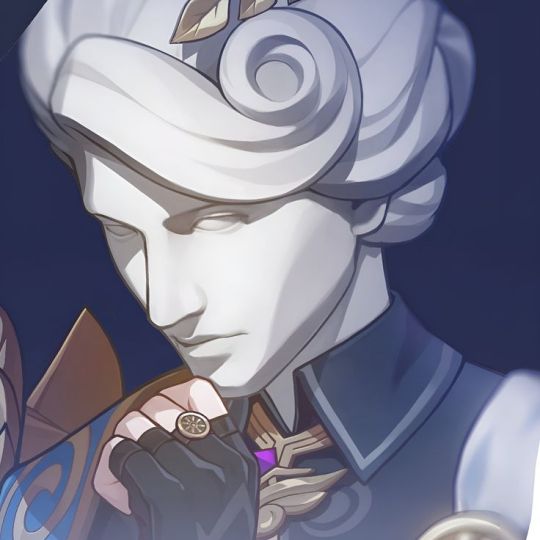
𝐃𝐑. 𝐑𝐀𝐓𝐈𝐎 𝐖𝐈𝐓𝐇 𝐆𝐄𝐍𝐈𝐔𝐒 𝐒𝐎𝐂𝐈𝐄𝐓𝐘!𝐑𝐄𝐀𝐃𝐄𝐑 👩🔬🔭

Ever since you accepted towards the genius society, you and veritas relationship has been strained for the past few days. Thinking it would all go back by giving him space. Until he breaks up with you...
( English is not my first language )
Playing - Goddess by laufey
You and veritas were both professors in the same university and that's how you both meet. Originally he was unbearable wearing that plaster on his face. Saying that he can't stand seeing the face of idiots. And he was referring to you.
But slowly sparks started to bloom. You are the only one that can match his intellectual aspect, and soon you both started to fall in love slowly.
One day he finally takes his plaster off and reveals his face.
Reader : I thought you said, you can't stand looking at idiots
Dr ratio : I don't, but as long as it's you. I wouldn't mind looking at you.
Soon you guys started to go for coffee together, bathing together, admiring the galaxy, enjoying and basking the presents of each other not minding the world because there's only one in each other's worlds.
During your first anniversary of dating, you gave him a two set custom made identical rubber duck of him as well as you, so when takes a bath. Rubber duck him and you will always be seen swimming together
You've always noticed his disappointment of not being accepted towards the genius society and you were there to comfort him and reassure him that he will always be enough.
It's only you and him in the sky, nothing could separate you guys. Even tho he or you are unbearable towards the other but deep inside you feel that there's love for the other one.
Many people said you guys are a perfect match. Everything was perfect until....
One day, you receive an invitation to join the genius society as its number 85# member. Everyone claps and congratulates you and when you look at him, he has this look of betrayal. When you guys are back at home, he stays in his office for the entire night leaving in the once warm bed.
During your congratulation party hosted by the university, many famous people as well as genius society members come to welcome the newest 85# member herta, ruan mei, screwllum, Stephen Lloyd, etc. during your official meeting with herta, veritas was with you, she didn't even acknowledge his existence only looking at you not gazing at him once. She asks for your cooperation towards building a project called simulation universe.
Even some IPC higher-ups arrive to celebrate. You see aventurine chatting with veritas in the corner, until one particular stone heart member introduces himself, his name was sugilite and he kisses your palm as well sending a wink. Suddenly someone sends a cough and it catches both of you guys attention. It was veritas. He said he has some business with you.
Before you can pull your arm away, veritas gently drags you away from the stone heart, and leads you to the balcony after asking are you okay he said he has some work to do and leave the party early.
By far your relationship has become strained, he always faces the other way of the bed without looking at you, he rarely talks to you only asking how are you or how's your day, he hesitated to touch you even when you wrap your arms around his waist he was hesitating whenever or not to touch you.
Recently since you are planning on working with herta on the simulation universe. Your office was told to be removed from the intelligence guild to the herta space station, for maximum work with herta on the simulation universe. Thinking you will only be gone for a few months and will be back to be with veritas.
Until he meets you in an isolated garden in the intelligence guild, he said you guys should break up. The world seems to stop, every thought of doubt comes to your mind and the only thing that comes out of your mouth is oh okay. You were just shocked and he leaves. After a few minutes after he left you sat at a bench and cried your hearts out.
Soon news about you guys breaking up quickly, but instead of crying your hearts out, you bury yourself into your work. Making sure everything is perfect unlike your love. But sometimes memories or reminders of him come towards your mind and make you stop mid-way. But soon you will continue to work. Also recently some gifts started to appear as well large amounts of credit donation towards your project with only one indication from who it was from, the secret admirer gave you jewelry made by the stone "sugilite".
When you try to ask for herta or ruan mei advice, they unfortunately said they are not experts in the fields of romance, but screwllum has been a big help, he will try to find ways to comfort you. You joke to him saying that he has more heart than a human being.
During your audience with nous the aeon themselves, you were allowed to ask any question but there were hundreds of questions but you settled towards one "why do people change" unfortunately you were unable to get a clear answer from the aeon.
You guys haven't been in contact for over one year. Until you meet him again when he visits the space station to inspect the simulation universe for the IPC.
#hsr#honkai star rail#hsr x reader#hsr headcanons#dr ratio x reader#dr ratio#screwllum#herta#ruan mei#sugilite hsr#stone hearts#aventurine mention#slight sugilite x reader#genius society#genius society!reader#not canon#angst#break up#miscommunication#misunderstandings
200 notes
·
View notes
Text
- Dr. Ratio nsfw alphabet -

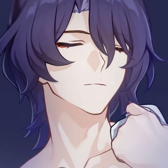
[Veritas Ratio x gn!reader] [Originally written with male reader in mind, but there is no mention of genitalia so I think it can work for any gender. I tried to provide both something for top and bottom reader so everyone can get something out of this. The reader is assumed to be in a long term relationship with Veritas]
A = Aftercare (What they’re like after sex)
Veritas can be really romantic. Initially, he doesn’t want either of you to pull away at all, just to nuzzle each other while your bodies stay intertwined in such an intimate fashion. Though if you really need it he’ll get up immediately to get you some water or snacks or really anything you need. Depending on the time of day you also might be expecting a bath, massages too.
B = Body part (Their favorite body part of theirs and also their partner’s)
Not a specific body part, but likes how proportional and symmetrical his body is as a whole. This guy is literally named Dr Ratio, leave me alone. On you though, I think he likes your face. Basic answer, but I really can't see it any other way. Definitely likes tracing the contours of your face when bored, studying it like an ancient sculpture. Oh, and I guess it's pretty hot how your face twists in pleasure while you're doing it.
C = Cum (Anything to do with cum basically)
If he's topping he likes to cum inside, otherwise cumming all over you is the second best. I feel like he wouldn't be a fan of cumming all over himself so if bottoming he'll like to do it either on the bed or if possible somewhere on you. My man also probably likes fruits, that's what gives his cum a sweet-ish taste, definitely not the sugary sweet kind though, the earthy natural sweet.
D = Dirty Secret (Pretty self explanatory, a dirty secret of theirs)
Definitely wants to do it in a very natural space, like a lake or something. That primal feeling, miles away from the rationality he exudes usually, really gets him going, but he's too afraid of someone walking in and ruining the moment to actually do it.
E = Experience (How experienced are they? Do they know what they’re doing?)
Virgin. Most of his life he probably had that kind of mindset that it's probably not worth it getting involved with someone else when he has everything he needs here. Still thinks that way, but now has you to keep his balls empty.
F = Favorite Position (This goes without saying.)
Loves lifting you off the ground, gotta show those muscles off. You just wrap around him so snugly and your faces are so close to each other it takes no effort just to start making out while pounding into you. Doesn't mind being lifted up himself either, especially if you're squeezing his ass while doing so, has and will attack your face with kisses. Other than that he likes anything where you two are face to face just in general.
G = Goofy (Are they more serious in the moment, or are they humorous, etc)
Very serious. Because of how little experience he has and how little people he has let see him this way he probably takes it as an extremely important bonding time so don't expect any jokes or laughs from him. Though he won't be mad if you're into the more casual kind, hell, he’ll let you try getting a laugh out of him.
H = Hair (How well groomed are they, does the carpet match the drapes, etc.)
Extremely well groomed. He's a neat freak, man loves baths and goes nuts when he sees a single dirty spot on his book, he's well capable of keeping himself clean. No hair out of place and all, if he even has any on his lower body.
I = Intimacy (How are they during the moment, romantic aspect…)
Said it already, but he takes sex very seriously. Slow and sensual is his thing. Makes it a whole ritual, lighting candles, maybe using some rose petals that he likes putting into his baths, massaging your back, everything to make you feel absolutely refreshed afterwards and ultimately make you feel closer to each other at the end.
J = Jack Off (Masturbation headcanon)
Doesn't do it that often, but when he does it's most likely during the morning shower. Though, unfortunately, if he has the displeasure of having another bath without his lover he might have to rub one out alone in there too.
K = Kink (One or more of their kinks)
Praise and degradation are a must with this man. Just state your preference, or do both if you’re into it, and he’ll already be running his mouth even before you start. Body worship is also a big thing for him. With his marble statues you can assume that he at least must love his own body and something tells me that he’ll be equally if not more obsessed with his lover's one.
L = Location (Favorite places to do the do)
Not into risky stuff, he has a reputation to keep. Maybe you can suck him off under his work desk with all the doors locked, but that's where it ends. Maybe bathhouses, but only if you have a reserved room or smth. Though when it comes to your private adobe nothing is off the table. The bed, bathtub, over the counter, against the wall, he isn't too picky.
M = Motivation (What turns them on, gets them going)
Not hard to get him in the mood. Loves how open you are with him and if you ask him nicely he’ll already feel motivated. Just seeing you so needy and wanting him makes him feel special, like he is the only one who you would run up to with something so intimate. Expect him to tease you about it though.
N = NO (Something they wouldn’t do, turn offs)
Anything that has to do with risking his reputation, no public sex or exhibitionism. Threesomes are also a no for him, not with someone he knows and definitely not with a stranger. He has made it clear that you're the only one who he wants to experience this kind of intimacy with.
O = Oral (Preference in giving or receiving, skill, etc.)
He was definitely a little weirded out at the start. Don't get me work, he knew how it's done and what it meant, he isn't that innocent, but the thought of actually doing just felt gross to him. Of course, that's where you came(in more ways than one) in. Unfortunately for you, he is a fast learner. Now oral is his favorite way to open up a long night session with you. It doesn't take much preparation, so expect him to wake you up using his mouth.
P = Pace (Are they fast and rough? Slow and sensual? etc.)
My guy likes to take his time. He sees sex like he sees his baths, a way to cleanse the body of all its filth, so sometimes it really does feel like you're making love instead of having sex. He just finds himself dissatisfied with the fast and rough methods that just dry him out.
Q = Quickie (Their opinions on quickies rather than proper sex, how often, etc.)
It might seem surprising after I talked so much about him taking his time, but I don't think he actually minds quickies that much. Though he doesn't like making a routine out of them, sure a quickie is good once in a while to relieve some stress, but he doesn't want it to spoil sex for him entirely. He likes them most during the morning showers.
R = Risk (Are they game to experiment, do they take risks, etc.)
While he doesn't want to take any risks with his reputation, he certainly doesn't mind doing risky stuff behind closed doors. How are you supposed to see the results without any experimentation?
S = Stamina (How many rounds can they go for, how long do they last…)
Oh, he can go for plenty. My man is beefy and all that muscle isn't just for show. The thing is, one round for him already takes a while so expect to be spent and thoroughly satisfied. Not that he doesn't mind going again, he's just wondering if you can keep up.
T = Toy (Do they own toys? Do they use them? On a partner or themselves?)
He doesn't have a lot of toys but he definitely doesn't mind using some on you or you using some on him. Keep in mind though, if you allow him he can get pretty ruthless with them.
U = Unfair (how much they like to tease)
Definitely a huge tease, refuse to believe otherwise. Going to go further into it in a moment, but my guy is talkative. Nothing you do will go unnoticed and everything you do will be commented on. Also teasing with his actions. That one extra button left unbuttoned was specifically left there to cause a reaction from you. Will deny you orgasm if you're into that. He loves the power all the things listed above give him and the feeling of being desired really gets him going. You could inflate his ego even more or even try to shut that pretty mouth yourself.
V = Volume (How loud they are, what sounds they make)
I don't know if this is a hot take but I think that he might get more vocal once he is with someone he trusts. Definitely won't hide his voice from you when he sees you getting more aroused, might as well use it to tease you. Oh, and he's definitely a talkative one. Expect lots of comments between those sweet groans and moans of his.
W = Wild Card (Get a random headcanon for the character of your choice)
Massages are his favorite form of foreplay. Be it during baths with all his fancy soaps and oils or in bed after an exhausting day, it's a very intimate, but not necessarily sexual, way to relax the body and he needs your body to be relaxed if he wants to proceed with more intense stuff. Doesn't mind receiving a massage either, though he is mostly the one giving them he can't deny himself the pleasure of your hands worshiping his muscles.
X = X-Ray (Let’s see what’s going on in those pants, picture or words)
He is a big man, what do you expect? No, but for real, it matches his size. Every part of him is proportional. Always cleanly shaven and well groomed and only has a few subtly visible veins just below the head. Cut and colored with a pinkish blush on the very tip.
Y = Yearning (How high is their sex drive?)
Not that high. He keeps himself intellectually occupied most of the time. Though he can get turned on pretty quickly when his partner initiates.
Z = ZZZ (… how quickly they fall asleep afterwards)
I imagine most of your steamy encounters happen at the end of the day so he already feels pretty drained. That orgasm is probably the last push for him before going to bed, assuming that all of your needs are taken care of first.
[Just something quick to deliver while I'm working on something bigger to keep you all well fed]
#hsr x male reader#hsr x reader#hsr#honkai star rail#dr ratio x male reader#dr ratio x reader#dr ratio x amab reader#veritas ratio x reader#veritas ratio x male reader#veritas ratio x amab reader#own writing#archive
588 notes
·
View notes
Text
The thing about growing up during the shift from CRTs to flat-screens with all that entails (VHS to DVD, low res to HD, full screen to widescreen, etc) is that I basically only experienced children's media in the older formats. Like intellectually I understand that, say, The Godfather has a VHS release. But it doesn't compute. Like, VHS? Nonono that's for Barney, VeggieTales, and old Barbie movies. CRTs emit a soft warm fuzzy glow like a blanket at bedtime. VHS tapes are big plastic and chunky like toys. My clumsy young hands could operate them at my own discretion because they required less precision than the sleek mature disc, which would (and in my case did) smudge if not handled delicately. 4:3 is the baby aspect ratio because it's smaller and less mature than 16:9. None of these feelings are based in fact but they are how I feel.
104 notes
·
View notes