#and I know they come in many colours
Explore tagged Tumblr posts
Text
…you know those funky coloured glasses they give dyslexic kids to make reading easier in the long run? Yknow this:

….

………..
….so
#kind of a crack HC#because why tf are bud glasses green??#my brother is dyslexic and his glasses were purple#so I know this is real and works fairly well for some people#dyslexia#and I know they come in many colours#like yellow purple green red orange#those are pretty normal dyslexia colours#dyslexic#saiki kusuo#saiki k#saiki kusuo no ψ nan#the disasterous life of saiki k#saiki#saiki kusuo no psi nan#saiki k reawakened#kusuo saiki#the disastrous life of saiki k.
969 notes
·
View notes
Text
I’ve been obsessed with the Olympics for the past week, and obsessed with Dick Grayson for longer, so here’s the crossover we all deserve.

Plus, gorgeous sweaty acrobat in gymnastics poses? Only positives.
#I know Bludhaven’s not a country don’t come at me#i wanted him in Nightwing colours#this was a compromise#plus look how pretty he looks#you can’t blame me#he looks good in blue and black what can I say#so good#someone help me I’m so bisexual#acrobat dick grayson#dick grayson fanart#dick grayson#nightwing fanart#nightwing#dc robin#olympics#olympics 2024#dc x Olympics#because we all know Dick would kill it at the Olympics if he wanted to#how many jobs has that man had#gold medal at the Olympics is just one more on the list
12K notes
·
View notes
Text


jungkook x blue 💙 [ cr: 0613data, namuspromised, @jung-koook ]
#btsedit#btsgif#jungkookedit#dailybts#usersky#userpat#userines#heygingko#userdimple#usersevn#raplineuser#annietrack#uservans#rjshope#useremmeline#usermaggie#anialook#usermizuoka#jungkook#*mine#yes this is a birthday gift to myself#why shouldn't i join in on the fun y'know#this truly was a labour of love because what possessed me to make a 30 gif comp fr#apparently i don't know when to stop lol#also don't come for me you colour this many different pieces of content and there's sure to be inconsistencies#and yes i tried to arrange it from light to dark (as best as i could anyway)#i digress i'm really happy with how this came out#and i can't wait to get to the next instalment <3
577 notes
·
View notes
Text
I love you smile lines and worry lines and grey and white hair and wrinkles and purple spiderweb veins and the process of aging and living in a body that is standing the test of times. I love you experiences that make you wiser and stories that make you laugh, and every little process that happens to get to the point where you have so many memories because you have the fortune to be here and be so radiant
#positivity#pro aging#also i hate you 'anti aging' scams that capitalize on fear of aging. death by 1000000 papercuts for ye#saw a hair video where they restored the salt-and-pepper colour in an older clients hair and it looked SO GOOD at the end#i love when people throw in the towel and embrace their aging however that looks#it isn't productive to shame people who are ashamed of aging and i just want to. celebrate aging#in a world that simultaneously venerates youth and adulthood and hates BOTH you need to find some sense of freedom#as a Young Adult(tm) please please PLEASE older folks seeing this/following me know that i look up to you#older folks i need you to know that your worth NEVER diminished when you added a new number on your birthday cake#and your body and mind and soul NEVER lost worth because it started to creak a little at the joints#and i might be wrong about this because i'm still young but it can be SO tempted to miss your youth when you feel like...#...you've somehow LOST part of yourself by growing older. and so much of aging is about change and some things don't stay the same...#...and that IS scary and i will never once fault somebody for that. but please don't fall into the trap that because you've aged that...#...you somehow have forever lost fundamental pieces of Who You Are and you could never come back from that...#...for your own sake and sanity you deserve to find comfort and solice and understanding in who you still are...#...because you are still - at the core - the same. you can never take this away from yourself#and i know this might ring hollow because i just don't get what it's like to be older#but i have looked at my elders and felt awe at their age and their experiences#and i know what that is like and it's awesome. i just wish more older people knew that so many of us look at you with awe...#...and - if you can believe it - some of us ENVY your age or experiences or even body#i'm watching an 'older' content creator (older by internet standards 🙄) and i envy him for how eventful his life was#i envy that he experienced a different world - one that i have only heard about from my dad because i was too young to remember it#and i admire this person for their wisdom and thoughts because they've come from his experiences living in a Different World#it's that type of stuff that makes me unafraid to keep on living#inspired by following somebody like. twice my age posting about their excitement abiut growing older and !!!!!!! YEAHHHHHH#didn't realize they were closer to my dad's age but that's so cool???????????
253 notes
·
View notes
Text

Happy Birthday Kalego Naberius [14/2]
#mairimashita! iruma kun#welcome to demon school iruma kun#mairuma#kalego naberius#M!ik#wtdsik#My colourings#I think I got some curse when colouring either one of the naberius brothers#Cuz why every time I do them I feel so unsatisfied with the end product skosldldkkdk#Anyways I didn't colour in the lines like I usually do cuz it wasn't coming out right so I forgo it#So if it looks unfinished in comparison to other stuff I did. That why#Also I know technically it camui BUT I wanted do pathetic kalego so bad for his bday 🫶💐#But I know now why not many colour this panel it was somehow simple but also hellish
33 notes
·
View notes
Text

Happy holidays! Here’s Jonathan in the most devastating au you can put him in: It’s A Wonderful Life au
Colour version↓

#this is the only au I’ve been thinking about for the past like 4-5 days#all credit goes to my dear moot Dearie (@jonathanbyersphd) for coming up with this au :]#she is right it’s TOO perfect of an au for him and by proxy jancy#I put the black and white version first because the movie is originally like that#colour is a bonus (even if that one technically came first)#(well for my art specifically)#three of these are doodles I had on my st digital sketchbook file that I just took and coloured in (they’re all the Jonathan doodles btw)#anyways I’m going to continue thinking about George Bailey!Jonathan#I’m sorry once again for the god knows how many time brining blorbo angst this Thursday afternoon#stranger things#jonathan byers#nancy wheeler#jancy
31 notes
·
View notes
Text
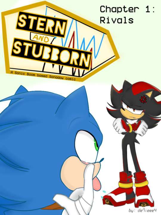
#I thought of making my own actual Sonadow comic based on Sonic Boom with chapters and stuff#that'll take some time tho the first pages might only be finished next year#If I plan on not colouring the panels it might come out earlier but idk#i don't even know why Sonic Boom tbh but I feel like there isn't enough out#this post shows the cover of the 1st chapter#each chapter gets different covers#how many chapters?..haven't decided yet#Sonadow#shadow the hedgehog#sonic the hedgehog#sonic boom#sonic comics
66 notes
·
View notes
Text

I guess I tried....
#posting after a month because damn it !#call it 'admiration' if you want...#and now I'll just go hide in a corner I guess#will I regret this ? probably#but there sometimes comes a time when one has to go 'fine I'll do it myself !'#that was it I guess :')#Jafar#Hakim#Jafar x Hakim#just my random drawings#it's been two years now... I had to do something for this ship#please take into consideration there's been years that I only draw rarely and I don't know why I even decided to do this#I know I am utterly terrible with colouring specially colour pencils :'')#also yeah I know there are so many things wrong with Hakim's clothes I might do better next time I guess :')#plus messed it up a bit with the scan and I absolutely hate it but anyway :/
13 notes
·
View notes
Text

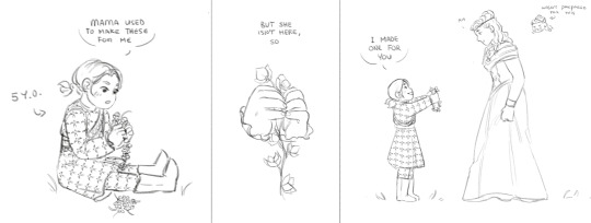
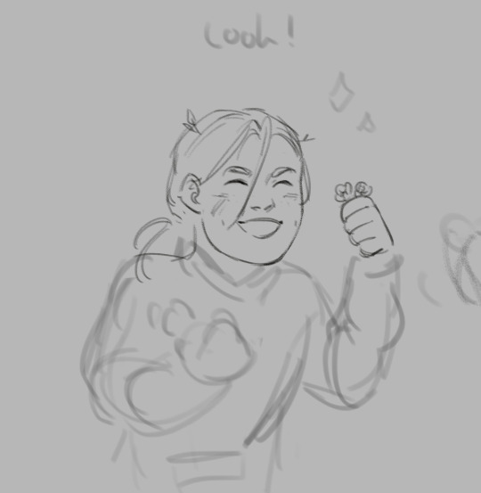
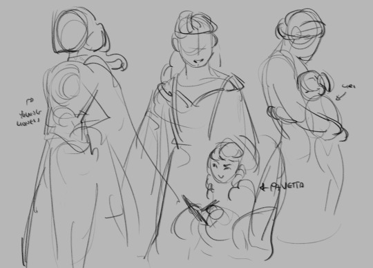
little request for @bookcalanthedaily of her calanthe & ciri (+ an additional tiny comic), thank you for your patience! ✨
sketches + process shot underneath the cut!

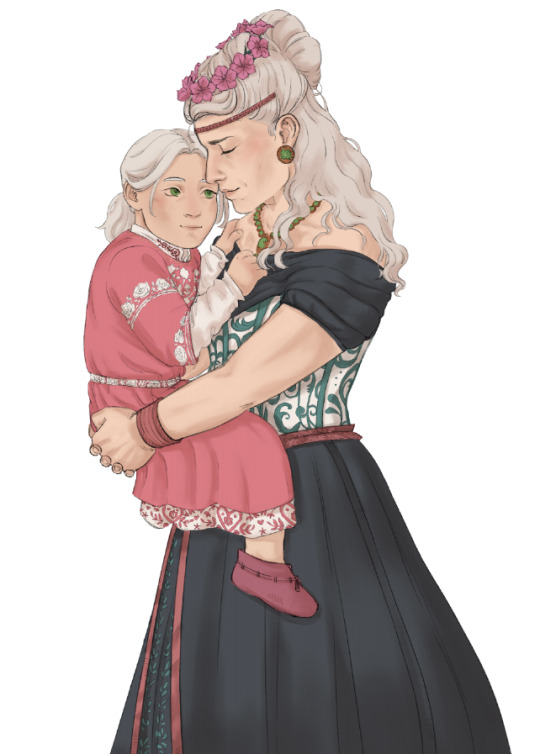
#the flowercrown is supposed to be made out of feainnewedd flowers but i took a lot of artistic liberties with the colours dshfjh#although they seem to potentially be based off of African Violets; which do come in pink!#the witcher#the witcher books#(kind of?)#the witcher 3#ciri#cirilla fiona elen riannon#calanthe#queen calanthe#my art#i redrew this piece (& parts of it) so many times djkfsf also thank you to my bf for his patience with me while i was working on this LMAO#me: ah yes. a quick little sketch request; my brain: okay now what if we colour it through a method you're not used to#and also activate perfectionistic tendencies you weren't even aware of#me: sure! i don't see how this could go wrong :)#[cue a montage of multiple weeks passing by]#i had fun with it though!#will tumblr let this post appear in the tags? who knows! we'll see!#fanart
275 notes
·
View notes
Text
As I said I would, I drew my oc with yours my beloved @clawdouobit
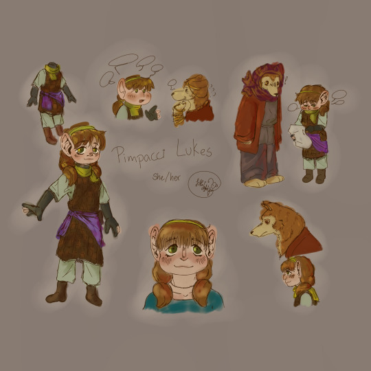
My pretty girl likes to infodump your pretty girl about the smallest things. She's like a reel, talks a lot but most of it is meaningless.
Close ups and more info because I can't shut up ehtier under the cut <3
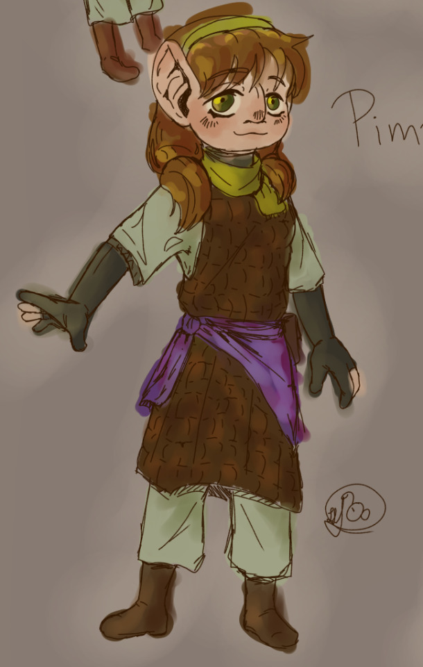
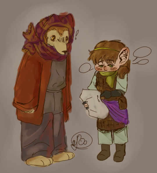

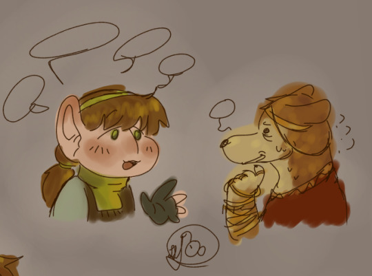
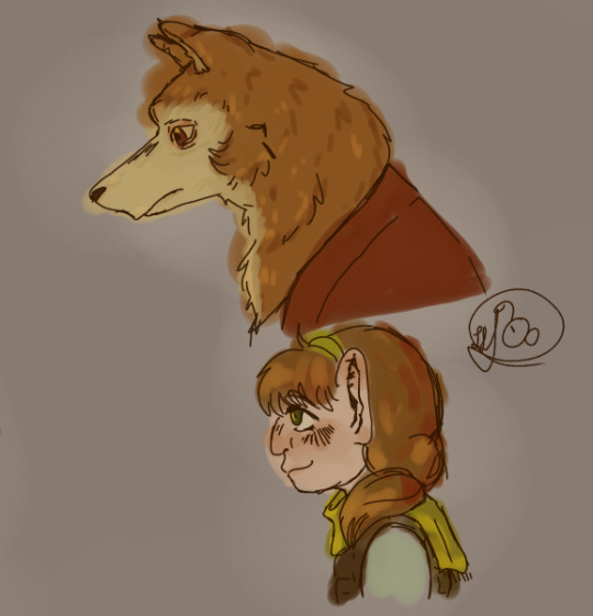
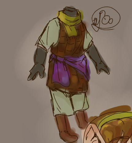
20 years old and engaged to a half-foot. They're waiting to gain some more money to get married and leave the dungeon. Note: they're best friends but idk if what they have going on is truly romantic love or just a very good friendship.
Quite skilled at upper levels, but wouldn't go to lesser levels. She isn't skilled enough to make her party survive there.
Her race is a mix between gnome and half-foot. Idk if that's possible but I don't think it's not.
If I had to guess, she's 13/14 on half-foot standars. It's unclear whether she's an adult or not, but she's preety mature most of the time. Most.
Flushed cheeks always. Also very pale.
She's 109 cms tall, a lot more than avarage on haflings, but lot less than avarage on gnomes. Since she hangs out mostly with haflings, she's a giant woman. This gives her some problems with traps so her BMI is 18 due to diet.
Fwens with Shahad. Who knows why tho. We gotta figure that out ;}
#dungeon meshi#dunmeshi#delicious in dungeon#dunmeshi oc#dungeon meshi oc#never thought i'd make an oc for a fandom again but here am i#shahad is so cool#she wears pretty jewlery#i love her design so much#but i hate drawing kobolds ooouugh i struggled but did it :')#they're so fwens#the divorced traumatized kobold and the little to-be braid she found while dungeoning#pimpacci can shut up when asked. for about 10 minutes at least.#i have 2 other dunmeshi ocs i made alongside her but i think Shaad would get along better with Pimpacci#because she's really kind and caring. but doesnt realizes her talking can get tyring/annoying.#while making her i noticed all haflings cover their necks on the dungeon. i wonder why. i gave her a scarf to match the thing#shaad#pimpacci lukes#i had so many trouble coming up with her name#i had to make it sound like two names mended together that don't tire the tounge because its too long to say it..#she gets really annoyed when someone calls her “Pim” because of cultural things.#also. she's often infintilized. many hafling don't know she's a mixed race. so she just looks taller and more childish than others her age#it doesn't bother her. she doesn't realizes most of the time. she doesnt infintilizes herself on purpose. she's just younger on perspective#yay#i need shahad and pim to have late night hours talks. it would be so interesting..#i should be asleep lol#my oc#my art#i've made a mistake on shahad eye colour... too late but... grr ...
31 notes
·
View notes
Text
one of my crucifix orchids is gonna bloom... i have no idea what colour it is so it will be a fun surprise. i stole all my crucifix orchids from ppls gardens & i picked keikis without flowers on them so i'm hoping i have one of each colour i saw
#🎇#i only know one is orange bc it did have flowers#and i definitely have a few dupes bc i have. many crucifix orchids#and the only colours ive seen are orange purple and red#i know they come in other colours i just haven't seen then
7 notes
·
View notes
Text
oh hello there

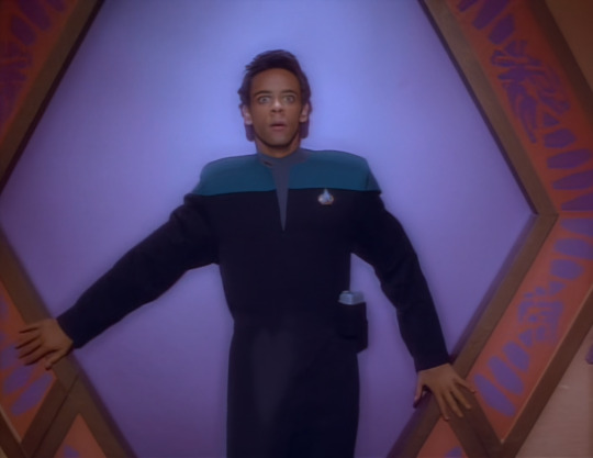
#not saying that i'm coming back here but i'm also not NOT saying it I GUESS...#i dont know if i trust myself to be healthy about it is the problem but alas#i may or may not be working on huge gifset that would be ridiculous not to post. in a sunk costs fallacy type of way#considering how many hours of work I've already put into it...#(picture me in shrimp position at my computer hand colouring every frame of every gif and by hand colouring i mean layer masking with#my mouse and zoomed in 800% djskfsjf this is fine i promise 🤡)#oh and I've been rewatching a lot of voyager while working on this (like everyone and their mother i got pulled back into the fold#by prodigy in such a big way lol but I'm not complaining) so there might be some gifs also?? in fact i have 1 set that i think is funny#so maybe i'll post that soon-ish? as a little treat...while i continue working on the big one...#well. mutuals and other followers who are still here after i abandonded ship...hi i love you! :)
17 notes
·
View notes
Text
ALSO since it's winter and my innate need to be a nerd about music and browse music stores for new beautiful guitars I can never afford (3k custom order aahahahahahahah kill me cuz thats still cheap) is back I've been thinking.
Nr 1:
Gort strikes me as an organ girlie. But at the same time it would suit Durge much much more. Raphael lost his organ rights by being such a lenient little man at times. Like you play that instrument with your whole ass body. Big pipe organs are literally part of a house foundation. It's a massive and breathtaking instrument that's just absolutely insane and the tunes it produces are godly. It's also so inventive like, bro the instrument is a fucking house. Oppressive as hell. Thats Gort. That's just the mecha megalomaniac. But then its also positively divine and often related to faith. And its a lot of harmonies and shit mixed together like the Bhaalspawn r and it's rly just a blood sweat and tears kinda thing and it's just giving Durge vibes yk?
Nr 2:
This is probably exclusive to me but uh, modern Band AU whatever would have Gort play an e guitar and be capable of absolutely insane riffs and also probably frontman if we're honest while Durge plays classical guitar. And I have my reasons for believing that cuz not only r guitars awesome and very versatile instruments that can produce both melodies and chords by themselves the e guitar / classic mix also has this rly weird just durgetash dynamic. There are harmonies but there's also chaos and both are capable of being gentle and soft in their own ways but they're also played fundamentally different and usually take a different role but both are still very capable of breathtaking solos and I'm just being a fucking nerd on main rn and will shut up before I pull out my music theory power point.
#my only wish in life is to get to play a pipe organ#literally if i ever get to use one of those many pedals i can die happily#its such a fascinating and beautiful instrument#its so soft but also imposing and i just love it#also I'm not joking i spent way too much time looking at guitars and their accessories rn#somebody pls stop me#my babe just turned 10 and she's still in peak condition and i dont need another one#thats how it starts#thats how you end up with 10 of em#i did end up finding a pretty sweet black one with a golden ornamental design on the body#and its affordable too#but the necks colour is throwing me off and apparently the sound is shit....#and the one i know sounds absolutely wonderful sadly simply doesnt come with nice designs#nd customising a guitar is not smth i'd look forward too#esp the body#since that can fuck up the sound#like i loathe the design of my babe but also shes treated like a princess#im not even touching the strings myself and instead dragging her to a manufacturer#also weird fun fact about classic guitarists#they'll have long nails on one hand and short nails on the other#it makes finger picking and gripping a lot easier#okay i'll shut up now im becoming too much of a nerd
10 notes
·
View notes
Text
i’ve stopped expecting interesting animation from bones. the star and stripe fight is cool but like every other fight/moment in mha, it’s only cool bc the source material itself is cool; bones does nothing to elevate the manga
they rarely try to experiment with colour and style. i saw so many colourings of the moment star and stripe made a giant version of herself out of the air; people made her look like a cosmos, like it reflected and bent the sky around her, doing so many inventive things and for the anime to just make her an outline against that godforsaken sky? i’m disappointed
but people will take me saying i’m disappointed and spin it to me saying the fight was bad. it wasn’t, just like most fights and moments in the anime aren’t bad but that’s all bc horikoshi knows how to draw. they never do anything beyond that; they never try and adapt it. whether it’s bc of time, direction, budget, or what have you, they will never do something truly inventive with their colouring
i’ve said this before and i’ll say it again, it’s not just that the sky is blue; it’s what the blue sky represents and that is an unwillingness to broaden their colour palette or atmosphere to support the changes in the tone of the story. the story isn’t just “will midoriya get into his dream high school and achieve his dream job?” it’s child abuse and societal systems and their dysfunctions, it’s racism and morality and is it right to try and save someone who’s determined to destroy the world just bc they are also a victim?
look at the finale of atla, a show that mirrors the narrative tone of mha; it starts out bright and colourful and vibrant to match the happy and small stakes nature of the story and as the tone of the story changes, the environment changes to reflect that. the siege of the north pole? everything goes blood red when the moon spirit is threatened, then goes completely desaturated when it is killed with only fire bending having any colour. the day of black sun? uses a solar eclipse to change the lighting. the entire sozin’s comet fight? has red skies and lighting to show the threat
bones abject refusal to change anything about the art itself is a detriment to horikoshi’s complex narrative
#its not just about the colour of the sky#lets get that straight#we’re doing some real the curtains arent just blue shit here so keep up#colour and lighting are a very deliberate choice in any visual medium#and choosing to ignore it and not take advantage of it will just be a detriment to whatever youre creating#i see so many colourings of manga panels where they do insane things and really do next level colourings#and to then see the anime that has so much money and talent behind it just for it to be flat and emotionless with no atmosphere?#it sucks#when you can pick out a scene from something called the WAR ARC and it looks the same as the sports festival arc? come on#and i know theres more to making a scene out of a panel then there is to colouring one#but when these indie creators doing visually gorgeous colourings its hard not to feel like the anime is lacking#and when your colours are flat and your camera angles are uninteresting then what is the point of an anime adaptation#even if they do change things here and there like the endeavour v hood fight or all might v afo#it doesnt change that the majority of the time its the exact same#and when the storm eventually comes round? that wont satisfy me either enless they change the colors of everything as well to be desaturate#and fully embrace the new atmosphere that horikoshi has very deliberately drawn#class a v deku is the one time they did a sustained colour difference and theres a reason that went over so well#coming out of my cage and ive been doing just fine.txt#go beyond plus ultra#mha#bnha#my hero academia#boku no hero academia#star and stripe#shigaraki tomura#izuku midoriya#bakugou katsuki#save post
21 notes
·
View notes
Text
--
#Mmmmmmmmmmmmmmmmmmmmmhhhhhhhhhhhhhhhhhhhhh#Mmmmmhhh#I had to step away and do something very quick after watching the episode so now I'm afraid I forgot all of it lol#Okay thoughts:#I'm afraid I'll keep saying this every time. Do not. Give me. An amv opening. Don't do that. Postpone your airing date. I don't care#I feel like I wasn't as pissed with it when they did that for s3 but it's probably a case of the s3 opening at least looked somewhat–#better (??) + you can make a mistake once but don't think I will let it slip a second time#Other than that... To be fair this episode was animated fairly well. I think you can really notice a big quality drop after the–#Ranpo-realizing-who-Kamui-is sequence but overall it's more than okay.#The colours of the ship irk me a little but to be fair I never thought colours were b/sd anime strong point...#This episode was sooooooo political in so many ways I could literally talk about it for hours#(don't test me I'm not kidding. Talking about politics in anime for hours is something I've done in the past and will do in the future.)#(Then again I study/think/breathe politics pretty much 24/7 so is that really surprising... )#I need to write an essay on Fukuchi's speech alone. The public speech communication techniques [redacted Italian politics comment].#The way he's welcomed [redacted eu parliament comment]. Unfortunately I don't have time for it but breaking it down very quickly#1. Suggesting to unify defences worldwide is INSANE. No one would ever take it. Probably going to be cynical here but there's one (1) thing#states care about and it's the independence of their own sovereignty (that is: no one has the right to come and tell what must be done–#within one's borders). Eu has been trying to do exactly that (unify defences) for decades to no avail. Nato is on the brink of crumbling–#down. It's just... Such a distant perspective from how the world works right now? Idk.#Which brings me to 2. Even if it's deeply inconsistent with how world politics work the bsd un perspective is still very coherent with–#a latter thesis brought up in the manga that is “countriest tend to merge and come together” which is. Very anti-historical if you ask me–#but idk. Beautiful to imagine I suppose.#What else uhm... I liked the drawings this episode... Even Atsushi was back being pretty at some points... (Generally not really a fan of–#what the style in the later seasons came to be). Also 55 Minutes reference ‼‼‼#I like Fukuchi's character so much......... I love idealist characters... And the inherent loneliness... The longing... The yearning!!!!!!#I love him so. Oh and I LOVED Akutagawa. I thought his entrance wouldn't have impacted me after all this time (and after knowing–#what episode 3 will be lol). And yet it was such an emotional moment!!!! What do you mean Atsushi is scared to be alone and Akutagawa is–#coming for him!!!!!! I'm crying all my tears. And Akutagawa was so cool in the end!!! By heart was beating so fast!!!!!#It's the etheral blurred light...#The way he still manages to come off so cool despite being inherently pathetic is nothing short to miraculous
7 notes
·
View notes
Text
@katkastrofa, circa 40-ish hours ago: Hey, what if our newest bunch of OCs adopted a baby from one of the other brothel girls who knew she couldn’t afford to raise one? That would make for some fun shenanigans :D
Me, with a notoriously non existent sleep schedule, instinct of self preservation or concern for my poor wrist: Alright, bet. Watch how fast I can make you fall in love with this hypothetical baby >:)

Daneli as a gentle and loving caretaker-turned-adoptive-mother is something that can be So Personal, actually, and originally I was going to leave it at this quick sketch, but then I got carried away thinking about what this child will grow up to be like raised by this little gang of misfits, so…

Here she is!! A little older and so, so beautiful, I need more of her in my life immediately, she’s way too precious
And, because I wouldn’t be me if I didn’t also add a sapphic element to this absolute cinnamon roll, a small crack ship that I’m only half serious about for when she’s a little older still:

All in all, we may be getting impossibly far from canon, but I for one already cannot get enough of sweet darling Kumisai <3
(I fully drew three pieces from scratch in 9 hours I cannot feel my brain or my hands anymore send help)
#my art#artists on tumblr#the legend of korra#original characters#jinora#wow. nia drew a canon character? what is this?? who was I replaced by???#but joking aside. a small explanation for this crack ship#originally it was me editing my timeline and realising that Kumisai would be around 14/15 during book 4. the same age as Jinora#so my mind immediately went 👀👀👀 and I decided to go for it#since in sotrl I sorta implied Jinora had a gay awakening by watching Suiren. so.. why not go all out and make her another baby queer?#no offence to Kai. what they had was rather cute tbh. but it felt kinda out of nowhere and just added for the sake of parental drama#plus she was a young girl meeting someone her age for the first time. of course she got a crush#doesn’t mean she has to stick with it you know?#anyway. as for how they would meet. Midori could introduce them :D#Kumisai is Daneli’s daughter. who’s a friend of Summiya’s. who’s Zaheer’s sister. who’s Midori’s uncle. who’s friends with Jinora#and spirits know Jinora deserves to act her age a little more often. she has way too many responsibilities on her shoulders#so maybe Midori would think that a friend her age would do her some good#and don’t even try to tell me these two wouldn’t be absolutely adorable puppy crushing on each other. look how cute Jinora turned out here#might be the first time I’ve drawn her? not sure. maybe I did before but it was A LONG time ago. 2019 ish#but okay. enough rambling about Jinora. back to Kumisai#I don’t really have too many headcanons about her yet. but she’s probably rather happy and carefree#having a large support system as a result of being raised communally#I think she considers Daneli her mom and the others are her aunties. auntie Shezan in particular is a notoriously bad influence :)#and maybe one day she’d get to meet her bio mom. but only if that’s something both of them want. not sure yet#I feel like she’s rather disconnected from her water tribe heritage since everyone around her is Earth Kingdom. save Phailin who’s half FN#but she still has small hints of blue in her clothing. the colour matching her beautiful eyes. maybe she is curious about her bio dad a bit#since unlike with her bio mom no one knew him and can’t tell her anything. that’s bound to come as a natural curiosity at some point right?#maybe that can be part of her story when she’s an adult. trying to find her bio dad. but ultimately it doesn’t matter that much#because Daneli is her mom and the only parent she needs <3 I’m really just throwing out suggestions here to fill the tag space#kaaatttt come discuss all this stuff with me I waited all night for you to wake up >:) distract me from my grandma’s tv watching
9 notes
·
View notes