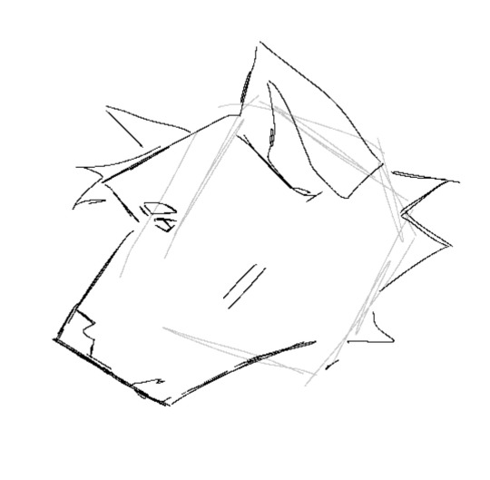
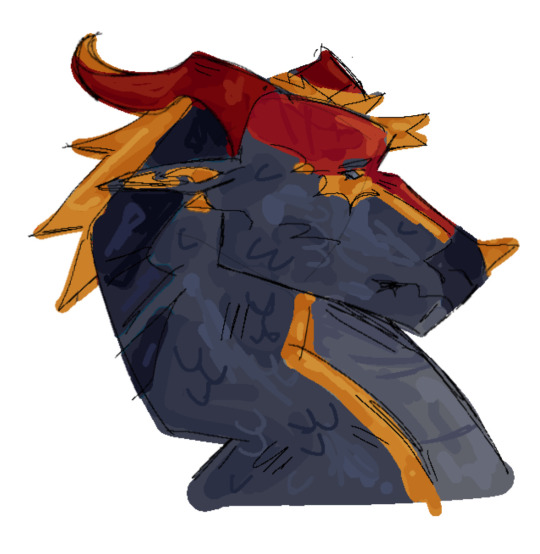
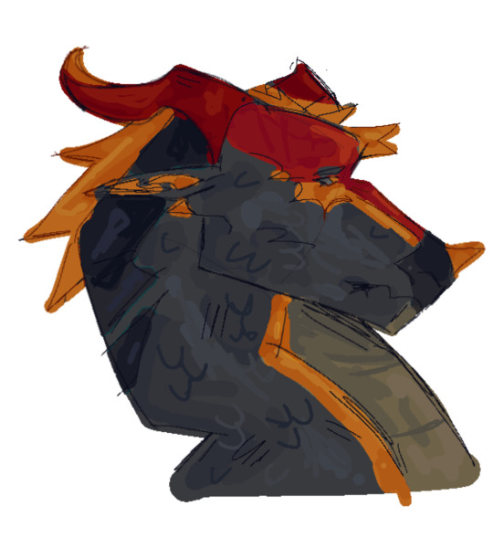
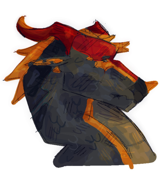
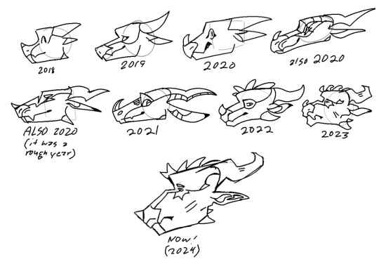
#also used these to play around with how I do lineart
Explore tagged Tumblr posts
Visit Tumblr Blog
Explore Tumblr blogs with no restrictions, modern design and the best experience.
Last Seen Tumblr Blogs


Fun Fact
Tumblr was the first site to host the blog for President Barack Obama in 2011.
Text
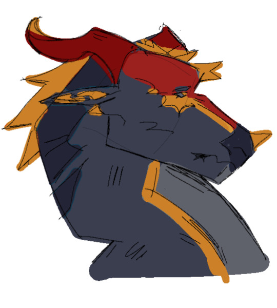
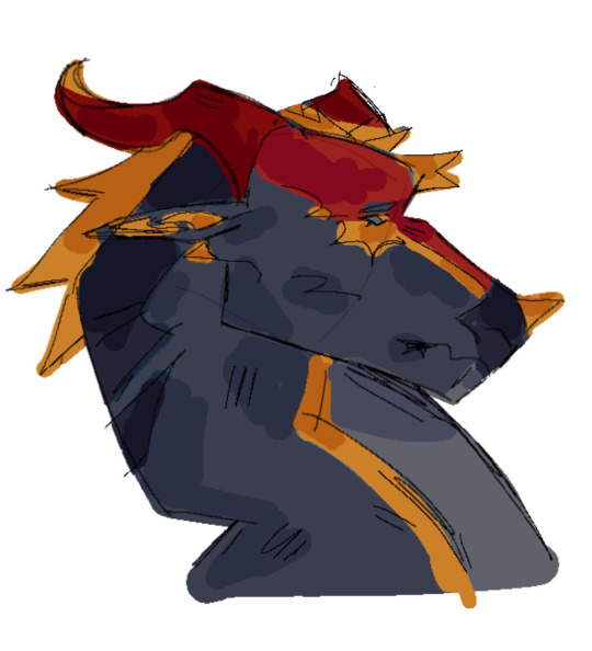
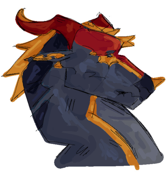
hits your mid naughties british police drama with my warrior-cats-ification beam


some extra notes and that under the cut
Naming
Fits a couple categories
1) Follows their initials (Annie - Asphodelcreep, Chris - Cressstrike)
2) already sounds like their name (Ray - Starlingclaw)
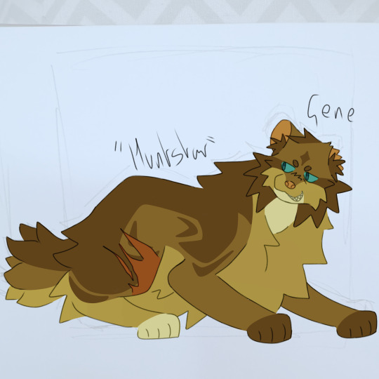
3) Name already works as a prefix (Gene - Huntstar)
4) was gonna follow the initials route but I couldn't find owt I liked so went with somet else (Sam - Sandmartinpelt)
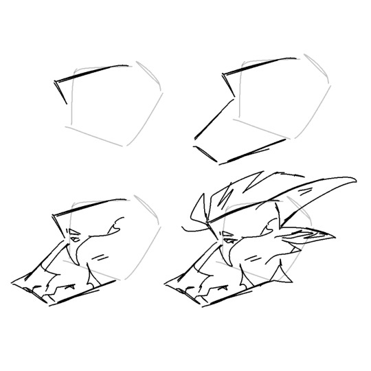
Onto individual designs
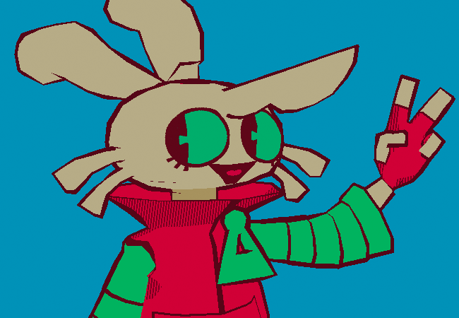
Sam | Sandmartinpelt
Wanted to get the jacket into his design in some way, as well as his sideburns
his 06 design has a dorsal stripe of the second darkest colour for 73 with his tail then being solidly that colour too
the lines down from his eyes are, tbh, purely there as I felt his face were too bland without - I couldn't think what other design would go
Will probably make his face rounder in the future and his side burns shorter
The prefix 'Sandmartin' is because you can shorten it to 'San' which is close enough to Sam for me, as well as take 'Mar' from the middle, a nice little nod to why Sam Williams was originally under cover in LoM
backstory does actually translate over well into - was leader of the Clan, hit by a car, wakes up in the past not as the clans leader
Is demoted down further than just one step tho - is a warrior in 73 - explained in Hunt's bit
Gene | Huntstar
His surname can already translate over into a wc prefix - so Huntstar
Took me the longest to design, mainly just cos I kept making him too light and having to go mess around with the values
only one I have a specific breed in mind for - Maine Coon
The scar on his leg is from 'getting shot' in the finale (obviously tho in this case he wasn't shot, probably mauled by dogs or somet)
bobtailed just cos he has them vibes yknow
The stripes going horizontal from his eyes are meant to contrast to Sam's going down vertical
dark front paws = driving gloves
Was deputy to Woolf, becomes leader after what would be 2x02, makes Sam his deputy
Annie | Asphodelcreep
Was always gonna be a black and white cat, somet that has just not changed at all since I started designing them
one of the cats that is just all fluff yknow
former kittypet - her home was near the clans territory and was something like a daylight warrior, her becoming a DC in 2x01 is her becoming a warrior full time in this
collar was red like her dress in 1x08
arguably the design I am most happy with and probably wont change at all
Name chosen mainly cos her initials are A.C. and I wanted it to match
Chris | Cressstrike
The prefix 'cress' was chosen cos it sounds like Chris and that is it
Is either the Clan's youngest warrior at the time Sam arrives, or one of the older apprentices who is massively struggling with Sam then taking over being his mentor (taken from Chris referring to Sam as a mentor in A2A)
Had to redo his entire design cos I accidentally made it piss ugly
Ray | Starlingclaw
Carling - Starling, it was low hanging fruit
Gene's former apprentice, I think it fits their dynamic well, especially Gene saying 'these men think they're made in my image' (paraphrasing) in 1x07
Curly fur cos I'm obsessed with his fucking perm in A2A
Will make him stockier and a more similar stature to Gene in the future
I think the antagonistic, generic brown tabby thing wcs does fits him well, like yeahh thats him
#life on mars#life on mars uk#life on mars (uk)#how many tags does rhis show have#will be doinv alex shaz viv and keats in the future#and doing these guys A2A designs#also didnt do phyliss here cos I had like no ideas for her#warriors#warrior cats#my art#also used these to play around with how I do lineart#after the first three i finalised teh idea that I had semi transparent lineart
4 notes
·
View notes
Text
You know he has to flip for it!
No text + flat under cut

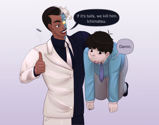
I've been working on this for a bit, and it is done! Two of my f/o's interacting for a silly meme. Ichimatsu's getting held by the scruff like a cat because Harv can't be normal /j/lh
#🦇// my art#i think we have to kill this guy#meme#two face#harvey dent#ichimatsu#ososan#btas#osomatsu san#dc#mr osomatsu#batman the animated series#self ship#f/o's#I LOVE LIMITED COLOR PALETTES!!!!!!#Also I'm really proud of the colors. I'm getting better at making them harmonious#I've been working on this for so long! honestly I finished it because I wanted to render something since i haven't in a bit#the lineart and anatomy was hell but that's partly because I chose shitty angles to work with in retrospect#alls well ends well I suppose#Look at Harveyyyyy <3 my wonderful Harv <3#It's supposed to be Harv talking that's why the speech bubble is black. I wasn't going to make it squiggly like in the comics for this.#Ichiiiiiii !!!!#I'm so happy with his facial expression! also this is the first time I've drawn him in the og suit I think#Yes he has a piercing because Iru took him to get his ears pierced I do what I want#Also Two Face gets makeup because he can get it and also I dislike the red lip thing. There's other headcanons too#I'm still playing around with his design but I like the skin tone and suit I used here#Also their noses!!! I LOVE THEIR NOSES!!!! Love how I drew them#only thing is their eyes aren't that detailed or rendered like I'd like. I got bored but they look good enough#honestly this whole thing I made so I could have a drawn header :3
38 notes
·
View notes
Text


also "textless" versions of these, wahooo
#corned beef#joe iconis christmas extravaganza#bsol#speaking of >:3 & >:3 third time's the >:3 in successfully slammed both up against the window of joe iconis's car (twitter @'d & Seen)#which is really just a :3 but whom among us (orchestra hit) is not a little impish with it#first year i did fanart like wouldn't it be fun if joe saw & liked this. second yr like Same plus it did happen last time#then also recency Fun Times bias sure but he did make it a frame in his End Of Year Good Times Celebration video like >:'3#yes i draw exactly what i wanna draw b/c it's some specific thing i enjoy that much so Yep that is the xmas show to me#so powerfully i was moved like ooh fun xmas villain wrole?? in '19 when i was paying attention & relieved of some bmc closure malaise#by the xmas show but obv Least aware / knowledgable lol. technically showed up in '18 around nov/dec but no chance Right then of tuning in#i mean i had the capacity but did not know it existed / even Less helpful preexisting context. anyway so by the time the show returns#& i've done research in between & gone my god i am i live laugh loving like Yeah i'll do more fanart & omg cyril & omg krampusfucking#able to ramp it up this year & like just thanks to Drawing Experience i'm better at forging ahead through thee process even when it's#extra ambitious like my god am i in over my head? well keep swimming for the surface like only several times going [aaa....] only to yknow#not be that tripped up anyway but still go [(celebrate) christmas!!! (with me)] & be like Do It For The Krampusfucking Gift#one post for another like lighting up my life joe just coming out like ''who wants clips. first up Full Cyril Fucks The Krampus number''#like jeez made that happen And passed it along....it's always the like epitome of my art like i make the specific often really niche stuff#i really respond to; does anyone else enjoy this? if yes; Wheeee; sometimes this is also ppl Behind the really niche shit i enjoy#like i truly hope you do get that kick out of it as i slam it up to the window; worth a Highlight Of Your Year or not#the power of [i do like to Draw the things i latch on to] + [internet] for you#really the bsol design even More an event in ''how did i even do this'' b/c even when planning to make it slightly easier like well#fewer figures; i'll use ink pen so i hone the lineart less than i would to precisely get [line weight mostly irrelevant] Line Geometry#yet still going ruh oh i'm honing for sure. but then like did Most of the lineart all in one night + all the coloring the next round#when i draw quite slowly / the Honing is virtually always an inextricable part of my process like i do Nothing in less than Hours#like i think even my freewheeling bsol sketches posted just this morning took me at Least an hour; judging by vids i played in the bg lol#not quite calibrated to have Attuned Confidence In My Ability To Forge Ahead thusly like oh no if i don't have Momentum or it doesn't#happen to be one of those times things just spontaneously come out great right off without more honing / consideration we're fucked....#not actually the case but yknow still realizing this lol But still able to just pat myself on the shoulder like It's Manageable & it is/was
8 notes
·
View notes
Text
*trying not to cry* trust the process, trust the process,,,

#im very impatient and very pessimistic about my art and have NO idea still how to draw backgrounds#but im using this as an opportunity to force myself to get better at it. bc ive got a lot more of these to go.#ill be more simple for small panels but my rule is if the background takes up the majority of the panel it has to be drawn#im playing around with painting things first just to experiment with it but if i gotta change later i will#also just dont wanna do lineart for any buildings lmao fuck that#my life: the musical#rudolf draws sometimes
1 note
·
View note
Text


I did an oil painting of Jade! I wasn't sure who I wanted to paint, so I rolled a dice and Jade was the lucky winner. I had a lot of fun doing this one, I need to use my paints more often.
And I took a whole bunch of photos of the process, so you guys can see how it came into being!

First things first. Planning. Traditional painting doesn't have the luxury of being able to make sweeping changes as you go like you can with digital, so if you generally want to plan ahead.


Next I printed out my lineart onto some watercolour paper and taped it to a board. I then sealed the print/paper with some clear acrylic medium and painted my tape white because it was bright fucking green and would throw off my colour mixing. My set up is pretty simple. I have a jar of mineral turpentine with a strainer at the bottom to clean my brushes on, my palettes are just boards with wax paper clipped onto them (easy cleanup) and a roll of paper towels and some rags for cleanup. And I also use an medium that both thins out my paint and helps it dry faster, otherwise oils can take months to fully cure.

I planned out all my colours in advance, so all I had to do was mix up the appropriate shades and then pretty much play paint by numbers.


The general process is block out each colour and then do whatever blending is required. If you want a harsh shadow you dont do too much blending, if you want a soft shadow you use a fluffy brush and go over the area multiple times.


And then you just go around area by area filling it in as you go. Of course there's a whole lot of different techniques and processes for completing a painting. This is just what I did for this specific painting.

And he's done! He took a few days to dry, even with the added fast drying medium. There's a few areas I'm not happy with, but I would cannibalise any colour on my palette by mixing it into the next colour I was going to use. So sans re-mixing that exact specific paint, I couldn't go back in to touch up anything.
The digital planning stage was done the evening before, and the painting stage was about 6 hours? So all in all anywhere from 8-10 hours total for this.
If you guys have anymore questions (this was a pretty brief overview) feel free to dm me or leave a comment or whatever. I don't bite and am happy to help anyone out there looking to improve thier skills, or satisfy anyone's curiosity.
#not too happy with my final photos#but I used the best camera I had access too so#*shrug*#I guess this is what I can show you#twst#is my art#twisted wonderland#jade leech
208 notes
·
View notes
Note
your rendering is so good how do you do it
Thanks, I love your rendering too!! Gonna try and make a tutorial ^^
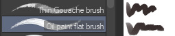
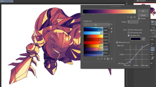
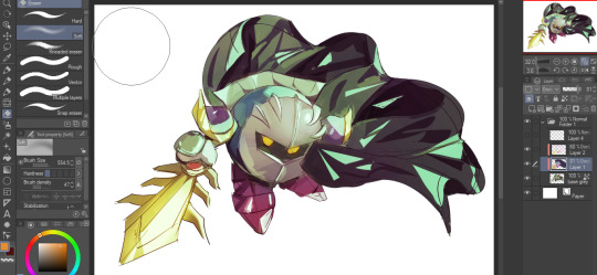
To start off, I'm on Clip Studio Paint and these are the brushes I use! First two for rendering characters (round brushes) and the other two for mostly backgrounds (square brushes)

I used to do lineart, but it takes too long >:( now I just make a sketch and sorta clean it up!

Next I fill it in with a gray color. For simpler pieces I just put in the flat colors, but for more paint-y pieces I do grayscale -> color! I'll be doing that here :)
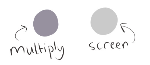
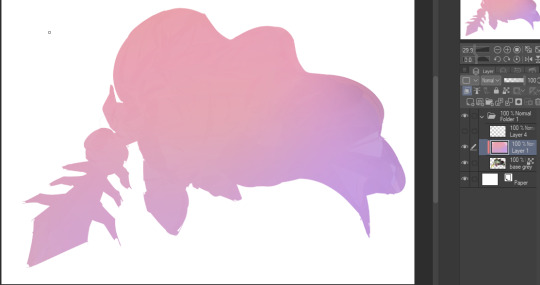
Also, I make 3 clipped layers on top of the gray - two are multiply, and the top one is screen. On the first multiply, I do a soft gradient using an airbrush
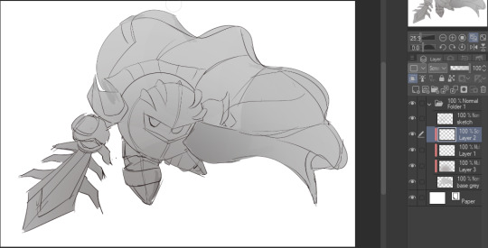
On the next multiply layer, I fill everything in with either a cool-ish or warm-ish gray, depending on the mood ^^
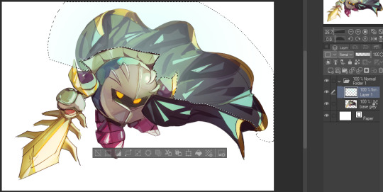
I also determine a light source, and use the lasso tool on the screen layer to block out where (I think) the light hits! Tbh I just do wherever feels right lmao, but I recommend having a reference! I like doing it in triangle patterns
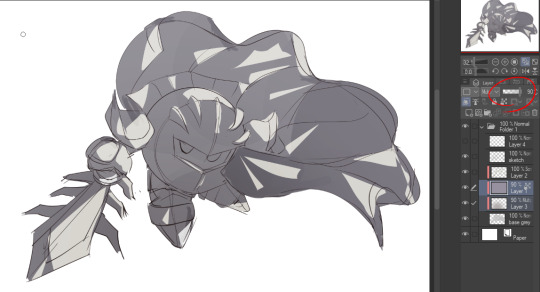
Then adjust the opacity of each layer to whatever feels right, and merge everything (I don't merge the sketch/lineart yet, I do it before adding colors in!)
Now... rendering. Some tips I have are color pick (greys) off of the canvas and use them to paint! Clean up the sketch more, erase edges, but I save details (like Galaxia's red gem, his eyes, etc.) for the end, or during coloring.
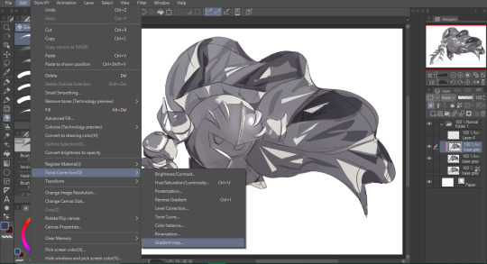
After I'm sorta happy with it, I merge the sketch layer, then duplicate it, and add a gradient map! I did this sunset-y one but changed the hue to yellow-ish, then lowered the layer's opacity ^^
Play around with the hue-saturation-luminosity setting!

Now go crazy with blending modes! Multiply, overlay, color, glow/color dodge, etc. Feel free to layer them up on top of each other too, and this is to add the character/piece's actual colors in. For example, I used a white-blueish overlay layer for his mask and glove, blue for his cape, blah blah
Now I clean the sketch up/refine it more. Also, to "harmonize" the color palette, you can add a colored gradient on top. Then set it to multiply, and add overlay/glow dodge layers with any colors you see fit! I like using teal and light/warm orange! Here is an example of a colored gradient:
Another tip is to add saturated colors on the edges of both lighting and darker shadows, before blending it:

Also I usually add in a light blue/grey in shadowy areas, and lower the opacity for reflective light:

Also! You can lasso + use an airbush with a light blue to block out parts of the background (his cape here, for example). It helps with more depth!
Finally, I like adding sparkles on low opacity :3 And gaussian blur to certain areas! I'm using radial blur on this piece though ^^

For the background, I like doing blocky shapes!! I use my square brush on 90% ish opacity, to color pick different hues from the piece. For lighting I use a glow dodge layer, here's a mini timelapse as well as the finished art!
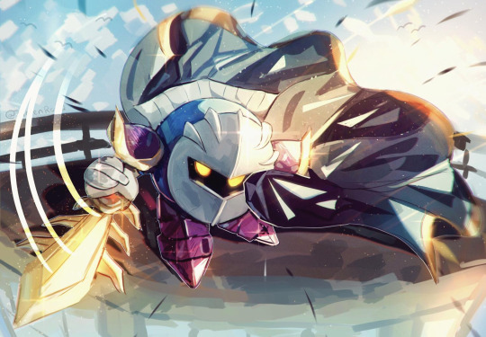
At the very end, play around with the hue/saturation and contrast tools to change the colors :)
#iiii hope this helped??#first time making a tutorial sorry!!#art tutorial#kirby meta knight#meta knight fanart#meta knight#nintendo kirby#kirby nintendo#kirby fanart#kirby series
563 notes
·
View notes
Note
I really love how clean and strong your lineart is! Do you have any tips on how people can get better at their lineart?
Thank you very much! I hope you don't mind me answering this super late asdjhskd I actually held onto this so I could link my brushes!
I use super high stabilization - usually at 90 if not 100%, lineart used to be my worst enemy when drawing (it actually became a joke among my friends how much I hated it) but setting all my brushes to super high stabilization and some post-correction really helped a lot. Also - I think tapered lineart brushes are the devil if you're first starting out. I use a little bit of taper now but definitely ease into this when you're new to it, something to look out for is brushes with tips that aren't super sharp.
Just as an example, the brush I use to do sketching and rough lineart doesn't have a sharp tip - the strokes look like this

but this is it when I am doing lineart:

Don't be afraid to do lineart with brushes that aren't the standard 100% opacity G-pens! Experiment! Download 50 brushes and make a bunch of lines on a blank canvas and narrow down the ones that feel nice - if they arent exactly to your liking, fiddle around with the settings, play around! The pen feeling nice to you is going to make or break your experience with it, always opt for brushes that suit you - not what suits other people.
I just put all my brushes up for free download (I don't believe in charging people for pencils sjfhkjasf) so if you have csp feel free to download and play around with them!
113 notes
·
View notes
Note
hello!! i love your art so much, your colors are beautiful and your characters are just so 👁️👁️ and i adore seeing them on my dash :)
i had a question about how you do the details on your fabrics: how do you keep the patterns on clothes on a body looking so,,, clean and readable while also making it make sense on the form under it?
like the cape/sleeve(? idk what it is but it looks cool as hell) on the magnolia commission pattern looks so cool and it's still readable on the fabric (like, if i wanted i could probably do a silly sketch of it) BUT ALSO it seems to make sense with the folds so it doesn't just look unnatural and stiff?
i'm so sorry this is kind of a long ask but like. would you be down to talk about your process for patterns on clothing? it's cool if you're not, that's totally fair, just figured i'd ask
have a wonderful day!!
OOOH Thank you so much for the ask!! I wanna do a more in depth tutorial, but I tend to make patterns in two different ways, with one being fully hand-drawn and the other playing with mesh transforms or the... Uh, liquify CSP tool? Let me find examples

This is an example of a fully hand-drawn pattern. No trickery here- Only trying to eyeball everything. It's kinda a lot of work to draw it manually, but it's the more convenient option if the character I'm drawing doesn't have files for the patterns, or if the files are a bit too different from my usual style, as they could potentially not look great with my linearted or painted style
And then- For cases such as Nolia's cloak, I did the entire pattern as a separate file, then placed it using Photoshop's mesh transform!

Here's a WIP file from when I placed all the patterns after finishing the lineart, where you can see them in full contrast. I tend to keep my patterns in different files- The black parts here are not joined with the base color of the cloth, so I can bring nice highlights and texturing when they're meant to be golden inlays, for example. Now, the Photoshop mesh transform is a bit finnicky to use, and I don't have any proper step by step of it- I could potentially record how I do it someday. But let's take the humble cylinder and demonstrate it quickly:

So, the mesh warp tool is the one on the right- You can see these sort of blue lines creating a mesh. I'm sure CSP has it in it's pro level or something? Correct me if I'm wrong. You play around with the different sections, move it to the right place, and put it on the cylinder. This is a very simplified form. You can make many subsections to your meshes (that's 3x3- you can have stuff such as 20x20) for when you have multiple folds.

And then you can just shade your pattern accordingly so it fits the volume of the drawing, and- ta-daa!
This is by no means an easy method. Sometimes you can get away with the Liquify tool (which CSP has and it's very decent), which I've used when the pattern in question was over a simpler surface with few folds. It takes some practise to use that well, and it isn't gonna be the best for complex ones, but it's also an option. Let me do a lil compilation of some patterns I've done and which tools I used for each!
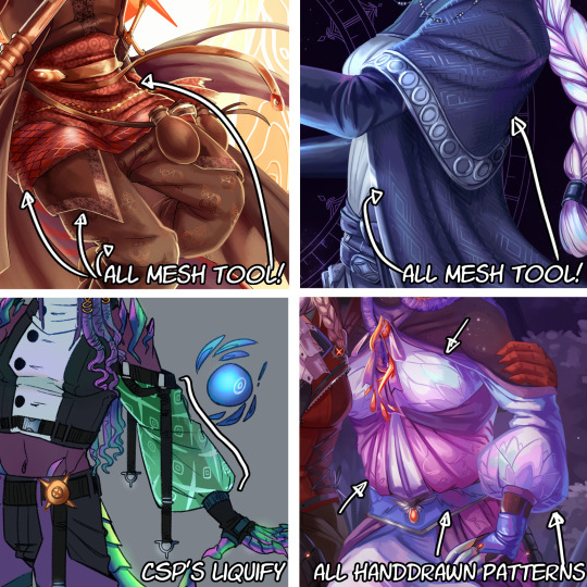
The tool I use highly depends on the time I have, the level of finish for the drawing, and so on. CSP's liquify is probably the fastest but gives simpler results, drawing them manually works better with some styles and more organic/less geometrical patterns, the mesh tool takes a bunch of time but it's great for small repeating patterns that are meant to be very precise or geometrical.
If people would be interested in it, I may someday do a video tutorial of me doing a pattern and then putting it over a folded cloth. I do hope this can help a bit tho!!
116 notes
·
View notes
Text
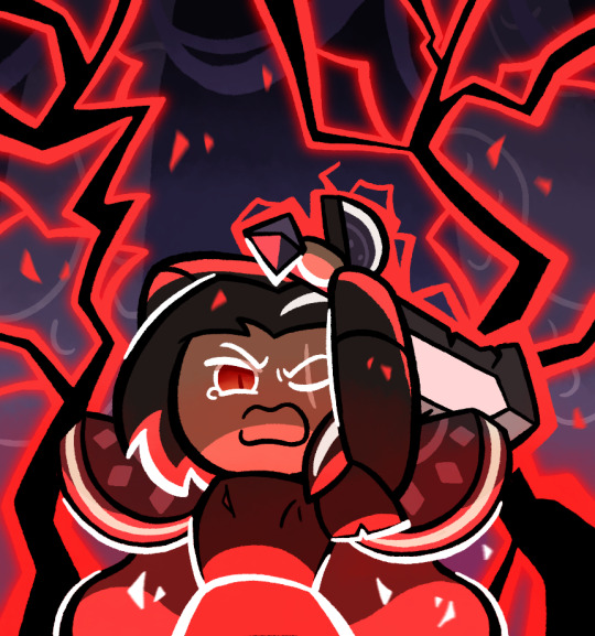
So I’ve been making this
So basically last night, I was listening to some music, specifically Not Gonna Die by Skillet, more specifically a version on YouTube with the intro (because I’m not the biggest fan of Good to be Alive where the intro actually is). Anyways, when it’s night, my imagination tends to be more active and I tend to have more energy. While listening to the song, I eventually got this mental image in my mind of this scene with Dark Choco, and the more it crystallized the more I wanted to draw it. I was going to go to sleep and maybe do it in the morning, but I realized that I probably would forget the vibe and not have as much energy, so instead I decided to power through and draw the idea
It was a bit difficult since I had limited references for the pose I wanted, and I suppose I can admit the sword looks a bit off anatomically, but it looks good enough I think, and lets me keep the eyes revealed
I did eventually have to stop drawing, because my iPad had been worked all the way down to 4% (and it was at 30% when I started, the poor thing), not to mention it was around 11:30 already which is pretty late for me, and my earbuds had been running nonstop for over 2 hours (yes I was listening to the same song, it’s how I keep the vibe). I was at least able to get the pose, base colors and lineart done, and I’m still pretty proud of where I left things last night
Today was mostly just doing the background and lighting, which admittedly I may have fumbled. I’m not very good at backgrounds and I didn’t know how to draw lightning. I tried my best, but honestly I don’t think I got the image in my head. Didn’t help that my brain was playing the wrong Skillet song this morning
Oh yeah and by the way, the background is supposed to be from this. That’s what I used as reference
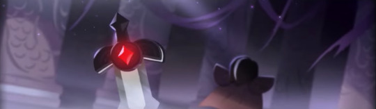
The lightning both feels like too much and too little. Like, it’s crowding the picture, and I can’t have more because it’d be way too crowded with it, but also at the same time, it doesn’t feel like enough, like there isn’t as much power as I wanted
Actually wait, maybe I can add some small particle effects to like, enhance the lightning feel. That was in the original sketch but I omitted it in the final. If you see one with that, you know I did that
Edit: I did indeed do that
To be fair though, I don’t think I have the art skill to properly convey the image in my head. Basically the scene is that Dark Choco is using absolutely every amount of his power for this final swing down, so much that it’s too powerful and the Strawberry Jam Sword completely shatters. But also it’s too powerful that Dark Choco’s body simply can’t handle it, and he basically ends up exploding. The scene depicted would be the wind up to that final swing that destroys the both of them
This isn’t necessarily the first time I’ve come up with this scenario, and the setup would basically be that he turned on the Cookies of Darkness slightly earlier, because he didn’t want to destroy his homeland again, and he tried to get rid of them while in the kingdom but not yet at the Citadel, but he ended up failing, so with nothing to lose, he chases after them and decides to put everything into destroying them, even if it likely ends in his death. After this he probably killed Pomegranate and crippled Licorice in some way (I don’t think he’d attack Poison Mushroom), so his final act did have some effect, but he’s still dead by the end of it. And he and his father never got the chance to properly reconcile because Dark Choco thought that could never be a possibility anymore and he had resigned himself to his fate
But yeah, I just don’t know how to convey that sheer overwhelming power and emotion that this scenario suggests. I tried my best though
I also want to submit this to the Dark Cacao Forever contest, but I’m not sure if it’s good enough for it. What do you think?
#cookie run#cookie run kingdom#dark choco cookie#my art#I really did try hard and this and it does look better than most of my others#but I don’t know if it’s really that good or anything
237 notes
·
View notes
Note
do you have any tips for thin (anime-style) lineart? I always tend to end up with much thicker lines unintentionally X-x
It depends a lot on what exactly you’d like to achieve, but my biggest recommendation would be to change brushes if your lines are naturally coming out too thick. Not just because of brush size, but because the kind of brush you use will change how you line things, technique-wise.
As an example I’ve tried lining a sketch using two different brushes here:
Though they’re both from the same sketch, in the first I used a thin brush with high stablization and almost no pressure sensitivity. As a result, I’m forced to line slightly slower, and it looks slightly stiff but achieves the sort of clean anime look you usually expect to see— almost no line breaks! This is the standard for anime I think because you have to have clean and closed line boundaries so that coloring and shading can go quickly.
On the other hand, on the right, I’ve used one I’m a bit more accustomed to, a round textured brush with a lot of pressure sensitivity. It’s also got lower stabilization, meaning I work quicker, my strokes are a lot more spontaneous, and you see a lot more natural variation in line width. That’s what I mean also by it depends on what you want to achieve— though this is also an anime style you wouldn’t find it as a screenshot anywhere because that line width variance would probably look really inconsistent in animation.
I als only switched to this round brush relatively recently, about half a year ago now??? Previously most of my lineart was done with a rectangular brush which also tended to yield thicker lineart than expected.
I would suggest playing around with different brush shapes and settings, especially in stabilization and pressure sensitivity, since I think those are often what affects my drawing style the most! You can do a similar exercise to this and try lining the same sketch multiple times with different brushes to test which feels best for you. Hope this helps!
101 notes
·
View notes
Note
i love the style of that 3d render of your character! may i ask how you animated the outline and made the whole thing pixel-y? :0
Very glad you asked!
There isn't many tutorials on how to make this kind of stuff so I am totally glad to be the first one.
BLENDER 2.5D TUTORIAL
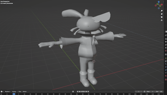
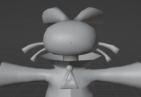
First of all

Get your model ready and steady, that part is what I ain't explaing, however if you want it to have these colors, you will have to put this nodes in your texture shader
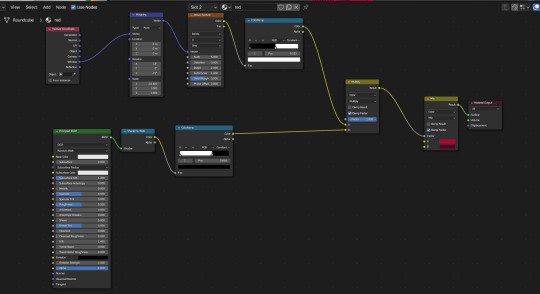
`[ This is for her red jacket, the lower nodes is for her primary colour and the upper nodes are for her shadows, which also has some extra nodes to give it a comic texture. ]
Quick reminder to give the model some lineart yourself to the parts that don't form its sihlouette, for example her shoes.
Now for the lineart, first of all make sure you have created a black Emissive material and that it has Backface Culling activated

After that go to the Modifier Properties and add a Solidify modifier

Make sure to Flip the Normals, set the Material Offset to where the Lineart material is, and adjust a little bit the Thickness of the mesh, then you will get some natural good-looking lineart like hers.

Now, you could easily be satisfied like this, but now we are going to make it feel like each frame is a new drawing by making her model lineart jiggly
First of all create a Displacement Modifier and give it a cloud texture

Make sure to lower the strenght and midlevel, otherwise it will look like this


Now, create an Empty Plain Axes and go to the Displace modifier, change the coordinates from Local to Object and focus the object on the Empty


And thanks to this adjustments, if you move the empty around, it will create a slight jiggle
Now what we want is for this empty to automatically move around without you having to do anything
Create a new screen and go to the Graph Editor section
In here we will be making the empty move with a modifier
Select the empty and press "I" of Italy and select Location, this will create a keyframe for the empty that we will be able to manipulate

Go to the Editor and ONLY SELECT THE Z POSITION, and then go to the Modifiers tab and add a Noise modifier
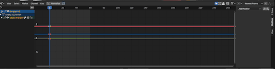
Make sure to adjust the Scale and the Strength so that it looks more proper for the jiggle effect, make it look like a rollercoaster!

And now, if you did everything right, your empty will be moving up and down and all around by its own
WHICH also means, the model displacement will follow the path of the empty to create that jiggly effect we crave so so much
However...

The model is indeed jiggling, but it's doing it the wrong way, we are trying to make it look like a cartoon not a gosh darnit gelatin
So to make it jiggle the right way we are going to make its noise feel more STEPPED
Go back to the modifiers of the Graph Editor and add a Stepped Interpolation, and make sure it has a Step Size of 5
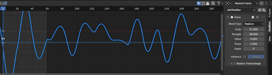
And now we finally get the choppy jiggle effect!!
Now you can play around the Displace and the Noise to make it more or less jiggly
But nonetheless, if you followed the tutorial right, you will be gifted with the perfect looking 2.5D effect!!!
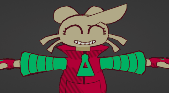
Now you can go ahead and try to fool everyone into thinking a 3D animation is 2D
And before we wrap up, one more extra for the one who asked how this is made,
We are going to make the render feel pixel-y!
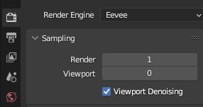
Go to Render Properties, make sure you are using Eevee, and in Sampling put the Render on 1 and the Viewport on 0
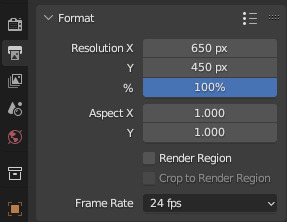
Then go to Output Properties and you can do two things:
1) Change the X n Y to a size lower than 1000 px
2) Change the Resolution % to these numbers (8, 16, 32, 64) This way if you wanna do pixel art you are more accurate
For this render I used the 1st option
And last but not least, in the Output Properties make sure you save your files in the right way with these settings

THen render animation, make an image sequence with all the pngs, and TA-DAH
You get a pixel-y 2.5D animation!!!
Thank you so much for checking, I hope this is useful for anyone who wants to do this stuff, if anyone has any questions don't be afraid to ask, I may have explained some stuff badly.
Anyways have a very jolly day
Tsuyo OUT
#blender#blender 3d#blender tutorial#tutorial#3d modelling#3d tutorial#art#model#3d model#my art#tsuyo art
1K notes
·
View notes
Text
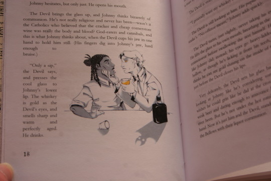
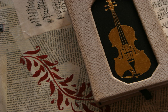
I've now received four (four!!!) different copies of my fic, bound and illustrated by different artists---and there's still a deep, almost reverential feeling I get when I hold them in my hands, lay them out. Ironically for the subject matter, they feel decidedly holy. After all, where else am I going to get proof that I did this---even if "tell a story about music and the devil" is one of the sillier things you can do to occupy your time.
But to be less vague, this is the kind gift of @fleabitebooks / @kettle-bird! They reached out to me a few months ago, saying they wanted to bind my Devil Went Down to Georgia fic, and would I like a copy too? As I would never say no to a gift like that, I gleefully accepted.
If you've been following me long enough, you've seen their art in my Cornstalk Fiddle tag, and I am pleased to say that the images lose none of their power. I think the choice to stick to a limited color palette works beautifully here---the golden-yellow of the title pages and the larger art almost seeps through the paper. With the crisp lineart and shading, it ends up being both lovely and vaguely ominous, a sign of the eldritch things moving around/beneath the story.
(Also, I realize this is not a major aspect, but....I love how truly awkward-looking the Devil is. He looks like a Southern Gentleman, and I love that touch of weakness in his jaw.)
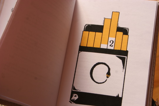
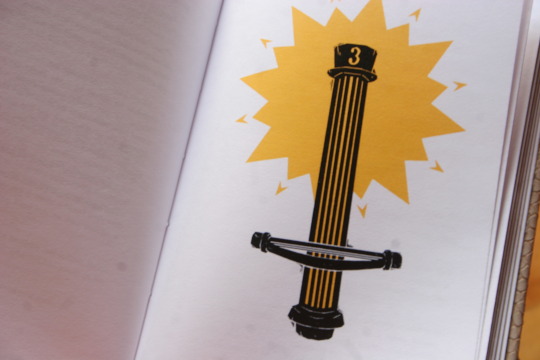
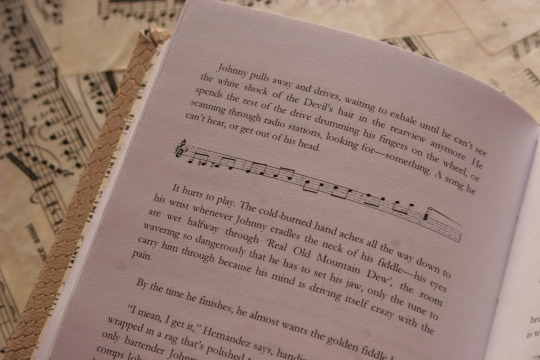
I also deeply adore some of the design choices---chapter 3 starting with the cornstalk fiddle and the triumphant starburst of golden-yellow? The white snakeskin-threaded-with-gold pattern used to bind the book? The way the paragraph breaks and endsheets are music? Amazing. Just amazing.
Maybe I should revise what I said above. Yes, having your silly fic about a country song turned into a physical book is proof that you did it, finished it---but it's also proof that someone else did too. In this case, @kettle-bird sat down with my fic and carefully copied it, played with fonts (oh, those are fantastic too by the way!) and spacings and margins; they drew art, colored it; laced the book together, made and bound the cover, then shipped it off to me.
Which means....if I did this, then I was hardly the only one.
168 notes
·
View notes
Text
youtube
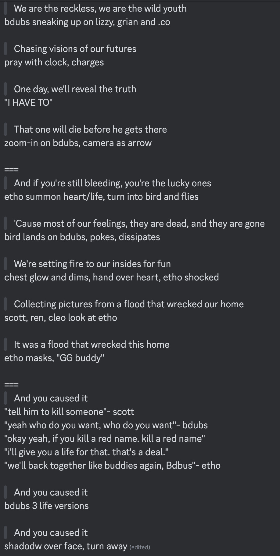
"Okay, yeah. If you kill a red name, killed a red name-" "I'll give you a life for that. That's the deal." "We'll be back together like buddies again, Bdubs."
In participation of Extreme Timed Challenge Gift Exchange hosted by @extremetimedchallengeexchange!
[gifs, full storyboard, behind-the-scene rambles under cut]
past 48h animatics: MCYTETC2023, ETC2023
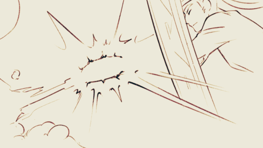
[Red Lives-Suspicion; Prayer-Determination; Fireworks]
Fiddled with gradient maps this time for some additional colors :D I would have colored in the eyes as well, but I didn't have enough energy left when the event hit the 47th hour xD
Also played around with camera movements. Respect to people who do fan edits and other forms of video/ assets editing 'cause keyframes are so 😭
13 hours to draft storyboard this time! Last year I used 16 but with waaay more frames idk how I accomplished that. Probably bc this year I'm drawing more than three(3) characters lmao
Progress Timeline:
[13th hour] finished storyboard/ draft (plany off time...) [25th hour] lineart for the first 10 seconds (wuh oh) [36th hour] lineart for the first 25 seconds (oh shit oh fuck gotta shorten it) [45th hour] finished Bdubs' part (NOOO I DONT HAVE TIME FOR ETHO)
ngl kinda glad i cut it in half rn 'cause i'd have to spend time figuring out shadowDog's design /lh
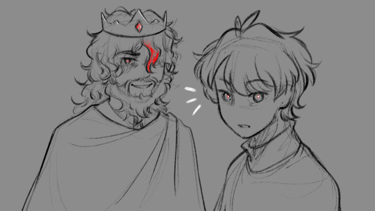
Designs I used for Lizzie and Joel (old art from 2022 and 2021 respectively) (holy shit i've been here for 3 years???)
Joel *shakes fist* i hate u and ur stupid beard
[Lyrics vibe/scene planning; hours before disaster]
I think most of the drawn parts didn't deviate from the initial idea. Mostly timing adjustments and building upon the vibes. The parts that were changed the most was the "And you caused it (×3 combo)".
Went from "vague flashbacks" to "following Etho and co. out of the cave and back to Scott's base while implying who Etho blames with single character focus shots".
The first one is Scott because he suggested the idea. Like, obviously he's to blame. It's not like Etho went along and cemented the deal himself. Scott totally peer-pressured him into it.
The second one is Etho because... well the scene ends up kind of being like. The sight of the Snow Fortress triggering a flashback. (EthosLab the content creator deliberately turned his camera towards the Snow Fortress and holds it there for a second instead of looking at the huge lava pillar right in front of him. What is WRONG with him.)
But also like. Clocks are kind of special to Bdubs right. Whoever gave him a clock basically has his (temporary) loyalty or at the least earned a favor from him. So like. If he hadn't gifted Bdubs the clock, which signifies a closer(?) bond, maybe Bdubs wouldn't be so devoted to him (wrong). Also serves as a call-back/ reference to the "Prayer-Determination" shot ("pray with clock" in the scene planning screenshot). I like to think that Bdubs weighted his options and thought about "if he will kill/ who to kill" a lot while following the other Red Names. And in that scene he's like, convincing/ motivating himself. Remembering who/ what he's doing this for.
(It is also meant to be part of my giftee's other prompt: "an exploration of the doubt one or both of them felt during the heart transfer that didn’t happen after Bdubs killed Lizzie, and the following guilt Etho felt." The Etho section starting from "we're setting fire to our inside for fun" til the end of the animatic is based on that prompt.)
After a brief period of self-blame, it's time to shift it onto someone else! Because you're in denial! If Bdubs hadn't gone red, then Etho wouldn't have to offer the deal. If Bdubs hadn't want to stay as teammates, then he wouldn't agree to the deal. If Bdubs wasn't so devoted to Etho, then he wouldn't have attacked Lizzie and gotten himself killed.
Then the animatic ends with the end of the session :D
...That's longer than I expected but also not that long. If you read through all that, tysm :] Tell me your thoughts! Have a good day/ evening/ night :D
#bdoubleo100#ethoslab#ethubs#bdoubleo100 fanart#ethoslab fanart#last life smp#last life spoilers#traffic smp#trafficblr#Extreme Timed Challenge Exchange#48 Hour Exchange#events#my art#animatic#i sound like i didnt sleep but i DID DO NOT WORRY
90 notes
·
View notes
Note
i’ve been trying to teach myself how to draw and your art has been a huge inspiration for me, do you have any tips on how to do line art like you do?
to be quite honest i try to avoid doing proper lineart whenever possible! it used to be a prominent feature of my art but I realized i just kinda felt miserable doing it. any lines you see are either painted on top, the sketch, or im doing something heavily stylized so I'll just show my process & share some general tips!
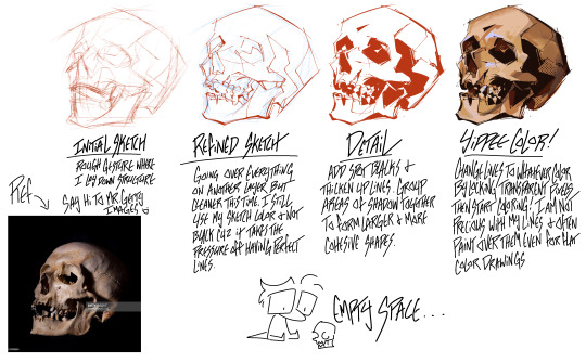
I try to stay as loose as possible and let myself leave in some mistakes as if I were inking with a real pen and paper. Another thing I recommend is playing around with whatever brushes and seeing what sticks! I prefer a much more textured gritty line over something super smooth but that isnt for everyone so playing around with different options is ideal
Also will leave some external resources under the cut!
FRAMED INK: book about comic/storyboarding composition but still has some bits in there about how different inking techniques can change the mood of a scene.
GUIDE TO SPOTTING TANGENTS: Self explanatory. Tangents can be a real pain when it comes to lineart so its best to learn What they are and How to spot them
SPOTTING BLACK AREAS: going more in depth with laying down your black areas
#art help#if theres something more specific you'd like lemme know! i just went over bits that are specifically style oriented#and less so of the basics cuz there are a lot of guides out there for lineart that are way more cohesive than I could make
611 notes
·
View notes
Text
Dca slasher au belongs to @wyervan :]
Yappin under cut
Hehehhe im happy to report I finished some ruff outlines for the fellas ,im thinking about redoing the lineart agin thats why im calling it "ruff" lol also moons lookin at sun he duse not have snake eyes I just noticed it kinda looks like he duse lol . I wasent shure what there wepons would look like +i dont draw wepons alot so ehh .
Anyway hears anouther wip , Ive been crankin out wips scents the day bf crismas eve bc i got my present early and its a drawing tabllit:0 shes so pretty and fun to work with named her blueberryand I hope we can make wonderfull things together :] . Hehhe
also ofc @wyervan you diserve kind words :] anyway l hope you have a lovely time and that im not bouthering u with the amount of lore im giving my y/n also i gess you added to ur slasher au playlist or i just didnt lisen to it fully (bc my phones a lil janky and pauses things when i listen to long) idk why but man you got some good mf songs on oh and i have a suggestion that might fit the fellas its.
slipknot -viruis of life. *and ik its maby just couenceadence but somesongs lind up so well with my y/n and boy oh boy thats what kick started me into the purfume wip( the masks name is purfume bc when i was making it i was inpashent and tryed it on bf the paint was dry and it was aird out from the meltd plastic where i reshaped it anyway the fumes gave me a headake lol i made purfume a in 2023 and have been doing tutch ups and reinforcing it ever scentse :]
@r0tting-rat hheh*seth rogan laghf* so i just read ur kind and lovely tags when i was about to post , im so happy u think that :] and the thing about them in full body in my stiyle welll hehehaha I love when shit lines up lol ,im glad yall like the cuddly fellas, so um hope you injoy them ik its not full body ill get around to that when i get use to drawing them .im still figureing em out :] heheh yay moots lol. Btw i raad youre writing prompt thing fore the slashers and dude that guy so desurved it like dont sell drugs to kid mf .. SELL EM TO ME >:] lol ( just weed and shrooms plz jack ass jake or what ever the loud ass's name was ) i love moons little song and how freekiy cute sun was at the door dude was sutch a distraction lol :]]
Lil tid bit about what i did last night bc I had fun [ affter cut ]
Okay so I was drawing for awhale affter coming back from a eve party at my stepdads moms place ( idk what to call her) and around like 1:23am I got bord and so I walked to the park in my town bc its just down the rode . On my way there someone was playing Abrahcadabra ( good song ) on speekers in there house so I took my earbuds out to listen to it bc it ecod nicely down the street anyway I swung for like awhile whal smoking then went down the wet af slide ( it rains alot hear) and then i just kinnda swang a bit more .i also found gold and silver confetti on the ground whitch i obveusly keepd bc pretty( and it reminded me of the Dca's Anyway i walked around for awhile listaning to misic and "dance walking" awile as in 3 houers and found new trash every time i tryed to leave so i threw it away which i had to walk back to the biger side not far away but still a good bit
( i fucking hate litter) but it started to feel like someone was messing with me bc like when i whent back to the spot i picked trash up from there was new trash . I kid you not there where 12 fuckin burger king shuger packits on the ground and shoved in the crevis of the sidewalk ??? They where full to and i just >:0 who even has 12 unopend packs of burger king suger packiets ???? Why would u even have that ??
#fnaf daycare attendant#dca slasher au#slasher sun#slasher moon#hope you like em im still figureing out how to draw there faces#ehh hehehe
55 notes
·
View notes
Note
can you do a style tutorial?? dude there's geniunally nobody else who draws like you, your art is so poetic and divine, it's inspiring
WAAA THANK YOU ANON OH MY DAYS ??? genuinely this is one of the nicest compliments ive ever received on my art omga what .
im not very good at explaining things but eem ill try !!
i feel like one of the biggest things is the sort of sketchy/messy vibe .. i use a super tiny brush ('digital brush' on ibis (its a premade lol) on size 1-2) and kind of scribble scrabble sometimes .. i also dont do lineart, i cant be bothered to do allat so i just clean up my sketch using an eraser !
i also stay away from using curves and instead try to use as many straight edges as possible if that makes sense .. also arbitrary lines in the drawing are a must . i think thats one of my fav parts of drawing :)
when it comes to coloring and rendering, i start by adding a darker, slightly more saturated color for shading, then blend it out with a midtone, do thr same for lighting, and then i add details !!
ive also been told that my usage of warmer tones is recognizable, and i achieve that by playing around with the 'color balance' filter on ibis until im happy with the results
for shading, i use a dark color (anywhere between blue and red, depending on the character and environment) for shading and a light yellowy color for lighting on an overlay layer ! then (also on overlay) i use those colors to add more arbitrary lines and scribbles
here i kind of tried to break down my sketching process, idk if it makes sense or not tho😓
my current artstyle is the result of six or so years of constant drawing and growing and experimenting !! experimenting with your artstyle is a huge factor in allowing it to evolve as well as for you to find what works the best .
referencing/figuring out how specific artists that you like achieve their artstyles is super good for experimenting !! in 2021 i was a huge fan of bellasaurus and animatedwings, so i referenced their art a lot, picked out what i liked, and incorporated it into my own style :)
i didnt include humans in this because im not very confident when drawing them and still have to heavily reference things lol .. maybe another day
overall just have fun and go with whatever feels right ! below ill attach some of my art pieces broken down if you want to use them as a reference

135 notes
·
View notes