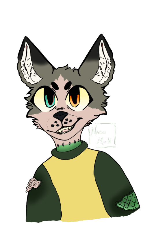
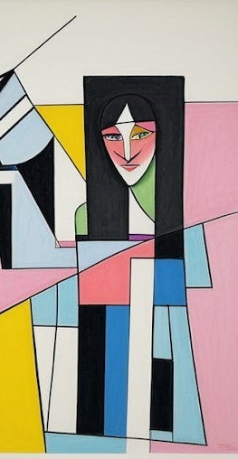
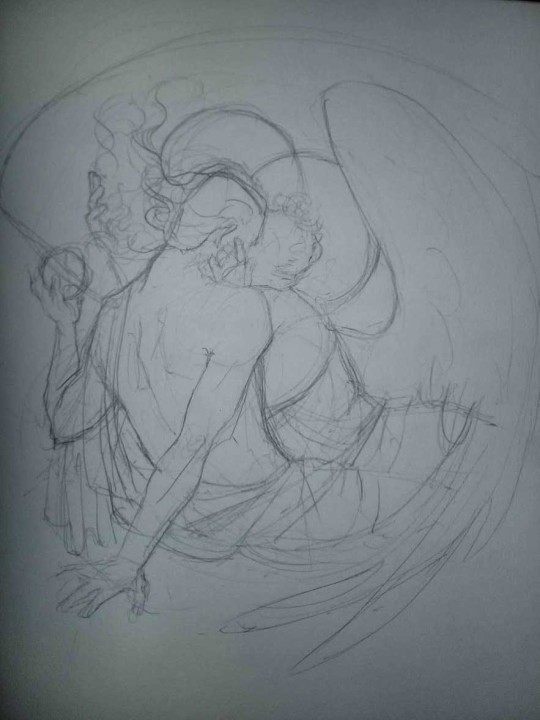
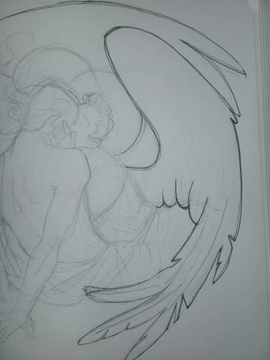
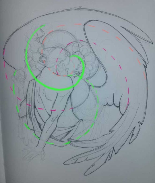
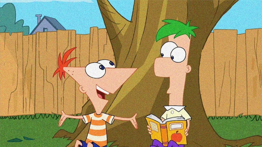
#also tried some different sort of lineart! i wanted to make it look a bit more like it does in the show
Explore tagged Tumblr posts
Visit Tumblr Blog
Explore Tumblr blogs with no restrictions, modern design and the best experience.
Last Seen Tumblr Blogs


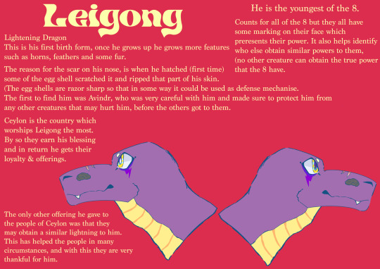
Fun Fact
25% of US internet users with an annual income of $80-100K use Tumblr.
Text
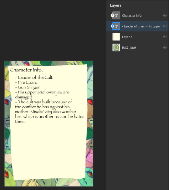
FULL FEM FORTRESS LINE UP


i finally FINALLY finished this lineup. those fuckers are in my head more that they should be. after writing my ideas for them i HAD TO DRAW THEM, i had such a clear image in my mind. the only one I've drawn before where engie, medic, sniper and scout, but those were just sketches.
if you wanna read what I wrote about them you can find the three posts here: defense | offense | support
full lineup, sketch lineup and design thoughts under the cut:


i always like the sketches more but i love the clear lineart, it makes the character more readable, so now it's time for some design thoughts:
engie - she was the first, she has seen everythin- no ok wrong franchise. i meant, she was the one i was more certain of. the outfit didn't change from the og but i made her have two small pigtails. i always viewed them as a cow girl hairstyle, and they're also practical. a stable hairstyle that keeps your hair out of your face.
heavy - the sleaves where kinda an instant idea i KNEW i had to incorporate. so i did a bit of reaserch on traditional russian clothes and their patterns. they seems to be very geometrical with not more than 5 colors, which two of them are white and black, usually at the seams or borders of the clothing. so i tried to do that. i really like how it came out.
demo - not much to say aside from me winging the hairstyle. i honestly didn't know which one to give to her, but i knew i didn't want a long hair style. maybe one day i'll draw her without the hat.
scout - she is the one with my favorite design. i LOVE how it came out. i fell it express her cockiness the best. i tried putting her in the og outift but eh, i prefer this one.
soldier - this is literally just normal soldier. i tried to but more "femminine" traits in her face. but still, just soldier with boobs.
pyro - it's normal pyro, with some stickers cause why not.
medic - she's my love. my beauty, the absolute perfection. i love her and every time i draw her she becomes more and more creepy. and i love her so much. at first i was unsure about the hairstyle, i tried to but her in a high bun but it didn't fit the face shape, so i just gave her a side swoosh. also you may have noticed she has the nurse hat, well, that's just because i think it's cute, and i mean, she is a field doctor and usually the women there where red crosses so, made sense to me.
sniper - ah, my beautiful, unkept woman. i had a hard time making her face look rugged without giving her 30 years more and doing that on women is actually pretty difficult. i had one time an art teacher saying to me "every line on a woman's face gives her 10 years more" and holy fuck if that's true. the second problem was the body type. a lot of people do her slim, and at first i drew her like so, but i found myself appreciating a bigger waist line, creating a sort of square siluette.
spy - finally the beautiful femme fatale. i will ALWAYS have problems with spy's suit color. i can't. it always feels so wrong aaaa. but that aside, i did a simple google search for 60s women's suit and i kinda went with it. it's a bit different from the og spy suit but it's also different from modern suits, so i had a bit of an hard time adjusting the jacket.
my asks are open if you wanna know more of them or if you wanna see them in some specific scenario!! and if you like tf2 i also did a team furtress lineup with explainations.
consider supporting me on my KOFI, i recently opened commissions!!
#art#artists on tumblr#tf2#fanart#tf2 medic#team fortress 2#tf2 engineer#fem fortress#tf2 fanart#tf2 scout#spy tf2#tf2 sniper#tf2 spy#tf2 art#team fortress 2 fanart#medic tf2#tf2 demoman#tf2 soldier#tf2 pyro#tf2 heavy#demoman tf2#engie#scout#medic#spy#sniper#pyro tf2#fem heavy#fem sniper#fem engineer
85 notes
·
View notes
Note
Do you have any tips or tricks on how to start a comic like this? Or even just how you got started?? I've had my own au for years that I so badly wanna put out into the world but I've been struggling with finding a good way to start it!!!!
Hm!! Ok!! This is a tough question with many different answers even just from me. I'll do my best to answer tho!! 😮
The main bit of advice I want to give, and which I think is vital to anyone creating anything:
☆ Know yourself.
When looking up advice for creating, people love to tell you that by doing things a specific way is the best and only way to go. Often advice of this sort has solid points, you should plan ahead, you should have easy character designs, buut... You don't have to.
I do not work well with outlines or scripts. I dislike sketching. You'd think that'd make being a long form comic artist impossible for me, but nope.
I know theres things I cannot do, so I've put all my practise to what I can do. My lineart style allows me to almost skip sketching completely, my scripts are more of an A to B structure than law. I improv 90% of the time when making pages. It's kinda like dnd with myself.
I would absolutely not reccomend what I'm doing to others, but I know it works for me. People can tell me I'm doing it wrong but its either wrong or no comic at all, SO. Suck it. 👍
Er. Rambling now.
My point is, figure out what you can and cant do, and do your best to give yourself the ideal work enviorment and process.
☆ Deal with being overwhelmed
Making just a few panels and suddenly realising its gonna take years to get anywhere is SO demoralising. It's gonna happen and its gonna happen again, and again, and—
But continuing with the earlier advice, you gotta ask yourself what would help you. Are you willing to sacrifice quality? Do you just need a break? Maybe you're like me and like to include smth you love in every update so you'll have something to get excited about making.
That feeling of overwhelm is trying to tell you something, so figure out what that is so it wont end the project for you.
☆ Start it
You wont like what you make when starting. I've never heard of an artist who has.
I'm not saying start this instant, not everyone is as into improv and flailing around as me. But I will say you'll never feel ready. Figure out the minimun of what you need to start and do it. Show friends first if youre afraid to post.
Also where to start? Well sure there's lots of good advice online about that, but you can also just doodle random stuff until you feel like diving deeper. That's what LV started with, just Twi and Wild hanging out with animals and some headcanons. It may not be the most tightly written work but theres beauty in the humanity of a mess.
☆ Extras
A "failed project" or "forgotten WIP" is only a failure if you let yourself feel that way. Yea it can be a hauntingly strong feeling thats hard to deal with... But it can be beaten. WIPS are proof you tried and not everyone can say they have.
Lv is far from done and I have no intention of dropping it, but because the journey has been so nice I'd satisfied even if I had to call it here. Its smth that helps me with the overwhelm... What I've made is beautiful even now.
Comparing yourself to others is gonna rip your heart out. I love that theres other links meet aus out there and hope the best for those artists but I caNNot follow any of them or I'll crumble to dust.
So Uhm.
Basically. Have fun and be yourself. 👍
Ps. Readability is basically the most important thing for a comic artist to pay attention to, that and not destroying yourself with details and rendering. 🙌 Good luck out there!
#Ask#I love discussing stuff like that but it always ends up so rambly and long ahsjjdjr#I hope I said at least smth slightly concrete
84 notes
·
View notes
Text
Today is the day I unleash my Mr. Bonzo fanart upon this webbed site.
This post is relatively safe up until the cut.
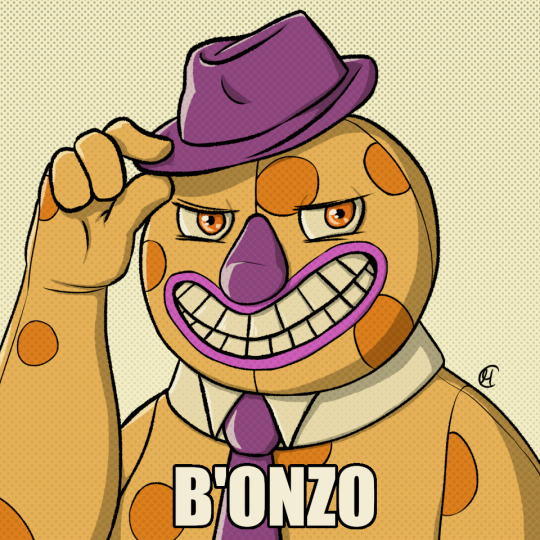
Is the *tips fedora* meme over a decade old? Yes. Do I care? No, absolutely not.
~
Now this is where I recommend "getting off" this post to anyone bothered by graphic depictions of body horror, blood, violence, or Mr. Bonzo (monster, not mascot like above).
I know the first image is silly, but I cannot stress enough how serious I am when I say:
Proceed at your own risk.
Now that you have chosen to continue, I have arranged the images in order of least to most vile and disturbing (though that might be slightly subjective on my part).
Remember that you can click off this post at any time.
Final warning: split tongue Bonzo.
I tried channeling Julia Drawfee with the lineart a little bit. Didn't feel like shading that one, so it's a bit flat.
Where did I lose my colours? Plot twist: the first image in this post is actually the last I've made, so technically I gained the colours. I wanted it to have more of a cheery vibe, unlike the ones under the cut, which I wanted to be kinda dreary and I feel like adding too much colour can mess that up.
Alright, I'll address the tongue. Remember how his head splits in tmagp 12? Yeah, it's a nod to that and also I asked myself "how do I make his design worse than it already is?" and that's the only answer I could come up with. I debated adding stitches connesting the two halves of the tongue but couldn't figure out how, so you're welcome. It will be present in all the upcoming drawings as well.
~
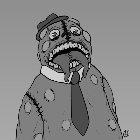
The next one is bloody, but it's not that much worse than the previous one overall.
I was playing with filters after I was done with this piece, because I felt like it lacked something, but didn't know what. Really liked this one, I think it's some sort of a gradient map. It pixelised the image and adjusted the colours a bit, it also really made the blood pop out, though it covered up some of the details.
Why did he lose his hat? It's stupid and hard to draw.
You may have noticed the artstyle change a little, the previous images having neat lineart and little to no shading. That's because I am using different tools, sketchy and soft brushes, that allow me to experiment with lighting and textures more (plus the aforementioned filter altering the image even further).
~
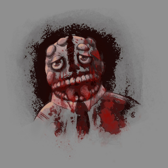
Alright, I feel like this last image deserves a separate warning. It references episode 12 (spoiler ahead), specifically the moment before the bartender loses a hand, though it's not entirely accurate. It's rendered in more detail than any of the previous images, so keep that in mind before scrolling down.
Basically it's pov: Bonzo licks your hand.
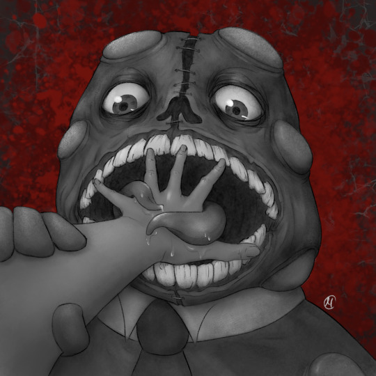
I feel like I could've made his tongue bigger in this one, it seems kinda small compared to his mouth. I really like how the skin on his face ended up looking. It took a lot of work.
The spit makes it look weirdly sexual, doesn't it? Listen, that was not my intention, but I'm not erasing it. I set out to make the worst thing I could and, though not without cost, I have achieved it.
I tried splattering Bonzo in blood, but it wasn't really working for me and it covered up a lot of the detail I liked, so I just put it in the background.
The human hand is drawn from reference, which I found by googling "hand reaching out away from the viewer". And let me tell you: google is shit at looking for drawing references, but I figured it was just going to be a sketch to explore an idea, so I didn't bother trying to get a better one. And then I fixated on it for a couple hours, you know, like a normal person.
I literally (and I mean no exaggeration) dusted off my drawing tablet after a few months of no use to spend the entire weekend, after tmagp 12 came out, glued to the screen making those images, except for the b'onzo one, which I made this evening.
Just to clarify: I drew all of those by myself. No filthy AI image generation is allowed in this house. I am capable of committing far greater sins than an artificial intelligence ever will.
The only thing left here is to extend my sincere congratulations/condolences to whoever got this far. It's up to you to either think you're brave or realise that you're foolish for doing so, but be comforted by the fact that at least you didn't make this post, which I cannot say for myself.
#this might be my worst post yet#i was so preoccupied with whether or not i could i didn't stop to think if i should (make bonzo worse)#do i regret it?#no#here's the sewage stew i promised/threatened you with a few weeks ago#the magnus protocol#tmagp#tmagp shitpost#long post#fanart#tmagp fanart#bonzo#mr bonzo#content warning#body horror#blood#violence#get bonzed#posts that would send me straight to a psychiatric ward were anyone i know irl to find out i made
14 notes
·
View notes
Note
I want to preface this by saying that I really enjoy and look up to the work that you do. Do you have any advice for improving digital drawing skills? How you do anatomy, how you found and chose your tools and workflow, that sort of thing.
Hey thanks that means a lot, and I appreciate the questions!! I have a feeling this’ll end up being a long-winded explanation, so strap in.
To begin with I tried a lot of different programs, but I ended up on procreate because it just feels the most natural to me! I draw on an ipad with an apple pencil, pretty standard stuff there.
As for the specific tools I use in procreate I actually just use the default round brush under paintbrushes for pretty much everything. Aside from a few more technical brushes for effects and patterns and whatnot, but all those are default brushes too!
When I first started digital art a couple years ago I really had no experience with it whatsoever. I had done traditional art throughout my whole life up until that point, but digital was a whole new beast. A lot of my skills with traditional work definitely carried over, especially once I started to get more comfortable working in digital.
The main thing I can tell you, and which I’m sure you’ve heard countless times already is practice practice practice! You don’t have to slave away practicing eight hours a day and devoting your life to it, but make sure you’re drawing smart! Any drawing is good drawing, but if you really want to improve try and make your practice a bit more focused. Pick one specific thing you struggle with at a time and work on them individually. Drawing from reference is always a good place to start.
As for my workflow, it’s honestly pretty horrible, but it works for me, so that’s all that matters tbh. You just gotta mess around with different things until you figure out what feels most comfortable and natural to your process.
Typically I’ll start from a reference, then once I’ve got enought of the figure down I’ll start to make adjustments with the liquify tool and clean up lines. I personally don’t use any sort of gesture or skeleton when I sketch, I just go straight into the lines and adjust as I go, then clean them up to a point I’m happy with. I also use a ton of layers so I can move around parts easier.
After this I start painting in my flat colors on a layer below the lineart, pretty standard stuff there! Typically when I choose colors I try and keep them all in the same family or tones, so you’ll see all my vampires have very cool tones and a lot of purple. Even the black and white colors have some cool tints in them.
Once my flats are finished I move on to the shadows. I start with the biggest section of color first, usually the skin, and make a clipping layer above it. I set the clip layer to overlay, then depending on the skin tone I use a very dark blue or dark red color for the shadows. This also often takes a bit of adjusting transparency and other values, but I’ve eventually gotten a feel for it.
When actually painting in the shadows I start pretty basic just to block out shapes and get an idea of where I want the light source to be. Then I go back in finer detail. Once I finish with a pass of shadow, depending on how it looks I’ll duplicate the layer, adjust transparency, then use gaussian blur to soften the edges while keeping the original shapes in tact. I also use the smudge tool occasionally for finer adjustments as well.
I do a similar process for each block of color until it’s to my liking. Sometimes, especially on the skin tone, I’ll go back and add another overlay layer above the shadows to do some countershading, which just makes things look a bit more three dimensional.
Once all the shading is finished I go back on the skin very gently with a soft, red airbrush to give it a bit of warmth and life, especially around the face. After this I use a white noise brush on another overlay layer to add some subtle highlights and skin texture. For shiny things like hair I make yet another overlay layer, and use a random brush pack I found online that has some nice water effects.
Once all the rendering and other effects are complete I then go back to my lineart layer, make a duplicate, then color it in red with a clipping mask. I take this new red lineart and bring it all the way down to above where the skin tone layer is. This has a very subtle effect, but it makes all the difference imo. After that I go back to the lineart layer once again and make a clipping layer above it, then gently use a red airbrush around where the light hits brightest. I do the same with a dark blue airbrush on the parts with the most shadow. This gives the lineart a bit of variation in color!
Lastly I just sorta wing the background most of the time so I can’t give you much assistance there haha.
Again, apologies for the super long explanation that probably makes zero sense, but I hope you’re able to at least glean some amount of knowledge from my process!!
2 notes
·
View notes
Text
Term Evaluation (part 1)
In these two terms I have created:
Character art - which were made in both Procreate and Photoshop. Sometimes I would start with drawing the line art in Photoshop and when it came to adding colour I would save the line art as a JPEG or PNG and move it over to Procreate.
Key Design - this was one of our first projects to do, it was tasked as our summer project work. I made one for each of my characters in my story using Procreate. Each one was designed to fit the characteristics of the character.
Pixel Art - We used very small pixel sizes as that is the best way to draw in pixel art. They were made in Photoshop, I did find they pretty hard to make as I'm not used to that size of pixels when drawing.
Movie Reviews - The right section we used to draw a character or object that connected to the topic of genre of the movie it self. Illustrations were made with pencil and I sometimes lined then with a lining pen. Then we scored how we thought about the characters, settings, music/surround sound and story out of ten. With then a few written sentences of how we felt about the movie and other things.
Clay seal mold + Plaster seal - Making the clay version was sort of difficult at times as I wasn't sure at times of how I wanted it to fully look. I did decide to make a texture in the middle around the snake shape to sort of make it look like the sand dunes you'd find in a desert. We then made a wall around the edges of the seal, so that when we poured the plaster in it wouldn't spill out. Mixing the plaster was interesting to do, as it was a first time thing and with it being a thermal reaction you had to tell when it was reading to be poured in the mold by putting a part of your finger in. When I got to that part I found out that I had a reaction to it, which may have been a very slight allergic reaction but am not sure. I was able to complete the task anyway, but wore gloves instead. When hardened, it got removed from the mold and any excess pieces of clay were also removed.
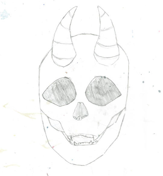
Skull drawing - We drew a normal head drawing first and then traced over the head with a skull design with tracing paper. Digital line art done in Photoshop. This was simple with the first part and then did get a bit hard as I've never drawn a skull before. The line art was sort of easy as I used the paper version and traced over it.
Designing monster from words - Photoshop used for lining and coloured in Procreate. As a class we all picked words which fit with either a part of an animal, colour or shape. Once we had finished creating that list, we then made our own version using all the words from the list. I did find this quite hard, as I've never really done something like this and am more used to when given just one worded or theme prompts for drawing. For the features I tried my best to incorporate them all, but it was slightly harder when it came to the shaping of things.
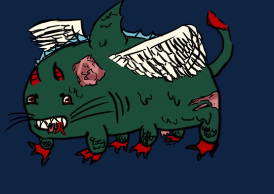
Taking parts of different monsters from films and creating my own version - Drawn in Procreate. We were given the base layers in Photoshop, for the mix matching of the creature. I then drew the lineart and coloured it in Procreate. I found it quite fun, as I like inventing new things but also taking parts of what I love and taking other things and putting them together.
Character sheets - All were made in Procreate, the ones I made only have a double sided head-shot of the character and the information of the characters. Making them are useful for when it comes to having information and a visual of a character. In a way there is an enjoyment to making them.
Story playlists on Spotify - This was quite simple as I used music which were in my liked but also music I saw fit well with the atmospheric parts of the stories.
Using Moodboards for drawing - We were given a few different mood boards of different parts of animals and objects. We were told to take a few and merge them into one thing, such as an artifact. I took two which I deemed were simple to use and would fit well together. Starting with a rough sketch of the concept and then building it from there on top of it, with finer details.


Gifs - The first was very simple as I only made the colour of the eyes change. It was quite easy to make as it was just a looped animation. The second one was more difficult as it was a big setting area, whilst I made the clouds move in it.

Custom Brushes in Photoshop - It was a progress which I didn't really understand at first, but it was fun to do as I was able to have something of my own in the end.
Headers - Making this was sort of like making the custom brush as I was able to decide which font to use and if I wanted it to have a border or not and the colouration of it too. It was slightly more easy to make, as it didn't feel much of a tedious task.

Super Sculpty ear - It was hard at first to get it look like a proper ear. It looked more from fictional rather than it being from real life. I was able to get help from my tutor though, and was able to make it look more realistic. Now the finished result is better than the first result in my opinion. Making it used the sculpty and modeling it into the right shape, and sculpting tools.
Sticker design - As a class we all made a mushroom person design each. It was quite an easy task with drawing and making the full design but one of our tutors were left with printing them out onto sticker paper. We only recently got them, (at the time this is posted, 18/12/23).
Super Sculpty mold for seal + Resin seal - This is like the first time with the clay and plaster but instead with super sculpty and resin. I found this easier, as the resin mixture had to be poured in by our tutor as it hardens to quickly. But the super sculpty mold was a lot smaller than the clay mold.
Patterned design for character card + Information back - Started off with one design and then with photoshop and also turned it into a custom brush. The pattern was created by making it an overlay and then putting it through symmetry fill and changing the directions it would go into, to get the right pattern wanted. When making the information backing I used the pattern that was made and then boxed it so it would act as the border whilst the writing would go into the boxed area that was inside it. It was hard when making the final decisions for each bit, but after consideration it couldn't be better.

Paper weathered envelope - Making a normal envelope was harder than I thought, so I decided to make it in the shape of the box one that is given on Chinese New Year. This worked a lot better for me, as it brings the flare of interest and love that I have for Asian culture into my work. The box one was smaller than the other but a lot easier to make.
3D models using magic voxel - This was one of my hardest projects, as it was a very new thing and I didn't think I have the true eye to draw properly in 3D. But once I got over the hurdle of the first attempt, it was just seeing it from a new eye and learning the better techniques to get it the right way that was needed. It was still difficult but there was progressed that was made.

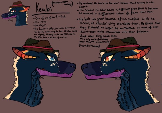
Character art for cards - At first thoughts it was going to be a full-body drawing but in the end turned into a bust drawing. There wasn't the time to make it a full-body drawing and I don't think I drew the sketched anatomy properly at first. I do prefer it as a bust though, and in another day there will be a full-body drawing of Keabi.

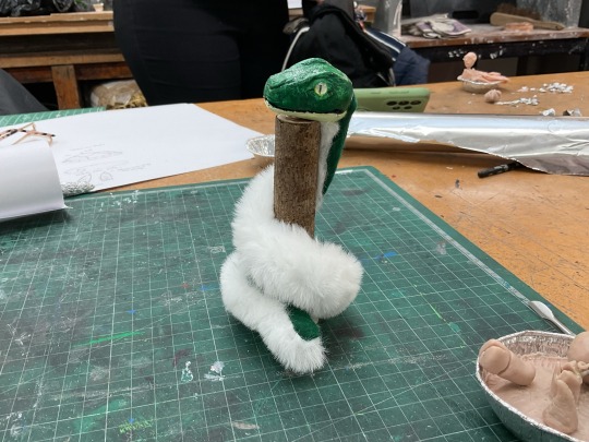
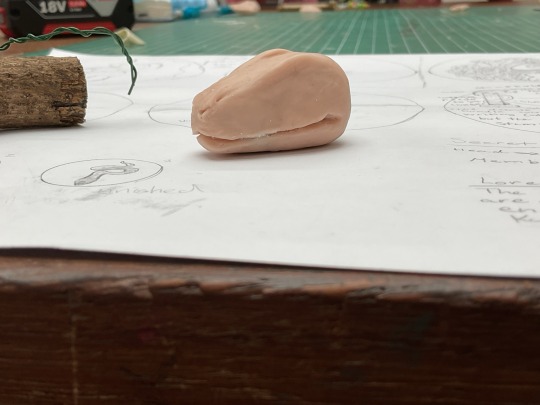
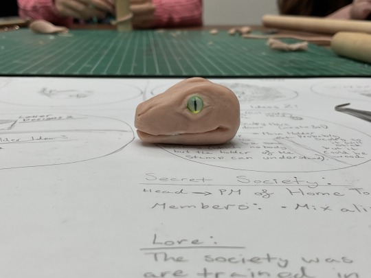
Handle for stamp + sort of art doll snake which is adjustable - Not much work was done on the actual handle of the stamp, instead it was spent upon making the snake that wrapped around it. It was interesting to learn all the new techniques needed to make the actual head and how to keep everything in proportion, but in the end it came out beautifully. There was some hardship when sewing the felt and fur together at the end of the making process, as I didn't know what stitch to us all the time in the end I got my hands on it and had a completed sewn body.
Comic pages - These were fun to make, at times it did remind me of PMVs, as they sort of work in the same way. With it being a slower process of animation and only have small parts of movements to show where the story is going.

1 note
·
View note
Text
I will also say, the vagueness of the term "AI Art" is, at this point, becoming actively misleading.
There's a sort of impression given off that you just type a simple sentence into a box and a picture pops out.
One picture I rather liked in the test was this one:
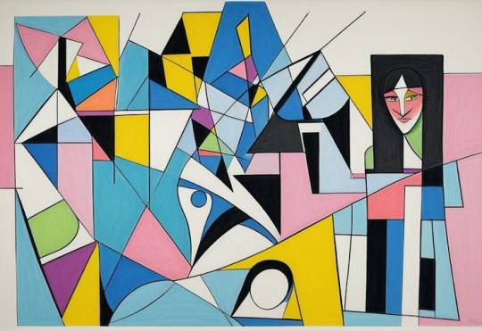
I particular, I like the extremely asymmetrical composition with the one figural bit being on the far left.
But the question I have is, how was that produced?
Because there are a number of possible answers:
The text prompt might not have mentioned anything about composition, and the AI model just happened to produce something I regard as interesting;
The prompter might have specifically directed the AI through the prompt, asking for, I don't know, "A woman on the far right";
The composition might originally have looked like this:
And the artist might have used outpainting to extend the side until the composition became more interesting;
Or maybe the opposite; it was a totally abstract picture and the artist used inpainting to insert a face.
I still haven't tried MidJourney yet, but even over the last year it has become significantly easier to art direct StableDiffusion, and especially to exert direct control over certain visual aspects, e.g. you can use lineart to direct the generation process in concert with a prompt.
At some point the process can get really involved:
Test a bunch of different models to get the look you want;
Use a 3d pose software to create a pose controlNet;
Use regions to block in the basic composition;
Turn that into a sketch or lineart controlNet and use that to control a different model;
Cut and paste new objects or use an image editing program to make broad corrections to the weird details and bad anatomy AI tends to produce;
Use image to image generation and inpainting to fuse those corrections in;
Repeat this a few times;
Use traditional techniques to do things like color correction, atmospheric perspective, add some bloom to lights, whatever;
Like, at some point the human being is starting to exert significant, direct control over a lot of aspects of the final picture, but in a way where the label "AI art" is still just as applicable as if they just typed a prompt and posted whatever came out.
Any sort of conclusions about AI art, and especially the future of AI art ought to really seriously take this into consideration, but in my experience they essentially never talk about this.
I keep saying it, but "AI art getting better" is basically synonymous with "Human beings exert more direct control over the final product"
Okay, guys, after reading a post by @centrally-unplanned I just took that ACX "AI Turing Test" that Scott Alexander did, and I am screaming, as the kids used to say.
You guys are way, way overthinking this.
I thought I would do better than average, and I guess I did; excluding three pictures I had seen before, I got 31/46 correct.
Not great if you're taking the SAT, but I feel like if I could call a roulette spin correctly 2 times out of 3 I could clean up in Vegas.
So, what is the secret of my amazing, D+ performance?
You have to look at the use of color and composition as tools to draw the eye to points of interest.
AI is really bad at this, when left to its own devices.
For example, here:

Part of the reason to suspect that this is AI is the "AI house style" and the bad hands that I literally only noticed right this exact second as I was typing this sentence. Even if the hands were rendered correctly, I would still clock this as AI.
The focal point of this piece ought to be the face of the woman and the little dragon she is looking at (Just noticed the dragon's wings don't match up either), but take off your glasses or squint at this for a second:
Your eye is being drawn by the bright gold sparkles on the lower right side of the piece. That particular bright gold is only in that spot on the image, but there's no reason to look there, it's just an upper arm and an elbow. The bright light source highlighting the woman's horn separates it out as a point of interest.
Meanwhile, the weird aurora streaming out of the woman's face on the left side means that it is blending in with the background.
In other words, the way the image is composed, and the subject matter suggest that your eye should be drawn here:

But the use of color suggests that you should look here:

That's a senseless place to draw the eye towards! It would be a really weird mistake for a human to make! In fact, I think there's a strong argument that the really close cropped picture of the face of the character is a strong improvement. It's still not a particularly good composition, but at least the color contrast now draws the eye to the proper points.
In fact, I would say that a good reason for my performance not being even better was this alarming statement at the start of the test:
I've tried to crop some pictures of both types into unusual shapes, so it won't be as easy as "everything that's in DALL-E's default aspect ratio is AI".
Uh...
So how about this one:
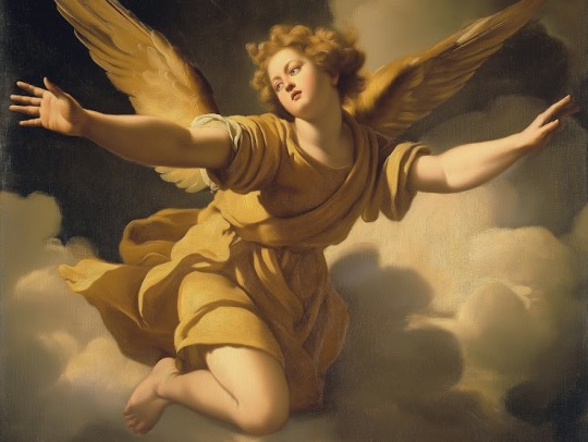
This is a lot better anatomically and in terms of the use of color and light to draw the eye towards sensible parts of the painting. The lighting makes pretty good sense in terms of coming from a particular direction and it also draws the eye to effectively to the face and the outstretched hand of the figure.
It's also a really flat and meaningless composition and subject matter that no renaissance artist would have chosen. What is this angel doing, exactly? Our eye is drawn to the face and hand, and the figure is looking off towards the left side, at, uh, what exactly?
But then I thought, "Well, maybe Scott chopped out a giant chunk of the picture, and this is just a detail from, like, the lower right eighth of some giant painting with three other figures that makes total sense"
This makes sense as a piece of a larger human made artwork, but if you tell me, "Nope, that's the whole thing and this is the original, un-cropped picture" I'd go, "Oh, AI, obviously.
All of the ones I had trouble with were AI art with good composition and use of color, and human ones with bad composition and use of color. For example, this one:

This has three solid points of interest arranged in an interesting relationship with different colors to block them out. I'd say the biggest tells are that the astronauts' feet are out of frame, which is a weird choice, and looking closely now, the landscape and smoke immediately to the right of the ship don't really make sense.
But again; I had to think, "Maybe Scott just cropped it weird and they had feet in the original picture."
Here's another problem:
StableDiffusion being bad at composition is such a known problem that there are a variety of tools which a person can use to manually block out the composition. In fact, let me try something.
I popped open Krita (Which now has a StableDiffusion plugin) and after literally dozens of generations and a couple of different models I landed on ZavyChromaXL with the following prompt:
concept art of two astronauts walking towards a spaceship on an alien planet, with a giant moon in th background, artstation, classic scifi, book cover
And this was the best I could do:

Not great, but Krita has a tool that lets you break an image into regions which each have different prompts, so I quickly blocked something out:

Each of those color blobs has a different part of the prompt, so the green region has "futuristic astronauts" the blue is the spaceship, the orange is the moon, grey is the ground and pink is the sky, which gives us:

Still way too much, so we can use Krita's adaptive patch tool and AI object removal to get:

I'm not saying it's high art, or even any good, but it's better than the stuff I was getting from a pure prompt, because a human did the composition.
But it's still so dominated by AI processes that it's fair to call it "AI Art".
Which makes me wonder how many of the AI pictures I called out as human made because one of the traits I was looking for, good composition, was in fact, actually made by a human.
182 notes
·
View notes
Note
Would you ever do a tutorial on how to draw tit so well? you are a titmancer!
Thank you! 🧙♂️
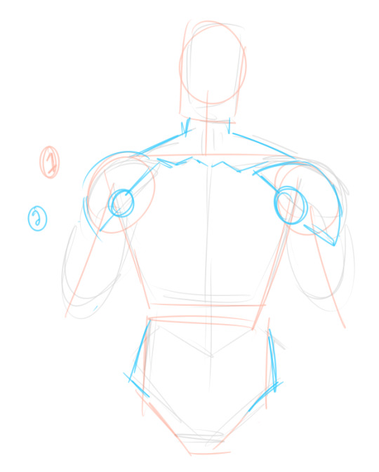
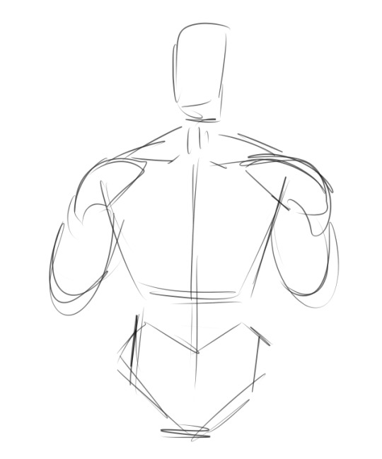
getting used to the Shapes of masculine chest/arms/etc takes some time but tbqh it is sort of just rectangle with more chunks
sketch the body
hes a quick how-to for the front angle and how i sketch the pecs
and then I put together a colour palette: i believe skin tones are not just a "base" and then the "darker shadowy colour" and then the "highlight colour"; it is made of so many blue-green-purpley-yellow-orange tones you wouldn't think to include, and all of those together are what creates the illusion of one solid skin tone. Study from real life and use photo references as much as you need. Challenge yourself and get lots of practice! I make a palette from photos when i want to make sure I'm accurate. Here's an example:
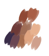
In this, there's light, saturated tones and desaturated colourful ones in deep purples. I tried to get as many different-looking swatches as possible; when I paint, these will blend together and create hundreds of more colours on the canvas. Try to not over-swatch or you'll be sitting there for ages and be focused on perfection.

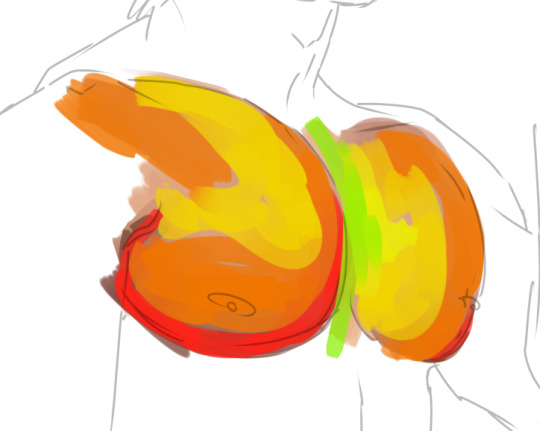
here, I'm getting the general shapes of shadows. In most real-life situations, shadows are not pure black, and highlights are not pure white. Of course, that isn't always true!
I'm not working from a photo reference in this because I am very very very very used to painting boobie but i REALLY recommend using one until you could do it blindfolded. I use references ALL the time, for colour and shape and lighting and angles I have trouble with. There is absolutely no shame in it; you are creating a strong foundation to draw from :)

I'm making it very stark so it's easy to see: the top "square" of both pecs is more shaded where it meets the collarbone. Notice how these bits of shadow don't touch; there's a highlight separating them. This creates the illusion of depth! Shading the body is all about shading the simple shapes plopped on top of eachother :)

I added purple to the underarms area; I find that adding a saturated colour fools the eye to think the shadows are more intense without needing to dip into a dark, instense palette. I blended out the colours on the pec to make them less stark: see how the general shape of shading versus shadow is the same on the left and right, but the left is more gentle. A lot of my technique is memorising What Stuff Goes Where; for example, the little triangle directly under the collarbone where it meets the shoulder. The collarbone itself is a strip of highlight, with that darker triangle directly underneath. This makes a HUGE!!! difference in how you perceive the shape.
As a general rule (with basic, diffuse lighting on the subject) I will do a strip of shadow along the bottom of the pec (ending a little above where the nip is at; this depends on how big the pec is. Someone with a smaller one will have a taller shadow!!) and then it is IMMEDIATELY a highlight in a kind of "U" shape. A lot of the form comes from choosing to blend slowly between dark and light versus putting darkness and lightness side-by-side. Practice and study photos and you will see what I mean, I promise!!

And there you have it!! The pec is just one part but it can really level up your apparent skill when you know how to draw or paint one to your standards. :)
Another quick tip: these general rules also apply to breasts, though the shadow at the top near the collarbone is far more gentle; that sharp shadow implies firmness and flatness.
And: when more at an angle, you can draw pecs quickly by doing this:

"the closer tit is dark around the edges" up beside "the right tit is highlighted on the edge"; the contrast between dark and light implies the two side by side :)
See, even without lineart, it implies Mounds:
I hope this is helpful!!!
175 notes
·
View notes
Photo


Take this Hermitcraft Season 8 Fanart that I spent 6 hours on :D
Doc and Ren’s intro was extremely wonderful, so I wanted to draw the two of them with Renbob, flying through space in the RV. It’s, of course, not an exact replica of Renbob’s RV, but I do think it looks nice still. I think the pink couches add to the aesthetic, ya know? Also I’ve been drawing Doc as a sort of centaur-creeper thing lately, I think it works for him, even though the proportions of that are really hard. I also used a reference for Ren this time, so I think I drew him here more accurate to his actual design. Looking at this now as I’m posting it here, I’m realizing that I could’ve done a few things differently, just to make it look/feel more like Ren and Doc were actually interacting with the RV shading-wise, but I think it looks alright. I think in general, proportionally, there are a few issues, but I stared at it for so long I didn’t really notice lol. I’m still very happy with it though.
Something I’m struggling with stylistically is my lineart, I’m wanting to try more varied lineweight but like, that’s hard (lol), and it’s something I’m not used to doing/haven’t done in a long time. I colored the lines on the first one but not on the second one, and I guess I’d like to know which version y’all like better, just out of curiosity. Because that’s something I’d like to improve and I hope it’s alright that I ask y’all on this post, it’s something I’m thinking about and that I tried here and I’m wondering how it worked, if at all.
I also threw in a couple of little sketchy doodles from various bits of the season so far, because how could I not draw Bdubs in his moss hoodie and Scar with his tiny hat and Tango with his giant glasses?? Also I’ve been thinkin about non-human hermits lately, hence Vex Scar and Tango as some sort of elemental fire creature (??? like I have a design for it all sketched up but I’m not sure if I like the idea, just thinkin about it).
Long rant about my thought process/general art reflection aside, I hope y’all like this :3
#hermitcraft#hermitcraft fanart#rendog#rendog fanart#renbob#docm77#docm77 fanart#digital art#fanart#drawing#tango tek#bdoubleo100#good times with scar
341 notes
·
View notes
Note
Benevolent red hare of art, i come bearing gifts of clover and poppies, and seeking your wisdom (for once, without mildly cursed takes) :
How would you recommend one starts studying about snarling animals? Should it be a broad study of various beast or just the one they are interested in? How should one find key points in their "expression"?
Asking for an OC that's gonna go through some trauma and get a little snarky - litterally
-🦎
Ooooohohoho yess! Red warning for nerd going on a tangent ahead because I fking LOVE drawing snarly creatures with them big chompers!
Okay first things first, you've got the right idea there. Start off by looking at real life animals, the internet is full of pics of dogs, cats, whatever your heart desires, snarling and growling. Learning the anatomy and structure behind what you're trying to do is always the best way to give yourself a solid foundation for creativity. Hehe, gotta know the rules before breaking them, you know.
Anatomy anatomy, we've got it right? Moving on now-
You really don't have to aim for realism. I mean if that's what you want, sure go ahead. But if your art style is not photorealistic, learning to stylize is almost, if not just as, important as learning the anatomical basics. Hell I don't draw my monsters realistically and I don't plan to either, because I worked and shaped my style to convey a certain vibe and have a certain dynamic.
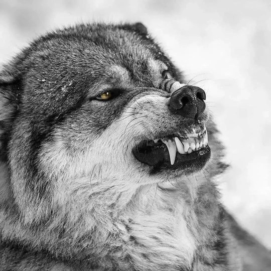
To bring out some examples, let's consider a wolf. In real life wolves have a lot of the upper gums visible while snarling, which I find goofy as hell. The edge of the gums where they meet the fangs are also very rounded, which I ignore in favour of a sharper edge that works better with my style. Here's some visuals:
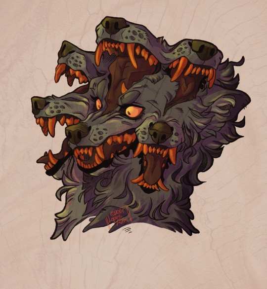
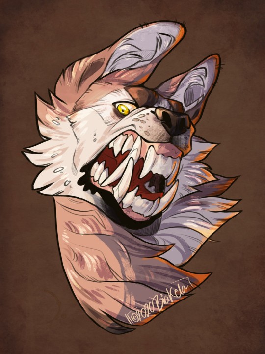
Compared to how I usually draw snarls, both in a more normal style and a drawing where I purposefully exaggerated the fangs:
It ends up quite different from the real life thing if you sit and compare them, but that's okay because those are changes done on purpose as opposed to just butchered anatomy.
A tip that could help with this step could be looking at artists that draw in a similar manner to what you'd like to achieve and learn from them. Observe and ask yourself how does x, y, z manage to convey this or that with their styles and find those little bits and pieces to incorporate in your work, like puzzle pieces. (Before anyone comes at me with bullshit like artstyle theft or something, I'm not suggesting people straight up copy, what I'm encouraging is to learn from each other)
This tip honestly stands for pretty much anything when it comes to drawing. It's what helped me work on my lineart for example. I looked at artists I admire and tried to understand how they achieved such well flowing lines. The result? I learned to apply more line variation, more harmonious poses and small details to my own art.
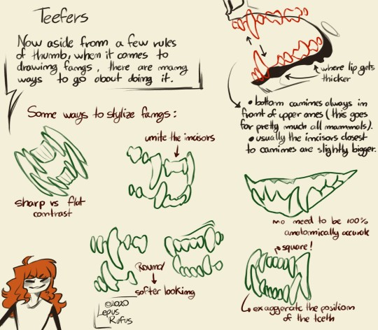
Anyway, back on track here. Ummm learn to draw teeth. I feel like well drawn fangs is what can make or break a good snarl most of the times. Study the proper placement on real life animals and skulls (and even learn to exaggerate the placement later if you wish). Also for the love of god, LOWER CANINES IN FRONT OF UPPER CANINES.
As a little gift of sorts, here's a shirt tutorial i did quite a while ago as per my Instagram followers' request. It's specifically for canine faces, but it may end up useful:
Hope this helps! :D
32 notes
·
View notes
Note
your art is sooo incredibly inspiring i absolutely love your lineart, composition, coloring, etc. you are so amazingly good at what you do!!! i only watched ajin s1 but your work motivates me to read the whole series. if i may ask, would you ever share insight on your artistic process? like how you prepare your idea for an illustration or comic and see it through to the end? anyway im convinced you deserve so much more attention, your art is so lovely to look at! thank you for sharing it.
Thank you, I really appreciate your kind words. I highly recommend reading the manga if you've seen the anime. They both sort of start on the same footing but over time the manga goes in this totally different direction that's very rich and colors the characters more deeply. It's been a while since I've seen the anime but I want to say it's defined more by events while the manga is more character-centric and really dives into the motivations and feelings of the characters.
On my main art blog (@cloverdraws), which you might not be aware, I have provided some insight into my comics process here ☺: https://www.tumblr.com/blog/view/cloverdraws/684198040768217088?source=share
I post my non-Ajin stuff there and also reblog my Ajin stuff over there after some time has passed and I remember to.
However, I wouldn't breaking down how I tried to come up with stuff for Ajin week since it's a little more different and simpler:
So I start off by having this document with a bunch of panels I made to plan and feel around for ideas.

I have different panels like this with different dimensions. Usually the piece will fit. It's a pretty big document but not so big that my tablet or computer can handle it okay. These are the dimensions of the document I use atm.

Anyway, I sketch out ideas. For Day 5 I had blue, social media and ajin in diff countries. I decided to draw a blue Izumi drawing or a group pic of the Maryland Ajin.
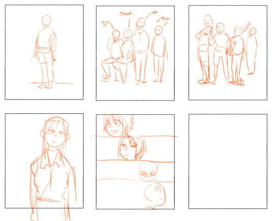
As I draw, my sketch begins to loosen up and more ideas come

In the end, I decide to go with the top center because I like the attitude of it. Usually if I'm really going to make a nice illustration, I would blow up the thumbnail and then sketch but I was pressed for time so I decided to work at the same dimensions as my thumb which is pretty decent size anyway.

I do line art. For this one I chose 'The Robin Sketcher' a nice grainy pencil-like brush I got via Clip Studio Assets. Lately I've gotten pretty comfortable with it.

It's really fun to add pools of black with this brush so that's what I do.
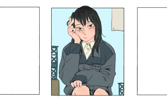

I block in colors that seem to fit with each other. The blue bg is added later and is a bit bright but it's because I like the contrast and I plan to darken it with a gradient and some texture. Also, this picture is me toggling the visibility of layers so you don't see the whole process, but here I also added a little color to the face, knees and other places. You don't see it well but her hair behind the lines in her hair is kind of green, working with the black imho.

I add more details like some darkness behind the crates, some shapes to the poster and the texture/gradient for the bg I was mentioning. I also added her name tag because she had that in canon and I thought it would be a fun detail to add her surname at the time, 'Tanaika'

Finally I do some pretty simple shading with a round brush and later soften it in strategic places but also try to keep the harder edges too. It's your standard 50% multiply layer.
The color feels a little flat, so I find adding a gradient adds some dimension. I also made this gradient normal at ~50% starting from the bottom to homogenize the bottom with some blue and draw our eyes to her face
Then I play around with layers and filters to strengthen the blue and the feeling I want to convey with this picture

I don't like to go crazy with the filters but this is what I used:
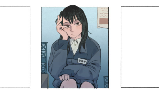
I then Save As a copy and make this drawing it's own file so I don't overload my thumbnail file. In the end this drawing came out to a decent-size dimension and I really loved how it turned out.
4 notes
·
View notes
Text
Jewel of the Sea: Chapter 11: Found
Chapter 10
Main Taglist: (Send an ask to be added or removed!) @starlocked01, @spoopy-turtle, @lizluvscupcakes, @more-fandon-than-friends, @i-cant-find-a-good-username, @vindicatedvirgil, @star-crossed-shipper, @justaqueercactus, @gayboopnoodle, @sanderssidesweirdo, @the-sympathetic-villain, @8-writes, @lizzy-lineart, @battlebunnyteardropsinthesun, @sirprplsnail
JotS Taglist (Send an ask to be added or removed!): @5-falsehoods-phonated, @vindicatedvirgil, @starlocked01, @viva-la-pluto-dam-you, @pan-immortal-jefferson-starships, @acetatertot, @silvarraven, @logan-positivity, @virgil-positivity, @luella-the-homosexual, @positivitykitty, @akatsuki-no-katira, @ironwoman359, @winterwynd, @lookingforaplacetosleep
Word Count: 1,354
Virgil normally wouldn’t have ever thought of pestering someone like this but it had been three days and he was getting anxious. So, he found himself outside Logan’s office with his hand poised to knock when the door opened on its own. Logan smiled at him, hand on the knob. “Hello, Virgil. I was actually just going to find you. Did you need something?”
Virgil took a deep breath and nodded. “Do you remember when you said you’d give me anything I ask?”
“After you saved Roman from the lake? Yes, I remember. Have you thought of something you want?” He shifted the papers in his hands to rest on his hip. Virgil was grateful he didn’t mention the mer’s reluctance to take him up on that offer before now.
“Yes, that. I want to go back into town and find a calcite crystal. I’m sure it holds the key to unlocking my memories. The only other thing I can think of is that the amnesia is a result of some sort of head trauma and I’d need to hit my head in the exact same way in order to regain my memories.”
As he spoke, he felt a pit in his stomach. He didn’t want to leave Logan, didn’t want his time here to fade from his memory like sea foam after a wave. At the same time, he saw a light in Logan’s eyes dim, as if he didn’t want Virgil to leave either. That made him feel a bit better, knowing the feeling was mutual, but he also didn’t like that he’d made Logan sad.
Logan smiled, the look quickly being covered in his usual neutral expression. “Okay. I have some time tomorrow. Maybe we can take Roman with us and give him a reason to get out of the castle. Do you know where we are going, at least the general area?”
Virgil nodded and the excursion was set. The next day, they were off in the car, Roman situated firmly in between them. Just as directed, they started from the other side of the town, Virgil keeping his head on a swivel as he tried to find the shops that were suggested by the store clerk. Over the course of the next four hours, they entered a lot of jewelry stores and other rockhound areas before they found the costume jewelry store Virgil was told about.
As they went through the stores, Virgil couldn’t help but notice that Logan’s eye was drawn again and again to the same type of jewelry: A simple pendant on a leather cord. He filed that information away for later, even as he looked for the stone Remy wanted. He wondered how Logan would react if he told him everything. If he told him he didn’t have amnesia, he was looking for the stone so he could regain his fins and get back to his blessing, how he was actually a mer and not a human at all. How would he react if he told him how he wasn’t sure he wanted to leave anymore, how he wanted to stay with him, how he wanted to court him and be courted by him? Virgil knew it was an unrealistic thought, but he couldn’t help it all the same.
Finally, they found it in the costume jewelry, Virgil having separated from the others in order to build up the courage to ask an attendant. She led him over to a display case that had a label that matched what he was looking for. Still, he couldn’t help but ask questions.
“Are you sure this is actual calcite and not something that looks like it? It has to be real.”
The attendant, her name tag read Emily, smiled patiently. “Yes, it’s completely real calcite.”
“Does it glow under certain lighting? I was told it would.”
“Yes, it glows under UV lights.”
Virgil nodded, eyes locking back on the pendant on display. It had a braided chain of leather attached to the actual pendant, the braid wrapping around the stone with a connector in between. Head shooting up, he searched the store for Logan, just barely able to see his head above the stands.
“I think I found it, Pebble!” The term of endearment slipped out and he bit his lip, hoping no one noticed.
Logan didn’t comment on it, simply walking over to view the object Virgil was quick to point at before nodding. “That does look like it. Does it make you think of anything in particular?” His gaze was intense as he looked at Virgil.
He dodged it by looking back down. “I don’t know.”
A hand came to rest on his lower back, causing him to look back up at Logan, who spoke, his voice tender. “Do you want to buy it?”
Virgil smiled, nodding. “If you wouldn’t mind.”
✴ ✴ ✴
Logan didn’t know if it was the vulnerable look in Virgil’s eye, a hesitance mixed with confidence, or if it was something else, but he knew he would do anything for him if needed. He’d always heard the age old adage of ‘if your friends jump off a bridge, would you do it too’ but, in that moment, he knew he would indeed jump off that bridge for Virgil if needed.
As they exited the store, Logan spotted a different one just down the street and smiled, putting his hand on Virgil’s shoulder to get his attention. “I know we discussed letting you borrow one of my father’s suits for the party, but would you be adverse to getting a tailor made one instead?” He nodded his head in the direction of the store he’d spotted.
Virgil’s smile was tight-lipped, as if he were tired. “That’ll be fine if it’s what you want.” He started toward it but Logan stopped him.
“I want you to tell me if you want it or not. You have the right to choose.” He tried to discreetly look him over, to make sure he was fine.
Roman tugged on Virgil’s sleeve, getting his attention. Virgil dropped down to one knee in order to be at Roman’s height. “Yeah, buddy?” He held the boy’s hand as his whole attention focused on him.
“You don’t have to go along with us just because we’re the ones using the money. You can say no, you know.” Roman’s eyes were wide and sincere.
Virgil laughed, rustling his hair. “I’ll keep that in mind.” He stood and Logan looked askance at him, desperately wanting to know what was going on behind those stormy gray eyes. “Yeah, getting a new suit would be the less time consuming option.” He frowned. “But wouldn’t it be a waste if I were only to use it once before I left?”
Logan’s mood fell at the mention of Virgil’s departure now that his injuries were almost completely healed. Before he could say anything, Roman beat him to it. “You could take it with you.”
Virgil smiled again, a faraway look entering his eyes. “I could, that’s right.” So, they walked into the suit store, Logan wondering if he should confess during the party at the end of the week. Should he let Virgil know he didn’t care about his past, didn’t care about who he was before? All Logan knew was who he was now, and that was a pretty good person. Before he could think on it further, he was drawn into a conversation with the tailor.
✴ ✴ ✴
He pulled his head back from around the corner, face morphing into another’s as he did so. Smirking, he started to walk down the street, his cane swinging by his side. So, they were having a party in a few days, were they? That would be the perfect time to strike, he thought, a gleeful smile spreading across his face. He twirled the cane as he jauntily walked down the street, so joyful he could whistle a tune. The prince was finally so close he could practically taste him. Janus smiled as he turned the corner. This would be easier than scaring a baby.
Chapter 12
#jots#analogical#logan sanders#virgil sanders#adhd!virgil#mer!virgil#the little mermaid au#Janus sanders#roman sanders#ace writes
56 notes
·
View notes
Note
Hello! May I ask how you draw? I'm currently learning how to myself and would be highly interested into a step to step process by you! Like from sketch to the done thing (no color necessary)
Hello there!
I dunno how I feel about showing how I work/giving advice to someone who’s learning (and I say it as a pro artist who went through years of traditional art education) because when I do the illustrations you see here on my tumblr I BREAK THE RULES you’d learn though life drawing routine, and give in to bad habits, and my methods are rather unplanned and chaotic which makes it difficult to pinpoint significant stages. But I used my portable potato to take some photos during working on my last piece, so I’ll throw it here with a bit of an explanation of what’s going on.
Before I begin - and because you’re about to look at a mess of a WIP - I’d like to give you some general advice that generally makes life easier when you draw (again, things that I learned in traditional arts education - another artist might advise you the complete opposite, dunno!)
Work holistically. Forget them satisfying-to-look-at clips on instagram showing someone produce a hyperrealistic portrait starting from an eye, with each and every element emerging being finished before they proceed to another part. It takes a lot of talent, yes, but these are ppl redrawing a photo in a kind of a mechanical manner. Most artists don’t work this way. Especially if you’re working without a reference, or if you’re doing a life drawing - your process will be layering and changing and finding what works best to give an impression of what you’re drawing rather than reproduce the exact image, and your artwork is likely to look messy most of the time.That said: don’t start with the details. Don’t spend too much time on a particular part while neglecting others. Your goal is to keep the whole piece at the same level of ‘finished’ (even though it’s unfinished - do I make sense?) before you’re confident that everything is where it should be and proceed to the details. So sketch out the composition first. See how things fit, what’s the dynamics. You’ll save yourself from limbs sticking out from the frame, odd proportions etc etc.
Because it’s a game of relationships between different parts of the picture/scene. I ask you not to worry about finishing a single element before laying out the rest because you’ll find that said element will look different once the other part appears! For instance - you might think that the colour you picked for a character’s hair is already very dark. But once you’re done with the night sky background, you’ll find that it’s in fact too light, and doesn’t work well with the cold palette. You’ll have to revisit different parts of the image as you go to balance these relationships and make the picture work as a whole.
Give an impression of something being there without actually drawing it ‘properly’- because details are hard, mate. You’ll see that my lineart usually has hardly any, and my colouring is large unrefined stains, but the finished thing looks convincing. Like, fuck, I can never focus on how Crowley’s eyes are really shaped. So I just turn them into large glowing yellow ellipses crossed by a line, and heard no protests so far.
Don’t panic if you messed up (you probably didn’t anyway). It might turn out to be a completely unnoticeable mistake - because, remember, things work together to balance each other, so another finished off prominent element will probably drown that badly placed line that looked so visible and out of place a second ago.
It might not look good before it’s finished. I’m mostly immune to it after years of drawing, and my recent illustrations all follow a specific method (ykno, my sunset glow effects and all that) so I can kinda predict the next stage. But I do my linearts on a specially picked crap paper, I don’t bother erasing the smudged graphite, and it looks messy af until I make the background white in Photoshop. Conclusion: you might have a moment of doubt as you work through a piece, but try to break through it - I often suddenly start to like what I cursed a minute before! - and try to finish it even if it’s meant to be bad. This way, looking through your past pieces, you’ll see the progress. And trust me, I can’t even look at my art from literally three months ago. It’s normal.
Now, pics! The sketches are paler in real life, but I increased the contrast a little so you can see something.
1. Laying out the composition!
I wanted to just show them kissing, but I got carried away due to some Art Nouveau inspiration. As you might have noticed, most of my illustrations are quite self-contained (ykno - they look like a sticker on a plain background). So I wanted a tight swirl bordered by Aziraphale’s wings creating a sort of rounded, yin-yang like bubble around them. Consequently I made the whole composition revolve around their heads.

2. Adding more details to the sketch. It’s messy af. It will be messy until I’m done. It’s fine.
3. These are the fineliners I use for the linearts! They are made by Uni-ball and come in light and dark grey. I also sometimes use the guy on the left - ‘Touch’ sign pen by Pentel, when I want more brush-like, wider strokes. I work in grey because when I scan it and do my usual boring trick with sunlight highlights - which is an Overlay mode layer in Photoshop - the highlights ‘burn out’ the lines too and make them vanish a little, and the lighting effect gets more striking. I also like to use the light grey ones to make something look pencil-y without actually using pencil, because pencil fucking smudges.
4. It smudges! So because I am right handed, I start inking from the right hand side, no matter how tempted I am to do their faces first.
5. You can see the composition directions here. I made it intuitively, but ofc some ppl actually use grids etc to lay out their drawings.
6. See how pale ans thin the lineart was at first? I kept adjusting it as new inked parts were appearing. It starts to look nice and consistent now!
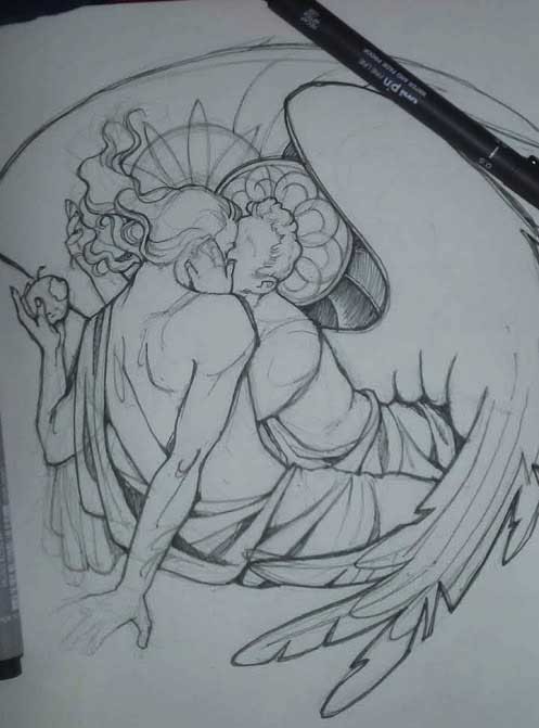
7. Finished lineart? There are some mistakes which I later corrected in PS. Notice that Aziraphale’s face has hardly any details on it - I tried to make the drawing suggest his expression rather than risk overdoing it.
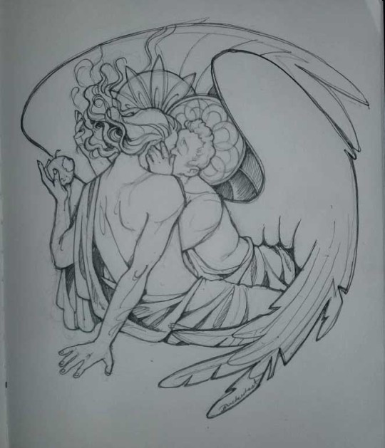
8. Photoshop time!! You can totally do what I did here even if you don’t have a graphic tablet. I used Curves tool to enhance the lineart, then Quick Selection Tool to select the background around around my sticker-like piece and filled it white (on a new layer ofc). I keep this white layer on top of the layer order so it works as a mask as I colour. I decided I did not like the hatching shading underneath Aziraphale’s halo, so I erased it with a Stamp tool (because I wanna keep the textured grey fill my crap paper naturally gives me!). It’s done roughly but won’t be visible once the thing is coloured.
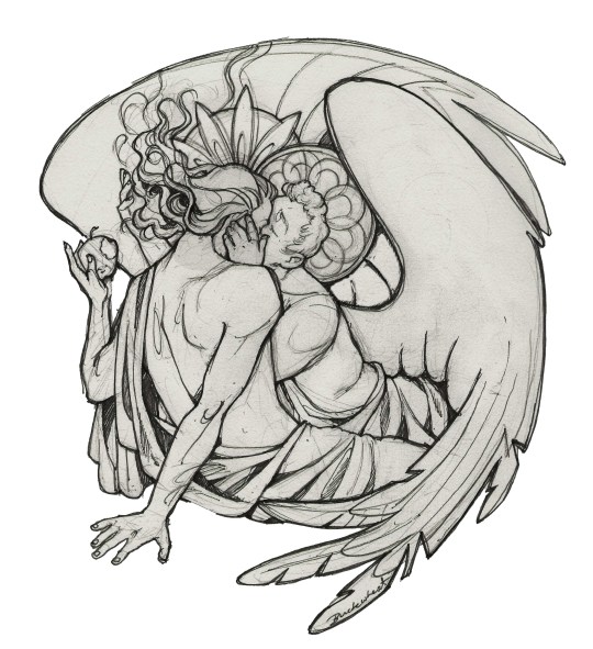
9. And the reason why I keep the grey shade instead of easily getting rid of it by using Curves/Levels is because when I set this layer to Multiply mode and colour underneath, it gives me this nice desaturated look like from an old cheap paper comic page. It works as a natural filter! But of course I can’t do bright colours this way, so all my glowing highlights happen ABOVE the lineart layer - on a separate layer in Overlay mode!
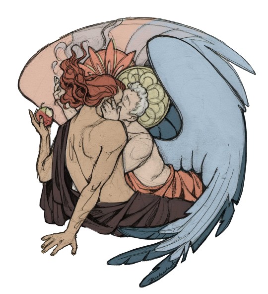
Finished thing here!
_____
Commission infoBuy Me a Coffee - help me with my transitioning expenses!Prints and stickers and things on my Redbubble!
#ask the buckwheat#long post#tutorial#drawing advice#drawing tutorial#good omens#ineffable husbands#good omens fanart#good omens art#my illustrations#doodles#toastedbuckwheat
1K notes
·
View notes
Note
Do you guys have any tips on making the lineart look more natural and fitting with the rest of the drawing? Like rn a lot of my lineart looks too stark and kinda jarring against the rest of the image ;w;
If there’s a disparity between your subject lineart, and the lineart you use in the background, it can make the image look unintentionally disjointed. This can be used for metacontextual or stylistic effect. But as you’ve experienced yourself, it can also make it difficult to draw the subjects looking properly integrated with the background.
In lieu of previous posts, I think we should set our eyes on some established visual universes and styles. What they all seem to have in common - is that their subjects usually share the same line -thickness and density as the backgrounds with few variations to make the two aspects stand out against one another.
Essentially, these universes work on the notion that subject and background can vary in aesthetic - but follow most of the same basic rules as one another.
Disney’ s Phineas and Ferb displays a very unified way of depicting characters against backgrounds. Their line thickness is, for the most part, the same all over the board. Some lineart is coloured, like the lines around the character’s hair, whilst others remain black. This lends itself well to animation. The motion of the characters against the still backgrounds will separate the two entities from one another. Although when seen in a still image like this, the visuals rely on having characters stand out from the background via their toont shapes and bright colours.
Steven Universe follows a method that’s been tried and tested by its predecessors. Character’s sport more bold lines than the background, which is drawn much more delicately. This makes the characters stand out immediately when put in a composition. But even with the differences in lineart thickness, the weight of the linework on the characters rarely go beyond the weight of the backgrounds’ most dense bits ( like the traffic cone’s outline ). This is a rule laid down to prevent the characters from ever appearing as if “ on top “ of the background, while still keeping them integrated with the environment.
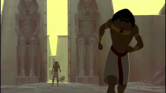
One popular method from all the way back to some of the first feature animated film was the lined-characters on painted backgrounds. Prince of Egypt is one of my favourite examples ( and favourite 2d animated musicals ). Notice how there’s a thin bit of outlining around the character ( most prevalent around Moses’ legs ). Had the lines been any thicker, the integration would’ve been rougher. But because the linework is so precise and delicate it’s perfectly harmonious with the otherwise lineless background.

On a completely different spectrum, you’ve got the comic-noir variety of styles. That integrate their characters completely with the background by having everything bathed in large chunky shadows. In this particular genre, characters are often brought forward by setting them against contrasty backgrounds- or through abstraction in the environment. In this particular style, especially the monochrome ones, the line thickness can vary greatly from image to image, depending on what sort of mood or atmosphere the artist wants to evoke. But the use of those dense shadows helps to bring it all into the same space seamlessly. Even if the denseity of the character’s lineart is vastly different from that in the background.
If your lineart of your subjects do not match with the lineart of your background, it can mean that the two aspects are following different rules. If you want to change that, making sure that the thickness of your lines doesn’t vary too much between the two aspects. Or if they do so, find a way to add other unifying aspects (shading, colours, etc ) that can link the two planes together.

As for me, my lineart varies somewhat in density depending on what I need it to do. I follow the basic rules of 2D animation - by keeping most lines the same thickness. While also taking liberties from the Noir genre when illustrating larger pieces.
- Characters are outlined to make them stand out against the background - These outlines are denser where there’s contact between the background and characters - The closer to the camera the character is, the thicker the linework and outline. - Segments, where characters overlap, have denser outlines
- Sturdy and heavy materials have thicker linework- Light and frail materials have thinner linework
It comes down to you figuring out what you want to do in terms of the rules of your visual universe, and then actively implementing these rules and keeping them consistent across the subjects and backgrounds when drawing. It takes a while to get a grip of - since it comes down to your abstract abilities, but as you develop your style more and more, perhaps hone some technical skill too - you ‘ll probably find it easier to pinpoint why something stands out in the linework and why some things don’t.
- Mod wackart ( ko-fi )
#whyis-every-username-taken#ask#mod wackart#lineart#style#art style#stylization#backgrounds#theredlinestation
272 notes
·
View notes
Text
April 4th-April 10th, 2020 Creator Babble Archive
The archive for the Creator Babble chat that occurred from April 4th, 2020 to April 10th, 2020. The chat focused on the following question:
What is something you’ve improved with in regards to writing or comic creation thanks to working on your story?
carcarchu
Oh this one i can answer definitively. it's 100% lineart. forcing myself to have to do lineart for hours everyday is definitely a way to force yourself to get better at it while i still don't like it it's something that i can do now without being scared about it
shadowhood (SunnyxRain)
Colouring. I had to get really creative in expressing emotion and hinting plot devices with colour. Also got much better with drawing gesture drawings due to looking at a lot of references!
Cronaj (Whispers of the Past)
Either writing dialogue or drawing/painting backgrounds... I used to be particularly awful at writing dialogue. It was too stiff and formal, and sounded a lot like old prose. Now, because of writing a comic and going through several scripts, the dialogue is a lot more natural, and the pacing is more realistic to actual conversations. And the other: backgrounds. I really used to not even draw them at all, and doing a comic forced me to have to think about environments in scenes. So I went from drawing floating characters to having to consider where they are and how it affects the story/mood.(edited)
Feather J. Fern
Paneling! That was my main focus to figure out how to do good paneling to have clearer pages
Deo101 [Millennium]
Honestly? Everything. It's all gotten better and I've learned so much. I would say my biggest improvement is probably in my time management, and art wise is probably composition and layouts. But it's hard to pick because I've grown so much in every aspect!
chalcara [Nyx+Nyssa]
Biggest thing I learned was to keep the story small and focused - and that the smaller, more human struggles are much better in creating tension than the whole default "the world's gonna end!" thing. Mind you, I still love a good "world's ending" story, but you gotta make people CARE about the people in that world first!
Holmeaa - working on WAYFINDERS
ohohohoooo I have done more drawing in photoshop in this short time I have worked on Wayfinders, than the rest of my life! That has given me some skills for sure! Coloring is another one, and generally just efficiency and flow in a comic
Nutty (Court of Roses)
For me it's been my use of color, and getting more confident in experimenting with it to really drive home a scene's mood!
LadyLazuli (Phantomarine)
The clearest improvement I always notice is my layouts - I’ve gotten more adventurous with panel shapes and placement as time has gone on, experimenting with more interesting designs for the whole page. Some of those experiments haven’t been totally successful but it always feels like a worthwhile try. I’ve gotten some really, REALLY cool layouts out of these experiments, and I love seeing how dynamic the panels have become compared to my first chapter. Also speed. I’m so much faster now. Thank gooooooodness (edited)
Eightfish (Puppeteer)
@LadyLazuli (Phantomarine) I've definitely noticed the experimental panel layouts! They're really cool.
AntiBunny
Planning. Book 2 is when I started using sketchbook thumbnails to plan ahead. The luxury of that first draft meant I could rethink panel layouts and how to best express the events happening if I first had an idea of what was happening laid out.
Also digital art by necessity since I switched to digital during the current arc. I was decent at lineart already, but other aspects have really challenged me to grow as an artist. I had to totally rethink the way I create backgrounds for instance. During this time the background quality actually declined a little while I got used to a new method, but experience has improved my skills greatly as I force myself into new methods.
DanitheCarutor
Hmmm maybe paneling, speechbubbles and backgrounds? My current project is my second real attempt at doing a comic, but I have learned a lot of stuff from the community and general art and story tutorials. Backgrounds and bubbles were the worst for me when first starting out, I only read manga before starting so the speechbubble shapes did not fit with how English is written. Plus I've only drawn wooded fantasy settings before making my comic, so using a ruler, figuring out perspective points and drawing buildings was very new to me. I still hate drawing cities and such, but I've gotten a lot better at it and it is easier to do now. Since I mostly stuck with B&W before my current project, coloring also kind of improved? Depending on who's looking at it. Lmao If I were to think about story/characters/dialogue, I have no idea if I've improved. Honestly, I don't pay much attention to the quality. Also my brain kinda says it's all bad regardless of what I make.(edited)
Joichi [Hybrid Dolls]
For my Improvements: I'm getting better at my comic panels, as I adjust to the vertical style. Before I've always drawn the standard format. It's more than just boxes, I try to keep a variety of sizes. I'm picking up roughly how much 'gutter space' I need per 2-3 panels.etc I'm also improving on choosing colors that fits my love of detailed linework.(edited)
OH! I'm also learning about Clip studio shortcuts, how to use the assets they provide which makes the process, abit easier on me. Things I need to change, is I want to get a good speedy coloring style, without referring to my usual coloring.(edited)
Tuyetnhi (Only In Your Dreams!)
the more I worked on the comic, the more I feel ambitious in making different angles and perspective. So it's really hitting me out of my comfort zone which is good! lol Though I'm trying to keep in mind of my speed, what I feel like I've improved a bit is trying to keep in mind of paneling and dialogue.
FeatherNotes(Krispy)
Process! Space and i have definitely figured out the most productive way to produce content at the rate and quality that also provides us with time for our own projects. Comics are a useful tool that helps you discover ways to better organize your creative workflow for sure!
sssfrs (JOE IS DEAD)
I think probably scenery. I used to dread drawing inanimate objects but now I feel more confident in filling in a scene & even look forward to it sometimes. Maybe also page composition and paneling but I still have a lot to learn there
eli [a winged tale]
One of the reasons I embarked on the webcomic journey is to push myself to improve not only storytelling but also utilizing art to create a reader experience that would be difficult to replicate with just words. I’d like to think that 9 months into making A Winged Tale, I’ve improved on deciding when is a good opportunity to invest more into backgrounds vs character dynamics and when should be focused more on sequences of panels and composition. While the comic is written in a four panel format, more and more I’m finding areas where the story could be told by breaking those rules (attached pic). It’s a balance and I hope going forward I will improve more in pushing the limits of panels and find ways to express the story in fun and interesting ways.(edited)
Joichi [Hybrid Dolls]
Wow that's a very good description @eli [a winged tale] I look forward to reading more of your story journey
eli [a winged tale]
Thanks so much Joichi! I’m eager to keep learning~
Capitania do Azar
I'm gonna go with planning and actually getting it done. I'm so much faster because now the process is much more streamlined to me
kayotics
My whole comic was started s an exercise to just get better at comics generally so I’d probably say every part I’ve improved at? The biggest things are probably colors and the upfront planning process
Phin (Heirs of the Veil)
Ooof hard question. I think my main improvement lies with page and speechballoon layouts and writing natural feeling dialouge. I'd say maybe also character acting?
Joichi [Hybrid Dolls]
I'm slowly learning how to create more engaging comic narrative. I read and research in the polished prem webcomics to see what makes them engaging? Like I'm going to challenge myself by creating a series of short stories with a reoccurring set of characters. Every new comic series I create is an experience, trial and error. Sometimes I skip the writeup and just go in blind, trust my own instincts. I'm glad to reach out and talk about it than in my own head. I hope by this year, I'll have at least 2 chapters of Hybrid Dolls out.(edited)
keii’ii (Heart of Keol)
I've definitely gotten better at planning/ outlining multiple chapters ahead of time. I did not even do this when I was doing the first 10 something chapters. (I did attempt an outline before I began the comic, but the story changed significantly from the outline by the time I started the comic, and I did not try to do it again for a long while.) I can't remember when I started, but I do recall having a lot of trouble the first time I tried to do it. It's gotten a little easier each time, though. In fact, I just spent the past few days outlining the next few very important chapters, de-tangling some big tangles. I'm really glad my outlining (and overall writing) skills had leveled up, because HOO boy, I don't think my 2014-2015 self could have done this!
I also became friends with enviros. I had already become somewhat comfortable drawing perspective when HoK started, but I had a sort of mechanical approach to it, like "oh I need some enviro for these establishing shots, guess I'll draw them." But now I LOVE drawing enviros! (some types anyway...) It's my comfort activity, something I treat myself to after a long day! In the thumbnails for my next few pages, there's a few enviro-heavy panels that I have to remove, because I drew too many of them (and the pacing got too slow as a result). I have to stop myself from drawing too many of these.
My biggest improvement is probably I've come to understand my characters and my themes much better, but that's more of a "I got better at making HoK" than a "I got better at making comics." There's definitely a difference between the two.
Joichi [Hybrid Dolls]
@keii’ii (Heart of Keol) ah I totally understand I tried the outline method before I start but my story changed alot after I drew it. So it start to feel like a waste of time for me, but I'll still write an outline to make sure to plan where my story heads(edited)
keii’ii (Heart of Keol)
Yeah! I needed to draw those first few chapters to understand the direction of my own story.
The drawing part is an essential part of self-reflection, to try to understand what it is that I want out of the story. The answer has always been there in my heart, but I'm not able to see it clearly from the get-go.
Joichi [Hybrid Dolls]
I end up breaking scenes and put them in for future episodes, since I want to get a certain flow in the story.
It could be tricky to see what it is you want out of the story until you are in at least 3 chapters in?
keii’ii (Heart of Keol)
I needed way more than 3 chapters -- though granted, my chapters are short, so that could be a part of it
Joichi [Hybrid Dolls]
I see the early first script as testing the water. like a test to figure out the characters personalities. Unless you are bringing in old characters which you knew before?(edited)
keii’ii (Heart of Keol)
Even if the characters have been with you for a while, unless I have made a comic with them, there is a big chance that the characters will completely change, too.
DanitheCarutor
You know, I was thinking about about this, mostly about how I wouldn't have been happy if I was able to finish my comic the day I started. Then I realized I'm happy that I didn't. The first chapter wasn't the best, I was just learning how to coloring a comic, still fleshing out my characters and was still brainstorming small kinks in the story. I also still didn't have as much of an understanding of perspective, or panel and bubble layout. Even though I still have a lot I need to work on, I've gotten a lot better in all those aspects. Even though my use of color is weird, I've definitely gotten much more confident in it, enough so that I experiment and take a lot more risks with style. Even though my panelling can be boring, I have a much better understanding of how I want a page to look. I've improved a lot with my planning as well, like even though my thumbnailing/storyboarding only takes maybe 30, I've learned to step away for a bit if I don't like a layout, or analyzing why I don't like it and brainstorming ways to make it better. If I had magically finished the comic all at once, it would look really bad and may have been less readable.
Joichi [Hybrid Dolls]
That is inspiring to hear about your improvement @DanitheCarutor
Natsu-no-Hikari
Chiming in! Just this week, Miko (my co-creator) and I were discussing how far we've come from when we started our first comic (https://liarsgotoparadise.com/) vs. where we are now. I think there have been a lot of learn experiences, such as art, dialogue, general editing - but especially with pacing and character interaction. We regret that we didn't stop to focus more on that interaction, as we wanted to move ahead in the story...and now we can't change that, except to start now and not allow ourselves to grow impatient. Take our time and enjoy the journey - that's our new motto. There's a time to rush ahead in perilous moments, but there's also definitely a time to catch our breaths and let the characters mingle and speak. It's an improvement that will become more noticeable going forward in Liars and our second comic as well.
#ctarchive#comic#webcomics#indie comics#comic chat#comic discussion#creator interview#comic creator interview#creator babble#comic tea party#ctp
1 note
·
View note
Note
Merry Christmas!! I hope you are happy, and have a good New Year! 😁
Thank you!!! I hope you had a wonderful Christmas and will have a wonderful New Year too!!
Anon said:aaaaawwwnnn the good ol' platonic (or not, depending on the interpretation) bak*deku
I’m not anti anything anon, so you never gotta worry about that! I have ships I like and ships I don’t and ships I’m indifferent about, but I’m a firm believer in the ship and let ship principle~ sadly bkdk is strictly platonic for me (I see them too much as sibs for it to work in a romantic way, at this point), but I do adore their relationship and the way Horikoshi is writing it TT^TT it’s def one of my favorite Bakugou relationships, such a wonderfully complex story 💕
Anon said:Have you ever thought about drawing Bakushima as different ships? Like, from different shows. Put them in their outfits and such? I thought that wouls be pretty cool. Sorry if someone has already suggested this! I thought maybe Black Butler style ? Fruits basket, Death note, ect. ❤
I have in the past drawn them in AUs inspired by characters from other fandoms, if that’s what you’re asking! At the top of my head I can remember drawing them as Black⭐Star and Tsubaki from Soul Eater, Doumeki and Watanuki from xxxHolic and Jacuzzi and Nice from Baccano!, but I’m sure those are not the only ones... I’m never against that sort of AUs, if you have anything you’d like to see ask and I’ll see if I know the fandom you’re thinking about! :D
Anon said://squints// did your.... Did your lineart imPROVE??? holy maples Fran ur killing me with ur art I wanna survive my last 7 months of high school--
If you think so, then I’m seriously happy and glad to hear it! Thank you so much!! I feel like I’ve been getting sloppier actually, ngl, but I have been trying new tools for the line, so maybe that’s the difference you’re seeing!
Anon said:Gonna say anonymously caz' i'm too embarrassed to reveal myself for now, but I love your blog and art so damn much!!! Been following you for two years and you really inspired me to draw and really to stay in touch with bnha. Again, love you so much and hope you a merry Christmas!!!
Ahhhhh anon thank you so much!!! I’m happy I can make you keep up with bnha, ngl!! And I hope you’ve had a wonderful amazing christmas too!!!
Anon said:Sero with the long hair can murder me
He wouldn’t!
Anon said:what do you think of bakukamijirou 👀
I don’t ship it, sorry :( as far as shipping Bakugou goes, I only ship him around if Kirishima is involved - I do have a few Baku ships I like just for the aesthetics (like with Jirou, or Todoroki!) but I wouldn’t really call it “shipping”, I just like to see them next to each other cause their designs work well together haha
Anon said:Hello? Yes. Hi. Dave I love. Thank you.
I’m so happy to hear that!!! TT^TT thank you so much!!!
Anon said:Kamijirou cures my depression :3
WELL IF THAT ISN’T A MOOD!!
Anon said:Have you every considered a voltron au for your ocs? I know youve made a voltron au befores so i was wondering if you ever did it for anything else (i really love all your art have a lovely day
I’ve never, actually :thinking: the vld fandom is very scary to me so I try to keep away from it, ngl! I’ve also not watched past the first season of the cartoon itself so by now I don’t think I have the necessary information to make AUs based on that fandom, but the concept of my kids in space or piloting mechas is a wonderful one nonetheless haha
Anon said:Ah man I love dav so much. It makes me so happy when you post your sweet green haired boy. Day: brightened.
:sob: thank you SO MUCH!!!! TT^TT it makes me so happy to hear you like my boy!!
Anon said:I love and appreciate every variety of your ocs
THANK YOU!!!💕💕
Anon said:You: This is my boy. | Me: I love him so much and his hair and his shirt- 👌
Thank you so much!! His hair and clothes make less sense every time I draw him, but I have fun with it so I’m glad you like them anyway hahaha
Anon said:Hey! Who is he? He looks cool
Thank you so muuuccchhhh!!! His name is Dave!! He doesn’t really have much of a story, but he’s a uni student and likes music, philosophy and cats! He has a bunch of friends I draw him with now and again, and they mostly spend their time avoiding studying and being generally ridiculous :D
Anon said:Just wanted to let you know your art style is GORGEOUS. You're one of the few people on this site whose art always makes me excited to see it. I'm a huge Bakushima fan to begin with but your Bakugou is just...oof. lol I don't know if it's the hooded eyes or the undercut but you make him HAVE it!
That’s such high praise oh my god! TTOTT I’m glad you like how I draw my boy, he makes me so happy to doodle !!!!! 💞💞💞
Anon said:The two art post with "An unexpected sappy thought" and "Bunch of stuff from yesterday I finally managed to finish" were both flagged. i tried to send them to u, but couldn't. Just thought you should know if you haven't been notified yet! sorry that i cant be much help. (also the protest starts in like 10 min for me, so youre probably off already if youre doing it) sorry for bothering!
Anon said:hey your post (a colored fanart) of kirishima and bakugou cuddling w/ song lyrics as the caption got flagged, just thought i’d let you know if you didn’t see it :( stupid tumblr
These are pretty old asks at this point but I wanted to thank you for the heads up anyway! I have gone through my posts twice already and new flagged things always pop up, so the fact that you took the time to let me know was seriously huge help! Thank you so much!!
Anon said:hi i just saw your year summery-thingy and i just realized that i have followed you for more than a year now and i just want to say thank you for all the beutiful art i have seen !! you are truly one of my favorite artist i hope that you are well
Ah man thank you so much!!! I’m so so happy to hear you’ve been following me that long, it’s incredible to me!! I hope I’ll manage to get out of the slump I’ve fallen into soon enough orz meanwhile thank you for sticking around!! 💕
Anon said:Seeing your art summary makes my soul feel the urge to have your beautiful kiribaku art in a book. Have you ever thought about making a little zine with some of your illustrations? Or selling prints ;___; You're absolutely amazing!
Oh heck thank you so much for being interested in something like that! I’ve actually thought about something of the like, but if I ever did it would be a small zine with pieces made specifically for it! I have to research the whole thing a bit more, but in case I’ll reach a point where it’s a concrete possibility I’d first post something to check the actual interest in it between everyone! ;^;
Anon said:... Why BakuJiro tho?
Why not! They are good friends, have a nice dynamic, and their styles match together well! And Jirou’s so tiny next to him, I like the idea of Baku hugging her a whole lot as it might have become obvious by this point haha
Anon said:7w7r I see you there
I dunno what this is about but !!! neat!!
Anon said:Soooo,,, DabiHawks or Hawks single? I have curious for how would a drawing of them be made by you
I’ve said this a couple of times before, but I’m really only interested in dabihawks if Dabi is Touya at this point! I might change my mind if Hori develops their relationship more, but right now that’s how it is... and until I have more concrete proofs of Touya and Dabi being the same person I don’t wanna get too involved with the ship, in case I end up disappointed haha
Anon said:Fran, have you ever posted a selfie before? For some reason, I imagine you looking a little more like Kuroo from Haikyuu!! Haha.
I haven’t! I prefer being behind the camera instead of before it hahaha a couple years ago you would have been right! By now I have too much hair for it, tho lol also, I wear glasses and have a bunch of piercings and earrings that Kuroo doesn’t have (but should have, cause it’d be hot 👀👀👀)
#fran answers#i wanted to post something colored today but my health said no#*sad*#instead i finally got around to answering the asks#a lil bit of productivity is always better than none at all haha#anonymous
171 notes
·
View notes
Text
Sans Tutorial?
Last year someone sent an ask for a tutorial about how I draw Sans, but I have been pretty busy and not gotten around to making it! I don’t know how helpful this will be, because it turns out my technique is basically:
1. draw a circle
2. draw the rest of the skeleton
But anyway, I’ll post the steps for this picture here :3
I have picked up some good tips from tutorials but I don’t use them very much because some are too basic, some are too advanced, some are written too proscriptively, and usually the example art looks way better than what I’m doing if I follow along. So my tips may be a mix of too-obvious and not-adequately-explained, but perhaps a few beginner or intermediate level artists will find something useful here :3 I will assume you know what layers are and have software that can do layers. I use Paint Tool SAI, which is pretty affordable, and there are other programs that are free.
First I draw a circle where I want the skull to be. I don’t necessarily stick with this circle as I continue sketching. And one of the advantages of drawing digitally is that I can move parts around if it’s not working. If I’m planning out a complex picture, Sans will be a circle with two more circles for eyes and a vague cylinder/blob as a body, at first.
Then sketch in more detail. Fingers are important, and I often have to go back and refine the sketch of the hands in the middle of doing the lineart.
There are many different and valid styles for drawing Sans. I always draw his eyes as this sort of arch-like shape, like a half circle that’s stretched out vertically. Even if they’re half-lidded, I start with the whole eye shape (and if they’re half closed they tend to end up pretty rectangular).
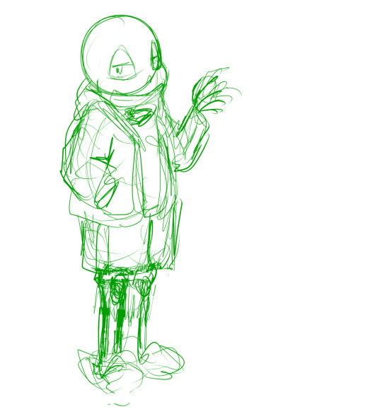
In this picture, I made his legs too short, then too long, and you can see some artifacts of how they got moved around and adjusted. (I pretty much never draw him just standing there in full-body, I guess owo) It’s much easier to adjust things in a sketch than after it’s been lined, so take your time. If I wasn’t feeling confident, or if I wanted to make the linework easier, or if I wanted someone to approve the picture before I did lines, I would do another, more-refined sketch on top of this one. But I’ve been drawing a lot of Sanses over the past few years so I didn’t :3 I do have a brush for sketches that is not totally opaque.
(Beginner tip: If you’re using a serious art program, you can reduce the opacity of the sketch layer and draw the next sketch in a new layer on top. This is how you’ll do the linework too. I also put Sans’s legs on a separate layer when I was adjusting them in this pic. This is also a good time to adjust the framing of the picture; I usually drew it too small and off-center. This pic is a bit off-center because I thought I might add text on the right side about the steps. But then I didn’t.)
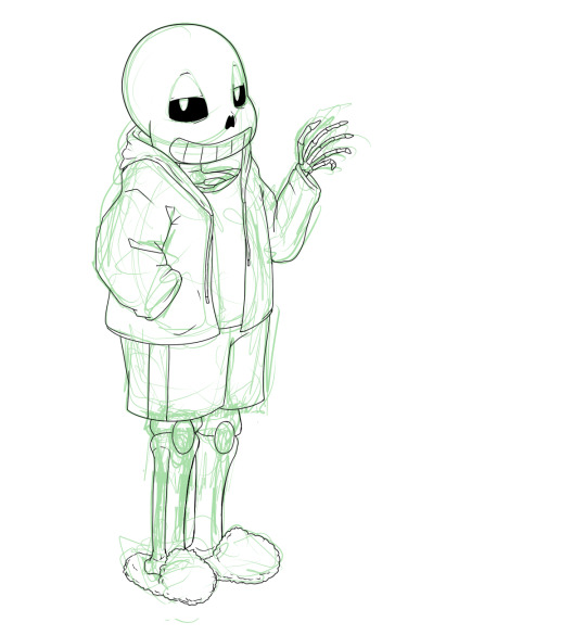
Next is lines. In Paint Tool SAI, I can have multiple layers in a folder and select the whole folder as “selection source” (so I can fill in the colors later). This makes it easy to use a Lineart layer for the smooth curve of Sans’s skull, and a regular Raster layer for the rest of the lines. Of course, make sure the line width is similar. (Being able to choose a selection source other than “current layer” or “whole image” is one of the advantages of SAI in my experience.)
I used thin lines here. I don’t always, but sometimes I try to use thin lines and add plenty of detail and I’m pretty pleased with it. (Often if I want to save some energy I use thicker, rough-textured lines, so that you won’t be able to tell so much where I got the curve of the skull wrong and then adjusted it.) When I first started drawing Sans, I gave him too many teeth. Then I overcompensated and gave him too few teeth. Now I’ve settled on about this many teeth. I like to draw bony, skeletal hands. For any bones, Google image search is your friend. You don’t need to know the proper name of the bone; just search for the body area + bones. I usually draw the nose hole a bit more simplified. I don’t always bother with the drawstring. Sometimes I give him a turtleneck sweater so I don’t have to draw a glimpse of collarbone, ribs, spine inside his shirt. Idk why his tibiae are so thick today owo

Flat colors and cel shading. I like to put a bright color that contrasts with the colors I’m using in the background, so I can easily see corners that got missed by the fill tool. Usually, I do multiple layers of the base colors, so that I won’t have to worry about the edges when shading. (All the color layers are collected in a folder. Not the bg though; if it’s complex it will have its own folder.) Here, I used a shading layer for each base color layer (the shading layer is a clipping layer, so the shade color won’t be visible unless it’s overlapping its correct base color). I don’t like to be organized and label my layers, so I do the shading right after the base color, while I still remember what layer it’s on :3 You can also do the flat colors on one layer (or just in one folder) and then put a multiply or shading layer as a clipping layer over that for the shading (many fewer layers to deal with but you must pay more attention to the staying inside the lines). Aside from the sketches, I still haven’t used any brush other than the default pen. You can of course use more layers and more colors for fancier cel shading. I have used a few extra darker shades on Sans’s neck.

More shading. I usually choose between cel-shading and more shading, but I tried adding a little bit more here since it’s a tutorial. It doesn’t make a huge difference though; if I hadn’t done cel-shading, I would have made the blendy shading stand out more. You can do each color individually (here’s a tutorial about that), but you can also make a clipping layer over all the colors (flat colors on one layer or all the color layers in a folder) and make it a multiply or shade layer, and shading for all the colors there. I like to fill in this shading layer with white so it blends more between the light and dark. This is also a great technique for adding shading to something that has a pattern on its surface (e.g. you can add fur texture to your rainbow cat without painting the texture in every color of the rainbow). This is where I use brushes I adapted myself or stole from other artists :3 and another place where SAI has an advantage because it’s specifically designed to be good at painting. I lightened the background and added a little shadow (blurred with the watercolor brush).

Extra cross-hatchy lines. When I do thin lines, I like to add these lines as a little extra shading/detail. I usually do them before color, and on a separate layer so I can keep them out of the “selection source” when filling in flat colors. This time I did them at the end. They add a little texture to everything and I think they work well on the hand bones.
22 notes
·
View notes