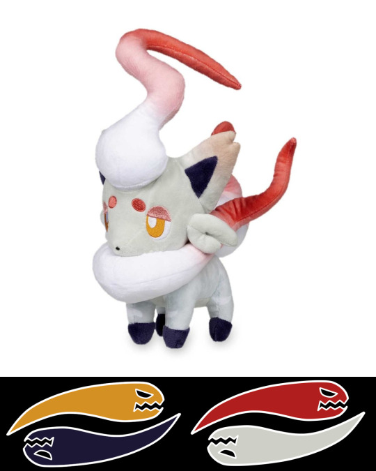
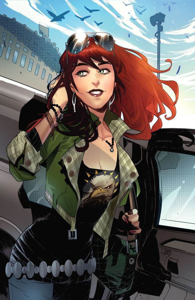
#also this is very specific to my version of green lol
Explore tagged Tumblr posts
Visit Tumblr Blog
Explore Tumblr blogs with no restrictions, modern design and the best experience.
Last Seen Tumblr Blogs


Fun Fact
Kazakhstan’s Minister of Communications and Informatics has blocked the Tumblr site because it contained 60 sites of terrorism, extremism, and pornography in 2015.
Text
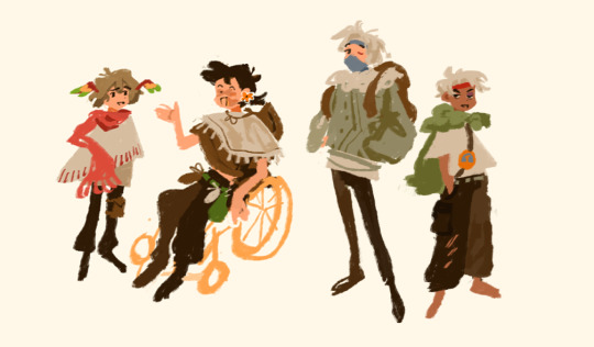
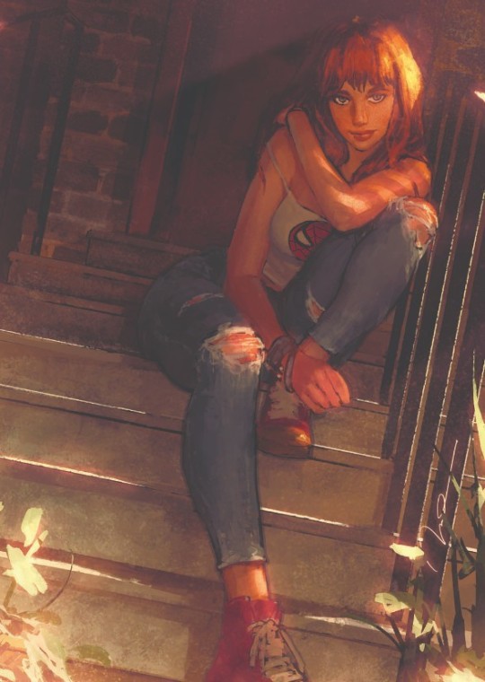
Green, on a fun day out with Red and Blue, is approached by a child. Said child has a piece of paper and pen. Looking behind them Green can see what she assumes is the kids mom, giving an encouraging smile. The kid wants an autograph, clearly. Green has been in these situations before though. They don't want an autograph from her. They want one from Red or Blue. Green has long since accepted that fact, so she gives the kid a smile before they can open their mouth.
" Hey there kiddo! Blue and Red are a bit busy at the moment, but they'll be back soon. Wanna wait with me?" A practiced line that she hopes doesn't leak any of the small bitterness she feels. That wouldn't be fair to the kid. Hell, that wouldn't be fair to Red and Blue. The child looks up at her in confusion, shifting awkwardly and fiddling with their pen and paper.
" U-um. I...I actually wanted your autograph, Miss Green!"
Eh?
The child continues, getting braver with each word, " I-I just think you're really cool! I like watching your battles a lot, a-and I wanna be as cool as you are someday!" Bowing slightly, thrusting the pen and paper forward, " C-can I please have your autograph?!"
Well. Damn. Fuck. She wasn't expecting this. Since when did she get fans?! Was her head too stuck in her ass to notice? Well now she feels like shit. Now she....now she feels like she's gonna cry. Fuck.
" You're really sweet, kid..." Green tries to keep her voice steady, a new reality settling in. She has a fan. Said fan wants her autograph. Holy shit, " Of course, I'll give you an autograph! Lemme see..."
She gingerly takes the pen and paper from the kid, and signs it. She winces at her work. She really needs to work on her signature. Kinda sloppy, and the kid doesn't deserve that. Still, not wanting to hold up the kid and their mom up any longer, she gives the pen and paper back, giving them a wide smile and a wink.
" Here ya go! One autograph for a very special fan, right here!" The kid eyes practically sparkle, excitedly taking both items and staring at it as if it's the entire world. Arceus, Green can feel the tears starting to swell, fuck.
" Thank you, Miss Green! I'll cherish it forever! " The kid quickly bows and runs off to their mom,cheering as they do. The mom happily looks at the autograph her kid is showing off, looking up when her kid isn't looking. She smiles at Green, mouthing a quick 'thank you' before taking her kids hand and walking off, the kid rambling excitedly as they go. Green waves them off, a swell of emotion in her chest.
Cherish it forever.
Green chuckles- it's wet and coarse,no longer able to keep it in. Was someone really going to remember her? Cherish her name,forever? The bitterness in her laughs at the thought. The sweetness from that encounter shoves it to the side, and she relishes in it. She is crying fully now, smiling to herself as the kid and their mom are long gone.
" Hey, sorry for the wait. That line was terrible - what the fuck happened to you?" Blue's voice catches her attention. She turns, eyes full of tears, to Red and Blue, who's looking at her with concern.
" I have a fan!" she croaked, raising her hands to gesture writing, " They wanted an autograph!"
Blue blinks, then shakes his head and sighs, " Green..." He says, though the affection was not lost of her.
Red's worry melts away with a smile, signing to his best friend, ' I told you so'
"Yeah, yeah," she waves him off, sniffing and wiping away her tears, " Pass me some food before I start bawling,you dorks".
" Dorks-"
The day goes on as usual after that. Blue and Green's banter, Red following along half-paying attention, half in his own world. Pikachu and Eevee playing with each other through it all. Green repeats the words the kid said to her throughout the day, a big goofy smile on her face that not even Blue's assholery can wipe off.
Cherish it forever.
#uuuuuuh hi#i once again wrote something that wasn't planned. just based on the vibes#the kid in the story wasn't specific cause i didn't think of them like that#but if you want to imagine them as the let's go protags or trace go for it#also this is very specific to my version of green lol#legendverse#r writes#kanto trio#trainer green#trainer leaf#Legendverse! Green#trainer red#trainer blue#rival blue
36 notes
·
View notes
Text
still figuring out how to draw them
#the goal is to draw a mini version of everyone yay#im very happy w the eefo..#my art#also i actually like drawing grian more with plain white wings but for life series stuff specifically the parrot wings (green/yellow/red)#fit waaaay too well to just pass up lol#which is so funny to me considering that the life series is very much not where the parrot thing originated from at all
3K notes
·
View notes
Text
Big day for the Sims 2
#WPVG#WPTS2#The Sims#The Sims 2#Things accomplished: Made ZEX and DAX and had them fall in love <3#Then moved in the Captain :3c For shenanigans#He looks like pirate fic!Captain lol#Made a set of I BELIEVE classic green alien boxers (lol)#And upgraded the Vargases' church so there is now a place to pee#And also the confessional booths are prettier - curtains! - and there's a little play area for kids and toddlers#I was gonna add a balcony but the windows got in the way :( Next time - in the real town when I actually move them in#I've also been working on the Vargases' clothes in the background - I am actively choosing to be very extra about Scriabin's coat lol#Does it even count if it doesn't have the wrist and waist ties tho - I think no#Which means hopefully! Soon!! I will actually have the correct clothes to move them into my actual real town!!#I went ahead and put their lots down hehe#Also planning on doing a Whole Thing with Squee - I've heard there's a way of setting up specific adoptions by timing CPS visits?#I haven't tried it myself and I'll make sure to save a version of him separately just in case but like#I think if I have his parents neglect him and he gets seized and then I have the Vargases call to adopt him he'll be like - queued first?#I think that's how that works... I wish it was like pet adoption where you could pick them out lol#I'm thinking about pulling a couple of the families I have set up there for now since I haven't been in the fandom for a while :P#I am absolutely planning to have ZEX ahem ''crossover'' with a few different households lol - definitely gunning for TSP Narrator lol#Also I gave him smile lines and aghfdsjahfa he's so cute I'm love#DAX just got a furrowed brow hehe <3 Their specific expression wrinkles! ♥#The Captain is so smooth-faced by comparison haha#The Sims 2 truly does emulsify my brain uou#SCII#Vargas
6 notes
·
View notes
Text
My Favorite Cheap Art Trick: Gradient Maps and Blending Modes
i get questions on occasion regarding my coloring process, so i thought i would do a bit of a write up on my "secret technique." i don't think it really is that much of a secret, but i hope it can be helpful to someone. to that end:

this is one of my favorite tags ive ever gotten on my art. i think of it often. the pieces in question are all monochrome - sort of.

the left version is the final version, the right version is technically the original. in the final version, to me, the blues are pretty stark, while the greens and magentas are less so. there is some color theory thing going on here that i dont have a good cerebral understanding of and i wont pretend otherwise. i think i watched a youtube video on it once but it went in one ear and out the other. i just pick whatever colors look nicest based on whatever vibe im going for.

this one is more subtle, i think. can you tell the difference? there's nothing wrong with 100% greyscale art, but i like the depth that adding just a hint of color can bring.
i'll note that the examples i'll be using in this post all began as purely greyscale, but this is a process i use for just about every piece of art i make, including the full color ones. i'll use the recent mithrun art i made to demonstrate. additionally, i use clip studio paint, but the general concept should be transferable to other art programs.


for fun let's just start with Making The Picture. i've been thinking of making this writeup for a while and had it in mind while drawing this piece. beyond that, i didn't really have much of a plan for this outside of "mithrun looks down and hair goes woosh." i also really like all of the vertical lines in the canary uniform so i wanted to include those too but like. gone a little hog wild. that is the extent of my "concept." i do not remember why i had the thought of integrating a shattered mirror type of theme. i think i wanted to distract a bit from the awkward pose and cover it up some LOL but anyway. this lack of planning or thought will come into play later.
note 1: the textured marker brush i specifically use is the "bordered light marker" from daub. it is one of my favorite brushes in the history of forever and the daub mega brush pack is one of the best purchases ive ever made. highly recommend!!!
note 2: "what do you mean by exclusion and difference?" they are layer blending modes and not important to the overall lesson of this post but for transparency i wanted to say how i got these "effects." anyway!
with the background figured out, this is the point at which i generally merge all of my layers, duplicate said merged layer, and Then i begin experimenting with gradient maps. what are gradient maps?
the basic gist is that gradient maps replace the colors of an image based on their value.

so, with this particular gradient map, black will be replaced with that orangey red tone, white will be replaced with the seafoamy green tone, etc. this particular gradient map i'm using as an example is very bright and saturated, but the colors can be literally anything.

these two sets are the ones i use most. they can be downloaded for free here and here if you have csp. there are many gradient map sets out there. and you can make your own!
you can apply a gradient map directly onto a specific layer in csp by going to edit>tonal correction>gradient map. to apply one indirectly, you can use a correction layer through layer>new correction layer>gradient map. honestly, correction layers are probably the better way to go, because you can adjust your gradient map whenever you want after creating the layer, whereas if you directly apply a gradient map to a layer thats like. it. it's done. if you want to make changes to the applied gradient map, you have to undo it and then reapply it. i don't use correction layers because i am old and stuck in my ways, but it's good to know what your options are.

this is what a correction layer looks like. it sits on top and applies the gradient map to the layers underneath it, so you can also change the layers beneath however and whenever you want. you can adjust the gradient map by double clicking the layer. there are also correction layers for tone curves, brightness/contrast, etc. many such useful things in this program.
let's see how mithrun looks when we apply that first gradient map we looked at.

gadzooks. apologies for eyestrain. we have turned mithrun into a neon hellscape, which might work for some pieces, but not this one. we can fix that by changing the layer blending mode, aka this laundry list of words:

some of them are self explanatory, like darken and lighten, while some of them i genuinely don't understand how they are meant to work and couldn't explain them to you, even if i do use them. i'm sure someone out there has written out an explanation for each and every one of them, but i've learned primarily by clicking on them to see what they do.
for the topic of this post, the blending mode of interest is soft light. so let's take hotline miamithrun and change the layer blending mode to soft light.

here it is at 100% opacity. this is the point at which i'd like to explain why i like using textured brushes so much - it makes it very easy to get subtle color variation when i use this Secret Technique. look at the striation in the upper right background! so tasty. however, to me, these colors are still a bit "much." so let's lower the opacity.

i think thats a lot nicer to look at, personally, but i dont really like these colors together. how about we try some other ones?

i like both of these a lot more. the palettes give the piece different vibes, at which point i have to ask myself: What Are The Vibes, Actually? well, to be honest i didn't really have a great answer because again, i didn't plan this out very much at all. however. i knew in my heart that there was too much color contrast going on and it was detracting from the two other contrasts in here: the light and dark values and the sharp and soft shapes. i wanted mithrun's head to be the main focal point. for a different illustration, colors like this might work great, but this is not that hypothetical illustration, so let's bring the opacity down again.

yippee!! that's getting closer to what my heart wants. for fun, let's see what this looks like if we change the blending mode to color.

i do like how these look but in the end they do not align with my heart. oh well. fun to experiment with though! good to keep in mind for a different piece, maybe! i often change blending modes just to see what happens, and sometimes it works, sometimes it doesn't. i very much cannot stress enough that much of my artistic process is clicking buttons i only sort of understand. for fun.
i ended up choosing the gradient map on the right because i liked that it was close to the actual canary uniform colors (sorta). it's at an even lower opacity though because there was Still too much color for my dear heart.

the actual process for this looks like me setting my merged layer to soft light at around 20% opacity and then clicking every single gradient map in my collection and seeing which one Works. sometimes i will do this multiple times and have multiple soft light and/or color layers combined.
typically at this point i merge everything again and do minor contrast adjustments using tone curves, which is another tool i find very fun to play around with. then for this piece in particular i did some finishing touches and decided that the white border was distracting so i cropped it. and then it's done!!! yay!!!!!
this process is a very simple and "fast" way to add more depth and visual interest to a piece without being overbearing. well, it's fast if you aren't indecisive like me, or if you are better at planning.

let's do another comparison. personally i feel that the hint of color on the left version makes mithrun look just a bit more unwell (this is a positive thing) and it makes the contrast on his arm a lot more pleasing to look at. someone who understands color theory better than i do might have more to say on the specifics, but that's honestly all i got.

just dont look at my layers too hard. ok?
2K notes
·
View notes
Text
Today is Dungeons & Daddies’s 5th Anniversary!

I haven’t been listening for nearly that long but the podcast and all its characters means a lot to me. Happy Anniversary!!!
Throwing the cropped sections under the cut because there’s a lot of stuff going on and I know Tumblr likes to throw half the pixel quality out the window. And also so I can ramble a bit about this piece!!!
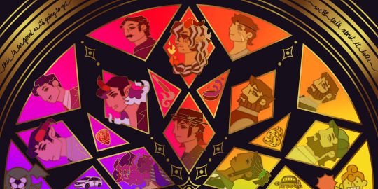
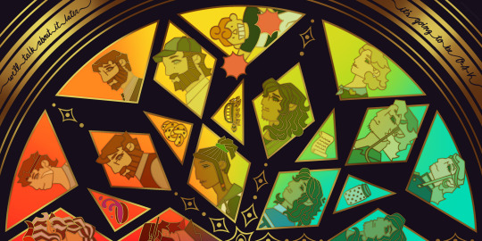
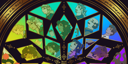
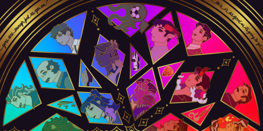
This piece has been months in the making, possibly an entire year. And by that I mean I’ve had a sketch of the comp scribbled on my whiteboard for ages because I wanted to save this specifically for 5th anni art. Now onto design stuff!
(First off a random thought: I really love how the garlic knot came out, I kind of want it as an enamel pin.)
I knew I wanted to make this a stained glass piece since the beginning, but I was also going to add flowers at one point but quickly dropped the idea. It felt like too much and I also didn’t want to fuss over flower language assignments for everyone. I was also going to add Doodler tentacles, but also dropped that idea pretty early. Kind of on accident, right at the end, I figured out how to make it even more stained glass-like but taking a duplicated lineart underneath the regular layer and turning the brightness all the way down, then setting it to overlay and adding a guassian blur. It’s very subtle but it adds that tiny bit of depth that makes it look more real. As for shading on the lineart/gold, I tried adding more highlight on the characters who died but once I evened everything out it wasn’t as noticeable anymore so I’m throwing that thought here so the attempt at least known lol.
The order of characters only changed a little bit from my original comp, I flipped the Wilsons and the Oaks so the rainbow could work. As for the anchors, specifically in season 2, I lined them up to the teens since the season 1 anchors lined up with each dad:
Tony —> Scary: his death was the beginning of Scary’s betrayal arc and also Willy killed him.
Guitar Pick —> Taylor: it’s not really aligned with Taylor at all, but the anchor was with Glenn so I put it next to his blunt.
Scroll —> Normal: was only because it was the last left to give him, but there’s the whole scene of him and Hermie in the Green Room so it still works!
Garlic Knot —> Link: one of two that he broke, but the more significant of the two with him telling Grant he never wants to see him again.
Small notes on the season 1 anchors: I put the layer of mold in the overnight oats but you can’t really tell with the overlay. And to make the supper bowl more interesting I added the fantasy sodas mix they dumped into it. The lure of actually drawn before so I just traced my own art lol.
As for the other smaller triangles, it took me a bit to figure out what I wanted to put there. I didn’t even think of adding the vehicles until two days ago but I’m so glad I did. I don’t really have my own take on the mascot version of the Doodler (yet?) so I borrowed the design from one of the stickers in their merch shop. Teeny was terrifying as just a front facing head so I made him cute again.
In the outer circles, I put what I felt was the most significant quotes for each family. I really wanted to use “It’s okay to be angry, it’s not okay to be cruel” but it was just a little too long.
That’s all I can think of! If you read all the way through, thank you for indulging me in my excitement to gush over this piece.
#dndads#dungeons and daddies#dndads fanart#dndads s1#dndads s2#dndads glenn close#darryl wilson#henry oak#ron stampler#jodie foster dndads#nick close#nicholas foster#nicky swift#grant wilson#sparrow oak#lark oak#terry jr#taylor swift dndads#lincoln li wilson#normal oak#scary marlowe#hermie unworthy#bill close#paeden bennetts#barry oak#willy stampler#meryl streep dndads#robert wilson#hildy russet#stud stampler
2K notes
·
View notes
Text
last set of tsumsitter ssr groovies 👀


THE TIME HAS COME

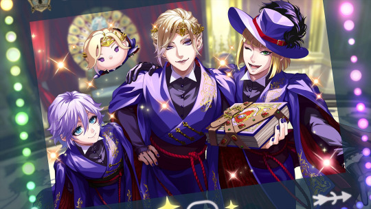
First is Pomefiore!! (Edit: The initial version of this Groovy is on the left; Rook is missing the golden Pomefiore markings on his robes. There was an update to fix this. The updated version is on the right.)
The trio is framed by a border of colorful lights, which reminds me a lot of old-fashioned movie theater signs (though not as colorful). If you look closely at the top and bottom, it seems they are posed for a candid photograph and it’s being posted to Magicam or something?? Rook and Epel look super crisp here, which I love!! I think Epel is posing with his hands held behind his back. This paired with his smile and the slight bird’s eye view of his face makes him look super cute please don’t beat me up for saying that, Epel. And Rook is being showy and familiar as usual, even putting one hand on Vil’s shoulder. Vil isn’t cringing or uncomfortable with it, which goes to show that he and Rook are truly good friends.
As for Vil, it’s rare to see him posed casually like this. Most of his cards feature him posed in very “model”-like and mature ways, so to have just one hand on hip, leaning forward slightly, and gripping his grimoire is unique for him (I mostly associate this pose with Ace, lol). His smile is quite casual too—it’s not quite the full catty smirk he has in his live2D model, it’s a lot more subtle and playful.
BahacTeHWWRVwkkwwm YHE VIL TSUM STeALS THE SHOW ThoUGH 😭 (You can tell it’s smiling despite the lack of a visible mouth) from how its eyes!! The placement of the Tsum is also funny. With Pomefiore’s peacock throne in the background, it forms sort of an angelic halo around… the sentient stuffed toy… Proof that Tsum Vil is a heavenly being/j
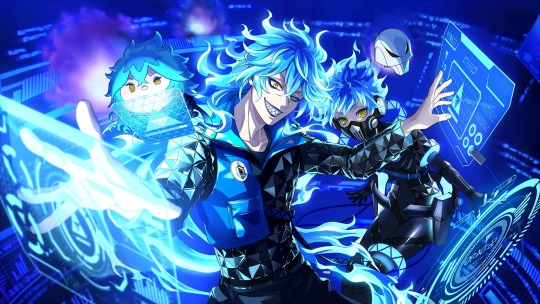
Next is Ignihyde!!
The Shroud brothers return to Cyberspace, that blue void with tons of ethereal floating screens, particle effects, and code www I don’t know what those three pink balls of flame are in the background, but there being three of them is a consistent theme for Ignihyde. Three pink fireballs, three Shroud brothers, three heads of Cerberus! I wish I could say more here, but I’m basically a Malleus when it comes to tech—
Idia’s pose isn’t anything we haven’t seen before (just at different angles of it, I suppose). But!! It feels different here and adding Ortho definitely adds to it. The Pokémon trainer energy of the initial art carries over to the Groovy. Idia looks like a smug, tough trainer looking down on you with a cocky grin and his face half-shadowed.
Ortho floats almost menacingly next to his big brother, his face entirely shadowed. His aura is like a phantom (fitting) or even like a Pokémon on standby waiting for the chance to fire off a Hyper Beam. This might be me overthinking things, but I wonder if the amount of light on the brothers’ faces references the original Ortho. Robo!Ortho’s face is entirely darkened because his parallel has passed on. Idia’s face is only partially shadowed because while he was close to stepping over to the “other side”, he ultimately found hope and was able to continue living, this time for himself and on his own terms.
I LIKE HoW TSUM IDIA HAS ITS OWN sCREEN TO WORK OFF OF TOO 😭 IBRO IS MAkING A sUS FACE TOO, IT’S GLEEfUL AbOUT WhAtEVRr it’S UP TO… That makes me think that it’s hard at work… I dunno, hacking something systems fnksgwiwozlapaeb Watch out, a Tsum near you might infect your computer and then bounce away happily after ruining all your programs and files.
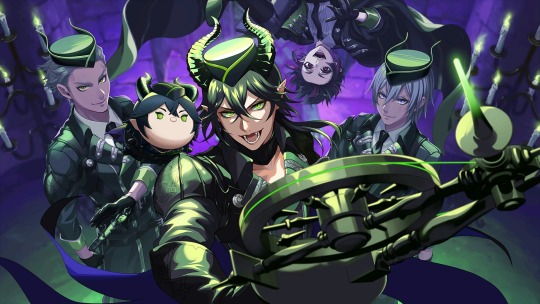
Last but not least… Diasomnia!! THIS ONE’S MY fAVORITE OF THE SSR TSUMSITTER GROUP, WHICH I WAs NOT EXPecTING AT ALL 🤡
The violet backlight is fantastic—it adds an interesting lighting to the illustration and highlights the green flames and Silver and Sebek’s bright eyes. And speaking of Sebek and Silver, LOOK AT THEM JUST LOOK AT THEM???????? More specifically, Sebek’s arms (they look ultra meaty somehow) and Silver’s whole face(that lopsided smile??? HELLO?????)!! On either side of Malleus like that… Peak bodyguard, I REPEAT, PEAK BODYGUARD
With Lilia bringing up the rear, the three form a perfect squad to surround and to protect their liege. cbsjsbevejwlw I like that Lilia is different than Silver and Sebek; he’s hanging out upside down (as he usually does) and bears a huuuge grin, completely having fun in the moment. (… How does his hat stay on like that when he’s fighting gravity though?)
Up front and center is Malleus of course! He’s wielding his spindle staff like a king might a scepter. This with his fierce face gives the impression of a leader marching into battle with his retainers. You get a real good shot of his teeth and reptilian eyes here which I’m sure the Malleus stans are going feral for right now—and with the limelight shining down on him, he looks almost hopeful for once instead of downtrodden or gloomy.
THE TSUM MALLEUS LOOKS SO FUNKY PLACED tHERE cnsnwveuxvDFsFjqk Just. Cheekily There on Malleus’s shoulder… Because Maleficent and Diablo is a known combination, the image of those two as master and minion comes to mind. Imagine Malleus blasting you with lightning, pausing to listen to his Tsum whispering a suggestion into his ear, and then telling you the Tsum has advised that he blast you with a second strike 💀
Aaaaaah, the Tsumsitter SSR Groovies are some of the best in this game 😭 So glad they’re finally over though, it’s stressful saving rolls for what you know would be a limited event with multiple SSR banners, lol
#twisted wonderland#twst#Malleus Draconia#Idia Shroud#Vil Schoenheit#jp spoilers#Ortho Shroud#Rook Hunt#Epel Felmier#Ignihyde#Diasomnia#Pomefiore#Silver#Sebek Zigvolt#Lilia Vanrouge#notes from the writing raven#disney twisted wonderland#disney twst#twst tsumtsum#twst tsumtsums#twisted wonderland tsumtsum#twisted wonderland tsumtsums#Maleficent#Diablo#book 7 spoilers#pokemon
608 notes
·
View notes
Text


my first color for the 2025 @green-with-envy-phandom-event! this adorable lineart was created by the lovely @marzfartz, and when i saw it i knew i just had to color my favorite girlie hehe. i couldn't decide whether i liked the version with the border or without it, so you get both!
i also did this as one of the event's palette challenges! all the colors in this were picked from the image under the readmore (some of them were very specific lol)
palette used:
#danny phantom#valerie gray#green with envy#green with envy 2025#gwe2025#greenwithenvy2025#GWEPaletteChallenge2025
80 notes
·
View notes
Text
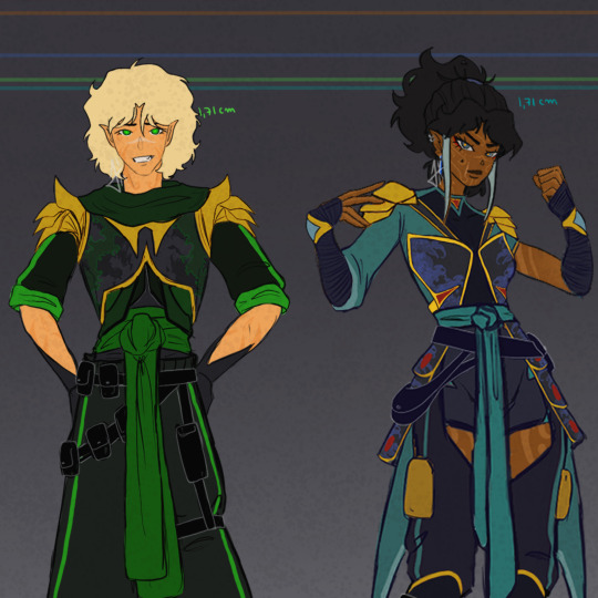
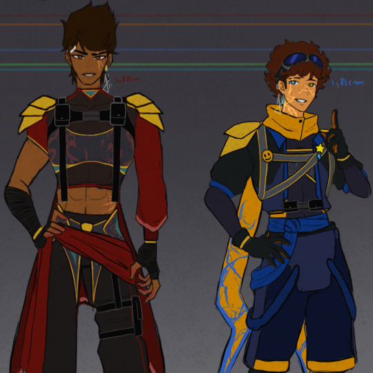
MY NINJAGO DESIGNS (UPDATED)
Ok FIRST OF ALL!!! follow me on tiktok and AO3!! I'm posting my art there and I have a fanfic project centered on Nya (and Morro) that I started writing, I think you might be interested!
Secondly..... YES! After less than a week of posting the first designs, I decided to change some things!!!!! If you compare it to the old post you'll see that there weren't any very drastic changes, but there were a few things that were particularly bothering me and now I feel like I'm satisfied (for now.....)
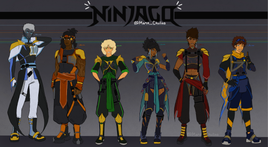
Obviously, as you can see, I haven't changed a lot of things. Maybe I shouldn't have made this update in a new post, changing the main one would have been more than enough but.... nah.
Colors of the gold armor - I gave them a brighter tone, the old one was very dull
Zane and Nya's boots - brother wtf were those, now they are sooo much better
Zane gloves - I totally forgot about them in the first version, but now he has them!!
Kai and Nya eyes - in the old version they already had matching eyes (main color in their own color palette and pupil in the color of their siblings), but I made Nya's eye color more towards gray and Kai's towards brown, instead of the dark -cyan-almost-green and amber that they had)
Nya's hair and sleeves - I left her hair a little closer to her original hair, I felt that in the old one I ended up giving her a hairstyle more similar to mine in real life..... oops? I also changed the flowing sleeve to a more well behaved one similar to Kai's, I don't know if I totally like this change to be honest
Marks on their body - Lloyd now has marks from the oni transformation!! although they are not that visible from far; Nya and Cole's marks are better done than before and Zane has more robot features (although these three in particular are more visible under his clothes *wink wink*)
Jay has goggles now :D
Some close ups (I swear I don't know what I'm doing wrong for the images to be saved in SUCH poor quality)

Some headshots


So I guess this is it? NOW I'm gonna leave these designs alone. I already posted on my tiktok too, so if you can stop by and give me a boost I'd really appreciate it!! I'm already working on the individual images of each one with some headcanons and more specifications on the details of each one's designs, but it will probably take a while. I also plan to do a part two of the designs with some secondary characters, but that totally depends on my willingness and willpower LOL
see you soon <3
#lego ninjago#ninjago#ninjago fanart#ninjago fandom#ninjago au#ninjago design#ninjago art#ninjago zane#zane julien#ninjago cole#cole brookstone#ninjago lloyd#lloyd garmadon#ninjago nya#nya jiang#nya smith#ninjago kai#kai jiang#kai smith#ninjago jay#jay walker#ninjago morro#wojira duo#(mentioned)#ao3#tiktok#artwork#art#fanart#chulios art
207 notes
·
View notes
Text
some more hobie1610! :)
i luv this little bug just bc i love mj and i LOVE LOVE LOVE hobie! i simply couldn't resist 🩷
in the story, i tried mashing together a bunch of different references for his character, while still trying to stay true to the character of mary jane watson but also not sacrificing too much of hobie brown. i hope i… did a good enough job?
more under the cut :)
☆ hobie1610 is a supermodel-in-training inspired by mj watson's dreams of being a model and an actress. except in 1610, mj has these dreams forced onto him rather than aspiring to be them. he's living mj watson's dreams and hates it lol
☆ hobie1610 has a strained relationship with his family, true to mj watson's awful family dynamics in canon. it just... runs in every mj's blood i guess lmao
☆ hobie1610 wants so badly to be an investigative journalist! his plan after graduating from visions is to land an internship at the daily bugle :)
☆ he also gets up to mechanical shenanigans in his free time, fixing and building whatever he can get his hands on. he's very handy with machines and tech, true to the original characterization of hobie brown on earth-616, except on earth-1610 he usually has to hide his tools and gadgets
☆ his favorite subjects in school are english lit and physics!
☆ i gave hobie1610 uniform locs to look like mj's signature long hair but also to directly contrast hobie138's freeform locs
☆ if hobie1610 were to ever meet hobie138, he'd seethe and mald with jealousy. just like miles, mj's biggest wish is for his family to stop stacking so much pressure on his shoulders all the time. seeing another version of him living the free anarchist life would def have him feeling a type of way
hobie meeting mj: oh wow... nearly forgot what my face looks like without m' piercings lol :p
mj meeting hobie: I'M BRITISH IN THIS DIMENSION?!
☆ but he's a hobie alright! he rebels as often as he can in the typical ways teens with strict parents do. no one is putting this guy's flame out 🔥
☆ most of that rebellion consists of sneaking out when he knows he shouldn't. his mother is strict, but she's often very busy and that gives hobie1610 many chances to slip away unnoticed. his bravery is inspired by mj's character in the spiderman ps4 game, where she gets involved in dangerous missions with peter. those gameplay scenes with her in the museum inspired the 3rd chapter of my hobie1610 story
☆ hobie1610's sense of humor is more like zendaya's mj than anyone else
☆ the concept of hobie being miles' mj didn't entirely come out of nowhere! it wasn't just abt punkflower-- the possibility came up when i remembered that andrew garfield claimed he wanted his spiderman's mj to be a man. specifically played by michael b jordan ;)
☆ hobie1610's casual wardrobe outside of visions and his photoshoots consists of mostly greens and earth tones. most mj's across various diff portrayals have green or earth tones in their casual fits
references ↓
#clown paint#punkflower#← tagging bc of implications i guess? we all know who mj is to spiderman LOL#yyyeah :)#i'm so glad i was able to receive a spark of motivation this winter#so i could use it on finishing this lil story! and getting to draw my beloved <3#it wasn't easy bc oof art is hard but yea i tried! i did!#was weird getting back on the saddle. that's why i needed more references this time i think#hope you guys enjoy my vision nonetheless#i've seen hobie as black cat and even read a fic where hobie was the one who met miles 1st instead of gwen#so i was like 'why not hobie as mj?' and set about to do All Of This lol#yeah! ¯\_(ツ)_/¯
111 notes
·
View notes
Note
Hey! So as I'm looking to ask* my partner to be Mr. Farnon, was gonna ask if you had any recommendations on where to go hunting for good jumpers and specifically, pants for the era. I've had good luck hunting down his coats, but the wools and tweeds are elusive here in The South. (And he refuses to wear linen pants, even though they're accurate, comfy, and good for this weather. 9_9 ) He requests something light, as even if we do this for Halloween, it'll be 85°F+ out here and a bazillion degrees of humidity. He's very down to wear the cool coats and has some of the WW1 pieces already from his grandfather's collection. And we even have two cats who'd be happy to stand in for Tristan and Heriot, lol. Probably looking for a season 1 type of vibe, as he likes his hair short. (*Read: I'm making him be Mr. Farnon to my Mrs. Hall, as he enjoys cosplaying and dressing for events, but hates making them/making the decision on what to wear himself. He's 10000% okay with it, even though its niche, as long as he doesn't need to do anything but put the thing on. XD )
Heya! If you're crafting your own outfit for him, my wardrobe post has a lot of links to new vintage shops, many of which have lighter weight trousers in their collections right now. Be sure to check the comments, and I have a new shop to add (Oldfield Outfitters) that has good jumpers.
If your fella doesn't mind going with heavier weight clothing, you can put together a pretty close screen-accurate version of what I call his "Darcy Clothing" outfit:
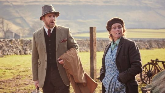
Coat: Use gem.app to find something in tweed or a heavy cotton. Coats from this era ran long. As long as it has a notched collar and completely covers the butt and crotch (modern sportscoats are awful here), you will be close enough.
Vest: Get the bottle green corduroy from Darcy
Shirt: Spear-point collar from Darcy. He wears the simple striped one often. You will need cufflinks for sure, and very likely arm garters (even with a coat on) because the sleeves on vintage shirts tend to run long.
Trousers: Fishtail moleskin from Darcy in chocolate brown. Make sure you also get suspenders!
Tie: Find a vintage one on etsy or ebay from the 30s/40s. Ties from then were a lot shorter and it makes a big difference. Also look for a pocket square in the same color!
Shoes: He has worn both working boots and dress boots, so, whatever. For extra fun, find WW1 gaiters.
Hat: Poshmark has tons of these, people just never know what to call it, so try "tweed hat" and work from there. The hat is *very* warm, however, would not recommend for the South.
35 notes
·
View notes
Text

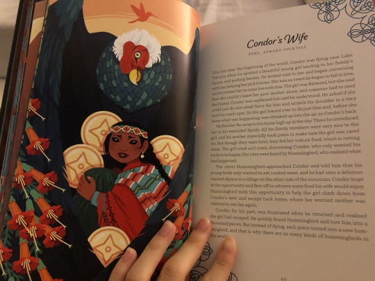
He tore Hummingbird into a thousand pieces. But each piece... ...turned into a new hummingbird.


'Picture book spread' assignment for my graphic novel illustration class! Text is from the Condor's Wife story, specifically the version from Yoshi Yoshitani's Beneath the Moon: Fairy Tales, Myths, and Divine Stories from Around the World ^^
I like to think of this spread as one in a children's book that would teach readers about animal species in South America (especially hummingbirds, of course!) I made the Pink Throated Brilliant our protagonist, and in this theoretical full picture book I imagine that they're just fully green at the beginning, until they get their pink throat from the condor at this point in the story :')
I had a lot of fun with this!! I actually initially wasn't looking forward to this assignment because I was more interested in the 'graphic novel/comics' part of this class (it's technically called a 'narrative illustration' class, so this was our first assignment), but I'm very pleased with how it turned out!
I did research on what species of hummingbirds could be found in the area around Peru, as well as the habitats of those hummingbirds and Andean condors! I got most of the hummingbirds from this list on Hummingbird Central. I didn't know there were so many hummingbird species!! Sword-billed might be my fav but they're really all so lovely
also got some real good feedback on this one about my typography; in my inital version of this piece the text was much larger and pink; im always too worried ppl won't notice the text but i was really disliking how it looked. My prof said the text reminded them of a poster too much, and after looking at other picture books for reference i realized the text in those are often really very understated and with smaller font!! and it suddenly clicked a little better when i thought back about when my prof had been talking about the importance of image over text in children's picture books and how they're often read to them by adults (I'm a big words enjoyer and sometimes I lose sight of image for the sake of text haha) so I changed it to this and while it's not 100% to my liking I think it's much better than my first version so I'm happy :)
commission info || ko-fi (tip jar)
here's the Condor's Wife story from Beneath the Moon by Yoshi Yoshitani!:
and here's my old version of this assignment with the big poster looking text lol:

#illustration#picture book#children's book#hummingbird#condor's wife#condor#concept art#peru#south america#the andes#andean mountains#book illustration#book#art#my art#digital#uni
49 notes
·
View notes
Note
Can you please say more about the Lanterns' politics?
I am so glad you asked me about this because I've been thinking about it since I reblogged that post but also I'm definitely about to get yelled at lol. ANYWAY THIS IS GOING TO BE LONG.
Tl;dr: John is the only one with a coherent political position or an up-to-date voter registration.
Hal:

So something interesting about Hal is that his stories are often very political but his character is not. With one extremely obvious exception, he rarely talks about politics; rather, he serves as a means through which to tell political stories, usually unintentionally.
What do I mean by that? Well, for example, in the Silver Age, his love interest would occasionally be possessed by a misandrist space jewel that would force her to attack him, but always lose because women are inherently inferior to men and prefer to be subjugated by them anyway. That's the original Star Sapphire concept. It's wildly misogynistic, but it doesn't mean Hal the character is misogynistic. But it's also a very political story, even if I don't think the writer was deliberately trying to make a point so much as...being an average, thoughtlessly sexist guy living in the 60s. (Carol continues to be the subject of mindbogglingly sexist writing and art well into the 2000s. Fucking comics.)
And so you have Hal Jordan, whose love life was ruined by his girlfriend getting promoted above him and who called his best friend by a racist nickname for decades; Hal Jordan, poster boy for chest-thumping post-9/11 kneejerk patriotism; Hal Jordan, lightning rod for a certain kind of regressive bigoted fanboyism. Choosing Hal as the Lantern for a particular story over John or Kyle has come to signify something very specific, but none of that is necessarily reflective of what Hal himself believes.
So what about Hal himself? Well, when we first meet him, he's the epitome of privilege: a white, straight, cis, Christian (I know he's canonically half-Jewish now but that's only as of the past decade or so), ablebodied, upper middle class (Geoff Johns retconned him to have a working class background, but in the Silver Age, he had one uncle who was a millionaire, another who was a judge, and a successful politician brother) man with a flashy job. Privilege tends to lean Republican; even if he is from California, I suspect Hal voted for Eisenhower in 1956.
In GL/GA, the word "Republican" isn't used to my recollection, but Hal is definitely presented as...I'm going to say conservative by I mean lower-case C. He doesn't have deeply held political beliefs, but he's traditional. He doesn't question the system, because he's never had to. He resists things that challenge the way he's always understood the world works, and that's very relatable - most people do! And he will absolutely argue with Ollie, who certainly isn't always right about everything. But he's also willing to listen, and have his mind changed, and certainly reachable via appeals to compassion and fairness.
Once the "relevance" trend of the late 60s-early 70s was over, Hal's stories default back to ostensibly politically neutral, although obviously nothing is actually politically neutral. In the late 80s and early 90s he's the most unpleasant version of himself, and that has political manifestations, like when he allows John to be imprisoned in apartheid South Africa for a ridiculous and unnecessary crime Hal himself committed. It's extremely fucked up, but again, it's less because of Hal's actual opinions and more because Christopher Priest wanted to write about apartheid, even if it does make Hal look incredibly, horrifically racist.
Then jump to the mid-2000s and Green Lantern: Rebirth, and you might imagine that losing his hometown, getting possessed by a giant space bug, becoming a supervillain, dying, and becoming the embodiment of God's vengeance might have some effect on Hal's politics, but that is not what Geoff Johns is here to write. Johns is writing a Hal who teleported in from, like, 1967 - no nuance allowed. He's a summer blockbuster that walks like a man. He's a Baja Blast. He's never had a coherent political thought in his life. In his defense, he has had more and goofier concussions than any superhero I can think of and his brain is smooth like an egg. Still.
Anyway, all of this is to say that I think Hal tends to default to center right positions but can be easily coaxed over to center left. That said, he has never not once in his life had his shit together enough to vote in a single election, not even for his own brother.
Guy:

So Guy's deal is a little bit complicated because his most vocally political era was also in part due to severe and personality-altering brain damage.
When Guy was originally introduced in the 1960s, he had the pleasantly bland personality of all superheroes. Many years later, he suffered a series of major injuries, torture, and a lengthy coma, and he emerged from the coma in 1985 with the aggressive, abrasive personality he's best known for today. Justice League International took that even further, using him to parody the jingoistic, red-blooded American action hero of the 80s.
This version of Guy is a vocal fan of Ronald Reagan and despises the USSR. He's pro-war, proudly xenophobic, and treats women badly enough that it crosses the line into repeated sexual harassment, both physical and verbal. (To be fair...ish, this last also applies to Wally West and arguably a number of other men, and was always played for laughs. It was gross all around.)
Again, this is partially a manifestation of his brain damage. There's also a running gag in JLI where if he gets hit on the head, his personality changes to this cloying, timid, gentle one, sort of halfway between a child and a flamboyant gay stereotype. Hit him again and he goes back to Asshole Guy. I'm not going to pretend I don't find some of the gags funny, but it's obviously all highly problematic, and not just from a medical standpoint.
That said, I don't think we can dismiss Guy's politics or his usual personality as simply a manifestation of brain damage. We see in later flashbacks that he developed the abrasiveness as a defense mechanism from growing up in an abusive home, and as he matures through the 90s, he doesn't actually become a significantly different person, even after his Vuldarian healing factor kicks in and heals his brain. (It's a thing.) I think it's more accurate to say that the brain damage probably affected his impulse control, his filter, and arguably even his paranoia levels.
All of which is to say that as much as I would love to go "Guy's better now, so he's not a Republican!"...that dog won't hunt. I think a really good canon writer could make the case that Guy is pro-union-style working class and also a former teacher so he's at least center left, but as of now canon evidence is pretty firmly on the red side. It doesn't help that the GLC has been written as fetishistically pro-cop and pro-military since Johns got his grubby hands all over it. I will happily ignore the New 52 retcon that Guy was a cop, and you could even try to argue that he dislikes cops because his brother was a corrupt cop who became a supervillain, but I think it's much more likely that he identifies with cops as a Corps member. Although I don't think he would have any patience for killer cops. ("You were afraid for your life even though you were the only one with a weapon? Then fucking quit, coward.")
All of that said, I think Guy is similar to Hal: defaults to center right, can be talked into center left on certain issues but he's more stubborn about it. (They would also both be enraged by Jan 6 and disgusted by the current Republican party - I can't quite argue that Guy Gardner is a Democrat but Green Lanterns don't have any patience for traitors or cowards.) It's also kind of a moot point because he never knows what is happening on Earth and hasn't voted since his pre-coma days.
John:
Oh John Stewart, thank god for you.
John was introduced as an explicitly political character in an explicitly political story. The first time we see him, he's stepping in to defend Black men from a white cop, citing his own knowledge of the law to do so. He shows a much more perceptive and informed perspective on the issue's main plot (a racist senator running for president) than Hal does. Even in the little moment above, we see that he's sensitive to exactly what it means for him, a Black man, to be taking on this role.
None of this is a surprise, since we'll later learn that John's parents were civil rights activists. Not only would he not have had the privilege Hal and Guy did to assume his existence was politically neutral, he was explicitly educated about political realities and progressive advocacy from childhood. He's well-informed, he's passionate, and he's going to tell you when you are being fucking stupid.
John isn't immune from the GL cop/military...thing, although I can't blame Johns for that - it was the cartoon that made him a Marine, and the comics followed suit. But that's never outweighed his origin or his upbringing. Like, he's friends with the DCU's fictional version of Nelson Mandela.
This one is straightforward: John is a staunch progressive. He is, however, in outer space 90% of the time, so he's always at least a little bit out of date. I imagine every time he comes back to Earth he spends the first 24 hours watching the news in abject horror.
Kyle:

Kyle doesn't talk about politics a lot, but when he does, he lands pretty much where you'd expect a young California-born artist living in New York City to land: to the left. My read on Kyle is that he hasn't really thought any of his politics through, which makes sense - he's a character who is led by emotion over reason every time. He doesn't have John's carefully thought-through arguments or knowledge of the law behind him. I feel like when something political upsets him, he's more likely to splutter angrily than make a coherent argument (which: same). When he's given the time to think things through and speak from the heart, though, he can be very eloquent, like in his speech to Terry after Terry accidentally comes out to him.
It's also worth pointing out that his solo appearances were mostly in the 90s, which were prone to avoiding politics or only addressing them in a halfhearted both sides-y way like the story above.
That said, I don't think he ever actually does anything about his political opinions. He never votes in midterm or primary elections, and probably only voted in a presidential one because Alex dragged him along one time. I feel like Donna tried to do the same when they were dating and that was when Kyle realized he'd forgotten to change his voter registration from California to New York. Jennie wasn't responsible enough to Mom him into doing his civic duty, and he's been in space pretty much nonstop ever since, so...
Simon:
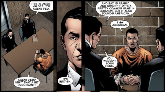
In that other post, I said Simon's experiences should have radicalized him, but instead he was created by Geoff Johns. Simon is a Muslim, Lebanese-American man who came of age in the post-9/11 era, and was wrongfully convicted of terrorism and waterboarded at Guantanamo Bay. His reaction to this was...to put on a ski mask and wave a gun around. Like, it's been a while since I've read these issues, but aside from the "ripped from the headlines!!!" of it all, I feel like Simon's experiences largely don't inform his actions or perspective except that he's super angry (fair enough).
The thing about Simon (and Jessica) is that he hasn't been around very long, and most comics don't have characters directly expressing political opinions. It's not a coincidence that these characters are in chronological order and each write-up is shorter than the last. I can think of about three times where Kyle has ever said anything I can interpret as political, and he's been around for 30 years. Simon only has a third of that history. So while one could certainly extrapolate what Simon's opinions are likely to be, I can't think of any canon where he actually says them.
Jessica:

Jessica has even less to go on in terms of explicitly political comics. You'd think she wouldn't like guns because of what happened to her friends, but she has one of her own and doesn't seem bothered by Simon's. I'd imagine she has opinions on immigration as someone whose family is from Mexico and Honduras, but it never comes up. If I were writing for DC, I'd make both Simon and Jess leftists, but as for actual canon proof? I got nothing.
I will say that she probably avoids political discussions because anxiety, and I bet she got really good at voting by mail during her years not leaving the house. She probably votes by mail from space. Maybe John's not the only one with an up-to-date voter registration.
Kilowog:
178 notes
·
View notes
Note
(welcome. i've talked about my Average Boring Headcanons before but I figured I might as well submit a few here. Somewhere that gets more reach. because i want to see more Average Boring Headcanons)
Skizz has trypanophobia (fear of needles, but more especially the medical kind). because Projection 100
Bdubs likes bread, but only if it's been in the toaster for exactly 15 minutes. he burns it every time because his toaster is broken. if he uses a different toaster it still must be exactly 15 minutes. these are the only times he gets unburnt (or at least, less burnt) toast.
impulse is lactose intolerant and that's why the first idimpy bar went so wrong. he Forgor. something something bullshit minecraft mechanics and magic edible amethyst properties can help digest lactose (as well as reverse magical effects, similarly to milk but not just for potions), but it's under very specific conditions- either when exposed to about 104 degrees Fahrenheit for a certain period of time, or left at average room temperature. It can't be left in the heat for longer than that period of time, but it also can't be colder than the average room temperature. The heated-up version is more effective when directly added to foods, and just eating the amethysts plain, like candy, is much slower, and more effective on reversing magic. (<- yes this one is because of isabeau ISAT being lactose intolerant. fuck you (/nsrs) they have similar designs)
Pearl likes to snack on pickles.
i popped off with the impulse one and apparently used all my wording ability on it, leaving the other ones as very short sentences LOL
I would also like to see more Average Boring Headcanons! Love them. Impulse messing up the lactose tolerance magic would certainly explain how green he got.
-Mod Mleem
93 notes
·
View notes
Text
thinking Thoughts today about the whole "Auction Day" part of dream bbq, so allow me to give Hopefully Not the most obvious analysis ever. I'm thinking specifically about the difference in color palette between the video series and DBBQ:
The ena videos, for the most part, all have environments of cool colors—grays, pale blues, some pale greens, etc, or at least the areas that seem to be "Outside" are in that palette. Dream bbq meanwhile is very heavy on warm colors, with most of the places that are "outside" being made up of browns, reds, and oranges. Even for the areas that don't have this palette, There are no areas that strongly match the video series's locations.
The only time we see a pale blue and gray palette is during the "Auction day" part, after we turn the smoke off, and the Uncanny Streets, somehow, for some reason, turn into... This. Most of its inhabitants disappear (or turn into something else...?), the landscape changes, etc.
Of course, this implies that the Auction Day video takes place in a scenario like this—possibly not exactly the same place, but something that was once something else now Transformed into... that place... for some reason. Like the reason they're auctioning things off in the first place is because things from that place no longer have owners and are free for the taking for new profiteers.
But i also think this might mean that ALL the locations we saw in the video series (except for Power of Potluck...?) had the same thing happen to them as the Uncanny Streets, ie they're All the transformed version of what was once a much different place.
My evidence for this is mostly—again—the color palette, which i DO think is valuable evidence since we all know how talented and, imo, Deliberate the artists of this project are. Classic Ena's world was all blues and grays, and even in videos like the Extinction Party, the landscape looks awful similar to Auction Day.

One caveat is I'm not sure whether the reason the landscape transformed like this was specifically because the Smoke turned off, or because the Door closed/was closing. (like clearly the door closed Because of the smoke turning off but. still. Shrug)
My other caveat to this theory is Temptation Stairway, as a lot of the places Ena visits there look NOTHING like this, but since she only gets to those areas after entering the "Holy Code" AND after seemingly entering another Door, it seems like those places are in some entirely different location.
(Also, the insane amount of mannequins in Temptation Stairway could support that that area's another wasteland, given... Whatever the hell seems to be the deal with the mannequins/the mannequins and Ena, but um. Idk where else to take that 😭)
Also lastly i know that Power of Potluck looked nothing like this. The only landscape we see in that video is pitch black. I have no idea what this means, if anything. Idk maybe ena just went on a vacation
NEVERTHELESS, I am not entirely sure whether "Classic Ena probably lived in a world of post-apocalyptic wastelands" means anything in specific at the moment but. Well. Would that be fucked up or what LOL. If anything:
It supports the interpretation that DBBQ is a prequel to the video series, but I'm definitely not entirely convinced of this; I personally doubt that the games and the series's relation to each other will be as straightforward as a prequel or a sequel, but what do i know
Maybe one of the reasons people fucking hate Ena so much is because she's accidentally done this to worlds before, or people Think she's done this to worlds before? but No matter the case, i... Doubt people's opinions will get any better of her after this 😭
#ena#ena dream bbq#dream bbq spoilers#ena joel g#dream bbq#calli.txt#wipes sweat off forehead. WHO WANTS SOME NOTHINGBURGER ANALYSIS ON A THURSDAY MORNING!!
50 notes
·
View notes
Note
Your opinion on Izuku Midoriya on the post you made on Stillness-in-greens post is really eye opening
I liked Izuku during Act 1 & 2, but when the Villain Hunt Arc happened I couldn't see him the same anymore
Especially when the conclusion of the final Arc happened
It's then when re reading the story, it becomes a lot clearer the Izuku is someone who expects people who suffer to bear the pain and conform
Him telling Shoto that forgiving Enji makes him a good person was just...
I really don't know what to say
I do agree with you saying he'd make for a good Villain aganist the League
Since he's someone who conforms to the system and protects it (Saying this kinda reminds me of the Matrix movie, Agent Midoriya lol)
Good luck on your AU 😊
Yeah, and the sad part is, is how he proved so many of the early criticisms right, I went into the show/manga liking him. He wasn't my favourite character but I liked him well enough, and I thought most criticisms were unfair.
Yes, he got One For All by chance, but so did everyone else at birth, and he did work to earn it once the opportunity was there.
Yeah, he wasn't working out before that, but most ways would require cash and/ or parental permission, and Japan has an insane bullying problem and is known for taking school very seriously.
Yeah when you're constantly being bullied and no one has your back, it's hard to have a spine because having one typically gets you hurt worse
And then he proved them right. He proved that he is a spineless coward that won't do anything to achieve his goals on his own
I can't even call it character assassination as it's not that this shit is new, it's that he became the worse possible version of himself and canon won't acknowledge it. And yes I am bitter, I am bitter that I was invested in seeing this character improve, only to find out he gets worse and worse as time goes on
---
One early warning sign of Midoriya's character is how right after the battle trials he rushes to partially tell Bakugou about OFA. So it's not in the heat of the moment, and with how it's done it's not to call out Bakugou's main character syndrome. It's that he's placating Bakugou. Bakugou is just the perfect metaphor for Deku and the hero's society issues, that they will not acknowledge that they/ it are just shit. That it is all about the glory, and they aren't going to solve any of it because they are allergic to the idea of accountability. And that once someone has the hero label on them, they can be the shittiest human being imaginable because they won't be held accountable. And this was before the series started constantly kissing Bakugou's ass
---
Also I hate Deku becoming a teacher, but the biggest point for me is that he's only a teacher, and no one else in 1A didn't become a hero, even with them saying oh the need for heroes went down, none of them opted out. As I've put on my main blog, Deku knows Hatsume Mei, and Melissa Shield, both characters who are eager to create support gear, why didn't he contact them in 8 years. Both All Might in his last fight, and Mirio with Overhaul have proven heroes can fight quirkless. So what the fuck was he doing? It certainly wasn't working out. Why the fuck was he waiting for someone to gift-wrap him the opportunity again? He never considered any other career while he was being bullied and told no for being quirkless, so what the fuck. You can't just choose to be a teacher, it does require a degree unless UA is just 100% disregarding that entirely.
And with it being a teaching job specifically, I'm going to say it. DEKU SUCKS AT EXPLAINING ANYTHING. In the whole series the closest we ever see him show any interest in 'teaching' anything is the sports festival when he offers to give Uraraka a plan to beat Bakugou, which she declines so no idea if it was any good. But start of the Endeavor agency arc, he overcomplicates and mumbles what he's trying to do with his quirk. It's not what he's saying that's complicated, it's that he's a shit explainer. When he realizes that concentrating all of OFA in a tiny area is a bad idea he announces a metaphor with zero context, during a meal. If it was just his thought process, I wouldn't care, but it's that he's doing it constantly when he's talking to people.
I actually plan on writing a comparison between the teacher ending of My Hero Academia and Assassination Classroom because holy fuck they did it infinitely better
#bnha#mha#my hero academia#boku no hero academia#league of protagonists#league of villains#mha meta#bnha meta#bnha au#mha au#anti deku#anti midoriya izuku#anti bakugo#anti bakugou
44 notes
·
View notes
Note
Hello! I just want to say your blinkie style is a huge inspiration for me! I love how everything looks, and its making me consider using aseprite instead of clip studio :D Do you have any tutorials, beginners guides, or other advice you can give to someone who's specifically wanting to make blinkies in the program? Thank you for all your cool art <3 - @m0dem0n (its a side blog so i cant ask from it OTL, pls @ me when you reply!)
THAT'S SO AWESOME, I'm so happy to have inspired you, @m0dem0n !! :'D
I've got a very quick and rough guide linked in my pinned post, but it's really basic and doesn't touch on any sort of 'advanced' techniques, so I'll go a bit more in-depth below the cut. I'll also include a 'speedpaint' of how I make my blinkies!
Before we get started, just a quick disclaimer: I am not really a professional! I love pixel art, but I really am just a hobbyist. Everything I've learned about Aseprite has been through trial and error. That said,
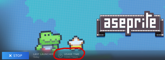
I've put enough hours into it to have picked up a few tricks, LMAO.
The pacing in this video is... bad. You'll need to pause to read all the text, sorry ;o; I'm not really familiar with making videos, but I did my best. (there is no audio, jsyk!)
A few things I didn't mention in the video:
If you plan on drawing any sort of pixel art graphics for your blinkie, CHECK THE "pixel perfect" BOX AT THE TOP!!! it's a magical option that helps you avoid 'doubled up' lines. example:

If you want several color versions of your blinkie (like how I tend to upload 2-3 versions of the same blinkie in pink, blue, green, etc), select every layer you'd like to change the color of (usually it's background, border, and text, but usually NOT the image), then use ctrl+u to open the hue menu. shift the hue here (it's the slider labeled "H"), and once you confirm, all of your selected layers will shift colors! Note that the preview may only show a single layer updating colors, but when you confirm, all selected layers will update.
You can use the alpha slider under the color wheel to select a fully transparent color. Combine this with the gradient tool for cool effects, but remember that you cannot have a *partially transparent* pixel on a *fully transparent* background and still save it as a gif. So if you have a partially transparent red on a solid black background, it'll work! But a partially transparent red on a fully transparent background will not.
When you save your blinkie, make sure you use the "save as" feature, not the "export" one.
I HIGHLY HIGHLY HIGHLY recommend you save every single blinkie as BOTH a .ase and a .gif. A gif will not save layers!! So if you want to edit your blinkie later, the .ase file will save your layers and make your life so much easier. Learn from my mistakes. ;O;
Aaaaand here's the speedpaint! This is what my process of making a blinkie looks like in real time, starting with my little flashing border template.

i had to shrink that speedpaint gif down so much to get it small enough for tumblr to accept that you can't really tell what's happening in it anymore LMAO, but it IS still real speed at least! also the weird distortion on the color picker is what happens if you have a non-dithered gradient with too wide a range. it clumps different values together to reduce colors and makes it look bad. that's why i recommend using dithering, or using a *very slight* gradient!
I know that was a lot of text but hopefully some of it is useful! o/ i'm gonna go lay down now LOL
32 notes
·
View notes