#also the lighting of the room made me think it was the 3d character model of punk from 2k24 and not actually him
Explore tagged Tumblr posts
Text
love how they just cornered him in a hallway
#also the lighting of the room made me think it was the 3d character model of punk from 2k24 and not actually him#but he's looking goooooooooood#cm punk
13 notes
·
View notes
Text
In the wake of losing my job I've thought about opening up 3d art commissions (and maybe also quick sketches or traditional art colored with markers) - but it'd be for humanoid characters only and maybe anthro/cartoon characters too. I'm still thinking about it but here are my ideas:
I told myself I wasn't "ready" to do 3D art yet because I'm not as efficient or as skilled as I would like to be; but I could still open up commissions for simple characters.
Here are the things I can't do (yet):
-full suits of heavy armor, fantasy or mech (light armor + some pieces are fine)
-animals and creatures, including dragons
-stuff that transforms
-guns or robots
-anime art style
.
.
.
If I were to open commissions for 3d, can I pick y'alls brains for some pricing and see if it sounds fair?
Keep in mind, ALL of the assets I'm going to be using to make these models will be made from scratch! I won't be buying premade clothing, or hairstyles, or skin tones. Everything will be hand made and hand painted. Typically a model takes me around a week to complete if I work on it for like 2-4 hours per day.
.
.
.
Portrait/bust - $45-60 (simple vs complex character)
Full body model - $90-125 (simple vs complex character)
(simple vs complex could also apply to stylized vs semi-realism)
A copy of the file so you can pose the model and make renders yourself: additional $15 cost
.
No background or single color: free
Simple background: $10 (only a few props, sparsely decorated, low poly, not too detailed)
Moderately complex background: $25 (cluttered rooms, high poly props, lots of props, detailed objects)
Realism background: $50
.
Simple animation: $25 (Up to 48 frames or 2 seconds)
Moderate animation: $50 (up to 240 frames or 10 seconds)
Complex animation: $100 (up to 720 frames or 30 seconds)
4 notes
·
View notes
Note
Hi! Would you happen to have recs for other blogs/artists like yourself? Or even just people who inspire you/your art?
hmm not sure if i can pick artists like myself (cuz its usually just one or two aspects i think are similar (my art is a big mashup of bits and pieces i love)) but i can def share some artists that inspire me! they'll mostly be on twitter tho cuz thats where i follow most of em ;p
@/Belial43157741 : super cool techwear/light mech elements to their art and great colors. their art usually has more minimalist shading which gives it a super clean look while still showing the form of the hard surface elements in their drawings
@/VibeStrike (NSFW) : love how soft their lines are and the shapes they use to draw bodies! once again someone who uses more minimal shading, although they tend towards softer/more blended colors/shadows which has a very soft and touchable look to it. i totally ripped off their paw style cuz i love it so much lol
@/Deceased_Bunny : their work was what got me to use that crispy ass binary brush and chromatic aberration more! I also really like the shapes they use for bodies and their art made me realize i could just give all my characters cute little paws lol. I love their little tableaus/scenes and how they can populate a room. great vibes
@/godbirdart : Their ref/outfits sheets were a huge inspiration for how i do a lot of my backgrounds. i love how they include a lot of icons/text in the layouts and it gives it this really sleek yet maximalist look, somehow balancing a lot of details while not distracting from the focal point of the characters
@/ISANANIKA : similar to prev, love their text layouts and more graphic approach especially with their work for Howl Out (their clothing brand)
@/scpkidd : love their character designs and how they can incorporate so many colors and hues in a piece while still having it look really harmonious. their use of textured brushes (especially in environments) def was one of the things that got me to start using procreate more
@/yapa_yappa : huge fan of their compositions that combine 3d models and 2d illustration/animated elements... not something i've done too much of yet but i really want to start experimenting with that combo more its such a cool effect
#holding myself back from just mentioning every artist i follow on twitter#probably gonna think of more specific ppl i want to point out but these are some highlights#also not in any particular order lol#its kinda crazy to me that im mutuals with half of these ppl... like wadda hell...... mutual art appreciation
32 notes
·
View notes
Text
Closing thoughts on Precure All Stars Movie F
Early in the story there was a visual gag with La Mer and Prism that made me think "is this by the guy who directed the best episode in all of Precure (That tropiRouge one)?", so I had to stop and check. And indeed it is the case, and he also directed Go! Princess Precure (one of the best seasons) and the Star Twinkle movie (the best Precure movie), so I knew I was in good hands. And indeed this turned out to be a pretty good movie and a really good anniversary movie, even though it does come with the unavoidable issue that 17 characters is way too many for a 70 minute movie. Towards the end when everyone joins the battle they even have to swap to the 3d models because nobody wanted to animate all that by hand and it looks rough.
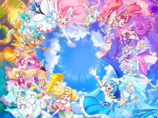
Clunky 3d aside this was a very pretty movie, with a lot of beautiful scenery and colours, creative shots and dynamic action. Unfortunately no new forms but at least there was a new Cure design to compensate.
There were also a lot of really good character moments, we did have to waste some time on characters just spouting their catchphrases, but there was still room for funny ways to have the characters from different shows interact with each other. The chaotic muscle brain energy of the Sky-Precious-Summer trio was probably my favourite. Also points for including almost all of my top tier Cures in the main cast! And as a known hater of the over-abundance of friendly and energetic Cures, I welcome the serious edgelord Cure Supreme with open arms.
Due to the short length of the movie and spending a significant amount of it on over a dozen characters just hanging out the story had to run through its worldbuilding, but I don't think that was a huge problem since the character interactions were the best thing anyway, and certainly more interesting than the exact mechanics on how the movies' world was created or where the Cures' ultimate power comes from. But I'd say the film would have greatly benefitted of some 20 extra minutes spent on the plot.
But who cares about the plot, this was very much an anniversary celebration movie, with the theme explicitly being something like "what makes a Precure?" and even a clip show of some of the franchise's biggest moments. Everyone is included in some way, even randos like HapiCha international Cures. Especially the nod towards mascots-turned Cures warmed my heart. Or really making it a plot point that the Cures have mascots in the first place, probably the first time in the history of the franchise that I appreciated it. And in the epic finale (that had music that slaps and some really good action in the shots that didn't use the 3d models) they clearly had fun grouping the Cures by themes, like here we have the mermaid Cures in the same scene for a few seconds! Here are the princesses (and Tsubasa)! Here go the butterflies!

Finally a shout-out to NOT including the stupid light sticks, or at least as obtrusively as usual. I was ready begrudgingly to accept them this time because it is a celebration of the franchise's history after all and they are unfortunately a part of it, but to my delight there were no calls of action directed at the audience.
My final verdict is that this is a very good movie for Precure fans, but probably not that interesting to anyone else. It was also not a very good Hirogaru movie since the Hirogaru girls kind of got buried in the sea of Cures, and didn't get that much of a connection with the antagonist, or even that personal character moments.
23 notes
·
View notes
Text
April Update!
Howdy! Cobalt here, as many of your guys know It’s Showtime and its characters/story are gonna be turned into a horror game by the same title. So for both Gamejolt and this blog I am gonna start trying to do monthly updates on development. I think it’ll be a good way to put into perspective how much progress is being made each month and keep you guys in the know about how things are going. These are gonna be formatted with work made that month going first and then afterwards any other small announcements or thoughts we’d like to share on development. That or things that weren’t created that month that I basically keep stored in case we have months where progress is slow or I can’t show much behind the scenes stuff. These logs will likely contain personal stuff too, since with me and my partner being the main heads of the project. Our well-being or IRL goals are relevant to how much work is being done. Also while developing Showtime I intend to create other games similar to it, to sort of learn and test the waters + Since those ones aren’t tied to an IP I can actually make money off of them. Something I can’t [or at least not without Mike n Meatly’s permission I suppose] with Showtime or its characters.
April was sadly, not my month, I found out I was vitamin D deficient and got a slight fever. So I spent a lot of days tired and recovering from that. Progress has still been made though, mostly on learning 3D modeling more, I’m almost done with a model I’m making for someone else actually and while it is not perfect by any means… I think it looks really awesome for being my maybe fourth or third model and it’ll be my first truly finished model as well. I also have made good progress on writing both dialogue and summaries of Showtime’s story. I did particularly get ideas for a good chunk of Showy's campaign however, which involves a character I was on the fence about including in Encore!... Until very recently... Art wise not too much has been done specifically this month besides some concept art for cycle designs and some progress on textures for the studio. But that’s okay cause we’re not really at a spot where major progress can be made art wise yet. There’s so much more I want to share but I’ll be doing my best to space out those things out between updates. So no update is too long or too short with nothing interesting in there. Also sorry this is all so vague and non-specific I’m gonna try and get in the habit of actually documenting what work is being done on Showtime monthly from now on, so I’ll be able to be more specific about what parts are being chipped away at.
So onto something that didn’t happen this month but is important we have decided to switch to Unity instead of Unreal Engine 4. I’d like to take some time to explain why and also make sure nobodies too anxious over the change. For one thing, not a lot of progress was made on Unreal Engine, you could hear footsteps as you walked, use a buggy animation to enter a miracle station and the map was just a room full of lights. This is due to the fact while working in Unreal Engine was interesting and I learned quite a bit, I found myself often feeling it was not a good fit for Showtime and that trying to make it so was fighting against the engine as opposed to working with it. Unreal Engine seems to be built for realistic, open world or multiplayer FPS type games. That’s not to say you can’t make anything else with it, but finding tutorials for things I wanted to do was. Basically a nightmare because youtube was flooded with videos on how to make those games specifically. Another big aspect however was the general style. Unreal Engine is great if you want very realistic lighting and have a computer that can tank the sort of weight of that too. Neither is true for me however, Showtime’s characters are all very stylized, our humans are cartoony have clear shapes and most of all, I just want Showtime’s overall style to pay loving homage to 1930’s and general 2D Animation. I think both are really underappreciated and god do I love them. Also I’m making this on literally a laptop, a new one and not a janky one by any means, but still not a desktop. Unreal Engine works great for those who know how to use it and want to create the games it was optimized for, but it’s not ideal for my purposes, Godot seems promising but Unity is just great at specifically doing what I want to do with Showtime. It’s great for beginners to Game Development, has plenty of tutorials for all kinds of games and is very flexible in style. Sadly nothing is better at being Unity than Unity right now. I’m still mad about what the CEO did, and I’m glad for those who were able to switch engines to those with better management but it’s not really an option for us currently. Of course, this will put things back a bit but I’ve already been learning how to build a basic map in Unity and so far have only run into a few issues. Still I would love any advice on how to do this, esp from those who had made games similar to BATIM and other mascot horrors. [I have been thinking of building the maps inside Blender first and then importing them into Unity, to see if that’s easier or practical, but mostly I would love to hear what others commonly do to build such intricate interior design in Unity.] Either way while this month wasn’t terribly exciting by no means was no work done, just nothing too fun to show off yet.
#it's showtime#not ask#Devlog#bendy and the dark revival#bendy and the ink machine#batim#batdr#Bendy Encore#Bendy fangame#queer horror#indie horror game#indie horror#mascot horror#mod whirly#I dont know yet if Ill be fully putting all the devlogs in the bendy tags#it feels like a good idea for making sure the posts reach more people but once a month might be annoying to those who are not interested?#but also one post every month doesnt sound too disruptive either so? Im not sure yet#anyways thank u guys for being so supportive so far I swear I am taking this project seriously its just I have other things I am working on#too and since were still in early pre production most of this is just planning and actually putting fun ideas to paper to see how theyll#actually work out yknow?#anyways yeah ty for everyones patience hopefully from now on communication will be a lot more consistent from us <3
4 notes
·
View notes
Text
My ranking of Kotori's limited SIFAS cards and why
We are SO BACK with the second installment of 'I whine about anime girls in a gacha game'. Kotori this time! I absolutely love her and I had a bit more to say about these somehow than the Honoka cards- Anyway, please enjoy!
4 - Welcome to Kotori's Costume Room

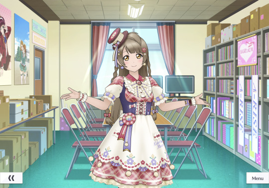
Kotori's second fes card has always left me leaving disappointed, ever since it came out. And this is from a set of festival cards that are generally very strong, to make matters worse. It's not a bad card per se, and could very possibly be someone's favourite, but it's never been for me. The idolised art is certainly pretty, but it stops at just that. This feels like one of those cards that really just feels like it's from an event gacha, not a limited one. It seems a little aimless as a concept, like sure, it's the whole 'costume making' thing with Kotori and her character, but the outfit itself doesn't seem to communicate that like, at all? They definitely could've done something better to show off her established costume making abilities, rather than grabbing a random outfit concept out of seemingly nowhere and making it into this... Underwhelming fes card. The 3D model has a pretty colour scheme and interesting texture usage, and is very nicely faithful to the artwork, but stops entirely at that. The silhouette and general outfit concept feels pretty boring and standard, which absolutely shouldn't be happening for a lim. As a whole, it's pretty underwhelming as a fes card.
3 - Tropical Squash
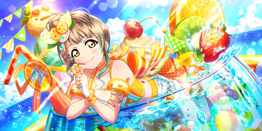
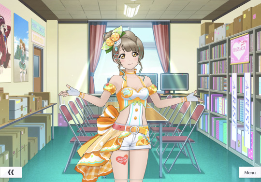
Kotori's party card pretty much only made it above the second fes card because of it's art. It's a pretty standard idea for a game like this, but oh my lord does it work in this context. The colours and background join together beautifully to make an aesthetic that's certainly very strong and is communicated well instantly. However, my issues start to come in when you look at the 3D model. To start with the good aspects, I really like what they did with the little flourish on the back of the shorts (a common trick for beach themed cards like these to jazz them up a little), and the shorts themselves. The hair too is fitting and the highlight makes it unique. HOWEVER. This is almost all ruined by the absolutely horrendous top and stomach design, which, to me, looks cheap and not at all nice to look at. It might be the simplistic bikini top or the overly bright colours that create this effect, but I really dislike it. The cuts on each side also don't at all help with this, as they feel unnecessary and lessen the outfit. So this was a beach card so close to greatness, but fell short on the chest and midriff so hard that it ruins the whole 3D model for me.
2 - An Elegant Night Party
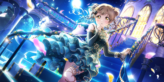

This is the third fes card and the idolised art is absolutely GORGEOUS. Fitting into a similar category as Honoka's second fes card, with the whole 'elegant and formal' theme, but in my opinion, this art is actually done better. The lighting and unique colours work wonders, and the characterisation, dress and hair are both absolutely on point. From art alone, this is actually my favourite out of the four. However, like the previous card, it fails to continue this good streak with the 3D model. The hair and overall vibes stay very strong and work well in this context too, but it's the dress that really disappoints me, it feels like a 'what I ordered vs what I got' sort of comparison. The frills, which seems to be a large focus in the art, are flattened and look much more lifeless and busy when they're all bunched up. I honestly think that had they padded out this section in particular, this model would be absolutely phenomenal. But no, it's that little detail there that seems to fail the whole thing. But, I will repeat, I am absolutely obsessed with the idolised art itself and think they did an amazing job with it.
1 - Humming Angel

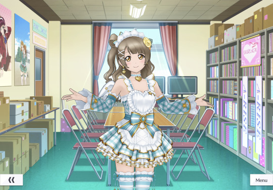
Ahh the absolute classic... Kotori's first festival card. I absolutely love what they did with this one, it's a pretty safe bet of an outfit and it absolutely pays off. Everything from the pose to the hair to the theme in the art fits Kotori beautifully, and as one of the first ever fes cards, it sets a great tone for them. This card is an absolute triumph for Kotori in my opinion, and an absolute SIFAS classic. The 3D model too is absolutely brilliant, with the outfit translating excellently and in a way that completely avoids the issue with the last one, with the skirt especially being still full of life and very, very pretty. The colour scheme is well thought out, with the yellow being the same colour as her eyes and the turquoise being a bit of a play on her usual green colour. And completely unlike her second fes card, the slight simplicity does wonders in this case entirely because it already has a solid concept and it's still very unique in itself, silhouette and all. PLUS the hair in the model was done excellently I am obsessed with it, so overall- It's excellent and I love it
---
Again, tysm if you read this far! I adore a lot of the Kotori cards, and this one was an absolute blast to write honestly. Hope you enjoyed!
#these are far too important to me lmao#I miss sifas SM#sifas#llsifas#love live#kotori minami#sifas card ranking#love live sifas#school idol festival#μ's#love live all stars
3 notes
·
View notes
Text
anyone still remembers this used to be sims blog?
i do, after like a year since last sims related post (lol) so i decided to build something, that something became a kuroko inspired apartment in san myshuno.
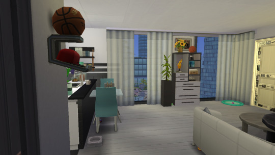
a small apartment in the heart of lively fashion district is a perfect fit for a man and his puppy (fun challenge: count the toys number 2 has hidden around the place!)
this one bedroom apartment has a spacious living space with an open renovated kitchen with newest appliances all the way from the north!
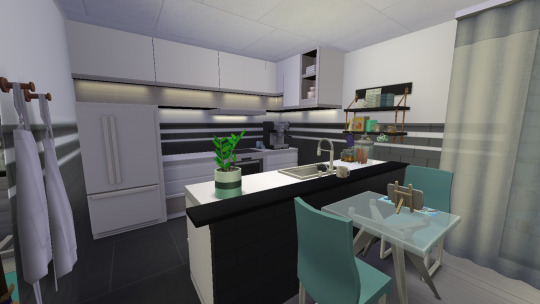
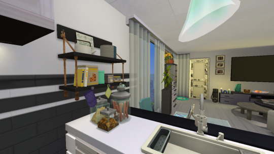


the bathroom is... clean, it's nothing special. let's move on to more interesting things, shall we?
kuroko has already made this place a home and we could not be more proud!
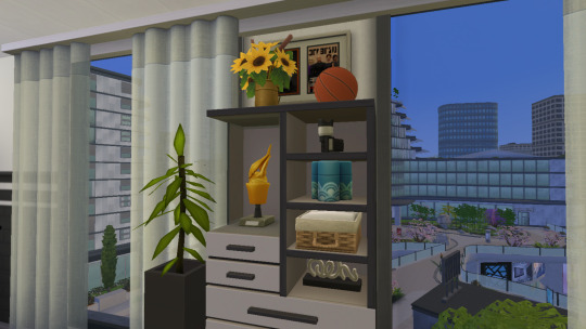
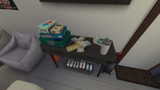
oh the basketball? there are many oh them, which one? the one on the wall? i see.. i was told that things on the wall display under the sconce were gifted to kuroko by his friend from america. there's a reason why such bright red cap is on a display in a room without much red. i think the same friend also left an umbrella when he stayed here last time.
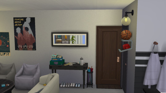
If there are no questions, i'd like us to move on to the bedroom, the views outside are impeccable i'm going to tell you all about it- there are still questions :/ the photos? just few photos kuroko took with his friends during a high school championships. such personal details in the houses always makes me happy

now shall we-- you want me to zoom in on my clients' personal photos? yeah, sure! too bad due to technical difficulties only one survived (i know there's inaccuracies and mixed up jersey numbers, this one photo took me over an hour to get, between sims being sims and game crashing more than once. after noticing too late i was not going to do that all over again for a prop, i'm sorry. let's say kuroko and kagami mixed theirs up and after the photo was taken, everyone had a great laugh, okay?)
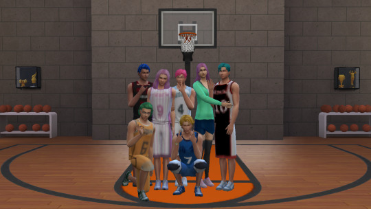
at last, the bedroom! the room isn't big so an open closet situations was the best decision. it leave so much more walking space and a puppy can go wild. kuroko went for a double bed, and a string light canopy as the main light source for the room, which isn't always necessary as the floor to ceiling windows let more than enough light from a vibrant city, both during the day time AND night time! the painting looks good too!!


the photo on the bedside table? yup, that's kuroko's friend from america! glad to say i can show the full size photo!
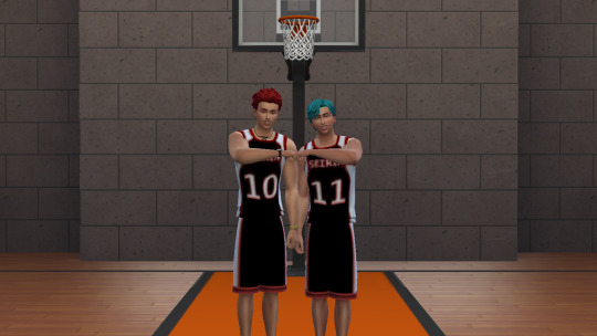
hope you enjoyed our virtual house tour! our next one should start in XYCSY minutes, strap yourselves in!
if you made it this far, i appreciate it so much lmao. miss building a lot, so this was very fun, tired to build a huge house for a few knb characters but after struggling for a bit, i was harshly reminded that i cant build big houses, not even modern. but the joy of looking into what could signal to others that this is apartment that belong to kuroko in a way that i see it was really fun. like finding the sims, finding the outfits, finding the pose as im still not equip to do 3d models. then putting this all together and nearly rage quitting due to game crashing. but that's why we love this game, right? right??
maybe someday ill get to revisit this build and fix the already mention and not mentioned details, but for a first proper post in a while, I don't hate it and that's a huge progress <3
also, in my last story&build post i was complaining about not being able to paint ceilings and now we can! maybe when i post next, there will be more hair color options? nah, im hoping for too much, aren't i.
outfits were made by @twoohugs !
3 notes
·
View notes
Text
Reflective New Learning Over the Project
BLOG 41 14/8/2024
As my postgraduate journey in Game Art and Design in the UK draws to a close, I reflect on a period marked by challenges, innovation, and personal growth.
The course began with the fundamentals of game art and design, including pre-conceptual design, game storytelling, and teamwork. These foundational elements were crucial in establishing a strong theoretical framework that guided my subsequent practical work. As the course progressed, we delved into more specialized and technical subjects such as 3D modelling and game engine mastery. These classes not only honed my technical abilities but also expanded my perspective, allowing me to continuously improve my portfolio and share my work on platforms like Artstation.
In this final project, I learned the proper techniques for character topology, specifically starting with a T-pose and then using skeletal binding to quickly pose the character. Additionally, I significantly improved my proficiency with Unreal Engine. Previously, my use of Unreal Engine was limited to just placing objects in the scene, but now I've made substantial progress in controlling fog, lighting, and rendering.
Although I have made great progress, I realize that there is still room for improvement. Technically, although I have acquired strong 3D modeling skills, I still encounter challenges in practical application. For example, I sometimes have problems with character line layout, and I have problems when baking high-polygon and low-polygon models. In addition, due to negligence, UV mapping errors occasionally appear, such as incorrect quadrant division. These may seem like small details, but they highlight the need to continue working hard. However, a lot of progress has been made in optimization, from the previous 100,000-face low-poly to 40,000-face low-poly.

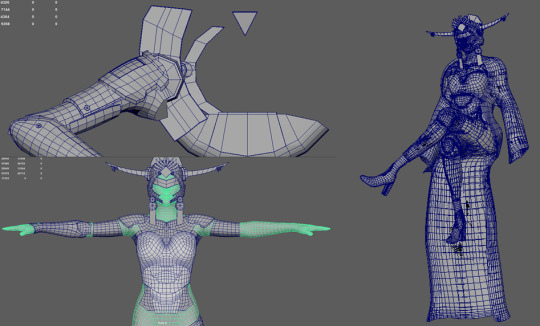
Lastly, I think that in this year of study in the University of Hertfordshire, besides maturing my technical skills, I also realized the importance of drawing. When creating characters, it’s crucial to understand the structure of the human body and the distribution of muscles to create better models. This is not only important for sculpting characters but also for understanding textures. Many textures need to be drawn out to be done well. Drawing can enhance your understanding of textures. In the past, we only required proficiency in software, but now I gradually realize that the upper limit of 3D art production is determined by one’s drawing skills.
Finally, I recognize the importance of continuously updating my knowledge to keep pace with industry developments. Game design is a rapidly evolving field, with new technologies and ideas emerging constantly. To stay competitive, I must commit to ongoing learning. Therefore, I plan to approach the future with a mindset of continuous education, remaining attuned to the latest trends and advancements in the industry.
My postgraduate experience in the UK's Game Art and Design has not only enriched me with extensive knowledge and skills but also clarified my career aspirations. I've grown into a more professional and confident game designer, and my determination to excel in this field has only strengthened. Moving forward, I am committed to further enhancing my abilities and contributing to the game design industry. Additionally, I hope to explore the intersection of game design with other fields, creating more possibilities and adding value to society.
0 notes
Text
Project Ideas
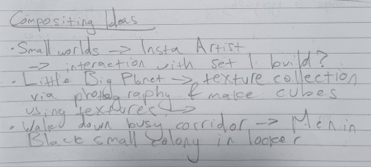
Here are some of the first ideas I scribbled down initially inspired by the artist David Zinn.
youtube
I thought I could explore something like the micro-world within the lockers in Men In Black 2 but the amount of detail for something like this would be excessive and less focused on compositing and may become more of a modelling and animation project.
youtube
This is the main video which inspired this train of thought, its all about the making of Little Big Planet. The game was stylised and build using simple blocky shapes with loads of textures applied and then dotted around with a sandbox feeling and I thought that I could try and make something of this sort for this project using a mixture of assets and real world interaction.
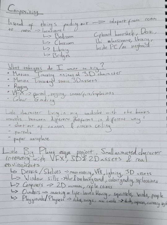
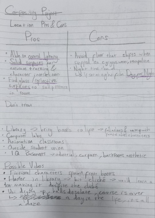
I wrote some more notes about location ideas and plans for using a small 3D character and which environments would work for this project.
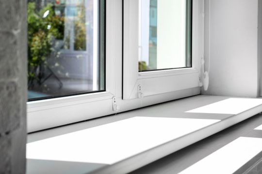

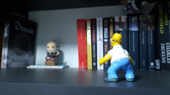
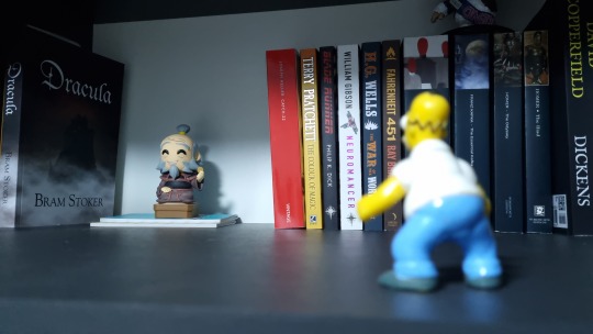
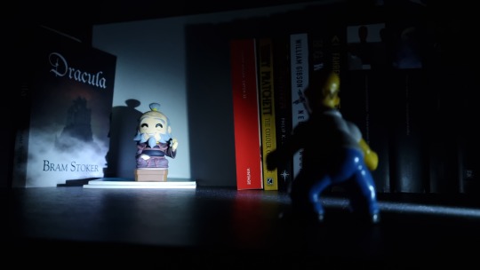

These are some of the locations I could use for this animation with some experimentation with reflections, lighting and some VFX added on top to transition from location to location with portals or cannons.
instagram
If I go down this route then I could try to make something like the video above, the animator uses a mixture of 3D and 2D animation with a lot of different techniques that would be useful to learn for compositing.
An alternative to the small world aesthetic is exploring campus with a video editing approach in mind with slightly less focus on animating characters. Taking what I have learnt about District 9's approach to VFX I could try to integrate VFX without turning it into the show piece of the project. The image above are some notes related this idea keeping in mind my limitations and which locations could work best. The idea I want to run with if I take this approach is an experimental approach trying out different types of effects within each shot and combining them together.
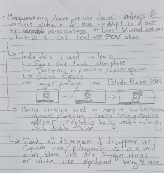
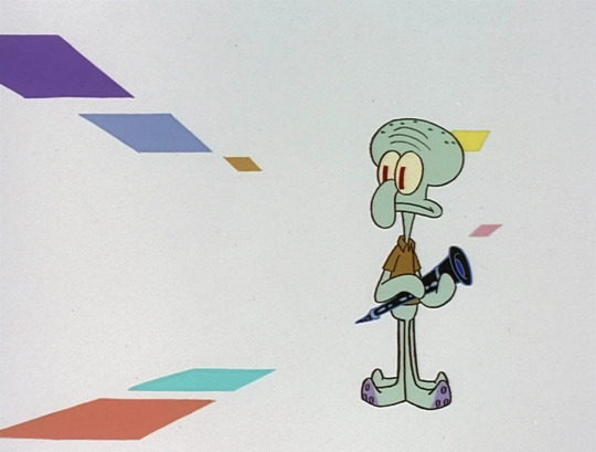
The notes here further explored this idea with a focus on a POV horror/experience inspired by the course closing down and the surroundings are fading with it with shots that have people and objects glitching, disappearing and transforming unnaturally until we are found in a void at the end like the image above.
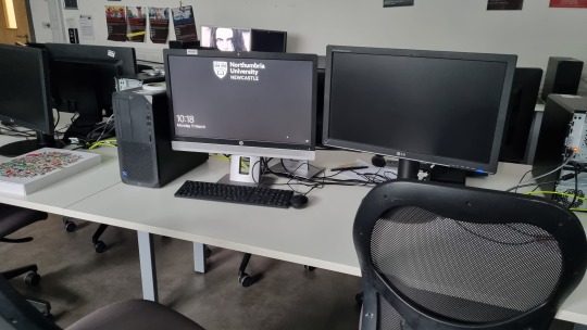
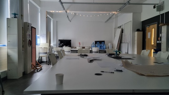
The main locations for this project would be the computer lab, classroom and I would also have to used the green screen room for the void at the end if I go down this route.
youtube
youtube
youtube
youtube
youtube
youtube
Above are some video tutorials or references which I want to try out for the VFX side of things as I think it would be a great way to push myself into video editing and VFX which I have not dabbled with much as of yet. Ideally I want to find a way to execute my best ideas for these two plans because I may find that focusing on smaller scale shots may be limiting for a module about compositing which aims for layers upon layers of different effects and techniques to make something really believable.
For the glitch/matrix style shots, the video above is one of the shots that would look visually amazing if I could make it work with a lot of rotoscoping and a 3 static shots one of which is a clean plate as reference for backgrounds and to not mess anything up. This relates to one of the ideas I wrote down in my sketchbook with a discussion between student and teacher and there is a jump-scare of someone coming through the teachers face saying something like "wake up" or "its over".
Whilst doing research I also found this post on reddit with someone doing compositing of their own looking for feedback to improve a shot of Godzilla composited into some of their own footage. The advice was really interesting because it talked about adding a camera shake to account for each footstep of Godzilla which made me think more about the environmental implications of the VFX added to a shot and what extra thought must be put in to make the shots feel real:
Camera Shake
Blurring
Smoke/Dust
Reflections
Lens Flare
0 notes
Text
Creative development: Reference for montage shot-3D-Blender
Character animation, lighting, render in Blender
I downloaded a 3D character from a library in Blender, I planed to ude 3D software and scene. I originally wanted to include this character in my animation, but it didn't fit well with the other elements, so I decided not to use it for the main animation. Instead, I thought it would be helpful to keep it as a reference. This means I can use it to guide me when I'm creating tricky camera angles and complex actions in my animation. It's like having a model to help me get those parts just right.
Above is a trial scene I've animated for the reference of complex rotational shot. I've used some techniques and tutorials to create this scene. Sources are below.
youtube
Used this tutorial to rotate my camera.
youtube
This helped me adding light to the scene.
Below tutorial helped to render my video.
youtube
In my creative journey and adding 3D to this 'PULL', I came across few tutorials that became a game changer. One of this tutorial taught me how to make my camera move in captivating ways. Think of it like how a filmmaker decides where to position the camera for a movie to make it more interesting. Learning this camera movement technique added a whole new dimension to my animation. Suddenly, my scenes felt more dynamic and engaging, as I could show them from various angles and perspectives.
But I didn't stop there, without adding lighting to this I felt uncomplete, even I've no use of lighting reference to trace the angles, to getting familiar with 3D also I got a spark of curiosity within me. I decided to explore the world of lighting in my animation. It's like when you adjust the lights in a room to create a particular mood. With the help of another tutorial, I discovered how to use lighting to give my scenes depth and emotion. Shadows and highlights became my tools to paint the right atmosphere for my story.
Also with setting camera and lighting , I felt more prepared and needed to render the scene. That's when I found a tutorial on rendering, which is like taking all your work and turning it into a finished video. This final step was like putting everything together. It made my animation complete and ready to share. This journey of learning and applying new skills not only improved my work but also fuelled my passion for creating and telling stories through 3D animation too.
Bibliography
www.youtube.com. (n.d.). Blender Beginner Tutorial - How to Render in Blender - Blender 3.4. [online] Available at: https://www.youtube.com/watch?v=RRCoKHDQTd8 [Accessed 3 Sep. 2023].
www.youtube.com. (n.d.). Blender Beginner Tutorial - Lighting Tutorial - Blender 3.4. [online] Available at: https://www.youtube.com/watch?v=R1tv1mgiOkQ [Accessed 3 Sep. 2023].
www.youtube.com. (n.d.). Blender Tutorial : How to Rotate or Orbit Camera Around Object in Blender 3.1. [online] Available at: https://www.youtube.com/watch?v=sb_FxJX4Jns [Accessed 3 Sep. 2023].
#ma animation#major study#university of hertfordshire#animation#major study_digital media arts#Youtube
1 note
·
View note
Text
not sure why I can no longer see the preview but: https://youtu.be/w_PtuVjsHCU
*special thank you post to the team*
Holy shit it’s been two years. Two whole ffing years. But we’ve done it! I think just that is enough to be proud of. And then, just look at what we made!!! <3<3<3
@thesteelchimera thank you so much for your insights, administrative skills and just being a genuinely good person, always ready to help, always there to listen and offer advice. You were always there, and it’s very appreciated. Oh! And let’s not forget your diligent work on the script.
@broken-risk-assessment-module Is there anything you can’t do? Always a solution ready. Can do anything. Did do everything. How can you do everything? Special thanks for taking care of the burden of editing (amongst other things). Which, as you know, was never my thing. But you did it wonderfully! Not to mention animating several awesome scenes, from mb to scu to Mensah.
audzilla thank you for your wonderful animationwork. The fight scene in the hall is still a masterpiece I enjoy just looking at every time. And thanks for letting me join in there for those funny, ridiculous frames for the extras! Ah yeah 😊nothing like thugs getting their ass handed to them. We had a good time!!
@nirelaz, You came later, and it was a good thing you jumped in when you did! What you missed of the begin process you well made up for in animation expertise and you really helped us through that mid-way slump, taking care of important tasks in finishing scenes like adding shadows etc. but also with sound! Thank you so much!
@alex-van-gore you fucking power animal. I’m always amazed at the sheer volume you can put out. Walkloops, murderbot, Mensah animations. And lining.. yes, my arch nemesis. You can do that too. Aah. Remember you were worried at the start of this, because you had no animation experience. Hahaha! Well, you sure do now!
@sometimesihaveideas, soul. Just your clever and even thinking was always a pleasure. First, you helped us out so much with your excellent 3d models, and then it turned out you had talent for sound too! It was a pleasure to work with you, always.
@chimaerakitten I think it should be said again how wonderful your interface work is. The overlays just add so much, yet still leave enough room for the animation to glow. Special kudos for those. And then there is the background. Holy shit what a background. I hope your loved once can vouch for your sanity. I hope you pulled though. Yet, I am not sure how.
@groovyleviathan the background work you did on the stairway scene (CSU jumping down) has become the blueprint for all our csu-fight sequence scenes. It was just so pretty. I hadn’t realized a flight of stairs could look that fabulous. I hope you know…
Cephei I really loved your positive can-do attitude. And damn, did you deliver! Awesome work on Mensah animation!
Technicaltoad your wonderful conceptart really inspired us, especially that sky on planet! It just gave joy just to look at. But, of course, the thing I’m most thankful for is you saving my ass on the lighting in the opening scene. Ooh! Thank you so much, I don’t think I could have figured it out without you!
@spiralofdragon You’re such a talented artists, and I loved your character designs. Working out the gun design to 3d from your designs was so interesting! I hope your comic dragonmage (on kickstarter) will become a great success!
Lue thank you for breathing life both into Ratthi and into The Worm! Such extremes, so well done. I hope you are well my friend.
@souldagger thank you for sharing your beautiful work on character design. It was a joy!
@rosewind2007thank you for always being there, for always being willing to help out. And the lists. God, sometimes I lost track of so much I didn’t even know who worked on what anymore. But, you had the list of tasks, and an answer!
@kesbeacon you had to bow out early due to real life responsibilities. Nevertheless thank you for your input, and of course, voice work!
@imaginariumgeographica you also had other engagements. But your voice of ART still rocks!
Vanessa how cool was that? Halfway our star-background artist got a job at an animation studio… making actual animation backgrounds!! Yeah, that really rocked. Unfortunately, that of course meant you had zero free time to help us afterwards. And yet, any chance you had, you still stopped by to check how we were doing, even offered your holidays up for us. Thank you, truly!
Verso you promised from the start that you’d take care of our public outreach and multimedia. And when we finally came to you. Like, over a year later, you were still ready and roaring to go!! That was amazing. It really gave us fresh energy, to have someone new looking at our project with fresh eyes and saying It fucking rocks!! Thank you! And of course, for all the work putting us out there!
Jude I know right! It’s been so long. You did some amazing work on our backgrounds! And they’re going life! I hope you are well.
Uovoc thank you for sharing and helping us with character designs! I really enjoyed the dry humor of your murderbot designs. Of course, I’m not sure it would have worked with us hiding its face, but it still would have been cool to animate.
THE MURDERBOT DIARIES: A Fan Animation
youtube
Subtitles in English, Spanish, French, and German.
In early 2021, as talk of a Murderbot Diaries adaptation was underway, fans of the series started asking each other questions like, "What would we want to see from an adaptation of our favorite book series?" and "Wouldn't it be cool if this or that scene was animated?" and "Hey, don't YOU know some things about animation?" and "What if a bunch of fans got together to make a Murderbot fan animation?"
Two years of teamwork later, the Murderbot Diaries Fanimation Project presents our labor of love: a fully realized animation adapting scenes from the first four novellas into a trailer, dedicated to showcasing everything we love about the story of our favorite rogue SecUnit.
Make sure to leave a like and share the video if you enjoyed our animation! And tell us what you liked about the video on our social media:
Ask the team on Tumblr | Instagram | YouTube
CREDITS
TheSteelChimera @thesteelchimera - Voice of Murderbot, Production Coordination, Script
Alex from Mars @imaginariumgeographica - Voice of ART Kebi/SpiralofDragon @spiralofdragon - Voice of Mensah, Character Design
Verso - Voice of Ratthi, Social Media
Kes @kesbeacon - Voice of Gurathin
brokenRAmodule @broken-risk-assessment-module @contakaidigon - Production Coordination, Backgrounds, Animation, Script, Storyboard, Character Design, Editing, 3D, Sounds & Music
theash0 @theash0 - Production Coordination, Animation, Editing, 3D, Graphics & Effects
Cephei - Backgrounds
ChimaeraKitten @chimaerakitten - Backgrounds, Graphics & Effects
Jude - Backgrounds
Livyatan @groovyleviathan - Backgrounds, Character Design Lue - Backgrounds, Animation
Nirelaz @nirelaz - Backgrounds, Animation, Lighting, Sounds & Music
sometimesihaveideas @sometimesihaveideas - Backgrounds, 3D, Sounds & Music
TechnicalToad - Backgrounds
Vanessa - Backgrounds, 3D
Alex van Gore @alex-van-gore - Animation, Storyboard, Lighting, Sounds & Music
audzilla - Animation, Lighting, Graphics & Effects
Mar @souldagger - Character Design
Sound & Music References
3K notes
·
View notes
Note
Hi! I really enjoy your coming Going to Weather and your art style. You always do such a great job drawing scenes and backgrounds. Do you have any advice on how you do it? Especially rooms. Sincerely, someone who struggles with drawing backgrounds.
Thank you so much! I'm glad you're enjoying it. Long post ahead.
For technical advice I’m not a good resource because perspective is the bane of my existence and I eyeball it poorly or half-ass trace the base shape of a room because I hate straight lines and rulers so much lol. Some people draw floorplans from a birds eye view and then do crazy things with transform tools. Some people make 3d models of rooms to use. I don't have the energy to learn how to do that effectively but if I did...THAT'D HELP. Maybe someday. I remember I once had a professor who was like 'your perspective is wonky but you put so much detail into it that I don't think people will really notice or care that much' so I have RUN WITH THAT haha!
But I do have advice for how to get excited about backgrounds. Because I also struggle with backgrounds. I've found the two most helpful things to keep in mind are:
The background is a character too.
Reference reference reference! References will surprise you and make the world richer.
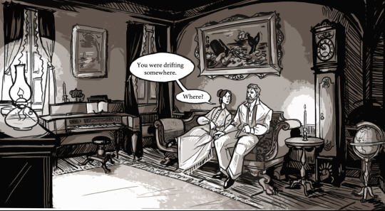
Backgrounds can tell a lot about the world your scene is set in, and thinking about them having personalities and also being part of the narrative can help you design them. For instance, I really wanted to show the difference of means between Ezra and Barzillai, that they're both career whalemen but that they're operating under quite different circumstances.


I used the backgrounds to tell that story without words. They have a purpose just as much as the characters do.
When building out my focsle, I liked thinking of what a space that was continually inhabited by a bunch of late-teens/early 20s lads for years at a time looked like, the mindsets people were in on those ships, and how their presence would be left behind. Also inspired by graffiti seen in the past and present.
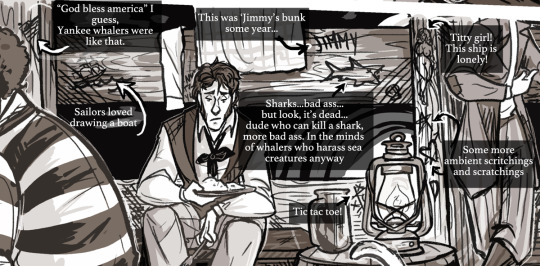
I also always try to push my backgrounds just a LITTLE more each time, which is easier said than done. To make my streets a little more crowded, to make the focsle just a little more chaotic, to make the waters just a little rougher. You gotta find what makes it fun for you, and what makes it fun for me is thinking about what story the background tells. I like thinking of practical elements too like...where do they put their stuff, what's their daily routine and how does that show in the space, what sort of art do they like to have, etc.
But to build those backgrounds, reference is so important. I've got about 1500 reference pictures for GTW and counting. And it's important to gather all kinds of reference! Photos, objects, other illustrations, written descriptions, videos, physically going to a place, all of that can help build one's visual library to craft places that feel like characters. Think of yourself as a set designer and you’re going shopping for all the little things you want to tell that story.
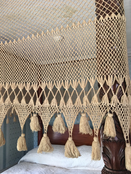
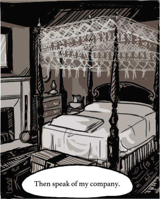
For instance, here are reference photos I took in various mid 19th century houses, that I cobbled together to make the Captain's house:
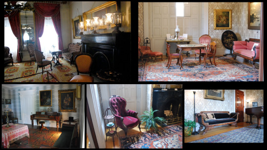
I remember really liking this bed I saw in a historic house and wanting it for my own room. So I did the next best thing and put it in a fake room.
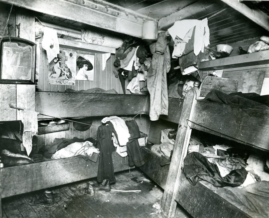
I love this reference of a focsle, too! I can't wait to draw the inside of a bunk where someone's hanging their hats or storing their pans. Little authenticating details like these that I wouldn't necessarily think of can be discovered in reference. It makes everything feel more real.
I remember when I made my pilgrimage to the Charles W. Morgan one of the many things that struck me was how much light deck prisms brought into the living spaces below. So that was something fun to keep in mind any time I was drawing a scene below deck during the day, how I could play with that lighting.
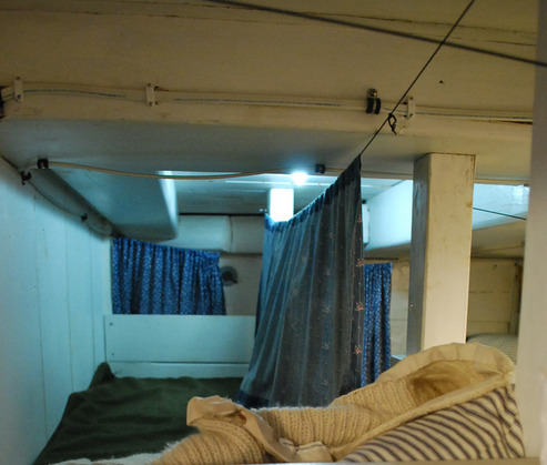
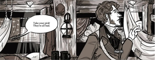
Which brings me to my last bit. I think if you can go to a place that embodies the settings you want to work in, that's so important too. Just spending time there. Taking in the vibe. Thinking about what it sounds like and feels like and smells like. Thinking about how the light falls. And to hold on to all those little things, and to keep them in mind as you draw those backgrounds. You can't exactly draw a smell or a sound, but when you think about those things, you can think about where they're coming from and draw that. A clock ticking, pipe smoke, water sloshing, fire crackling. It's all there. I personally don't strive to create the most technically-sound looking rooms, but I really do try to make rooms that get across a Vibe and that feel lived-in.
Hope that was helpful! And thank you for reading the comic!
142 notes
·
View notes
Text
Pokemon Violet - Initial Thoughts
Just started playing Pokemon Violet; I was always planning on picking it up in the first place despite not pre-ordering. All the talk of its apparently glitchy nature was disheartening, but I wanted to give it a fair shake all the same. A lot of the time such reports get overblown, after all. I've seen people shriek about a game being unplayable if it drops from 60 frames per second to 59 in a heavy load zone, after all.
That said? After going in with simultaneously low expectations and a giving it a lot of slack?
I'd consider what I've seen so far to be a genuinely impressive feat for an amateur game dev's tech demo. But for a full release? Let alone from a major studio with as much weight behind it as the Pokemon franchise carries? This game is embarrassingly bad.
Literally the very first second of game play and there's a major graphical glitch. The game opens showing off the fancy academy your character will be attending, but it loads in a low-rez stand-in model that snaps into the high-rez version full on screen. During the opening cut scene, characters blink into T-Poses as they load in and out.
As I walked my character out of their bedroom at the very beginning of actual controllable gameplay, the camera glitched and got stuck inside a wall, resulting in a total black-out screen that made me think my system had crashed. The colors of your character's hair, skin, and make-up don't match between the menu screen where you select them and how they're displayed in the overworld's lighting. Said lighting also flickers around or changes entirely full on-screen with no transitions, jolting from one lighting set to another before the scene it's required for actually loads in. Textures out in the world - signs, terrain, the environment in general - are pixelated and blurry to the point of being distorted blobs. The frame rate is absolutely appalling, dropping and lagging down wildly for seemingly no reason, sometimes going as low as less than 10 frames per second. As I have my character walking around in their homeroom, the seated classmates and the books on their desk flicker rapidly into the floor and back up again. NPCs blink in and out of existence where they stand, or walk in jerky 3 frames per second flip book animations. Even as my own Player model is moving smoothly and without any visual issues in the same rendered scene. I'm honestly not even sure how the code could even make that happen; it'd be one thing if everyone in the room was moving in the same jarring, jerky way, but two or three characters are moving normally while the rest are jittering around.
When you go into shops to try on various clothing items, it takes about 10 seconds for your character model to load in and several more seconds to switch between clothing item previews. Even if the only difference is just a color swap. Keep in mind that this was instantaneous in previous games, including games back on the 3DS. If your hair style isn't compatible with hats, your character model just won't show up at all and you can't preview the item whatsoever. As you leave the shop, the character model is loaded in off the ground and jitter-pops into existence with a short drop.
Out in the overworld, different models load in at different distances from the Player and animate at different frame rates. For example, as I walk down the road just outside my house, NPCs load in (a low-poly stand-in version first that snaps into a higher-rez version with no smooth transition) after bushes do, but before trees (which also have the same jerky low-poly to high-poly snap transition). As I walk around, the game chugs down to a crawl at random, often requiring me to reset it entirely. I speak to a NPC out in the field and my game freezes, only to not freeze a second time after I restart the game and talk to them again. When you call out your partner Pokemon into the field to act solo (a core selling point of this game), there's no summoning animation or effects; they just abruptly pop into existence, which is doubly weird because there is both an animation and effect for when they return to their Pokeball or if you call them over from a distance. When I get into battles and there's a third character on the sidelines, the game camera gets stuck on them as it swings to and fro, resulting in the view spiraling wildly out of control for a few seconds. The camera glitches into the terrain seemingly at random or gets caught at weird angles, resulting in constant screen-blocking closeups of my Pokemon's back, or ignoring Player inputs to try and move the camera around.
This game is atrociously bad. I mean, holy shit, the problems it has are basic, fundamental flaws that NEVER should have made it past quality control in the first place. Things that are just basics in regards to coding and design. Especially when considering that earlier Pokemon titles on the Switch hardware (Sword/Shield and Pokemon Arceus) ran just fine by comparison. Previous generations on the 3DS are more stable and better performing than this.
And this is just the basic mechanics in the immediate starting area of the game. I haven't even gotten into design part of the game play experience. That's a whole other kettle of fish and its own post.
#pokemon#pokemon violet#scarlet and violet#nintendo#game freak#seriously game freak - get your shit together this is embarrassing
6 notes
·
View notes
Text
Artist Resources (Part 1?)
This is basically just going to be a bunch of resources I have found to be useful. I can’t say that I’ve used all of them, but I’m sure they’re all worth checking out.
I’m also gonna try to put a detailed description for most of the links so you have a better idea of what you’re getting. I apologize in advance if some of them are redundant lol
(I put “Part 1″ if in the case I make another one)
~Links to Tutorials, Tips, Resources, etc~
Another Resource List -- Leads to another Tumblr post. Apparently, the post isn’t mobile-friendly, so it’s suggested to view this on Tumblr browser. Has a bunch of other links. I’ve checked out a few of them (mainly the copyright stuff lol), and it seems that some of the links may be a bit outdated. Still, it doesn’t hurt to check out the links.
Arms and Legs -- Leads to another Tumblr post. A handy tutorial on elbow and knee placement.
Art & Game Dev -- This leads to my personal playlist of a bunch of YouTube videos. Has a bunch of tutorials and interesting videos that I’ve collected over the course of a few years lol.
Blamblot -- A website that contains resources and tutorials on comic lettering. This is primarily in reference to western comics, but it doesn’t help to take a looksie.
Commission Calculator -- Leads to another Tumblr post. Helps artists to stop selling themselves short.
Comparing Heights (hikaku-sitatter) -- A height comparer for centimeters.
Comparing Heights -- A height comparer for feet and inches.
Mouth Shapes and Lip-Syncing -- Leads to another Tumblr post. Useful for... drawing mouth shapes.
Reference Angle -- Useful for when you’re trying to map out a face from an odd angle.
Soft Proofing for Printing -- Leads to another Tumblr post. Helps when you’re trying to make prints of your artwork.
Textures -- A website full of different and mostly free textures. While this website is made for 3D texturing, it can also be useful for 2D drawings. Signing up gives you 15 free credits everyday, and you can use those credits to download some textures for free.
The Models Resource -- A website of models ripped from a wide array of games.
The Spriters Resource -- A website of sprites ripped from a wide array of games.
The Textures Resource -- A websites of textures ripped from a wide array of games.
~Links to Stock Images~
Please check out whatever policies they may have for their images before using them!
(not sure if any of them are active anymore as I followed some of these accounts a long time ago when I used to be more active on Deviant Art lol)
adorkastock (formerly senshistock)
anatoref -- Leads to another Tumblr post. Has a bunch of hand photo references
charligal-stock
HumanAnatomy4Artist -- Does contain nudity
null-entity
PhelanDavion
RobynRose
~Links to Other Artists~
Akihito Yoshitomi -- Yoshitomi is a mangaka who has tutorials on manga making. He also has an insightful series in which he drafts and draws a 30-page manga in 18 days. Remember that every artist works differently and his process may be different from another’s.
Drawfee -- Drawfee is an improv drawing show of four artists: Nathan Yaffe, Jacob Andrews, Julia Lepetit, and Karina Farek. While they don’t have tutorials in a sense, their videos explain the different processes they go through as they draw. They also occasionally provide tips, tricks, and resources in their videos. They do have another channel and a Twitch channel where they host drawing classes in addition to other fun shenanigans.
EtheringtonBrothers -- Has a bunch of useful and eye-catching tutorials called “How to Think When You Draw”.
Mark Crilley -- Mark is a comic artist, specializing in manga, who has a bunch of tutorials about anatomy, perspective, comic making, and other things.
Miyuli -- Miyuli is an artist who posts tutorials on their Twitter. Their tutorials range from anatomy to clothing to other things. They even have a few books of art tips. Currently (as of the time of posting this), their 2018 version is free for download, so I highly recommend you download that. Some tips may be outdated, but they should still be helpful.
Whyt Manga (Twitter/YouTube) -- Odunze is a comic artist, specializing in manga, that has a bunch of tutorials on manga making and drawing characters of color.
~Links to Free Programs~
Blender -- A free 3D program if you’re into 3D modeling and such. I also personally haven’t used Blender (I use Maya lol), but I know it’s a respectable program.
Krita -- A free painting program if you can’t afford Photoshop or Clip Studio Paint. I personally haven’t used Krita, but I have recommended it to a few friends and they have positive reviews about it.
Paint Tool SAI -- Okay, this one isn’t free, but it’s a significantly cheaper painting program where you don’t have to pay a subscription. It’s 5,500JPY (~50 USD). I’m not sure how well it still works on modern computers (the last update was 2016), but I still use it here and there because I love the pen tool feature it has, and it still works like a charm for me.
~General Tips From Raine~
Raine admits that she’s guilty of not following her own advice, but Raine hopes that the tips that she does know will be beneficial to someone who will follow them. She’s also going to keep all her tips under the cut so as to not make this post a huge wall of text (even though it technically already is lol)
Also, if you have some resources, tutorials, tips yourself, please feel free to send them to me and maybe I’ll make a part 2 to this post!
ALWAYS LOOK FOR REFERENCE. This should really go without saying. You can’t draw from life if you refuse to observe life itself.
If you can’t find the exact thing you need, MAKE YOUR OWN REFERENCE. Time and time again, I can’t find something exactly that I need. So instead, what I do is that I take pictures of my own reference. Sometimes I even grab a friend and take pictures of them doing whatever it is I need.
Have a mirror handy when you’re drawing. Sometimes what you need is actually right there in front of you.
Having trouble drawing something? Do some studies. Take the time to understand what it is you’re drawing. I can’t remember the exact story, but I heard that the people who were working on Tarzan were having a hard time drawing his hands. So, what they did was spend a few hours looking at hands to try and understand how they work.
IT’S OKAY TO STUDY THE ART OF OTHER ARTISTS. Just as we look to the old masters as a reference, it’s definitely okay to look at modern-day artists for reference. Just don’t go copying exactly everything that they do, or worse, trace what they do. Just don’t do it... at all.
Not every line needs to be realized. The viewer of your work will automatically connect the dots.
DO NOT TRASH YOUR OLD DRAWINGS. Please, never ever do this. Your old drawings have value to them, even if they look terrible to you. Old drawings may hold ideas for things you could do for the future. They also serve as a way to see how far you’ve come as an artist.
GETTING BETTER AT DRAWING TAKES TIME AND EFFORT. You’re not gonna get better overnight. It’ll take months, or even years, to feel like you’re a competent artist, and even then, you’ll still have room for improvement.
DON’T LOOK DOWN ON YOURSELF IF YOU’RE TAKING A LONG TIME TO GET BETTER. It’ll be better for your mental health in the long run.
Alternatively, DON'T LOOK DOWN ON OTHER ARTISTS EITHER, ESPECIALLY TO MAKE YOURSELF FEEL BETTER. You know the struggles it took for you to get where you are, so don’t go putting down other people when you’ve been in their shoes once.
KEEP DRAWING. If you’re not making an effort to get better, then you’re not going to be better. I get that it’s hard to find the inspiration to draw (I’m very guilty of this), but just keep trying. It doesn’t have to be big or spectacular. You don’t even have to post it if you’re the type who likes to post their art stuff.
Try to find references from real-life. It’ll help you better understand form, lighting, shadows, etc., especially if you’re going for a more realistic kind of art style. Otherwise, finding reference from things like cartoons, anime, comics, etc. are just as good.
Try new things. Try new art mediums. Try a different art style. Switch up the way you do things. Maybe you’ll hate it, maybe you’ll like it. Who knows if you don’t try.
Watch time-lapses (or speed draws/speed paints) of other artists!
Pinterest and Google are your friends if you need tutorials or references or whatever.
If you’re offering commissions, DO NOT WORK UNDER YOUR LOCAL MINIMUM WAGE. You are literally devaluing the work you actually put into a piece.
I like to think I’m an aficionado of Photoshop, so feel free to ask me questions on how to achieve something! I’ve used Photoshop for about 11 years now and know my way around the program. On another note, I do recommend setting custom keyboard shortcuts in Photoshop because the default shortcuts are terrible (in my opinion), and because having custom shortcuts increases the speed of your workflow.
Because I’ve been seeing this a lot lately in Twitter, you’re never too old to start in art. Art is just one of those things that anyone can pick up at any age because the only thing you really need to get good in art is time, diligence, and patience.
Try not to post hi-res images of your artwork to prevent art stealers from selling your artwork in high resolution.
Always, always, always add your signature and watermark on your artwork. I like to add my signatures and watermarks in places that’ll be hard to erase or crop out. I’ve also seen people add their signatures and watermarks in creative ways (ex. on a character’s shirt). You need to protect your work in an era where people will just blatantly steal it and make profit off your work.
Tag List
@reality-is-often-disappointing
#artists#artists on tumblr#artist tips#artist resources#art resources#artists of tumblr#art tips#art tutorial#raine rambles and muses#raine can art
173 notes
·
View notes
Note
So, how exactly are you good with shades, shadows, light sources in drawing? I've always had trouble with those sort of things so I was wondering if you could give me some advice other than "practice." Also, are you an animator or what exactly is your art profession? I'm an art student soon to be taking her Masters, but I still want to know.
i think some good advice is to grab some objects you have, and maybe a flashlight, and move the light around these things and see what parts cast shadows and which parts attract light. shadows and light sources all come from understanding that what you’re drawing is a 3 dimensional object. the more you start to understand the shapes that make up forms (like the human face, what cloth folding means, etc) the more you will start to see your art as an object that casts shadows instead of just a flat drawing. practice will only get you so far, a lot of art is thinking hard about what you’re drawing.
Here are some images that visually explain what I mean. I wouldn’t even draw these myself bc time is short and there is always so much I want to draw, BUT looking at them and studying them is a valid form of practice just as much as drawing is.
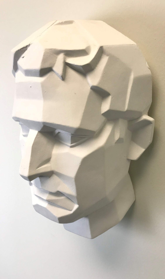
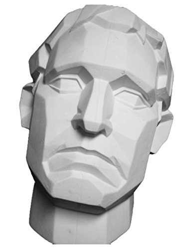

^^^^ this is the same head, shown at three different angles, but the head is made of the same basic shapes each time. In each photo can you identify the light source? if you can, great! now think, Why do you know where the light is coming from? Its because even though these are 2D photos, the object in the photo has a very clear 3D form. Apply that knowledge to your art! If you can’t tell where the light source is coming from, start to analyze which parts of the face are highlighted and which parts are in shadow. Reality tells us things that are brighter are closer to the light, things that are darker are obscured by some other form which is why shadows are cast. Shadows happen when the light is unable to reach part of the form because something opaque is obscuring the light from passing through!
Here is another great image from RobynRose on deviantart that shows how light from different angles casts shadows on different parts of the face and body. This happens because we are 3 dimensional forms!
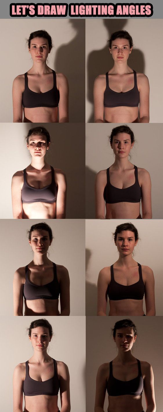
When it comes to finding visual refs to study from, another awesome resource is senshistock on deviantart. Its literally a god send for art refs. They do great poses, have amazing diversity with their models and are an overall great resource!). I also recommend pinterest boards that people have already made. its a really quick and easy way to find a large amount of tutorials and visual explanations on like any art topic you need help with! The only downside with pinterest is if you’re going to use any specific image as a direct reference for a piece, make sure you can hunt down the source creator for that tutorial if you plan on sharing it anywhere! Pinterest is often a helpful but creditless place lol.
So, you say you’re tired of being told to just practice. Well, thats super fair! But realize part of bettering your art is paying attention to the way things look all! the! time! Pay attention, detailed attention to everything around you when you’re not drawing. And by paying attention I mean like, walking into a room and identifying the light source, is there more than one light source, is there any kind of secondary light source, etc. Now, its not that I’m consciously doing these things 24/7 but it’s more of like, a mode of vision.
Art is just as much about understanding, thinking, and problem solving as it is making things look pretty and knowing which colors to pick. ESPECIALLY when it comes to shading and light sources, that stuff requires serious thought. So, when you are ready to practice some more I recommend using a reference photo to practice (being told using references is cheating or shameful is the biggest lie young artists are told. its so damaging) and when you have your reference photo, don’t just copy what you see, think about WHY it looks the way it does. Why is there a shadow there? whats blocking it? why does the clothes fold the way it does? what is it being pushed or pulled against? All these questions become clearer the more you start to visualize what youre seeing as something that is 3 dimensional instead of 2 dimensional.
Sorry that was so long, I really hope it helps not just you but others.
ALSO my degree is in animation but I rarely animate for fun / for work / in my own time. I consider myself to be a visual development artist for animation (character design, color scripting, and background art are some of my favorite things to do!) as well as a freelance illustrator.
429 notes
·
View notes
Text
After a billion years of waiting, the 2nd anniversary digest is out, and even though it didn’t talk about quite as much stuff as I expected, the stuff it DID show off was extremely good on just about every level, and oh boy do I have some thoughts about it, lol.
I’m not even sure where to begin with this one, lmao. There’s so much stuff they talked about, and so much stuff they DIDN’T even talk about. Like how they didn’t talk about the October events and banners even though they’re teased at on the 2nd anniversary website, which I guess means we’ll have to wait longer for info on that.
we also didn’t get any info on a collab, but I assume they’re going to announce that at the start of November and have the collab itself release a few weeks later.
I’m kinda sad that they accidentally leaked out the existence of guns, but I still got to experience all the shock and surprise about it, so that was fun. I’m really surprised that they’re adding a new weapon type so late into the game. Especially since they don’t seem to be planning to retcon any old adventurers into being gun units, which means that they’re going to make up a super tiny portion of the pool. But I still really like how they work, from what we’ve seen of them.
It’s great that Joe got a new gun alt who everyone gets for free, but it really feels like they screwed him over by making him a 3-star, lol. He’s probably gonna get immediately replaced by any light gun units they introduce after this point. But it’s still nice to see him get some love. He was the perfect unit to go for to showcase the new weapon type.
All the changes to weapon and wyrmprints are extremely overwhelming, so it’ll probably be a while until I have an actual opinion on them. But thus far I think it’s fine, but we REALLY need the ability to save wyrmprint set-ups so we don’t have to spend so much time shuffling them about again and again.
It’s kinda sad that it’s such an eldwater sink if you want to equip the same print to multiple units, but it’s much cheaper to do that with event prints, so you can still fill your team out with some good prints. And on the other hand, this is actually why I’m fine with the fact that so many prints are almost identical now, since it means you have way less of a need to actually spend eldwater to get extra copies. There’s like 4+ different prints that all give 30% skill damage, so you’d never actually have a reason to bother getting extra copies of any of them, if you at least already had all these prints before this update. It does make it harder to keep track of if you end up using like 15+ different prints across a whole team, but still, the eldwater cost is more or less avoidable if you just use different prints with the same effects.
I think the weapon bonus thing is going to be the most grindy, long-term part of this update, but I’m cool with it. It gives everyone something to slowly work towards, like when you’re at the stage of leveling your dojos. The issue is that people will want to max their weapon boosts as quickly as possible, but it’s clearly not designed to be rushed like that.
It’ll all take a lot of getting used to, but I’m happy that they’ve drastically cut down on the amount of weapons in the game, and made the progression system more linear. Once everyone gets used to it and more people start playing the game after this update, it’ll become more natural.
We also got a bit of an overhaul to the textures and lighting/rendering for all the 3D models, which still feels like a really strange decision to me. It gives them a really different sort of aesthetic, and I have mixed feelings about it. I think if they made it a bit less ‘harsh’ I’d really like it, but at the moment there’s a bit too much contrast between the lighting and the shading, and the black outlining just looks a bit odd.
We also got the big adventurer balance change, and even though it’ll be a while before we’ve got all the new numbers and stuff for everyone, I already get the feeling that Vice is gonna end up way worse than he was before this. Which is sad, since outright nerfing people always sucks, but I get why they did it. It messed with the balance too much to have a 3-star be in like the top 3 for DPS units across the entire game. At the very least they gave him poison on his S1 so he can afflict that more often now, instead of it just being on his S2.
Just going by what they’ve said, and what we can see in-game, one of the really big changes seems to be how basically all of the healers except Grace now have strength buffs on their S1s, which basically all seem to be 15% for 60 seconds. Which is a really interesting way to make healers more relevant, but I like it. I think it doesn’t stack, so you won’t get as much buff uprime as with dedicated buff units, but it at least means they contribute SOMETHING to the team’s DPS.
One other notable change is how T-Hope now has a 15% strength buff on his S1, which makes it pretty much exactly the same as Patia. So that should make auto eCiella a lot faster, with how often he gets that skill off, lol. This was something I expected him to eventually get via a spiral, but in general a lot of stuff in this balance patch feels like mana spiral upgrades in all but name, which is neat.
Lots of characters also got more status punisher stuff, which should hopefully at least make more units stronger. Most of it’s all pretty self-explanatory, but it’s kinda interesting that Norwin is now a poison punisher unit. I guess it’s one way to make him somewhat relevant to the shadow meta, lol.
They also buffed the older gala units, which is great. At least this way they can put off on establishing the precedent of gala mana spirals, by just directly buffing the old ones. We’ll see how it turns out when all the exact numbers have been datamined, but it seems like they’ve addressed the main isseus with G-Mym, G-Sarisse, G-Ranzal, and G-Euden.
I also noticed that they added defense debuffs to a fair amount of units, and made a lot of existing defense debuff moves land more often, so that’s interesting.
I’m also pretty excited to try out Pipple with this balance patch, since he now gets a 30% strength buff for himself with his S2. It at least makes it so that it’s always worth using whenever you can.
They didn’t announce anything about new endgame bosses like we expected, but it does sound like we’re still getting some eventually, and it’ll just come up later. Which is a good idea, probably, since we need some time to keep focusing on Agito stuff.
And on the note of the Agito fights, and current endgame content in general, I really like the addition of solo versions of all of them. For one thing it means a new wave of first clear bonuses, but it also means that you can pretty much entirely avoid co-op if you want to. The solo fights seem to give less rewards, but hopefully still enough that you can just stick to doing them exclusively if you want to. I haven’t tried any of it out, but it sounds like they’re all balanced around solo play, which should make it way more easier to do them than it was to try and solo fights that were designed for co-op.
It’s also kinda funny to me that even though they said we’re getting another tier of difficulty for the Agito fights, the only thing we know that we’re getting from it is fancier skins for the Agito weapons. They’ll probably still get stat boosts, but I could see them pretty much just being cosmetic upgrades.
They also upgraded the amount of weekly chests for HDTs and Agitos to five, and it sounds like we’re gonna start getting double drop events for them soon, so that’s great. In general I think this whole update will make it way easier to actually do endgame grinding, especially with the solo fights.
And then there’s the elephant in the room, which is the new battle royale mode. I haven’t tried it yet, but honestly I actually like the sound of it, lol. I absolutely never expected that they’d add something like this, especially since it’s effectively PVP, but it actually sounds perfectly fine. It’ll probably get tweaked as time goes on, but it sounds like you barely even get any extra rewards from it by winning compared to just dying immediately, and the whole mode is designed to have you start from a blank slate where you and everyone else are at the same playing field, so it’s basically entirely skill-based, and you don’t even need to be good at it to get rewards.
I wasn’t even sure how they’d handle PVP in an action RPG like this, but I think this is a good way to go about it.
We’re also getting a return of the time attack mode, which is . . . worrying, but hopefully now that people are much more familiar with both HDTs and Agitos, it’ll go by a lot more smoothly. I’m surprised they’re even touching this concept again after how badly it was received the first time, but I’m curious to see how it goes. I know a lot of people really liked it, so hopefully it’s balanced so that you can ignore it if you want to, without feeling like you’re missing out on too much.
They also finally got around to adding sparking, which is great. I honestly wasn’t really expecting it at this point, but after the patch notes got revealed yesterday I figured this was probably gonna happen. I know some people would wish it had been introduced earlier, but I’m glad it’s finally a thing. I still don’t think it’s as much of a make or break issue for me as it is for others, but it’s still pretty much an objective bonus over the old/current system. My main concern with sparking, though, has always been that it might lead them to notably tanking the amount of summons we can do each month as F2P players, which would cancel out the good parts of sparking, but I doubt they’d do that.
Either way, it seems to work in exactly the same way as GBF, in that each summon gets you a unique bit of currency, and when you get 300 of it, you can trade it for a featured unit of your choice. But also like with GBF, your sparks reset after each banner and turn into different items that you can exchange at a store for regular in-game items, so your 300 summons all have to be on the same banner, and you can’t just accumulate a spark by summoning across several banners. Though one thing that seems to be different to GBF is that summons done with diamantum give you twice the amount of sparks, which is really interesting, since it really cuts down on the amount of money you’d need to spend to get a spark that way. It’d still be super expensive to do an entire spark just through diamantum, but 150 summons with diamantum is still way cheaper than 300, lol.
If they keep our monthly summon income about the same as it’s been thus far even after they add sparking, I think that we’d be able to do a spark every 6-8 weeks just from event and log-in bonus rewards. At the moment we get around 150-200 summons per month just from all that, so it seems like it’ll be WAY faster to save for a spark than it is in GBF [where outside of specific holiday periods that have free summon events you’re probably looking at 4+ months of saving to be able to spark].
This at least means it’ll be way easier to plan out my hoarding, since I know that as long as I have 300+ summons saved, I can at least spark a new unit I want. And there’s always the possibility of just getting them early and being able to quit while I’m ahead.
And on the note of summons, we’re also getting 330 free summons total between the anniversary and the end of October, which is absolutely insane. Sadly you can’t save up sparks across banners, so you won’t be able to do a spark JUST from that, but it’d go a long way to helping supplement a spark on a specific banner.
It looks like we’re gonna get a short pre-gala of sorts soon that’ll contain all the previous gala units, but I’m probably gonna skip that, outside of the free pulls. The only one I don’t have from that set is Gala Alex, and at this point I’d rather just chase her when she’s in a future gala remix. If it’s anything like the same type of bonus gala we got for the first anniversary, all the featured units on this banner will probably have lower than normal rates to make up for how many of them will be on the banner, so it’d just be a really low-value banner for someone like me who already has all but one of them. I’m also not even sure if I’d be able to get all the way to 300 summons that quickly.
Either way I’m more interested in saving for stuff like Halloween, Christmas, new gala dragons, and New Years.
We’re also getting Gala Zena on the anniversary itself, and I think everyone saw her coming, lol. She’s not a gun unit, though, which is actually a bit lame, even though I figured it wouldn’t happen. Her being an attack-type light staff unit is really interesting, at least if she ends up working like Heinwald, but I’m still not sure if I’d be interested in actually spending resources to try and get her.
The gala banner is also going to have the new girl from the anniversary event, and a Midgardsormr alt. Though it sounds like he’s going to be non-limited, so he’s not our wind gala dragon.
The anniversary event also sounds extremely interesting. It sounds like we’re time-traveling back 1000 years to when Ilia created her religion, and she seems to basically be a punk biker girl, which is extremely cool on so many levels. It also kinda looks like Zethia is going to be the MC of this event, and it might not even feature Euden and co, which would be a nice change of pace.
I thought Ilia might be our new welfare unit, but going by the preview image for the event it looks like it’ll be Mordecai, who looks like he’s gonna end up possessed by Morsayati or something, since he looks a lot like Morsayati’s human form we’ve seen a few times. I hope he’s a gun unit, just so we can get more of them, but we’ll see how it goes.
I’m guessing that Ilia will eventually be playable, but maybe just for the 3rd anniversary event or something.
We also got a tease at the next three main story chapters, which all look really interesting. It seems like the Archangels event is going to pretty immediately become important to the story, and now we’re heading off to North Grastaea. We’re also going to be going to the fairy kingdom eventually, which is cool, especially since the teaser for it heavily implied that Notte will become a playable character then.
Which also reminds me that we’re probably eventually going to get a gun unit from the main story, since we have all the other weapon types already, but I doubt Notte will be a gun unit, lol.
Going by the teasers, I also get the feeling that Leonidas and Chelle will be our next two gala adventurers, and at least one of them, if not both, will probably be a gun unit. I think one of the shots of Leonidas had a gun visible in it, but Chelle’s also apparently the one who introduced guns to the world, so who knows how that’ll turn out. At the very least they did say that we’re gonna start getting new gun units soon, and we might get a lot of them really quickly to help fill out the pool. Which also means that some of the new holiday units might end up using guns, so that’s also worth saving for.
I also get the feeling that we might take a break from gala dragons for a while, since we’ve basically run out of good options for them. But who knows. We still need ones for water and wind.
Hopefully with the spark system in place I’ll be able to spark on at least the Halloween and New Years banners, since those are my top two priorities, but we’ll see how it goes. It’s always scary to enter limited holiday banner hell season, but at least they introduced sparking right before it all starts. At the moment I think I’ve got like 150 summons saved up, but I’ve still got most of my reset co-op rewards to go through, and I haven’t touched the Halloween event they added to the compendium, so that’ll add a lot. I think the anniversary log-in bonus will also give us like 2k wyrmite, and if the retweet event succeeds we’ll get an extra 1.2k wyrmite. So as long as they don’t tank our monthly summon currency, I should be able to spark on Halloween if I can commit to saving for it. Which is much easier said than done, lol.
All in all I think I really love this update, but it REALLY changes the entire game, so it’s gonna take a long time to get used to. And thankfully even with the introduction of stuff like sort-of-PVP, it doesn’t look like they’re going in any sort of P2W direction with the game.
Also, there’s still the 45-minute Game Live presentation set to come later tonight, but I’m not expecting that to tell us much, since it’ll probably be targeted at new players. I’m still holding out hope for a Switch port announcement, though.
8 notes
·
View notes