#also the character design is literally copy/paste with color changes
Explore tagged Tumblr posts
Text
as someone whos watched h3IIuva b0$$ I really hate that the show's creator is Like That because i love the characters but theyre all built like sticks & unnecessarily fetishized so watching makes me Uncomfortable
#like i LOVE Flzz3roIIi & i think the domestic shit between him & 0z would be rly cute normally!#if ''he's designed/animated/written like that bc he's being fetishized'' wasnt blaring in the back of my mind#im stealing the characters from her actually theyre mine now & im gonna draw them cooler/fatter/non-fet & theyre gonna be happy <3#also the character design is literally copy/paste with color changes#when i heard lucifer was revealed i was SO EXCITED cause after seeing 0z i thought the character design would be sick!!#was very disappointed to find out that he's just another skinny twlnk who doesnt have enough torso to hold his own organs#a coworker at blaze was like ''nah you should see it when he transforms its SO FUCKING SICK'' i looked it up. he was wrong#DO NOT REBLOG#also i wont hear other peoples side to this I LIKE THE SHOW just hate how its characters are handled#when i hear the KING OF HELL swoops in & TRANSFORMS to his ''true demon form'' im expecting badass not wings & horns#just had to get that out ive been feeling this way for months#emma rambles#hate tag
3 notes
·
View notes
Text


I finally finished all the re-designs for my super hero kids! I first started making these guys about 16 years with my best friend. A lot has changed over the years, but the "core" concept of the characters was always there. The things I've updated genuinely feel RIGHT, like this is who the characters were always supposed to be.
In the first image, left to right; Lisa, Bobby, Ella, Deke, Rodney, Cloe, Min.
Lisa's powers are enhanced strength/durability, flight, and the ability to control/conjure flames. Bobby initially thinks he only has powers after stopping an experiment that was trying to recreate what Lisa can do, thus giving him similar abilities (his REAL power is being able to absorb energy, and that lets him copy other powers), no flight and less of a strength-boost, but he can also conjure/create fire. Ella can control metal, moving it, liquefying and reforming it, and manipulating magnetic fields. Deke has nature powers, connected to plants and flowers (making them move or rapidly grow). Rodney creates solid forms of colorful glowing light, using it as shields for defense, or an energy blast as an attack. Cloe is, basically, a witch with magical powers, but she is also capable of telepathy. Min has music/sound themed abilities, she can let out a scream so loud it creates a sonic-boom, but she can also literally sing a song that influences reality (literally like a musical, and it gets stronger when other people join in), as well as being able to identify/mimic any sound or voice.
The basic plot of their story is two groups of kids start developing super powers, and naturally want to start being heroes and villains about it (though, the "villain" kids aren't "evil", just little jerks/brats/punks who have some angst to work through). In the larger scheme of things, there is a lot of insidious background problems the kids slowly become aware of, and they all start working together to deal with it (a slow realization that the world they live in, while seemingly "normal", is actually recovered from some kind of post-apocalyptic event, and the concept that "heroes" have been used as tools or weapons in the past becomes clear. it is an unfair responsibility, but the kids are determined to change the system that the adults around them use to destroy each other... also, they have plenty of fun shenanigans, too. these are kids with super powers after all~)
16 notes
·
View notes
Note
Hi! 🦀 here thanks for answering my idea. Here's what I imagine what would Mania form! Chief would look like;

Credits to the original owner of the character Ping and the artist Neytirix! You should check out their arts in Twitter,yt, and deviant art (those are the only platform I know from now)
Basically I took the 'consume' in a literal way- like- in the future Mania form! Chief consume the first ever black ring(BR-000 if i remember it correctly) or consume the Mania in the city like those contamination, corpus, Corruptors etc. Probably the Sinners but instead their suffering or manic I guess? So yeah :D I hope your doing alright, drink plenty of water, gets some rest and good night
I like this design for their Mania form, something otherworldly and unnatural in form, wholly alien to our world and understanding, not quite solid, and yet not quite gaseous, a form of matter unknown to all making up a body that defies all other explanation beyond monstrous.
I can picture the Chief loosing control as the Mania overwhelms them, shadows and mist erupting from their form as they scream and howl in agony, the shackles burning with their pain as they begin to twist and distort into the monster pictured above, a howl slipping past the beasts lips as it surges towards BR-00, where it begins to feed on the power, culminating in a monstrous metamorphosis.
I like to imagine that they also possess a human form that they can switch into, after they achieve this state of Apotheosis, their eyes changing into the symbol of the Illusory Moon as the shackles coalesce into a halo above their head, wings of dark red and black, the colors of mania, mingled with the white and blue of Hypercubes mingled with the colors as they cast an ominous glow over the Chief's surroundings.
Part of this design is inspired by an idea I have that Mania is setting the chief up to be some form of Messianic figure to use as a means of securing dominance over the world, utilizing an angelic form to make them appear more divine to humanity, but I digress on that front.
This design makes me imagine their form as being more cosmic and otherworldly in nature even when human, the wings gaining an almost nebula like quality, the reds, blacks, blues, and whites mingling in constellations and galaxies.
Their hair becomes as comet trails, burning wisps of platinum gray light with the colors Mania and Hypercubes, of Madness and Order, reflecting from within the trails of light as the hair lengthens to caress their heels with each step, their skin gaining a faint glow as their clothing mends of any damage as they begin to walk towards their Sinners, their arms outstretched as though to embrace them as their eyes blaze with power undreamt of by mortals.
I feel this change would also manifest in their mentality warping, where as the human form embodies their desire for order and stability, along with their juvenile state, with the Mania form and their altered human state representing their growth into their own desires and mania, perhaps not quite their adult hood, but the middle ground between the pair, or mayhap a fusion of both Mania and Order.
The changes of their personality could be something as mild as them becoming more selfish, more determined to achieve their own happiness amidst the world, to something as major as them becoming near tyrannical in their views of matters, disdainful of those they cannot shackle and bind to them, and seeking to spread mania to all so that they may bind all to them.
In addition to this, I feel that their powers would alter, the normal Protestats, I think I spelled that right, growing to nightmarish levels of power, a Dark Sound becomes enough to level buildings, an Empower can recharge entire squadrons of Sinners, and a Last Stand, can make an entire legion fight like the hounds of hell made flesh and bone.
The Mania form would likely possess not only these powers, but also the ability to feed upon the Mania of the Sinners and to copy and or utilize said Sinner's powers as their own, something their human form would share to a lesser extent.
A towering monster of Mania is already a loathsomely powerful foe, but one that can call forth Ignis's flames along with Kelvin's ice to cause temperature explosions brought about by super cooling and then super heating the air, along with Chameleon's Hypnotic powers and Adele's ability to alter Memories to insure that none would even be aware of just who or what they were fighting unless the beast wished the m to be, perhaps even erasing its presence entirely until it is ready to strike.
There is also the fact that having absorbed so much Mania, it is likely the Chief would be giving off enough mania to turn any person in an enormous radius around them into either a sinner or a corruptor, with the sinners being the only ones able to draw near to them, their Mania monster form would likely have a radiation field of Mania able to effortlessly envelop all of Dis in its grasp and begin to contaminate all of those present.
Beyond all of that, I feel like this transformation would mark the beginning of a complete and total breakdown of Dis as Paradeisos and the Underground are faced with the the Chief's control over Mania and Sinners, along with their own power, reaching the point of being able to challenge both of them with ease as they become the one ready to flip the chessboard betwixt the two factions as they make their own play for Dis.
Would the Chief's actions be born out of malice?
Unlikely.
But as the saying goes, "The road to Hell is paved with good intentions," and one can only imagine what the Chief would do in pursuit of any noble goal with their mind and form altered such.
Like it or not, a new age would dawn for Dis and the world as a whole, and only time would tell if it would be a Golden age, or a Cruel Age.
At least that is all I have at the moment lol, sorry for the rambling, I got carried away again.
Take care and stay safe.
#nomorefstogive answer#ptn#path to nowhere#ptn Chief#path to nowhere chief#ptn chief headcanons#path to nowhere chief headcanons#ptn mania form chief#ptn headcanons#ptn thoughts#thoughts and headcanons
28 notes
·
View notes
Text
Saizo / サイゾウ, Xaizor / サイゾー, and Asugi / グレイ
Saizo (JP: サイゾウ; rōmaji: saizou) is the fiery ninja that serves as a retainer to Hoshido's crown prince Ryoma in Fire Emblem Fates. This name is in reference to the fictitious ninja Kirigakure Saizō (JP: 霧隠才蔵). He belonged to a group of ninja known as the Sanada Ten Braves, who served the samurai warlord Sanada Yukimura during the Sengoku period. According to the tales, the Ten Braves participated in the Seige of Osaka, a year-long conflict in which Sanada, loyal to the Toyotomi clan, lost the defensive war of attrition. Of the ten, only Kirigakure Saizō and Sarutobi Sasuke really stuck in pop culture.
This choice of name for the Fire Emblem character is based not only on him being a skilled shinobi, but his fierce loyalty to Ryoma—also named after a renown Sengoku period samurai. Given the importance of the fall of Osaka, with the Tokugawa Shogunate becoming Japan's militant government system for the next two hundred years, the fall of Ryoma and Shirasagi Castle in the Conquest story route could be influenced by the Seige of Osaka. The death of Saizo's father may also pull from stories that claim that Kirigakure was the son of Azai Nagamasa, brother-in-law to the infamous warlord Oda Nobunaga—the very man who had killed Azai.
Xaizor is a dread fighter of Rigel that is fought in a skirmish at the foot of Fear Mountain in Fire Emblem Gaiden and its remake Fire Emblem Echoes: Shadows of Valentia. Though not immediately apparent, this random mook is also based upon Kirigakure Saizō. This could be surmised in the original release, with his Japanese name being サイゾー (rōmaji: saizо̄)—a less common rendering of the name in katakana—and the ninja-inspired design of the Dread Fighter class. The remake deepened this connection with additional lines in the script indicating a devotion to the noble Emperor Rudolf, rather than the cruel witch Nuibaba. One could even consider a parallel between the Seige of Osaka and the Deliverance storming Rigel, and thus, a parallel between Rudolf and Sanada Yukimura.
Asugi is the young, candy-loving shinobi and heir to the Saizo name in Fire Emblem Fates. Surprisingly enough, he shares quite a bit of intel on both his and his father's names in the game itself! Straight from the horse's mouth:
"Asugi" is a word in one of the languages they speak out there. It means "gray."
As it turns out, asugi is only a word in some languages of the Philippines, primarily Hiligaynon. In those tongues, asugi means mercury—not gray, but the silver color of the metal is gray-adjacent.
More than anything, the name Asugi was intended to be an anagram of Gaius, the character from Fire Emblem Awakening that he is practically a carbon copy of. And though the name is certainly not Japanese, when rendered in the language as アスギ, it would closely resemble アズキ (rōmaji: azuki), just with the dakuten (the two hash marks on the top right corner of ギ and ズ) changed. Azuki, more commonly referred in English as adzuki beans, are typically boiled with sugar to make red bean paste. This paste is a common ingredient in sweets in East Asia, used as a filling in Japanese dango, mochi, and other confectionaries.
In Japanese, Asugi is instead called グレイ (rōmaji: gurei). In internal files, this is romanized as Gurei, while the official artbook calls him Gray. In the original script, this is what he said about his name:
「グレイ」は、暗夜の言葉で「灰色」って意味だそうだ。
Translation: I heard that in the language of Nohr, "Gray" means "ash-colored*."
*In Japanese, the word for many colors refer to a common natural occurrence of that color. As such, the color gray literally means "ash-colored" in the language.
Much like the English localization, the name also makes reference to a familiar face. The rōmaji rendering Gurei is an anagram of Guire, the official romanization of Gaius' Japanese name. However, there is a possibility that there is a reference to another character in this name:グレイ is also the name of Gaiden's Gray. Though not indicated in the original game, the stats of the Ram villagers suggest that Gray is intended to take the Mercenary classline. This class distribution would be further pushed with the release of Shadows of Valentia two years after Fates. It's not an unreasonable possibility that Asugi and Saizo were intended to be named after the suggested choice of playable Dread Fighter in Alm's army and the only named Dread Fighter encountered by the Deliverance before the final battle.
As hinted earlier, Asugi also reveals some information about the Saizo name, at least in the world of Fates. Here's what he has to say in English:
If I understand right, [Saizo is] a Hoshidan word that means "color bringer."
In Japanese, Asugi instead says that Saizo means 彩りを造る (rōmaji: irodori wo tsukuru)—"making color." The kanji used in the phrase are alternatively read as sai and zou, making Saizo the only Hoshidan character in Fire Emblem Fates with a canonical kanji rendering of his name: 彩造.
18 notes
·
View notes
Text
did you know that negaduck from darkwing duck was based off reverse-flash? yeah, that doesnt even BEGIN to describe what's actually been going on between their character histories..
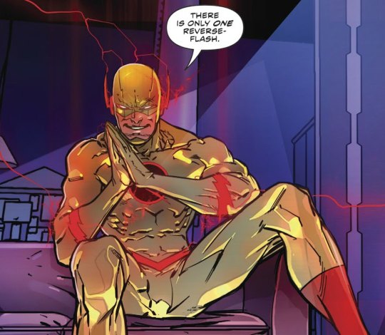
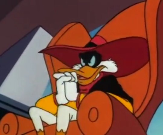
first, negaduck wasnt just inspired by or a reverse-flash parody. he's a literal copy-paste of silver age thawne with a very few changes of origin place from future to parallel universe and identity from some random future guy to main hero's evil twin, because originally eobard was fixated on being a Criminal and not particularly flash's nemesis. back in the day, thawne constantly mentions how much he loves his criminal life. half of his lines are negaduck-worthy purely because the rest is related to being a speedster scientist. my personal favorite as an example:
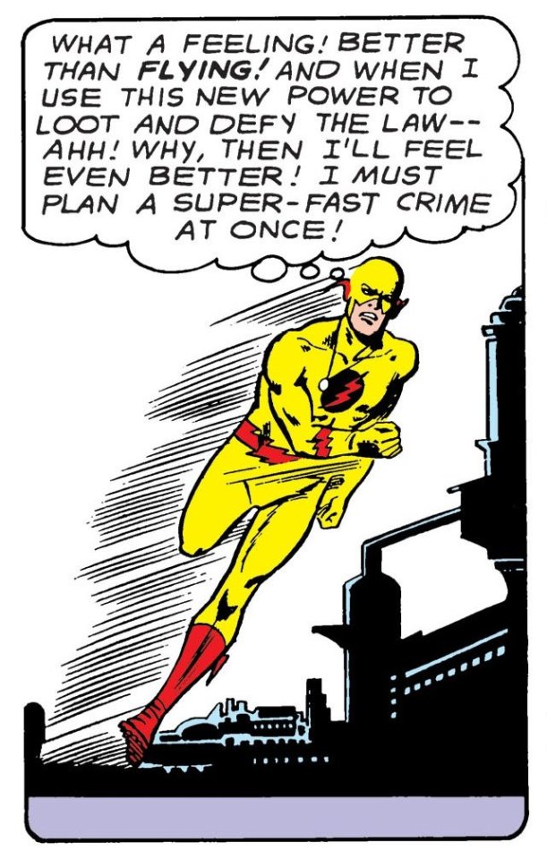
he passes the speed limit law in central city so that barry couldnt use superspeed without breaking it but thawne still could because he is 'a hardened criminal'. he invents rays that turn everything inflicted evil (something even negaduck has never done (ig solely because megavolt's already done it in the negaduck episode where he accidentally splits darkwing into good dw (posiduck) and bad dw(negaduck, with a black and gray color scheme), and while yellow negaduck is a different character this is basically how the idea of him was born and the writers just decided to keep him in a different form bc the gray one merged back into normal dw at the end which is super funny. imagine coming up with a duck villain and going 'oh this guy actually reminds me a lot of reverse-flash with all that opposite/negative thing. LET'S PAINT HIM IN THOSE COLORS AND GIVE HIM THE SAME PERSONALITY AND SIMILAR ORIGIN THIS TIME'), altho he DOES test the power gem on a cat in jail bird like thawne did with evil rays). he repeatedly tries to get poor former dr alchemy back to crime just because 'crime fun. why cant you see that. im doing it for your own good' and negaduck tried something like that with morgana in feb 14th episode my valentine ghoul (+that brief scene with gos from 2016 comics run where he believes she must be bad deep down inside out of comparsion to nega!gosalyn). negaduck also travels from a whole other world just to fuck around here for fun (there was this bronze age flash issue called flashback where thawne gets lost in the timestream because barry pushed the wrong buttons in his time capsule which is almost exact negaduck's fate in life, the negaverse and everything) and one of another few differences related is that negaduck is shown to be a dictator of his universe's St. Canard who is bored to live somewhere he already has all the power so he travels to another universe to cause problems on purpose.
second. dc's new52. eobard is rewritten again, now he and zoom are kind of one character. but guess what else is new in this version that never happend neither in zoom or professor zoom's lives? thawne is a fucking dictator in his own time. and people tried to fight his rule in flash's name just like friendly four needed darkwing as inspiration to finally fight back for their world.
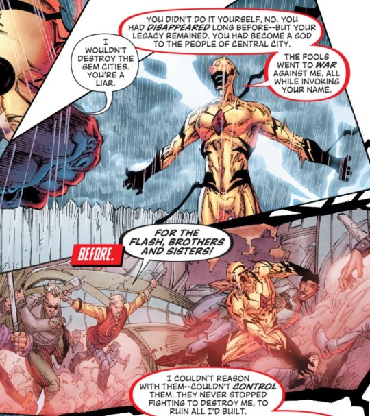
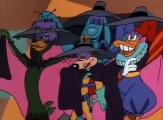
he gets his own team, acolytes of zoom (i wish i could call them local fearsome 4 but there are 5 of them, making it more of a sinister 6 if you count thawne) which he trains for centuries to fight the flash and betrays later by trying to steal their powers just like negaduck stole f4's in jail bird to become mega-negaduck and if all that wasnt enough, without the mask he straight up looks like negaduck humanization. look at him. this mf is only missing a hat and a cape.
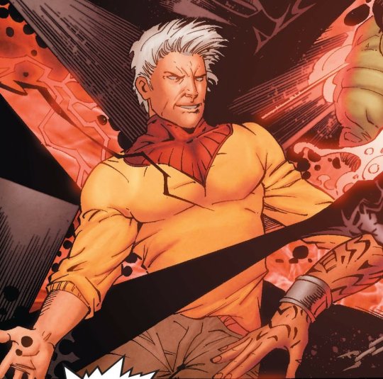
also these sudden black parts in his new speedster suit design? either it is some absolute fucking bonkers of a coincidence or someone on the flash writing team really went 'hey guys you know what would be real funny? lets base new thawne off negaduck. like he was originally based off thawne. i swear no one will notice' and everyone went with that. (i could also mention he has the same dumb motivation for being evil (having shitty childhood/being deep down sad about mistreatment and loneliness) as 2011 dwd comics run negaduck but imo that's too far of a stretch to actually be included)
third. yall know the deal of the first season of cw's the flash? yeah, what if i told you the whole thawne messes with the particle accelerator and causes barry to gain superspeed thing already fucking happend in darkwing duck, episode going nowhere fast?
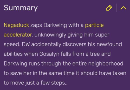
(the way i lost my mind over this back in the day when i decided to watch dwd just because negaduck reminded me of thawne(i didnt even know he was a direct rip-off, i just went 'oh wait dt universe has this evil fuck that wears the same color scheme as reverse-flash? girl i AM checking the whole thing out just to see if he's anything like thawne'.) and first watched the episode... priceless, still haunts me to this very day. how the hell was that written in 1991. did cw writers just take the idea from dwd too. honestly i cant be sure about anything anymore).
and remember in the duck knight returns (2011 comics run arc) flashbacks there was a super funny thing with negaduck not knowing dw's secret identity and being so proud he cracked the case? remember cw!og!thawne looking for flash's time period and not knowing his identity in 2nd season cameo episode? what the hell was even up with that!!! like guys. guys one of you is the most devoted flash fan from the future and there is NO way none of that kind of information was left a CENTURY after (i mean come on dude couldntve you just asked gideon. she literally had that 2024 newspaper about vanishing and thats at the very least not mentioning she was created by barry) and another is straight up the same fucking person as the hero with the same fucking relatives and enemies. idk take a wild guess??? ((i really wonder if anybody on the wirting team of 2011 dwd run saw not just life, the negaverse and everything but any episode featuring negaduck at all. not only do they ignore the existence of nega!gos in the 'oh he mean bc alone :(' approach, they ignore the very definition of negaduck's character which is literally evil drake mallard. i mean sure hes dumb and may miss obvious clues because of being the same dw just evil but come on, such a comedic situation and never addressed by drake whos literally been in the negaverse and knows they are the same person or by anyone else he coluldve told that? oh well unless drake is also dumb af and thought there never was any drake mallard in the negaverse in the first place and that negaduck is some other guy. which is a real probability i suppose))
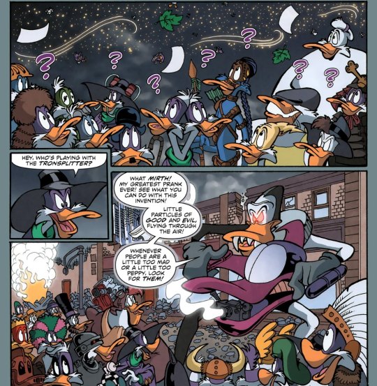
also. negaduck's death by being split on billions of evil particles in crisis on infinite darkwings and thawne, being 'exorcised' from nash's body in a form of a negative speed force stream with sparks in 6x15 of cw's the flash.
fourth! yall did watch ducktales 2017 reboot, right? specifically the duck knight returns episode? they introduce a whole new version of negaduck there! and guess what. jim starling, an old darkwing duck (in-universe 90s tv series) actor obsessed with his role, goes fucking nuts because there is a new darkwing duck actor in a new movie and he didnt even know. because he feels forgotten. because no one remembers neither him nor original series (objectievely not true bc obviously launchpad and drake but to jim they just dont count bc reasons. he seems to count only children but calls lp his fan when anthagonizes drake for taking even that from him in the end). because he was replaced and no one even bothered to tell him. he causes a fire on the set, almost kills drake but does have a change of heart at the end after launchpad's speech about what darkwing duck stands for and seemingly sacrifices himself to save drake and lp from the explosion. then they have the worst idea they could have in relation to jim's character ever: for drake to be a real life darkwing duck to honor jim's sacrifice. so naturally he hears that from the sewers or wherever he was hiding to see their reactions(look i am. 100% sure that this is what happened bc that makes so much more sense than jim getting brain damage or whatever from that explosion and waking up to choose violence again for no other reason). he gets hit with the being replacable and forgotten thing once again and renders back to negaduck tendencies, for all we know for good this time as his darkwing suit changes to the yellow-red one. yk who else went on a rampage because he felt forgotten and replaced? you guessed it! the return of barry allen, a 90s classic where thawne goes to 21st century for the first time, thinks he's barry (original-ish flash) because dissociation from trauma of seeing himself being killed by his hero and acts exactly like starling, having the same issues as motivation aka him/barry being forgotten and replaced by wally. he implies wally taking on the flash mantle is most disrespectful to barry. he rants about how he's the only flash and threatens to destroy not only the flash family but the whole central city for forgetting that. he and wally have a conflict of legacy similar to jim and drake's conflict in dt17. he is The starling blueprint only a lot more mentally ill. also we've heard something like the duck knight returns in running scared (this one is less reminiscent of jim but still features some things that werent in the return of barry allen). it's a rebirth arc that introduces another new origin of reverse-flash. now, he's been hyperfixated on barry allen his whole life (on a whole new level i mean) and there was the first meeting in 25th century where they Connected like thawne always believed they would. that day ended up in a fight and thawne's imprisonment because he set up casualties to get attention and praise for being the flash of 25th century but unlike all other versions this thawne has a change of heart after the fight, too. he promises to 'fix everything' including himself, he even goes to therapy afterwards. then he goes to the 21st century to tell barry how much he accomplished since they last met and then sees barry saying to wally one meaningful phrase he said to thawne that perfect day. like it wasnt something special only barry and eobard shared. like the day they met never happened. like he forgot thawne ever existed. like he was replaced as barry's speedster partner/friend/whatever he thought they were after that day by wally. and that shatters thawne so much he runs back to 25th and just decides to become the reverse-flash and make barry suffer until he gives him attention and recognition he deserved. frank angones, i am inside your walls. you CANT deny you based your versions of dw and nd off flash comics and thawne particularly. and more, you legit made reverse!eobarry au and put it in dt in duck forms. i have been losing my mind about it for 3 years now. i am exposing you and there is nothing you can do to escape that.
fifth(ish). yeah, and btw about friendly four from life, the negaverse and everything. did you think they actually escaped being mirrored in the flash? ha. i present to you reverse-rogues from the 25th century aka the renegades, carefully created by zoom and thawne himself, thinking it would somehow be funny.
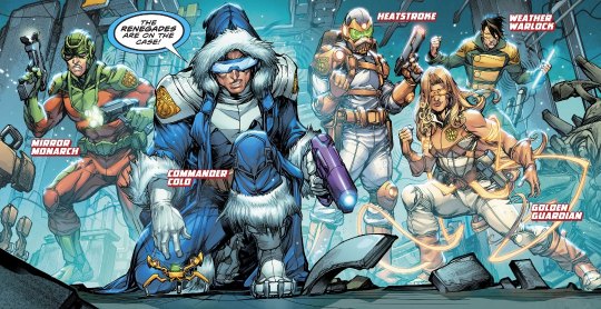
cant believe hunter once saw it on tv put 2 and 2 together and went 'eobard my dude we need to go full negaverse with the 25th century. we need a friendly four to your negaduck. i swear it'll be Hilarious'. god the only thing they lack at this point is nega!gosalyn (i mean. hunter actually did try something like that with inertia, saving him from the museum and trying to teach him how to torture flashfam into improving them but thad was more of a nega!honker and reverted hunter to disabled powerless state just because. love that kid)
and that's all i have so far, if anyone here also into both yellow-red mfs with no life feel free to comment or even add more because there sure is or at least will be more and no one has the power to stop it.
#negaduck#darkwing duck#ducktales 2017#dwd#dt17#jim starling#drake mallard#disney afternoon#the flash#the flash cw#dc comics#eobard thawne#professor zoom#reverse flash#imagine d*sney puts you in their superheroics parody show as a duck and later you get rewritten in the image of said duck SEVERAL TIMES#how is eobard thawne as a character even real.#thawne-negaduck pipeline going BOTH ways is the most insane shit in existence and i cannot bear being the only one who Knows any longer#and to think i've ALSO unintentionally done that with my own starling and thawne versions and realized it only afterwards..#every once in a while someone reinvents negaduck when writing thawne or other way around. that's just their fate at this point.#thawne-negaduck pipeline
94 notes
·
View notes
Text
@/damoselcastel was kind enough to show me a bunch of the FE:Fates visual works artbook pages the other day!
and because i am continuing to be .... brain rotted (lol) ... grabbed a copy since there was more than a few relevant pages/official artworks, and wanted to have a high res/color corrected version of these pages for art refs to slap on my reference boards! if i'm looking at them every day now for the past three months they better be accurate!!!
anyway! it came TODAY!!! :D :D pakidge
IT WASN'T EVEN SUPPOSED TO COME UNTIL THE END OF THE MONTH AAAAA
god dang this thing is THICK, now this is what i call a proper artbook! a little hard to see here but you can see by both the front and the spine that it's a chonker -- the two tellius artbooks combined are thicker but they're also a bit smaller elsewhere.
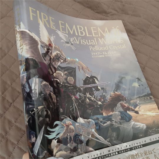
rest is under the cut b/c it's me promptly going feral :P
(and seeing who's on the spine ahhh!!! honestly that's really cool and super appropriate given his subtle plot/character relevance?! super fucking cool to keep seeing nintendo nod at him in symbolically relevant places, but not too overtly )
SPEAKING OF I SHIT YOU NOT GUESS WHICH SPREAD THIS THING FELL TO FIRST
I SHIT
YOU
NOT--
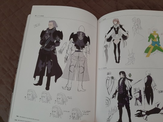
stone cold, swear to you, straight up didn't intend that but this was literally me irl then:

:')))))))))
(also HE GETS A WHOLE SPREAD???? and a turnaround?!!!!!! even freaking corrin's nohr noble design gets like an EIGHTH of the page
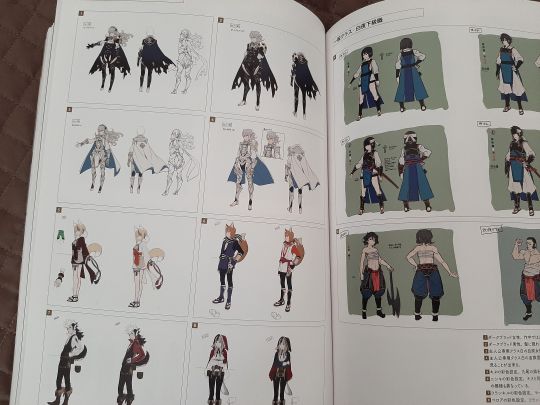
gunter gets treated SO WELL in this artbook i'm on the floor trying not to sob like i'm sixteen again and begging for any zihark scraps
also this is so much more high res than what's on my reference board the nitpicky artist in me is literally crying for joy about FINALLY HAVING A HIGH RES REFERENCEEEEEEEEEEE
also what the fuck the architecture is so cool???????????
THE WORLDBUILDING I AM WILDING
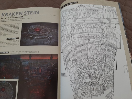
for real tho i remember my first conquest playthrough my jaw was on the FLOOR being genuinely amazed at how cool the worldbuilding was especially on the nohrian side with the gothic vibe and y'all don't know how useful this is going to be to replicate nohrian motifs in all of my drawings/probable comics/doujinshi/etc.
[foams at mouth]
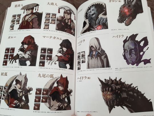
this artbook also covers EVERYTHING
like there's a healthy amount of character work , but there's also enemy designs (always thought fate's enemy designs were unusually kickass, like some of these folks could be outright characters themselves), the architecture stuff above....
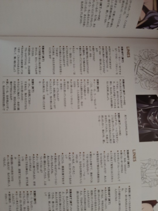
my room lines....
OH MY GOD THIS MEANS I HAVE A THIRD SET OF TRANSLATIONS I CAN CROSS REFERENCE TO FUCK YES
sorry for shitty blurriness it's just me vibrating in excitement lmao i'll upload it in the high res chunk
.....
hellooooo sir~~~~
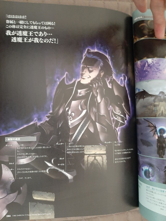
(you knew i was going to be posting that shot >:D )
his possession CGI gets a full fucking page too ajlsjsjkskjhhjshjg
HE GETS TREATED SO GOOD HERE Y'ALL, SO MANY FULL PAGES???????????? is this what it's like to be brain rotted over a major character i will never know the feeling lul
(there's actually at least two other gunter fullbody artworks in here, those have already been scanned/uploaded properly by others so i won't post 'em here unless y'all want em!
and then lastly!
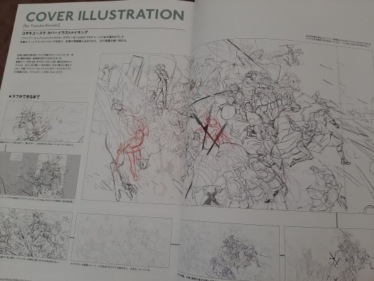
to finish it off, god this cover progress is so cool, kozaki knows what he's doing.
and i'm pretty sure gunter's linework gets changed halfway through, his expression's somewhat different than on the final! and i'll be posting that along with the other high res/cleaned up scans! just need to figure out if my scanner's gonna do a better job than my phone or vice versa.
[tries to stay composed] [fails]
aaaaaaaaaaaaaaaaaaaaaaaaaaaaaaaaaaaaaaaaaaaaaaaaaaaaaaaaaaaaaaaaaaaaaaaaaaaaaaa
15 notes
·
View notes
Text
#sward is a word for an expanse of short grass so you could have twins named like#darkblade and swardstrike#sward pronounced like sword but with the w pronounced
Darkblade the shadowclan medicine cat and his sister Swardstrike the Shadowclan deputy, Darkblade was named for his ability to be both calm and quiet, like a blade of grass at night. While Swardstrike was named for her ability to do precise quick steps, almost like striking the ground. They are both very calm and rational cats with not an edgy bone in their bodies

Edit: I'm so happy people like them so im adding to this specific reblog that I fully proclaim these two siblings to be open for anyone to draw or write or do anything with. Also if anyone else wants to draw other cats with fun "edgy" or "weird" but technically accurate names for their clan go ahead as long as you allow anyone else to draw and mess around with those characters as well! Feel free to tinker with the designs as well I rushed these out in like ten minutes and swardstrike is literally just a copy past of darkblade's body with the colors edited and a few details changed
Cats know the term blade of grass so technically a name like darkblade or or frostblade would work as a name. Ironically because they likely only know blade as in blade of grass, darkblade is probably a quiet shadowclan medicine cat named for how she can walk through the territory at night while being as quiet as grass
222 notes
·
View notes
Note
PLEASE talk to me about your tmnt designs they are so good and friend shaped
OK!!! >:D gonna just copy paste them directly from discord so excuse the “like previously stated” stuff lmao
Raph:
Ok so!! This one might be short bc I do really enjoy his canon design. I made his spikes a bit more rounded than they are in canon because alligator snapping turtles are sharp but not that sharp (I’m aware the show’s style is just generally sharp as well). I also think it suits his personality more, with the spikes being a bit rounded out. He’s big and tough, yes, and he can definitely beat the shit out of people, but with his brothers he’s just a big teddy bear! Clothes wise I was initially going to give him a ripped jersey but decided against it because I wanted to show off the cracks and marks on his shell. He’s a big guy which means he most likely just throws himself (literally) into fights, which would definitely end up with him getting some marks in his shell. I left the x bandages on his chest and added some others on his side, as well as a sticker from Mikey over one of the smaller scratches. I ended up ripping the ends of his bandana as well, more than I think it is in the show, if it is at all. I let him keep the wraps on his feet and hands, and added some sweat bands on his wrists (despite the fact they wouldn’t work that way) to replace the sporty vibe the jersey would’ve given. I also gave him shorts for the same reason. It just gives him a boxer vibe imo. Giving him a tail is the only thing I will never regret because 1. TAIL. 2. long tails are like??? A defining trait of snapping turtles bro. I already explained that his markings aren’t natural, and that they’re sprayed on by Mikey. He probably has to get them redone every once in a while, which means the shape of them might change a bit every time. (The small splatters definitely do) that’s sort of all I can think about to say for Raph? He’s my sweet cheese? My good time boy?
Leo:
Woo! Guy I stole my name from let’s go- his design didn’t change much either, if I’m being honest. Probably changed less than Raph’s. I liked the crescent markings on his eyes instead of the classic slider stripes, I just think they fit his vibe more so I let those be. The crescents on his arms, however, had to go. I know they were probably chosen to be easier for the animators, but I’m not an animator and my boy isn’t a damn tiger!! So racing stripes it is! I left the color alone tho bc I liked the contrast. His gloves also got left alone because I enjoy how dramatically they flare out. He got a scarf because I thought it looked cool but also !! It is kind of reminiscent of the weird shock collar thingy he got in Donnie’s Gifts. Obviously this scarf won’t keep his quips at bay, but at least he’ll be warm while he messes around. He also gets to keep his over the shoulder thing instead of being downgraded to a belt like Mikey, just because his sword is too damn long to fit in a side holster thingy (idk if holster is the right term for the sword one or if it’s exclusively for firearms). I was high key debating giving him a Fanny pack bc I thought it would’ve been funny, but braces *and* a Fanny pack would’ve made me feel like I was trying to make fun of him for some reason so he just gets a slightly bigger side bag. Satchel? Idk. I gave him a few marks as well because out of all four of them, I feel like he gets knocked around the most- mostly because he’s the one running in without a plan. He’s got one on his leg, two (from the same injury) on his left arm, and one across the bridge of where his nose would be. I wasn’t sure if I was going to add the nose one, because I was having trouble thinking of how he would get a cut so deep on his nose to scar but not to affect his eyes, but then I remembered I don’t care for logic when it comes to character design. He’s also got a bit of a torn up shell from roughhousing with Raph and pulling stupid stunts.
Donnie:
Burger boy!! Ok so I am a firm believer in Donnie should get clothing/tech that will actually help him and doesn’t just look cool. Hence the welding gloves and goggles! I also think he would use the bandana around his neck as a mask to cover the bottom half of his face! When he’s not wearing his mask, as you can see, he just keeps the goggles around his neck. I think that the turtles wouldn’t always be wearing their masks, but Donnie always wants his goggles with him, so he just lets em hang there. The tech pad on his arm controls his shells and Shelldon, as well as just being used like any tablet can be used. He usually does things himself, but he has the doc Ock robot arms to help him with smaller tasks like carrying things or holding stuff for him while he works. Also to hold his phone because,,, Gen Z man… anyways actual design wise, I just kept with the patterns he has in the show. I gave him 2012 Donnie’s tooth gap because I enjoy it immensely, and I gave him slightly webbed feet for swimming. He would be the best swimmer out of all of his brothers because of it. Also yeah, he’s got normal people eyebrows now, but the ones you see over his mask are 100% drawn on. Speaking of his mask!!!! I gave him a little Deadpool type bump at the back of it because I wanted to and also because I have never once in my life been able to tie a bandana around my head like that without having a bump. Is this the shortest one? Probably, I literally can’t tell rn 💀 Sorry Donnie I said Leo changed the least but maybe it was you. Or I’m just bad at analyzing my design for him
Mikey:
Ok Mikey now bc he’s last (rip)!! He definitely got the most little details added in, because he was the first one I drew. Also because his initial design already has so much character compared to the others. First off, pattern: FRECKLESSSSS I enjoy him having tiny speckles instead of just big blotches. I just think it gives him more of an asymmetrical look. Same with the stickers on his shell!! I purposely gave him no two shapes the same so it would be a bit more mismatchy. The skull- like previously stated- is a reference to his toddler design, which had a skull on an orange sleeveless hoodie. WHY DOES HE HAVE KNEE PADS AND NO ELBOW PADS. WHAT IS THE POINT OF THEM. So anyways he has elbow pads now. You can’t see them but he has more faces drawn on them. I gave him one sweatband on one wrist and the beaded bracelets on the other, again, for asymmetry. One of the only symmetrical things is probably his spats/socks/shoe thingies. His backpack straps aren’t even even. Speaking of his backpack, he has some pins and patches on there that are 90% gifts from his brothers and 10% ones he found on the ground. His skateboard on the bottom is a drawing he did by himself, and was one of the first pieces he ever did without copying something. Not super intentional, but his shell design sort of looks like a firework going off, which I think matches his personality a whole lot. The tooth he has missing is a permanent tooth and he honestly doesn’t care that it’s missing he thinks he looks cool.
1,300+ words later, you deserve a Turtle Tot design so here you go!!

132 notes
·
View notes
Text
ok heres a very very very detailed analysis on all of my character design choices i made on my human bill design for no reason except i sent this to my friend and she encouraged me to post it sooooo.... here we go

ok so this photo implies that either A) bill wears really long gloves and boots all the time B) his arms and legs changed color as he grew C) they changed color when he destroyed his dimension and accidentally gained cosmic power. i thought it would be cool to implement this fact by giving his human design vitiligo to show the fact that his skin is literally two different colors (i personally think the theory is B cuz when ford blew that hole into his hat (which is also black) it was a part of him wnd therefore skin so i think his skin just changed over time). i also added in the vitiligo on his face to represent the brick pattern thats seen on him. idk i genuinely felt like he should have some sort of face markings to represent that. i also wanted to make him verryyyy gender non comforming. in the book of bill it states that his gender is quite literally triangle, so i feel like he wouldn't really fall into the same gender norms as humans and would end up looking very androgynous simply bc he would not care about looking masculine or feminine and you cant misgender him anyway bc his gender is incomprehendable. i also didnt want to give him a lot of eurocentric features cuz ive seen so many human bill designs that are kinda copy n paste white twink and while it is a good design i wanted him to be more "him" or what he would like. i felt like giving him a sharper nose and jawline would help attribute to his character and also to the sharp angles of his triangular form. i genuinely just wanted him to look beautiful, but not in an average every day person conventional way, moreso in an ancient deity, model, once in a lifetime person type of way. i wanted him to look beautiful in the intimidating way not the cute way. the hair was honestly just for sillies and their wasn't a LOT of thought behind it- again, i went with the adrogynous themes and gave him sort of a scaramouche bowl cut mullet but a little more wolf cut-y. yellow is obviously his color, but since black is also so prevalent in his character design i wanted to keep that theme going and make his roots + the bottom black. the roots symbolize his hat, while the bottom symbolizes his arms and legs. finally, the blue streak was kind of me wanting to incorporate his powers into his character design, and i thought it would be cool if the blue part of his hair glowed when he used his powers too. also his eyes are blue for similar reasons, and also because his eyes turned blue when he offered a deal to gideon(? or someone else can't remember). the entire theory behind his color scheme is obviously sticking to his original one, but also incorporating more blues to clash with the yellows because he's a very conflicted character. he so desperately wants to come off as like this emotionless and chaotic entity when in reality he has weaknesses and feelings and regrets, and his biggest flaw is his own simultaneous ego and insecurity. on this is not a website dotcom (i think, im like 99% sure i saw a ss of this) his listed weakness is himself, along with his favorite thing being himself, which kind of conveys what i was trying to convey with his colors. i felt like a lot of clashing would fit his character and make him sort of "pop" if that makes sense. blue snd yellow are stark opposites the same way his personality is very oppositional to himself and it just felt right. i also included the scar he gained when stan beat him in his mind, and i made that a darker blue not to represent his powers, but to represent his loss and also to be a contrast to the orange i used to shade (the bright blue contrasts the yellow, the dark blue contrasts the orange) to kind of show his weird angstyness afte his loss and sooort of death. i didn't want the scar to be as bright bc obviously its not a source of his power or connected to that in any way, but it still serves as a permanent reminder. i ALSO stopped the outer lineart at his scar to make it look like he was "shattered," to show his crumbling and cracked mental state within the theraprism
some bill/billford sketches from when i was on the plane yesterday (including my human!bill design :)


tumblr butchered the quality :/
#rose rambling#hi guys#im normal im normal#im so normal#please#guys#make me write a bill cipher character analysis pretty pretty please#bill cipher fanart#billford#bill cipher#the book of bill#book of bill#rose arting#my art#artists on tumblr#gravity falls#this is not a website dot com#billford fanart#stanford pines#bill cipher x ford#human bill cipher#human bill design#gravity falls fanart#stanford gravity falls#gf fanart#stanford fanart#ford fanart#gravity falls stanford#gravity falls ford#gravity falls ford fanart
59 notes
·
View notes
Text
v3′s art is comically terrible for a professionally distributed game in a series: a compilation
in this not-essay I will list all of the mistakes and problems I have spotted in v3′s art. don’t worry, it’s entirely for fun and I’m doing this on a whim, so please feel free to not take this seriously but also it’s hilarious and embarrassing how ridiculous this is like what happened did they speedrun the whole production or what
see, there are some things you can take as meta like “they made it bad on purpose to allude to the downfall of tv shows that have been on air for much too long” but I have a very strong feeling this is not the case due to the nature of some of these errors
disclaimer, the more I study this art, the more I fear that the artists were underpaid and underslept, so if this is in fact the case, I am so sorry to all of them but also I’m going to make fun of the art anyway
anyway let’s get started!

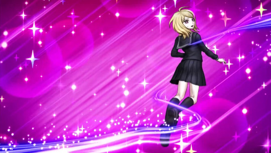
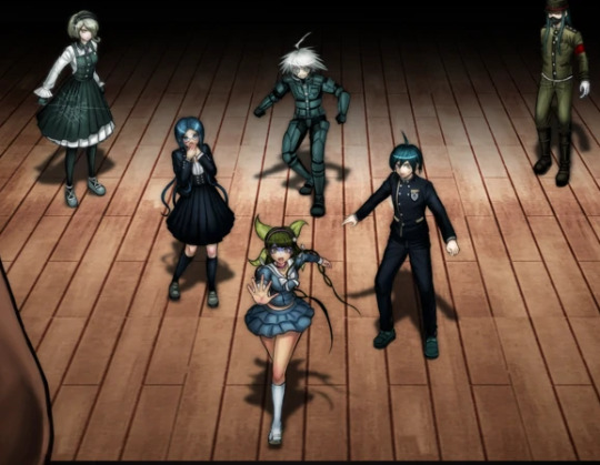
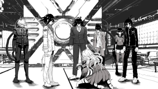
if you study this image for longer than 5 seconds, you will see that kaede is the only one fully shaded and keebo is literally just his normal sprite pasted into the image. every other character is just an ordinary ref, hence most of them facing the exact same direction with neutral expressions on their faces. it looks like a bad edit, and is probably one of the worst pieces of art in the game. it kind of gets better from here on, but my roasting will not.
with that out of the way, here’s the problem that officially bothers me the most and clarifies my viewpoint of “this is not meta and an actual lack of company communication”
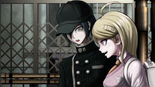
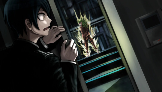
this freaking cg, which seems normal at a glance, but some wiseass was like “oh, kaede is a girl, so obviously she’s going to be shorter than the Male Protagonist™” ah, that’s funny. because if you look at the character bios, kaede is, in fact, one inch taller than shuichi and not like 6 inches shorter as she is shown here.
also shuichi’s shoulder is disproportionate and horrendous and he looks vaguely like a jojo character, but I wasn’t even thinking about that until right now.
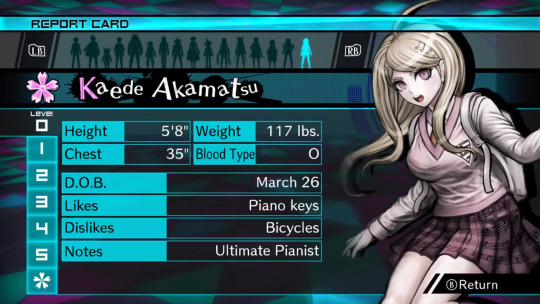
thanks guys, 50% of the fandom who has never bothered to check these bios thinks that kaede is like 5′3 (did the developers really put so little thought into her to the point where drawing her correctly in the game didn’t even matter??)
also I would like to point out that, even though this isn’t related to the art itself, yes, a character kaede’s size being only 117 lbs is unfeasible, but this applies to literally every character in danganronpa ever and it’s not new news that it’s unrealistic
update: someone in the tags informed me that in versions of the game that use centimeters, like the japanese version, kaede is actually shorter than shuichi, which just adds another thing to the list of weird decisions the localization team made for no reason. that said, after confirming this, kaede is 167 cm in the original, while shuichi is 171 cm, which are approximately 5′6 and 5′7 respectively, but one inch is still nowhere near as drastic as it is depicted above. (in spite of this, I would rather depict kaede as slightly taller, so I’m probably going to keep doing that.)
the journey continues!
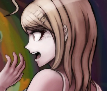
bro if you want kaede to have shoulder length hair then stick to it to begin with
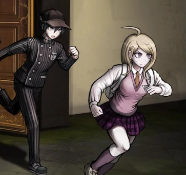
you can pretend this is at an angle all you want but they definitely committed the shorter kaede sin a second time
wait a goddamn second.
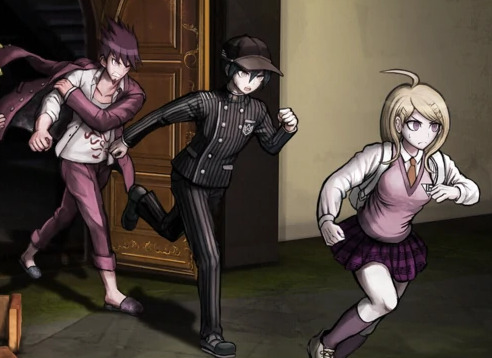
DO YOU SEE THIS
no………… it wasn’t kaede who shrank. it was shuichi who got taller
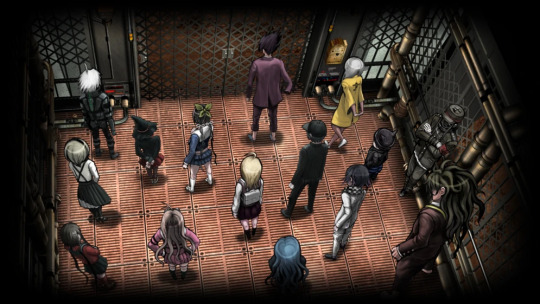
speaking of which, can we talk about how shady the perspective is in this elevator pic? look at shuichi and kokichi in comparison to kaede. kokichi, who is canonically 7 inches (edit: or 5, if you’re loyal to the original) shorter than kaede, looks taller than kaede. he’s growing too. what steroids are these gays taking

running into the room, electric boogaloo: I don’t think tsumugi is supposed to be the same height as kokichi
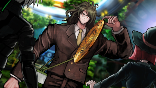
gonta… gonta you’re lookin a bit like a jojo character there
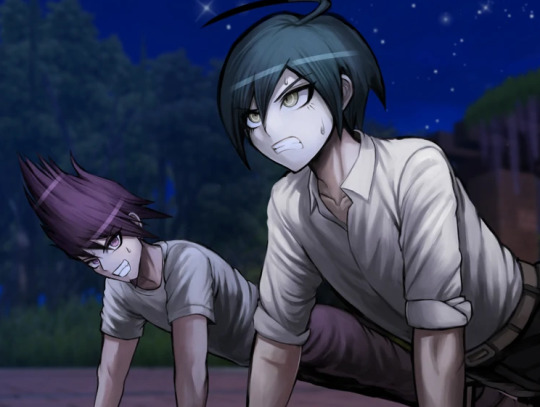
I love how kaito’s head looks kind of like it was pasted onto his body. why is he the same size as shuichi? shouldn’t he be high school bully size or something? his torso is teensy
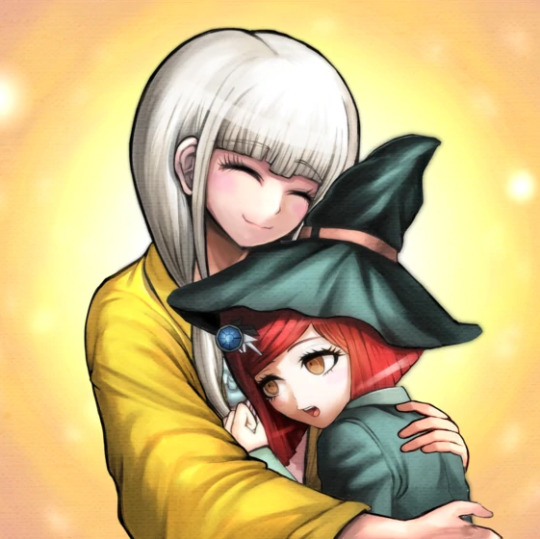
ah yes, white angie.
I love this cg but why is shuichi’s right hand so much bigger than his left hand
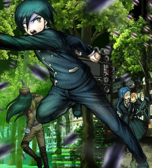
I also love how this cg looks like they literally took pictures of trees and pasted them into the background, especially on the left. the shadows are so weird, especially closer to the ceiling, it’s difficult for me to believe they didn’t do exactly that.
return of Enlarged shuichi
puberty update: kokichi is now taller than shuichi in spite of shuichi never missing leg day. what crimes will he commit
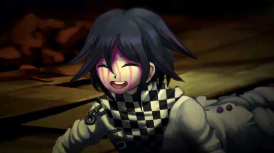
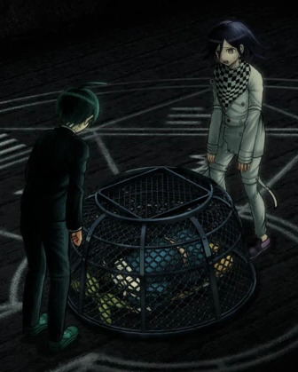
I have to mention it, guys. this has to be one of the worst danganronpa cgs. kokichi’s facial proportions look atrocious. look at the way his face sticks out like his jaw is in the wrong place. his scarf is a pasted texture. that’s it. this moment was so iconic but the cg just looks so… so… off. like something is terribly wrong, but you can’t put your finger on it.
you know what? let’s get into that ‘pasted texture’ thing.
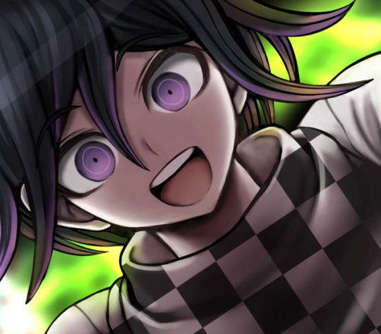
let’s imagine you’re an artist working on a professional game. you’re assigned to draw cgs of kokichi ouma, who has a checkered scarf from hell. sure, it will be terrible to draw, but you only have to draw it once at a time! plus, perspective is pretty important, right? can you be bothered? nah, actually. let’s just copy paste a checkered pattern into the cg, because I’m sure nobody will notice. it’ll blend right in with the other cgs that someone actually put effort into drawing his scarf in, right?
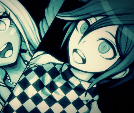
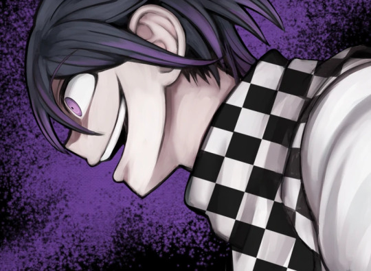
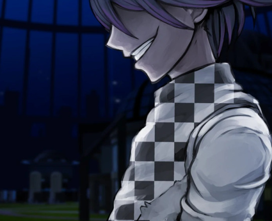
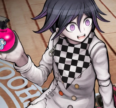
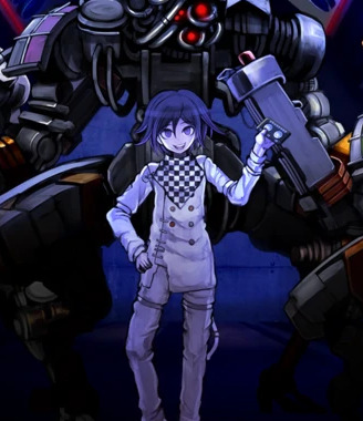
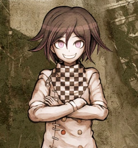
no. the answer is no and I very much noticed. this genuinely looks terrible and I would understand taking a shortcut like that in fanart or even an indie game but this is a full price pc and console distributed game
(an addition: look at kokichi’s TINY HANDS in that last one)
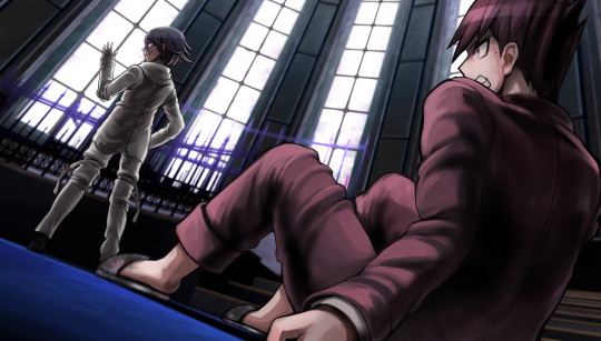
meanwhile, they straight up forgot to color in kokichi’s scarf in this cg.
dude. I forgot about whatever the hell this cg was. anyway look at keebo please just look at him
lovin kaito’s baby arms
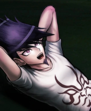
real talk, maybe you could argue that he’s missing muscle because he’s deathly sick, but most of his cgs don’t line up with this, and his arms just look disproportionate to his torso size (granted this is a consistent problem across all danganronpa games and a lot of characters have this weird problem, like hajime, but also kaito is bigger than hajime so I kind of have higher expectations of him) maybe it’s his stupid goatee and the way he reminds me of yasuhiro?? it creates this illusion that he’s older than he is and so I keep expecting him to look more like an adult
oh, also rantaro is missing some of his accessories in that video he made–you know the one–but I don’t wanna go back and screenshot it
also you may have noticed that I’m skipping all of the monokub cgs because I literally do not care about them and I’m not even bothering to check and see if they have artistic mistakes in them
JIMMY NEUTRON???
hey um uh kaito you seem to be missing your neck
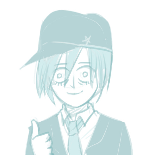
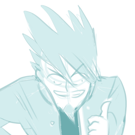
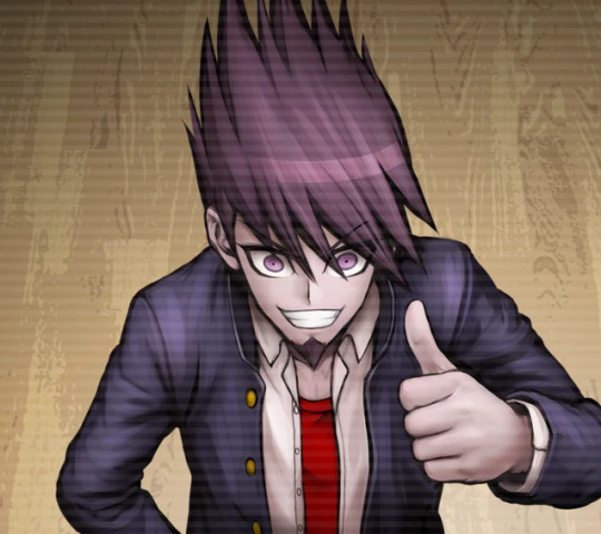
hey guys do you like my pregame fanart
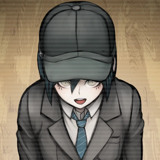
so, that done, the sprites are also pretty terrible at times. they’re not as interesting to go through, however, and downloading the full sprite sets for every character and studying every single one of them will drive me insane, so I’ll just sum some of the ones I noticed up. I made things for kaede and shuichi before deciding I wasn’t going to get into it, so here are these.

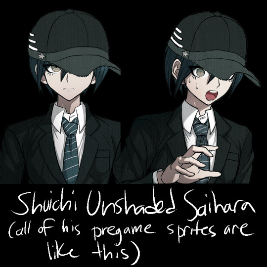
that said, other mistakes include kokichi missing his purple highlights in all of the sprites encompassing a specific pose, stray pixels all over the place on everyone, and everyone also has heavily inconsistent shading, but literally all I think about is how pregame shuichi is unshaded and two of kaede’s pregame sprites have glaring outfit change mistakes in them
anyway, thank you for taking the time to read my ridiculous ramble. in all seriousness, there’s this looming presence of some lack of communication in the development team, like with all the art and design inconsistencies, pieces and sprites that look rushed, stray pixels, and missing basic proportional stuff. these are the kinds of things that you supposedly have to pretty much have in the bag in order to get jobs in professional businesses, so it’s really weird to me that this game suffers from so many of these problems. it’s like they tried to make the art so much more crisp than the other games, but it fell on its face as they realized it was going to take longer to draw everything and they started to rush. it’s weird, because the coloring itself looks normal–it’s just sloppily drawn, and the proportions are a mess once put into the context of perspective. many of the cgs look like they were drawn by different people, and I’m still not over the fact that half of kokichi’s cgs have his scarf pasted in as a texture.
the moral of the story is that if you’re selling a game at full price that also happens to be in a series that has had 3 very good games in it already the stakes should probably be higher than this. v3 has been out for more than 3 years and it’s still $40 (did it cost more than that before? I sure hope not), and the overarching quality of the game is just not as high as the other games. I’m not saying that the other games don’t have any problems with their art at all, they’re just not as glaringly obvious and every artistic choice in those games feels intentional.
regardless, I had a blast roasting the art at 2am, so maybe you got a kick out of all this chaos.
#god I keep telling myself I'm gonna stop rambling about v3#v3 spoilers#drv3 spoilers#ndrv3#random stuff#but making this… it sounded so fun#danganronpa
687 notes
·
View notes
Text
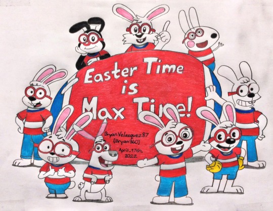
Here’s my note before I’ll get started….
(DON’T YOU EVER COPY FROM MINE OR MY FRIEND’S WORK, CHARACTERS, AND STUFF IF ONE OF YOU ARE IMPOSTERS WHO HAD HABITS OF PLAGIARISM! I WILL BLOCK YOU FROM MY BLOG IF I SEE YOUR POST WITH MINE OR MY FRIEND’S ORIGINAL WORK BEING EDITED ALL OVER! I’LL EVEN SHARE IT ONTO MY BLOG SO IF EVERYONE WILL SEE THAT YOU TRYING TO COPY MINE OR MY FRIEND’S THINGS FOR NO GOOD REASON WHATSOEVER! That will be all….I mean it.)
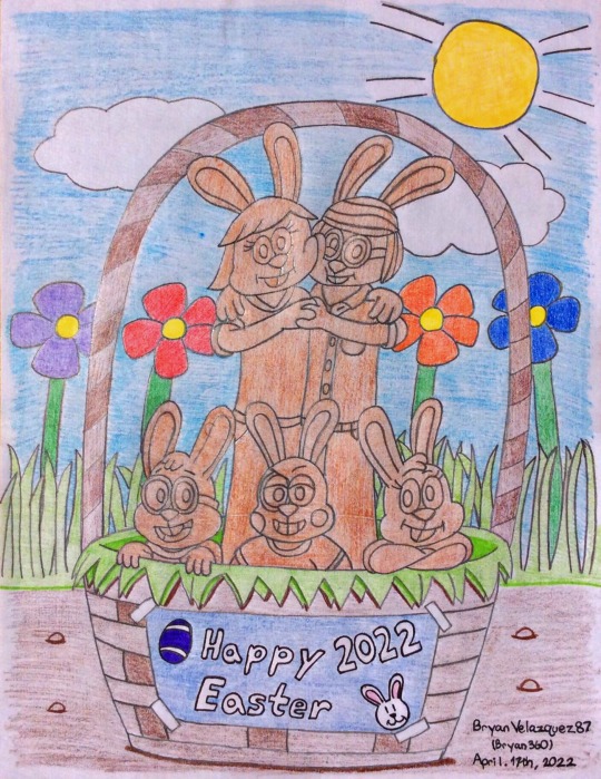
Easter Time is Max Time and Chocolate Bunny OCs
🇵🇷Me: Today's the day of what I came to prepare during this year's Easter with Maxwell and his family. Though decided of bringing two related artworks I've work on from past weeks, but originally would've save it at DA. Nevertheless, I'm came for to share at Tumblr as a way to celebrate Easter with my closest friends. Hope to see them and everyone can have their good Easter Day as well. What that being said, here's what I called my latest art posts to worth checking in.
🦊⚽️Sam: Definitely. While looking at it though would've been so cool if you go with digital coloring via PicsArt app when you had much time to go around.
🇵🇷Me: I know. At least knowing I'm doing well with using colored pencils to work out. Although needed to edit things up later to make it look brighter as I can.
🦊⚽️Sam: I see. Good thing that it looks alright for both artworks in quality. 👍🏼
🐰🖌Maxwell: Mhm. The first one that he placed on top though is surprisingly bring some of my cartoon art style appearances. There's even on the left side in "Jellystone!" version of myself that you've previous did back in November. 8th, 2021 to list on; including others as well.
Ollie and Moon Maxwell (April. 18th, 2018) - Link Here
Playkids Maxwell (November. 6th, 2018) - Link Here
Peppa Pig Maxwell (April. 19th, 2019) - Link Here
Cuphead Maxwell (July. 3rd, 2019) - Link Here
George of the Jungle Maxwell (October. 13th, 2019) - Link Here
The Simpsons Maxwell (Dec. 9th, 2019) - Link Here
STH Maxwell (February. 15th, 2020) - Link Here
Animaniacs (April. 18th, 2021) - Link Here
Jellystone Maxwell; aside May and Sam's inclusion (November. 8th, 2021) - Link Here
🐰🖌Maxwell: Though almost complete of myself that would like to see all of them, but at least this came close enough while having to celebrate this year’s Easter.
🇵🇷Me: That's alright, Maxwell. I had the same feeling as you were for a reason. However I may wanted to included those in their rabbit forms as your are. You know, because today’s Easter Sunday in terms of rabbits? 😅
🐰🖌Maxwell: I see. Well no problem that you've tried your best to go through it. Still looks pretty good anyways. As for the second one though, wasn’t that a remake from your original 2016 Easter artwork that you’ve posted on DeviantArt?
🇵🇷Me: That’s right. Thought I’m hoping it was a good case to have. I did well to redrawn your family or just your chocolate designs of yourselves; while making sure to added details and changes. It looks better to make as a comparison if you wanted to check out my original through link down below. ⬇️
Happy Easter 2016 - Link Here
🐰👊💥May: That’s really good to take us back in memories from years ago, but this looks better with the flowers bloom then last time you’ve drawn. No offense, though.
🇵🇷Me: That’s alright, May. It was something I worked on when doing practice I’ve been getting through in my life.
🐰🖌Maxwell: Well gotta say that it turn out alright after you’ve finished it, but also to share with my family and friends together. Just wish you can join us, Sam.
🦊⚽️Sam: Yeah. Though make me wanted crave those chocolate bunnies to snack on....I mean not literally on real bunnies of course! Just saying. 😅
🐰🖌Maxwell: Okay then? Anyways, hope you guys enjoy our creator friend’s art post to celebrate Easter Sunday this year. See you next year when we’re hopping around! 😆
Maxwell (plus other of his alternate cartoon art style versions of himself), May, Choco, Windy, and Scottie created by me; BryanVelasquez87 (Bryan360)
#bryanvelasquez87#bryan360#art post#traditional artwork#traditional remake#easter#easter sunday#easter sunday 2022#cartoon art style#art style#2022 remake#chocolate bunnies#maxwell#may#choco#windy#scottie#family#mom#dad#brother#sister#cousin#april 2022#april 17th 2022
9 notes
·
View notes
Text
LGBTQ Comic Review - Amongst Us Book 1
A masterful combination of comedy, subtle romance, and incredible sensuality

I make no attempts to hide my complete admiration and infatuation with Shilin Huang's Yuri webcomic Amongst Us. The slice of life AU featuring reimagined versions of the lead characters from fantasy series Carciphona as a lesbian couple has held a special place in my heart for a long time. I named the series one of the best Yuri works of the past one-hundred years, can frequently be found lurking in the author's Twitch streams, and even have a wall in my office dedicated to the artwork of the main couple (or I did before my office became a remote classroom). So, when a Kickstarter by Shilin and Hiveworks Comics launched promising a print version of the work, I was eager to support it financially and promote it with my humble platform. The Kickstarter took place in March, and books were initially estimated for release in May of 2020. However, as you have probably realized by the dates alone, the world went very South around this time. A combination of disruptions from the COVID-19 pandemic, a healthy amount of bad luck, and what I am inclined to believe, for various reasons, was some awful mismanagement by Hiveworks led to numerous delays. Indeed, by the time the book finally shipped, I had moved, so my copy arrived a little later as it had to be forwarded. But, at the end of this frustrating and anticipation-building event, I finally have the volume in my hands, and it was worth the wait. While I adore the webcomic, this gorgeous print volume completely enthralls me. The book is absolutely the preferred way to read this spectacular comic.
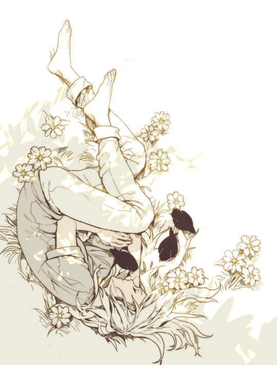
Before getting into the exquisite details of Amongst Us Book 1: Soulmates, I need to take a minute to praise how well this book is put together. The paperback binding is thick and features amazing spot glass that sparkles in the light. This feature only accentuates the fantastic and bright the cover illustration of main characters Veloce and Blackbird loving holding each other is. The back cover has a simpler but more imaginative illustration of the two flying through the sky, and the character's expressions tell you everything you need to know about this fantastic, odd couple. There are a few things you will notice upon opening the volume. The first is how well Amongst Us made the challenging transition from vertical webcomic to the page. The assembly and paneling are fantastic and clear, and chapters feature stylized illustrations and title cards. You will then see the inside cover, a powerful display that perfectly contrasts the front's glowing and tender love. Finally, there is Shilin's presents moving forward and dedication, where she lovingly dedicates the book to her partner, Kristen.
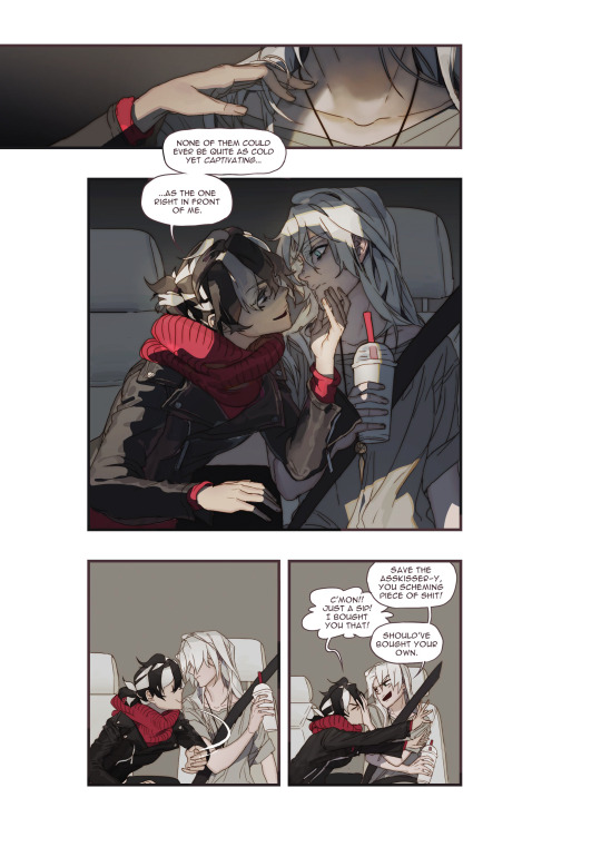
I assure you, as good as the book's presentation and assembly is, the contents within are even better. Amongst Us follows Veloce and Blackbird's bombastic relationship. The two women are eccentric and striking musicians in their early twenties, and I swear you will never forget them. The slice of life storylines are, per the genre's definition, mundane and include events like shopping at the mall, riding the train, and having lunch with a friend. The charming simplicity of the story serves well to the reactions of the characters. Shilin effortlessly transitions from adorable moments of affection to explosive and hilarious comedy and irresistible and delightful moments of sexual tension; Veloce's neck and jawline alone could topple a monarchy. Often, slice of life works can become dull or repetitive, but these stories and the frequent changes in tone help the reader stay engaged and excited.
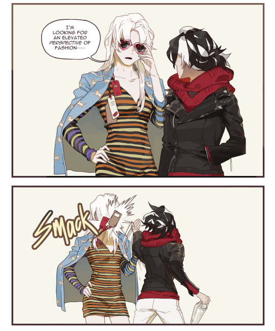
Putting slice of life aside for a moment, it is also important to note that Amongst Us is also has an interesting place within the Yuri genre, or "Girl's Love/GL" as it is often called in webcomic circles (originally an analogous term of Boy's Love). Webcomics have often been a bit more adventurous with their storylines and styles than Japanese manga. While the genre rose to popularity in the space thanks to digital manhwa and manhua, some (not all) of the Yuri tropes did not carry over between the similar mediums. Many modern webcomics and webtoons take their inspiration more from manhwa and manhua GL, which has developed its own canon and tropes over the years. However, even for a webcomic, Shilin's work feels somewhat divorced from most other worlds of Yuri. This first volume exists mainly against the Yuri genre's expectations. However, the next book, which flashes back to the couple's origin, undoubtedly is more in line with convention, for better or worse. It feels like the author decided to screw the norms and write a work that she would enjoy, and I am so glad that she did. Veloce and Blackbird are young adults, out of school in an established relationship with no drama. This (sadly) unconventional setting is made all the more irregular because of just how distinctive, and unwonted Blackbird and Veloce are.

Blackbird and Veloce, originally from the fantasy world of Carciphona, take on a new life, literally, in this wonderful modern reimagining and homage. You do not need to be a fan of the original work to enjoy their bizarre and larger-than-life personalities. Indeed, when I read Amongst Us online for the first time, I had not ever even heard of Carciphona. Veloce is the quieter and more stoic of the two, although she is not afraid of showing a more relatable and human side as she reacts to Blackbirds wild antics. Veloce's (not)straight man approach is hilariously sobering. But, her best moments are in those when she lets loose a little bit, like when she is rendered drooling by the promise of her favorite smoothie or in her stoic yet alluring flirtations with Blackbird, only to get close enough to steal a healthy chomp of ice cream.
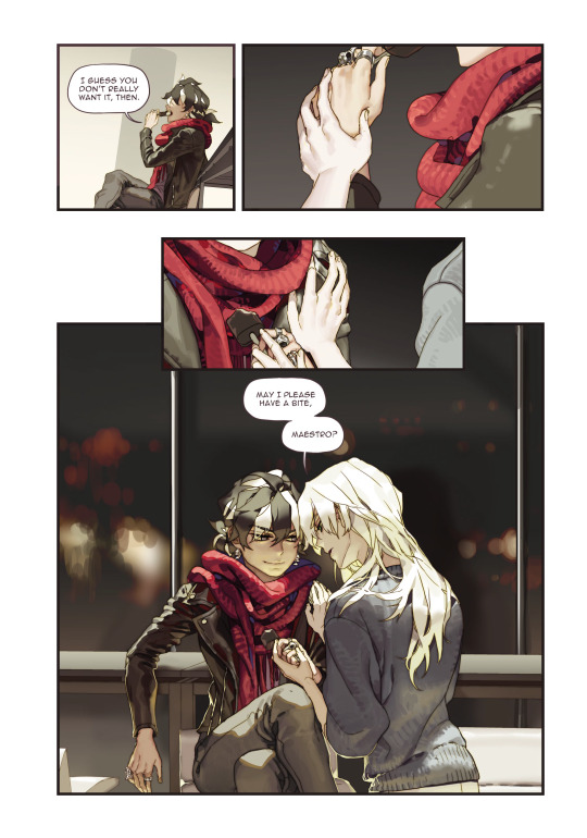
Blackbird, on her part, is completely insane. She continuously pulls of wild antics like jumping on Veloce to surprise her or singing an especially threatening song after a glorious battle over lunch. However, she is perfectly capable of showing her love and admiration for Veloce in her own cheeky way. However, true to form, each softer or more personal moment between the two is often immediately and perfectly juxtaposed with comedy, with the apparent exception of the book's touching and thoughtful finale. Veloce and Blackbird will both more than please readers individually, but you will fall in love with them as a couple. I must have read this at least a few dozen times between the webtoon and the book, and I am just as enchanted as ever by their loud and unapologetic love.
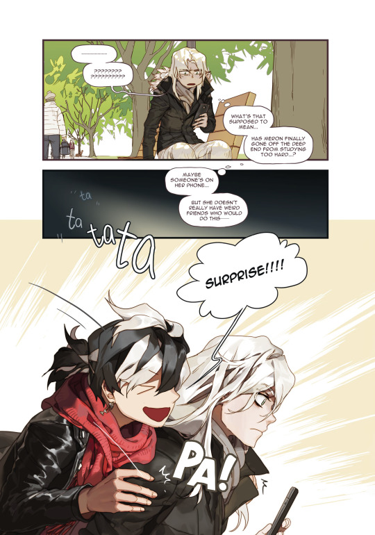
The ordinary misadventures of Blackbird and Veloce are accompanied by genuinely astounding artwork. No, that statement does not do Shilin's illustrations justice. Veloce and Blackbird lead from the page thanks to stunning, full-color illustrations that detail every moment of hilarity. Every movement from the slightest smirk to the over-the-top dramatizations of regular events thoughtfully and beautifully sprawl across the pages and invite you to stare for hours. Shilin is the only person possible who could make something as simple as someone softly singing Happy Birthday so epic and sultry. Speaking of which, my goddess of Yuri is this work titillating. No, there are no gratuitous scenes, but just the characters leaning over each other or touching the other's chin makes my hands shake. My only small complaint is that some early chapters show their age slightly with noticeably lower quality linework and flatter colors than the dazzling and dynamic work demonstrated towards the end. Still, even on its worst day, Amongst Us looks better than most of its peers and the entirety of its many inferiors.
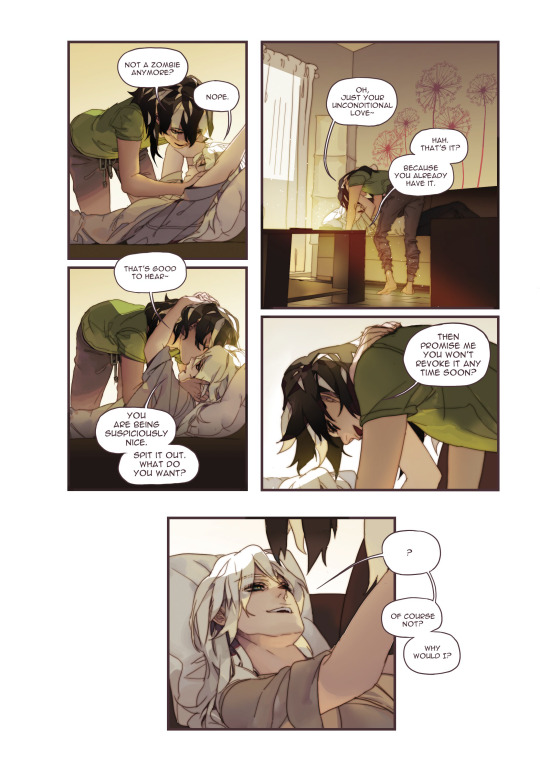
Amongst Us is nearly the perfect work. It has a uniquely compelling and mirth-inducing way of displaying a young yet very unordinary couple's everyday life. Its characters, from design to personality, are instantly memorable and striking. Despite being ready to rip each other's heads off at the drop of a hat, or rather because of it, Blackbird and Veloce feel the perfect and natural couple we so rarely witness. Shilin's masterful combination of comedy, subtle romance, and incredible sensuality is astounding. This book is worth it for the outstanding and vibrant artwork alone, but its combination with excellent writing create a sonorous and majestic modern romance unlike any other. I believe that Shilin has created something genuinely special here, and I can confidently say that out of the hundreds of webcomics I have read, this one is the pinnacle of its kind and my absolute favorite.
You can purchase Amongst Us book 1: Soulmates exclusively on Shilin's online shop and read the webcomic now for free on Twitter, Webtoon and Tumblr @okolnir.
Ratings: Story – 9 Characters – 10 Art – 10 LGBTQ – 8 Sexual Content – 5 Final – 10
#yuri#reviews#lgbt#lgbtq#lgbtq+#queer#gay#anime#manga#amongst us#shilin#lesbian#gl#wlw#girls love#comics#comic#webtoon#webcomic#cute#funny#lol
269 notes
·
View notes
Note
Tbh I sometimes feel RWBY would definitely benefit more from... explaining its power system, and have characters explain what they're doing. The only one we've gotten in eight seasons was Penny about Ruby's semblance in V8C3. Closest past that was the training montage in V7, which basically amounted to "I dunno, works for me".
Also on the topic of semblance evolution; what do you think about the idea of Yang's hair and eyes glowing blue as an evolution? It seems to be a popular idea.
Oh, hard agree. I know it's a common complaint leveled at critics nowadays, this idea that the show needn't hold your hand, but there's a rather significant difference between treating the audience as incapable of critical thought and/or bogging the story down with an unnecessary amount of exposition... and simply refusing to clarify crucial world building points. RWBY is well into the latter. There's a reason why schools are such a popular setting for magic/sci-fi stories — it allows the author to impart knowledge to the audience under the guise of the characters receiving the same information via education. There's a reason why so many magic/sci-fi stories feature a prominent, ignorant character — it allows the author to impart that knowledge with the implication that of course everyone in-world knows this already... just not this one person for specific, established reasons. Isn't it convenient that by explaining things to them we, the audience, learn them too? And there's a reason why RWBY features both these tools: Beacon and Jaune. So it's not that our authors don't understand how to have characters explain what's happening in a believable way — Oobleck gives a lecture on Faunus history, Pyrrha info dumps about aura, etc. — but that they themselves are now unclear about how their world functions. How exactly do semblances and aura work? I don't think RT knows anymore, which is why aspects keep changing, are couched in rumor, additions are accepted without question, or questions are ignored entirely. How does the Staff work? I don't think they knew until this volume, which is why we ended up with an explanation minutes before the characters used it — and why the explanation of how Ambrosius functions vs. what Ambrosius actually does on screen is so out of synch. Yeah, the characters should absolutely explain what is going on, like they used to in the early volumes, but that first requires that the writers make those decisions and stick to them.
And I hadn't heard that idea about Yang before! I'm... on the fence? On the one hand, I like the idea of her literally getting hotter like the blue in a flame, as well as the fact that it would visually connect her with Tai. I mean yeah, they already look similar given their hair color and outfits, but it would be cool for a powered-up Yang to have eyes the color of her mom's and hair the color of her dad's eyes. On the other hand, still thinking aesthetically, that would really mess with her already dwindling color scheme. Not that anyone but Ruby is really adhering to their primary color anymore, but blue is still pretty out there for Yang (it would thrill the freezerburn fans though lol). It would also be a pretty out there semblance change for an already strange semblance. Yeah, yeah, Ruby literally turns into rose petals, but at least they're still red. Blue hair on Yang would be kinda jarring imo and, ngl, but my immediate thought was, "Oh, so she's really just a Super Saiyan then. Lighten the blue enough and it'll look like Ultra Instinct..." I know there's been talk recently about when RT's interest in anime homages turns into outright copying, so I guess it would just depend on whether it feels like RWBY has made the idea their own and, frankly, whether it looked good. Blue hair could look awesome. It could also look incredibly stupid. Get a decent design going and that's something that can easily fall under our Rule of Cool. Ren sees pretty colors in a B&W landscape in Volume 8 and Yang's hair goes blue in Volume 9. Sure, why not lol
21 notes
·
View notes
Text
What’s wrong with Quackerjack in DT17 in my opinion.
I don’t make a secret about it how much I dislike the DT17 style and hey, it’s okay if you disagree and the majority likes it. It’s a preference after all.
But I already saw how fans got attacked by other fans for simply not liking DT17. This is childish and pathetic behavior...I won’t accept that. Be better than that.
Now for all those who are curious why I think so, let me pin it down a bit.
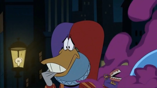
When my bestie showed me the newest screens of the appearance of the F4 I didn’t know what to think first. Now after I literally stared at the one with Quackerjack long enough I think can explain what on that style..on him... bothers me so damn much.
I totally understand how all the fans are hyped and trust me, I would love to join that hype...DWD get’s some love after all those years and this is great....but I simply can’t. I look at the show...I look at screencaps... and I only can find mistakes after mistakes which not only bothers me but make me very sad and hurt my lil’ fan-heart. :(
Just look at this:
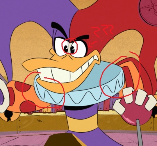
I circled the main things which I can’t wrap my head around.
Why did they not fill in the fool’s cap between his eyes?
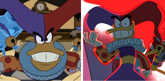
It’s clearly something the changed on his design since the white gap is visible in every sneak-peak of him. But that’s not how his -or any other fool’s cap which covers the eyes- work...
Also what is going on with the edgy emo eyeliner? I thought we left this behind in the 00s? And eyebrows OVER the fool’s cap?
And do the animators actually know how a ruff works? It looks like Quackerjack has some kind of plate around his neck and not something out of fabric.
Look at the difference in the DWD cartoon:
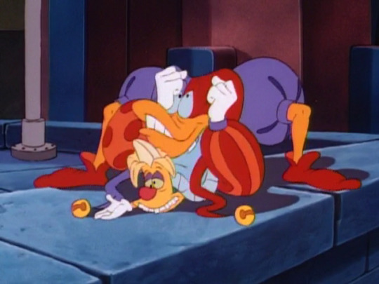
That thing is made out of fabric and MOVES with the shoulders. Depending on the fabric it moves more or less, but it would never behave like a plate!
Back then they sure made their homework about such details. Those details make cartoons lively in the first place. That’s why I think DT17 looks overall very stiff. And that everything is so angular sadly doesn’t help with it.
And speaking about details...why are the folds in his pants missing in the first place? That’s also not how his pants work.

Also that pose in the robot (Why does it even look like him? His robots ALWAYS were toy inspired. He is not that narcistic!) is so bad I‘m not even sure how to redline this mess. I tried..I really tried but...I can’t! How does Quackerjack need to break his arms or dislocate his shoulders to make that work? It seems a part of his upper right arm is even missing!? Where is his elbow...where is the rest of his upper arm? And since the ruff behaves like a massive plate and Quackerjack’s left arm is coming from behind..it looks like his arm is way much longer than the right one and seems to grow out of his back!? @_@
And while I wrote this I noticed the screenshot of his first cameo isn’t that better. What are those arms? Why does he have the stature of Bernd das Brot?

Also why is his (and of the other F4 members) design in the art style so inconsistent? The most notable change is the beak. You can see without a second glance it got changed. I can’t even say it changed for the better or got worse since I overall think the beaks are drawn ugly in DT17.
I mean, changes can be good and sometimes are needed but usually you create a character sheet long before the cartoon is even created and then all animators stick to it. I just can wonder how consistent it will be between the scenes if the special comes out.
I can’t even really compare it to the old cartoon since back in the days a lot more studios were needed to draw and animate a cartoon. So don’t get me wrong. I’m totally aware that stuff like this happened back then:
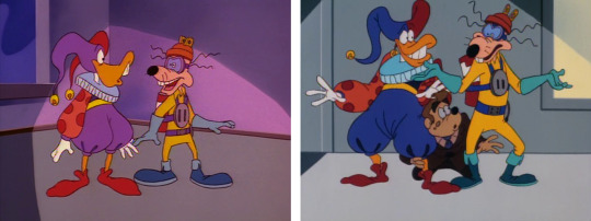
Same characters, different episodes but same studio.
Yes, even the same studio couldn’t be consistent between the episodes, but they managed to somewhat be it in the episode itself.
So why does this bother me with DT17 so much, when even back then they couldn’t get their shit together and be consistent? Easy..it’s because back then everything was drawn and animated by hand. It was a lot more effort. Back then they couldn’t just use paste and copy. There was no eyedropper tool to get the right color quickly. There were no programs who can break down a model to seperate their parts so you can animate their limbs easily. There were no programs for simulating facial animation or lip-syncing. Everything was much more complicated. I don’t say animation became easier but it became different. That’s why it’s hard to compare old cartoons with new ones in some aspects.
But since cartoons nowadays are most solely made on computers...why are color mistakes still happening?
I want to believe this is a ref to the purple hand recolor mistake Quackerjack also had in the original next to several others because that would be hilarious. But seeing stuff like this
destroys that belief.
One would assume that such mistakes get reduced with all that modern computer programs, but it doesn’t seem so. Tbh color mistakes and wrong layering is something which I can forgive easily, but not breaking a characters whole anatomy and change his overall appareance to such a degree you just can wonder how this is supposed to be the same character. I look at DT17 Quackerjack and see Quackerjack but also do not see Quackerjack at the same time. It’s like my brain full on goes “this is Quackerjack...wait no...this is more a manic Quackerjack imposter with dwarfism but not the real deal.” and this each single time I look at him. The way he is shown to be portrayed actually makes it worse.
@raeloganthesonic06fangirl jokingly made a post how he got his spine finally fixed, but isn’t that terrible posture one detail why we loved that dork in the first place? :(
Also his facial expression. He already had a major character shift once.
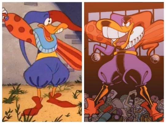
...sure there were reasons but the comics were another can of worms I won’t open in this post here now. And pls don’t get me started on how ridiculous it is how Silvani draws his beak.
I just can hope DT17 will at least get his character right but...
This

looks more like

than
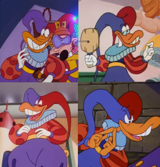
😟
#darkwing duck#ducktales 2017#quackerjack#dt17#this post took me too many days to finish because of my broken wrist -.-
81 notes
·
View notes
Text
We are getting really close to the scene in lost fragment of snow that was genuinely confusing in the book, and it's the scene were everyone in the circus is killed. I think what we will probably get is a scene were mana finally ends up giving into despair after he is hit and then allen is fed to a lion.
I think that with more current info, i can say for sure that sleeve earl and mana are a hybird. This will likely cause a resurgence of sleeve earl into taking over the body and becoming whole. This only lasts for a short time however and when cross confronts him after the rest of the circus has died from the audience turning into akuma(which i suppose are implied to be constantly just around the earl and is probably one of the many reasons cross warned Allen to stay away) some exchange of words or damage causes a lots of control. This damage however also hurts mana(or potentially just being forced out off control) causing him to loose even more memories as seen when mana and Allen reunite the next day.
Now i think we can agree that sleeve earl exists as a third entity, especially since her recent art exhibit interview, as she talked about the suit being a super sophisticated golem. I think in this case as with tim and lero yhat "golem" refers to AI. Id argue with the weird phrasing like helix of life and all the biotech style that magic is more often than not just more advanced technology, and wherever the noahs came from likely was, hence why they say they only seem strong because we have become so weak. This is only further shown with innocences resemblance to machines like its gear like parts and percentage resonance.
The noah memories in general i think are some kind of AI that passes through generation lines, carrying significant portions of its past forward and then fusing with a similar person in their lineage. For example early on road would have been just road, then through some means either became an AI(or was given a piece of someone that counts as one under golem, its unclear). Regardless once connected to the noah memory, it acts like a save file and becomes more sophisticated with time. It carries each life and gives all those memories, feelings and drives to a new body. So new road would remember being road, her life and everything, but also the life they had been living up until the two combined. Over time the noah memory keeps getting larger and larger to the point new experiences are so small, relatively speaking, that it overrides much more than normal. Since they are fuzed as one being they likely cant be separated without mutually assured destruction, were the current entity will die and any remains will not be the origionals, if anything remains at all. An example of this is that tyki could not be made human by Allen I their fight i the arc, despite having a blade that should destroy only part of him. Admittedly tyki is a special case though, and more tyki backstory is needed.
Changes from body to body become more subtle, but the base, which likely has a distinct core function as seen by its response to certain tasks and ideas, remains a strong aspect. This creates an almost reincarnation like effect for them, needing to only find a new body to continue.
The suit is like this, but different. I don't know how the original earl split, but i do think that some aspect of him was placed on the suit. I would like to say its the original version of the noah memories of the earl and nea got like a brand new copy, but i actually have no idea what memories he has of being past earl so its mostly a guess. Regardless the noah actually all seem to transform in some way when they get mega pissed. Im looking at you skinn, jasdevi, and tyki/joyd. So the suit is likely that kind of thing, but way more distinct and capable of acting autonomously. Since they all have different forms it makes sense that his would also be unique. They all probably represent some inner desire related to their memory. Skinn is just rage so big angry man works fine. Jasdero and devit are bonds so they want most to be one. Tyki got all fucked up before he changed so i got nothing, but it had a heavy does of sadism, which I guess is pleasure? Taking into account that killing in horrible graphic ways is his guilty pleasure it kinda makes sense.
So because of that, this sentient AI is constantly trying to pair with half a fucking brain because nea and mana only share one brain cell. Some kind of resistance from mana or strain causes him to constantly fall ill or comatose. Now to be clear on naming, sleeve earl does not refer to themselves as adam in the mirror scene nor does he refer to mana as adam, and only uses "we" when talking to mana about being the earl. Oddly enough the earls self pronouns are we, using wagashi which is kind of like the japanese equivalent of the royal we used in europe for the entirety of the series. For the record, mana in the flashbacks uses male or single they pronouns, i don't remember if he uses boku or watashi, but he uses at least one if not both.
So from this it seems millennium earl is a title, used by whatever is paired with the suit. Adam is the original name of the noah, and is the preferred name of the current earl aside from the title.
This circumstance was likely caused by the rest of the noah, who are using the earl for something related by the pillar. His separation either by accident or by intent was likely by the hands of his family trying to keep control for their ends. This is why the current earl is called a broken puppet and has so many things around him related to acting and stage plays. He is playing a role, the red clown to allens white clown as stated in the ark arc. He even wears a mask. His memories and mind have been damaged though, therefore broken. However broken puppet for both allen and the earl could also refer to a puppet that doesnt work as a double meaning, implying they can no longer be controlled or puppeted.
It is also implied that he is still unaware of this betrayal, but it is likely nea does to some degree as it would explain why he became a traitor and killed his own family. To be clear, i dont think all of the noah know everything, and i dont think they dont actually care for the earl. It seems they still genuinely follow him to their death and see him as one of their own, especially in cases like road, tyki and wisely.
Now early i said that different generations of noah would cope woth reincarnating differently. Since the earl only died once before 7000 years ago, id say resetting to a new body with only 17 years would be just smashed flat by any algorithm with that much data. However manas feelings are still the newest, and so still have an impact even on the current earl.
Now we come to resurrecting mana. How? Why? Well i dont know. But my guess is whatever part was the memories of mana for the 20 or so years he lived, or at least his memories at death, are in allen. His curse and weird hallucinations of mana seem to suggest it. Alternatively that part of his soul may have passed on, or it fuzed with the noah memory making the origional mana part of the hive and much like tyki and his noah memories cannot be seperated. Not good regardless.
As two additional things, i want to mention that hoshino is a twin and has always been obsessed with it, so having twins in her book was inevitable. What is extra weird is hoshino was actually going to be a triplet, but either her or her sister absorbed it before birth. She has mentioned it in dgm interviews and i cant PROVE it translates to anything in the plot but its suspicious. She also still list mana, nea and the earl as distinct in every book up to date in extra novels and at the start of her books. Oh and her favorite hat for the earl right now? The one featured on the most recent chapter? Has two faces on the front that are visible, and one in the back thats hidden, and the most recent art has the back face as the only one visible, angrily staring allen down. Great art foreshadowing if im right. Its also usually sleeve earl, if not exclusively, that wear it.
The second thing is mana talking about love and drive in the most recent chapter just brings up the earl having the noah memory of love or devotion or something for me. Ive written about it before but it just seems to fit. This character is all about that from the ability to fuze loved ones together to the hearts he talks with and his drives being based on grand acts of devotion, being by their side etc. Mana also loved and adopted both and dog and a homeless child and keeps talking about how the world is so beautiful despite all the bad. The earl literally acts like the whole noah clans mom by his own words and cooks for them, and both of them go out of their way to be cartoony to break tension. The earl literally goes and buys a single red rose from a poor girl while tyki pontificate on how he doesnt act like a villain. He doesnt take an umbrella because he wants to feel the rain. He talks about how what he does is in human nature and requires a connection between two people. He is even designed with his ideal colors as red and purple with white, as well as being designed after flowers. I know this probably doesnt make sense, but its stuck in my head.
47 notes
·
View notes
Text
Happy Halloween Scooby Doo! Review
Muahahhhahahhahahaha! Thanks to the Walmart tradition of stocking movies for sale weeks before the intended release date, I have myself a copy of what claims to be Scooby Doo’s FIRST Halloween adventure!
…in spite of movies like Witch’s Ghost and Goblin King, holiday specials like WNSD’s A Scooby Doo Halloween (which had a haunted Scarecrow too…), BCSD’s EL Bandito (for Dia de los Muertos - obvs not the same, but most companies act like it) and Halloween, The NSDM’s Halloween Hassle at Dracula’s Castle, and the DTV short film Scooby Doo and the Spooky Scarecrow (which, ironically enough, did NOT take the opportunity to feature Dr. Jonathan Crane).
So let us take a look now at Happy Halloween Scooby Doo! and see whether this film will be a graveyard smash of a treat, or a black licorice bomb of disappointment.
Full review (and SPOILERS TO GO WITH IT) are below the cut in my new review format; if all goes smoothly, I’ll go with this for future Scooby films.
WARNING: This review is very long.
One minor note before we begin: the Special Features actually include BCSD’s Halloween, WNSD’s A Scooby Doo Halloween, and PNSD’s Ghost Who’s Coming to Dinner
...so they were AWARE this was not the first Halloween adventure of the Scooby gang, and yet still use that tag line. Hm.
Still, kudos for including them - this’ll help boost the reasons to keep this movie, if it turns out to be a real Milk Dud of a movie *ba-dum tish* :D
-----------
The movie starts off rather abruptly, actually - no slow pan over the setting, just WB Animation credit and BOOM, we’ve cut to a Halloween parade and Elvira is talking.
I’m of a mixed opinion including Elvira on top of having Bill Nye and a Batman Rogue - while she most certainly fits the Scooby aesthetic, it doesn’t feel as grand an impact after her weird little cameo in Return to Zombie Island (ugh) and I’m not sure how well the movie will balance her in wait a minute
wait just a
WAIT A MINUTE
Did - did that parade float skeleton just sing Crystal Cove as the town’s name?
oh no.
Oh No.
....also their song is terrible and they should feel terrible.
-------
Fred: We got him! Banh Mi Shop, second floor!
me: the heck is a Banh Mi Shop? *mild googling noises*
So I guess Jonathan Crane really had a craving for a Vietnamese sandwich before he enacted his Halloween scheme.
...you think he’s a lemongrass chicken type of guy or a BBQ pork guy? It’s always hard to guess at these things, esp when coffee and pumpkin spice aren’t on the table (as per fanon, of course)
-----
Velma: We have a flawless track record!
So I guess WB is just gonna ignore the past few DTV retcons established in 13 Ghosts and Return to Zombie Island?
I mean that rather defeats the purpose of them existing at all, but fcuk YEAH I can get behind throwing that retcon garbage out of canon!
And STAY OUT!!
------
Shaggy, talking about ghosts being real: I’m like the boy who cried wolf - I keep warning you but like, you won’t believe me until I finally get eaten!
Yet again, Warner Bros makes a wolf reference to Shaggy. Yet again, I am torn asunder between wanting werewolf!Shaggy in a new Scooby property, and fearing for the appearance of werewolf!Shaggy in a new Scooby property.
-------
Velma: Point is, being afraid is a waste of time!
Scarecrow, LITERALLY EXPLODING THROUGH A BRICK WALL three buildings away:
------
He’s floating through the air and t-posing to assert his dominance 🤣🤣🤣
Gods bless animation 😁
------
Daphne @ Shag and Scoob locking themselves in the van: Are you serial?
Me: wait, SERIAL? *re-reads captions* yup, that says “serial”.
Is this an editing mistake? I don’t think that works here…unless that’s supposed to be a joke on how they always do this. But then why would that be an irritating surprise, they literally do this EVERY episode 🙄
-------
Oh hey, Red Herring’s Party Screams truck has Red Herring running out of it
Could this be a hint to how the story goes? The villain appearing on a literal Red Herring?
Naaaaaah, WB’s not THAT smart
-------
So if we take @captainbaddecisions crack theory on Jonathan Crane being Shaggy’s uncle seriously, does this mean that Jonathan is using magic to fly, float fear toxin orbs around himself, and making things explode, a la the family trait of Crack Theory A?
Logically he’s probs using wires or magnets or some shit, but it’s a fun thought to entertain 😁
------
Welp, we finally get the opening credits! … with Jonathan Crane smashing through the Mystery Machine’s windshield, set to a slow poppy song straight from the 60s, and spewing the title of the film out in glittery pink mist.
All the while Scooby and Shaggy throw candy at each other, deliberately obtuse to the cloud of fear toxin enveloping their friends and the townsfolk, the steady destruction of the Mystery Machine they’re laying in as multiple cars crash into it and send it spiraling, and the general mayhem and destruction that Scarecrow is causing
Never change, guys, never change
--------
I just choked on my lemonade
There’s an article plastered to the roof of the Mystery Machine titled “Talking Dog Confounds, Ignites Ethics Debate Over Dog Labor”
ahahahahaha
-------
Annnnnnnnd there goes the Mystery Machine, tumbling in the air and over the roads with Shaggy and Scooby still inside without seat belts. Will they perish in this horrible road accident? Will Death finally come to claim them at last?
Of course not. This is Shaggy and Scooby we’re talking about - I’m almost positive they can survive anything up to and including a nuclear bomb. This is child’s play to them.
-------
So they “capture” Scarecrow… by pinning his cape to a tree with crossbow bolts.
And they do not try to at least tie up his arms or his hands in ANY capacity.
JUST the cape.
...you know, Velma, for a team with a “flawless” track record, you guys are making a hecking TON of mistakes in facing against one of Batman’s ROGUES GALLERY, ESPECIALLY with no Batman in sight, good freakin’ grief. 😩
------
Yaaaaaaaaas, this Scarecrow design is LUSH
He’s got the lank, the height, the BTAS costume colors, the elongated face with beaky nose and pointed chin and angular cheekbones, the eyebags like Gucci, the furrowed brow… honestly the only thing missing is the more reddish color hair, and even that isn’t mandatory. I love 😍
Not to mention the HOT DAYUM voice he has - low and velvet rough and so godsdamned particular in a way that could either tie in to obscuring a southern accent as in fanon or just as a stringent academic, oh my yes. He’s voiced by someone called Dwight Schultz, who’s most well known for playing Captain ‘Howling Mad’ Murdock in the OG A-Team show, and someone called Reginald Barclay in Star Trek TNG and Voyager, if any of y’all know that character in particular.
And of course, the first line he says is a delightfully wry “Oh, but I AM getting away with it,” with the sort of smirk that absolutely lends credence to why he’s a threat to Batman, and not some simpering wimp that can be defeated with some crossbow bolts in a tree.
I think I’m going to enjoy this movie at least somewhat, so long as we get to see him 🥰🥰🥰
(tho on a side note: Daphne why on EARTH are you trying to film Crane saying the meddling kids line? Do you have a video compilation of past villains who’ve done that, and you hope to add his to it? Was your phone damaged when you went up against the Riddler a few DTVs ago and you want a second shot at recording a Gotham Rogue saying it? Bc I don’t think a Gotham Rogue would be too pleased with seeing himself as a Mystery Meme on the Youtubes, you get what I’m saying?)
-------
Okay, so the floating orb things are explained away as fear toxin bomb drones somehow… despite looking nothing like the other drones and being much smaller with no visible propulsion, while also flying unassisted through and around objects to explode against places once flung…
(tho interesting note, none of them are aimed directly at the crowds, just behind them - odd, that)
But how did he heckin’ FLY at the beginning?
Yeah, they show him wearing wrist-mounted grappling hooks at the end of the intro song sequence, but they are NOWHERE IN SIGHT at the beginning - and I do mean in sight, since he emerges against a backdrop of flames. There was nothing there (see the T-pose above for further evidence), and nothing there when he FLEW THROUGH THE MYSTERY MACHINE’S WINDSHIELD AND FLEW BACK OUT AGAIN. And these things are pale silver, which stands out like crazy against the darker backgrounds, so no hand-wavy ‘they were always being used’ bullcrap we’ve seen in other movies.
Hmmm *scribbles in notepad* note to self, add notation concerning Crack Theory A on magic!Shaggy to “Uncle Crane” theory files - evidence denotes that Crane is able to fly (or at least hover in mid-air unassisted) for terrorization purposes. May boost strength of CTA by family association, lending credence to magic inheritance along the bloodline...
------
“Avocado Toast Generation”? Crane, I honestly don’t know if you really mean that, or if you understand just how much that phrase gets under any Millennial/Gen Z kid’s skin. Having seen multiple variations of your character, it really could swing either way (tho kudos on the dead switch idea - very nice 👍🏻)
Although this does lead to an interesting stand-off: Fred, upon seeing the town threatened with 3 days worth of fear toxin, immediately moves to let Crane go, while Velma stops him and refuses to consider compromising if it means Crane escapes. They both look legitimately frustrated at the other for taking the stance they do.
Fascinating~
------
Hmmm
Crane honey, I don’t know if your drones are made of flash paper and hope, or if Scooby and Shaggy are using the reeeeeeeeaaaaaaaaally old candy (the stuff made about ~3 years ago most neighborhoods give out to the teenagers that knock around midnight on Halloween) to shoot them down, but either way you may wish to speak with the manufacturer about this
Then again, this IS Shaggy and Scooby - they probably could’ve spat marshmallows at the drones and brought them down with equal success and explosions
(and good on them for shooting those down! Atta boy 👍🏻)
-------
Aw dang it
1. They still have Crane captured and now in handcuffs (despite having… you know… NOT been bound by anything except cross bolts in his curtain cape thing)
2. Dwight Schultz has decided to pitch his voice higher and more nasally than what he has. Hopefully this is more of an incredulous sort of pitch than something that sticks for the rest of the movie, ugh.
Also, I think they’re framing the movie to be more Velma-centric this time around - she’s the one explaining to Crane how they tracked him down, apparently through a piece of fan mail he sent Elvira (is that the only reason she’s there? Also why was Velma examining random pieces of fan mail for toxins, Elvira probs gets hundreds a week irl) and it looks like they’re framing something up on how fear isn’t something you can pretend isn’t there. neat!
------
whajit
53rd?
53rd?!?!
ONLY 53rd?!?!?!?!
Boooo, Scarecrow’s WAY more popular than that! I call foul
---
Okay why is Daphne’s schtick so far to spit laaaaaaame slang after every sentence Velma says
I would rather this not be her schtick
Actually could she go back to filming mystery stuff, bc at least I can pretend it’ll build into the OG Zombie Island Daphne
----
Phew, his voice has returned to its low, raspy goodness
also, Crane needs to learn about personal space, good grief
(interesting clue brought up tho - Crane only steals tech that CAN’T leak his toxin, ergo it can’t be tracked until he releases it. Sensible use, given that Batman probs tracks it if it does.)
----
Velma: I’m not afraid of you, Crane. Fear is an illogical reaction to an imagined threat.
Crane:

-----
Crane: Fearless, then. Intelligent. Proud and stubborn. You remind me very much of the one person in this world I care about.
uhhhhhh
Yourself? Harley? Edward Nygma? Ichabod the raven? Idk, I’m honestly curious as to where this thread will go 🤔🤔🤔
-----
Fred, leaning against the Mystery Machine: Guys, it’s gonna be okay. She told me!
O_o
Fred? Honey? Are you sure you weren’t supposed to join Crane in the transport vehicle back to Arkham?
----
OH SWEET JESUS SHAGGY GREW YAOI HANDS
WHAT THE HECK
THAT’S WAY MORE UNNERVING THEN YOU GUYS NOT BEING AFRAID ANYMORE
(although the fact that they’re both unsettled by NOT constantly shaking or having their heart racing is honestly kind of heartbreaking. Y’all need therapy, good grief)
----
Shaggy and Scooby just chewed up candy (wrapper and all) to make themselves a Halloween costume of… what looks like barfed-up candy (ew)
Before then proceeding to dance so well that everyone around them also starts dancing in a 60s-70s era rainbow light show and giving them candy
I worry for these two sometimes - that kind of power seems to be getting to their head 😬😬😬
---
Oh hey, acid green toxic waste is spilling from an 18-wheeler onto the Fear Toxin drones and emitting a purple pink haze that envelops a pumpkin patch! That won’t do anything suspicious at all I bet!
(wait is Poison Ivy going to come into this at some point)
(also major kudos to the music here - very 80s horror synth, I like)
----
So the Pumpkins have grown faces, limbs, consciousness, the ability to fly and a lust for human flesh
And they appear to be led by the Pumpkin King of the Pumpkin Patch mentioned in the Charlie Brown Halloween special
He’s not as friendly as I pictured him being, sadly 😕
---
Why is this random ass cop coming up to FD&V to say that they’re in over their heads… AFTER the mystery’s been solved?
Like dude, you’re only making yourself suspicious at this point, go home
----
Huh, interesting - the gang are being interviewed for a tv news network while they’re considered the town heroes
Why am I getting bad vibes from this…
Eh, it’s probably nothing
----
Velma: {Shaggy and Scooby} are, um… REALLY into the Halloween spirit.
Shaggy: THIS ISN’T COSPLAY, VELMA!
I’m dying 😂
------
Holy Shit
Velma just snapped and went off on Shaggy and Scooby for acting scared and doing nothing to help wrap up the mystery
(even though these guys are the ONLY reason that the gang didn’t have to choose between setting Scarecrow free and poisoning the entire town for 3 days straight, but hey, what do I know - I’m just writing an in-depth reaction post to this movie and taking note of details like this, clearly I know nothing *eye roll*)
Last time I saw Velma critique the guys’ usual mystery solving shenanigans, it was much more low-key and without knowing they were nearby
But I’m sure that’s just a coincidence
------
What the
Bills?
Bills?!?!
Fred just mentioned that fixing the Mystery Machine was going to leave a hefty bill and that they may need to get dishwashing jobs to earn money
Which is more of a job you might expect a high schooler to get on the go and yet
They actually have to pay bills
How old are they here??!
------
wait a tic
THIS is how they introduce Bill Nye?
He just calls up Velma with no explanation other than Velma saying “Oh hey, it’s Bill Nye!”
I just - what?!?!
How do you know him so well that he can just pull up your number and call you, and then geT YOU A NEW FREAKING CAR LIKE
WHAT?!?!?!?
Was there a Scooby episode with him in the past two years where the fcuk did this come from
------
Also the car is dressed like Bill Nye
And he can talk to the gang directly as the car
So that he can solve mysteries with them whenever he wants
This… this was not what I was expecting to come about from the Bill Nye cameo
(alas, poor predictions of being Crane’s roommate, you will not come to pass this day) 😔
-------
Ooooo, purple haze throbbing on the horizon! That’s always a good sign of things to come! 😀
------
And now Daphne’s… asking Elvira to mentor her fashion wise. And Elvira’s taking her on as her unpaid intern/personal assistant.
Yooo, movie, can you pick a direction and stick with it for Daphne? You’ve gone from her spewing outdated slang to wanting a costume for trick-or-treating, and now this.
-------
Welp, now I can say I saw a giant pumpkin dog vore an old woman
I didn’t WANT to see that mind, but I guess I can say it now 😐
------
OH SHIT NO
IT TURNED HER INTO A FLYING PUMPKIN SHAPED LIKE HER FACE
ABSOLUTELY UNSETTLING, 0/10 WOULD NOT RECOMMEND
-------
At least we get a nice scene of Daphne kicking the pumpkins’ collective butt
Something normal
------
Elvira: WOW! You’re a regular Mary Sue!
*falls over cackling*
------
And now there’s a giant purple fissure opening up in the concrete to swallow the town of Crystal Cove whole
(good, i whisper softly into the darkness of my living room. Let it fall)
--------
Man, I feel so bad for this single father right now
He’s gotten wrapped up in all of this nonsense with his daughter, and he is just Distraught at being chased by Jackal Lanterns, having the town collapsing under his feet, and having to gorge jump in his sedan to get away from the worst of it
It’s okay, Mike Dad - we would feel the same way in your shoes
-------
Hologram Bill Nye is wearing Cat ears and cat whiskers/nose, and is cleaning his hands like a cat cleans its paws
Why was this the movie we found out Bill Nye was a furry
Why Warner Bros
Why would you inflict this upon us in a Scooby Doo-Scarecrow mystery
-------
Hey, can Jonathan Crane return now? The movie needs its dignity back.
------
A clue on the whys here - the town was built on top of a MASSIVE lithium deposit, with the talks to mine it being scrapped due to environmental concerns. That’s actually a decent lead in for why some
-------
Welp
The Jackal Lanterns just went full Mad Max with the Halloween Parade floats and cars
No, I don’t have any idea why either, just roll with it
-------
Nice, they confirmed that Fred’s full name is still Frederick Herman Jones XD
Also a great little action sequence with Daphne - while there’s not much movement, they frame the scene dynamically, with some good quick wordplay. Very nice.
--------
Velma has a mind palace
Aight
--------
Velma: Shaggy, I could kiss you!
Oh, to hear this as a child, when I still hardcore shipped Shelma *sigh*
------
Oh thank gods we’re going back to Scarecrow again
------
Shaggy ate some Scooby Snacks, leapt out of a moving vehicle, and onto the backs of two flying pumpkins that he promptly reined in to fly to Crane’s prison transport
...yet again, I am amazed at the sentences I am led to type for Scooby Doo DTVs
------
Ah, how very Hannibal Lector of you, Jon
Man, he actually looks very meek in normal clothes - red long-sleeved shirt and grey slacks
-----
Hmmm
So Crane ISN’T behind the Jackal Lanterns - in fact he’s outright befuddled by them. This means his whole spiel to Velma earlier about both of them being caught in the same trap was… metaphorical? The breakdown doesn’t actually go into WHY he thinks they’re in the same trap - Crane’s whole schtick is tied to accepting fear, not denying it, so why would they be the same?
Either way, someone is using both him and Mystery Inc to do something to Crystal Cove (please be Red Herring, please be Red Herring, please be Red Herring)
Actually, that reference at the beginning really WAS a red herring - they framed it as being Jon the whole time when it wasn’t. Kudos!
Additional kudos to having Jon be seen more out of mask than in - he is a looker, and I aim to look as much as I can ;)
-------
Annnnd Daphne’s now trying to convince Elvira to switch clothes with her
I don’t get it - how on earth did we get from Daphne trying to find a good costume for trick-or-treating to asking Elvira to switch oh there it is nevermind.
-----
There is literally a scene where a giant buzzsaw is slicing towards Crane
and he just
stares at it
going “huh, that’s different”
And I LOVE IT
------
And here we have another fascinating scene: Velma going to free Crane from his cell, as Daphne tells her to just leave him to die by pumpkin
I’m wondering if they meant to draw a parallel between the two here - Velma starts by reciting a nursery rhyme, then overcoming her fears in order to release madness to take control. It’s not done very cleanly - mainly bc we barely have any time with Crane in this movie - but I wonder if they meant to insinuate that Crane was like Velma once, where he refused to acknowledge he was afraid, which caused him to lose focus on his initial goals
Idk, ignore my ramblings
---
Crane, smirking: I’ll need my personal effects - extenuating circumstances.
Me, fanning myself: I’ll need you to remove yours first
(i am not even kidding, Crane is an absolute DILF in this movie and it flusters me. Stupid sexy animation)
---
YAAAAAAAAAAASSSSS
SCARECROW TO THE MOTHERFCUKING RESCUE BABY, SCYTHE AND FCUKING ALL!!!
WOOOOOOOOOOOOOO
----
FCUK YEAH THE GIFT THAT KEEPS ON GIVING
HE HAS A DANCE LIKE QUALITY WITH SOME OF HIS FIGHTING MOVES
VIOLENT DANCING BRINGS THE GIANT JACKAL LANTERN DOWN BABY
THEN HE BACKFLIPS AND GYMNASTIC SWINGS INTO THE VAN
ROCK IT SCARECROW FCUKING ROCK IT
(minor note here, but the subtitles show Dr. Crane instead of Scarecrow - unsure if that’s more that the movie calls him Dr Crane or if it indicates he’s acting more heroic than villainous)
---
GODDAMNIT
THE GIANT PUMPKIN SNUCK VINES INTO THE VAN AND STOLE HIM BACK
WHEN CRANE WAS... wearing a seatbelt before, but isn’t now.
...
BOOOOO
---
Yet again, we find a Scooby movie that attempts character development, but with Velma
Unlike Shaggy’s Showdown however, I’m mixed on how successful it is.
For starters, Velma hasn’t been this cocksure in other DTVs we’ve seen, so it’s a bit odd to see it now. While not 100% out of place - after all, the gang DID capture one of Batman’s Rogues Gallery on their own - it still feels a touch forced. Compare that to Shaggy’s Showdown, where Shaggy has ALWAYS been a coward (one that, in more recent years, writers have had willing to abandon his friends for safety), so the character development there feels more natural.
The progression of events with Velma actually work somewhat okay - but again, here’s where past DTVs come to bite them in the ass. The past handful have had the gang be wrong, have had them fail, or catch the wrong guy. This makes Velma’s attitude here at odds with the other films, something that sticks more due to a character that’s appeared in the past few films as a minor inconvenience - a Sheriff who keeps telling the gang not to interfere, they’re doing things wrong, etc. If this had been a character who was completely wrong in the past AND SHOWN TO BE WRONG FOR HIS OPINIONS, while the gang never guessed wrong, this would work much better. Unfortunately, it doesn’t, and here we are.
I think it would have flowed better if Velma’s cockiness came solely from catching Crane on their own. Have a random cop character or reporter or whatever (just not the recurring cop), insinuate that the gang is in too deep with Scarecrow, that he should be handled by the adults or professionals or whatever. Velma could bristle, overcompensate, and THEN fall from her pedestal like we see, reach out to the gang and commiserate over feeling scared, and grow. Again, it’s not too far to reach for, but they handle it poorly; as a result, the outcome feels a little more shoehorned in.
It’s an honest shame, bc we haven’t had a Velma centered story since Frankencreepy, and we all remember what a hideous fcuking mess THAT was *shudders*. Still, it somewhat gets its point across, I guess.
---
Fred why did you rip your shirt off
Actually better question why do you not have nipples
---
Awwwwwww
Velma just apologized to Shag and Scoob for snapping at them earlier, and admits how she doesn’t appreciate how much they make Mystery Inc what it is
Also she eats a Scooby Snack with them and admits they taste pretty good
----
Huh
Velma’s mind palace is the Mystery Machine driving through space
Also Shaggy and Scooby are able to telepathically follow her in and communicate with her
Literally, they actually followed her into her head telepathically, and show her their memories of things she hasn’t gotten to see tonight (while also possibly enhancing her ability to remember things, given how much DETAIL she captures perfectly of things that she would maybe have glimpsed in a millisecond AT MOST)
...another tally for Crack Theory A of magic! Shaggy and Scooby *scribbles*
-------
Fred, be very very thankful that there are no people operating those pumpkins in person cause uhhhh
Those traps would be spraying red instead of orange
------
Another weird music choice - the gang goes up to fight the Jackal Lanterns, but the music is the same 60s bubble we heard earlier
Not terribly atmospheric, really
(wouldn’t a Smashing Pumpkins cover of Scooby Doo be more appropriate, or did you guys spend all your money on hiring Elvira and Bill Nye?)
------
Dang
Velma just admitted her fears and jumped into the mouth of the Mega Pumpkin, before getting Fred to use the app from earlier to shut it down, revealing it to be a giant drone surrounded by smaller pumpkin drones
This feels… counterintuitive, but I’ll try to explain at the end
---
Okay
I’ll admit it
The Whodunnit is actually pretty decent in concept
There was a sprinkling of tidbits that could be assembled for the final conclusion and still make a decent amount of sense, all to find the sheriff doing it
Only he isn’t a sheriff
He’s a former Tech CEO who was also busted by the gang years ago in a case the Sheriff kept bringing up throughout the movie - due to his prison sentence, he lost more than half his wealth and the opportunity to expand it further with the Crystal Cove Lithium deposits
He was also someone who sold tech to Crane for his fear toxin distribution, where he got the idea to frame him for it
(tho on a side note, Crane is an absolute dork and a terrible liar - just look at the email he sent XD and that profile pic, my gods)
He deliberately picked at the gang for the past few DTVs (specifically 2: Return to Zombie Island and Curse of the 13th Ghost) to fracture their confidence, undermine them, etc - all so that in one fell swoop, he could retake his fortune, frighten everyone in town away from the mines so they couldn’t interfere, frighten away the gang (while also ruining their reputation as mystery solvers), and take Crane off the docket so he couldn’t identify the CEO when he pretended to be the sheriff
This… is actually a pretty damn good plan, for a Scooby villain. He was patient, manipulative, and clever, learning how best to tie up loose ends and win back what he lost. A clever revenge story that came so close to coming to fruition, and could have honestly been sold convincingly…
...if it hadn’t been done so much better in Scooby Doo 2: Monsters Unleashed.
Yeeeaaaah, this movie basically lifts the rough framework up from that one - past mystery villain comes back to attack the gang and ruin their reputation (tho this one decides to also make his fortune back and tie up loose ends with former criminal contacts, a la Crane). Gang is embarrassed in front of the news folk, another villain is framed for it (like Old Man Wickles of the Black Knight fame), and the gang must reconcile to foil the villain for good.
Although it also??? Merges elements of Frankencreepy in it?? The movie is focused on Velma, who is struggling to admit when she’s wrong (which ties into her fear, somehow… I’ll think on that point a little) and things purportedly go haywire when she won’t bend. This… isn’t illustrated as well here, since there’s very little direct cause-and-effect from Velma’s actions that would prove this point - that insisting her way is the right, best, and therefore only way to go ends up making things worse.
As much as I despised Frankencreepy (and I DESPISED IT), it did do that part well - showing that refusing to budge on something can lead to you hurting your friends (literally, in that one), and that admitting you were wrong and need help isn’t the end of the world.
(that movie also had former villains returning to gain vengeance upon the gang using psychological warfare, hm - may need to go over that one again, unfortunately).
It’s a shame, too - the basic elements for this plot are all here, they just need to be polished and reworked a bit to make a really fascinating movie.
------
Anyways, back to the asshat CEO who just… faked being a sheriff. Because white people can get away with that so long as they have the outfit and the car *throws up hands* (the sad part is this is probably something that actually happens)
As he drives away we see a familiar silhouette looming in the cornfields, watching him approach
Velma had Bill Nye on speaker, so he could record the entire confession for the federal officers nearby (who were taking Scarecrow back to Arkham), and track the phone signal to his exact location
And right as his holographic call cuts out, we see the shadow of a Scarecrow looming over him, causing him to scream.
When the feds arrive at his final location, both his body and the money have vanished. The car still sits, engine running, before the crows leering over him from the field vanish into the sky.
-------
Now that he’s dead, the gang walks and finds themselves at a Halloween party, with friendly faces and good food. The mystery is solved, though the culprit may never be found again.
Then Daphne admits to NOT trying to steal Elvira’s costume for Halloween, but instead trying to steal Elvira’s identity and replace her.
Something that she’s apparently nearly gotten away with on past mysteries working with Phillis Diller
*sighs* movie, why couldn’t you just stick to the costume schtick? This is just… so much worse.
-----
From there, Elvira walks off to wrap things up, reveal the monster face on the back of her head sans wig (which was also a monkey), and start the credits, where we see the gang working to bring the Mystery Machine back to its former glory a la Frankenstein pastiche.
This movie… this movie is a hot mess, but at least it’s an OKAY hot mess.
It really does feel like someone started writing a decent Velma-focused movie concerning the Scarecrow and a past Mystery Inc villain interfering, but was bogged down by notes from higher-ups: Wait! Write in Elvira! Also write in Bill Nye! Hey, let’s have a Mad Max car chase with the Jackal Lanterns! And have Daphne obsessed with literally becoming Elvira! Also make reference to things that we’ll insist be explained this way instead of a way that makes sense! Great!
(seriously tho, we never find out who Crane cares about most that reminds him of Velma, what the heck?)
It’s like two or three different scripts were smooshed together without being cleaned up - stuff is said that doesn’t get resolved, the celebrity guests don’t get to breathe much and feel squished together, and the build-up for the villain feels… less impactful, even knowing that he’s been in the past two films.
It might have worked if he’d been in… let’s say like 5 or 6 DTVs in a row, speaking roles for dissing the gang growing in each (ex start with “Good job kids! But maybe next time, leave it to the professionals, okay?” and growing more bitter from there), but only 2 feels kind of meh. Still, I do appreciate the clues we got to collect together, and they all work in the final breakdown of the scheme - some DTVs can feel like they pull stuff completely out of nowhere, so kudos there.
I appreciate what they wanted to do with Velma - give her a character development arc similar to Shaggy’s in Shaggy’s Showdown. Unfortunately, it wasn’t set up quite so neatly: they blended her ‘refusal to admit fear’ with her overconfidence that she was always right, and it led to a weird conclusion. To face her fears, she leapt into the Giant Pumpkin, which… proved that she was right all along about it being fake, and that solves things somehow. It doesn’t address how she can get something wrong sometimes, it doesn’t really address what she’s afraid of (which is honestly quite good: she’s afraid of failing in a way that allows bad guys to escape justice and in a way that hurts her friends), it’s just a bit of a mess. Points for aiming the focus the right way (and in a way that DOESN’T sexualize the underage teenage girl, unlike some DTVs cough cough Frankencreepy cough cough), but it’s very very messy how it goes about it.
The movie actually balanced pretty well for the whole gang - no excessive focus on one leaving the rest in the dust (too much at least - Fred was a touch underdeveloped, but nowhere near as annoying as past iterations have been. Shaggy and Scooby were kind of meh in some places but great in others, while Daphne was just odd. I think they were trying to recapture the BCSD Daphne characterization, but they failed. Still, she did spend some good time kicking ass with the pumpkins, so that was fun.
Now for the Rogue, Jonathan Crane. If you like Crane, this movie gives you: maniacal Scarecrow, calm and creepy Crane, a brief glimpse at fanboy!Crane (he admits in his own awkward way that he’s a fan of Elvira, and later tells her he loves her work - it’s fun), and (best of all for me) a heroic Crane - one who helps the protagonists and ends up kicking ass pretty damn well, brief as it was. And while DILF Crane is always a treat, he feels underutilized in this. In comparison, Scooby Doo/Batman Brave and the Bold really utilized a lot of different aspects of Riddler, to the point he actually does feel pretty menacing by the third act. It’s a shame we don’t quite get that with Crane, but I do love seeing him 1. More out of mask, and 2. Acting as a good guy (in his own way), so he’s enjoyable on the whole.
I kind of wish that the whole movie was spent more with Crane, but again, the script is a bit of a mess on this part - the fact that he’s not completely screwed over is a goddamn miracle.
Elvira was… okay. She didn’t have much of a purpose beyond getting the plot started and giving Daphne some hooks to play off of. Bill Nye (abrupt as his introduction was) did provide some necessary elements to the mystery, as well as the tech; he wasn’t too bad by the end. (still a touch bitter we didn’t get ex roommate Nye, but hey, what can you do)
Humor was… mixed. Some good, some meh, but very few long enough to feel painful. Some bits felt extraneous at times, but they did help to build to the conclusion, so points for effort.
At the end of the day though, I’m probably keeping this more for Jonathan Crane than anyone else. It does have a lot of fanfic potential tho 🤔🤔🤔
That’s all from me tonight, folks! Hope you enjoyed my own little breakdown of the movie.
32 notes
·
View notes