#also it helps to visualize the composition + works a bit like a sketch
Explore tagged Tumblr posts
Visit Tumblr Blog
Explore Tumblr blogs with no restrictions, modern design and the best experience.
Last Seen Tumblr Blogs


Fun Fact
If you dial 1-866-584-6757, you can leave an audio post for your followers.
Text

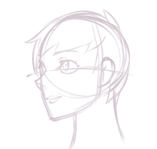
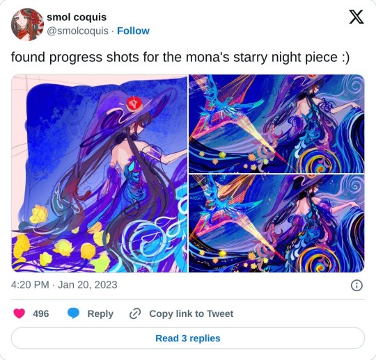
the reference collage i made for that delilah + vecna + laudna piece is so funny to me. just a bunch of random lines and animals all over the place
#poses references from the pose archive + adorkastock btw! life saving tools#whenever i want to do a piece with a lot of things i dont normally draw (like these animals) or specific pose ideas i like to do this sort#of thing#also it helps to visualize the composition + works a bit like a sketch
18 notes
·
View notes
Note
Got any tips in shading stuff in black and white digitally?
Hi Anon!
You're in luck! I'm currently wrapping up a book which is shaded digitally, so I've been thinking a lot about this recently.
How I do this is by no means the only way, so take from these tips as much or little as you want! When I add grays and shadows to a line art drawing, I try to think about these things:
Preparing the image
I like to work with a file that has a white background and a layer with only line art on top of it. Between these two layers I add new layers where I use the pen tool and bucket to fill areas with black, then I lower the opacity for that layer to get a value that I want.


This method works well for me, and for simpler pieces I don't need more than 3 layers with different values - light, medium and dark grays.
I work in Clip Studio. Here's a picture of the layers of a recent drawing. Each layer is actually completely black but you can see the opacity percentages by each layer. Lower percentage -> brighter value. This makes it super duper easy to change the value of a layer, no need to repaint it, just change the opacity!

Value composition
For the best result, do a couple of value sketches with a limited set of values and find something that works well for the image. Getting the values right is what will improve the image the most! Here's a quick tutorial on muddycolors. Muddy Colors is a very nice art blog to check out. Looking at grayscale storyboard drawings or value sketches are great ways to pick up on this too.
I try to group values when working with grays. Take this image for example:
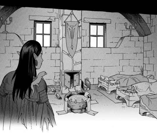
The character in the foreground has mainly dark grays, which separates her from the background, which has mostly light grays. Then the windows are white and the roof black.
Value composition is a huge and complex area and I recommend anyone wanting to learn to be more conscious about their values and to do value sketches. Analysing art you think has good values is great too.
Shadows
Not every piece needs shadows, but they can add a lot to an image! I use three kinds of shadows when I work in grayscale.
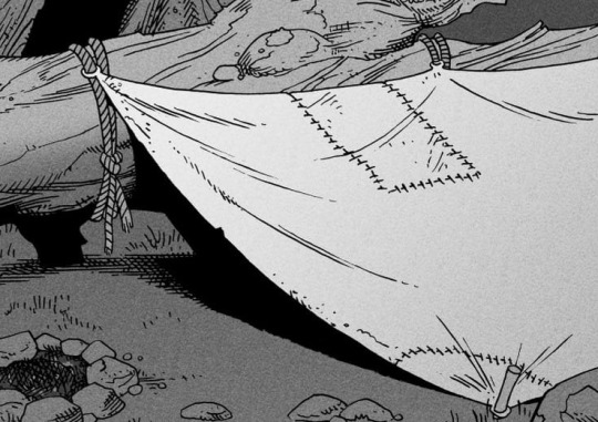
Inked shadows - these shadows are added during the inking stage and usually show areas where light would have almost no way of getting there, such as under this tent.
Gradient shadows - these shadows usually represent something getting further and further away from a light source or an area that would bounce light. This tree receives a tiny bit of light from a campfire on the ground and moonlight that bounces on the ground and up, fading as we get higher up in the tree. But mainly I add these gradients in ways that look cool and will help the overall composition.
Hard shadows - these shadows appear when a strong light casts shadows and can be used on a shape or to cover something. Here's a werewolf with shadows on its back, which gives it a better sense of mass and is interesting visually!
You can also cover an area in shadow like this, where the tree casts a shadow down on the archer and the cliff.
Texture
I like to add a layer of noise as a finishing touch. In Clip Studio you can create a noise layer with Filter->Render->Perlin noise... Find a balance of scale and amplitude that works for the image, then change the layer mode to "Vivid Light" and lower the opacity of the layer to around 30%. I like how this looks, it's not super visible usually but helps make the drawing feel less artificial and digital.

I hope that helps! Here are some nice links too:
Muddy Colors
Android Arts
Gurney Journey - Read his books!
Happy drawing!
348 notes
·
View notes
Note
Can you share a little bit about your art process? I'm curious to know about how you use references and how you figure out compositions. Your pieces are always so nice to look at and I love how you post a full piece and then a close up, and both of those look really nice on their own.
Love your art <3
(hooo this is long. sorry I love 2 chat.)
well it's multiple factors; in regards to being able to crop a close up and having that work as its own image, that's thanks to the scale the digital medium allows with ease; if these were traditional pencil drawings they would have to be pretty fucking big to have that much detailing on the face, and that in turn would make the drawing process different as you'd be having to step back often, but it's a lot easier digitally to just zoom in back and forth, check things are working from zoomed in and out, flip the image to see things with fresh eyes and make sure things are looking alright etc. I've been drawing on paper for years, and mostly draw/paint in a completely different style to how I do for my fanart, so coming in to digital and seeing it as a hugely different beast actually kinda helps in that sense (tho I'd say most of the time the digital thing really hinders me).
on that digital vs traditional note though, I take pretty much all of my inspiration from traditional artists, so when I'm drawing fanart I'm thinking about how I want the drawing to give me the feeling and sorta composition that those pieces I admire have, whether it's more modern queer and fetish art or old masters and book illustrators. it's having an awareness that the human brain wants to focus in on a face or find eyes, getting as much emotion across in that area but also being conscious and having fun of the potential narrative telling of other details and what the body is doing, sewing in your own symbolism.
for figuring out poses, I have a visual mind, I can see compositions pretty well in my head, so for example; if someone who is commissioning something states the details they would like in a piece, I can usually tell without beggining the sketching stage that, for example, maybe they wouldn't be able to see the hand they want doing something specific if characters were interacting that way and we were seeing their faces as well, or you wouldn't be able to see one of their faces, and if you value seeing their expressions maybe let's chose what you prioritise in terms of what the viewer sees. idk what to give in terms of advice for that, I'm lucky I've got a photographic brain when it comes to stuff like drawing or other boons it grants me irl (but I'm useless with numbers and words so, it balances out).
as for reference I feel like I've touched on this a few times: reference is great! it's important if you're doing the style of drawing I'm doing here (but I also really love work that is more stylised as well, i love folk art and goofy and expressive things) at this point for the likes of Imogen and laudna (and I'm getting there with fearne) - I've drawn them so many times that I just reference myself, and if there's a specific expression I'm needing then I keep a shaving mirror near by and look at myself, same with hands, they're right there, draw straight from em or take a photograph (saying this I am not good at hands lol). other than that yes I will often look for reference of something that roughllly resembles what I wish to draw in terms of posing, and then it's a mixture of kinda treating the reference images like a frankenstein paper doll with metal pin joints and arranging them how I need, but as I've also said before I like to not have a 1:1 reference and duplicate because i want to get my own hand in there, figuring out angles and limbs with lines gives a little bit of movement, proportions being a little off shows what the maker wishes to exaggerate or minimise, these are all enjoyable things to me, I'm not tryna make something photo realistic. so yeah, reference good, reference teach, but your own hand is very important too.
in summary I use a combination of photo/painting/screen cap reference and just my intuition from years of drawing and looking at people for the bodies, and my own drawings and a mirror for the faces. sketching it all out takes quite a bit of time, and I often won't realise until near "the end" (after spending hours colouring caus idk the proper digital ways to do it) that I'm not happy with a thing or two. sometimes I try to "fix" this, sometimes I say "fuck it, it's an excercise and is what it is". people who have commissioned work from me might have had this happen where I've said I'm sending the drawing over and then been like actually can u wait a while I need to tweak some things and spend an hour doing so, caus part of my process is sending the image from my laptop to my phone, and not only is the colour different from my phone to my laptop, but once again it's like seeing it with a new set of eyes and pretty much always reveals a bunch of "mistakes" I've made. the phone thing also goes back to what I said earlier and what you brought up, of that intuition to look at an image both zoomed out in it's full composition, but also pushes our intuition to tap and zoom in (I'm sure there's essays on this shit about viewing art digitally and specifically on phones vs irl) this can be used to your advantage! maybe you have a style that suggests detail but when zoomed in it's very satisfying certain wide strokes of colour, or yeah you can pack in tiny details made with a finer point that you can't see zoomed out. one of the things that sucks about the style I do for my fanart is it's way more obvious when something is wrong. when it's stylised to you it's never gonna be wrong, yknow? uh. anyway. I hope this sorta answers your question. I'm happy to talk about making all day long, I always think what's best is to find what works for you. for me being inspired by things outside of the space youre making things for is really important, and plays part in us all not making similar end results. keep putting your own hand and brain to it and have fun.
thank you❣️
#sorry if this sounds really wanky#that's the last thing I wanna be#this is also me being like hey maybe u think this blog isn't CR fandom related much past my own drawings and fic#but actually all the art and imagery and music I post is stuff that has huge influence on what I make and it's often from the same strain#of brain rot#we are but a cluster of interests and experiences
7 notes
·
View notes
Note
how do you come up with such interesting composition? your pieces are always so captivating 💗
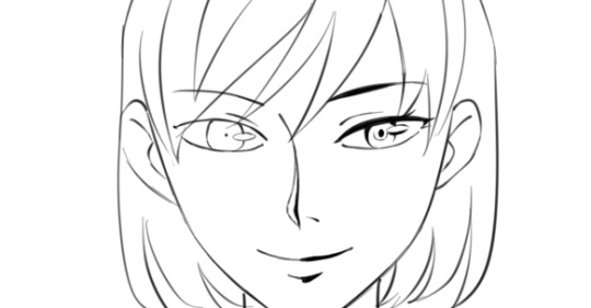
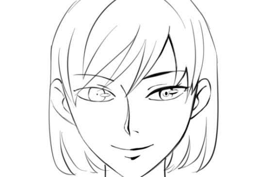
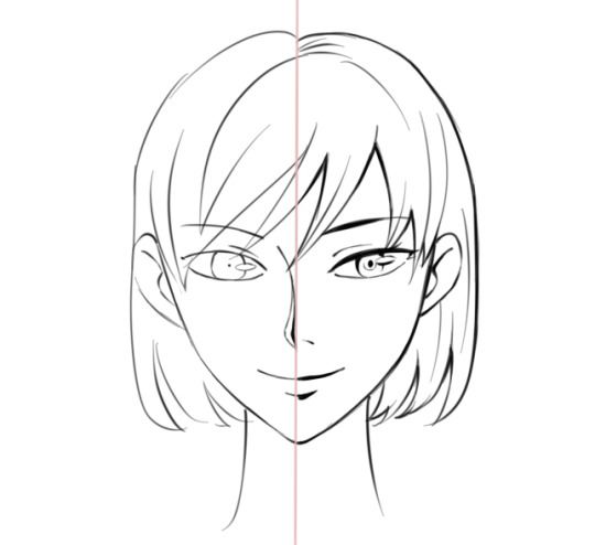
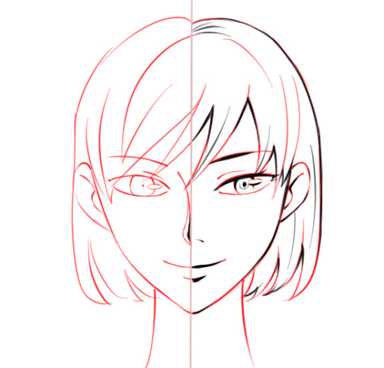
thank youuuuuuuuuu <33 and the truth is. idk. i am kinda just winging it and making a lot of adjustments as i go.... im not very orderly about it and have my thoughts kinda all over the place. heres some examples under the cut w what process pics i could find

direction process goes >>>
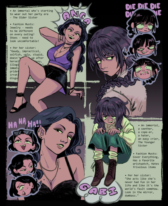
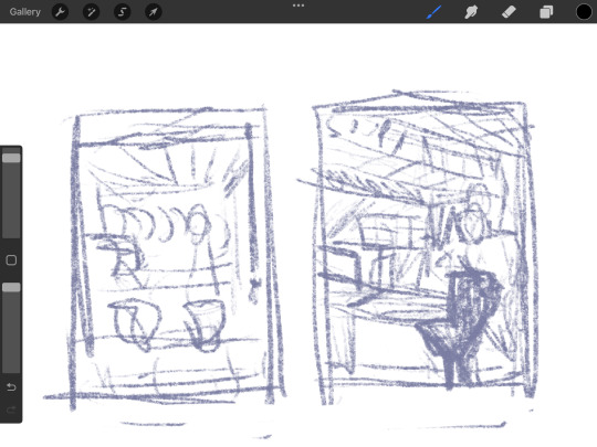
first did a pencil sketch for big shapes. was just placing stuff down. i wanted to make ref sheets for an art trade but didnt want to make a traditional type bc i hate drawing ppl standing full body (bc im bad at it 👍) also i did not have specific outfits in mind and was going more for a reference of the general vibe of the characters, so i just wanted a full body pose + face close up. to avoid having to show specific details. bc i was cheating. was originally going to have multiple text bubbles around for the character facts
did like two sketches digitally. messed around a LOT with placement. the little emote heads came out of me feeling like it was empty and boring on its own and they are fun to draw so why not include them. the multiple text bubbles seemed like a bad idea now so i took them out and just did one text wall.
i actually dont like the text wall now and think breaking it up wouldve been more fun visually but that would've required effort i didnt wanna put in LOL
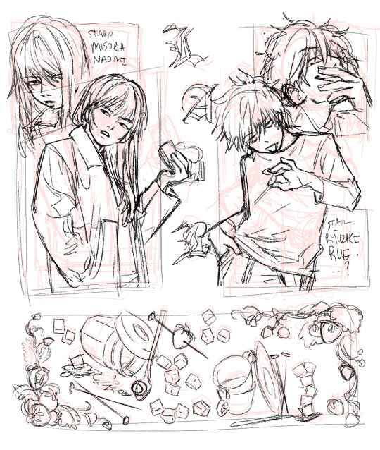
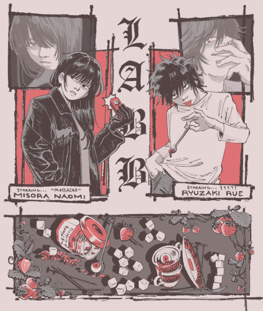
^ i lost the pencil sketch for this one (i always do a pencil sketch) but it was actually just the two half body drawings at first with none of that shit at the bottom or the close ups until i was like fuckkkkkkkkkkkkkkkkkkk i gotta add smth around to make this look like theres stuff happening..... the idea was to draw the two main characters of the labb novel in some kinda comic format w panels around and i then. kept adding things until it seemed like i was getting somewhere. thats kind of my process for everything TT i think it helps to stay in a workshopping stage for longer if needed to get somewhere but i often get impatient LOL
im putting a stupid note abt this here bc im still annoyed at myself but in this novel, there was a bit about a crossword puzzle related to a murder case and i only thought of it afterwards that it would be kinda cool to put the sugar cubes in like a crossword puzzle formation....... why didnt i do that......
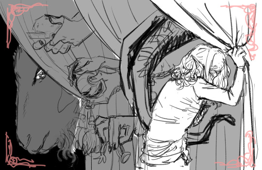

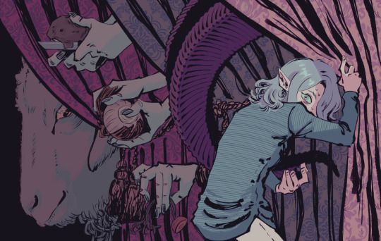
^ and heres some of the process for this one, but i lost a LOT of the steps for this. the beginning was totally different. the character wasnt as pathetic and scared looking at first but then i was like uhhhhh lets draw him that way :)
the first pencil draft was from a different perspective and it was gonna have a mirror composition to it kinda? but i wasn't able to make that look appealing so i deleted it. it still had the curtains tho but then i also included stuff with framed mirrors + other frames around
i decided to instead make the curtains be the focus of the whole piece to not make it so cluttered. character's pose was so different at first it was so bad i dont even wanna remember it. i took out the frames entirely bc i didnt think they added much to the piece in terms of the atmosphere. since like. the more i worked on it w the character's + the goat's expressions the more it gave a 'being hunted' feeling to it and portrait frames dont fit that vibe. which feels funny bc u look at it and thats all u can think abt but i wasnt even gunning for that when starting out. BE FLEXIBLE. TRUST THE PROCESS.
25 notes
·
View notes
Text
23rd Feb '24 - [arch] OH RISO my beloved!!!!!! ft. cyberpunk hermitcraft soup group
A cliffhanger!!!! And now I have to wait a month for you to upload the second half?? How will I cope :’’0
For real, it’s so awesome to see your process and the sheer amount of inspiration you take! In particular, I thought ‘Sit on Two Chairs’ and ‘This Was Our Pact’ were particularly yummy.
I think book covers are really hard. You have to sum up a book’s energy in one image, make it stand out and show just enough so people want more. Exploring the narrative through those full pages is really interesting - though this is something you did for fun, it could be a really useful technique for getting to know a narrative. When I’m designing my comic covers, I always do it last - that way I’ve had practice with the visual style and I’m thoroughly familiar with the themes, so I guess spending a bit of time with the characters and narrative in this way helps for standalone book covers too. Of course, it helps if you have the time for that XD
Okay!! Onto what I've been up to!!! [warning this is a beefy post I'm sorry for your poor reading brain]
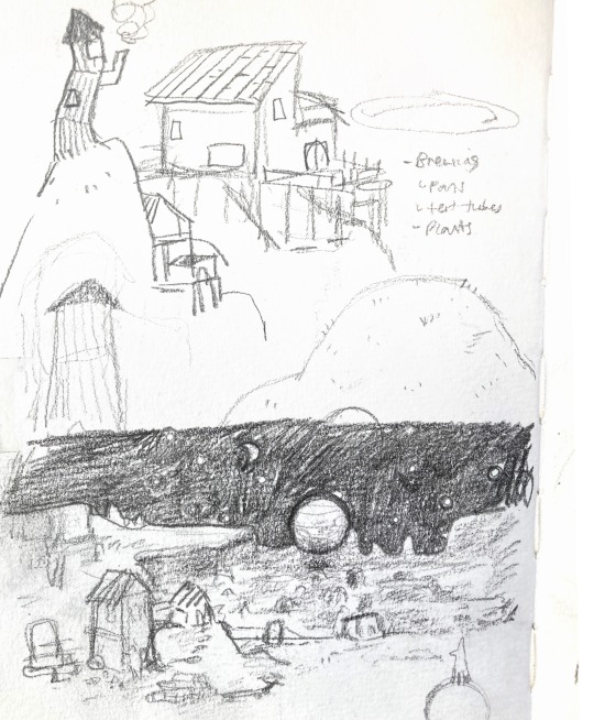
The past two weeks have been really enjoyable! I’ve been playing a lot with slow world-building, in sketchbooks, google documents, and voice notes to friends. Letting myself really sit with concepts, think about the characters, let them play in my head with no expectations. With this relaxation and lack of pressure, some beautiful narratives and interactions have been developing. I’m starting to need a name for a world/ the story. I’m not quite ready to give them a full introduction to the internet - I know it doesn’t but it feels like there’s some accountability to *produce something* and this slow development is really important for the quality and my skill building. It’s really hard to take on, but we actually don’t have to make the perfect thing now! In fact, it’s impossible. Pressure on ourselves makes it so hard to make something good if we’re always grasping at the final result. In the meantime, while those characters develop, I have been working hard on my basic skills. I wrote about characterization last post, but this week I focused on setting and colour. I was inspired (once again) by Hermitcraft. I’ve seen some really incredible illustrations of Minecraft builds in the fandom, and it seems like a great exercise.
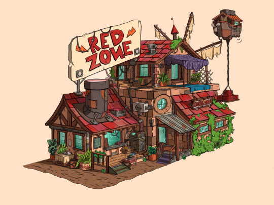
Bdouble0's Season 10 Base illustrated by @applestruda [source] and The Red Zone, built and illustrated by Bdouble0 [source]
One of the creators on Hermitcraft, ImpulseSV, created this build in a recent episode. It takes inspiration from the last season of Hermitcraft, where he was part of the ‘soup group’ with two other players, and his current base concept - a cyberpunk city. I also LOVE his new character design, so I wanted to place him in the scene.
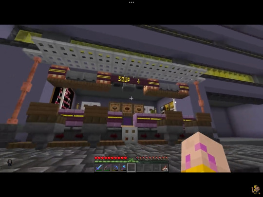
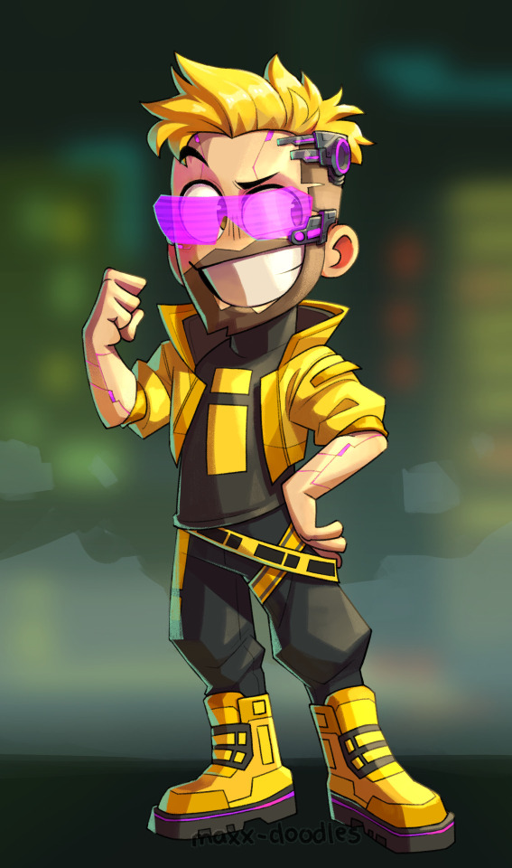
Screenshot from Impulse's video and new impulse design by @maxx-doodles
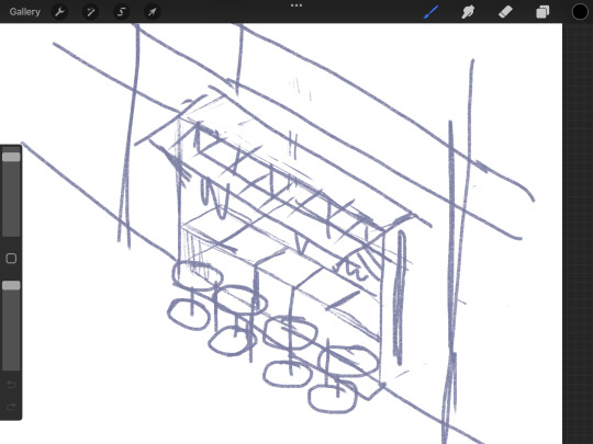
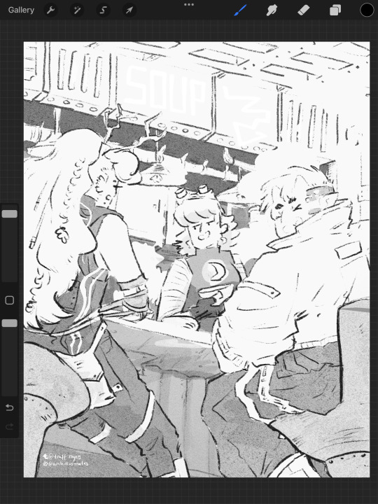
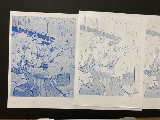
Here are some initial thumbnails I did, trying to figure out the composition. I wasn’t sure of the vibe yet, so I tried some rough thumbnailing, and drawing on an isometric grid and other perspective techniques. I’m going a bit mad for characters at the mo, so I wanted to place some in the scene. I found the angle of the isometric grid steep to place characters comfortably, so decided against that.
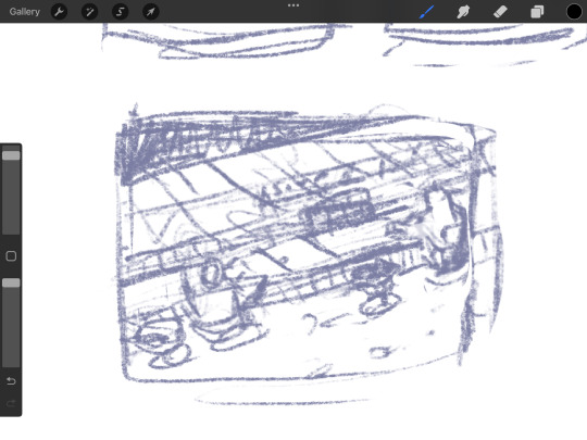
Looking back at it, I love the second! But I believe I was struggling with the perspective. I decided on the last one eventually.
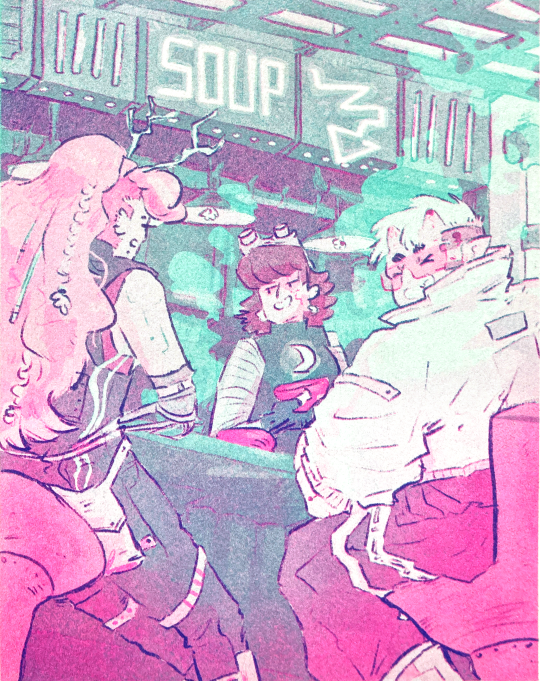
Now, I absolutely adore all of the players in the Soup Group, and I am BIG fan of redesigning their notable characteristics to suit different settings. So yes, I decided to put all of the soup group in the image.
PearlescentMoon (left) from my comic and GeminiTay's Hermitcraft Season 10 design [from this thumbnail] (right)
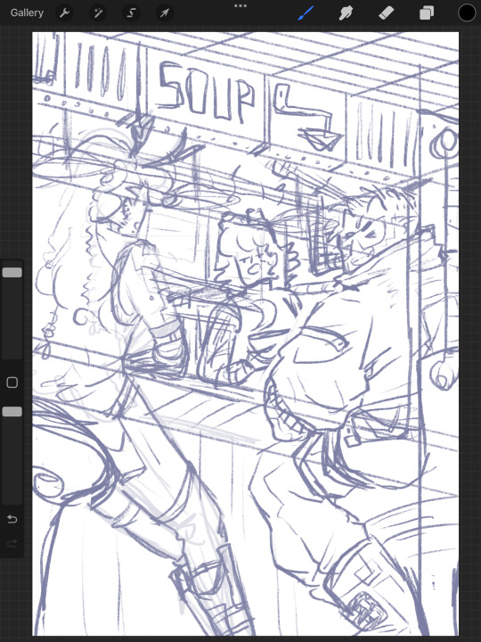
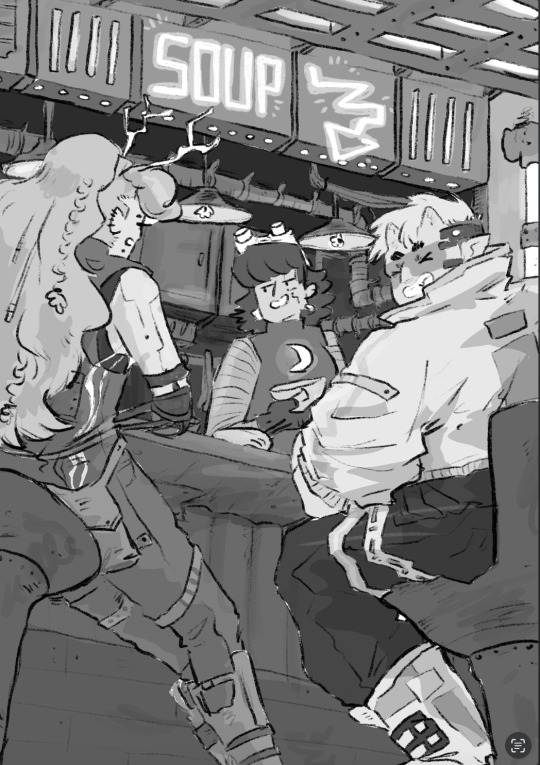
Here's the sketch of the final image. I really enjoyed coming up with cyberpunk versions of them all. I used the impulse design almost exactly, with a few extra interesting details since he's mostly viewed from the back. For PearlescentMoon (middle) I kept her fringe, dark hair and gave her a glowing moon symbol on her top. For GeminiTay, I kept her long ginger hair, antlers (but glowing!) and took inspiration from her new season 10 design - a dark blue jumpsuit to match her dark blue clothes in her new design, and the braids she is often drawn with. I also gave them edgy new hairstyles. And a robot arm. I don't have lore for that.
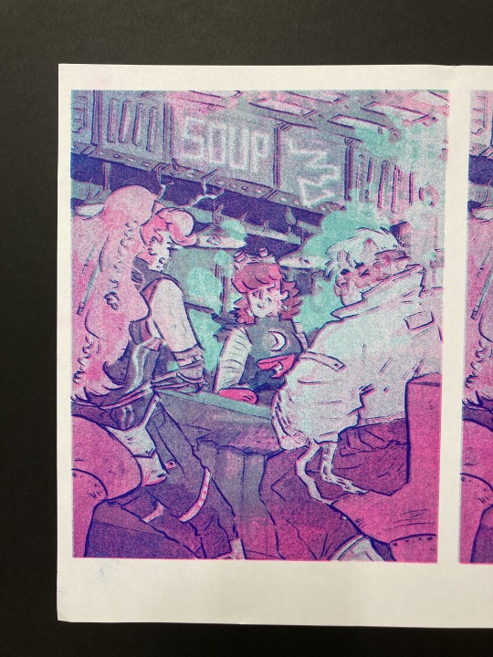
As usual, I filled each flat colour-to-be with black and lowered the opacity to play with the values. Then I added colours one at a time, aware might be riso printing it. Originally I stuck to trying to make it printable (making the colours out of ones I could make my layering 2-3 colours at different opacities), but as I went on, I decided to drop that and focus on the quality of the image in a digital format alone. I did keep the grayscale version above with all the separate layers in case I needed that if/when I came to riso printing it. Below are the main two digital colour schemes I tried out.
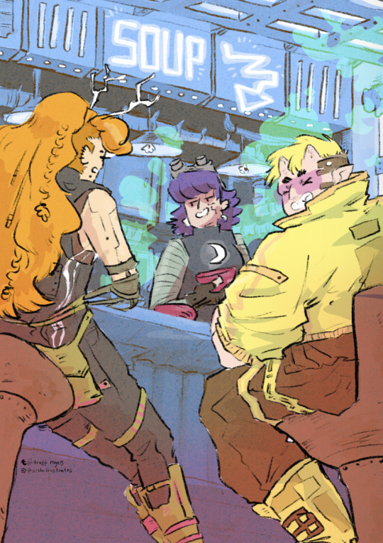
I settled on the one on the left, with the blue tones - the foreground characters really pop. I put a few details in Gem's hair, colour variations etc, and cropped it for Instagram. I actually much prefer the cropped version - it sits better in a rule of thirds.
Now the moment we've all been waiting for :'')
RISO!!!!!!!!!!!
I returned to Cardiff after a couple of months away and was delighted to spend my first day back at The Printhaus, an awesome shared print studio where I have basically made my home. A few of my awesome friends happened to be there, so I spent the day playing around with this image with their help! (please check them out they're very cool - Gavin helped me a lot (we hung out at Thought Bubble, remember? and Rhi gave good crits too!!)
For those who don't know, risograph is basically a shitty photocopier that can only print one colour at a time. However, you can play with gradients and opacities, and layer colours really nicely to combine. I've done a lot of single-colour tonal work with riso but this is my first go really layering.
First, Gavin showed me how to separate the channels in Photoshop, using the flat image uploaded to the 'gram. We copied and pasted these layers in grayscale and added blending modes to each layer to replicate what they might look like when printed.
With blending modes, the digital mockup looked like this!!
This bit goes into technical details for replicating what the print might look like for those who might want it - feel free to skip :)))
I copied and pasted the Cyan, Black and Magenta layers as greyscale (as you can see above)
I made all of the greyscale layers multiply layers since risograph ink is transparent and we wanted to see how it layers. The ink usually comes out a bit lighter than you think, so it's good to bear that in mind. I used a clipping mask over each greyscale layer and a blending mode. WHEN YOU PRINT, PRINT IN GREYSCALE, NOT COLOUR.
Here's how I split the colours from CMYK to the riso colours, their hex codes and the blending mode I used to replicate the colours:
Cyan - Mint [HEX#82D8D5] Screen Magenta - Fluorescent Pink [HEX#FF48B0] Screen Black - Blue [HEX#0078BF] Overlay Yellow - scrapped for colour scheme purposes
Blue, Mint and Florencent Pink layers in greyscale in Procreate.
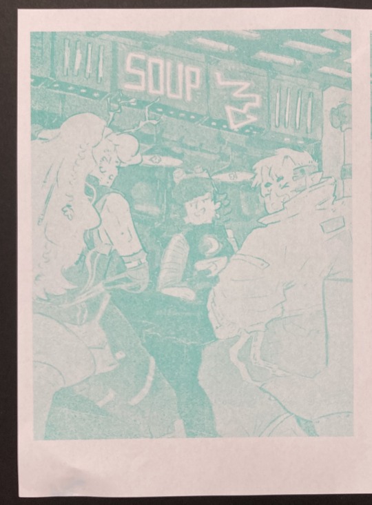
Riso printed Mint and Florescent Pink layers on separate paper, followed by the two layered together.
We always start with the lighter colour inks first, because sometimes the rollers can pick up the ink and cause extra marks where you don't want them. The first two colours came out great!
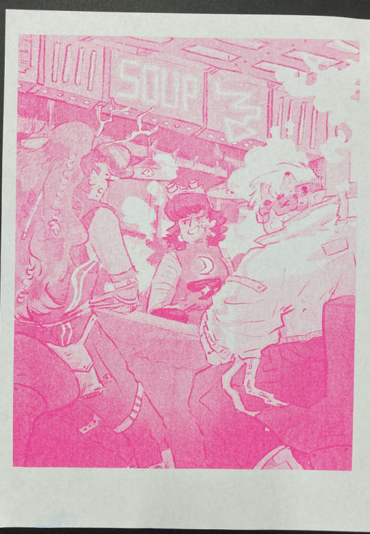
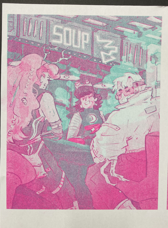
The first time we printed the blue, it came out very dark (left, first image). I have had this issue before - my last book, Winter Wellbeing, came out much darker than I wanted. Now I realise that the blue ink is super sensitive. All the 'white space' that is covered by a low-opacity blue on the left is only 2%, and yet it has come out pretty strong. We tried printing it on one of the misaligned images just to see, but it took all of the brightness out of the neon soup sign at the top of the image (second image). So I changed the values and pushed them way lighter, so it just pushed the values of the darker bits slightly, and brightened some of the lineart (right, first image)
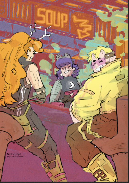
And this is the final riso printed version!! I'm so so happy with how this came out. It's so different from the original digital version, and I actually love that.
I didn't create new colours in the way that I intended to - I wanted to play with overlaying purposefully to create specific colours eg. orange for the hair etc. But!!! I'm really happy with how it came out. That will have to be a project for next time.
Also, many copies are slightly misaligned, so in future I think I'd do flat layers for the colours a more blobby style with the linework on one layer only so there's less of a chance for obvious misalignment. design for the riso, rather than riso the design.
Overall though, this feels like a super cool step up and a milestone for me. Super happy with how it came out!! And I'm excited to play with colour some more. Can't wait to see the rest of the Lionheart brothers! Enjoy your weekend :)))
Archie 🕺🕺🕺🕺🕺🕺🕺🕺🕺🕺🕺🕺 <3
#archillustrates#arch is learning#smileyshri#project development#art#art process#art resource#process#artists on tumblr#illustration#comic#picture book#small art blog#art blog#illustration blog#female artists on tumblr#queer artists on tumblr#illustrator#book illustrator#female illustrator#queer illustrator#comic artist#comic art#female artists on instagram#artists on instagram#procreate#digital artwork#digital artist#artist blog#artist on tumblr
21 notes
·
View notes
Text
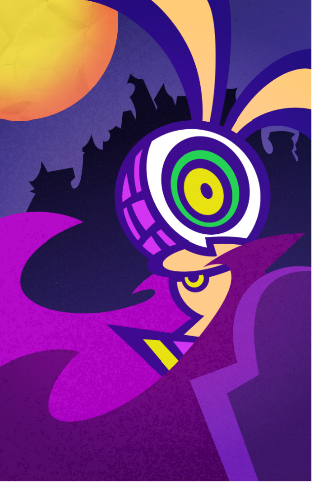
Rabbit of the Night He'll suck the orange out of your carrots (Sketches n' processes under the break! It's a REAAAAAL long one)
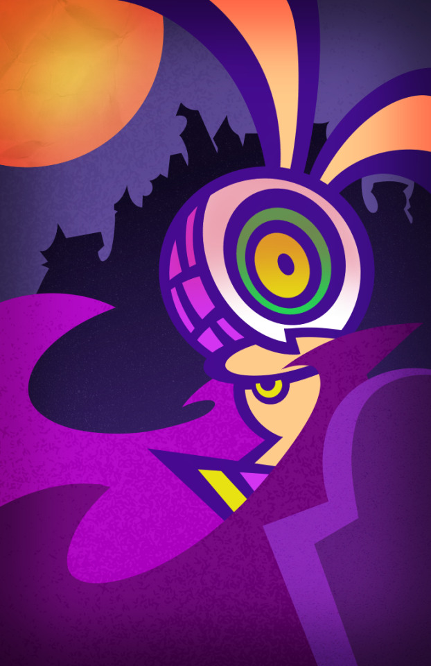
I've been meaning to draw a piece that actually includes a background instead of a character standing in the void. The issue that arises is that... I just didn't have any good ideas for backgrounds, lol. Partially the issue is that I tend to design the character first, which makes it challenging to draw stuff around them. Since around the time that I made this piece was October and the big holiday was Halloween, I figured I could do something within the theme. I've been meaning to draw my character, Nosferatu, again since they have always been one of my lowkey favorites of mine.

An older piece of the character, which you can see with the others here The character was quite macabre, which made it perfect for doing something slightly spooky. The cape also gave me a great idea for making something more visually striking, as well.
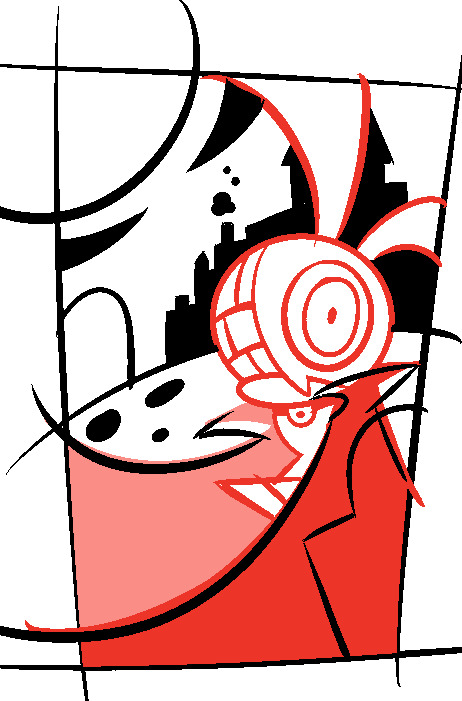
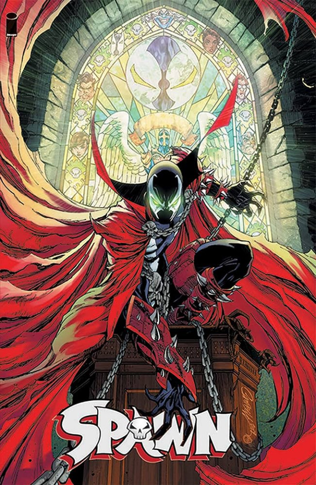
My first attempt. As you can see, I tried to do a thumbnail this time so I can have a better understanding of the amount of space I have to work with. I highly recommend that you do something similar if you struggle with doing backgrounds. Though, I think I ought to make it a bit more square, lol. I had to tweak some things to fit within the standard square shape since I drew everything at a wonky angle. I was inspired by Soul Eater and Majora's Mask when it comes to the background design, especially with the moon having a prominent appearance. I knew that was a consistent thing I wanted to keep throughout the iterations. The flowing cape was heavily inspired by Spawn and the artwork of Lelouch from Code Geass
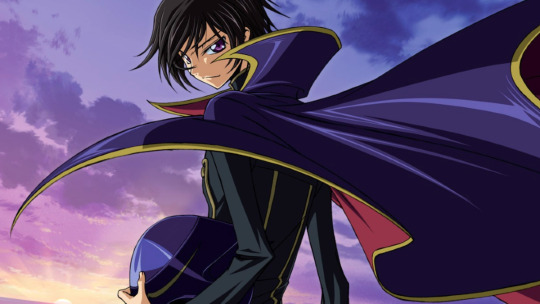
I always found it to be such a striking iconography for the characters. Despite being an inanimate piece of clothing, it adds a lot to the design. Spawn was always an intimidating dude, but having that cape overwhelms the viewer and takes up so much screen space every time he wears it helps give him more of an otherworldliness. You may not truly understand who or what is he, but you may get the vibe that he's someone with great power and importance. It's befitting of someone who is viewed as the best spawn of the devil. I find it also interesting for a character like Lelouch. Now, I never watched the show he came from, only understood the basic premise from various sources throughout my life. Pardon if my read on the character is incorrect, but to me, he's quite the scrawny guy and perhaps lacks power of his own. Despite this, he runs a rebellion and goes under the alias of "Zero". He dresses up as Zero, including the cape. With it on, his form became much more imposing yet concealed. It gives him a sense of royalty, which you might attribute to the likes of Kings or Queens. Someone with power. Sorry for that brief character analysis tangent, lol. It's just something that I thought about when creating the character of Nosferatu. I find it interesting that something so simple as a cape can help give a feeling of power. It's something that I feel everyone subconsciously think of and not realize. Back on topic, the rest of the composition I wasn't super satisfied with. I sorta lean into the "Dracula" look the character had by having the castle in the background, but I think it came off as very flat. I also thought it made things visually unclear. A bunch of things off in their own corner instead of organic guiding the viewer's eyes. I scrapped the first idea and tried to go in another direction.
I had the idea of being underneath an overpass and having buildings being lit by the moon. I don't think it was too bad of an idea, but I had trouble refining it and making it more "full", if that makes sense? This had a weird sense of emptiness and dragged the composition down for me. Perhaps if I drew the character differently and played more with the perspective, it would've been better. I went back to my original idea and checked if I could improve some things on a base level.

Originally, I had the cape go off-screen but checking my original inspiration, like various art pieces of Spawn, I noticed that the cape "ends" tend to curve back into the frame. I decided to do something similar which I think helped give the piece a sense of "flow" to it. I found that it also gives a composition more layers of depth and fills in any "empty" spaces that I had worried about before. I tilted Nosf's head a bit so they weren't just standing there stiffly as well. Sometimes it's the little things that help improve the piece than having to redo it all over again.
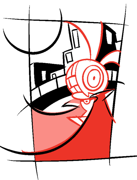
Finally, I just decided to make the background more on the simple side. I think I had the issue of really wanting to prove myself that I could do backgrounds that I made it way more complicated than it needed to be. It gave me the chance to make the moon much bigger, which I always meant to be a striking aspect of the piece. When drawing, I decided to forgo the "ground" that the cliffs are on since I felt it cluttered up the piece with too many colors. Now, I just got to finish it!
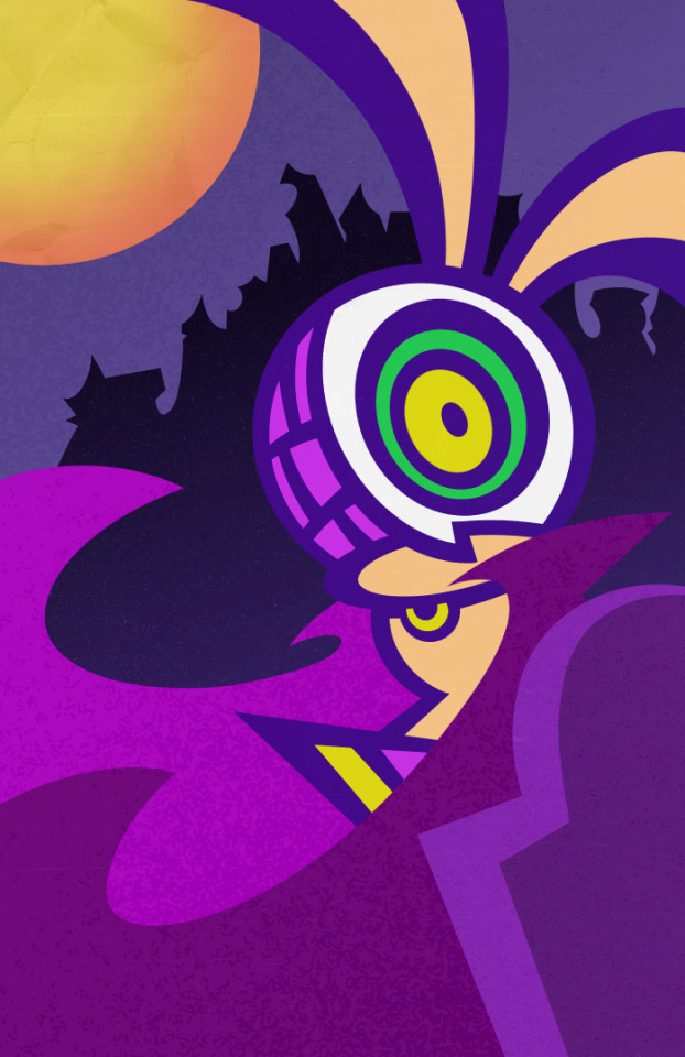
I should be done, right? Well, not exactly. While I think it looks nice (I'm personally proud of my use of noise filters), it just still lacks the depth that I'm looking for. Something about it is too bright and clear. I went back and experimented some more until I found a solution that made me feel stupid not realizing it before, lol. So initially, I tried to use this photo editing program called "Picsart". I used to use it a lot when I was doing digital art since I like the added filters. I eventually stopped because it would ruin the image quality. I thought they fixed that issue, but it's still the same.
It's a bit subtle in this picture, but I like to use the "vintage" filter since I like the added shadows on the sides of the images. The problem is that the quality got ruined and I'm very stubborn about keeping it in the nicest resolution possible. I decided to see if I could replicate it in my own art program. What I discovered is that I can and the solution was very simple, lol. First I drew a square with a solid color on a new layer-

Then I used the "Gaussian Blur" Filter-

I turned down the opacity, set the blending to "burn" and overlaid it on the artwork, which gave the depth I was looking for!


I gave the head some slight shading too since the filter unintentionally gave it to their ears. Good call since I think that helped with the Halloween atmosphere I was intending.
#oc#artwork#character design#my art#original work#luchador#halloween#rabbit#furry#nosferatu#I meant to post this 3 hours ago but the write up became super long lol#also i should've posted this on halloween WHOOPS
38 notes
·
View notes
Text
X-Men #2

Late, but who cares, let's do this.
So, will freely admit, this issue felt a little bit like filler to me. Good filler, mind you, I enjoyed it pretty decently, but unlike the first issue, which sketched out pretty interesting character trajectories, gave us a status quo, and introduced us to the general concept of what our team are going to be fighting - seemingly Orchis remnants that are turning themselves into mutants, possibly in conjunction with 3K - this issue is . . . mostly just kinda mindless fun?
Which, I don't mind, necessarily, it just feels like a bit of an odd choice for the second issue of your run that's coming off the collapse of the previous insanely popular status quo. You want to sell people on why they should still care about X-Men, and, for a lot of people, the answer that they should still care about X-Men because, look, there's the X-Men and they're doing X-Men things, isn't quite enough.
That being said, this is still fun!

I know that, objectively speaking, this is a bit of a waste of page space, dedicating basically a third of your page to credits and white space for visual contrast, but. I like it. This has impact, it demonstrates kinetic energy, it's a statement. I notice it. Generally speaking, if I'm noticing your panel composition, then that is a good thing.

Appreciate the callback to the San Francisco years of the X-Men, which I liked and still recall with some fondness, and I do appreciate the consistency of Scott's outlook towards humanity - yeah, sometimes they can be dicks and massive obstacles, but also, helping them generally makes mutant lives better and easier, and also, it's the right goddamn thing to do.
It's not quite classic boy scout Scott, he puts mutant lives front and centre here in a way that 60s-90s Scott wouldn't, but it's not 'did you really think we weren't going to just take what we were owed?' weirdo creepazoid Scott from House of X, either.
But. That's not what this issue is really about.
This issue is about Quentin Quire being lame.
Now, I understand that there are some people who care about Quentin Quire. I understand that for some, this book is a bit of a regression for Quentin, compared to where he was in X-Force and Wolverine.
Given that my favourite character is currently dealing with a 40 year regression in development, all I really have to say is, I'll get around to really caring about Quentin Quire's development when I've got time.
Also, I never really bought that Quentin developed all that much under Ben Percy anyway, given that he was doing gross, privacy invasive shit like keeping bright pink husks of his teammate's bodies around to wear, and confidently making entirely the wrong call in tactical decisions in such a way that he nearly doomed Mars to being eaten by a black hole gun because he didn't bother to psychically scan the Beast clone when X-Force brought him back.
He grew? Vertically, maybe.


Also, irrespective of whether or not you think Quentin grew as a person during X-Force, the Quentin I read there would also have forced a Neon Genesis Evangelion reference here that someone would have sandbagged.
Anyway, people are talking about Hank!!!


The implication that Hank came back to life, sorted out his dumb evil self, lived with Simon for a bit in LA, moved to Alaska to become part of Scott's X-Men, realised that Juggernaut was now a good guy and on the team, and immediately started working on a way to fire the man out of a cannon, is amazing. I have no notes.
I also appreciate Cain just. Being kinda cute and wholesome here? He's just a good dude. He's fistbumping, he's reassuring, he's just. Nice. This feels like the same guy that became good friends with Sammy Pare.
Maybe I'm old fashioned, but I just kinda like it when my heroes are nice and they like their teammates?


Amazing. Love it. Beautiful. This is what I read comic books for.

Hank's human rail gun. I love it, too, Illyana.
I also kind of enjoy this dialogue here because it reminds me of this little exchange from S.W.O.R.D.

I doubt it's an intentional reference, but it just makes me think that MacKay and Gillen share a kinda similar ethos when it comes to crafting dialogue, and that this mission and maybe this era, is maybe meant to be something other than what people are expecting it to be.
People are expecting it to be the next grand epoch of X-Men, as dramatic a turn in the world as House of X or New X-Men, and. It clearly isn't? And I don't really think it's trying to be? I think it's trying to be fun comic books. Which. Is not a crime, provided it's done in the right context. There's a difference between doing just some fun comics when the era is just getting started and things have yet to hit the fan, and doing just some fun comics when the era is coming to a close and people are expecting you to try and put a bow on some five year long character arcs.
Take a hint, Gerry Duggan.

I like this moment because it's basically the mission statement of the X-Men in general. We're here for you. We're here to help. I fucking hated Bendis' All-New X-Men with a passion, but one of the few things I didn't mind was Scott's rescue of the younger mutants in the first few issues, because that's what the X-Men should be doing. If I was picking this comic up as a launching point and I had never read X-Men before, this would be very good at communicating what they're about. What Scott is about. And that's good.
I am beyond tired of kill teams, gang. I am beyond tired of that shit.
I also appreciate the guy in the background with his phone out. Whether that'll be important or not, I have no idea, but I like it. It's a nice little detail.

Hank's only in the one panel here, but I do appreciate the gravitas of this. Scott's tactical genius got Ben out of danger and now Max and Hank have a piece of the puzzle to unravel, which is a dynamic I appreciate.
Even if Hank and Max didn't get a ton to do here, they at least feel like they're being afforded respect as other parts of the triangle that issue 1 set up, and . . . I realise that this may seem like a weird thing to compliment, I just appreciate these characters being respected?
Maybe it's just a shock after 5 years of X-Force, but that series never respected Beast, or a lot of its characters, to be honest, it treated them as props or ways to elevate Wolverine, the actual main character, and this . . . even though they haven't been on panel doing stuff, the positioning here makes it important that they have an effect on the narrative. I just appreciate it.
That being said, I do have to ask . . . who's taking care of Ben here? Because Hank ain't a medical doctor. This Hank doesn't have any of that medical expertise. Is Xorn hanging around? Did Scott or Max hook Ben up to the medical doodads he's got going here? Or did Hank do a load of catch up courses and now he's a doctor again? These are questions I need to know the answer to.
Finally, I did notice this in the back of the issue . . .

RIP, Don Perlin. I genuinely loved your work on Defenders, and you drew a very lovely Hank McCoy. You had a damned fine innings, and I hope you knew you're gonna be remembered for decades to come for your contributions to the comic book industry, though I doubt it brought you as much financial success as I think you deserved.
To commemorate your passing, here's one of my very favourite scenes you did the pencils for. I'll think of it, and you, for a long time to come.


10 notes
·
View notes
Text

@wild-moss-art Hi there! I'm more than happy to share art philosophy about lineart! You are correct, I am definitely spending less time than usual on my lineart to get these requests done, but I'm still glad with the final results. :3
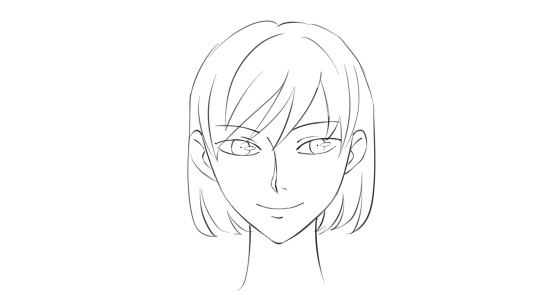
Here are the three stages that I take to achieve clean and polished lineart.
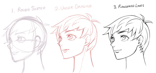
1) The Rough Sketch is used to figure out what the final product may look like. No fine details yet, only guidelines and basic shapes. I make sure the proportions, alignment, and composition is correct. The completed Rough Sketch gives me a good idea of what the rendered lines may look like, but is a bit too messy to follow. While I do have the option of erasing all of the guidelines and cleaning up the lines, what I usually do is lower the opacity of the rough sketch and start on a new layer.
2) The Under Drawing is done in a non-black color on top of the rough sketch. Here is where I get into finer detail with expression and anatomy. However, because we are following the messy lines of the rough sketch, the Under Drawing will still look a little unpolished. It is still very suitable for coloring if you plan to render all of the details in the painting stage, or if you are going for a more sketchy style.
In order to get sharp, detailed, finely rendered lines however, an additional stage is required.So lets lower the opacity and start a new layer using black ink this time.

3) When Rendering Lines, I carefully follow all of the details provided by the Under Drawing, which shows exactly where each line should be placed. I take my time going over each line, using the zoom tool and rotating the canvas when needed to get the best angle.

Because the final product should have a sharp and clean look, it can be very time consuming and pain staking to go over all the details. That said, I have a few tips that will help this stage go along faster while adding visual appeal to the final product.
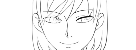
Let's use an example. Suppose you place down your lines and end up with something that looks like this.
It's not bad, but it could use a little work. The expression and level of detail that we want isn't there yet, but it's actually a good starting point. If you are new to line art or still practicing, you may wish to aim something like the drawing above so that we can take it a step further using the steps I will demonstrate in the tutorial below.
So how do we make clean lineart into something even greater?

Here is what I mean by line weight. Lines of lower weight are lighter and thinner. Lines of heavier weight are darker and thicker. Then there are modulated lines, which gradually increase or decrease in weight.
In the example drawing, all of the lines are of equal weight. We can make the line art less monotonous by increasing the weight of certain lines. For demonstration purposes, I will only make changes to the right side of the drawing so that you can see the difference.
To start, we will add another line to the upper eyelid and fill in the gap, creating a new, bolder line.

We will also build up the iris, pupil and highlight, adding details as we go. Already, it is looking more expressive.
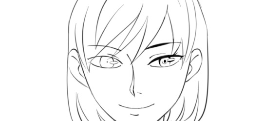
Lets build up the nose and mouth lines while keeping the ends nice and thin.
Then, we can add weight to the face and ear lines. For the hair outline, we want to make the lines heavier closer to the roots while keeping the ends thin. Hair lines on the inside can be left alone.
Finally, we make the outside line of the character heavier. With these small changes, we have a much more expressive, detailed, and visually appealing product.
Here I've highlighted in red where the lines remained unchanged. You will definitely want to leave some lines alone while building up others. As a rule, outlines should be thicker while the detail lines on the inside should be thinner.
If you increase the weight of all lines with the same amount, it will remain flat.
So, you should aim to have a variety of light lines, heavy lines, and modulated lines. You may wish to use the eraser to lighten up heavy lines or create modulated ones.

If you can do all the steps above, then a lot of detail and expression will be preserved even when the image is shrunk down

Hope that helps :3 Let me know if there are any other questions I can answer.
81 notes
·
View notes
Text
The Top 5 Carmen Sandiego Adaptations
And by adaptations, I strictly mean mediums in which you as a player serve no function, you are only here to observe. Therefore not the computer games, nor the board games, nor the choose-your-own-adventure style books. Just the shows, chapter books, and comic books.
Honorable(?) Mention: The DC Comics Series.

This only lasted four issues before being cancelled, and honestly? I can see why. I like the idea behind this series, which is compositing the various versions of Carmen Sandiego into one (the older games, the newer games, the PBS gameshow...had it continued we may have gotten stuff from the syndicated animated series.) The problem is that there is way too much going on in almost every panel. It's the equivalent of an obnoxious children's show that thinks constant movement and loud noises is the only way to keep its young viewer's attention. Beyond that, the main character Evan and his sidekick Bazooka Mel aren't that interesting or likeable, and Carmen herself barely shows up or does anything. It was a nice try, but it failed.
5: Where in Time is Carmen Sandiego?
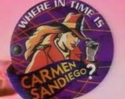
This PBS gameshow was the successor to Where in the World is Carmen Sandiego, lasting for two seasons and a total of 115 episodes across 1996 and 1997. For comparisons sake, its predecessor lasted for five seasons across five years, with a total of 295 episodes. And that kind of says it all. I like things about this show - having people play historical figures and interact with the contestants is fun, the villains, also depicted by real-life actors, are a good balance of wacky and intimidating especially with the creepy effects around them and their willingness to attack the contestants directly, and much like its predecessor the final solo challenge is always exciting to watch. The problem is that it just doesn't feel like Carmen Sandiego. ACME is suddenly this hard sci-fi oriented group feeling more like the Federation from Star Trek than a detective agency, Carmen is a cackling supervillain out to make people miserable rather than a classy master thief, and while Lynne Thigpin's Chief is as delightful as ever, she and Kevin Shinick just lack the chemistry she had with Greg Lee....heck, Shinick himself is a major step down from Lee in just about every way. I think he was funnier in the Robot Chicken sketch about the show than he ever was on the show itself! I feel as though if this show was its own thing, totally removed from Carmen Sandiego, it would work better.
4: Carmen Sandiego

The recent Netflix series has a wonderful two-part pilot, "Becoming Carmen Sandiego", that shows exactly how this incarnation is going to differ from previous ones - namely with Carmen being an anti-hero going against V.I.L.E with the help of "Player" rather than the leader of V.I.L.E who "Player" is trying to catch - and with a lot of interesting possibilities on the horizon, particularly with its somewhat darker tone and reinventions of characters from several separate past continuities. And it's all downhill from there! OK, that's a bit harsh, but as I've noted recently the show really did squander its potential more and more with each passing season, culminating in a finale that made it crushingly clear that the developers did just seek to keep Carmen an anti-hero the whole way rather than go through the villain origin story that was logically being set up. It never felt like it truly knew what it wanted to be, and almost every character and plotline ended up suffering as a result. It's got great visual style and superb voice-acting, and I appreciate the attention it brought back to the otherwise dead property, but I wouldn't recommend it to anyone as a first experience with Carmen Sandiego.
3: The Carmen Sandiego Mysteries
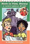
This series of juvenile chapter books had a total of six installments: two representing World, two representing USA, and two representing Time. And it's a shame that's all we got, because these were pretty damn good! Maya and Ben are likable leads, Carmen is a competent and even somewhat threatening villain while still maintaining her own personal code of ethics, and it does what a good adaptation should in keeping the feel and style of the computer games while also making allowances for the medium shift. I especially like "Take the Mummy and Run", which includes some legit emotional drama and a non-Carmen villain.
2: Where on Earth is Carmen Sandiego?

Pretty similar to the Carmen Sandiego Mysteries books in that it features a young boy/girl duo of detectives hunting down a similarly characterized Carmen. But this being a syndicated animated TV show rather than a book series, it lasted longer - 40 episodes total, and even got its own spinoff computer game Carmen Sandiego: Junior Detective Edition. There's also more of an action-y feel to it despite the network censors preventing anything overtly violent from happening, siblings Zack and Ivy are even more charismatic protagonists than Ben and Maya, and the great Rita Moreno just is Carmen; her alluring voice probably sticks out in most people's memory when thinking about the character. I do question why an AI Chief was used rather than a human one, as that just feels weird, but thanks to Rodger Bumpass' voicework he gets a lot of laughs so I can let it slide. The one thing that drags this show down is the educational aspect, as it manifests in a lot of ham-fisted monologuing from characters that grinds the pacing of each episode to a halt every time. Guys, you're in a 22-minute TV episode, not Nine Hours, Nine Persons, Nine Doors! You're kind of pressed for time here! It's the one thing I think the Netflix show actually did better, as while there were still lines here and there serving as educational the series usually focused on showing rather than telling as should be expected of the animation medium. However...this theme song goes way harder than it needs to, so maybe that balances things out. And speaking of stellar theme songs....
1: Where in the World is Carmen Sandiego?
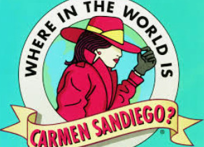
This legendary PBS gameshow simply IS Carmen Sandiego distilled into a compact form easily transmitted via airwaves. It's got the thrill of the chase while learning more about the world down perfectly, it's got the old-school detective vibe and the quirky humor, and it's got a stellar cast of characters - not only is this the first time Carmen herself displayed any real personality, but we've got a truly memorable Rogues Gallery of V.I.L.E operatives serving her. And even if the different kid contestants opposing them each episode do nothing for you, we still have Lynne Thigpen as THE Chief of ACME, Greg Lee as one of the funniest and most energetic gameshow hosts you could ask for, and of course - ROCKAPELLA! It's easy to see why this show endured for as long as it did and while it's still fondly looked upon even now.
29 notes
·
View notes
Text
Amber's Art Resource Compilation (The Return!)
Once upon a time, I used to regularly share link collections of helpful art resources here that I would stumble across on my various feeds and timelines, both to keep track of them for myself for later reference, and to share them with others who also might find these resources useful or interesting. And considering how many websites most folks are spread across nowadays? It seems like as good a time as any for me to start doing this again! Feel free to share and reblog to whoever you think will benefit!
(I would recommend that if there's any links that you find particularly helpful, perhaps save the image or video to your computer for safekeeping. I have no idea how long Twitter links will work because of obvious site shenanigans, even with Nitter as a workaround...)
TIPS, TRICKS, AND TECHNIQUES
Drawing easy straight lines in CSP with line variance! (I use this one all the time now):
https://nitter.net/PharanBrush/status/1573559518830940160
Every layer blending mode explained in detail!
https://nitter.net/DanHollick/status/1583080119068807168
A digital inking tip for unsure artists: use a blurred sketch!
https://nitter.net/quasimaddi/status/1585011119277555712
Tips for drawing motion blur by hand:
https://nitter.net/stardustjarr/status/1553140493462241280
Divide layer trick for removing unwanted colours for a picture! (Works great for cleaning up scans)
https://nitter.net/DaveRapoza/status/1513918096922226694
Quick perspective tip: think in several layers of depth!
https:/nitter.net/toni_infante/status/1530209210558042114
A trick for handling 1-point perspective in backgrounds:
https://nitter.net/djamilaknopf/status/1478738291386204160
And another interesting perspective insight from someone else in the same thread:
https://nitter.net/Masa_Ikku/status/1478747970233585667
Easy architectural facades for buildings: paint it flat, skew, and expand!
https://nitter.net/DevinElleKurtz/status/1481791432490815489
Sinix Design: Anatomy Quick Tips. A playlist of videos focusing on how to break down and draw specific parts of body anatomy. (A favorite resource of mine!)
https://www.youtube.com/playlist?list=PLflflDShjUKH4EfZyf0vuKEuqeqvlV0Qd
EDITED TO ADD: Thank you to Honeybees for a wonderful link to some additional book resources!
https://drive.google.com/drive/folders/1vEv0qEQKeGuWI4MPUcX8adWtNuGtTgSB
This folder contains:
"Anatomy for Sculptors", "Anatomy of Facial Expression", and "Form of the Head and Neck" by Uldis Zarins. An invaluable set of resources for understanding the 3D volumes of the human body from all angles! Goes into detail about skeletal structure and musculature, with photos and 3D models to help break down structures.
Volume 1 through 6 of "Hamm Tips", an amazing PDF archive of knowledge from the late Jon Hamm's art advice Twitter. Covering a wide variety of topics from inking to composition to visual narrative, there's a little bit of everything to learn here! (These PDFs are also still available to purchase on https://jessehamm.gumroad.com/ Proceeds go towards supporting Hamm's wife.)
The Morpho Series by Michel Lauricella: "Clothing Folds and Creases", "Fat and Skin Folds", "Hands and Feet", "Simplified Forms Anatomy for Artists", and "Skeleton and Bone Reference Points". A collection of detailed drawn figures and studies covering a variety of essential topics. Especially helpful if you find it easier to learn from seeing drawings rather than photos or 3D models!
DOWNLOADABLE TOOLS AND ASSETS
Baydews shares their favorite CSP brushes:
https://nitter.net/baydews/status/1607413330444169219?t=wH2Ijop-0llRr_HUF-0PTA&s=19
Master list of CSP brushes and assets!
https://cspmasterlist.carrd.co/
CSP Perspective Box asset:
https://nitter.net/PharanBrush/status/1687876570764238848?t=82DGi0khF8qtZTrndemHhg&s=19
Extensive 3D prop resource (Models can be imported into CSP and more!)
https://thebasemesh.com/
REFERENCE MATERIAL
Line of Action, a figure drawing resource tool! Most folks probably know this one, but it's still worth pointing out as a favorite for gesture drawing practice of many kinds:
https://line-of-action.com/practice-tools/figure-drawing/
AdorkaStock, another great resource for pose photos:
https://www.adorkastock.com/sketch/
A reference search resource for finding photos of human heads from specific angles:
http://referenceangle.com/
A similar resource to above, but for animal heads from specific angles:
https://x6ud.github.io/#/
And another, for finding photos of poses with limbs in specific positions:
https://x6ud.github.io/pose-search/#/
Japanese terms for certain eye shapes, with photo examples:
https://nitter.net/authorkurikuri/status/1597780432526925824?t=45tt1w6XFisqf53wLpW4TQ&s=19
Need pose inspiration for a mermaid? Try photos of skaters!
https://nitter.net/BelgharbiHouda/status/1521578742203752453
Actual mermaid poses, in 3D model form, with multiple turnaround angles:
https://nitter.net/kingcholera/status/1466065821835403271?t=QOTTQ_NaM4lC67hjaIWHKw&s=19
KingCholera's Patreon is a great resource for free 3D model poses! (Select "public" in the Tier dropdown at the top of their Patreon post feed to get a list of currently available free resources):
https://www.patreon.com/kingcholera
Another example from KingCholera's public ref collection: shoe refs (turnarounds)
https://www.patreon.com/posts/480-shoe-pt-2-70970957?utm_medium=social&utm_source=twitter&utm_campaign=postshare_creator
PAID RESOURCES
Eco-friendly bubblewrap substitute (helpful if you sell merch):
https://www.ecoenclose.com/shop/greenwrap/
Plushie sewing templates and tutorials from an awesome plushie artist, NazFX:
https://nazegoreng.gumroad.com/
MISC RESOURCES
Font help: good title and body typeface pairings:
https://nitter.net/Unenthuser/status/1539391099919224837
Font: SS Pretzel comic-friendly font:
https://nitter.net/salinsley/status/1445752040123092998?t=JqHW97mq0Zsie84vddCkPg&s=19
Rarebit: a Neocities webcomic website template:
https://nitter.net/spellsquad/status/1537116379706298368
24 notes
·
View notes
Note
hi! dunno if this has been answered before or if youre in the mood to get interviewed, but im sososo in love with your art - im esp fascinated by the different textures n how you color. everything about your art scratches my brain just right!! im rlly interested in your process. are you more intuitive with a piece, or do you usually map out a pretty clear outline/palette beforehand? what's your fav/least fav part of your process? would you ever post timelapses or maybe no bc of ai?
heyo anon, thanks a bunch !! <33
I have talked about my process here and there but I'm generally all over the place about it KFHDSJGJDJSD
I used to plan out my color palettes back in 2020 since I wasn't that great at coloring (it was pretty painful for me..!! lots of my work looked bland bc of it) and I didn't really know how to draw backgrounds either so they were always an afterthought.
I blabbed a bit about how I learned how to jump over that hurdle in another ask!
Usually I have a hard time visualizing what I want to draw in my head, so unless I have a clear picture in mind, my sketches are definitely where I begin forming my ideas.
At this point in my art journey, I plan both the background and the character together so the finished piece looks more cohesive. Most of my coloring process by now is pretty intuitive since I can generally feel what colors work together and what doesn't, and I also edit my pieces with tone curve,gradient maps, and color balance if needed.
this was from an ask I got on twitter, but I think it's super relevant and the best explanation I was able to put into words, so I want to reshare here⤵️
"Generally when in the early stages of a piece, I start off with some limited and often very light pastel-like colors. I also keep shapes simple, just for the sake of planning my composition's direction.
As I render in details, I gradually bring in my more darker + saturated colors. I like to check the piece in black and white often to make sure there's a full range of values. This also helps to verify if the composition itself is clear and understandable even without the help of colors. Usually this is why many artists start in black and white and then bring in their colors, since it saves time in that area."
My least favorite part of my process??? I'd say the sketch 😭😭😭😭😭 sometimes its fun though,,,,?
The feeling of knowing what you want to draw but not being able to put it down on paper is so... RAGHHH. OR that moment where the sketch looks better than the finished product.
Actually I noticed this more while doing commissions, since I become more hyper aware to meet the client's request.
I have posted timelapses before!!! Ta daaa
I haven't recorded more because clip studio used to lag a lot with the timelapse feature on, but I recently got more ram so maybe I'll give it another shot eventually?
15 notes
·
View notes
Text
Follow Me Quietly
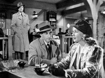
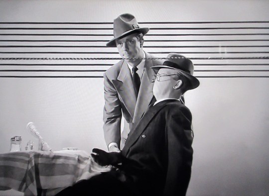
Director Richard Fleischer and cinematographer Robert De Grasse make something special visually out of Lillie Hayward’s script for FOLLOW ME QUIETLY (1949, TCM), taken from an original story by Anthony Mann and Francis Rosenwald. Although it’s basically a police procedural about the search for a serial killer who calls himself “The Judge,” they give it a noir look with lots of dark shadows, evocative framing and a stunning conclusion shot at the Los Angeles Gas Works. Unfortunately, they can’t do a thing with the film’s two leads. To call William Lundigan and Dorothy Patrick bland, would be an insult to bland.
The Judge strikes when it rains, strangling people he considers to be guilty of something or other (it’s never stated). Unable to catch a break, the homicide detective (Lundigan) uses what few clues he’s found to construct a faceless mannequin as a kind of 3D composite sketch. Meanwhile, he also has to dodge an ambitious reporter (Patrick) out to get an exclusive on the case.
It’s all very tidily constructed, coming to its inevitable conclusion in just under an hour. There are fun, quirky bits like the use of the mannequin, a cigar stand operator constantly on the phone betting on the horses and a chatty waitress who likes her men dumb and muscular. The film makes a case for persistent police work as the means of solving the crime, but there are plot holes. It would be nice to know what crimes motivate the Judge. Patrick gets access to secret information with no explanation beyond her statement that she has “connections.” And there’s a very strange scene in which she bribes her way into Lundigan’s apartment. As she tries to talk him into helping her, he strips partially (to very little effect; he has the kind of body that makes me want to yell “Put it on” rather than “Take it off”). He then goes into the bathroom, puts on his pajama top and turns on the shower. It’s a surprise when he steps out after the world’s shortest shower, and his PJs are totally dry.
The plot holes and illogic are eclipsed by the strong visuals. But there’s a bigger hole where the film’s heart should be. The male lead was originally slated for Lawrence Tierney and then Kent Smith, both capable actors. Lundigan, however, can’t capture the sense of obsession needed to portray a cop constantly beating himself up for his failure to catch the killer. Most of the time, he doesn’t seem to be playing objectives, just attitudes, and rather weak ones at that. And Patrick matches his flat performance beat for beat. Unfortunately for them but fortunately for us, they’re surrounded by colorful character actors, the kinds of performers who had to be good to keep working. Jeff Corey is so lived-in as Lundigan’s partner he dominates his every scene. Frank Ferguson is moving as an editor attacked by the Judge, Nestor Paiva is very funny as the gambling cigar salesman, and there are nice bits by Douglas Spencer as a compulsive confessor and Marlo Dwyer as the waitress. Hell, even the non-speaking actors shown being interviewed during the investigation are more interesting than Lundigan and Patrick.
#police procedural#film noir#richard fleischer#anthony mann#william lundigan#dorothy patrick#jeff corey#nestor paiva
0 notes
Text
Storyboard and Production Process
Giorgia Menon
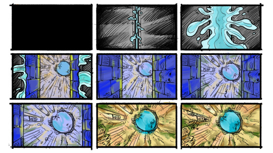
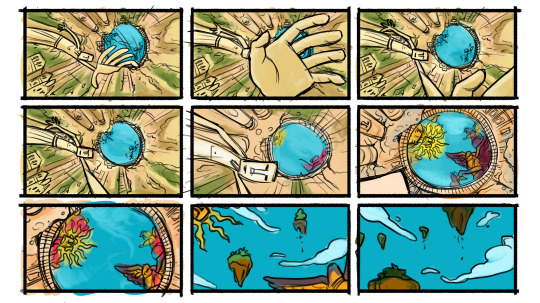
In order to have a better idea of the setting and actions that were going to play in the 2 minutes video, I took care of the storyboard. The movements are going to be very simple: the audience is simply going to be lifted up, first by floating in water and subsequently by a magical statue hand. We still need to properly take a look at the actual timing of all the actions, but we know that everything is going to be quite slow. Given the fact that the whole video is going to take place into a single place only, we need to time every little movement carefully so that the viewer doesn't get bored too easily.
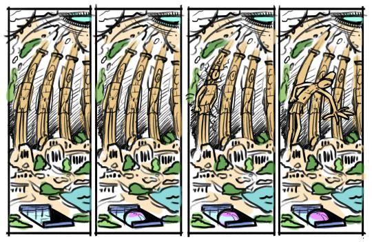
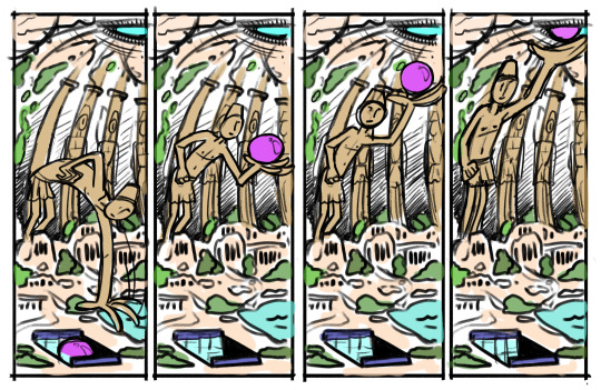
I also thought to provide an external view of what is going to happen. However, talking about it with Saint, we figured that it might be better to include at least two "moving statues" on opposing sides of the scene so that the movement can be visible from all the POVs of the dome. This will not impact our workload too much, since we are going to use the same modelled 3D sketch of the statue that one of my groupmates already made in Blender and just readjust it a bit, to make it look like a different character.


These two different designs carved into the stone were made by me to be placed on the underwater walls that are present at the beginning of our sequence. I drew the compositions on Photoshop and merged them with already existing brick and wall textures from the Unreal Engine software. I tried using different wall patterns with the same drawing in order to achieve the best effect possible, but I think we are going to make the final decision once we place the water element on top of it. Just to be clear, the subjects of these drawings were originated by a bit of research with regards to the culture of the ancient Babylon, to keep the theme going throughout the whole video.


For this week, we also prepared a drafty and simple presentation, to show the rest of the class how much we progressed over the last week. I think this was a very nice way to "pressurize" us and to show our updates in front of classmates and professors, even new ones! Actually having to explain what the thought process is behind an idea and what the actual choices were toward a specific strategy can really help the group understand what the following steps might be and what the project is lacking. The constant confrontation made the whole assignment feel more professional and it gave us the motivation to push through the days and surpass our limits as a team.
Even though we made the first draft of presentation all together as a group, I volunteered to take care of the following versions after the first rehearsal. First of all, I love presentations because they allow my creativity to come through with new fonts and artistic styles, secondly, I wanted to take some "weight" off of the 3D guys' shoulders. I knew this was not really a priority, but I knew this little thing was not going to take any time away from my parts of the project and I knew it had to be taken care of. Moreover, I believe that the visual way that a team presents its work can be really important. Especially in a future a maybe more professional situation, the visuals present on the PowerPoint and the way that you express an idea can really make the difference in the perception of the idea and on the final win.
References:
Biblical Archaeology Society. (2020). Hanging Gardens of Babylon … in Assyrian Nineveh. [online] Available at: https://www.biblicalarchaeology.org/daily/news/hanging-gardens-of-babylon-in-assyrian-nineveh/.
Cooper, T. (2008). British Museum exhibition exposes modern tragedy of Babylon. [online] Pinterest. Available at: https://uk.pinterest.com/pin/313000242834029765/ [Accessed 11 Feb. 2025].
Sinclair, D.A. (2018). The Mesopotamian Blues: musings on Sumerian colour values. [online] Blogspot.com. Available at: https://artisticlicenseorwhyitrustnoone.blogspot.com/2018/03/the-mesopotamian-blues_21.html [Accessed 3 Feb. 2025].
2 notes
·
View notes
Text
New Year, New Me

I never really thought about starting a blog.
Perhaps it was because I grew up keeping my personal feelings to myself, within my mind, within my voice. After all, those thoughts and feelings were mine and mine alone, and the thought of sharing my personal feelings made me feel cringe and all icky inside. I'm sure many of you, whoever you are, can relate to this dilemma.
There were times where I tried to keep a diary, but they never last more than two pages before I found myself cringing and wishing I never picked up that sparkly pink pen onto lined paper. It just didn't feel right for me.
When it came down to it, I expressed my intense feelings through the visual arts. Sketching and coloring in my sketchbook, putting visuals and compositions together to show what it was I was feeling.
Though when my feelings were getting too intense to be simply be expressed through visuals, I turned to listening to a variety of music, where they were able to put my thoughts and feelings into melodies and lyrics.
Although, I suppose that was never enough to quench the emotions.
Besides being a strong artist, I was also strong in the subject of literature and writing. Thanks to my mom, who taught me how to read and cherish books, as well to my deceased grandpa, who was a famous screen writer and director in the Philippines. For as long as I've known, I've loved creating stories and characters, who I would then give visuals to with my artworks. This gave me a creative edge to my writings, as well as having a bit of a dramatic flair to it if I was really feeling it. Along side it, I also enjoyed writing essays in English (yes I know, I'm a masochist), which in turned made me enjoy analyzing and exploring themes. Together, I had the power to create decent writings, at least enough for others to be entertained and to get good grades.
It was actually thanks to those numerous personal essays that I had to do in high school that finally let me be comfortable expressing my emotions. At least in writing form, expressing them in person is something I'm still working on.
The inspiration of creating the blog, came in the same day that I'm posting this. I was feeling highly emotional, perhaps it was my period coming or perhaps it being a first-year art college student in New York, dealing with a surplus of emotions, but I needed an outlet, bad. Like. Real bad.
When I got home from a night out with friends, I was watching season 2 of Netflix's "XO Kitty", then, because of my short attention span I switched to "To all the Boys I Loved Before: Always and Forever." It was then, as Laura Jean was writing her heartfelt post cards to Peter Kavinsky, inspiration struck.
It made sense that Laura Jean was my inspiration to start this blog. We were practically almost the same person. We both were hopeless romantics, looking for love. We both shared a love for writing, and viewed life with a vivid and passionate outlook. Not to mention, the both of us were New York college students.
There was no better person to inspire me to start this new path in my life.
I know this may never get any views, nor maybe never even discovered, but knowing that there's a small, a very small chance mind you, of someone reading this, inspires me to continue to write. To no longer be afraid of expressing my emotions and that maybe I can help others express their feelings as well.
And so with that, I wrap up my very first blog post. May fate do what is does best, for this blog and for myself.
1 note
·
View note
Text
Continuing my puzzle illustration
Continuing from what I did last week, I added the some of the last major details like the islands on the horizon and then I decided to add some flat colours. I did this to see how they worked with the composition and if I need to tweak or add anything to the scene. This also helped me visualize how the two blue sections in my illustration would look together as them being the same colour was one of the things I was concerned about. I then did a quick rendering trial, focusing on the shadows and highlights in this piece. Hopefully, this will act as a reference and help me correctly place the shadows/light source when it comes to colouring the final illustration.


Once I had finished experimenting with colours, I looked back at the sketch and thought it looked too messy. I originally was going to clean it up with the rubber tool but I decided that would be a bit difficult as I still had some small details (like fur texture) to do so I just created another layer that would be in place of the "line art layer" and began tracing over and refining the sketch even more.


0 notes
Note
hello it's drawing anon!! thank you for your long and detailed response, it was very helpful. if you don't mind i would love if you shared your technical tips as well!
also kudos to you for studying engineering (i could never), and i hope you continue to draw and share lots of lovely brainwormy art :D
in the meantime i'll try to work on my art swag ( ≧ᗜ≦)
hi drawing anon! sorry for the late response, midterms are upon me and they are here for revenge. D:
here are some things that help me with drawing faces + and for general composition! i also learnt a lot from watching people work, so i'll put some at the end.
this thing is beefy so here's a general overview:
breaking stuff into shapes, how to control eye movement, general -> specific, speed-run color tips, then some techniques i consider for nailing faces.
my favorite thing is to break down faces into geometric bits. for laying down the initial sketch or framework for whatever you are working on, it's helpful to work generally and then to get specific. this way when you start working on details there is harmony! i have had a lot of moments when i focus on something specifically for too long and then everything else comes out of proportion. it also is helpful for general sanity too because it can be very frustrating to have to adjust something after working on it for so long.
if working generally is good for harmony within how things fit into your piece, it also can be good for how your eye moves around the piece. there are so many ways to emphasize areas of your art, and sometimes peoples eyes can get stuck on things so to say. for pieces that you want to have deep meaning, this is a powerful tool for narrative. here's some things that can deal with eye movement!
directional lines, like contour shading or hatching
repetition of elements around the piece, like stickers or colors
avoiding lines going into the corners of your piece (think of it like leading off a cliff. i think of arrows going into the corner as like a "flip me here!" thing)
areas with more details or areas with less texture, etc., have different visual weight and the imbalance can create interest
there is a lot of theory within this, but i think these points are a good takeaway.
color theory is a whole beast, and most of my context with color is from working traditionally. when mixing colors to make a new one, i generally try to keep a limited amount of paints to avoid having muddy colors. outside of the digital landscape, my understanding is that your eye still registers each individual pigment mixed in even though you can't separate them out visibly. this can make a color look muddy and hard to register. some pigments also lean one way or the other (warm vs cold) and can create muddy colors. i think the most common example of this i have is mixing pthalo blue (yellow leaning) and a red and getting a gross purple.
two ways to introduce shadows: mixing the area of interest with a complimentary color (opposite side of color wheel!), and using complimentary colors to create contrast between areas in light and areas in shadow. this creates a bit of a dynamic
facesfacesfacesfacesfaces

pleasepleaseplease click for higher resolution but this was a good way for me to kind of describe how i do it. i consider these methods jointly when drawing a face from scratch, and i see people with more cartoony styles or OC sketches that consider the shape face thing.
i generally draw the main profile/size of the head and then start from the eyes since i find it easier to build everything else off of it. the nose is between the eye sockets so it comes next naturally, etc.
i also think a tips video is not complete without the classic step by step

these aren't super refined, but they give a general idea on how i break it down.
referencing photos is great, but building a framework that you can use as reference within your own drawing to understand ratios and proportions is critical! i find it easier to draw people with glasses sometimes because the glasses themselves are good reference for eye size, nose placement, etc.
some art youtubers/creators i watched alot when learning drawing outside of school (please keep in mind most of this stuff is old):
draw with jazza, how to draw the marvel way, peter draws (pen reviews & doodle seshes), camileon, and more. if you have any artists in mind they may have drawing sessions/speedpaints up which also can help (especially if they are a comic artist or youtuber or some sorts). artists that do interviews also often talk about other people they take inspiration from, and this can build a nice net of things to check out!
i think out of these i used the marvel one the most while learning on my own, before finding a system that was more intuitive for me.
i also grew into who i am as an artist within a community that inspired me (school and also online). having stuff that inspires you or some kind of inspiration board (i be sortin on pinterest) is good too. i will say that those portfolio videos on what got people into art school are scary to watch & aren't necessarily a blueprint for what they are looking for exactly (with animation schools that feed specific companies being an exception, i guess).
this is freakn long and probably overwhelming but i hope it's some kind of help!
0 notes