#queer illustrator
Explore tagged Tumblr posts
Text
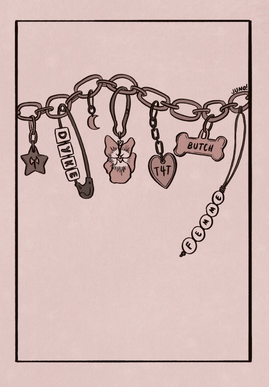
happy lesbian week of visibility here’s a new illustration 🪲🪲🪲
#my art#sorry for posting so much#illustration#queer art#queer pride#queer illustrator#queer artist#queer community#lesbian week of visibility#lwov#dyke#butch#femme#sapphic#lesbian#transmasc lesbian#t4t#illustrative art#wlw#nblw
7K notes
·
View notes
Text
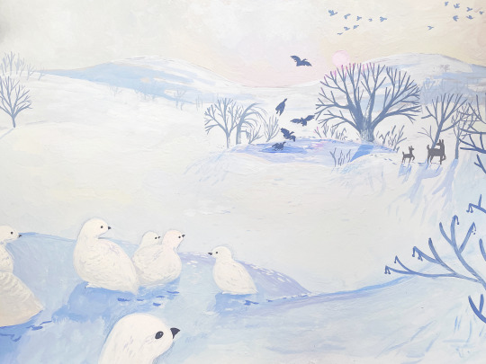
❄️🪿🪽🦌🌞 // willow grouse in winter // gouache on hot press paper
#made for my agency!#they're doing lookbooks and prompted me with snow#my art#gouache#illustration#winter#willow grouse#geese#flying south#ice#snow#deer#forest#nature illustration#queer illustrator#trans illustrator#bird art#wintercore#picture book illustration#traditional art#art#painting#artists on tumblr
184 notes
·
View notes
Text


I trust you / I’m gonna figure it out
Awwww, this art is (almost) 10 years old!
#gravity falls#pine twins#mabel pines#dipper pines#gravity falls fanart#queer artist#queer illustrator#not what he seems
121 notes
·
View notes
Text
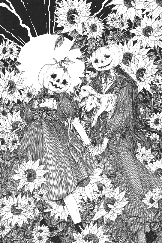
✷𝕻𝖚𝖒𝖕𝖐𝖎𝖓 𝕯𝖆𝖙𝖊 𝖑𝖑
#orphicss#queer artist#sapphic#wlw art#sapphic art#wlw#artists on tumblr#queer illustrator#illustration
692 notes
·
View notes
Text
28th June ‘24 - [arch] One Page Limitation??? - My process for Traffic Zine #5

Hello All!
A couple months ago, I got accepted to @trafficzine, a digital anthology of pieces by a large group of artists and writers based on the most recent season of the Life Series. I made this piece back in April, but thankfully I kept some notes of my process.
Heads up - this contains spoilers for Secret Life :D
We were able to choose our own prompt from a list! For this project, I wanted to push my comic making - especially how to communicate a lot of information in a small space. I went through and watched a few clips from the series to see which prompt would fit a comic and settled on Scott’s death.
As usual, I began by getting some reference images and going ham on some big paper. This gets me excited about the project and helps generate ideas. I go for whatever interests me in terms of medium and subject matter, but I try to use a process that doesn’t let me control too much (in this case brush and ink)
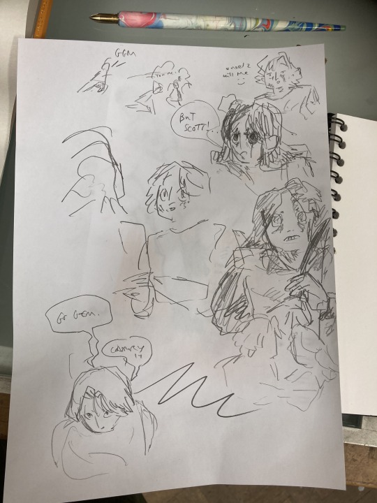
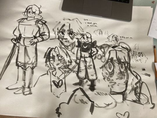
initial sketches for fun and vibes :D
During this, I also took the time to transcribe the scene - I wanted to use the dialogue directly, and see how much I could fit into the single page that I was allowed for the zine.
In these early planning stages I make sure to do warm-up sketches to remind myself of the energy I want to communicate. This also keeps things fun and fresh so I'm not ONLY thinking about page composition and making things 'good'. (the expectation for it to be 'good' kills a project prove me wrong)
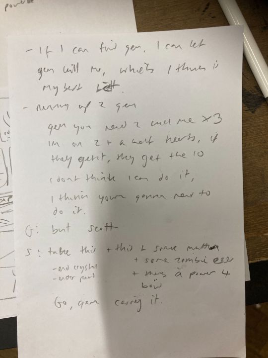
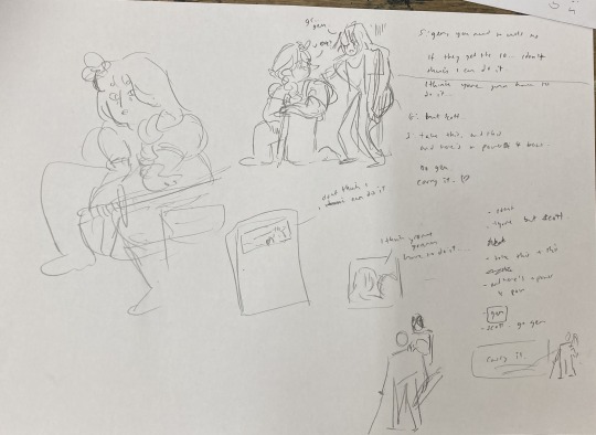
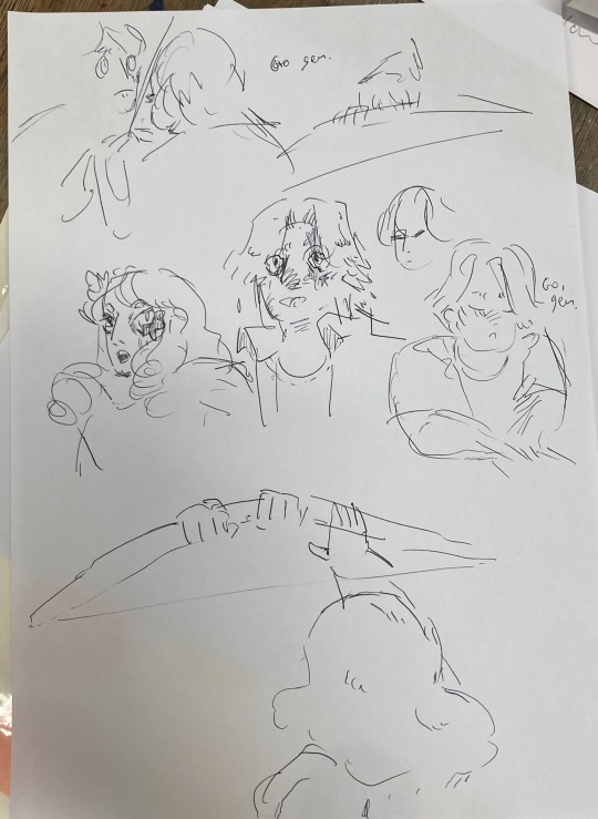
Dialogue from the clip + warm up sketches
Next up, I started to plan what panels I have on the page. At this stage, some panels might just be a box with some words, and some may have a sketch if I have a clear composition in mind. This stage is mostly for pacing and plot, so instead of focusing on what the panel and page will look like, I will think about:
what will happen in the panel
it's purpose and
what it will communicate
Sometimes I'll illustrate a string of panels that tell the story and fit them on a page after - but this depends on the project and my confidence with the size of it.
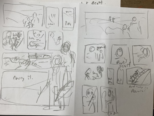
After messing around with these and coming up with a pretty clear direction, I draw a bunch of boxes to see how the panels could sit nicely together. At this stage I might realise I have too many panels, and need to cut a few or come up with a creative solution. Nothing is set in stone at this point.
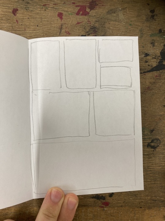
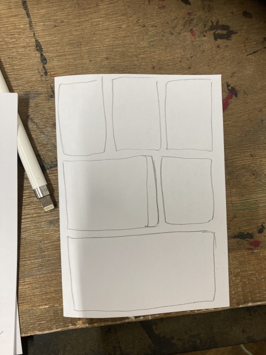
sketching panel layouts
Now begins the fun! I decide on the layout I prefer and I can start putting planned compositions into the boxes. I often do this digitally, or a digital editing process will be involved.

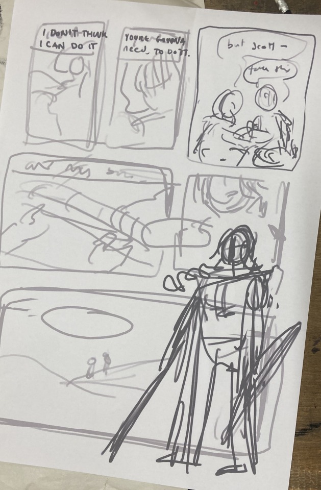
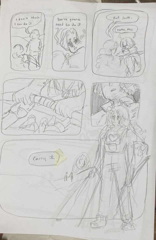
Once planned, I print these out to do a more refined sketch over. I find that my traditional drawings have a lot more life and character to them than digital ones, so I try to keep the majority of the process traditional, with passes of scanning and digital editing.


I tried a version with her looking out at the distance - ready to face the oncoming battle. But it still felt off. So I turned to my slides to ask myself some questions!!

I tried to think of more things that were working - but I really felt like it was lacking a lot. I was going for this slower emotional feeling because that came more naturally to me, but it just wasn't working for this image. The original clip is quite rushed and chaotic - which would be harder to communicate in a comic format but the challenge interested me. Either way, I knew I wasn't happy with this direction so... i decided to start from scratch! Back to the drawing board!!!
In the previous version, I had cut out a lot of the dialogue, but I decided to go back to the original clip and use AS MUCH as possible. Since passing the bow was my favourite part of that first composition, I really wanted to lean into it as the emotional height and final goodbye before Scott's death. It's a moment to slow down and absorb the vibes :D

I made a list of panels along with their descriptions to refer to when trying to figure out the order of panels. there were SO MANY and it was VERY CONFUSING when they were too small to read.
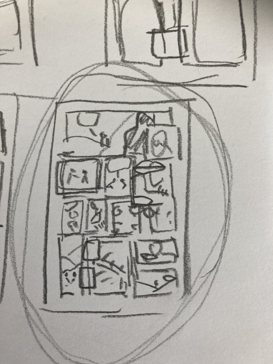
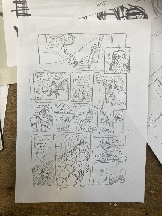
These thumbnails were super small and would not have made sense without my list, I swear.
I printed this tiny thumbnail out at A4, so I could sketch over it and get a clearer sense of flow. Then began a loooong process of printing out tiny photocopies and rearranging the panels to be legible. It was a difficult balance of communicating busyness while making sure the hierarchy/reading order made sense.


After some tweaking, i printed out an A3 copy to draw my panel borders and text.
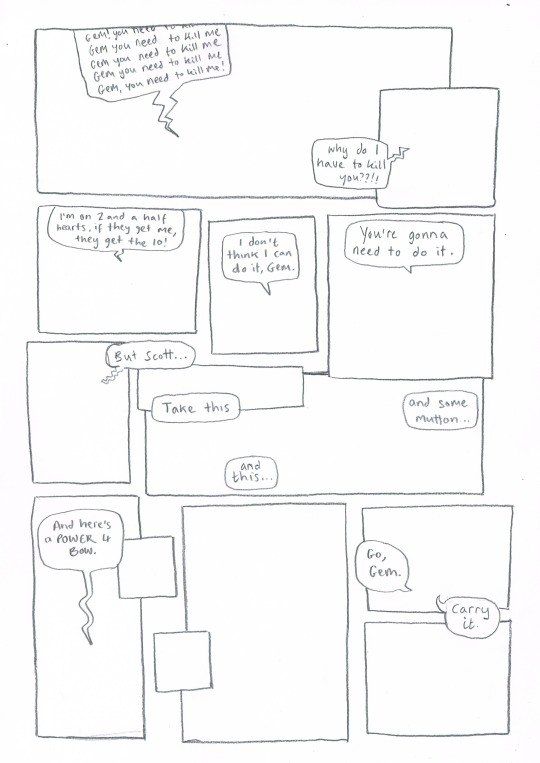
Doing this on a separate piece of paper means I don't have to worry so much about messing up the text or borders when drawing the characters. This allows me to be more free and expressive with my illustration.
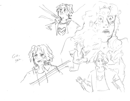
Woah! Quick trip back in time!! During the thumbnailing process I drew these warm up sketches! I looooved the way the linework came out. I drew this on an A3 piece of paper - and the shocked Gem would, in theory, be one of the smallest panels. So I decided to do a crazy thing.
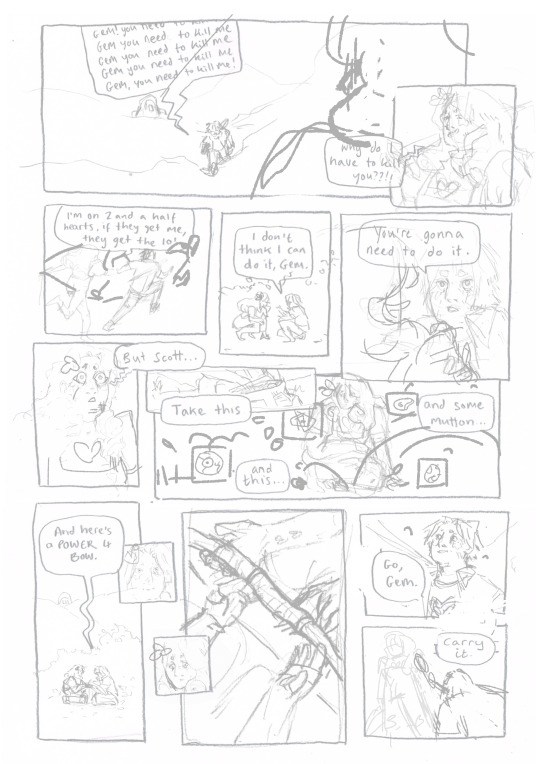
I touched up the sketch digitally, compiling some of my favourite warm up sketches, some traditional sketches made for the panels, and filling the rest in digitally. Then I printed this image out in QUATERS at A3!! This meant the final sketch layer, printed out was A1!! (aka very large, considering the final file would be at A4, about 8x smaller)
I did this so I could get fairly small detailed lines with my pencil while being quite expressive and firm with my mark-making. Slowly, I dlined all of the panels traditionally and scanned them in. Then I assembled the finished linework on Photoshop, along with the text and panel borders and got to colouring :D

final linework :D
For colouring, I played a little bit with halftone but I found the texture made it feel a bit too busy - the panels are already doing enough. Because of this, I also decided to use a limited colour palette. Here are some images of the colouring process, which I won't go into today.


I'm really happy with how this came out - I think it captures the chaos of the moment, while taking time to linger on the emotion of it. Keeping that bow moment really made it, I think.
I think the last panel is still quite weak. Earlier in the process there was a low-angle shot of Gem about to kill Scott which may have been more powerful, but I think I was struggling with my actual drawing skill when it comes to perspective. A lot of learning how to draw, and in particular with comics, is about knowing where your skills are at, how to utilise them best and how to test and push them.
I'm glad that I started again, instead of finishing that composition I wasn't happy with. It was a tough project but I learnt sooooo much from it, and it's been essential skill-building for.... the current comic I'm working on (stay tuned!!! :0) Thanks for reading this incredibly long post! Go check out @trafficzine and look at all the other cool art Cool vibes and silly men,
Archie :D
#archillustrates#arch is learning#project development#art#art process#art resource#process#artists on tumblr#illustration#comic#picture book#art blog#illustration blog#queer artists on tumblr#illustrator#female illustrator#queer illustrator#comic artist#comic art#female artists on instagram#artists on instagram#procreate#digital artwork#artist blog#artist on tumblr#web comics#tumblr art#tumblr art blog#art on tumblr#life series
144 notes
·
View notes
Text
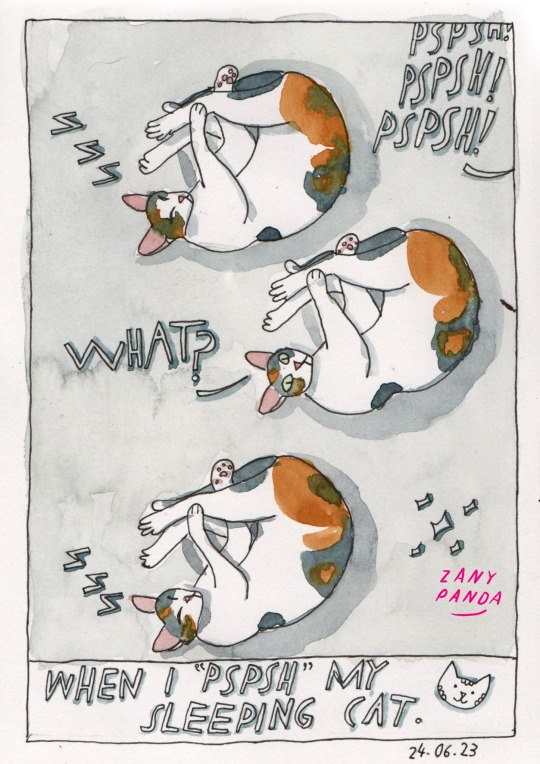
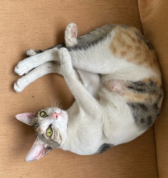
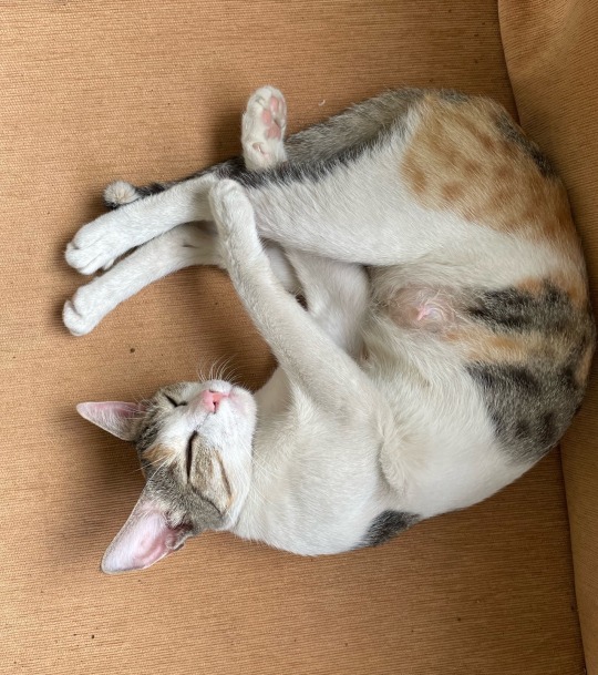
24.06.2023
When I “Pspsh” my sleeping cat
Follow me on Instagram @zany.panda
#sketchbook#100daysproject#queer artist#queer illustrator#catlife#cat sketch#zany panda#drawdrawdraw#drawdaily#drawsomething#watercolour sketch#caturday#watercolour sketchbook#web comics#watercolourpainting#watercolor sketch#webcomic#comics#funny cats#cute cats#cat lovers#daily sketch#sketches#sleeping cat#catlover
532 notes
·
View notes
Text


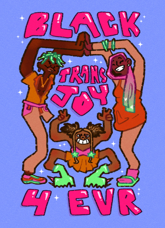
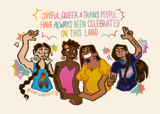
Happy Pride! Ft a buncha illustrations I did for my local LGBT center :- )
#queer#qtpoc#pride#pride month#black#indigenous#lantine#lesbian#dyke#trans#illustration#queer illustrator#wlw art#gay
119 notes
·
View notes
Text
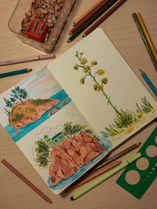
Tiny islands!!!
support me on Patreon (and get lots of exclusive stuff) shop my stickers and prints watch my process videos!!
#illustration#art#trans artist#artists on tumblr#artist support#financial support#queer artist#commissions open#sketchbook spread#sketchbook#colored pencils#colored pencil#traditional illustration#original illustration#illustration art#illustrator on tumblr#queer illustrator#queer owned business#trans owned business#original drawing#original art#human artwork#artwork#landscape drawing
76 notes
·
View notes
Text

She gets the job DONE! 💯
#chappell roan#chappell fanart#chappell roan fanart#chappell roan fandom#Pink pony club#Good luck babe#queer illustrator#illustration student#queer artist#illustration#the giver
40 notes
·
View notes
Text
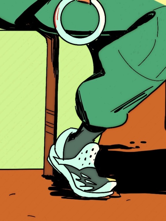
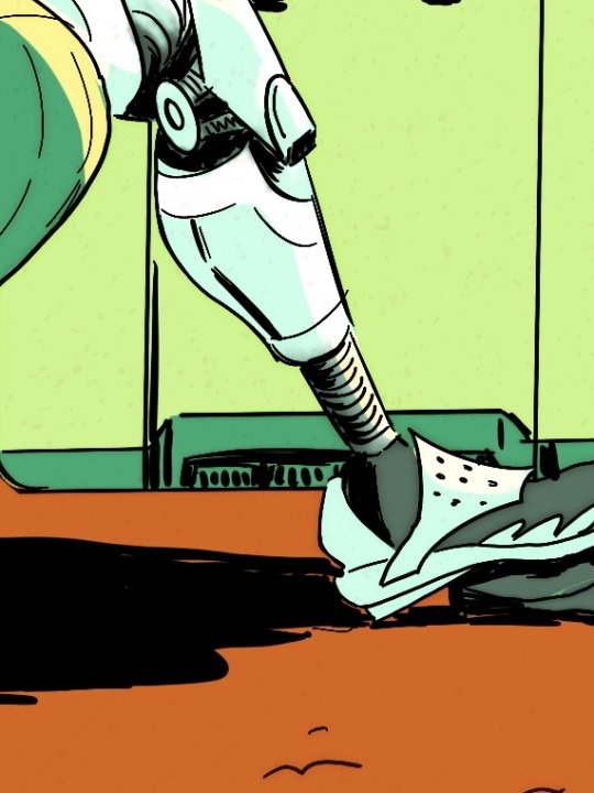
4 DAYS REMAIN!! Help us bring A Hitchhiker’s Guide to Art History to life. Queer sci-fi goodness brought to you by 50+ artists! Back the project to reserve your copy 🚀 the books will be printed ONLY if the KS is fully funded, so help us out if you can!! Love you, bye!
GET YOUR COPY HERE
#sci-fi#sci-fi illustration#anthology#kickstarter#illustration anthology#queer artist#queer illustrator#space lesbians#kickstarter book#lesbian artist
62 notes
·
View notes
Photo

the p in pride stands for spiderman [digital illustration]
#spiderman#pride month#digital illustration#fanart#peter parker#marvel comics#spiderman pride#lgbtq+#queer art#my art#queer illustration#queer illustrator#queer artist#it's a repaint of an old one!
458 notes
·
View notes
Text
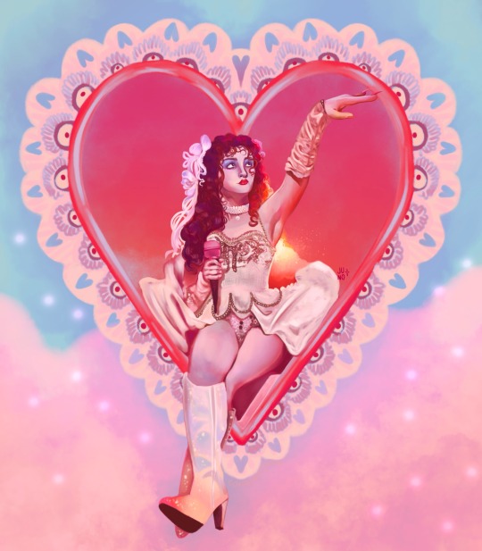
ALRIGHT it’s 3am and i have spent 7 hours and 36 minutes on this one but she is done and i love her.
#my art#illustration#queer art#queer artist#artists on tumblr#character illustration#queer illustrator#chappell fanart#chappell roan fanart#chappell my beloved#chappell roan#lesbian#dyke#sapphic#art#sapphic art#lesbian art#wlw#nblw#human made art#pastel illustration#pastel aesthetic#dreamy art
636 notes
·
View notes
Text
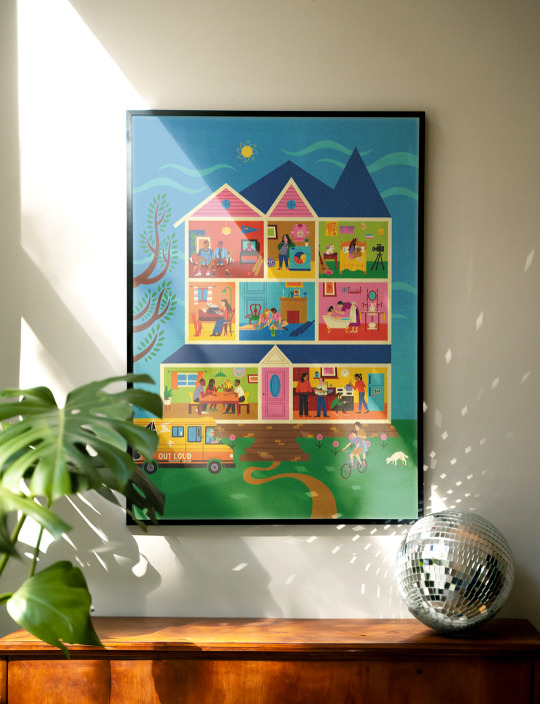
🌈 LIMITED EDITION QUEER MOVIE PRINT 🌈
I'm so so excited to finally be able to launch this beautiful print celebrating the best of QUEER CINEMA in collaboration with brilliant illustrator @filipanamorado!
Also there's a fun mini-game we made where you can guess all 25 movies that are in the poster based on the clues lol
LIMITED EDITION: SALE ENDS 4TH MARCH!!
#queer movie#lgbt movies#everything everywhere all at once#the handmaiden#the watermelon woman#moonlight#but im a cheerleader#rowan ellis#art print#queer decor#queer illustrator#queer design
21 notes
·
View notes
Text
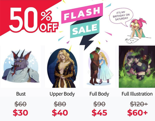
BIRTHDAY SALE!
For the next week, all commissions are 50% off. This is only going to last until Saturday 7/6, so be fast, and have a great week!
As always, if you’re interested, please send a message via ASKBOX to order so it doesn’t get lost in the shuffle. Once I have time that day, I’ll message you via DMs
MENU
BUST: $30
UPPER BODY: $40
FULL BODY: $45
FULL ILLUSTRATION: $60
Full illustrations consist of dynamic lighting and poses, character interactions, backgrounds, etc. Please contact directly for more details.
WHAT TO EXPECT
Please pay at least half upfront. After receiving payment, I’ll work out a basic sketch and present to you for revisions. Up to 3 revisions available for every commission’s sketch phase. Extra revisions available for $20/revision.
After you’re happy with the sketch, provide the rest of the payment. Then I’ll lay down flats and once again present for revision. Once you’re happy, I’ll shade and complete the commission.U
nless otherwise requested, a lower-res, watermarked version of the commission will be posted to my socials, and I’ll send the high-res version to you directly.
All prices listed in USD. CashApp, Ko-Fi, PayPal, and Venmo accepted.
DO'S AND DONT'S
YES: Human characters, OCs, DnD characters, fanart, sillies, multiple-panel comics, Monsters, sfw terato/exo, furries, scalies, etc, body horror, romance, etc.
NO: Suggestive art with characters that are depicted as minors in their source material, nor will I age them up. No complicated mecha (Simple mech ok).
NSFW and Fetish Commissions Selectively Accepted. Please contact me directly to discuss more in depth.
#artblr#artists on tumblr#commissions open#art comms open#art commissions#comms open#art sale#commission sale#digital artist#digital art#queer artist#queer illustrator
60 notes
·
View notes
Text
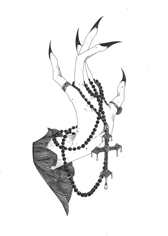
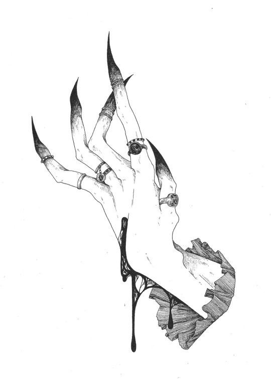
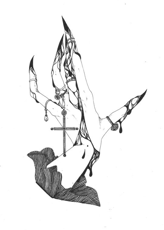
✺𝖁𝖆𝖒𝖕𝖎𝖗𝖎𝖈 𝖍𝖆𝖓𝖉𝖘
409 notes
·
View notes
Text

dyke dawg !!!!
#my art#furry anthro#furry art#furry character#furry fandom#furry oc#fursona#illustration#pansy-paws#safe fur work#dykeposting#butch dyke#dyke art#lesbian art#puppyboy#dog furry#transmasc#queer furry#queer illustrator#grunge aesthetic#grunge art#furry community#furry#sfw furry
35 notes
·
View notes