#also is this just gonna be a thing i do?? redraw a page from the new chapter????
Explore tagged Tumblr posts
Text
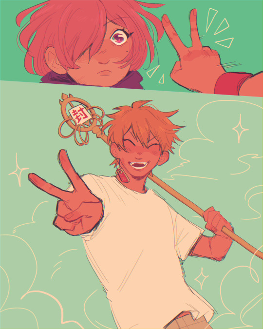
"looks like i win! take that!"
#bro these chapters have been a wild fucking ride omfg#also is this just gonna be a thing i do?? redraw a page from the new chapter????#drawing kous staff made me wanna just#idk commit some violence in general#why is it so complicatedddd 😭😭#toilet bound hanako kun#tbhk#jibaku shounen hanako kun#jshk#tbhk spoilers#jshk spoilers#also chapter 100!! thats crazy#mitsuba sousuke#minamoto kou#mitsukou#fanart#my art#guys do you think i put too much unrelated shit in the tags??#anyways i found out that one of my cats is super scared of tape earlier- that was hilarious#my poor baby 💀💀💀
2K notes
·
View notes
Note
Director's commentary maybe?


HELLO!! lots to say abt this one
i have this diagram with the entire plot of bonus links on it where every plot point is a digital sticky note. anyway the note for this update was just called "loft and wolf talk about being assholes". The original intent was for them to talk a bit more about how they both left their families behind (re: the party update) but the scene ended up taking itself in a different direction, as they so often do. I've saved that dialogue for later tho >:-)
this panel? bane of my existence to color. you would think after 3 years of making these comics I would have learned how to color night time lighting. ANYWAY. i think it's really funny that Wake is the only one managing to get a good night of sleep 😂 good for him

this whole scene was originally also going to be at night but a) i am so tired of night lighting and b) i thought this kind of morning twilight was appropriate for this conversation :-) it turned out a little brighter than intended maybe but I did my best lol
one more thing to keep loft up at night forever

this is directly referenced from this TP screenshot, I think from the mortal draw training. one of the overall themes for this update is, loosely, the ghosts haunting everyone, so. hello hero's shade :D and hi mask


speaking of ghosts haunting everyone, Loft's BG is the pattern I use on Fi's text boxes, and Wolf's is the shattered mirror of twilight

i also set up these shots to kind of parallel each other; wolf and loft coming to an understanding, while slate and champion can't. another parallel being how Fi is silent the way Champion is silent.


I'm not gonna comment too much on Champion and Slate's conversation (or lack thereof lol), but I will say that Champion's role in the story is like. one part literal and one part metaphorical. Champion is not fully the person he was when he was alive. It's the ghost of him in all senses of the word. something to keep in mind
in regards to the fairies, that's actually a total happy accident 😭 i was just sort of coloring them at random, but it really does look like it could be Ciela, Leaf, and Neri 🥺 i'll leave that interpretation up to you guys

omg also if you saw the WIP for the last page on Patreon, I had originally drawn Slate without his tunic. Literally the only reason i changed it was bc I felt like the page needed the pop of green from his tunic lol the dark color of his turtleneck kept getting lost in the bg. so yes I did have to go back and redraw/recolor every panel 😭

that's all for now, thanks for reading!
270 notes
·
View notes
Text
💣💥💣💥💣
so with Episode 67 finally posted and the dust settled, I wanted to share some funny behind-the-scenes stuff with you all.
Clip Studio is a great piece of software, it's what allows Banshriek and I to work on the same episode together via cloud-syncing (it's a function called "Teamworks" in the app) but it's also... kind of garbage sometimes. Without getting too much into it, CSP has a bottleneck issue with how it predominantly uses CPU rather than the graphics card in a computer. And considering it's literally graphics software, yeah, you can probably figure out pretty quickly with the most bare minimum of computer knowledge why this is a problem that's really silly for it to have LOL
ANYWAYS. This has been known to cause problems between Banshriek and I when trying to complete an episode. Problems that - often enough for me to tell you stories about it - result in us having to essentially "rebuild" the episode we're working on. This doesn't necessarily mean having to redraw anything (thankfully that doesn't happen very often) but it usually goes down something like this:
1.) The software suddenly has an issue syncing our changes which results in either conflicted files that can't update, software crashes that refuse to load pages, updates not even going through, or taking WAY too long to update to the point that we'd rather just rebuild and work on the episode independently and then swap the files and layers when it's time for the other person to do their part.
2.) I have to inform Banshriek that Clip Studio crashed again, and in the event that I can't get back into page editing because of the aforementioned issues ^^^ they immediately get to backing up their most recent version of the file that's stored on their computer. Thankfully a lot of the time these versions are pretty up to date, but it's still a moment of tension every single time because these crashes don't always happen the same way every time.
3.) Using the backup version, a new .cmc file (the file that contains every page for each episode, it's the thing that lets you make pages for comics in the software!) is created by whoever has access to the pages without issue (usually Banshriek is the one who's able to do it, this has become a very one-sided problem LMAO) and then is sent to me so that I can upload it to the cloud to replace the old version. This file is then usually called something like "Episode#BACKUP" to distinguish between both versions as we usually still have the older versions downloaded as well.
4.) Work (hopefully) continues as normal. Though it's definitely caused setbacks, so far our survival rate is still 100% 😆
This happens at least every other episode. It's become rare to go a whole episode without having to go through this process. We're still trying to figure out what we can do to avoid it, but we've tried a bunch of other options (and Banshriek has created some test episodes using pages from completed episodes that crashed for the sake of experimenting) and so far it's still a struggle understanding what exactly is going wrong with Clip Studio and it's syncing features. Fortunately, Banshriek and I are both auDHD enough that we're gonna obsess over it until we figure it out LMAO but until then, we're constantly having to treat Clip Studio like a live snake that's trying to wrangle itself out of our hands 💀😆
And the most recent episode? Episode 67, which ran a week and a day late? It set a new personal best for number of backups, because we had to rebuild it not just once, but TWICE.
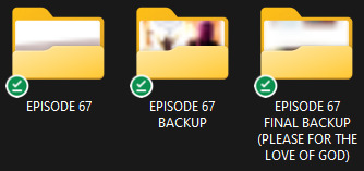


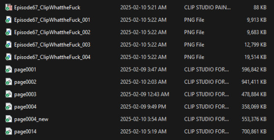
What we've noticed is that sometimes you can barely make a change to an episode and these crashes still happen, as if major changes have been made. So far the best hypothesis Banshriek has come up with regarding this observation is that the software struggles more to update changes that affect overall pixel count and appearance - stuff like moving canvases, flipping canvases, adding on textured layers (which is what we do at the end of making each page) , etc. that covers a lot of pixels at a time, even if it's only changing the hues / colors slightly, seems to cause the most problems.
During the production of Episode 67, the following plagues came to pass:
Our car exploded
Our cat nearly exploded (btw! for anyone wondering from my last post about him, he's doing better now!)
Our toilet pipes froze twice (and exploded once)
Democracy in the U.S. exploded
My husband's wisdom teeth were exploding so the last 3 of them were removed all at once
The files for Episode 67 exploded twice and had to be rebuilt just to keep it on life support (by the end of the episode we were literally sending files back and forth via Google Drive like peasants 😔 /hj)
The most non-explosive thing to happen was the tattoo shop I work at moving locations up the street, and even then, I came very close to exploding a few times during that process LMAO (and our debit machine just exploded so we're cash only for the next few days sksksks)
This episode was probably our most cursed yet, and frankly, it couldn't be more fitting, I think Dionysus himself had a hand in our madness, just for the sake of being on theme with this episode. And the worst part, we haven't even gotten into the truly chaotic stuff yet. All Dionysus has done so far is slam Hades' head into a table, he's barely gotten started. Dionysus only knows what Episode 68 has in store for me and Banshriek as well 😭💀
83 notes
·
View notes
Note
I'm really curious to know if you have officially dropped the manga. If so (and even if not obvs), I'd just like to thank you for so many amazing years of awesome translations. This manga may not be very popular in the west but I'm glad you kept bringing it for so many of us
Hey, sorry for just now seeing this even though this question was sent back in late November.
No, we haven't officially dropped the manga, and Idk if any group has picked up the series while I was gone. Emphasis on the "I" because our absence was not a consenting choice made by anyone else in this group. So if anyone harbors any kind of resentment, then do not direct it towards anyone but me. If we ever decide to officially drop the series, I'll make an official announcement on this blog. To be honest, I wasn't really gonna make much hubbub about a comeback and just post a chapter as if no time had passed. But, because I got this question and you were very nice about it. I'll give some insight.
- 🦙
The only reason I'm an active part of this fandom (any fandom now really) despite it being against my lurker nature and excessive anxiety issues is because I was encouraged to do so by a friend. If you know me from Discord, then you probably know that aside from running this blog, I'm leader of the scan group and owner of its server, I'm even an admin for the Natsume fan server which is its own separate thing.
I don't know if that sounds already sounds overwhelming, but just to scare you, I also proofread the scripts so the dialogue sounds natural and act as quality checker for each chapter. This means cleaning/redrawing sections of pages if the CLDR forgot or didn't meet the standard of quality I'm looking for. Similar with typesetting, I'll rearrange the text if I feel it could be done better. I'm also the main SFX person. When it comes to the scan server, outside of running and maintaining it, I also act as mod to make sure people aren't posting anything inappropriate or inoffensive + setting up bots and permissions.
When I was in High School and even during my early years of college, I could manage it cause I had the support and energy for it. Plus, my love for Natsume was scary intense. So when life got hard, I found that working on scans acted as a lifeline.
Then I had a messy fallout with the friend who prompted all of this, and things shifted. It didn't help that things in my personal life got really bad and more or less stayed that way for 2/3 years. And because of the association, and the guilt of falling behind, working on Natsume was no longer a stress-relieving activity. It became the source of my stress. I ran away because I was scared and overwhelmed. It wasn't healthy and it only made things worse, honestly.
But, I've been really hard on myself over this past year, and I finally reached the point of wanting to come back, but the guilt from being a deadbeat was still eating me alive. Then I got really sick at the start of this month, and I'm no lie, I'm still sick... but that gave me a lot of time to think and reevaluate all kinds of things. Because honestly? I miss working on scans and the collaborative aspect that I fell in love with because of Natsume.
And literally just this past Saturday/Sunday night, I sent a message to the group, apologizing for what I did and provided a similar explanation of why I did what I did. I trying it as just an explanation and not an excuse - I hope I was able to do that here too.
I told my group to give me several days before I actually start working on scans again, though, because it'll allow me to catch up with everything and figure out what needs to be done next, and it'll also give me more time to recover.
Thank you once again for being kind and understanding! I really appreciate it 🥹���
72 notes
·
View notes
Text
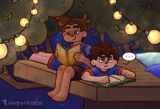
They’re having another reading session!
It’s almost been a year since my first ever post, so I figured it’d be the perfect time for a redraw! The original is… um… well… I’ve definitely improved lol
(Some updates and stuff below the cut)
I’ve been having a bit of art block when it comes to Luca stuff lately (besides the FDM comic). It’s not because of a lack of interest (this fixation has been going on for over a year now and isn’t stopping anytime soon), I just don’t have any ideas on what to draw. I have been thinking of writing, though. I have an entire doc filled with random ideas (shout out to the notes app), maybe I could flesh them out? I have one in particular I’d love to write, about Luca and Giulia’s time in Genova. It’s basically what I’d want out of a Luca series; seeing how the Underdogs spend their time apart during the school year. I might start working on that, actually! We’ll see, lol.
Festa Del Mare updates may slow down? I’ve had the whole thing written since I came up with the idea (thanks notes app), but now that it’s been a bit, I want to go back and rework the story a little. Not too much, though. I mainly just need to redraw the thumbnail sketches for the rest of the pages, which is gonna take a bit of time. Trust me, though, I do not plan on stopping this project. It’s way too much fun for me!
I also just want to thank you all so much for your support, it means the world to me! Each reblog and comment I get brings the biggest smile on my face, and can make even a horrible day turn into a good one. You guys are the best ♥︎
That’s enough rambling from me, lol. Have this extra doodle as a thanks for reading it all. Ciao! ★彡
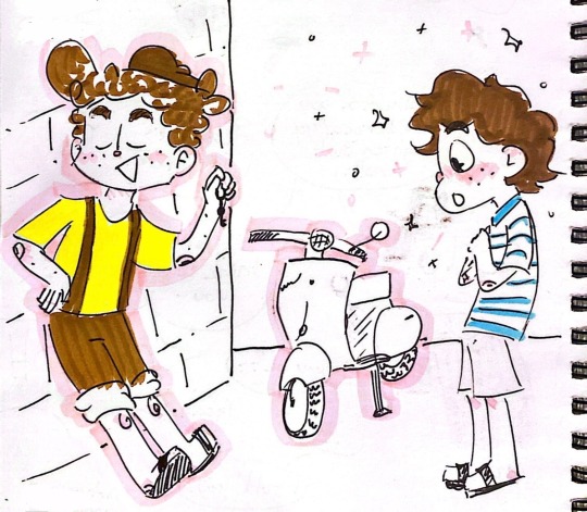
#wow that was a lot of rambling#anywayyyyy tags#pixar luca#luca paguro#alberto scorfano#luberto#i drew a proper background for them this time#with LEAVES!#and a TREE#(the lights were just floating in the air in the original and i didn’t even notice until redrawing it 😭)#luca 2021#luca pixar#disney#pixar#fanart#art#doodle#update
60 notes
·
View notes
Note
i have a newfound respect for drawing comics. i think a big reason why people are always asking when the next pages are gonna come out is because they don't realize just how long they take to make. the last 3 projects i had were multipage, colored/shaded comics that reach took several days/weeks to complete (one of them isn't even done!). then i drew just a singular picture of a guy standing in a color void and was surprised when it only took a few hours. i even fiddled with it for an extra hour because i felt like i had "time left."
I've always followed comics and have drawn them in the past, but until i spent a month almost exclusively doing them, i get very empathetic towards you when people continuously ask when/if you're continuing each comic. it is so much work!!! and what you create is gorgeous. so take as long as you need, including breaks, because comics take so much work they get boring to work on at some point lol
yeah comic pages can take a lot longer than regular pics depending from how u draw them and amount of shading or backgrounds but also just the planning part alone takes a while
thank you! and it's not about the ppl asking 💀 I just can't deal with going back and forth between the mindset of doing this comic and of doing other things every week anymore and I've wanted it to be done asap since 2022 so if I can power through and finish it in a week instead of finishing it in 5 months? I'm rUNNING
but that aside I did a 20 page buffer for my other comic as well at the end, it just makes things more organized for the printed version release, I think I got around 10 pages left to do + redrawing some pages and I do want to take a break but I'll just make things worse for myself if I stop now;;
174 notes
·
View notes
Note
Show us your Kirby gijinkas. Now. (If you even have any.)
sorry abt the long wait, but here u go
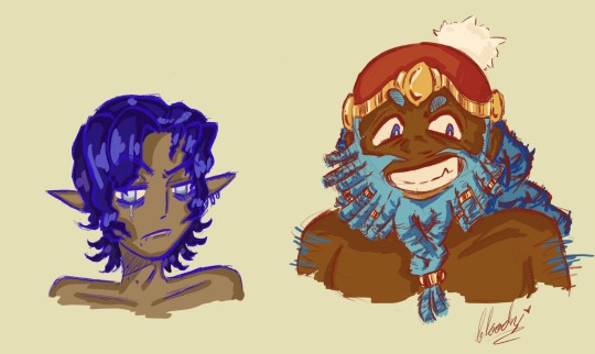
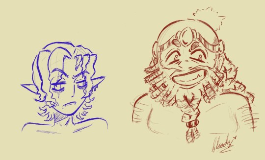
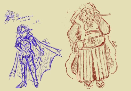
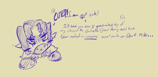
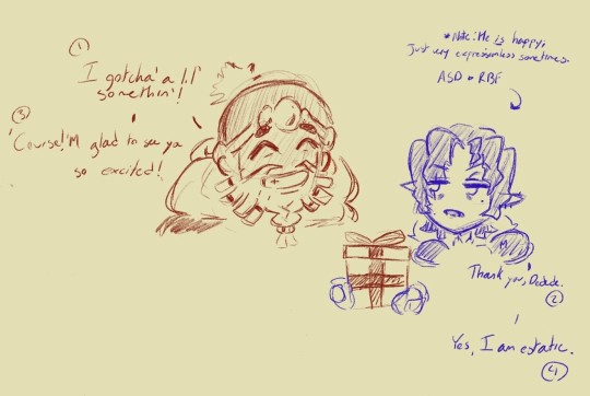
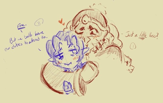
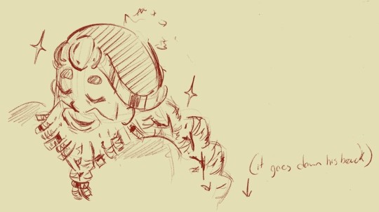
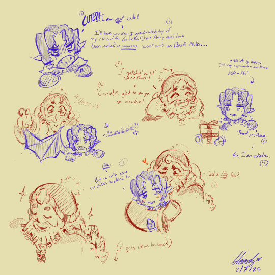
im SOOOO happy w how these turned out.
sorry, but i only really have set designs for meta and ddd at the moment but i'd LOVE to do the other characters. i know you didn't explicitly ask for mtdd, but I just couldn't help myself <3
(ill go into more detail about my choices under the cut, I just love to yap)
okay now that ur stuck here with me, I'm gonna start with my design headcanons and inspirations.
Meta Knight:
Okay for Meta I wanted go with a more slender-ish, short-statured body will a bit of a baby face. I really tried leaning into a bit for vampiric features like fangs, desaturated colors, and the signature vampire bites (although these ones are just moles for the aesthetic). I wanted to give him a good chunk of unique features too like a scar under his right eye, a few beauty marks, pale-white eyes, prominent fangs, like 2c/3a hair (this means curly/wavy incase ur unaware), permenant eye bags, and a hooked nose for good measure. Ski-slope nose meta is evil propaganda which shall not be trusted.
yes yes, i can hear u saying "he looks like a twink" and to that I respond, "well, I'm fucking trying. he looks strange w facial hair to me and also Im a raging lesbian who only draws women over and over again". Also I made him Mexican because have u SEEN the anime dub. its fucking gold. and while I'm not Mexican, I AM colombian and black, so I thought this would be a good time to flex my liberal wokeness and make meta darker than a piece of paper. excuse the egregious anime hairstyle, I like anime and don't get out much.
King Dedede:
Alrighty I REALLY stepped out of my comfort zone here. I'm gonna be honest and say not only do I not draw a lot of men, but I don't draw a lot of men with larger body types like ever so this was definitely a bit of a challenge. god bless the "fat guy" anatomy tumblr post I saved a year ago, it came in clutch. anyways, I wanted to add some traditionally black hairstyles to my kingy king so I did a bit of thinking until I came to a realization. BEARD. LOCS. it was genius. I scrolled thru this guys page on tiktok who also had beard locs but they had jewelry on them and I just thought "wow, el, ur a genius." so I threw them into the design ofc. I like how a few other gijinka designs of ddd give him a long braid in the back. It's very regal. So I did that too but it's a braid made up of locs. Dedede's head is probably extremely heavy from the hairstyle I gave him, but he'll live. To list off some attributes; I gave ddd a wide, flat nose, vibrantly dark skin, like the underbite kind of fangs that u see in werewolves(not sure what it's called exactly? anti fangs??), locs, bushy eyebrows, and blue, tiny pupils. Again, I am VERY happy w/ my resdesign of him since my design of MK didn't change all that much from 2022.
In Conclusion:
thank you to anyone who made it this far!!1!!1
I know I say a whole lot of nothing sometimes, but I'm just so touched somebody out there wanted to see MY gijinka designs. its so funny cuz that's literally what my first ever post was on this app and Its nice to see things come full circle for once. hopefully, you all think Ive improved since then. personally, I think I improved a wee bit, but ill always strive towards improvement so I can have enough talent to consider redrawing the designs I just made, but even better <3
49 notes
·
View notes
Text
In recent weeks, @puzzled-zebra got me into the anime (and manga) Ancient Magus' Bride.
Before I say any more, I want to say I've only seen the first season's worth so far! So please no spoilers beyond that!
I am far from being an anime enthusiast. I've tried a few different ones in the past, but very few stuck with me, and I've only seen one or two all the way through.
But AMB has gripped me hard... and I think a large part of that is just how many parallels there are to Jamie's story. I don't know if that makes me self-centered, but it's a story that feels familiar yet very different, and just makes me happy in its own right. Come for the parallels, stay for the beautiful art, charming characters, and intriguing story! ^w^
Anyway, I've made a couple artworks centered around AMB, but I'm gonna put them under a read-more for different reasons.
Some warnings for the below: 1; Painting of a semi-realistic canine skull. I feel like it could creep people out, so I wanted to be cautious about it. ^^ 2; SPOILERS for AMB; Season 1, Episode 8 and beyond of the Anime and the equivalent portion of the manga.
But before that, here's a completely safe page of Woolybug doodles~
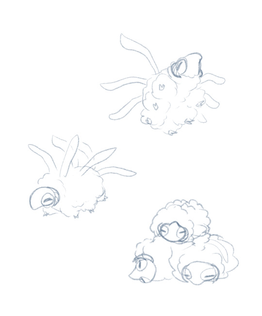
AKA a Normal/Bug type Pokemon lol
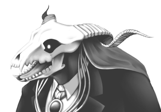
I wanted to do a painting, and brain said it would be fun to try Elias' skull head.
It was very fun, but also... a pain... as you can imagine...
It's a painting of a panel redraw. :>
Context for this next thing (this is the spoiler part);
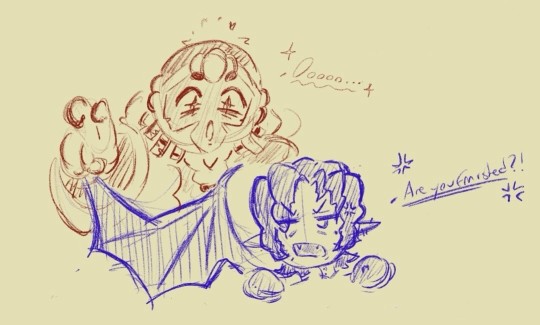
The person on the right, who is a black fae dog who's seen here in human form, is becoming the Familiar of Chise, the person on the left. Because it's a Magic Bond™, there was a whole big cinematic to-do around it.
It gave me a silly thought.
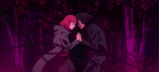
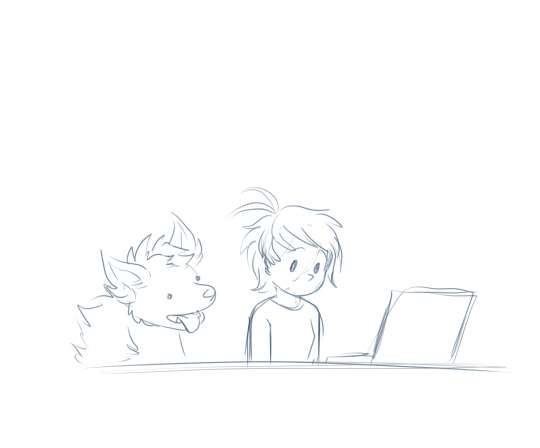
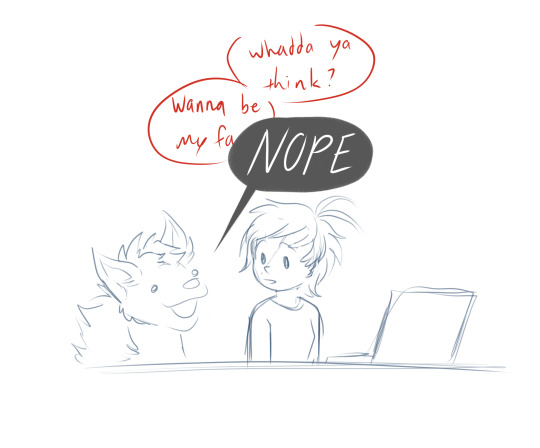
I feel like that bit can only be fully appreciated by AMB fans, but I wanted to include it anyway. X3
I've got half a mind to list out all the parallels Zebra and I have noticed, but that'll be a later project. ^^
102 notes
·
View notes
Text
One Piece 1132
I don't have a lot of thoughts on this one, yet somehow it might be my favorite Elbaph chapter so far based on vibes alone!

OK I'M GONNA START WITH THE MID-CHAPTER DOUBLE SPREAD BECAUSE WOWWWWW. Wow. God the atmosphere and the scale and the art is off the charts. The Luffy and Usopp bit made me smile sooo hard I'm going insane in the head.

They're so cute. Usopp is so cute here, shut up!!! I'm so happy, this is so important to both of them! This gives me hope that their dynamic will be explored more once again. My boy's dream is coming true.........
Anyway as I said, I don't have too many thoughts this time around, but I am so so glad Oda found a way to unite every single group of characters in this chapter.
I tend to hate "everyone is separated and therefore confusion / misunderstandings / hijinks ensue" type plots, so this was a relief. But also, the convergence was just done in a very competent way, and the whole time there's a lighthearted and fun atmosphere that makes it fun to read.
This chapter in general just made me happy. It's a very charming and explorative chapter of small good things happening, before we settle into any serious plot. Somehow because of that, as I mentioned earlier, it's been my favorite so far!


Also I know I said this last time too, but I love Goldberg and Gerd so much as a little character duo. They have a very charming dynamic and really cute designs, I hope we see much more of them throughout the arc!
I like how Gerd comes off as kinda unintentionally patronizing towards humans lmao. She has good intentions but she kinda treats them like lost little puppies or something.

And speaking of the New Giant Pirates, people were probably right on Rodo being based on Gargamel a bit, lmao. This brought me back to my childhood, it definitely has that vibe. Good Saturday-Morning-Cartoon slapstick. Nice to see he continues to be absolutely terrible. But hey, at the very least he gets the lights kicked out of him by Goldberd and Gerd.
Speaking of old nostalgic cartoon and comic-book properties that inspired Oda in this arc, we also see a lot of that giant kid who seems to be based on Vicky the Viking again. Turns out his name is Colon and his family lives on the village on the second layer (the "Sun Realm" as they call it). The barmaid, who is presumably his mother, also mentions a character called "Ripley", but we don't know anything about who that is yet. I hope Colon ends up being the Aisha / Tama etc of this arc, it'd be really cute!

As far as more plot-important events go, we do find out that Loki and Luffy did in fact make a deal. Luffy does try to keep the secret, so that tells me he accepted it. I have a feeling this is Not Going to Go Well!

The chapter however, despite being very cheerful and fun, ends in a pretty sinister and spooky note. That tells me we're actually going to be here for a while lol, I'm so curious on where this will go. Note that Arnot is a character who's been mentioned before! Apparently he published a book with his adventures decades ago, and he was first mentioned having written about Whiskey Peak and Little Garden.
In this final page, we also see the silhouette of the mystery man in the kasa hat who's been allegedly waiting for the Strawhats again! Place your bets on who's it going to be. Is it Shiki? Gaban? The "Hinokizu / Flame-scar" Man? Someone from the Red-Hair Pirates? A completely new guy? Who knows! Looking forward to the next chapters!
(Hope I can find the time to do a little redraw of Usopp's little crying face, what a highlight for me!)
17 notes
·
View notes
Text
Christmas Dino V1
Okay so there was this post and my brain latched onto the idea.
Christmas Dino! Way cooler than a tree, easier to store and no stupid pine needles everywhere.
We're super close the holidays so this year will be V1 - with plans for embedding lights and possibly engraving designs next year with more time.
So with like -2 planning skills and +5 to ADHD hyperfocus, off we go. The goal is if I chronicle this, maybe it'll keep me from getting distracted. HA.
Day 1:
Okay so the plan is to pick a dino, find a basic pattern, and then figure out how big to size it up so it fits on our tree table (aka the dining room table because we don't use it).
As much as I really wanted to do a Stegosaurus, the issue is that with the restriction of the table size, I'd be looking at a fairly small dino. Also, we want to keep our tree topper - a modified Heroes of the Storm Tyreal figure - and an bipedal dino allows for more hilarious possibilities for how to mount him on top.
So t-rex it is. I found a pattern online after a bit of Googling - it's low rez as hell, but I'm going to have to redraw it anyway to properly size the joints so no big deal.
Next step - Measure the table, and then maths to figure out how big to scale it Naw, we're going by vibes. Slap the pattern into MS Paint, scale it 300%, print it, reassemble, cut it out of cardboard and test the size.
(Just FYI in case someone isn't aware, because I wasn't - if you ever need to print something over multiple pages, MS Paint does it for freeeeeeee. Otherwise the only other option I know of that actual works decently well is Adobe Acrobat but you need the stupid CC sub for that feature. So to hell with Adobe, MS Paint ftw!)
This is gonna be so much easier than maths. Yup.
There were two pages of pattern pieces, each page ended up being 16 pages once pushed to 300%. Yay for laser printer speeds (seriously so happy we finally bit the bullet on one - this would have been objectively painful on an inkjet)
Popped Fantasia on in the background to began assembly!
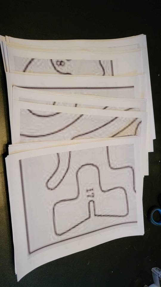
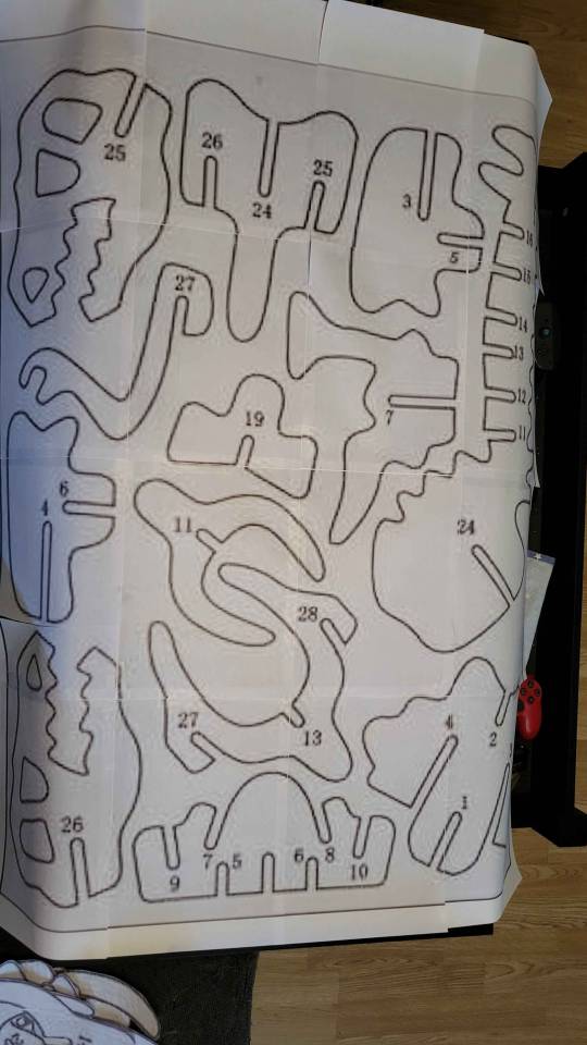
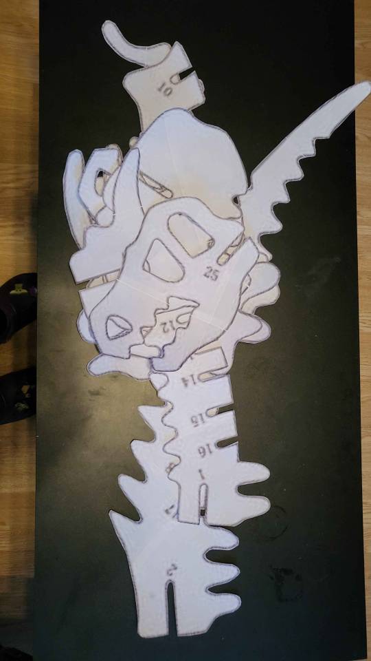
Once assembled, cutting begins and a few songs later, we've got a pile of pattern pieces!
Luckily my ADHD brain has forgetten to put out the cardboard for the last like month and half on recycle day, so I've got a solid IKEA box to cut (most) of the pattern out.
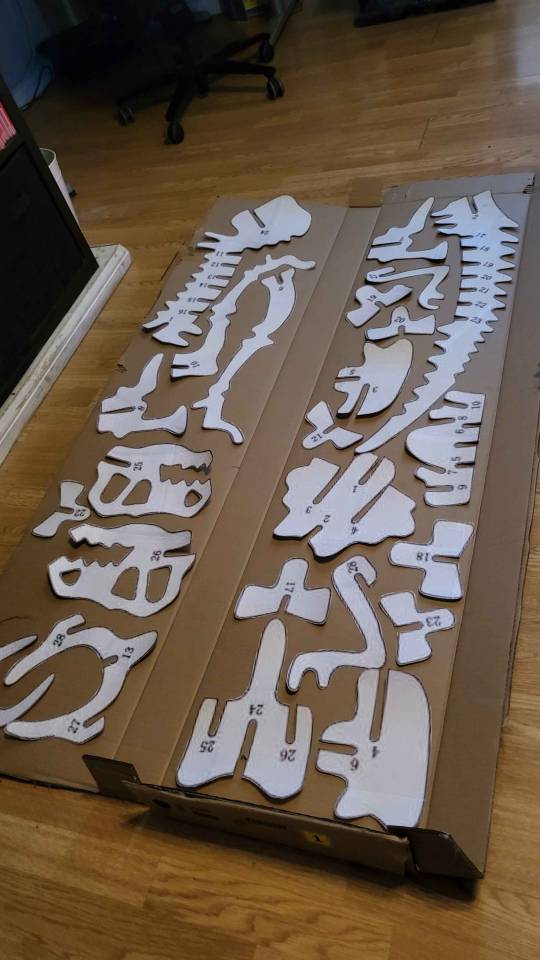
(There's a few ribs that had to be done on another box, but they're not technically structurally significant so that's okay.)
Traced and numbered everything (mostly), and then we cut out!
I would like to note two things at this point:
This is all taking place in my living room, on my coffee table and my floor. I have a decently sized full on craft room and table JUST FOR THIS KIND OF THING but no. On the floor we go. At almost 40. My lower back has not forgiven me yet.
Since the IKEA cardboard is thick, I figure using my flip out utility knife is going to be the easiest tool for cutting. This is both correct and wrong. The knife is sharp and gets through the layers no problem HOWEVER it is a utility knife designed for more single quick use on a work site. It's got a rough texture and bolts and a belt hook. (Google Milwaukee utility knife and you'll see...) So by the end of this I've got a blister at the bottom of my middle finger that's popped, and several more on my finger tips that I notice as soon as I start typing.
TL;DR I'm dumb and injured myself in ENTIRELY PREVENTABLE WAYS.
But! I've got t-rex bones now!
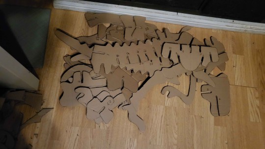
It's assembly tiiiiiiiime!
Okay so cardboard isn't the most sturdy, and my boy cannot hold himself up on his spindly little cardboard legs. But still! He's the perfect size! A little wall for support and he's all set! Aiden really didn't want cooperate with requests to be used as a scale model, so Tali jumped in because she's the goodest girl 💜
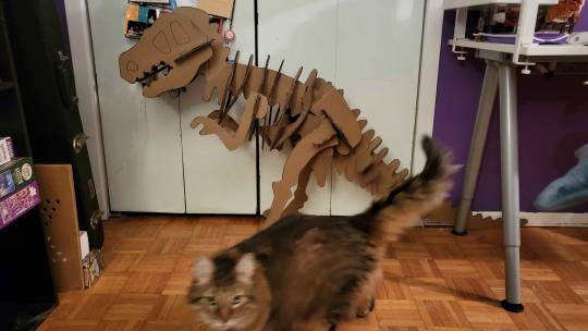
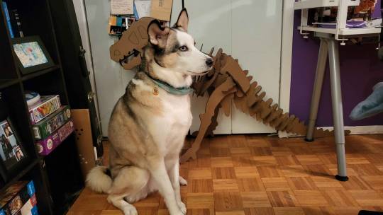
Alright, so we've got our size (sort of) and a pattern. Success! Next steps:
Figure out if we need to modify the head in any way to accommodate Tyreal
Determine the best pattern layout for the sizes of wood sheets available
Make an actual file of the pattern that isn't a blurry PNG so we can pull it into Lightburn
ONWARD!
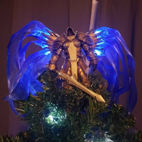
For reference, here's our Tyreal - he deserves an epic t-rex to ride
Part 2
#nel rambles#nel makes a thing#christmas dino#adhd hyperfocus project time#also massive shout out to my partner#who just rolled along with this plan#perfectly happy to let me go insane and make us a dino#he knows the ADHD latch on when he sees it#our ADHD brains go together so well lol
13 notes
·
View notes
Text
Well, the one page I was able to completely finish today somehow got wiped from the face of the earth hours ago and I just found out. :,) I was able to get a Lo res screenshot of the page from the exported Timelapse video but I’m gonna have to redraw everything.
A great thing to happen in the last few hours of weekend freedom before Day Job. Also, a little bit of salt in my wounds considering I’ve been feeling low about my art and its relevance/reach.
Ok…affirmations time, I guess….um…I am proud of the fact that I was able to write, thumbnail and complete several pages of a one-shot comic this weekend. That is an accomplishment for me even though my brain is not letting it feel like one.
Well, I can’t beat myself up too much…time to take a break and *checks to do list* um…pay some bills. Yay.
#and my period is gonna start any day now and that will probably have me bedridden but not able to draw#it’s just like that sometimes!!#putting my thoughts out there I guess
28 notes
·
View notes
Text

Day 12: Is this love?
Aka, a Garrance lore dump!
Garroth was assigned to help Laurance get acquainted with Phoenix Drop during his recovery from the nether. Aph thought it would be good for Laurance to have someone else to talk to aside from her and Zoey, and thought him and Garroth would get along due to their shared guard experience.
Laurance is pretty down during their first few meetings, but he starts to perk up as his health improves, and he grows more trusting of Garroth guiding him through the village. It doesn’t take long for Laurance to start flirting with him, though Garroth writes it off as him just being friendly, even as he’s lowkey reciprocating the advances.
During one of their “totally platonic outings” Laurance opens up about his past: He was born in O’Khasis, and had no memories of his birth parents because they were arrested when he was a baby. He spent a few years in an O’Khasis orphanage, but quickly transitioned to living on the streets, experiencing first-hand the struggles and cruelty O’Khasis hid from the rest of the region. It’s why he’s so slow to trust; after having no one to rely on but himself for so many years, it’s difficult to be so reliant on others while he adjusts to blindness.
Garroth, while not revealing everything (for obvious reasons), also opens up; he had run away from home because he didn’t like the person his family was pushing him to be, and he’s still struggling to be his own person.
When Garroth drops him back off at his home, Laurance kisses him on the cheek before going inside.
(Old art, didn’t feel like redrawing the scene)
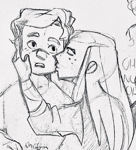
Garroth.exe has stopped working.
Garroth avoids Laurance the next few days. He feels awful about it, but he can’t pin down how he’s feeling, and he feels talking to Laurance would just make it more confusing. Eventually, he gets frustrated enough to go and talk with Aphra:
G: I need to ask you a question.
A: Sure? Go for it.
G: Hypothetically, if someone kissed you, and afterwards you felt like you were gonna throw up, what does that mean?
A: …like throw up from disgust, anxiety, or butterflies?
Garroth shrugs.
A: Irene help us. Come inside.
It takes a long conversation with some input from Zoey (Aroace Aph is somewhat limited in the advice she can give), but they eventually get to the root of the issue:
G: I didn’t have a say in anything growing up. Everyone just told me what to do, told me what I wanted, and I went along with it. I thought I was finally getting better, but it’s like I’m still waiting for an approval that doesn’t exist anymore! I’m so confused, I can’t even tell what I want.
A: Well, that might be a good thing to tell Laurance. It’s okay to be confused, but it’s not okay to just ignore him while you work through this. You should let him know how you’re feeling, even if you’re not sure the feelings match.
Garroth goes home to think a bit more before leaving to find Laurance. When he opens his door, Laurance is already standing there, about to knock.
L: I just wanted to say sorry for the other day. I feel like I crossed a boundary, I should have asked before trying that.
He talks faster, clearly flustered.
L: I thought we were on the same page, but I guess I’ve never done this without being able to see so maybe I misjudged how comfortable you were, and either way I’ve really liked talking to you and I don’t want things to be awkward so if you just want to pretend it never happened I’d be fine with that-
…
G: Please? For real? I need to know.
#aphmau#aphblr#aphverse#garrance#aphtober#aphtober 2023#mcd#minecraft diaries#mcd rewrite#aphmau mcd#mcd garroth#mcd laurance#aphmau garroth#aphmau laurance#garroth ro'meave#laurance zvhal#garroth x laurance
89 notes
·
View notes
Text
I think I'm going to stop doing art for some time.
I have too many ideas for posts and comics but I need to put it aside and focus on writing my AU's summary. It urgently needs an update and it's gonna be a HUGE one since I'm putting more details about the story. I just started with the first arc and I'm already reaching 6 pages, so you can imagine it will take a while to finish it all. Not to mention that I'm going to do some redrawings for the new update too.
I have some pics ready to be posted for Halloween and after that I will be on hiatus so I can work on the summary. I'll try my best to finish it as soon as possible because I have 3 comics to work on after that and one has to be ready for December AND I'm also planning to do a summary of the summary of my AU lol please someone stop me I have no control over myself I have so many WIPS I'm going to die.
Anyway, I'm a mess and I need to focus on one thing at a time, so no more art stuff for a temporary time :')
In exchange, I'll share with you some WIPs that I haven't touched in a while because I'm a disaster, tee hee. ���
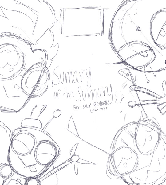
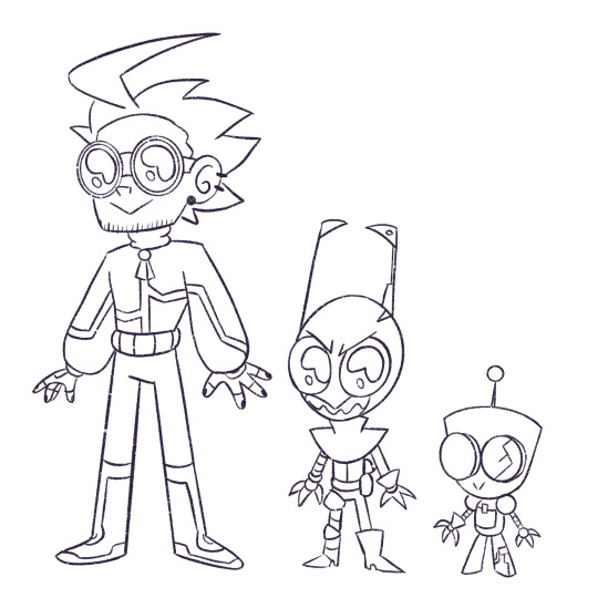
Stuff for the summary of the summary lmao

Comic I have to finish for December :)))))
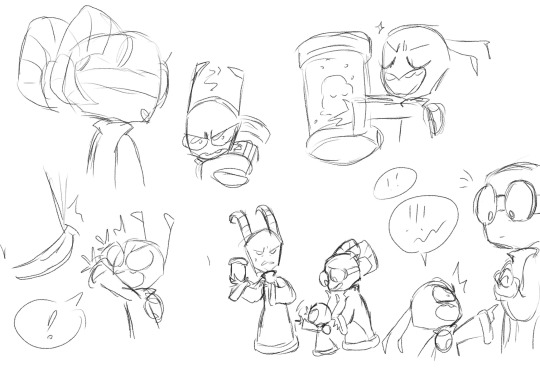
Dad Nar comic? Dad Nar comic.
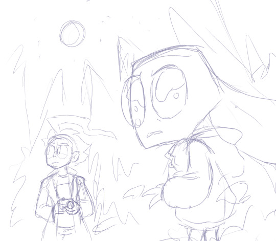
Road trip AU thingy I never finished
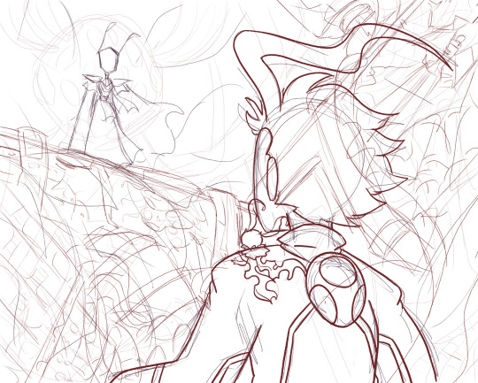
Amygdala San uwu

Miyuki!!! (And her traumatized son)
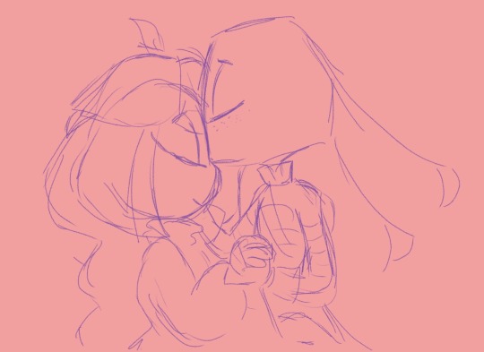
Odi and Lu. I hope I can post something for them for February :')
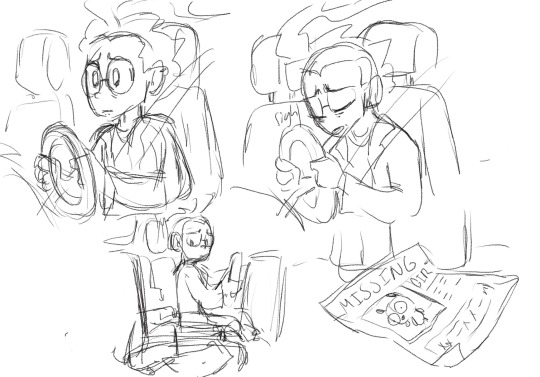
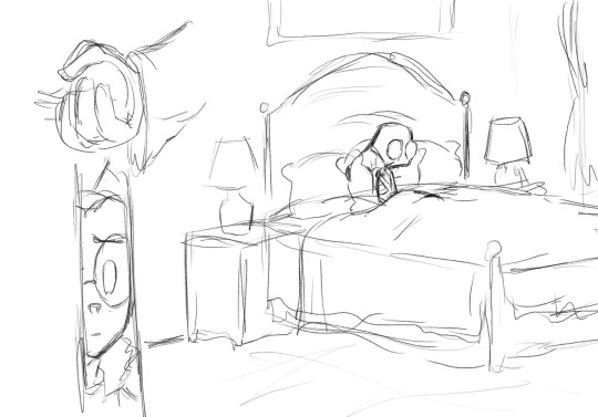
More Road trip AU stuff

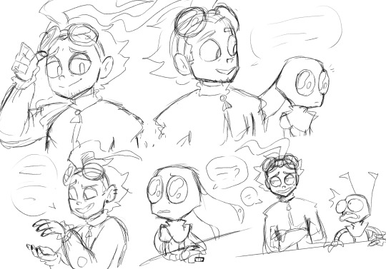
another comic :''')
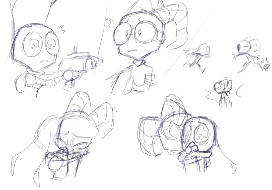
Not exactly a WIP, I just wanted to let it out of my system

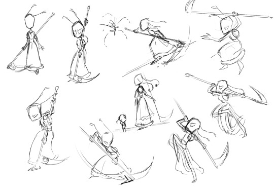
These are not WIPs either, I just wanted to practice battle poses using boss fights from the Souls games as reference :)
And that's it, I have many more but If I don't cut it here we will never finish this post. Now if you excuse me, I'm gonna go cry and scream in a corner 👍
#And I need to work with Dib's comic too.....#brb I'm gonna perish#shut up liizz#invader zim#invader zim au#spacejunk au#space junk au#road trip au#dib membrane#the almighty tallest#tallest red#tallest purple#gir#lard nar#tallest miyuki#original characters#AI urania#amygdala#the little one#ex invader odi#lu the erucian#my art#2023#liizz
137 notes
·
View notes
Note
Hii I amabsoloutly inlove eith your artstyle.
can I ask a few questions? :<
how lomg does your deawings usually take? and do you have any speedpaints,,, uploaded somewbere... for studying purposes
your drawings makr me want to to back to lineless art lol. and not take it so hard on myself.....
Hi there!! Unfortunately I don’t have any speedpaints seeing as I stop drawing while I’m working on my stuff cuz I get distracted easily 😭😭 so if I did you’d just have big periods where nothings happening LOL usually I post process shots on my personal irl server after each drawing session just so I can see how far along I am but that’s about it!
Also I fully support lineless!! I don’t do any lineart (clearly LOL) and it’s more fun to just paint over your sketch and make as you go!! And yeah don’t be so hard on yourself anon! Art is hard and shit takes time, so whether you take a few days on a piece or months I think you should be proud that you actually made something, even if it’s just for yourself :)!!
As for the question of how long I take on my drawings:
(More under the cut!)
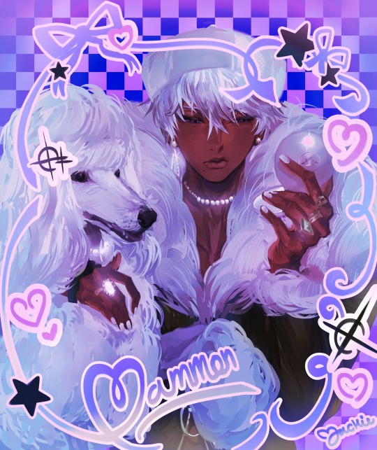
As for how long it takes me to make drawings, I’d say it varies like this purple mammon I recently posted took a month but that’s because I had lots of final school work to do and I got sick twice during that time 💀💀 but this three pose page I did as a commission:
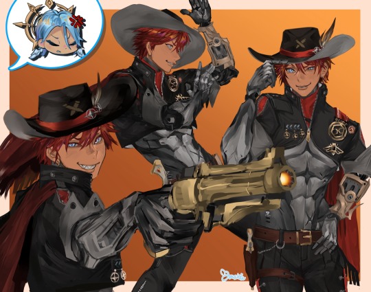
This one took me 9 days which is crazy when I think abt it actually cause there’s way more happening but yeah!!
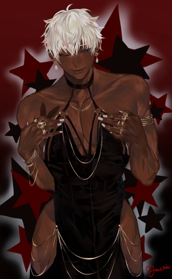
This mammon in the back dress as well took about five days!! So to give you an estimate I’d say anywhere from 1 to 4 weeks? Most mammons I do usually end up being on the lower half of that range! Outside circumstances may make it vary but that’s usually the time it takes!!
Oh and I’d like to add that I usually am a night owl and only start working till around the evening times when I draw!! So when I say days I don’t mean like I spend d all day over my tablet, I don’t think that’d be very good for your health anyways 🤕🤕 take breaks yall play a game you like or watch something on YouTube!!! Don’t spend all your time working lest you burn out!!
I’m gonna be real with all of you, cause my friends make fun of me for it ALL THE TIME LOL but the largest majority of mammon drawing time is like 80% redrawing the face over and over and 20% the rest give or take. I drive myself crazy drawing mammon faces cause I need it to be perfect cause it’s mammon so when it’s not “perfect” I keep working at it and I don’t move on until it is 💀💀 my friends notice a cycle where it’s like:
“You guys I have such a fire idea for a mammon drawing” (makes sketch and flats in like 10 mins) —> (starts face) “wait you guys this face is kinda good maybe I won’t spend fifty years on it :D” —> “eehhhhhhgh okay face not looking good lemme see if I can tweak it” —> “okay face need to be redone.” —> “I decided against redoing it I’m just gonna fix what I have” —> “we gotta throw the whole idea out and start again.” —> “wait you guys I think I did it the face looks good asf was I crying for nothing before??” (They tell me yes I always do) —> (I move on from the face) —> (the rest is completed within 2-4 days) —> Done!
It’s stupid as hell I know LOL but when it comes to mammon if i don’t make him as best as I can I don’t feel like I do him justice. The things we do for love, right?
#asks#mammon obey me#yeah I’m usually pretty quick#but when it comes to mammon I must stay locked in my chambers#until he’s ready#and if he’s not#I spend fifty years and fifty nights tinkering
20 notes
·
View notes
Text
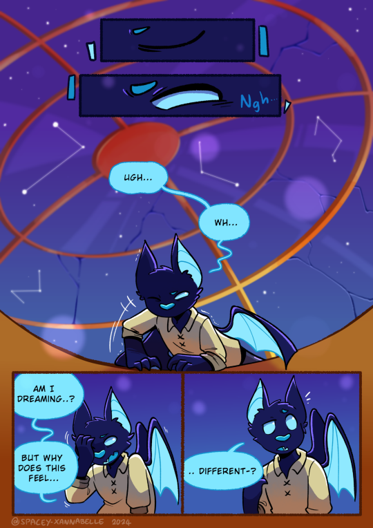
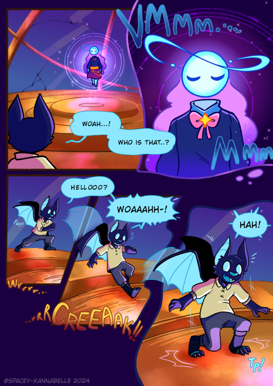
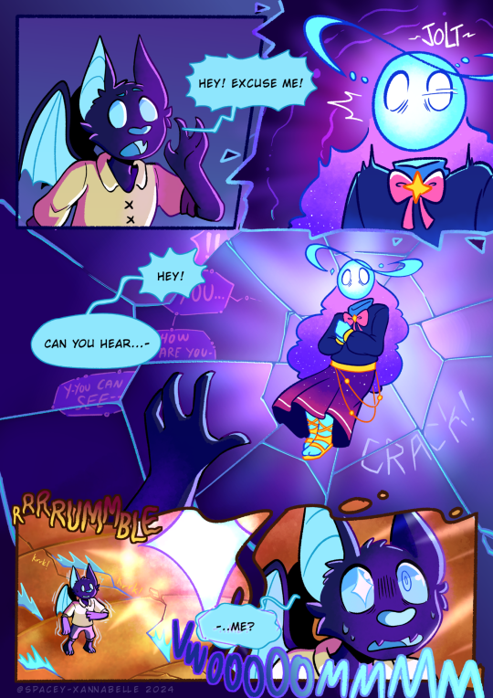
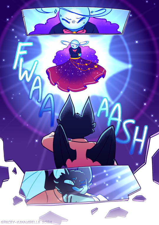
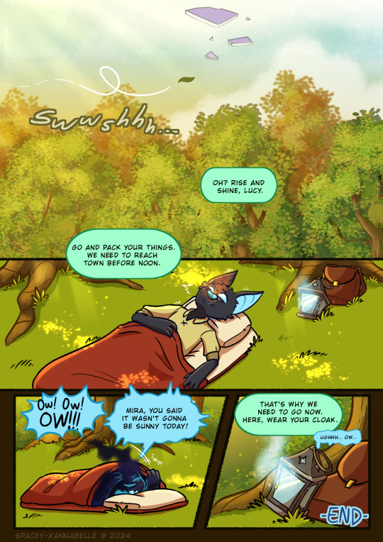
Fateful Encounter...
Last month, at around April 10th, I decided to revisit an old project I started months prior which was to polish up a test sketch of a comic page about Lucy encountering Lumi in the dreamspace. And after slowly making progress on this, I'm finally finished with this!
I'm gonna leave some artist notes under the read more, but overall I'm super proud of how this turned out!! This is pretty much my first serious attempt at making comics in general so this has been a very interesting learning experience!
Artist notes: So this is what the original sketch for this whole thing was. It was just me scribbling out a scene I had in my head for Startrails that I wanted to put on paper:
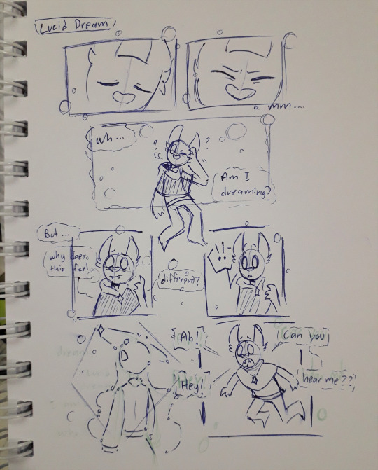
This I'd say was made around 2020-2021 ish. At the time, I didn't really do much with it. Until several months ago, I thought of trying to redraw this page and expand upon it.
But my first attempt at doing this didn't quite lead anywhere. I barely got through the thumbnailing process and just gave up bc I lost motivation (and life/work stuff was Happening so yea I had to put this aside as I figured stuff out). Here's the first draft of the thumbnails:
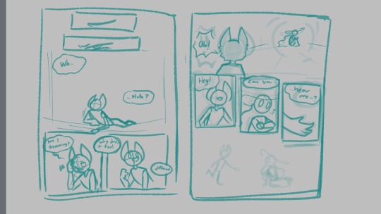
It was just two pages at the time and was pretty simple. I left this project sitting in my files for a while until I one day just, started binging videos from Thestarfishface on YouTube, primarily her webcomic guide videos. And I decided I'd give this project another go.
It was here where I began making a second draft of the thumbnails and this was what I had to work with:
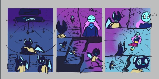
I wanted to experiment with the panels and get funky with the compositions this time around. The 2 page draft expanded to a 3 page thing. But I thought it would've been better if I added one more page at the end with Lucy waking up as a conclusion to wrap this whole thing together.
And in the middle of working on page 3, my friend had suggested to do a an impact frame page, which I hadn't considered during the thumbnailing, so 4 pages became 5. And this was the result!
I posted the pages as I finished them onto my deviantart so that's where a lot of my thoughts were journaled as I went along dfjsdh. To summarize my ramblings there, this project was a very fun (and a bit frustrating) learning experience! I'm hoping to keep practicing and improving my workflow, and hopefully one day make Startrails a full fledged webcomic :')
Additional ramblings:
The structure that Lucy finds Lumi in is inspired by an orrery.
For page 5, I initially didn't plan for much dialogue but as I drew it, it felt just a liiiitle bit empty, so I kinda just threw in some dialogue for Mira. But bc I was already in the inking process (and I just wanted to have this project completed), I didn't redo the page to even include Mira in it. So Mira's just out of frame sdfjskdh. If I had more time and energy to keep this up, I'd have made a revision of the page so I could include her.
This experience has taught me that I could seriously work on my rendering process a bit more, and that my layer management is just atrocious sdkfjksdfh
This has also taught me that while Medibang has the tools needed for me to draw these pages just fine, it also lacks some stuff that I personally need if I were to do a longer project like this. So I'll be experimenting with CSP next!
The dialogue throughout this whole thing wasn't all that planned out- I really just stuck close to what the initial doodle had which probably wasn't the best idea bc I just have like, 2 pages of Lucy's awkward sounding dialogue aaaa. I might do something a bit more dialogue heavy to help improve this skill next time.
Anyway, thank you for reading through my 1 am ramblings on this little project of mine shdkjhks
#artists on tumblr#Art#Digital art#comic art#original characters#OC lobby#OC art#Xan draws#Lucy#Lumi#Mira#Kinda dfjfkh#Startrails
23 notes
·
View notes
Text
Special Informal Devlog
Hi-ho, Wudge here! Aaaa. I missed the update last week... as we crawl closer and closer to release, it's become harder for me to write devlogs. I'm making progress every single day, and that makes me so frustrated that it isn't done yet, you know? 😭 Something something curse of perfectionism...
Anyway.
I thought I'd try something a little different with this post by chronicling a specific screen I've worked very hard on, from start to finish!
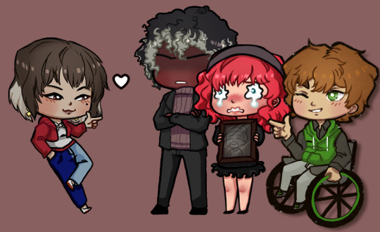
(Pictured: a preview of where we're gonna end up)
It all began on... August 2021?! Yowza, two years ago! When I posted a poll on tumblr and on itch about how I should handle flirt indicators. The votes were split 50/50 between two popular options, and I was able to surmise that yall would really, really love an option to toggle between the two.
It didn't take me long to figure out how to implement the toggle itself.
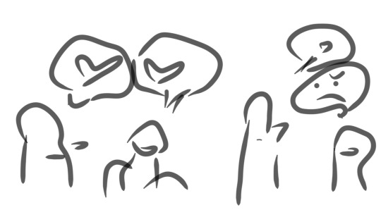
The following year (September 2022), I came up with the idea of putting in an illustrated tutorial on how my flirt indication system works - after all, poll participants had told me that they loved the idea and had never seen it before in other games. I was on a treadmill at the time, so I quickly doodled the idea on my phone. It looks like this:
Then when I got home, I did a rough pen draft to solidify the idea...
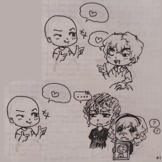
I worked on the digital version over the next 2-3 weeks, and asked my friends for help with editing the text to ensure clarity.

.... Then I took a looong break from the infographic to, uh.... write, edit, playtest the game, draw expressions for Griffin CG, draw expressions for the landlord, work on a new Clammy Lady sprite, playtest the game again, make all the characters blink, make the first glowing animation for Jade's powers, code in Griffin's CG expressions, stress about paypal making changes in my country, do concept art for upcoming npcs, write some more, playtest some more, draw a birthday picture for Dart, write devlogs every single week, make sure all my files were safely transferred to my new laptop before my old one completely died... etc.
So it was February 2023 by the time I came back around to try implementing the infographic in code :')

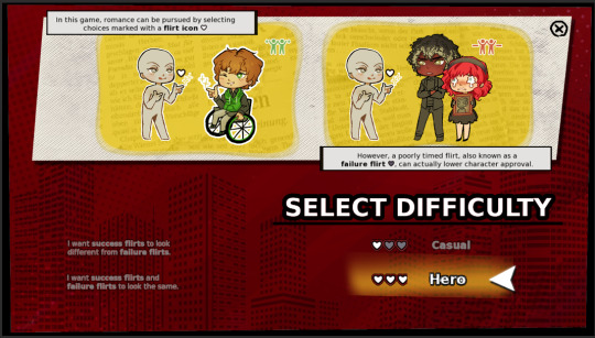
... It was functional, but no matter what I tried, I didn't like how it looked with everything crammed into one page.
... Then I got really sick... but after I recovered and did some more work (drawing, writing, playtesting, etc) I came back to the infographic with the intention to learn how to code pages in renpy.

Still didn't look phenomenal, but there's a whole lot more breathing room! This was in April 2023.
I took another "break" (worked on a million other things) and then... FINALLY... in late August 2023, just a few weeks ago, I had an art breakthrough!
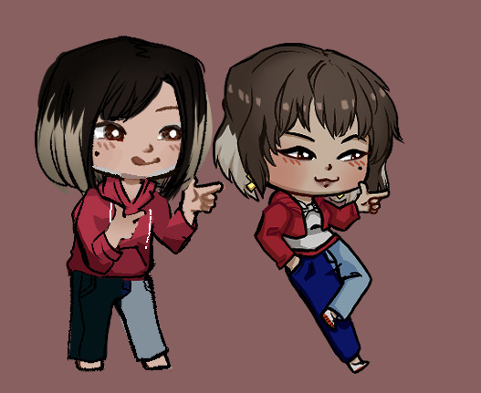
I had garnered a better understanding of color and poses, and as a result my chibis became a LOT cuter! I was able to redraw most of them without too much hassle - whereas when I first started, it would take me all day to draw a single one.
I also drew custom heart icons (a plain heart, a golden heart, and a broken heart), figured out how to make text buttons look more fun and intuitive..
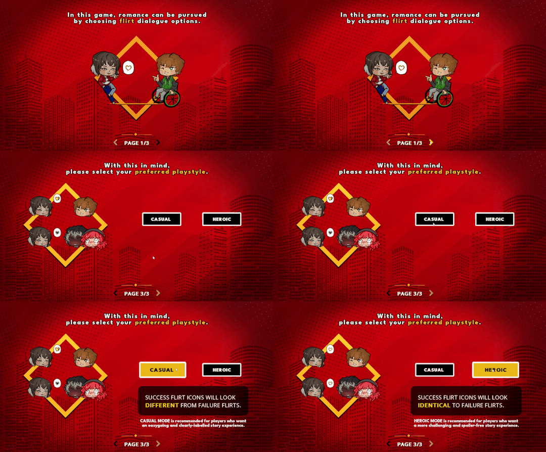
And here's where we're at now!!! I still need to draw eyes for Dart.... but I researched and absorbed a lot about screen compositions, and had a rather late realization that I could re-use backgrounds and assets I already have in the game.
That's it for the special edition. I'll update with more soon!
Stay safe and keep warm,
Wudge.
#herotome update#herotome highlights#interactive fiction#indie game#oelvn#otome#visual novel#otome game#english otome#indie#chibis#anime
48 notes
·
View notes